
Qt for Beginners Part 3 - QML and Qt Quick
60
Qt For Beginners - Part 3 QML and Qt Quick Eric Magnuson, Qt Consultant Integrated Computer Solutions Visit us at http://www.ics.com Watch the video: http://bit.ly/qt-beginners-qml-quick Copyright 2016, Integrated Computers Solutions, Inc. This work may not be reproduced in whole or in part without the express written consent of Integrated Computer Solutions, Inc. 1
Transcript of Qt for Beginners Part 3 - QML and Qt Quick
Qt For Beginners - Part 3QML and Qt Quick
Eric Magnuson, Qt ConsultantIntegrated Computer SolutionsVisit us at http://www.ics.com
Watch the video: http://bit.ly/qt-beginners-qml-quick
Copyright 2016, Integrated Computers Solutions, Inc.
This work may not be reproduced in whole or in part without the express written consent of
Integrated Computer Solutions, Inc.
1

● Introduction● Qt Quick Hello World● QML Concepts● Composing User Interfaces● Nested Elements● Graphical Types● Text Items
Agenda
2

● Anchor Layout● QML Components● Qt Quick Controls● Mouse Input● Touch Input● Keyboard Input● Q&A
Agenda (continued)
3
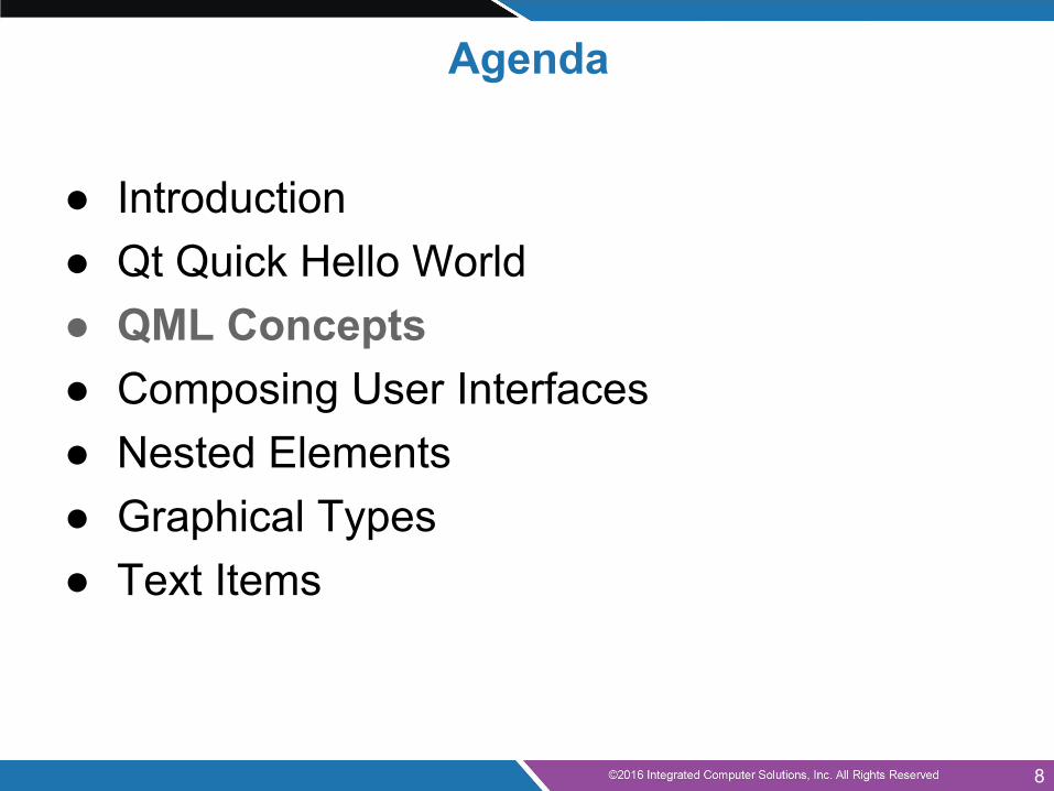
● Introduction● Qt Quick Hello World● QML Concepts● Composing User Interfaces● Nested Elements● Graphical Types● Text Items
Agenda
4
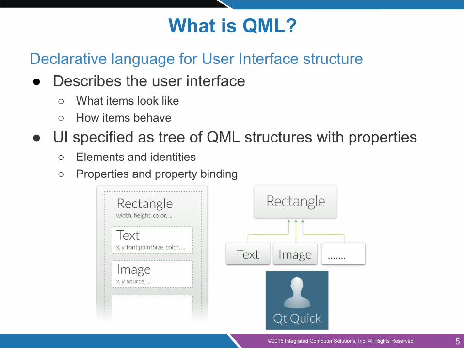
What is QML?Declarative language for User Interface structure● Describes the user interface
○ What items look like○ How items behave
● UI specified as tree of QML structures with properties○ Elements and identities○ Properties and property binding
5
● Introduction● Qt Quick Hello World● QML Concepts● Composing User Interfaces● Nested Elements● Graphical Types● Text Items
Agenda
6
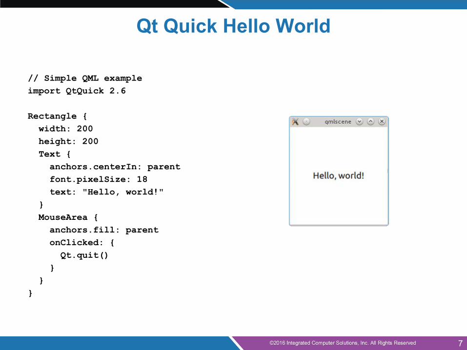
// Simple QML exampleimport QtQuick 2.6
Rectangle { width: 200 height: 200 Text { anchors.centerIn: parent font.pixelSize: 18 text: "Hello, world!" } MouseArea { anchors.fill: parent onClicked: { Qt.quit() } }}
Qt Quick Hello World
7
● Introduction● Qt Quick Hello World● QML Concepts● Composing User Interfaces● Nested Elements● Graphical Types● Text Items
Agenda
8
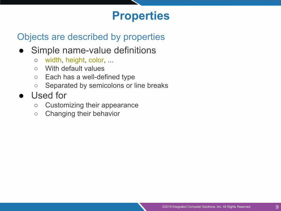
PropertiesObjects are described by properties● Simple name-value definitions
○ width, height, color, ...○ With default values○ Each has a well-defined type○ Separated by semicolons or line breaks
● Used for○ Customizing their appearance○ Changing their behavior
9
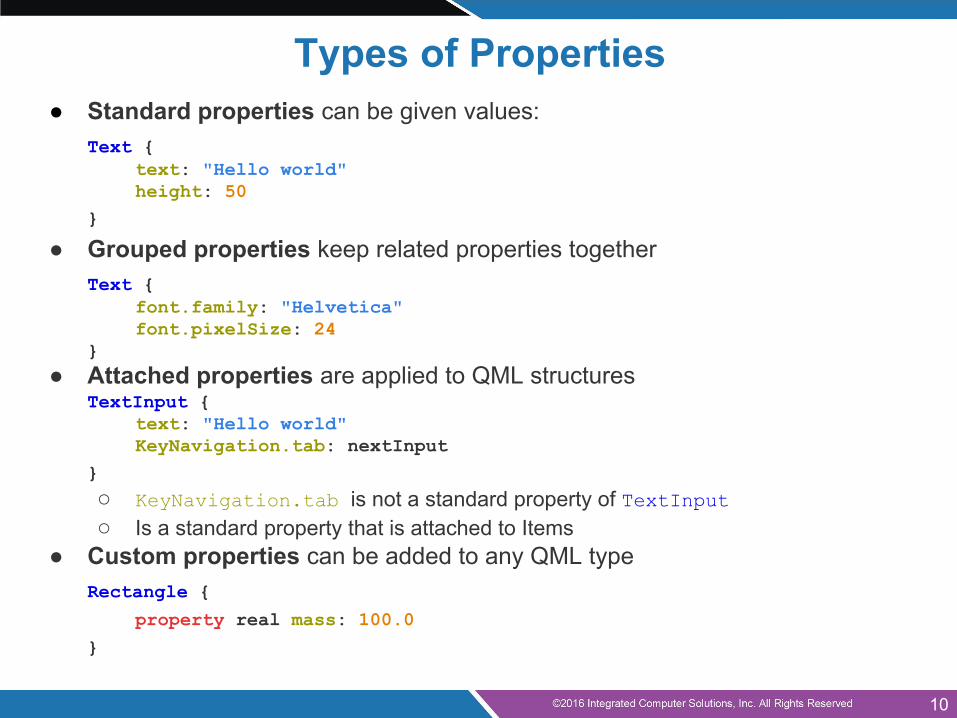
Types of Properties● Standard properties can be given values:
Text {text: "Hello world"height: 50
}
● Grouped properties keep related properties togetherText {
font.family: "Helvetica"font.pixelSize: 24
}● Attached properties are applied to QML structures
TextInput {text: "Hello world"KeyNavigation.tab: nextInput
}
○ KeyNavigation.tab is not a standard property of TextInput○ Is a standard property that is attached to Items
● Custom properties can be added to any QML typeRectangle {
property real mass: 100.0
}
10
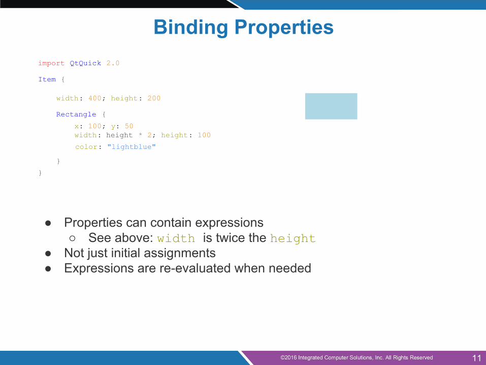
Binding Propertiesimport QtQuick 2.0
Item {
width: 400; height: 200
Rectangle {
x: 100; y: 50width: height * 2; height: 100
color: "lightblue"
}
}
● Properties can contain expressions○ See above: width is twice the height
● Not just initial assignments● Expressions are re-evaluated when needed
11
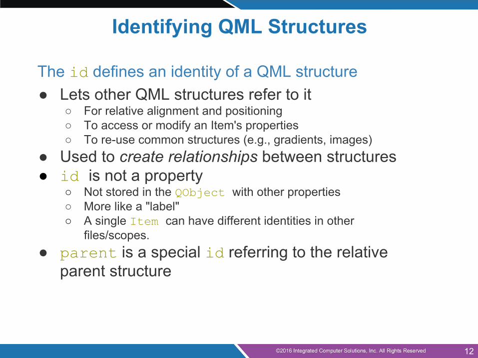
Identifying QML Structures
The id defines an identity of a QML structure● Lets other QML structures refer to it
○ For relative alignment and positioning○ To access or modify an Item's properties○ To re-use common structures (e.g., gradients, images)
● Used to create relationships between structures● id is not a property
○ Not stored in the QObject with other properties○ More like a "label"○ A single Item can have different identities in other
files/scopes.● parent is a special id referring to the relative
parent structure
12
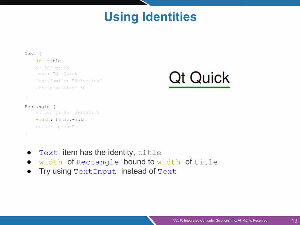
Using Identities
Text {
id: title
x: 50; y: 25text: "Qt Quick"
font.family: "Helvetica"
font.pixelSize: 50
}
Rectangle {x: 50; y: 95; height: 5
width: title.width
color: "green"
}
● Text item has the identity, title● width of Rectangle bound to width of title● Try using TextInput instead of Text
13
Methods
● Most features are accessed via properties● Methods are also used, to perform actions
○ TextInput has a selectAll() method○ Timer has start(), stop() and restart() methods○ Particles has a burst() method
● All methods are public in QML● Other methods are used to convert values between
types:○ Qt.formatDateTime(datetime, format)○ Qt.md5(data)○ Qt.tint(baseColor, tintColor)
14
Property values can have different types:● Numbers (int and real): 400 and 1.5● Boolean values: true and false● Strings: "Hello Qt"● Constants: AlignLeft● Lists: [ ... ]
○ Lists with one item can be written as just the item itself● Scripts:
○ Included directly in property definitions● Other types:
○ colors, dates, times, rects, points, sizes, 3D vectors, ...○ Usually created using constructors
Basic Types
15
● Introduction● Qt Quick Hello World● QML Concepts● Composing User Interfaces● Nested Elements● Graphical Types● Text Items
Agenda
16
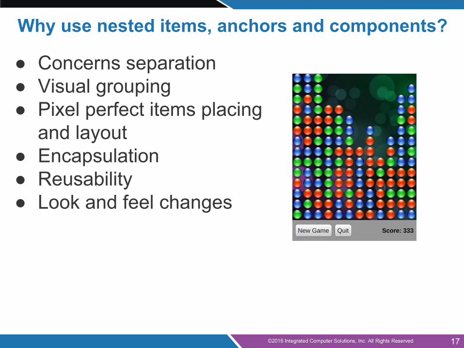
Why use nested items, anchors and components?
● Concerns separation● Visual grouping● Pixel perfect items placing
and layout● Encapsulation● Reusability● Look and feel changes
17

● Introduction● Qt Quick Hello World● QML Concepts● Composing User Interfaces● Nested Elements● Graphical Types● Text Items
Agenda
18
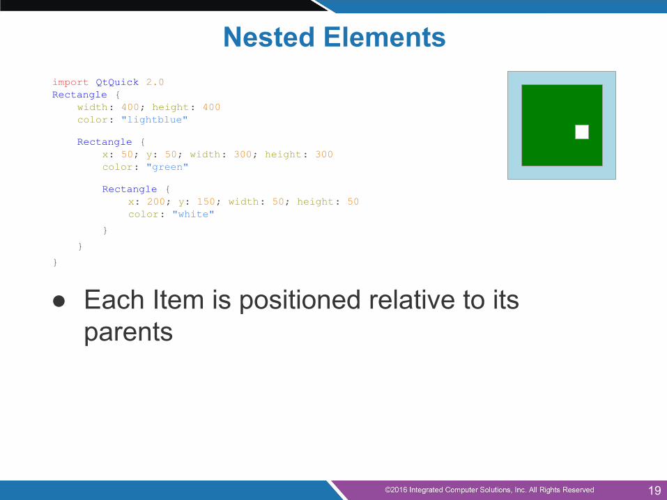
import QtQuick 2.0Rectangle {
width: 400; height: 400color: "lightblue"
Rectangle {x: 50; y: 50; width: 300; height: 300color: "green"
Rectangle {x: 200; y: 150; width: 50; height: 50color: "white"
}
}
}
● Each Item is positioned relative to its parents
Nested Elements
19
● Introduction● Qt Quick Hello World● QML Concepts● Composing User Interfaces● Nested Elements● Graphical Types● Text Items
Agenda
20
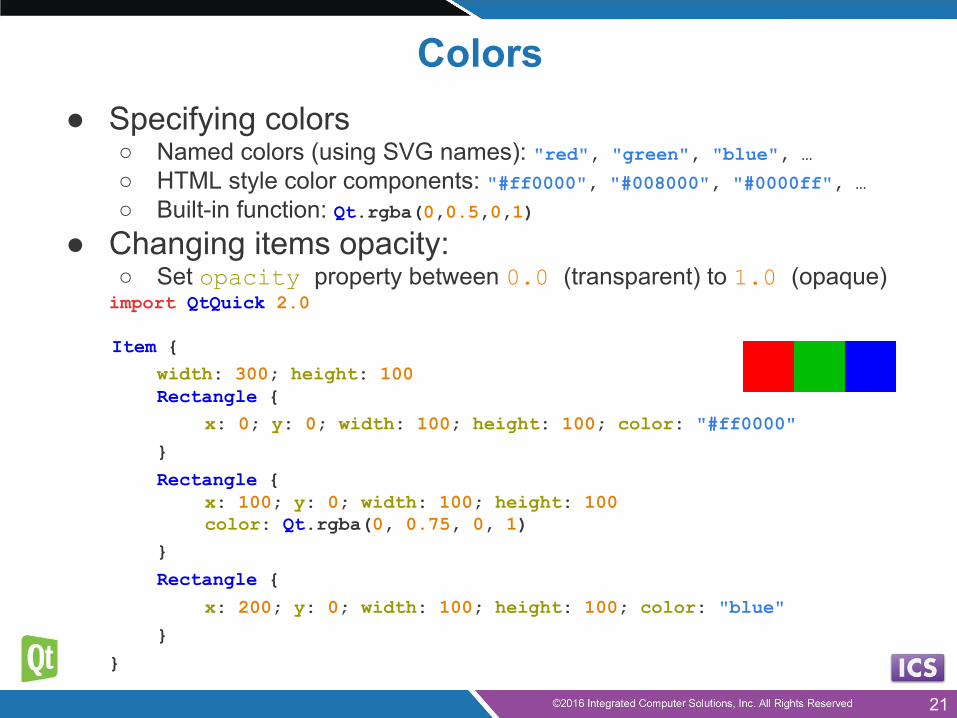
Colors● Specifying colors
○ Named colors (using SVG names): "red", "green", "blue", …○ HTML style color components: "#ff0000", "#008000", "#0000ff", …○ Built-in function: Qt.rgba(0,0.5,0,1)
● Changing items opacity:○ Set opacity property between 0.0 (transparent) to 1.0 (opaque)import QtQuick 2.0
Item {width: 300; height: 100Rectangle {
x: 0; y: 0; width: 100; height: 100; color: "#ff0000"
}
Rectangle {x: 100; y: 0; width: 100; height: 100color: Qt.rgba(0, 0.75, 0, 1)
}
Rectangle {
x: 200; y: 0; width: 100; height: 100; color: "blue"
}
}
21
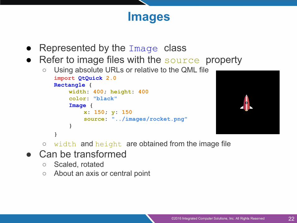
Images
● Represented by the Image class● Refer to image files with the source property
○ Using absolute URLs or relative to the QML fileimport QtQuick 2.0Rectangle {
width: 400; height: 400color: "black"Image {
x: 150; y: 150source: "../images/rocket.png"
}}
○ width and height are obtained from the image file● Can be transformed
○ Scaled, rotated○ About an axis or central point
22
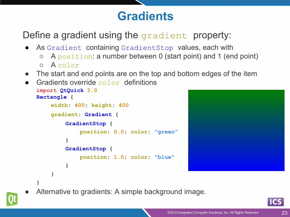
GradientsDefine a gradient using the gradient property:● As Gradient containing GradientStop values, each with
○ A position: a number between 0 (start point) and 1 (end point)○ A color
● The start and end points are on the top and bottom edges of the item● Gradients override color definitions
import QtQuick 2.0Rectangle {
width: 400; height: 400
gradient: Gradient {
GradientStop {position: 0.0; color: "green"
}
GradientStop {
position: 1.0; color: "blue"
}
}
}
● Alternative to gradients: A simple background image.
23
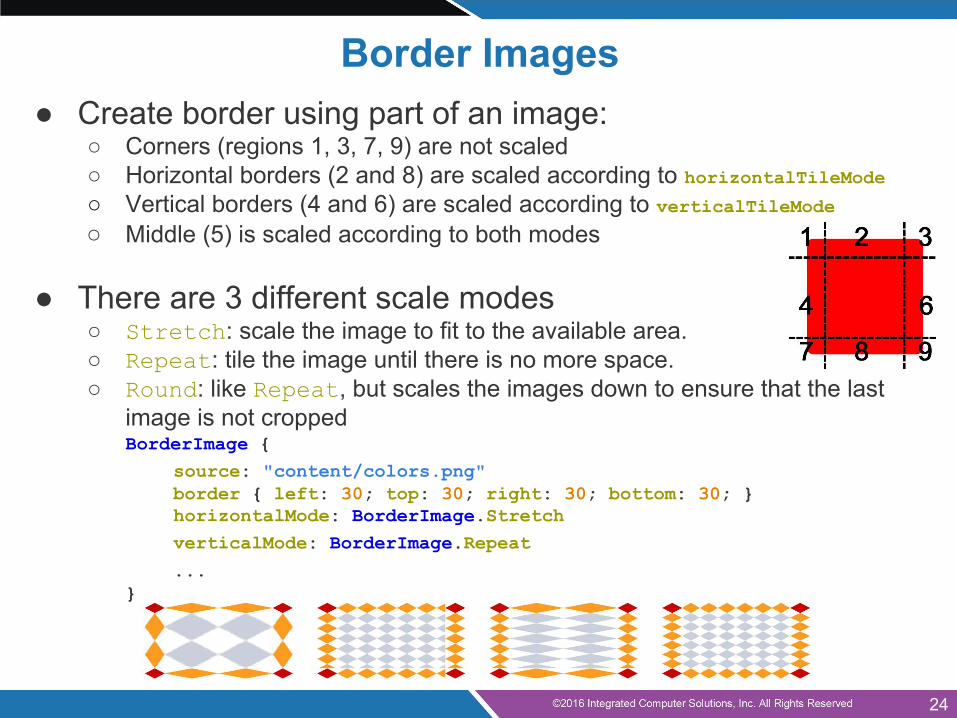
● Create border using part of an image:○ Corners (regions 1, 3, 7, 9) are not scaled○ Horizontal borders (2 and 8) are scaled according to horizontalTileMode○ Vertical borders (4 and 6) are scaled according to verticalTileMode○ Middle (5) is scaled according to both modes
● There are 3 different scale modes○ Stretch: scale the image to fit to the available area.○ Repeat: tile the image until there is no more space.○ Round: like Repeat, but scales the images down to ensure that the last
image is not croppedBorderImage {
source: "content/colors.png"border { left: 30; top: 30; right: 30; bottom: 30; } horizontalMode: BorderImage.StretchverticalMode: BorderImage.Repeat
...}
Border Images
24

● Introduction● Qt Quick Hello World● QML Concepts● Composing User Interfaces● Nested Elements● Graphical Types● Text Items
Agenda
25
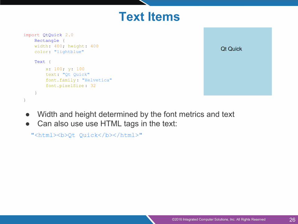
Text Itemsimport QtQuick 2.0 Rectangle {
width: 400; height: 400color: "lightblue"
Text {
x: 100; y: 100text: "Qt Quick"font.family: "Helvetica"font.pixelSize : 32
}
}
● Width and height determined by the font metrics and text● Can also use use HTML tags in the text:"<html><b>Qt Quick</b></html>"
26
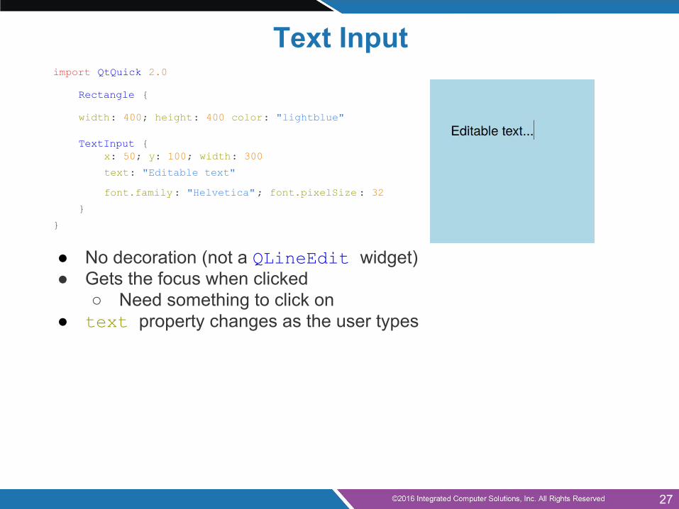
import QtQuick 2.0
Rectangle {
width: 400; height: 400 color: "lightblue"
TextInput {x: 50; y: 100; width: 300
text: "Editable text"
font.family: "Helvetica"; font.pixelSize : 32
}
}
● No decoration (not a QLineEdit widget)● Gets the focus when clicked
○ Need something to click on● text property changes as the user types
Text Input
27
● Anchor Layout● QML Components● Qt Quick Controls● Mouse Input● Touch Input● Keyboard Input● Q&A
Agenda (continued)
28
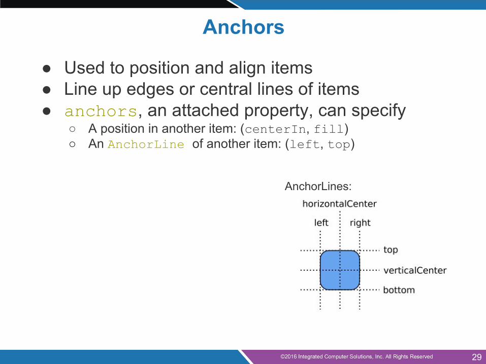
Anchors
● Used to position and align items● Line up edges or central lines of items● anchors, an attached property, can specify
○ A position in another item: (centerIn, fill)○ An AnchorLine of another item: (left, top)
AnchorLines:
29
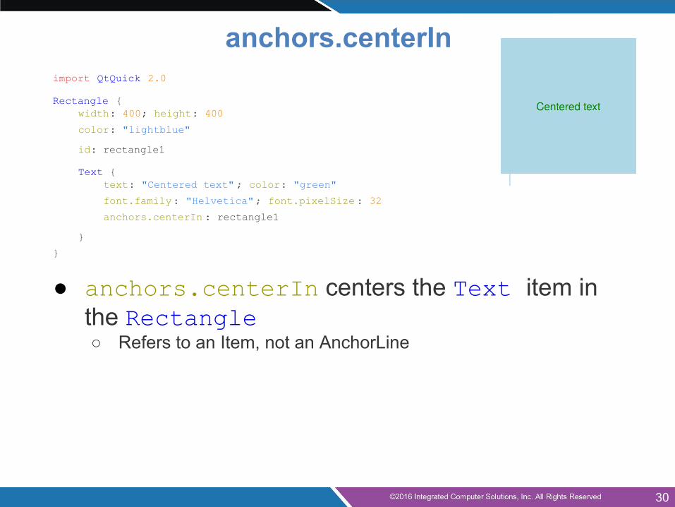
import QtQuick 2.0
Rectangle {width: 400; height: 400
color: "lightblue"
id: rectangle1
Text {text: "Centered text" ; color: "green"
font.family: "Helvetica"; font.pixelSize : 32
anchors.centerIn : rectangle1
}
}
● anchors.centerIn centers the Text item in the Rectangle○ Refers to an Item, not an AnchorLine
anchors.centerIn
30
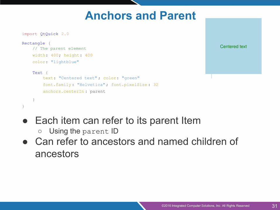
import QtQuick 2.0
Rectangle {// The parent element
width: 400; height: 400
color: "lightblue"
Text {text: "Centered text" ; color: "green"
font.family: "Helvetica"; font.pixelSize : 32
anchors.centerIn : parent
}
}
● Each item can refer to its parent Item○ Using the parent ID
● Can refer to ancestors and named children of ancestors
Anchors and Parent
31
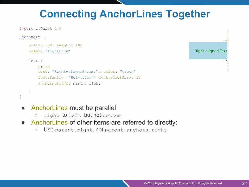
Connecting AnchorLines Togetherimport QtQuick 2.0
Rectangle {
width: 300; height: 100
color: "lightblue"
Text {
y: 34text: "Right-aligned text" ; color: "green"
font.family: "Helvetica"; font.pixelSize : 32
anchors.right: parent.right
}
}
● AnchorLines must be parallel○ right to left but not bottom
● AnchorLines of other items are referred to directly:○ Use parent.right, not parent.anchors.right
32
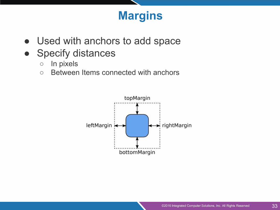
Margins
● Used with anchors to add space● Specify distances
○ In pixels○ Between Items connected with anchors
33
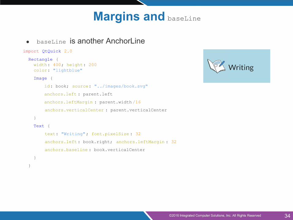
● baseLine is another AnchorLineimport QtQuick 2.0
Rectangle { width: 400; height: 200 color: "lightblue"
Image {
id: book; source: "../images/book.svg"
anchors.left : parent.left
anchors.leftMargin : parent.width /16
anchors.verticalCenter : parent.verticalCenter
}
Text {
text: "Writing"; font.pixelSize : 32
anchors.left: book.right; anchors.leftMargin : 32
anchors.baseline : book.verticalCenter
}
}
Margins and baseLine
34
Hints and Tips – Anchors● Anchors can only be used with parent and sibling
items● Anchors work on constraints
○ Some items need to have well-defined positions and sizes○ Items without default sizes should be anchored to fixed or well-
defined items
● Anchors creates dependencies on geometries of other items○ Creates an order in which geometries are calculated○ Avoid creating circular dependencies
■ e.g., parent → child → parent
● Margins are only used if the corresponding anchors are used○ e.g., leftMargin needs left to be defined
35
Strategies for Use – Anchors
Identify Items with different roles in the user interface:
● Fixed items○ Make sure these have id defined○ Unless these items can easily be referenced as parent items
● Items that dominate the user interface○ Make sure these have id defined
● Items that react to size changes of the dominant items○ Give these anchors that refer to the dominant or fixed items
36
● Anchor Layout● QML Components● Qt Quick Controls● Mouse Input● Touch Input● Keyboard Input● Q&A
Agenda (continued)
37
QML Types
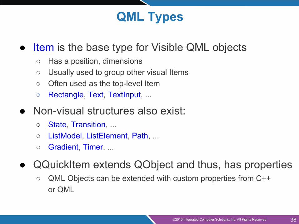
● Item is the base type for Visible QML objects○ Has a position, dimensions○ Usually used to group other visual Items○ Often used as the top-level Item○ Rectangle, Text, TextInput, ...
● Non-visual structures also exist:○ State, Transition, ...○ ListModel, ListElement, Path, ...○ Gradient, Timer, ...
● QQuickItem extends QObject and thus, has properties○ QML Objects can be extended with custom properties from C++
or QML
38
Agenda (continued)
● Anchor Layout● QML Components● Qt Quick Controls● Mouse Input● Touch Input● Keyboard Input● Q&A
39
Qt Quick Controls
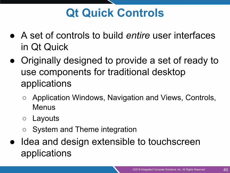
● A set of controls to build entire user interfaces in Qt Quick
● Originally designed to provide a set of ready to use components for traditional desktop applications○ Application Windows, Navigation and Views, Controls,
Menus○ Layouts○ System and Theme integration
● Idea and design extensible to touchscreen applications
40
Qt Quick Controls
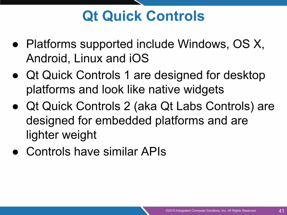
● Platforms supported include Windows, OS X, Android, Linux and iOS
● Qt Quick Controls 1 are designed for desktop platforms and look like native widgets
● Qt Quick Controls 2 (aka Qt Labs Controls) are designed for embedded platforms and are lighter weight
● Controls have similar APIs
41

● Anchor Layout● QML Components● Qt Quick Controls● Mouse Input● Touch Input● Keyboard Input● Q&A
Agenda (continued)
42
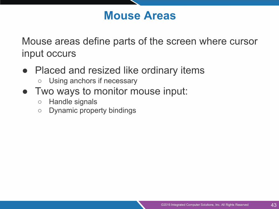
Mouse Areas
Mouse areas define parts of the screen where cursor input occurs
● Placed and resized like ordinary items○ Using anchors if necessary
● Two ways to monitor mouse input:○ Handle signals○ Dynamic property bindings
43
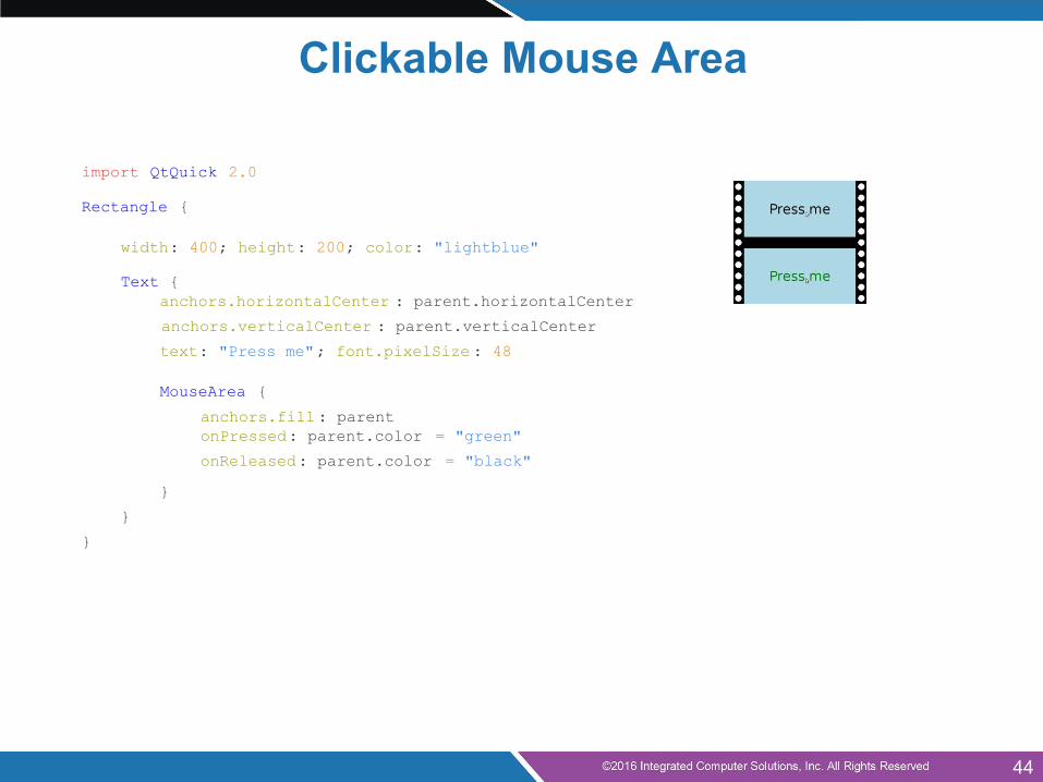
import QtQuick 2.0
Rectangle {
width: 400; height: 200; color: "lightblue"
Text {anchors.horizontalCenter : parent.horizontalCenter
anchors.verticalCenter : parent.verticalCenter
text: "Press me"; font.pixelSize : 48
MouseArea {
anchors.fill: parentonPressed: parent.color = "green"
onReleased: parent.color = "black"
}
}
}ml
Clickable Mouse Area
44
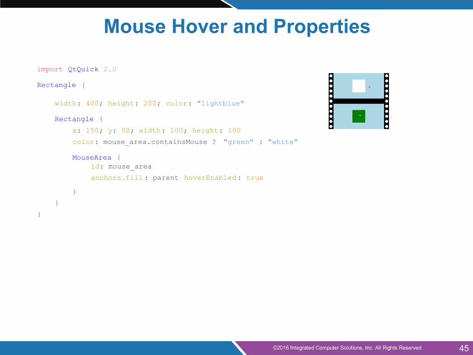
import QtQuick 2.0
Rectangle {
width: 400; height: 200; color: "lightblue"
Rectangle {
x: 150; y: 50; width: 100; height: 100
color: mouse_area.containsMouse ? "green" : "white"
MouseArea {id: mouse_area
anchors.fill: parent hoverEnabled: true
}
}
}
Mouse Hover and Properties
45
Mouse Area Hints and Tips
● A mouse area only responds to its acceptedButtons○ The handlers are not called for other buttons, but○ Any click involving an allowed button is reported○ The pressedButtons property contains all buttons○ Even non-allowed buttons, if an allowed button is also
pressed
● With hoverEnabled set to false○ containsMouse can be true if the mouse area is clicked
46

● Anchor Layout● QML Components● Qt Quick Controls● Mouse Input● Touch Input● Keyboard Input● Q&A
Agenda (continued)
47
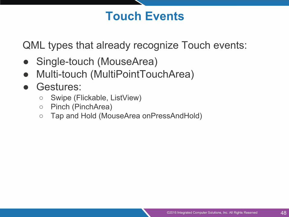
Touch Events
QML types that already recognize Touch events:● Single-touch (MouseArea)● Multi-touch (MultiPointTouchArea)● Gestures:
○ Swipe (Flickable, ListView)○ Pinch (PinchArea)○ Tap and Hold (MouseArea onPressAndHold)
48
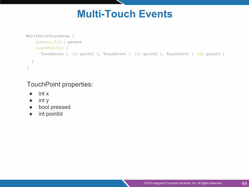
Multi-Touch Events
MultiPointTouchArea {
anchors.fill: parent
touchPoints: [
TouchPoint { id: point1 }, TouchPoint { id: point2 }, TouchPoint { id: point3 }
]
}
TouchPoint properties:● int x● int y● bool pressed● int pointId
49
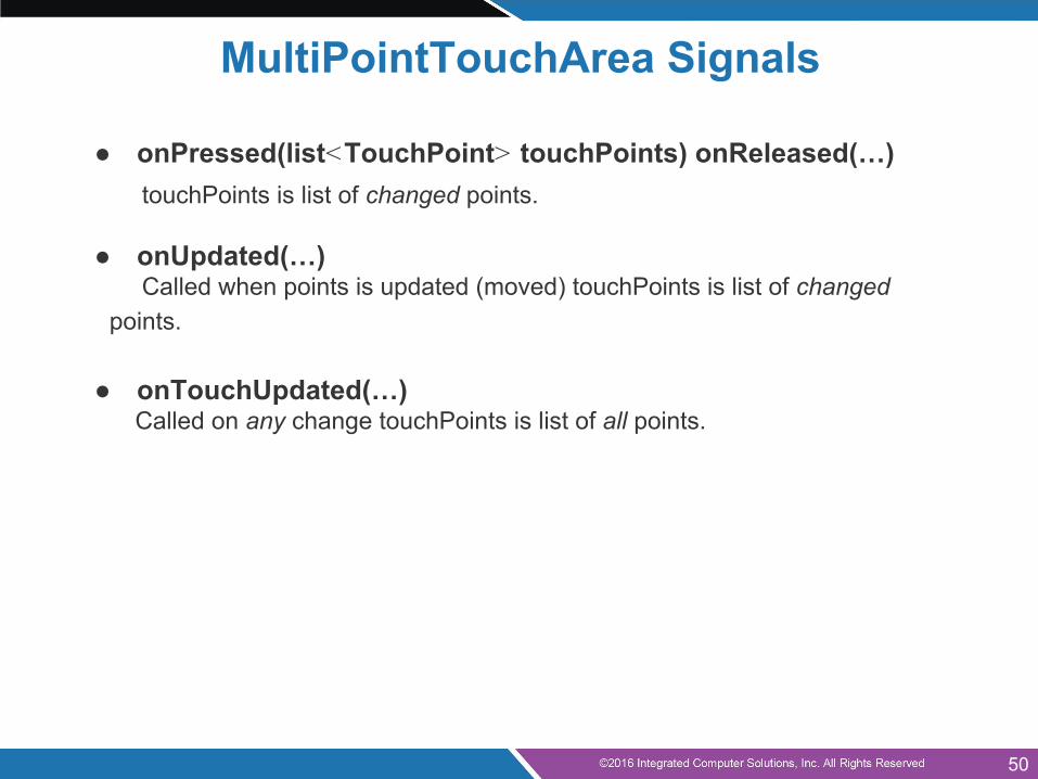
MultiPointTouchArea Signals
● onPressed(list<TouchPoint> touchPoints) onReleased(…) touchPoints is list of changed points.
● onUpdated(…) Called when points is updated (moved) touchPoints is list of changed points.
● onTouchUpdated(…) Called on any change touchPoints is list of all points.
50
MultiPointTouchArea Signals
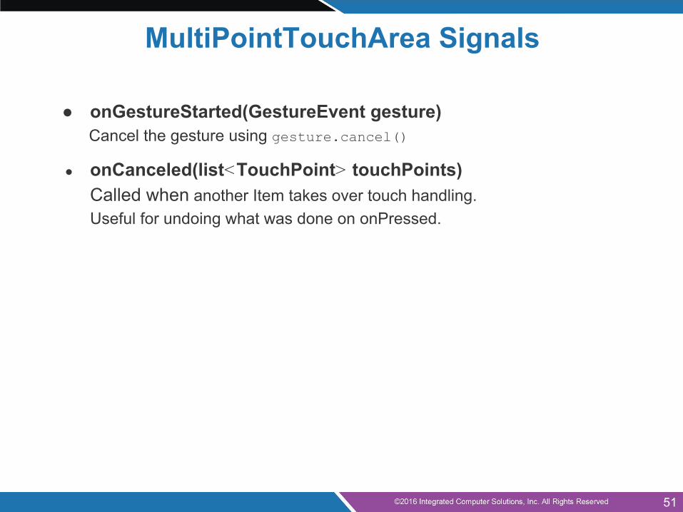
● onGestureStarted(GestureEvent gesture) Cancel the gesture using gesture.cancel()
● onCanceled(list<TouchPoint> touchPoints) Called when another Item takes over touch handling. Useful for undoing what was done on onPressed.
51
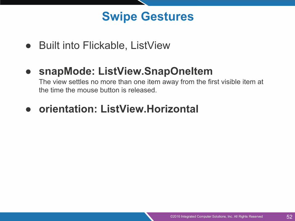
Swipe Gestures
● Built into Flickable, ListView
● snapMode: ListView.SnapOneItemThe view settles no more than one item away from the first visible item at the time the mouse button is released.
● orientation: ListView.Horizontal
52
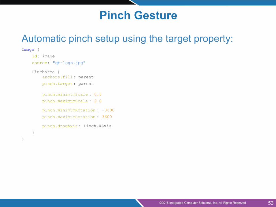
Pinch Gesture
Automatic pinch setup using the target property:Image {
id: image
source: "qt-logo.jpg"
PinchArea {anchors.fill: parent
pinch.target: parent
pinch.minimumScale : 0.5
pinch.maximumScale : 2.0
pinch.minimumRotation : -3600
pinch.maximumRotation : 3600
pinch.dragAxis : Pinch.XAxis
}
}
53
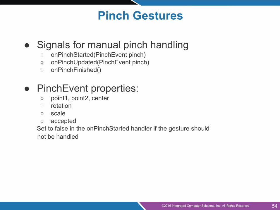
Pinch Gestures
● Signals for manual pinch handling○ onPinchStarted(PinchEvent pinch)○ onPinchUpdated(PinchEvent pinch)○ onPinchFinished()
● PinchEvent properties:○ point1, point2, center○ rotation○ scale○ accepted
Set to false in the onPinchStarted handler if the gesture should not be handled
54
Agenda (continued)
● Anchor Layout● QML Components● Qt Quick Controls● Mouse Input● Touch Input● Keyboard Input● Q&A
55
Keyboard InputBasic keyboard input is handled in two different use cases:● Accepting text input
○ TextInput and TextEdit● Navigation between Items
○ Changing the focused Item○ Directional (arrow keys), tab and backtab
56
Raw Keyboard Input
● Raw key input can be handled by items○ With predefined handlers for commonly used keys○ Full key event information is also available
● The same focus mechanism is used as for ordinary text input○ Enabled by setting the focus property
● Key handling is not an inherited property of items○ Enabled using the Keys attached property
● Key events can be forwarded to other objects○ Enabled using the Keys.forwardTo attached property○ Accepts a list of objects
57
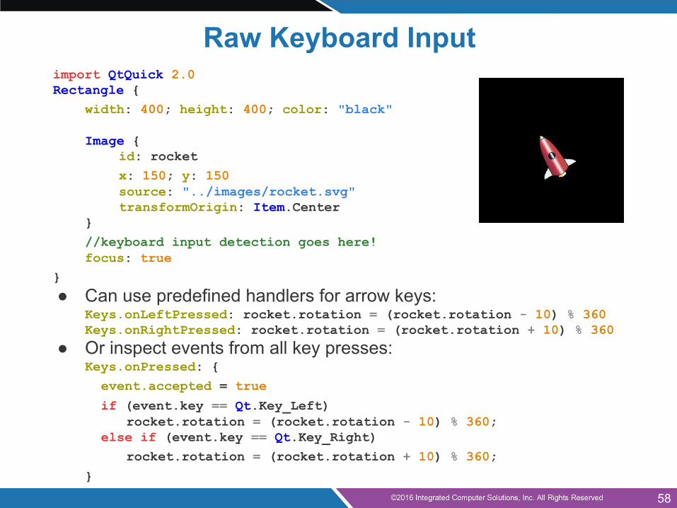
Raw Keyboard Inputimport QtQuick 2.0Rectangle {
width: 400; height: 400; color: "black"
Image {id: rocketx: 150; y: 150source: "../images/rocket.svg"transformOrigin: Item.Center
}//keyboard input detection goes here!focus: true
}
● Can use predefined handlers for arrow keys:Keys.onLeftPressed: rocket.rotation = (rocket.rotation - 10) % 360Keys.onRightPressed: rocket.rotation = (rocket.rotation + 10) % 360
● Or inspect events from all key presses:Keys.onPressed: {
event.accepted = true
if (event.key == Qt.Key_Left)rocket.rotation = (rocket.rotation - 10) % 360;
else if (event.key == Qt.Key_Right)rocket.rotation = (rocket.rotation + 10) % 360;
}
58

Agenda (continued)
● Anchor Layout● QML Components● Qt Quick Controls● Mouse Input● Touch Input● Keyboard Input● Q&A
59
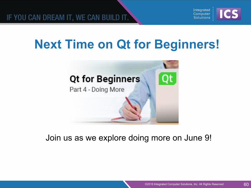
Next Time on Qt for Beginners!
Join us as we explore doing more on June 9!
60