Q1 Media Magazine Evaluation:In what ways does your media product use , develop or challenge forms...
21
Q1: In what ways does your media product use , develop or challenge forms and conventions of real media products? Klaudia Demczuk
-
Upload
klaudia666 -
Category
Art & Photos
-
view
41 -
download
0
Transcript of Q1 Media Magazine Evaluation:In what ways does your media product use , develop or challenge forms...

Q1:In what ways does your
media product use , develop or
challenge forms and conventions of
real media products?
Klaudia Demczuk

My magazine cover-Transformation
I have improved my magazine cover because I personally felt that it didn’t clearly show the genre of my magazine. The magazine briefly followed the pop magazine conventions however more bright colors were needed and I felt that other media pop conventions should be included.

Fin
al m
agaz
ine
co
ver
Artist is looking at the camera-making eye contact with the audience
The cover lines to be on the edges of the page so that the photograph of the artist is not covered up.
The masthead is the biggest font.
Barcode visible : following the conventions
Date and price of the magazine on top of the cover : Easier for target market to spot
Name of the artist(stands out): Second largest font and very eye-catching(Use of the yellow colour) makes it easier to notice the name of the artist
Name of the artists featured in the magazine
Addition to the magazine-Persuades the audience even more to purchase the magazine
Pull quote

Masthead
I have used a variety of media to make the magazine look as eye-catching as possible to fit into the conventions of the pop magazine but also so that it stands out from the other variety of magazines in the stores as in some supermarkets only the top of the magazine is shown therefore it is important to use the most effective media on the masthead of the magazine for the potential customers to notice it in other ranges of magazines.
Because the magazine is mainly aimed at the younger ages and especially aimed at the female gender, I have attempted to make the font fit into the target market. I have used a hot pink as the main color because that is the main female color however have also made the font blend into a black color to make the font color more interesting and exciting for the target market(catches more attention to the eye). I have also picked a bubbly font to make it easier to see that is the name of the magazine but also to make it fascinating for the younger age so that it is easier for them to remember (Younger ages like creative effects just like the ‘We heart pop’ magazine did.
I have also put a frame underneath the name of the magazine so that it stands out from the creamy background, which makes it even more easier to spot the name of the magazine and makes the masthead almost look like a logo which makes it more simpler to recognize it for the customers.
I have located the masthead on top of the page because I wanted to follow the conventions of the magazine cover but also so that the masthead is visible in the supermarkets when placed on the shelves.
The font is the biggest and different than other fonts on the cover so that the audience are able to identify that this is the magazine name to remember it in the future for the next buy of the magazine.
The mast head starts top left so that the magazine is following the conventions of a magazine as it will be easier for the audience to read (The way the eyes start reading any text).

Developing ideas To look for inspiration I looked at other pop magazine names and other magazines to see what other magazines have done to make the masthead stand out.
I have developed my masthead idea mainly from this magazine because I liked how the text is big and bold with an interesting and creative font to attract the younger audience(Swirly font).
I have noticed that all the mastheads are attention-grabbing and very striking, for example the ‘we heart pop’ has an interesting black bold border which acts as a speech mark to get the audience feel a part of the magazine by using the word ‘we’. The pop magazines also make the audience aware that it is a pop magazine by including ‘pop’ in their magazine name therefore I have decided to do the same so that it is easier for the younger target market to be fully aware of the genre of the magazine.
I have also decided to include a border in my masthead in the background so that it also stands out from the rest of the magazine and makes the masthead distinctive and more creative just like the ‘we heart pop’ magazine did.
The mastheads in most magazines are very bold and are usually found on top of the magazine, they are also in a altered colour so that it stands out from the rest of the magazine.

Headlines , cover lines ,selling line
,pull quote, date line Cover lines
My cover lines fit the conventions of the magazine because they are found on the edges of the page so that they don’t cover up the important features of the artist, so the cover lines are placed so that the artists face is still visible. Small margins were also left so that the text is not disappearing off the page. The sizes of the cover lines are also following the conventions as they are not bigger than the masthead. I have used bright colours for the cover lines so that it is easier and quicker to read for the younger audience and also so that each cover line stands out. I have used borders and strokes to make the text more visible from the background of the page and make it more eye grabbing for my target market.
Developed ideas
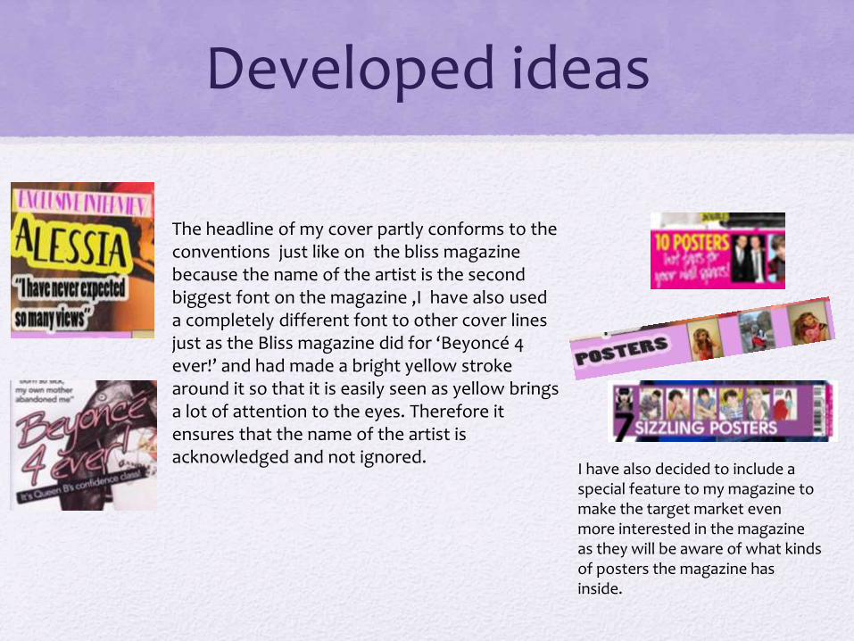
The headline of my cover partly conforms to the conventions just like on the bliss magazine because the name of the artist is the second biggest font on the magazine ,I have also used a completely different font to other cover lines just as the Bliss magazine did for ‘Beyoncé 4 ever!’ and had made a bright yellow stroke around it so that it is easily seen as yellow brings a lot of attention to the eyes. Therefore it ensures that the name of the artist is acknowledged and not ignored.
I have also decided to include a special feature to my magazine to make the target market even more interested in the magazine as they will be aware of what kinds of posters the magazine has inside.

I have decided to make a list of the featured artists on the cover so that the audience is aware of all the artists featured inside the magazine so if they are unsure about the featured main artist there will always be a guarantee that an artist that they like is presented in the magazine.I have decided to use pop artists to match the genre of the magazine so the target market will be aware of those artists.
Underneath the artists name is a pull quote from the article found inside the magazine so the audience will get an idea of what the article will be about which can draw them into purchasing the magazine.

Cover image of artist : Eye contact
I have looked at variety of magazines and noticed that most of them had the artist making eye contact with the audience giving an innocent and sophisticated look. Therefore I have decided to progress this idea and make the artist look really focused into the camera to make the artist eye-catching for the target market. I have also noticed that in other magazines the background of the magazine is plain and mostly white , therefore I have decided to make my background colour a creamy colour so that the artist can stand out even more from the magazine and so that there is a full focus on the artist at a first glance of the magazine.
The artist is on the centre of the page so that the magazine looks well composed(Artist is underneath the masthead on the centre so that the headline and cover lines can be easily located around the artist without ruining the quality of the image).

Barcode, date
I have kept to the conventions of a magazine and included a barcode on the front page of the magazine on the right hand side as I noticed that most magazine have it aligned there ,I have decided to include a barcode on the front page because I felt that it looked more professional having it at the front and only very well known magazines don’t have it on the front page e.g. ‘Billboard’ magazine.
I have also included the date of the magazines release but also the price of the magazine at the top of the page just underneath the masthead so that it is easier for the target market to notice it and find out quickly whether they can afford the magazine but also if that is the recent issue.

Magazine examples I took inspiration from

Contents page

I have included the website for the magazine so that the reader can find out more information about any articles in the magazine and if the readers have any questions they would like to raise etc. I have located it at the bottom of the page as I observed that other magazines located it there as it doesn't interfere with other text but it is also easy to notice on the page.
The name of the magazine is set on top on top of the page so that it will get more recognisable for the audience but also because ‘chart pop’ is a convention of the contents page as it reminds the audience of the cover and makes it easier to create a house style
I have used the same font as the masthead but in a different colour and used different effects so that they are both distinct. I have made the page title stand out by from the background by adding a faint white stroke to make it eye-catching and to make it clear that it is the title page.
Other pop magazines have inspired me to do an editors letter to get to welcome the younger target market a bit more so that they will feel a part of the ‘chart pop’ community
I have announced a competition on the contents page so that the target market can get involved in a exciting activity. I have used a photograph that I took of the big Ben when I was visiting London.I used a bright yellow star with a ‘win’ bold text on top to make audience aware of this opportunity as it draws a lot of attention from the rest of the fonts.
I have included the date of the magazine so that
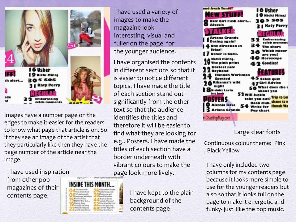
I have only included two columns for my contents page because it looks more simple to use for the younger readers but also so that it looks full on the page to make it energetic and funky- just like the pop music.
I have used a variety of images to make the magazine look interesting, visual and fuller on the page for the younger audience.
I have used inspiration from other pop magazines of their contents page.
I have organised the contents in different sections so that it is easier to notice different topics. I have made the title of each section stand out significantly from the other text so that the audience identifies the titles and therefore it will be easier to find what they are looking for e.g.. Posters. I have made the titles of each section have a border underneath with vibrant colours to make the page look more lively.
Images have a number page on the edges to make it easier for the readers to know what page that article is on. So if they see an image of the artist that they particularly like then they have the page number of the article near the image.
I have kept to the plain background of the contents page
Large clear fonts
Continuous colour theme: Pink , Black Yellow


Article

I have placed the page numbers at the bottom of the page to keep to the conventions of themagazine article.
The article is a Q and A interview, therefore I have made a different colour of the font to make the readers recognise the question for the artist given and the answer the artist have responded with.
The page numbers are quite small however the layout makes the numbers still easily visible for the target market as the numbers are provided with a bright pink circle shaped border which keeps to the convention of the magazine as it makes the magazine look more professional and for the audience to make it easier to recognise the page numbers instantly.
To make the magazine also visual for the target market I have included images of the things that are mentioned in the article so that the audience knows exactly what the article is talking about. It also keeps to the conventions of a pop magazine as it tends to use a lot of images to make the appearance of the magazine much more pleasant than just having a plain text as the article(makes the younger audience interested in the article. I have also developed this idea from the we ’heart’ pop magazine as they did an interview article and I had made my article a similar style.
Developed the style of a Jessie J article.

I have made the border of the pull quote in the same style as the Jessie J article because it is very eye-catching and makes the pull quote stand out magnificently from the article.
I have made the artist look relaxed and trendy to relate to the target market of the magazine.
The title of the article located at the top of the page. It has the biggest font and is found at the very top of the page so that it is the most eye catching ,to make sure the audience knows who the article is about before starting to read it. It therefore follows the convention of the magazine as each title on different page has to have the biggest font and be the most noticeable.
’Blurb’-Introduction to the article. This usually drags the reader in and decided whether the audience is interested in the article and wants to read it or skip the page.
The Blurb is separated from the interview text for the audience to see the distinction inbetween.


Challenging forms and conventions
• I have only challenged the conventions slightly in the contents page as I have not included the smaller version of the cover giving page numbers of where each important article is placed.
• I have not done this as I have decided I wanted to include more images of the artists and other images(Image of the Big Ben)on the contents page rather than having the magazine cover, I also made the pictures more bigger which make the page looks more visual with the things that the audience is waiting to find inside the magazine.

• I have also thought it is pointless including the smaller image of the cover as the audience has just seen it when they turned in the page, it is more beneficial to have more images and text found on the contents page.
Overall I have kept to the conventions of a pop magazine and tried to make it appropriate for the target market as much as possible.