Q1 - In what ways does your music video use, develop or challenge forms and conventions of real...
12
does your music video use, develop or challenge forms and conventions of real media products?
Transcript of Q1 - In what ways does your music video use, develop or challenge forms and conventions of real...
Q1 In what ways does your music video use, develop or challenge
forms and conventions of real media
products?

‘Music videos demonstrate genre characteristics’ Goodwin’s Theory
A convention of literature and film is that the landscape amplifies the mood of the characters. For example, in the opening to ‘Far from the madding crowd’, based on the novel by Thomas Hardy (1967), the dull, low key lighting within the dreary and isolated location indicates a sense of melancholic threat. For audiences of John Schlesinger’s film, the tragic opening, in which a flock of sheep is accidentally knocked off a cliff by the sheepdog, is a signifier of bad to come and sets the bleak tone for the rest of the film. Similarly, I make use of location and lighting in my media text to highlight the tragic events which are unfolding in the protagonist, Jonny’s life. The opening scene of my music video, where the solitary seascape is established indicates a similar sense of melancholy.
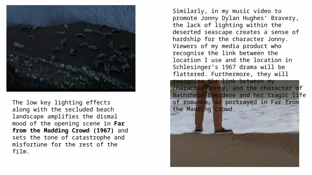
The low key lighting effects along with the secluded beach landscape amplifies the dismal mood of the opening scene in Far from the Madding Crowd (1967) and sets the tone of catastrophe and misfortune for the rest of the film.
Similarly, in my music video to promote Jonny Dylan Hughes’ Bravery, the lack of lighting within the deserted seascape creates a sense of hardship for the character Jonny. Viewers of my media product who recognise the link between the location I use and the location in Schlesinger’s 1967 drama will be flattered. Furthermore, they will recognise the link between my character Jonny, and the character of Bathsheba Everdene and her tragic life of romance, as portrayed in Far from the Madding Crowd.

Another media text which makes use of a landscape to tell the story is Jane Campion’s The Piano (1993) in which again, a solitary seascape is used to emphasise the mood of the film. In the case of Campion’s film, the secluded beach location is used to show the emotions of isolation and loneliness felt by the mute protagonist, Ada, who has been left with no other choice but to emigrate to New Zealand to live with her husband, Stewart, whom she is in a forced marriage with. The sepia colours, along with the deserted landscape illustrate Ada’s feelings of alienation within a marriage she despises, forced to be separated from her beloved piano and in a foreign country. Campion has chosen to create the mise en scene, of a desolate and barren location to emphasise the feelings of entrapment that Ada must feel when there is little hope or pleasure in her life. I similarly make use of the conventions of literature and film which The Piano uses, in using my location as a tool to amplify the mood of the characters. In particular, I reference The Piano in my production by using a similar location to present the aloofness of my protagonist Jonny, who is shown to be suffering a poor mental state following a break up, as indicated by the pictures of a female, in a similar way to how the mise en scene is used in The Piano to demonstrate Ada’s feelings of loss and separation from her instrument.
My music video to promote Jonny Dylan Hughes’ Bravery – the landscape amplifies the emotions of the character, in that his loss of a previous relationship is demonstrated through the isolated location.
In The Piano (1993) the mood of the protagonist, Ada, is evident through the use of a desolate seascape in the mise en scene, emphasising the loss of her beloved piano.

‘There is a link between the lyrics and the visuals’. Goodwin’s Theory
In following Goodwin’s theory of music videos, my media product to promote Jonny Dylan Hughes’ Bravery includes visuals which amplify the lyrics. The lyrics “Throw this curse in the sea” are amplified by the visuals of the protagonist Jonny throwing a pebble into the sea and then walking into the waves.
In Leftfield, Afrika Bambaataa’s music video to promote Afrika Shox (1999) there is a similar amplification of the lyrics “Let’s get electrified’ where the black, male protagonist touches a barbed wire fence which has connotations to an electric fence, which may be used to pen wild animals in. These visuals emphasise the fact that the particular lyrics refer to the alienation of the male, who feels trapped and mistreated, within the New York City metropolis.
In my music video to promote Hughes’ Bravery, the matching lyrics and visuals highlight the protagonist, Jonny’s feeling of grievance for his previous relationship and his desire to put his feelings behind him.
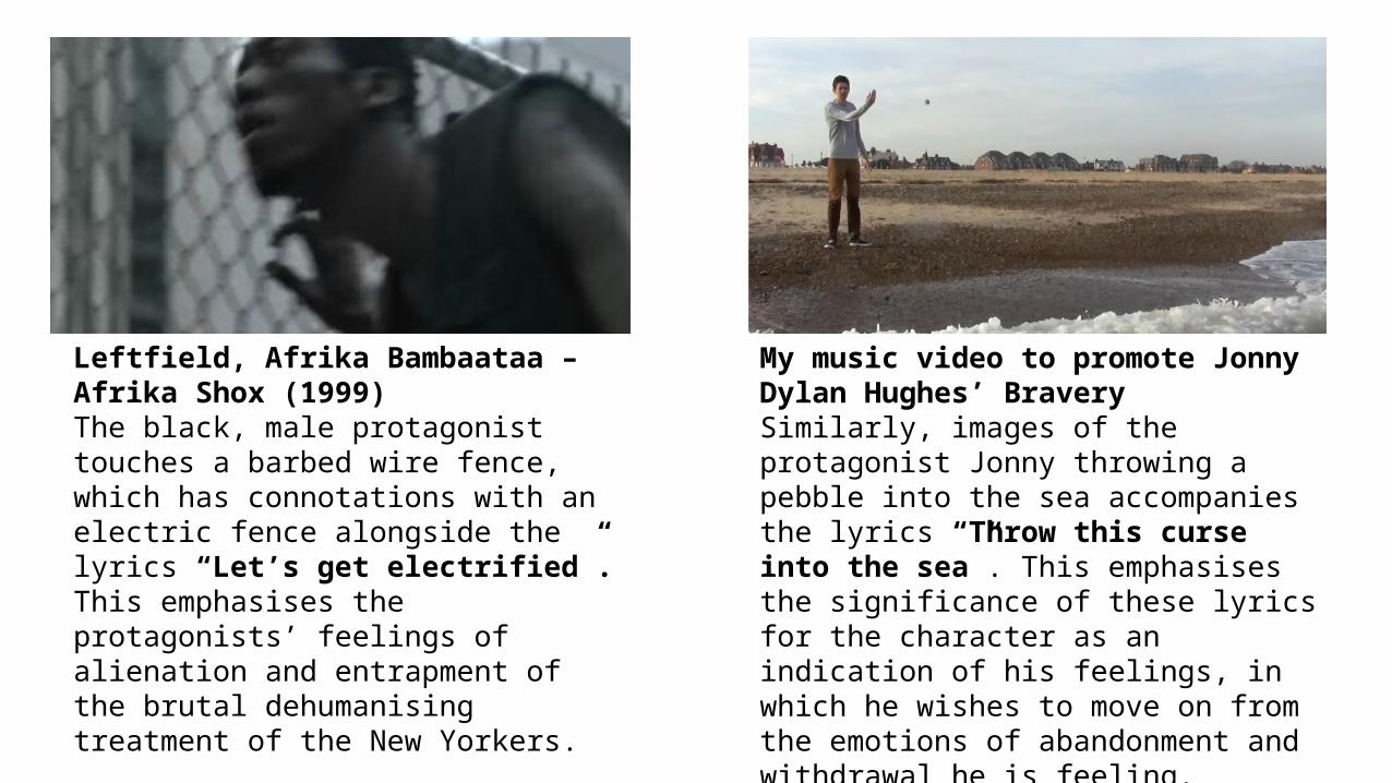
Leftfield, Afrika Bambaataa – Afrika Shox (1999) The black, male protagonist touches a barbed wire fence, which has connotations with an electric fence alongside the lyrics “Let’s get electrified”. This emphasises the protagonists’ feelings of alienation and entrapment of the brutal dehumanising treatment of the New Yorkers.
My music video to promote Jonny Dylan Hughes’ BraverySimilarly, images of the protagonist Jonny throwing a pebble into the sea accompanies the lyrics “Throw this curse into the sea”. This emphasises the significance of these lyrics for the character as an indication of his feelings, in which he wishes to move on from the emotions of abandonment and withdrawal he is feeling.

In my music video, there is a link between the lyrics and the visuals in the references to the symbolic image of poppies. Conventionally, poppies have connotations to bravery, which is the name of the track and a word which regularly features in the lyrics of the song.
In the Blackadder final episode, ‘Good luck everyone’, the image of the field of poppies at the closing of the episode creates a sombre atmosphere of melancholy, a grave contrast to the comedy, moments before. The solemn associations which the image of a field of poppies hold, due to their growth in the barren fields of post WWI Western Europe, emphasises the devastation that the viewer is witnessing.
In a similar way, the imagery of the poppies in my music video indicates the hard hitting nature of the loss and isolation felt by Jonny, as well as heightening the impact of lyrics such as “If Bravery, was the moment you saved me”, in the same way that poppies create empathy in other texts, such as Blackadder.
The field of poppies, used in the closing of the final episode of Blackadder, to create a sombre atmosphere.
Use of poppies to emphasise the lyrics “If Bravery was the moment you saved me”, as well as the title and main theme of the track, in following conventions of images of poppies in the media.

‘The notion of looking will be referenced’ Goodwin’s Theory My music video to promote Jonny Dylan Hughes’ Bravery challenges the voyeuristic treatment of females which is seen in William Wheatley’s Broadway musical production of The Black Crook, for example. In Wheatley’s 1866 musical, female performers were intentionally objectified, and this remains a convention of the modern music video, and is notably seen in Robin Thicke’s 2013 music video to promote Blurred Lines where his two female performers are dehumanised as mere possessions of men with sexually explicit performances.
In my media product however, there is an absence of a female character and instead the mise en scene is dominated entirely by the single male protagonist. This challenges the generic conventions of the electropop/pop music genre in that the notion of looking is regularly referenced though voyeurism of the female gender.
Voyeuristic treatment of females, as seen in the 1866 musical, The Black Crook, as well as in the 2013 music video to promote Robin Thicke’s Blurred Lines.
In comparison, my music video to promote Hughes’ Bravery is solely male dominated.

My music video does though conform with the convention of females being under-represented in the music industry, insofar that there is a notable absence of any female performer and that the mise en scene is heavily male dominated. Further to this, my music video also conforms to the theory of Sven E Carlson who stated that ‘Almost everything is…perceived as opposites’, and that a sense of binary opposites drive the narrative forward. The only female character in my music video is presented on one occasion as an image on a mobile phone screen. This reference to the notion of looking (screens within screens), as well as Carlson’s binary opposites is similarly seen in the 2008 music video to promote The Script’s ‘Breakeven’ where the female character is dehumanised and presented as the possession of males, when the female character is shown through only an image on a phone screen.
The protagonist, played by Danny O’ Donoghue in The Script’s Breakeven views an image of a female, giving us a sense of a past relationship. Reference to The Notion of Looking (Goodwin) and binary opposites, evident from the striking difference between the male’s physical presence to the female’s virtual existence.
The protagonist, Jonny, in my music video to promote Hughes’ Bravery similarly references the notion of looking and binary opposites, by viewing an image of a female on a mobile phone screen, similar to in The Script’s Breakeven.
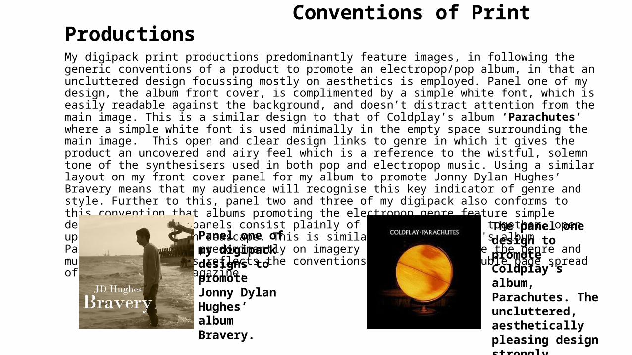
Conventions of Print ProductionsMy digipack print productions predominantly feature images, in following the generic conventions of a product to promote an electropop/pop album, in that an uncluttered design focussing mostly on aesthetics is employed. Panel one of my design, the album front cover, is complimented by a simple white font, which is easily readable against the background, and doesn’t distract attention from the main image. This is a similar design to that of Coldplay’s album ‘Parachutes’ where a simple white font is used minimally in the empty space surrounding the main image. This open and clear design links to genre in which it gives the product an uncovered and airy feel which is a reference to the wistful, solemn tone of the synthesisers used in both pop and electropop music. Using a similar layout on my front cover panel for my album to promote Jonny Dylan Hughes’ Bravery means that my audience will recognise this key indicator of genre and style. Further to this, panel two and three of my digipack also conforms to this convention that albums promoting the electropop genre feature simple designs. My inside panels consist plainly of two images, which together, open up to create a beach seascape. This is similar to how Coldplay's album Parachutes focusses predominantly on imagery to best illustrate the genre and music. Further, this reflects the conventions of style in a double page spread of a newspaper or magazine.
Panel one of my digipack designs to promote Jonny Dylan Hughes’ album Bravery.
The panel one design to promote Coldplay’s album, Parachutes. The uncluttered, aesthetically pleasing design strongly references the solemn tone of the electropop genre.

During construction of my digipack designs, I used the standard dimensions for a British CD case and in this way I can be certain that it conforms with the conventional forms of a media product of a similar nature.
Panel four of my digipack, the rear cover, is again mostly image based in keeping with the generic conventions of an electropop album, with the focus being on aesthetics. As is conventional for a rear panel, the names of the tracks in order are presented. Institutional information and a barcode is also incorporated into this design in keeping with the conventions of the rear panel of an album .
Back panel of Owl City’s album Ocean Eyes.
Back panel of my digipak to promote Jonny Dylan Hughes’ Bravery.
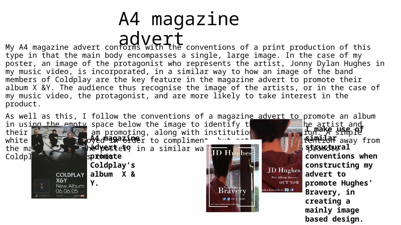
A4 magazine advertMy A4 magazine advert conforms with the conventions of a print production of this type in that the main body encompasses a single, large image. In the case of my poster, an image of the protagonist who represents the artist, Jonny Dylan Hughes in my music video, is incorporated, in a similar way to how an image of the band members of Coldplay are the key feature in the magazine advert to promote their album X &Y. The audience thus recognise the image of the artists, or in the case of my music video, the protagonist, and are more likely to take interest in the product.
As well as this, I follow the conventions of a magazine advert to promote an album in using the empty space below the image to identify the name of the artist and their album that I am promoting, along with institutional information. A simple white font is employed in order to compliment, but not distract attention away from the main body of the poster, in a similar way to how the advert to promote Coldplay's X&Y uses this.
A4 magazine advert to promote Coldplay’s album X & Y.
I make use of similar structural conventions when constructing my advert to promote Hughes’ Bravery, in creating a mainly image based design.