Q1- In what ways does your media product use, develop or challenge forms and conventions of real...
11
COVER
-
Upload
agnes-galek -
Category
Social Media
-
view
84 -
download
0
Transcript of Q1- In what ways does your media product use, develop or challenge forms and conventions of real...

COVER

COVER CONVENTIONSI structured my cover on the conventions of a NME magazine cover. This is focused on general music, the headlines, the masthead and the colours and the fonts, also the selling line. As my magazine is an indie-pop one it seemed the right thing to do follow the structure of NME to keep it with the indie genre conventions. I picked from a range of photographs which I took that made the model look the most serious, and the face expression and the dark make up were visible and standing out. I made the headline relate to the masthead too, because it is ‘absolute’ to the artist that music is her everything, that it’s something she relies on.
Eye contact with the reader and a serious face expression showing how serious the artist is about their music.
“Music makes me feel alive” is an absolute to the artist.
I decided to follow the genres conventions other than be opposite and not follow them at all, because it’s what the audience is used to and feels comfortable with. They are also familiar with the structure and enjoy it. But if I did break the conventions people might then not understand it, and want to stick to what they already know.
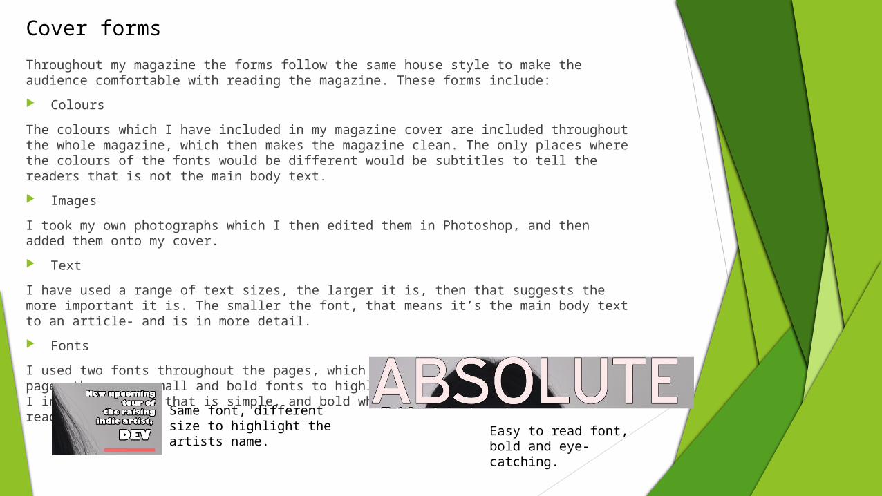
Cover formsThroughout my magazine the forms follow the same house style to make the audience comfortable with reading the magazine. These forms include:
Colours
The colours which I have included in my magazine cover are included throughout the whole magazine, which then makes the magazine clean. The only places where the colours of the fonts would be different would be subtitles to tell the readers that is not the main body text.
Images
I took my own photographs which I then edited them in Photoshop, and then added them onto my cover.
Text
I have used a range of text sizes, the larger it is, then that suggests the more important it is. The smaller the font, that means it’s the main body text to an article- and is in more detail.
Fonts
I used two fonts throughout the pages, which I first included in my cover page, there are small and bold fonts to highlight some things. To my masthead I included a font that is simple, and bold which makes it stand out to the reader.
Same font, different size to highlight the artists name. Easy to read font,
bold and eye-catching.

CO
NTE
NTS
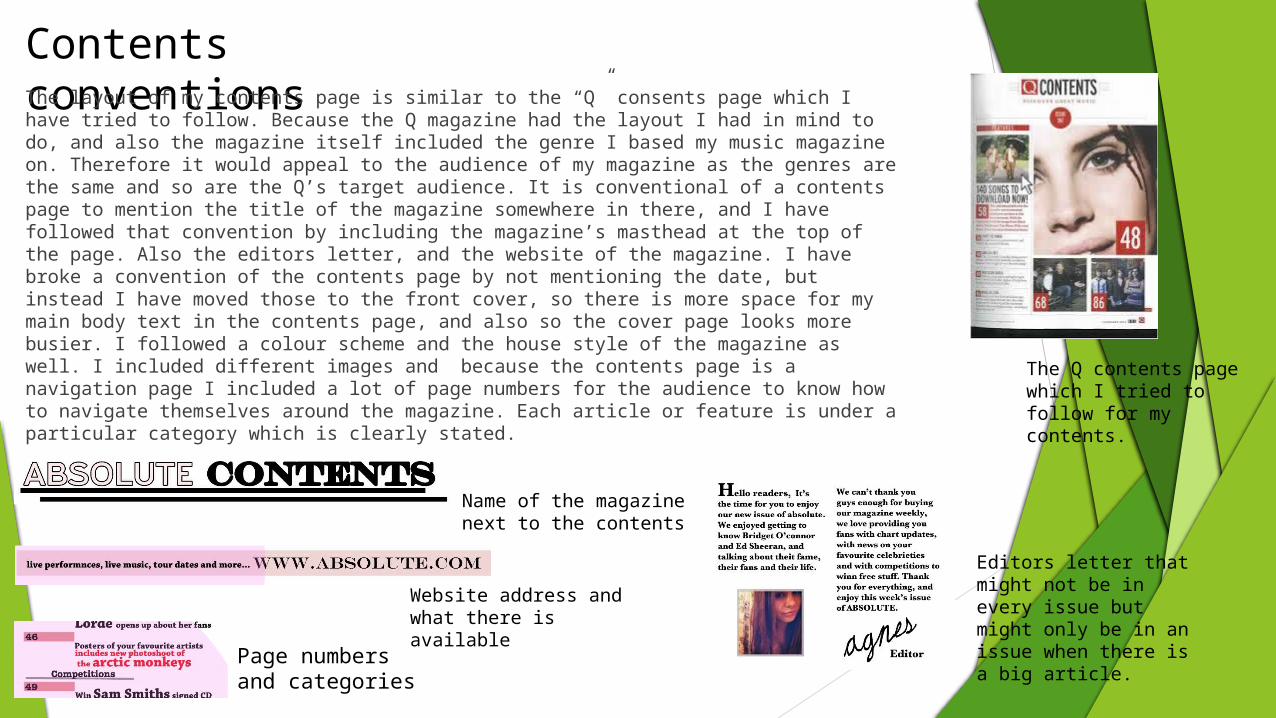
Contents conventionsThe layout of my contents page is similar to the “Q” consents page which I have tried to follow. Because the Q magazine had the layout I had in mind to do, and also the magazine itself included the genre I based my music magazine on. Therefore it would appeal to the audience of my magazine as the genres are the same and so are the Q’s target audience. It is conventional of a contents page to mention the title of the magazine somewhere in there, and I have followed that convention by including the magazine’s masthead at the top of the page. Also the editors letter, and the website of the magazine. I have broke a convention of the contents page by not mentioning the date, but instead I have moved those to the front cover, so there is more space for my main body text in the contents page, and also so the cover page looks more busier. I followed a colour scheme and the house style of the magazine as well. I included different images and because the contents page is a navigation page I included a lot of page numbers for the audience to know how to navigate themselves around the magazine. Each article or feature is under a particular category which is clearly stated.
Page numbers and categories
Website address and what there is available
Name of the magazine next to the contents
Editors letter that might not be in every issue but might only be in an issue when there is a big article.
The Q contents page which I tried to follow for my contents.

Contents Forms
My forms of my contents page allow it to stand out to the audience and fit the indie-pop genre.
ColoursI used the same colours in the contents page as I have in my cover page to keep the house style. This will give the reader a more comfortable feel.
ImagesI used two images which I took for my contents page to follow the Q’s contents page conventions to make it look clean and also visual at the same time. It’s all related to the information on the page, and also I have used an image of the model on my cover page as she is the main article In the magazine. This means the audience can then infer what each article is about.
TextThe text I have used relates to the information on the page in context, but visually linked to the font used in my cover. It’s very simple to read because it’s bold and clear. I focused more on what the text would look like because I haven’t included a lot of images so I wanted the audience to be attracted to the text as well as the images.
ARTIC
LE

Article conventions
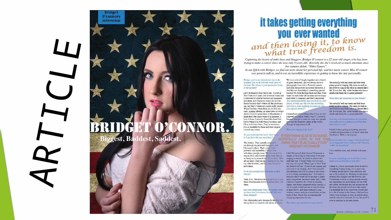
I wanted my article to represent the indie genre more than pop as the artists my article is based on is more of an indie artist. I wanted the article to have a serious tone to it as my model has been photographed to look as a serious artist whom is serious about her music. An article that I have found which I followed was about the artists personal life, so I decided to follow this so the readers get inspiration from it and find out more about the artist. The structure was simple and easy so I followed the structure. My magazine article follows the conventions of a title, main image, quotations, an article, a sub heading (possibly something which relates to the article).
Headline and subheading located under the headline.
Quotations throughout the article.

Article formsThe forms in my article are similar to both my contents and my front pages. They allow to meet the audiences needs and also appeal to them.
Colours
I have used the same colours as I have in my cover and my contents to make the reader comfortable and easy for them to read the article. This also then allows the pages to be connected.
Text
The text is the most important form in this article as most of it is just text, the text I have used is in black, and it’s easy to read in front of the background, it is also small therefore more text could fit on the page. I changed the colour of the quote to make it stand out to the reader and bring their attention towards it. This was also so they would be separated from the rest of the text. The main body text is smaller than the title, so the title stands out to the reader and will be the first thing noticed on the page. It is also positioned on the main image.
Images
I have only used one main image as it is conventional for an article in a music magazine to only have one image. It is positioned on the left of the double page spread and takes up half of the two pages.

Challenging conventionsThe aspects which make my magazine cover, contents and article pages follow the conventions of an indie-pop magazine. It follows a quirky, relaxed, and a serious tone to it.
I decided to only challenge one convention which was to not have date of my magazine on the contents page but have it on the front cover instead, this was to give the front cover a more busier look.
I decided not to challenge any other conventions because I thought it would be easier for the reader to get used to the magazine and then that’s what the reader is used to. Also it will make the audience comfortable with reading the magazine, and It will not look any different in other issues of this magazine.

Existing magazine conventionsI based my magazine on a variety of different existing indie pop music magazine such as NME and Q. The main one I have used is Q, I used it because Q uses the conventions the audience for my magazine would like. Its what they are used to and what they expect.
Q feature a range of different artists throughout the magazine following a particular style. They make their cover look quite busy as I have tried to make mine look. They jam it with cover lines and headlines, images. I wanted to make my magazine like Q because it’s what would meet my target audiences needs.