Q1. In what ways does your media product use, develop or challenge conventions of a real mgazine?
9
1. In what ways does your media product use, develop or challenge forms and conventions of real media products? Evaluation of Media Product Alice Coulson Love
-
Upload
alicecoulsonlove -
Category
Education
-
view
20 -
download
0
Transcript of Q1. In what ways does your media product use, develop or challenge conventions of a real mgazine?

1. In what ways does your media product use, develop or challenge forms and conventions of real media products?
Evaluation of Media ProductAlice Coulson Love

Front Cover – ELLE Magazine
Plain background so they can easily layer text
without it looking overcrowded or childish
and unprofessional.
Only one text colour so it’s not overly colourful
which could look tacky or childish and put off more
sophisticated readers.
Different but clear text fonts and styles of magazine article titles. The largest
cover lines will be the most important and the ones that sell the magazine the most
as they are what the reader’s are interested in.
Cover lines in bold with more information about the
article underneath not in bold as it’s less important and they want to catch the reader’s attention quickly.
Clear image with the model looking directly at the
camera. The lighting is good and there are no shadows
on their face or body.
Patterned dress draws attention to the model as
it’s the only colourful piece on the cover. It also gives
the impression of what genre and topics are in the
magazine.
Large, bold masthead which is easily
recognisable and is always at the top of the page.
Front Cover – NME Magazine
‘Warning’ is in red and catches your attention it’s
also emotive language which catches the reader’s
attention.
Cover lines in bold with more information about the
article underneath not in bold as it’s less important and they want to catch the reader’s attention quickly.
The model is wearing red which ties him in with the masthead and cover lines.
This sets a consistent house style which will be continued throughout the magazine.
Nothing overlapping the masthead so that’s easy for
readers to see. This is especially important for new magazines as they are not
yet established.
The cover lines have the same colours as the
masthead which helps maintain a house style.
This magazine has listed popular musicians/artists
that feature in this issue of their magazine. They are all from the same genre as the artist on the cover and the genre that this magazine represents – typically rock
and pop.
Plugs other popular artists of the same genre
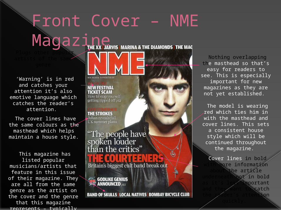
Front Cover Challenges the generic conventions as it has the
artist’s head layering over the masthead banner. This is especially unusual in new magazines that aren’t yet
well established.I put the articles on the left hand side third so that they
will be read first by customers as this is the
most important information on the magazine cover.
The barcode and price are on the right hand side third as they are least important. I also want the customer to
decide they want the magazine based on the
articles before seeing the price as it is expensive.
I plug other well-known artists that are featured in the magazine to gain the readers attention
I put the main cover lines in red with more information in a smaller font and different
colour underneath
I used a red block theme for my house style and kept this
consistent throughout the magazine in order to
establish it

Contents Page – Heat Magazine Small article on
something typical of the magazine’s genre. It will
be the most important/popular article
in the magazine and typically has something to do with the artist on the
cover
Small masthead/logo and the date that this
magazine was issued. Image of cover on the
contents page.
Lots of smaller images which link to other articles
within the magazine – typical of the magazine’s
genre
Social media links to engage the younger and
more technologically aware audience
Main article in one colour and then more detail
underneath in another colour as that information
is less important
Articles are organised under
headings to make it easier for the reader to find what they’re
looking for

Contents Page I continued the use of the red block themed
house style
I included the main article on the contents page and gave some information about the
artist and the interview
The logo is at the bottom of the page as it would be in a typical
music magazine
I should have included a website address and social media links to engage the readers further. Also as my target audience are
quite young then they’ll be technologically
aware and use social media.
I included lots of detailed content in the contents. I categorised
them under titles to create a clear layout
I put more information under the article title
and put the page numbers in red to make
it easy to navigate
I used lots of images to visually engage the
reader

Double Page Spread – Q Magazine
Clear sans serif font with a drop case letter
at the start of the interview
Clear layout so you know exactly who the interview is
about
Page number and date and also the
magazine logo which maintains the magazine’s
house style
Large image of the artist which shows readers who the
interview is about and will catch their eye if they are just flicking
through quickly
Introductory paragraph shows what the interview is about-
artist may be going on tour or releasing new music
Typically the text is organised into three columns and the text is
justified to consolidate the
lines
Hyphenation is removed so that it’s easier for the reader to read the interview without
words being broken up
The image fits in with the mise-en-scene and genre of the
artist as well as matches the cover image to establish house
style
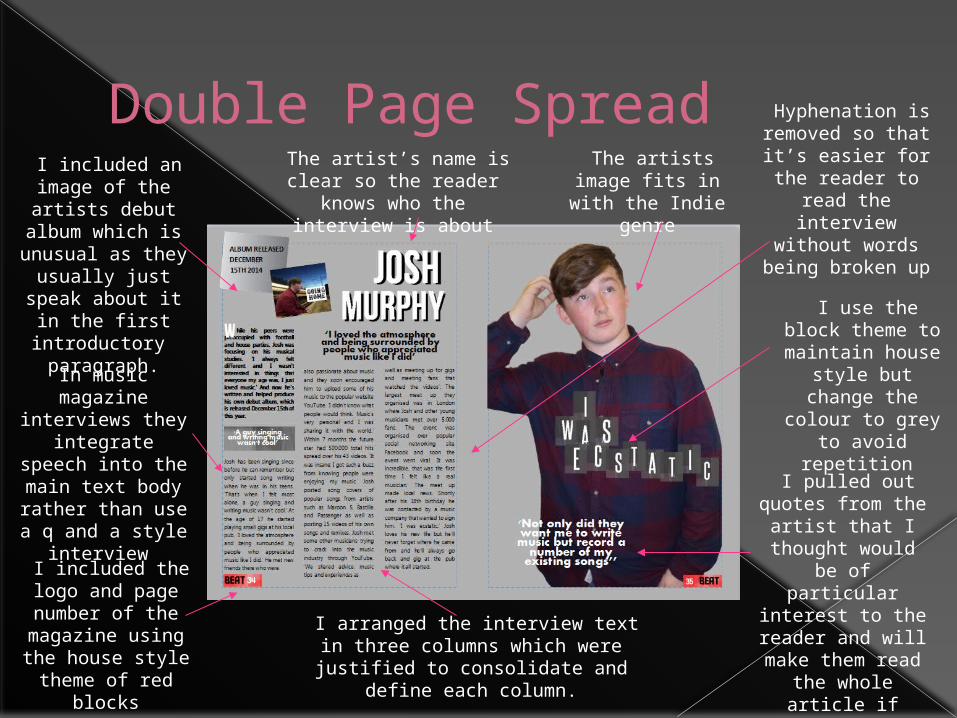
Double Page Spread Hyphenation is removed so that it’s easier for the reader to read the interview without
words being broken up
I included an image of the artists debut
album which is unusual as they
usually just speak about it in the first
introductory paragraph.
I included the logo and page number of the
magazine using the house style theme of red
blocks
I pulled out quotes from the
artist that I thought would be
of particular interest to the reader and will
make them read the whole article if they’d just been
skimming through
I arranged the interview text in three columns which were justified to
consolidate and define each column.
The artist’s name is clear so the reader knows
who the interview is about
The artists image fits in with the
Indie genre
In music magazine interviews they
integrate speech into the main text body rather than
use a q and a style interview
I use the block theme to maintain
house style but change the colour to grey to avoid
repetition
Final Response/Overall Conclusion
Overall I think that I included many of the generic conventions of a traditional music magazine, such as masthead, cover lines and page numbers.
I did challenge them in some forms through layering the cover image over the masthead and including an image of the artist’s album on the double page spread.
To improve and include more generic conventions I could have included a wider variety of artist’s images with different mis-en-scene. I could also have included social media links so that I could develop more links to the readers.