Q1- In what ways does your media product use
8
product use, develop or challenge forms and conventions of real media products? By Carrie Woodhead
-
Upload
carrierosew -
Category
Education
-
view
138 -
download
0
Transcript of Q1- In what ways does your media product use

In what ways does your media product use, develop or challenge forms and conventions of real media products?
By Carrie Woodhead
The Use of conventions in my music video
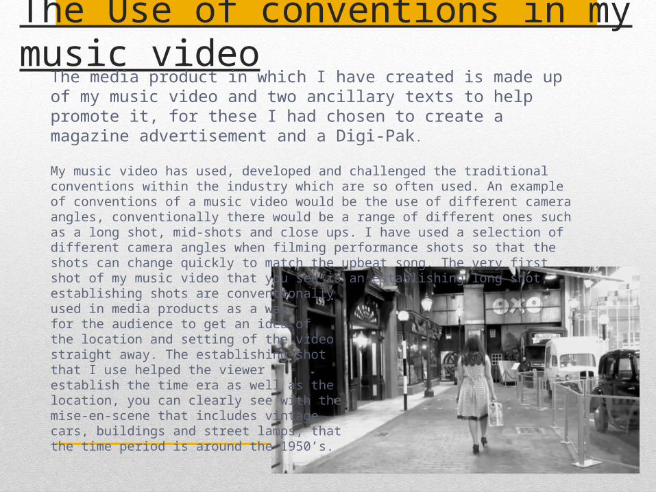
The media product in which I have created is made up of my music video and two ancillary texts to help promote it, for these I had chosen to create a magazine advertisement and a Digi-Pak.
My music video has used, developed and challenged the traditional conventions within the industry which are so often used. An example of conventions of a music video would be the use of different camera angles, conventionally there would be a range of different ones such as a long shot, mid-shots and close ups. I have used a selection of different camera angles when filming performance shots so that the shots can change quickly to match the upbeat song. The very first shot of my music video that you see is an establishing long shot, establishing shots are conventionally used in media products as a way for the audience to get an idea of the location and setting of the video straight away. The establishing shot that I use helped the viewer establish the time era as well as the location, you can clearly see with the mise-en-scene that includes vintage cars, buildings and street lamps, that the time period is around the 1950’s.
The Use of conventions in my music video
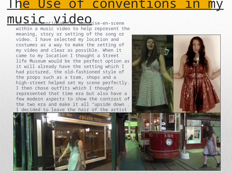
It is conventional for the mise-en-scene within a music video to help represent the meaning, story or setting of the song or video. I have selected my location and costumes as a way to make the setting of my video and clear as possible. When it came to my location I thought a Street life Museum would be the perfect option as it will already have the setting which I had pictured, the old-fashioned style of the props such as a tram, shops and a high-street helped set my scene perfectly. I then chose outfits which I thought represented that time era but also have a few modern aspects to show the contrast of the two era and make it all “upside down”. I decided to leave the hair of the artist natural as a way to do so and to also make the outfits more of the viewers attention.
The Use of conventions in my music video
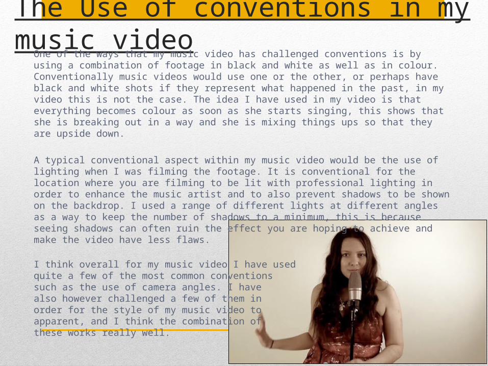
One of the ways that my music video has challenged conventions is by using a combination of footage in black and white as well as in colour. Conventionally music videos would use one or the other, or perhaps have black and white shots if they represent what happened in the past, in my video this is not the case. The idea I have used in my video is that everything becomes colour as soon as she starts singing, this shows that she is breaking out in a way and she is mixing things ups so that they are upside down.
A typical conventional aspect within my music video would be the use of lighting when I was filming the footage. It is conventional for the location where you are filming to be lit with professional lighting in order to enhance the music artist and to also prevent shadows to be shown on the backdrop. I used a range of different lights at different angles as a way to keep the number of shadows to a minimum, this is because seeing shadows can often ruin the effect you are hoping to achieve and make the video have less flaws.
I think overall for my music video I have used quite a few of the most common conventions such as the use of camera angles. I have also however challenged a few of them in order for the style of my music video to apparent, and I think the combination of these works really well.
The Use of conventions in my Digi-pak
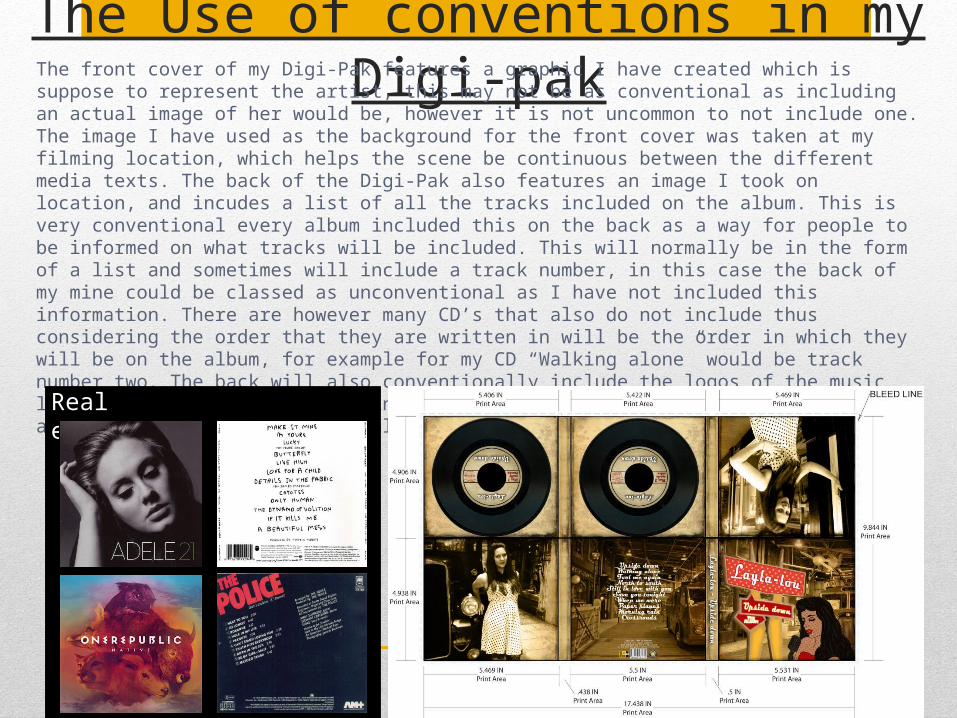
The front cover of my Digi-Pak features a graphic I have created which is suppose to represent the artist, this may not be as conventional as including an actual image of her would be, however it is not uncommon to not include one. The image I have used as the background for the front cover was taken at my filming location, which helps the scene be continuous between the different media texts. The back of the Digi-Pak also features an image I took on location, and incudes a list of all the tracks included on the album. This is very conventional every album included this on the back as a way for people to be informed on what tracks will be included. This will normally be in the form of a list and sometimes will include a track number, in this case the back of my mine could be classed as unconventional as I have not included this information. There are however many CD’s that also do not include thus considering the order that they are written in will be the order in which they will be on the album, for example for my CD “Walking alone” would be track number two. The back will also conventionally include the logos of the music labels and other institutions included in the creation of the album as well as a barcode and copyright laws, all of which I have included in my Digi-Pak.Real examples
The Use of conventions in my Digi-Pak
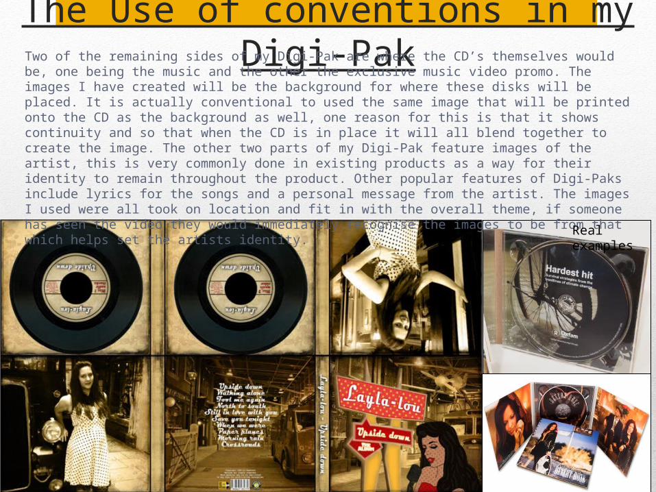
Two of the remaining sides of my Digi-Pak are where the CD’s themselves would be, one being the music and the other the exclusive music video promo. The images I have created will be the background for where these disks will be placed. It is actually conventional to used the same image that will be printed onto the CD as the background as well, one reason for this is that it shows continuity and so that when the CD is in place it will all blend together to create the image. The other two parts of my Digi-Pak feature images of the artist, this is very commonly done in existing products as a way for their identity to remain throughout the product. Other popular features of Digi-Paks include lyrics for the songs and a personal message from the artist. The images I used were all took on location and fit in with the overall theme, if someone has seen the video they would immediately recognise the images to be from that which helps set the artists identity.
Real examples
The Use of conventions in my magazine advert
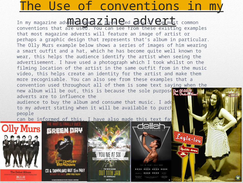
In my magazine advertisement I have used many of the most common conventions that are used. You can see from these existing examples that most magazine adverts will feature an image of artist or perhaps a graphic design that represents that’s album in particular. The Olly Murs example below shows a series of images of him wearing a smart outfit and a hat, which he has become quite well known to wear, this helps the audience identify the artist when seeing the advertisement. I have used a photograph which I took whilst on the filming location of the artist in the same outfit from in the music video, this helps create an identity for the artist and make them more recognisable. You can also see from these examples that a convention used throughout all of them is some text saying when the new album will be out, this is because the sole purpose of the adverts are to influence the audience to buy the album and consume that music. I added some text to my advert stating when it will be available to purchase so that people can be informed of this, I have also made this text fairly large and readable with a bright outline.
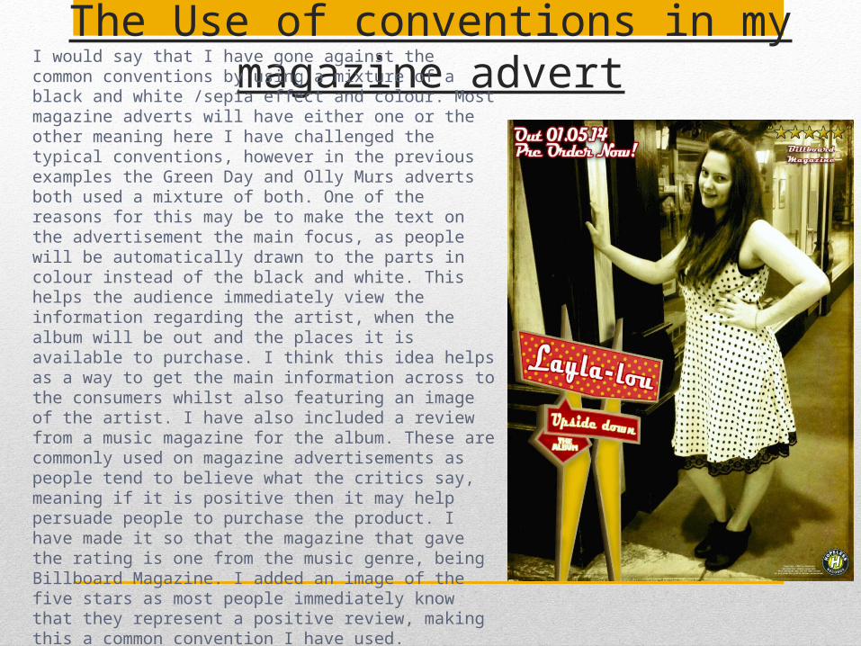
The Use of conventions in my magazine advert
I would say that I have gone against the common conventions by using a mixture of a black and white /sepia effect and colour. Most magazine adverts will have either one or the other meaning here I have challenged the typical conventions, however in the previous examples the Green Day and Olly Murs adverts both used a mixture of both. One of the reasons for this may be to make the text on the advertisement the main focus, as people will be automatically drawn to the parts in colour instead of the black and white. This helps the audience immediately view the information regarding the artist, when the album will be out and the places it is available to purchase. I think this idea helps as a way to get the main information across to the consumers whilst also featuring an image of the artist. I have also included a review from a music magazine for the album. These are commonly used on magazine advertisements as people tend to believe what the critics say, meaning if it is positive then it may help persuade people to purchase the product. I have made it so that the magazine that gave the rating is one from the music genre, being Billboard Magazine. I added an image of the five stars as most people immediately know that they represent a positive review, making this a common convention I have used.