PyCoin: Process Bookpycoin.herokuapp.com/process_book/processbook.pdf · PyCoin: Process Book...
20
PyCoin: Process Book Website | Github Repo By Claudia Huang, Raul Jordan and Jacques van Rhyn
Transcript of PyCoin: Process Bookpycoin.herokuapp.com/process_book/processbook.pdf · PyCoin: Process Book...

PyCoin: Process Book
Website | Github Repo
By Claudia Huang, Raul Jordan and Jacques van Rhyn

Our Project
We live in a period of unprecedented change, a time where viable challenges to some of core belief are emerging. We’re particularly interested in cryptocurrencies, a phenomenon that has the potential to change the way we do transactions between each other forever. As of now, there is no single cryptocurrency to invest in, no gold standard in the world of online currencies: cryptocurrencies like Ripple, Bitcoin and Litecoin are currencies that are prominent but they are currencies that constantly fluctuate. But besides the big three, there are many more lesserknown cryptocurrencies, from (365) to Zetacoin. Any one of these has the potential to rise to prominence and play a role in replacing currently existing governmental currencies. We want to create a visualization that compares all of the current publicly traded cryptocurrencies. This already exists, but we believe that we can do it better than anything available online. The following are the top three biggest websites that enable a user to look up the exchange rates between cryptocurrencies: http://coinmarketcap.com/ http://www.coinwarz.com/cryptocurrency/coins https://www.cryptonator.com/ None of these enable a user to quickly look up the historical exchange rate between two currencies. This is important and useful data. From deciding which currency to invest in to researching out arbitrage opportunities, having a way to display trade volume and historical exchange rate data between any two cryptocurrencies would help greatly to further the field of alternative currencies.

Log Book Setting up the repository [entry by Jacques 3.23.2015] Today we set up the repo for our final project from Raul Jordan’s github account. Even though we decided that we would do a lot of the coding together, we also decided that we would use separate branches in Jacques’s, Raul’s, and Claudia’s computers to avoid the same kind of issues that we had experienced in CS51 with commit issues. It’s also just a lot neater when you merge commits from the branches into the master branch.
the repository
the different branches

Initial design idea [entry by Jacques 4.3.2015]
For our homework 4 suggestion, our idea was to have a network of all the cryptocurrencies display at the top of the visualization, possibly in the form of a force graph. At the bottom, we want to have the exchange rate history between the two cryptocurrencies selected by the user. The user will select the cryptocurrencies to display by hovering over the edge that connects them.

Day of research [entry by Jacques 4.5.2015] Where on earth would we find trading data between different currencies? After realizing that there’s no big convenient file of trading data on the internet, we realized that scraping was the best way to obtain the data we wanted for the project. We spent the whole of today looking at and figuring out the different API’s of cryptocurrency websites. Finally, we decided that we wanted to use the API on cryptsy, a database of trading data between different cryptocurrencies.

First full day of coding [entry by Jacques 4.12.2015] Today, we sat down and figured out how to scrape data from cryptsy using Python with the requests package. After a lot of trial and error we were able to tease out vast amounts of data from the website. There’s nothing more satisfying than having a data file so big that it takes a while for Sublime Text Editor to open it.
loading…
It lives!

This file contains exactly what we need it: it sorts every trade between two different currencies together. As you can see in the example above, MNC/XRP contains all the trades between MNC (MinCoin) and XRP (Ripple). The data in our file is between the dates 1 March and 13 April, 2015. We also decided to have a look at the different ways with which we could implement the website: we decided that we wanted to apply design principles not just to our visualization but to our graph itself. This is a bit tangential but after looking at Google’s material design principles, we also found a really cool framework called materialize. We collectively decided on a color scheme (#ffab00 for orangeyellow color and #008793 for the teal color) that we wanted to follow for the rest of the project and after tinkering with materialize and heroku for a while, we had a beautiful heroku website, located at http://pycoin.herokuapp.com/
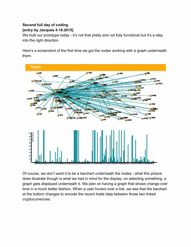
Second full day of coding [entry by Jacques 4.16.2015] We built our prototype today it’s not that pretty and not fully functional but it’s a step into the right direction. Here’s a screenshot of the first time we got the nodes working with a graph underneath them.
Of course, we don’t want it to be a barchart underneath the nodes what this picture does illustrate though is what we had in mind for the display: on selecting something, a graph gets displayed underneath it. We plan on having a graph that shows change over time in a much better fashion. When a user hovers over a link, we see that the barchart at the bottom changes to encode the recent trade data between those two linked cryptocurrencies.

There is definitely still work that we want to do: Firstly, the currencies are very cluttered in parts of the visualization: it’s sometimes hard to read the labels of the individual nodes. To solve this problem we also might want to use the d3 fisheye plugging, allowing the user to see more when the mouse hovers over the nodes. Images demonstrating this below:

We decided that some kind of highlighting, as in making all nonadjacent nodes to a clicked node, fade away, could also be an option. More on this later.
We also want to make the visualization more useful we decided that we need a search function that will do highlighting on the found search result. We also realized that users might not be familiar with the codes of cryptocurrencies, we like the idea of displaying the full names and icons of icons when the user hovers over the edge connecting them. Here is a rough idea of some of the additional features we want to implement:

Finally, we decided that we wanted to make the force layout more clever and encode more information. How we’re doing this is something we’ll decide after having a chat with our TF. Meeting with Andrew Mauboussin [entry by Jacques 4.20.2015] Met with Andrew and had a discussion about how to make our visualization simpler to use and also more useful. We also had a talk about the layout of everything in the website and decided on a layout that would allow for a big amount of space for the node visualization and a little bit less space for the volume and price graphs. This is what we came up with:
Top right: a search bar of some sort as well as a display of the icons of the two cryptocurrencies currently selected. This would make the visualization a lot more useable.

In terms of making the nodes easier to visualize, we decided to use a sticky force layout. In this layout, when a user moves a node, the node stays in its new position and doesn’t rocket back like you would see in most of the other force layouts. Another feature that one can add to the sticky force layout is to make all of the moved nodes change color, making it easier for the user to keep track of custom changes. Images below to illustrate an example of the sticky force layout:
original > one sticky node > two sticky nodes By default, we want to make to make some of the nodes already “moved” to pin their position and make everything easier to visualize. We’re going to start by pinning Dogecoin and Bitcoin, because these are some of the most popular currencies and therefore have the most coming in and out of them. Another change we talked about was to maybe try to use edge width to encode the total trade volume between currencies.

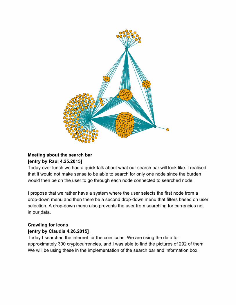
Experimenting with the force layout [entry by Jacques 4.24.2015] We all had midterms this week so we couldn’t do too much coding. However, when we met today we had a look at the force layout that Claudia had been experimenting with all week. As it turns out, the sticky force layout worked out pretty well:
It’s now a lot easier to see which nodes have the most links coming to and from them because the user can now just simply move nodes to the right places. We decided to delve deeper into the data to see specifically which nodes have the most links. After playing with the new visualization a bit more and found that it was not just Bitcoin and Litcoin that was being traded a lot through cryptocurrencies but that there was another currency lurking in the data: Ripple (XRP). After trying a few different arrangements of XRP, BTC and LTC, we have the following graph. The screenshot featured below shows how the most trade happens with BTC (bottom left), XRP (bottom right) and LTC (top).
Meeting about the search bar [entry by Raul 4.25.2015] Today over lunch we had a quick talk about what our search bar will look like. I realised that it would not make sense to be able to search for only one node since the burden would then be on the user to go through each node connected to searched node. I propose that we rather have a system where the user selects the first node from a dropdown menu and then there be a second dropdown menu that filters based on user selection. A dropdown menu also prevents the user from searching for currencies not in our data. Crawling for icons [entry by Claudia 4.26.2015] Today I searched the internet for the coin icons. We are using the data for approximately 300 cryptocurrencies, and I was able to find the pictures of 292 of them. We will be using these in the implementation of the search bar and information box.

Implementation of the search bar [entry by Raul 4.26.2015] I took a stab at it it today and this is what I got:
The icons at the top will be the icons of the currently selected cryptocurrencies. Below are the two dropdown menus used to manually choose selected currencies. We might however only choose one if our highlighting function works well. Third full day of coding [entry by Jacques 5.3.2015] Today we finished up all of the proposed changes. We started implementing a currency selection menu. We also met with Andrew to discuss additional features as well as issues with the scale that we had been having with the menus. We coded a box that appears over every node when you hover above it.
The day ended with us implementing a feature with intro.js that guides the user through all of the key parts of the visualization.

Fourth full day of coding [entry by Jacques 5.4.2015] Today we coded from 8am until 2am the next day a full 18 hours. We realized all of the most important features of our visualization:
double clicking nodes highlights only the node’s neighbours and makes it impossible for the user to select edges that are not neighbouring the selected node

since the above feature makes selecting individual nodes a lot simpler, we decided to change the idea behind of our dropdown menu a little: selecting a currency from the dropdown menu will highlight the corresponding node on the
graph, making it easy for the user to see connecting currencies.
We made finishing touches to the currency viewer, making sure that it refreshes with every update.
We added prefixes to the side of the trade volume chart, making the chart take
up a lot less space whenever currencies with a large trade volume are selected
Finally, we built a box that displays total trade volume and average price for the
currently selected currencies. TODO : paste image of final
http://www.coppelia.io/2014/07/anatozofextrafeaturesforthed3forcelayout/

Fifth and final day of coding [entry by Jacques 5.5.2015] Since yesterday we completed the main implementation of the project, today was focused on finetuning and perfecting the details. We cleaned up the transitions of the bar graph. Additionally, we added a link in the top right hand corner to our data files.
We fixed the trade volume bar chart and also added a link on the website to our data. We ended our day filming and editing the screencast. Then, we submitted the project!
Final Product In our final product, we encode each currency as a node in a force layout, where the links are the currencies each node is traded with. We offer clear and robust display of information by having a tooltip appear above a node when a user hovers over it, and offer interactivity by allowing users to click and drag nodes (stick node feature), as well as double click on one to fade out everything but its immediate neighboring nodes and links. We added event handlers to the force layout to change the displayed data on the side charts we created and also a UI card next to the images of the cryptocurrencies that display relevant information, such as the total amount traded as well as the average trading price for that specific currency exchange.
We also allow users to select a currency from a dropdown menu and it highlights it on the force layout and fades out all other nodes except for its immediate neighbors. We have really learned the power of using d3 to extract information from data that could otherwise not have been found. Using this force layout, we discovered trading trends as well as exchanges between currencies that we had never even heard of, but discovered trade paths that can be valuable for anyone trying to find arbitrage opportunities.

Evaluation We learned a lot from coding this project we all gained a lot of experience using javascript and got handson experience applying offtheshelf code on our website. Besides using the d3 library, we also used materialize.js to make some of the visual features. And, of course, we used into.js to make an effective intro to our website. We also learned how to scrape vast quantities of data from the internet, a skill that will definitely be useful later in life. This project was not just about coding, and we learned quite a bit about design and user interface along the way. Taking our pretty complicated dataset and making it usable and relevant was not nearly as simple as we had originally imagined to be we gained a lot of design expertise implementing our website. Quite a few design implementations would not have happened without the feedback of friends and roommates. It was fun seeing the project grow as a process and take a life of its own. Our final implementation bears little resemblance to the initial implementations. Finally, we learned not just about design and coding but also about the data itself. It was surprising to find how the different ways with which the different currencies interacted with each other. It was interesting to see how few currencies ever ended up traded with the USD, a sign that few of the currencies have matured into having realworld value. It was also interesting to see the huge influence and popularity of Ripple (XRP) in the cryptocurrencies, as well as seeing the relative obscurity of DogeCoin (DOGE), especially given how much media coverage the currency has been given. From our graph it seems that the big three cryptocurrencies, Ripple (XRP), BitCoin (BTC) and LitCoin (LTC) are becoming the reserve currencies of the cryptocurrency market, similar to the USD in forex markets. It was interesting to see how many of the currencies are only traded with BTC, the giant of cryptocurrencies. Many currencies only traded with BTC and XRP, Without the graph, we would not have been able to gain any of these insights, especially because none of this information is conveyed readily online.