Projects 63 : Karin Davie, Udomsak Krisanamis, Bruce ... · Krisanamis, Bruce Pearson, Fred...
7
Projects 63 : Karin Davie, Udomsak Projects 63 : Karin Davie, Udomsak Krisanamis, Bruce Pearson, Fred Krisanamis, Bruce Pearson, Fred Tomaselli Tomaselli [Lilian Tone and Anne Umland] [Lilian Tone and Anne Umland] Date 1998 Publisher The Museum of Modern Art Exhibition URL www.moma.org/calendar/exhibitions/208 The Museum of Modern Art's exhibition history— from our founding in 1929 to the present—is available online. It includes exhibition catalogues, primary documents, installation views, and an index of participating artists. © 2017 The Museum of Modern Art MoMA
Transcript of Projects 63 : Karin Davie, Udomsak Krisanamis, Bruce ... · Krisanamis, Bruce Pearson, Fred...

Projects 63 : Karin Davie, UdomsakProjects 63 : Karin Davie, UdomsakKrisanamis, Bruce Pearson, FredKrisanamis, Bruce Pearson, FredTomaselliTomaselli[Lilian Tone and Anne Umland][Lilian Tone and Anne Umland]
Date
1998
Publisher
The Museum of Modern Art
Exhibition URL
www.moma.org/calendar/exhibitions/208
The Museum of Modern Art's exhibition history—
from our founding in 1929 to the present—is
available online. It includes exhibition catalogues,
primary documents, installation views, and an
index of participating artists.
© 2017 The Museum of Modern ArtMoMA

0
karin davie
udomsak krisanamis
bruce pearson
fred tomaselli
The Museum of Modern Art
New York
May 14— June 30, 1998

X The Museum of Modern Art
Mo HA Library
j^Q2, Thus, the comfort of the familiar always bore with it the
frisson of the exotic, and the effect of this conflation, ide
ally, was persuasive excitement—visual pleasure. As Baude
laire says, "the beautiful is always strange, " by which he
means, of course, that it is always strangely familiar.
— Dave Hickey, 1993 1
The artists included in this exhibition take a stand on
"visual pleasure," which they incorporate into their work
in "strangely familiar" ways. Karin Davie sinuously weaves
bodily references into the traditionally abstract purview of
stripe paintings. Udomsak Krisanamis cuts up and collages
newspapers and other texts to create shimmering night
skies. Bruce Pearson uses snippets of conversation scav
enged from the contemporary media as the basis for elab
orately patterned, sumptuously decorative wall reliefs and
works on paper; and in Fred Tomaselli's lustrous, exquisite
ly crafted collage-paintings, recognizable real-world objects
are sealed beneath layers of transparent resin, displayed for
our delectation, rendered at once familiar and strange.
Despite their many differences—in age, approach, and back
ground as well as in subject matter, medium, and style—
Davie, Krisanamis, Pearson, and Tomaselli share a concern
with visual seduction and its mechanics. Each strives to cre
ate artworks with what Pearson calls "a real pleasure com
ponent," artworks that are "enormously rewarding to look
at."2 There are many roads to pleasure; these artists choose
retinal stimulation. The pulsing, vibrating, eye-popping
vocabulary of their work has a sensorial immediacy that
directly engages the viewer. They also exploit conventions of
accessibility inherent in art that provokes a strong perceptu
al response, the optically overloaded surfaces of their works
evoking not only the hyperactive world of screen-savers,
video games, and computer-generated effects but the much
maligned yet perennially popular 1960s style known as
"Op." This analogy serves not to point to some stylistic influ
ence or to posit a cause-and-effect relationship. Instead it
raises some questions about
Op and this sampling of 90s
art—specifically concerning
their shared reliance on visual
razzle-dazzle, and the effect
of this reliance on audience
response.
In 1965, critics responded to
this Museum's overwhelming
ly popular Op art exhibition,
The Responsive Eye—an
international survey of paint
ings and reliefs with strong
psychophysiological effects—
in a variety of ways. Writers
for specialized publications
dismissed Op as gimmicky perceptual trickery that pandered to
its audience. Thomas Hess, the influential editor of Art News,
wrote, "In Op they [the public] sense that art, at long last, is not
only meeting [them] half-way [but] will actually come down off
the walls and shake your hand."3 This image provides a point
of entry for considering the "optical" dimension of Davie's,
Krisanamis's, Pearson's, and Tomaselli's work as a means of
engagement, allure, seduction, and direct audience appeal.
"I liked using something very familiar, like the stripe, and that
had been used in popular culture," says Davie. "Something that
people could recognize. A teacher of mine used to say, 'You are
kind of interested in democratic art.' It is a funny way of putting
it, but I want something somewhat accessible, so that people
will enter, and once they are in, all this other stuff will be unrav
eling, slowly."4 Davie touches on issues key to her work and to
that of the other artists: the use of familiar imagery as a means
of instantly engaging the audience and the desire to achieve a
nonthreatening, "democratic" art. Her interest in using the
familiar and other strategies to slip past her audience's guard
dovetails with Tomaselli's frequent references to the "mechan
ics of seduction," the nuts-and-bolts aspects of visual pleasure.
It is worth looking more closely at the popularity of The Respon
sive Eye in connection with this current interest in user-friendly
art. What accounted for Op's public appeal in the 1960s?
Judging from contemporaneous reviews in the general press, a
number of factors were at work. The high level of craftsman
ship and impeccable execution seen in Op reassured 60s
viewers, as did its mechanical aspect: drips and gestures were
banished, as were other troubling signs of the artist's subjectiv
ity. Op's message was to be communicated coolly and clearly,
with the immediacy of a verbal one-liner. Op was also seen as
wildly entertaining. One critic went so far as to compare it to a
"roller coaster ride"5; many others, doctors included, were fasci
nated by its physiological impact, its capacity to confuse, to
disorient, to modify reality. Comparisons were drawn between
the mind-altering effects of Op and those of psychedelic drugs.
Op's grounding in the familiar
gadgetry of "Chinese puzzles,"
"souvenir and carnival novelties,"
fabric patterns, and quilts points
to its connection with the deco
rative, and helps to explain its
rapid absorption by the fashion
industry. All of these factors
served to secure Op's lowly posi
tion in the annals of art history, as
did what was perceived as its ret
rograde reliance on illusionism
and trompe Toeil.
Karin Davie. Something Like This. 1995-96.
(228.6 x 193.0 cm), overall 90 x 158" (228.6
Oil on canvas, diptych, each 90 x 76"
x 401.3 cm). Collection Mark Fluent
Each of the artists in this exhibi
tion recaptures aspects of Op's
fundamental accessibility, recast-
ing many of its qualities in a positive rather than a pejorative
light. As a result, their works speak to the ongoing tension
between high and low culture while challenging the unwritten
criteria used to identify works as merely pleasurable or simply
gimmicky. At the same time, however, it is important to
acknowledge the differences and distance that separate us
today from 60s Op art and its audience. Simply to delight the
eye, for instance, does not seem to be enough. Witness how
Davie, Krisanamis, Pearson, and Tomaselli infuse the contentless,
flickering fields of perceptual abstraction with references to the
body, pop culture, mass media, and language. In doing so they
explore a domain that has figured prominently in much recent
painting: the shifting territory between abstraction and repre
sentation. And, far from relying on Op's hard-edged geometries
as a point of stylistic reference, these artists derive their affini
ties with that movement from popular culture and psychedelia.
Karin Davie embraces Op's inviting opticality while blatantly dis
regarding its prohibitions against the "slightest clue ... to some
past association with actual objects" and "nonessentials such as
freely modulated shape and tone, brush strokes and impasto."6
In fact, she specializes in representation's "slightest clues" and
other "nonessentials." The body lurks beneath the surface of
Davie's art. The resolutely nonreferential stripes of high mod
ernist abstraction are made to wiggle, bounce, and jiggle, sug
gesting that these far-from-purely-geometric lines lead a
corporeal and carnal life. When Davie first began to make stripe
paintings, she was, she has said, "looking at Morris Louis. It is
only now that I realize what drew me to him: it was the body. I
see those things as interiors of flesh and blood somehow. They
are stained; they have almost a religious kind of feel to them."
Davie's memory of an R. Crumb psychedelic poster featuring a
melting human face also underlies her interest in corporeal
transformation.
Speaking of an early series of stripe paintings, Davie notes that
she "really wanted to make an image that felt like it was mov
ing, swinging, like a butt that sways when it walks." Davie's
words, her paintings' titles, and her insistence on referencing the
erotic all contribute to her peculiarly anthropomorphic brand of
abstraction and speak to her psychological resistance to purely
formal art. Her most recent works are "less about the exterior
of the body and more about the interior, either physically or
mentally." Instead of suggesting forms concealed beneath the
surface, there is a shift toward an exaggerated, cartoonlike ani
mation and distortion.
In diptychs such as Something Like This (1995-96), repetitive
mark-making meets up with the messy signs of process. Here
as in earlier pairs, Davie obsessively replicates "spontaneous"
gestures, drips, and brushstrokes from one canvas to the other,
highlighting the performative character of her work. "The ear
ly paintings were very much influenced by dance and memory.
Because there was a desire to reproduce my body's movements,
I would draw the curves and try to memorize exactly at what
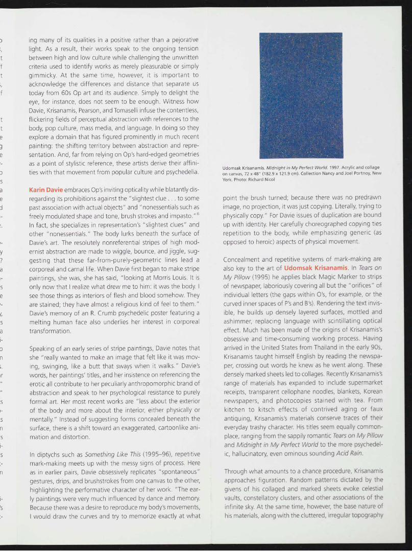
Udomsak Krisanamis. Midnight in My Perfect World. 1997. Acrylic and collage
on canvas, 72 x48" (182.9 x 121.9 cm). Collection Nancy and Joel Portnoy, New
York. Photo: Richard Nicol
point the brush turned; because there was no predrawn
image, no projection, it was just copying. Literally, trying to
physically copy." For Davie issues of duplication are bound
up with identity. Her carefully choreographed copying ties
repetition to the body, while emphasizing generic (as
opposed to heroic) aspects of physical movement.
Concealment and repetitive systems of mark-making are
also key to the art of Udomsak Krisanamis. In Tears on
My Pillow (1995) he applies black Magic Marker to strips
of newspaper, laboriously covering all but the "orifices" of
individual letters (the gaps within O's, for example, or the
curved inner spaces of P's and B's). Rendering the text invis
ible, he builds up densely layered surfaces, mottled and
ashimmer, replacing language with scintillating optical
effect. Much has been made of the origins of Krisanamis's
obsessive and time-consuming working process. Having
arrived in the United States from Thailand in the early 90s,
Krisanamis taught himself English by reading the newspa
per, crossing out words he knew as he went along. These
densely marked sheets led to collages. Recently Krisanamis's
range of materials has expanded to include supermarket
receipts, transparent cellophane noodles, blankets, Korean
newspapers, and photocopies stained with tea. From
kitchen to kitsch effects of contrived aging or faux
antiquing, Krisanamis's materials conserve traces of their
everyday trashy character. His titles seem equally common
place, ranging from the sappily romantic Tears on My Pillow
and Midnight in My Perfect World to the more psychedel
ic, hallucinatory, even ominous sounding Acid Rain.
Through what amounts to a chance procedure, Krisanamis
approaches figuration. Random patterns dictated by the
givens of his collaged and marked sheets evoke celestial
vaults, constellatory clusters, and other associations of the
infinite sky. At the same time, however, the base nature of
his materials, along with the cluttered, irregular topography

Bruce Pearson. Violence and Profanity Supernatural Strangeness and Graphi
cally Rendered Sexual Situations. 1997-98. Oil and acrylic on Styrofoam, 72 x yj^
96 x 5" (182.9 x 243.8 x 12.7 cm). Collection the artist
SO
of his surfaces when looked at close up, make his pictures To
flip-flop back and forth between the celestial and the ter- an
restrial, the sublime and the vulgar, between lofty subject inc
and base matter. On a formal level, Krisanamis plays with w(
figure-ground reversals, positives becoming negatives and cn
vice-versa. His subjects become the silent spaces between "v
things, the voids that litter the printed page. m<
W(
Where Krisanamis foregrounds the spaces within letters, ev
Bruce Pearson's Styrofoam relief constructions give letters Ye
palpable material form. Using phrases clipped from popu- int
lar magazines and newspapers, or overheard on television ha
talk shows, these works too thwart language's commu- tra
nicative function. Mirrorings and reversals of basic sentences wl
provide the departure points for elaborate, often vividly th,
colored patterns that encrypt the original message to the
point of virtual illegibility. The overall image is dictated by Th
the shapes of the letters in Pearson's found texts, consti- dif
tuting another chance procedure variant. tic
en
"Making language physical, that's one of the contradictions un
that I love," says Pearson. "I'm just trying to create a really en
strong image. I like to take idea back to image back to idea. re;
I'm really interested in those kinds of contradictions and in an
not trying to solve them. " Another opposition that interests Dr
Pearson is that between illusionistic and "real" pictorial ra*
space. On his carved and highly textured Styrofoam sur- ph
faces, he may use color to add false shadows despite the m<
presence of real ones. Intentionally sending wrong signals, of
he frustrates attempts at linear reading, whether of image pil
or of text. tic
co
Despite their ultimate illegibility, Pearson's phrases are pa
carefully chosen for content. Playing the role of amateur na
anthropologist, he checks the pulse of our times, isolating
phrases that he views as indexes of "where we are cultural- Se
ly and philosophically." In his search for telling fragments, Cf
Pearson draws parallels between his process and that of con- an

temporary sample-based music. Both take a "supermarket"
approach to culture, erasing distinctions between high and low.
Everything is up for grabs.
Pearson's titles often provide the only clues to the original tex
tual fragment upon which his images are based. Violence and
Profanity Supernatural Strangeness and Graphically Rendered
Sexual Situations (1997-98) comes from a movie review Pear
son cut from The New York Times. Scanning the clipping for
"loaded words," he underlined those open-ended enough to
suggest multiple narratives. The finished work transforms Pear
son's "story" into an oozing, dripping mass, but a sense of the
original message reverberates subliminally, spreading out
through the picture in hallucinatory rippling waves.
The retinal "buzz" common to Davie's, Krisanamis's, and Pear
son's art finds a pharmaceutical counterpart in that of Fred
Tomaselli, whose hermetically sealed, marquetrylike collages
are inlaid with pills and other psychoactive substances. Often
including cut-out illustrations and hand-painted elements, his
works straddle a tenuous line between fine art, pop culture,
craft, and design. Tomaselli sees a connection between Op art's
"visual dislocation and vibration" and the "notion of reality
modification inherent to the best drugs and the best art. " Many
works incorporate Op effects of movement and illumination,
evoking the visual instability associated with psychedelic drugs.
Yet the stimulating dose of pleasure that he seeks to provide is
intended to expand perceptual experience without the aid of
hallucinogens or other illicit substances. "I think of my work as
transportational vehicles that are supposed to take you some
where else," says Tomaselli. "I really believe in that very old idea
that art can take you to another place."
The drugs Tomaselli embeds in his art function in a number of
different ways: as metaphors for transport and for the modifica
tion of reality, as formal elements, and as familiar found objects
enhancing what he describes as the "user-friendly" impulse
underlying his art. "I do think that my art can reference pop audi
ences," says Tomaselli. "They respond to the craft, and they
respond to the drugs because drugs mean things to people. They
are very recognizable, communicative, incendiary, and loaded."
Drugs are not the only familiar elements that Tomaselli incorpo
rates into his works; in Bird Blast, for example, hundreds of
photomechanically reproduced images of birds, cut from nature
magazines and wildlife guides, are each collaged with a picture
of a human eye. Further combined with hemp leaves and inlaid
pills, these conjunctions create strange hybrids and odd muta
tions. For Tomaselli, "Bird Blast pointed to a new level of visual
confusion in my work. I tried to make as dense and airless a
painting as possible while depicting the gorgeousness of
nature."
Seen from afar, Bird Blast looks purely geometric and abstract.
Close observation, however, reveals any number of what the
artist calls "polluting" elements. Tomaselli has remarked that

abstraction and figuration "seem interchangeable and about
the same thing. I don't think of them as polar opposites; they
are not enemies, but then, I've taken a lot of enemy 'isms'
and put them together in my work." In different ways and to
different degrees, these words can be applied to Davie's,
Krisanamis's, and Pearson's work as well: each of these artists
introduces, isolates, and accentuates a variety of oppositions,
allowing for the coexistence of contradictions, raising questions
rather than answering them, presenting us with work that is
visually animated and conceptually open-ended rather than
statically resolved.
Between Baudelaire's idea of the beautiful as "always strange"
and Hickey's as "always strangely familiar" lie over a hundred
years in which the beautiful—along with the familiar and the
strange—has been defined in many ways. "Beauty is in the eye
of the beholder," the saying goes. The work of Davie,
Krisanamis, Pearson, and Tomaselli, however, underscores that
beauty resides not only in the eye but in the beholder's "brain,
heart, gut and genitals."7 Taken as a group, these artists pre
sent one of a number of approaches to the readdress of visual
pleasure in the late 1990s, providing us with persuasively excit
ing, sensually stimulating, and intellectually engaging reasons
to indulge in their art.
Lilian Tone and Anne Umland
Department of Painting and Sculpture
Grateful acknowledgment is due to our colleagues Amy Hamlin, Laura Hoptman,
Raul Loureiro, and David Frankel; to the artists; and to the lenders.
notes
1. Dave Hickey, The Invisible Dragon: Four Essays on Beauty (Los Angeles:
Art Issues Press, 1993), p. 18.
2. All quotes from the artists are drawn from interviews conducted on
March 28, 1998.
3. Thomas B. Hess, "You Can Hang It in the Hall," Art News, vol. 64, no. 2
(April 1965): 49.
4. Op has been resuscitated before, most memorably by Ross Bleckner and
Philip Taafe. Of these four artists, only Davie quotes so directly from art
history, and, as her words indicate, such quotation is only part of the story.
5. This and subsequent quotations concerning 1960s responses to The
Responsive Eye are drawn from clippings preserved in the library of The
Museum of Modern Art.
6. William Seitz, The Responsive Eye (New York: The Museum of Modern Art,
1965), p. 7.
7. Peter Schjeldahl, "Beauty is Back," The New York Times Magazine,
September 28, 1996, p. 161.
biographies
Karin Davie. Born Toronto, Canada, 1965. Lives in New York.
Udomsak Krisanamis. Born Bangkok, Thailand, 1966. Lives in New York.
Bruce Pearson. Born Aruba, Dutch Antilles. Lives in New York.
Fred Tomaselli. Born Santa Monica, California, 1956. Lives in New York.
The projects series is sponsored by Peter Norton.
Cover: Fred Tomaselli. Bird Blast. 1997. Resin, acrylic, collage, leaves, and pills on
wood, 60 x 60" (152.4 x 152.4 cm). The Museum of Modem Art, New York. Purchase
©1998 The Museum of Modern Art, New York