PROGRAM ON HOUSING AND URBAN POLICYurbanpolicy.berkeley.edu/pdf/Hartley_Essays_D09-002.pdf ·...
182
Institute of Business and Economic Research Fisher Center for Real Estate and Urban Economics PROGRAM ON HOUSING AND URBAN POLICY DISSERTATION AND THESES SERIES UNIVERSITY OF CALIFORNIA, BERKELEY These papers are preliminary in nature: their purpose is to stimulate discussion and comment. Therefore, they are not to be cited or quoted in any publication without the express permission of the author. DISSERTATION NO. D09-002 ESSAYS IN URBAN ECONOMICS By Daniel Aaron Hartley Fall 2009
Transcript of PROGRAM ON HOUSING AND URBAN POLICYurbanpolicy.berkeley.edu/pdf/Hartley_Essays_D09-002.pdf ·...

Institute of
Business and
Economic Research
Fisher Center for
Real Estate and
Urban Economics
PROGRAM ON HOUSING
AND URBAN POLICY
DISSERTATION AND THESES SERIES
UNIVERSITY OF CALIFORNIA, BERKELEY
These papers are preliminary in
nature: their purpose is to stimulate
discussion and comment. Therefore,
they are not to be cited or quoted in
any publication without the express
permission of the author.
DISSERTATION NO. D09-002
ESSAYS IN URBAN ECONOMICS
By
Daniel Aaron Hartley
Fall 2009

Essays in Urban Economics
by
Daniel Aaron Hartley
B.S. (Massachusetts Institute of Technology) 2000M.Eng. (Massachusetts Institute of Technology) 2000
M.B.A. (University of Chicago) 2004
A dissertation submitted in partial satisfaction of the
requirements for the degree of
Doctor of Philosophy
in
Economics
in the
GRADUATE DIVISION
of the
UNIVERSITY OF CALIFORNIA, BERKELEY
Committee in charge:Professor Enrico Moretti, Chair
Professor David CardProfessor Steven RaphaelProfessor John M. Quigley
Fall 2009

The dissertation of Daniel Aaron Hartley is approved:
Chair Date
Date
Date
Date
University of California, Berkeley
Fall 2009

Essays in Urban Economics
Copyright 2009
by
Daniel Aaron Hartley

1
Abstract
Essays in Urban Economics
by
Daniel Aaron Hartley
Doctor of Philosophy in Economics
University of California, Berkeley
Professor Enrico Moretti, Chair
This dissertation uses various empirical techniques to analyze economic outcomes within
cities. The first chapter considers the e!ect that demolishing public housing has on
crime and property values. The second chapter examines the e!ect of residential home
foreclosure on nearby property values. The third chapter focuses on how neighborhood
home prices respond housing demand shocks. The theme that unifies the three chapters
is a focus on economic factors and outcomes that operate within cites.
I first consider the e!ect of public housing demolition on crime and property
values. Despite popular accounts that link public housing demolitions to spatial redistri-
bution of crime, and possible increases in crime, little systematic research has analyzed
the neighborhood or city-wide impact of demolitions on crime. In Chicago, which has
conducted the largest public housing demolition program in the United States, I find
that public housing demolitions are associated with a 20% to 50% reduction in violent

2
crime in neighborhoods where the demolitions occurred. I also find evidence of increases
in residential construction and home prices in these neighborhoods. Furthermore, homes
close to large public housing developments exhibit larger price growth than those located
further from public housing, during the period when these developments are being de-
molished. Finally, using a panel of cities that demolished public housing, I find that
public housing demolitions are associated with a drop of about 10% in a city’s murder
rate. I interpret these findings as evidence that while public housing demolitions may
push crime into other parts of a city, crime reductions in neighborhoods where public
housing is demolished are larger than crime increases elsewhere.
The next chapter examines the e!ect of residential home foreclosures on nearby
property values. Several studies have measured negative price e!ects of foreclosed res-
idential properties on nearby property sales. However, these studies do not address
which mechanism is responsible for these e!ects. I decompose the e!ects of foreclosures
on nearby home prices into a component that is due to additional available housing sup-
ply and a component that is due to dis-amenity stemming from deferred maintenance
or vacancy. I find measurable e!ects on home prices within 250 feet of a foreclosure
auction that occurred within the past year. In census tracts with low vacancy rates, the
supply e!ect is roughly -1.3% per foreclosure and the dis-amenity e!ect is roughly -1%
per foreclosure. In census tracts with high vacancy rates, the supply e!ect falls to about
zero, while the dis-amenity e!ect remains near -1% per foreclosure. Finally, I consider
optimal liquidation strategies for lenders with foreclosed properties within 250 feet of
one another, and under what conditions Pareto-improving policies could exist.

3
In the final chapter Veronica Guerrieri, Erik Hurst, and I focus on how neigh-
borhood home prices respond to city-level demand shocks. A number of studies have
explored housing price dynamics at the level of cities or metropolitan areas. However, far
less is known about neighborhood housing price dynamics. How do low price neighbor-
hoods fair relative to high price neighborhoods in times of boom and bust? This paper
examines those questions. We document a stylized fact. On average, low-price neighbor-
hoods appreciate more during city-wide housing booms than high-price neighborhoods
(price convergence during booms). This pattern is robust across di!erent data sets,
time periods, and city boundary definitions. We also find somewhat weaker evidence
suggesting that low-price neighborhoods depreciate more during busts than high-price
neighborhoods (price divergence during busts). We then discuss possible models that
could produce these stylized facts, and consider further implications of these models.
Professor Enrico MorettiDissertation Committee Chair

i
To Maggy,
My Mother and Father,
Alex, Ben, Bill, and Chris.

ii
Contents
List of Figures iv
List of Tables vi
Preface 1
1 The E!ect of High Concentration Public Housing on Crime, Construc-tion, and Home Prices: Evidence from Demolitions in Chicago 41.1 Introduction . . . . . . . . . . . . . . . . . . . . . . . . . . . . . . . . . . . 41.2 Background on Public Housing and HOPE VI . . . . . . . . . . . . . . . . 12
1.2.1 A Brief History of Public Housing . . . . . . . . . . . . . . . . . . 121.2.2 The HOPE VI Program . . . . . . . . . . . . . . . . . . . . . . . . 13
1.3 Local E!ect of Public Housing Demolition . . . . . . . . . . . . . . . . . . 151.3.1 Data Sources and Descriptive Statistics . . . . . . . . . . . . . . . 161.3.2 Empirical Methodology . . . . . . . . . . . . . . . . . . . . . . . . 201.3.3 Results . . . . . . . . . . . . . . . . . . . . . . . . . . . . . . . . . 27
1.4 City-Wide E!ect of Public Housing Demolition . . . . . . . . . . . . . . . 371.4.1 Data Sources and Descriptive Statistics . . . . . . . . . . . . . . . 381.4.2 Empirical Methodology . . . . . . . . . . . . . . . . . . . . . . . . 411.4.3 Results . . . . . . . . . . . . . . . . . . . . . . . . . . . . . . . . . 42
1.5 Conclusion . . . . . . . . . . . . . . . . . . . . . . . . . . . . . . . . . . . 47
2 The E!ect of Foreclosures on Owner-Occupied Housing Prices: Supplyor Dis-Amenity? 802.1 Introduction . . . . . . . . . . . . . . . . . . . . . . . . . . . . . . . . . . . 802.2 Data . . . . . . . . . . . . . . . . . . . . . . . . . . . . . . . . . . . . . . . 852.3 Empirical Methodology . . . . . . . . . . . . . . . . . . . . . . . . . . . . 862.4 Results . . . . . . . . . . . . . . . . . . . . . . . . . . . . . . . . . . . . . . 92
2.4.1 Interpreting Results Assuming Full Segmentation of Single-Familyand Multi-Family Markets . . . . . . . . . . . . . . . . . . . . . . . 95

iii
2.4.2 Interpreting Results Assuming Full Integration of Single-Familyand Multi-Family Markets . . . . . . . . . . . . . . . . . . . . . . . 98
2.4.3 Variation in E!ect by Vacancy Rate . . . . . . . . . . . . . . . . . 992.4.4 Variation in E!ect by Number of Nearby Foreclosures . . . . . . . 1002.4.5 Price Elasticity of Demand for Owner-Occupied Housing . . . . . . 101
2.5 Welfare Implications . . . . . . . . . . . . . . . . . . . . . . . . . . . . . . 1022.5.1 Optimal Liquidation Strategy of a Monopolist Lender . . . . . . . 1022.5.2 Optimal Liquidation Strategy in Stackelberg Leadership Model . . 1042.5.3 Policy Implications . . . . . . . . . . . . . . . . . . . . . . . . . . . 104
2.6 Conclusion . . . . . . . . . . . . . . . . . . . . . . . . . . . . . . . . . . . 105
3 House Price Dynamics and Endogenous Gentrification† 1143.1 Introduction . . . . . . . . . . . . . . . . . . . . . . . . . . . . . . . . . . . 1143.2 Data . . . . . . . . . . . . . . . . . . . . . . . . . . . . . . . . . . . . . . . 1153.3 Within-City House Price Movements During Housing Booms . . . . . . . 120
3.3.1 Within-City Movements in Housing Prices: The 2000s . . . . . . . 1203.3.2 Within-City Movements in Housing Prices: The 1990s . . . . . . . 1273.3.3 Within-City Movements in Housing Prices: The 1980s . . . . . . . 1293.3.4 Summary of Fact . . . . . . . . . . . . . . . . . . . . . . . . . . . . 130
3.4 Economic Models that Explain Price Growth Di!erences Across Neigh-borhoods . . . . . . . . . . . . . . . . . . . . . . . . . . . . . . . . . . . . 131
3.5 Additional Empirical Evidence . . . . . . . . . . . . . . . . . . . . . . . . 1343.5.1 The Spatial Patterns of Price Movements . . . . . . . . . . . . . . 1353.5.2 Building Within Gentrifying Areas . . . . . . . . . . . . . . . . . . 137
3.6 Discussion . . . . . . . . . . . . . . . . . . . . . . . . . . . . . . . . . . . . 1393.6.1 Spatial Equilibrium Models . . . . . . . . . . . . . . . . . . . . . . 1393.6.2 Local Barriers to Housing Price Adjustment . . . . . . . . . . . . . 1413.6.3 Neighborhood Gentrification . . . . . . . . . . . . . . . . . . . . . 1423.6.4 Within-City Price Movements . . . . . . . . . . . . . . . . . . . . . 143
3.7 Conclusion . . . . . . . . . . . . . . . . . . . . . . . . . . . . . . . . . . . 146
†This chapter is joint work with Veronica Guerrieri and Erik Hurst.
iv
List of Figures
1.1 Cumulative Number of Housing Units to be Demolished with Fundingfrom HOPE VI Demolition Grants . . . . . . . . . . . . . . . . . . . . . . 50
1.2 Community Areas with Family Public Housing Developments . . . . . . . 511.3 Annual Number of CHA Buildings Closed in High Rise Development Com-
munity Areas . . . . . . . . . . . . . . . . . . . . . . . . . . . . . . . . . . 521.4 Lead and Lagged E!ect of Building Closure on the Square-root of Murder
in High Rise Development Community Areas . . . . . . . . . . . . . . . . 521.5 Lead and Lagged E!ect of Building Closure on the Fourth-root of Crimes
Other than Murder in High Rise Development Community Areas . . . . . 531.6 Lead and Lagged E!ect of Building Closure on the log of Median Home
Prices and New Residential Units . . . . . . . . . . . . . . . . . . . . . . . 531.7 Kernel-Weighted Local Polynomial Regression Plots of Housing Price Gra-
dient . . . . . . . . . . . . . . . . . . . . . . . . . . . . . . . . . . . . . . . 541.8 Number of Relocatees by Community Area . . . . . . . . . . . . . . . . . 551.9 Lead and Lagged E!ect of E!ect of Demolition Grant on City-Wide Mur-
der Square-Root Specification and Falsification Test . . . . . . . . . . . . 56
2.1 High and Low Vacancy Rate Census Tracts . . . . . . . . . . . . . . . . . 1072.2 High and Low Vacancy Rate Census Tracts . . . . . . . . . . . . . . . . . 108
3.1 Shaded Zipcodes are Covered by Case-Shiller Indices in 2005 . . . . . . . 1473.2 Chicago Community Areas and NYC Community Districts . . . . . . . . 1483.3 Convergence or lack of: 2000-2006 . . . . . . . . . . . . . . . . . . . . . . 1493.4 Other Metro Areas using Case-Shiller Index by Zipcode 2000-2006 . . . . 1503.5 Summary Plots Showing Convergence and Divergence . . . . . . . . . . . 1513.6 Convergence 1990-1997 . . . . . . . . . . . . . . . . . . . . . . . . . . . . . 1523.7 Divergence 1990-1997 . . . . . . . . . . . . . . . . . . . . . . . . . . . . . 1533.8 Summary of Convergence and Divergence 1990-1997 . . . . . . . . . . . . 1533.9 Convergence 1984-1989 . . . . . . . . . . . . . . . . . . . . . . . . . . . . . 1543.10 Covergence in the 1980’s . . . . . . . . . . . . . . . . . . . . . . . . . . . . 154
v
3.11 Di!usion Maps: dark shaded areas are high price in 2000, light shadedares are high growth 2000 - 2006, black regions are both. . . . . . . . . . . 155
3.12 Di!usion Maps: dark shaded areas are high price in initial year, lightshaded ares are high growth over period listed, black regions are both. . . 156
3.13 Supply Response: Top Price Quartile 2000, Top Growth Quartile 2000-2006, and all Other Community Areas . . . . . . . . . . . . . . . . . . . . 157
vi
List of Tables
1.1 CHA Family Housing Developments . . . . . . . . . . . . . . . . . . . . . 571.2 Descriptive Statistics . . . . . . . . . . . . . . . . . . . . . . . . . . . . . . 581.3 Total Crime in 8 High-Rise Community Areas over Time . . . . . . . . . . 591.4 1950 Characteristics of Neighborhoods where High-Rise Public Housing
was Proposed . . . . . . . . . . . . . . . . . . . . . . . . . . . . . . . . . . 601.5 20 Neighborhoods with the Highest Predicted Probability of Containing
High-Rise Public Housing . . . . . . . . . . . . . . . . . . . . . . . . . . . 611.6 Decennial Population and the Number of Households Displaced by Clo-
sures in Neighborhoods where High-Rises were Demolished . . . . . . . . 621.7 Estimates of E!ect of Closures on Murder . . . . . . . . . . . . . . . . . . 631.8 OLS Estimates of the E!ect of Closures on Crime Fourth-root Specification 641.9 OLS Estimates of the E!ect of Closure on Housing Log-Linear Specification 651.10 OLS Estimates of the Housing Log Transaction Price Gradient Near High
Rise Public Housing Developments . . . . . . . . . . . . . . . . . . . . . . 661.11 Poisson Regression Estimates of the E!ect of Relocatees on Crime . . . . 671.12 E!ect of HOPE VI Demolition Grants on City-Wide Fiscal Year Murder
Rate and Falsification Test . . . . . . . . . . . . . . . . . . . . . . . . . . 681.13 Demolition City Summary Statistics and Falsification Test City Summary
Statistics . . . . . . . . . . . . . . . . . . . . . . . . . . . . . . . . . . . . 691.14 Cities that Received Hope VI Demolition Grants . . . . . . . . . . . . . . 701.14 Cities that Received Hope VI Demolition Grants - continued . . . . . . . 711.14 Cities that Received Hope VI Demolition Grants - continued . . . . . . . 721.14 Cities that Received Hope VI Demolition Grants - continued . . . . . . . 731.14 Cities that Received Hope VI Demolition Grants - continued . . . . . . . 741.14 Cities that Received Hope VI Demolition Grants - continued . . . . . . . 751.14 Cities that Received Hope VI Demolition Grants - continued . . . . . . . 761.14 Cities that Received Hope VI Demolition Grants - continued . . . . . . . 771.15 Box-Cox Curvature Parameter Estimates . . . . . . . . . . . . . . . . . . 781.16 Poisson Regression Estimates of the E!ect of Closures on Crime . . . . . 79
2.1 Relationship Between Newly Vacant Addresses and Foreclosure Auctions . 109

vii
2.2 Descriptive Statistics of Nearby Foreclosures for SFR and Condo Trans-actions . . . . . . . . . . . . . . . . . . . . . . . . . . . . . . . . . . . . . . 109
2.3 E!ect of Foreclosures on log Prices - Replication of Campbell et al. [2009] 1102.4 E!ect of Any Type of Foreclosures on log Prices . . . . . . . . . . . . . . 1112.5 E!ect of Foreclosures on log Prices by Type and Vacancy Rate . . . . . . 1122.6 E!ect of Foreclosures on log Prices . . . . . . . . . . . . . . . . . . . . . . 113

viii
Acknowledgments
I would like to give thanks and acknowledgement for all the help and support I received
from my committee (Professor Enrico Moretti, Professor John M. Quigley, Professor
David Card, Professor Thomas Davido!, and Professor Steven Raphael), the depart-
ment, and my peers. I would especially like to thank and acknowledge the continued
help and support of Professor Erik Hurst, who encouraged me to continue studying
economics past the M.B.A. level.

1
Preface
My goal in researching and writing this dissertation was to learn more about
economic processes that work within cities. Most cities in the United States contain
neighborhoods that vary drastically in terms of home prices, household incomes, and
racial and socio-economic composition. The contents of this manuscript attempt shed
light on several of the processes that give rise to or result from this variation. This dis-
sertation uses various empirical techniques to analyze economic outcomes within cities.
The first chapter considers the e!ect that demolishing public housing has on crime and
property values. The second chapter examines the e!ect of residential home foreclosure
on nearby property values. The third chapter focuses on how neighborhood home prices
respond housing demand shocks. The theme that unifies the three chapters is a focus
on economic factors and outcomes that operate within cites.
I first consider the e!ect of public housing demolition on crime and property
values. Despite popular accounts that link public housing demolitions to spatial redistri-
bution of crime, and possible increases in crime, little systematic research has analyzed
the neighborhood or city-wide impact of demolitions on crime. In Chicago, which has

2
conducted the largest public housing demolition program in the United States, I find
that public housing demolitions are associated with a 20% to 50% reduction in violent
crime in neighborhoods where the demolitions occurred. I also find evidence of increases
in residential construction and home prices in these neighborhoods. Furthermore, homes
close to large public housing developments exhibit larger price growth than those located
further from public housing, during the period when these developments are being de-
molished. Finally, using a panel of cities that demolished public housing, I find that
public housing demolitions are associated with a drop of about 10% in a city’s murder
rate. I interpret these findings as evidence that while public housing demolitions may
push crime into other parts of a city, crime reductions in neighborhoods where public
housing is demolished are larger than crime increases elsewhere.
The next chapter examines the e!ect of residential home foreclosures on nearby
property values. Several studies have measured negative price e!ects of foreclosed res-
idential properties on nearby property sales. However, these studies do not address
which mechanism is responsible for these e!ects. I decompose the e!ects of foreclosures
on nearby home prices into a component that is due to additional available housing sup-
ply and a component that is due to dis-amenity stemming from deferred maintenance
or vacancy. I find measurable e!ects on home prices within 250 feet of a foreclosure
auction that occurred within the past year. In census tracts with low vacancy rates, the
supply e!ect is roughly -1.3% per foreclosure and the dis-amenity e!ect is roughly -1%
per foreclosure. In census tracts with high vacancy rates, the supply e!ect falls to about
zero, while the dis-amenity e!ect remains near -1% per foreclosure. Finally, I consider

3
optimal liquidation strategies for lenders with foreclosed properties within 250 feet of
one another, and under what conditions Pareto-improving policies could exist.
In the final chapter Veronica Guerrieri, Erik Hurst, and I focus on how neigh-
borhood home prices respond to city-level demand shocks. A number of studies have
explored housing price dynamics at the level of cities or metropolitan areas. However, far
less is known about neighborhood housing price dynamics. How do low price neighbor-
hoods fair relative to high price neighborhoods in times of boom and bust? This paper
examines those questions. We document a stylized fact. On average, low-price neighbor-
hoods appreciate more during city-wide housing booms than high-price neighborhoods
(price convergence during booms). This pattern is robust across di!erent data sets,
time periods, and city boundary definitions. We also find somewhat weaker evidence
suggesting that low-price neighborhoods depreciate more during busts than high-price
neighborhoods (price divergence during busts). We then discuss possible models that
could produce these stylized facts, and consider further implications of these models.

4
Chapter 1
The E!ect of High Concentration
Public Housing on Crime,
Construction, and Home Prices:
Evidence from Demolitions in
Chicago
1.1 Introduction
Large public housing developments, particularly those with high-rise buildings,
have had a reputation as epicenters of crime and gang activity. Beginning in October

5
1992, the United States Department of Housing and Urban Development (HUD) began
to award grants to local public housing authorities that could be used for demolition
and revitalization of public housing through a program that has come to be known as
HOPE VI.1 By 2003, HUD had awarded over $390M in demolition grants to local public
housing authorities. In addition, HUD awarded more than $5.8B in revitalization grants
from 1993 through 2006. Under HOPE VI, more than 50,000 units of distressed public
housing will be demolished and about the same number of units will be developed. One
of the objectives of the HOPE VI program is to “provide housing that will avoid or
decrease the concentration of very-low-income families.”2 To that end, public housing
in the United States is moving away from the old model of large developments including
high-rise buildings and moving toward more low-rise, scattered-site, and mixed-income
developments.3 How has the HOPE VI program a!ected crime, and what e!ect has it
had on housing markets near sites where public housing has been demolished?
This paper evaluates the impact of HOPE VI on crime and housing markets.4
Economic theory does not provide a clear prediction about the impact of this program on
crime. On one hand, if there are peer e!ects in crime, then one might expect demolishing
high-rise public housing to reduce city-wide crime by decreasing the density of poverty
in neighborhoods where poverty is most concentrated.5 By similar reasoning, public1HOPE VI program information is available at: http://www.hud.gov/offices/pih/programs/ph/
hope6/about/2Popkin et al. [2002]3Goetz [2003] points out that HOPE VI can be viewed as the second generation of subsidized housing
dispersal programs. The first being the fair housing movement in the late 1960’s and early 1970’s.4Another recent study of the local impact of a large federal program is Busso and Kline [2007]. The
authors find that the federal Empowerment Zone program had significant positive e!ects on local laborand housing markets.
5Bayer et al. [2008] show evidence of the existence of criminal peer e!ects in juvenile correctional

6
housing demolition could lead to a reduction in city-wide crime if dispersing subsidized
housing more evenly throughout the city results in fewer areas where informal social
controls have broken down.6 One might also expect public housing demolition to decrease
city-wide crime if the physical structure of high-rise public housing buildings provides
a unique environment which is hard to police, and thus particularly suited to gang
activity.7 On the other hand, the level of city-wide crime could remain the same if
crime is simply displaced from neighborhoods that are being revitalized to other poor
neighborhoods.8 Finally, net crime might even be expected to increase if displaced
residents have a hard time adapting to their new neighborhoods, rival gangs are pushed
into each other’s territory, or police find it hard to adapt to new spatial patterns of
criminal activity.9
I split my analysis into two parts. In the first part, I examine the local e!ect
facilities in Florida. Case and Katz [1991] find evidence that residence in a neighborhood where peersare involved in crime increases the probability that an individual is involved in crime. Glaeser et al.[1996] analyze a social interaction model with multiple equilibria to explain spatial variation in crimerates. Freeman et al. [1996] propose a di!erent model, also featuring multiple equilibria, in whichspatial variation in crime rates is driven by the assumption that a criminal’s chance of being caught isa decreasing function of the number of other criminals operating in the same area. Card et al. [2008]document evidence of thresholds in the minority share of a neighborhood beyond which the neighborhoodmay move toward an equilibrium with either 0% or 100% minority share. These non-linearities areconsistent with the existence of multiple equilibria predicted by social interaction models.
6Geographic concentration of poor households may lead to breakdowns in informal social controls,exacerbating crime problems. See Skogan [1990]. Sampson and Raudenbush [1999] and Moreno! et al.[2001] find that the degree of “collective e"cacy”, social control of public space, is associated with thelevel of violent crime. Hirschfield and Bowers [1997] study the connection between crime and “socialcohesion”. See Sampson et al. [2002] for an overview of “neighborhood e!ects” in the sociology literature.Joseph et al. [2007] discuss the theoretical justifications for mixed-income development as a means toaddress poverty.
7This explanation is related to the theory of defensible space as popularized by Newman [1972].8Evidence of crime displacement due to weather shocks has been shown by Jacob et al. [2007].9Kling et al. [2005] find that male youths randomly selected to relocate to lower-poverty areas have
lower probabilities of arrest for violent crime, but higher probabilities of arrest for property crime.Hagedorn and Rauch [2007] suggest that the fall in Chicago’s homicide rate may have been delayedby conflicts created when gang members displaced by public housing closures relocated to rival gangterritory. Rosin [2008] argues that police were not prepared for the new spatial distribution of crimecaused by public housing demolition and resident relocation.

7
of public housing demolition on neighborhoods where high-rise public housing was de-
molished in Chicago. I find that public housing demolitions are associated with large
reductions in neighborhood violent crime. Within these neighborhoods, I also find evi-
dence that public housing demolitions lead to increases in home sale prices and residential
construction. In the second part, I assess the degree to which crime was displaced by
public housing demolitions. I begin by estimating the e!ect that public housing residents
displaced by demolitions have on crime in their new neighborhoods. However, these re-
sults are inconclusive, as they suggest a zero displacement e!ect, but do not rule out a
scenario in which demolitions lead to increases in crime in neighborhoods where public
housing residents move that are as large as the decreases in crime in the neighborhoods
from which they have come. For a more definitive answer, I estimate the e!ect of public
housing demolitions on the murder rate of a panel of 121 cities that received HOPE
VI demolition grants. I find that demolitions are associated with reductions in city-
wide murder rates, implying that any increase in murder due to displacement is smaller
in magnitude than decreases in murder in neighborhoods that are directly a!ected by
public housing demolitions.
The degree to which the demolition of high-rise public housing can reduce
crime, increase neighborhood and city-wide amenity values, and stimulate economic de-
velopment is interesting from both an urban economics perspective and a public policy
perspective. From the viewpoint of urban economics, the fact that total crime might de-
crease by dismantling concentrated public housing developments and relocating residents
to low-rise and scattered-site developments is consistent with economic theories of crim-

8
inal peer e!ects, urban planning theories of defensible space, and sociological theories of
crime and disorder. From a public policy perspective, the extent to which concentrated
public housing imposes a larger externality, through its impact on crime and property
values, than would be imposed by scattered-site public housing is important for policy
makers and urban planners when weighing the costs and benefits of where and how to
o!er subsidized housing.10
Estimating the impact of public housing demolition on crime and housing mar-
kets is complicated by a number of issues. Estimates that simply compare the level
of crime before demolition to the level of crime after demolition will reveal the change
in crime that is correlated with public housing demolition, but, in general, will not re-
veal the change in crime that is caused by public housing demolition in the presence
of other time-varying factors that influence crime, such as changes in the number of
police or rising prison populations.11 Naive comparisons of the change in crime levels
in neighborhoods where public housing is demolished to the change in crime levels in
neighborhoods where public housing is not demolished may be confounded by di!erences
in pre-existing trends. To overcome these empirical problems, I compare neighborhoods
where public housing has been demolished to other neighborhoods where public housing
will be demolished or is in the process of being demolished. To estimate the e!ect of10While other studies have investigated the impact of public housing on public housing residents, none
have looked at its impact on the surrounding neighborhood and the city as a whole. Using data fromChicago, Jacob [2004] compares the educational outcomes of children who moved out of public housingbecause their buildings were closed for demolitions to outcomes of those who remained. He finds nosignificant di!erence in outcomes between the two groups. Currie and Yelowitz [2000] and Oreopoulos[2003] also study educational and future labor market outcomes of children in public housing and do notfind negative impacts of public housing when compared to other low-income households.
11Levitt [2004] names these among possible factors that contributed to falling crime rates in the 1990’s.
9
public housing demolition on neighborhood-level crime and housing markets in Chicago
neighborhoods, I exploit variation in both the timing and number of high-rise public
housing buildings or units closed per year. To estimate the city-wide e!ect of pub-
lic housing demolition on crime, I employ an empirical strategy in which identification
comes from variation in the timing of demolition grants awarded by HUD across cities.
In both cases, the sample contains only the a!ected geographic units: the eight Chicago
neighborhoods that contained high-rise family public housing in 1990 or the set of cities
that received demolition grants. In practice, specifications for both sets of estimates
include fixed-e!ects and year-e!ects. For the neighborhood level analysis, fixed-e!ects
control for persistent di!erences in crime, housing, or construction levels between neigh-
borhoods. Year-e!ects control for any transitory shocks that a!ect outcomes in all eight
neighborhoods where public housing is demolished. Thus, identification relies on the as-
sumption that there are no other factors that a!ect crime or housing outcomes that are
correlated with public housing closures, and cannot be controlled for by neighborhood-
and year-e!ects. A parallel identification assumption is required for the city-level analy-
sis.
In Chicago, I find that demolition of high-rise public housing led to large de-
creases in violent crime in the neighborhoods where demolitions occurred. I estimate
a decrease of about 11.5 murders per year per high-rise public housing neighborhood.
For the eight neighborhoods that contained high-rise public housing, this represents a
decrease of about 90 murders per year from a pre-demolition average of 170 murders per
year, roughly a 53% drop. The estimates for rape translate to about 140 fewer rapes per

10
year, or a 27% decrease from the pre-demolition average of 520 rapes per year. Estimates
for assault indicate a fall of about 1,715 per year, or 30% due to demolitions. Robberies
fall by about 2,600 (42%). Crimes involving guns fall by about 2,020 per year (37%).
Personal crimes in street locations fall by about 3,065 per year (26%). Using a unique
data set of property-related documents which I collected electronically, I find evidence
of an increase in median home prices in the range of 19% to 26% associated with public
housing demolitions, despite an increase in the construction of new residential units.
This housing supply response to public housing demolitions comes to about 240 addi-
tional residential units constructed per year (as measured by building permits), in the
neighborhoods where high-rise public housing was demolished. I also find evidence that
public housing demolitions increased property values within a half mile of demolition
sites by at least $110M city-wide. Finally, using a panel of cities that received HOPE VI
demolition grants, I find evidence that public housing demolitions reduced city-wide per
capita murder rates by about 10%. These results indicate that, within cities, the direct
benefit of public housing demolition in reducing murder within a neighborhood is larger
than any possible spillover or displacement e!ects which might increase murder in other
parts of the city.12
These results have several implications for policy makers. First, although the
increased amenity value of land near the demolition sites may also be due to factors such12An overview and assessment of the literature concerning the unexpected decrease in crime during
the 1990’s is provided by Levitt [2004]. While public housing demolitions are not mentioned as a possibleexplanation, one of the factors that is mentioned is the receding crack epidemic. In as far as demolitionof high-rise public housing denied gangs a place to sell crack in which there was less risk of being caughtby police than on the street or in smaller public housing developments, the receding crack epidemic maybe related to changes brought about by the HOPE VI program.

11
as the removal of large dilapidated buildings, the opening of new retail establishments,
or improvements in school quality, it is likely that decreased crime is a major compo-
nent. With that caveat, a back-of-the-envelope calculation for the cost of neighborhood
crime can be found by dividing the estimated increase in median home prices ($37K to
$50K) by the estimated reduction in crime (11.5 murders). The result puts the cost of
one murder and the package of other violent crimes associated with one murder in the
range of $3,200 to $4,300 dollars per home in the eight neighborhoods where high-rise
public housing was demolished.13 Second, my findings are consistent with the existence
of criminal peer e!ects and other theories from the social sciences which predict that
total crime production increases as the spatial concentration of poverty increases. An
optimal strategy for local public housing authorities and policy makers whose objective
is to minimize crime may be to distribute low-income housing evenly through the city.
However, there is no guarantee that this policy would maximize welfare. Consider a
scenario in which households have heterogeneous preferences with respect to crime and
have sorted into neighborhoods based upon these preferences. The value of decreasing
crime to a household that decided to live near a high-rise public housing development
may be less than the cost of increasing crime for a household that chose to live far
from public housing developments. However, the fact that city-wide crime decreases
substantially indicates that the cost of increasing crime in neighborhoods far from pub-
lic housing would have to be very large for the demolition of public housing to have a13In a recently published study, Linden and Rocko! [2008] find that the arrival of a sex o!ender leads
to a drop in nearby home sale prices of about $5,500. Similarly, Pope [2006] estimates that sex o!enderslead to about a $3,500 drop in home prices. Gibbons [2004] finds an increase in property value of aslightly smaller magnitude is associated with a tenth of a standard deviation reduction in incidents ofcriminal damage in inner London.

12
negative impact on social welfare through its e!ect on crime.
1.2 Background on Public Housing and HOPE VI
1.2.1 A Brief History of Public Housing
In the United States, federally provided public housing dates back to 1918,
when 16,000 units were built for workers during World War I. The passage of the 1937
National Housing Act established the current system of local, independent housing au-
thorities that receive federal money and perform the tasks of building and managing
public housing. Under this program, and continuing through World War II, the Federal
government financed the construction of 365,000 permanent housing units and an even
greater number of temporary units. As World War II veterans returned, and African-
American migration from the rural south to northern cities continued, urban housing
was in short supply. In 1949, a new Housing Act was passed, providing loans and sub-
sidies for the construction of about 810,000 units of low-rent housing.14 While the pace
of building and the uptake rate of federal funds varied from city to city, a large number
of federally subsidized, low-rent housing units were built over the next fifteen years.
However, from the mid-1970’s through the early 1990’s, conditions in public housing
deteriorated significantly. Problems associated with public housing included high crime
and low educational and employment outcomes of residents. Furthermore, much of
the stock of public housing was in disrepair. Funding had been cut during the 1980’s,
resulting in deferred maintenance, and contributing to the large and growing costs of14Meyerson and Banfield [1955].
13
rehabilitation.15
In Chicago, site selection for new public housing units to be constructed during
the 1950’s was a contentious issue. The CHA initially proposed some sites on vacant
land in outlying neighborhoods that were predominantly White and other sites in poor
African-American neighborhoods closer to the center of the city, which were not vacant
but were deemed to be “blighted slums”. This classification was meant to indicate areas
where housing was not structurally sound, and living conditions were deemed to be
unsanitary. Many of the city council members whose wards contained the sites that
were proposed in the outlying areas organized an opposition which threatened to derail
the entire plan of building up to 40,000 new units of housing over a six-year period. In
the end, the CHA was denied the use of most of the vacant land sites. Construction of
public housing that took place from 1950 to 1964 was either as an extension of an existing
development, or on a site that was in a poor African-American neighborhood. The public
housing buildings built in Chicago during this time were almost all high-rises.16
1.2.2 The HOPE VI Program
From the mid-1970’s through 1992, laws requiring one-for-one replacement of
demolished units in order to qualify for HUD funding made demolition of public housing
a prohibitively expensive option for local public housing authorities. However, after
severe funding cuts during the 1980’s, much of the public housing stock was in need
of repair. In October 1992, a new housing bill and HUD appropriations bill changed15Poliko! [2006].16Bowly, Jr. [1978].

14
the law to make funding available for demolition and redevelopment of distressed public
housing developments. The program created by the law eventually became known as
HOPE VI (the sixth iteration of a program identified by an acronym which stood for
“Housing Opportunities for People Everywhere”).17
During the period from 1993 through 2006, the HOPE VI program awarded
the CHA $258M in revitalization grants representing 4.4% of the total $5.8B awarded
to local housing agencies. Of the 127 housing authorities that were awarded HOPE VI
demolition grants from 1996 through 2003, the CHA received $83.4M of grant money
for the demolition of 12,500 units of public housing, representing about 21% of the total
HOPE VI demolition grants awarded in terms of dollars or numbers of units. Figure
1.1 shows the cumulative number of housing units for which demolition was funded by
HOPE VI grants during this period.
The only other cities that were awarded more than $10M in demolition grants
were New Orleans with $25.2M, Philadelphia with $23.0M, Pittsburgh with $16.5M,
Detroit with $15.1M, Atlanta with $14.2M, and Bu!alo and Memphis both with $10.4M.
The two largest cities, New York and Los Angeles, were awarded only $0.7M and $6.0M,
respectively. Appendix Table 1.14 lists cities which received HOPE VI demolition grants,
the number of units the grant covered, the dollar amount of the grant, and the fiscal
year in which it was awarded.
The scope of the HOPE VI program was broadened when, in 1996, the United
States Congress passed the Omnibus Consolidated Rescissions and Appropriations Act.17Poliko! [2006].
15
Section 202 of this law required local housing authorities to remove any units from their
stock that cost more to maintain than the combined cost of demolition and provision of
voucher-based private sector rental assistance (known as Section 8 Vouchers or Housing
Choice Vouchers). As a result, in 1998, the CHA announced that all Chicago’s gallery-
style high-rise public housing developments had failed the viability test and were slated
for demolition. In February 2000, the Chicago Housing Authority’s Plan for Transforma-
tion was approved by HUD. The plan called for the demolition of roughly 22,000 units
of public housing out of an existing stock of about 40,000 units. The remaining units
were to be rehabilitated and an additional 8,000 units were to be constructed, leaving
the city with approximately 25,000 new or revitalized units by the end of the ten-year
plan, equivalent to the number of units that were occupied at the time the plan was
drawn up. The proposed redevelopments focused on mixed-income housing employing
private developers and management companies.18
1.3 Local E!ect of Public Housing Demolition
In this section, I estimate the local e!ect of public housing demolition on crime,
home prices, and residential construction for neighborhoods in Chicago where high-rise
public housing was demolished.18More information on the CHA’s Plan for Transformation can be found at http://www.thecha.org/
transformplan/files/plan for transformation brochure.pdf. Rosenbaum et al. [1998] study LakeParc Place, one of the first low-income public housing developments in Chicago that was converted tomixed-income housing.

16
1.3.1 Data Sources and Descriptive Statistics
For this analysis, I use data on public housing, crime, home sales, and building
permits for the City of Chicago.
CHA Building Occupancy, Closure, and Demolition Data
I use data on the stock of public housing units from the early 1990’s (42,681
units) and monthly occupancy rates and building closures for a subset of buildings
comprising 23,347 units. These building-level detail data sets are from the Chicago
Housing Authority and were provided to me by Brian Jacob.19 These data cover the years
from 1990 through 2000. Figure 1.2 shows which community areas contained high-rise
family public housing developments and which contained low-rise family public housing
developments.20 I also use building level data on the number of housing units demolished
from 2000 through 2007 from the Chicago Housing Authority’s annual plans and reports.
Table 1.1 lists all family CHA developments, indicates whether the development contains
high-rise buildings, the year of construction, and the number of units the development
has, broken down by the community area in which the units are located.
Building occupancy and closure data come from two sources. Occupancy and
closure data for the years 1990 through 2000 were provided to me by Brian Jacob.
Jacob’s data come from a comprehensive building list provided by the Chicago Housing19Brian Jacob is the Walter H. Annenberg Professor of Education Policy in the Gerald R. Ford School
of Public Policy at the University of Michigan20I use the terms neighborhood and community area interchangeably throughout this paper. Chicago
community areas are sets of around 10 to 30 census tracts whose boundaries were drawn by socialscientists at The University of Chicago in the 1920’s. Venkatesh [2001] provides a detailed account.

17
Authority detailing the stock of public housing in Chicago in the early 1990’s at the
address level and the number of units at each address. A separate file contains monthly
observations (from 1990 - 2000) of the number of units that were occupied for a subset of
the buildings on the list. The building list provides the addresses of 42,681 units of public
housing. Of these, 32,707 are family housing and 9,974 are senior housing. I focus on the
family housing buildings. The occupancy file covers 27,874 of the 32,707 family units.
Of the 4,833 family units which are not covered in the occupancy data, 2,939 units are in
scattered-site buildings, and 955 units are in City-State housing developments (leaving
only 939 family units which are not scattered-site or City-State that are missing from
the occupancy data). Furthermore, all 19,237 family units that are not City-State, and
are not scattered-site and are in buildings with more than 35 units, are included in the
occupancy data set.
I compile occupancy and building closure data from CHA annual reports from
2001 through 2007. Building closure lists in the annual reports give the address of the
building, allowing me to link these later closures to the CHA building list. However,
the occupancy data are by development. To determine occupancy by community area,
I assign each development to one or multiple community areas based upon the fraction
of units located in each community area for the old developments as documented in the
building list.
The data contain a total of 107 high-rise building closures from the period 1990
- 2007. The number of units in the buildings a!ected by closures ranges from 48 to 230
with a mean of 130. The buildings are spread across eight community areas. Of the
18
buildings that were closed, 86 were in the Near West Side, Grand Boulevard, Douglas,
and the Near North Side community areas. Figure 1.3 shows the annual number of
high-rise buildings closed. I compile building demolitions by address from CHA annual
plans and reports for the years 2000 through 2007. I rely on newspaper articles and
online publications to identify demolitions that occurred before 2000. Table 1.2 provides
summary statistics from the 1990 census and 2000 census regarding the eight community
areas where high-rise public housing was demolished and the City of Chicago as a whole.
Chicago Neighborhood Crime Data
I use crime data drawn from Chicago Police Department annual reports, which
provide detailed counts of major crime types for each of the city’s 77 community areas.
These data cover the period from 1991 through 2007. I also use data on murders in
Chicago from 1965 to 1995 that provide census tract level geographic details from Block
et al. [1998]. Both data sets use crime definitions that conform to those of the FBI’s Uni-
form Crime Reporting Program. I use the terms murder and homicide interchangeably
throughout this paper. Whenever I use either word, I am referring to “the willful killing
of one human being by another,” which includes murder and non-negligent manslaugh-
ter, but does not include justifiable homicide.21 Table 1.3 provides crime counts for the
eight neighborhoods where high-rise public housing was demolished.21More information regarding the FBI’s definition of crimes under the Uniform Crime Reporting
Program can be found here: http://www.fbi.gov/ucr/cius2007/about/o!ense definitions.html.

19
Chicago Housing Data
I collect data on the universe of residential property transactions from the
Chicago Tribune website. These data are taken from county records and provided to the
Chicago Tribune by a private company named Record Information Services. The data
contain the address, latitude, longitude, parcel identification number, and transaction
price of all real estate transactions from 2000 through the end of 2007. I drop commercial
transactions, transactions under $10K, and transactions over $10M.
I augment these data with records from the Cook County Recorder of Deeds
(CCRD) website. The CCRD website contains documents going back to 1988 and is
searchable by parcel identification number. I am in the process of retrieving summary
information for every document filed with the Cook County Recorder of Deeds (CCRD)
that is related to any of the parcel identification numbers that I obtained from the
Chicago Tribune data set. However, retrieval of documents from the CCRD website is
rather slow (even with the help of a script that I wrote to automate the process). As
such, my current data set of housing transactions for the period from 1988 through 1999
is based upon a random and much smaller sample of the parcel identification numbers
that I retrieved from the Chicago Tribune data.
Building permit data come from the website chicagoareahousing.org. The data
include addresses and contain the universe of building permits that were granted from
1993 through 2004.

20
1.3.2 Empirical Methodology
My goals are to estimate the local e!ect of public housing demolition on crime,
housing prices, and residential construction, and to measure the city-wide e!ect of public
housing demolition on crime. Correlation between public housing demolition and crime
reduction does not necessarily indicate that public housing demolition is causing crime
to fall. Levitt [2004] identifies increases in the number of police, the rising prison popu-
lation, the receding crack epidemic, and the lagged e!ect of the legalization of abortion
in 1973 as factors contributing to the nationwide decline in crime during the 1990’s. All
of these factors may contribute to the decrease in crime in Chicago during the period in
which public housing was being demolished, and could potentially contribute to a spu-
rious correlation between public housing demolition and crime. In addition, it is likely
that other, unobserved, factors also have an influence on crime during this period. For
these reasons, identifying the correct counterfactual level of crime had public housing
not been demolished is di"cult.
One solution could be to use a di!erence-in-di!erences estimator: essentially
a comparison between the change in crime in neighborhoods where public housing was
demolished and the change in crime in similar neighborhoods where public housing was
not demolished. However, historical factors indicate that neighborhoods where high-rise
public housing was built are not comparable to other neighborhoods. The problems are
rooted in the original sites selected for high-rise public housing in the 1950’s and 1960’s.
The site selection process was extremely contentious. In the end, high-rise public housing
was built either as an extension to existing low-rise public housing developments or in

21
low-income African-American neighborhoods which had been designated as “blighted”.22
This meant that almost all high-rise public housing in Chicago was built in the neigh-
borhoods closest to the downtown central business district or along a contiguous stretch
of land extending directly south of downtown (see Figure 1.2).
Using neighborhoods where high-rise public housing sites were proposed but
rejected as controls is problematic as the sites that were rejected had quite di!erent
characteristics than the sites that were eventually built upon. Site selection was a long
and contentious process. Initially the CHA investigated sites on the far north side, far
south side, and center of the city. It rejected the far north side sites based largely
upon high land costs. The remaining sites were then presented to the Mayor and City
Council, who eventually rejected the far South Side sites at the behest of the aldermen
who represented these neighborhoods and who wanted to prevent African-Americans
from moving in. As Table 1.4 shows, the sites rejected by both the CHA and the City
Council were located in neighborhoods that had relatively fewer African-Americans, had
higher income, had lower population density, and were further from the central business
district than the sites where high-rise public housing was eventually built.23
From 1960 through 1990, the neighborhoods containing high-rise public housing
remained relatively low-income and predominantly African-American. Selecting suitable
neighborhoods for comparison based on 1990 characteristics is di"cult, because all other
neighborhoods that are situated as close to downtown as the high-rise neighborhoods22Bowly, Jr. [1978], Meyerson and Banfield [1955], and Poliko! [2006].23Meyerson and Banfield [1955] present a detailed case study of the site selection process and the
political wrangling that was associated with it.

22
tend to be predominantly White, Hispanic, or Asian and higher income. There are other
low-income African-American neighborhoods in Chicago, but they are much farther from
downtown and a number of them contain low-rise family public housing. It is important
to exclude the neighborhoods with low-rise public housing from any possible set of com-
parison neighborhoods because they have been a!ected by the Plan for Transformation
in an unsystematic fashion. Some have been closed and demolished, while others have
been filled with relocatees from the high-rises. Attempting to address the di!erences
between neighborhoods where high-rise public housing was demolished and a set of com-
parison neighborhoods via statistical methods of re-weighting or matching (such as by
the propensity score) would yield imprecise estimates due to the lack of common support.
Table 1.5 displays the predicted probability of a neighborhood containing high-rise public
housing in 1990 based on a probit using only the percentage of African-American house-
holds and the percentage of households below the poverty line as explanatory variables.
The estimate is from the sample of 68 neighborhoods which did not contain low-rise
public housing. Seven of the eight neighborhoods with high-rise public housing have the
highest propensity scores, illustrating the fact that neighborhoods with high-rise public
housing have quite di!erent characteristics than those without high-rise public housing.
Estimators That Exploit the Timing of Building Closures
Therefore, my proposed solution is to exploit variation in the timing and num-
ber of building closures prior to demolition among the eight neighborhoods which had
high-rise public housing. Instead of comparing neighborhoods with high-rise public hous-

23
ing to those without high-rise public housing, I compare neighborhoods with high-rise
public housing with themselves before and after building closures.
In the next section, I present least squares estimates of ! and "j in the following
regression models:
Yi,t = #i + $t + !Ci,t + %i,t (1.1)
and
Yi,t = #i + $t +b!
j=a
"jFi,t!j + %i,t (1.2)
where Yi,t denotes an outcome in community area i in year t, for example, the number
of murders in Grand Boulevard in 1999. Ci,t represents several possible cumulative
variables: the cumulative number of buildings closed, the cumulative number of units
closed, or a binary variable which is set equal to one once the cumulative number of
units closed has reached a particular threshold in community area i and remains equal
to one for the remaining years in the sample. Fi,t!j represent leads and lags of flow
variables: the number of buildings closed in a particular year, the number of units closed
in a particular year, or a binary variable indicating only the particular year in which the
cumulative number of units closed has reached a particular threshold. The flow variables
can be obtained by taking first di!erences of the cumulative variables Fi,t = Ci,t!Ci,t!1.
#i and $t are community area fixed-e!ects and year-e!ects, respectively. Finally, %i,t
represents unobservable determinants of outcome Yi,t.

24
The first specification, Equation 1.1, provides a summary of the mean impact
of building or unit closure from the time of closure through the end of the sample pe-
riod, while the second specification, Equation 1.2, is useful for analyzing the dynamics
of outcome Yi,t relative to the year of a closure event. Specifically, the first specification
assumes that the e!ect of public housing demolition on crime at time t remains the
same, irrespective of how many years prior to t the demolition occurred. The second
specification allows for the e!ect of a demolition two years ago to di!er from the e!ect
of a demolition three years ago. Equations 1.1 and 1.2 are estimated using a sample
consisting only of the eight community areas where high-rise public housing was demol-
ished. It is important to note that inclusion of community area fixed-e!ects will absorb
any unobservable characteristics of community areas which are time-invariant. For ex-
ample, fixed-e!ects will control for persistent di!erences in population density between
neighborhoods which may a!ect crime. Furthermore, the year-e!ects will absorb com-
mon transitory shocks to the eight high-rise public housing neighborhoods. For example,
aggregate changes and trends in crime will be controlled for (it is well known that crime
exhibits large trends over time). The ! and "j parameters are identified by variation in
the timing and number of building or unit closures across the eight a!ected community
areas. It is also important to note that the estimates which use number of buildings or
units closed as an explanatory variable contain the parametric assumption that e!ects
on the outcome are linear in the explanatory variable. Estimates which use an indicator
for whether a threshold number of units has been closed avoid the linearity assumption,
but rely upon choosing the correct threshold.

25
Any time-varying omitted variables which a!ect the outcome variable and are
correlated with the timing and number of closures but not absorbed by the year e!ects
will cause OLS estimates of the ! parameter to be biased. One possible scenario in which
OLS estimates may be biased is if the order of building closures is determined by the
crime level in prior years. If this were the case, then a serially correlated shock to crime in
a particular neighborhood would cause crime to rise and might induce building closures.
Building closures would occur at the same time that crime is falling back to its mean
level; hence, the e!ect of public housing closures on lowering crime would be overstated.
This problem is mitigated by the fact that almost all of the high-rise buildings in the
family public housing developments are slated to be demolished eventually. There is
anecdotal evidence that indicates that this type of selection may be a problem in the
earlier period of the sample.24 However, beginning in 2000, the Plan for Transformation
laid out the timetable for the remaining demolitions, so there was less opportunity to
selectively close buildings in response to crime shocks from 2000 on. A check of whether
buildings tend to be selected for closure in response to elevated crime in prior years can
be implemented by testing whether the "j parameters are significantly greater than zero
for j = !1,!2,!3, ....
Another time-varying omitted variable that could bias OLS estimates is popu-
lation. A decrease in population can result in less violent crime simply because there are
fewer possible victims. Ideally, I would estimate the e!ect of public housing demolition24Jacob [2004] and Poliko! [2006] mention incidents such as the shooting of seven-year-old Dantrell
Davis prior to demolitions at Cabrini-Green and demolition of three Robert Taylor buildings known as“the hole” due to entrenched gang problems.

26
on the crime rate (crime per capita). However, population counts for Chicago commu-
nity areas are only available every ten years when the census is conducted. Columns
(1) through (3) of Table 1.6 show population counts for the eight neighborhoods with
high-rise public housing for 1980, 1990, and 2000. As a robustness check I estimate com-
munity area populations between census years by assuming linear population trends for
non-public housing residents (post 2000 numbers come from linear extrapolation of the
1990 to 2000 trend) and adding that figure to annual public housing occupancy numbers.
This allows for a negative correlation between public housing demolition and population.
In fact, it may overstate the negative correlation if some households who leave public
housing obtain private market housing in the same neighborhood in which they were
living prior to leaving public housing. In this sense, estimates of the e!ect of public
housing demolition on crime rates that use my population estimates are conservative.
These estimates are not substantively di!erent from those obtained using crime as the
outcome variable and are available upon request.
Another problem which is theoretically possible, although less likely, may arise
if building closures were selected based upon serially correlated shocks to housing prices.25
In this case, an upward shock to housing prices might induce closures in subsequent years
and also result in a further rise in housing prices in subsequent years. OLS estimates of !
would attribute the further increase in housing prices to the closures, and hence ! would
be biased upwards. Whereas the pre-closure "j estimates could be used to check for
evidence of closure selection on persistent crime shocks, the situation is not as clear cut25Evidence of high serial correlation in home price growth has been shown in many studies. See, for
example, Case and Shiller [1989].
27
for housing prices or housing supply. Since homes are assets, home prices are dependent
upon expectations of future rents. For forecastable closures, such as those laid out in the
Plan for Transformation, one would expect to see any expected increase in future rents
due to increased amenity level from demolition of high-rise public housing capitalized
into housing prices at the time the information is released. However, since this is the
first time such a program has been undertaken, there may be substantial uncertainty
regarding the degree to which future rents will increase. If this uncertainty is gradually
resolved as demolitions occur, then the home prices may increase initially at the time
demolition plans are announced and subsequently increase further as demolitions occur.
In this situation, observing pre-closure "j estimates that are greater than zero does not
provide a test of whether buildings were selected for closure based upon serially corre-
lated positive shocks to home prices. However, it seems unlikely that there was enough
flexibility in scheduling that demolitions could have been timed in this manner.
1.3.3 Results
In this section I present evidence about several empirical findings. First, I
discuss the impact of public housing demolition on crime in Chicago neighborhoods
where demolitions occur. Next, I consider the e!ect of demolitions on housing and labor
markets near the demolitions.

28
Functional Form
Since I do not have a strong prior about the correct functional form of the
model, I consider linear, log-linear, Poisson, and square-root specifications. While the
linear, log-linear, and Poisson specifications are the easiest to interpret, estimates from
the Box-Cox regression model where the dependent variable is
Y (!)it =
Y !it ! 1
&(1.3)
imply that the square-root transformation is most appropriate when murder is the out-
come of interest. Appendix Table 1.15 shows estimates of ' for the outcome variables
that are discussed in the next few sections. For murder per capita, the estimate of
' = 0.524. Likelihood ratio tests strongly reject tests of ' = 0, which would imply
that the log-linear specification is appropriate, and ' = 1, which would imply that the
linear specification is appropriate. For crime outcomes other than murder, the Box-Cox
estimates indicate that the appropriate transformation of the outcome variable lies some-
where between log and square-root. Estimates of ' for crimes other that murder can be
found in Appendix Table 1.15. The average of the ten Box-Cox parameters excluding
murder that are presented in column (2) is 0.25. Thus, for ease of comparison among
di!erent crimes, I focus on specifications which use the fourth-root transformation of
the crime count as the dependent variable.
29
Local E!ect of Demolitions on Murder
Figure 1.4 plots estimates of the "j coe"cients from Equation 1.2. The esti-
mates are obtained by regressing murder on the flow of closures (the number closed in
a particular year as opposed to the cumulative number of closures), twenty leads of the
flow of closures, and ten lags of the flow of closures. A large number of leads is possible,
as the murder series extends back to 1965. However, it is important to note that with
ten lags, the coe"cients at the far right of the plot are identified only by the closures
that occur toward the beginning of the program. The estimates are from a linear speci-
fication for ease of interpretation. Coe"cients can be interpreted as the estimated e!ect
of a single closure in the years before and after it occurs. On inspection, it appears that
the e!ect prior to closure is about zero, while the e!ect after closure is clearly negative.
I take this as evidence in support of interpreting my estimates of Equation 1.1 as causal
estimates of the e!ect of closures on murder.
Table 1.7 presents estimates of Equation 1.1 for murder. Standard errors for the
Poisson specifications are clustered by community area. For the linear, log-linear, and
square-root specifications, heteroskedasticity and autocorrelation consistent standard
errors calculated according to Newey and West [1987] are shown in parentheses. The
number of lags used in the Bartlett kernel are reported in the row titled “bw”. This
bandwidth was selected using the procedure outlined in Newey and West [1994].
Estimates shown in the top panel of Table 1.7 use cumulative number of high-
rise buildings closed prior to demolition as the explanatory variable. For the linear
specification, each building closure is associated with about 1.4 fewer murders per high-

30
rise neighborhood. A mean of 13.38 high-rises per a!ected community area were closed
during the course of the sample; thus, the estimate implies that building closures led to
a decrease of about 19 murders per year or a total of 150 murders per year in all a!ected
community areas. This translates to approximately an 87.8% reduction in murders in
the neighborhoods where high-rises were demolished; however, it is important to keep
in mind that tests of the Box-Cox curvature parameter reject the linear model.
The second column of Table 1.7 presents estimates from the log-linear speci-
fication. In this case, each building closure is associated with about a 3.8% reduction
in murder, translating to about a 50.4% reduction in murder. Note that the number
of observations for the log-linear specifications is 329 rather than 344, as in the other
specifications. This is because there are 15 observations for which the number of murders
is zero.
The third column of Table 1.7 shows Poisson regression estimates. The point
estimate reveals that each building closure is associated with about a 1.7% drop in
murders or about a 23.1% reduction overall.
The last column of Table 1.7 displays estimates from the square-root trans-
formed specification. In this case, the estimate of -0.111 indicates that each building
closure is associated with a 0.111 decrease in the square-rooted annual count of murders.
Since the mean number of cumulative closures per community area is 13.38 by the end
of the sample, this implies a total reduction of 1.49 square-rooted murders from the
mean square-rooted number of murders 21.261/2 = 4.61. Thus, the cumulative e!ect of
building closures is to reduce the square-rooted number of murders from 4.61 to 3.12,
31
roughly 11.5 fewer murders, or a 54.0% decrease.
The specifications shown in the second panel use the number of public housing
units closed in high-rise buildings as the main explanatory variable. As of 2007, 13,970
units had been closed in high-rise public housing buildings, or a mean of 1,746 per
high-rise community area. In the first column of the second panel, the estimate of
0.0103 translates into a reduction of about 18 murders per year or approximately an
84.6% reduction. All four specifications in the second panel result in point estimates
that translate to similar percentage reductions in murder as the specifications in the
top panel. This is to be expected, as the variation in the number of units per high-rise
building is not terribly large.
Finally, the specifications presented in the bottom panel use an indicator vari-
able, which is equal to one when the cumulative number of high-rise units closed in the
neighborhood exceeds 500, as the main explanatory variable. The estimate reveals a
drop of about 11.4 murders per year associated with the period after 500 units have
been closed for demolition, or about a 53.6% drop. The log-linear specification in the
second column shows about a 36.9% drop in murders, but is not statistically di!erent
from zero. The Poisson specification in the third column reveals a point estimate indi-
cating about a 5.1% decrease in murders, but is also not statistically significant. The
square-root specification shows that a drop of 0.628 square-rooted murders is associated
with the period after 500 units have been closed. This translates into a drop of about
5.4 murders per year per community area, or a 25.4% reduction.
Considering all the evidence presented, I take the square-root specifications
32
using either buildings closed or units closed as the most credible specifications and
conclude that public housing closures are responsible for a drop of about 52% to 54% in
the number of murders in the eight community areas where high-rise public housing was
demolished. This represents a total drop of about 90 - 94 murders. Put another way,
public housing closures account for about 60% of the decrease in the number of murders
from 1991 (188 murders) to 2007 (33 murders) shown in Table 1.3.
Local E!ect of Demolitions on Other Crimes
Table 1.8 presents OLS estimates of the e!ect of closures on the fourth-root of
crimes other than murder. For these remaining crimes, I focus on the specifications in the
top two panels and those in the fourth and fifth panels, which use the cumulative number
of high-rise buildings closed and the cumulative number of units closed as explanatory
variables. These specifications are more appealing than the specification presented in the
third and sixth panels for two reasons. The first reason is that they exploit variation in
both the timing and number of building or unit closures. Second, they do not rely upon
the use of an ad-hoc threshold. The estimates for rape imply a reduction of about 17
rapes per community area per year or about a 27% decrease from the pre-1995 mean of
65 per high-rise neigborhood per year. The decrease in assaults associated with closures
is about 215 per neighborhood per year, a 30% decrease. The drop in robberies is about
325 per community area per year (a 42% drop). Crimes involving guns drop by about
253 per neighborhood per year (a 37% decrease). Finally, closures are associated with a
drop of about 383 personal crimes ocurring in street locations per community area per
33
year (a 26% decrease).
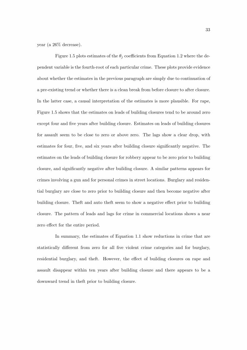
Figure 1.5 plots estimates of the "j coe"cients from Equation 1.2 where the de-
pendent variable is the fourth-root of each particular crime. These plots provide evidence
about whether the estimates in the previous paragraph are simply due to continuation of
a pre-existing trend or whether there is a clean break from before closure to after closure.
In the latter case, a causal interpretation of the estimates is more plausible. For rape,
Figure 1.5 shows that the estimates on leads of building closures tend to be around zero
except four and five years after building closure. Estimates on leads of building closures
for assault seem to be close to zero or above zero. The lags show a clear drop, with
estimates for four, five, and six years after building closure significantly negative. The
estimates on the leads of building closure for robbery appear to be zero prior to building
closure, and significantly negative after building closure. A similar patterns appears for
crimes involving a gun and for personal crimes in street locations. Burglary and residen-
tial burglary are close to zero prior to building closure and then become negative after
building closure. Theft and auto theft seem to show a negative e!ect prior to building
closure. The pattern of leads and lags for crime in commercial locations shows a near
zero e!ect for the entire period.
In summary, the estimates of Equation 1.1 show reductions in crime that are
statistically di!erent from zero for all five violent crime categories and for burglary,
residential burglary, and theft. However, the e!ect of building closures on rape and
assault disappear within ten years after building closure and there appears to be a
downward trend in theft prior to building closure.

34
Local E!ect of Demolitions on Housing and Labor Markets
Figure 1.6 presents plots of the "j coe"cients from Equation 1.2 for log-linear
specifications of the e!ect of building closure on median housing transaction prices and
number of new residential units that have been authorized by building permits.
As opposed to crime, one would expect to see housing prices and construction
activity respond prior to building closure. If real estate developers had perfect foresight,
then I would expect housing prices to adjust at the time information of public housing
demolition plans is released. Prices would adjust to a level that capitalizes the increased
future rents due to increased amenity levels. Increased amenity levels would be expected
if it was thought that some sector of the population would value removal of the high-rise
public housing buildings either because of crime reduction or architectural bias against
large, poorly maintained, imposing buildings.
However, if there was some uncertainty about the size of the amenity increase,
then prices may adjust gradually as developers become more certain that there is a
segment of the population which values the changes that have occurred in the neighbor-
hood. Furthermore, one would expect supply to adjust in a manner so as to maximize
developer profit. This may involve having units ready just in time for a jump in demand,
but typically it would not make sense for new units to be ready before crime has dropped
and demand has increased.
The plots shown in Figure 1.6 are consistent with a model of forward-looking
real estate developers making investment decisions in the face of uncertainty about the
size of the potential demand increase. First, six years prior to building closure, housing
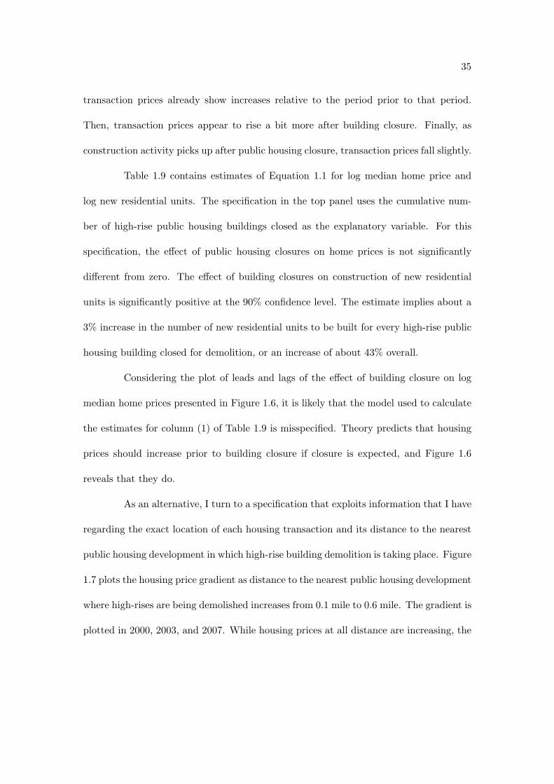
35
transaction prices already show increases relative to the period prior to that period.
Then, transaction prices appear to rise a bit more after building closure. Finally, as
construction activity picks up after public housing closure, transaction prices fall slightly.
Table 1.9 contains estimates of Equation 1.1 for log median home price and
log new residential units. The specification in the top panel uses the cumulative num-
ber of high-rise public housing buildings closed as the explanatory variable. For this
specification, the e!ect of public housing closures on home prices is not significantly
di!erent from zero. The e!ect of building closures on construction of new residential
units is significantly positive at the 90% confidence level. The estimate implies about a
3% increase in the number of new residential units to be built for every high-rise public
housing building closed for demolition, or an increase of about 43% overall.
Considering the plot of leads and lags of the e!ect of building closure on log
median home prices presented in Figure 1.6, it is likely that the model used to calculate
the estimates for column (1) of Table 1.9 is misspecified. Theory predicts that housing
prices should increase prior to building closure if closure is expected, and Figure 1.6
reveals that they do.
As an alternative, I turn to a specification that exploits information that I have
regarding the exact location of each housing transaction and its distance to the nearest
public housing development in which high-rise building demolition is taking place. Figure
1.7 plots the housing price gradient as distance to the nearest public housing development
where high-rises are being demolished increases from 0.1 mile to 0.6 mile. The gradient is
plotted in 2000, 2003, and 2007. While housing prices at all distance are increasing, the

36
increase nearest to public housing is the most dramatic. Thus, the slope of the gradient
appears to be decreasing over time as high-rises are demolished.
Table 1.10 presents estimates of the price gradient for housing transactions near
high-rise public housing developments. The estimates are from the following regression
model
pn,i,t = #i + $t + (tdistn,t + %n,i,t (1.4)
where pn,i,t is the log price of transaction n which is for a home located in community
area i and which occurred in year t. #i is a community area fixed e!ect and $t is a
year e!ect. The distn,t variable is the interaction of a year indicator and distance to
the nearest high-rise public housing development. The (t are the coe"cients of interest,
the distance to public housing gradient in a particular year. The sample only contains
transactions from the years 2000 through 2007, because the data are too thin for the
years between 1988 and 1999. For the estimates presented in the first column, the sample
is limited to transactions that occurred between 0.1 and 0.6 mile of a high-rise public
housing development. The specification in the second column further limits the sample
to only include transactions from the eight neighborhoods which had high-rise public
housing developments.
The estimate in the first row and column of Table 1.10 reveals that transaction
prices rose by about 30% in the year 2000 as the distance to the nearest high-rise public
housing development increased from 0.1 mile to 0.6 mile. However, adding the coe"cient

37
in the first row and column to the coe"cient on “(year==2007)*dist” in the first column
results in a slope of only 0.114, meaning that the prices rose by about 5.5% when moving
from 0.1 mile to 0.6 mile away from the nearest high-rise public housing development in
2007.
In the bottom panel of Table 1.10, I attempt to quantify the size of the ex-
ternality that high-rise public housing was imposing upon nearby property values. The
row entitled “Mean reduction in 2000 Price” is calculated by taking the mean di!erence
between the exponentiated predicted value of log prices from the regression model and
the exponentiated counterfactual predicted values, had the gradient been equal to zero
in 2000. The counterfactual assumes that there was a 0% increase in prices in 2000
when moving from 0.1 to 0.6 mile away from high-rise public housing and that all values
would have been the same as those predicted at 0.6 mile. A zero gradient appears to
have been approximately true in 2006. Finally, the row entitled “Gross Reduction in
2000” multiplies the mean reduction by the number of transactions to determine the
number of dollars that were lost in property transactions in 2000. Of course, this is
a lower bound for the size of the externality, as it is likely that only a small amount
of the land or homes that was between 0.1 and 0.6 mile of a high-rise public housing
development transacted in 2000.
1.4 City-Wide E!ect of Public Housing Demolition
In this section, I estimate the degree to which the direct reductions in neigh-
borhood crime associated with public housing demolition, shown in the previous section,

38
are countered by increases in crime in other parts of the city due to displacement.
1.4.1 Data Sources and Descriptive Statistics
For this analysis, I use data on the relocation of public housing residents in
Chicago who were displaced by public housing demolitions. I also use city-level data on
HOPE VI demolition grants and city-level data on murder rates for a panel of cities in
the United States.
Data Concerning Relocation of CHA Residents
From a policy evaluation standpoint, I am interested in measuring the e!ects
of the CHA’s Plan for Transformation; however, the degree to which I am able to learn
about the e!ects of public housing deconcentration in general depends upon the specifics
of the relocation process.
Several possible scenarios would allow the measurement of di!erent e!ects. In
the first scenario, residents who are induced to move by building closures evenly dis-
perse throughout the same neighborhood in which their public housing development
was located. In this scenario, neighborhood composition does not change; hence, the
local e!ect measured in the previous section would simply measure the e!ect of decon-
centrating public housing residents within a neighborhood and of demolishing poorly
maintained high-rises. In this case, one might not expect any crime displacement to
other neighborhoods. A second possible scenario would be that all former public hous-
ing residents left their old neighborhoods for other parts of the city or moved out of the
39
city entirely. Of course, the reality is some combination of both scenarios.
The CHA’s website describes the relocation process in the following way:
Every resident who occupied a CHA unit on October 1, 1999 and continuesto comply with the terms of their lease during the rebuilding process is enti-tled to return to a redeveloped or rehabilitated unit. Many of these residentswill need to relocate from their existing apartments on at least a temporarybasis to accommodate renewal. The CHA, in conjunction with other citydepartments and social service organizations, manages this complex reloca-tion process, helping residents choose temporary and permanent replacementhousing.26
I use data from two sources to learn about relocation of displaced CHA resi-
dents. The first, a study conducted by the National Opinion Research Center (NORC),
sheds some light on where public housing residents moved when their buildings were
closed. Eight hundred residents whose buildings were closing in 2002 and 2003 were
surveyed then and again in 2006. The follow-up survey response rate was 83%. Of those
who did respond, 37% were living within one mile of their original building, 38% between
one and five miles of their original building, 20% between five and ten miles of their orig-
inal building, and the remaining 8% were living more than 10 miles from their original
building. The residents’ original buildings were located in 11 di!erent community areas.
In 2006, 46% of those who responded were living in the same 11 community areas (39%
of the residents from the eight neigborhoods with high-rise public housing were still liv-
ing in those eight neighborhoods). Only 3% were no longer living in the city. However,
it is likely that the non-response rate was higher for households that left Chicago. As
of 2006, 19% of respondents had permanently relocated to a CHA building, 37% had
permanently relocated to voucher-based housing (Section 8), 35% were temporarily re-26http://www.thecha.org/transformplan/plan summary.html.

40
located in a CHA building, 4% were temporarily relocated in voucher-based housing,
and the remaining 5% were still in their original unit. Adding the non-respondents and
those who reported moving out of Chicago results in an upper bound of 20% for the
proportion of households that has left the city. The same assumption results in 38%
remaining in the 11 neighborhoods where buildings were closed, and 42% moving to
other neighborhoods within the city, primarily on the South Side and West Side.
The second source of information regarding displaced resident relocation is
an August 2008 press release issued by the CHA. The press release reveals that 8,000
households who held a lease with the CHA in October 1999 had moved as a result of
building closures. Over 4,277 of those households have chosen to receive Housing Choice
Vouchers HCV (also known as Section 8 Vouchers), which can be used in the private
rental market. The press release shows that only 116 households (or 2.7%) who opted to
receive HCV’s have moved out of the City of Chicago. The press release also provides a
count of the number of these households by the community area in which they currently
live as of August 2008. Figure 1.8 shows the geographic distribution of the relocatees as
of August 2008.
HUD Demolition Grant and FBI Uniform Crime Reporting Data
I use data on HOPE VI demolition grants from HUD’s website.27 The data
cover the period from fiscal year 1996 through fiscal year 2003, and provide the city,
state, and name of the local housing authority that is receiving the grant. The name27http://www.hud.gov/o"ces/pih/programs/ph/hope6/grants/demolition/

41
of the development, number of units to be demolished, dollar amount of the grant, and
fiscal year are also specified.
Data on city-level murder rates come from the FBI’s Uniform Crime Reporting
Program. I use monthly murder counts reported by municipal police departments from
1988 through 2004 from the National Archive of Criminal Justice Data. For the years
2005 through 2007, I obtain annual murder counts for municipal police departments from
the FBI’s Uniform Crime Reporting website.28
1.4.2 Empirical Methodology
A critical question is whether public housing demolition leads to a net reduction
in crime or simply causes it to move from one area to another. I attempt to determine
whether public housing demolitions lead to a net reduction in crime in two ways. First,
I estimate the impact of public housing relocatees on crime in Chicago neighborhoods.
For this analysis, I use the specification presented in Equation 1.1. In this case, Ci,t is
a measure of the number of public housing residents that were displaced by demolitions
and have relocated to community area i in year t. Second, I estimate the net e!ect
of public housing demolition on the crime rate of a panel of roughly 120 cities which
received HOPE VI demolition grants. For this analysis, I use specifications similar to
Equations (1.1) and (1.2). However, in this case the outcome, Yi,t, is the crime rate
in city i in fiscal year t, #i are city fixed-e!ects, $t are fiscal year-e!ects, and Ci,t is a
dummy variable that is equal to zero in every fiscal year before a city receives a HOPE28http://www.fbi.gov/ucr/ucr.htm

42
VI demolition grant and is equal to one in the fiscal year that a grant is received and
all subsequent fiscal years. This city-level analysis identifies only the net e!ect. If crime
is simply displaced from one neighborhood to another, and there is no net change in
crime for the city as a whole, then receiving a HOPE VI demolition grant should have
no e!ect on a city’s crime rate.
1.4.3 Results
In this section, I present evidence concerning the net e!ect of public housing
demolition on crime. First, I consider measures of the amount of crime that follows
displaced public housing residents to their new neighborhoods in Chicago. Subsequently,
I turn to a panel of the roughly 120 cities which received HOPE VI demolition grants
to learn about the e!ect of receiving a demolition grant on the city murder rate.
Displacement of Crime in Chicago
Table 1.11 presents estimates of the e!ect of relocatees on crime. I am cautious
about assigning a causal interpretation to these estimates as they may be biased due to
endogeneity of the explanatory variable. If households chose to move to neighborhoods
that had experienced a serially correlated downward shock to crime in the previous pe-
riod, then OLS estimates of the e!ect of relocatee households on crime will be negatively
biased.
In Table 1.11, the variable labeled “Relocatee” is a proxy for the cumulative
number of households that have relocated to a particular community area after having

43
been displaced by CHA building closures. I calculate the number of relocatees by as-
suming that the fraction of households moving from one of the eight community areas
where high-rise demolitions occur is always equal to the fraction in the NORC survey.
For example, in the NORC survey, 14% of households who relocated from the Near West
Side moved to Austin. Thus, for every building closure that occurs in the Near West
Side, there is an increase in the Relocatees observation for Austin in the same year by
14% of the number of households a!ected by the building closure.
Table 1.11 contains estimates of the e!ect of relocatee households on violent
crime. All specifications include community area e!ects variables and year e!ects. Box-
Cox regression estimates indicate that the log transformation of the dependent variable
is most appropriate. However, I choose to focus on Poisson regression specifications as
they impose a functional form similar to log, but are better suited for count data.
The top panel of Table 1.11 contains estimates for a sample limited to the 29
community areas which received more than one relocatee and which did not contain high-
rise or low-rise family public housing developments. For the most part, the estimates
are negative in sign, but not significantly di!erent from zero. The exceptions are the
estimate for rape, which is significantly less than zero, and the estimate for personal
crimes in a street location, which is positive but very close to zero. The upper limit of
the 95% confidence interval for murder is about 0.00236, which corresponds to a 27.6%
increase in murder. For all 29 community areas in the sample, the upper bound of the
confidence interval implies an increase of about 103 murders per year. The lower 95%
confidence bound implies a decrease of about 43.9%, or 164 fewer murders, for all 29

44
community areas.
The second panel from the top of Table 1.11 contains estimates for a sample
limited to the 13 community areas that received more than 100 relocatees and which did
not contain high-rise or low-rise family public housing developments. For this restricted
sample, the point estimates for all six violent crime categories are negative. The estimate
for murder is significantly less than zero, but only at the 90% confidence level. The other
point estimates are not statistically di!erent from zero.
The third and fourth panels of Table 1.11 contain estimates of the e!ect of
relocatees on property crimes. For the sample of 29 community areas that received
one or more relocatee, shown in the third panel, all point estimates are positive. The
estimates for auto theft and crimes in commercial locations are statistically di!erent
from zero. The influx of relocatees is associated with an 11.7% increase in auto theft
and an 8.8% increase in crimes in commercial locations. However, for the more restrictive
sample of 13 community areas which received 100 or more relocatees shown in the second
panel from the top, the point estimates are negative and not statistically di!erent from
zero. Finding that relocatees are associated with increased auto theft in a sample that
includes community areas that receive relatively few relocatees, while finding no e!ect
in the sample that is limited to only the community areas that receive a high number
of relocatees is consistent with neighborhoods that receive few relocatees having either
more valuable cars or more poorly secured cars than the neighborhoods that receive a
high number of relocatees.
Taken together, the evidence about the e!ect of relocatees on crime is inconclu-

45
sive. This is not entirely surprising, given the noisy measure of the number of relocatees
that I am using.
City-Wide E!ect of Demolitions on the Murder Rate
Next, I turn to estimates of the e!ect of receiving a HOPE VI demolition grant
on a city’s murder rate. Table 1.12 presents estimates of linear, log-linear, and square-
root transformed specifications of Equation 1.1. Estimates in the upper panel are from
a sample of all cities which received HOPE VI demolition grants from 1996 through
2003. The explanatory variable labeled “Demolition Grant” is a dummy variable which
is equal to one in the fiscal year in which a particular city received its first demolition
grant and remains equal to one through the end of the sample. The linear specification
shows a reduction of about 1.9 murders per year per 100,000 residents, which translates
to a reduction of about 12% from a pre-demolition mean murder rate of 16.3 murders per
year per 100,000 residents for the sample of 121 cities that received demolition grants.
The point estimate for the linear specification is significantly di!erent from zero at the
95% confidence level. The log specification shows a drop of about 11% in the murder rate
associated with receiving a demolition grant. This estimate is also significantly di!erent
from zero at the 95% confidence level. The third column shows the estimate for the
specification in which the square-root of murders per capita is the dependent variable.
For this specification, the point estimate is not quite significantly di!erent from zero
even at the 90% confidence level; however, the point estimate translates to about a 9%
reduction in murders per capita, which is close to the percentage reduction in murders

46
per capita implied by the linear and log-linear specifications.
The middle panel of Table 1.12 presents estimates of the same three specifi-
cations for a sample that has been limited to the 101 cities which received all of their
HOPE VI demolition grant funding in a single fiscal year. For this sample, the timing of
demolitions may be more clearly defined. The point estimates in each specification be-
come slightly more negative using this limited sample. The estimates in the linear and
log-linear specifications remain statistically di!erent from zero at the 95% confidence
level, while the estimate for the square-root specification is still close to the boundary
of being significantly less than zero at the 90% confidence level.
The lower panel of Table 1.12 presents estimates from a falsification test. I
randomly assign the demolition grant history of the 121 cities that received demolition
grants to the 121 highest population cities that did not receive demolition grants. As
expected, the e!ect of “False Demolition Grant” is not statistically di!erent from zero.
Figure 1.9 plots the "j coe"cients from Equation 1.2 for the square-root spec-
ifications. The left plot is for the full sample of 121 cities which received demolition
grants. The coe"cients can be interpreted as being relative to the period prior to five
years before receiving a demolition grant. The coe"cients appear to be close to zero
prior to receiving a demolition grant, and negative beginning with the year that the de-
molition grant is awarded. The right plot shows coe"cients for the set of the 121 highest
population cities which did not receive demolition grants. Most of the coe"cients are
close to zero indicating that, as expected, the year in which another randomly assigned
city received a demolition grant has no e!ect on the murder rate of a city that did not

47
receive a demolition grant. Appendix Table 1.13 presents summary statistics for the 121
cities that received demolition grants and the highest population 121 cities that did not
a receive demolition grant used in the falsification test.
It is interesting to compare the size of the direct e!ect of public housing demo-
lition on murder with the city-wide e!ect. I estimate that public housing demolitions in
Chicago lead to a combined reduction of about 90 murders per year in the eight com-
munity areas where high-rise public housing was demolished. This represents a drop of
11.8% from a mean of 762 murders per year for the entire City of Chicago in the pre-
demolition period. Comparing the 11.8% direct e!ect to the 10% reduction measured
across cities that received demolition grants implies that displacement e!ects account
for only about a 2% increase in murder.
1.5 Conclusion
This paper provides empirical evidence regarding the neighborhood-level and
city-wide impact of the HOPE VI public housing demolition program on crime, housing,
and labor markets. It is the first to show that Chicago’s large-scale public housing demo-
lition program is associated with large drops in violent crime, increases in home prices,
and increases in residential construction in the neighborhoods where public housing is
demolished. Furthermore, estimates from 121 cities that received HOPE VI demolition
grants indicate that public housing demolition is associated with a net reduction in the
city-wide murder rate.
These results provide support for theories which predict that high concentra-

48
tions of low-income households will lead to a greater amount of crime than would occur
if low-income households were more evenly spatially distributed. The evidence is consis-
tent with economic theories that emphasize the importance of social interaction or peer
e!ects for crime, sociological theories that emphasize disorder and the breakdown of col-
lective e"cacy that can occur when poverty is spatially concentrated, and urban design
theories that focus on the degree to which certain building designs enable criminals to
avoid capture.
The preceding analysis demonstrates that, in Chicago, public housing demoli-
tions lead to a 25% to 50% decrease in murder in neighborhoods where high-rise public
housing is demolished. Furthermore, violent crimes other than murder drop by 20% to
40% in neighborhoods where high-rise public housing is demolished. The local neighbor-
hood e!ect of public housing demolitions on murder in Chicago translates to a slightly
larger drop in murder for the entire city than the 10% city-wide drop in the murder rate
that I find using a panel of cities that received HOPE VI demolition grants. This implies
that violent crime displacement due to public housing demolition is likely to be small.
There is also evidence of a 20% to 25% increase in median home prices and
a 30% to 40% uptick in residential unit construction in Chicago neighborhoods where
high-rise public housing was demolished. A back of the envelope calculation suggests
that each neighborhood murder and the package of other crimes that are correlated with
each murder impose a cost of about $3,200 to $4,300 dollars per home in neighborhoods
where public housing was demolished. Furthermore, the relationship of home prices
increasing with distance from high-rise public housing developments, which is present

49
in the year 2000, has disappeared by the year 2006, when a large fraction of Chicago’s
high-rise public housing stock has been demolished. The implication is that large public
housing developments were creating an externality that lowered nearby property values.
While I am unable to say whether deconcentration of public housing increases
welfare, it is clear that policy makers with an objective of minimizing city-wide crime
should avoid promoting the spatial concentration of low-income households by build-
ing large high-rise public housing developments as they did in Chicago in the 1950’s
and early 1960’s. The results point to possible benefits of the current move toward a
more even spatial distribution of public housing which emphasizes scattered-site low-rise
construction and mixed-income developments.
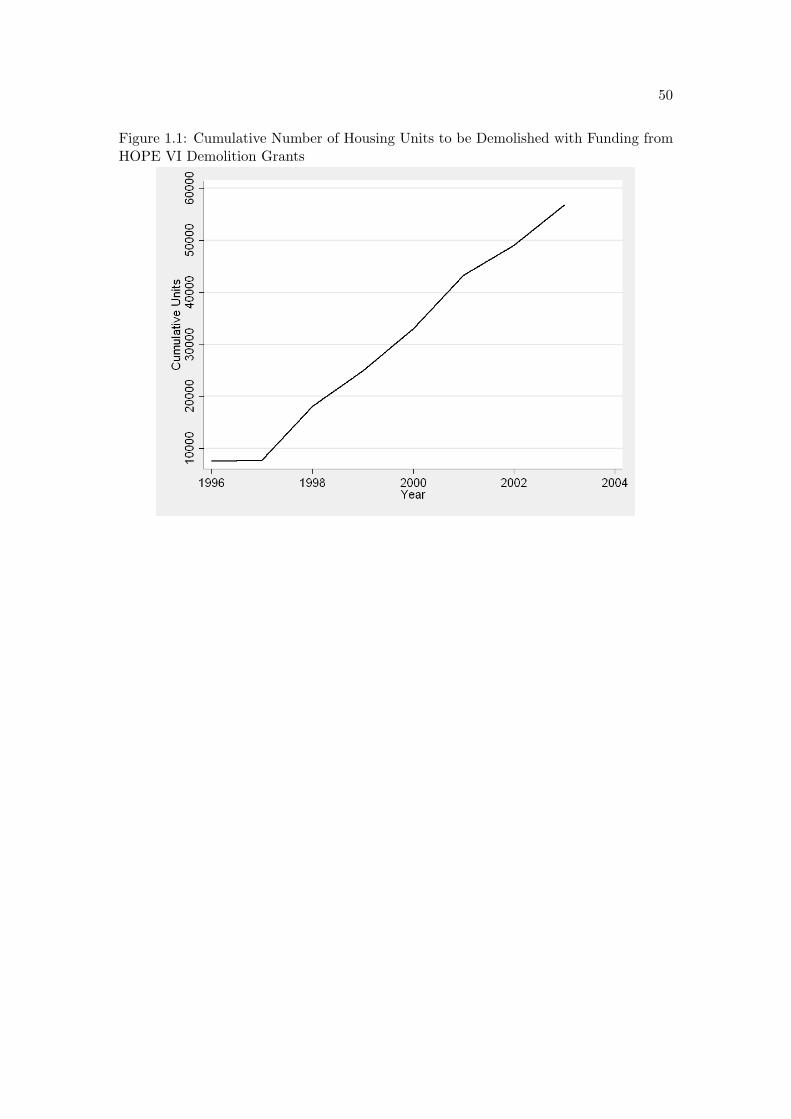
50
Figure 1.1: Cumulative Number of Housing Units to be Demolished with Funding fromHOPE VI Demolition Grants

51
Figure 1.2: Community Areas with Family Public Housing Developments

52
Figure 1.3: Annual Number of CHA Buildings Closed in High Rise Development Com-munity Areas
Figure 1.4: Lead and Lagged E!ect of Building Closure on the Square-root of Murderin High Rise Development Community Areas

53
Figure 1.5: Lead and Lagged E!ect of Building Closure on the Fourth-root of CrimesOther than Murder in High Rise Development Community Areas
Figure 1.6: Lead and Lagged E!ect of Building Closure on the log of Median HomePrices and New Residential Units

54
Figure 1.7: Kernel-Weighted Local Polynomial Regression Plots of Housing PriceGradient

55
Figure 1.8: Number of Relocatees by Community Area

56
Figure 1.9: Lead and Lagged E!ect of E!ect of Demolition Grant on City-Wide MurderSquare-Root Specification and Falsification Test
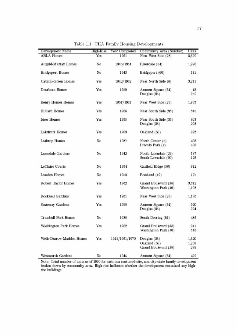
57
Table 1.1: CHA Family Housing Developments

58
Table 1.2: Descriptive Statistics

59
Table 1.3: Total Crime in 8 High-Rise Community Areas over TimeTotal Crime in High Rise CAs 1991 1995 1999 2003 2007Murder 188 87 84 56 33Rape 578 430 291 177 137Robbery 8,142 4,357 2,863 1,866 1,492Assault 6,322 5,256 4,001 2,682 1,974Burglary 5,171 3,584 2,705 1,948 1,590Residential Burglary 2,940 2,160 1,550 1,115 949Theft 24,907 21,912 19,541 14,719 12,330Motor Vehicle Theft 5,280 3,715 3,138 2,167 1,661Gun Involved 7,124 3,294 2,331 1,461 1,016Street Crime 13,550 10,143 9,156 7,346 5,780Commercial Location 11,740 10,443 10,712 9,407 7,721Note: Total crime counts for 8 neighborhoods that contained high-rise public housing.

60
Table 1.4: 1950 Characteristics of Neighborhoods where High-Rise Public Housing wasProposed

61
Table 1.5: 20 Neighborhoods with the Highest Predicted Probability of Containing High-Rise Public Housing

62
Table 1.6: Decennial Population and the Number of Households Displaced by Closuresin Neighborhoods where High-Rises were Demolished

63
Table 1.7: Estimates of E!ect of Closures on Murder(1) (2) (3) (4)
Murder log Murder Poisson (Murder)1/2
Buildings Closed -1.396*** -0.0377*** -0.0173* -0.111***(0.102) (0.0101) (0.0103) (0.0174)
Observations 344 329 344 344R-squared 0.885 0.879 0.893bw 27 27 27
Approximate Change -87.8% -50.4% -23.1% -54.0%
Units Closed -0.0103*** -0.000288*** -0.000141** -0.000810***(0.000715) (5.40e-05) (7.04e-05) (0.000116)
Observations 344 329 344 344R-squared 0.884 0.880 0.891bw 3 6 16
Approximate Change -84.6% -50.3% -24.6% -51.9%
1(Units Closed > 500) -11.39*** -0.269 -0.0510 -0.628**(2.027) (0.199) (0.215) (0.286)
Observations 344 329 344 344R-squared 0.828 0.869 0.863bw 5 27 27
Approximate Change -53.6% -26.9% -5.1% -25.4%
Note: Unit of observation is community area - year. All specifications include community area-e!ects and year-e!ects. The mean number of murders per year per community area prior to 1995was 21.26. The mean number of buildings and units closed per community area by the end ofthe sample are 13.38 and 1,746, respectively. Standard errors for all specifications are shown inparentheses. Newey-West Heteroskedasticity and Auto-Correlation consistent standard errors arepresented for all specifications except Poisson. The bandwidth of the Bartlett window is displayedon the line labeled “bw”. For Poisson specifications standard errors are clustered by communityarea.

64
Table 1.8: OLS Estimates of the E!ect of Closures on Crime Fourth-root Specification

65
Table 1.9: OLS Estimates of the E!ect of Closure on Housing Log-Linear Specification(1) (2)
log Median Home Prices log New Res. Units
Buildings Closed 0.0144 0.0323*(0.0144) (0.0172)
Observations 116 93R-squared 0.797 0.740bw 16 12
Approximate Change 19.3% 43.2%
Units Closed 0.000152* 0.000178*(8.82e-05) (0.000101)
Observations 116 93R-squared 0.809 0.737bw 16 5
Approximate Change 26.5% 31.1%
1(Units Closed > 500) 0.256** -0.0772(0.113) (0.189)
Observations 116 93R-squared 0.802 0.734bw 17 12
Approximate Change 25.6% 7.7%
Pre 1995 Mean 27.061990 Median Home Price 186.9k
Note: Unit of observation is community area - year. All specifications include community areae!ects and year e!ects. Newey-West Heteroskedasticity and Auto-Correlation consistent standarderrors are shown in parentheses. All dollar amount are in terms of year 2000 dollars. The bandwidthof the Bartlett window is shown in the rows titled “bw”.

66
Table 1.10: OLS Estimates of the Housing Log Transaction Price Gradient Near HighRise Public Housing Developments
(1) (2)All CAs High Rise CAs
Distance in miles 0.617** 0.749*(0.279) (0.379)
(year==2001)*dist -0.389** -0.422*(0.189) (0.208)
(year==2002)*dist -0.333 -0.496(0.256) (0.268)
(year==2003)*dist -0.610* -0.766(0.356) (0.431)
(year==2004)*dist -0.660** -0.901**(0.257) (0.301)
(year==2005)*dist -0.568** -0.755**(0.245) (0.303)
(year==2006)*dist -0.706** -0.934*(0.280) (0.398)
(year==2007)*dist -0.503* -0.660(0.285) (0.397)
Observations 49,559 39,158R-squared 0.172 0.087
Transactions in 2000 4,416 3,502
Mean Reduction in 2000 Price $25,500 $33,500
Gross Reduction in 2000 $113M $117MNote: Unit of observation is residential real estate transaction. All specifications include communityarea-e!ects and year-e!ects. Standard errors clustered on community area in parentheses. All dollaramounts are in terms of year 2000 dollars. Column (1) uses all housing transactions from 2000-2007that were between 0.1 and 0.6 mile of a high-rise public housing development. Column (2) usesall housing transactions from 2000-2007 that were between 0.1 and 0.6 mile of a high-rise publichousing development and were also located in a community area containing a high-rise publichousing development. The variable dist is simply distance to the nearest high-rise public housingdevelopment.

67
Table 1.11: Poisson Regression Estimates of the E!ect of Relocatees on Crime
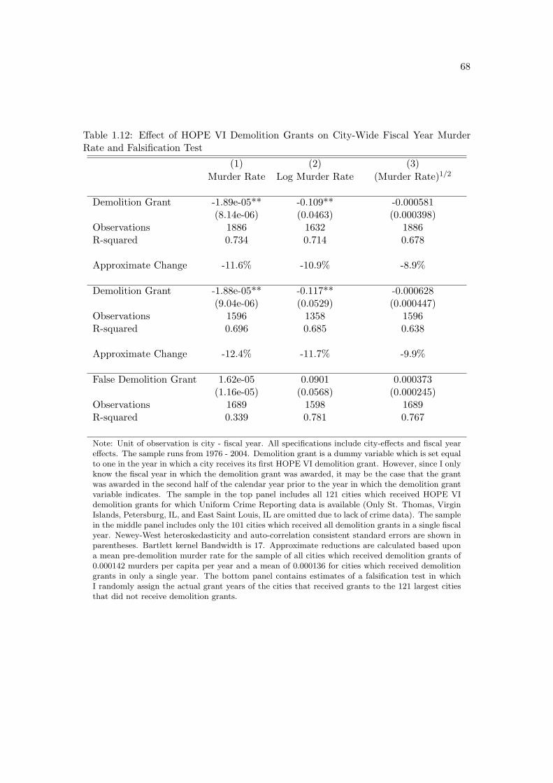
68
Table 1.12: E!ect of HOPE VI Demolition Grants on City-Wide Fiscal Year MurderRate and Falsification Test
(1) (2) (3)Murder Rate Log Murder Rate (Murder Rate)1/2
Demolition Grant -1.89e-05** -0.109** -0.000581(8.14e-06) (0.0463) (0.000398)
Observations 1886 1632 1886R-squared 0.734 0.714 0.678
Approximate Change -11.6% -10.9% -8.9%
Demolition Grant -1.88e-05** -0.117** -0.000628(9.04e-06) (0.0529) (0.000447)
Observations 1596 1358 1596R-squared 0.696 0.685 0.638
Approximate Change -12.4% -11.7% -9.9%
False Demolition Grant 1.62e-05 0.0901 0.000373(1.16e-05) (0.0568) (0.000245)
Observations 1689 1598 1689R-squared 0.339 0.781 0.767
Note: Unit of observation is city - fiscal year. All specifications include city-e!ects and fiscal yeare!ects. The sample runs from 1976 - 2004. Demolition grant is a dummy variable which is set equalto one in the year in which a city receives its first HOPE VI demolition grant. However, since I onlyknow the fiscal year in which the demolition grant was awarded, it may be the case that the grantwas awarded in the second half of the calendar year prior to the year in which the demolition grantvariable indicates. The sample in the top panel includes all 121 cities which received HOPE VIdemolition grants for which Uniform Crime Reporting data is available (Only St. Thomas, VirginIslands, Petersburg, IL, and East Saint Louis, IL are omitted due to lack of crime data). The samplein the middle panel includes only the 101 cities which received all demolition grants in a single fiscalyear. Newey-West heteroskedasticity and auto-correlation consistent standard errors are shown inparentheses. Bartlett kernel Bandwidth is 17. Approximate reductions are calculated based upona mean pre-demolition murder rate for the sample of all cities which received demolition grants of0.000142 murders per capita per year and a mean of 0.000136 for cities which received demolitiongrants in only a single year. The bottom panel contains estimates of a falsification test in whichI randomly assign the actual grant years of the cities that received grants to the 121 largest citiesthat did not receive demolition grants.

69
Table 1.13: Demolition City Summary Statistics and Falsification Test City SummaryStatistics
(1) (2)Year 1992 2007
Murders 79.1 48.8(236) (94.2)
Population 307k 349k(808k) (906k)
Murders per 100,000 Residents 18.1 15.0(14.9) (14.3)
Murders 35.4 29.0(57.2) (46.5)
Population 256k 317k(224k) (299k)
Murders per 100,000 Residents 11.8 8.0(11.4) (7.2)
Note: Means (standard deviations) for cities that received HOPE VI demolition grants in upperpanel. Means (standard deviations) for 121 highest population cities that report UCR statisticsbut did not receive HOPE VI demolition grants in lower panel.
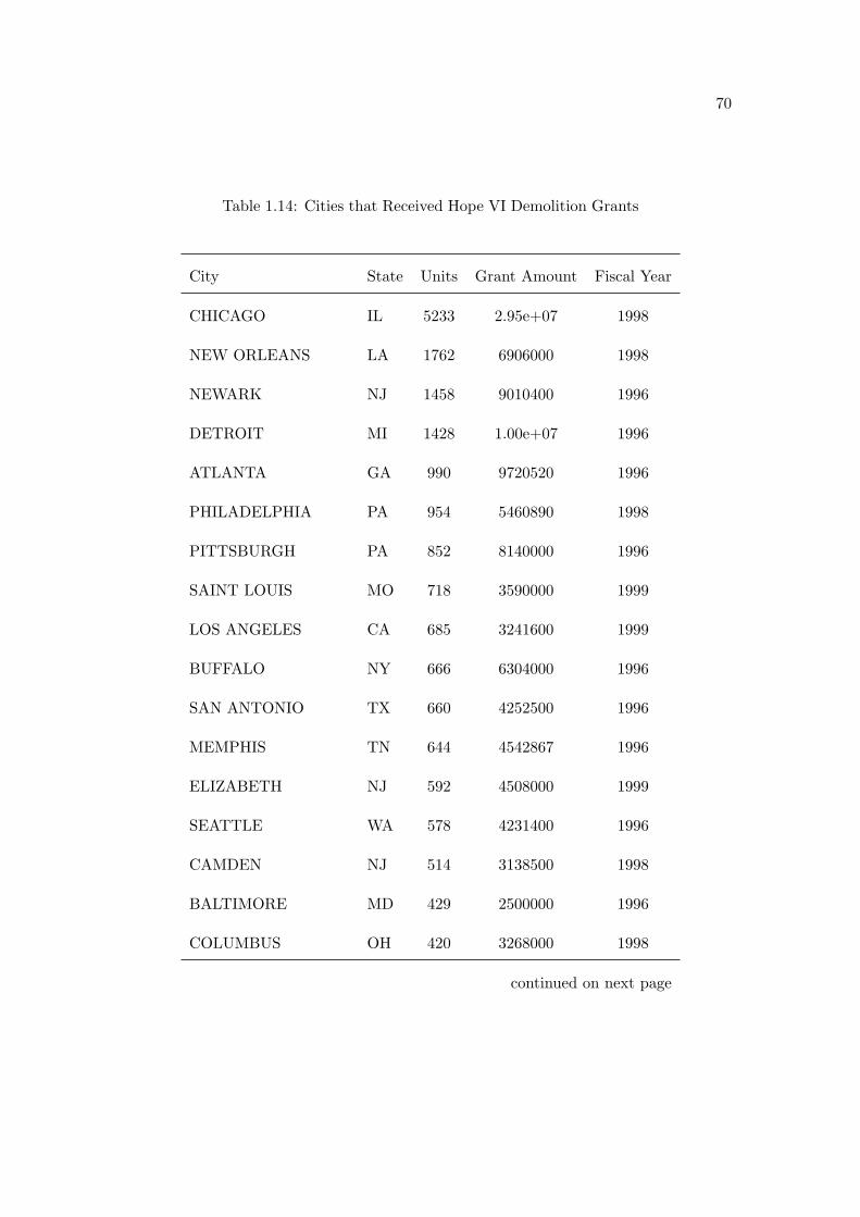
70
Table 1.14: Cities that Received Hope VI Demolition Grants
City State Units Grant Amount Fiscal Year
CHICAGO IL 5233 2.95e+07 1998
NEW ORLEANS LA 1762 6906000 1998
NEWARK NJ 1458 9010400 1996
DETROIT MI 1428 1.00e+07 1996
ATLANTA GA 990 9720520 1996
PHILADELPHIA PA 954 5460890 1998
PITTSBURGH PA 852 8140000 1996
SAINT LOUIS MO 718 3590000 1999
LOS ANGELES CA 685 3241600 1999
BUFFALO NY 666 6304000 1996
SAN ANTONIO TX 660 4252500 1996
MEMPHIS TN 644 4542867 1996
ELIZABETH NJ 592 4508000 1999
SEATTLE WA 578 4231400 1996
CAMDEN NJ 514 3138500 1998
BALTIMORE MD 429 2500000 1996
COLUMBUS OH 420 3268000 1998
continued on next page

71
Table 1.14: Cities that Received Hope VI Demolition Grants
- continued
City State Units Grant Amount Fiscal Year
PONTIAC MI 364 2153000 1998
HARTFORD CT 335 5025000 1996
WASHINGTON NC 328 1826000 1998
DAYTON OH 312 1998000 1998
WASHINGTON DC 308 2020707 1996
JACKSON TN 306 1987830 2003
MINNEAPOLIS MN 306 1825500 1998
COLUMBIA SC 300 1938250 1999
RALEIGH NC 296 2602877 1998
YOUNGSTOWN OH 289 1503880 1999
CLEARWATER FL 284 2529000 2003
CHATTANOOGA TN 279 2375172 2003
LEXINGTON KY 279 1973000 2000
WILMINGTON NC 276 2325500 2002
SHREVEPORT LA 269 2463650 2003
NEW HAVEN CT 259 1540000 1996
UNIONTOWN PA 255 1574100 2002
continued on next page

72
Table 1.14: Cities that Received Hope VI Demolition Grants
- continued
City State Units Grant Amount Fiscal Year
INDIANAPOLIS IN 250 1898900 2001
ALEXANDRIA LA 247 1347870 2003
CLEVELAND OH 243 2201997 1998
LITTLE ROCK AR 233 1669261 2000
CHARLESTON WV 230 922684 1998
SAN FRANCISCO CA 229 3205325 2001
GALVESTON TX 228 1215000 2003
KNOXVILLE TN 217 1686000 2003
EAST ORANGE NJ 212 2185000 2002
CORPUS CHRISTI TX 200 1165000 1998
DELAND FL 200 1803344 2003
HIGH POINT NC 198 1058650 1998
MIDDLETOWN CT 190 986000 1998
JERSEY CITY NJ 188 1277000 1999
JACKSON MS 184 1194922 2003
WILMINGTON DE 180 1323000 2003
MILWAUKEE WI 170 976000 1998
continued on next page

73
Table 1.14: Cities that Received Hope VI Demolition Grants
- continued
City State Units Grant Amount Fiscal Year
CHARLOTTE NC 166 1455144 2003
CHAMPAIGN IL 165 1490800 2003
PORTSMOUTH VA 160 1588700 2001
PATERSON NJ 160 2047000 1996
CHESTER PA 152 839860 1996
MERIDIAN MS 148 1112000 2001
MOBILE AL 144 642000 1999
CINCINNATI OH 144 720000 1997
TROY NY 144 720000 1999
ALBANY NY 142 710000 1998
SAGINAW MI 142 1413200 1996
LAS VEGAS NV 141 810000 1998
ORANGE NJ 140 1010000 2002
AKRON OH 134 844000 1998
OCALA FL 130 1642957 1996
TAMPA FL 127 873000 1996
KANSAS CITY KS 125 972000 2001
continued on next page

74
Table 1.14: Cities that Received Hope VI Demolition Grants
- continued
City State Units Grant Amount Fiscal Year
BRADENTON FL 125 1572500 2001
MARIETTA GA 124 1050311 2003
ROCHESTER NY 111 639940 2002
LUBBOCK TX 108 606000 1999
TACOMA WA 106 639500 1996
DECATUR AL 105 979025 2003
TALLAHASSEE FL 102 753000 2003
NEW YORK NY 102 731688 1999
LAKE WALES FL 100 805917 2003
BROWNSVILLE TX 86 774000 2003
HUNTSVILLE AL 86 430000 1999
LAS VEGAS NM 82 679680 2003
NEWNAN GA 81 672000 2001
FORT LAUDERDALE FL 78 690975 2003
FORT WAYNE IN 75 834200 1999
PHARR TX 75 487500 1998
LOUISVILLE KY 72 540000 2002
continued on next page
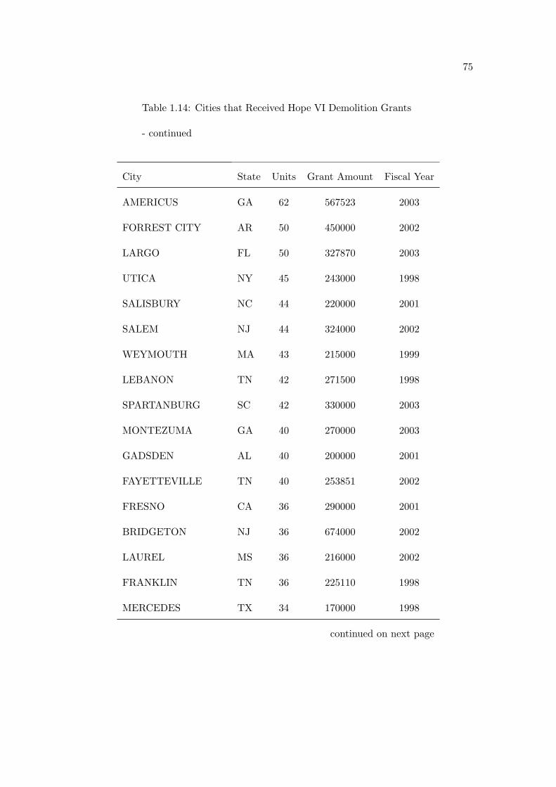
75
Table 1.14: Cities that Received Hope VI Demolition Grants
- continued
City State Units Grant Amount Fiscal Year
AMERICUS GA 62 567523 2003
FORREST CITY AR 50 450000 2002
LARGO FL 50 327870 2003
UTICA NY 45 243000 1998
SALISBURY NC 44 220000 2001
SALEM NJ 44 324000 2002
WEYMOUTH MA 43 215000 1999
LEBANON TN 42 271500 1998
SPARTANBURG SC 42 330000 2003
MONTEZUMA GA 40 270000 2003
GADSDEN AL 40 200000 2001
FAYETTEVILLE TN 40 253851 2002
FRESNO CA 36 290000 2001
BRIDGETON NJ 36 674000 2002
LAUREL MS 36 216000 2002
FRANKLIN TN 36 225110 1998
MERCEDES TX 34 170000 1998
continued on next page

76
Table 1.14: Cities that Received Hope VI Demolition Grants
- continued
City State Units Grant Amount Fiscal Year
DOUGLAS GA 30 160000 2001
COOKEVILLE TN 30 166500 1999
HONOLULU HI 27 135000 2001
BRISTOL VA 25 125000 1999
JASPER AL 24 120000 1997
COLUMBIA MO 22 169200 1996
SYRACUSE NY 20 100000 2001
WASHINGTON PA 20 181000 1999
DANBURY CT 18 117000 1998
ASHLAND KY 16 80000 1999
WINONA MN 16 96500 1998
ROCKFORD IL 14 76000 1999
SANFORD NC 13 65000 1997
PUEBLO CO 12 109550 1996
JEFFERSONVILLE IN 12 100000 2002
SACRAMENTO CA 10 50000 1997
WINONA MS 10 60000 2002
continued on next page

77
Table 1.14: Cities that Received Hope VI Demolition Grants
- continued
City State Units Grant Amount Fiscal Year
HUMBOLDT TN 10 64880 2002
SOUTH BEND IN 8 64000 2001

78
Table 1.15: Box-Cox Curvature Parameter Estimates

79
Table 1.16: Poisson Regression Estimates of the E!ect of Closures on Crime

80
Chapter 2
The E!ect of Foreclosures on
Owner-Occupied Housing Prices:
Supply or Dis-Amenity?
2.1 Introduction
As housing prices have fallen and foreclosure rates have risen over the past few
years, lenders have been put in the position of having to liquidate ever larger inventories
of foreclosed homes. Recently, a number of articles in the popular press have cited
a “shadow inventory” of homes, part of which is made up of homes that have been
repossessed by lenders but have not been listed for sale. In a July 7, 2009 segment on
National Public Radio, Yuki Noguchi reports,
“I do know that banks are holding onto inventory, and what they’re doing is

81
they’re metering them out at an appropriate level to what the market willbear,” says Pat Lashinsky, chief executive of online brokerage site ZipRealty.1
Such a strategy raises a number of questions. What factors determine the optimal rate
at which an individual lender should release inventory into the market? If each lender
pursues its own optimal strategy, will the outcome be socially e"cient, or could everyone
be made better o! through government intervention?
The answers to these questions hinge upon the mechanisms through which fore-
closures decrease nearby property values and the relative size of these e!ects. There are
two primary mechanisms which are theoretically plausible ways by which a foreclosure
may lower the value of other properties nearby. The first mechanism is by way of in-
creasing the supply of homes on the market.2 The second mechanism operates through
the dis-amenity imposed on nearby properties if a foreclosed property is not properly
maintained or if it falls victim to crime or vandalism, possibly while vacant. This paper
attempts to measure the e!ect of foreclosure on nearby property values and to decom-
pose this e!ect into portions attributable to the aforementioned supply and dis-amenity
mechanisms.
I pursue an empirical strategy under which identification of seperate supply
and dis-amenity e!ects depends upon the degree of segmentation between the single-
family and multi-family housing markets. Specifically, I consider two extreme cases: full
segmentation and full integration. In the full segmentation case, I assume that foreclosure1The full segment can be found at http://www.npr.org/templates/story/story.php?storyId=
106113137.2Wheaton [1990] shows that prices fall as vacancies rise in a housing market search and matching
model.

82
of a nearby single-family home a!ects the property values of single-family homes through
both the supply and dis-amenity mechanisms, whereas foreclosure of a nearby non-owner
occupied multi-family building a!ects the property values of single-family homes only
through the dis-amenity mechanism. In the full integration case, the foreclosure of a
nearby single-family home still a!ects property values of single-family homes through
both the supply and dis-amenity mechanisms; however, I assume that foreclosure of a
nearby non-owner occupied multi-family building a!ects the property values of nearby
single-family homes through the dis-amenity mechanism in proportion to the number
of units in the building and through the supply mechanism at only one new unit of
supply per building (the unit that a potential owner-occupier would inhabit). Under
either assumption, identification of separate supply and dis-amenity e!ects hinges upon
identification of the e!ect of single-family home foreclosures and non-owner occupied
multi-family building foreclosures.
I estimate the e!ects of single-family home and non-owner occupied multi-
family foreclosures on the universe of single-family home sales in Chicago between 1998
and 2008. Using a hedonic framework, I estimate the e!ect of single-family and multi-
family foreclosure sales that occurred during the prior year and within 500 feet on the log
price of single-family homes. In addition to the universe of other residential foreclosures,
I control for a large number of property characteristics that could a!ect home prices.
I also include census tract e!ects to control for persistent di!erences in prices across
the city. Finally, I control for trends in housing prices over the sample period using
either year e!ects to control for city-wide price trends or community area-year e!ects

83
to control for neighborhood-level price trends. A central concern of all studies that
examine the e!ect of foreclosures on property values is that they may be a!ected by
reverse causality. The issue is that falling property values may provide an impetus
for home-owners to default on their mortgages; thus foreclosures could be concentrated
precisely in the places prices are lowest, yet the low prices would not have been caused
by the foreclosures. If prices fall at di!erent rates in di!erent neighborhoods, then the
inclusion of community area - year e!ects may be neccessary to avoid bias due to reverse
causality.
I find that each scheduled single-family home foreclosure auction within a 250
foot radius and in the past year is associated with a reduction in the price of a single-
family home that ranges from about 0.9% in high vacancy census tracts to about 2.2% in
low vacancy census tracts.3 In contrast, multi-family forcelosure auctions in the past year
within a 250 foot radius are associated with about a 1% (per unit of foreclosed building)
reduction in the price of a single-family home irrespective of the census tract vacancy
rate. I interpret these findings as evidence that the supply e!ect ranges from about -1.3%
in low vacancy census tracts to about zero in high vacancy census tracts, whereas the3This finding is in line with the findings of several other recent studies. Immergluck and Smith [2006a]
find about a 1% reduction in the price of single-family homes in Chicago in 1999 for each foreclosurewithin one eighth of a mile. Schuetz et al. [2008] find a smaller e!ect, about -0.2%, in New York Citybetween 2000 and 2005 in a 250 foot radius. It is not surprising that I find a larger e!ect for two reasons.The first reason is that the New York City housing market was booming during their sample, whereasmy sample includes the subsequent bust as well. The second reason is that they study the e!ect offoreclosure filings whereas I focus on foreclosures that have proceeded to the point where an auction hasbeen scheduled. As opposed to the hedonic framework used by the two aforementioned studies, Hardinget al. [2009] use a repeat sales framework and find e!ects of a similar magnitude in several MSAs. Usingdata from Massachusetts, Campbell et al. [2009] also find a spillover e!ect of about -1% per foreclosurewithin about 250 feet. Lin et al. [2007] find much larger e!ects using data from 2003 and 2006 fromChicago, but their results may be biased by not having a complete listing of all foreclosures.
84
dis-amenity e!ect is consistently about -1%.4 The supply e!ect result is consistent with
the theoretical prediction from the search and matching model of housing presented in
Wheaton [1990] in that marginal increases in the vacancy rate have diminishing e!ects on
prices as the vacancy rate rises. Somewhat interestingly, I also find that in low vacancy
census tracts the marginal supply e!ect of an additional foreclosure is increasing in the
number of foreclosures, while the marginal dis-amenity e!ect of an additional foreclosure
is close to constant in the number of foreclosures.
Using the estimates of the supply and dis-amenity e!ects reported above, I
consider optimal liquidation strategies for lenders with two or more foreclosed properties
within 250 feet of each other. I consider cases in which policy has the potential for
Pareto-improvement. Since I am focusing on the e!ect of foreclosures on home prices,
I assume that, absent any foreclosures, homes simply sell at a constant intrinsic value.
Under this assumption, it will always be optimal for lenders to sell all homes that are
in high vacancy rate census tracts in the first period, since the supply e!ect is zero in
high-vacancy rate census tracts. However, in low vacancy rate census tracts there may
be cases in which it is optimal not to sell all the foreclosed homes in the first period. I
consider the case of a monopolist lender with many foreclosed properties in a 250 foot
radius circle. I find that it is optimal for a lender with 10 foreclosed properties in such
an area to hold at least one property until the second period as long as the interest rate
plus the depreciation rate (the cost-of-carry) is less than about 15%.4Using data from Columbus, OH in 2006, Mikelbank [2008] finds an e!ect of about -2.4% for each
foreclosure within 250 feet and an e!ect of about -4.0% for each vacant and abandoned building within250 feet. While both of these e!ects are larger than the e!ects that I measure, it may be due to the factthat he does not control for di!erences in price between di!erent areas of the city, except through theuse of several neighborhood characteristic variables.

85
2.2 Data
I use data from several sources. Residential property sales data come from the
Cook County Recorder of Deeds and the Chicago Tribune. Foreclosure data for Cook
County are from a private data provision company named Record Information Services.
Property characteristic data and homeowner tax exemption claim data come from the
Cook County Tax Assessor’s O"ce.
Property identification numbers allow the foreclosure and sales data to be linked
to the property characteristic and tax exemption data. After geocoding the addresses,
I calculate the distance between every sale and every foreclosure. Since I am interested
in the e!ect of foreclosures on nearby properties but not on the foreclosed properties
themselves, I drop any sale that is for the same property identification number and
occurs less than two years before or after a forelcosure.
The foreclosure data contain entries for two types of events. These events are
the initial filing of the foreclosure and the auction date of the foreclosure if an auction is
ever scheduled. I include both types of events in my sample. In the end, the sample that
I use for estimation includes roughly all residential property transactions in the City of
Chicago from 1999 through 2008 and counts of the number of initial foreclosure filings
and foreclosure auctions within the past year and within 250 feet or 500 feet for each
of the following categories: Single-family home foreclosure, renter-occupied multi-family
building foreclosure, owner-occupied multi-family building foreclosure, and condominium
foreclosure.

86
2.3 Empirical Methodology
My goals are to estimate the e!ect of residential foreclosures on the price of
nearby property and to separate this estimate into a component due to excess supply
induced by forclosures and a component due to the dis-amenity of nearby foreclosures
stemming from defered care and maintenance or vacancy. Basically, my strategy is to
seperately estimate the e!ect of a single-family home foreclosure on nearby single-family
home property values and the e!ect of a multi-family apartment building foreclosure on
nearby single-family home property values. Then, with a few assumptions outlined be-
low, I interpret the e!ect of a single-family home forclosure as representing the combined
e!ect of putting an additional single-family-home on the market and the dis-amenity ef-
fect of deferred maintenance or vacancy on the nearby properties. In comparison, under
the assumption the single-family and multi-family housing markets are fully segmented,
I interpret the e!ect of a multi-family apartment building foreclosure on nearby single-
family home property values as being due only to the dis-amenity e!ect of deferred
maintenance or vacancy on the nearby properties. Finally, under the assumption that
single-family and multi-family housing markets are fully integrated, I interpret the e!ect
of a multi-family apartment buliding foreclosure on nearby single-family home property
values as being due to a composite e!ect of one additional unit of supply (the unit that
could potentially become the new owner’s home) and a dis-amenity e!ect of deferred
maintenance or vacancy that is proportional to the number of units in the building.
Several assumptions are necessary in order to interpret my results in this man-

87
ner. Under full segmentation, the first assumption is that multi-family apartment build-
ing foreclosures do not add to the supply of single-family homes for sale. This assump-
tion requires that potential buyers of single-family homes do not regard multi-family
apartment buildings as substitutes and that sellers cannot quickly convert multi-family
apartment buildings to condominiums and sell the units individually. Anecdotal evi-
dence from real estate brokers that I spoke with suggests that these assumptions hold in
practice.5 While it is di"cult to directly measure the degree to which potential buyers
view multi-family apartment buildings as a potential substitute for a single-family home,
it is possible to assess the frequency with which multi-family apartment building foreclo-
sures result in a renter-occupied building becoming owner-occupied. Data from the Cook
County Tax Assessor on claims of the owner-occupied tax exemption for the years 2004
- 2007 reveal that only about 3.3% of multi-family buildings that experienced a foreclo-
sure in either year did not file an owner-occupied exemption in the first year but did file
an owner-occupied exemption in the second year. This suggests that entirely renter-
occupied multi-family apartment buildings do not frequenly become owner-occupied
following a foreclosure. While I do not have direct evidence regarding the degree to
which potential home-buyers regard currently owner-occupied multi-family apartment
buildings as substitutes for single-family homes, it is clear that renter-occupied multi-
family buildings in forclosure are not commonly used as a substitute for a buyer in the
market for a single-family home. Otherwise, the new owner-occupier would claim the5Chris Young, Sales Associate, Coldwell Banker, Cambridge, MA says, “Rarely have crossover
b/w owner-occupied MF and SF/Condo. During property searches, the parameters are separatedCondo/SF/MF. Sometimes I get a buyer who’s looking SF & Condo, but for the most part they stickwith one type. Once they have one type in their head, they stay locked in.”
88
tax exemption, and the transition rate of renter-occupied to owner-occupied foreclosed
multi-family apartment buildings would be higher than 3.3%. Finally, in order to put a
bound on my estimated e!ects in the case that the assumption of full segmentation is
too stringent, I also consider the case of full integration of single-family and multi-family
housing markets. In this case, the assumption is that potential buyers of single-family
homes do regard multi-family apartment buildings as substitutes, but only one house-
hold of owner occupiers can live in a multi-family building and, again, that multi-family
apartment buildings cannot be quickly converted to condominiums and sold as individual
units.
The second assumption is that both single-family home foreclosures and multi-
family apartment building foreclosures create dis-amenities for neighboring single-family
homes because of deferred maintenance or vacancy. While it is di"cult to obtain histor-
ical vacancy status data for particular properties, the United States Postal Service has
aggregated a number of measures of stocks and flows of vacancy by census tract at a
quarterly frequency.6 Table 2.1 presents estimates of the association between the num-
ber of di!erent types of residential foreclosures and the number of residential addresses
that have become vacant in the past three months. These estimates come from a regres-
sion of the number of newly vacant addresses in a census tract-quarter on the number
of condominium foreclosures, single-family foreclosures, and multi-family foreclosures in
the same census tract-quarter. Quarter e!ects are included to account for time trends
in the number of new vacancies, and community area e!ects are included to account for6The data are available through the HUDuser website.

89
di!erences in the number of new vacancies across neighborhoods. The data are for all
census tracts in the City of Chicago and cover the four quarters in 2008. The foreclo-
sure data are counts of the number of units of each type of residential housing that are
scheduled to be sold at a foreclosure auction in a particular census tract-quarter.
The estimate presented in the first row of Table 2.1 indicates that each addi-
tional condominium unit scheduled for foreclosure auction is associated with 1.76 newly
vacant units. The fact that this estimate is larger than one implies that the estimate is
picking up more than just the vacancies due to condominium foreclosures; otherwise the
estimate could not exceed one. The estimator uses di!erences in foreclosures between
census tracts within a particular community area to explain di!erences in the number
of newly vacant addresses between these census tracts. While the estimate for the ef-
fect of condominium foreclosures on the number of newly vacant addresses implies that
there are omitted factors that influence the number of new vacancies and are correlated
with the number of condominium foreclosures, it is still important to note that at the
census tract level of detail there is a positive correlation between foreclosure auctions
and the number of newly vacant addresses. Furthermore, the coe"cients on the number
of single-family units being auctioned due to foreclosure and the number of multi-family
non-owner occupied units being foreclosed due to auction are 0.93 and 0.77, respec-
tively and are not statistically di!erent from each other. This implies that single-family
home foreclosures and multi-family apartment building foreclosures are associated with
a similar number of newly vacant addresses on a per unit basis.
While it may seem counter-intuitive that lenders who are foreclosing on multi-
90
family apartment buildings would move to evict rent-paying tenants, the practice occurs
su"ciently often that toward the end of 2008, the Cook County Sheri!, Thomas J. Dart,
suspended all mortgage foreclosure evictions until more protections for tenants of fore-
closed multi-family buildings were put into place.7 The primary motivation for lenders
to evict tenants from multi-family buildings that are in the process of foreclosure is that
it resolves a potential informational problem faced by potential buyers. Knowing that a
building is vacant may be more attractive to a buyer at a foreclosure auction who typ-
ically does not have a lot of information about the property and may not have enough
time to examine lease contract terms and tenant credit history information. Further-
more, in the case that the lender’s reservation price is not met at auction, ownership of
the property will go to the lender, who may not have expertise in the property manage-
ment business. Another possibility is that tenants may choose to move out if multi-family
apartment buildings are not maintained properly during the foreclosure period.
The final assumption is that the dis-amenity created by deferred maintenance
or vacancy stemming from a multi-family building foreclosure is comparable to the dis-
amenity created by deferred maintenance or vacancy stemming from a single-family
foreclsoure or that these two e!ects can be compared after controlling for the number of
units in the multi-family apartment building. An implication of this assumption is that
in areas where one would expect the e!ect of an additional unit for sale to be negligible,7The overhaul of Cook County’s mortgage eviction process and the safeguards added to protect renters
are described here: http://www.cookcountysheriff.org/press page/press evictionSafeguards 1016 08.html. This action occurred right at the end of my sample period, so I do not believe that ithas the potential to significantly impact my estimates; however, as more data are available, there isthe potential that this policy change may have provided an exogenous change in foreclosure inducedvacancies that could aid in estimating the dis-amenity e!ect of foreclosures on nearby property values.

91
such as areas which already have a high vacancy rate, the magnitude of the e!ect of
a single-family home foreclosure should be similar to the per unit magnitude of multi-
family apartment building foreclosure since both are only capturing the dis-amenity
stemming from deferred maintenance and vacancy.
Conditional on the assumptions outlined above, my analysis relies upon obtain-
ing credible estimates of the e!ect of single-family home foreclosures and multi-family
apartment building foreclosures on nearby property values. To achieve this I analyze
the prices of almost all single-family home sales in Chicago between 1999 and 2008. I
compute the number of single-family, condominium, owner-occupied multi-family, and
non-owner occupied multi-family homes in distance based rings surrounding each trans-
action. I estimate a number of di!erent variations of the following specification,
lnPi,j,c,t = !Fi,j,c,t + #Xi + (Cj + &Nc,t + %i,j,c,t (2.1)
where lnPi,j,c,t is the log transaction price of single-family home i, located in census tract
j, in community area c, in year t. Fi,j,c,t is a vector of variables indicating the number
of initial foreclosure filings or foreclosure auctions within a certain time and distance
of property i. Xi is a vector of property specific characteristics, Cj is either a vector
of census tract characteristics or a vector of census tract dummies, and Nc,t is either
a hedonic price index that varies community area and year or community area * year
dummies.
In my preferred specification, I control for all available structural characterisis-
92
tics of the properties. I include census tract e!ects to control for persistent di!erences in
prices across space. Furthermore, I include either year e!ects or year-by-community area
e!ects to control for either time trends in housing prices at the city level or community
area level, respectively.
2.4 Results
In this section I present estimates of the e!ect of foreclosures on nearby property
values using a number of di!erent specifications. For the sake of comparison Tables 2.3
and 2.4 estimate specifications comparable to those found in Campbell et al. [2009] and
Schuetz et al. [2008], respectively.
Table 2.3 presents estimates of the e!ect of the foreclosure of any type of
residence (single-family, condominium, or multi-family) on nearby property values. The
sample includes all single-family home transactions from 1999 through 2008. For each
transaction, variables containing counts of the number of initial foreclosure filings and
the number of scheduled foreclosure auctions in the year prior to the transaction are
computed for areas within 0.25 and 0.10 miles of the transacted home. The variable
containing counts of foreclosures within 0.10 miles of the transaction is weighted linearly
by distance, so that a foreclosure at distance zero gets a weight of one, a foreclosure at
0.05 miles away gets a weight of one half, and foreclosure at 0.10 miles is not counted
(weight equal to zero). This variable is labelled “Close” in Table 2.3. The variable
labelled “Far”, is simply an unweighted count of the number of foreclosures within
0.25 miles of the transaction in the prior year. In this and all subsequent tables, the

93
estimates for the number of foreclosure auctions scheduled are presented. However, in
all cases controls for the number of foreclosure auction filings are included. The estimate
presented in the first row of column (1) of Table 2.3 implies that having a foreclosure
zero miles away in the previous year is associated with about a 12% reduction in the
price of a single-family home. If the foreclosure had occurred 0.05 miles away, the price
reduction would be about 6%. The estimate in the third row of column (1) indicates
that each additional foreclosure within 0.25 miles of a single-family home that occurred
in the past year is associated with about a 1% increase in its sale price. Campbell et al.
[2009] obtain estimates of about -9% and -2% for the “Close” and “Far” variables, using
a similar specification with data from Massachusetts.
The specification presented in column (2) of Table 2.3 adds an annual hedonic
price index calculated for each community area. Controlling for local shocks that may
a!ect both prices and foreclosures in this manner reduces the magnitude of the estimated
coe"cient on the “Close” variable slightly. The specification presented in column (3)
adds variables that contain counts of the number of foreclosures that occur in the year
after the single-family home transaction (within each distance and weighted similarly).
The di!erence between the estimates between these before and after variables can be
regarded as a kind of di!erence-in-di!erences estimator that compares single family home
prices near to and far from foreclosures and before-and-after foreclosures. The di!erence
beween the estimate presented in rows 1 and 2 implies that a foreclosure zero miles
away is associated with about a 1.5% reduction in single-family home prices. Campbell
et al. [2009] find about a 2% reduction using a similar specification. Finally, column (4)

94
adds a control for neighborhood home prices. The di!erence in the “Close” coe"cients
indicates about a 1.8% reduction in prices, very similar to the 1.7% reduction reported
in Campbell et al. [2009] for a similar specification.
One particular drawback of weighting foreclosures within 0.10 miles linearly by
their distance to the home being transacted in my sample is that it leads to estimates
with relatively large standard errors. Table 2.4 presents estimates from an alternate
specification. Instead of weighting linearly between distance zero and 0.10 miles (528
feet), I use variables which are counts of the number of foreclosures with 250 feet of a
transaction and between 250 and 500 feet of a transaction. Essentially, I am moving
away from the assumption that the e!ect decays linearly to an assumption of a step-
function, where the height of each step will be estimated. Furthermore, to ensure some
consistency in my sample, I limit my sample to only those transactions for which at least
one foreclosure has occurred in the past year or will occur in the next year with a radius
of 1000 feet. The first four columns of Table 2.4 present specifications similar to Table
2.3 but with the new variable definitions and restricted sample. I focus on the estimate
of the e!ect of a foreclosure within 250 feet of a transaction. Column (1) implies that
each foreclosure within 250 feet is associated with a 3.5% reduction in price. Adding the
neighborhood price index in column (2) results in a drop in the magnitude of the discount
to about 2.5%. Finally, the di!erence-in-di!erences estimators presented in columns (3)
and (4) imply about a 2.5% and 1.5% reduction in price, respectively, for each foreclosure
within 250 feet of a transaction that occurred in the past year. In column (5) I control
for trends in neighborhood home prices in a less parametric fashion. Instead of including

95
the neighborhood hedonic price index, I include neighborhood (community area) * year
dummies. In this specification, the estimated price reduction per foreclosure within 250
feet drops in magnitude to about 1%. Finally, column (6) includes both census tract
e!ects to control for persistent di!erences between housing prices at a fairly fine level of
geography and community area * year e!ects to control for neighborhood-level trends in
prices over time. The estimates in rows one and two of column (6) imply that a discount
of about 1% is associated with each foreclosure with 250 feet of a transaction in the past
year. It is important to note that the estimate for the e!ect of a foreclosure that occurs
after a transaction is now very close to zero. This implies that once adequate controls
for non-foreclosure induced variation in single-family home prices have been included,
time-di!erencing may no longer be neccessary. In the analysis that follows, I limit my
sample to transactions for which at least one foreclosure filing or auction has occurred
in the past year within 1000 feet. Furthermore, I only estimate the e!ects of foreclosure
filings and auctions that occurred in the year prior to the transaction.
2.4.1 Interpreting Results Assuming Full Segmentation of Single-Family
and Multi-Family Markets
Table 2.5 presents estimates of the e!ect of several types of residential hous-
ing foreclosures that occurred over the past year on the price of nearby single-family
homes. I limit my sample to single-family homes because detailed data on the structural
characteristics of these properties are available from the Cook County Tax Assessor’s
o"ce. In contrast, the only structural characteristic that is available for condominium

96
units is the age of the building. Furthermore, to ensure that I am comparing homes near
foreclosures to comparable homes, I limit my sample to home sales that have at least
one foreclosure filing or auction within the past year within 1000 feet. Each specification
presented in Table 2.5 contains controls for a vector of structural characteristics such
as the logs of land and building square-footage, a quartic in the age of the structure,
and indicator variables for: the number of bathrooms, the type of construction (frame,
masonry, or mixed), whether the structure has an attic or basemant (and whether they
are full and/or finished), air conditioning, fire place, garage (number of cars and whether
it is attached to the home). All specifications also contain census tract e!ects to control
for persistent di!erences in factors that a!ect home prices. Examples of such factors
include persistent di!erences in amenity levels across the city, such as proximity to train
stations or to Lake Michigan.
Each specification also includes either year e!ects or year-community area ef-
fects to control for time-trends in home prices. The specifications in columns (1), (3),
and (5) include year e!ects which control for the large increases and subsequent de-
creases in Chicago home prices during the sample period from 1999 through 2008. With
this large set of structure, place, and time-specific controls, my hope is that any omitted
variable is not correlated with the number of nearby foreclosures over the past year. This
assumption could, potentially, be violated if variation in the number of foreclosures over
time is driven by community area-level changes in prices. Such reverse-causality bias
could be a problem if a drop in home prices in one community area is particularly large
compared to another community area, and this drop leads to more foreclosures in the

97
first community area. If this were the case, then an estimator that does not control for
community area-year e!ects might overstate the e!ect of foreclosures on home prices.
The specifications presented in columns (2), (4), and (6) include community area-year
e!ects to control for time-trends in home prices at the community area-level which will
help to avoid potential reverse causality bias.
The estimate presented in the first row of column (1) of Table 2.5 indicates
that each additional single-family home foreclosure within 250 feet lowers the selling
price of a single-family home by about 2.6%. The estimate in the second row of column
(1) indicates that each additional single-family home foreclosure that is between 250 and
500 feet away is associated with about a 0.7% reduction in the sale price of a single-
family home. The estimate presented in the third row of column(1) implies that each
unit of a non-owner occupied multi-family apartment building foreclosure within 250
feet is associated with about a 1.4% drop in the sale price of a single-family home. The
estimate in row four of column (1) reveals that foreclosures of non-owner occupied multi-
family apartment buildings between 250 feet and 500 feet away are associated with about
a 0.8% price reduction. Rows five through eight of column (1) present similar estimates
for owner-occupied multi-family apartment building foreclosures and for condominium
foreclosures. I do not focus on these estimates, but have included them in case the
reader is interested. All estimates are calculated on a per-unit basis, and can thus be
interpreted as the price reduction of a single-family home associated with an additional
unit of foreclosure of a particular type of housing in each distance-based band. All
specifications include controls for the number of initial foreclosure filings.
98
Column (2) of Table 2.5 presents estimates from the specification which includes
community area-year e!ects. The reduction in the magnitude of estimates from column
(1) to column (2) is consistent with the story that reverse causality may be biasing
estimates that do not control for community area-specific price trends.
Interpreting the estimate in the first row as the combined supply and dis-
amenity e!ect of foreclosure on nearby single-family home prices and the third row as
the dis-amenity e!ect alone results in a decomposition which attributes a 1.2% decline
in price to the supply e!ect and a 1.4% decline in price to the dis-amenity e!ect for
the estimates in column (1). Similarly, the estimates in column (2) attribute a 0.7%
drop in single-family home prices to the supply e!ect and a 1.1% drop in prices to the
dis-amenity e!ect.
2.4.2 Interpreting Results Assuming Full Integration of Single-Family
and Multi-Family Markets
Although I find it reasonable to assume that the single-family and multi-family
housing markets are segmented, it is informative to consider the case in which these
markets are fully integrated in order to bound the impact that this would have on my
estimates. The average number of units in a foreclosed multi-family building in Chicago
during my sample is about 3. If the single-family and multi-family markets were fully
integrated, but multi-family buildings could not be converted to condominiums in the
short run, then the e!ect of a multi-family building foreclosure would be to add one
additional unit of supply to the combined single-family / owner-occupied multi-family

99
market. Assuming the dis-amenity e!ect is still proportional to the number of units, then
the estimate in row one of Table 2.5 can again be interpreted as the combined supply
and dis-amenity e!ect of foreclosure on nearby single-family home prices; however, the
estimate in the third row must now be interpreted as the sum of the dis-amenity e!ect
and a fraction of the supply e!ect equal to one over the number of units in the building.
On average this would be about one third. In this case, subtracting the multi-family
estimate from the single-family estimate would yield two-thirds of the supply e!ect so
that the full supply e!ect would be 32 " (!0.018 + 0.011) = !0.0105, or about -1.1%.
This implies that the dis-amenity e!ect is about -0.7%. In summary, switching from an
assumption of full segmentation to full integration of the single-family and multi-family
housing markets changes my estimate of the supply e!ect from about -0.7% to about
-1.1% and changes my estimate of the dis-amenity e!ect from about -1.1% to about
-0.7%.
2.4.3 Variation in E!ect by Vacancy Rate
Columns (3) through (6) of Table 2.5 present estimates for the same specifica-
tions as those in columns (1) and (2) but for a sub-sample of low vacancy rate census
tracts and a sub-sample of high vacancy rate census tracts. Figure 2.1 shows a map
classifying Chicago census tracts by whether their vacancy rate is above or below the
median census tract vacancy rate of 5.17%. Census tract vacancy rates are calculated
from USPS data from 2005 - 2008. The estimates from columns (3) and (4) imply a
supply e!ect of -2.1% and -1.3% per unit of foreclosure within 250 feet, respectively.

100
The estimates from columns (3) and (4) imply a dis-amenity e!ect of -1% and -0.9% per
unit of foreclosure within 250 feet, respectively. Consistent with the theoretical results
illustrated in Wheaton [1990], the supply e!ect is more pronounced in a tight housing
market. Columns (5) and (6) present the similar estimates for the sub-sample of high-
vacacncy rate census tracts. The supply e!ects implied by these estimates are a 1.0%
decrease in price and a 0.1% increase in price per unit of foreclosure within 250 feet.
On the whole, the evidence presented in Table 2.5 shows that both the supply
and dis-amenity e!ect of foreclosures are detectable only for the sale prices of single-
family homes within 250 feet of the foreclosure. The dis-amenity e!ect appears to be
present in both high and low vacancy rate areas and is consistently about -1%. The
supply e!ect is only present in low vacancy areas and ranges from -2% to -1.3%.
2.4.4 Variation in E!ect by Number of Nearby Foreclosures
Table 2.6 presents estimates of specifications which are similar to those pre-
sented in Table 2.5 except that for each distance-based band and each type of foreclosure
a quadratic term is also included. To save space, only the estimates of the coe"cients
for single-family home and non-owner occupied multi-family apartment building fore-
closures are shown. These estimates provide empirical evidence regarding whether the
marginal e!ect of an additional nearby foreclosure increases or decreases as the number
of nearby foreclosures increases. The estimates presented in the first two rows of column
(1) reveal that the marginal e!ect of a single-family home foreclosure within 250 feet is
increasing in the number of such foreclosures. In comparison, rows five and six of column

101
(1) reveal that the marginal e!ect of a multi-family building foreclosure descreases as
the number of these foreclosures increases (on a per unit basis). Column (2) presents
the same specification as column (1), but estimated on the low vacancy rate sub-sample.
Figure 2.2 plots the supply and dis-amenity e!ects that are implied by the
estimates in rows one, two, seven, and eight of column (2) as the number of foreclosures
within 250 feet varies between zero and four. Over this range the dis-amenity e!ect is
close to linear, while the supply e!ect becomes much more pronounced when considering
the change between two and four foreclosures than it does when considering the change
between zero and two foreclosures.
2.4.5 Price Elasticity of Demand for Owner-Occupied Housing
The results presented in Table 2.5 can be used to calculate a localized price
elasticity of demand for owner-occupied housing. The estimates in column (4) imply
that the supply e!ect associated with an additional single-family unit on the market due
to foreclosure is about !1.3% in low-vacancy rate census tracts. On average there are
about 19 owner-occupied housing units within 250 feet of each single-family foreclosure
in the sample. This means that an additional unit of available owner-occupied housing
represents about a 5.3% increase in supply within a 250 foot radius of the foreclosure.
These numbers imply a price elasticity of demand for housing of about -4. This estimate
is much larger in absolute value than those found and reported in Hanushek and Quigley
[1980], which fall between zero and negative one.

102
2.5 Welfare Implications
In this section I consider whether there are scenarios under which lenders,
acting in their own best interests, impose externalities on other lenders or residents, and
under what conditions Pareto-improving public policies exist.
2.5.1 Optimal Liquidation Strategy of a Monopolist Lender
Consider a monopolist lender with an inventory, St, of foreclosed single-family
homes all within 250 feet of each other. Suppose that each sale within the same year
a!ects the price of all homes sold that year through the supply e!ect, and each home kept
in inventory until the next year a!ects price in the previous year through the dis-amenity
e!ect. The monopolist seeks to maximize total revenue or,
maxqt
T!
t=1
"1
1 + c
#t
Rt
where,
Rt = [p0(1! s)qt(1! v)St!qt ]qt
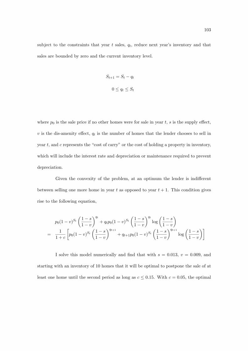
103
subject to the constraints that year t sales, qt, reduce next year’s inventory and that
sales are bounded by zero and the current inventory level.
St+1 = St ! qt
0 # qt # St
where p0 is the sale price if no other homes were for sale in year t, s is the supply e!ect,
v is the dis-amenity e!ect, qt is the number of homes that the lender chooses to sell in
year t, and c represents the “cost of carry” or the cost of holding a property in inventory,
which will include the interest rate and depreciation or maintenance required to prevent
depreciation.
Given the convexity of the problem, at an optimum the lender is indi!erent
between selling one more home in year t as opposed to year t + 1. This condition gives
rise to the following equation,
p0(1! v)St
"1! s
1! v
#qt
+ qtp0(1! v)St
"1! s
1! v
#qt
log"
1! s
1! v
#
=1
1 + c
$p0(1! v)St
"1! s
1! v
#qt+1
+ qt+1p0(1! v)St
"1! s
1! v
#qt+1
log"
1! s
1! v
#%
I solve this model numerically and find that with s = 0.013, v = 0.009, and
starting with an inventory of 10 homes that it will be optimal to postpone the sale of at
least one home until the second period as long as c # 0.15. With c = 0.05, the optimal
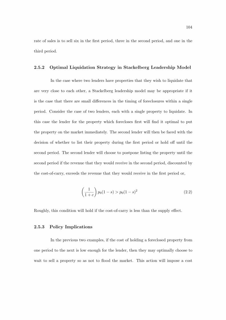
104
rate of sales is to sell six in the first period, three in the second period, and one in the
third period.
2.5.2 Optimal Liquidation Strategy in Stackelberg Leadership Model
In the case where two lenders have properties that they wish to liquidate that
are very close to each other, a Stackelberg leadership model may be appropriate if it
is the case that there are small di!erences in the timing of foreclosures within a single
period. Consider the case of two lenders, each with a single property to liquidate. In
this case the lender for the property which forecloses first will find it optimal to put
the property on the market immediately. The second lender will then be faced with the
decision of whether to list their property during the first period or hold o! until the
second period. The second lender will choose to postpone listing the property until the
second period if the revenue that they would receive in the second period, discounted by
the cost-of-carry, exceeds the revenue that they would receive in the first period or,
"1
1 + c
#p0(1! s) > p0(1! s)2 (2.2)
Roughly, this condition will hold if the cost-of-carry is less than the supply e!ect.
2.5.3 Policy Implications
In the previous two examples, if the cost of holding a foreclosed property from
one period to the next is low enough for the lender, then they may optimally choose to
wait to sell a property so as not to flood the market. This action will impose a cost

105
on residents that live near the foreclosed property which is equal to the dis-amenity
e!ect. In cases where the dollar amount of this dis-amenity e!ect summed over all
residents within 250 feet of the foreclosed property exceeds the gain that the lender
realizes by holding o! selling the property until the next period, a Pareto-improving
policy exists. The policy would be to tax the nearby residents the minimum amount
so that the government could o!er the lender an incentive payment so that they would
be in favor of selling their entire inventory of foreclosed homes in the first period rather
than carrying any of them into the second period.
2.6 Conclusion
In the face of falling housing prices and rising foreclosure rates, researchers have
sought to determine the size and geographical extent of spillover e!ects from residential
mortgage foreclosures. The main contribution of this paper is to decompose foreclosure
spillover e!ects into e!ects that are operating through two distinct mechanisms: a supply
shock mechanism and a dis-amenity mechanism.
Before decomposing the spillover e!ects of foreclosures, I replicate the results
of two recent studies: Campbell et al. [2009] and Schuetz et al. [2008]. I find very similar
results to the former study, which uses data from Massachusetts and a similar sample
period. I find that foreclosures are associated with larger discounts in the price of nearby
properties than did the latter study, but this may be due to the fact that it uses data
from New York City during the peak of its recent housing boom.
After decomposing the supply and dis-amenity e!ects, I find that the supply

106
e!ect varies with the vacancy rate of the census tract, while the dis-amenity e!ect is
fairly constant across high and low vacancy rate census tracts. In low vacancy rate
census tracts, I find that each e!ect is about -1%. However, in high vacancy rate census
tracts, the supply e!ect is about zero.
I then use my estimates to consider optimal liquidation strategies for lenders
that are in the position of having to liquidate a number of foreclosed homes in close
proximity.

107
Figure 2.1: High and Low Vacancy Rate Census Tracts

108
Figure 2.2: High and Low Vacancy Rate Census Tracts

109
Table 2.1: Relationship Between Newly Vacant Addresses and Foreclosure Auctions
Table 2.2: Descriptive Statistics of Nearby Foreclosures for SFR and Condo TransactionsMean S.D. Min Max
SFR Forcs 0! 250 ft. 0.17 0.45 0 6SFR Forcs 250! 500 ft. 0.36 0.72 0 9SFR Forcs 500! 1000 ft. 1.27 1.93 0 26
Units RO MF Forcs 0! 250 ft. 0.06 0.43 0 10Units RO MF Forcs 250! 500 ft. 0.17 0.78 0 18Units RO MF Forcs 500! 1000 ft. 0.67 2.03 0 49
Units OO MF Forcs 0! 250 ft. 0.02 0.23 0 8Units OO MF Forcs 250! 500 ft. 0.06 0.38 0 8Units OO MF Forcs 500! 1000 ft. 0.21 0.77 0 11
Condo Forcs 0! 250 ft. 0.00 0.08 0 5Condo Forcs 250! 500 ft. 0.01 0.15 0 8Condo Forcs 500! 1000 ft. 0.05 0.34 0 13
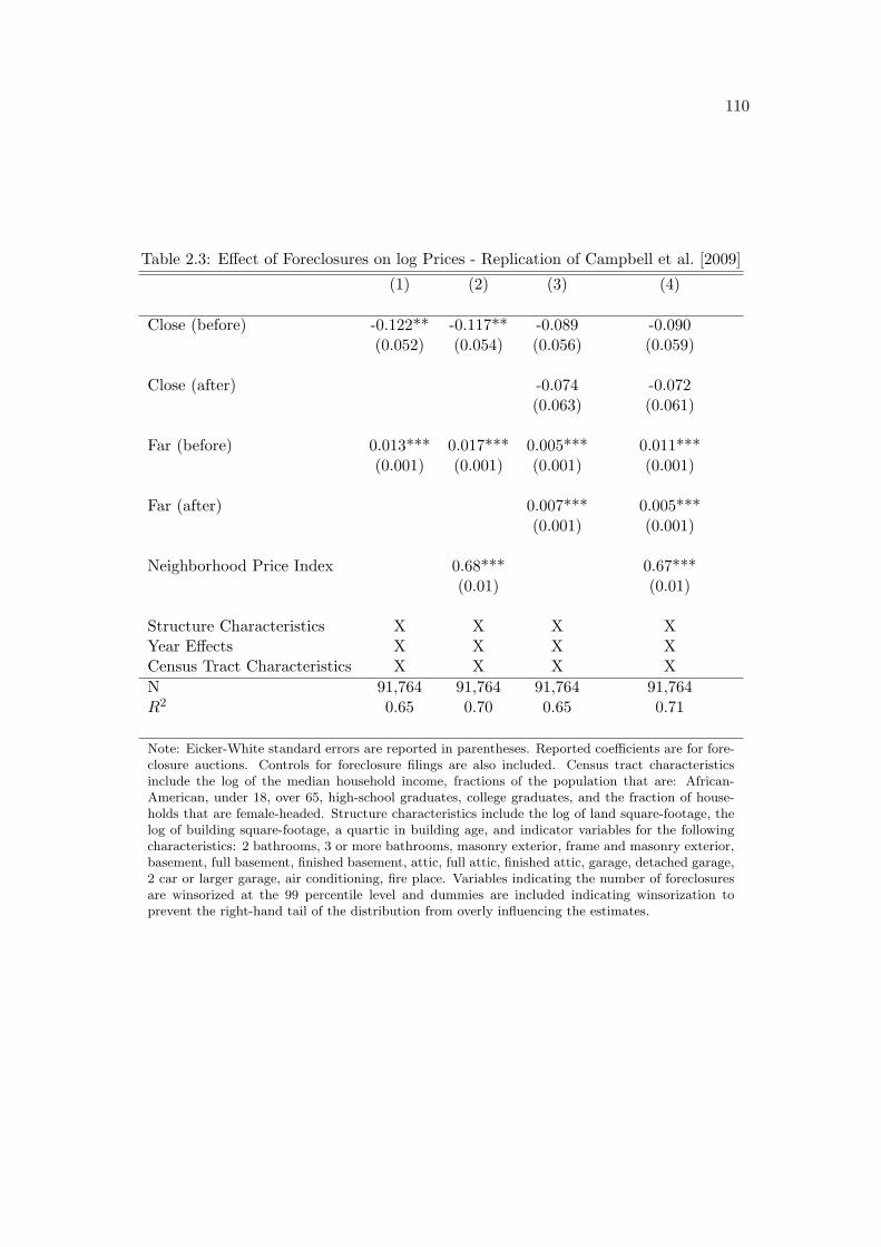
110
Table 2.3: E!ect of Foreclosures on log Prices - Replication of Campbell et al. [2009](1) (2) (3) (4)
Close (before) -0.122** -0.117** -0.089 -0.090(0.052) (0.054) (0.056) (0.059)
Close (after) -0.074 -0.072(0.063) (0.061)
Far (before) 0.013*** 0.017*** 0.005*** 0.011***(0.001) (0.001) (0.001) (0.001)
Far (after) 0.007*** 0.005***(0.001) (0.001)
Neighborhood Price Index 0.68*** 0.67***(0.01) (0.01)
Structure Characteristics X X X XYear E!ects X X X XCensus Tract Characteristics X X X XN 91,764 91,764 91,764 91,764R2 0.65 0.70 0.65 0.71
Note: Eicker-White standard errors are reported in parentheses. Reported coe"cients are for fore-closure auctions. Controls for foreclosure filings are also included. Census tract characteristicsinclude the log of the median household income, fractions of the population that are: African-American, under 18, over 65, high-school graduates, college graduates, and the fraction of house-holds that are female-headed. Structure characteristics include the log of land square-footage, thelog of building square-footage, a quartic in building age, and indicator variables for the followingcharacteristics: 2 bathrooms, 3 or more bathrooms, masonry exterior, frame and masonry exterior,basement, full basement, finished basement, attic, full attic, finished attic, garage, detached garage,2 car or larger garage, air conditioning, fire place. Variables indicating the number of foreclosuresare winsorized at the 99 percentile level and dummies are included indicating winsorization toprevent the right-hand tail of the distribution from overly influencing the estimates.

111
Table 2.4: E!ect of Any Type of Foreclosures on log Prices

112
Table 2.5: E!ect of Foreclosures on log Prices by Type and Vacancy Rate

113
Table 2.6: E!ect of Foreclosures on log Prices(1) (2) (3)
all SFR Low Vac High Vac
SFR Forcs 0! 250 ft. -0.010 -0.001 -0.003(0.009) (0.014) (0.014)
(SFR Forcs 0! 250 ft.)2 -0.005 -0.014 -0.003(0.005) (0.010) (0.006)
SFR Forcs 250! 500 ft. 0.002 0.002 0.006(0.006) (0.006) (0.010)
(SFR Forcs 250! 500 ft.)2 -0.001 -0.004 -0.001(0.003) (0.003) (0.003)
Units RO MF Forcs <= 250 ft. -0.025* -0.031 -0.028*(0.014) (0.022) (0.016)
(Units RO MF Forcs <= 250 ft.)2 0.004 0.007 0.005(0.004) (0.006) (0.004)
Units RO MF Forcs 250! 500 ft. 0.007 0.009 0.007(0.008) (0.008) (0.010)
(Units RO MF Forcs 250! 500 ft.)2 -0.002 -0.003** -0.002(0.002) (0.001) (0.002)
Structure Characteristics X X XYear x Community E!ects X X XCensus Tract E!ects X X XN 40,829 25,286 15,541R2 0.73 0.76 0.65
Note: Eicker-White standard errors are reported in parentheses. Sample limited to transactionswithin 1000 feet of a foreclosure filing or auction that occurred within the past year. Reportedcoe"cients are for foreclosure auctions. Controls for foreclosure filings are also included. Structurecharacteristics include the log of land square-footage, the log of building square-footage, a quartic inbuilding age, and indicator variables for the following characteristics: 2 bathrooms, 3 or more bath-rooms, masonry exterior, frame and masonry exterior, basement, full basement, finished basement,attic, full attic, finished attic, garage, detached garage, 2 car or larger garage, air conditioning, fireplace.

114
Chapter 3
House Price Dynamics and
Endogenous Gentrification†
3.1 Introduction
Since the pioneering work of Case and Shiller [1989] much of the literature on
housing price dynamics has focused on movements of city- or metropolitan area-level
housing price indices. To explain di!erences in the relationship between housing prices
and housing supply responses across metropolitan areas, studies have looked at factors
such as local regulations, available land and geography.1
We consider another possible explanation. Builders may be slow to respond to†This chapter is joint work with Veronica Guerrieri and Erik Hurst.1Green et al. [2005] argue that di!erences in urban form and urban land use explain di!erences
in supply elasticities of housing across cities. Quigley and Raphael [2005] find that current land useregulation explains di!erences in future price appreciation and construction activity in California. Saizconstructs a geographical constraint measure of housing supply using satellite and other data about landavailability.

115
housing demand shocks because there is a coordination problem regarding which neigh-
borhoods will gentrify next. If this is the case, home prices in di!erent neighborhoods
should appreciate by di!erent amounts when a city experiences a positive housing de-
mand shock. Specifically, some lower price neighborhoods should have more price growth
than higher priced neighborhoods. This convergence in prices will occur as amenity lev-
els change endogenously to make the formerly low price neighborhoods closer substitutes
for the high price neighborhoods.
This paper documents a stylized fact. On average, low-price neighborhoods
appreciate more during city-wide housing booms than high-price neighborhoods (price
convergence during booms). This pattern is robust across di!erent data sets, time peri-
ods, and city boundary definitions. We also find somewhat weaker evidence suggesting
that low-price neighborhoods depreciate more during busts than high-price neighbor-
hoods (price divergence during busts). We then discuss possible models that could
produce these stylized facts, and consider further implications of these models.
3.2 Data
To examine house price appreciation across neighborhoods within a city during
a city-wide housing boom, we use a variety of di!erent data sets. In particular, we use
(1) zip code level housing price indices computed as part of the Case-Shiller index, (2)
transaction level data on the universe (or near universe) of residential housing transac-
tions for Chicago, New York, Boston, and Charlotte, and (3) micro data from the 1980
and 1990 U.S. Censuses. As we show in the following section, all three data sources yield

116
similar results about how housing prices evolve within a city during a city-wide housing
price boom.
The bulk of our results use the Case-Shiller zip code-level price indices.2 The
Case-Shiller indices are calculated from data on repeat sales of single family homes. The
benefit of the Case-Shiller index is that it gets consistent constant quality price indices
for localized areas within a city or metropolitan area over long periods of time. Most of
the zip code level price indices go back in time through the late 1980s or the early 1990s.
The data were provided to us at the quarterly frequency and our most recent data are
for the fourth quarter of 2008. As a result, for each metro area, we have quarterly price
indices on selected zip codes within selected metro areas going back roughly 20 years.
There are four limitations to the Case-Shiller data. First, the Case-Shiller
index only covers approximately 30 metropolitan areas.3 Second, as noted above, the
Case-Shiller index for almost all cities does not start until the late 1980s or early 1990s.
This limits the amount of analysis we can do for cities that experienced housing price
booms in the early to mid 1980s. Third, the Case-Shiller index only covers single-family
homes (as opposed to also including condos or townhomes). To the extent that condos
and townhomes evolve di!erentially during housing price booms and to the extent that
di!erent neighborhoods have di!erent compositions of housing structures, the Case-2The zip code indices are not publicly available. Fiserv, the information company overseeing the
Case-Shiller index, provided them to us for the purpose of this research project. The data are the sameas the data provided to other researchers studying very local movements in housing prices. See, forexample, Mian and Sufi.
3We were provided with zip code level data for at least 20 zip codes at the city level or at least 65 zipcodes at the metro area level for the following cities/metropolitan areas: Atlanta, Baltimore, Boston,Charlotte, Chicago, Cincinnati, Columbus (OH), Dayton, Denver, Detroit, Hartford, Jacksonville, LasVegas, Los Angeles, Memphis, Miami, Minneapolis, New York, Orlando, Philadelphia, Phoenix, Portland(OR), Sacramento, San Bernardino, San Diego, San Francisco, San Jose, Seattle, Tampa, and WashingtonDC.

117
Shiller data could yield a biased picture of within-city house price changes. Finally,
given its focus on repeat sales of single-family homes, there are not enough data to
compute reliable price indices for all zip codes within a metropolitan area. As a result,
many zip codes - particularly those in center cities- have no reported Case-Shiller price
indices. Figure 3.1 illustrates this point. In this Figure we show the zip codes within
three cities: Chicago (panel A), New York City (panel B), and Charlotte (panel C). The
darkened zip codes on the city maps are the ones for which a Case-Shiller index exists.
Notice, that a Case-Shiller zip code index exists for less than 50 percent of the zip codes
in Chicago, less than 10 percent of the zip codes in New York City, and essentially all
of the zip codes in Charlotte.4 Notice, for New York City proper, only some zip codes
in Staten Island are included.
To overcome some of the shortcomings of the Case-Shiller zip code indices, we
supplement our analysis using data from two additional sources. First, for four cities,
we were able to get data for the universe (or near universe) of housing transactions.
The four cities were Chicago, Charlotte, New York and Boston. These data allow us
to explore whether our results change using data that include condos and townhomes
(as well as single-family homes) and allow us to examine price behavior in all zip codes
within city. As we show below, the results in these more detailed datasets mirror the
results from the Case-Shiller indices giving us confidence that these limitations of the
Case-Shiller indices are not biasing our results.4Coverage in the metro areas is much higher given that most zip codes outside the center city have
su"ciently large single-family home transactions to compute reliable price indices. The reason that zipcodes in center cities tend to have lower coverage is that most homes sales are condos or townhomeswhich are excluded from the Case-Shiller index.

118
For Chicago and Charlotte, we compiled the data on all residential real estate
transactions ourselves. Using the Chicago Tribune website, we downloaded all residential
real estate transaction data for the City of Chicago. The data we were able to download
include all residential real estate transactions from 2000 through 2008 (inclusive). We
believe this to be the universe of residential real estate transactions. We merged the data
from the Chicago Tribune on Chicago real estate transactions with information from the
Cook County Tax Assessor which included information on the age of the structure and
building type. For Charlotte, the procedure was much easier. We downloaded all real
estate transactions back to 1990 using the Mecklenburg County Real Estate Lookup
System. Like the data from the Chicago Tribune, we believe the Charlotte Deed data
to be the universe of all residential real estate transactions.
Given that we had some attributes of the structure in the Chicago data that we
merged in from the Cook County Tax Assessor, we made a simple price index for each
Chicago neighborhood. The real estate transactions in the Chicago Tribune are mapped
to Chicago neighborhoods (all within the city of Chicago). Chicago neighborhoods are
slightly smaller than Chicago zip codes. For example, there are 77 Chicago neighbor-
hoods and only 60 Chicago zip codes. In Figure 3.1, we show the Chicago neighborhood
map. We have kept the Chicago Tribune price data at the level of Chicago neighbor-
hood (instead of converting them to zip codes) so as to match our building permit data
- which is at the neighborhood level - discussed in Section 5. To make the simple price
index, we regressed all Chicago residential real estate transaction (log) price data on
dummies for building type (multi-family, single-family, or condo), dummies for the age

119
of the building (1-5 year old, 6-10, 11-20, 21-30, etc.), and dummies for neighborhood
interacted with year. The coe"cients for the neighborhood year variable were used to
make the neighborhood price indices over time.
For New York City, we use the Furman Center repeat sales index which covers
all of NYC. The Furman data use NYC community districts as their level of aggregation.5
There are 59 community districts in New York City which represent clusters of several
neighborhoods. The Furman data for New York City extend back to 1974. The benefit
of the Furman data is that they give us extensive coverage of New York neighborhoods
over a long time period and cover all residential real estate transactions in New York
City (not just single-family homes). Additionally, this is a repeat sales index measuring
the change in price for constant quality housing units. A map of the NYC community
districts can be found in panel B of Figure 3.2.
To help examine neighborhood trends within a broad set of cities during the
1980s, we augment our analysis using data from the 1980 and 1990 U.S. censuses. We
restricted our analysis of the U.S. Census data to census tracts within a metro area.
So, when we use the census data, our unit of analysis - a census tract - is much smaller
than zip code or community area. We only focus on census tracts whose boundaries
remained constant between 1980 and 1990. For each census tract within the metro area,
we computed the growth rate in median home prices. When computing the growth
rate in median house prices by census tract, we did not hedonically adjust the series
for changing housing characteristics. As a result, using these data, we can explore the5See http://furmancenter.org/.
120
changing house prices within a neighborhood that are both due to the fact that the price
of a constant quality unit of housing may be changing and due to the fact the quality of
housing in the neighborhood may be changing.
3.3 Within-City House Price Movements During Housing
Booms
In this section, we explore the nature of housing price movements within a city
or metro area during local housing price booms. We begin by exploring data from the
2000s. In separate sub-sections, we explore similar patterns within cities that experienced
housing price booms in the 1990s and then in the 1980s. The key results documented
in this section are very robust to both the use of alternate housing price series and to
alternate time periods.
3.3.1 Within-City Movements in Housing Prices: The 2000s
We begin our analysis by estimating the following relationship:
gHP
i,j
t,t+k = #jt,t+k + !j
t,t+k ln(HP i,jt ) + %i,j
t,t+k (3.1)
where HP i,jt is the level of housing prices in neighborhood i, within city (metro area)
j, in year t andg
HPi,j
t,t+k is the growth in housing prices in neighborhood i, within city
(metro area) j, between years t and t + k. We estimate these relationships separately
within each city (metro area). !jt,t+k is an estimate of the relationship between the initial

121
level of house prices (in logs) and the subsequent house price appreciation within city
(metro area) j between t and t + k. We will examine neighborhood price movements
within both cities and broader metro areas. As a result, sometimes j will index a city
and sometimes it will index the broader metro area that contains that city.
Figure 3.3 shows the estimates of (3.1) where j = Chicago (Panel A), New York
City (Panel B), and Charlotte (Panel C) over the 2000-2006 time period.6 Along with
the actual estimated regression line, we plot the underlying neighborhood data. The
house price growth data (on the y-axis) is the growth rate in the neighborhood level
house price indices (which were discussed in the previous section). The initial level of
house prices (on the x-axis) is the median house price in the neighborhood as reported
by the 2000 census.7 We chose these three metro areas to start our analysis with for
two reasons. First, as noted in the previous section, we have house price measures from
multiple sources for these three cities. Second, the cities provide a nice contrast with
each other given that the New York metro area as a whole experienced a substantial
housing price boom between 2000 and 2006 (of 93.7 percent), while the Chicago metro
area experienced a medium sized housing price boom during that period (of 47.6 percent)
and the Charlotte metro area experienced a very small housing price boom during that
period (of 8.8 percent).8
6All prices in the paper are measured in year 2000 dollars.7Figures with zip code-level observations use 2000 Census summary file (SF3) tabulations of median
value of owner-occupied housing units by zip code, which are available from http://factfinder.census.gov/. The left-most figure of Panel B also uses 2000 Census tabulations of median value of owner-occupied housing units, but these are specially tabulated for NYC community districts and are availablefrom NYC’s GIS department at http://gis.nyc.gov. Finally, the x-axis for the left-most figure of panelA simply uses the log of the previously mentioned hedonic index for Chicago community areas for theyear 2000.
8To compute the change in the metro area price indices as a whole, we use the Case-Shiller metro

122
For each of the three cities in Figure 3.3, we provide three panels that shed light
on the relationship between house price growth across neighborhoods and the initial level
of prices in the neighborhood. In the left most panel, we use our alternate data sets for
each city. For Chicago, we use the Chicago Tribune data. For New York, we use the
Furman data for Manhattan. And for Charlotte, we use the universe of deed data. In
the middle panel, we use the zip code level data from Case-Shiller. As noted above, for
New York City, the Case-Shiller data only cover some zip codes in Staten Island (see
Figure 3.1). The left and middle panels focus on only neighborhoods within the city of
Chicago, New York or Charlotte. In the right most panel, we expand our analysis to
include all the zip code data from Case-Shiller for the entire metro area.
Focusing on the Chicago panel of Figure 3.3 (Panel A), we see that both the
Chicago Tribune data and the Case-Shiller data show a large amount of convergence of
zip codes across neighborhoods within Chicago during the 2000-2006 period. Focusing
on the Tribune data (which, as discussed in the previous section, only controls for limited
property characteristics in the hedonic relationship), we find that prices of transacted
properties in the initially low priced Chicago neighborhoods grew at a rate that was 2
to 3 times higher than the prices of transacted properties in the initially high priced
Chicago neighborhoods. For example, the average transacted property grew at less
than 25 percent in Chicago’s high priced neighborhoods of Lincoln Park (community
7), Lakeview (community 6) and The Loop (community 32). Conversely, some of the
neighborhoods that had initially low price levels experienced an increase of 100 percent
area price indices.

123
for the average value of transacted property prices.
The left hand panel of Figure 3.3A also includes estimates of (3.1). The esti-
mated ! from (3.1) for Chicago using the Chicago Tribune data during the 2000-2006
period is -0.40 with a robust standard error of 0.08. In other words, a 100 percent in-
crease in the initial level of housing prices reduces the growth rate in housing prices by
40 percentage points. The simple R-squared of the scatter plot is 0.43.
The data in the left-hand panel of Figure 3.3A include the universe of transacted
properties within the city of Chicago during the 2000-2006 period. The drawback of these
data is that they are not based on repeat sales transactions. To explore the movement
of prices using a better neighborhood repeat sales price index, we use the Case-Shiller
zip code data for Chicago. As noted above, the Case-Shiller data only cover about 45
percent of Chicago’s 60 or so zip codes. Moreover, the Case-Shiller data only focus on the
price movements of single-family homes. Despite the di!erences in coverage, the results
in the middle panel of Figure 3.3A (using the Case-Shiller data) are very similar to the
results in the left panel of Figure 3.3A (using the Chicago Tribune data). A one-hundred
percent increase in initial housing prices reduces the growth rate in housing prices by 33
percentage points (with a standard error of 4 percentage points). The simple R-squared
of the scatter plot is 0.78. The right hand panel of Figure 3.3A shows the results using the
Case-Shiller zip code data for the entire Chicago metro area (as opposed to just the city
of Chicago). Again, a similar pattern emerges. High price neighborhoods experienced
lower appreciation rates than lower priced neighborhoods (! = -0.23 with a standard
error or 0.04).

124
In Figure 3.3B, similar results are shown for New York. Using the Furman
data for community districts in Manhattan (left-hand panel) or using Case-Shiller zip
codes from Staten Island (middle panel), we find that a 100 percent increase in initial
housing prices reduced the subsequent growth rate in housing prices between 2000 and
2006 by 39 percentage points or 32 percentage points, respectively. Both estimated
slope coe"cients are significant at the 1 percent level. For example, the Harlem area of
Manhattan appreciated at twice the rate of midtown Manhattan. As seen in the right
hand panel of Figure 3.3B, the results also hold broadly for the New York metro area as
a whole (! = -0.35 with a standard error of 0.02).
In Figure 3.3C, we see similar graphical representations for Charlotte. The re-
sults, however, for Charlotte are very di!erent. No matter what level of aggregation and
no matter what measure of housing prices, there is no systematic relationship between
the initial level of housing prices and the subsequent growth in housing prices. Across
the three figures, ! equals 0.07, 0.07 and 0.08 - none of which are significant at standard
levels.
Similar patterns can be found in Figure 3.4. In the top panel of Figure 3.4,
we show the convergence patterns for other metropolitan areas (using the Case-Shiller
data) that experienced large metropolitan area wide housing price increases. These
metro areas include Boston, Los Angeles, San Francisco, and Washington DC. These
pictures are analogous to the right hand panels of Figure 3.3. In every one of these
metro areas, property prices as a whole increased by at least 50 percent throughout the
metro area. Also, in every one of these metro areas, the neighborhoods with initial low

125
levels of housing prices increased by a substantially higher amount than higher price
neighborhoods. For example, the estimated !’s for Boston, L.A., San Francisco, and
Washington, D.C., were, respectively, -0.19, -0.29, -0.40, and -0.23 (all significant at the
1 percent level).
In the bottom panel of Figure 3.4, we present similar plots for metro areas that
did not experience large property price booms. These metro areas include: Atlanta,
Cincinnati, Denver, and Seattle. In none of these metro areas do we find that subsequent
local neighborhood price appreciation during the 2000-2006 period was correlated with
the initial level of property prices in that neighborhood. The estimated !’s for these
metro areas, respectively, were -0.07, 0.02, -0.01, and -0.01.
Figure 3.5 formalizes the relationship between the level of housing price growth
within the metro area as a whole and the amount of cross-neighborhood convergence
that takes place within the city. In particular, we estimate the following:
!jt,t+k = $0 + $1
gHP
j
t,t+k + )jt,t+k (3.2)
where the !j ’s are estimated for each metro area as described in (3.1) andg
HPj
t,t+k is
house price appreciation in the entire metro area j between t and t+k. When estimating
(3.2), we restrict our analysis to the 30 metro areas where we have zip code level price
indices from Case-Shiller.
Figure 3.5A shows that the larger the price increase in the metropolitan area,
the more convergence takes place within the city (the estimated metro area ! is more

126
negative). This Figure restricts the analysis to the 2000 to 2006 period. In other words,
the !’s are the same as ones estimated in Figures 3.3 and 3.4 - but for all the metro
areas in the Case-Shiller data with an adequate number of zip codes9. The figure shows
that places that experienced large price increases also had the price appreciation rates of
initially lower price neighborhoods that were much higher than the price appreciation of
initially higher priced neighborhoods. The simple correlation from the data underlying
Figure 3.5 is 0.50. The negative relationship across metro areas between the size of
house price growth in the metro area and the rate of convergence (the !’s) is highly
statistically significant ($1 = -0.37 with a bootstrapped standard error = 0.03).10
Are the results symmetric during periods of housing price declines? For the
recent episode this is hard to answer given that prices are still falling (and our data
only go through the fourth quarter of 2008). However, Figure 3.5B shows some evidence
that the results are weakly symmetric. During this time period, every metro area in our
sample experienced some decline in housing prices between 2007 and 2008. Figure 3.5B
shows the estimates from (3.2) except the time period is for house price changes 2007
to 2008. On average, places with bigger price declines for the metro area experienced a
greater divergence in housing prices between initially high and low priced neighborhoods
between 2007 and 2008 (i.e., ! was more positive). Specifically, the estimated relation-
ship between the change in house prices and the rate of convergence (!) was -0.19 with
a bootstrapped standard error of 0.04. Despite the economic and statistical significance9Our zip-code sample includes any city with at least 20 city zip codes or 65 metro area zip codes
present in the Case-Shiller data.10To compute bootstrapped standard errors we re-sample with replacement stratified by city/metro
area and then compute the second stage coe"cient. We repeat this operation 500 times.

127
of the relationship, the R-square from the regression in Figure 3.5B is low (0.09). This
may be due to the fact that we have a very short period of time where housing prices
have fallen in our data. In the subsequent sub-section, we will explore this question in
greater depth using the housing price busts that occurred in many metropolitan areas
during the 1990s.
3.3.2 Within-City Movements in Housing Prices: The 1990s
Are the patterns documented above robust to other time periods? The answer is
yes. In this sub-section, we focus on results from the 1990-1997 period.11 The early 1990s
is another good laboratory to study the movement of housing prices across neighborhoods
within a metro area given that some metro areas experienced rapidly accelerating housing
prices while others experienced non-trivial housing price declines.
Figure 3.6 shows the results of estimating (3.1) for the Denver metro area
(Panel A) and Portland, Oregon metro area (Panel B) for the 1990 - 1997 time period.
Denver and Portland both experienced very large metro area real housing price booms
during the 1990s (on the order of 30 - 40 percent). In both of these cities (the left
panels) or metro areas more broadly (the right panel), there was a sharp convergence
of property prices during the housing price boom. As with the property housing price
booms during the 2000s, the appreciation of housing prices in initially lower housing
price neighborhoods was substantially higher than the appreciation of housing prices in
initially higher housing price neighborhoods. The estimated convergence metro area !’s11We stop at 1997 because that is the beginning of subsequent housing booms that continued through
2006 in many metro areas. We wanted to focus on housing price dynamics unrelated to the currentperiod of rapidly appreciating housing prices.
128
were -0.49 and -0.35, respectively, for Denver and Portland.
Figure 3.7 reports the estimates for (3.1) for areas that experienced housing
price declines during the 1990-1997 period. The areas examined are: New York City
(city only), New York metro area, San Francisco metro area and Boston metro area.
The first uses data from the Furman Center. The latter three use the Case-Shiller data.
Within New York City (left panel), there is no evidence that housing prices started to
diverge (i.e, ! was not positive) as housing prices were falling. However, within the New
York metro area broadly, within the San Francisco metro area, and within the Boston
metro area, there again is weak evidence that housing prices started to diverge during
the housing price bust (!’s were positive). The estimated !’s were 0.07, 0.09, and 0.22,
respectively, for the New York, San Francisco, and Boston metro areas. All estimates
were significant at the 1 percent level. The results seem to indicate that in metro areas
- broadly defined - lower priced neighborhoods fell by a greater amount during the bust
period than did the higher priced neighborhoods.
Figure 3.8 is the analog to Figure 3.5 in that it shows the results from spec-
ification (3.2) for the 1990-1997 time period using the 30 metro areas for which we
have Case-Shiller data. The results are striking. Just as in the 2000-2006 period, the
amount of convergence (divergence) is positively related to the size of the housing price
increases (declines). Areas such as Denver and Portland had big price increases and
sizeable convergence while areas such as Chicago, Atlanta, and Minneapolis had little
price appreciation or depreciation and little convergence or divergence. Areas like San
Bernardino, L.A., and San Diego had sizeable price declines and some divergence. The

129
R-squared of the scatter plot of change in house prices against the estimated ! was 0.61
with the estimated $ being -0.48 (with a bootstrapped standard error of 0.03).
3.3.3 Within-City Movements in Housing Prices: The 1980s
For our last set of results, we examine property price movements across neigh-
borhoods within various metro areas during the 1980s. Given that our Case-Shiller data
do not exist for many metropolitan areas prior to 1987, we will primarily use data from
the U.S. Census to examine the robustness of our fact during the 1980s.
We start by focusing on New York and Boston - two cities that experienced
substantial housing price booms during the 1980s. Average real housing prices increased
in these two cities between 1984 and 1989 by well over fifty percent. In the left panel of
Figure 3.9, we show the estimates from (3.1) for New York using the Furman data for
the period 1984-1989. In the middle panel, we show the estimates from (3.1) for Boston
using the Case-Shiller data for the period 1984-1989. The Boston metro area was one
of the few metro areas where Case-Shiller data existed throughout the entire 1980s. In
the last panel, we show the data from the U.S. Census - by census tract - for the city
of Boston during the 1980 - 1990 period. What we plot in the right-most panel is just
the raw change in median house price by census tract between 1980 and 1990. Like the
results for the 1990s and 2000s, New York and Boston saw sharp convergence in housing
prices across neighborhoods during their 1980s property price booms. The estimated !’s
from the three panels are -0.38, -0.13, and -1.43, respectively. All convergence estimates
are significant at the 1 percent level. Given that the Census data are not holding the
130
quality of the housing stock constant in the price estimates, the magnitude of the housing
price increases is much greater. That is why the estimated ! from the Census data is so
much higher than the estimated !’s from the other two specifications.
In Figure 3.10, we estimate (3.2) using the Census data for the 1980-1990
period. Our unit of analysis is any metro area that had at least 50 distinct census tracts
in the first stage regression where we estimated the !’s.12 There were 41 such metro
areas that met our definition. As with the results in Figures 3.5 and 3.8, those metro
areas that experienced large property price increases between 1980 and 1990 experience
substantial convergence in house prices across neighborhoods within the MSA during
that same time period.
3.3.4 Summary of Fact
In this section we have shown a very robust statistical relationship between
area wide changes in house prices and the amount of convergence or divergence that
takes place across neighborhoods in that area. Specifically, when a local area (either
city or metro area) experiences a large property price increase, there is substantial con-
vergence in house prices across neighborhoods. During the housing price boom, it is
the initially lower house price neighborhoods that experience substantially higher rates
of appreciation compared to the higher priced neighborhoods. This fact is found with
cities/metro areas in the 1980s, 1990s, and 2000s and is robust to using many di!erent
types of price indices to measure changes in prices within neighborhoods. Lastly, there12When ensuring that there were 50 distinct census tracts in the metro area, we restricted our analysis
to only those census tracts whose boundaries remained intact between 1980 and 1990 and where theCensus actually reported a median home price for the district in both 1980 and 1990.

131
is some evidence that the results are symmetric. When a local area experiences a period
of property price declines, there is a divergence in house prices across neighborhoods
within the area.
3.4 Economic Models that Explain Price Growth Di!er-
ences Across Neighborhoods
Before examining the empirical evidence regarding neighborhood housing price
growth during city-wide booms and busts, we consider which types of models might
yield predictions that are either consistent or inconsistent with the data. If the model
is to yield predictions about relative price growth of low- and high-price neighborhoods
during a demand shock, we must start with a reason why neighborhoods start out as
low- or high-price. One possibility of a very simple model that yields this result is to
assume that people derive utility from living near other people. In such an agglomeration
economy, an equilibrium will consist of a focal point where people are bunched together
most densely and home prices are highest. Bid-rent curves will then fall as density falls
with distance from the focal point. A demand shock will raise prices everywhere. The
low-price neighborhoods farthest from the center will show the highest price growth
since they are starting from the lowest base. In this simple model di!erent sized demand
shocks will generate di!erent rates of convergence. Also, negative demand shocks will
result in divergence, more negative growth rates for the low-price neighborhoods than
for the high-price neighborhoods.
132
Another possible starting point for explaning the existence of initial price dif-
ferences in neighborhoods is that there are multiple types of households and utility is a
function of the composition of household types in the neighborhood. Becker and Murphy
[2003] analyze a particular form of that model in which there are two types of households,
denoted H and L. They assume that utility for the H type is an increasing function of
the share of H’s in the neighborhood. They assume two neigborhoods A and B, with
di!erent amenities. They show that if each neighborhood has the same number of units
and there are the same number of each type of household, that only a fully segregating
equilibrium exists. Furthermore, even slight di!erences in the willingness to pay for
amenities between the types H and L can lead to large di!erences in housing prices
between the two neighborhoods.
One possible way to extend the model presented in Becker and Murphy [2003]
that could yield testable implications regarding relative neighborhood housing price
growth rates in response to city-wide demand shocks is to integrate it with the mono-
centric city model of Alonso [1974], Mills [1967], Mills [1972], and Muth [1969]. The
most straightforward way to do this is to assume that commuting time increases with
distance from the central business district (CBD), and that the type H represents a high
productivity worker and thus values the amenity of a short commute more than the L
type. Under these conditions, we would expect to see a segregated equilibrium, where
all the H types located close to the central business district and all the L located farther
away. If commuting time increased continuously with distance from the central business
district, then we would expect continuously decreasing bid-rent curves out to the point

133
where the last H types live. At that point the bid rent curve would drop discontinuously,
as the L types do not get as much utility from living near H types, and they would bid
less to live at the same distance as the last H type at the boundary. In this way, we
begin with a model in which there are high-price (where H’s live) and low-price (where
L’s live) neighborhoods. Also, it should be noted that the amenity that is valued more
by the H’s does not have to be proximity to the central business district, it could instead
be proximity to some other amenity such as a neighborhood with good restaurants or
nightlife.
Next we consider what happens to the bid-rent curve when an influx of H
types move to the city. Several things occur. First, the bid-rent curves in the H type
neighborhood will increase. Second, the boundary between the H and L type neigh-
borhoods will shift farther out from the central business district. Third, if there is an
imposed boundary to the city, the bid-rent function for the L type neighborhoods will
also increase. If there is no boundary, then the city-size may increase, annexing nearby
farmland, and the bid-rent function for the L type neighborhoods would not necessarily
have to increase. Whether we will expect to see low-price neighborhoods converge to or
diverge from the price-levels of the high-price neighborhoods depends on the degree to
which the H type / L type boundary shifts out. If the boundary shifts out a lot, then
a number of formerly low-price neighborhoods will become the lowest of the high-price
neighborhoods as their bid-rent functions switch from being driven by the L types to
being driven by the H types. In this case, we will see convergence. On the other hand,
if the boundary does not move much, the bid-rent curve for the former high-price neigh-

134
borhood will simply be bid up causing the price gap to increase; thus the high-price
neighborhood will diverge from the low-price neighborhoods. The degree to which the
boundary moves is governed by the degree to which proximity to the central business
district is valued by the H types and the size of the demand shock. Similar forces govern
the degree to which the boundary moves inward during a negative demand shock, and
thus the degree of divergence that will occur.
3.5 Additional Empirical Evidence
While both of the models outlined above yield results consistent with the con-
vergence of low-price neighborhoods to high-price neighborhoods during positive demand
shocks and divergence of low-price neighborhoods away from high-price neighborhoods
during negative demand shocks, the models have di!erent implications regarding the
spatial patterns of housing price changes during housing price booms and the reason
that housing prices change so dramatically in lower priced neighborhoods. In this sec-
tion, we examine the empirical validity of these predictions. We start by exploring the
geographic location of the housing price changes. In particular, we ask whether poor
neighborhoods next to rich neighborhoods were more likely to experience house price in-
creases. In the last part of this section, we bring in new data on neighborhood building
patterns to explore whether we see more building in the gentrifying neighborhoods. The
results in this section o!er strong support of the model outlined in the previous section.
Large increases in housing demand within a local area induce poorer neighborhoods that
neighbor richer neighborhoods to gentrify.

135
3.5.1 The Spatial Patterns of Price Movements
The top panel of Figure 3.11 shows a map of the neighborhoods within the
city of Chicago. The underlying map is the same as Panel A of Figure 3.1 (discussed
above). Using the complete data from the Chicago Tribune, we identify two types of
neighborhoods within the city of Chicago. The first set of neighborhoods are the high
property price neighborhoods in year 2000. Specifically, these neighborhoods are in the
top quartile of all Chicago neighborhoods with respect to average housing prices in year
2000 (as measured by the 2000 U.S. Census). These high initial priced neighborhoods are
indexed in Panel A of Figure 3.11 with darker shading. The second set of neighborhoods
includes those neighborhoods that experienced the highest growth in property prices
between 2000 and 2006 (as measured by our Chicago Tribune Price Index). Again, we
highlight only those neighborhoods in the top quartile of all Chicago neighborhoods with
respect to the growth in property prices. In Figure 3.11, these neighborhoods are shaded
grey. There is no overlap between these two groups.
The results in Panel A of Figure 3.11 show the spatial analog to the results
shown in Panel A of Figure 3.3. In this Figure, we show that the areas that grew fastest
in Chicago were the poor neighborhoods that directly neighbored the initially rich neigh-
borhoods. This is exactly what was predicted in the spatial equilibrium model discussed
above. During the property price boom of the early 2000s, the rich neighborhoods of
Chicago expanded outwards (to the west and the south). Notice, the extreme south side
of Chicago (South Deering, East Side, Hegewisch, and Riverdale) did not grow as fast
as the neighborhoods directly to the west and south of the initially high priced areas.
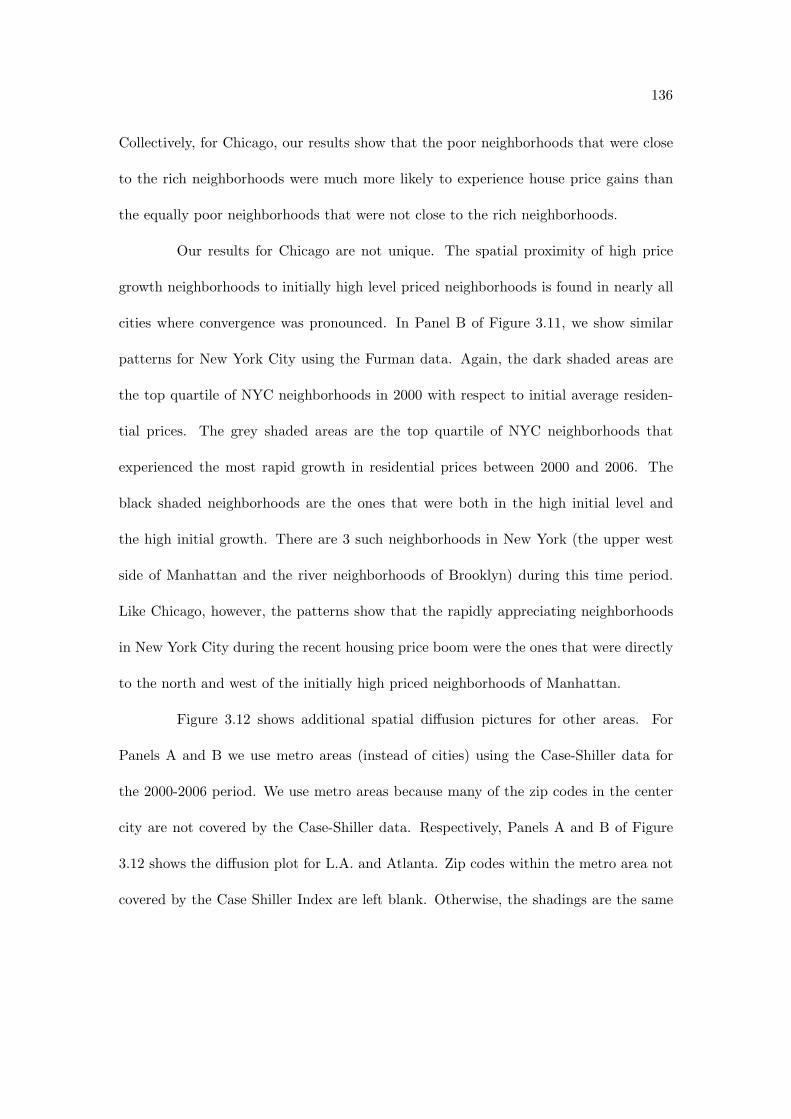
136
Collectively, for Chicago, our results show that the poor neighborhoods that were close
to the rich neighborhoods were much more likely to experience house price gains than
the equally poor neighborhoods that were not close to the rich neighborhoods.
Our results for Chicago are not unique. The spatial proximity of high price
growth neighborhoods to initially high level priced neighborhoods is found in nearly all
cities where convergence was pronounced. In Panel B of Figure 3.11, we show similar
patterns for New York City using the Furman data. Again, the dark shaded areas are
the top quartile of NYC neighborhoods in 2000 with respect to initial average residen-
tial prices. The grey shaded areas are the top quartile of NYC neighborhoods that
experienced the most rapid growth in residential prices between 2000 and 2006. The
black shaded neighborhoods are the ones that were both in the high initial level and
the high initial growth. There are 3 such neighborhoods in New York (the upper west
side of Manhattan and the river neighborhoods of Brooklyn) during this time period.
Like Chicago, however, the patterns show that the rapidly appreciating neighborhoods
in New York City during the recent housing price boom were the ones that were directly
to the north and west of the initially high priced neighborhoods of Manhattan.
Figure 3.12 shows additional spatial di!usion pictures for other areas. For
Panels A and B we use metro areas (instead of cities) using the Case-Shiller data for
the 2000-2006 period. We use metro areas because many of the zip codes in the center
city are not covered by the Case-Shiller data. Respectively, Panels A and B of Figure
3.12 shows the di!usion plot for L.A. and Atlanta. Zip codes within the metro area not
covered by the Case Shiller Index are left blank. Otherwise, the shadings are the same

137
as above. The dark shaded areas are the zip codes within the top quartile of the highest
level of prices in 2000. The grey areas are the neighborhoods within the top quartile of
housing price growth between 2000 and 2006. The black areas are the neighborhoods
that are both in the highest level and which experience the highest growth. Panel C
shows the same convergence patterns for New York during the 1984-1989 period using
the Furman data. The spatial patterns are consistent across all areas. Collectively, the
results show that the growth in prices is highly correlated spatially as predicted by the
model. The areas that grew the fastest were the poorer neighborhoods that initially
bordered the rich neighborhoods.
3.5.2 Building Within Gentrifying Areas
In our last empirical sub-section, we explore building patterns within gentrify-
ing neighborhoods. There is no systematic collection of building behavior at the neigh-
borhood level across multiple cities for a long time period. As a result, in this sub-section,
we restrict are analysis to the neighborhoods within Chicago during the 1993-2004 pe-
riod. We use this time period because the city of Chicago maintained a database with
all Chicago building permits issued during that time period. For each permit in the
database, it was recorded whether or not the permit was for residential property (as op-
posed to non-residential). For residential properties, the number of units in the proposed
building was also tracked. Lastly, we only focus on permits for “new construction”. At
this point we ignore all permits for additions, alterations, and repairs. Each permit is
associated with an address. We use the addresses to map the permits into the 77 Chicago

138
neighborhoods. (These are the same neighborhoods as shown in Panel A of Figure 3.1).
Using the permit data, we make measures of gross building activity within each
neighborhood for each year. The gross number of units added to a neighborhood in each
year is defined as the total units planned to be built from permits issued in a given year
using the information from the “new construction permits”.13
In Figure 3.13, we show the building patterns across three groups of Chicago
neighborhoods for the 1993 - 2004 period. The three groups of neighborhoods are the
same as the three groups of neighborhoods discussed in Panel A of Figure 3.11: the high
initial price neighborhoods in 2000, the high growth neighborhoods between 2000 and
2006, and all other neighborhoods. Panels A and B focus on the gross building behavior
within these groups of neighborhoods. In Panel A, we show the actual gross number of
units built in each of the three neighborhood groups during each year. In Panel B, we
show the share of units built in each year for the three di!erent neighborhoods. The
solid line is for the initially high priced neighborhoods, the long dashed line is for the
high growth neighborhoods and the dotted line is for the other neighborhoods. For
example, in 1993, roughly 900 new units were added to the high priced region while only
roughly 250 and 500 new units were added to the high growth and other neighborhoods
respectively. As seen from Panel B, of all new units built in 1993, 47 percent were built
in the high price neighborhoods, 21 percent were built in the high growth neighborhoods,13For ease of exposition, we are going to refer to the amount of planned units built from the permit
data as being actual building behavior. We are well aware of the possibility that not all buildingpermits will be executed. However, such di!erences between building permits and actual constructionare typically small. For example, for the U.S. as a whole between the 1999 and 2004 period, the U.S.Census Bureau estimated that 97.5 percent of all residential building permits resulted in a housing start(i.e., construction started) and 94 percent of permits resulted in a housing completion (i.e., constructionwas completed). See http://www.census.gov/const/www/nrcdatarelationships.html for more details.

139
and 32 percent were built in the other neighborhoods.
Throughout the entire time period, most of the gross addition of units in
Chicago occurred within the initially high priced neighborhoods. However, as seen from
Panel B, there was a rapid shift in the building patterns within the City of Chicago
between 2000 and 2004. In the high growth neighborhoods, the share of units built went
from roughly 15 percent (in 2000) to over 30 percent (in 2004). As these neighborhoods
experienced rapid price increases, these neighborhoods experienced gross additions to
their housing stock.
3.6 Discussion
The model and empirical results have implications for four related literatures.
In this section, we briefly discuss the relationship of our results to these literatures. In
the first sub-section, we discuss how our model di!ers from many of the existing spatial
equilibrium and residential sorting models. Second, we discuss how our results augment
the existing literature on why housing prices evolve di!erentially across metropolitan
areas at both high and low frequencies. Third, we discuss how our results add to the
existing work on neighborhood gentrification. Lastly, we review some existing papers
that examine within-city house price movements.
3.6.1 Spatial Equilibrium Models
Our paper adds to the extensive literature on spatial equilibriums. One of the
key tenets of the spatial equilibrium models is that individuals are going to be ex-ante

140
indi!erent between living in di!erent areas. This literature states that housing prices
in a given area account for the relative costs and benefits of living within that area.
The benefits of living in a given area include both the access to jobs that pay a given
distribution of wages and the positive amenities associated with the area. The costs of
living within an area include both the time spent commuting and any potential negative
amenities associated with the area. Housing prices adjust to equate the cost and benefits
of living in di!erent areas.14
Alonso [1974], Mills [1967] and Muth [1969] discuss models to explain housing
price di!erentials within a given metropolitan area. These models hold the distribution
of wages constant and focus on the trade-o! between transportation costs (measured in
distance to the center city business district) and house prices. In this model, housing
prices decline as distance to the center city increases. The model assumes that outer
suburbs will have lower housing prices than the housing prices in the center business
district. There is robust empirical evidence for this finding (Glaeser 2007).
Research by Rosen [1979] and Roback [1982] sets out to explain price di!eren-
tials across metropolitan areas. Places are distinguished by the amenities they provide
and by the wages paid to workers. In high amenity places (places that are warm, for
example), wages are low or housing prices are high.
Becker and Murphy [2003] set out to explain house prices and residential sorting
patterns across neighborhoods within a city.15 In this paper, one of the “amenities” is
endogenous. As found in our model, there is an externality generated when individuals14See Glaeser et al. for a thorough survey of this literature.15A similar mechanism was highlighted by Bailey (1959).

141
live around high income individuals. The existence of such preferences can result in two
neighborhoods with the exact same access to jobs, the exact same commuting costs, and
the exact same natural amenities having dramatically di!erent property price levels. If
an equilibrium occurs where rich people sort with other rich people, the willingness to
pay by the marginal resident for the rich neighborhood will be higher than for the poor
neighborhood.
3.6.2 Local Barriers to Housing Price Adjustment
Given recent housing price dynamics, there has been a renewed interest in
understanding why house prices cycle and why the size of the cycle di!ers across di!erent
locations. As seen from Figure 3.5, there were large di!erences in the extent of housing
price increases across metropolitan areas during the 2000-2006 period. A prominent
explanation for why housing prices increased more in one area relative to another for
a similar sized demand shock is that di!erent areas have di!erent short-to-medium run
housing supply elasticities. In areas where supply can adjust easily, the e!ect of demand
shocks on prices are mitigated via increased building. In areas where it is harder or
more costly to adjust supply, increased demand shocks will raise the equilibrium price of
housing. If long run housing supply elasticities are bigger than short run housing supply
elasticities, an increase in housing demand followed by the subsequent housing supply
adjustment will lead to equilibrium housing price cycles.16
What are the short run supply constraints and why do they di!er across loca-16For a formalization of these concepts, see Topel and Rosen [1988] and Glaeser et al..
142
tions? Through a series of papers, Glaeser shows that strict regulations on new building
are an important deterrent to housing supply adjustments (see, for example, Glaeser
and Gyourko [2003], Glaeser et al. [2005b], and Glaeser and Ward [2009]). In a recent
paper, Saiz shows that water barriers and the steepness of land gradients, in addition
to regulation, serve as binding barriers to the adjustment of housing supply. Gyourko
(2008) provides a detailed survey of barriers to supply adjustment.
3.6.3 Neighborhood Gentrification
There is a large literature discussing the gentrification of urban areas. Recent
work has discussed the role of the following in explaining gentrification: the increased
consumption benefits from living in a city (Glaeser et al. [2001]), the age of a city’s
housing stock (Rosenthal [2008] and Brueckner et al.) and direct public policy initiatives
via community redevelopment programs (Busso et al.).17
Despite the broad literature on gentrification, very little work emphasizes the
importance of spatial dependence - either theoretically or empirically - in predicting
the spatial patterns of gentrification. There are two notable exceptions. Brueckner
[1977] finds that urban neighborhoods in the 1960s that were in close proximity to
rich neighborhoods got relatively poorer between the 1960-1970 period (as measured by
income growth). Conversely, Kolko finds the opposite pattern. Kolko finds that 1990
neighborhoods bordering richer neighborhoods grew faster between 1990 and 2000 than
1990 neighborhoods bordering poorer neighborhoods.17For a recent survey of the theoretical and empirical work on gentrification, see Kolko.

143
Our model reconciles both of these results. During periods of declining housing
demand in urban areas (as in the suburbanization movement during the 1960s), neigh-
borhoods within an urban area will diverge - with the divergence being most pronounced
for the areas neighboring the high priced areas. Conversely, during urban renewals (as
is what was witnessed during the 1990s), neighborhoods within the urban area will con-
verge - with the convergence being most pronounced for areas neighboring the high priced
areas. In short, our model makes very specific predictions about the spatial patterns
of gentrification when urban centers are faced with either positive or negative housing
demand shocks.
3.6.4 Within-City Price Movements
Very few existing studies have examined within-city (or metropolitan area)
price movements. Of those that exist, most perform their within-city analysis by com-
paring the appreciation rates of “high end” properties to the appreciation rate of “low
end” properties. Moreover, these studies are more case-study in nature in that they tend
to focus their analysis on a given market (or a very small set of markets) during a given
time period. For example, Mayer [1993] and Poterba [1991] both examined the di!eren-
tial price appreciation rates for high end and low end properties within Oakland, Dallas,
Chicago, and Atlanta between 1970 and the mid 1980s. Similar analyses were done by
Case and Shiller (1994) who examined price movements of initially high end and initially
low end properties within Boston and Los Angeles during the early 1980s through the
early 1990s. Smith and Tesarek (1991), likewise, examined price movements of di!erent

144
property types within Houston during the 1970s and 1980s. The results across these
studies are mixed. For example, Smith and Tesarek [1991] find that the prices of high
quality homes appreciated faster during the Houston property price boom. Similarly,
Case and Shiller [1994] found that high end properties appreciated more in Los Angeles
during the 1980s. However, in that same paper, Case and Shiller found that high end
properties appreciated less in Boston during the 1980s.
Two recent papers look at di!erences in house price appreciation across zip
codes or cities within a metropolitan area. Both these papers, again, focus on a few
cities during a given time period. For example Case and Mayer [1996] look at di!erential
movements in prices within cities of the Boston metro area between 1982 and 1992 while
Case and Marynchenko [2002] look at di!erential trends in prices across di!erent zip
codes within the Boston, Chicago, and Los Angeles metro areas during the 1983 to 1993
period. Again, across the locations, no systematic relationship appears.
In another recent paper Mian and Sufi look at di!erential price movements
across zip codes within a given metropolitan area. The goal of that paper is to ask
why there was such an extension of credit to subprime borrowers during the 2000-2006
period and to ask whether such extension of credit was directly related to the subsequent
increase in mortgage defaults. At the end of their paper, Mian and Sufi document that
housing prices in neighborhoods that had a large amount of subprime borrowers in 1996
appreciated faster during the 2000-2006 period than did housing prices in neighborhoods
that had few subprime borrowers in 1996. Although they did not cast it this way, their
results for the 2000-2006 period are related to ours given that some of the low initial

145
priced/high growth rate neighborhoods that we focus on are also the ones with a larger
amount of poor households initially who could have been subprime borrowers in 1996.
Mian and Sufi attributed the di!erential price movements as being strong ev-
idence that the housing demand shock experienced during the 2000-2006 period was
larger for poorer (sub-prime) households than it was for richer households. As poor
households suddenly received access to credit, they bid up the price of properties in
poorer neighborhoods (where they lived) relative to rich neighborhoods. Our paper of-
fers no evidence one way or another about whether the poor (sub-prime) households
increased their demand for housing during the recent time period more than richer (non
sub-prime) households. However, our paper does strongly suggest that di!erent price
movements between rich and poor neighborhoods cannot - by themselves - be used as
evidence that demand shocks are di!erentially bigger for rich and poor households. In
terms of our model, we show that even in a world with a common housing demand shock
(across people with di!erent incomes), initially poor neighborhoods will appreciate at a
higher rate as richer households expand out of their original neighborhoods into newer
neighborhoods. As evidence of this, we find the same patterns of convergence during a
city wide housing boom during the 1980s and the early 1990s when there was no system-
atic story (such as increased lending to the poor) that implied that the demand shock
for housing was bigger for the poor relative to the rich. Our conclusions are further
bolstered during the 2000 - 2006 period by both the spatial nature of the neighborhoods
that appreciated (shown in Figure 3.11 and Figure 3.12) and the evidence of building
that we documented in Section 5 (shown in Figure 3.13).

146
Our results expand on the above literature by analyzing collectively within-
city di!erences in price movement between initially high priced and initially low priced
neighborhoods. We do this for many cities and for many time periods. Moreover, we
show that the extent to which convergence (or divergence) occurs across neighborhoods
within a city is related to the size of the property price boom (or bust) experienced
within the city/metro area as a whole. In addition to providing a systematic overview
of within city property price movements, we o!er a spatial equilibrium model to explain
those patterns and then show additional evidence supporting the model.
3.7 Conclusion
This paper documents a stylized fact. On average, low-price neighborhoods
appreciate more during city-wide housing booms than high-price neighborhoods (price
convergence during booms). This pattern is robust across di!erent data sets, time peri-
ods, and city boundary definitions. We also find somewhat weaker evidence suggesting
that low-price neighborhoods depreciate more during busts than high-price neighbor-
hoods (price divergence during busts). We then discuss possible models that could
produce these stylized facts, and condsider further implications of these models.

147
A: Chicago
B: New York City
C: Charlotte
Figure 3.1: Shaded Zipcodes are Covered by Case-Shiller Indices in 2005

148
A: Chicago
B: New York City
Figure 3.2: Chicago Community Areas and NYC Community Districts

149
A: Chicago
B: New York
C: Charlotte
Figure 3.3: Convergence or lack of: 2000-2006
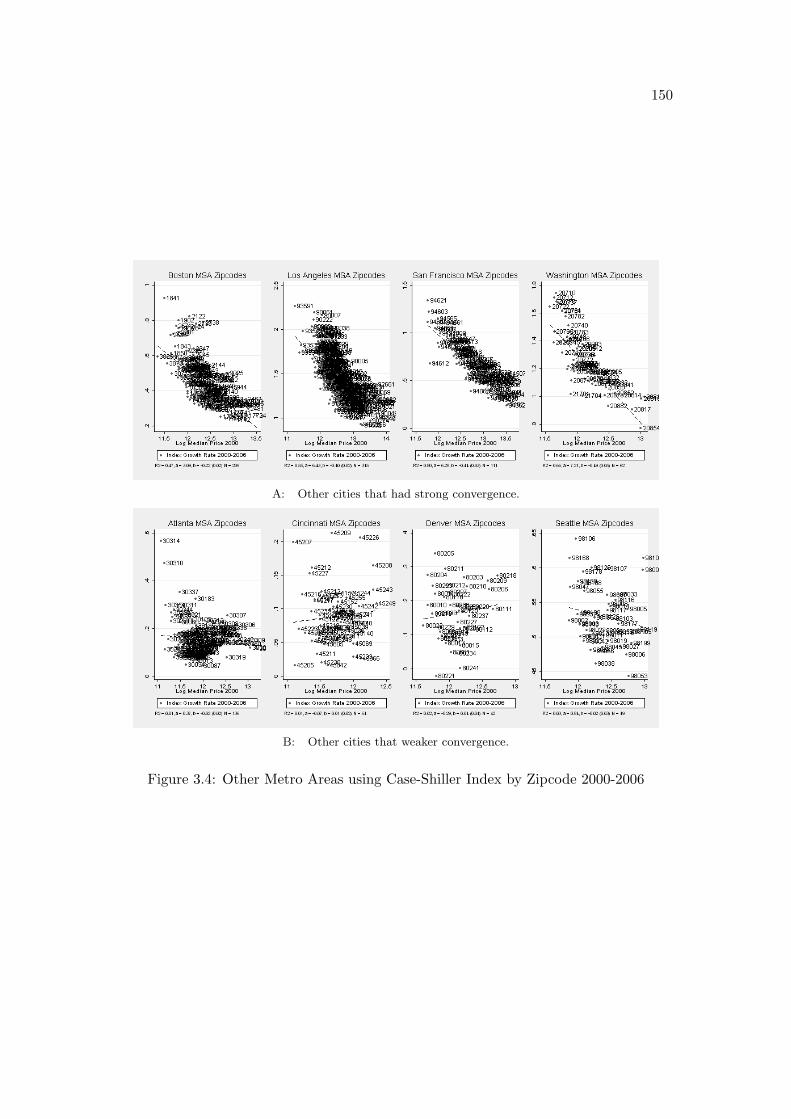
150
A: Other cities that had strong convergence.
B: Other cities that weaker convergence.
Figure 3.4: Other Metro Areas using Case-Shiller Index by Zipcode 2000-2006

151
A: Beta vs. Growth 2000-2006
B: Beta vs. Growth 2007-2008
Figure 3.5: Summary Plots Showing Convergence and Divergence

152
A: Denver
B: Portland
Figure 3.6: Convergence 1990-1997

153
Figure 3.7: Divergence 1990-1997
Figure 3.8: Summary of Convergence and Divergence 1990-1997

154
Figure 3.9: Convergence 1984-1989
Figure 3.10: Covergence in the 1980’s

155
A: Chicago City
B: New York City
Figure 3.11: Di!usion Maps: dark shaded areas are high price in 2000, light shaded aresare high growth 2000 - 2006, black regions are both.
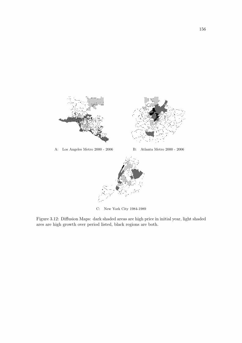
156
A: Los Angeles Metro 2000 - 2006 B: Atlanta Metro 2000 - 2006
C: New York City 1984-1989
Figure 3.12: Di!usion Maps: dark shaded areas are high price in initial year, light shadedares are high growth over period listed, black regions are both.

157
A: New Units
B: New Units
Figure 3.13: Supply Response: Top Price Quartile 2000, Top Growth Quartile 2000-2006,and all Other Community Areas

158
Bibliography
W. Alonso. Location and Land Use. Harvard Univ. Press, 1974.
Batrick Bayer, Randi Hjalmarsson, and David Pozen. Building Criminal Capital Behind
Bars: Peer E!ect in Juvenile Corrections. The Quarterly Journal of Economics, 2008.
G.S. Becker and K.M. Murphy. Social Economics: Market Behavior in a Social Envi-
ronment. Harvard University Press, 2003.
Carolyn Rebecca Block, Richard L. Block, and the Illinois Criminal Justice Information
Authority. Homicides in Chicago, 1965-1995. Computer File, 1998. Distributed by:
Inter-university Consortium for Political and Social Research.
Devereux Bowly, Jr. The Poorhouse: Subsidized Housing in Chicago. Southern Illinois
University Press, 1978.
J. Brueckner. The Determinants of Residential Succession. Journal of Urban Economics,
4(1):45–59, 1977.
J.K. Brueckner, S.S. Rosenthal, and P. Str. Gentrification and Neighborhood Housing
Cycles: Will America’s Future Downtowns be Rich?

159
M. Busso, P. Kline, E. Engel, and R. Fischer. Do Local Economic Development Programs
Work? Evidence from the Federal Empowerment Zone Program.
Matias Busso and Patrick Kline. Do Economic Development Programs Work? Evidence
from the Federal Empowerment Zone Program. 2007.
Charles W. Calomiris, Stanley D. Longhofer, and William Miles. The Foreclosure-
Housing Price Nexus: Lessons from the 2007-2008 Housing Turmoil. 2008.
John Y. Campbell, Stefano Giglio, and Parag Pathak. Forced Sales and House Prices.
2009.
David Card, Alexandre Mas, and Jesse Rothstein. Tipping and The Dynamics of Seg-
regation. The Quarterly Journal of Economics, pages 177–218, 2008.
Anne C. Case and Lawrence F. Katz. The Company You Keep: The E!ects of Family
and Neighborhood on Disadvantaged Youths. NBER Working Paper 3705, 1991.
Karl E. Case and Robert J. Shiller. The E"ciency of the Market for Single Family
Homes. The American Economic Review, 79:125–137, 1989.
K.E. Case and M. Marynchenko. Home Price Appreciation in Low-and Moderate-Income
Markets. Low-income homeownership: Examining the unexamined goal, pages 239–
256, 2002.
K.E. Case and C.J. Mayer. Housing Price Dynamics within a Metropolitan Area. Re-
gional Science and Urban Economics, 26(3-4):387–407, 1996.

160
K.E. Case and R.J. Shiller. A Decade of Boom and Bust in the Prices of Single-Family
Homes: Boston and Los Angeles, 1983 to 1993. New England Economic Review, pages
40–40, 1994.
Kenneth Y. Chay and Michael Greenstone. Does Air Quality Matter? Evidence from
the Housing Market. The Journal of Political Economy, 113(2):376–424, 2005.
Julie Berry Cullen and Steven D. Levitt. Crime, Urban Flight, and the Consequences
for Cities. Review of Economics and Statistics, 81(2):159–69, 1999.
Janet Currie and Aaron Yelowitz. Are Public Housing Projects Good for Kids? The
Journal of Public Economics, 75(1):99–124, 2000.
Scott Freeman, Je!rey Grogger, and Jon Sonstelie. Spatial Concentration of Crime. The
Journal of Urban Economics, 40:216–231, 1996.
Steve Gibbons. The Costs of Urban Property Crime. The Economic Journal, 114(449):
F441–63, 2004.
Edward L. Glaeser and Joseph Gyourko. Urban Decline and Durable Housing. The
Journal of Political Economy, 113(2):345–75, 2005.
Edward L. Glaeser, Bruce Sacerdote, and Jose A. Scheinkman. Crime and Social Inter-
actions. The Quarterly Journal of Economics, 111(2):507–48, 1996.
E.L. Glaeser and J. Gyourko. The Impact of Building Restrictions on Housing A!ord-
ability. Economic Policy Review, 9(2), 2003.

161
E.L. Glaeser and B.A. Ward. The Causes and Consequences of Land Use Regulation:
Evidence from Greater Boston. Journal of Urban Economics, 65(3):265–278, 2009.
E.L. Glaeser, J. Gyourko, and L. Center. Housing dynamics.
E.L. Glaeser, J. Kolko, and A. Saiz. Consumer City. Journal of Economic Geography, 1
(1):27, 2001.
E.L. Glaeser, J. Gyourko, and R. Saks. Why Is Manhattan So Expensive? Regulation
and the Rise in Housing Prices*. The Journal of Law and Economics, 48(2):331–369,
2005a.
E.L. Glaeser, J. Gyourko, and R.E. Saks. Why Have Housing Prices Gone Up? American
Economic Review, 95(2):329–333, 2005b.
E.L. Glaeser, J. Gyourko, and A. Saiz. Housing Supply and Housing Bubbles. Journal
of Urban Economics, 2008.
Edward G. Goetz. Housing Dispersal Programs. Journal of Planning Literature, 18(3):
3–16, 2003.
R.K. Green, S. Malpezzi, and S.K. Mayo. Metropolitan-Specific Estimates of the Price
Elasticity of Supply of Housing, and their Sources. American Economic Review, pages
334–339, 2005.
John Hagedorn and Brigid Rauch. Housing, Gangs, and Homicide: What We Can Learn
from Chicago. Urban A!airs Review, 42(4):435–456, 2007.

162
Eric A. Hanushek and John M. Quigley. What is the Price Elasticity of Housing Demand?
Review of Economics and Statistics, 62:449–454, 1980.
John P. Harding, Eric Rosenblatt, and Vincent W Yao. The Contagion E!ect of Fore-
closed Properties. Review of Economics and Statistics, 2009.
A. Hirschfield and K. J. Bowers. The E!ect of Social Cohesion on Levels of Recorded
Crime in Disadvantaged Areas. Urban Studies, 34(8):1275–1295, 1997.
Dan Immergluck and Geo! Smith. The External Costs of Foreclosure: The Impact
of Single Family Mortgage Foreclosures on Property Values. Housing Policy Debate,
17(1):153–171, 2006a.
Dan Immergluck and Geo! Smith. The Impact of Single-family Mortgage Foreclosures
on Neighborhood Crime. Housing Studies, 21(6):851–866, 2006b.
Brian Jacob, Lars Lefgren, and Enrico Moretti. The Dynamics of Criminal Behavior:
Evidence from Weather Shocks. The Journal of Human Resources, 42(3):489527, 2007.
Brian A. Jacob. Public Housing, Housing Vouchers, and Student Achievement: Evidence
from Public Housing Demolitions in Chicago. The American Economic Review, 94:
233–258, 2004.
Mark L. Joseph, Robert J. Chaskin, and Henry S. Webber. The Theoretical Basis
for Addressing Poverty Through Mixed-Income Development. Urban A!airs Review,
42(3):369–409, 2007.

163
Je!rey R. Kling, Jens Ludwig, and Lawrence Katz. Neighborhood E!ects on Crime for
Female and Male Youth: Evidence from a Randomized Housing Voucher Experiment.
The Quarterly Journal of Economics, pages 87–130, 2005.
J. Kolko. The Determinants of Gentrification.
Owen Lamont and Jeremy C. Stein. Leverage and House-Price Dynamics in U.S. Cities.
RAND Journal of Economics, 30(3):498–514, 1999.
Steven D. Levitt. Understanding Why Crime Fell in the 1990’s: Four Factors that
Explain the Decline and Six that Do Not. The Journal of Economic Perspectives,
18(1):163–190, 2004.
Zhenguo Lin, Eric Rosenblatt, and Vincent W. Yao. Spillover E!ects of Foreclosures on
Neighborhood Property Values. Journal of Real Estate Finance and Economics, 2007.
Leigh Linden and Jonah E. Rocko!. Estimates of the Impact of Crime Risk on Property
Values from Megan’s Laws. The American Economic Review, 98:1103–1127, 2008.
Jens Ludwig, Greg J. Duncan, and Paul Hirschfield. Urban Poverty and Juvenile Crime:
Evidence from a Randomized Housing-Mobility Experiment. The Quarterly Journal
of Economics, pages 655–679, 2001.
C.J. Mayer. Taxes, Income Distribution, and the Real Estate Cycle: Why all Houses do
not Appreciate at the Same Rate. New England Economic Review, pages 39–39, 1993.
Martin Meyerson and Edward C. Banfield. Politics, Planning, and the Public Interest:

164
The Case of Public Housing in Chicago. The Free Press of Glencoe, Collier Macmillan
Limited, 1955.
A. Mian and A. Sufi. Forthcoming. The Consequences of Mortgage Credit Expansion:
Evidence from the 2007 Mortgage Default Crisis. Quarterly Journal of Economics.
Atif Mian and Amir Sufi. The Consequences of Mortgage Credit Expansion: Evidence
from the U.S. Mortgage Default Crisis. The Quarterly Journal of Economics, 2009.
Brian A. Mikelbank. Spatial Analysis of the Impact of Vacant, Abandoned and Fore-
closed Properties. 2008.
E.S. Mills. An Aggregative Model of Resource Allocation in a Metropolitan Area. The
American Economic Review, pages 197–210, 1967.
E.S. Mills. Studies in the Structure of the Urban Economy. 1972.
Je!rey D. Moreno!, Robert J. Sampson, and Stephen W. Raudenbush. Neighborhood
Inequality, Collective E"cacy, and the Spatial Dynamics of Urban Violence. Crimi-
nology, 39(3):517–560, 2001.
R.F. Muth. Cities and Housing. Univ. of Chicago Press, 1969.
Whitney K. Newey and Kenneth D. West. A Simple, Positive Semi-Definite, Het-
eroskedasticity and Autocorrelation Consistent Covariance Matrix. Econometrica,
55(3):703–8, 1987.
Whitney K. Newey and Kenneth D. West. Lag Selection in Covariance Matrix Estima-
tion. The Review of Economic Studies, 61(4):631–53, 1994.

165
Oscar Newman. Defensible Space: Crime Prevention Through Urban Design. Macmillan,
1972.
Philip Oreopoulos. The Long-Run Consequences of Living in a Poor Neighborhood. The
Quarterly Journal of Economics, 118(4):1533–75, 2003.
Alexander Poliko!. Waiting for Gautreaux. Northwestern University Press, 2006.
Jaren C. Pope. Do Scarlet Letters Lead to Scarlet Homes? 2006.
Susan J. Popkin, Victoria E. Gwiasda, Larry Buron, Lynn M. Olson, and Dennis P.
Rosenbaum. The Hidden War: Crime and the Tragedy of Public Housing in Chicago.
Rutgers University Press, 2000.
Susan J. Popkin, Diane K. Levy, Laura E. Harris, Jennifer Comey, Mary K. Cunningham,
Larry Buron, and William Woodley. HOPE VI Panel Study: Baseline Report. The
Urban Institute, 2002.
J.M. Poterba. House Price Dynamics: The Role of Tax Policy and Demography. Brook-
ings Papers on Economic Activity, pages 143–203, 1991.
J.M. Quigley and S. Raphael. Regulation and the High Cost of Housing in California.
American Economic Review, 95(2):323–328, 2005.
Francisco Richter. An Analysis of Foreclosure Rate Di!erentials in Soft Markets. 2008.
J. Roback. Wages, Rents, and the Quality of Life. The Journal of Political Economy,
90(6):1257, 1982.

166
S. Rosen. Wage-based Indexes of Urban Quality of Life. Current issues in urban eco-
nomics, 3, 1979.
James E. Rosenbaum, Linda K. Stroh, and Cathy A. Flynn. Lake Parc Place: A Study
of Mixed-Income Housing. Housing Policy Debate, 9(4), 1998.
S.S. Rosenthal. Old homes, Externalities, and Poor Neighborhoods. A Model of Urban
Decline and Renewal. Journal of Urban Economics, 63(3):816–840, 2008.
Hanna Rosin. American Murder Mystery. Atlantic Monthly, July/August 2008, 2008.
A. Saiz. On Local Housing Supply Elasticity.
Robert J. Sampson and Stephen W. Raudenbush. Systematic Social Observation of
Public Spaces: A New Look at Disorder in Urban Neighborhoods. American Journal
of Sociology, 105(3), 1999.
Robert J. Sampson, Je!rey D. Moreno!, and Thomas Gannon-Rowley. Assessing “Neigh-
borhood E!ects”: Social Processes and New Directions in Research. Annual Review
of Sociology, 28:443–478, 2002.
Jenny Schuetz, Vicki Been, and Ingrid Gould Ellen. Neighborhood E!ects of Concen-
trated Mortgage Foreclosures. Journal of Housing Economics, 17:306–319, 2008.
Wesley G. Skogan. Disorder and Crime: Crime and the Spiral of Decay in American
Neighborhoods. Free Press, 1990.
B.A. Smith and W.P. Tesarek. House Prices and Regional Real Estate Cycles: Market
Adjustments in Houston. Real Estate Economics, 19(3):396–416, 1991.

167
Jeremy C. Stein. Prices and Trading Volume in the Housing Market: A Model with
Down-Payment E!ects. The Quarterly Journal of Economics, 110(2):379–406, 1995.
R. Topel and S. Rosen. Housing Investment in the United States. The Journal of Political
Economy, pages 718–740, 1988.
Sudhir Venkatesh. Chicago’s Pragmatic Planners: American Sociology and the Myth of
Community. Social Science History, 25:2, 2001.
William C. Wheaton. Vacancy, Search, and Prices in a Housing Market Matching Model.
The Journal of Political Economy, 98(6):1270–1292, 1990.