Process Improvement Using Control...
53
This appendix explains how to use control charts to improve business processes. Basically, a control chart is a graphical device that helps us determine when a process is not operating consistently and therefore is “out of control.” The information provided by a control chart helps us discover the causes of unusual process variations. When such causes have been identified, we attempt to remove them in order to reduce the amount of process variation. By doing so, we improve the process. We begin this appendix by providing definitions of the concept of quality. Then we study control charts for monitoring the level and variability of a process and for monitoring the frac- tion of nonconforming (or defective) units produced. We also discuss how to evaluate the process capability. That is, we show how to assess a process’s ability to produce individual items that meet customer requirements (specifications), we explain the concept of six sigma capability, and we discuss cause-and-effect diagrams. L.1 QUALITY DEFINED What is quality? It is not easy to define quality, and a number of different definitions have been proposed. One definition is fitness for use. Here the user of a product or service can be an individual, a manufacturer, a retailer, or the like. For instance, an individual who purchases a high-definition television set or a DVD recorder expects the unit to be defect-free and to provide years of reliable, high-performance service. If the TV or DVD recorder performs as desired, it is fit for use. Another definition of quality says that quality is the extent to which customers feel that a product or service exceeds their needs and expectations. For instance, if the DVD recorder’s purchaser believes the unit exceeds all the needs and expectations he or she had for the recorder when it was purchased, then the customer is satisfied with the unit’s quality. APPENDIX L OUTLINE L.1 Quality Defined L.2 Statistical Process Control and Causes of Process Variation L.3 Sampling a Process, Rational Subgrouping, and Control Charts L.4 x and R Charts L.5 Pattern Analysis L.6 Comparison of a Process with Specifications: Capability Studies L.7 Charts for Fraction Nonconforming L.8 Cause-and-Effect and Defect Concentration Diagrams Process Improvement Using Control Charts Practise and learn online with Connect. Throughout this appendix, items for which there are online data sets (such as questions and tables) are marked with .
Transcript of Process Improvement Using Control...
This appendix explains how to use control charts to improve business processes. Basically, a control chart is a graphical device that helps us determine when a process is not operating consistently and therefore is “out of control.” The information provided by a control chart helps us discover the causes of unusual process variations. When such causes have been identifi ed, we attempt to remove them in order to reduce the amount of process variation. By doing so, we improve the process. We begin this appendix by providing defi nitions of the concept of quality. Then we study control charts for monitoring the level and variability of a process and for monitoring the frac-tion of nonconforming (or defective) units produced. We also discuss how to evaluate the process capability. That is, we show how to assess a process’s ability to produce individual items that meet customer requirements (specifi cations), we explain the concept of six sigma capability, and we discuss cause-and-effect diagrams.
L.1 QUALITY DEFINED
What is quality? It is not easy to defi ne quality, and a number of different defi nitions have been proposed. One defi nition is fi tness for use. Here the user of a product or service can be an individual, a manufacturer, a retailer, or the like. For instance, an individual who purchases a high-defi nition television set or a DVD recorder expects the unit to be defect-free and to provide years of reliable, high-performance service. If the TV or DVD recorder performs as desired, it is fi t for use. Another defi nition of quality says that quality is the extent to which customers feel that a product or service exceeds their needs and expectations. For instance, if the DVD recorder’s purchaser believes the unit exceeds all the needs and expectations he or she had for the recorder when it was purchased, then the customer is satisfi ed with the unit’s quality.
APPENDIX L
OUTLINEL.1 Quality Defi ned
L.2 Statistical Process Control and Causes of Process Variation
L.3 Sampling a Process, Rational Subgrouping, and Control Charts
L.4 x and R Charts
L.5 Pattern Analysis
L.6 Comparison of a Process with Specifi cations: Capability Studies
L.7 Charts for Fraction Nonconforming
L.8 Cause-and-Effect and Defect Concentration Diagrams
Process Improvement Using Control Charts
Practise and learn online with Connect. Throughout this appendix, items for which there are online data sets (such as questions and tables) are marked with .
bow39604_appL_L1-L53.indd Page L-1 10/01/14 11:58 AM F-468 bow39604_appL_L1-L53.indd Page L-1 10/01/14 11:58 AM F-468 /203/MHR00232/bow39604_disk1of1/0071339604/bow39604_pagefiles/OLC/203/MHR00232/bow39604_disk1of1/0071339604/bow39604_pagefiles/OLC
Pass 2nd

L-2 Appendix L Process Improvement Using Control Charts
Three types of quality can be considered: quality of design, quality of conformance, and quality of performance. Quality of design has to do with intentional differences between goods and services with the same basic purpose. For instance, all DVD recorders are built to perform the same function—record and play back DVDs. However, DVD recorders differ in various design characteristics, such as picture sharpness, sound quality, digital effects, and ease of use. A given level of design quality may satisfy some consumers and may not satisfy others. The product design will specify a set of tolerances (specifi cations) that must be met. For example, the design of a DVD recorder sets forth many specifi cations regarding electronic and physical characteristics that must be met if the unit is to operate acceptably. Quality of conformance is the ability of a process to meet the specifi cations of the design. Quality of performance is how well the product or service actually performs in the marketplace. Com-panies must fi nd out how well customers’ needs are met and how reliable products are by conducting after-sales research.
L.2 STATISTICAL PROCESS CONTROL AND CAUSES OF PROCESS VARIATION
Statistical process control Statistical process control (SPC) is a systematic method for analyzing process data (quality characteristics) in which we monitor and study the process variation. The goal is to stabilize the process and to reduce the amount of process variation. The ultimate goal is continuous process improvement. SPC is often used to monitor and improve manufacturing processes. However, SPC is also commonly used to improve service quality. For instance, we might use SPC to reduce the time it takes to process a loan applica-tion or to improve the accuracy of an order entry system. Before the widespread use of SPC, quality control was based on an inspection approach in which the product is fi rst made and then inspected to eliminate defective items. This is called action on the output of the process. The emphasis here is on detecting defective product that has already been produced. This is costly and wasteful because, if defective product is produced, the bad items must be (1) scrapped, (2) reworked or reprocessed to fi x the problem, or (3) downgraded (sold off at a lower price). In contrast to the inspection approach, SPC emphasizes integrating quality improvement into the process that will pre-vent the production of defective items. To accomplish this goal, we must determine where these process improvements are needed. The focus of much of this appendix is to show how this can be done.
Causes of process variation To understand SPC methodology, we must realize that the variations observed in quality characteristics are caused by different sources, such as equip-ment (machines or the like), materials, people, methods and procedures, and the environ-ment. Here we must distinguish between usual process variation and unusual process variation. Usual process variation results from what is known as common causes of process variation.
PRACTICE TO THEORY
The marketing research arm of a company might determine what consumers want in each dimension of a product that a company develops. Consumer research is then used to develop a product or service concept—a combination of design characteristics that exceeds the expectations of a large number of consumers. The fi nance area of a company may assess the quality of performance of the new product by assessing sales of the product.
Th
bow39604_appL_L1-L53.indd Page L-2 10/01/14 11:58 AM F-468 bow39604_appL_L1-L53.indd Page L-2 10/01/14 11:58 AM F-468 /203/MHR00232/bow39604_disk1of1/0071339604/bow39604_pagefiles/OLC/203/MHR00232/bow39604_disk1of1/0071339604/bow39604_pagefiles/OLC
Pass 2nd

Appendix L Process Improvement Using Control Charts L-3
Common causes of process variation are sources of variation that have the potential to infl u-ence all process observations. That is, these sources of variation are inherent to the current process design.
Common cause variation can be substantial. For instance, obsolete or poorly maintained equipment, a poorly designed process, and inadequate instructions to workers are examples of common causes that might signifi cantly infl uence all process output. As an example, suppose that we are fi lling jars with grape jelly. A 25-year-old, obsolete fi ller machine might be a com-mon cause of process variation that infl uences all of the jar fi lls. While in theory it might be possible to replace the fi ller machine with a new model, the choice not to do so would result in the substantial variation of all jar fi lls. Common causes also include small infl uences that would cause slight variation even if all condi-tions are held as constant as humanly possible. For example, in the jar fi ll situation, small variations in the speed at which jars move under the fi ller valves, slight fl oor vibrations, and small differences between fi ller valve settings could always infl uence the jar fi lls, even when conditions are held as constant as possible. Sometimes these small variations are described as being due to “chance.” Together, the important and unimportant common causes of variation determine the usual process variability—the amount of variation that exists when the process is operating routinely. We can reduce the amount of common cause variation by removing some of the important common causes. Reducing common cause variation is usually a management responsibility. For instance, replacing obsolete equipment, redesigning a plant or process, or improving plant maintenance would require management action. In addition to common cause variation, processes are affected by a different kind of varia-tion called assignable cause variation (sometimes also called special cause or specifi c cause variation).
Assignable causes are sources of unusual process variation—intermittent or permanent changes in the process that are not common to all process observations and that may cause important process variation. Assignable causes are usually of short duration but they can be persistent or recurring conditions.
For example, in the jar fi lling situation, one of the fi ller valves may become clogged so that some jars are being substantially underfi lled (or perhaps are not fi lled at all). Or a relief operator might incorrectly set the fi ller so that all jars are being substantially overfi lled for a short period of time. As another example, suppose that a bank wants to study the length of time customers must wait before being served. If customers do not have the required documents readily available, the resulting temporary delays will increase the waiting time for other cus-tomers. Notice that assignable causes such as these can often be remedied by local supervision. One objective of SPC is to detect and eliminate assignable causes of process variation, thereby reducing the amount of process variation and improving quality. It is important to point out that an assignable cause could be benefi cial—it could be an unusual process variation resulting in unusually good process performance. In such a situation, we want to discover the root cause of the variation and then we want to incorporate this con-dition into the process, if possible. For instance, suppose we fi nd that a process performs unusually well when a raw material purchased from a particular supplier is used. It might be desirable to purchase as much of the raw material as possible from this supplier. When a process exhibits only common cause variation, it will operate in a stable, consistent fashion. That is, in the absence of any unusual process variations, the process will display a constant amount of variation around a constant mean. On the other hand, if assignable causes are affecting the process, then the process will not be stable—unusual variations will cause the process mean or variability to change over time. It follows that
1 When a process is infl uenced only by common cause variation, the process will be in statistical control.
2 When a process is infl uenced by one or more assignable causes, the process will not be in statistical control.
bow39604_appL_L1-L53.indd Page L-3 10/01/14 11:58 AM F-468 bow39604_appL_L1-L53.indd Page L-3 10/01/14 11:58 AM F-468 /203/MHR00232/bow39604_disk1of1/0071339604/bow39604_pagefiles/OLC/203/MHR00232/bow39604_disk1of1/0071339604/bow39604_pagefiles/OLC
Pass 2nd
L-4 Appendix L Process Improvement Using Control Charts
In general, to bring a process into statistical control, we must fi nd and eliminate undesirable assignable causes of process variation and, if feasible, build desirable assignable causes into the process. When we have done this, the process is what we call a stable, common cause system that operates in a consistent fashion and is predictable. Since there are no unusual process variations, the process as currently confi gured is doing all it can be expected to do. When a process is in statistical control, management can evaluate the process capability to determine whether the process can produce output meeting customer or producer requirements. If it does not, action by local supervision will not remedy the situation—remember, the assign-able causes (the sources of process variation that can be dealt with by local supervision) have already been removed. Rather, some fundamental change will be needed to reduce common cause variation. For instance, perhaps a new, more modern fi ller machine must be purchased and installed in the jelly situation, requiring action by management. Finally, the SPC approach is really a philosophy of doing business that requires an entire fi rm or organization to be focused on a single goal: continuous quality and productivity improvement. The impetus for this philosophy must come from management. Unless management is supportive and directly involved in the ongoing quality improvement process, the SPC approach will not be successful.
Exercises for Sections L.1 and L.2CONCEPTS
L.1 Generate a defi nition of quality in relation to restaurant service.
L.2 Explain how common causes of process variation differ from assignable causes of process variation.
METHODS AND APPLICATIONS
L.3 In this exercise, we consider several familiar processes. In each case, describe several common causes and several assignable causes that might result in variation in the given quality characteristic. a. Process: Getting ready for school or work in the morning. Quality characteristic: The time it takes to get ready. b. Process: Driving, walking, or otherwise commuting from your home to school or work. Quality characteristic: The time it takes to commute. c. Process: Studying for and taking a statistics exam. Quality characteristic: The score received on the exam.
L.4 Select a familiar process and determine a variable that measures the quality of some aspect of the output of this process. Then list some common causes and assignable causes that might result in variation of the variable you have selected for the process.
L.3 SAMPLING A PROCESS, RATIONAL SUBGROUPING, AND CONTROL CHARTS
To fi nd and eliminate assignable causes of process variation, we sample output from the process. To do this, we fi rst decide which process variables—that is, which process characteristics—will be studied. Several graphical techniques (sometimes called prestatistical tools) are used here. Pareto charts help identify problem areas and opportunities for improvement. Cause-and-effect diagrams help uncover sources of process variation and potentially important process variables. The goal is to identify process variables that can be studied in order to decrease the gap between customer expectations and process performance. Whenever possible and economical, it is best to study a quantitative, rather than a categor-ical, process variable. For example, suppose we are fi lling 500-mL jars with grape jelly, and suppose specifi cations state that each jar should contain between 498.5 and 501.5 mL of jelly. If we record the fi ll of each sampled jar by simply noting that the jar either “meets specifi cations”
bow39604_appL_L1-L53.indd Page L-4 10/01/14 11:58 AM F-468 bow39604_appL_L1-L53.indd Page L-4 10/01/14 11:58 AM F-468 /203/MHR00232/bow39604_disk1of1/0071339604/bow39604_pagefiles/OLC/203/MHR00232/bow39604_disk1of1/0071339604/bow39604_pagefiles/OLC
Pass 2nd

Appendix L Process Improvement Using Control Charts L-5
(the fi ll is between 498.5 and 501.5 mL) or “does not meet the specifi cations,” then we are studying a categorical process variable. However, if we measure and record the amount of grape jelly contained in the jar, then we are studying a quantitative process variable. Actually measuring the fi ll is best because this tells us how close we are to the specifi cation limits. This additional information often allows us to decide whether to take action on a process by using a relatively small number of measurements. When we study a quantitative process variable, we say that we are using measurement data. To analyze such data, we take a series of samples (usually called subgroups) over time. Each subgroup consists of a set of several measurements; subgroup sizes between 2 and 6 are often used. Summary statistics (for example, means and ranges) for each subgroup are calculated and are plotted versus time. By comparing plot points, we hope to discover when unusual process variations are taking place. Each subgroup is typically observed over a short period of time—a period of time in which the process operating characteristics do not change much. That is, we use rational subgroups.
Rational subgroups are selected so that if process changes of practical importance exist, the chance that these changes will occur between subgroups is maximized and the chance that these changes will occur within subgroups is minimized.
To obtain rational subgroups, we must determine the frequency with which subgroups will be selected. For example, we might select a subgroup once every 15 minutes, once an hour, or once a day. In general, we should observe subgroups often enough to detect important pro-cess changes. For instance, suppose we want to study a process and suppose we feel that workers’ shift changes (that take place every eight hours) may be an important source of process variation. In this case, rational subgroups can be obtained by selecting a subgroup during each eight-hour shift. Here shift changes will occur between subgroups. Therefore, if shift changes are an important source of variation, the rational subgroups will enable us to observe the effects of these changes by comparing plot points for different subgroups (shifts). In addition, suppose hourly machine resets are made and we feel that these resets may also be an important source of process variation. In this case, rational subgroups can be obtained by selecting a subgroup during each hour. Here machine resets will occur between subgroups, and we will be able to observe their effects by comparing plot points for different subgroups (hours). If in this situation we selected one subgroup each eight-hour shift, we would not obtain rational subgroups because hourly machine resets would occur within subgroups and we would not be able to observe the effects of these resets by comparing plot points for dif-ferent shifts. In general, it is very important to try to identify important sources of variation (potential assignable causes such as shift changes and resets) before deciding how subgroups will be selected (constructing a cause-and-effect diagram helps uncover these sources of vari-ation; this will be discussed later in this appendix). Once we determine the sampling frequency, we need to determine the subgroup size—that is, the number of measurements that will be included in each subgroup—and how we will actu-ally select the measurements in each subgroup. It is recommended that the subgroup size be held constant. Denoting this constant subgroup size as n, we typically choose n to be from 2 to 6, with n 5 4 or 5 being a frequent choice. To illustrate how we can actually select the subgroup measurements, suppose we select a subgroup of 5 units every hour from the output of a machine that produces 100 units per hour. We can select these units by using a consecutive, periodic, or random sampling process. To use consecutive sampling, we would select 5 consecutive units produced by the machine at the beginning of (or at some time during) each hour. Here produc-tion conditions—such as machine operator, machine setting, and raw material batch—will be as constant as possible within the subgroup. Such a subgroup provides a “freeze-frame picture” of the process at a particular point in time, so the chance of variations occurring within the sub-groups is minimized. If we use periodic sampling, we would select 5 units periodically through-out each hour. For example, since the machine produces 100 units per hour, we could select the 1st, 21st, 41st, 61st, and 81st units produced. If we use random sampling, we could use a random number table to randomly select 5 of the 100 units produced during each hour.
bow39604_appL_L1-L53.indd Page L-5 10/01/14 11:58 AM F-468 bow39604_appL_L1-L53.indd Page L-5 10/01/14 11:58 AM F-468 /203/MHR00232/bow39604_disk1of1/0071339604/bow39604_pagefiles/OLC/203/MHR00232/bow39604_disk1of1/0071339604/bow39604_pagefiles/OLC
Pass 2nd

L-6 Appendix L Process Improvement Using Control Charts
If production conditions are really held fairly constant during each hour, then consecutive, periodic, and random sampling will each provide a similar representation of the process. If production conditions vary considerably during each hour and if we are able to recognize this variation by using a periodic or random sampling procedure, this would tell us that we should be sampling the process more often than once an hour. Of course, if we are using periodic or random sampling every hour, we might not realize that the process operates with considerably less variation during shorter periods (perhaps because we have not used a consecutive sampling procedure). We therefore might not recognize the extent of the hourly variation. Finally, it is important to point out that we must also take subgroups for a period of time that is long enough to give potential sources of variation a chance to show up. If, for instance, different batches of raw materials are suspected to be a signifi cant source of process variation and if we receive new batches every few days, we may need to collect subgroups for several weeks in order to assess the effects of the batch-to-batch variation. A statistical rule of thumb says that we require at least 20 subgroups of size 4 or 5 in order to judge statistical control and in order to obtain reasonable estimates of the process mean and variability. However, practical considerations may require the collection of much more data. Examples L.1 and L.2 provide concrete examples of subgrouped data.
Example L.1 The Refrigerator Temperature Example
A manufacturer that produces refrigerators wants to ensure that the temperature is consistent at 3 degrees Celsius so it creates rational subgroups by selecting a subgroup produced every 20 minutes. Specifi cally, every 20 minutes, fi ve refrigerators are selected from the process output. For each unit selected, a measurement of the temperature is made. Figure L.1 gives the measurements obtained for 20 subgroups that were selected between 8 a.m. and 2:20 p.m. on a particular day. Here a subgroup consists of the fi ve measurements labelled 1 through 5 in a single row in the table. Notice that Figure L.1(b) also gives the mean, x, and the range, R, of the measurements in each subgroup. In the next section, we will see how to use the subgroup means and ranges to detect when unusual process variations have taken place.
FIGURE L.1 The Refrigerator Temperature Data FridgeTemp
Twenty subgroups of 5 temperature measurements (target value is 3oC)
Measurement
Time Subgroup 1 2 3 4 5 Mean Range 8:00 A.M. 1 3.05 3.02 3.04 3.09 3.05 3.05 0.07 8:20 A.M. 2 3.00 3.04 2.98 2.99 2.99 3.00 0.06 8:40 A.M. 3 3.07 3.06 2.94 2.97 3.01 3.01 0.13 9:00 A.M. 4 3.02 2.96 3.01 2.98 3.02 2.998 0.06 9:20 A.M. 5 3.01 2.98 3.04 3.01 3.01 3.01 0.06 9:40 A.M. 6 3.01 3.02 2.99 2.97 2.96 2.99 0.06 10:00 A.M. 7 3.03 2.98 2.92 3.17 2.96 3.012 0.25 10:20 A.M. 8 3.05 3.03 2.96 3.01 2.97 3.004 0.09 10:40 A.M. 9 2.99 2.96 3.01 3.00 2.95 2.982 0.06 11:00 A.M. 10 3.02 3.02 2.98 3.03 3.02 3.014 0.05 11:20 A.M. 11 2.97 2.96 2.96 3.00 3.04 2.986 0.08 11:40 A.M. 12 3.06 3.04 3.02 3.10 3.05 3.054 0.08 12:00 P.M. 13 2.99 3.00 3.04 2.96 3.02 3.002 0.08 12:20 P.M. 14 3.00 3.01 2.99 3.00 3.01 3.002 0.02 12:40 P.M. 15 3.02 2.96 3.04 2.95 2.97 2.988 0.09 1:00 P.M. 16 3.02 3.02 3.04 2.98 3.03 3.018 0.06 1:20 P.M. 17 3.01 2.87 3.09 3.02 3.00 2.998 0.22 1:40 P.M. 18 3.05 2.96 3.01 2.97 2.98 2.994 0.09 2:00 P.M. 19 3.02 2.99 3.00 2.98 3.00 2.998 0.04 2:20 P.M. 20 3.00 3.00 3.01 3.05 3.01 3.014 0.05
bow39604_appL_L1-L53.indd Page L-6 10/01/14 11:58 AM F-468 bow39604_appL_L1-L53.indd Page L-6 10/01/14 11:58 AM F-468 /203/MHR00232/bow39604_disk1of1/0071339604/bow39604_pagefiles/OLC/203/MHR00232/bow39604_disk1of1/0071339604/bow39604_pagefiles/OLC
Pass 2nd
Appendix L Process Improvement Using Control Charts L-7
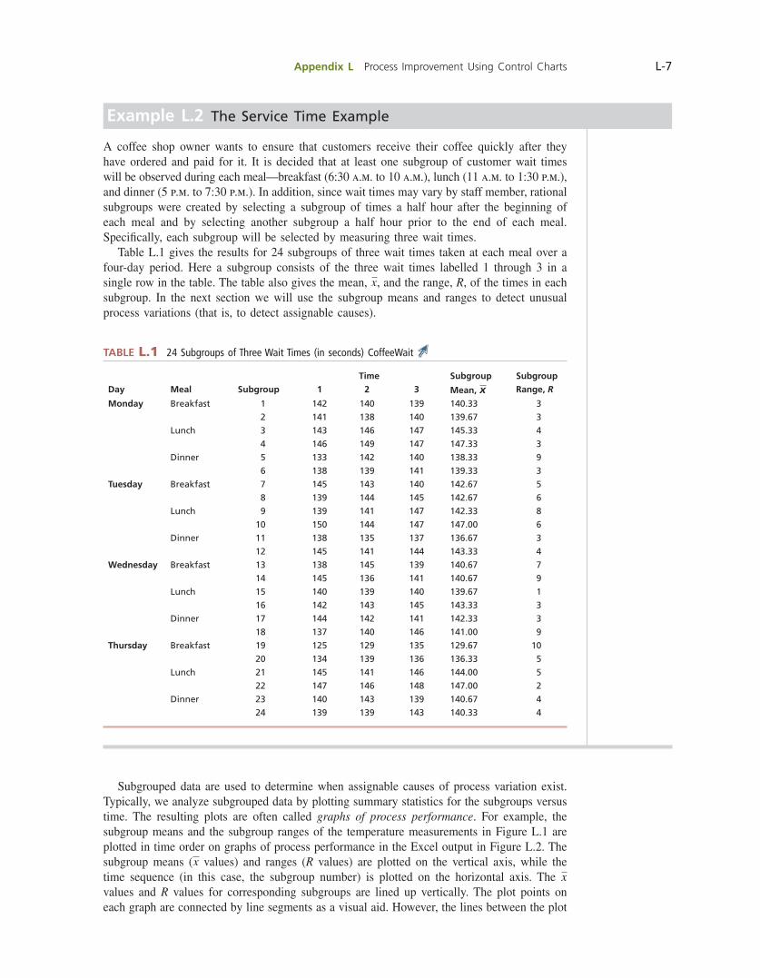
Example L.2 The Service Time Example
A coffee shop owner wants to ensure that customers receive their coffee quickly after they have ordered and paid for it. It is decided that at least one subgroup of customer wait times will be observed during each meal—breakfast (6:30 a.m. to 10 a.m.), lunch (11 a.m. to 1:30 p.m.), and dinner (5 p.m. to 7:30 p.m.). In addition, since wait times may vary by staff member, rational subgroups were created by selecting a subgroup of times a half hour after the beginning of each meal and by selecting another subgroup a half hour prior to the end of each meal. Specifi cally, each subgroup will be selected by measuring three wait times. Table L.1 gives the results for 24 subgroups of three wait times taken at each meal over a four-day period. Here a subgroup consists of the three wait times labelled 1 through 3 in a single row in the table. The table also gives the mean, x, and the range, R, of the times in each subgroup. In the next section we will use the subgroup means and ranges to detect unusual process variations (that is, to detect assignable causes).
TABLE L.1 24 Subgroups of Three Wait Times (in seconds) CoffeeWait
Time Subgroup Subgroup
Day Meal Subgroup 1 2 3 Mean, x Range, R
Monday Breakfast 1 142 140 139 140.33 3
2 141 138 140 139.67 3
Lunch 3 143 146 147 145.33 4
4 146 149 147 147.33 3
Dinner 5 133 142 140 138.33 9
6 138 139 141 139.33 3
Tuesday Breakfast 7 145 143 140 142.67 5
8 139 144 145 142.67 6
Lunch 9 139 141 147 142.33 8
10 150 144 147 147.00 6
Dinner 11 138 135 137 136.67 3
12 145 141 144 143.33 4
Wednesday Breakfast 13 138 145 139 140.67 7
14 145 136 141 140.67 9
Lunch 15 140 139 140 139.67 1
16 142 143 145 143.33 3
Dinner 17 144 142 141 142.33 3
18 137 140 146 141.00 9
Thursday Breakfast 19 125 129 135 129.67 10
20 134 139 136 136.33 5
Lunch 21 145 141 146 144.00 5
22 147 146 148 147.00 2
Dinner 23 140 143 139 140.67 4
24 139 139 143 140.33 4
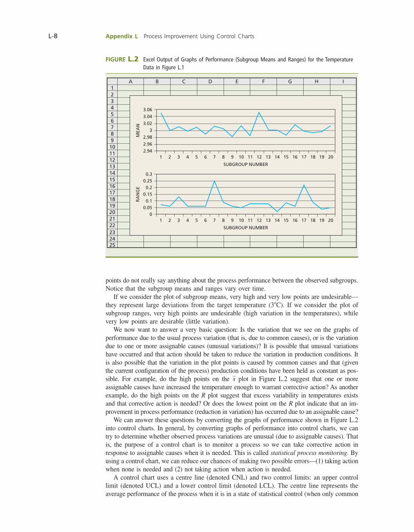
Subgrouped data are used to determine when assignable causes of process variation exist. Typically, we analyze subgrouped data by plotting summary statistics for the subgroups versus time. The resulting plots are often called graphs of process performance. For example, the subgroup means and the subgroup ranges of the temperature measurements in Figure L.1 are plotted in time order on graphs of process performance in the Excel output in Figure L.2. The subgroup means (x values) and ranges (R values) are plotted on the vertical axis, while the time sequence (in this case, the subgroup number) is plotted on the horizontal axis. The x values and R values for corresponding subgroups are lined up vertically. The plot points on each graph are connected by line segments as a visual aid. However, the lines between the plot
bow39604_appL_L1-L53.indd Page L-7 10/01/14 11:58 AM F-468 bow39604_appL_L1-L53.indd Page L-7 10/01/14 11:58 AM F-468 /203/MHR00232/bow39604_disk1of1/0071339604/bow39604_pagefiles/OLC/203/MHR00232/bow39604_disk1of1/0071339604/bow39604_pagefiles/OLC
Pass 2nd
L-8 Appendix L Process Improvement Using Control Charts
points do not really say anything about the process performance between the observed subgroups. Notice that the subgroup means and ranges vary over time. If we consider the plot of subgroup means, very high and very low points are undesirable—they represent large deviations from the target temperature (3oC). If we consider the plot of subgroup ranges, very high points are undesirable (high variation in the temperatures), while very low points are desirable (little variation). We now want to answer a very basic question: Is the variation that we see on the graphs of performance due to the usual process variation (that is, due to common causes), or is the variation due to one or more assignable causes (unusual variations)? It is possible that unusual variations have occurred and that action should be taken to reduce the variation in production conditions. It is also possible that the variation in the plot points is caused by common causes and that (given the current confi guration of the process) production conditions have been held as constant as pos-sible. For example, do the high points on the x plot in Figure L.2 suggest that one or more assignable causes have increased the temperature enough to warrant corrective action? As another example, do the high points on the R plot suggest that excess variability in temperatures exists and that corrective action is needed? Or does the lowest point on the R plot indicate that an im-provement in process performance (reduction in variation) has occurred due to an assignable cause? We can answer these questions by converting the graphs of performance shown in Figure L.2 into control charts. In general, by converting graphs of performance into control charts, we can try to determine whether observed process variations are unusual (due to assignable causes). That is, the purpose of a control chart is to monitor a process so we can take corrective action in response to assignable causes when it is needed. This is called statistical process monitoring. By using a control chart, we can reduce our chances of making two possible errors—(1) taking action when none is needed and (2) not taking action when action is needed. A control chart uses a centre line (denoted CNL) and two control limits: an upper control limit (denoted UCL) and a lower control limit (denoted LCL). The centre line represents the average performance of the process when it is in a state of statistical control (when only common
FIGURE L.2 Excel Output of Graphs of Performance (Subgroup Means and Ranges) for the Temperature Data in Figure L.1
3.06
3.04
3.02
MEA
N
SUBGROUP NUMBER
3
1 2 3 4 5 6 7 8 9 10 11 12 13 14 15 16 17 18 19 20
2.98
2.96
2.94
0.30.250.2
RA
NG
E
SUBGROUP NUMBER
0.15
1 2 3 4 5 6 7 8 9 10 11 12 13 14 15 16 17 18 19 20
0.10.05
0
12345678910111213141516171819202122232425
A B C D E F G H I
bow39604_appL_L1-L53.indd Page L-8 10/01/14 11:58 AM F-468 bow39604_appL_L1-L53.indd Page L-8 10/01/14 11:58 AM F-468 /203/MHR00232/bow39604_disk1of1/0071339604/bow39604_pagefiles/OLC/203/MHR00232/bow39604_disk1of1/0071339604/bow39604_pagefiles/OLC
Pass 2nd
Appendix L Process Improvement Using Control Charts L-9
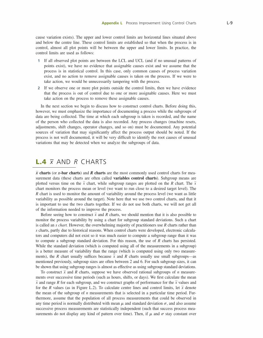
cause variation exists). The upper and lower control limits are horizontal lines situated above and below the centre line. These control limits are established so that when the process is in control, almost all plot points will be between the upper and lower limits. In practice, the control limits are used as follows:
1 If all observed plot points are between the LCL and UCL (and if no unusual patterns of points exist), we have no evidence that assignable causes exist and we assume that the process is in statistical control. In this case, only common causes of process variation exist, and no action to remove assignable causes is taken on the process. If we were to take action, we would be unnecessarily tampering with the process.
2 If we observe one or more plot points outside the control limits, then we have evidence that the process is out of control due to one or more assignable causes. Here we must take action on the process to remove these assignable causes.
In the next section we begin to discuss how to construct control charts. Before doing this, however, we must emphasize the importance of documenting a process while the subgroups of data are being collected. The time at which each subgroup is taken is recorded, and the name of the person who collected the data is also recorded. Any process changes (machine resets, adjustments, shift changes, operator changes, and so on) must be documented. Any potential sources of variation that may signifi cantly affect the process output should be noted. If the process is not well documented, it will be very diffi cult to identify the root causes of unusual variations that may be detected when we analyze the subgroups of data.
L.4 x AND R CHARTS
x charts (or x-bar charts) and R charts are the most commonly used control charts for mea-surement data (these charts are often called variables control charts). Subgroup means are plotted versus time on the x chart, while subgroup ranges are plotted on the R chart. The x chart monitors the process mean or level (we want to run close to a desired target level). The R chart is used to monitor the amount of variability around the process level (we want as little variability as possible around the target). Note here that we use two control charts, and that it is important to use the two charts together. If we do not use both charts, we will not get all of the information needed to improve the process. Before seeing how to construct x and R charts, we should mention that it is also possible to monitor the process variability by using a chart for subgroup standard deviations. Such a chart is called an s chart. However, the overwhelming majority of practitioners use R charts rather than s charts, partly due to historical reasons. When control charts were developed, electronic calcula-tors and computers did not exist so it was much easier to compute a subgroup range than it was to compute a subgroup standard deviation. For this reason, the use of R charts has persisted. While the standard deviation (which is computed using all of the measurements in a subgroup) is a better measure of variability than the range (which is computed using only two measure-ments), the R chart usually suffi ces because x and R charts usually use small subgroups—as mentioned previously, subgroup sizes are often between 2 and 6. For such subgroup sizes, it can be shown that using subgroup ranges is almost as effective as using subgroup standard deviations. To construct x and R charts, suppose we have observed rational subgroups of n measure-ments over successive time periods (such as hours, shifts, or days). We fi rst calculate the mean x and range R for each subgroup, and we construct graphs of performance for the x values and for the R values (as in Figure L.2). To calculate centre lines and control limits, let x denote the mean of the subgroup of n measurements that is selected in a particular time period. Fur-thermore, assume that the population of all process measurements that could be observed in any time period is normally distributed with mean m and standard deviation s, and also assume successive process measurements are statistically independent (such that success process mea-surements do not display any kind of pattern over time). Then, if m and s stay constant over
bow39604_appL_L1-L53.indd Page L-9 10/01/14 11:58 AM F-468 bow39604_appL_L1-L53.indd Page L-9 10/01/14 11:58 AM F-468 /203/MHR00232/bow39604_disk1of1/0071339604/bow39604_pagefiles/OLC/203/MHR00232/bow39604_disk1of1/0071339604/bow39604_pagefiles/OLC
Pass 2nd
L-10 Appendix L Process Improvement Using Control Charts
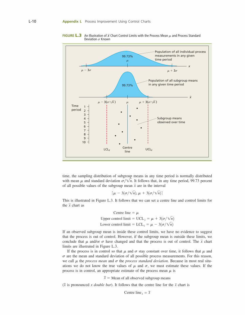
time, the sampling distribution of subgroup means in any time period is normally distributed with mean m and standard deviation sy1n. It follows that, in any time period, 99.73 percent of all possible values of the subgroup mean x are in the interval
3m 2 31sy1n2, m 1 31sy1n2 4This is illustrated in Figure L.3. It follows that we can set a centre line and control limits for the x chart as
Centre line 5 m
Upper control limit 5 UCL x 5 m 1 31sy1n2 Lower control limit 5 LCLx 5 m 2 31sy1n2
If an observed subgroup mean is inside these control limits, we have no evidence to suggest that the process is out of control. However, if the subgroup mean is outside these limits, we conclude that m and/or s have changed and that the process is out of control. The x chart limits are illustrated in Figure L.3. If the process is in control so that m and s stay constant over time, it follows that m and s are the mean and standard deviation of all possible process measurements. For this reason, we call m the process mean and s the process standard deviation. Because in most real situ-ations we do not know the true values of m and s, we must estimate these values. If the process is in control, an appropriate estimate of the process mean m is
x 5 Mean of all observed subgroup means
(x is pronounced x double bar). It follows that the centre line for the x chart is
Centre line x 5 x
FIGURE L.3 An Illustration of x Chart Control Limits with the Process Mean m and Process Standard Deviation s Known
99.73%m
m 2 3s m 1 3s
99.73%
mm 2 3(s/ n ) m 1 3(s/ n )
1Timeperiod 2
3456789
10
LCLx UCLxCentre
line
Population of all subgroup means in any given time period
Subgroup meansobserved over time
Population of all individual processmeasurements in any given time period
x
x
bow39604_appL_L1-L53.indd Page L-10 10/01/14 11:58 AM F-468 bow39604_appL_L1-L53.indd Page L-10 10/01/14 11:58 AM F-468 /203/MHR00232/bow39604_disk1of1/0071339604/bow39604_pagefiles/OLC/203/MHR00232/bow39604_disk1of1/0071339604/bow39604_pagefiles/OLC
Pass 2nd

Appendix L Process Improvement Using Control Charts L-11
To obtain control limits for the x chart, we compute
R 5 Mean of all observed subgroup ranges
It can be shown that an appropriate estimate of the process standard deviation s is 1Ryd22, where d2 is a constant that depends on the subgroup size n. Although we do not present a development of d2 here, it intuitively makes sense that, for a given subgroup size, our best estimate of the process standard deviation should be related to the average of the subgroup ranges 1R2. The number d2 relates these quantities. Values of d2 are given in Table L.2 for subgroup sizes n 5 2 through n 5 25. At the end of this section, we further discuss why we use Ryd2 to estimate the process standard deviation. Substituting the estimate x of m and the estimate Ryd2 of s into the limits
m 1 31sy1n2 and m 2 31sy1n2we obtain
UCL x 5 x 1 3aRyd2
1nb 5 x 1 a 3
d21nbR
LCLx 5 x 2 3aRyd2
1nb 5 x 2 a 3
d21nbR
Finally, we defi ne
A2 53
d21n
TABLE L.2 Control Chart Constants for x and R Charts
Subgroup Size, n
Chart for Averages (x) Chart for Ranges (R)
Factor for Control Limits,A2
Divisor for Estimate of Standard Deviation, d2
Factors for Control Limits
D3 D4
2 1.880 1.128 — 3.267
3 1.023 1.693 — 2.574
4 0.729 2.059 — 2.282
5 0.577 2.326 — 2.114
6 0.483 2.534 — 2.004
7 0.419 2.704 0.076 1.924
8 0.373 2.847 0.136 1.864
9 0.337 2.970 0.184 1.816
10 0.308 3.078 0.223 1.777
11 0.285 3.173 0.256 1.744
12 0.266 3.258 0.283 1.717
13 0.249 3.336 0.307 1.693
14 0.235 3.407 0.328 1.672
15 0.223 3.472 0.347 1.653
16 0.212 3.532 0.363 1.637
17 0.203 3.588 0.378 1.622
18 0.194 3.640 0.391 1.608
19 0.187 3.689 0.403 1.597
20 0.180 3.735 0.415 1.585
21 0.173 3.778 0.425 1.575
22 0.167 3.819 0.434 1.566
23 0.162 3.858 0.443 1.557
24 0.157 3.895 0.451 1.548
25 0.153 3.931 0.459 1.541
bow39604_appL_L1-L53.indd Page L-11 10/01/14 11:58 AM F-468 bow39604_appL_L1-L53.indd Page L-11 10/01/14 11:58 AM F-468 /203/MHR00232/bow39604_disk1of1/0071339604/bow39604_pagefiles/OLC/203/MHR00232/bow39604_disk1of1/0071339604/bow39604_pagefiles/OLC
Pass 2nd
L-12 Appendix L Process Improvement Using Control Charts
and rewrite the control limits as
UCLx 5 x 1 A2R and LCLx 5 x 2 A2R
Here we call A2 a control chart constant. As the formula for A2 implies, this control chart constant depends on the subgroup size n. Values of A2 are given in Table L.2 for subgroup sizes n 5 2 through n 5 25. The centre line for the R chart is
Centre lineR 5 R
Furthermore, assuming normality, it can be shown that there are control chart constants D4 and D3 so that
UCLR 5 D4R and LCLR 5 D3R
Here the control chart constants D4 and D3 also depend on the subgroup size n. Values of D4 and D3 are given in Table L.2 for subgroup sizes n 5 2 through n 5 25. We summarize the centre lines and control limits for x and R charts in the following boxed feature.
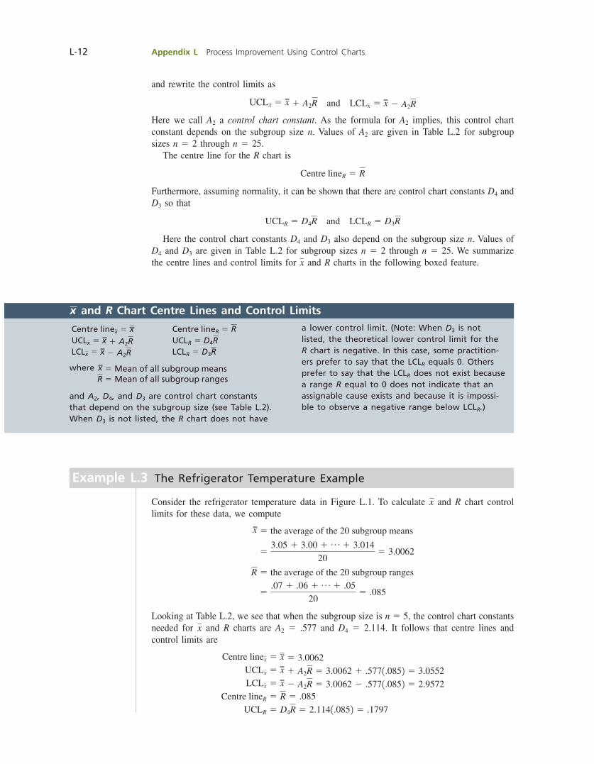
Example L.3 The Refrigerator Temperature Example
Consider the refrigerator temperature data in Figure L.1. To calculate x and R chart control limits for these data, we compute
x 5 the average of the 20 subgroup means
53.05 1 3.00 1 p 1 3.014
205 3.0062
R 5 the average of the 20 subgroup ranges
5.07 1 .06 1 p 1 .05
205 .085
Looking at Table L.2, we see that when the subgroup size is n 5 5, the control chart constants needed for x and R charts are A2 5 .577 and D4 5 2.114. It follows that centre lines and control limits are
Centre linex 5 x 5 3.0062 UCLx 5 x 1 A2R 5 3.0062 1 .5771.0852 5 3.0552 LCLx 5 x 2 A2R 5 3.0062 2 .5771.0852 5 2.9572
Centre lineR 5 R 5 .085
UCLR 5 D4R 5 2.1141.0852 5 .1797
x and R Chart Centre Lines and Control Limits
Centre linex 5 x Centre lineR 5 R UCLx 5 x 1 A2R UCLR 5 D4R LCLx 5 x 2 A2R LCLR 5 D3R
where x 5 Mean of all subgroup means R 5 Mean of all subgroup ranges
and A2, D4, and D3 are control chart constants that depend on the subgroup size (see Table L.2). When D3 is not listed, the R chart does not have
a lower control limit. (Note: When D3 is not listed, the theoretical lower control limit for the R chart is negative. In this case, some practition-ers prefer to say that the LCLR equals 0. Others prefer to say that the LCLR does not exist because a range R equal to 0 does not indicate that an assignable cause exists and because it is impossi-ble to observe a negative range below LCLR.)
bow39604_appL_L1-L53.indd Page L-12 10/01/14 11:58 AM F-468 bow39604_appL_L1-L53.indd Page L-12 10/01/14 11:58 AM F-468 /203/MHR00232/bow39604_disk1of1/0071339604/bow39604_pagefiles/OLC/203/MHR00232/bow39604_disk1of1/0071339604/bow39604_pagefiles/OLC
Pass 2nd
Appendix L Process Improvement Using Control Charts L-13
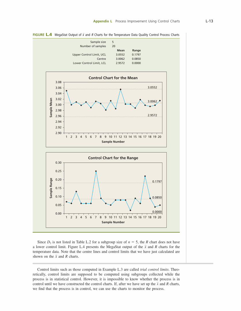
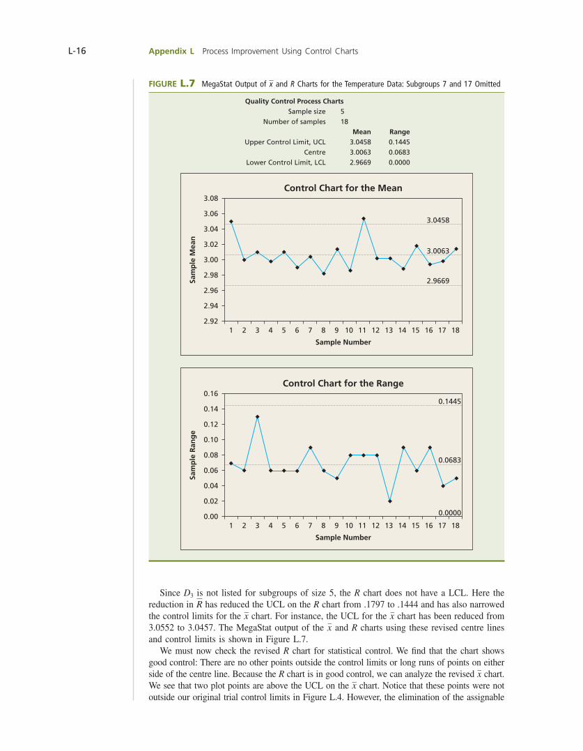
Since D3 is not listed in Table L.2 for a subgroup size of n 5 5, the R chart does not have a lower control limit. Figure L.4 presents the MegaStat output of the x and R charts for the temperature data. Note that the centre lines and control limits that we have just calculated are shown on the x and R charts.
FIGURE L.4 MegaStat Output of x and R Charts for the Temperature Data Quality Control Process Charts
Sample size 5 Number of samples 20 Mean Range Upper Control Limit, UCL 3.0552 0.1797 Centre 3.0062 0.0850 Lower Control Limit, LCL 2.9572 0.0000
Control Chart for the Mean
Sample Number
Sam
ple
Mea
n
3.08
3.06
3.04
3.02
3.00
2.98
2.96
2.94
2.92
2.901 2 3 4 5 6 7 8 9 10 11 12 13 14 15 16 17 18 19 20
3.0552
3.0062
2.9572
Control Chart for the Range
Sample Number
1 2 3 4 5 6 7 8 9 10 11 12 13 14 15 16 17 18 19 20
Sam
ple
Ran
ge
0.00
0.05
0.10
0.15
0.20
0.25
0.30
0.1797
0.0850
0.0000
Control limits such as those computed in Example L.3 are called trial control limits. Theo-retically, control limits are supposed to be computed using subgroups collected while the process is in statistical control. However, it is impossible to know whether the process is in control until we have constructed the control charts. If, after we have set up the x and R charts, we fi nd that the process is in control, we can use the charts to monitor the process.
bow39604_appL_L1-L53.indd Page L-13 10/01/14 11:58 AM F-468 bow39604_appL_L1-L53.indd Page L-13 10/01/14 11:58 AM F-468 /203/MHR00232/bow39604_disk1of1/0071339604/bow39604_pagefiles/OLC/203/MHR00232/bow39604_disk1of1/0071339604/bow39604_pagefiles/OLC
Pass 2nd

L-14 Appendix L Process Improvement Using Control Charts
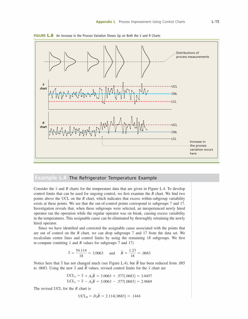
If the charts show that the process is not in statistical control (for example, there are plot points outside the control limits), we must fi nd and eliminate the assignable causes before we can calculate control limits for monitoring the process. In order to understand how to fi nd and eliminate assignable causes, we must understand how changes in the process mean and the pro-cess variation show up on x and R charts. To do this, consider Figures L.5 and L.6. These fi gures illustrate that, whereas a change in the process mean shows up only on the x chart, a change in the process variation shows up on both the x and R charts. Specifi cally, Figure L.5 shows that, when the process mean increases, the sample means plotted on the x chart increase and go out of control. Figure L.6 shows that, when the process variation (standard deviation, s) increases,
1 The sample ranges plotted on the R chart increase and go out of control.
2 The sample means plotted on the x chart become more variable (because, as s increases, s x 5 sy1n increases) and go out of control.
Because changes in the process mean and in the process variation show up on the x chart, we do not begin by analyzing the x chart because, if there were out-of-control sample means on the x chart, we would not know whether the process mean or the process variation had changed. Therefore, it might be more diffi cult to identify the assignable causes of the out-of-control sam-ple means because the assignable causes that would cause the process mean to shift could be very different from the assignable causes that would cause the process variation to increase. For instance, unwarranted frequent resetting of a machine might cause the process level to shift up and down, while improper lubrication of the machine might increase the process variation. To simplify and better organize our analysis procedure, we begin by analyzing the R chart, which refl ects only changes in the process variation. Specifi cally, we fi rst identify and eliminate the assignable causes of the out-of-control sample ranges on the R chart and then we analyze the x chart. The exact procedure is illustrated in Example L.4.
FIGURE L.5 A Shift of the Process Mean Shows Up on the x Chart
Distributions ofprocess measurements
Increase inthe process mean occurshere
LCL
CNL
UCL
LCL
CNL
UCL
Rchart
xchart
bow39604_appL_L1-L53.indd Page L-14 10/01/14 11:58 AM F-468 bow39604_appL_L1-L53.indd Page L-14 10/01/14 11:58 AM F-468 /203/MHR00232/bow39604_disk1of1/0071339604/bow39604_pagefiles/OLC/203/MHR00232/bow39604_disk1of1/0071339604/bow39604_pagefiles/OLC
Pass 2nd
Appendix L Process Improvement Using Control Charts L-15
FIGURE L.6 An Increase in the Process Variation Shows Up on Both the x and R Charts
Distributions ofprocess measurements
Increase inthe process variation occurshere
LCL
CNL
UCL
LCL
CNL
UCL
Rchart
xchart
Example L.4 The Refrigerator Temperature Example
Consider the x and R charts for the temperature data that are given in Figure L.4. To develop control limits that can be used for ongoing control, we fi rst examine the R chart. We fi nd two points above the UCL on the R chart, which indicates that excess within-subgroup variability exists at these points. We see that the out-of-control points correspond to subgroups 7 and 17. Investigation reveals that, when these subgroups were selected, an inexperienced newly hired operator ran the operation while the regular operator was on break, causing excess variability in the temperatures. This assignable cause can be eliminated by thoroughly retraining the newly hired operator. Since we have identifi ed and corrected the assignable cause associated with the points that are out of control on the R chart, we can drop subgroups 7 and 17 from the data set. We recalculate centre lines and control limits by using the remaining 18 subgroups. We fi rst re-compute (omitting x and R values for subgroups 7 and 17)
x 554.114
185 3.0063 and R 5
1.23
185 .0683
Notice here that x has not changed much (see Figure L.4), but R has been reduced from .085 to .0683. Using the new x and R values, revised control limits for the x chart are
UCLx 5 x 1 A2R 5 3.0063 1 .5771.06832 5 3.0457 LCLx 5 x 2 A2R 5 3.0063 2 .5771.06832 5 2.9669
The revised UCL for the R chart is
UCLR 5 D4R 5 2.1141.06832 5 .1444
bow39604_appL_L1-L53.indd Page L-15 10/01/14 11:58 AM F-468 bow39604_appL_L1-L53.indd Page L-15 10/01/14 11:58 AM F-468 /203/MHR00232/bow39604_disk1of1/0071339604/bow39604_pagefiles/OLC/203/MHR00232/bow39604_disk1of1/0071339604/bow39604_pagefiles/OLC
Pass 2nd
L-16 Appendix L Process Improvement Using Control Charts
FIGURE L.7 MegaStat Output of x and R Charts for the Temperature Data: Subgroups 7 and 17 Omitted
Quality Control Process Charts Sample size 5 Number of samples 18 Mean Range Upper Control Limit, UCL 3.0458 0.1445 Centre 3.0063 0.0683 Lower Control Limit, LCL 2.9669 0.0000
Control Chart for the Mean
Sample Number
Sam
ple
Mea
n3.08
3.06
3.04
3.02
3.00
2.98
2.96
2.94
2.921 2 3 4 5 6 7 8 9 10 11 12 13 14 15 16 17 18
3.0458
3.0063
2.9669
Control Chart for the Range
Sample Number
Sam
ple
Ran
ge
0.16
0.14
0.12
0.10
0.08
0.06
0.04
0.02
0.001 2 3 4 5 6 7 8 9 10 11 12 13 14 15 16 17 18
0.1445
0.0683
0.0000
Since D3 is not listed for subgroups of size 5, the R chart does not have a LCL. Here the reduction in R has reduced the UCL on the R chart from .1797 to .1444 and has also narrowed the control limits for the x chart. For instance, the UCL for the x chart has been reduced from 3.0552 to 3.0457. The MegaStat output of the x and R charts using these revised centre lines and control limits is shown in Figure L.7. We must now check the revised R chart for statistical control. We fi nd that the chart shows good control: There are no other points outside the control limits or long runs of points on either side of the centre line. Because the R chart is in good control, we can analyze the revised x chart. We see that two plot points are above the UCL on the x chart. Notice that these points were not outside our original trial control limits in Figure L.4. However, the elimination of the assignable
bow39604_appL_L1-L53.indd Page L-16 10/01/14 11:58 AM F-468 bow39604_appL_L1-L53.indd Page L-16 10/01/14 11:58 AM F-468 /203/MHR00232/bow39604_disk1of1/0071339604/bow39604_pagefiles/OLC/203/MHR00232/bow39604_disk1of1/0071339604/bow39604_pagefiles/OLC
Pass 2nd
Appendix L Process Improvement Using Control Charts L-17
cause and the resulting reduction in R has narrowed the x chart control limits so that these points are now out of control. Since the R chart is in control, the points on the x chart that are out of control suggest that the process level has shifted when subgroups 1 and 12 were taken. Investiga-tion reveals that these subgroups were observed immediately after start-up at the beginning of the day and immediately after start-up following the lunch break. We fi nd that, if we allow a fi ve-minute machine warm-up period, we can eliminate the process level problem. Because we have again found and eliminated an assignable cause, we must compute newly revised centre lines and control limits. Dropping subgroups 1 and 12 from the data set, we re-compute
x 548.01
165 3.0006 and R 5
1.08
165 .0675
Using the newest x and R values, we compute newly revised control limits as follows:
UCLx 5 x 1 A2R 5 3.0006 1 .5771.06752 5 3.0396 LCLx 5 x 2 A2R 5 3.0006 2 .5771.06752 5 2.9617 UCLR 5 D4R 5 2.1141.06752 5 .1427
Again, the R chart does not have a LCL. We obtain the newly revised x and R charts that are shown in the MegaStat output in Figure L.8. We see that all of the points on each chart are inside their respective control limits. This says that the actions taken to remove assignable causes have brought the process into statistical control. However, it is important to point out that, although the process is in statistical control, this does not necessarily mean that the pro-cess is capable of producing products that meet the customer’s needs. (A capable process is a process that has the ability to produce products or services that meet customer or manufac-turer requirements or specifi cations.) That is, while the control charts tell us that no assignable causes of process variation remain, the charts do not directly tell us anything about how much common cause variation exists. If there is too much common cause variability, the process will not meet customer or manufacturer specifi cations. We talk more about this later.
When both the x and R charts are in statistical control, we can use the control limits for ongoing process monitoring. New x and R values for subsequent subgroups are plotted in rela-tion to these limits. Plot points outside the control limits indicate the existence of assignable causes and the need for action on the process. The appropriate corrective action can often be taken by local supervision. Sometimes management intervention may be needed. For example, if the assignable cause is out-of-specifi cation raw materials, management may have to work with a supplier to improve the situation. The ongoing control limits occasionally need to be updated to include newly observed data. However, since employees often seem to be uncom-fortable working with limits that are frequently changing, it is probably a good idea to update centre lines and control limits only when the new data would substantially change the limits. Of course, if an important process change is implemented, new data must be collected, and we may need to develop new centre lines and control limits from scratch. Sometimes it is not possible to fi nd an assignable cause or it is not possible to eliminate the assignable cause even when it can be identifi ed. In such a case, it is possible that the original (or partially revised) trial control limits are good enough to use; this will be a subjec-tive decision. Occasionally, it is reasonable to drop one or more subgroups that have been affected by an assignable cause that cannot be eliminated. For example, the assignable cause might be an event that very rarely occurs and is unpreventable. If the subgroup(s) affected by the assignable cause have a detrimental effect on the control limits, we might drop the sub-groups and calculate revised limits. Another alternative is to collect new data and use them to calculate control limits.
bow39604_appL_L1-L53.indd Page L-17 10/01/14 11:58 AM F-468 bow39604_appL_L1-L53.indd Page L-17 10/01/14 11:58 AM F-468 /203/MHR00232/bow39604_disk1of1/0071339604/bow39604_pagefiles/OLC/203/MHR00232/bow39604_disk1of1/0071339604/bow39604_pagefiles/OLC
Pass 2nd

L-18 Appendix L Process Improvement Using Control Charts
FIGURE L.8 MegaStat Output of x and R Charts for the Temperature Data: Subgroups 1, 7, 12, and 17 Omitted. The Charts Show Good Control.
Quality Control Process Charts Sample size 5 Number of samples 16 Mean Range Upper Control Limit, UCL 3.0396 0.1427 Centre 3.0006 0.0675 Lower Control Limit, LCL 2.9617 0.0000
Control Chart for the Mean
Sample Number
Sam
ple
Mea
n
3.06
3.04
3.02
3.00
2.98
2.96
2.94
2.921 2 3 4 5 6 7 8 9 10 11 12 13 14 15 16
3.0396
3.0006
2.9617
Control Chart for the Range
Sample Number
Sam
ple
Ran
ge
0.16
0.14
0.12
0.10
0.08
0.06
0.04
0.00
0.02
1 2 3 4 5 6 7 8 9 10 11 12 13 14 15 16
0.0675
0.0000
0.1427
bow39604_appL_L1-L53.indd Page L-18 10/01/14 11:58 AM F-468 bow39604_appL_L1-L53.indd Page L-18 10/01/14 11:58 AM F-468 /203/MHR00232/bow39604_disk1of1/0071339604/bow39604_pagefiles/OLC/203/MHR00232/bow39604_disk1of1/0071339604/bow39604_pagefiles/OLC
Pass 2nd
Appendix L Process Improvement Using Control Charts L-19
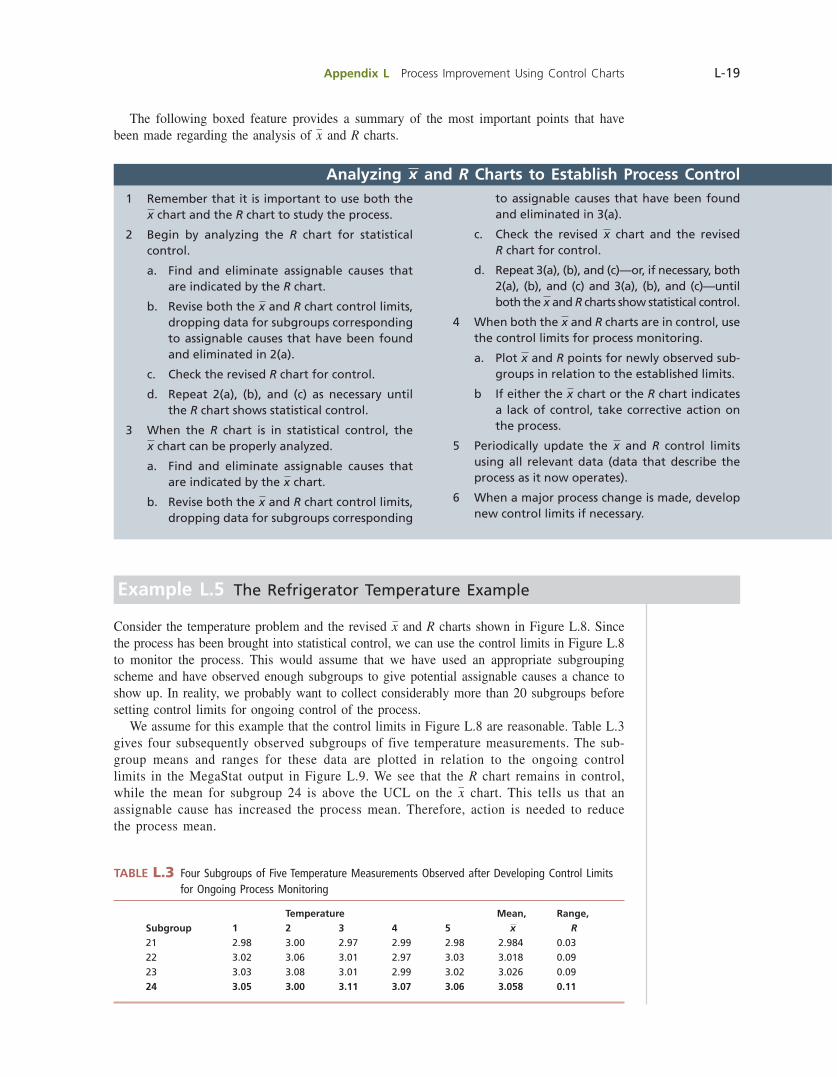
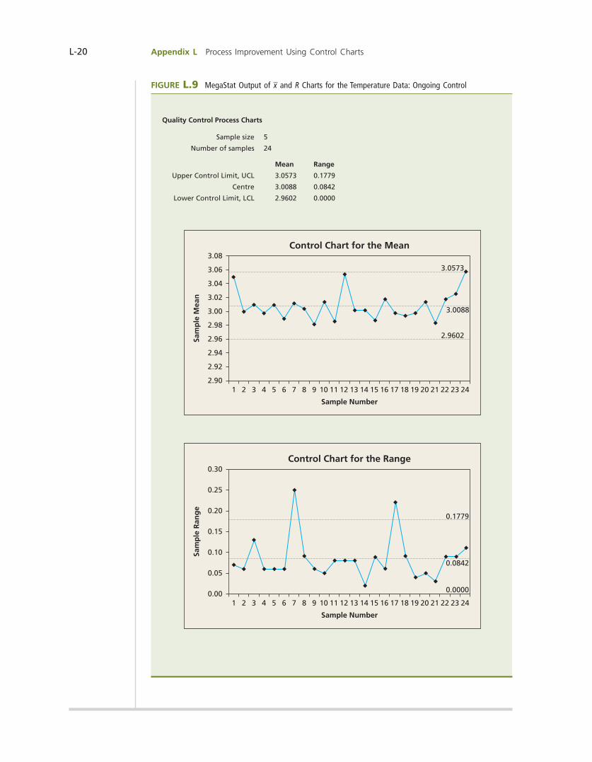
Example L.5 The Refrigerator Temperature Example
Consider the temperature problem and the revised x and R charts shown in Figure L.8. Since the process has been brought into statistical control, we can use the control limits in Figure L.8 to monitor the process. This would assume that we have used an appropriate subgrouping scheme and have observed enough subgroups to give potential assignable causes a chance to show up. In reality, we probably want to collect considerably more than 20 subgroups before setting control limits for ongoing control of the process. We assume for this example that the control limits in Figure L.8 are reasonable. Table L.3 gives four subsequently observed subgroups of five temperature measurements. The sub-group means and ranges for these data are plotted in relation to the ongoing control limits in the MegaStat output in Figure L.9. We see that the R chart remains in control, while the mean for subgroup 24 is above the UCL on the x chart. This tells us that an assignable cause has increased the process mean. Therefore, action is needed to reduce the process mean.
Temperature Mean, Range,Subgroup 1 2 3 4 5 x R21 2.98 3.00 2.97 2.99 2.98 2.984 0.0322 3.02 3.06 3.01 2.97 3.03 3.018 0.0923 3.03 3.08 3.01 2.99 3.02 3.026 0.0924 3.05 3.00 3.11 3.07 3.06 3.058 0.11
TABLE L.3 Four Subgroups of Five Temperature Measurements Observed after Developing Control Limits for Ongoing Process Monitoring
Analyzing x and R Charts to Establish Process Control1 Remember that it is important to use both the
x chart and the R chart to study the process.
2 Begin by analyzing the R chart for statistical control.
a. Find and eliminate assignable causes that are indicated by the R chart.
b. Revise both the x and R chart control limits, dropping data for subgroups corresponding to assignable causes that have been found and eliminated in 2(a).
c. Check the revised R chart for control.
d. Repeat 2(a), (b), and (c) as necessary until the R chart shows statistical control.
3 When the R chart is in statistical control, the x chart can be properly analyzed.
a. Find and eliminate assignable causes that are indicated by the x chart.
b. Revise both the x and R chart control limits, dropping data for subgroups corresponding
to assignable causes that have been found and eliminated in 3(a).
c. Check the revised x chart and the revised R chart for control.
d. Repeat 3(a), (b), and (c)—or, if necessary, both 2(a), (b), and (c) and 3(a), (b), and (c)—until both the x and R charts show statistical control.
4 When both the x and R charts are in control, use the control limits for process monitoring.
a. Plot x and R points for newly observed sub-groups in relation to the established limits.
b If either the x chart or the R chart indicates a lack of control, take corrective action on the process.
5 Periodically update the x and R control limits using all relevant data (data that describe the process as it now operates).
6 When a major process change is made, develop new control limits if necessary.
The following boxed feature provides a summary of the most important points that have been made regarding the analysis of x and R charts.
bow39604_appL_L1-L53.indd Page L-19 10/01/14 11:58 AM F-468 bow39604_appL_L1-L53.indd Page L-19 10/01/14 11:58 AM F-468 /203/MHR00232/bow39604_disk1of1/0071339604/bow39604_pagefiles/OLC/203/MHR00232/bow39604_disk1of1/0071339604/bow39604_pagefiles/OLC
Pass 2nd
L-20 Appendix L Process Improvement Using Control Charts
FIGURE L.9 MegaStat Output of x and R Charts for the Temperature Data: Ongoing Control
Quality Control Process Charts
Sample size 5
Number of samples 24
Mean Range
Upper Control Limit, UCL 3.0573 0.1779
Centre 3.0088 0.0842
Lower Control Limit, LCL 2.9602 0.0000
Control Chart for the Mean
Sample Number
Sam
ple
Mea
n
3.08
3.06
3.04
3.02
3.00
2.98
2.94
2.96
2.92
2.901 2 3 4 5 6 7 8 9 10 11 12 13 14 15 16 17 18 19 20 21 22 23 24
3.0573
3.0088
2.9602
Sample Number
0.30
0.25
0.20
0.15
0.10
0.05
0.001 2 3 4 5 6 7 8 9 10 11 12 13 14 15 16 17 18 19 20 21 22 23 24
0.1779
0.0842
0.0000
Control Chart for the Range
Sam
ple
Ran
ge
bow39604_appL_L1-L53.indd Page L-20 10/01/14 11:58 AM F-468 bow39604_appL_L1-L53.indd Page L-20 10/01/14 11:58 AM F-468 /203/MHR00232/bow39604_disk1of1/0071339604/bow39604_pagefiles/OLC/203/MHR00232/bow39604_disk1of1/0071339604/bow39604_pagefiles/OLC
Pass 2nd
Appendix L Process Improvement Using Control Charts L-21
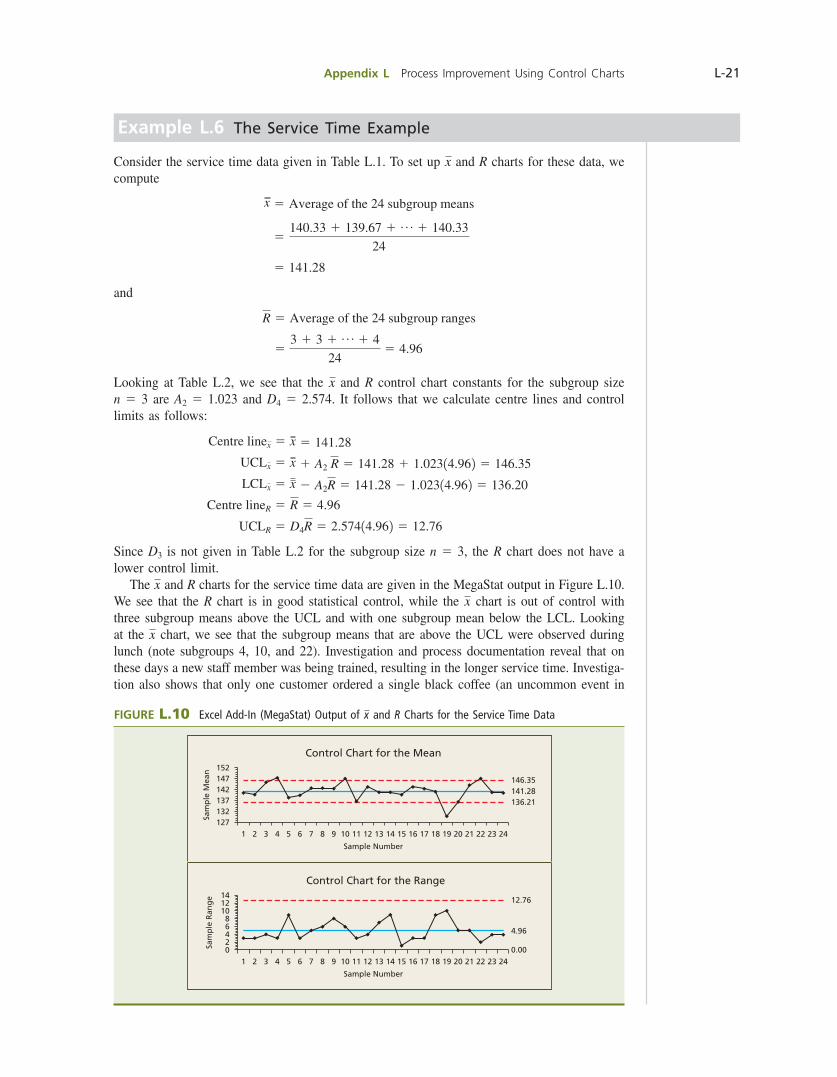
Example L.6 The Service Time Example
Consider the service time data given in Table L.1. To set up x and R charts for these data, we compute
x 5 Average of the 24 subgroup means
5140.33 1 139.67 1 p 1 140.33
24
5 141.28
and
R 5 Average of the 24 subgroup ranges
53 1 3 1 p 1 4
245 4.96
Looking at Table L.2, we see that the x and R control chart constants for the subgroup size n 5 3 are A2 5 1.023 and D4 5 2.574. It follows that we calculate centre lines and control limits as follows:
Centre linex 5 x 5 141.28
UCLx 5 x 1 A2 R 5 141.28 1 1.02314.962 5 146.35
LCLx 5 x 2 A2R 5 141.28 2 1.02314.962 5 136.20
Centre lineR 5 R 5 4.96
UCLR 5 D4R 5 2.57414.962 5 12.76
Since D3 is not given in Table L.2 for the subgroup size n 5 3, the R chart does not have a lower control limit. The x and R charts for the service time data are given in the MegaStat output in Figure L.10. We see that the R chart is in good statistical control, while the x chart is out of control with three subgroup means above the UCL and with one subgroup mean below the LCL. Looking at the x chart, we see that the subgroup means that are above the UCL were observed during lunch (note subgroups 4, 10, and 22). Investigation and process documentation reveal that on these days a new staff member was being trained, resulting in the longer service time. Investiga-tion also shows that only one customer ordered a single black coffee (an uncommon event in
FIGURE L.10 Excel Add-In (MegaStat) Output of x and R Charts for the Service Time Data
152
127132
1 2 3 4 5 6 7 8 9 10 11 12 13
Sample Number
Control Chart for the Mean
14 15 16 17 18 19 20 21 22 23 24
137142
Sam
ple
Mea
n
147 146.35
136.21141.28
Control Chart for the Range14
0
42
1 2 3 4 5 6 7 8 9 10 11 12 13
Sample Number
14 15 16 17 18 19 20 21 22 23 24
6
108
Sam
ple
Ran
ge
12 12.76
0.00
4.96
bow39604_appL_L1-L53.indd Page L-21 10/01/14 11:58 AM F-468 bow39604_appL_L1-L53.indd Page L-21 10/01/14 11:58 AM F-468 /203/MHR00232/bow39604_disk1of1/0071339604/bow39604_pagefiles/OLC/203/MHR00232/bow39604_disk1of1/0071339604/bow39604_pagefiles/OLC
Pass 2nd

L-22 Appendix L Process Improvement Using Control Charts
this venue), resulting in the very fast service time for subgroup 19 causing the subgroup mean for subgroup 19 to be far below the x chart LCL. Figure L.11 shows x and R charts with revised control limits calculated using the subgroups that remain after the subgroups for the out-of-control lunches (subgroups 3, 4, 9, 10, 21, and 22) and the out-of-control breakfast (subgroups 19 and 20) are eliminated from the data set. We see that these revised control charts are in statistical control.
FIGURE L.11 Excel Add-In (MegaStat) Output of Revised x and R Charts for the Service Time Data. The Process Is Now in Control.
133
138
143
148
1 2 3 4 5 6 7 8 9 10 11 12 13 14 15 16
Sample Number
Control Chart for the Mean
Sam
ple
Mea
n
145.59
140.73
135.87
0
5
10
15
1 2 3 4 5 6 7 8 9 10 11 12 13 14 15 16
Sample Number
Control Chart for the Range
Sam
ple
Ran
ge
12.23
4.75
0.00
Having seen how to interpret x and R charts, we are now better prepared to understand why we estimate the process standard deviation s by Ryd2. Recall that when m and s are known, the x chart control limits are 3m 6 31sy1n2 4 . The standard deviation s in these limits is the process standard deviation when the process is in control. When this standard deviation is un-known, we estimate s as if the process is in control, even though the process might not be in control. The quantity Ryd2 is an appropriate estimate of s because R is the average of individual ranges computed from rational subgroups—subgroups selected so that the chances that important process changes occur within a subgroup are minimized. So each subgroup range, and therefore Ryd2, estimates the process variation as if the process was in control. Of course, we could also compute the standard deviation of the measurements in each subgroup and use the average of the subgroup standard deviations to estimate s. The key is not whether we use ranges or standard deviations to measure the variation within the subgroups. Rather, the key is that we must calcu-late a measure of variation for each subgroup and then must average the separate measures of subgroup variation in order to estimate the process variation as if the process is in control.
Exercises for Sections L.3 and L.4CONCEPTS
L.5 Explain (1) the purpose of an x chart, (2) the purpose of an R chart, (3) why both charts are needed.
L.6 Explain why the initial control limits calculated for a set of subgrouped data are called trial control limits.
L.7 Explain why a change in process variability shows up on both the x and R charts.
L.8 In each of the following situations, what conclusions (if any) can be made about whether the process mean is changing? Explain your logic. a. R chart out of control. b. R chart in control, x chart out of control. c. Both x and R charts in control.
bow39604_appL_L1-L53.indd Page L-22 10/01/14 11:59 AM F-468 bow39604_appL_L1-L53.indd Page L-22 10/01/14 11:59 AM F-468 /203/MHR00232/bow39604_disk1of1/0071339604/bow39604_pagefiles/OLC/203/MHR00232/bow39604_disk1of1/0071339604/bow39604_pagefiles/OLC
Pass 2nd
Appendix L Process Improvement Using Control Charts L-23
METHODS AND APPLICATIONS
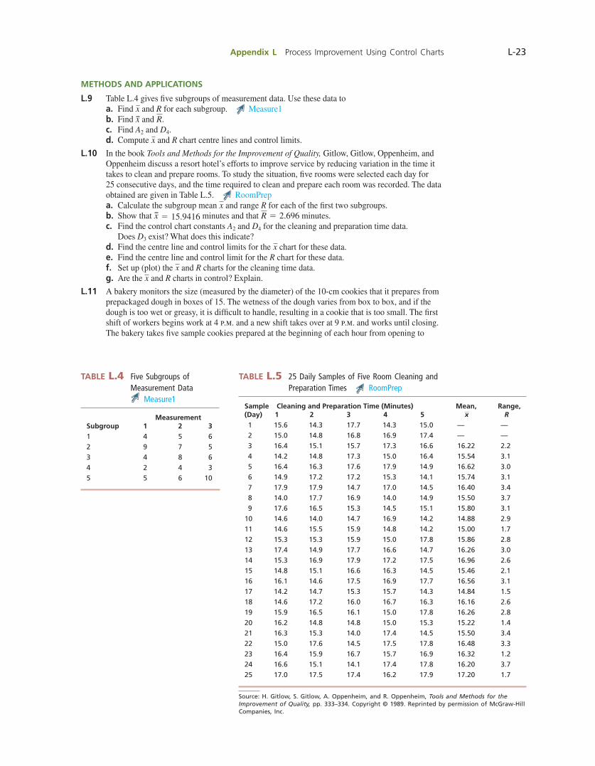
L.9 Table L.4 gives fi ve subgroups of measurement data. Use these data to a. Find x and R for each subgroup. Measure1 b. Find x and R. c. Find A2 and D4. d. Compute x and R chart centre lines and control limits.
L.10 In the book Tools and Methods for the Improvement of Quality, Gitlow, Gitlow, Oppenheim, and Oppenheim discuss a resort hotel’s efforts to improve service by reducing variation in the time it takes to clean and prepare rooms. To study the situation, fi ve rooms were selected each day for 25 consecutive days, and the time required to clean and prepare each room was recorded. The data obtained are given in Table L.5. RoomPrep a. Calculate the subgroup mean x and range R for each of the fi rst two subgroups. b. Show that x 5 15.9416 minutes and that R 5 2.696 minutes. c. Find the control chart constants A2 and D4 for the cleaning and preparation time data.
Does D3 exist? What does this indicate? d. Find the centre line and control limits for the x chart for these data. e. Find the centre line and control limit for the R chart for these data. f. Set up (plot) the x and R charts for the cleaning time data. g. Are the x and R charts in control? Explain.
L.11 A bakery monitors the size (measured by the diameter) of the 10-cm cookies that it prepares from prepackaged dough in boxes of 15. The wetness of the dough varies from box to box, and if the dough is too wet or greasy, it is diffi cult to handle, resulting in a cookie that is too small. The fi rst shift of workers begins work at 4 p.m. and a new shift takes over at 9 p.m. and works until closing. The bakery takes fi ve sample cookies prepared at the beginning of each hour from opening to
Source: H. Gitlow, S. Gitlow, A. Oppenheim, and R. Oppenheim, Tools and Methods for the Improvement of Quality, pp. 333–334. Copyright © 1989. Reprinted by permission of McGraw-Hill Companies, Inc.
MeasurementSubgroup 1 2 31 4 5 62 9 7 53 4 8 64 2 4 35 5 6 10
TABLE L.4 Five Subgroups of Measurement Data
Measure1Sample Cleaning and Preparation Time (Minutes) Mean, Range,(Day) 1 2 3 4 5 x R 1 15.6 14.3 17.7 14.3 15.0 — — 2 15.0 14.8 16.8 16.9 17.4 — — 3 16.4 15.1 15.7 17.3 16.6 16.22 2.2 4 14.2 14.8 17.3 15.0 16.4 15.54 3.1 5 16.4 16.3 17.6 17.9 14.9 16.62 3.0 6 14.9 17.2 17.2 15.3 14.1 15.74 3.1 7 17.9 17.9 14.7 17.0 14.5 16.40 3.4 8 14.0 17.7 16.9 14.0 14.9 15.50 3.7 9 17.6 16.5 15.3 14.5 15.1 15.80 3.110 14.6 14.0 14.7 16.9 14.2 14.88 2.911 14.6 15.5 15.9 14.8 14.2 15.00 1.712 15.3 15.3 15.9 15.0 17.8 15.86 2.813 17.4 14.9 17.7 16.6 14.7 16.26 3.014 15.3 16.9 17.9 17.2 17.5 16.96 2.615 14.8 15.1 16.6 16.3 14.5 15.46 2.116 16.1 14.6 17.5 16.9 17.7 16.56 3.117 14.2 14.7 15.3 15.7 14.3 14.84 1.518 14.6 17.2 16.0 16.7 16.3 16.16 2.619 15.9 16.5 16.1 15.0 17.8 16.26 2.820 16.2 14.8 14.8 15.0 15.3 15.22 1.421 16.3 15.3 14.0 17.4 14.5 15.50 3.422 15.0 17.6 14.5 17.5 17.8 16.48 3.323 16.4 15.9 16.7 15.7 16.9 16.32 1.224 16.6 15.1 14.1 17.4 17.8 16.20 3.725 17.0 17.5 17.4 16.2 17.9 17.20 1.7
TABLE L.5 25 Daily Samples of Five Room Cleaning and Preparation Times RoomPrep
bow39604_appL_L1-L53.indd Page L-23 10/01/14 11:59 AM F-468 bow39604_appL_L1-L53.indd Page L-23 10/01/14 11:59 AM F-468 /203/MHR00232/bow39604_disk1of1/0071339604/bow39604_pagefiles/OLC/203/MHR00232/bow39604_disk1of1/0071339604/bow39604_pagefiles/OLC
Pass 2nd

L-24 Appendix L Process Improvement Using Control Charts
closing on a particular day. The diameter of each cookie in the subgroups is measured, and the diameters obtained are given in Table L.6. Use the diameter data to do the following: CookieDiam a. Show that x 5 10.032 and R 5 .84. b. Find the centre lines and control limits for the x and R charts for the cookie data. c. Set up the x and R charts for the cookie data. d. Is the R chart for the cookie data in statistical control? Explain. e. Is the x chart for the cookie data in statistical control? If not, use the x chart and the
information given with the data to try to identify any assignable causes that might exist. f. Suppose that, based on the x chart, the manager of the bakery decides that the employees are
not trained well and thoroughly trains the employees. Because an assignable cause (training) has been found and eliminated, we can remove the subgroups affected by this unusual process variation from the data set. We therefore drop subgroups 1 and 6 from the data. Use the remaining eight subgroups to show that we obtain revised centre lines of x 5 10.2225 and R 5 .825.
g. Use the revised values of x and R to compute revised x and R chart control limits for the cookie diameter data. Set up x and R charts using these revised limits. Be sure to omit subgroup means and ranges for subgroups 1 and 6 when setting up these charts.
h. Has removing the assignable cause brought the process into statistical control? Explain.
L.12 A chemical company has collected 15 daily subgroups of measurements of an important chemical property called acid value for one of its products. Each subgroup consists of six acid value readings: A single reading was taken every four hours during the day, and the readings for a day are taken as a subgroup. The 15 daily subgroups are given in Table L.7. AcidVal
TABLE L.6 10 Samples of Cookie Diameters CookieDiam
CookieDiameter (cm) Mean, Range,Subgroup Time 1 2 3 4 5 x R 1 4 P.M. 9.8 9.0 9.0 9.2 9.2 9.24 0.8 2 5 P.M. 9.5 10.3 10.2 10.0 10.0 10.00 0.8 3 6 P.M. 10.5 10.3 9.8 10.0 10.3 10.18 0.7 4 7 P.M. 10.7 9.5 9.8 10.0 10.0 10.00 1.2 5 8 P.M. 10.0 10.5 10.0 10.5 10.5 10.30 0.5 6 9 P.M. 10.0 9.0 9.0 9.2 9.3 9.30 1.0 7 10 P.M. 11.0 10.0 10.3 10.3 10.0 10.32 1.0 8 11 P.M. 10.0 10.2 10.1 10.3 11.0 10.32 1.0 9 12 P.M. 10.0 10.4 10.4 10.5 10.0 10.26 0.510 1 P.M. 11.0 10.5 10.1 10.2 10.2 10.40 0.9
New shift at 9 P.M., pressing machine adjusted at the start of each shift (4 P.M. and 9 P.M.).
TABLE L.7 15 Subgroups of Acid Value Measurements for a Chemical Process AcidVal
Subgroup Acid Value Measurements Mean, Range,(Day) 1 2 3 4 5 6 x R 1 202.1 201.2 196.2 201.6 201.6 201.6 200.717 5.9 2 201.6 201.2 201.2 200.8 201.2 201.2 201.2 .8 3 200.4 200.0 200.8 200.1 198.7 200.4 200.067 2.1 4 200.4 200.4 200.4 200.8 200.4 201.2 200.6 .8 5 200.0 201.6 202.9 201.6 201.2 201.2 201.417 2.9 6 200.0 200.4 200.8 200.8 199.5 200.4 200.317 1.3 7 200.4 200.0 200.4 200.4 200.4 200.4 200.333 .4 8 200.0 200.8 200.0 200.4 200.0 200.0 200.2 .8 9 199.1 200.4 200.4 200.4 200.4 200.0 200.117 1.310 201.2 195.3 197.4 201.2 200.0 201.6 199.45 6.311 201.6 200.8 200.4 201.2 200.4 199.5 200.65 2.112 200.0 199.5 200.4 200.8 200.4 200.8 200.317 1.313 201.6 201.6 200.8 201.2 200.8 200.8 201.133 .814 200.4 200.0 202.5 200.4 201.2 201.2 200.95 2.515 200.0 200.0 201.6 200.8 200.4 200.0 200.467 1.6
bow39604_appL_L1-L53.indd Page L-24 10/01/14 11:59 AM F-468 bow39604_appL_L1-L53.indd Page L-24 10/01/14 11:59 AM F-468 /203/MHR00232/bow39604_disk1of1/0071339604/bow39604_pagefiles/OLC/203/MHR00232/bow39604_disk1of1/0071339604/bow39604_pagefiles/OLC
Pass 2nd
Appendix L Process Improvement Using Control Charts L-25
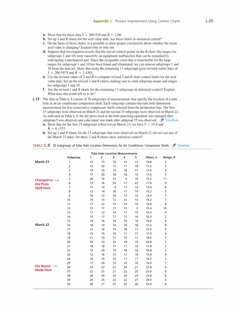
a. Show that for these data x 5 200.529 and R 5 2.06. b. Set up x and R charts for the acid value data. Are these charts in statistical control? c. On the basis of these charts, is it possible to draw proper conclusions about whether the mean
acid value is changing? Explain why or why not. d. Suppose that investigation reveals that the out-of-control points on the R chart (the ranges for
subgroups 1 and 10) were caused by an equipment malfunction that can be remedied by redesigning a mechanical part. Since the assignable cause that is responsible for the large ranges for subgroups 1 and 10 has been found and eliminated, we can remove subgroups 1 and 10 from the data set. Show that using the remaining 13 subgroups gives revised centre lines of x 5 200.5975 and R 5 1.4385.
e. Use the revised values of x and R to compute revised x and R chart control limits for the acid value data. Set up the revised x and R charts, making sure to omit subgroup means and ranges for subgroups 1 and 10.
f. Are the revised x and R charts for the remaining 13 subgroups in statistical control? Explain. What does this result tell us to do?
L.13 The data in Table L.8 consist of 30 subgroups of measurements that specify the location of a tube hole in an air conditioner compressor shell. Each subgroup contains the tube hole dimension measurement for fi ve consecutive compressor shells selected from the production line. The fi rst 15 subgroups were observed on March 21 and the second 15 subgroups were observed on March 22. As indicated in Table L.8, the die press used in the hole-punching operation was changed after subgroup 5 was observed, and a die repair was made after subgroup 25 was observed. TubeHole a. Show that for the fi rst 15 subgroups (observed on March 21) we have x 5 15.8 and
R 5 6.1333. b. Set up x and R charts for the 15 subgroups that were observed on March 21 (do not use any of
the March 22 data). Do these x and R charts show statistical control?
TABLE L.8 30 Subgroups of Tube Hole Location Dimensions for Air Conditioner Compressor Shells TubeHole
Tube Hole Location Measurements Subgroup 1 2 3 4 5 Mean, x Range, R
March 21 1 15 15 16 15 13 14.8 3 2 15 20 15 17 19 17.2 5 3 19 16 15 18 17 17.0 4 4 17 20 18 18 15 17.6 5 5 20 16 15 9 16 15.2 11Changed to —➛
6 13 16 20 17 22 17.6 9Die Press 7 15 13 9 17 13 13.4 8#628 Here 8 13 14 18 17 14 15.2 5
9 19 12 16 13 15 15.0 7 10 19 14 12 13 13 14.2 7 11 17 22 15 14 16 16.8 8 12 19 17 17 15 9 15.4 10 13 17 13 14 17 15 15.2 4 14 15 17 17 17 16 16.4 2 15 14 16 18 16 16 16.0 4March 22 16 18 10 14 16 18 15.2 8 17 12 16 15 18 17 15.6 6 18 15 19 19 17 17 17.4 4 19 21 16 17 19 17 18.0 5 20 20 22 25 18 19 20.8 7 21 18 18 17 17 19 17.8 2 22 19 20 19 18 18 18.8 2 23 13 16 15 17 16 15.4 4 24 16 15 16 17 17 16.2 2 25 17 20 13 16 16 16.4 7Die Repair
—➛ 26 25 23 21 24 21 22.8 4
Made Here 27 22 25 21 22 25 23.0 4 28 26 29 25 26 23 25.8 6 29 24 25 22 22 27 24.0 5 30 26 21 27 25 26 25.0 6
bow39604_appL_L1-L53.indd Page L-25 10/01/14 11:59 AM F-468 bow39604_appL_L1-L53.indd Page L-25 10/01/14 11:59 AM F-468 /203/MHR00232/bow39604_disk1of1/0071339604/bow39604_pagefiles/OLC/203/MHR00232/bow39604_disk1of1/0071339604/bow39604_pagefiles/OLC
Pass 2nd
L-26 Appendix L Process Improvement Using Control Charts
c. Using the control limits you computed by using the 15 subgroups observed on March 21, set up x and R charts for all 30 subgroups. That is, add the subgroup means and ranges for March 22 to your x and R charts, but use the limits you computed from the March 21 data.
d. Do the x and R charts obtained in part (c) show statistical control? Explain. e. Does it appear that changing to die press #628 is an assignable cause? Explain. (Note that the
die press is the machine that is used to punch the tube hole.) f. Does it appear that making a die repair is an assignable cause? Explain.
L.14 A company packages a bulk product in bags with a 50-kg label weight. During a typical day’s operation of the fi ll process, 22 subgroups of fi ve bag fi lls are observed. Using the observed data, x and R are calculated to be 52.9364 kg and 1.6818 kg, respectively. When the 22 x and 22 R instances are plotted in relation to the appropriate control limits, the fi rst 6 subgroups are found to be out of control. This is traced to a mechanical start-up problem, which is remedied. Using the remaining 16 subgroups, x and R are calculated to be 52.5875 kg and 1.2937 kg, respectively. a. Calculate appropriate revised x and R chart control limits. b. When the remaining 16 x and 16 R instances are plotted in relation to the appropriate revised
control limits, they are found to be within these limits. What does this imply?
L.15 In the book Tools and Methods for the Improvement of Quality, Gitlow, Gitlow, Oppenheim, and Oppenheim discuss an example of using x and R charts to study tuning knob diameters. In their problem description the authors say this:
A manufacturer of high-end audio components buys metal tuning knobs to be used in the assembly of its products. The knobs are produced automatically by a subcontractor using a single machine that is supposed to produce them with a constant diameter. Nevertheless, because of persistent fi nal assembly problems with the knobs, management has decided to examine this process output by requesting that the subcontractor keep an x-bar and R chart for knob diameter.
On a particular day, the subcontractor selects four knobs every half hour and carefully measures their diameters. Twenty-fi ve subgroups are obtained, and these subgroups (along with their subgroup means and ranges) are given in Table L.9. KnobDiam a. For these data show that x 5 841.45 and R 5 5.16. Then use these values to calculate control
limits and to set up x and R charts for the 25 subgroups of tuning knob diameters. Do these x and R charts indicate the existence of any assignable causes? Explain.
b. An investigation is carried out to fi nd out what caused the large range for subgroup 23. The investigation reveals that a water pipe burst at 7:25 p.m. and that the mishap resulted in water leaking under the machinery used in the tuning knob production process. The resulting disruption is the apparent cause for the out-of-control range for subgroup 23. The water pipe is mended, and since this fi x is reasonably permanent, we are justifi ed in removing subgroup 23 from the data set. Using the remaining 24 subgroups, show that revised centre lines are x 5 841.40 and R 5 4.88.
c. Use the revised values of x and R to set up revised x and R charts for the remaining 24 subgroups of diameters. Be sure to omit the mean and range for subgroup 23.
d. Looking at the revised R chart, is this chart now in statistical control? What does your answer say about whether we can use the x chart to decide if the process mean is changing?
e. Looking at the revised x chart, is this chart in statistical control? What does your answer tell us about the process mean?
f. An investigation is now undertaken to fi nd the cause of the very high x values for subgroups 10, 11, 12, and 13. We again quote Gitlow, Gitlow, Oppenheim, and Oppenheim:
The investigation leads to the discovery that . . . a keyway wedge had cracked and needed to be replaced on the machine. The mechanic who normally makes this repair was out to lunch, so the machine operator made the repair. This individual had not been properly trained for the repair; for this reason, the wedge was not properly aligned in the keyway, and the subsequent points were out of control. Both the operator and the mechanic agree that the need for this repair was not unusual. To correct this problem it is decided to train the machine operator and provide the appropriate tools for making this repair in the mechanic’s absence. Furthermore, the maintenance and engineering staffs agree to search for a replacement part for the wedge that will not be so prone to cracking.
Since the assignable causes responsible for the very high x values for subgroups 10, 11, 12, and 13 have been found and eliminated, we remove these subgroups from the data set. Show that removing subgroups 10, 11, 12, and 13 (in addition to the previously removed subgroup 23) results in the revised centre lines x 5 840.46 and R 5 5.25. Then use these revised values to set up revised x and R charts for the remaining 20 subgroups.
g. Are all of the subgroup means and ranges for these newly revised x and R charts inside their respective control limits?
bow39604_appL_L1-L53.indd Page L-26 10/01/14 11:59 AM F-468 bow39604_appL_L1-L53.indd Page L-26 10/01/14 11:59 AM F-468 /203/MHR00232/bow39604_disk1of1/0071339604/bow39604_pagefiles/OLC/203/MHR00232/bow39604_disk1of1/0071339604/bow39604_pagefiles/OLC
Pass 2nd

Appendix L Process Improvement Using Control Charts L-27
TABLE L.9 25 Subgroups of Tuning Knob Diameters KnobDiam
SubgroupNumber
Diameter Measurement Average, Range,
Time 1 2 3 4 x R
8:30 A.M. 1 836 846 840 839 840.25 10
9:00 2 842 836 839 837 838.50 6
9:30 3 839 841 839 844 840.75 5
10:00 4 840 836 837 839 838.00 4
10:30 5 838 844 838 842 840.50 6
11:00 6 838 842 837 843 840.00 6
11:30 7 842 839 840 842 840.75 3
12:00 8 840 842 844 836 840.50 8
12:30 P.M. 9 842 841 837 837 839.25 5
1:00 10 846 846 846 845 845.75 1
1:30 11 849 846 848 844 846.75 5
2:00 12 845 844 848 846 845.75 4
2:30 13 847 845 846 846 846.00 2
3:00 14 839 840 841 838 839.50 3
3:30 15 840 839 839 840 839.50 1
4:00 16 842 839 841 837 839.75 5
4:30 17 841 845 839 839 841.00 6
5:00 18 841 841 836 843 840.25 7
5:30 19 845 842 837 840 841.00 8
6:00 20 839 841 842 840 840.50 3
6:30 21 840 840 842 836 839.50 6
7:00 22 844 845 841 843 843.25 4
7:30 23 848 843 844 836 842.75 12
8:00 24 840 844 841 845 842.50 5
8:30 25 843 845 846 842 844.00 4
Source: H. Gitlow, S. Gitlow, A. Oppenheim, and R. Oppenheim, Tools and Methods for the Improvement of Quality, p. 301. Copyright © 1989. Reprinted by permission of McGraw-Hill Companies, Inc.
L.5 PATTERN ANALYSIS
When we observe a plot point outside the control limits on a control chart, we have strong evidence that an assignable cause exists. In addition, several other data patterns indicate the presence of assignable causes. Precise description of these patterns is often made easier by dividing the control band into zones—designated A, B, and C. Zone boundaries are set at points that are one and two standard deviations (of the plotted statistic) on either side of the centre line. We obtain six zones—each zone being one standard deviation wide—with three zones on each side of the centre line. The zones that stretch one standard deviation above and below the centre line are designated as C zones. The zones that extend from one to two standard deviations away from the centre line are designated as B zones. The zones that extend from two to three standard deviations away from the centre line are designated as A zones. Figure L.12(a) illustrates a control chart with the six zones, and Figure L.12(b) shows how the zone boundaries for a x chart and an R chart are calculated. Part (b) of this figure also shows the values of the zone boundaries for the refrigerator temperature x and R charts shown in Figure L.9. In calculating these boundaries, we use x 5 3.0006 and R 5 .0675, which we computed from subgroups 1 through 20 with sub-groups 1, 7, 12, and 17 removed from the data set; that is, we are using x and R when the process is in control. For example, the upper A–B boundary for the x chart has been calculated as follows:
x 12
3 1A2R2 5 3.0006 1
2
3 1.5771.06752 2 5 3.0266
bow39604_appL_L1-L53.indd Page L-27 10/01/14 11:59 AM F-468 bow39604_appL_L1-L53.indd Page L-27 10/01/14 11:59 AM F-468 /203/MHR00232/bow39604_disk1of1/0071339604/bow39604_pagefiles/OLC/203/MHR00232/bow39604_disk1of1/0071339604/bow39604_pagefiles/OLC
Pass 2nd
L-28 Appendix L Process Improvement Using Control Charts
Finally, Figure L.12(b) shows (based on a normal distribution of plot points) the percentages of points that we would expect to observe in each zone when the process is in statistical control. For instance, we would expect to observe 34.13 percent of the plot points in the upper portion of zone C. For an x chart, if the distribution of process measurements is reasonably normal, then the distribution of subgroup means will be approximately normal and the percentages shown in Figure L.12 apply. That is, the plotted subgroup means for an “in control” x chart should look as if they have been randomly selected from a normal distribution. Any distribution of plot points that looks very different from the expected percentages will suggest the existence of an assignable cause. Various companies have established sets of rules for identifying assignable causes; use of such rules is called pattern analysis. We now summarize some commonly accepted rules. Note that many of these rules are illustrated in Figures L.13, L.14, L.15, and L.16, which show several common out-of-control patterns.
*When the R chart does not have a lower control limit (n , 7), the lower B–C and A–B boundaries should still be computed as long as they are 0 or positive.
FIGURE L.12 Zone Boundaries
A
A
B
B
CC
UCL
LCL
x
(a) A control chart with A, B, and C zones
(0.135%)
(2.145%)
(13.59%)
(34.13%)
(34.13%)
(13.59%)
(2.145%)
(0.135%)
Zone A
Zone A
Zone B
Zone B
Zone C
Zone C
Zone Boundaries
Upper A–B Boundary:
Upper B–C Boundary:
Centre Line:
Lower B–C Boundary:*
Lower A–B Boundary:*
Lower Control Limit:*
Upper Control Limit:
x Chart
x 1 (A2R) 5 3.026623
x 2 (A2R) 5 2.974623
x 1 (A2R) 5 3.013613
x 2 (A2R) 5 2.987613
x 5 3.0006
x 1 A2R 5 3.0396
x 2 A2R 5 2.9617
(b) Calculating zone boundaries for x and R charts in the hole location case
R Chart
R 1 (D4R 2 R) 5 0.117623
R 2 (D4R 2 R) 5 0.017423
R 1 (D4R 2 R) 5 0.092613
R 2 (D4R 2 R) 5 0.042413
R 5 0.0675
D4R 5 0.1427
D3R 5 does not exist
FIGURE L.13 A Plot Point Outside the Control Limits
1 5 10 15Observation
UCLCNLLCL
bow39604_appL_L1-L53.indd Page L-28 10/01/14 11:59 AM F-468 bow39604_appL_L1-L53.indd Page L-28 10/01/14 11:59 AM F-468 /203/MHR00232/bow39604_disk1of1/0071339604/bow39604_pagefiles/OLC/203/MHR00232/bow39604_disk1of1/0071339604/bow39604_pagefiles/OLC
Pass 2nd

Appendix L Process Improvement Using Control Charts L-29
FIGURE L.14 Two Out of Three Consecutive Plot Points in Zone A (or beyond)
Zone A
Zone AZone B
Zone BZone CZone C
1 5 10 15 20
Observation
UCL
CNL
LCL
FIGURE L.15 Four Out of Five Consecutive Plot Points in Zone B (or beyond)
Zone A
Zone A
Zone B
Zone B
Zone C
Zone C
1 5 10 15 2520
Observation
UCL
CNL
LCL
Source: H. Gitlow, S. Gitlow, A. Oppenheim, and R. Oppenheim, Tools and Methods for the Improvement of Quality, pp. 191–93, 209–211. Copyright © 1989. Reprinted by permission of McGraw-Hill Companies, Inc.
Pattern Analysis for x and R ChartsIf one or more of the following conditions exist, it is reasonable to conclude that one or more assign-able causes are present:
1 One plot point beyond zone A (that is, outside the three standard deviation control limits)—see Figure L.13.
2 Two out of three consecutive plot points in zone A (or beyond) on one side of the centre line of the control chart. Sometimes a zone boundary that separates zones A and B is called a two standard deviation warning limit. It can be shown that, if the process is in control, then the likelihood of observing two out of three plot points beyond this warning limit (even when no points are outside the control limits) is very small. Therefore, such a pattern signals an assignable cause. Figure L.14 illustrates this pat-tern. Specifi cally, note that plot points 5 and 6 are two consecutive plot points in zone A and that plot points 19 and 21 are two out of three consecutive plot points in zone A.
3 Four out of fi ve consecutive plot points in zone B (or beyond) on one side of the centre line of the control chart. Figure L.15 illustrates this pattern. Specifi cally, note that plot points 2, 3, 4, and 5 are four consecutive plot points in zone B and that plot points 12, 13, 15, and 16 are four out of fi ve consecutive plot points in zone B (or beyond).
4 A run of at least eight plot points. Here we defi ne a run to be a sequence of plot points of the same type. For example, we can have a run of points on one side of (above or below) the centre line. Such a run is illustrated in part (a) of Figure L.16, which shows a run above the centre line. We might also observe a run of steadily increasing plot points (a run up) or a run of steadily decreas-ing plot points (a run down). These patterns are illustrated in parts (b) and (c) of Figure L.16. Any of these types of runs consisting of at least eight points is an out-of-control signal.
5 A nonrandom pattern of plot points. Such a pat-tern might be an increasing or decreasing trend, a fanning-out or funneling-in pattern, a cycle, an alternating pattern, or any other pattern that is very inconsistent with the percentages given in Figure L.12 (see parts (d) through (h) of Figure L.16).
If none of the patterns or conditions in 1 through 5 exists, then the process shows good sta-tistical control—or is said to be in control. A pro-cess that is in control should not be tampered with. On the other hand, if one or more of the patterns in 1 through 5 exist, action must be taken to fi nd the cause of the out-of-control pattern(s) (which should be eliminated if the assignable cause is undesirable).
It is tempting to use many rules to decide when an assignable cause exists. However, if we use too many rules we can end up with an unacceptably high chance of a false out-of-control signal (that is, an out-of-control signal when there is no assignable cause present). For most control charts, the use of the rules just described will yield an overall probability of a false signal in the range of 1 to 2 percent.
bow39604_appL_L1-L53.indd Page L-29 10/01/14 11:59 AM F-468 bow39604_appL_L1-L53.indd Page L-29 10/01/14 11:59 AM F-468 /203/MHR00232/bow39604_disk1of1/0071339604/bow39604_pagefiles/OLC/203/MHR00232/bow39604_disk1of1/0071339604/bow39604_pagefiles/OLC
Pass 2nd
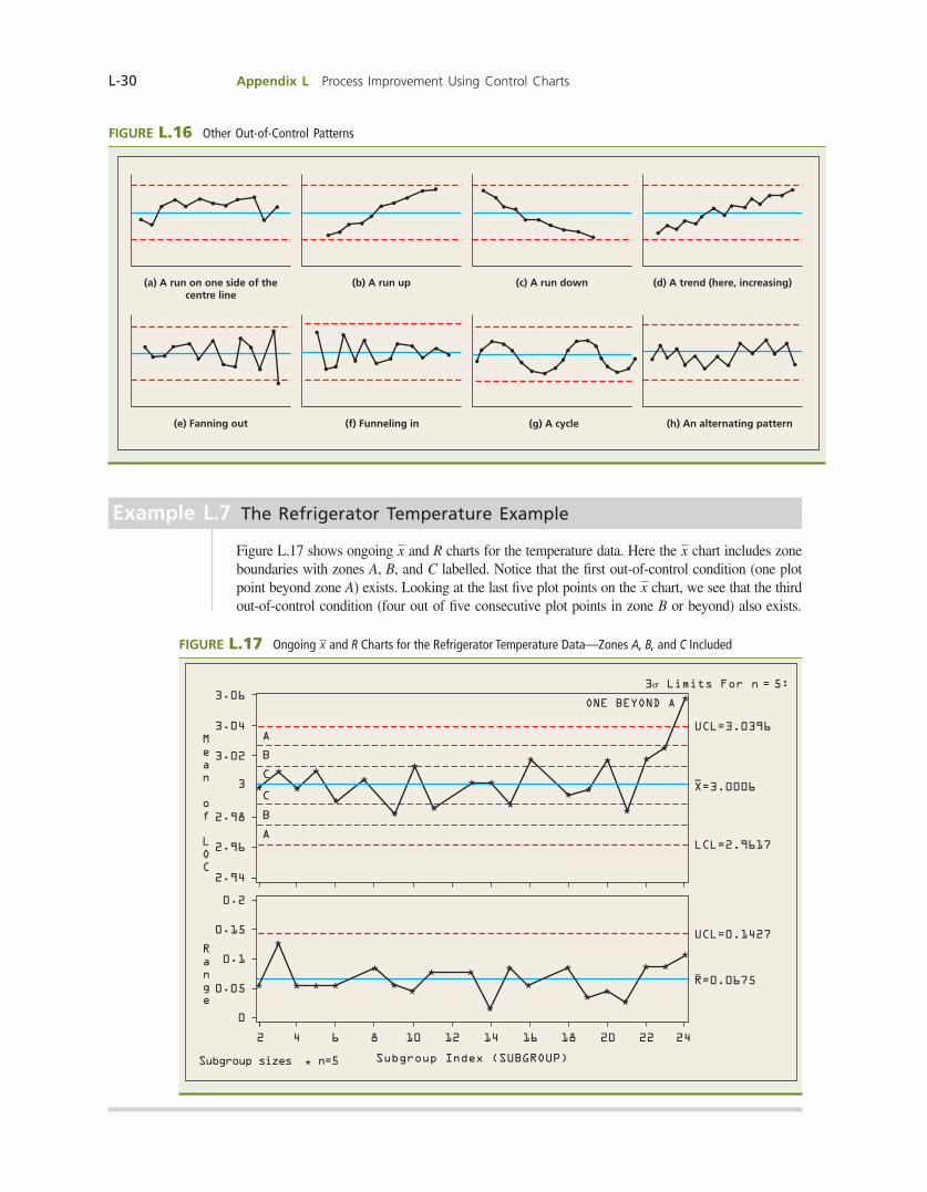
L-30 Appendix L Process Improvement Using Control Charts
Example L.7 The Refrigerator Temperature Example
Figure L.17 shows ongoing x and R charts for the temperature data. Here the x chart includes zone boundaries with zones A, B, and C labelled. Notice that the fi rst out-of-control condition (one plot point beyond zone A) exists. Looking at the last fi ve plot points on the x chart, we see that the third out-of-control condition (four out of fi ve consecutive plot points in zone B or beyond) also exists.
FIGURE L.17 Ongoing x and R Charts for the Refrigerator Temperature Data—Zones A, B, and C Included
3.06
3.04
3.02
3
2.98
2.96
2.94
A
B
C
C
B
A
ONE BEYOND A
3s Limits For n = 5:
UCL=3.0396
LCL=2.9617
X=3.0006
0
2 4 6 8 10 12
Subgroup Index (SUBGROUP)Subgroup sizes n=5
14 16 18 20 22 24
0.05
0.1
0.15
0.2
UCL=0.1427
R=0.0675
Mean of
LOC
Range
FIGURE L.16 Other Out-of-Control Patterns
(c) A run down(a) A run on one side of thecentre line
(b) A run up (d) A trend (here, increasing)
(e) Fanning out (f) Funneling in (g) A cycle (h) An alternating pattern
bow39604_appL_L1-L53.indd Page L-30 10/01/14 11:59 AM F-468 bow39604_appL_L1-L53.indd Page L-30 10/01/14 11:59 AM F-468 /203/MHR00232/bow39604_disk1of1/0071339604/bow39604_pagefiles/OLC/203/MHR00232/bow39604_disk1of1/0071339604/bow39604_pagefiles/OLC
Pass 2nd

Appendix L Process Improvement Using Control Charts L-31
Exercises for Section L.5CONCEPTS
L.16 When a process is in statistical control: a. What percentage of the plot points on an x chart will be found in the C zones (that is, in the
middle 1y3 of the chart’s “control band”)? b. What percentage of the plot points on an x chart will be found in either the C zones or the
B zones (that is, in the middle 2y3 of the chart’s “control band”)? c. What percentage of the plot points on an x chart will be found in the C zones, the B zones,
or the A zones (that is, in the chart’s “control band”)?
L.17 Discuss how a sudden increase in the process mean shows up on the x chart.
L.18 Discuss how a sudden decrease in the process mean shows up on the x chart.
L.19 Discuss how a steady increase in the process mean shows up on the x chart. Also, discuss how a steady decrease in the process mean shows up on the x chart.
L.20 Explain what is meant by a false out-of-control signal.
METHODS AND APPLICATIONS
L.21 In the June 1991 issue of Quality Progress, Gunter presents several control charts. Four of these charts are reproduced in Figure L.18. For each chart, fi nd any evidence of a lack of statistical control (that is, for each chart identify any evidence of the existence of one or more assignable causes). In each case, if such evidence exists, clearly explain why the plot points indicate that the process is not in control.
FIGURE L.18 Charts for Exercise L.21
5.0
4.0
3.0
50 10
Subgroup number
Sub
gro
up
mea
n
15 20
UCL 5 5.3
LCL 5 2.7
x 5 4.0
5.0
4.0
3.0
50 10
Subgroup number
Sub
gro
up
mea
n
15 20
UCL 5 5.3
LCL 5 2.7
x 5 4.0
5.0
4.0
3.0
50 10
Subgroup number
Sub
gro
up
mea
n
15 20
UCL 5 5.3
x = 4.0
LCL = 2.7
5.0
4.0
3.0
50 10
Subgroup number
Sub
gro
up
mea
n
15 20
UCL 5 5.3
x 5 4.0
LCL 5 2.7
Source: B. Gunter, “Process Capability Studies Part 3: The Tale of the Charts,” Quality Progress (June 1991), pp. 77–82. Copyright © 1991. American Society for Quality. Used with permission.
(a) (b)
(c) (d)
bow39604_appL_L1-L53.indd Page L-31 10/01/14 11:59 AM F-468 bow39604_appL_L1-L53.indd Page L-31 10/01/14 11:59 AM F-468 /203/MHR00232/bow39604_disk1of1/0071339604/bow39604_pagefiles/OLC/203/MHR00232/bow39604_disk1of1/0071339604/bow39604_pagefiles/OLC
Pass 2nd
L-32 Appendix L Process Improvement Using Control Charts
L.22 In the book Tools and Methods for the Improvement of Quality, Gitlow, Gitlow, Oppenheim, and Oppenheim present several control charts in a discussion and exercises dealing with pattern analysis. These control charts, which include appropriate A, B, and C zones, are reproduced in Figure L.19. For each chart, identify any evidence of a lack of statistical control (that is, for each chart identify any evidence suggesting the existence of one or more assignable causes). In each case, if such evidence exists, clearly explain why the plot points indicate that the process is not in control.
L.23 Consider the tuning knob diameter data given in Table L.9. Recalling that the subgroup size is n 5 4 and that x 5 841.45 and R 5 5.16 for these data, KnobDiam a. Calculate all of the zone boundaries for the x chart. b. Calculate all of the R chart zone boundaries that are either 0 or positive.
L.24 Given what you now know about pattern analysis, examine each of the following x and R charts for evidence of lack of statistical control. In each case, explain any evidence indicating the existence of one or more assignable causes. a. The cookie diameter x and R charts in Exercise L.11. CookieDiam b. The acid value x and R charts in Exercise L.12. AcidVal c. The tube hole location x and R charts in Exercise L.13. TubeHole
L.6 COMPARISON OF A PROCESS WITH SPECIFICATIONS: CAPABILITY STUDIES
If we have a process in statistical control, we have found and eliminated the assignable causes of process variation. Therefore, the individual process measurements fl uctuate over time with a constant standard deviation s around a constant mean m. It follows that we can use the in-dividual process measurements to estimate m and s. Doing this lets us determine if the process is capable of producing output that meets specifi cations. Specifi cations are based on fi tness for use criteria—that is, the specifi cations are established by design engineers or customers. Even if a process is in statistical control, it may exhibit too much common cause variation (repre-sented by s) to meet specifi cations. As will be shown in Example L.9, one way to study the capability of a process that is in statistical control is to construct a histogram from a set of individual process measurements. The histogram can then be compared with the product specifi cation limits. In addition, we know that if all possible individual process measurements are normally distributed with mean m and standard deviation s, then 99.73 percent of these measurements will be in the interval [m 2 3s, m 1 3s]. Estimating m and s by x and R/d2, we obtain the natural tolerance limits
FIGURE L.19 Charts for Exercise L.22
Source: H. Gitlow, S. Gitlow, A. Oppenheim, and R. Oppenheim, Tools and Methods for the Improvement of Quality, pp. 191–93, 209–11. Copyright © 1989. Reprinted by permission of McGraw-Hill Companies, Inc.
2051 10 15 25 30
Observation
Zone A
Zone B
Zone C
Zone C
Zone B
Zone A
UCL
CNL
LCL51 10
Observation
Zone A
Zone B
Zone C
Zone C
Zone B
Zone A
15
UCL
CNL
LCL
(a) (b)
bow39604_appL_L1-L53.indd Page L-32 10/01/14 11:59 AM F-468 bow39604_appL_L1-L53.indd Page L-32 10/01/14 11:59 AM F-468 /203/MHR00232/bow39604_disk1of1/0071339604/bow39604_pagefiles/OLC/203/MHR00232/bow39604_disk1of1/0071339604/bow39604_pagefiles/OLC
Pass 2nd

Appendix L Process Improvement Using Control Charts L-33
for the process. (Note: There are a number of alternative formulas for the natural tolerance limits. In the following boxed feature, we give the version that is the most clearly related to using x and R charts. At the end of this section we present an alternative formula.)
Natural Tolerance Limits
The natural tolerance limits for a normally distributed process that is in statistical control are
c x 6 3a Rd2b d 5 c x 2 3a R
d2b, x 1 3a R
d2b d
where d2 is a constant that depends on the subgroup size n. Values of d2 are given in Table L.2 for subgroup sizes n 5 2 to n 5 25. These limits contain approximately 99.73 percent of the individual process measurements.
If the natural tolerance limits are inside the specifi cation limits, then almost all (99.73 per-cent) of the individual process measurements are produced within the specifi cation limits. In this case we say that the process is capable of meeting specifi cations. Furthermore, if we use x and R charts to monitor the process, then as long as the process remains in statistical control, the process will continue to meet the specifi cations. If the natural tolerance limits are wider than the specifi cation limits, we say that the process is not capable. Here some individual process measurements are outside the specifi cation limits.
Example L.8 The Service Time Example
Consider the x and R chart analysis of the service time data. Suppose the coffee shop staff has determined that all customers should be served coffee between 130 and 150 seconds after placing their initial order and paying for their coffee at the counter. Recalling that the x and R charts in Figure L.11 show that the process has been brought into control with x 5 140.73 and with R 5 4.75, we fi nd that x 5 140.73 is an estimate of the mean service time, and that Ryd2 5 4.75y1.693 5 2.81 is an estimate of the standard deviation of all the service times. Here d2 5 1.693 is obtained from Table L.3 corresponding to the subgroup size n 5 3. Assuming that the times are approximately normally distributed, the natural tolerance limits
3x 6 31Ryd22 4 5 3140.73 6 314.75y1.6932 4 5 3140.73 6 8.42 4 5 3132.31, 149.15 4
tell us that approximately 99.73 percent of the individual times will be between 132.31 and 149.15 seconds. Since these natural tolerance limits are inside the specifi cation limits (130 to 150 seconds), almost all of the times are within the specifi cations. Therefore, the coffee service is capable of meeting the required time specifi cations. Furthermore, if the process remains in control on its x and R charts, it will continue to meet specifi cations.
Example L.9 The Refrigerator Temperature Example
Again consider the temperature data. Recall that we were able to get this process into a state of statistical control with x 5 3.0006 and R 5 .0675 by removing several assignable causes of process variation. Figure L.20 gives a relative frequency histogram of the 80 individual temperature measure-ments used to construct the x and R charts in Figure L.8. This histogram suggests that the population of all individual temperatures is approximately normally distributed.
BI
BUSI
NE
SS IMPRO
VE
ME
N
T
bow39604_appL_L1-L53.indd Page L-33 10/01/14 11:59 AM F-468 bow39604_appL_L1-L53.indd Page L-33 10/01/14 11:59 AM F-468 /203/MHR00232/bow39604_disk1of1/0071339604/bow39604_pagefiles/OLC/203/MHR00232/bow39604_disk1of1/0071339604/bow39604_pagefiles/OLC
Pass 2nd

L-34 Appendix L Process Improvement Using Control Charts
Since the process is in statistical control, x 5 3.0006 is an estimate of the process mean and Ryd2 5 .0675y2.326 5 .0290198 is an estimate of the process standard deviation. Here d2 5 2.326 is obtained from Table L.2 corresponding to the subgroup size n 5 5. Furthermore, the natural tolerance limits
c x 6 3a R
d2b d 5 c 3.0006 6 3a .0675
2.326b d
5 33.0006 6 .0871 4 5 32.9135, 3.0877 4
tell us that almost all (approximately 99.73 percent) of the individual temperatures produced by the refrigerators are between 2.9135 and 3.0877 degrees Celsius. Suppose a major customer requires that the temperature must meet specifi cations of 3.00 6 .058C. That is, the customer requires that every individual refrigerator must generate a tem-perature between 2.95 and 3.058C. The natural tolerance limits [2.9135, 3.0877], which contain almost all temperatures, are wider than the specifi cation limits [2.95, 3.05]. This says that some of the temperatures are outside the specifi cation limits. Therefore, the process is not capable of meeting the specifi cations. Note that the histogram in Figure L.20 also shows that some of the temperatures are outside the specifi cation limits. Since the process is not capable of meeting specifi cations, it must be improved by removing common cause variation. This is management’s responsibility. Suppose that after a research and development program is carried out, the refrigerators are built using a new method and 20 new subgroups of n 5 5 refrigerator temperatures are obtained. The resulting x and R charts (not given here) indicate that the process is in control with x 5 3.0002 and R 5 .0348. Fur-thermore, a histogram of the 100 temperatures used to construct the x and R charts indicates that all possible temperatures are approximately normally distributed. It follows that we esti-mate that almost all individual temperature measurements are contained within the new natural tolerance limits
FIGURE L.20 A Relative Frequency Histogram of the Refrigerator Temperature Data (Based on the Data with Subgroups 1, 7, 12, and 17 Omitted)
LOC
Specifications: Lower=2.95 Upper=3.05
0
10
5
15
20
25
30
2.95 2.972.91 2.93 2.99 3.01 3.03 3.05 3.07 3.09
Percent
bow39604_appL_L1-L53.indd Page L-34 10/01/14 11:59 AM F-468 bow39604_appL_L1-L53.indd Page L-34 10/01/14 11:59 AM F-468 /203/MHR00232/bow39604_disk1of1/0071339604/bow39604_pagefiles/OLC/203/MHR00232/bow39604_disk1of1/0071339604/bow39604_pagefiles/OLC
Pass 2nd

Appendix L Process Improvement Using Control Charts L-35
c x 6 3a R
d2b d 5 c 3.0002 6 3a .0348
2.326b d
5 33.0002 6 .0449 4 5 32.9553, 3.0451 4
These tolerance limits are within the specification limits 3.00 6 .05. Therefore, the new process is now capable of producing refrigerator temperatures inside the specifications. The new process is capable because the estimated process standard deviation has been substantially reduced (from Ryd2 5 .0675y2.326 5 .0290 for the old process to Ryd2 5 .0348y2.326 5 .0149613 for the redesigned process). Next, note that for the improved process, the z-value corresponding to the lower specifi cation limit (2.95) is
z2.95 52.95 2 3.0002
.01496135 23.36
This says that the lower specifi cation limit is 3.36 estimated process standard deviations below x. Since the lower natural tolerance limit is 3 estimated process standard deviations below x, there is a leeway of .36 estimated process standard deviations between the lower natural toler-ance limit and the lower specifi cation limit. Also, note that the z value corresponding to the upper specifi cation limit (3.05) is
z3.05 53.05 2 3.0002
.01496135 3.33
This says that the upper specifi cation limit is 3.33 estimated process standard deviations above x. Since the upper natural tolerance limit is 3 estimated process standard deviations above x, there is a leeway of .33 estimated process standard deviations between the upper natural toler-ance limit and the upper specifi cation limit. Because some leeway exists between the natural tolerance limits and the specifi cation limits, the distribution of process measurements can shift slightly to the right or left (or can become slightly more spread out) without violating the specifi cations. Obviously, the more leeway, the better.
BI
BUSI
NE
SS IMPRO
VE
ME
N
T
Leeway importanceTo understand why process leeway is important, recall that a process must be in statistical control before we can assess the capability of the process.
ROADBLOCK
To demonstrate that a company’s product meets customer requirements, the company must present
1 x and R charts that are in statistical control.2 Natural tolerance limits that are within the specifi cation limits.
Even if a capable process shows good statistical control, the process mean and/or the process variation will occasionally change (due to new assignable causes or unexpected recurring problems). If the process mean shifts and/or the process variation increases, a process will need some leeway between the natural tolerance limits and the specification limits in order to avoid producing out-of-specification products. We can determine the amount of process leeway (if any exists) by defining what we call the sigma level capa-bility of the process.
bow39604_appL_L1-L53.indd Page L-35 10/01/14 11:59 AM F-468 bow39604_appL_L1-L53.indd Page L-35 10/01/14 11:59 AM F-468 /203/MHR00232/bow39604_disk1of1/0071339604/bow39604_pagefiles/OLC/203/MHR00232/bow39604_disk1of1/0071339604/bow39604_pagefiles/OLC
Pass 2nd
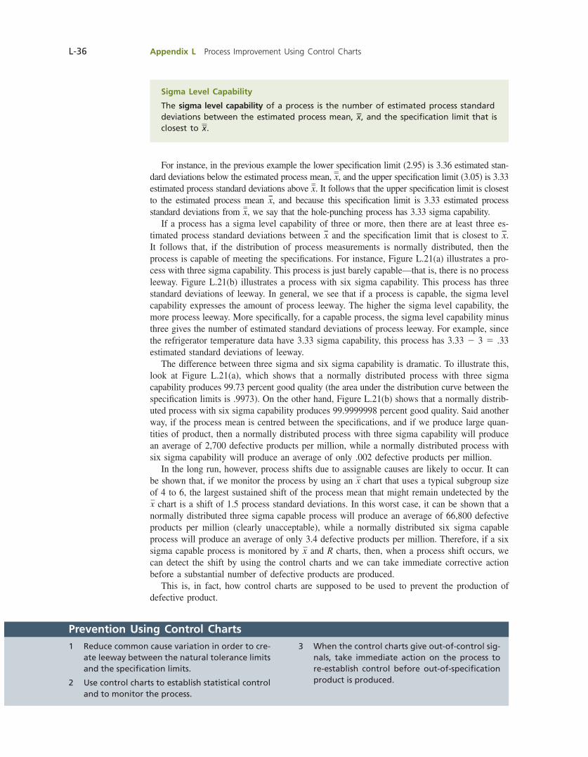
L-36 Appendix L Process Improvement Using Control Charts
For instance, in the previous example the lower specifi cation limit (2.95) is 3.36 estimated stan-dard deviations below the estimated process mean, x, and the upper specifi cation limit (3.05) is 3.33 estimated process standard deviations above x. It follows that the upper specifi cation limit is closest to the estimated process mean x, and because this specifi cation limit is 3.33 estimated process standard deviations from x, we say that the hole-punching process has 3.33 sigma capability. If a process has a sigma level capability of three or more, then there are at least three es-timated process standard deviations between x and the specifi cation limit that is closest to x. It follows that, if the distribution of process measurements is normally distributed, then the process is capable of meeting the specifi cations. For instance, Figure L.21(a) illustrates a pro-cess with three sigma capability. This process is just barely capable—that is, there is no process leeway. Figure L.21(b) illustrates a process with six sigma capability. This process has three standard deviations of leeway. In general, we see that if a process is capable, the sigma level capability expresses the amount of process leeway. The higher the sigma level capability, the more process leeway. More specifi cally, for a capable process, the sigma level capability minus three gives the number of estimated standard deviations of process leeway. For example, since the refrigerator temperature data have 3.33 sigma capability, this process has 3.33 2 3 5 .33 estimated standard deviations of leeway. The difference between three sigma and six sigma capability is dramatic. To illustrate this, look at Figure L.21(a), which shows that a normally distributed process with three sigma capability produces 99.73 percent good quality (the area under the distribution curve between the specifi cation limits is .9973). On the other hand, Figure L.21(b) shows that a normally distrib-uted process with six sigma capability produces 99.9999998 percent good quality. Said another way, if the process mean is centred between the specifi cations, and if we produce large quan-tities of product, then a normally distributed process with three sigma capability will produce an average of 2,700 defective products per million, while a normally distributed process with six sigma capability will produce an average of only .002 defective products per million. In the long run, however, process shifts due to assignable causes are likely to occur. It can be shown that, if we monitor the process by using an x chart that uses a typical subgroup size of 4 to 6, the largest sustained shift of the process mean that might remain undetected by the x chart is a shift of 1.5 process standard deviations. In this worst case, it can be shown that a normally distributed three sigma capable process will produce an average of 66,800 defective products per million (clearly unacceptable), while a normally distributed six sigma capable process will produce an average of only 3.4 defective products per million. Therefore, if a six sigma capable process is monitored by x and R charts, then, when a process shift occurs, we can detect the shift by using the control charts and we can take immediate corrective action before a substantial number of defective products are produced. This is, in fact, how control charts are supposed to be used to prevent the production of defective product.
Sigma Level Capability
The sigma level capability of a process is the number of estimated process standard deviations between the estimated process mean, x, and the specifi cation limit that is closest to x.
Prevention Using Control Charts1 Reduce common cause variation in order to cre-
ate leeway between the natural tolerance limits and the specifi cation limits.
2 Use control charts to establish statistical control and to monitor the process.
3 When the control charts give out-of-control sig-nals, take immediate action on the process to re-establish control before out-of-specifi cation product is produced.
bow39604_appL_L1-L53.indd Page L-36 10/01/14 11:59 AM F-468 bow39604_appL_L1-L53.indd Page L-36 10/01/14 11:59 AM F-468 /203/MHR00232/bow39604_disk1of1/0071339604/bow39604_pagefiles/OLC/203/MHR00232/bow39604_disk1of1/0071339604/bow39604_pagefiles/OLC
Pass 2nd
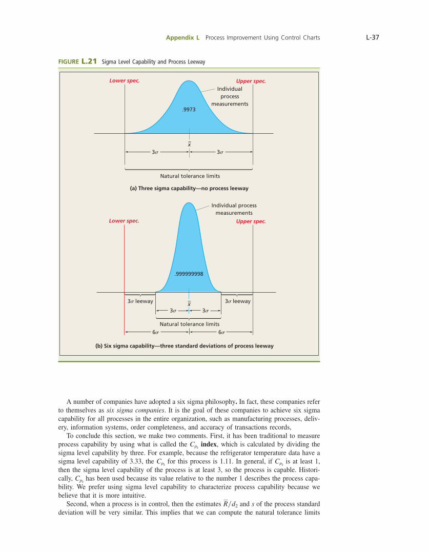
Appendix L Process Improvement Using Control Charts L-37
A number of companies have adopted a six sigma philosophy. In fact, these companies refer to themselves as six sigma companies. It is the goal of these companies to achieve six sigma capability for all processes in the entire organization, such as manufacturing processes, deliv-ery, information systems, order completeness, and accuracy of transactions records, To conclude this section, we make two comments. First, it has been traditional to measure process capability by using what is called the Cpk
index, which is calculated by dividing the sigma level capability by three. For example, because the refrigerator temperature data have a sigma level capability of 3.33, the Cpk
for this process is 1.11. In general, if Cpk is at least 1,
then the sigma level capability of the process is at least 3, so the process is capable. Histori-cally, Cpk
has been used because its value relative to the number 1 describes the process capa-bility. We prefer using sigma level capability to characterize process capability because we believe that it is more intuitive. Second, when a process is in control, then the estimates Ryd2 and s of the process standard deviation will be very similar. This implies that we can compute the natural tolerance limits
FIGURE L.21 Sigma Level Capability and Process Leeway
3s 3s
6s 6s
Natural tolerance limits
Individualprocess
measurements
(a) Three sigma capability—no process leeway
Individual processmeasurements
Natural tolerance limits
.999999998
.9973
3s leeway 3s leeway
3s3s
Lower spec. Upper spec.
x
Lower spec. Upper spec.
x
(b) Six sigma capability—three standard deviations of process leeway
bow39604_appL_L1-L53.indd Page L-37 10/01/14 11:59 AM F-468 bow39604_appL_L1-L53.indd Page L-37 10/01/14 11:59 AM F-468 /203/MHR00232/bow39604_disk1of1/0071339604/bow39604_pagefiles/OLC/203/MHR00232/bow39604_disk1of1/0071339604/bow39604_pagefiles/OLC
Pass 2nd
L-38 Appendix L Process Improvement Using Control Charts
by using the alternative formula 3x 6 3s 4 . For example, since the mean and standard deviation of the 80 observations used to construct the x and R charts in Figure L.8 are x 5 3.0006 and s 5 .028875, we obtain the natural tolerance limits
3x 6 3s 4 5 33.0006 6 31.0288752 4 5 32.9140, 3.0872 4
These limits are very close to those obtained in Example L.9 [2.9135, 3.0877], which were computed by using the estimate Ryd2 5 .0290198 of the process standard deviation. Use of the alternative formula 3x 6 3s 4 is particularly appropriate when there are long-run process variations that are not measured by the subgroup ranges (in which case Ryd2 underestimates the process standard deviation). Because statistical control in any real application of statistical process control will not be perfect, some people suggest that this version of the natural toler-ance limits is the most appropriate.
Exercises for Section L.6
CONCEPTS
L.25 Explain why a process that is in statistical control is not necessarily capable of meeting customer requirements (specifi cations).
L.26 Explain the interpretation of the natural tolerance limits for a process. What assumptions must be made in order to properly make this interpretation? How do we check these assumptions?
L.27 Explain how the natural tolerance limits compare to the specifi cation limits when a. A process is capable of meeting specifi cations. b. A process is not capable of meeting specifi cations.
L.28 For each of the following, explain a. Why it is important to have leeway between the natural tolerance limits and the specifi cation
limits. b. What is meant by the sigma level capability for a process.
METHODS AND APPLICATIONS
L.29 Consider the room cleaning and preparation time situation in Exercise L.10 . We found that x and R charts based on subgroups of size 5 for this data are in statistical control with x 5 15.9416 minutes and R 5 2.696 minutes. RoomPrep a. Assuming that the cleaning and preparation times are approximately normally distributed,
calculate a range of values that contains almost all (approximately 99.73 percent) of the individual cleaning and preparation times.
b. Find reasonable estimates of the maximum and minimum times needed to clean and prepare an individual room.
c. Suppose the resort hotel wants to specify that every individual room should be cleaned and prepared in 20 minutes or less. Is this upper specifi cation being met? Explain. Note here that there is no lower specifi cation, since we would like cleaning times to be as short as possible (as long as the job is done properly).
d. If the upper specifi cation for room cleaning and preparation times is 20 minutes, fi nd the sigma level capability of the process. If the upper specifi cation is 30 minutes, fi nd the sigma level capability.
L.30 Suppose that x and R charts based on subgroups of size 3 are used to monitor the moisture content of a type of paper. The x and R charts are found to be in statistical control with x 5 6.0 percent and R 5 .4 percent. Further, a histogram of the individual moisture content readings suggests that these measurements are approximately normally distributed. a. Compute the natural tolerance limits (limits that contain almost all of the individual moisture
content readings) for this process. b. If moisture content specifi cations are 6.0 percent ±5 percent, is this process capable of meeting
the specifi cations? Why or why not? c. Estimate the fraction of paper that is out of specifi cation. d. Find the sigma level capability of the process.
bow39604_appL_L1-L53.indd Page L-38 10/01/14 11:59 AM F-468 bow39604_appL_L1-L53.indd Page L-38 10/01/14 11:59 AM F-468 /203/MHR00232/bow39604_disk1of1/0071339604/bow39604_pagefiles/OLC/203/MHR00232/bow39604_disk1of1/0071339604/bow39604_pagefiles/OLC
Pass 2nd

Appendix L Process Improvement Using Control Charts L-39
L.31 A grocer has a contract with a butcher that specifi es that the butcher will supply the grocer with salami for the meat counter, with each salami weighing at least .75 kg. To monitor the weights, the grocer randomly selects three salamis from each of 25 received. Each salami’s weight is determined and, therefore, 25 subgroups of three salami weights are obtained. When x and R charts based on these subgroups are constructed, we fi nd that these charts are in statistical control with x 5 .8467 and R 5 .11. Further, a histogram of the weights indicates that these measurements are approximately normally distributed. a. Calculate a range of values that contains almost all (approximately 99.73 percent) of the
individual weights. b. Find a reasonable estimate of the maximum weight of a salami that the grocer is likely to
receive. c. Suppose that the grocer’s contract with the butcher specifi es that salamis are to weigh a
minimum of .75 kg each. Is this lower specifi cation being met? Explain. Note here that there is no upper specifi cation.
d. If the lower specifi cation of .75 kg is not being met, estimate the fraction of salamis that weigh less than .75 kg. Hint: Find an estimate of the standard deviation of the weights.
L.32 Consider the cookie diameters for 10-cm cookies given in Exercise L.11. We found that, by removing an assignable cause, we were able to bring the process into statistical control with x 5 10.2225 and R 5 .825. CookieDiam a. Recalling that the subgroup size for the cookie x and R charts is 5, and assuming that the
diameters are approximately normally distributed, calculate the natural tolerance limits for the diameters.
b. Using the natural tolerance limits, estimate the largest diameter likely to be sold by the bakery as a 10-cm cookie.
c. Using the natural tolerance limits, estimate the smallest diameter likely to be sold by the bakery as a 10-cm cookie.
d. Are all 10-cm cookies sold by this bakery really at least 10 cm in diameter? If not, estimate the fraction of cookies that are not at least 10 cm in diameter.
L.33 Consider the bag fi ll situation in Exercise L.14. We found that the elimination of a start-up problem brought the fi lling process into statistical control with x 5 52.5875 and R 5 1.2937. a. Recalling that the fi ll weight x and R charts are based on subgroups of size 5 and assuming that
the fi ll weights are approximately normally distributed, calculate the natural tolerance limits for the process.
b. Suppose that management wants to reduce the mean fi ll weight in order to save money by giving away less product. However, since customers expect each bag to contain at least 50 kg of product, management wants to leave some process leeway. Therefore, after the mean fi ll weight is reduced, the lower natural tolerance limit is to be no less than 50.5 kg. Based on the natural tolerance limits, how much can the mean fi ll weight be reduced? If the product costs $2 per kilogram and if 1 million bags are sold per year, what is the yearly cost reduction achieved by lowering the mean fi ll weight?
L.34 Suppose that a normally distributed process (centred at target) has three sigma capability. If the process shifts 1.5 sigmas to the right, show that the process will produce defective products at a rate of 66,800 per million.
L.35 Suppose that a product is assembled using 10 different components, each of which must meet specifi cations for fi ve different quality characteristics. Therefore, we have 50 different specifi cations that potentially could be violated. Further suppose that each component possesses three sigma capability (process centred at target) for each quality characteristic. Then, if we assume normality and independence, fi nd the probability that all 50 specifi cations will be met.
L.7 CHARTS FOR FRACTION NONCONFORMING
Sometimes, rather than collecting measurement data, we inspect items and simply decide whether each item conforms to some desired criterion (or set of criteria). For example, a fuel tank does or does not leak, an order is correctly or incorrectly processed, a batch of chem-ical product is acceptable or must be reprocessed, or plastic wrap appears clear or too hazy. When an inspected unit does not meet the desired criteria, it is said to be a nonconforming unit (or defective). When an inspected unit meets the desired criteria, it is said to be a
bow39604_appL_L1-L53.indd Page L-39 10/01/14 11:59 AM F-468 bow39604_appL_L1-L53.indd Page L-39 10/01/14 11:59 AM F-468 /203/MHR00232/bow39604_disk1of1/0071339604/bow39604_pagefiles/OLC/203/MHR00232/bow39604_disk1of1/0071339604/bow39604_pagefiles/OLC
Pass 2nd
L-40 Appendix L Process Improvement Using Control Charts
conforming unit (or nondefective). Traditionally, the terms defective and nondefective have been used but lately, the terms nonconforming and conforming have become popular. The control chart that we set up for this type of data is called a p chart. To construct this chart, we observe subgroups of n units over time. We inspect or test the n units in each sub-group and determine the number d of these units that are nonconforming. We then calculate for each subgroup
p̂ 5 dyn 5 the fraction of nonconforming units in the subgroup
and we plot the p̂ values versus time on the p chart. If the process being studied is in statisti-cal control and producing a fraction p of nonconforming units, and if the units inspected are independent, then the number of nonconforming units d in a subgroup of n units inspected can be described by a binomial distribution. If, in addition, n is large enough so that np is greater than 2 (some statisticians state that this condition should be np . 5 but for p charts, many think np . 2 is suffi cient), then both d and the fraction p̂ of nonconforming units are approximately described by normal distributions. Furthermore, the population of all possible p̂-values has mean mp̂ 5 p and standard deviation
sp̂ 5 Bp11 2 p2
n
Therefore, if p is known, we can compute three standard deviation control limits for values of p̂ by setting
UCL 5 p 1 3Bp11 2 p2
n and LCL 5 p 2 3B
p11 2 p2n
However, because it is unlikely that p will be known, we usually must estimate p from process data. The estimate of p is
p 5Total number of nonconforming units in all subgroups
Total number inspected in all subgroups
The control limits calculated using these formulas are considered to be trial control limits. Plot points above the upper control limit suggest that one or more assignable causes have increased the process fraction nonconforming. Plot points below the lower control limit may suggest that an improvement in the process performance has been observed. However, plot points below the lower control limit may also tell us that an inspection problem exists. Perhaps defective items are still being produced but for some reason the inspection procedure is not fi nding them. If the chart shows a lack of control, assignable causes must be found and elim-inated and the trial control limits must be revised. Here data for subgroups associated with assignable causes that have been eliminated will be dropped, and data for newly observed subgroups will be added when calculating the revised limits. This procedure is carried out until the process is in statistical control. When control is achieved, the limits can be used to monitor process performance. The process capability for a process that is in statistical control is
Centre Line and Control Limits for a p ChartSubstituting p for p, we obtain the following:
Centre line 5 p
UCL 5 p 1 3Bp11 2 p2
n
LCL 5 p 2 3Bp11 2 p2
nNote that if the LCL calculates negative, there is no lower control limit for the p chart.
bow39604_appL_L1-L53.indd Page L-40 10/01/14 11:59 AM F-468 bow39604_appL_L1-L53.indd Page L-40 10/01/14 11:59 AM F-468 /203/MHR00232/bow39604_disk1of1/0071339604/bow39604_pagefiles/OLC/203/MHR00232/bow39604_disk1of1/0071339604/bow39604_pagefiles/OLC
Pass 2nd
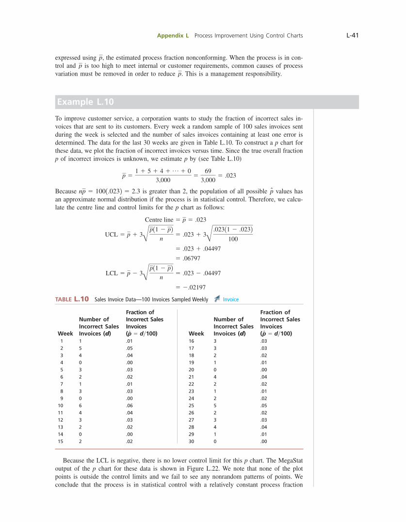
Appendix L Process Improvement Using Control Charts L-41
expressed using p, the estimated process fraction nonconforming. When the process is in con-trol and p is too high to meet internal or customer requirements, common causes of process variation must be removed in order to reduce p. This is a management responsibility.
Example L.10
To improve customer service, a corporation wants to study the fraction of incorrect sales in-voices that are sent to its customers. Every week a random sample of 100 sales invoices sent during the week is selected and the number of sales invoices containing at least one error is determined. The data for the last 30 weeks are given in Table L.10. To construct a p chart for these data, we plot the fraction of incorrect invoices versus time. Since the true overall fraction p of incorrect invoices is unknown, we estimate p by (see Table L.10)
p 51 1 5 1 4 1 p 1 0
3,0005
69
3,0005 .023
Because np 5 1001.0232 5 2.3 is greater than 2, the population of all possible p̂ values has an approximate normal distribution if the process is in statistical control. Therefore, we calcu-late the centre line and control limits for the p chart as follows:
Centre line 5 p 5 .023
UCL 5 p 1 3Bp11 2 p2
n5 .023 1 3B
.02311 2 .0232100
5 .023 1 .04497
5 .06797
LCL 5 p 2 3Bp11 2 p2
n5 .023 2 .04497
5 2.02197
TABLE L.10 Sales Invoice Data—100 Invoices Sampled Weekly Invoice
Week
Number of Incorrect Sales Invoices (d)
Fraction of Incorrect Sales Invoices (p̂ 5 dy100) Week
Number of Incorrect Sales Invoices (d)
Fraction of Incorrect Sales Invoices (p̂ 5 dy100)
1 1 .01 16 3 .03
2 5 .05 17 3 .03
3 4 .04 18 2 .02
4 0 .00 19 1 .01
5 3 .03 20 0 .00
6 2 .02 21 4 .04
7 1 .01 22 2 .02
8 3 .03 23 1 .01
9 0 .00 24 2 .02
10 6 .06 25 5 .05
11 4 .04 26 2 .02
12 3 .03 27 3 .03
13 2 .02 28 4 .04
14 0 .00 29 1 .01
15 2 .02 30 0 .00
Because the LCL is negative, there is no lower control limit for this p chart. The MegaStat output of the p chart for these data is shown in Figure L.22. We note that none of the plot points is outside the control limits and we fail to see any nonrandom patterns of points. We conclude that the process is in statistical control with a relatively constant process fraction
bow39604_appL_L1-L53.indd Page L-41 10/01/14 11:59 AM F-468 bow39604_appL_L1-L53.indd Page L-41 10/01/14 11:59 AM F-468 /203/MHR00232/bow39604_disk1of1/0071339604/bow39604_pagefiles/OLC/203/MHR00232/bow39604_disk1of1/0071339604/bow39604_pagefiles/OLC
Pass 2nd
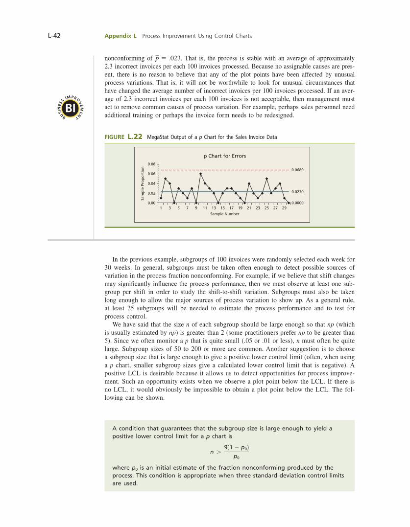
L-42 Appendix L Process Improvement Using Control Charts
nonconforming of p 5 .023. That is, the process is stable with an average of approximately 2.3 incorrect invoices per each 100 invoices processed. Because no assignable causes are pres-ent, there is no reason to believe that any of the plot points have been affected by unusual process variations. That is, it will not be worthwhile to look for unusual circumstances that have changed the average number of incorrect invoices per 100 invoices processed. If an aver-age of 2.3 incorrect invoices per each 100 invoices is not acceptable, then management must act to remove common causes of process variation. For example, perhaps sales personnel need additional training or perhaps the invoice form needs to be redesigned.
FIGURE L.22 MegaStat Output of a p Chart for the Sales Invoice Data
0.08
0.06
0.04
Sam
ple
Pro
po
rtio
n
0.02
0.0000
0.0230
0.0680
0.001 3 5 7 9 11 13 15
Sample Number
p Chart for Errors
17 19 21 23 25 27 29
BI
BUSI
NE
SS IMPRO
VE
ME
N
T
In the previous example, subgroups of 100 invoices were randomly selected each week for 30 weeks. In general, subgroups must be taken often enough to detect possible sources of variation in the process fraction nonconforming. For example, if we believe that shift changes may signifi cantly infl uence the process performance, then we must observe at least one sub-group per shift in order to study the shift-to-shift variation. Subgroups must also be taken long enough to allow the major sources of process variation to show up. As a general rule, at least 25 subgroups will be needed to estimate the process performance and to test for process control. We have said that the size n of each subgroup should be large enough so that np (which is usually estimated by np) is greater than 2 (some practitioners prefer np to be greater than 5). Since we often monitor a p that is quite small (.05 or .01 or less), n must often be quite large. Subgroup sizes of 50 to 200 or more are common. Another suggestion is to choose a subgroup size that is large enough to give a positive lower control limit (often, when using a p chart, smaller subgroup sizes give a calculated lower control limit that is negative). A positive LCL is desirable because it allows us to detect opportunities for process improve-ment. Such an opportunity exists when we observe a plot point below the LCL. If there is no LCL, it would obviously be impossible to obtain a plot point below the LCL. The fol-lowing can be shown.
A condition that guarantees that the subgroup size is large enough to yield a positive lower control limit for a p chart is
n .911 2 p02
p0
where p0 is an initial estimate of the fraction nonconforming produced by the process. This condition is appropriate when three standard deviation control limits are used.
bow39604_appL_L1-L53.indd Page L-42 10/01/14 11:59 AM F-468 bow39604_appL_L1-L53.indd Page L-42 10/01/14 11:59 AM F-468 /203/MHR00232/bow39604_disk1of1/0071339604/bow39604_pagefiles/OLC/203/MHR00232/bow39604_disk1of1/0071339604/bow39604_pagefiles/OLC
Pass 2nd
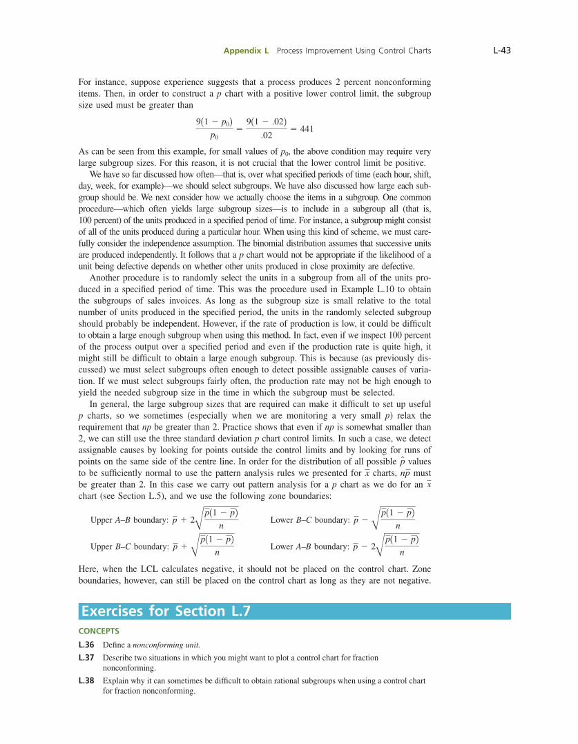
Appendix L Process Improvement Using Control Charts L-43
For instance, suppose experience suggests that a process produces 2 percent nonconforming items. Then, in order to construct a p chart with a positive lower control limit, the subgroup size used must be greater than
911 2 p02p0
5911 2 .022
.025 441
As can be seen from this example, for small values of p0, the above condition may require very large subgroup sizes. For this reason, it is not crucial that the lower control limit be positive. We have so far discussed how often—that is, over what specifi ed periods of time (each hour, shift, day, week, for example)—we should select subgroups. We have also discussed how large each sub-group should be. We next consider how we actually choose the items in a subgroup. One common procedure—which often yields large subgroup sizes—is to include in a subgroup all (that is, 100 percent) of the units produced in a specifi ed period of time. For instance, a subgroup might consist of all of the units produced during a particular hour. When using this kind of scheme, we must care-fully consider the independence assumption. The binomial distribution assumes that successive units are produced independently. It follows that a p chart would not be appropriate if the likelihood of a unit being defective depends on whether other units produced in close proximity are defective. Another procedure is to randomly select the units in a subgroup from all of the units pro-duced in a specifi ed period of time. This was the procedure used in Example L.10 to obtain the subgroups of sales invoices. As long as the subgroup size is small relative to the total number of units produced in the specifi ed period, the units in the randomly selected subgroup should probably be independent. However, if the rate of production is low, it could be diffi cult to obtain a large enough subgroup when using this method. In fact, even if we inspect 100 percent of the process output over a specifi ed period and even if the production rate is quite high, it might still be diffi cult to obtain a large enough subgroup. This is because (as previously dis-cussed) we must select subgroups often enough to detect possible assignable causes of varia-tion. If we must select subgroups fairly often, the production rate may not be high enough to yield the needed subgroup size in the time in which the subgroup must be selected. In general, the large subgroup sizes that are required can make it diffi cult to set up useful p charts, so we sometimes (especially when we are monitoring a very small p) relax the requirement that np be greater than 2. Practice shows that even if np is somewhat smaller than 2, we can still use the three standard deviation p chart control limits. In such a case, we detect assignable causes by looking for points outside the control limits and by looking for runs of points on the same side of the centre line. In order for the distribution of all possible p̂ values to be suffi ciently normal to use the pattern analysis rules we presented for x charts, np must be greater than 2. In this case we carry out pattern analysis for a p chart as we do for an x chart (see Section L.5), and we use the following zone boundaries:
Upper A–B boundary: p 1 2Bp11 2 p2
n Lower B–C boundary: p 2 B
p11 2 p2n
Upper B–C boundary: p 1 Bp11 2 p2
n Lower A–B boundary: p 2 2B
p11 2 p2n
Here, when the LCL calculates negative, it should not be placed on the control chart. Zone boundaries, however, can still be placed on the control chart as long as they are not negative.
Exercises for Section L.7CONCEPTS
L.36 Defi ne a nonconforming unit.
L.37 Describe two situations in which you might want to plot a control chart for fraction nonconforming.
L.38 Explain why it can sometimes be diffi cult to obtain rational subgroups when using a control chart for fraction nonconforming.
bow39604_appL_L1-L53.indd Page L-43 10/01/14 11:59 AM F-468 bow39604_appL_L1-L53.indd Page L-43 10/01/14 11:59 AM F-468 /203/MHR00232/bow39604_disk1of1/0071339604/bow39604_pagefiles/OLC/203/MHR00232/bow39604_disk1of1/0071339604/bow39604_pagefiles/OLC
Pass 2nd
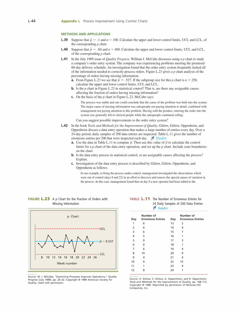
L-44 Appendix L Process Improvement Using Control Charts
METHODS AND APPLICATIONS
L.39 Suppose that p 5 .1 and n 5 100. Calculate the upper and lower control limits, UCL and LCL, of the corresponding p chart.
L.40 Suppose that p 5 .04 and n 5 400. Calculate the upper and lower control limits, UCL and LCL, of the corresponding p chart.
L.41 In the July 1989 issue of Quality Progress, William J. McCabe discusses using a p chart to study a company’s order entry system. The company was experiencing problems meeting the promised 60-day delivery schedule. An investigation found that the order entry system frequently lacked all of the information needed to correctly process orders. Figure L.23 gives a p chart analysis of the percentage of orders having missing information. a. From Figure L.23 we see that p 5 .527. If the subgroup size for this p chart is n 5 250,
calculate the upper and lower control limits, UCL and LCL. b. Is the p chart in Figure L.23 in statistical control? That is, are there any assignable causes
affecting the fraction of orders having missing information? c. On the basis of the p chart in Figure L.23, McCabe says:
The process was stable and one could conclude that the cause of the problem was built into the system. The major cause of missing information was salespeople not paying attention to detail, combined with management not paying attention to this problem. Having sold the product, entering the order into the system was generally left to clerical people while the salespeople continued selling.
Can you suggest possible improvements to the order entry system?
L.42 In the book Tools and Methods for the Improvement of Quality, Gitlow, Gitlow, Oppenheim, and Oppenheim discuss a data entry operation that makes a large number of entries every day. Over a 24-day period, daily samples of 200 data entries are inspected. Table L.11 gives the number of erroneous entries per 200 that were inspected each day. DataErr a. Use the data in Table L.11 to compute p. Then use this value of p to calculate the control
limits for a p chart of the data entry operation, and set up the p chart. Include zone boundaries on the chart.
b. Is the data entry process in statistical control, or are assignable causes affecting the process? Explain.
c. Investigation of the data entry process is described by Gitlow, Gitlow, Oppenheim, and Oppenheim as follows:
In our example, to bring the process under control, management investigated the observations which were out of control (days 8 and 22) in an effort to discover and remove the special causes of variation in the process. In this case, management found that on day 8 a new operator had been added to the
FIGURE L.23 A p Chart for the Fraction of Orders with Missing Information
Source: W. J. McCabe, “Examining Processes Improves Operations,” Quality Progress (July 1989), pp. 26–32. Copyright © 1989 American Society for Quality. Used with permission.
Week number
p Chart
2624222018161412108LCL
p 5 0.527
UCL
TABLE L.11 The Number of Erroneous Entries for 24 Daily Samples of 200 Data Entries
DataErr
DayNumber of Erroneous Entries Day
Number of Erroneous Entries
1 6 13 2
2 6 14 4
3 6 15 7
4 5 16 1
5 0 17 3
6 0 18 1
7 6 19 4
8 14 20 0
9 4 21 4
10 0 22 15
11 1 23 4
12 8 24 1
Source: H. Gitlow, S. Gitlow, A. Oppenheim, and R. Oppenheim, Tools and Methods for the Improvement of Quality, pp. 168–172. Copyright © 1989. Reprinted by permission of McGraw-Hill Companies, Inc.
bow39604_appL_L1-L53.indd Page L-44 10/01/14 11:59 AM F-468 bow39604_appL_L1-L53.indd Page L-44 10/01/14 11:59 AM F-468 /203/MHR00232/bow39604_disk1of1/0071339604/bow39604_pagefiles/OLC/203/MHR00232/bow39604_disk1of1/0071339604/bow39604_pagefiles/OLC
Pass 2nd
Appendix L Process Improvement Using Control Charts L-45
workforce without any training. The logical conclusion was that the new environment probably caused the unusually high number of errors. To ensure that this special cause would not recur, the company added a one-day training program in which data entry operators would be acclimated to the work environment.
A team of managers and workers conducted an investigation of the circumstances occurring on day 22. Their work revealed that on the previous night one of the data entry consoles malfunctioned and was replaced with a standby unit. The standby unit was older and slightly different from the ones currently used in the department. The repairs on the regular console were not expected to be completed until the morning of day 23. To correct this special source of variation, the team recommended purchasing a spare console that would match the existing equipment and disposing of the outdated model presently being used as the backup. Management then implemented the suggestion.
Since the assignable causes on days 8 and 22 have been found and eliminated, we can remove the data for these days from the data set. Remove the data and calculate the new value of p. Then set up a revised p chart for the remaining 22 subgroups.
d. Did the actions taken bring the process into statistical control? Explain.
L.43 In the July 1989 issue of Quality Progress, William J. McCabe discusses using a p chart to study the percentage of errors made by 21 buyers processing purchase requisitions. The p chart presented by McCabe is shown in Figure L.24. In his explanation of this chart, McCabe says:
The causes of the errors . . . could include out-of-date procedures, unreliable offi ce equipment, or the perceived level of management concern with errors. These causes are all associated with the system and are all under management control.
Focusing on the 21 buyers, weekly error rates were calculated for a 30-week period (the data existed, but weren’t being used). A p chart was set up for the weekly department error rate. It showed a 5.2 percent average rate for the department. In week 31, the manager called the buyers together and made two statements: “I care about errors because they affect our costs and delivery schedules,” and “I am going to start to count errors by individual buyers so I can understand the causes.” The p chart . . . shows an almost immediate drop from 5.2 percent to 3.1 percent.
The explanation is that the common cause system (supervision, in this case) had changed; the improvement resulted from eliminating buyer sloppiness in the execution of orders. The p chart indicates that buyer errors are now stable at 3.1 percent. The error rate will stay there until the common cause system is changed again.
a. The p chart in Figure L.24 shows that p 5 .052 for weeks 1 through 30. Noting that the subgroup size for this chart is n 5 400, calculate the control limits UCL and LCL for the p chart during weeks 1 through 30.
b. The p chart in Figure L.24 shows that after week 30 the value of p is reduced to .031. Assuming that the process has been permanently changed after week 30, calculate new control limits based on p 5 .031. If we use these new control limits after week 30, is the improved process in statistical control? Explain.
FIGURE L.24 p Chart for the Weekly Department Error Rate for 21 Buyers Processing Purchase Requisitions
Source: W. J. McCabe, “Examining Processes Improves Operations,” Quality Progress (July 1989), pp. 26–32. Copyright © 1989 American Society for Quality. Used with permission.
Week number
p Chart Based on 400 requisitions per week
40302010
LCL
0.031
p 5 0.052
0.0900.0800.0700.0600.0500.0400.0300.0200.010
UCL
bow39604_appL_L1-L53.indd Page L-45 10/01/14 11:59 AM F-468 bow39604_appL_L1-L53.indd Page L-45 10/01/14 11:59 AM F-468 /203/MHR00232/bow39604_disk1of1/0071339604/bow39604_pagefiles/OLC/203/MHR00232/bow39604_disk1of1/0071339604/bow39604_pagefiles/OLC
Pass 2nd
L-46 Appendix L Process Improvement Using Control Charts
L.44 The customer service manager of a discount store monitors customer complaints. Each day a random sample of 100 customer transactions is selected. These transactions are monitored, and the number of complaints received concerning these transactions during the next 30 days is recorded. The numbers of complaints received for 20 consecutive daily samples of 100 transactions are, respectively, 2, 5, 10, 1, 5, 6, 9, 4, 1, 7, 1, 5, 7, 4, 5, 4, 6, 3, 10, and 5.
Complaints a. Use the data to compute p. Then use this value of p to calculate the control limits for a p chart
of the complaints data. Set up the p chart. b. Are the customer complaints for this 20-day period in statistical control? That is, have any
unusual problems caused an excessive number of complaints during this period? Explain why or why not.
c. Suppose the discount store receives 13 complaints in the next 30 days for the 100 transactions that have been randomly selected on day 21. Should the situation be investigated? Explain why or why not.
L.8 CAUSE-AND-EFFECT AND DEFECT CONCENTRATION DIAGRAMS
Pareto charts are often used to identify quality problems that require attention. When an opportunity for improvement has been identifi ed, it is necessary to examine potential causes of the problem or defect (the undesirable effect). Because many processes are complex, there are often a very large number of possible causes, and it may be diffi cult to focus on the im-portant ones. In this section we discuss two diagrams that can be used to help uncover poten-tial causes of process variation that are resulting in the undesirable effect. The cause-and-effect diagram was initially developed by Japanese quality expert Professor Kaoru Ishikawa. These diagrams are often called Ishikawa diagrams or fi shbone charts (for reasons that will become obvious when we look at an example). Cause-and-effect diagrams are usually constructed by a quality team. For example, the team might consist of product designers and engineers, production workers, inspectors, supervisors, quality engineers, managers, sales representatives, and maintenance personnel. The team will set up the cause-and-effect diagram during a brainstorming session. After the problem (effect) is clearly stated, the team attempts to identify as many potential causes (sources of process variation) as possible. None of the poten-tial causes suggested by team members should be criticized or rejected. The goal is to identify as many potential causes as possible. No attempt is made to actually develop solutions to the problem at this point. After beginning to brainstorm potential causes, it may be useful to observe the process in operation for a period of time before fi nishing the diagram. It is helpful to focus on fi nding sources of process variation rather than discussing reasons why these causes cannot be eliminated. The causes identifi ed by the team are organized into a cause-and-effect diagram as follows:
1 After clearly stating the problem, write it in an effect box at the far right of the diagram. Draw a horizontal (centre) line connected to the effect box.
2 Identify major potential cause categories. Write them in boxes that are connected to the centre line. Various approaches can be used in setting up these categories. For example, Figure L.25 is a cause-and-effect diagram for “Why tables are not cleared quickly” in a restaurant. This diagram uses the categories:
Policy Procedures People Physical Environment
3 Identify sub-causes and classify these according to the major potential cause categories identifi ed in step 2. Identify new major categories if necessary. Place sub-causes on the diagram as branches. See Figure L.25.
4 Try to decide which causes are most likely causing the problem or defect. Circle the most likely causes. See Figure L.25.
bow39604_appL_L1-L53.indd Page L-46 10/01/14 11:59 AM F-468 bow39604_appL_L1-L53.indd Page L-46 10/01/14 11:59 AM F-468 /203/MHR00232/bow39604_disk1of1/0071339604/bow39604_pagefiles/OLC/203/MHR00232/bow39604_disk1of1/0071339604/bow39604_pagefiles/OLC
Pass 2nd

Appendix L Process Improvement Using Control Charts L-47
After the cause-and-effect diagram has been constructed, the most likely causes of the prob-lem or defect need to be studied. It is usually necessary to collect and analyze data in order to fi nd out if there is a relationship between likely causes and the effect. We have studied various statistical methods (for instance, control charts, scatter plots, ANOVA, and regression) that help in this determination. A defect concentration diagram is a picture of the product. It depicts all views—for example, front, back, sides, bottom, top, and so on. The various kinds of defects are then illustrated in the diagram. Often, by examining the locations of the defects, we can discern information concerning the causes of the defects. For example, in the October 1990 issue of Quality Progress, the Juran Institute presents a defect concentration diagram that plots the locations of chips in the enamel fi nish of a kitchen range. This diagram is shown in Figure L.26. If the manufacturer of this range plans to use protective packaging to prevent chipping, it appears that the protective packaging should be placed on the corners, edges, and burners of the range.
FIGURE L.25 A Cause-and-Effect Diagram for “Why Tables Are Not Cleared Quickly” in a Restaurant
Source: M. Gaudard, R. Coates, and L. Freeman,“Accelerating Improvement,” Quality Progress (October 1991), pp. 81–88. Copyright © 1991. American Society for Quality. Used with permission.
Can’t start clearingsoon enough
Not allowed to clear untilentire party has left
Takes too long to pay checkWaitress must bringcheck to desk
Not enough staffat busy times
Highturnover
Can’t clear promptly
Customers drink coffee endlessly
Waitresses don’t carePoor morale
Poor pay
Credit card machine jams
Takes long time toget to kitchen
Kitchen is far from tables
Empty tablesare not cleared quickly
Waitresses not available
Waitresses spend too much time sorting dishes in kitchen—less time to clear
Bottlenecks in kitchen
No standard training
Physical EnvironmentPeople
Policy Procedures
FIGURE L.26 Defect Concentration Diagram Showing the Locations of Chips in Enamel on Kitchen Ranges
Source: “The Tools of Quality Part V: Check Sheets,” from QI Tools: Data Collection Workbook, p. 11. Copyright © 1989. Juran Institute, Inc. Reprinted with permission from Juran Institute, Inc.
(Top)
(Back)
bow39604_appL_L1-L53.indd Page L-47 10/01/14 11:59 AM F-468 bow39604_appL_L1-L53.indd Page L-47 10/01/14 11:59 AM F-468 /203/MHR00232/bow39604_disk1of1/0071339604/bow39604_pagefiles/OLC/203/MHR00232/bow39604_disk1of1/0071339604/bow39604_pagefiles/OLC
Pass 2nd
L-48 Appendix L Process Improvement Using Control Charts
Exercises for Section L.8CONCEPTS
L.45 Explain the purpose behind constructing (a) a cause-and-effect diagram and (b) a defect concentration diagram.
L.46 Explain how to construct (a) a cause-and-effect diagram and (b) a defect concentration diagram.
METHODS AND APPLICATIONS
L.47 In the January 1994 issue of Quality Progress, Hoexter and Julien discuss the quality of the services delivered by law fi rms. One aspect of such service is the quality of attorney–client communication. Hoexter and Julien present a cause-and-effect diagram for “poor client–attorney telephone communications.” This diagram is shown in Figure L.27. a. Using this diagram, what (in your opinion) are the most important causes of poor client–
attorney telephone communications? b. Try to improve the diagram. That is, try to add causes to the diagram.
L.48 In the October 1990 issue of Quality Progress, the Juran Institute presents an example that deals with the production of integrated circuits. The article describes the situation as follows:
The manufacture of integrated circuits begins with silicon slices that, after a sequence of complex operations, will contain hundreds or thousands of chips on their surfaces. Each chip must be tested to establish whether it functions properly. During slice testing, some chips are found to be defective and are rejected. To reduce the number of rejects, it is necessary to know not only the percentage but also the locations and the types of defects. There are normally two major types of defects: functional and parametric. A functional reject occurs when a chip does not perform one of its functions. A parametric reject occurs when the circuit functions properly, but a parameter of the chip, such as speed or power consumption, is not correct.
Figure L.28 gives a defect concentration diagram showing the locations of rejected chips within the integrated circuit. Only those chips that had fi ve or more defects during the testing of 1,000 integrated circuits are shaded. Describe where parametric rejects tend to be, and describe where functional rejects tend to be.
FIGURE L.27 A Cause-and-Effect Diagram for “Poor Client–Attorney Telephone Communications”
Source: R. Hoexter and M. Julien, “Legal Eagles Become Quality Hawks,” Quality Progress (January 1994), pp. 31–33. Copyright © 1994 American Society for Quality. Used with permission.
4. Did not greet caller courteously
Did not takemessage
Did not identifyfirm name
3. Transfer call to wrong extension
1. Attorney does not return client’s call
Too manyinterruptions
5. Client dis- connected for no obvious reason
Four or morerings before callis answered
2. Insufficient space on message form
No means toverify thatattorney gotmessage
Employeedirectory not up to date
Poor clienttelephone
communications
Operators
Environment Methods
Equipment
Causes Effect
FIGURE L.28 Defect Concentration Diagram Showing the Locations of Rejected Chips on Integrated Circuits
Source: “The Tools of Quality Part V: Check Sheets,” from QI Tools: Data Collection Workbook, p. 12. Copyright © 1989 Juran Institute, Inc. Used with permission.
Parametric rejectsFunctional rejects
bow39604_appL_L1-L53.indd Page L-48 10/01/14 11:59 AM F-468 bow39604_appL_L1-L53.indd Page L-48 10/01/14 11:59 AM F-468 /203/MHR00232/bow39604_disk1of1/0071339604/bow39604_pagefiles/OLC/203/MHR00232/bow39604_disk1of1/0071339604/bow39604_pagefiles/OLC
Pass 2nd
Appendix L Process Improvement Using Control Charts L-49
L.49 In the September 1994 issue of Quality Progress, Franklin P. Schargel presents a cause-and-effect diagram for the “lack of quality in schools.” We present this diagram in Figure L.29. a. Identify and circle the causes that you feel contribute the most to the lack of quality in schools. b. Try to improve the diagram by adding causes to it.
FIGURE L.29 A Cause-and-Effect Diagram on the Lack of Quality in Schools
Source: F. P. Schargel,“Teaching TQM in an Inner City High School,” Quality Progress (September 1994), pp. 87–90. Copyright © 1994 American Society for Quality. Used with permission.
Staff
Underpaid
Student
Parent
Society
Lack ofquality inschools
Dual jobs
NeglectAbuse
Single parent
Lazy
No respectfrom media
Lack of education
Substance abuse
Substance abuse
Lack disciplineAutomatic promotion
Short-term goalsStereotype teenagers
Media promote negative school image
Do not emphasize importanceof education
Dysfunctional familieson rise
Do notprovide educationalrole models
Lack ofcommunicationwith child
Do not valueeducationor schools
Lack ofinvolvementwith school
Emphasis onmaterialgoods
Disruptivestudents
Do not wantto teach
Lack of involvementin school
Need training
Not taught how to
Peer pressure
Lack ofself-respect
Sports
StudyTake testsListen
bow39604_appL_L1-L53.indd Page L-49 10/01/14 11:59 AM F-468 bow39604_appL_L1-L53.indd Page L-49 10/01/14 11:59 AM F-468 /203/MHR00232/bow39604_disk1of1/0071339604/bow39604_pagefiles/OLC/203/MHR00232/bow39604_disk1of1/0071339604/bow39604_pagefiles/OLC
Pass 2nd
L-50 Appendix L Process Improvement Using Control Charts
control does not guarantee that the process output meets specifi ca-tions, we must carry out a capability study after the process has been brought into control. We studied how this is done by comput-ing natural tolerance limits, which are limits that contain almost all of the individual process measurements. We saw that, if the natural tolerance limits are inside the specifi cation limits, then the process is capable of meeting the specifi cations. We also saw that we can measure how capable a process is by using sigma level capability, and we learned that a number of major businesses now orient their management philosophy around the concept of six sigma capabil-ity. In particular, we learned that, if a process is in statistical control and if the process has six sigma or better capability, then the defec-tive rate will be very low (3.4 per million or less). We continued by studying p charts, which are charts for fraction nonconforming. Such charts are useful when it is not possible (or when it is very expensive) to measure the quality characteristic of interest. We concluded this appendix with a section on how to construct cause-and-effect diagrams and defect concentration diagrams. These diagrams are used to identify opportunities for process im-provement and to discover sources of process variation.
In this appendix, we studied how to improve business processes by using control charts. We began by considering several meanings of quality. We next learned that processes are infl uenced by common cause variation (inherent variation) and by assignable cause varia-tion (unusual variation), and we saw that a control chart signals when assignable causes exist. Then we discussed how to sample a process. In particular, we explained that effective control charting requires rational subgrouping. Such subgroups minimize the chances that important process variations will occur within sub-groups, and they maximize the chances that such variations will occur between subgroups. Next we studied x and R charts in detail. We saw that x charts are used to monitor and stabilize the process mean (level), and that R charts are used to monitor and stabilize the process variability. In particular, we studied how to construct x and R charts by using control chart constants, how to recognize out-of-control conditions by using zone boundaries and pattern analysis, and how to use x and R charts to get a process into statistical control. While it is important to bring a process into statistical control, we learned that it is also necessary to meet the customer’s or man-ufacturer’s requirements (or specifi cations). Because statistical
SUMMARY
assignable causes of process variation: Unusual sources of process variation. Also called special causes or specifi c causes of process variation.capable process: A process that has the ability to produce prod-ucts or services that meet customer or manufacturer requirements (specifi cations).cause-and-effect diagram: A diagram that lists the potential causes of an undesirable effect.common causes of process variation: Sources of process variation that are inherent to the process design—that is, sources of usual process variation.conforming unit (nondefective): An inspected unit that meets a set of desired criteria.control charts: Graphs of process performance that include a centre line and two control limits—an upper control limit, UCL, and a lower control limit, LCL. The purpose of the charts is to detect assignable causes.Cpk
index: A process’s sigma level capability divided by 3.defect concentration diagram: An illustration of a product that depicts the locations of defects that have been observed.natural tolerance limits: Assuming a process is in statistical control and assuming process measurements are normally distrib-uted, limits that contain almost all (approximately 99.73 percent) of the individual process measurements.nonconforming unit (defective): An inspected unit that does not meet a set of desired criteria.pattern analysis: Looking for patterns of plot points on a control chart in order to fi nd evidence of assignable causes.p chart: A control chart on which the proportion nonconforming (in subgroups of size n) is plotted versus time.
quality of conformance: How well a process is able to meet the requirements (specifi cations) of the process design.quality of design: How well the design of a product or service meets and exceeds the needs and expectations of the customer.quality of performance: How well a product or service performs in the marketplace.rational subgroups: Subgroups of process observations that are selected so that the chances that process changes will occur between subgroups is maximized.R charts: Control charts on which subgroup ranges are plotted versus time. They are used to monitor the process variability (or spread).run: A sequence of plot points on a control chart that are of the same type—for instance, a sequence of plot points above the centre line.sigma level capability: The number of estimated process stan-dard deviations between the estimated process mean, x, and the specifi cation limit that is closest to x.statistical process control (SPC): A systematic method for analyzing process data in which we monitor and study the process variation. The goal is continuous process improvement.subgroup: A set of process observations that are grouped together for purposes of control charting.variables control charts: Control charts constructed by using measurement data.x charts (x-bar charts): Control charts on which subgroup means are plotted versus time. They are used to monitor the process mean (or level).
KEY TERMS IN APPENDIX L
bow39604_appL_L1-L53.indd Page L-50 10/01/14 11:59 AM F-468 bow39604_appL_L1-L53.indd Page L-50 10/01/14 11:59 AM F-468 /203/MHR00232/bow39604_disk1of1/0071339604/bow39604_pagefiles/OLC/203/MHR00232/bow39604_disk1of1/0071339604/bow39604_pagefiles/OLC
Pass 2nd
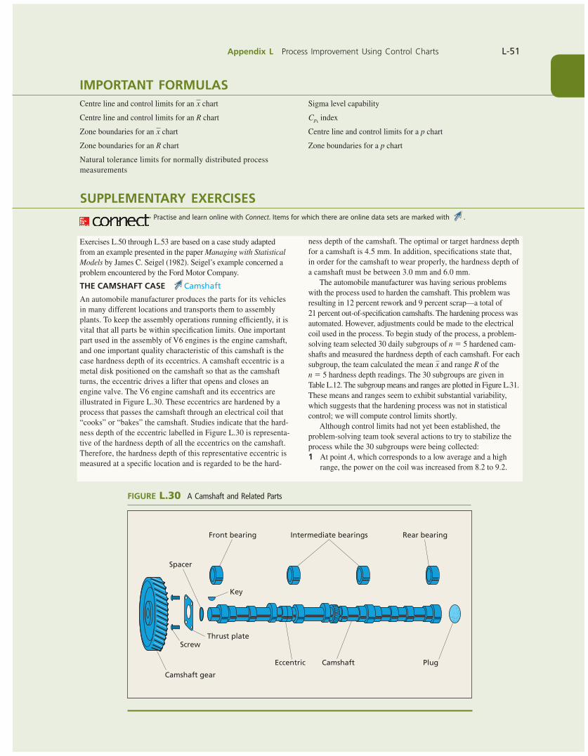
Appendix L Process Improvement Using Control Charts L-51
IMPORTANT FORMULASCentre line and control limits for an x chart
Centre line and control limits for an R chart
Zone boundaries for an x chart
Zone boundaries for an R chart
Natural tolerance limits for normally distributed process measurements
Sigma level capability
Cpk index
Centre line and control limits for a p chart
Zone boundaries for a p chart
SUPPLEMENTARY EXERCISES
Exercises L.50 through L.53 are based on a case study adapted from an example presented in the paper Managing with Statistical Models by James C. Seigel (1982). Seigel’s example concerned a problem encountered by the Ford Motor Company.
THE CAMSHAFT CASE Camshaft
An automobile manufacturer produces the parts for its vehicles in many different locations and transports them to assembly plants. To keep the assembly operations running effi ciently, it is vital that all parts be within specifi cation limits. One important part used in the assembly of V6 engines is the engine camshaft, and one important quality characteristic of this camshaft is the case hardness depth of its eccentrics. A camshaft eccentric is a metal disk positioned on the camshaft so that as the camshaft turns, the eccentric drives a lifter that opens and closes an engine valve. The V6 engine camshaft and its eccentrics are illustrated in Figure L.30. These eccentrics are hardened by a process that passes the camshaft through an electrical coil that “cooks” or “bakes” the camshaft. Studies indicate that the hard-ness depth of the eccentric labelled in Figure L.30 is representa-tive of the hardness depth of all the eccentrics on the camshaft. Therefore, the hardness depth of this representative eccentric is measured at a specifi c location and is regarded to be the hard-
Practise and learn online with Connect. Items for which there are online data sets are marked with .
ness depth of the camshaft. The optimal or target hardness depth for a camshaft is 4.5 mm. In addition, specifi cations state that, in order for the camshaft to wear properly, the hardness depth of a camshaft must be between 3.0 mm and 6.0 mm.
The automobile manufacturer was having serious problems with the process used to harden the camshaft. This problem was resulting in 12 percent rework and 9 percent scrap—a total of 21 percent out-of-specifi cation camshafts. The hardening process was automated. However, adjustments could be made to the electrical coil used in the process. To begin study of the process, a problem-solving team selected 30 daily subgroups of n 5 5 hardened cam-shafts and measured the hardness depth of each camshaft. For each subgroup, the team calculated the mean x and range R of the n 5 5 hardness depth readings. The 30 subgroups are given in Table L.12. The subgroup means and ranges are plotted in Figure L.31. These means and ranges seem to exhibit substantial variability, which suggests that the hardening process was not in statistical control; we will compute control limits shortly.
Although control limits had not yet been established, the problem-solving team took several actions to try to stabilize the process while the 30 subgroups were being collected:1 At point A, which corresponds to a low average and a high
range, the power on the coil was increased from 8.2 to 9.2.
ScrewThrust plate
Camshaft gear
Camshaft PlugEccentric
Key
Spacer
Front bearing Intermediate bearings Rear bearing
FIGURE L.30 A Camshaft and Related Parts
bow39604_appL_L1-L53.indd Page L-51 10/01/14 11:59 AM F-468 bow39604_appL_L1-L53.indd Page L-51 10/01/14 11:59 AM F-468 /203/MHR00232/bow39604_disk1of1/0071339604/bow39604_pagefiles/OLC/203/MHR00232/bow39604_disk1of1/0071339604/bow39604_pagefiles/OLC
Pass 2nd
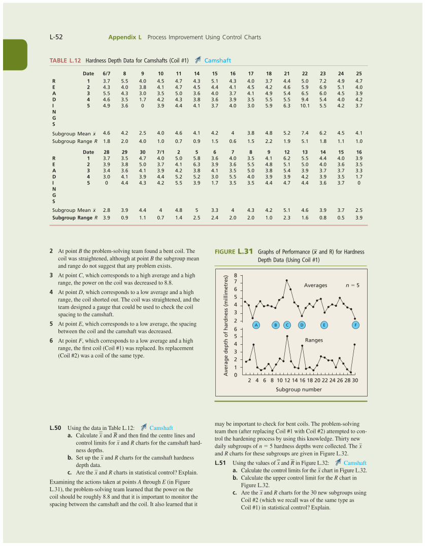
L-52 Appendix L Process Improvement Using Control Charts
TABLE L.12 Hardness Depth Data for Camshafts (Coil #1) Camshaft
Date 6/7 8 9 10 11 14 15 16 17 18 21 22 23 24 25
R 1 3.7 5.5 4.0 4.5 4.7 4.3 5.1 4.3 4.0 3.7 4.4 5.0 7.2 4.9 4.7E 2 4.3 4.0 3.8 4.1 4.7 4.5 4.4 4.1 4.5 4.2 4.6 5.9 6.9 5.1 4.0A 3 5.5 4.3 3.0 3.5 5.0 3.6 4.0 3.7 4.1 4.9 5.4 6.5 6.0 4.5 3.9D 4 4.6 3.5 1.7 4.2 4.3 3.8 3.6 3.9 3.5 5.5 5.5 9.4 5.4 4.0 4.2I 5 4.9 3.6 0 3.9 4.4 4.1 3.7 4.0 3.0 5.9 6.3 10.1 5.5 4.2 3.7NGS
Subgroup Mean x 4.6 4.2 2.5 4.0 4.6 4.1 4.2 4 3.8 4.8 5.2 7.4 6.2 4.5 4.1
Subgroup Range R 1.8 2.0 4.0 1.0 0.7 0.9 1.5 0.6 1.5 2.2 1.9 5.1 1.8 1.1 1.0
Date 28 29 30 7/1 2 5 6 7 8 9 12 13 14 15 16R 1 3.7 3.5 4.7 4.0 5.0 5.8 3.6 4.0 3.5 4.1 6.2 5.5 4.4 4.0 3.9E 2 3.9 3.8 5.0 3.7 4.1 6.3 3.9 3.6 5.5 4.8 5.1 5.0 4.0 3.6 3.5A 3 3.4 3.6 4.1 3.9 4.2 3.8 4.1 3.5 5.0 3.8 5.4 3.9 3.7 3.7 3.3D 4 3.0 4.1 3.9 4.4 5.2 5.2 3.0 5.5 4.0 3.9 3.9 4.2 3.9 3.5 1.7I 5 0 4.4 4.3 4.2 5.5 3.9 1.7 3.5 3.5 4.4 4.7 4.4 3.6 3.7 0NGS
Subgroup Mean x 2.8 3.9 4.4 4 4.8 5 3.3 4 4.3 4.2 5.1 4.6 3.9 3.7 2.5
Subgroup Range R 3.9 0.9 1.1 0.7 1.4 2.5 2.4 2.0 2.0 1.0 2.3 1.6 0.8 0.5 3.9
FIGURE L.31 Graphs of Performance (x and R) for Hardness Depth Data (Using Coil #1)
02 4 6 8 10 12 14
Subgroup number
16 18 20
Ranges
Averages n 5 5
22 24 26 28 30
1
23456
2
345678
Ave
rag
e d
epth
of
har
dn
ess
(mill
imet
res)
A B C D E F
2 At point B the problem-solving team found a bent coil. The coil was straightened, although at point B the subgroup mean and range do not suggest that any problem exists.
3 At point C, which corresponds to a high average and a high range, the power on the coil was decreased to 8.8.
4 At point D, which corresponds to a low average and a high range, the coil shorted out. The coil was straightened, and the team designed a gauge that could be used to check the coil spacing to the camshaft.
5 At point E, which corresponds to a low average, the spacing between the coil and the camshaft was decreased.
6 At point F, which corresponds to a low average and a high range, the fi rst coil (Coil #1) was replaced. Its replacement (Coil #2) was a coil of the same type.
L.50 Using the data in Table L.12: Camshafta. Calculate x and R and then fi nd the centre lines and
control limits for x and R charts for the camshaft hard-ness depths.
b. Set up the x and R charts for the camshaft hardness depth data.
c. Are the x and R charts in statistical control? Explain.
Examining the actions taken at points A through E (in Figure L.31), the problem-solving team learned that the power on the coil should be roughly 8.8 and that it is important to monitor the spacing between the camshaft and the coil. It also learned that it
may be important to check for bent coils. The problem-solving team then (after replacing Coil #1 with Coil #2) attempted to con-trol the hardening process by using this knowledge. Thirty new daily subgroups of n 5 5 hardness depths were collected. The x and R charts for these subgroups are given in Figure L.32.
L.51 Using the values of x and R in Figure L.32: Camshafta. Calculate the control limits for the x chart in Figure L.32.b. Calculate the upper control limit for the R chart in
Figure L.32.c. Are the x and R charts for the 30 new subgroups using
Coil #2 (which we recall was of the same type as Coil #1) in statistical control? Explain.
bow39604_appL_L1-L53.indd Page L-52 10/01/14 11:59 AM F-468 bow39604_appL_L1-L53.indd Page L-52 10/01/14 11:59 AM F-468 /203/MHR00232/bow39604_disk1of1/0071339604/bow39604_pagefiles/OLC/203/MHR00232/bow39604_disk1of1/0071339604/bow39604_pagefiles/OLC
Pass 2nd
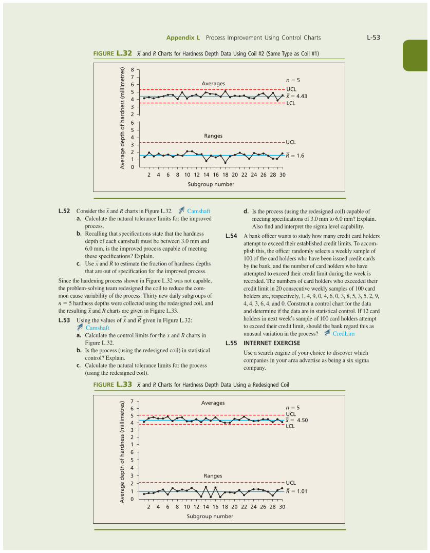
Appendix L Process Improvement Using Control Charts L-53
L.52 Consider the x and R charts in Figure L.32. Camshafta. Calculate the natural tolerance limits for the improved
process.b. Recalling that specifi cations state that the hardness
depth of each camshaft must be between 3.0 mm and 6.0 mm, is the improved process capable of meeting these specifi cations? Explain.
c. Use x and R to estimate the fraction of hardness depths that are out of specifi cation for the improved process.
Since the hardening process shown in Figure L.32 was not capable, the problem-solving team redesigned the coil to reduce the com-mon cause variability of the process. Thirty new daily subgroups of n 5 5 hardness depths were collected using the redesigned coil, and the resulting x and R charts are given in Figure L.33.
L.53 Using the values of x and R given in Figure L.32:
Camshafta. Calculate the control limits for the x and R charts in
Figure L.32.b. Is the process (using the redesigned coil) in statistical
control? Explain.c. Calculate the natural tolerance limits for the process
(using the redesigned coil).
FIGURE L.32 x and R Charts for Hardness Depth Data Using Coil #2 (Same Type as Coil #1)
02 4 6 8 10 12 14 16
Subgroup number
18 20
Ranges
Averagesn 5 5
22 24 26 28 30
123456
2345678
Ave
rag
e d
epth
of
har
dn
ess
(mill
imet
res)
UCL
UCL
x 5 4.43
R 5 1.6
LCL
d. Is the process (using the redesigned coil) capable of meeting specifi cations of 3.0 mm to 6.0 mm? Explain. Also fi nd and interpret the sigma level capability.
L.54 A bank offi cer wants to study how many credit card holders attempt to exceed their established credit limits. To accom-plish this, the offi cer randomly selects a weekly sample of 100 of the card holders who have been issued credit cards by the bank, and the number of card holders who have attempted to exceed their credit limit during the week is recorded. The numbers of card holders who exceeded their credit limit in 20 consecutive weekly samples of 100 card holders are, respectively, 1, 4, 9, 0, 4, 6, 0, 3, 8, 5, 3, 5, 2, 9, 4, 4, 3, 6, 4, and 0. Construct a control chart for the data and determine if the data are in statistical control. If 12 card holders in next week’s sample of 100 card holders attempt to exceed their credit limit, should the bank regard this as unusual variation in the process? CredLim
L.55 INTERNET EXERCISE
Use a search engine of your choice to discover which companies in your area advertise as being a six sigma company.
02 4 6 8 10 12 14 16
Subgroup number
18 20
Ranges
Averagesn 5 5
22 24 26 28 30
1234561234567
Ave
rag
e d
epth
of
har
dn
ess
(mill
imet
res)
x 5 4.50
R 5 1.01
UCL
LCL
UCL
FIGURE L.33 x and R Charts for Hardness Depth Data Using a Redesigned Coil
bow39604_appL_L1-L53.indd Page L-53 10/01/14 11:59 AM F-468 bow39604_appL_L1-L53.indd Page L-53 10/01/14 11:59 AM F-468 /203/MHR00232/bow39604_disk1of1/0071339604/bow39604_pagefiles/OLC/203/MHR00232/bow39604_disk1of1/0071339604/bow39604_pagefiles/OLC
Pass 2nd