
Print Issue 03
16
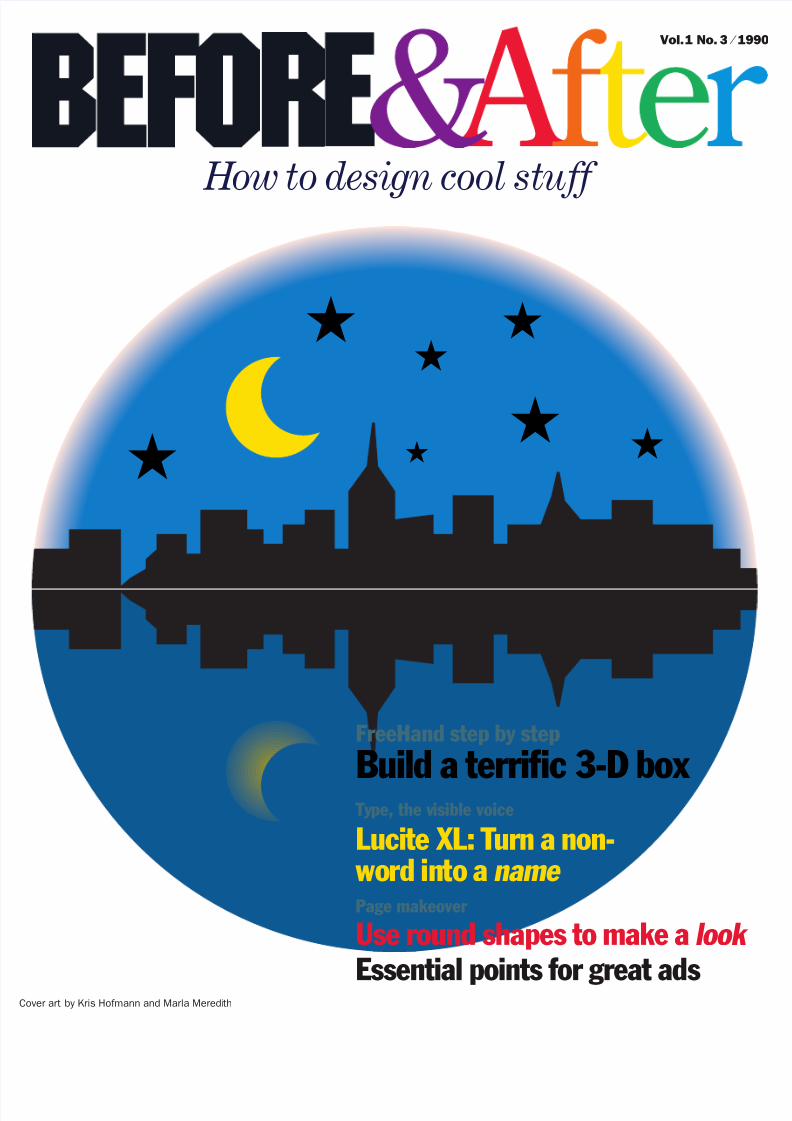
Cover art by Kris Hofmann and Marla Meredi th FreeHand step by step Build a terri fi c 3-D box Ty pe, the v isible voice Lucite XL: T urn a non- wo rd in to a Page makeover Use round shapes to make a Essential points for great ads Vol. 1 No. 3 ⁄ 1990 H ow to design cool stuff look name
-
Upload
hesed-antonim -
Category
Documents
-
view
236 -
download
0
Transcript of Print Issue 03
7/27/2019 Print Issue 03
http://slidepdf.com/reader/full/print-issue-03 1/16
55
5
5
5
ver art by Kris Hofmann and Marla Meredith
5
55
5
5
5
5
FreeHand step by step
Build a terrific 3-D box Type, the visible voice
Lucite XL: Turn a non- word into aPage makeover
Use round shapes to make a
Essential points for great ads
Vol. 1 No. 3 ⁄ 1
How to design cool stuff
look
name

7/27/2019 Print Issue 03
http://slidepdf.com/reader/full/print-issue-03 2/16
THE MAILBOX
PAGE NOTES Beige sidebars are made of 3% Cyan7% magenta and 16% yellow. Cast shadows arethe same except for 25% black (shadows arealways the color they’re on plus some black).
A SLICE OF THE WORLD FOCUSES A PAGESee, the earth is flat after all. This unusualmap-drawing technique will isolate—andfocus attention on—any piece of real es-tate. For this example, I used FreeHand torecreate Pastor Schmidt’s Countryside’s Connection map line for line, then moved acopy straight down and (carefully) cut and
joined the pieces (it took a while). Note theangles of the street names (I set them at30° before rotating the whole image –30°)and the way the map bursts from its border(just draw a box behind it and crop).
Dear Mr. McWade:Is there a difference between a typeface
and a typefont? John Robards Tacoma, WA
Only in hot metal. There, a type face is astyle; a type font is one size of that style,i.e. the 14-pt Helvetica font. Computershave erased the distinction.
Dear Mr. McWade:
Before & After is indeed cool. Wheredo you get your ideas? Aren’t you afraid you’ll run out of them?
Nancy Vickers Vancouver, BC
I look around and often begin by imitat-ing the things I see. A silhouette-on-text logo like the one on the next pagehas been done before, but never in quitethis way. Start with something else andmake it work for you.
Dear Mr. McWade:I love Before & After! I’m new to design
and must design advertisements for my busi-ness. Do you plan any articles on advertising?
Richard RamirezCoral Gables, FL
I expect to address advertising designmany times. Advertising is a fascinatingfield to which intelligent and otherwisecapable businesspeople forget to bringtheir brains. (What else explains the factthat you can’t remember even one per-cent of the ads you see—from excellentcompanies, no less—and you probablydon’t believe even those?) No other fieldis so filled with illusions, misconceptionsand silly expectations.
Because of this, it is one area wherelooking around won’t help much. (Whatwould you look at?) Also, design is onlyone piece of the advertising equation. Auseful ad requires concept, writing and,most of all, clear thinking. See page 6.
Dear Mr. McWade:I’m planning a new newsletter and
would like your opinion on which is best: two-, three- or four-column pages.
Edith FineEncinitas, CA
I usually begin with a simple format andmake it more complex only if I must.That generally means starting with atwo-column page.
Don’t feel compelled to mimic fancydesigns. Adult readers respond best tothe shapes and colors of kindergarten—red, green, yellow; circles, squares andso forth (consider the effectiveness of traffic signals). The most memorablecase for simple I ever saw was watchinga group of dark-suited businessmen
Vollmerhausen
CFCSavage-Gullford
Baltimore
Foundry
Gorman
H o w a r d
R o u t e 3 2
U S R
o u t e
1
CountrysideFellowship Church
P. O. Box 1001
Laurel, MD 20725
Non-Profit Org.
US PostagePAID
Permit 5943Laurel, MD
Our Neighbor
Countryside Fellowship Church
meets at Patuxent Valley Middle School
Sundays, 10:30 amNursery and Children’s classes provided each week
Church Office: 490-5737
COUNTRYSIDE FELLOWSHIP CHURCH
P.O. Box 1001
Laurel, MD 20725
Non-Profit Org.US PostagePAIDPermit 5943Laurel, MD
C O U N T R Y S I D E F E L L O W S H I P C H U R C Hmeets at Patuxent Valley Middle School Sundays, 10:30 am
Nursery and Children’s classes provided each week
C H U R C H O F F I C E : 4 9 0 - 5 7 3 7
SAVAGE-GULLFORD
FOUNDRY
BALTIMORE
VOLLMERHAUSEN
HOWARD
US ROUTE 1
ROUTE 32
CFC
GORMAN

7/27/2019 Print Issue 03
http://slidepdf.com/reader/full/print-issue-03 3/16
Hardcopy S. I. Connally
Route 2, Box 208
Mineral Wells, TX. 76067
817/ 325-1802
view an animated computer program.They laughed! They marveled! They
responded. Who were these men? Theyrepresented about $100 million in legaltalent, investment capital and engineer-ing skill, and the product they had cometo see—a megaton salvo in a worldwiderace for technological superiority, thegrist for Wall Street Journal essays andHarvard Business School studies—wasbeing brought to life by a cartoon.
Keep it simple. Trust me.
Dear Mr. McWade:I design a regular newsletter with my
computer but every month I have the sameargument with my editor; she always wantsmore words and says “form follows func- tion.” I think some pictures and extra whitespace would help a lot. How do I convinceher design is important?
Rebecca Mark New York, NY
Your goal should be to speak in a visuallanguage that reflects your newsletter’s
written language. You’re having troublewith your editor because your designisn’t doing that; when it does, she’ll seeit. Good design isn’t necessarily picturesand white space; a literary newsletter,for example, could be thick with text, inwhich case your job might be to endow itwith the aura of classic literature. Studythe typography of fine books—marginwidths, small caps, ligatures, old-stylenumerals, typographic ornamentationand so forth—and make the words glow.
It is my position that in an editorialenvironment, the art director serves theeditor. You must understand that design
is more than decoration; it speaks with avery strong voice. That color or line orinitial cap that you like so much cantruly alter the tone of her publication.Respect that. Serve her with it.
S. I. Connally
Route 2, Box 208
Mineral Wells, TX 76067
817 ⁄ 325-1802
Close your eyes for a moment (this isimportant) and visualize the wordHardcopy. That’s one word; not two.Hardcopy. I’m serious; picture it for aminute. I’ll tell you what I see: I seehardbody trucks, hardbody people,heavy machinery, precision, authority,a thesaurus full of words that makeme want to stand back a step or two.If I get carried away, I can even hearDarth Vader. Hardcopy is a cool wordbecause it’s a picture word—the kindthat stays in the mind—which gives itexceptional communication potential(unlike, oh, Bob & Associates ).
But the language of de-sign can be maddeningly elusive. Sandy Connally knew the power of a horsewhen she scanned one forher first letterhead. Yetthe result sent a confus-ing message. Is her Hard-copy about horses? If so,why the name Hardcopy?If not, why picture thehorse? And set in swashy Zapf Chancery, Hardcopy says hard but looks soft; itis a visual oxymoron thatneutralizes the word.
The makeover bringswords and graphics to-gether. Set in mighty ITCMachine, Hardcopy towersabove the horse like amonolith, while the whitehorse conveys eleganceand the classic power of contrast; the horse—much smaller—now repre-sents Sandy the person,not Hardcopy the busi-ness. The eye is quickly drawn to thehorse; note how the placement of theaddress (Helvetica Black and Light, set8.5/10) takes advantage of this.
ITC Machine makes a versatile backdropfor silhouettes. The one below was set inFreeHand at 69 points with a 2.5-pt stroke and –4.2-pt letterspacing. Fine-tune theletter-pair kerning manually.
Silhouette-on-text makes a
beginner lookestablished
MINI-MAKEOVER
Questions? Contributions? Address letters to
John McWade, Before & After, 331 J Street, Suite 150, Sacramento, CA 95814-9671.
S. I. Connally
Route 2, Box208
MineralWells, TX 76067
817 ⁄325-1802
HARDCOPY
HARDCOPY

7/27/2019 Print Issue 03
http://slidepdf.com/reader/full/print-issue-03 4/16
4
1. WHAT’S IN A NAME? LOTS OF TROUBLE.Rolled from the writer’s Underwood (copywriters always use manuals), thename Lucite XL sends at least four messages: what you read (the words),what you hear (excel), what you sense (X-cite, which is subliminal), and oneother: If you’re like my literal-minded wife, what it says is Luciteextra large.
2. THIS COULD BE UNDERWEARWhat is this? Lucite is a nonword; only the XL looks familiar. This problemmust be resolved by the designer or the product will die on the shelves.Although Helvetica is a handsome typeface, the plain version on your laserprinter wasn’t drawn well and this lonely setting has neutralized even that.
3. A FOUNDATION IS ESSENTIALWe may not know what a classic acrylic surface is, but at least the wordsare in English so we glom onto them. This line must be here; it is not anadd-on. Because of its power, it can be set in any size, style and position,as long as Lucite XL appears dominant. Helvetica Black and Light are crisp.
4. UPPERCASE CHARACTERS WORK AS A UNIT This setting resolves the XL problem and balances the entire statement;Lucite XL now reads as a single name. The setting is sharp-edged andauthoritative; under other conditions it would be the ideal. In this case,authority isn’t enough; the emblem must also radiate a look-at-me appeal.
We perceive complex data more intui-tively than we give ourselves credit for.When the president speaks, for exam-ple, we understand his words, but whatdo we pick up in his tone of voice? hisbody language? the chart on the wallbehind him? How do we feel, in otherwords, about what we’re hearing?
Type is no different. Before we readthe words we see them and begin toform an opinion. That opinion matters.
Du Pont’s Lucite XL is an interest-ing—and common—case. Lucite XL hasno English translation. It is, like manyothers, a name invented for an occasion.
What can the designer do? He canlet the type speak. Lucite XL is thekind of name that has virtually no mean-ing until the designer—and the market-ing department—assign it one. Set in afont that looks cheery, Lucite will lookcheery. In type that says highbrow,Lucite will appear highbrow. But firstthere are some problems to solve:
Lucite XL, The Classic
Acrylic Surface
Lucite XLThe Classic Acrylic Surface
LUCITE XLThe Classic Acrylic Surface
Lucite XL
What does what we’re seeing say?If the type is right, it always says something more.
TYPE: THEVISIBLE VOICE
mark). The words LUCITE XL are set in ITC Serif Gothic; THE CLASSIC ACRYLIC SURFACE is in Friz Quadrata.Du Pont’s famous oval is old, handmade and unique; it has earned the right to be admired reverently.
TWO STORE-BOUGHT FONTS AND A FAMOUS LOGOThe emblem above was created by Du Pont and is used to promote Lucite XL (Lucite is a Du Pont trade-
L U C I T E
X L T H E C LA S
S I C A C R
Y L I C S U R
FA C E
7/27/2019 Print Issue 03
http://slidepdf.com/reader/full/print-issue-03 5/16
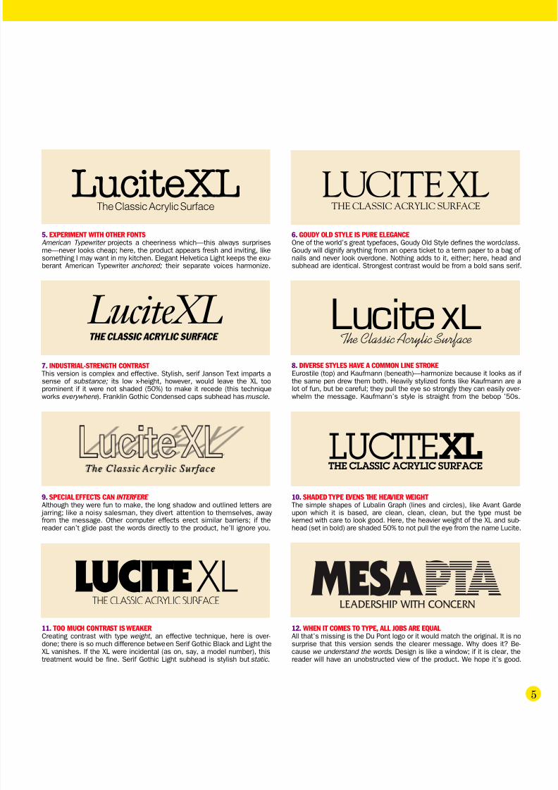
9. SPECIAL EFFECTS CAN INTERFERE
Although they were fun to make, the long shadow and outlined letters are jarring; like a noisy salesman, they divert attention to themselves, away from the message. Other computer effects erect similar barriers; if thereader can’t glide past the words directly to the product, he’ll ignore you.
The Classiche Classic Acrylic Surfacecrylic Surface
10. SHADED TYPE EVENS THE HEAVIER WEIGHT The simple shapes of Lubalin Graph (lines and circles), like Avant Gardeupon which it is based, are clean, clean, clean, but the type must bekerned with care to look good. Here, the heavier weight of the XL and sub-head (set in bold) are shaded 50% to not pull the eye from the name Lucite.
11. TOO MUCH CONTRAST IS WEAKERCreating contrast with type weight , an effective technique, here is over-done; there is so much difference between Serif Gothic Black and Light theXL vanishes. If the XL were incidental (as on, say, a model number), thistreatment would be fine. Serif Gothic Light subhead is stylish but static .
12. WHEN IT COMES TO TYPE, ALL JOBS ARE EQUALAll that’s missing is the Du Pont logo or it would match the original. It is nosurprise that this version sends the clearer message. Why does it? Be-cause we understand the words . Design is like a window; if it is clear, thereader will have an unobstructed view of the product. We hope it’s good.
5. EXPERIMENT WITH OTHER FONTSAmerican Typewriter projects a cheeriness which—this always surprisesme—never looks cheap; here, the product appears fresh and inviting, likesomething I may want in my kitchen. Elegant Helvetica Light keeps the exu-berant American Typewriter anchored; their separate voices harmonize.
The Classic Acrylic Surface
LuciteXL
6. GOUDY OLD STYLE IS PURE ELEGANCEOne of the world’s great typefaces, Goudy Old Style defines the word class.Goudy will dignify anything from an opera ticket to a term paper to a bag of nails and never look overdone. Nothing adds to it, either; here, head andsubhead are identical. Strongest contrast would be from a bold sans serif.
THE CLASSIC ACRYLIC SURFACE
THE CLASSIC ACRYLIC SURFACE
8. DIVERSE STYLES HAVE A COMMON LINE STROKEEurostile (top) and Kaufmann (beneath)—harmonize because it looks as if the same pen drew them both. Heavily stylized fonts like Kaufmann are alot of fun, but be careful; they pull the eye so strongly they can easily over-whelm the message. Kaufmann’s style is straight from the bebop ’50s.
LUCITE XL
7. INDUSTRIAL-STRENGTH CONTRAST This version is complex and effective. Stylish, serif Janson Text imparts asense of substance; its low x-height, however, would leave the XL tooprominent if it were not shaded (50%) to make it recede (this techniqueworks everywhere ). Franklin Gothic Condensed caps subhead has muscle .
Lucite XLThe Classic Acrylic Surface
THE CLASSIC ACRYLIC SURFACE
LUCITE XL
LUCITEXLTHE CLASSIC ACRYLIC SURFACE
Lucite xL
MESA PTA LEADERSHIP WITH CONCERN

7/27/2019 Print Issue 03
http://slidepdf.com/reader/full/print-issue-03 6/16
6
3. They involve the reader.
5. They command answers.
6. They let the reader think.
7. The headline and picture are a unit.
8. They never brag.
9. They’re always well executed.
10. They sell.Copyright AdsOnlySan Francisco, Inc.1604 Union StreetSan FranciscoCalifornia 94123415-776-1170Used by permission
WHAT A JOLT OF RED!This black and white on
red treatment will arrestattention anywhere it isused. The stun-gun effecthas a downside, however:There is very little contrastbetween black and red;reading the black typerequires some effort.
Inside great ads
6
THE THINKINGDESIGNER
1. Their message is a surprise.Great ads state ordinary arguments in an unexpected way.
Creativity is violating the expected.
2. They don’t lose clarity.
4. They challenge curiosity.
Great ads are very hard to find. Here’s what to look for:
An ad can look great and still not sell anything.In advertising, what you say is as important as how you say it.
The message must sell or all creativity is wasted.
People with brains enough to create great ads don’t diminishthem with poor layout, typography or pictures.
Ads may brag only if their message is presented
in a disarming way.
The headline is a vital part of the picture. But it nevertells you what you see in the picture. Only what you don’t see.
Together, the headline and visual create drama.
The strongest conclusion is the one you draw yourself.
They demand that you respond; the ad acts like a question mark.
Sparking human curiosity is the best way to grab andhold attention. And the most forgotten one.
Great ads charm, shock, please or irritate,but never leave you cold.
Creativity does not overpower communication.The idea is simple.

7/27/2019 Print Issue 03
http://slidepdf.com/reader/full/print-issue-03 7/16
3.5" (90mm) Micro Flopp y disk
Micro Disque Souple
Micro Flopp y disk
Xample x Xample x
3.5" (90
mm)
Micro Flo
pp y disk
Micro Disqu
e Souple
Micro Flo
pp y disk 3.5
X a m p l e x
3. 5 " ( 9 0 m m )
M i c r o F l o p p y d i s k
M i c r o D i s q u e S o u p l e
M i c r o F l o p p y d i s k
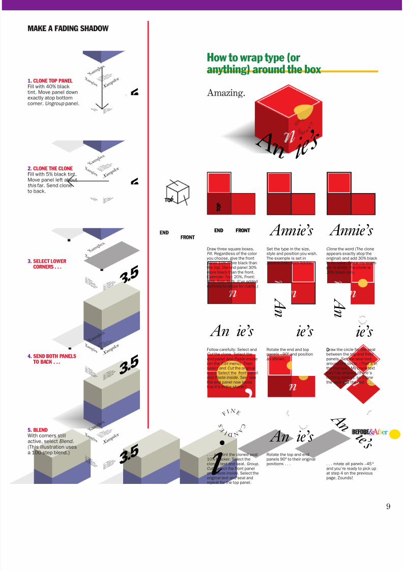
For a package designer, the need for athree-dimensional presentation is essen-tial business. For the rest of us, how-ever, what follows is just a terrific exer-cise in computer artistry. (It comes withbragging rights.) The rotation angles
and scaling percentages are a strict for-mula; follow them exactly. The tintswhich create the colors and shades,however, are variable; I’ve provided theones I used; you’ll enjoy experimentingwith your own. Have fun!
FADING SHADOWA shadow under most room light (and all officelight) is indistinct and usually fades to practically nothing—often in several directions at once.Here, the shadow is 40% black nearest the boxand 5% black at the outer edge. Brighter, moredirect light would result in a shadow that’s dark-er at both ends. Experiment to coordinate theshade of the end panel and the cast shadow.
End panel is too darkrelative to room light.
Same shading on darkbackground looks right
TRANSFORMED TYPESkewed, rotated type is
often used for special
effects, but drawings likethis are what it’s really for.
FLAT PANELSThe box is first drawn, designed and colored inthree flat panels. The top and end panels must bethe same width. I’ve added black lines for illus-tration purposes; a real box has no ruled edges.
3.5" (90mm) Micro Floppydisk Micro Disque Souple Micro Floppydisk
Xamplex Xamplex
3.5" (90mm) Micro Floppydisk Micro Disque Souple Micro Floppydisk
3.5
Xamplex
3.5" (90mm) Micro Floppydisk Micro Disque Souple Micro Floppydisk
SHADED END PANELIt looks like a real box because the end panel islightly shaded . This detail is easy to overlook(Had you noticed it?) because it appears so nat-ural. Shading is done by adding a percentage of black to the color—in this case it’s 20%, aboutwhat you find in normal room light. If the box isalready a shade of black—as it would be whenworking in black and white—just add more black.Be sure to darken everything on the panel—text,graphics, other colors, everything . If the box iscolored solid black, there can be no shadowedpanel. Where light exists, however, a condition of pure black never occurs in real life; some light al-
ways reflects off the surface no matter how darkan object is. Therefore, even the blackest objectshould be rendered in dark grays—and thus theend panel can always be darker!
In the light, even the blackest object appears merely dark gray.
BEFORE & AFTER FREEHAND PROJECT
Make a box that looks real
Master these shadows and angles and your computer drawingconfidence will soar! Here’s how.

7/27/2019 Print Issue 03
http://slidepdf.com/reader/full/print-issue-03 8/168
3 . 5 " ( 9 0 m m )
M i c r o F l o p p y d i s k
M i c r o D i s q u e S o u p l e
M i c r o F l o p p y d i s k
X a m p l e x
X a m p l e x
3 . 5 " ( 9 0 m m )
M i c r o F l o p p y d i s k
M i c r o D i s q u e S o u p l e
M i c r o F l o p p y d i s k
3 . 5
X a m p l e x
3. 5 " (
9 0 m m
)
M i c r o
F l o p p
y d i s k
M i c r o
D i s q u
e S o u
p l e
M i c r o
F l o p p
y d i s k
3 . 5 " ( 9 0 m m )
M i c r o F l o p p y d i s k
M i c r o D i s q u e S o u p l e
M i c r o F l o p p y d i s k
X a m p l e x
X a m p l e x 3 . 5 " ( 9 0 m m )
M i c r o F l o p p y d i s k
M i c r o D i s q u e S o u p l e
M i c r o F l o p p y d i s k
3 . 5
X a m p l e x
3. 5 " ( 9 0 m m )
M i c r o F l o p p y d i s k
M i c r o D i s q u e S o u p l e
M i c r o F l o p p y d i s k
3. ROTATE ALLPANELS –45°
Move the end panelaway from the others.
3 . 5 " ( 9 0 m m )
M i c r o F l o p p y d i s k
M i c r o D i s q u e S o u p l e
M i c r o F l o p p y d i s k
X a m p l e x
X a m p l e x
3 . 5 " ( 9 0 m m )
M i c r o F l o p p y d i s k
M i c r o D
i s q u e S o u p l e
M i c r o F l o p p y d i s k
3 . 5
X a m p l e x
3. 5 " (
9 0 m m
)
M i c r
o F l o p
p y d i s k
M i c r
o D i s q
u e S o u p l e
M i c r
o F l o p
p y d i s k
3.5" (90mm) Micro Floppydisk Micro Disque Souple Micro Floppydisk
Xamplex Xamplex
3.5" (90mm) Micro Floppydisk Micro Disque Souple Micro Floppydisk 3.5
Xamplex
3.5" (90mm) Micro Floppydisk Micro Disque Souple Micro Floppydisk
3.5" (90mm) Micro Floppydisk Micro Disque Souple Micro Floppydisk
Xamplex Xamplex
3.5" (90mm) Micro Floppydisk Micro Disque Souple Micro Floppydisk 3.5
X a m p l e x
3 . 5 " ( 9 0 m m )
M i c r o F l o p p y d i s k
M i c r o D i s q u e S o u p l e
M i c r o F l o p p y d i s k
2. ROTATE TOP PANEL 90°
From the point shown(It helps to use the
Preview mode andzoom way in).
5. SCALE END PANEL
Select end panel only.Scale horizontally exactly 57.74%.*
4. SCALE TOP AND
FRONT PANELSSelect top and frontpanels only. Scalevertically exactly 57.73%.*
1. DRAW THREE PANELSAny dimensions (the ones aboveare for the example); just be certainthe top and end panel are the samewidth. It’s here that type and graph-ics are added; if you’re brave, goahead; otherwise, leave the boxesblank for now.
3.5" (90mm) Micro Flopp y disk
Micro Disque Souple
Micro Flopp y disk
Xample x Xample x
3.5"(90mm)
Micro Flopp y disk
Micro Disque Souple
Micro Flopp y disk 3.5
X a m p l e x
3. 5 " (
9 0 m m
)
M i c r
o F l o p
p y d i s k
M i c r
o D i s q
u e S o u p l e
M i c r
o F l o p
p y d i s k
7. ROTATEENDPANEL
30°
3.5" (90mm) Micro Flopp y disk
Micro Disque Souple
Micro Flopp y disk
Xample x Xample x
3.5" (90
mm)
Micro Flo
pp y disk
Micro Disqu
e Soupl
e
Micro Flo
pp y disk 3.5
X a m p l e x
3. 5 " (
9 0 m m
)
M i c r
o F l o p
p y d i s k
M i c r
o D i s q
u e S o u p l e
M i c r
o F l o p
p y d i s k
3 . 5 " ( 9 0 m m )
M i c r o F l o p p y d i s k
M i c r o D i s q u e S o u p l e
M i c r o F l o p p y d i s k
X a m p l e x
Xample x
3.5" (90
mm)
Micro Flo
pp y disk
Micro Disqu
e Soupl
e
Micro Flo
pp y disk 3.5
X a m p l e x
3. 5 " (
9 0 m m
)
M i c r
o F l o p
p y d i s k
M i c r
o D i s q
u e S o u p l e
M i c r
o F l o p
p y d i s k
6. ROTATE FRONT PANEL 60° 8. ASSEMBLE THE PARTS
(Use the Preview modeand zoom way in.)
23p
11p
Text and
graphics on endpanel have 20%
more black
23p
11p
OPEN FREEHAND
places, the perfect number is 57.735%.*For those of you using a program like Adobe Illustrator that can calculate percentages to three decimal
7/27/2019 Print Issue 03
http://slidepdf.com/reader/full/print-issue-03 9/16
3.5" (90mm) Micro Flopp y disk
Micro Disque Souple
Micro Flopp y disk
Xample x Xample x
3.5"(90mm)
Micro Flopp y disk
Micro Disque Souple
Micro Flopp y disk 3.5
X a m p l e x
3. 5 " (
9 0 m m
)
M i c r
o F l o p
p y d i s k
M i c r
o D i s q
u e S o u p l e
M i c r
o F l o p
p y d i s k
3.5" (90mm) Micro Flopp y disk
Micro Disque Souple
Micro Flopp y disk
Xample x Xample x
3.5"(90mm)
MicroFlopp y disk
Micro Disque Souple
Micro Flopp y disk 3.5
X a m p l e x
3. 5 " (
9 0 m m
)
M i c r
o F l o p
p y d i s k
M i c r
o D i s q
u e S o u p l e
M i c r
o F l o p
p y d i s k
3.5" (90mm) Micro Flopp y disk
Micro Disque Souple
Micro Flopp y disk
Xample x Xample x
3.5"(90mm)
Micro Flopp y disk
Micro Disque Souple
Micro Flopp y disk 3.5
X a m p l e x
3. 5 " (
9 0 m m
)
M i c r o
F l o p p
y d i s k
M i c r o
D i s q u e
S o u p l e
M i c r o
F l o p p
y d i s k
3.5" (90mm) Micro Flopp y disk
Micro Disque Souple
Micro Flopp y disk
Xample x Xample x
3.5" (90mm)
Micro Flopp y disk
Micro Disque Souple
Micro Flopp y disk 3.5
X a m p l e x
3. 5 " ( 9 0 m m )
M i c r o F l o p p y d i s k
M i c r o D i s q u e S o u p l e
M i c r o F l o p p y d i s k
3.5" (90mm) Micro Flopp y disk
Micro Disque Souple
Micro Flopp y disk
Xample x
X a m p l e x
3. 5 " (
9 0 m m
)
M i c r o
F l o p p
y d i s k
M i c r o
D i s q u
e S o u
p l e
M i c r o
F l o p p
y d i s k
Xample x
3.5"(90mm)
Micro Flopp y disk
Micro Disque Souple
Micro Flopp y disk 3.5
MAKE A FADING SHADOW
1. CLONE TOP PANELFill with 40% blacktint. Move panel down
exactly atop bottomcorner. Ungroup panel.
2. CLONE THE CLONEFill with 5% black tint.Move panel left aboutthis far. Send cloneto back.
3. SELECT LOWERCORNERS . . .
4. SEND BOTH PANELS TO BACK . . .
5. BLENDWith corners stillactive, select Blend.(This illustration usesa 100-step blend.)
How to wrap type (or anything) around the box
Amazing.
ENDFRONT
TOP
Annie’s Annie’s END FRONT
T O P
A n
ie’s
F IN E
C A
N D I E S
An ie’s
DFollow carefully: Select andCut the clone. Select theend panel and Paste inside (on the Edit menu). Thenselect and Cut the originalword. Select the front paneland Paste inside. See howthe end panel now lookslike it’s in the shade?
Rotate the end and toppanels –90° and positionas shown.
Draw the circle for the sealbetween the top and frontpanels. Set the seal textaround the circle. (That’s inthe manual.) My black textcan’t be shaded (there’snothing darker), so Clone the seal and the text . . .
i
C A
N D I E S
F IN E
An ie’s
C A
N D I E S
F I
N E
. . . and tint the cloned seal10% blacker. Select thecloned text and seal, Group,Cut, select the front paneland Paste inside. Select theoriginal text and seal andrepeat for the top panel.
Rotate the top and endpanels 90° to their originalpositions . . . . . . rotate all panels –45°
and you’re ready to pick upat step 4 on the previouspage. Zounds!
Draw three square boxes.Fill. Regardless of the coloryou choose, give the frontpanel 10% more black thanthe top, the end panel 30%more black than the front.Example: Top: 20%, Front:30%, End: 60%. (I’ve addedoutlines to steps for clarity.)
Set the type in the size,style and position you wish.The example is set inJanson italic from Adobe.
Clone the word (The cloneappears exactly atop theoriginal) and add 30% blackto its color. Since my exam-ple is white, the clone is30% black only.
A n
ie’s
A n
i e ’ s C
A N D I
E S
FI N
E
C A
N D I E S
i e’ s F I N E
An
7/27/2019 Print Issue 03
http://slidepdf.com/reader/full/print-issue-03 10/160
New ImagesPhotography
9365 City Court
Davis, CA 95673
916-555-5555
Karen Foster
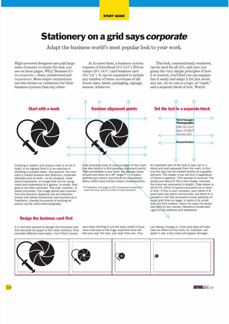
Creating a modern and unique mark is an art initself; in its highest form it is an exercise indistilling a complex stew—the product, the com-pany’s market position and direction, corporateattitudes and so forth—to its simplest, mostdirect expression, an image that can be recog-nized and understood at a glance. In reality, thatgoal is not often achieved. The look, however, iseasily mimicked. The image above was scannedfrom the Dynamic Graphics clip art collection,traced with Adobe Streamline and touched up inFreeHand. Literally thousands of existing artpieces can be used interchangeably.
An important part of the look is type set in ablock and kept separate from the mark; in thisway the type can be treated strictly as a graphicelement. The reader’s eye will find it regardlessof where it appears. (The sample is unusual: Thewords just about fit into a box shape; normally the lines vary somewhat in length.) Type above isset 8/10, which is typical (one point up or downis fine). If this is your company, your name in 8-point type may seem microscopic, but there is aparadox in the fact we bestow more authority onsmall print than on large. In spite of its smallsize, the font matters. Here I’ve used Friz Quad-rata bold for the names, Helvetica CondensedLight for the address and telephone.
Start with a mark
High-powered designers are paid largesums of money to create the look yousee on these pages. Why? Because it’sso corporate— clean, uncluttered andimpressive. More major corporationsuse this theme (or variations) for theirbusiness systems than any other.
At its most basic, a business systemconsists of letterhead (81 ⁄ 2Љx11Љ), #10 en-velope (91 ⁄ 2Љx41 ⁄ 8Љ) and business card(31 ⁄ 2Љx 2Љ). It can be expanded to includeany number of items: envelopes of dif-ferent sizes, labels, packaging, signage,memos, whatever.
This look, conscientiously rendered,can be used for all of it, and once yougrasp the very simple principles of howit is created, you’ll find you can manipu-late it easily and adapt it for just aboutany use. At its core is a logo, or “mark,”and a separate block of text. Watch:
Envision alignment points Set the text in a separate block
Rule boundary lines at various edges of the mark;the idea here is to find possible alignment points.This sample has a nice twist; the plunger loopsaround and down at a 45° angle*—it createsdefinite eye motion and should be considered.Many marks have similar unique characteristics.
*In FreeHand, this angle is 315° (measured counterclock-wise from zero, which is at the 3 o’clock position).
It is normally easiest to design the business cardfirst because its space is the most confined. Firstconsider different size marks. You’ll find it neces-
sary when printing to cut the laser sheet to busi-ness card size or the huge unprinted area willfool your eye. For now, just look. Pick one. (You
can always change it.) Color and type will laterhave an effect on the mark; for example, setapart in red, a tiny mark will appear stronger.
STUDY GUIDE
Adapt the business world’s most popular look to your work.
Stationery on a grid sayscorporate
Design the business card first

7/27/2019 Print Issue 03
http://slidepdf.com/reader/full/print-issue-03 11/16
NewImagesPhotography
9365 City Court
Davis, CA 95673
Now, move around on a grid
There are no standard grids; you make one to suityourself and the task at hand. Note, however, thatthe mark and text block are always linked by a lineof sight or a grid line. The eye will not see this inthe finished product, yet the viewer will recognizethe work as “somehow” better. Experiment; thistechnique will yield abundant dividends.
NewImagesPhotography
9365CityCourt
Davis,CA 95673
916-555-5555
Above: Automated postal equipment has put thelower third of a business envelope pretty much oflimits. Note that name and telephone number arenormally not printed on the envelope. The positiorelationship of mark and text block need not bethe same on all pieces, but I find the work easierif I start with it the same and change it only if I’mnot happy with the result.
NewImagesPhotography
9365 City Court
Davis, CA 95673
August 16, 1999
Mr. Justin Howard
Xamplex Corporation
9876 Fortune Blvd.
Las Cruces, NM 88001
Dear Mr. Howard:
Lorem ipsum dolor sit amet, consectetur adipscing elit, diam nonnumy eiusmod
tempor incidunt ut labore et dolore magna aliquam erat volupat. Ut enim ad mini-
mim veniami quis nostrud exercitation ullamcorper suscipit laboris nisl ut aliquip ex
ea commodo consequat.
Duis autem vel eum irure dolor in reprehenderit in voluptate velit esse son
consequat, vel illum dolore eu fugiat nulla pariatur. At vero eos et accusam et justo
odio dignissim qui blandit praesent lupatum delenit aigue duos dolor et molestais
exceptur sint occaecat cupidat non provident, simil tempor sunt in culpa qui officia
deserunt mollit anim id est laborum et dolor fugai. Et harumd dereud facilis est er
expedit distinct. nam liber a tempor cum soluta nobis eligend optio comque nihil
quod a impedit anim id quod maxim placeat facer possim omnis es voluptas as-
sumenda est, omnis dolor repellend.
Temporem eutem quinsud et aur office debit aut tum rerum necessit atib
saepe eveniet ut er repudiand sint et molestia non este recusand. Itaque earud rerum
hic tentury sapiente delectus au aut prefer endis dolorib asperiore repellat.
Hanc ego cum tene sentniam, quid est cur verear ne ad eam non possing nost
ros quos tu paulo ante cum memorite it tum etia ergat. Nos amice et nebevol, oles-
tias access potest fier ad augendas cum conscient to factor tum toen legum odioque
civiuda. Et tamen in busdad ne que pecun modut est neque nonor imper ned libiding
gen epular religuard on cupiditat, quas nulla praid im umdnat. Improb pary minuiti
potius inflammad ut coercend magist and et dodecendense videantur.
Sincerely,
Karen Foster
NewImagesPhotography
9365CityCourt
Davis,CA95673
916-555-5555
Designs by Marla Meredith
Left and below: Letterhead must take into accounfolds and letter margins. The left margin should bwide—at least 11 ⁄ 2Љ, more if you’re daring. (Havelots of white space.) Prepare a dummy letter andwork around it. At left, text block aligns with bothfold and letter salutation. Below, mark and namein upper right corner is cool.
New ImagesPhotography
9365 City Court
Davis, CA 95673
916-555-5555
Karen Foster
Karen Foster New ImagesPhotography
9365 City Court
Davis, CA 95673
916-555-5555
New ImagesPhotography
9365 City Court
Davis, CA 95673
916-555-5555
Karen Foster
New ImagesPhotography
9365 City Court
Davis, CA 95673
916-555-5555
Karen Foster
New ImagesPhotography
9365 City Court
Davis, CA 95673
916-555-5555
Karen Foster

7/27/2019 Print Issue 03
http://slidepdf.com/reader/full/print-issue-03 12/16
7/27/2019 Print Issue 03
http://slidepdf.com/reader/full/print-issue-03 13/16

7/27/2019 Print Issue 03
http://slidepdf.com/reader/full/print-issue-03 14/164
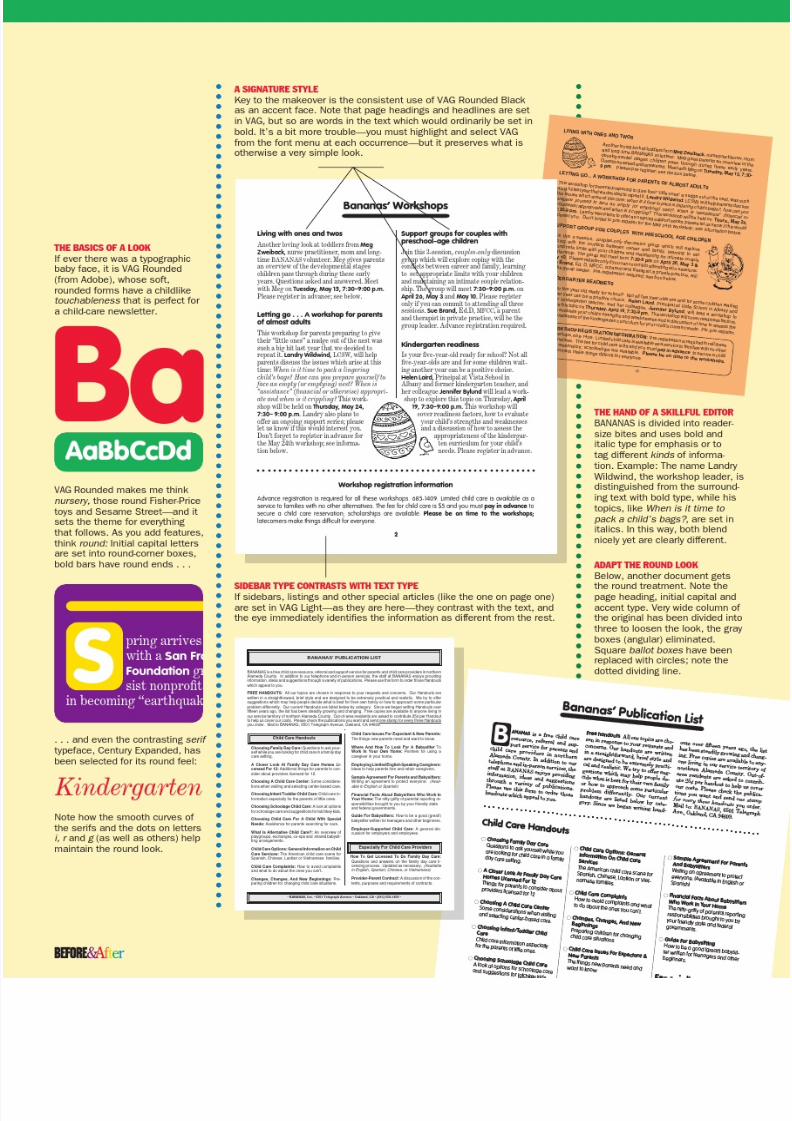
DETAILS: STYLE SHEETS
PageMaker’s style sheets are extremelypowerful and worth knowing how tohandle. One style (typeface, size, indent,etc.) always applies to an entire para-graph (a paragraph ends at a return
stroke). The BANANAS sample below,however, has two typestyles in eachlead paragraph: Zapf Dingbats (thebullet) and VAG Rounded Bold. Thethird style, VAG Rounded Light, is a
second paragraph (it comes after a return stroke) and therefore has its ownstyle. This, therefore, is a useful drill.
The sequence below will duplicatethe sample setting exactly.
HOW TO MAKE ROUND BALLOT BOXES AND HANGING INDENTS
Sample fonts:VAG Rounded Bold (head)VAG Rounded Thin (text)Zapf Dingbats outline (bullet)Size: 10/12
SET THE FIRST LINESet the bullet (Zapf Dingbats outline ),then a fixed space (here, it’s a thin en )and Copy both, thentype the subhead in VAGRounded Bold; if it’s longerthan one line, as shown here,let it wrap.
SET THE INDENTSWith the cursor still active inthe paragraph, select theParagraph dialog and enter thefollowing indent values: Left:0p11; First: –0p11. Click OK.Different fonts and sizes willrequire other values; you’llhave to experiment later.
DEFINE THE FIRST STYLEWith the cursor still active,
select Define styles. Click New and enter a name, like Bullet head. Delete the contents of the Based on box. Click OK.Note that your bullet has beenchanged to some obscuremark; ignore this for now.Press return .
DEFINE THE SECOND STYLESelect the Paragraph dialogand change the first line indentto 0. Click OK. Select Type.Change the font to VAGRounded Thin. Click OK. Typethe line of text. With the cursorstill active, select Define styles and enter another name, like
Text (note that it is based onyour first style, which is whatyou want). Click OK.
FIX THE BULLET Select the odd mark that oncewas the bullet—and the spaceafter it—and Paste .
Subsequent heads and textcan be made simply by clickingin the Styles dialog, but,because the bullet is a differ-ent typefont, you must Paste the real bullet in each time.
4
q Child Care Issues For Expectant &New ParentsThe things new parents need andwant to know
q Where And How To Look For ABabysitter To Work In Your OwnHomePointers for using a caregiver in yourhome
Especially For ChildCare Providers
q How To Get Licensed To Do FamilyDay CareQuestions & answers on the familyday care licensing process. Updatedas necessary. (In English, Spanish,Chinese, or Vietnamese)
For Care Providers
q Provider-Parent Contract A discussion of the contents, purposesand requirements of contracts.
For Care Providersq Provider-Parent Contract
A discussion of the contents, purposesand requirements of contracts.
q Choosing Family Day CareQuestions to ask yourself while youare looking for child care in a familyday care setting.
q A Closer Look At Family Day CareHomes Licensed For 12Things for parents to consider aboutproviders licensed for 12
q Choosing A Child Care Center Some considerations when visitingand selecting center-based care.
q Choosing Infant/Toddler Child CareChild care information especially forthe parents of little ones.
q Choosing Schoolage Child CareA look at options for schoolage careand suggestions for latchkey kids.
q Choosing Child Care For A Child
With Special NeedsAssistance for parents searching forcare.
q What Is Alternative Child Care?An overview of playgroups, ex-changes, co-ops and shared baby-sitting arrangements.
q Child Care Options: GeneralInformation On Child Care ServicesThe American child care scene for
Spanish, Chinese, Laotian or Vietnam-ese families.
A Closer
Homes Li
Things fo
provid

7/27/2019 Print Issue 03
http://slidepdf.com/reader/full/print-issue-03 15/16
preparedness repairs such as securing hot wa-ter heaters and toy cabinets to the walls, etc.
As part of this grant BANANAS will also be of-
fering for sale, at a greatly reduced
pring arrives along with a San Francisco Foun-
dation grant to assist nonprofit centers in be-coming “earthquake-ready.” BANANAS will becontacting centers in the near future to make
an appointment for a free check of common
earthquake hazards which will include minor
Any page looks cleaner when its typeis aligned horizontally. (Attention tothis detail will always add to yourwork; I think it’s worth it.) The proc-ess is sometimes referred to as align-
ing to a grid, the grid being the lead-ing, or line spacing, value.The leading of the BANANAS text
is 12 points, or one pica. But the head-ings—this isn’t unusual—are set on18-pt leading. Because of this, a one-line heading will throw the text whichfollows off the grid by six points. Tocompensate, adjust the Space after inthe Paragraph dialog by six points. Atwo-line heading (36 points total lead-ing) puts the text which follows backon the grid.
HORIZONTAL ALIGNMENT
A TWO-LINE HEADING MAINTAINS ALIGNMENT
Because two lines of 18-pt typemaintain text alignment,(18+18=36) no compensation isneeded. Add one pica Space after to the heading to give breathingroom to the line that follows.
ADJUST THE SPACE AFTERSelect the heading and changeSpace after in the Paragraphdialog to 0p6.
Although the text is alignedacross the page, there are nowonly six points between headingand text, a visible discrepancy.
If this bothers you (it does me),the only solution will requiremore fiddling: Enter 0p9 Space after for the heading; thenselect one of the empty linesimmediately above it andreduce its leading by threepoints. It’s still different fromthe others, but now no one willnotice. You’ll speed up subse-quent entries a lot by making aspecial Style for each variation.
HOW TO ADD THE LARGE INITIAL CAPS
A ONE-LINE HEADING GOOFS IT UPWith one pica of Space after,12+18+12=42, the type whichfollows a one-line heading is sixpoints off the grid.
12
18
1. DRAW A BOX Turn on Snap to rulers and flow the text from aone-pica ruler mark (which matches the 12-ptleading of the text). Draw a round-corner boxatop it; align the bottom with a text baseline.
pring arrives along with a San
dation grant to assist nonprofi
coming “earthquake-ready.” B
contacting centers in the near
2. LOWER THE TOP WINDOWSHADESelect the text block and lower the top window-shade—not the entire column—to the first fullpica mark beneath the box. Note how it snapsto the ruler marks as it moves.
centers in becoming “earthquake-ready.”
BANANAS will be contacting centers in thenear future to make an appointment for a free
check of common earthquake hazards which
pring arrives along with a
San Francisco Foundation
grant to assist nonprofit Spring arrives a
Francisco Foun
assist nonproficoming “earthq
BANANAS wil
centers in the n
make an appointment for a fre
mon earthquake hazards whicminor preparedness repairs s
hot water heaters and toy cab
3. DRAG-PLACE THE TEXT Click on the top windowshade handle to “load”the cursor and drag-place the text from the orig-inal ruler mark at 13 picas (it will snap to it) tothe top of the remaining text at 19.
4. ADD THE LETTERDrag across the box to create a text block,then type the initial cap; here, it’s 92-pt VAGRounded. Reverse the type (for white on black)The result: three text blocks and a graphic.
12
18
12
18
12
18

7/27/2019 Print Issue 03
http://slidepdf.com/reader/full/print-issue-03 16/16
C A
N D I E S
i e’ s F I N E
Anever read: Betty Edwards’Drawing on the Right Side of the Brain. It is a book that willteach anyone, overnight, how todraw. Starting from scratch. Stick-figure level. I’m not kidding.
Look at the box. Everything we
need to know aboutit—size, angles, shad-ows, curves, all of it—is in plain view, liter-ally in front of oureyes. Nothing is hid-den. In spite of that,most of us believe wecan’t draw it.
Ms. Edwardspoints out that the ability to draw hasnothing to do with motor control; if youcan sign your name you have enoughdexterity to draw a picture. Rather, it
has to do with perception—we can’tdraw, she says, because we can’t see.And we can’t see the object in front of us because—and this is her startlingpremise— we think we know what itlooks like.
JOHN McWADE
Why we can’t draw
BEFORE & AFTER, HOW TO DESIGN COOL STUFF(ISSN 1049-0035), is a newsletter of designand page layout for desktop publishers. It ispublished 12 times each year by PageLab,Inc., 331 J Street, Suite 150, Sacramento,CA 95814-9671. Telephone 916-784-3880.Copyright 1990, PageLab, Inc. All rightsreserved. Second-class postage pending atSacramento, CA. POSTMASTER: Sendaddress change to: Before & After, 331 JStreet, Suite 150, Sacramento, CA 95814-9671. Subscription rate: $60 per year (12
issues). Canadian subscribers please add $6and remit in U.S. funds; overseas subscribersplease add $12. Subscriptions may beginwith Vol. 1, No. 1 if you wish. Bulk subscrip-tions: 5–10, $54 each; 11–20, $48 each;21–35, $42 each; 36 or more, $36 each.Bulk subscriptions will be entered under onename and mailed to a single address. Individ-ual back issues are $10 each plus postage.Terms “Before & After,” “How to design coolstuff,” “Xamplex” and “Type: the visiblevoice” have trademarks pending.
Publisher and creative director John McWade
PRODUCTION NOTES Before & After is totally desktop-published with Aldus PageMaker3.02 (with Color Extension) and Aldus Free-Hand 2.02. Its pages and everything on themcan be built using your own standard equip-ment; I want to emphasize that. Neverthe-less, I have been asked what hardware I use.My list: Apple Macintosh II with 8mb RAM (I’veadded some RAM since last time), standard13Љ color monitor and 8-bit video board (256colors on-screen) 100mb Rodime hard disk(internal), 45mb MicroNet hard disk withremovable cartridges (external, for backup).Laser printers for plain-paper proofing: QMSPS800II (300 dpi) and Agfa P3400PS (400dpi). Scanner: Agfa Focus II (400 scan linesper inch). For color proofing: QMS ColorScript100. Negative, plate-ready film is from a Lino-tronic 300 (RIP 3), 2540 dpi, 150-line screen.
ee this box? Drawing it mademe remember to tell youabout the best art book I
VOL. 1, NO. 2Asymmetrical newsletterlayout leads the eye •Set a perfect paragraphof type • A folding bro-chure with peekaboopanels • False emboss
ROUND OUT YOUR DESIGNLIBRARY. BACK ISSUES: $10
This isn’t as puzzling as itsounds. The box is square. Ourminds, she explains, have sincechildhood stored hundreds of simplified images: eyes, chairs,cars, flowers, and so on. When
we try to draw what we see, themind retrieves one of these simple
icons and we draw it instead. So in placeof a realistic box, we end up with some
square-looking thing.The solution?She begins with a
simple but extremelyeffective drill: Turn thepicture upside down.Now the image is lessrecognizable and themind—the left brain—disengages. Dwell onwhat you now see; theobject has changed; itis no longer a box withwords, but a collection
of shapes and shadesand angles. Take it astep further. Study thenegative space; that is,the space around the
box. Finally, put pencil to paper. Proceeddeliberately. Concentrate on shapes.You will be astounded.
The technique works for anything:a photo of a face, a landscape, a still life.Soon (very), you’ll be able to “see” anyimage properly without inverting it.You’ll see that real-life objects aren’tcomposed of lines but of shades andfunny shapes. As I sit here I can stareat my Merlin telephone and see in itangles and curves and reflections, noneof which are a phone as my mindrecords it but which, combined, willyield an exact replica of what I see.
It is a renaissance discovery. Onceyou can see to draw, your entire imageof yourself will flourish.
Drawing on the Right Side of the Brain by Betty Edwards, Library of Congress #78-62794, isdistributed by St. Martin’s Press, New York.
What the mindthinks it’s seeing
What’s actually infront of our eyes
A A
Draw the yellowshapes. Slowly.
ABOUT THE PUBLISHERBefore & After is written, edited, designedand produced by John McWade. Mr.McWade has been an award-winning pub-lication designer for 20 years. He found-ed PageLab, the world’s first desktop publishing studio,in March 1985 and has written and lectured exhaustively on this new industry. Clients include Apple, Adobe andAldus, for whom he created two Portfolio templatepackages, Designs for Newsletters and Designs for Busi- ness Communications . Often he answers his own phonebecause he’d just as soon chat with readers as work.
VOL. 1, NO. 1Crop photos dramatically to pull readers in • Stagepresence with type •Versatile newsletter onhalf a page • Plasticbusiness cards in color
S


