Priemere presentation
9
Transcript of Priemere presentation


The name of our company is called ‘Paranormal Pictures’. We are in association with universal pictures.We made this product on Photoshop that was done by our group member, we got the font from dafont which we copied and pasted, we got a picture of a camera and using the magic wand tool we were able to select parts of the camera and change the colour from black to grey. The blood was then edited on to represent. the normal iconography of horror. However we did not use this on our trailer because it did not fit in but it is shown on the poster.

Target audience
Our aim was to attract the attention of aged 15 and over. The reason for the age rating was that our trailer consists of strong violence and iconography relating to horror ( blood, knife, possession).

Genre
The sub-genre for our trailer was psychological horror. We were inspired by ‘Paranormal Activity’ and ‘Drag Me To Hell’ which we had watched analysed prior to creating our final products.
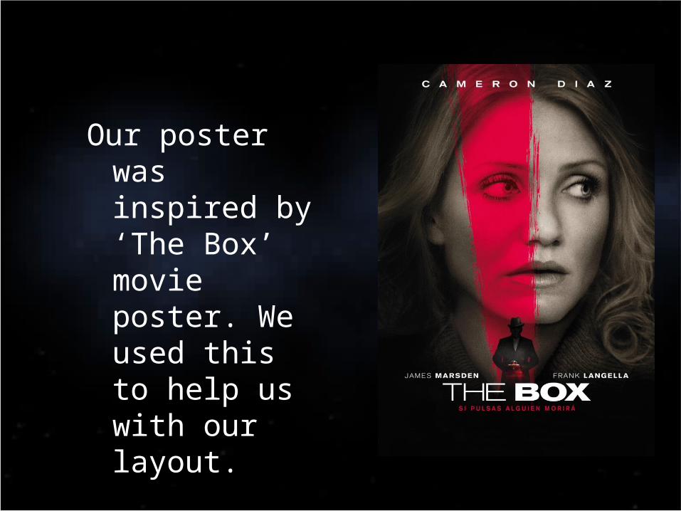
Our poster was inspired by ‘The Box’ movie poster. We used this to help us with our layout.

What we were trying to achieve?
The aim of our trailer was to create adrenaline, suspense and enigma – this would make the audience question the reason behind everything that has occurred. We wanted the audience to feel fear for the character when watching the trailer itself. Also we wanted them to go and watch the movie.