Presentazione di PowerPoint - Ascel palette... · Presentazione di PowerPoint Author - Created...
48
ga architects Designing Environments for Children & Adults with ASD
Transcript of Presentazione di PowerPoint - Ascel palette... · Presentazione di PowerPoint Author - Created...

ga architects
DesigningEnvironments
for Children &Adults with ASD

ga architects
About GA Architects
• Designers of environments
for ASD
• New build and refurbishments
• Residential, educational
and respite
• CDA to London Borough of Hackney
• Advisor to school in Svendborg Denmark
• Member of Sensory Star Advisory Board of America
• Member of British Standards Institute Neuro-diversity
Working Group
• Collaborator with University of Kingston research project
on colour palette for Autism
• Associated with Sapienza University of Rome
• Regular speakers at conferences
• Organisers of twice yearly seminars on ASD
ga architects
The Method
85 colours selected by the
Design Research Centre
20 colours
presented to
children with
ASD between
15-19 years old
GAA selected 23
colours as ASD
friendly
Selection through
elimination
process
School teachers and
carers’ opinion on
preferred colours
Summarise the
results

ga architects
Basic Principles• Low arousal colours
• Single colour
• Organic and non-toxic and low
odour paints
• Patterns should be
avoided
• Soft furnishings
should also be kept
fairly plain
• Patterned floors can
be confusing and
may increase anxiety
x
x

ga architects
GAA Colour Palette Selection

ga architects
Colours used on various projects visited

ga architects
Colour palette presented to children

ga architects
ASD friendly palette chosen by children
• Subdued and colours mixed with grey were favoured by the children with
autism
• A predominant preference for colours in the Blue/Green hue sectors was
notable
• A balance between colourfulness and greyness is seen to be popular.

ga architects
The Natural Colour System
3020 R40B
30%Black
20%Chromaticness
50% White
60% Red
40%Blue
ga architects
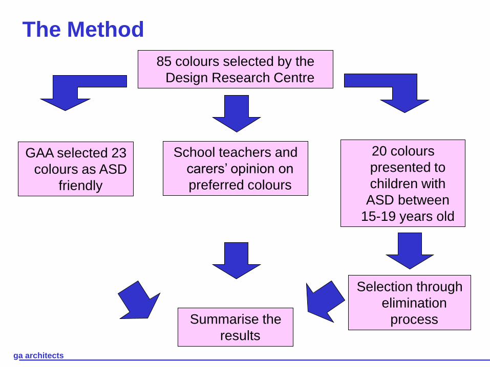
Proxemics
Definition: How much space is needed around an individual to feel
comfortable
• Too little space may result in
feelings of discomfort and
possibly claustrophobia
Basic Principles:
xx

ga architects
• Too little space may result in
feelings of discomfort and
possibly claustrophobia
• Too much space may result in
feelings of isolation
Basic Principles:
Definition: How much space is needed around an individual to feel
comfortable
xx
Proxemics

ga architects
• Too little space may result in
feelings of discomfort and
possibly claustrophobia
• Too much space may result in
feelings of isolation
• Colour used in tonal blocks
helps to understand the space
around
• Lighting and shade helps the
relationship between the space
and the individual
Basic Principles:
Definition: How much space is needed around an individual to feel
comfortable
xx
Proxemics

ga architects
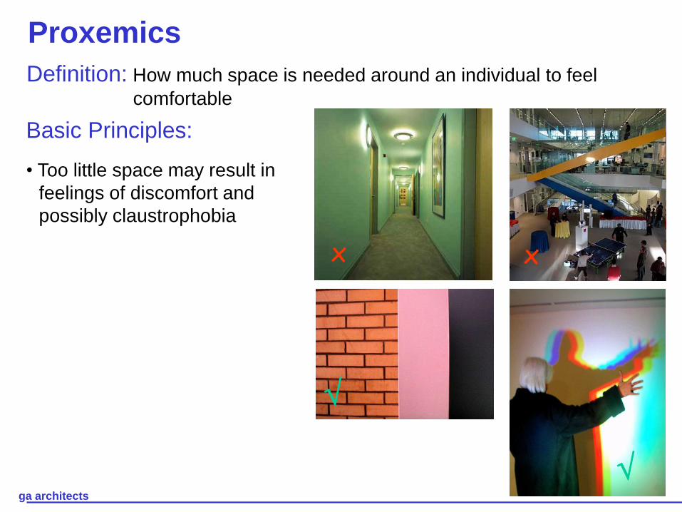
Colour coding• Review preferred colour palette

ga architects
Colour coding• Review preferred colour palette
• No stimulating colours
ga architects
Colour coding• Review preferred colour palette
• No stimulating colours
• Consider colours in daylight and
artificial lighting conditions

ga architects
Lighting• Lighting and room layout influence the perception of colours
x x

ga architects
• Lighting and room layout influence the perception of colours
• No flickering fluorescent lighting
x x
Lighting

ga architects
• Lighting and room layout influence the perception of colours
• No flickering fluorescent lighting
• Hidden or indirect lighting preferred
x x
Lighting

ga architects
• Lighting and room layout influence the perception of colours
• No flickering fluorescent lighting
• Hidden or indirect lighting preferred
• We seek an interior that glows
x x
Lighting

ga architects
• Lighting and room layout influence the perception of colours
• No flickering fluorescent lighting
• Hidden or indirect lighting preferred
• We seek an interior that glows
• Incorporate dimming facilities
x x
Lighting

ga architects
• Lighting and room layout influence the perception of colours
• No flickering fluorescent lighting
• Hidden or indirect lighting preferred
• We seek an interior that glows
• Incorporate dimming facilities
• Consider coloured lighting for scene setting
x x
Lighting

ga architects
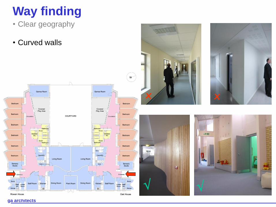
Way finding• Clear geography
x x
ga architects
x x
• Clear geography
• Curved walls
Way finding

ga architects
x x
• Clear geography
• Curved walls
• Using colours to distinguish
walls, floors and furniture
makes it easier to navigate
Way finding

ga architects
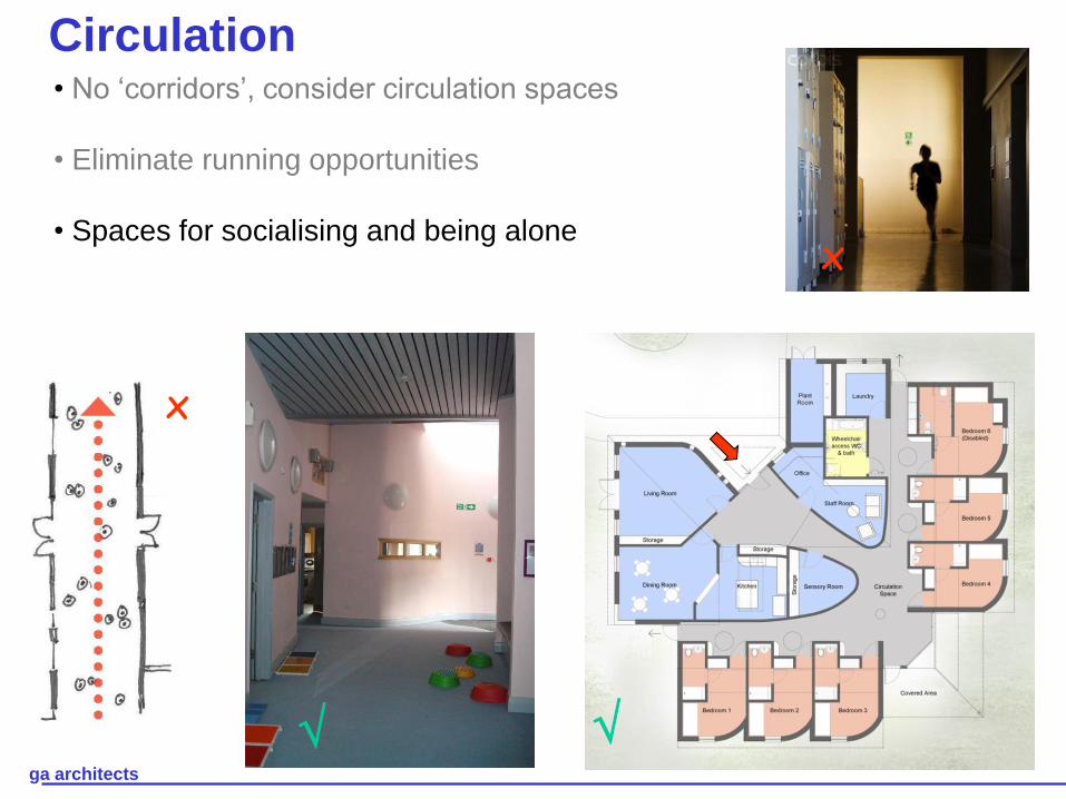
Circulation• No ‘corridors’, consider circulation spaces
x
x

ga architects
Circulation• No ‘corridors’, consider circulation spaces
• Eliminate running opportunities
x
x
ga architects
Circulation• No ‘corridors’, consider circulation spaces
• Eliminate running opportunities
• Spaces for socialising and being alone
x
x

ga architects
Circulation• No ‘corridors’, consider circulation spaces
• Eliminate running opportunities
• Spaces for socialising and being alone
• Point of interest, recognisable spaces
x
x

ga architects
Calm and simple spaces• No stimulating colours
x
x

ga architects
Calm and simple spaces• No stimulating colours
• Good acoustics
x
x

ga architects
Calm and simple spaces• No stimulating colours
• Good acoustics
• No confusing textures
x
x

ga architects
Bedrooms
• Soft colours to the ceiling

ga architects
Bedrooms
• Soft colours to the ceiling
• Screening and filtering the
sunlight

ga architects
Bedrooms
• Soft colours to the ceiling
• Screening and filtering the
sunlight
• Flexibility to choose colours from
a selected palette

ga architects
Bedrooms
• Soft colours to the ceiling
• Screening and filtering the
sunlight
• Flexibility to choose colours from
a selected palette
• Collect items from their early
childhood. Familiarity even if
visually stimulating and
potentially disturbing

ga architects
Bedrooms
• Soft colours to the ceiling
• Screening and filtering the
sunlight
• Flexibility to choose colours from
a selected palette
• Collect items from their early
childhood. Familiarity even if
visually stimulating and
potentially disturbing
• Natural ventilation through high
level windows

ga architects
Classrooms
• Simple layout

ga architects
Classrooms
• Simple layout
• Between 6-12 pupils per classroom

ga architects
Classrooms
• Simple layout
• Between 6-12 pupils per classroom
• Recommended area of 52m2

ga architects
Classrooms
• Simple layout
• Between 6-12 pupils per classroom
• Recommended area of 52m2
• Tonal colours i.e. colours from the
same colour group such as blue

ga architects
Classrooms
• Simple layout
• Between 6-12 pupils per classroom
• Recommended area of 52m2
• Tonal colours i.e. colours from the
same colour group such as blue
• Colours are used for identification of
areas such as ‘personal’ space

ga architects
Classrooms
• Simple layout
• Between 6-12 pupils per classroom
• Recommended area of 52m2
• Tonal colours i.e. colours from the
same colour group such as blue
• Colours were used for identification
of areas such as ‘personal’ spaces
• Filtered light to avoid distraction and
glare

ga architects
Classrooms
• Simple layout
• Between 6-12 pupils per classroom
• Recommended area of 52m2
• Tonal colours i.e. colours from the
same colour group such as blue
• Colours were used for identification
of areas such as ‘personal’ spaces
• Filtered light to avoid distraction and
glare
• Subdivision of areas / quiet areas
• Dedicated external areas

ga architects
Classrooms

ga architects
Conclusions
• Balance between grey and colour treatments
• Predominance of blue and green
• Lighting and shape of room can affect the
colour perception
• Avoidance of stimulating colours
• Consider: • Proxemics
• Way finding and circulation areas
• Calming spaces

ga architects
Designing Environments for
Children and Adults with ASD
Maria Luigia Assirelli
ga architects
www.autism-architects.com