
Practical Responsive Images - from Second Wednesday
39
Practical Responsive Images http://unsplash.com/
-
Upload
ben-seymour -
Category
Internet
-
view
724 -
download
0
Transcript of Practical Responsive Images - from Second Wednesday
Practical Responsive
Images
http://unsplash.com/
A picture is worth a thousand words…
http://unsplash.com/
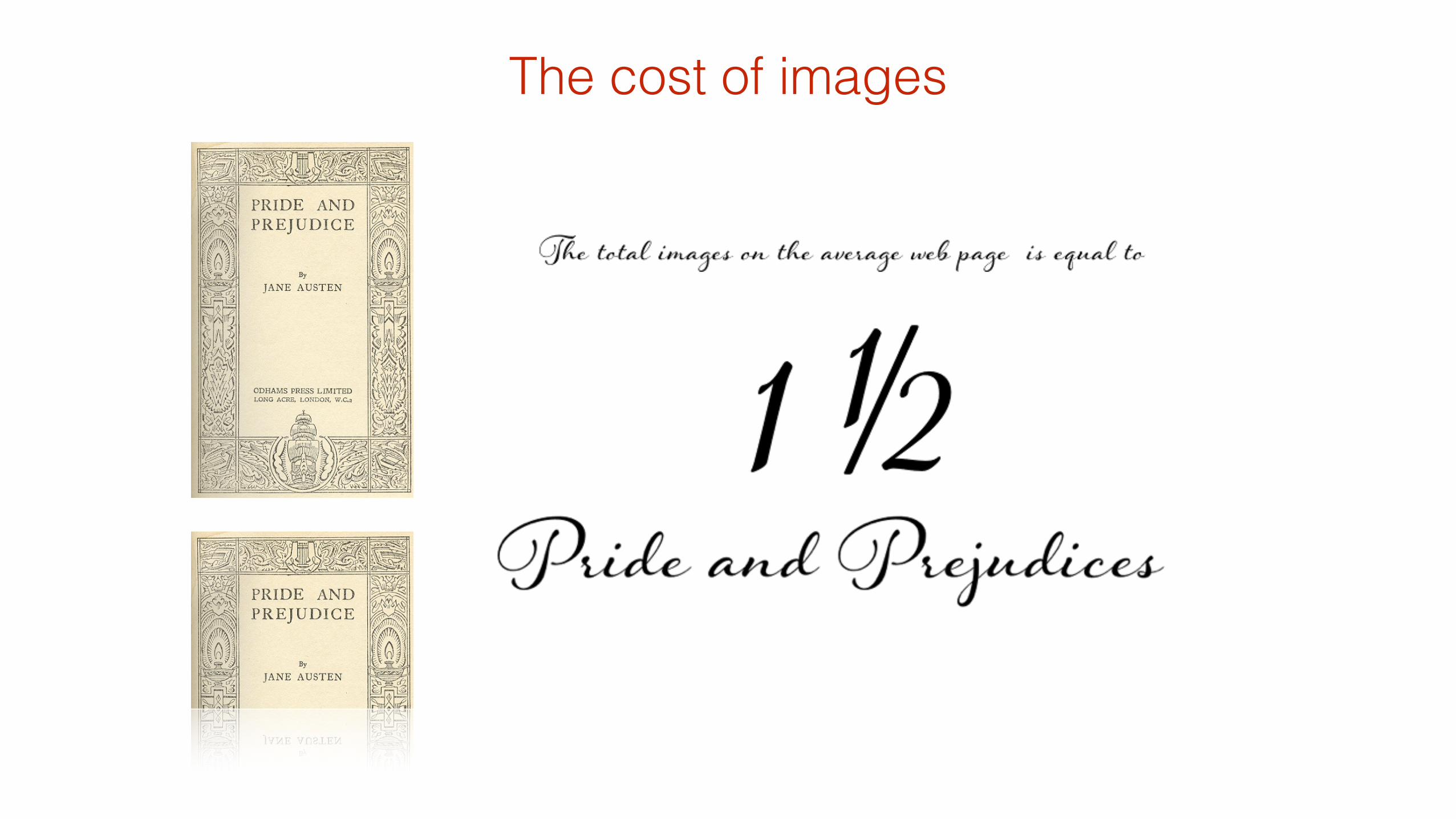
…but the cost is much greater

http://httparchive.org/interesting.php?a=All&l=Jul%2015%202014http://en.wikipedia.org/wiki/Wikipedia:Size_comparisons
198,000 Words
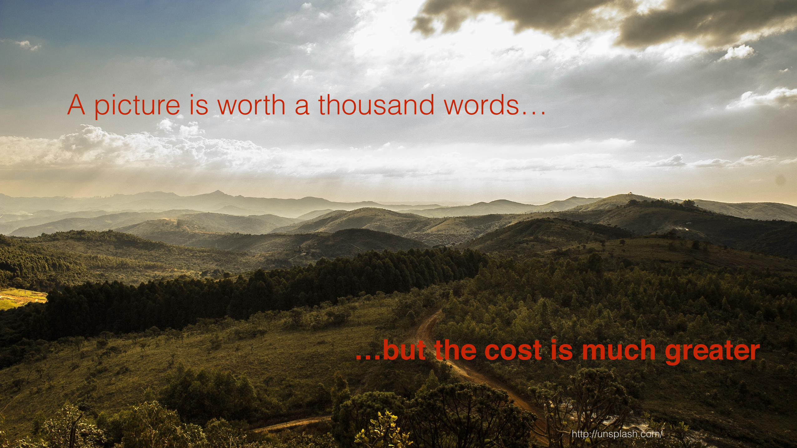
The cost of images
1165kB Images
Average Bytes per Page by Content Type (July 2014):
If 1kB is 1024 ASCII characters
6 chars/wordAn estimated average word length
is five characters, plus a space,
(1165kB * 1024) / 6 = ~198, 800
(including HTML)
(of a total: 1850kB)
50-60 img requests
per page
Average image size for JPEG
was 30kB
Pride and Prejudice apparently contains
122,000 words
http://www.searchlit.org/novels/460.php
The cost of images
The cost of images
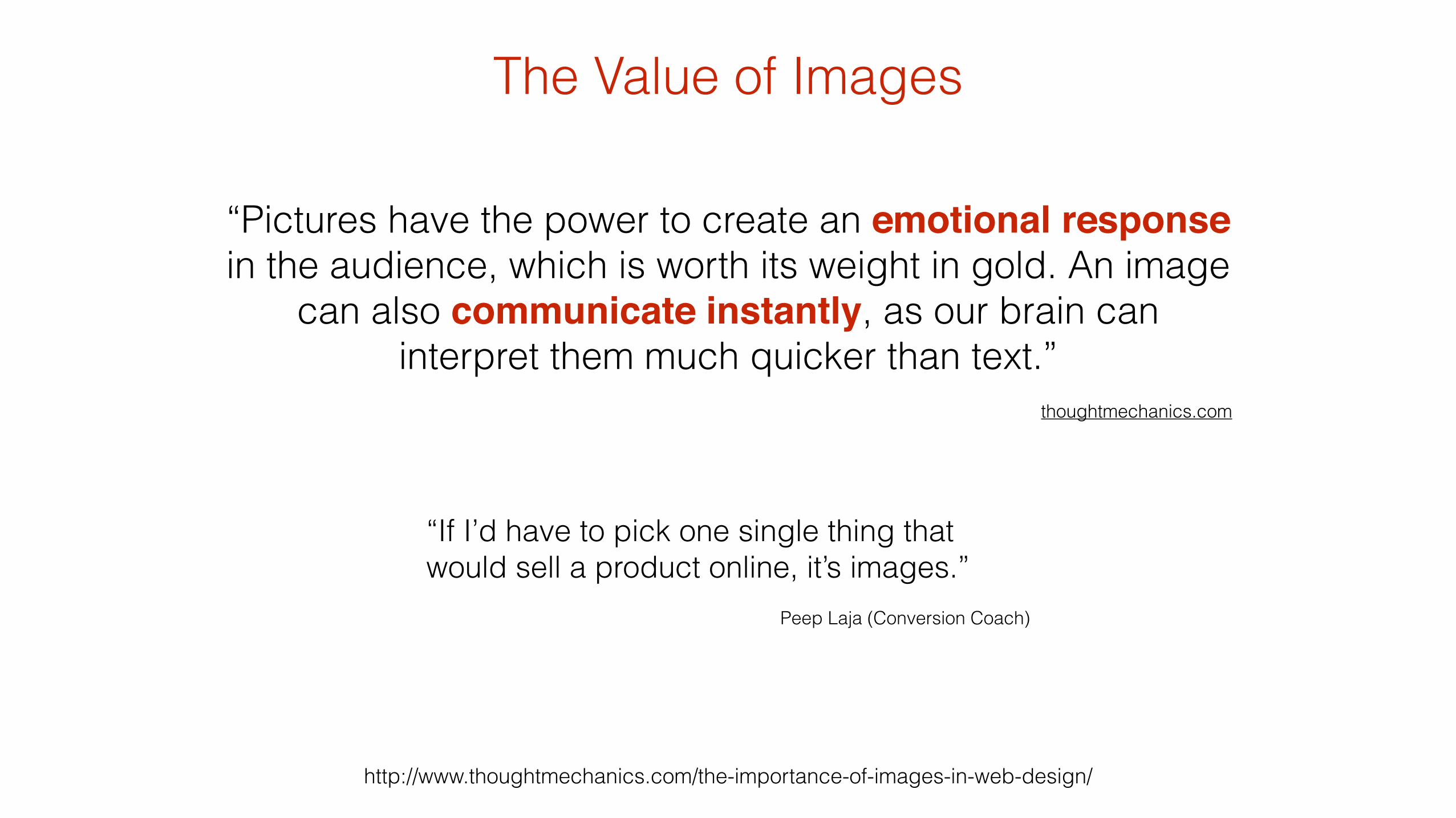
The Value of Images
http://www.thoughtmechanics.com/the-importance-of-images-in-web-design/
“Pictures have the power to create an emotional response in the audience, which is worth its weight in gold. An image
can also communicate instantly, as our brain can interpret them much quicker than text.”
!thoughtmechanics.com
“If I’d have to pick one single thing that would sell a product online, it’s images.”
!Peep Laja (Conversion Coach)
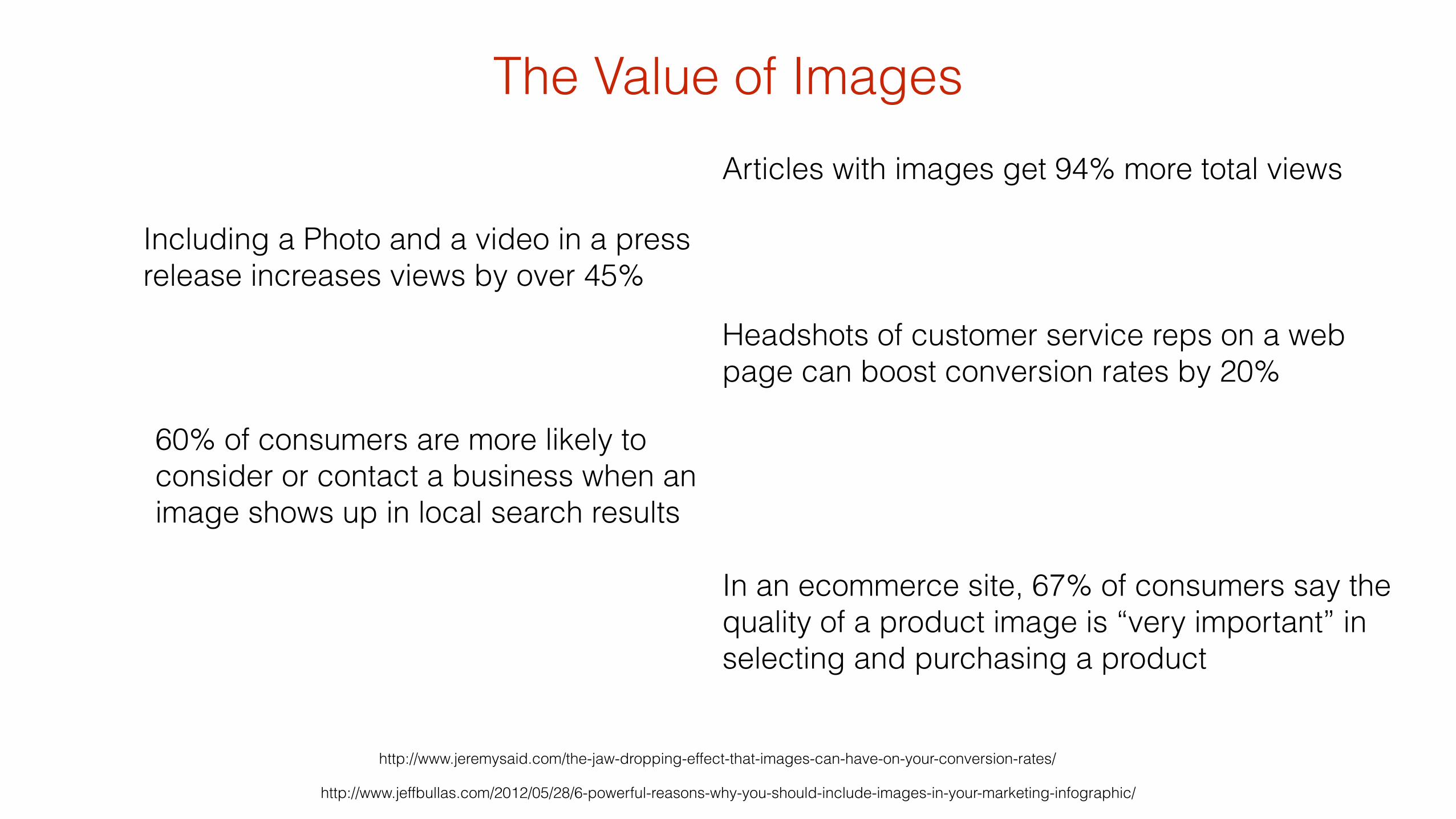
The Value of Images
http://www.jeffbullas.com/2012/05/28/6-powerful-reasons-why-you-should-include-images-in-your-marketing-infographic/
In an ecommerce site, 67% of consumers say the quality of a product image is “very important” in selecting and purchasing a product
http://www.jeremysaid.com/the-jaw-dropping-effect-that-images-can-have-on-your-conversion-rates/
Headshots of customer service reps on a web page can boost conversion rates by 20%
Articles with images get 94% more total views
Including a Photo and a video in a press release increases views by over 45%
60% of consumers are more likely to consider or contact a business when an image shows up in local search results
In some studies
10-15x more viewers look at and engage with the
content when the model is looking or gesturing towards it
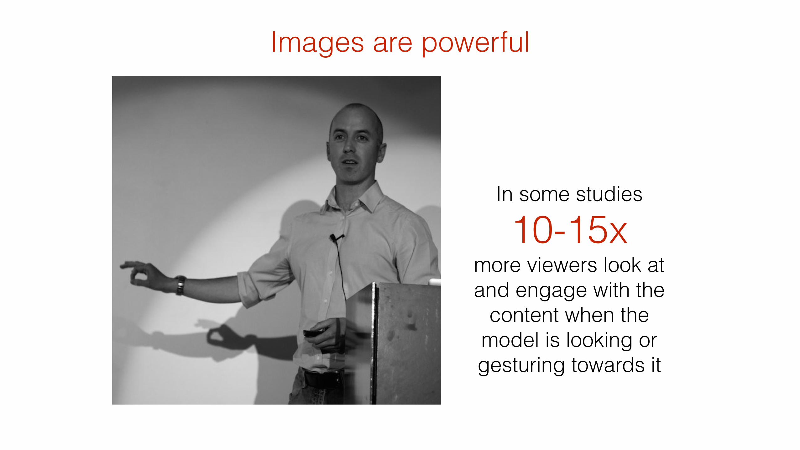
Images are powerful

Images are powerful
In some studies
10-15x more viewers look at and engage with the
content when the model is looking or gesturing towards it
http://thinkeyetracking.com/2009/06/cuing-customers-to-look-at-your-key-messages/ Photo courtesy of Christian Hambly
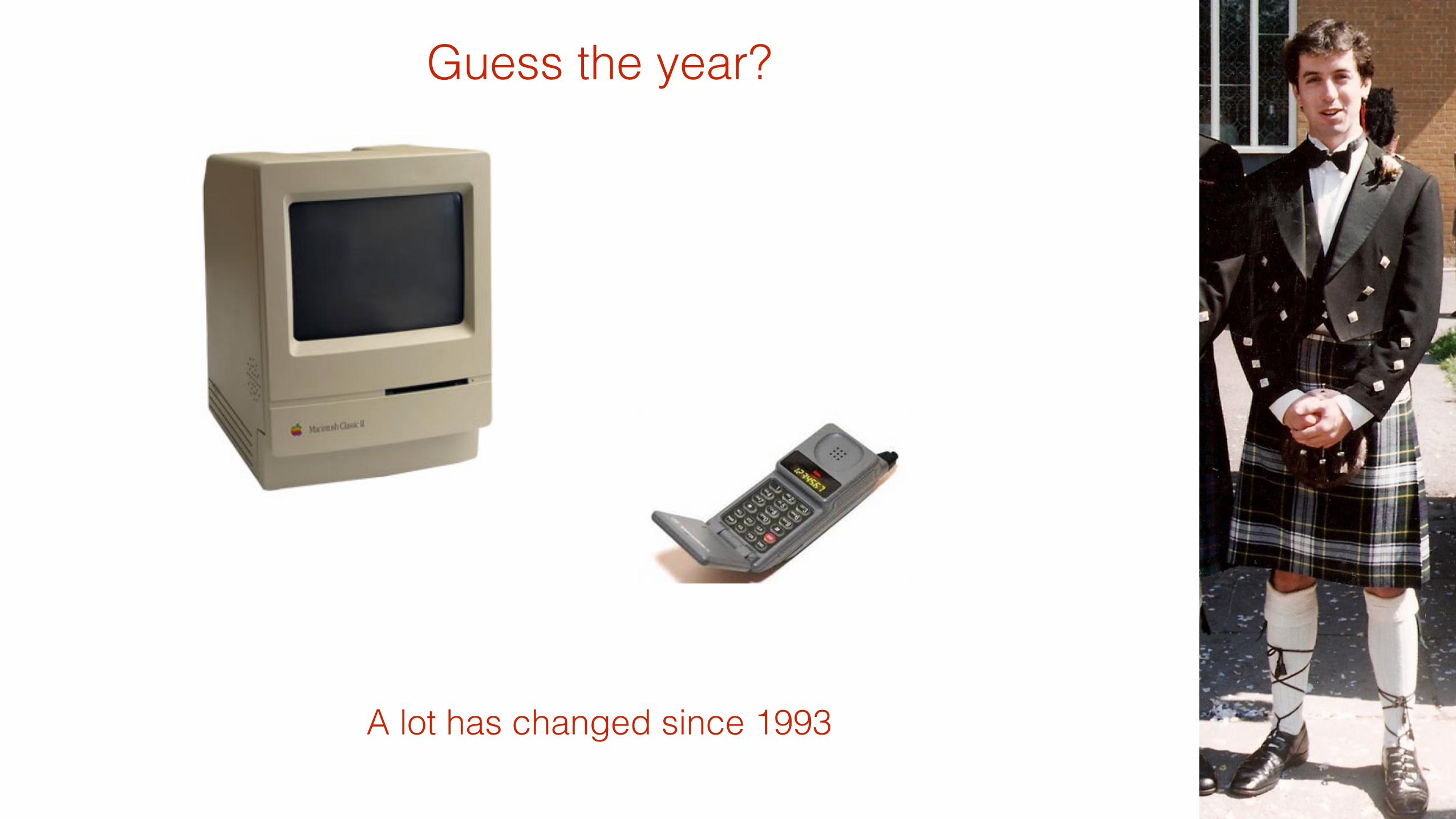
A lot has changed since 1993
Guess the year?

Since first proposed in 1993, the <img > tag has remained mostly unchanged….
!
…whereas the rest of the web-world change quite a bit!
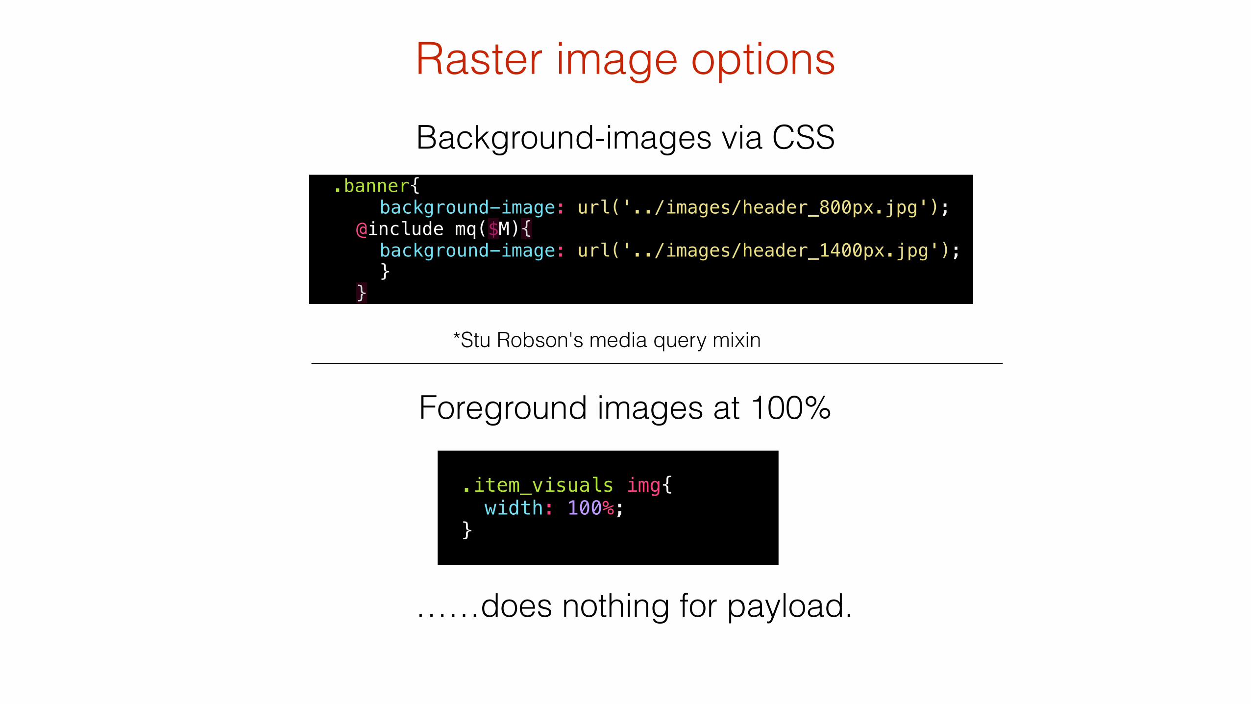
Foreground images at 100%
Raster image optionsBackground-images via CSS
*Stu Robson's media query mixin
.banner{ background-image: url('../images/header_800px.jpg'); @include mq($M){ background-image: url('../images/header_1400px.jpg'); } }
! .item_visuals img{ width: 100%; }
……does nothing for payload.
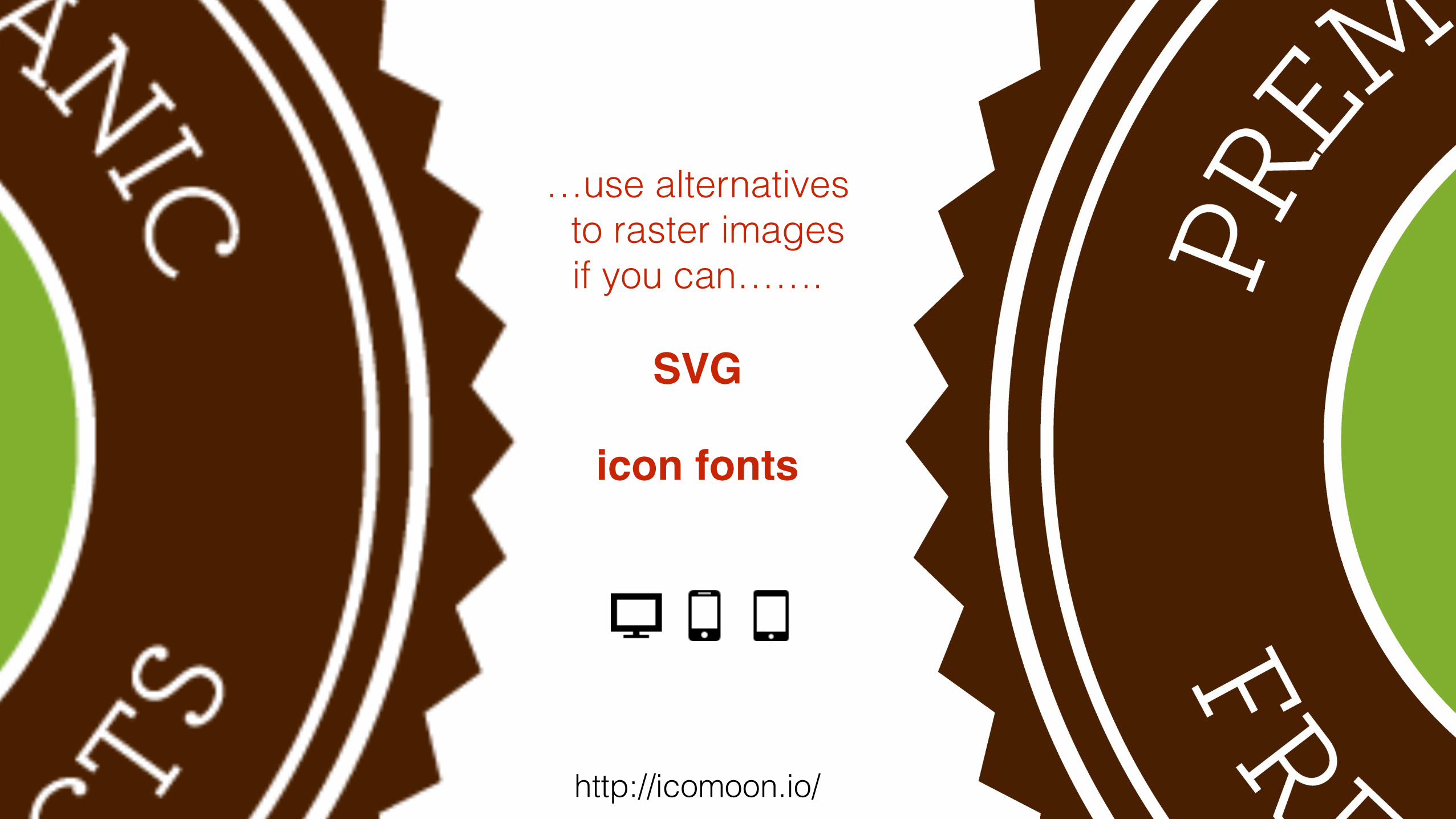
…use alternatives to raster images
if you can……. !
SVG!!
icon fonts
http://icomoon.io/
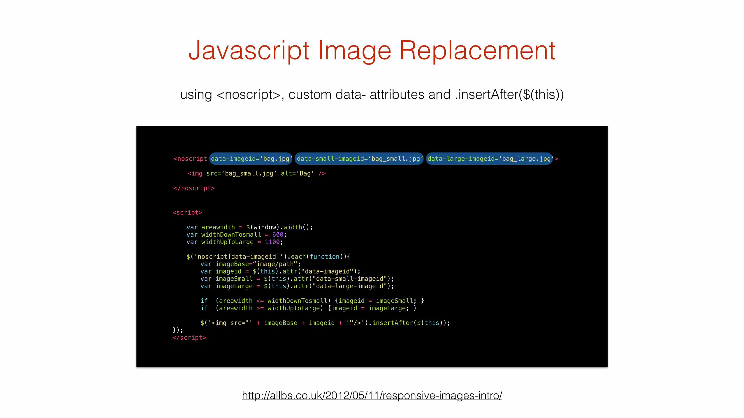
using <noscript>, custom data- attributes and .insertAfter($(this))
http://allbs.co.uk/2012/05/11/responsive-images-intro/
Javascript Image Replacement
<script> ! var areawidth = $(window).width(); var widthDownTosmall = 600; var widthUpToLarge = 1100; ! $('noscript[data-imageid]').each(function(){ var imageBase=“image/path"; var imageid = $(this).attr("data-imageid"); var imageSmall = $(this).attr("data-small-imageid"); var imageLarge = $(this).attr("data-large-imageid"); if (areawidth <= widthDownTosmall) {imageid = imageSmall; } if (areawidth >= widthUpToLarge) {imageid = imageLarge; } $('<img src="' + imageBase + imageid + '"/>').insertAfter($(this)); }); </script>
<noscript data-imageid=‘bag.jpg’ data-small-imageid=‘bag_small.jpg’ data-large-imageid=‘bag_large.jpg’> <img src=‘bag_small.jpg’ alt='Bag' /> !</noscript>
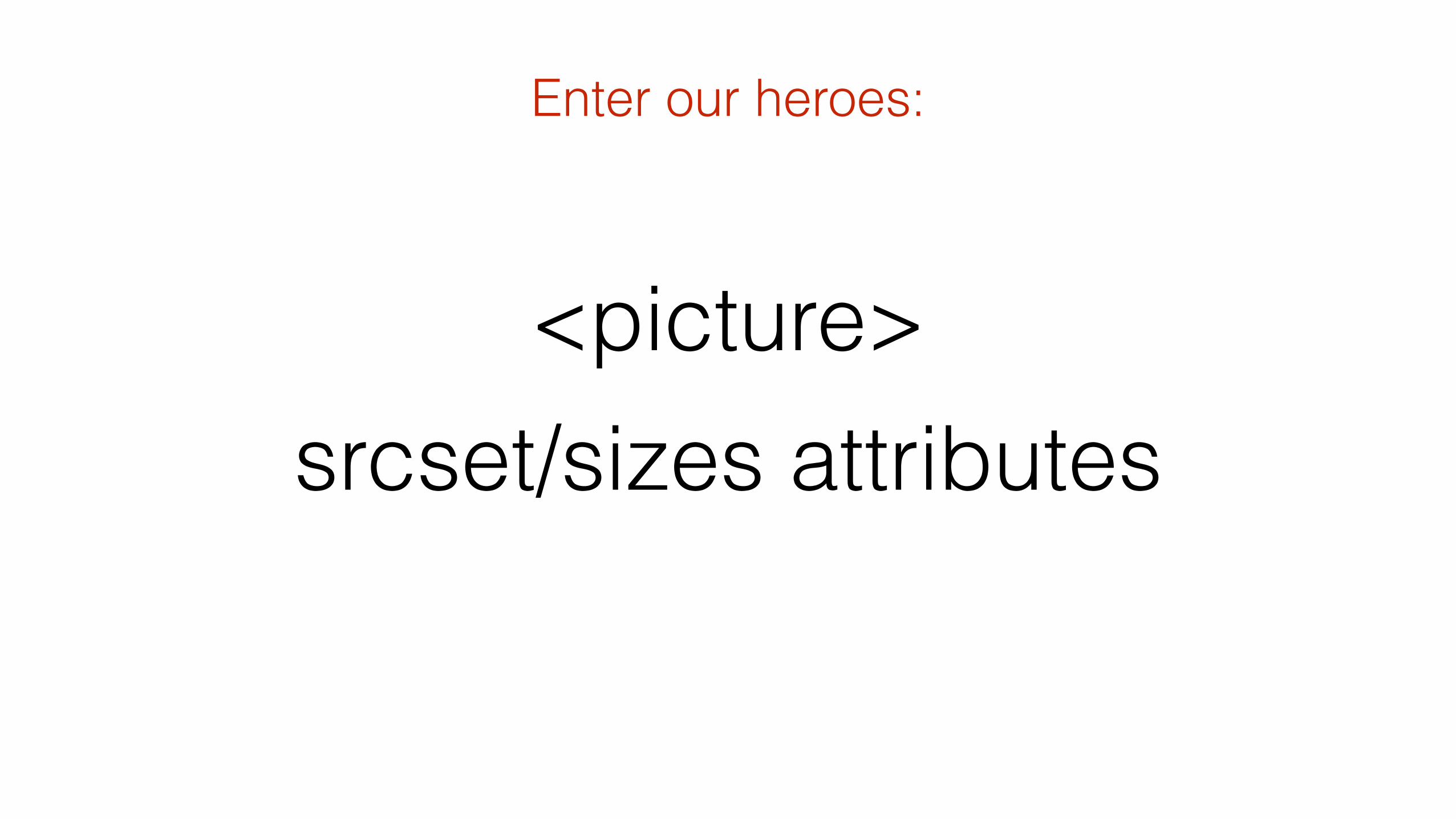
<picture> srcset/sizes attributes
Enter our heroes:
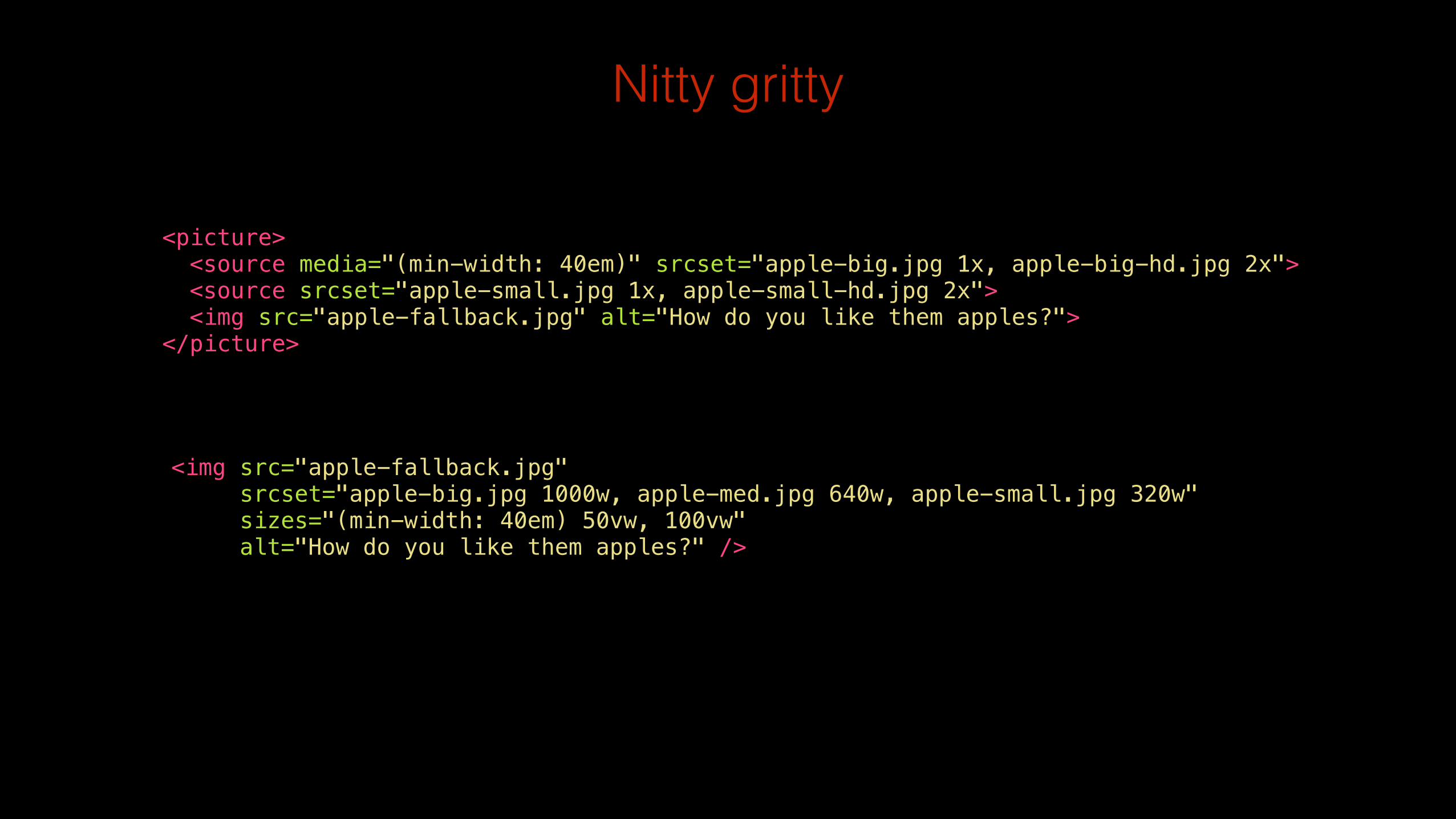
Nitty gritty
! <picture> <source media="(min-width: 40em)" srcset="apple-big.jpg 1x, apple-big-hd.jpg 2x"> <source srcset="apple-small.jpg 1x, apple-small-hd.jpg 2x"> <img src="apple-fallback.jpg" alt="How do you like them apples?"> </picture>
<img src="apple-fallback.jpg" srcset="apple-big.jpg 1000w, apple-med.jpg 640w, apple-small.jpg 320w" sizes="(min-width: 40em) 50vw, 100vw" alt="How do you like them apples?" />

(As of : June 11th ‘14)
Progress
http://responsiveimages.org/
(As of : August 17th ‘14)
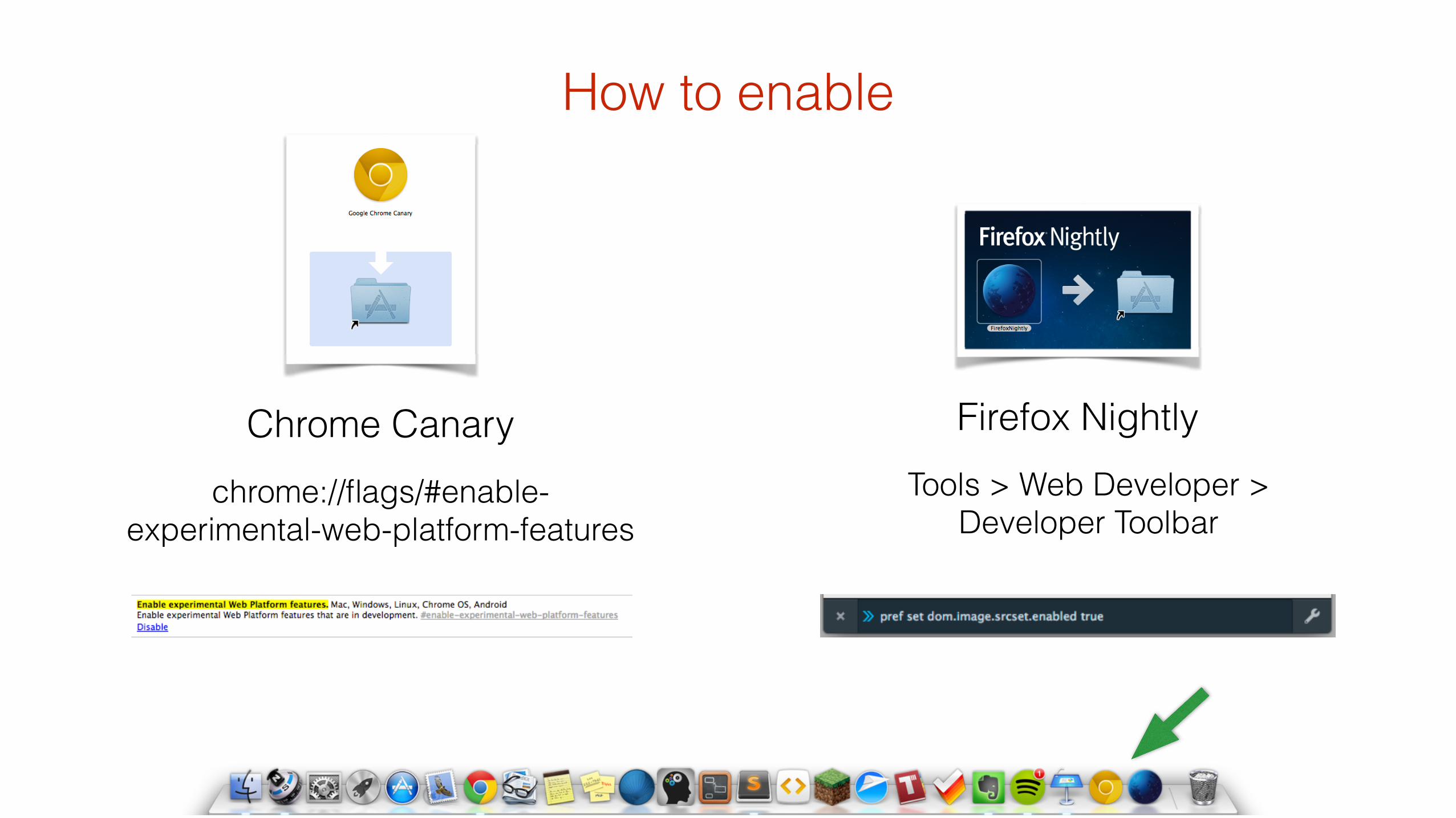
How to enable
chrome://flags/#enable-experimental-web-platform-features
Firefox NightlyTools > Web Developer >
Developer Toolbar
Chrome Canary
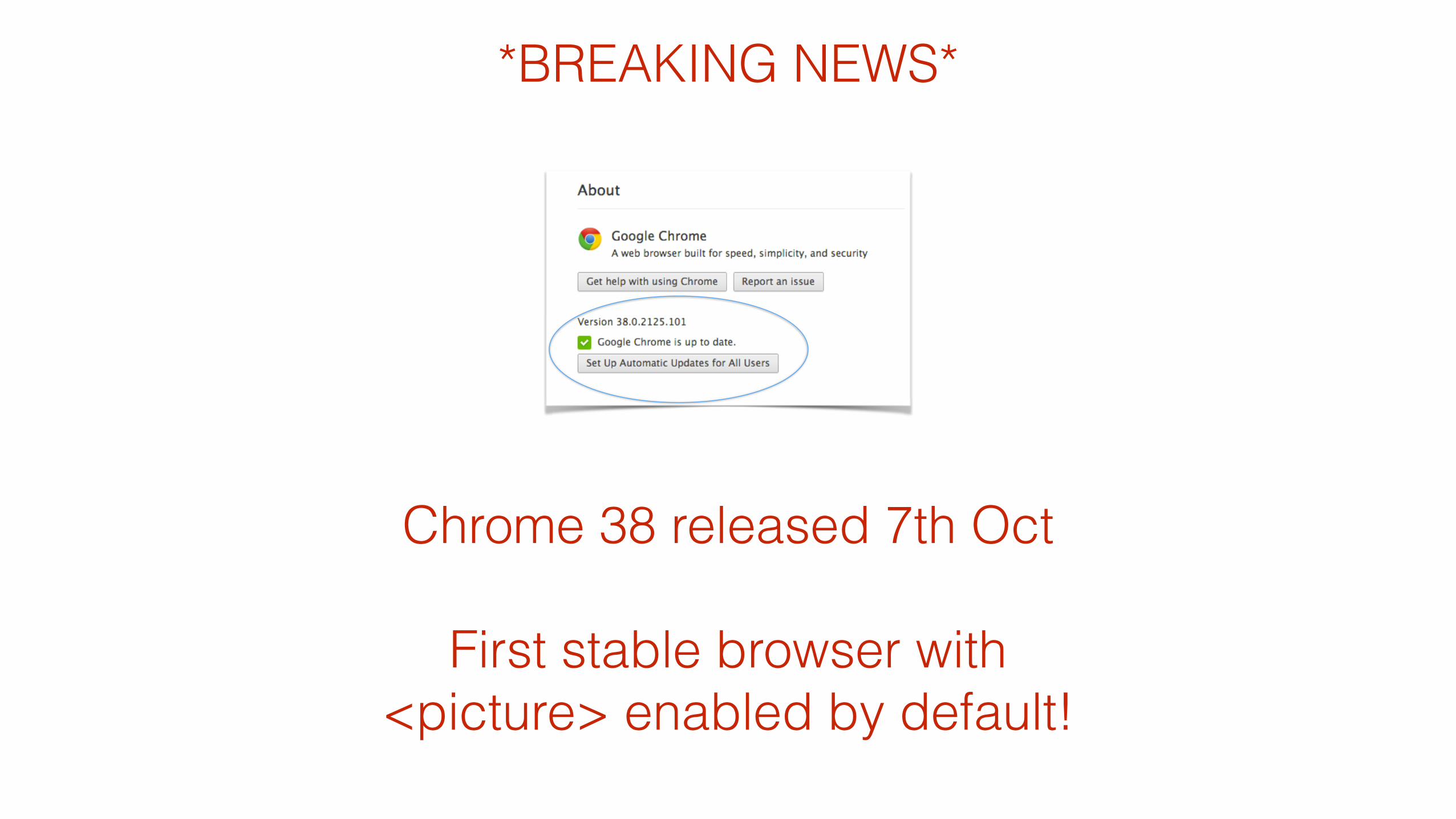
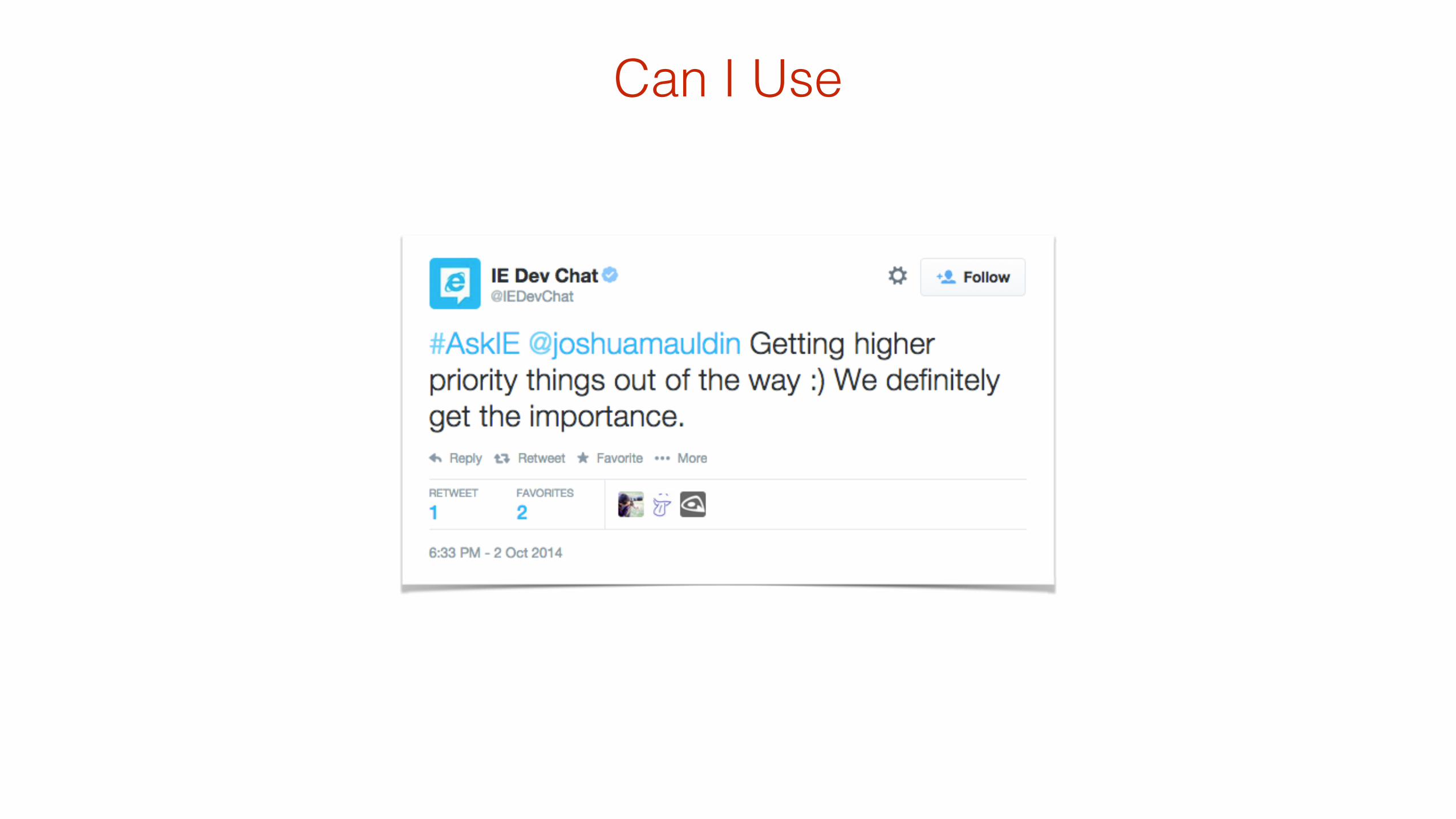
*BREAKING NEWS*
Chrome 38 released 7th Oct !
First stable browser with <picture> enabled by default!
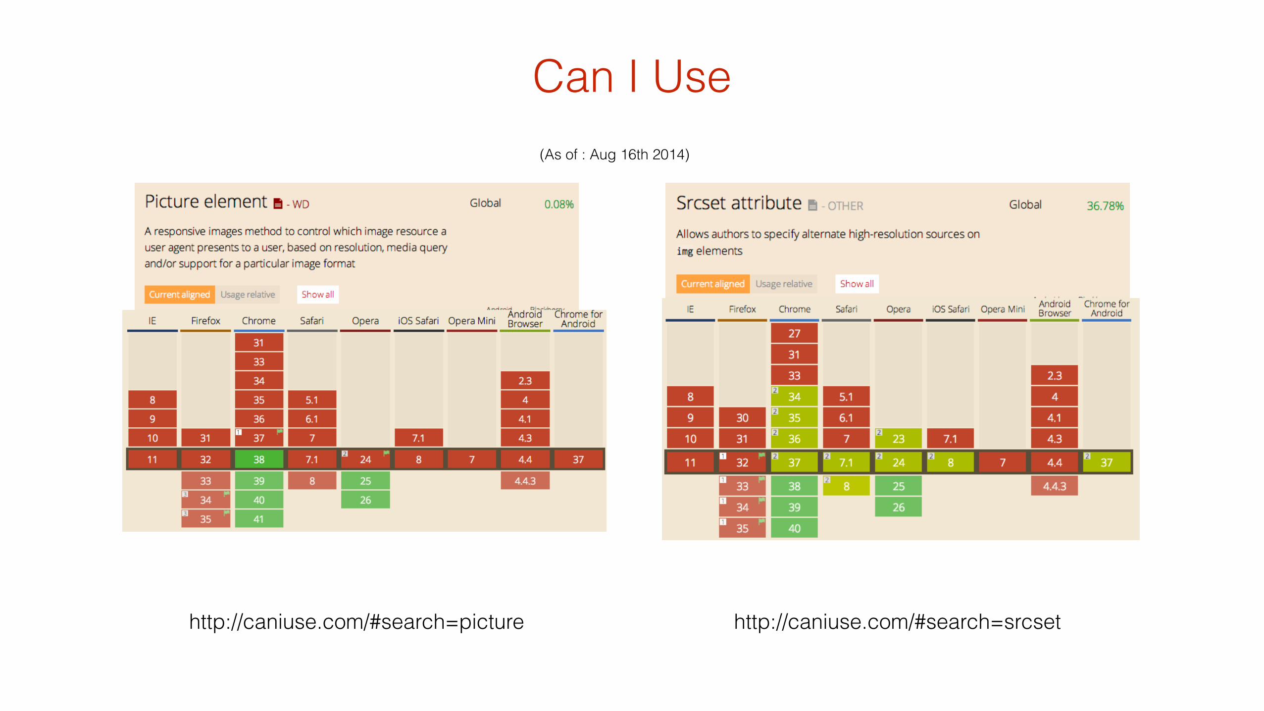
(As of : Aug 16th 2014)
Can I Use
http://caniuse.com/#search=srcsethttp://caniuse.com/#search=picture
Can I Use
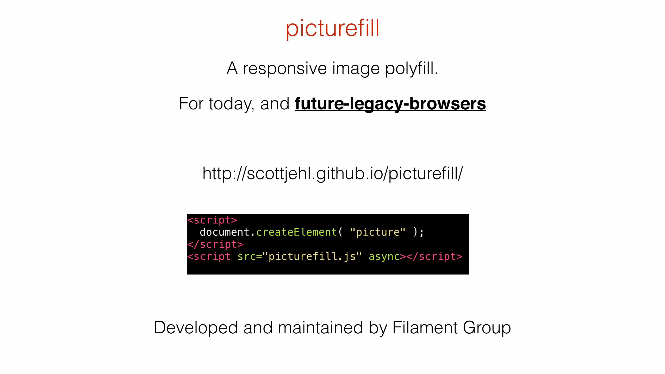
A responsive image polyfill.
For today, and future-legacy-browsers
picturefill
http://scottjehl.github.io/picturefill/
Developed and maintained by Filament Group
<script> document.createElement( "picture" ); </script> <script src="picturefill.js" async></script>
picture phil
* Sorry
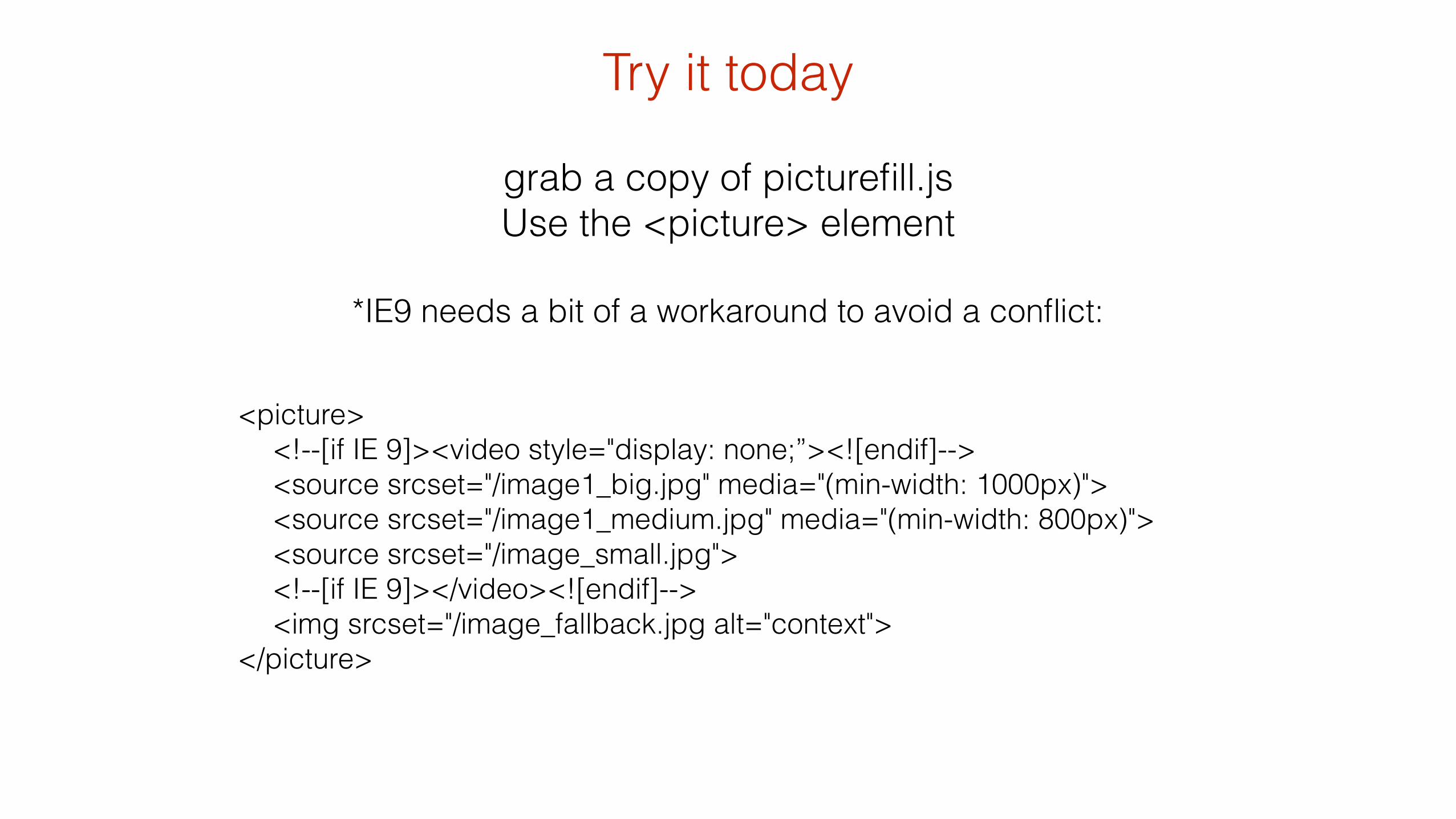
grab a copy of picturefill.js Use the <picture> element
!
*IE9 needs a bit of a workaround to avoid a conflict:
<picture> <!--[if IE 9]><video style="display: none;”><![endif]--> <source srcset="/image1_big.jpg" media="(min-width: 1000px)"> <source srcset="/image1_medium.jpg" media="(min-width: 800px)"> <source srcset="/image_small.jpg"> <!--[if IE 9]></video><![endif]--> <img srcset="/image_fallback.jpg alt="context"> </picture>
Try it today

Use Case 1: breakpoint optimised images (retina/pixel ratio)
media="(min-width: 1000px)"
media="(min-width: 400px)"
srcset="/image1_big.jpg"
srcset=“/image1_small.jpg"
http://responsiveimag.es/Practical_Example_1.html
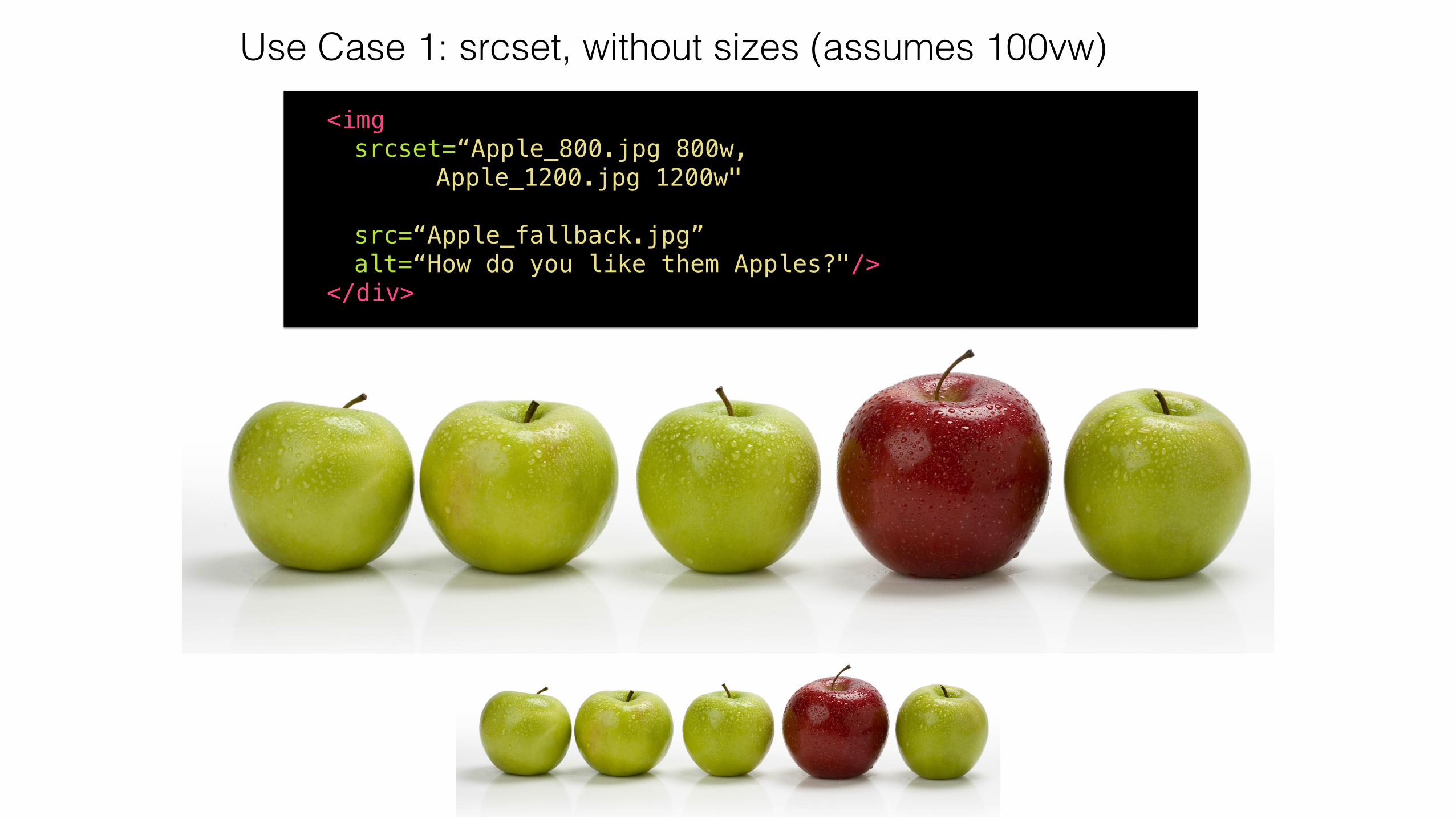
Use Case 1: srcset, without sizes (assumes 100vw) <img srcset=“Apple_800.jpg 800w, Apple_1200.jpg 1200w" src=“Apple_fallback.jpg” alt=“How do you like them Apples?"/> </div>

Use Case 2: Crop to point of interest (Art Direction)
http://responsiveimag.es/Practical_Example_2.html
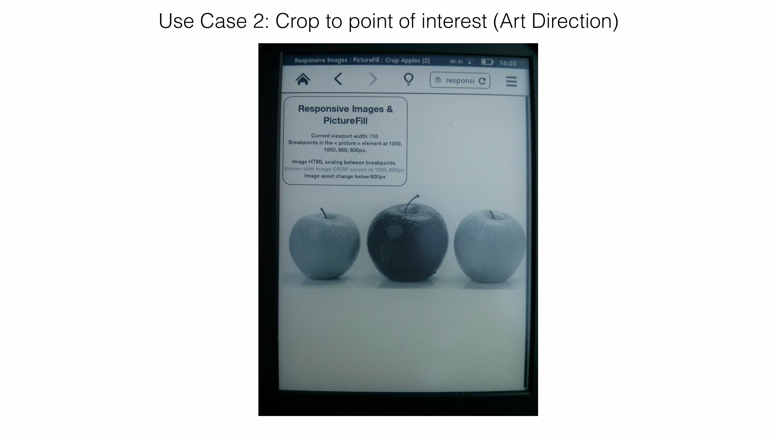
Use Case 2: Crop to point of interest (Art Direction)
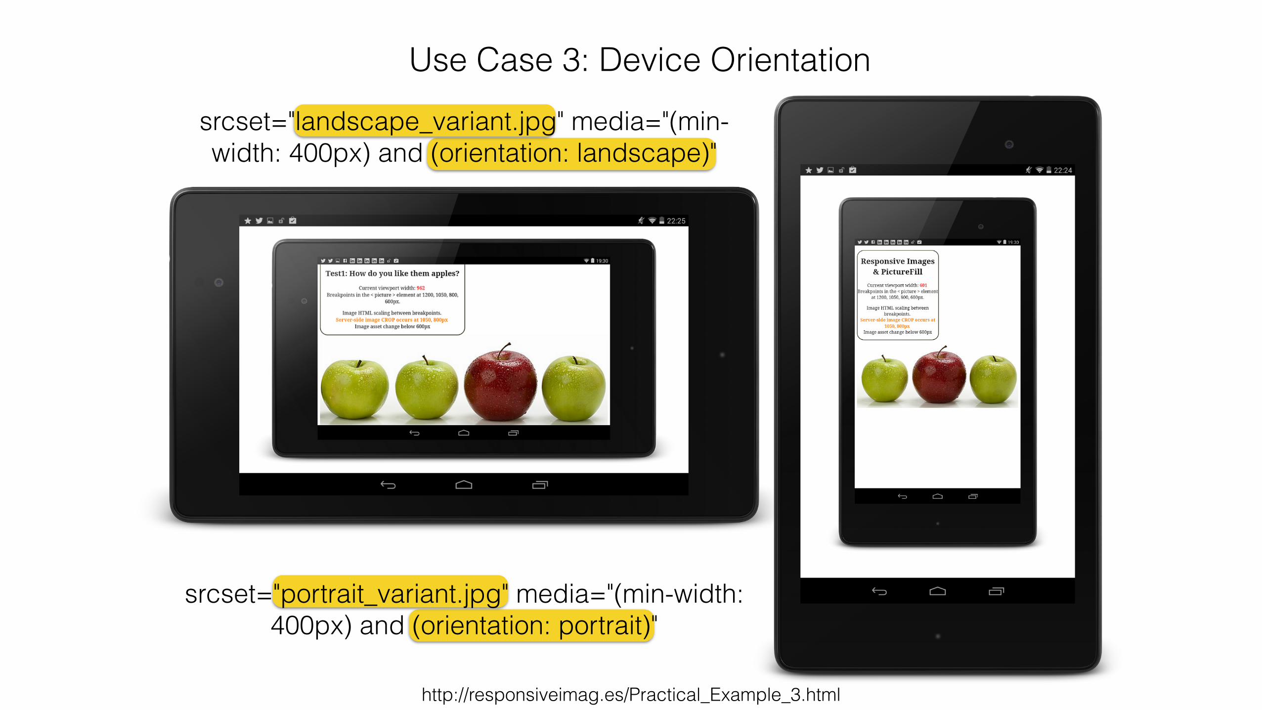
Use Case 3: Device Orientation
http://responsiveimag.es/Practical_Example_3.html
srcset="portrait_variant.jpg" media="(min-width: 400px) and (orientation: portrait)"
srcset="landscape_variant.jpg" media="(min-width: 400px) and (orientation: landscape)"
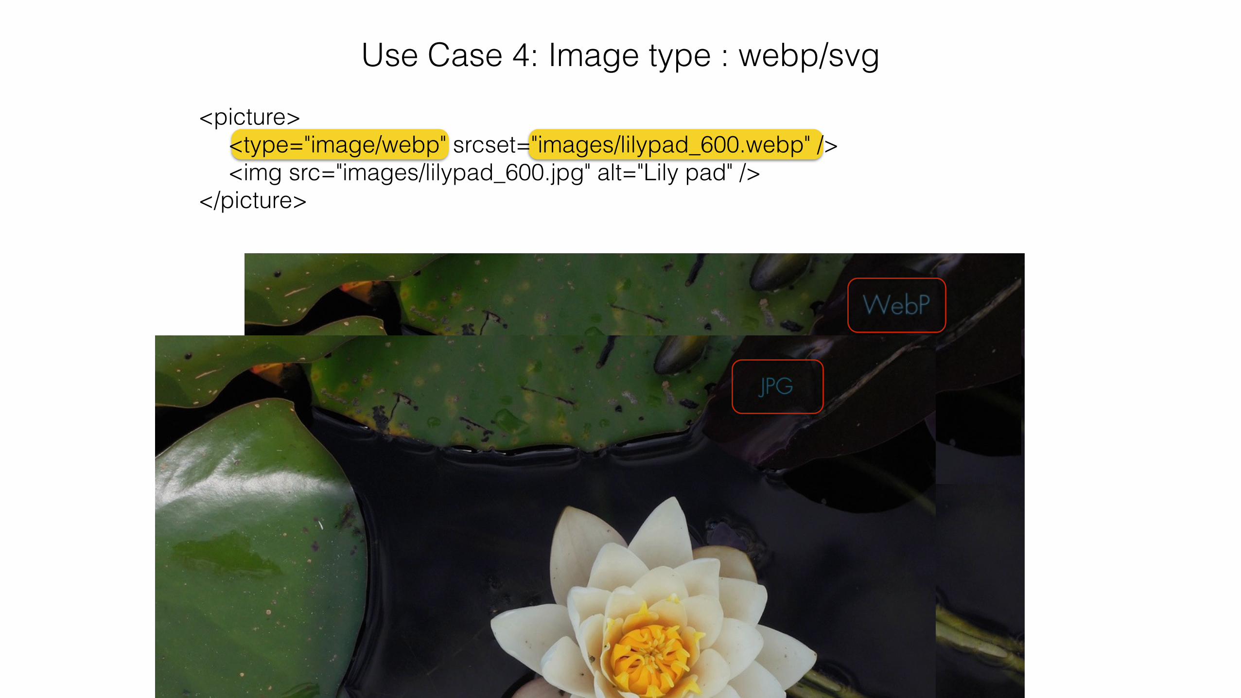
Use Case 4: Image type : webp/svg
<picture> <type="image/webp" srcset="images/lilypad_600.webp" /> <img src="images/lilypad_600.jpg" alt="Lily pad" /> </picture>
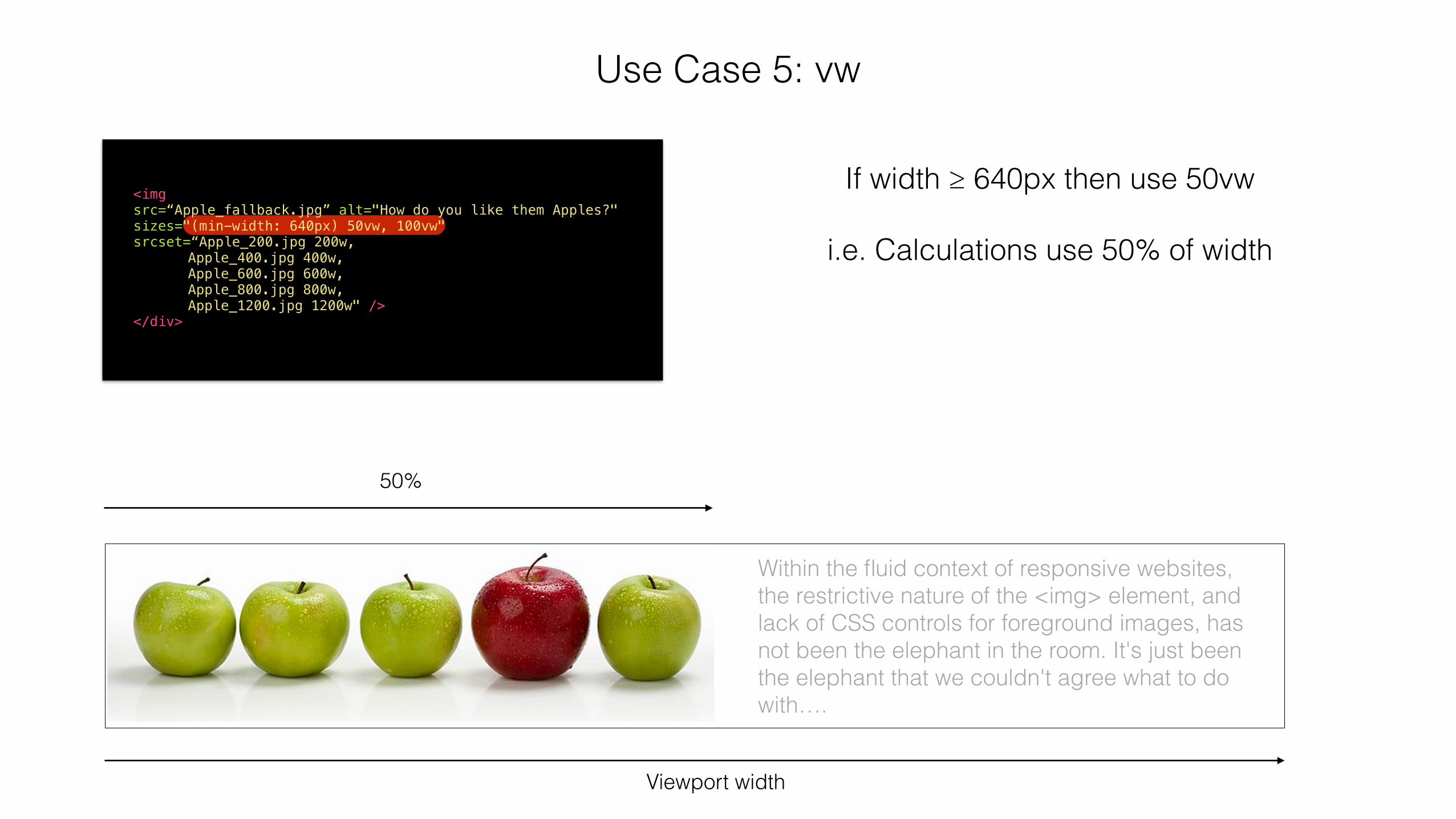
Use Case 5: vw
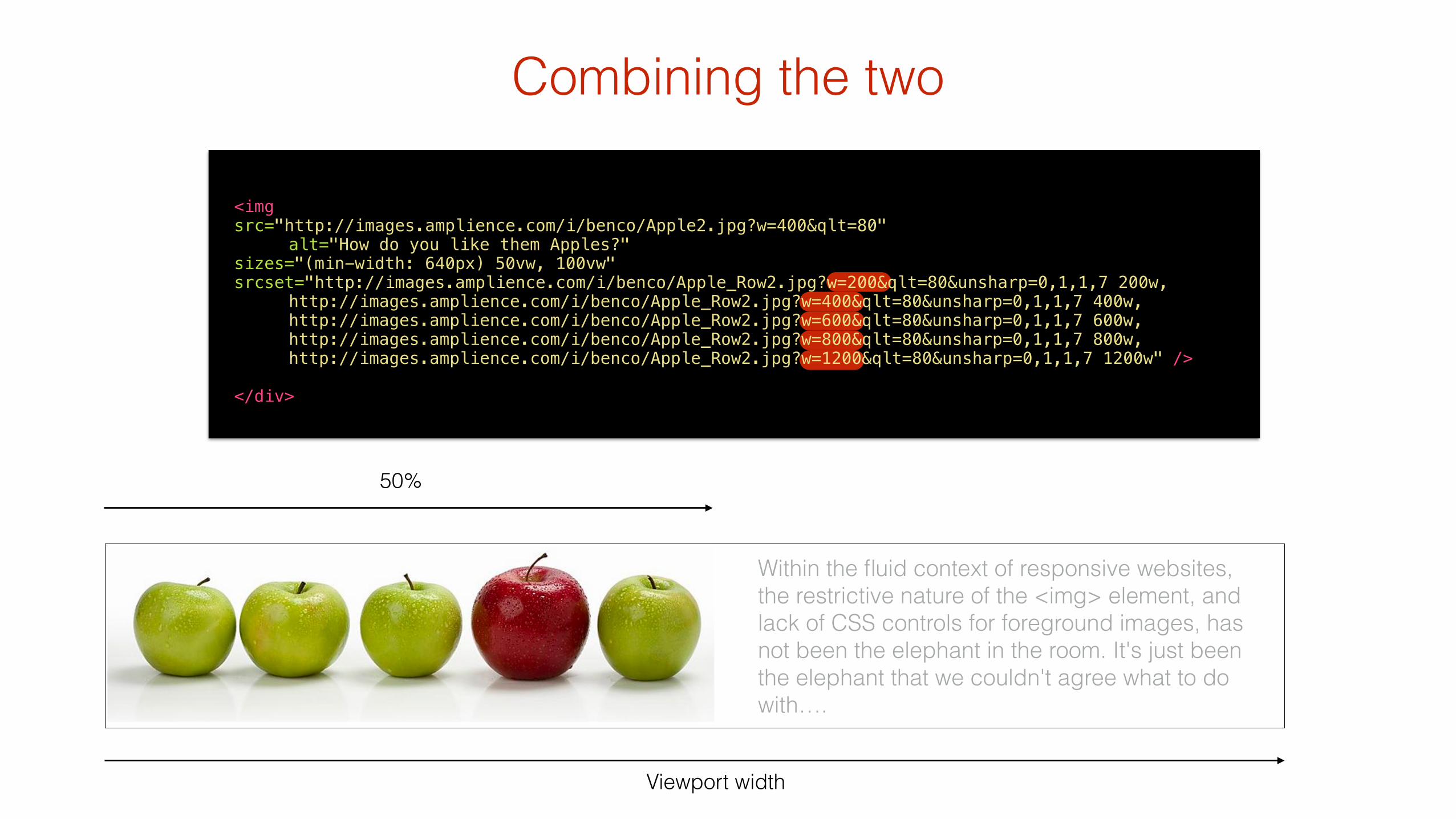
<img src=“Apple_fallback.jpg” alt="How do you like them Apples?" sizes="(min-width: 640px) 50vw, 100vw" srcset=“Apple_200.jpg 200w, Apple_400.jpg 400w, Apple_600.jpg 600w, Apple_800.jpg 800w, Apple_1200.jpg 1200w" /> </div>
Viewport width
If width ≥ 640px then use 50vw !
i.e. Calculations use 50% of width
50%
Within the fluid context of responsive websites, the restrictive nature of the <img> element, and lack of CSS controls for foreground images, has not been the elephant in the room. It's just been the elephant that we couldn't agree what to do with….
(scaling / CDN)
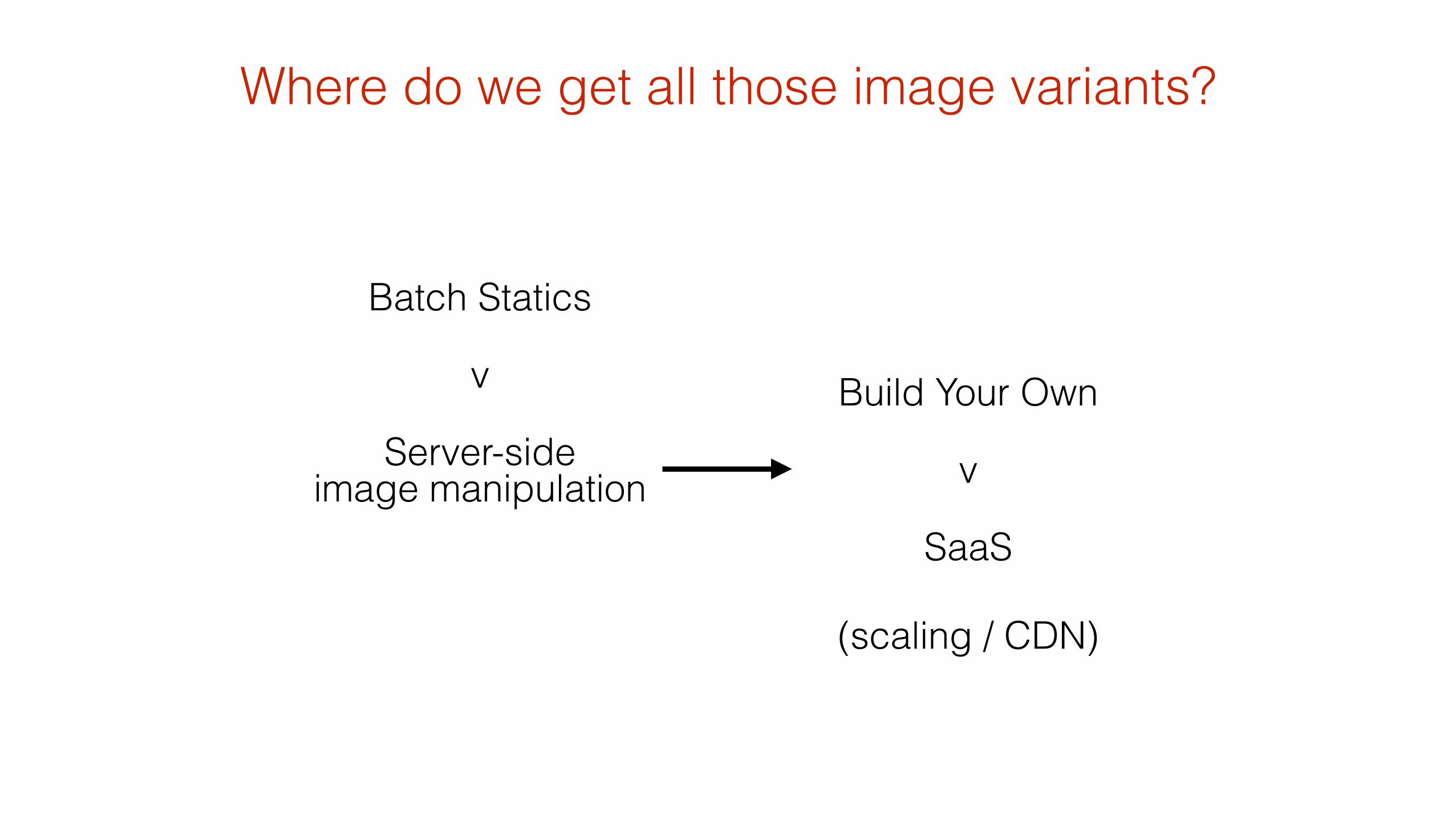
Where do we get all those image variants?
Batch Statics
v
Server-side image manipulation
Build Your Own
v
SaaS
!
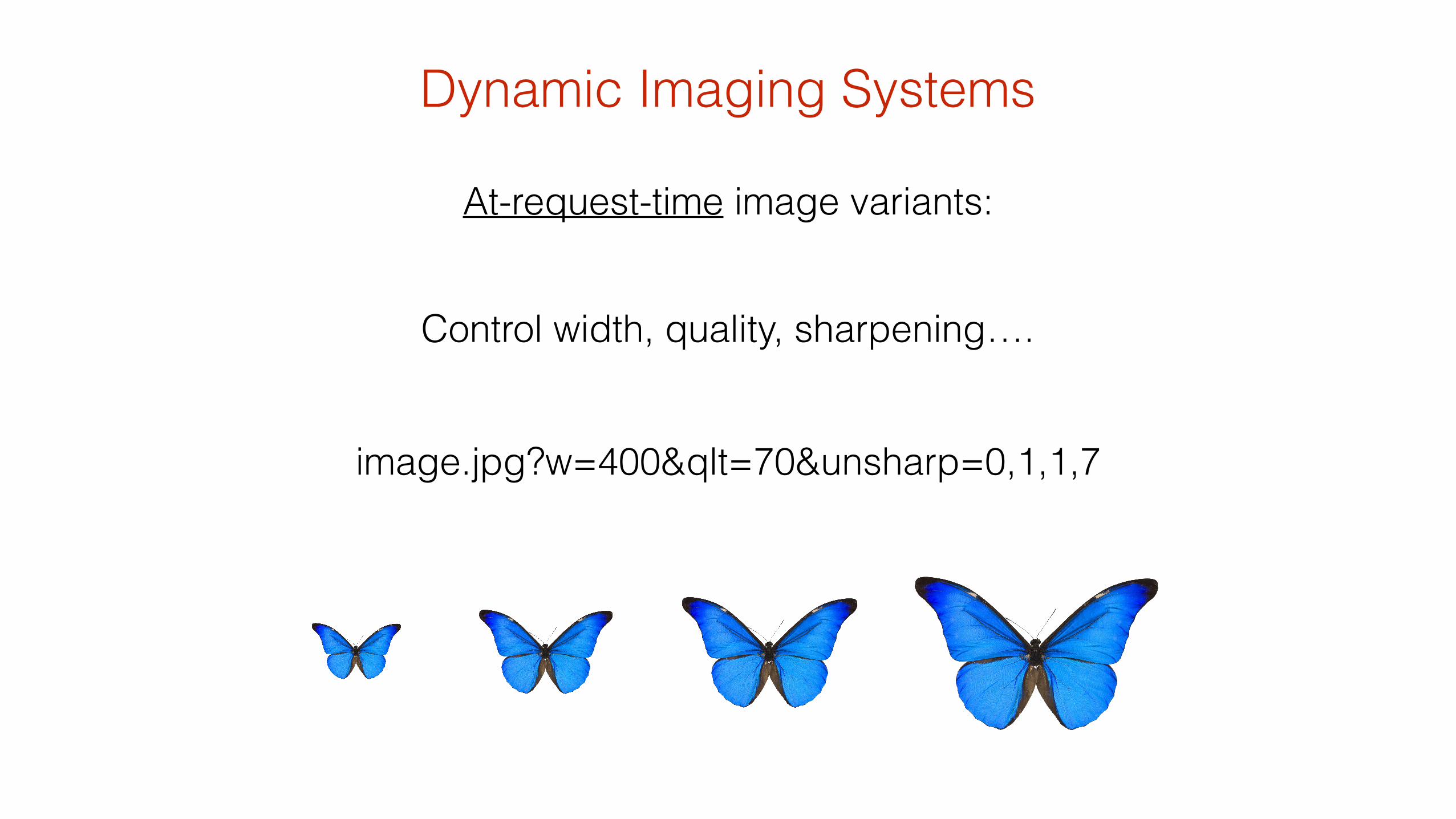
image.jpg?w=400&qlt=70&unsharp=0,1,1,7
At-request-time image variants:
Control width, quality, sharpening….
Dynamic Imaging Systems
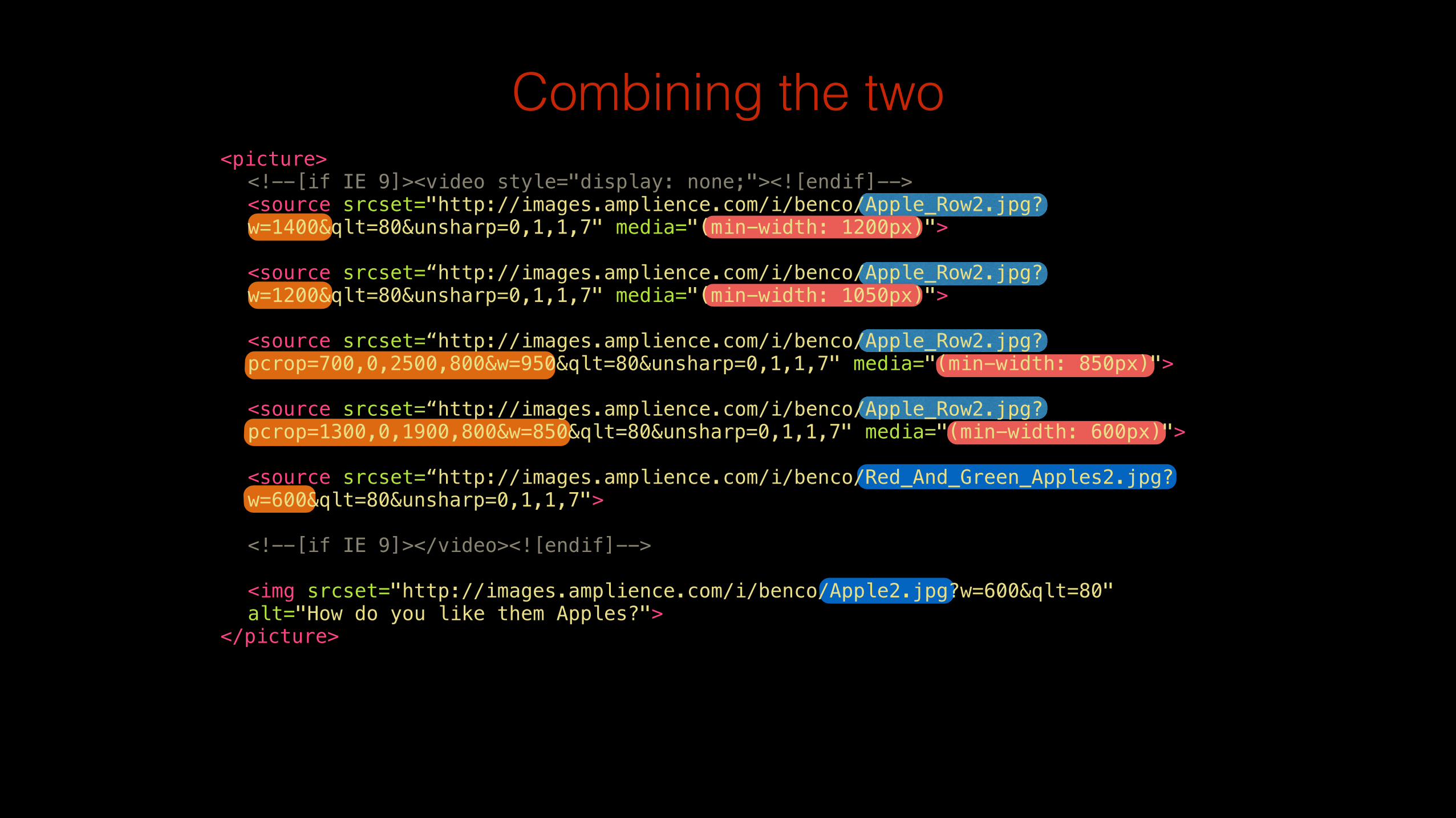
Combining the two<picture> <!--[if IE 9]><video style="display: none;"><![endif]--> <source srcset="http://images.amplience.com/i/benco/Apple_Row2.jpg? w=1400&qlt=80&unsharp=0,1,1,7" media="(min-width: 1200px)"> <source srcset=“http://images.amplience.com/i/benco/Apple_Row2.jpg? w=1200&qlt=80&unsharp=0,1,1,7" media="(min-width: 1050px)"> <source srcset=“http://images.amplience.com/i/benco/Apple_Row2.jpg? pcrop=700,0,2500,800&w=950&qlt=80&unsharp=0,1,1,7" media="(min-width: 850px)"> <source srcset=“http://images.amplience.com/i/benco/Apple_Row2.jpg? pcrop=1300,0,1900,800&w=850&qlt=80&unsharp=0,1,1,7" media="(min-width: 600px)"> <source srcset=“http://images.amplience.com/i/benco/Red_And_Green_Apples2.jpg? w=600&qlt=80&unsharp=0,1,1,7"> <!--[if IE 9]></video><![endif]--> <img srcset="http://images.amplience.com/i/benco/Apple2.jpg?w=600&qlt=80" alt="How do you like them Apples?"> </picture>
Viewport width
50%
Within the fluid context of responsive websites, the restrictive nature of the <img> element, and lack of CSS controls for foreground images, has not been the elephant in the room. It's just been the elephant that we couldn't agree what to do with….
Combining the two
<img src="http://images.amplience.com/i/benco/Apple2.jpg?w=400&qlt=80" alt="How do you like them Apples?" sizes="(min-width: 640px) 50vw, 100vw" srcset="http://images.amplience.com/i/benco/Apple_Row2.jpg?w=200&qlt=80&unsharp=0,1,1,7 200w, http://images.amplience.com/i/benco/Apple_Row2.jpg?w=400&qlt=80&unsharp=0,1,1,7 400w, http://images.amplience.com/i/benco/Apple_Row2.jpg?w=600&qlt=80&unsharp=0,1,1,7 600w, http://images.amplience.com/i/benco/Apple_Row2.jpg?w=800&qlt=80&unsharp=0,1,1,7 800w, http://images.amplience.com/i/benco/Apple_Row2.jpg?w=1200&qlt=80&unsharp=0,1,1,7 1200w" /> ! </div>

One last thing….
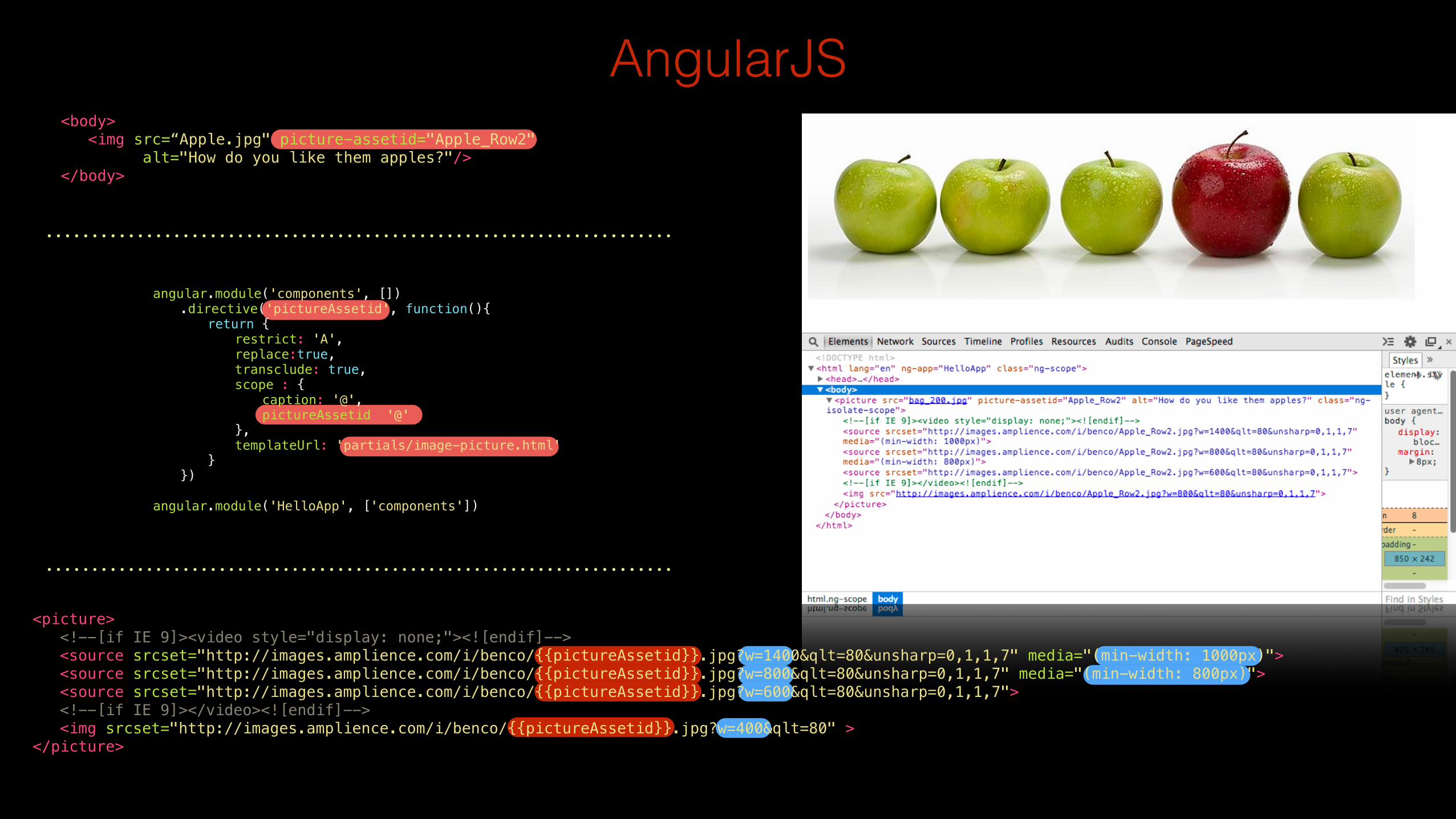
AngularJS<body> <img src=“Apple.jpg" picture-assetid="Apple_Row2" alt="How do you like them apples?"/> </body>
angular.module('components', []) .directive('pictureAssetid', function(){ return { restrict: 'A', replace:true, transclude: true, scope : { caption: '@', pictureAssetid: '@' }, templateUrl: 'partials/image-picture.html' } }) !angular.module('HelloApp', ['components'])
<picture> <!--[if IE 9]><video style="display: none;"><![endif]--> <source srcset="http://images.amplience.com/i/benco/{{pictureAssetid}}.jpg?w=1400&qlt=80&unsharp=0,1,1,7" media="(min-width: 1000px)"> <source srcset="http://images.amplience.com/i/benco/{{pictureAssetid}}.jpg?w=800&qlt=80&unsharp=0,1,1,7" media="(min-width: 800px)"> <source srcset="http://images.amplience.com/i/benco/{{pictureAssetid}}.jpg?w=600&qlt=80&unsharp=0,1,1,7"> <!--[if IE 9]></video><![endif]--> <img srcset="http://images.amplience.com/i/benco/{{pictureAssetid}}.jpg?w=400&qlt=80" > </picture>
<picture>
srcset/
Dynamic Imaging System
Practical Responsive
Images=+
@bseymour
responsiveimag.es
Thank you