Poster research
8
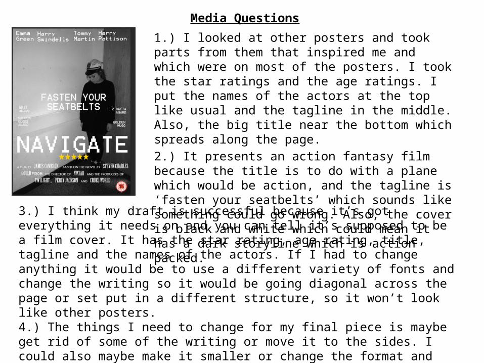
1.) I looked at other posters and took parts from them that inspired me and which were on most of the posters. I took the star ratings and the age ratings. I put the names of the actors at the top like usual and the tagline in the middle. Also, the big title near the bottom which spreads along the page. 2.) It presents an action fantasy film because the title is to do with a plane which would be action, and the tagline is ‘fasten your seatbelts’ which sounds like something could go wrong. Also, the cover is black and white which could mean it has a dark storyline which is action packed. 3.) I think my draft is successful because it’s got everything it needs on and you can tell it’s supposed to be a film cover. It has the star rating, age rating, title, tagline and the names of the actors. If I had to change anything it would be to use a different variety of fonts and change the writing so it would be going diagonal across the page or set put in a different structure, so it won’t look like other posters. 4.) The things I need to change for my final piece is maybe get rid of some of the writing or move it to the sides. I could also maybe make it smaller or change the format and design. Media Questions
-
Upload
paigerowell -
Category
Art & Photos
-
view
12 -
download
0
Transcript of Poster research
1.) I looked at other posters and took parts from them that inspired me and which were on most of the posters. I took the star ratings and the age ratings. I put the names of the actors at the top like usual and the tagline in the middle. Also, the big title near the bottom which spreads along the page.2.) It presents an action fantasy film because the title is to do with a plane which would be action, and the tagline is ‘fasten your seatbelts’ which sounds like something could go wrong. Also, the cover is black and white which could mean it has a dark storyline which is action packed.
3.) I think my draft is successful because it’s got everything it needs on and you can tell it’s supposed to be a film cover. It has the star rating, age rating, title, tagline and the names of the actors. If I had to change anything it would be to use a different variety of fonts and change the writing so it would be going diagonal across the page or set put in a different structure, so it won’t look like other posters.4.) The things I need to change for my final piece is maybe get rid of some of the writing or move it to the sides. I could also maybe make it smaller or change the format and design.5.) Whilst making my draft I learnt how to use photoshop more effectively and I can edit things faster and save time. Also, I can edit my pictures faster and more effectively.
Media Questions

Gallery1.) Firstly, I added my own photo from an aeroplane.
2.) Secondly, I added the names of the people In the movie.
3.) Thirdly, I put the name of the film on, in big writing so it stands out.

5.) Also, I added a tag line so people would recognise the movie and to make it sound catchy.
6.) Lastly, I put some awards that the film got too show its worth watching.

Gallery - Girls1.) Firstly, I took a picture of Emma in a pilot’s hat and changed it to black and white to make it look more effective.
2.) Secondly, I wrote the actors that will be in the film and put them above the picture right at the top, so it won’t be in the way of anything. Also, because it’s easy to see when people want to know who will be in the film.
3.) After, I added the awards to show that the film is worth watching.
4.) Next, I wrote the tagline and put it near the middle in bold to stand out.

8.) Lastly, I added the age rate to allow people to know the age of who should be watching it.
7.) Next, I added the golden stars to people will know how good the film is and its ratings, so more people will buy and watch it.
5.) I added the title next in big, bold writing so people can see what the film is called.
6.) After that, I wrote the bottom writing, which says who made the film and films also made by the producer. I put the important information in a different font and size to make it stand out more.
I made a new film poster because although my previous one had my own photos, it wasn’t of a person like suggested. Also, the font I chose looked blurry and I improved this one so it looks even better than the other one.

Gallery - Boys1.) Firstly, I opened my other poster so I could use it as a template.
2.) Secondly, I removed the photo of the girl and replaced it with a boy. After I realised that in the background were objects that made my photo not look as good, like the light switch and the photo frame.
3.) Next, I decided to take some more photos to replace the other, making sure there was nothing in the back ground to take the focus off the boy.I tried this photo on the poster and thought it looked quite good.

4.) Looking at both the posters I decided I liked the original, so I zoomed in on the picture. This way I could still use the picture but without the background items spoiling it. I also, edited out the logo on the tshirt so it doesn’t ruin the outfit, and so the poster looks more real.
5.) Lastly, I changed the colour of the writing because it wasn’t very visible due to the colour of the clothes, so I changed the tag line and the awards to black.The actor names, star rating, age rate and the information about the director was left the same to try and make the posters look as similar as possible.

I chose the pixel type font with white writing because I thought it matched the photo well and stood out quite a bit. I used the same writing throughout my poster so it looks neat and professional. I took this photo down a corridor and turned the light out to make a dark atmosphere. I then changed the picture to black and white. The people modelling in my poster have Lutterworth College uniform on, with their logo on it. In Photoshop I edited the logo out so it doesn’t look like the film is based in a school or that it has a school theme. I wanted my film based on a plane because I already had some ideas, and I found a photo I had taken looking out the window of a plane so I was originally using that. I finished all my writing on it like the name, the actors and the title and then I realised I had to have a person on it, so I took a picture of Emma facing down with a pilots hat on, and used that instead. It now looks more dramatic because I have improved it. I then took one of Tommy with the same hat on and used that for my boys poster.The audience can tell this poster is for an action film for teenagers, because it has a teenager on the front and the actors are also teenagers. The first poster could be aimed at a male audience because it has a girl on the front which would draw attention, but because it isn’t zoomed in on her face and you can’t see her makeup and hair in great detail, it would be mainly aimed at a female audience.
Poster Evaluation
I chose the dark colours on my posters to create the scary, action effect so it will stand out to viewers of action fantasy films. I put the name of the film near the middle in big bold writing to empathise the atmosphere of the film. I placed it in near the middle because that’s where people would usually look, so it should stand out to them more. I put the tagline in the centre across the main part of the picture so when people look at the picture, they will see the tagline straight the way.