Portfolio
34
alison tourville design portfolio
-
Upload
alison-tourville -
Category
Documents
-
view
219 -
download
0
description
Portfolio 2012
Transcript of Portfolio

alison tourville
design portfolio


SIX-WORD AUTOBIOGRAPHY
A purely typographic and visual six-word autobiography, in which my name is the
focal point of the composition


LETTERFORM
The combination of one wq and one nu-meral into a single visual unit


SOCIAL AWARENESS POSTER
A cartoon illustration on newsprint which focuses on the role of women
in the Catholic Church

“Priest Club” of the Catholic Church


TYPE SPECIMEN BOOK
A type specimen book based on the typeface Interstate, in the form of a map

The day we stop needing new type will be the same day that we stop needing new stories and new songs.
Interstate is a sans serif typeface designed by Tobias
Frere-Jones in 1993-1994. Based on interstate highway
signage of the U.S. Federal Highway Administration,
this neo-grotesque typeface was designed using the
original sign manual sketches and kerning tables pub-
lished by the U.S. government.
Today, the Interstate typeface has been expanded into
a versatile range of display designs that includes 40
fonts, 3 widths, and 7 weights. The typeface also of-
fers a family of symbols inspired by traffic signs.
Interstate is based on roadway signs and is therefore
optimal for signage usage. The characteristics of the
typeface make it suitable for display usage in print and
it is often a popular choice for newspapers, magazines,
and online use.
As a common typeface for highway signs on major U.S.
roads, Interstate must be seen and read by U.S. drivers
on a daily basis. Its simple, clean letterforms make it
more legible at various distances on the road.
The oblique terminals make the counterforms more open, thus performing better at smaller siz-es and on rough paper stocks. The dynamic of each character, rather than pointing back at itself (as it would in Univers or Helvet-ica) points at its neighbors. The characters thus bind themselves more readily into coherent and readable word-shapes.
Tobias Frere-Jones was an artist from a young age. He
created paintings, sculptures and photographs at age
14. Tobias was born on August 28, 1970, in Brooklyn,
NY to Robin Carpenter Jones and Elizabeth Frere.
He was raised in a family of writers and printers and
quickly discovered a passion for type and letterform
during his teenage years.
In 1992, Tobias received a BFA in Graphic Design from
the Rhode Island School of Design. He drew the atten-
tion of Matthew Carter, a well-known typographer, who
directed him after graduation to the Font Bureau in
Boston. Frere-Jones worked for 7 years at Font Bureau,
where he eventually became a Senior Director. Tobias
took part in the creation of 18 retail and 21 custom
typeface families during his time at Font Bureau. His
most notable typeface creations include Interstate,
Gotham, Grand Central, and Benton Sans.
In 1999, Frere-Jones left Font Bereau to return to New
York, where he joined forces with typographer Jonathan
Hoefler at The Hoefler Type Foundry, Inc. Since working
together, the two have collaborated on projects for major
publications such as The Wall Street Journal, Martha Stew-
art Living, GQ, The New York Times Magazine and Esquire.
Their company continues to work with brand leaders in ev-
ery sector today, developing original typefaces and licens-
ing fonts from its library of nearly 1,000 designs.
This type specimen book is one of a series of 11 books
designed under the direction of instructor Ingrid Hess
by the students of Graphic Design II at the University
of Notre Dame during the spring semester of 2011.
This volume explores the use and origins of the Inter-
state typeface created by Tobias Frere-Jones in 1994.
This book has been researched, designed, and edited
by Alison Tourville.
INTERSTATE is...
an elegant sans serif in a modern setting
an elegant sans serif in a modern setting
an elegant sans serif in a modern setting
an elegant sans serif in a modern setting
an elegant sans serif in a modern setting
an elegant sans serif in a modern setting
an elegant sans serif in a modern setting
an elegant sans serif in a modern setting
an elegant sans serif in a modern setting
an elegant sans serif in a modern setting
classified as late 19th century grotesque
shares basic proportions and attributes with faces like
Helvetica and Univers
modern font, has larger x-heights, less stress in rounded
strokes, and no serifs•
counters are open, contributes to legibility at
smaller sizes
Characteristics:
t ls ea
terminals of curved strokes are cut at a 90° angle
to the stroke
terminals of ascending strokes are cut at an
angle to the stroke
y
dgk
“
” jm
p
r
u
b
“”
••
Hoefler(left) and Frere-Jones (right)
Introduction Purpose Characteristics History Designer Colophon
Tobias Frere-JonesInterstate was first released in 1994 and was
loosely based on the typeface Highway Gothic,
which was used by the US Federal Highway
Administration for national road signs. Despite
its origins, Interstate was embraced universally
by graphic designers and is considered the result
of Frere-Jones’ continuing interest in what he
calls “working class lettering.”
Sainsbury’s Supermarkets
Invesco Perpetual
signage for Southwest Airlines
2004 Weather Channel on-air newscasts
2006 US Army “Army Strong” ad campaign
Hammersmith and West London College
INTERSTATE
GD 2
Type Spec Book
Aa – Tobias Frere-Jones
– Tobias Frere-Jones
Bibliography
DEAD END
American Type Design & Designers by David Consuegra
An A-Z of Type Designers by Neil Macmillan
Font Bureau People: Tobias Frere-Joneshttp://www.fontbureau.com/people/TobiasFrereJones
Interstate by Allan Haley
Interstate - Fonts.com http://www.fonts.com/fontpackages/interstate-font-family.htm
Is Gotham the New Interstate? by Dmitri Siegel
Wikipedia, Interstate Typefacehttp://en.wikipedia.org/wiki/Interstate_(typeface)
1
T EI N T E R S T A(Back)
(Front)


SOCIAL AWARENESS CAMPAIGN
A visual campaign to promote the con-nection between poverty and education
in the United States for the “Poverty Ties to Education” event on-campus

Poverty tiesTO EDUCATIONPoverty ties
TO EDUCATIONPoverty ties
TO EDUCATIONPoverty ties
TO EDUCATION
YOUR DONATION HAS MADE AN IMPACT ON A
CHILD IN NEED.
Thank YouFOR TAKING THE TIME TO TIE YOURSELF TO
SOMETHING WORTHWHILE.
YOUR DONATION HAS MADE AN IMPACT ON A
CHILD IN NEED.
Thank YouFOR TAKING THE TIME TO TIE YOURSELF TO
SOMETHING WORTHWHILE.
tie yourself to text 89413
to donate $5TO HELP MINIMIZE TUITION
FOR A CHILD IN NEED
Did you know that poverty ties to education? Here at Notre Dame we live less than 5 miles from schools with children that live under the poverty line. You can help by donating today!
%56In 2.4 miles from campus
of students are on the FREE LUNCH PROGRAMat James Madison Elementary
In 2.2 miles from campus
%54of students are on the
FREE LUNCH PROGRAMat Perley Elementary
In St. Joseph’s county
%19.7of children ages 5-16 LIVE IN POVERTY
SOMETHING WORTHWHILE
At St. Adalberts Elementary,
~40/160of students are on
FREE TUITION VOUCHERS
Balloon hang tags (left) and signs to promote the event (right)


HISTORY OF CUPCAKES
A research project on the history of cup-cakes; presented as an illustrated book

Example spreads from the book


2012 NATIONAL STUDENT ADVERTISING COMPETITION
A branding and communications cam-paign to promote the Nissan brand;
developed by a team of seven students and presented to a panel of judges

Example pages from the team plan book

Print advertisement (left), Tumblr page (top right), Twitter page (bottom right)


SOUTH AFRICA CAMPAIGN
An educational and promotional cam-paign to address xenophobia in South Africa; this senior-level project was ex-ecuted in Johannesburg in March 2012
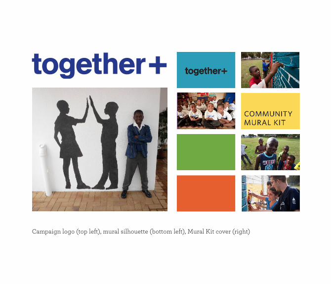
Campaign logo (top left), mural silhouette (bottom left), Mural Kit cover (right)
COMMUNITY MURAL

Design team with the community mural in South Africa (bottom)