Portflio
40
B Flores etty : Plan V Graphic Design & Marketing Visual Arts Department Cal-State University San Bernardino Art 443 Winter 2010 George Mcginnis Portfolio
-
Upload
betty-flores -
Category
Documents
-
view
213 -
download
0
description
My first portfolios for Cal-State Ssn Bernardino. Enjoy!
Transcript of Portflio

BFloresetty:
Plan V Graphic Design & MarketingVisual Arts DepartmentCal-State UniversitySan BernardinoArt 443 Winter 2010George Mcginnis
Portfolio B:

BFloresetty:
Plan V Graphic Design & MarketingVisual Arts DepartmentCal-State UniversitySan BernardinoArt 443 Winter 2010George Mcginnis
Portfolio B:
BFloresetty:
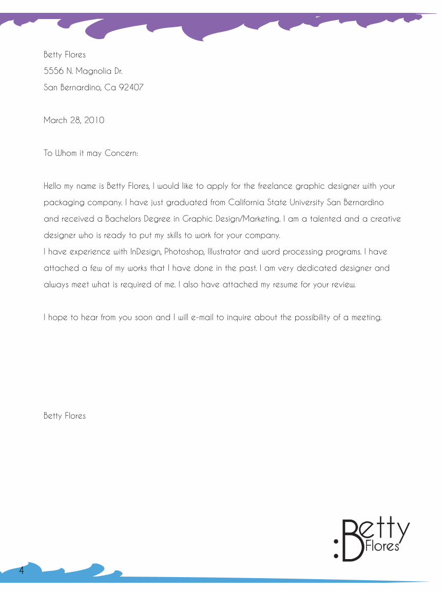
Betty Flores
5556 N. Magnolia Dr.
San Bernardino, Ca 92407
March 28, 2010
To Whom it may Concern:
Hello my name is Betty Flores, I would like to apply for the freelance graphic designer with your
packaging company. I have just graduated from California State University San Bernardino
and received a Bachelors Degree in Graphic Design/Marketing. I am a talented and a creative
designer who is ready to put my skills to work for your company.
I have experience with InDesign, Photoshop, Illustrator and word processing programs. I have
attached a few of my works that I have done in the past. I am very dedicated designer and
always meet what is required of me. I also have attached my resume for your review.
I hope to hear from you soon and I will e-mail to inquire about the possibility of a meeting.
Betty Flores
BFloresetty:
43
BFloresetty:
Betty Flores
5556 N. Magnolia Dr.
San Bernardino, Ca 92407
March 28, 2010
To Whom it may Concern:
Hello my name is Betty Flores, I would like to apply for the freelance graphic designer with your
packaging company. I have just graduated from California State University San Bernardino
and received a Bachelors Degree in Graphic Design/Marketing. I am a talented and a creative
designer who is ready to put my skills to work for your company.
I have experience with InDesign, Photoshop, Illustrator and word processing programs. I have
attached a few of my works that I have done in the past. I am very dedicated designer and
always meet what is required of me. I also have attached my resume for your review.
I hope to hear from you soon and I will e-mail to inquire about the possibility of a meeting.
Betty Flores
BFloresetty:
43

Design Statement
When I was in high school I was always fascinated by the layout of pictures I
saw in magazines. I always cut out pictures and printed pictures from the internet. I
would use those same pictures and lay them out as if my folder was my magazine. I
love laying out pictures on a piece of paper and arranging them as much as I can
to get a better layout each time.
When starting a project I look at what other people have done in the pass
and try to go a different direction I try not to do the same as others have done.
I always try to make my work stand out from the rest. When I did my packaging
assignments I knew that I didn’t want to do the same thing that others had done.
For example when I see boxes of cake mixes I feel like they’re too plain, and most
of them just use a huge cake picture to grab consumers’ attention. I wanted to use
that same method but I used bright colors to do that. When I design I know I will try
to go in a new direction. I love being able to have a new look for each project that
I do.
Betty Flores
BFloresetty:
5 6
ResumeBetty Flores
Cal-State San Bernardino
5500 University Parkway
San Bernardino, Ca 92407
(909)754-7749 [email protected]
www.betty182.weebly.com
Objective: A permanent, full time position with advancing opportunities in graphic designing
and packaging design.
Skills: Able to use programs such as Adobe InDesign, Adobe Photoshop, Adobe Illustrator, and
Microsoft Word; experience with packaging and advertising. Excellent communication skills.
and Strong attention to detail.
Education: San Bernardino Valley College- Associate’s Degree in Liberal Arts
California State San Bernardino University- Bachelors Degree in Graphic Design
and Marketing
Expierience: JcPenney Customer Service Representative
Employee: JcPenney in Rancho Cucamonga as a customer service representative since
2008-present
Strengths: Able to communicate and satisdy customer’s wants and needs. Able to finish produts in
a timely manner. Able to create new designs different from the norm.
Interest: Photography, Design, Traveling,
References: Available Upon Request BFloresetty:

D
namaarso
Table of ContentsLogo Designs Pages: Nama Solar 10,11 Sea Organic 12,13 Jelly Jams 14 Panda Cakes 15 Lena Cookies 16,17
7 8
B:
Packaging: The Action Design Remake CD 20 Sea Organic 21 Panda Cakes 22,23 Jelly Jams 24,25 Lena Cookies 26,27
Typography Bowl Font Definition 30 Serif Font Definition 31 The Action Design Promo Poster 32 Trajan Font Book 33
Advertising Nikon Magazine Ad 36 Name Solar Ad 37 Sea Organic Ads 38,39
B:

D
namaarso
Table of ContentsLogo Designs Pages: Nama Solar 10,11 Sea Organic 12,13 Jelly Jams 14 Panda Cakes 15 Lena Cookies 16,17
7 8
B:
Packaging: The Action Design Remake CD 20 Sea Organic 21 Panda Cakes 22,23 Jelly Jams 24,25 Lena Cookies 26,27
Typography Bowl Font Definition 30 Serif Font Definition 31 The Action Design Promo Poster 32 Trajan Font Book 33
Advertising Nikon Magazine Ad 36 Name Solar Ad 37 Sea Organic Ads 38,39
B:solar
solarnama
nama
C= 100M= 60Y= 10K= 0
C= 0M= 20Y= 80K= 0
Font: Caviar Dreams
Betty FloresArt 344Mc Ginnis
Logo DesignsBFloresetty:
9 10
When Designing this logo I wanted to have the sun in my logo because it was for a solar company. The original name of the company was namaste solar and I shorten the name to make it more easier to remember.

solar
solarnama
nama
C= 100M= 60Y= 10K= 0
C= 0M= 20Y= 80K= 0
Font: Caviar Dreams
Betty FloresArt 344Mc Ginnis
Logo DesignsBFloresetty:
9 10
When Designing this logo I wanted to have the sun in my logo because it was for a solar company. The original name of the company was namaste solar and I shorten the name to make it more easier to remember.

Design Brief Betty Flores
Target Audience:
South East Organic is a Thailand company that is based on organic agriculture. Since 1999 they have been creating social development projects all at in the major agriculture areas of Thailand. Their main focus is to be successful on what they do and being the best at what they do. The target audience would be people who want to have organic foods from Thailand or organic foods in general.
Look & Feel:
The original logo to me seems too green, what I got from it was that they were trying to sell plants more than organic foods. I used earthtone colors, blue and green to give that organic feel. SEA sells starch, sugar cane, syrup, and sweeten powder. I used a leaf because that is used for most organic logos and gives that five that feel, and i used the waves to represent overseas and to make it easier to remember the name SEA Organic.
Message:
The message I would like to give is that this company is really focused on giving the best quality products. The logo they have does not deliver that message. I want to show that the products are organic and good for you.
Sea Organic Sea Organic
Sea OrganicSea Organic
Sea Organic Sea Organic
Sea OrganicSea Organic
C: 87.27M: 60.07Y: 2.08K: 0.05
C: 52.17M: 0Y: 87.27K: 0
C: 70M: 0Y: 100K: 9
Sea Organic Sea Organic
Sea OrganicSea Organic
11 12
Font: Kabel Md Bt
The use of the logo can be recognized very easily. Once the company is more and more recognized the company can even just use the sun to represent themselves and not have to use their whole name.
When creating this logo I knew I wanted to have a leaf to represent it’s organic feel. I used the waves to represent that the company was from overseas and combined both water and leaf to represent Southeast Asia Organic. I also Shorten the name of this company so it can be easier to remember.

Design Brief Betty Flores
Target Audience:
South East Organic is a Thailand company that is based on organic agriculture. Since 1999 they have been creating social development projects all at in the major agriculture areas of Thailand. Their main focus is to be successful on what they do and being the best at what they do. The target audience would be people who want to have organic foods from Thailand or organic foods in general.
Look & Feel:
The original logo to me seems too green, what I got from it was that they were trying to sell plants more than organic foods. I used earthtone colors, blue and green to give that organic feel. SEA sells starch, sugar cane, syrup, and sweeten powder. I used a leaf because that is used for most organic logos and gives that five that feel, and i used the waves to represent overseas and to make it easier to remember the name SEA Organic.
Message:
The message I would like to give is that this company is really focused on giving the best quality products. The logo they have does not deliver that message. I want to show that the products are organic and good for you.
Sea Organic Sea Organic
Sea OrganicSea Organic
Sea Organic Sea Organic
Sea OrganicSea Organic
C: 87.27M: 60.07Y: 2.08K: 0.05
C: 52.17M: 0Y: 87.27K: 0
C: 70M: 0Y: 100K: 9
Sea Organic Sea Organic
Sea OrganicSea Organic
11 12
Font: Kabel Md Bt
The use of the logo can be recognized very easily. Once the company is more and more recognized the company can even just use the sun to represent themselves and not have to use their whole name.
When creating this logo I knew I wanted to have a leaf to represent it’s organic feel. I used the waves to represent that the company was from overseas and combined both water and leaf to represent Southeast Asia Organic. I also Shorten the name of this company so it can be easier to remember.

ellyams
ellyams
Sea
Org
anic
Where People Meet Organic.
ellyams
ellyams
Pantone 2593c
Pantone2635c
Pantone2627c
Pantone1785mOpacity 70%
Pantone1805c
13 14
Font: Nilland
These are examples of the logo on items. The truck will be used to delivery the products of Sea Organic. The canvas bag would be sold online and offered at promotional events as well as the coffee cup. These are the logos for the Jelly jams project for my Packaging class. I knew I wanted a
different feel and use bright colors to grab the consumers attention. I’ve seen most jams have an old fashioned feel and I wanted to go a different direction.

ellyams
ellyams
Sea
Org
anic
Where People Meet Organic.
ellyams
ellyams
Pantone 2593c
Pantone2635c
Pantone2627c
Pantone1785mOpacity 70%
Pantone1805c
13 14
Font: Nilland
These are examples of the logo on items. The truck will be used to delivery the products of Sea Organic. The canvas bag would be sold online and offered at promotional events as well as the coffee cup. These are the logos for the Jelly jams project for my Packaging class. I knew I wanted a
different feel and use bright colors to grab the consumers attention. I’ve seen most jams have an old fashioned feel and I wanted to go a different direction.

Panda
Cakes
C: 0 M:26.27 Y:95.69 K: 0
C: 0 M:99.61 Y:85.1 K: 0
CookiesLenaC: 0M: 0Y: 31K: 0
Font: Grenouille and Floozy
15 16
Font: RNS Camelia
With my cake mixes I knew I wanted to create a character for them. I chose a panda to represent my cake mixes with his delightful smile and eyes to grab a child’s attention. Even though I did want children to see him I also wanted to grab the parents attention with the sophisticated look of the logo.
WIth Lena cookies I wanted to use pastel colors to have sort of a playful feel to it. The logo itself I think reminds me of cookies with the use of the swilrls in the letters.. The circle itself represents the moon because tof the owl that is used.

C: 41M: 49Y: 44K: 6
C: 0M: 3 Y: 50K: 0
C: 18M: 44Y: 64K: 1
1817
I found this owl online because I couldn’t think of an owl right away. I gave it different shades of brown to represent the colors of cookies. The eyes of the owl also look like cookies and I felt that it was the prefect character to represent Lena Cookies.
B:

BFloresetty: Packaging
19 20
I re-designed The Action Design Never Say album. I wanted to make it more simple and colorful than the original. I altered a bird I found and made him colorful. I like the new design because it is clean and colorful.

BFloresetty: Packaging
19 20
I re-designed The Action Design Never Say album. I wanted to make it more simple and colorful than the original. I altered a bird I found and made him colorful. I like the new design because it is clean and colorful.
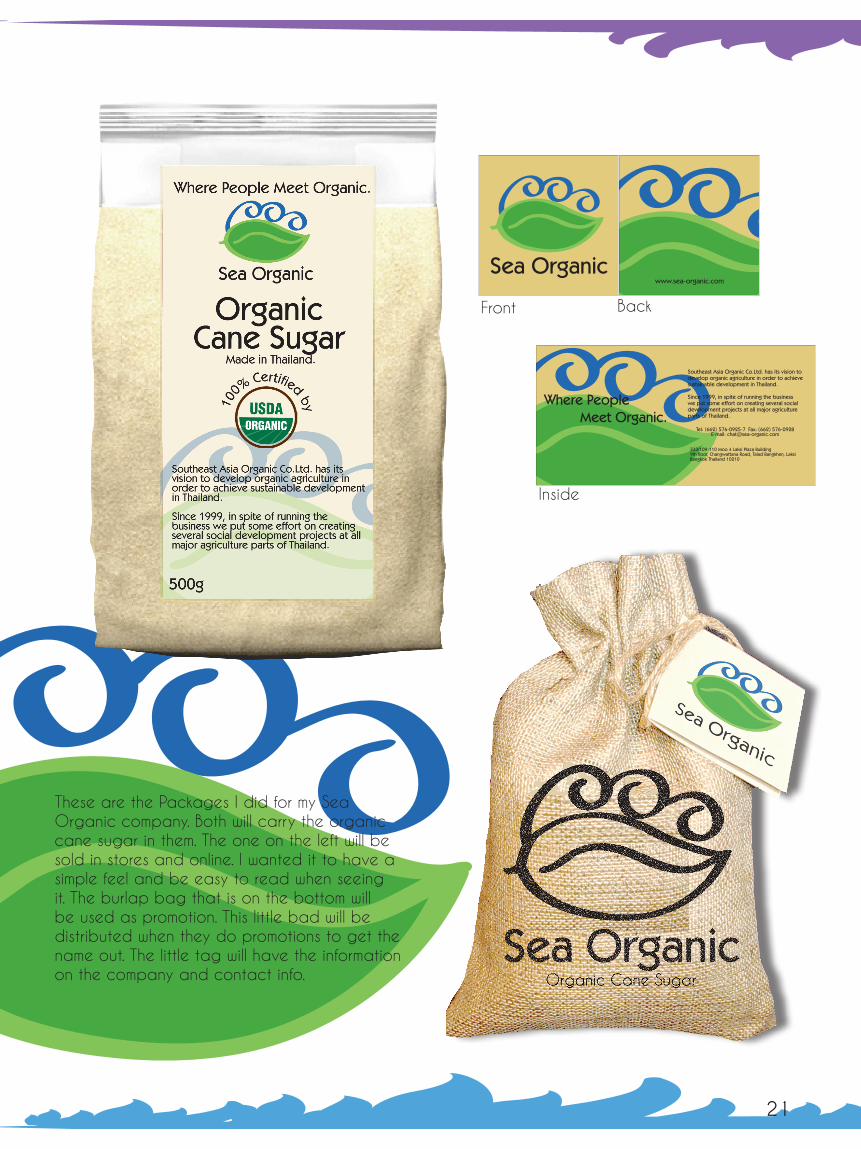
21 22
D
Sea Organic Sea Organic
Sea OrganicSea Organic
www.sea-organic.com
Sea Organic Sea Organic
Sea OrganicSea Organic
Sea Organic Sea Organic
Sea OrganicSea Organic
Where PeopleMeet Organic.
Sea Organic Sea Organic
Sea OrganicSea Organic
Southeast Asia Organic Co.Ltd. has its vision to develop organic agriculture in order to achieve sustainable development in Thailand.
Since 1999, in spite of running the business we put some effort on creating several social development projects at all major agriculture parts of Thailand.
333/109-110 Moo 4 Laksi Plaza Building9th floor, Changwattana Road, Talad Bangkhen, LaksiBangkok Thailand 10210
Tel: (662) 576-0925-7 Fax: (662) 576-0928E-mail: [email protected]
Front Back
Inside
These are the Packages I did for my Sea Organic company. Both will carry the organic cane sugar in them. The one on the left will be sold in stores and online. I wanted it to have a simple feel and be easy to read when seeing it. The burlap bag that is on the bottom will be used as promotion. This little bad will be distributed when they do promotions to get the name out. The little tag will have the information on the company and contact info.

23 24
These are my Jelly Jams Product. I used the bright colors to grab the consumers attention. Most jellies that I see on the shelves go for the old fashioned look and I wanted a more modern look and go a different direction.
I made cake mixes for my first project, I knew I wanted bright colors for the mixes to stand out. Most cake mixes have too much clutter and I wanted it simple and clean. I also designed the character for the cake mixes.

25 26
This is my Lena cookies Project. I was really proud of this one because it came out so well. I Wanted something that you could see with the pastel colors. I also wanted the package to be displayed in two different ways. This photo above is one way it can be displayed and on the other side it just has the logo on the side.

27 28
B:
27 28
B:

P a b p q B g d P P a b p q B g d P P a b p q B g d P P a b p q B g d P
P a b p q B g d P P a b p q B g d P P a b p q B g d P P a b p q B g d P
P a b p q B g d P P a b p q B g d P P a b p q B g d P P a b p q B g d P
P a b p q B g d P P a b p q B g d P P a b p q B g d P P a b p q B g d P
P a b p q B g d P P a b p q B g d P P a b p q B g d P P a b p q B g d P
P a b p q B g d P P a b p q B g d P P a b p q B g d P P a b p q B g d P
P a b p q B g d P P a b p q B g d P P a b p q B g d P P a b p q B g d P
P a b p q B g d P P a b p q B g d P P a b p q B g d P P a b p q B g d P
P a b p q B g d P P a b p q B g d P P a b p q B g d P P a b p q B g d P
P a b p q B g d P P a b p q B g d P P a b p q B g d P P a b p q B g d P
P a b p q B g d P P a b p q B g d P P a b p q B g d P P a b p q B g d P
P a b p q B g d P P a b p q B g d P P a b p q B g d P P a b p q B g d P
P a b p q B g d P P a b p q B g d P P a b p q B g d P P a b p q B g d P
P a b p q B g d P P a b p q B g d P P a b p q B g d P P a b p q B g d P
P a b p q B g d P P a b p q B g d P P a b p q B g d P P a b p q B g d P
P a b p q B g d P P a b p q B g d P P a b p q B g d P P a b p q B g d P
P a b p q B g d P P a b p q B g d P P a b p q B g d P P a b p q B g d P
P a b p q B g d P P a b p q B g d P P a b p q B g d P P a b p q B g d P
P a b p q B g d P P a b p q B g d P P a b p q B g d P P a b p q B g d P
P a b p q B g d P P a b p q B g d P P a b p q B g d P P a b p q B g d P
P a b p q B g d P P a b p q B g d P P a b p q B g d P P a b p q B g d P
P a b p q B g d P P a b p q B g d P P a b p q B g d P P a b p q B g d P
P a b p q B g d P P a b p q B g d P P a b p q B g d P P a b p q B g d P
P a b p q B g d P P a b p q B g d P P a b p q B g d P P a b p q B g d P
P a b p q B g d P P a b p q B g d P P a b p q B g d P P a b p q B g d P
P a b p q B g d P P a b p q B g d P P a b p q B g d P P a b p q B g d P
P a b p q B g d P P a b p q B g d P P a b p q B g d P P a b p q B g d P
P a b p q B g d P P a b p q B g d P P a b p q B g d P P a b p q B g d P
bowlA curved or semicircular line of a character.
b 164 Fifth AvenueNew York, NY 10010212 807 1990
bBFloresetty: Typography
29 30
This was done for my first design class and we had to make ads for AIGA In the ads we had to define typography words.. I wanted to make sure it was easy to remember the definition so I highlighted the area of what the definition meant with the pink dots. I also used examples of the definition on the background as well.

P a b p q B g d P P a b p q B g d P P a b p q B g d P P a b p q B g d P
P a b p q B g d P P a b p q B g d P P a b p q B g d P P a b p q B g d P
P a b p q B g d P P a b p q B g d P P a b p q B g d P P a b p q B g d P
P a b p q B g d P P a b p q B g d P P a b p q B g d P P a b p q B g d P
P a b p q B g d P P a b p q B g d P P a b p q B g d P P a b p q B g d P
P a b p q B g d P P a b p q B g d P P a b p q B g d P P a b p q B g d P
P a b p q B g d P P a b p q B g d P P a b p q B g d P P a b p q B g d P
P a b p q B g d P P a b p q B g d P P a b p q B g d P P a b p q B g d P
P a b p q B g d P P a b p q B g d P P a b p q B g d P P a b p q B g d P
P a b p q B g d P P a b p q B g d P P a b p q B g d P P a b p q B g d P
P a b p q B g d P P a b p q B g d P P a b p q B g d P P a b p q B g d P
P a b p q B g d P P a b p q B g d P P a b p q B g d P P a b p q B g d P
P a b p q B g d P P a b p q B g d P P a b p q B g d P P a b p q B g d P
P a b p q B g d P P a b p q B g d P P a b p q B g d P P a b p q B g d P
P a b p q B g d P P a b p q B g d P P a b p q B g d P P a b p q B g d P
P a b p q B g d P P a b p q B g d P P a b p q B g d P P a b p q B g d P
P a b p q B g d P P a b p q B g d P P a b p q B g d P P a b p q B g d P
P a b p q B g d P P a b p q B g d P P a b p q B g d P P a b p q B g d P
P a b p q B g d P P a b p q B g d P P a b p q B g d P P a b p q B g d P
P a b p q B g d P P a b p q B g d P P a b p q B g d P P a b p q B g d P
P a b p q B g d P P a b p q B g d P P a b p q B g d P P a b p q B g d P
P a b p q B g d P P a b p q B g d P P a b p q B g d P P a b p q B g d P
P a b p q B g d P P a b p q B g d P P a b p q B g d P P a b p q B g d P
P a b p q B g d P P a b p q B g d P P a b p q B g d P P a b p q B g d P
P a b p q B g d P P a b p q B g d P P a b p q B g d P P a b p q B g d P
P a b p q B g d P P a b p q B g d P P a b p q B g d P P a b p q B g d P
P a b p q B g d P P a b p q B g d P P a b p q B g d P P a b p q B g d P
P a b p q B g d P P a b p q B g d P P a b p q B g d P P a b p q B g d P
bowlA curved or semicircular line of a character.
b 164 Fifth AvenueNew York, NY 10010212 807 1990
bBFloresetty: Typography
29 30
This was done for my first design class and we had to make ads for AIGA In the ads we had to define typography words.. I wanted to make sure it was easy to remember the definition so I highlighted the area of what the definition meant with the pink dots. I also used examples of the definition on the background as well.

Small Decorative strokes added to the end of a letters main stokes to improve readability by leading the eye along the line of type. Small Decorative strokes added to the end of a letters main stokes to improve readability by leading the eye along the line of type. Small Decorative strokes added to the end of a letters main stokes to improve readability by leading the eye along the line of type. Small Decorative strokes added to the end of a letters main stokes to improve readability by leading the eye along the line of type. Small Decorative strokes added to the end of a letters main stokes to improve readability by leading the eye along the line of type. Small Decorative strokes added to the end of a letters main stokes to improve readability by leading the eye along the line of type. Small Decorative strokes added to the end of a letters main stokes to improve readability by leading the eye along the line of type. Small Decorative strokes added to the end of a letters main stokes to improve readability by leading the eye along the line of type. Small Decorative strokes added to the end of a letters main stokes to improve readability by leading the eye along the line of type. Small Decorative strokes added to the end of a letters main stokes to improve readability by leading the eye along the line of type. Small Decorative strokes added to the end of a letters main stokes to improve readability by leading the eye along the line of type. Small Decorative strokes added to the end of a letters main stokes to improve readability by leading the eye along the line of type. Small Decorative strokes added to the end of a letters main stokes to improve readability by leading the eye along the line of type. Small Decorative strokes added to the end of a letters main stokes to improve readability by leading the eye along the line of type. Small Decorative strokes added to the end of a letters main stokes to improve readability by leading the eye along the line of type. Small Decorative strokes added to the end of a letters main stokes to improve readability by leading the eye along the line of type. Small Decorative strokes added to the end of a letters main stokes to improve readability by leading the eye along the line of type. Small Decorative strokes added to the end of a letters main stokes to improve readability by leading the eye along the line of type. Small Decorative strokes added to the end of a letters main stokes to improve readability by leading the eye along the line of type. Small Decorative strokes added to the end of a letters main stokes to improve readability by leading the eye along the line of type. Small Decorative strokes added to the end of a letters main stokes to improve readability by leading the eye along the line of type. Small Decorative strokes added to the end of a letters main stokes to improve readability by leading the eye along the line of type. Small Decorative strokes added to the end of a letters main stokes to improve readability by leading the eye along the line of type. Small Decorative strokes added to the end of a letters main stokes to improve readability by leading the eye along the line of type. Small Decorative strokes added to
the end of a letters main stokes to improve readability by leading the eye along the line of type.
Serif
erif
Small Decorative strokes added to the end of a letters main stokes to improve readability by leading the eye along the line of type.
164 Fifth AvenueNew York, NY 10010212 807 1990
The
ActionDesign
The Blank Club
San Jose, Ca 3/5
❤
Knitting Factory
Hollywood, Ca 3/11
Hollywood Alley
Mesa, Az 3/15
Bar Pink
San Diego, Ca 3/12
The Uptown
Oakland, Ca 3/7
Thee Parkside
San Francisco, Ca 3/6
31 32
Promotional poster that will be used to promote The Action Design when they go on tour. I used the same pictures as what is on the CD cover.
a b c d e f g h i j k l m n o p q r s t u v w x y z A B C D E F G H I J K L M N O P Q R S T U V W X Y Z
1 2 3 4 5 6 7 8 9 0
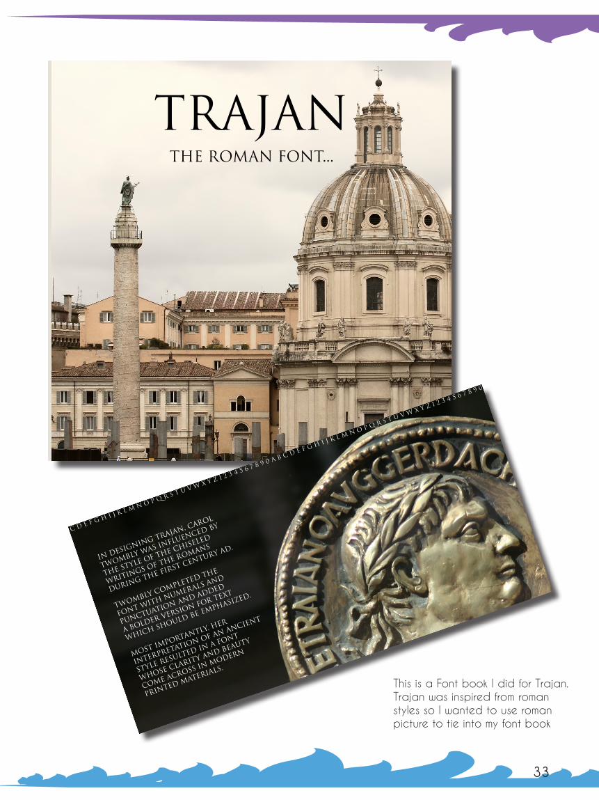
Trajanthe roman Font...
In designing Trajan, Carol
Twombly was influenced by
the style of the chiseled
writings of the Romans
during the first century AD.
Twombly completed the
font with numerals and
punctuation and added
a bolder version for text
which should be emphasized.
Most importantly, her
interpretation of an ancient
style resulted in a font
whose clarity and beauty
come across in modern
printed materials.
a b c d e f g h i j k l m n o p q r s t u v w x y z 1 2 3 4 5 6 7 8 9 0 a b c d e f g h i j k
l m n o p q r s t u v w x y z 1 2 3 4 5 6 7 8 9 0
33 34
B:This is a Font book I did for Trajan. Trajan was inspired from roman styles so I wanted to use roman picture to tie into my font book

a b c d e f g h i j k l m n o p q r s t u v w x y z A B C D E F G H I J K L M N O P Q R S T U V W X Y Z
1 2 3 4 5 6 7 8 9 0
Trajanthe roman Font...
In designing Trajan, Carol
Twombly was influenced by
the style of the chiseled
writings of the Romans
during the first century AD.
Twombly completed the
font with numerals and
punctuation and added
a bolder version for text
which should be emphasized.
Most importantly, her
interpretation of an ancient
style resulted in a font
whose clarity and beauty
come across in modern
printed materials.
a b c d e f g h i j k l m n o p q r s t u v w x y z 1 2 3 4 5 6 7 8 9 0 a b c d e f g h i j k
l m n o p q r s t u v w x y z 1 2 3 4 5 6 7 8 9 0
33 34
B:This is a Font book I did for Trajan. Trajan was inspired from roman styles so I wanted to use roman picture to tie into my font book

BFloresetty: Advertising
Catch him when he’s not looking.
35 36
I used this Nikon ad for a magazine project I had. The picture is originally mine.

BFloresetty: Advertising
Catch him when he’s not looking.
35 36
I used this Nikon ad for a magazine project I had. The picture is originally mine.

Transforming Energy. Transforming Business.
Serving the Denver/Boulder Metro Area. Over 1000 solar installations, totaling over 6 megawatts since 2005.
www.namastesolar.com
namaarso
37 38
Where PeopleMeet Organic.
Where PeopleMeet Organic.
Sea Organic Sea Organic
Sea OrganicSea Organic
www.sea-organic.com
This is an Advertisement for the Nama Solar project I wanted to show the buildings because the company slogan is based on making businesses expand and I wanted to show the sky as well to show they are a solar company.
This is the ad I did for Sea Organic I wanted to show the product in raw form so I used this picture. I wanted the picture itself to grab a person’s attention.

Where PeopleMeet Organic.
Sea Organic
333/109-110 Moo 4 Laksi Plaza Building, 9th floor, Changwattana Road, Talad Bangkhen, Laksi, Bangkok Thailand 10210Tel: (662) 576-0925-7 Fax: (662) 576-0928 E-mail: [email protected]
39 40
This is the second advertisement I did for Sea Organic. I wanted to show that organic is good and used the cupcake as an example.

BFloresetty:
Plan V Graphic Design & MarketingVisual Arts DepartmentCal-State UniversitySan BernardinoArt 443 Winter 2010George Mcginnis
Portfolio