Planning my film poster and magazine cover
7
Planning my film poster and magazine cover
-
Upload
youwouldthankmelater -
Category
Business
-
view
221 -
download
0
Transcript of Planning my film poster and magazine cover

Planning my film poster and magazine cover

Inspiration for my magazine coverLooking at the features on this particular magazine issue, I feel that it would help me meet the conventions for a magazine front cover so I would use this to inspire to use some aspects like the preview photos on the bottom of the magazine, also the big “PLUS!” quote as a technique to effectively draw the audience in and create an impulse for them. I would also use the red colour on the titles to express a supernatural/thriller theme, as it usually represent danger. The main image that would be a medium shot of the character in my trailer, which I feel that this a particular a good way of showing the viewer the body language and it tends to shows a lot features about the character such as, their personality, attitude as a result it makes the character come across as a very powerful and high status, thus I would be using this to convey a similar message. The image on the right which I found on google gave me an idea with my main image and I would be using that same sort of body language because it simple but effective as it express a sinister and emotionless person that seems to have only one purpose in their life, also have a background to support sinister and mysterious theme.

The 1st draft of my magazine coverI felt that this magazine cover seems more like a film poster therefore I plan to just change the image but I’ll keep the conventions on the sketch however, I may it alter the text a little so it can suit the image and the theme.

The final draft of my magazine cover
I re-drafted the magazine front cover and used the “I Am Legend” magazine issue as a reference to help me think about the what type of image I should use for my front cover and looking the “I Am Legend” issue I decided to do a long shot of the main character of my film as the main attraction. I felt that it was too plain and I want to add something more to it, and then I managed to obtain a concept of good and evil against each other, therefore I sketched the antagonist of my film and placed it beside the protagonist. I wanted to the same magazine conventions that I had on the other draft of my magazine cover. The main colours that I would use is red, white and black to give a mixture of different vibes e.g. dangerous, mysterious, and innocence.

Best photo for my magazine coverI took different approach for the image my magazine cover, on the left I changed the camera setting, one on low focus and the other low brightness. On both of these images I tried to create an ambiguous message and create a cloudy effect.
On the right, I chose to do one shot of my colleague as she isn’t the main attraction for my magazine cover, and I took various shots of myself walking down the stairs and tried to capture the right pose for the magazine.
After looking the shot and observing them I felt that the one on the left is the best image for my cover as it captures the right body structure, which expresses fear and doubt.

Inspiration for my film poster
I want my film poster is convey a simple and effective message towards the audience. I started to look for poster that doesn’t involve too much visual features that alters the image and I managed to find 2 poster that I like and I could use the technique in a similar way, because the “Perfume” poster made the face creeping out of the dark as a focal point, which creates a menacing and mysterious atmosphere that shows an ambiguous message because it raises different questions e.g. if the body in front of the person dead or alive. I want to show that type of visual message to the audience, thus I would be using that convention, and the “American Beauty” poster used a extreme close up to show the image in detail, also the colour red is used on both poster which stands out and it could represents two different meaning whether if its love or grieve. To sum it up I would make have a close up image of one of my character and use red to support the image by showing the character is evil and sinister.
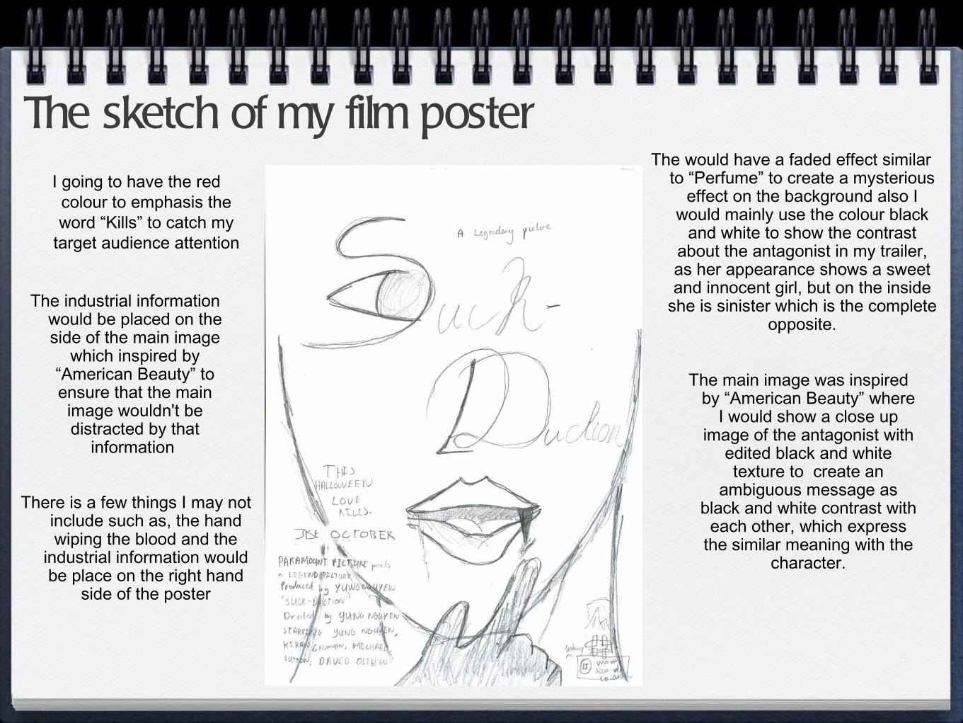
The sketch of my film posterI going to have the red colour to emphasis the word “Kills” to catch my
target audience attention
The industrial information would be placed on the side of the main image
which inspired by “American Beauty” to ensure that the main image wouldn't be distracted by that
information
The main image was inspired by “American Beauty” where
I would show a close up image of the antagonist with
edited black and white texture to create an
ambiguous message as black and white contrast with
each other, which express the similar meaning with the
character.
The would have a faded effect similar to “Perfume” to create a mysterious
effect on the background also I would mainly use the colour black
and white to show the contrast about the antagonist in my trailer, as her appearance shows a sweet and innocent girl, but on the inside
she is sinister which is the complete opposite.
There is a few things I may not include such as, the hand wiping the blood and the
industrial information would be place on the right hand
side of the poster