Pitch Book Minute Maid Juice Box Product Redesign
4
-
Upload
megan-bennett -
Category
Documents
-
view
247 -
download
2
description
Megan Bennett's product redesign for the Minute Maid juice box. Pitch book includes a style guide, colors schemes, photography, flat package design, package construction, and logo instructions.
Transcript of Pitch Book Minute Maid Juice Box Product Redesign

Product NameMinute Maid (Juice Boxes)
Target GroupKids and Young Adults (ages 3-30)
Brief history This company was created by Coca-Cola. Starting in 1945, Minute Maid’s name was chosen because of how easy and fast it was to prepare and drink their products. In 1960 Minute Maid and Coca-Cola teamed up, and buisness “boomed” ever since then. They created chilled drinks, frozen preparable drinks, and dozens of different flavors. As time went on, they added more nutrition to the drinks and changing their look. Their most recent changes have been in lighter drinks that have great flavor with fewer calories.
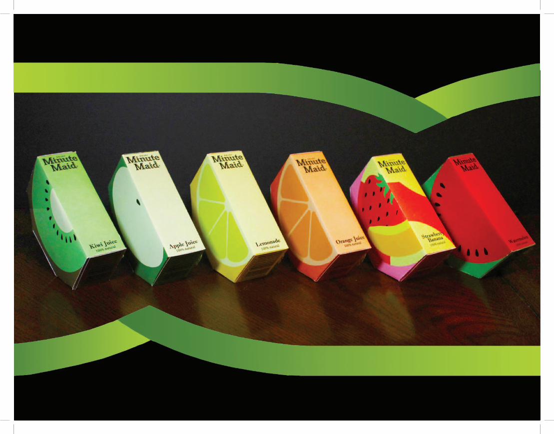
Big Idea Simplicity has a great way of grabbing attention. Kids want something tasty and something fun, while parents want something inexpensive and something healthy. My redesign will incorperate all of those ideas into one unique design. Instead of the stereotypical box shape of a juice box, the box will be the shape of a trapezoid. This is meant to make it look like an actual slice of fruit, with the color and the picture on the box being the flavor of the drink. I plan to advertise this design through my websites/blogs, through the book in this class, and through presentations. This design will sell more than the original design because it has a look that grabs attention on the outside, and a taste and health benefit that will grab attention on the inside. plan on advertising your new redesigned product. Also include how your redesign and advertising will increase sales.)
Titles: Coolvetica Style: RegularSize: 30 ptColor: Black or white
Body Copy: Minion Pro Style: RegularSize: 12 ptColor: BlackLeading between title and body: 16 pt
GradientsLighter color towards center of fruit designDo not use gradient colors that aren’t the same color(no red with green, black with orange, etc)
Black#000000RGB: 000
Pantone: 426 CCMYK: 75, 68, 67, 90
Lime Green#c6e72dRGB: 198, 231, 45
Pantone: 381 CCMYK: 27, 0, 95, 0
Leaf Green#498308RGB: 73, 131, 8
Pantone: 381 CCMYK: 75, 27, 100, 12
Inside an Apple#f0ffb9RGB: 240, 255, 185
Pantone: 600 CCMYK: 7, 0, 34, 0
Inside an Orange#ffbc60RGB: 255, 188, 96
Pantone: 1355 CCMYK: 0, 30, 71, 0
Outside an Orange#ff803aRGB: 255, 128, 58
Pantone: 1575 CCMYK: 0, 62, 84, 0
Watermelon#f60034RGB: 246, 0, 52
Pantone: 032 CCMYK: 0, 100, 82, 0
White#ffffffRGB: 255, 255, 255
Pantone: 7541 CCMYK: 0, 0, 0, 0
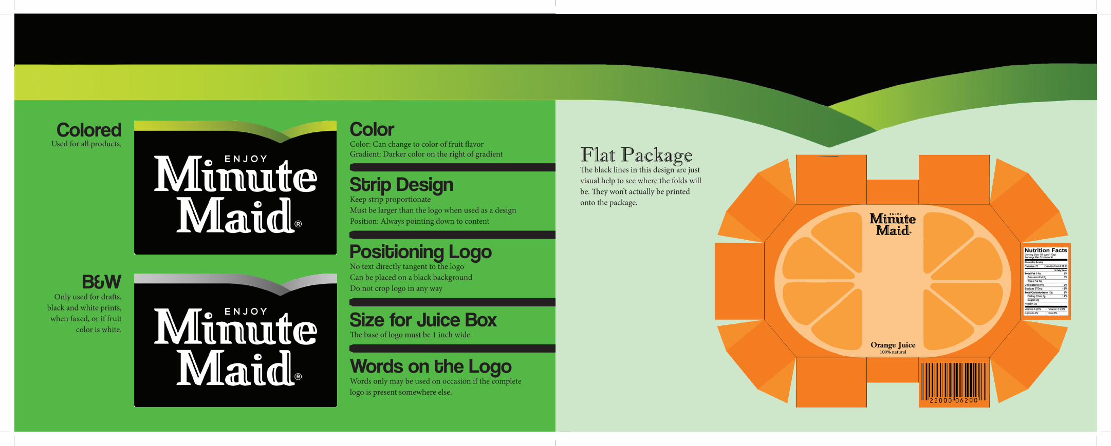
Color Color: Can change to color of fruit flavorGradient: Darker color on the right of gradient
Strip Design Keep strip proportionateMust be larger than the logo when used as a designPosition: Always pointing down to content
Positioning Logo No text directly tangent to the logoCan be placed on a black backgroundDo not crop logo in any way
Size for Juice BoxThe base of logo must be 1 inch wide
Words on the LogoWords only may be used on occasion if the complete logo is present somewhere else.
Colored Used for all products.
B&WOnly used for drafts,
black and white prints, when faxed, or if fruit
color is white.
Flat PackageThe black lines in this design are just visual help to see where the folds will be. They won’t actually be printed onto the package.
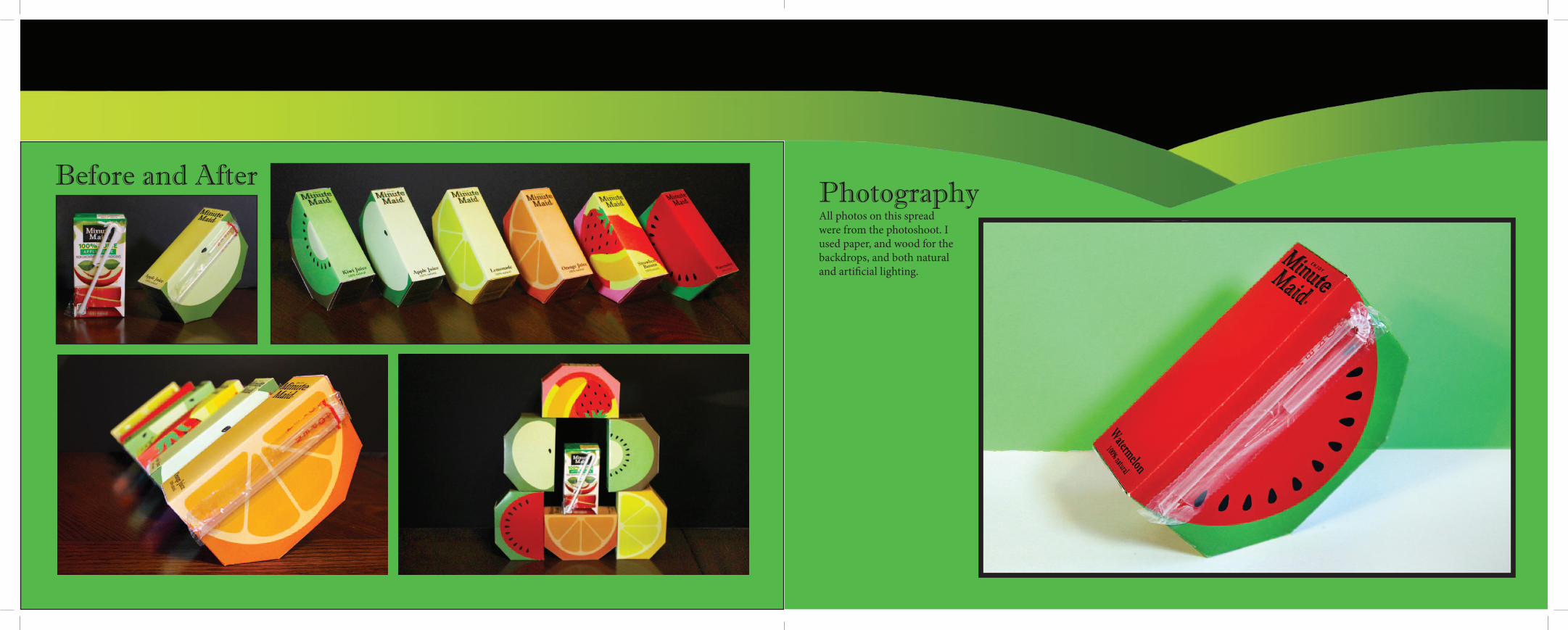
Before and AfterPhotographyAll photos on this spread were from the photoshoot. I used paper, and wood for the backdrops, and both natural and artificial lighting.


![[2] Big Data: Regression - Booth School of Businessfaculty.chicagobooth.edu/matt.taddy/teaching/02...Orange Juice Three brands (b)Tropicana, Minute Maid, Dominicks 83 Chicagoland Stores](https://static.fdocuments.net/doc/165x107/5b24c8827f8b9a7c788b655a/2-big-data-regression-booth-school-of-juice-three-brands-btropicana-minute.jpg)