
Perspective 2015 mar apr
68
US $8.00 MARCH – APRIL 2015 THE JOURNAL OF THE ART DIRECTORS GUILD MARCH – APRIL 2015 PERSPECTIVE
-
Upload
art-directors-guild -
Category
Documents
-
view
220 -
download
1
description
http://www.adg.org/sites/art/information/Perspective/Perspective_2015_Mar_Apr.pdf
Transcript of Perspective 2015 mar apr

US $8.00 MARCH – APRIL 2015
T H E J O U R N A L O F T H E A R T D I R E C T O R S G U I L D
MARCH – APRIL 2015
PERSPECT IVE

Birdman_PerspectiveADG_Mar-Apr_Final.indd 1 1/12/15 12:45 PM

PERSPECTIVE | MARCH/APRIL 2015 1
RELEASEDTHE BAR - Ext.
Plan & Elevs - SIgn
09.11.13
TTT
005
Missouri
5.03
1"=1'- 0"
3'-10"
2'-5
"
3'-10"
7 3/
8"
1'-2
"
6 3/
4"4
3/8"
7 1/
2"2
1/2"
2 1/
2"3'
-3/8
"
1 1/8"
1 1/
8"
1 3/
8"
Painted white letterNeon in front (white) Extruded metal profile
Neon (white)
Painted letter Neon in front(white)
Extruded metal profile
Neon (white)
PLAN VIEWSection B thru center - looking down
Scale: 1" = 1'-0"
FRONT ELEVATIONDouble faced Neon Can SIgn
Scale: 1" = 1'-0"MAKE ONE - to hang
from outrigger pipe
SIDE VIEWSection A thru center - looking Left
Scale: 1" = 1'-0"
FRONT ELEVATIONDouble faced Neon Can SIgn
Scale: 1" = 1'-0"Paint lightly weathered charcoal/black
Painted letters WhiteInterior of profile extrusions - White
SectB
SectA
8 1/
4"
1 3/8"
7 1/2"
2 1/2"
1"
1"
1'-1
/2"
3/4"
RIG TO HANG from Outrigger pipe
2 1/2"
7 5/8" 2'-6 3/4" 7 5/8"
R
R
R
24
36
42
50
®
contents
A heaving nest of piratesWolf Kroeger, Production Designer
Finding the film Kevin Kavanaugh, Production Designer
The whys and hows of Gone GirlSusan Chan, Supervising Art Director
...and still going strongAlan Roderick-Jones
5 EDITORIAL
6 CONTRIBUTORS
9 NEWS
22 IN PRINT
58 PRODUCTION DESIGN
60 MEMBERSHIP
62 CALENDAR
64 RESHOOTS
ON THE COVER:A detail of a hand-drawn elevation, section and
plan of the space port cantina at Mos Eisley from the first Star Wars (1976 – later called Episode IV), built on stage at Elstree Studios outside of
London. The pencil drafting was created by Alan Roderick-Jones, credited as the Assistant to Oscar®-winning Production Designer John Barry.
Black Sails
Nightcrawler
Research. Process.Success.
50 Years
2 PERSPECTIVE | MARCH/APRIL 2015
PERSPECTIVET H E J O U R N A L O F T H E A R T D I R E C T O R S G U I L D
March/Apri l 2015
PERSPECTIVE ISSN: 1935-4371, No. 58, © 2015. Published bimonthly by the Art Directors Guild, Local 800, IATSE, 11969 Ventura Blvd., Second Floor, Studio City, CA 91604-2619. Telephone 818 762 9995. Fax 818 762 9997. Periodicals postage paid at North Hollywood, CA, and at other cities.
BOARD OF DIRECTORS
Subscriptions: $32 of each Art Directors Guild member’s annual dues is allocated for a subscription to PERSPECTIVE. Non-members may purchase an annual subscription for $40 (overseas postage will be added for foreign subscriptions). Single copies are $8 each.
Postmaster: Send address changes to PERSPECTIVE, Art Directors Guild, 11969 Ventura Blvd., Second Floor, Studio City, CA 91604-2619.
Submissions:Articles, letters, milestones, bulletin board items, etc. should be emailed to the ADG office at [email protected] or send us a disk, or fax us a typed hard copy, or send us something by snail mail at the address above. Or walk it into the office —we don’t care.
Website: www.artdirectors.org
Disclaimer:The opinions expressed in PERSPECTIVE, including those of officers and staff of the ADG and editors of this publication, are solely those of the authors of the material and should not be construed to be in any way the official position of Local 800 or of the IATSE.
THE ART DIRECTORS GUILD MEMBERSHIP INCLUDES PRODUCTION DESIGNERS, ART DIRECTORS,
SCENIC ARTISTS, GRAPHIC ARTISTS, TITLE ARTISTS, ILLUSTRATORS, MATTE ARTISTS, SET DESIGNERS,
MODEL MAKERS, AND DIGITAL ARTISTS
EditorMICHAEL [email protected]
Copy EditorMIKE [email protected]
Print ProductionINGLE DODD MEDIA310 207 [email protected]
Advertising310 207 [email protected]
PublicityMURRAY WEISSMANWeissman/Markovitz Communications 818 760 [email protected]
MIMI GRAMATKY, PresidentJIM WALLIS, Vice PresidentSTEPHEN BERGER, TrusteeCASEY BERNAY, Trustee
SCOTT BAKERPATRICK DEGREVE MICHAEL DENERINGCOREY KAPLANGAVIN KOONADOLFO MARTINEZ
JUDY COSGROVE, SecretaryCATE BANGS, TreasurerMARJO BERNAY, TrusteePAUL SHEPPECK, Trustee
NORM NEWBERRY RICK NICHOLDENIS OLSENJOHN SHAFFNERTIM WILCOXTOM WILKINS
SCOTT ROTH, Executive DirectorGENE ALLEN, Executive Director Emeritus

ADG PERSPECTIVE JOURNAL 2015, REVISION 5 4-COLOR, FULL PAGE ADTRIM: 8.875” X 10.875”BLEED: 9.125” X 11.125”
Warner Bros. Pictureswould like to thank the
Art Directors Guildand congratulate our nominees
for Excellence in Production Design
Contemporary Film
Production Designers James J. Murakami, Charisse Cardenas
Set Decorator Gary Fettis
Period Film
Production Designer David CrankSet DecoratorAmy Wells

PERSPECTIVE4/C | FULL PAGE | WITH BLEEDBLEED: 9.125” W X 11.125” HTRIM: 8.875” W X 10.875” HSAFE: 8.375” W X 10.375” HPDF/X-1a:2001
2F2274-37 01/13/15
UBK_Perspective_4CFP_2F
MATERIALS DUE: TUESDAY, 1/13THIS AD RUNS: FRIDAY, 1/16
©2014 UNIVERSAL STUDIOS
universalpicturesawards.com
F O R Y O U R C O N S I D E R A T I O N
JON HUTMANEXCELLENCE IN PRODUCTION DESIGN FOR A FEATURE FILM
(PERIOD FILM)
THE UNBELIEVABLE TRUE STORYTHE UNBELIEVABLE TRUE STORY

editorial
PERSPECTIVE | MARCH/APRIL 2015 5
PERSPECTIVE4/C | FULL PAGE | WITH BLEEDBLEED: 9.125” W X 11.125” HTRIM: 8.875” W X 10.875” HSAFE: 8.375” W X 10.375” HPDF/X-1a:2001
2F2274-37 01/13/15
UBK_Perspective_4CFP_2F
MATERIALS DUE: TUESDAY, 1/13THIS AD RUNS: FRIDAY, 1/16
©2014 UNIVERSAL STUDIOS
universalpicturesawards.com
F O R Y O U R C O N S I D E R A T I O N
JON HUTMANEXCELLENCE IN PRODUCTION DESIGN FOR A FEATURE FILM
(PERIOD FILM)
THE UNBELIEVABLE TRUE STORYTHE UNBELIEVABLE TRUE STORY
DESIGN IS DESIGNby Michael Baugh, Editor
It is Awards season and lots of lunch and cocktail conversation revolves around what films have been nominated in which categories, and —more often— which achievements were not nominated, but should have been. Even here on California’s Central Coast where I am writing this, I hear these discussions at restaurants and wine tastings and even in my own living room. Everyone seems to have a favorite film that was snubbed. I am no exception.
There are lots of opportunities to reward good feature film design. The Motion Picture Academy nominated five wonderful-looking films. The ADG Awards have three separate categories for motion pictures. Then there are BAFTA Awards, Césars, Genies, Golden Palms, Silver Bears, and hundreds if not thousands of film critics’ nominations. Plenty of good Production Design is on display everywhere this month, and I enjoy it all.
But the one film whose whimsical look I absolutely loved was ignored by each and every one of these knowledgeable groups. The reason, I am certain, is because all of the sets were built for actors the size of a Barbie doll. I’m talking, of course, about The Boxtrolls, the most ambitious and elaborate stop-motion feature film ever shot.
Based on Alan Snow’s book Here Be Monsters!, The Boxtrolls is huge and complicated. It features 79 highly inventive and fanciful sets, 20,000 handmade props and pieces of set dressing, 200 animated puppets (including one that is five-feet tall), a thousand tiny pieces of wardrobe, and many thousands of interchangeable limbs and facial parts. The lead character, Eggs, had more than 15,000 pieces of his face alone—different tops and bottoms, eyebrows and mouths—all created in-house on 3D rapid prototyping printers.
The design process is very similar to live action. Art Director Curt Enderle says, “Set Designers work from 2D illustrations and develop scale and style within VectorWorks® to generate drawings for the construction shops—just like the real world, only smaller.” In addition to a full Art Department, the film provided more than a year’s work for thirteen model builders, twelve carpenters, nine Scenic Artists, three Graphic Designers, eight set dressers and four greens persons.
The final result is totally immersive entertainment. The medieval town of Cheesebridge, with its twisted cobblestone streets and market squares opulent homes and eerie sewers comes to life.
Good design is good design, no matter how big the sets are.
Below: The cover, if my favorite films were nominated. John Leonhardt positions one of the Red Hats on the diabolical Boxtroll-extermination vehicle.

6 PERSPECTIVE | MARCH/APRIL 2015
contributors
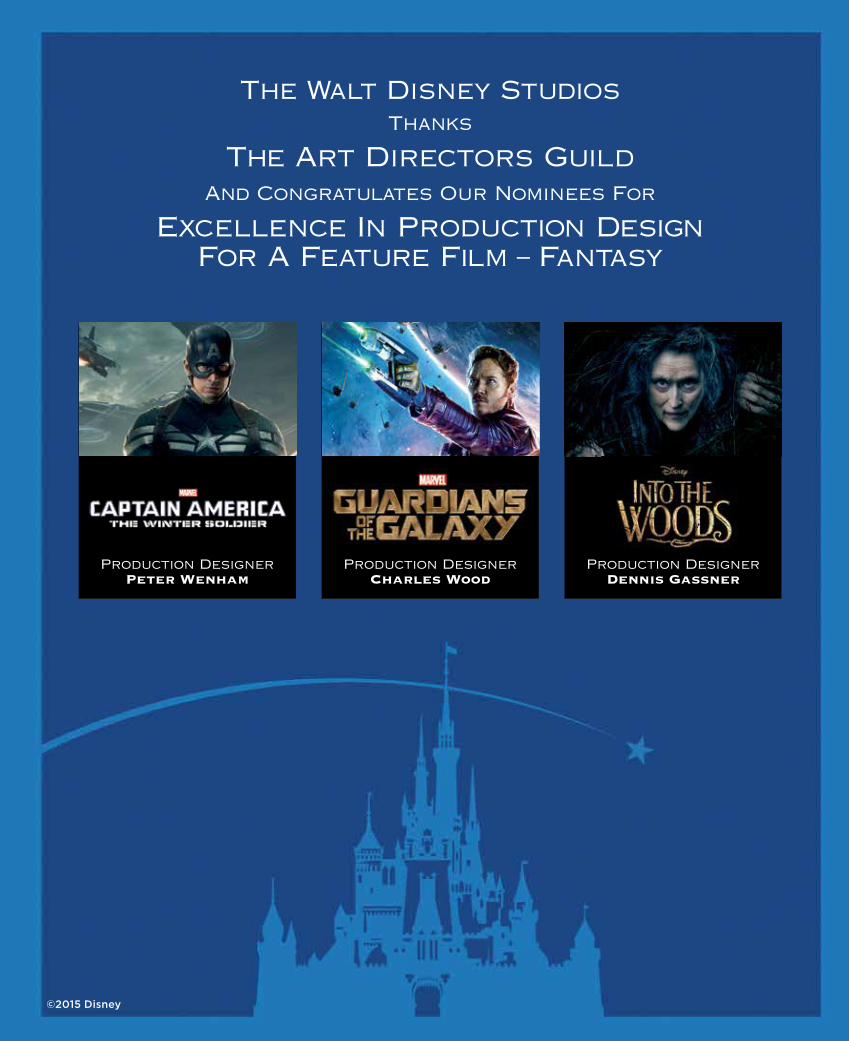
PERSPECTIVE MAGAZINE4/C | SPREAD | BLEEDBLEED: 9.125” W X 11.125” HTRIM: 8.875” W X 10.875” HSAFE: 8.375” W X 10.375” HPDF/X-1a:2001
3F2500-4 01/08/15
DIS_ADGawards_4C_3F
MATERIALS DUE: 1/9
©2015 Disney
The Walt Disney StudiosThanks
The Art Directors GuildAnd Congratulates Our Nominees For
Excellence In Production DesignFor A Feature Film – Fantasy
Production DesignerPeter Wenham
Production DesignerCharles Wood
Production DesignerDennis Gassner
SUSAN CHAN was born in New York City and raised in central New Jersey where her parents owned the only Chinese restaurant in town. She graduated from Harvard University with a degree in visual and environmental studies and a minor in East Asian studies. After college, she and her husband moved to San Francisco, where she found work first in architecture, then in theater before entering film. In 1997, the lure of Hollywood and more interesting design challenges led her to Los Angeles. She has worked in short-form and long-form television, commercials and both independent and studio film projects, and is currently the Production Designer on the Fox series Weird Loners. “I love what we do in the Art Department,” she says. “Every project has its unique set of stories to craft, and the collaboration with the talented men and women who come together to make movies and television shows is endlessly rewarding. I wouldn’t trade my job for anything.”
KEVIN KAVANAUGH was raised in Southern California and graduated from San Francisco State University. He first became interested in film design while working part time during college at American Zoetrope Studios during the making of The Godfather: Part III and Bram Stoker’s Dracula. He stayed on as Francis Coppola’s assistant for three years in San Francisco before moving back to Southern California. Mr. Kavanaugh made his debut as a Production Designer on Drew Barrymore’s directorial debut, Whip It. Since then he was the co-designer on Christopher Nolan’s The Dark Knight Rises as well as Art Director on several other projects with Mr. Nolan, including The Dark Knight and The Prestige. His other Production Design credits include Casa de mi Padre, Going the Distance, and the upcoming Rings, and he has worked as an Art Director with designers Tom Sanders, Nathan Crowley, Jeff Mann and Scott Chambliss. He now lives near Pasadena with his wife and two children.
WOLF KROEGER was born in East Germany and moved with his family to Australia shortly after the Second World War. He was educated there and began his career in television, before returning to Germany for two seasons as a set designer with the Bavarian State Opera. In the early 1970s, he designed television and film in Canada, and toward the end of that decade worked regularly on American productions which were often shot in Canada, as well as in Europe, Asia and Africa. He won two Genie Awards for The Bay Boy and Shadow of the Wolf, and a BAFTA Award nomination for Michael Mann’s The Last of the Mohicans. Director Robert Altman selected Mr. Kroeger to design the whimsical village of Sweet Haven for the film Popeye, a set which still stands as a tourist attraction in Malta. In addition to multiple times with Mr. Altman, Mr. Kroeger has also worked with Brian De Palma, Michael Cimino, Daniel Petrie, Mike Newell, Ted Kotcheff and John McTiernan.
A graduate of London’s Chelsea School of Art, ALAN RODERICK-JONES has had a prolific career in many areas of entertainment, fine arts and advertising. He has designed over nine hundred commercials for leading worldwide advertising agencies and is the recipient of numerous awards for Production Design, including six CLIO Awards, the Silver Lion at Cannes and the New York Advertising Award for Excellence in Art Direction. He began his career as a draftsman in the Art Departments of the British film industry, and had the rare opportunity to be mentored by some the industry’s finest Production Designers, including John Barry, John Box, Peter Murton, John Bryan and Geoffrey Drake. He continues to work as a fine artist, creating landscape paintings, figurative nudes, sculpture, and silkscreens, which are exhibited in regional galleries across the country. He has also designed a series of interactive games, including Van Helsing, Hulk 2 and Dirty Harry. He currently lives in Malibu, California.
PERSPECTIVE MAGAZINE4/C | SPREAD | BLEEDBLEED: 9.125” W X 11.125” HTRIM: 8.875” W X 10.875” HSAFE: 8.375” W X 10.375” HPDF/X-1a:2001
3F2500-4 01/08/15
DIS_ADGawards_4C_3F
MATERIALS DUE: 1/9
©2015 Disney
The Walt Disney StudiosThanks
The Art Directors GuildAnd Congratulates Our Nominees For
Excellence In Production DesignFor A Feature Film – Fantasy
Production DesignerPeter Wenham
Production DesignerCharles Wood
Production DesignerDennis Gassner
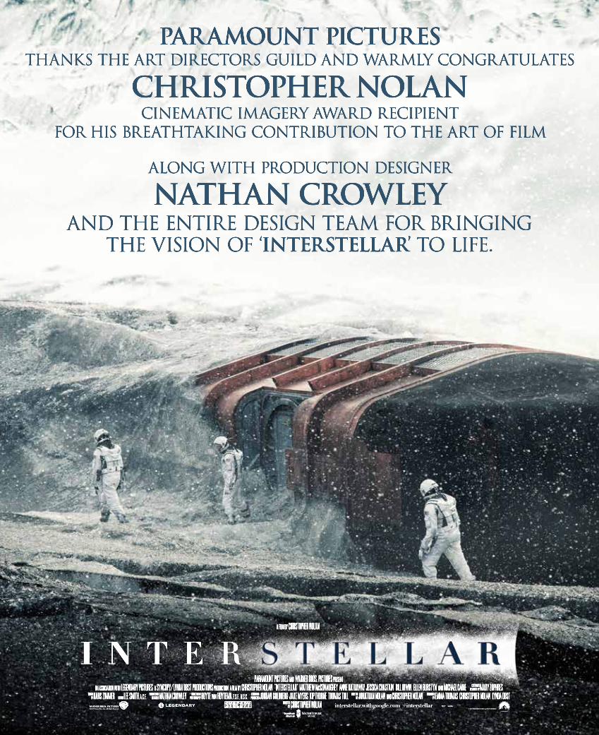
PARAMOUNT MECHINTERSTELLAR MAG. AD
1.9.15 v.16422 Selma Ave. Hollywood, CA 90028 | 323.461.3696 | conceptarts.com
PERSPECTIVE FULL PAGE AD PUB. JAN. 16thTRIM: 8.875”X10.875”BLEED: 9.125”X11.125”
PARAMOUNT PICTURESTHANKS THE ART DIRECTORS GUILD AND WARMLY CONGRATULATES
CHRISTOPHER NOLANCINEMATIC IMAGERY AWARD RECIPIENT
FOR HIS BREATHTAKING CONTRIBUTION TO THE ART OF FILM
ALONG WITH PRODUCTION DESIGNER
NNATHAN CROWLEYAND THE ENTIRE DESIGN TEAM FOR BRINGING
THE VISION OF ‘INTERSTELLAR’ TO LIFE.

PERSPECTIVE | MARCH/APRIL 2015 9
news
Above: Christopher Nolan with INTERSTELLAR leading actor Matthew McConaughey inside a hypersleep pod unit, built on location at a cold storage unit in Los Angeles.
CHRISTOPHER NOLAN – 2015 CINEMATIC IMAGERY AWARDby Dave Blass and James Pearse Connelly, ADG Awards Producers
On January 31, 2015, at the Art Directors Guild’s Annual Awards Banquet at the Beverly Hilton Hotel in Beverly Hills, director Christopher Nolan, one of the most successful and creative directors working today, will be presented with the ADG’s Outstanding Contribution to Cinematic Imagery Award. Over the course of fifteen years of filmmaking, Nolan has gone from low-budget independent films to directing some of the biggest blockbusters ever made. His most current project, Interstellar, has been nominated for an ADG Award for Fantasy Feature Film.
Born in London in 1970, Mr. Nolan began making films at the age of seven using his father’s Super 8 camera and an assortment of male action figures. He graduated to making films involving real people, and his Super 8 surrealistic short Tarantella was shown on the PBS series Image Union in 1989. Chris studied English literature at University College London while starting to make sixteen-millimeter films at the college film society. His short film Larceny was shown at the Cambridge Film Festival in 1996, and his other sixteen-millimeter shorts include a three-minute surrealistic film called Doodlebug.
Mr. Nolan’s first feature, the noir thriller Following (1998), shot on a budget of around $6,000, was recognized at a number of international film festivals prior to its theatrical release, and gained him enough credibility that he was able to gather financing for his next film Memento (2000). Starring Guy Pearce, the film based on a short


PERSPECTIVE | MARCH/APRIL 2015 11
news
Right, top to bottom: INTERSTELLAR: The Ranger, a single-stage-to-orbit (SSTO) spacecraft used by NASA, on a gimbal on Stage 27 at Sony Pictures Studios. The interior of a black hole, also built on Stage 27. INCEPTION: The rotating corridor set was built in Shed 2 at Cardington Stages, a former airship hangar in Bedfordshire, about an hour outside of London.
story by Mr. Nolan’s brother Jonathan and directed from his own script, brought Mr. Nolan Academy Award® and Golden Globe nominations for Best Original Screenplay, and allowed him to then direct the psychological thriller Insomnia (2002), starring Al Pacino, Robin Williams and Hilary Swank.
The turning point in Mr. Nolan’s career occurred when he was given the chance to revive the Batman franchise. In Batman Begins (2005), he brought a level of gravitas and a gritty, modern interpretation to the familiar hero. Production Designer Nathan Crowley received both BAFTA and ADG nominations for the film. Before moving on to a Batman sequel, Nolan directed, cowrote and produced the mystery thriller The Prestige (2006), starring Christian Bale and Hugh Jackman as magicians whose obsessive rivalry leads to tragedy and murder. Mr. Crowley received an ADG nomination for that film as well.
The Dark Knight (2008), directed, cowritten and produced by Mr. Nolan, went on to gross more than a billion dollars at the worldwide box office. He was nominated for a Directors Guild of America Award, Writers Guild of America Award and Producers Guild of America Award, and the film also received eight Academy Award nominations, including one for Mr. Crowley, who also won the ADG Award for Excellence in Design for a Fantasy Film.
In 2010, Mr. Nolan captivated audiences with the science fiction thriller Inception, which he directed and produced from his own original screenplay. The thought-provoking drama was a worldwide blockbuster, earning more than $800 million. Among its many other honors, Inception received four Academy Awards out of its eight nominations, including Mr. Nolan for Best Picture and Best Screenplay. Guy Hendrix Dyas was nominated for Best Art Direction, and he won the ADG Award for Excellence in Design for a Fantasy Film. Mr. Nolan was recognized by his peers again with DGA and PGA Award nominations, as well as a WGA Award win for his work on the film.
The Dark Knight Rises (2012) concluded Nolan’s Batman trilogy. Due to his success rebooting the Batman character, Warner Bros. enlisted Nolan to produce their revamped

12 PERSPECTIVE | MARCH/APRIL 2015
news
Left, top to bottom: The Batcave on Stage 30 at Sony. Two views of the the Batbunker in the Cardington hangar. Above: ThE DARk kNIghT rises on the huge stage at Cardington.
Superman movie Man of Steel, which opened in the summer of 2013.
Mr. Nolan’s current film, Interstellar, received five Academy Award nominations, including one for Mr. Crowley for Best Production Design. In addition to ADG and Oscar® nominations, Mr. Crowley was also nominated for a BAFTA Award, a Broadcast Film Critics Award, and awards from film critics’ associations in Chicago, Florida, Georgia, Phoenix, San Diego and Washington, DC.
Mr. Nolan currently resides in Los Angeles with his wife, producer Emma Thomas, and their children. Nolan and Thomas have their own production company, Syncopy.
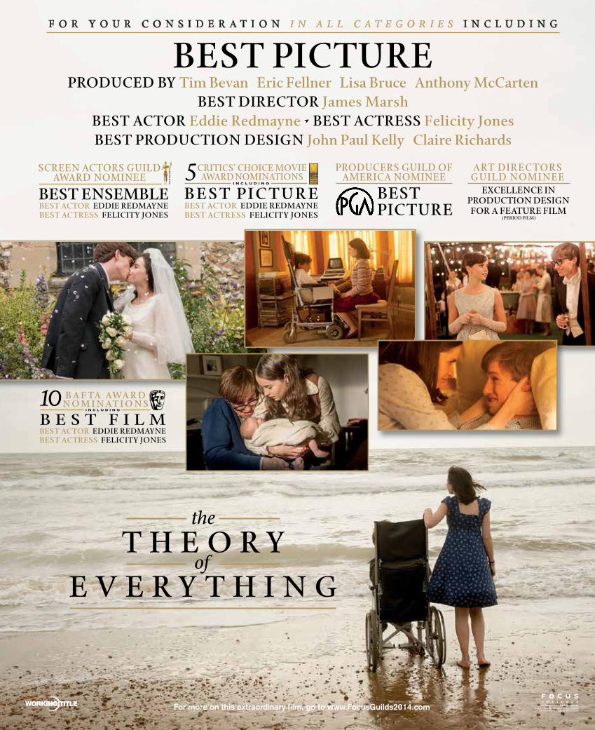
PAGE 1 OF 1January 9, 2015 4:12 PM PST
TOE_ADG_1_14_4C_4_Fnl
THE THEORY OF EVERYTHING - ADG PERSPECTIVE - FinalMARCH/APRIL ISSUE - FULL PAGE 4CSTREET: 1/14/15DUE: 1/9/15BLEED: 9.125" X 11.125" • TRIM: 8.875" X 10.875" • SAFETY: .25" ALL AROUND
ARTWORK: ©2014 FOCUS FEATURES LLC. ALL RIGHTS RESERVED.FILM: ©2014 UNIVERSAL STUDIOS. ALL RIGHTS RESERVED.
For more on this extraordinary film, go to www.FocusGuilds2014.com
BEST ENSEMBLEBEST ACTOR EDDIE REDMAYNEBEST ACTRESS FELICITY JONES
SCREEN ACTORS GUILDAWARD® NOMINEE
© 1995 S
AG
-AF
TR
A
B E S T PI C T U R EBEST ACTOR EDDIE REDMAYNEBEST ACTRESS FELICITY JONES
CRITICS’ CHOICE MOVIEAWARD NOMINATIONS5
I N C L U D I N G
BESTPICTURE
PRODUCERS GUILD OFAMERICA NOMINEE
EXCELLENCE INPRODUCTION DESIGN FOR A FEATURE FILM
(PERIOD FILM)
ART DIRECTORSGUILD NOMINEE
BEST PICTUREF O R Y O U R C O N S I D E R A T I O N I N A L L C A T E G O R I E S I N C L U D I N G
PRODUCED BY Tim Bevan Eric Fellner Lisa Bruce Anthony McCartenBEST DIRECTOR James Marsh
BEST ACTOR Eddie Redmayne • BEST ACTRESS Felicity JonesBEST PRODUCTION DESIGN John Paul Kelly Claire Richards
B E S T F I L MBEST ACTOR EDDIE REDMAYNEBEST ACTRESS FELICITY JONES
B A F TA AWA R DN O M I N AT I O N S10
I N C L U D I N G
14 PERSPECTIVE | MARCH/APRIL 2015
news
Above: Examples of the various forms in which ECOR® is manufactured:FlatCOR is a flat board, WavCOR is a corrugated panel, honeyCOR is a honeycomb core made from WavCOR, honeyCOR ESP is a piece of WavCOR sandwiched between two sheets of FlatCOR, and CurvCOR exploits ECOR’s ability to form structural curves.
GREEN BUILDING MATERIALS ARE ALL AROUND USInformation from ecorusa.com
Environmental Leader, the daily trade publication about energy, environmental and sustainability news, recently reported that Whole Foods and Google are now using a building material called Ecor in their business locations. A few Art Departments have designed film sets with it as well, beating those giant companies to the punch. ECOR®, developed by Noble Environmental Technologies in Serbia, is made from 100% recycled material. It is a sustainable alternative to traditional wood, particleboard, fiberboard, aluminum, plastic and composites. ECOR Advanced Environmental Composites presents a family of natural building materials that are strong, lightweight, flexible, and environmentally-friendly.
SUSTAINABILITY – It’s made from 100% recycled materials: fiber sources are old corrugated cardboard, bovine- processed fibers, and other agricultural fibers. It’s formaldehyde-free, non-toxic with zero off-gassing. Multi-ply panels are constructed using an eco burlap and white PVA glue.
USABILITY – It’s lightweight and easy to install, has superior pliability/workability, and can be clear-coated to provide a moisture barrier, which allows nearly any form of paint finish afterward. A Class A fire rating is available.

EXCELLENCE IN PRODUCTION DESIGN
GBH: PERSPECTIVE FP BLEED AD 01-14-15 4CBLEED: 9.125" W X 11.125" HTRIM: 8.875" W X 10.875" HSAFETY: 8.375" W X 10.375" H
1-12-15

16 PERSPECTIVE | MARCH/APRIL 2015
newsECOR is formed into component parts, the first of which is a flat sheet known as FlatCOR™ (flat board). Currently, FlatCOR is is manufactured in 2’ x 4’ or 2’ x 8’ panels with a 1/8” thickness. It is available in single, multi-ply or custom configurations and curves. Panels can be clear-coated and used in their natural form, or treated with standard paints, sealers and decorative coatings.
The second component part of ECOR is formed into a corrugated panel known as WavCOR™ (corrugated panel). Currently, WavCOR is produced in 2’ x 8’ x 1-5/8” or 2’ x 4’ x 1-5/8” sheets and is available in custom sizes and curves. WavCOR can be used separately or combined with FlatCOR to create a variety of unique, sustainable architectural surfaces in a variety of colors.
HoneyCOR™ is a honeycomb core made from WavCOR panels that are cut and glued together. HoneyCor can be used to create various configurations and shapes. HoneyCOR is currently available in ½” to 2” thicknesses, and all dimensions.
HoneyCor™ESP is a panel of HoneyCOR™ glued, rib-to-rib, between two FlatCOR™ panels to produce a three-dimensional Environmental Structural Panel (ESP). ESP panels are available in ½” to 2” thicknesses. Custom and 3D ESP Plus are also available.
WavCOR™ESP is a panel of WavCOR sandwiched between two panels of FlatCOR to create a three-dimensional Environmental Structural Panel. ESP panels are three-ply ESP stressed-skin assemblies.
CurvCOR™ is a strong, lightweight curved panel. ECOR’s ability to create structural curves is one of its most unique features. By bending an ECOR sub-panel over a form, a curve is created.
More information is available at ecorusa.com and [email protected]

18 PERSPECTIVE | MARCH/APRIL 2015
news3D PRINTING: THE 21st CENTURY TOOLfrom Brian McLean, Director of Rapid Prototyping, Laika Studios
Stop-motion animation has been used since the earliest days of filmmaking. The first example of the frame-by-frame animation process is probably 1898’s The Humpty Dumpty Circus, a short film starring toy circus animals and acrobats. Pioneer animator Willis O’Brien brought King Kong to life in 1933 using methods that are still used today.
In recent years, stop-motion animation looked like it might be doomed by CGI. The computer made two-dimensional animation faster, less expensive and more robust. Then a company called Laika came along. The Portland, Oregon, studio combined handmade artistry with the new technology of 3D printing, and their films Coraline and ParaNorman revitalised the 100-year-old genre.
At the SIGGRAPH Conference in the Vancouver Convention Center this past August, Brian McLean, the studio’s Director of Rapid Prototyping, described how Laika pushed the boundaries further with their latest film Boxtrolls.
Its Dickensian world of snobby cheese-loving humans and charming but disdained sewer-dwelling, box-clad trolls is the biggest stop-motion production ever mounted, and it would have been impossible a few years ago. The film’s creators took the 120-year-old technique and introduced a modern tool: the small, affordable 3D printer. The result is magical.
Each of the film’s 185 puppets was handmade, using silicone sculpted over a posable stainless steel armature. The faces are built with interchangeable segments, which can be changed out completely between frames to create different facial expressions. The technique is called “replacement animation,” in which parts of a puppet—usually faces or limbs—are replaced with similar (but ever-so-slightly different) parts to achieve the illusion of movement. McLean described the process for creating the replacement faces used during production: “On Coraline, we produced upward of 20,000 faces, ParaNorman was around 33,000, and with Boxtrolls we’re upward of 52,000.”
Each 1:5 scale puppet (slightly larger than a Barbie doll) is scanned in 3D and its expression tweaked with digital software—Maya® mostly, and ZBrush® sometimes. This modeling process is especially important because 3D printers tend to soften edges and details. The digital models have to be purposefully exaggerated to retain their sculptural origins and compensate for the printing output. Mr. McLean’s rapid-prototyping department produced up to 150 faces per day during filming, as well as thousands of pieces for props and set dressing—anything that required multiples, or multiple variations, was a candidate for the printers.
The faces are broken up into facial kits—eyebrows, mouths, mustaches, eyes, etc. The kits are grouped into expressions like “up surprised eyebrows” and “frown mouths.” The more replacement parts, the broader the performance possibilities for the puppet. Eggs, the leading character, is capable of around 1.4 million expressions.

FINAL
T H EI M I T A T I O N
G A M E
Artwork © 2015 The Weinstein Company. All Rights Reserved.
PUBLICATION: PERSPECTIVEISSUE: 01/14 DUE DATE: 01/09
LIVE: 8.375 " X 10.375" TRIM: 8.875" X 10.875" BLEED: 9.125" X 11.125"
twcguilds.com
PRODUCTION DESIGNIN A PERIOD FILM
ART DIRECTORS GUILD AWARDSN O M I N E E
MARIA DJURKOVIC
F O R Y O U R C O N S I D E R A T I O N
CLAUDIA PUIG
DEBBIE ELIAS
KENNETH TURAN
SCOTT FOUNDAS
“METICULOUS PRODUCTION DESIGN. THERE IS VERY SPECIFIC ATTENTION TO THE ELECTRICAL DETAIL AND INTRICACIES OF THE SCHEMATICS, AND THE
VERY CLOAK AND DAGGER NATURE OF THE VERY BUILDINGS IN WHICH THE CODEBREAKERS WORKED, ALL OF WHICH ELEVATED THE STORY TO AN IMMERSIVE EXPERIENCE.“
“TOP-FLIGHT CRAFT CONTRIBUTIONS ADD TO THE OVERALL CLASSY FEEL, PARTICULARLY THE CLUTTERED DESKS AND
PRIMITIVE COMPUTING MACHINES OF PRODUCTION DESIGNER MARIA DJURKOVIC.”
“EVOCATIVE PRODUCTION DESIGN.“
“A MARVELOUS-LOOKING COMPUTING MACHINE
GRADUALLY GETS BUILT BY MARIA DJURKOVIC, THE PRODUCTION DESIGNER.“
examiner

20 PERSPECTIVE | MARCH/APRIL 2015
After modeling, the process becomes much like traditional CG workflow: rigging, texture painting and animating. But instead of rendering the final images as frames, they are sent to one of Laika’s nine printers, manufactured by 3D Systems in Rock Hill, South Carolina.
Fifty people work in McLean’s department. Half of them create the CG assets, and the other half are responsible for processing the parts as they come off the printers. “Everyone assumes,” says McLean, “that the elements are perfect when they come out of the printer, but they’re not. They oftentimes are a mess.” The post-processing system sometimes includes sanding down edges, smoothing out inconsistences and applying pastels directly to the piece by hand. “We are [using] a technology that was never designed for replacement animation, never designed for mass production at this level of scrutiny and this level of precision between parts.
“3D printing is really in its infancy. I want to be able talk to you three years from now and not have there be any limitation between the subtlety that we can put into a face and our ability to get the most out of a character.”
Above: Laika has licensed its characters for consumer download to be printed as collectable figurines at home on personal 3D printers.
news
Landscapes, skyscapes, domestic and foreign—we have the backings that fit your needs. Whether it’s doing a custom photo
shoot or choosing from more than 5,000 stock images and rental backings, JC Backings can help make your production come alive.
The Painted, Photo and Digital Print Backings Company
310-244-5830 www.jcbackings.com facebook.com/jcbackingscorp
© 2
015
AM
C N
etw
orks
Ent
erta
inm
ent L
LC. A
ll rig
hts
rese
rved
.
CONGRATULATIONSArt Directors Guild Awards Nominee
®
PRODUCTIONDESIGNER DAN BISHOP
Nominee for Excellence in Production Design in Television 2014: One-Hour Period or Fantasy Single-Camera Television Series
“TIME ZONES”
22 PERSPECTIVE | MARCH/APRIL 2015
in print
In Production Design, Fionnuala Halligan questions sixteen Production Designers who share their insights, anecdotes and technical achievements, through a series of exclusive interviews. Fascinating for both film fans and practicing entertainment artists, this book is the perfect companion for anyone who wants to learn about the craft from some of the greatest film artists of our time.
It includes brand-new interviews with Sir Ken Adam, Dean Tavoularis, Stuart Craig, Dante Ferretti, Jim Bissell, Sarah Greenwood, Eve Stewart, Antxón Gómez, Grant Major, Nathan Crowley, Rick Carter, Alex McDowell, John Myhre and Jack Fisk, among others.
FilmCraft: Production Designby Fionnuala HalliganILEX Press, 2012. $33.95pb
Above: Paperback cover. Right: Rick Carter discusses AVATAR.
Fionnuala Halligan is a London-based film writer, critic and consultant. A regular contributor to SCREEn InTERnATIonAL for two decades, she has also worked extensively in Asia. She attends all the major film festivals as a critic, has served on several juries and selection committees, and has also worked on staff at THE SouTH CHInA MoRnIng PoST, VARIETy, and THE HoLLywooD REPoRTER.

1-800-876-8320 uclahealth.org/mptf
Los Angeles, Hollywood, Mid-City
Bob Hope Health Center
335 N. La Brea Avenue
Los Angeles, CA 90036
(323) 634-3850
Los Angeles, West Los Angeles
Westside Health Center
1950 Sawtelle Boulevard #130
Los Angeles, CA 90025
(310) 996-9355
Santa Clarita
Santa Clarita Health Center
25751 McBean Parkway #210
Valencia, CA 91355
(661) 284-3100
Toluca Lake
Toluca Lake Health Center
4323 Riverside Drive
Burbank, CA 91505
(818) 556-2700
Woodland Hills
Jack H. Skirball Health Center
MPTF Wasserman Campus
23388 Mulholland Drive
Woodland Hills, CA 91364
(818) 876-1050
Motion Picture & Television Fund and UCLA —
working together for better health
MPTF focuses solely on the unique needs of the entertainment community.
Recently, the health centers became part of UCLA Health, and you can rest
assured you’ll still fi nd them in the same convenient locations close to where
you work and on the studio lot with the Health Wheels mobile clinic.
So whether you’ve always counted on MPTF healthcare or haven’t yet
experienced it, there’s never been a better time to explore the healthcare
options available to you — now with the expertise of UCLA Health.
Our focus is on
UCLA1122 MPTF-Taking Care Of Our Own-Perspectives-Ad(PRS)ms.indd 2 1/13/15 11:38 AM

Black SailS
by Wolf kroeger, Production Designer

PERSPECTIVE | MARCH/APRIL 2015 25
Pirates.I thought from the very beginning that, despite all the pirate movies, here was a chance
to create something special and exciting. History, adventure, action and a little
romance. All in one.
Nassau in the Bahamas at the start of the 18th century. A village on the Caribbean island of New Providence, set in a dazzling blue
harbour, populated by a band of lawless, carousing, drinking, roaring and whoring pirates and prostitutes. A heaving nest of a
pirate haven. Taverns, brothels, a burned-out wooden church, a crumbling stone fortress, all reflecting its turbulent past
under an often-changing rule, and all set off with palm trees, roads and buildings overgrown with tropical
vegetation...and of course, the sandy beaches and that particular aquamarine tropical sea. And that
sea filled with ships—English gun ships, pirate ships, a Spanish treasure fleet, longboats, sea
battles and boardings. Well, off to the Bahamas we go!

26 PERSPECTIVE | MARCH/APRIL 2015
Previous pages: a colored starboard side elevation of the HMS Scarborough. Most of the working drawings of ships were based on 3D caD studies of 18th century vessels done by Richard Braithwaite, a naval architect based in Plymouth in the Uk. Top: a preliminary pencil drawing of the harbour at Nassau on New Providence island in the Bahamas. above, left: The art Department’s highly detailed study model of the harbour. Right: a production photograph of the finished set, built on the backlot at cape Town Film Studios in cape Town, South africa.
Not. In true show business fashion, off to Cape Town, South Africa, we went. Not to beaches, but to the middle of nowhere, the outskirts of town on a newly created backlot and soundstages located in landlocked semiarid scrubland...which paradoxically turns to marshland for six months of the year during the rainy season.
But actually, great, free reign on an empty canvas. What a challenge. What fun. Nothing more boring for a designer than having to shoot on existing locations.
Having spent most of my years working on sets for motion pictures, designing a television miniseries was something totally new for me. I got around that by approaching it as I would a movie and came to realize, perhaps because of that approach, that technically there’s not that much difference anymore between a good movie and a good television show.
As usual, in the beginning, lots of research and the first rough sketches. The story was to be based on a mixture of historical facts out of which the fiction and fantasy could grow.

PERSPECTIVE | MARCH/APRIL 2015 27
For various reasons, including security, environmental restrictions, travel times and cost, it was a good idea to keep our main town on the backlot...except we didn’t have an ocean.
Fortunately, the studio had already committed to building a tank for the yet-to-be-designed ship and it emerged that this was to be fed and filtered via a reservoir tank, the construction of which was not yet underway. The reservoir tank offered a wonderful opportunity to create Nassau on the water. For relatively little additional cost, one hundred meters of beachfront could be created that even had a controllable tide.
Now that we had an ocean, I could start designing the town and landscape that was to interface with it. I
wanted Nassau to be sensorially real, with humidity, heat and associated tropical decay, the wear and tear of a war-ravaged and largely un-maintained town. To achieve this, I referenced elements of the architecture and colour palette of decaying buildings in Cuba. Nassau had been variously occupied, and attacked, by both the French and the Spanish prior to the show’s period when it was a gloriously independent pirate republic.
As always, I allow my thinking to emerge through a drawing process, and developed an ideal view of the town which then became almost a blueprint reference for the individual buildings and the environment in general. It was also a great way of opening up a dialogue with the scriptwriter/show runner Jon Steinberg.
Top: Sunlight studies were done by positioning the harbour model next to the art Department window. above, left: The set for the main street of Nassau. Many of the buildings have integral interiors. Right: an overview of the backlot, showing the harbour set and the tank for the ships. cape Town’s surrounding mountains in the distance had to be removed digitally for a believable caribbean island.
28 PERSPECTIVE | MARCH/APRIL 2015
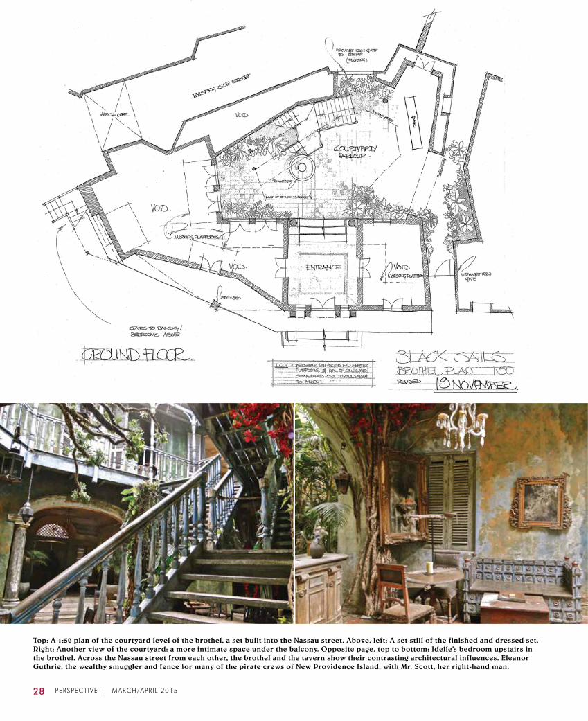
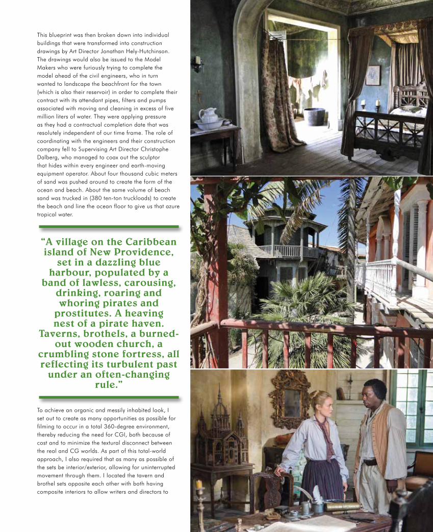
Top: a 1:50 plan of the courtyard level of the brothel, a set built into the Nassau street. above, left: a set still of the finished and dressed set. Right: another view of the courtyard: a more intimate space under the balcony. Opposite page, top to bottom: idelle’s bedroom upstairs in the brothel. across the Nassau street from each other, the brothel and the tavern show their contrasting architectural influences. Eleanor Guthrie, the wealthy smuggler and fence for many of the pirate crews of New Providence island, with Mr. Scott, her right-hand man.
PERSPECTIVE | MARCH/APRIL 2015 29
This blueprint was then broken down into individual buildings that were transformed into construction drawings by Art Director Jonathan Hely-Hutchinson. The drawings would also be issued to the Model Makers who were furiously trying to complete the model ahead of the civil engineers, who in turn wanted to landscape the beachfront for the town (which is also their reservoir) in order to complete their contract with its attendant pipes, filters and pumps associated with moving and cleaning in excess of five million liters of water. They were applying pressure as they had a contractual completion date that was resolutely independent of our time frame. The role of coordinating with the engineers and their construction company fell to Supervising Art Director Christophe Dalberg, who managed to coax out the sculptor that hides within every engineer and earth-moving equipment operator. About four thousand cubic meters of sand was pushed around to create the form of the ocean and beach. About the same volume of beach sand was trucked in (380 ten-ton truckloads) to create the beach and line the ocean floor to give us that azure tropical water.
To achieve an organic and messily inhabited look, I set out to create as many opportunities as possible for filming to occur in a total 360-degree environment, thereby reducing the need for CGI, both because of cost and to minimize the textural disconnect between the real and CG worlds. As part of this total-world approach, I also required that as many as possible of the sets be interior/exterior, allowing for uninterrupted movement through them. I located the tavern and brothel sets opposite each other with both having composite interiors to allow writers and directors to
“a village on the caribbean island of New Providence,
set in a dazzling blue harbour, populated by a
band of lawless, carousing, drinking, roaring and whoring pirates and
prostitutes. a heaving nest of a pirate haven.
Taverns, brothels, a burned- out wooden church, a
crumbling stone fortress, all reflecting its turbulent past
under an often-changing rule.”

play off action on the street. This worked well as the brothel and tavern together form the commercial center of our town.
The juxtaposition of cultures between the tavern and the brothel was also manifest in their architecture: the brothel a flamboyant, almost Rococo building with strong Spanish roots, and the tavern more reminiscent of English colonial architecture, a little restrained in comparison. This difference was emphasized again with the careful set dressing by Tom Hannam and his team, the tavern feeling almost utilitarian in comparison to the decaying, opium-dream sumptuousness of the brothel.
Ultimately, the town was completed as I had intended through the timely delivery of sets by the carpentry crew (HOD Dave Bastiaans), the fabricating team under Marian Moncek, and the exquisite finishes applied by Liz van den Berg and her Scenic Artists. This was further augmented by rich tropical foliage from the greens department led by Carla Jackson, and all of the above was precisely managed and coordinated by construction manager Clive Pollick.
The studio interior sets were delivered with the same meticulous care but it was here that I could contrast the pirates’ world of Nassau with other more civilized places. This was particularly true of Miranda Barlow’s farmhouse interior. Here was an opportunity to portray a calm and homely refuge in contrast to a bawdy and bloody pirate world.

PERSPECTIVE | MARCH/APRIL 2015 31
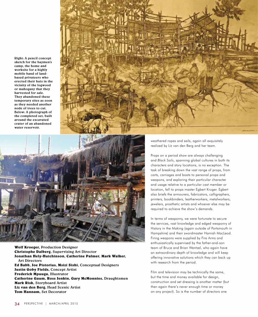
There were of course, occasions when it was necessary to leave the backlot in order to open up the film to more varied scenery. This was great, inasmuch as it allowed one to design into a new environment and expand the basic world and its characters further. Most expressive of these was the baymen’s camp which I built around an abandoned water reservoir in the form of a excavated crater. The baymen are timbermen by occupation (and mean by inclination). I had a load of fun creating an appropriately gothic edifice which was their camp. Infinitely less anarchic but hugely important, given the screen time, character support and identity, was Miranda Barlow’s farmhouse exterior. The location was chosen for its closeness—little more than a mini-move for the unit—its row of mature trees, there being none on the backlot, and its general sense of inhabited agrarian space which helped to ground and anchor the set. There was again the need to create a 360-degree environment for the same reasons as above, but also to obscure as much as possible of South Africa’s ubiquitous mountains, which don’t exist in the Bahamas.
Then of course, there were the ships.
As I mentioned previously, it was determined early that a tank was required. This needed to be sufficiently large to float and maneuver a ship on. Given the shallow water table in winter and to add some elevation above the background landscape, the tank was built on a 6m-tall elevated mound. The tank footprint is 115m x 115m, a little more than two football fields. This includes a 50m x 70m tank, 1.2m deep, with a central 10m x 20m x 4.5m deep stunt and underwater photography portion located centrally within it. The tank is bordered with a 15m-wide access and equipment hard surface on three sides and a 50m x 100m staging area to the fourth side.
The ship’s brief was to create a memorable pirate ship, the Walrus, encompassing all the flamboyance, danger, romance and a myriad of other attributes one may associate with pirates. The ship is to be a lead character in itself. Oh, and then it must be capable of simultaneously transforming into any number of dowdy merchant ships. The solution to multiple ships was to build an additional two-thirds of a ship to float in the tank. This ship would consist of a partial gundeck and stern and would be based on the same hull design as the Walrus. This, in theory, would allow alternating the finish elements from one ship to another and, in the case of the Walrus, back again. The full ship it was determined would remain on the hard staging area adjacent to the tank, using the tank water as background as required. The full ship would also need to be self-propelled in order to rotate it to optimize the orientation for water, sun and wind, and it had to be gimbaled to simulate deck movement. All this had to be ready for filming in five months. Easy.
Opposite page, top: Deck plan and elevation drawings of one of the ships, showing how it is to be modified to play as both the Walrus and a British merchant vessel. center: The two ships under construction. a two-thirds ship floated in the tank, and the full ship played on the hard staging area adjacent to the tank, using the tank water as background, but both could be rotated to control sunlight and moved to shoot two ships close to one another. Bottom: The two ships, both dressed as the Walrus, showing the extensive detailing designed and constructed for these beautiful vessels. This page, top: Below decks interiors are built on stage at cape Town Film Studios. Here, the hold of the Walrus is an all-purpose living space with hammocks, gimbaled tables and ship’s guns. above: The gundeck is built on stage as well.

32 PERSPECTIVE | MARCH/APRIL 2015
The time frame meant that research and design had to be hugely compressed and it was determined, along with construction manager Pollick, that the best way to achieve this was to find an already existing design on which to base the ship.
We were lucky to stumble upon the
work of Richard Braithwaite, a naval architect based in Plymouth in the UK. Richard, out of curiosity, had modeled the hull of the HMS Southhampton, an 18th century, 140-foot frigate, in a 3D CAD® program in order to conduct flow tests and establish hull resistance. We were also fortunate (and extremely grateful) that Richard allowed us use of his model.
The model was perfect as it provided a fairly neutral shape that could revert to various other ship configurations while also allowing Dave Bastiaans, our resident CAD fiend, to extract construction frame profiles for building the full-sized hull. He could further build onto and amend the 3D model toward a version of the Walrus, which included the addition of fore and quarter decks and a significant opening up of the gundeck, amongst a multitude of finer carpentry
details. This model was ultimately handed over to the visual effects artists and became the basis of their fully rendered CG Walrus.
While ship frame construction was progressing in a studio workshop under the supervision of boatbuilder/mariner Gary Brown (yes, the man has built any number of sailing craft, both actual sea-faring and film-set varieties), the mechanized frame to carry and gimbal the ship was being designed and built by steel construction HOD Alex Wheeler: a purpose-built chasis with eight crabbing wheels, hinged along its length to accommodate the eight-degree gimbal movement provided by a hydraulic ram; bearing in mind that this was to carry, move and animate a 120-ton live load 18th century three-masted ship, more often than not under full sail.
Meanwhile, the Art Department, under the supervision of Christophe and the research and design capabilities of Art Director Cat Palmer and Brian Glazer, was furiously researching appropriate period detailing for the ship’s wheels, fighting tops, gun’als, capstans, galleries, figureheads and the multitude of other parts that adorn and make up the whole. This research was then turned into working drawings which were issued to Gary Brown and his team for the exterior ships and to Herbie Adler for the fabrication of the studio-based interiors, including below decks and Captain’s cabin sets, both of which needed to be transformed into various ships. To achieve this, I designed the cabin with mobile panels and a piece of mast which allowed the
Top: Production Designer Wolf kroeger’s pencil sketch of the Walrus careened on a beach for a process called breaming—softening the pitch on the hull and scraping off shells and other matter that has adhered to the ship. above: a screen capture of the scene shows the kind of contribution that the Emmy-winning visual effects team regularly provides to Black SailS. Only a small portion of the hull was actually present on the South african beach for this scene; the topsides and rigging are a set extension.
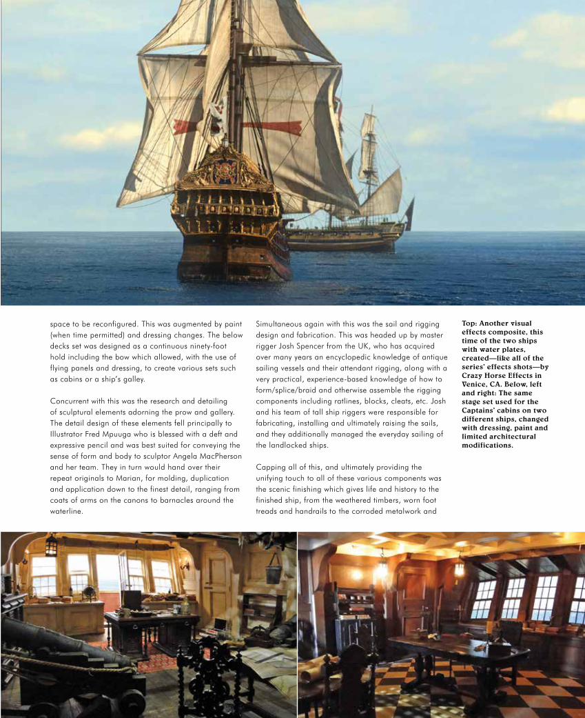
space to be reconfigured. This was augmented by paint (when time permitted) and dressing changes. The below decks set was designed as a continuous ninety-foot hold including the bow which allowed, with the use of flying panels and dressing, to create various sets such as cabins or a ship’s galley.
Concurrent with this was the research and detailing of sculptural elements adorning the prow and gallery. The detail design of these elements fell principally to Illustrator Fred Mpuuga who is blessed with a deft and expressive pencil and was best suited for conveying the sense of form and body to sculptor Angela MacPherson and her team. They in turn would hand over their repeat originals to Marian, for molding, duplication and application down to the finest detail, ranging from coats of arms on the canons to barnacles around the waterline.
Top: another visual effects composite, this time of the two ships with water plates, created—like all of the series’ effects shots—by crazy Horse Effects in Venice, ca. Below, left and right: The same stage set used for the captains’ cabins on two different ships, changed with dressing, paint and limited architectural modifications.
Simultaneous again with this was the sail and rigging design and fabrication. This was headed up by master rigger Josh Spencer from the UK, who has acquired over many years an encyclopedic knowledge of antique sailing vessels and their attendant rigging, along with a very practical, experience-based knowledge of how to form/splice/braid and otherwise assemble the rigging components including ratlines, blocks, cleats, etc. Josh and his team of tall ship riggers were responsible for fabricating, installing and ultimately raising the sails, and they additionally managed the everyday sailing of the landlocked ships.
Capping all of this, and ultimately providing the unifying touch to all of these various components was the scenic finishing which gives life and history to the finished ship, from the weathered timbers, worn foot treads and handrails to the corroded metalwork and
34 PERSPECTIVE | MARCH/APRIL 2015
Wolf Kroeger, Production DesignerChristophe Dalberg, Supervising art DirectorJonathan Hely-Hutchinson, Catherine Palmer, Mark Walker,
art DirectorsEd Babb, Joe Pistorius, Msizi Sishi, conceptual DesignersJustin Goby Fields, concept artistFrederick Mpuuga, illustratorCatherine Gaum, Ross Jenkin, Gary McMonnies, DraughtsmenMark Risk, Storyboard artistLiz van den Berg, Head Scenic artistTom Hannam, Set Decorator
Right: a pencil concept sketch for the baymen’s camp, the home and worksite for a highly mobile band of land-based privateers who erected their huts in the vicinity of the logwood or mahogany that they harvested for sale. They abandoned these temporary sites as soon as they needed another node of trees to cut. Below: a photograph of the completed set, built around the excavated crater of an abandoned water reservoir.
weathered ropes and sails, again all exquisitely realized by Liz van den Berg and her team.
Props on a period show are always challenging and Black Sails, spanning global cultures in both its characters and story locations, is no exception. The task of breaking down the vast range of props, from carts, carriages and boats to personal props and weapons, and exploring their particular character and usage relative to a particular cast member or location, fell to props master Egbert Kruger. Egbert also briefs the armourers, fabricators, calligraphers, printers, bookbinders, leatherworkers, metalworkers, jewelers, prosthetic artists and whoever else may be required to achieve the show’s demands.
In terms of weaponry, we were fortunate to secure the services, vast knowledge and edged weaponry of History in the Making (again outside of Portsmouth in Hampshire) and their swordmaster Hamish MacLeod. Firing weapons were supplied by Fire Arms and enthusiastically supervised by the father-and-son team of Bruce and Brian Wentzel, who again have an extraordinary depth of knowledge and will keep offering innovative solutions which they can back up with research from the period.
Film and television may be technically the same, but the time and money available for design, construction and set dressing is another matter (but then again there’s never enough time or money on any project). So is the number of directors one

PERSPECTIVE | SEPTEMBER/OCTOBER 2014 35
has to work with, each with a different approach, style, personality and experience. Not to mention the eight scripts, generating almost seven hours of edited footage—nearly four regular movies. And consequently meetings, so many meetings. Add to that the accelerated shooting schedule and the constant transformation of sets in new episodes and the occasional out-of-sequence episodes that can trip one up on continuity, compounded by a second unit doing pickups on sets already changed to something else. Fortunately, I had another Art Director, Mark Walker (aka List Guy), who managed to keep track of the constantly shifting goal posts. A lot of sets had to be designed without a script or a director. Intuition
above: The simple farmhouse of the mysterious Miranda Barlow, confidant and lover of the pirate captain James Flint. Below: a view of the cape Town Film Studios backlot from the rear. in the center is the main street of Nassau in front of the large tank with its two ships. To the right is the reservoir tank that filters and feeds the large tank. The reservoir is edged with nearly 4,000 tons of white sand which gives the water a typical caribbean azure hue.
and guesswork played a big part, as did trying to build in flexibility to accommodate unforeseen requirements and provide new opportunities for directors and cinematographers in often-visited key sets.
Ultimately, I had a lot of fun, and so I hope did everyone else. ADG
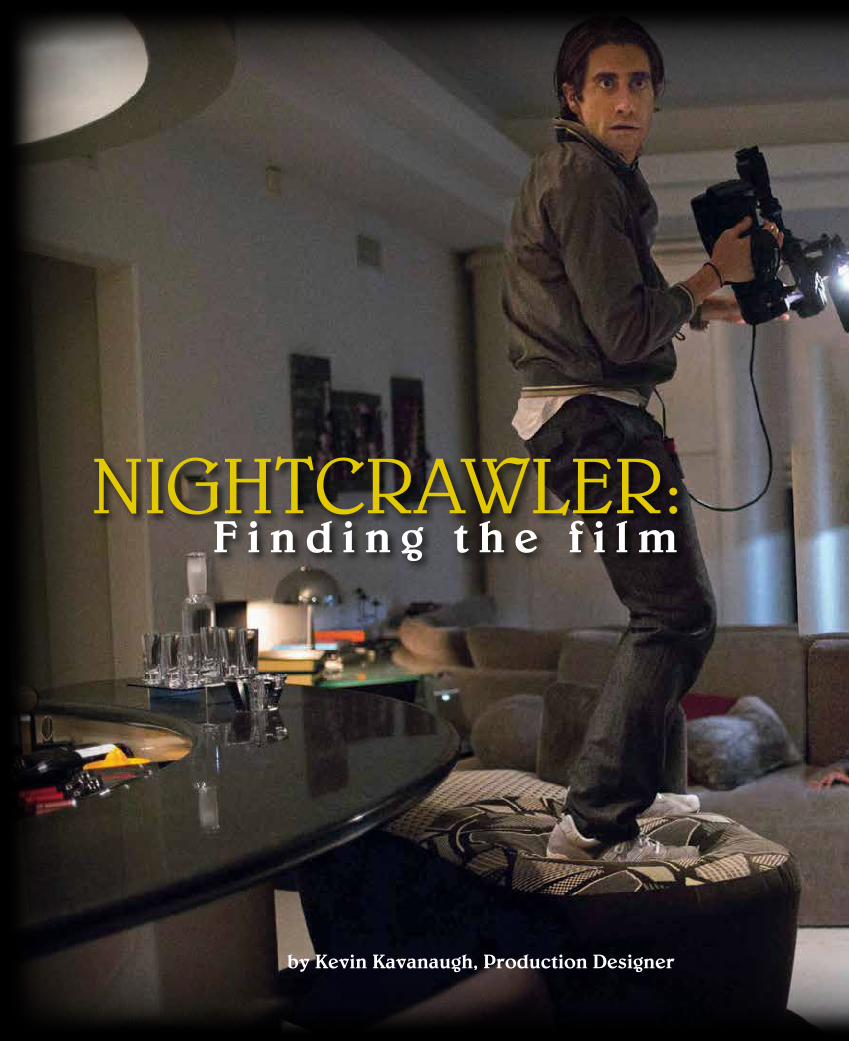
by Kevin Kavanaugh, Production Designer
nightcrawler:F i n d i n g t h e f i l m

PERSPECTIVE | MARCH/APRIL 2015 37
Photographs by Chuck Zlotnick © Open Road Pictures
nightcrawler:

38 PERSPECTIVE | MARCH/APRIL 2015
Although a first-time director, Dan Gilroy was no novice to the filmmaking process. He’s been around the industry for more than twenty years as a writer (The Bourne Legacy, Real Steel, among others). When he first spoke with me about the film, we discussed portraying Los Angeles, the city itself, as a character in the movie. He described an overhead view of Los Angeles at night, an image of glowing sparkles of light that consume the vast square mileage that encompasses the city. However, what intrigued him was not the lights but the darkness that emanates from the ocean, the desert and the mountains surrounding the city. At night, Los Angeles is an island of glowing white noise, alive with energy, in a sea of black. This idea, Los Angeles as one big sparkling canvas where the lost soul, Louis Bloom, roams around at night, intrigued me. I would have to re-discover the city again, to get lost in a familiar home, in order to find this film.
The varied landscapes of Los Angeles—the fabrics of the different neighborhoods—this city would be more than just a backdrop in
Nightcrawler. The central character Louis Bloom (Jake Gyllenhaal) would come down from the surrounding hills at night like a coyote looking for whatever scraps he could find to survive, an opportunist who would do anything to be successful in his own deranged mind.

PERSPECTIVE | MARCH/APRIL 2015 39
I anticipated that scouting would come easily to me since I grew up in Los Angeles in a time before GPS and the Google Maps app. Back then, all I had was a thick, torn and battered Thomas Guide of Los Angeles and Surrounding Counties. I kept this book stuffed under my driver’s seat ready to be pulled out at any moment to prevent me from getting lost. During the early years, navigating this spider’s web of endless avenues, boulevards and freeways is how I got to know Los Angeles. Nowadays, it’s easy not to get lost. For Nightcrawler, I needed to learn how to get lost again. So that’s what I did. At night, I would
spend hours driving the streets and searching the neighborhoods from Hollenbeck Park, to the hills of Glendale and down to the Los Angeles river basin at Atwater Village. I would ride down Sunset Boulevard enjoying the bright lights of Dodger Stadium over Echo Park during the Dodgers playoff run, then onward to the South Bay and endless parallel streets like Hawthorne and Prairie Boulevards. I was washed ashore in the ebb and flow of the city at night. These intersections, neighborhoods, 24-hour laundromats, late-night taco trucks and Korean BBQ stands would be the sets and locations—and characters—for this film.
Previous pages, left: At a location in Granada Hills, Louis Bloom (Jake Gyllenhaal) stumbles onto a murder scene before the police arrive and films the maid dead on the couch for the local news station. Right, top to bottom: At the Venice Beach boardwalk, director Dan Gilroy and Jake Gyllenhaal discuss the scene where Louis steals a bicycle to pay for his first police scanner and camcorder. The parking lot on Sunset Boulevard in front of Angelino’s Bakery in Echo Park looks a lot less dramatic in the daytime location photograph than it does in the actual footage filmed at night where Louis and his new partner Rick (Riz Ahmed) are listening to the police scanner waiting for a crime to happen. This illustrates why scouting this kind of scene needs to be done at night. Opposite page, top: On the stage set of the fictional KWLA news with its translight backing of the Los Angeles skyline, Louis and news director Nina (Rene Russo) discuss the business of late-night stringers. Bottom: On Sunset Boulevard outside of the KTLA 5 studios, Louis finishes up editing the night’s work before selling it to Nina at KWLA. This page, left: A model by Art Director Naaman Marshall, built with foam, plaster, paint and a heat gun, of a head-on crash scene on Mulholland Drive where Louis moves a dead body for a more dramatic shot. Bottom, left and right: Laurel Canyon Boulevard in Burbank, where Louis chases after the cops and a SUV, filming a crash sequence.

Top: Set Designer Aaron Haye’s rendered 3D Maya® model of the news set, later changed to KWLA 6. Above: The finished set on Stage 1 at the old KCET Studios on Sunset Boulevard in east Hollywood. Below, left and right: Nina giving Louis a tour of the KWLA studios. The stage, one of the oldest in Hollywood, belonged to Monogram Pictures and Allied Artists before KCET moved there in the 1970s.
These nights became sort of a routine for me. During the day I would work in the office relaying to the Art Department team what I and the location scouts had found the night before. Soon, I decided to get everyone involved in the process. I told the Art Department one morning that each and every member needed to go out and find at least one location for themselves. And, that’s what happened. We all began to see more than just an endless desert of concrete and mind-numbing sodium vapor lights. We began to appreciate the locations as characters in the story, alongside the actors. In the first few weeks, I couldn’t wait for the sun to set and the traffic to abate so that I could get back on the road and get lost again. Scouting takes patience and determination. The right location will speak to you in a familiar way; it will become clear in your head and the abstract becomes real. You will see the scene take place in front of you. I found that each of us

PERSPECTIVE | MARCH/APRIL 2015 41
Kevin Kavanaugh, Production DesignerNaaman Marshall, Art DirectorMeg Everist, Set Decorator
“I was washed ashore in the ebb and flow of the city at night. These intersections,
neighborhoods, 24-hour laundromats, late-night taco
trucks and Korean BBQ stands would be the sets and locations—and characters—
for this film.”
has a unique story of why we are here in Los Angeles. Some of us were born and raised here; some of us are descendants of immigrants and travelers looking for a home and an opportunity to be successful. I realized that to understand this city and this film, I had to look past the endless streets in order to find the real fabric of Los Angeles. Re-discovering the neighborhoods, people and places became the spark that ignited the design process. Sometimes you just need to get lost. ADG
Top: At the murder house in Granada Hills, Louis stumbles onto a bloody scene and films it before the police arrive. Above: The opening scene at an industrial yard in Boyle Heights with Los Angeles in the background—OZ like—where Louis Bloom scavenges around a chain-link fence like a coyote coming down from the hills.
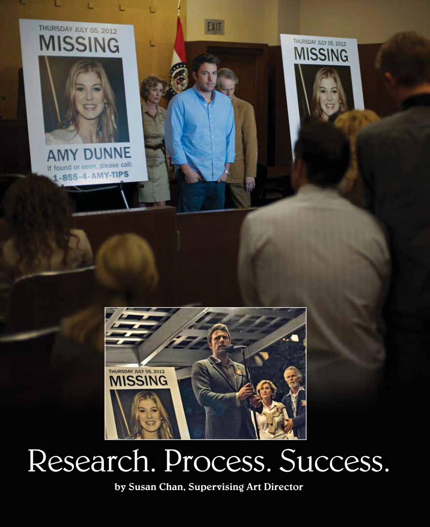
Research. Process. Success.by Susan Chan, Supervising Art Director

PERSPECTIVE | MARCH/APRIL 2015 43
Opposite page: A press conference at the courthouse, one of the first appearances of the Amy Dunne missing poster, shot on location in Culver City. Inset: A candlelight vigil for Amy, shot on location in Cape Gerardo, Missouri. Left: Some of Graphic Designer Adam Khalid’s fictional news outlet logo designs (and real news outlet logos), interspersed with his mockup illustrations of the ways the logos should appear on news vans.
I was struck, on the first day of work on Gone Girl, by the fact that neither Production Designer Don Burt nor director David Fincher spends a lot of time explaining the whys and hows of achieving the right sets. The Art Department just dives directly into their Process that includes the careful culling of lots of research and equally careful listening to what Fincher and Burt said about their choices. It was as if long before we all arrived to take part in our portion of the Process, Fincher had completely worked out what the world of the book was all about. The Process became one of teasing his take into reality.
I was (of course) delighted when Don invited me to join the Art Department and expected that the novel (I hadn’t read it) had to contain a high level of complexity to interest David Fincher. I’d seen most of his movies, and in each one a distinct and highly specific world is embodied. These worlds are wholly different from one another, yet they are somehow cohesive. They are clearly all the creations of a single director.
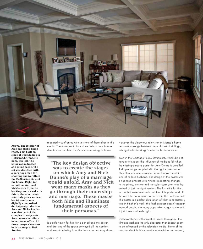
The key design objective was to create the stages on which Amy and Nick Dunne’s play of a marriage would unfold. Amy and Nick wear many masks as they go through their courtship and marriage. These masks both hide and illuminate fundamental aspects of their personas. So, the house that they share in Carthage, Missouri, is a perfectly appointed McMansion, but lacks the warmth of a home. Amy is superficially an ideal girlfriend, wife and companion but somehow cold, just like her home. Amy’s office is perfect in an Ethan Allen home office kind of way, complete with a shrine to her alter ego, Amazing Amy, the children’s book character based on her life that her parents made their fortunes fictionalizing from the real Amy’s shortcomings. She both despises and depends upon that character for her self-definition.
Nick’s home office contains nods to his happier, more productive past in New York as a men’s magazine writer. Unlike the rest of the perfectly tidy house, which bears Amy’s stamp, his space contains a messy assortment of items. They give insight into Nick’s taste: jazz posters, a vintage stereo receiver and turntable, a collection of LPs, vintage moon posters (think school maps). His decorating choices were designed to convey that he’s a likeable guy with pastimes and interests, whereas Amy is something of an enigma. Also prominent in his office are pointed reminders that he still hasn’t become the novelist that Amy thought she had married. In addition to his empty “ideas” bin is a big television.
A major theme in the film is the way in which reputation is made or broken through the filter of mainstream television news. Almost every major set includes a television as a focal point and characters are
NEW YORK
NEW YORK
NEW YORK
NEW YORK
NEW YORK
44 PERSPECTIVE | MARCH/APRIL 2015
repeatedly confronted with versions of themselves in the media. These confrontations drive their actions in one direction or another. Nick’s twin sister Margo’s home
is a safe haven for him for a period and the design and dressing of the space conveyed all the comfort and warmth missing from the house he and Amy share.
Above: The interior of Amy and Nick’s living room, a set built on stage at Red Studios in Hollywood. Opposite page, top left: The living room dressed as a crime scene. The set was designed with a very open plan for shooting and to reflect the McMansion style of the house. Right, top to bottom: Amy and Nick’s entry foyer. No backings were used with this or the other stage sets, only green screen; backgrounds were digitally composited during postproduction. Amy and Nick’s kitchen was also part of the complex of stage sets. Amy creates her diary in her home office. All three images show sets built on stage at Red Studios.
However, the ubiquitous television in Margo’s home becomes a wedge between these closest of siblings, raising doubts in Margo’s mind of his innocence.
Even in the Carthage Police Station set, which did not have a television, the influence of media is felt when the missing-persons poster for Amy Dunne is unveiled. A simple image coupled with the right expression on Nick Dunne’s face serves to define him as a certain kind of callous husband. The design of the poster was a nuanced process with Fincher requesting changes to the photo, the text and the color correction until he arrived at just the right version. The first stills for the movie that were released contained this poster and all the work that went into it was clear in the final product. The poster is a perfect distillation of what is consistently true in Fincher’s work: the final product doesn’t appear labored despite the many steps taken to get to the end. It just looks and feels right.
Detective Boney is the skeptical voice throughout the film and perhaps the only character that doesn’t seem to be influenced by the television media. None of the sets that she inhabits contains a television set; instead,
“The key design objective was to create the stages on which Amy and Nick
Dunne’s play of a marriage would unfold. Amy and Nick
wear many masks as they go through their courtship and marriage. These masks
both hide and illuminate fundamental aspects of
their personas.”

PERSPECTIVE | MARCH/APRIL 2015 45
she pieces together the clues to Amy’s disappearance with a straightforward focus on what she believes to be facts. These clues are often found in hidden places where people don’t go: an old basement, an abandoned mall, the woodshed behind Go’s house and Amy’s closet. The plot of the movie requires that the audience believes that the trail of clues is legitimate. The locations where they turn up had to be seamless, complete and instantly, psychologically plausible.
The cuts in the film happen very quickly so the sets needed to support this style of shooting and editing. In Papa Dunne’s basement, the stairs leading down almost direct the detectives to the old furnace where Amy’s diary is found. Go’s woodshed is located just below a small rise in the backyard location, leading the eye down to it naturally and giving a vantage point from which to be drawn to its contents. Similarly, the Abandoned Mall is accessed via a long, tall derelict escalator that brings the detectives down into the bowels of a cavernous space that then closes in tighter to the spot where Boney learns of Amy’s attempt to buy a gun. The physical narrative of the set elements, coupled with Fincher’s camerawork and editing

46 PERSPECTIVE | MARCH/APRIL 2015
choices, work nicely to bring the audience, as well as the detectives, to the clues.
The work in the last key sets of the movie are exercises in knitting practical locations, containing lots of detail, with sets on stage that had to be equal in richness. Like almost all of the sets, the exteriors for The Hideaway Cabins in the Ozarks where Amy waits for Nick to be charged with her murder, were shot on location in Missouri or Virginia. The interiors were built at Red Studios along with the interiors for Amy and
RELEASED
TTT
Desi's House Int.
Elevations:Sections
10.17.13 056
Red Studios - Stg 5
56.02
3/8" = 1'-0"
Obscure Glass TBD
As Marble
As Marble
1D ELEVATION of Section thru Hallway-Bedrm-Bath & Shower
Scale: 3/8" = 1' 0"
1E ELEVATION of Section thru Office
Scale: 3/8" = 1' 0"
1F ELEVATION of Section thru Office
Scale: 3/8" = 1' 0"
1G ELEVATION of Shower
Scale: 3/8" = 1' 0"
1H SECTION thru Dressing / Lavatory Area- looking at Shower
Scale: 3/8" = 1' 0" 1J SECTION thru Lavatory / Dressing Area looking at Bedrm
Scale: 3/8" = 1' 0"
11'-0"
1'-6"4"
7'-4"4"
3"3"
8'-6
" 5'-11" Mirr
or
Capture mirrors in 1" x 1" channelto allow gimbal
adjustment
Skylight:Bleached Muslin(verify)
1'-6"
3' 0"
2"
Milk Plexi 1/8"
3 1
/2"
4"
9"
3 1/2"
1'-6
"1
'-1/2
"1
'-1/2
"
2'-1/4" 2'-1/4"
2 1/4"
1'-1 7/8"
1'-1 7/8"2 1/4"
1'-10 1/2"
6'-9 1/2"3 1/2"
2 1/4"
2'-3 3/4"
2 1/4"
2'-1/4" 2'-1/4"
2 1/2"
3 1/2"3'-10 3/4"
11
1/2
"
5/8
"5
/8"
2 1
/2"
4'-9
1/2
"
3"
1'-10 3/4"
5 1
/4"
5 1
/4"
6'-7
1/2
"1
'-6"
10"1"
10"
10"
3'-0"
As skylight: Bleached Muslin1" x 1/2"
1'-3"
5 1/2"
16'-2 1/2"
7'-8
"
7'-
1/4
"1'-3"
1'-0"
9'-6
"
2'-7
"6
'-1"
1C ELEVATION of Section thru Bedroom looking at TV wall
Scale: 3/8" = 1' 0"
Wall Mount Large Flatscreen
Eq2 1/4"
Eq2 1/4"2 1/4"
3"
2'-6
"
2'-9
"
7 3/
8" 7 3/
8"5 7/
8"
4" 2 1/
2"
7'-3"
2 1/4"1'-11 1/4" 3'-0" 1'-11 1/4"
2 1/4"1'-
10"
3"
2"
4 1/2"
10"
2 1/2"
10 "
5 1/
4"6
'-7 1/
2"1/
2"1/
2"5 1/
4"1'-
8 3/
4"3
1/4"
1/2"
1/2"
6'-1"
8'-6
"
6 5/8"
Symmetrical along CenterLine
WILD
5'-4
1/2"
3'-1
1/2"
1'-0"
3"5
1/4"
4"
Note: Wild Wall Extends up to 8' 6"So�t ht. behind beam 8' 9"
1'-10"2 1/2"
4"
4 1/2"Aspaintedplaster
As paintedplaster
6 5/8"
Note: wood end capsare 1 1/8"wider than wall behind
Cabinet Doors & drawers not practical
2 1/
2"
1/2"
5'-7
"
1'-2"
10 1/2"
4"
1'-0
"
As Marble
5'-1"
2"
4'-1
/2"
1'-1
0 1
/2"
10
"4
"1
"
6'-0
"
2 1/2"
2'-6" 2'-6"3'-0"
6'-0
"
Clear Glass
4"
1"
Open to Closet Doors in Bkgrnd
4"
H a l l w a y B e d r o o m B a t h r o o m /Dressing Area
S h o w e r
2" 2"3/4"
3/4"
2'-3"
3"
7'-3
1/2
"
2 1/2"
1/2"
2 1/2" 2 1/2"3'-2"3'-2" 3'-2" 3'-2"
2 1/2"
2"
2"
1 1/2"
13'-3 1/2"1'-6" 1'-6"2 1/2"
1/2"
1 1/2"
Threshold plateor guide groove in stone �oorFor Sliding doors
GimbalMirror
GimbalMirror
14'-0"
2 1/2" 2 1/2"2'-10"
4 1/2" 4 1/2"7'-2" 2'-10"
2'-2 3/4"2'-2 3/4"
18'-5 1/2"
2'-9 3/4"
9"
4"
1'-1
/2"
4 1
/2"
1'-6" 3'-9 3/4"
2 1/2" 2 1/2"
1/2
"
11'-7 1/4"
3 1/2"
2 1/2"3'-9 1/4"
2 1/2"
1'-3 1/2"
3 1/2"
3'-9 3/4"
2 1/2"
1'-3 1/2"
11
1/4
"
5 3
/4"
3"
6 1
/8"
1'-4
"1
'-0"
2"2"
9"
3/4
"
4'-4
1/4
"2
'-9 3
/4"
1'-10"
2'-8 1/2"
1"
1/2
"
2 1
/2"
4'-3
1/2
"2
"1
/2"
1'-1
3/4
"
1'-5 1/2"
1'-9 1/2"
3 1/2"
1 3/4"
1 3/4"
1/2
"5
/8"
5/8
"
3"
1"
3'-9"3"
2"
1/2
"
3"
4 1/4" return
12" return
8" return 11" return
11"
2 1
/4"
2"
1/2
"
2'-1
/2"
5'-4
1/2
"3
"
1 1
/2"
3 1
/2"
1/4
"
1/2
"
9 1/2"
1/2"
11 3/4"
1 3
/4"
1 3
/4"
4"
2"
5 1/2"4'-10 1/2"
1"
8'-6
"
7'-
1/4
"
2 1/2"
Sliding Doors to Shower
Hinged Doors to Bedroom 6 5/8"6 5/8"2'-10"
2'-3"
1/2"
2'-0"
1/2
"
2"
3"
4 1
/2"
1'-0
"1
'-3"
7'-1
/2"
2 1
/2"
Recessed lightsAs Sel. Discuss
1 1/2"
1/2"
2'-2"
1'-10 1/2"+/-5' 0"
5'-11"
6'-5
"
2 1
/2"
7 1
/2"
4"1"
2"
3"
3'-0"3'-0"
5/8"
1 1/4"
5/8" x 11/4" plant-on handlesspaced 1 1/4" apart
11 1/4" 11 1/4"3' 0"
5 1/2"4'-5"
3/4"
10"
O P E N to Stage 5
Aspainted plaster
Aspainted plaster
Aspainted plaster
Aspainted plaster
Aspainted plaster
Aspainted plaster
Aspainted plaster
Aspainted plaster
As painted plaster
Aspainted plaster
Plant-onwood trimPlant-on
wood trim
1 3
/4"
1/2
"
4"3"
3 1
/4"
1 3
/4"
B2dDtl.
-Dtl.
-Dtl.
2 1/2"1'-11 1/4"
1 1/2"
return wall
6 5/8"3'-0"
11 1/4"
2"
3"
2 1/2" 3"4 1/2"
3/4
"
1/2
"
1/2"
1"1/2"
2"
Detail: Horizontal Section thru vertical mldgsScale: 3" = 1'-0"
Wilding joint
1"
1/2
"
Vertical Section thru facia trimScale: 3" = 1'-0"
1'-6
"
See Elevation B2 for reverse sideDbl Faced walls 7"19'-6 3/4"
2 1/2"
9'-6
"
8"
8'-1
0"
As tall narrow wood cabinet doorsNon-pract.
( unless access to int. for mirror gimbal)
Cl. Gls panels:30"W x 72" H x 3/8"polished edges
Chrome Brackets to hold glassTBD.
As metal framing
2'-5
1/2
"
5 3
/4"
5 3
/4"
NOTE: ALL PRACTICAL DRAWERS & CABINET DOORSAlso note that upper drawers have been divided into
two smaller drawers
10.16.13
REVISED: 10.17.13
10.17.13 HOLD ON SHOWER
handle
10.16.13Transom Window removedabove sliding doors
10.16.13Transom Window removedabove sliding doors
8 1/2"
2 1
/2"
7'-8
"
Nick’s house, Go’s house, Papa Dunne’s kitchen and basement, and Desi Collings’ lake house bedroom and bathroom. The work in Missouri comprised the first four weeks of principal photography and the sets on stage were being built simultaneously with the location filming. The Missouri Art Department fed details back to Los Angeles, and they were immediately dialed into the sets as they were being drawn and built. The search for Desi’s lake house interior started in Los Angeles, looking for a practical location, and ended
Top: Set Designer Tom Taylor’s construction drawings for Desi’s lake house bedroom/bathroom set, built on stage at Red Studios to match the detailing on the location house in Missouri. Above, left: Desi’s dining room, shot on location in Cape Gerardo, Missouri. Right: Desi’s living room, also on location in Cape Gerardo.
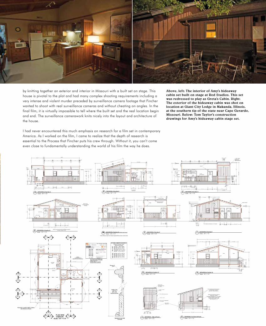
Above, left: The interior of Amy’s hideaway cabin set built on stage at Red Studios. This set was redressed to play as Greta’s Cabin. Right: The exterior of the hideaway cabin was shot on location at Giant City Lodge in Makanda, Illinois, at the southern tip of the state near Cape Gerardo, Missouri. Below: Tom Taylor’s construction drawings for Amy’s hideaway cabin stage set.
RELEASEDCabin Interior
Plan & Elevations
09.20.13
TTT
045
Red Studios - Stage 5
45.01
1/4" = 1'-0"
-A
-B
-C
-D
-E
-G
- F
-H
-K
-J
-E
-G
-A
-C
-B
-D
-F
-H
-A ELEVATION of Section A
Scale: 1/4" = 1' 0" -B ELEVATION of Section B
Scale: 1/4" = 1' 0" -C ELEVATION of Section C
Scale: 1/4" = 1' 0"
-D ELEVATION of Section D
Scale: 1/4" = 1' 0" -E ELEVATION of Section E
Scale: 1/4" = 1' 0" -F ELEVATION of Section F
Scale: 1/4" = 1' 0"
-G ELEVATION of Section G
Scale: 1/4" = 1' 0" -H ELEVATION of Section G
Scale: 1/4" = 1' 0"
-K ELEVATION K of Front of Porch
Scale: 1/4" = 1' 0" -J ELEVATION J Side of Porch
Scale: 1/4" = 1' 0"
-BB ELEVATION of Section B
Scale: 1/4" = 1' 0"
8' 0"
8'-0
"
7"
2'-0
"8'
-0"
11 1
/2"
3'-5 3/4"
5 1/2"••
•
*
•11
1/4
"
1 1/
2"
3 1/2"
5' 11"
1 1/
2"
23'-6"
6"6"5'-5"5'-5"
6"5'-5" 5'-5"
2"2"
3'-7
"
5'-1 3/4"5 1/2"
4"c-c
2'-2 1/2" 2'-2 1/2"7'-10"6' 0"
3'-1
"
5 1/2"
6'-8
1/8
"
3 1/2"
3'-6
"
2'-0
"
12'-0
"
8'-0
"
15'-1/2"+/-
7'-3 1/4"
6"7'-3 1/4"
6"
2 1/
2"
3'-7
"1'
-4"
3'-1
"
6'-8
"
6 1/4"2'-8" 11'-3 1/4"
7'-0
"
2'-1/2"2'-11 1/2"
3'-6
"
PLAN VIEWCABIN INT.
Scale: 1/4" = 1'-0"
2'-6" 4'-0"1'-0"
5'-0"
2' 0"3'-0"
3 1/
2"3'
-0"
1'-6
"2'
-6"
1'-1
/2"
5'-6
"4" 8'-0
"
12'-0
"
6'-3/4"2 1/2"
14'-6"
2'-8"
2 1/
2"
6"
3'-7
"3'
-1"
2'-0
"
5'-7"15'-0"
3'-0"
3'-7
"2'
-0"
3'-1
"
8'-0
"
12'-0
"
6"7'-3" 7'-3"
6 7/8"
8'-6
"
6'-8
"
5"
2" 2"Sloping Ceiling
6"
SmallStove bySet Dec.
verifyDim.
Shelves
Purchase Corner Shower CabSim. to Home Depot # 403306ASB Shower Kit:38" W x 38" D x 74 1/4" H(Verify whether practical)
3'-2" 1'-8"
4"
1'-2
"5'
-6"
8'-6
"
2'-9
1/2
"2'
-2"
8 1/
2"
15'-0"
6"7'-1"
2"2"7'-1"
8'-0
"
2'-2 1/2"2'-2 1/2"1'-9"
1 3/
4"
4"
obsc.gls.
1 3/
4 "Ceiling
9'-10 3/4"
3'-2"
5'-9
" 8'-0
"
5'-6
"
2'-0
"
5'-2 1/4"
6"
3'-0" 3'-0"5 1/4"
7'-6 1/4"9'-6 1/2"+/- 5' 11"
13"+/-
1'-8" 1/2+/-
12"2'-6"
1'-3"2'-0"
12'-0
"2'
-0"
8'-0
"1
3/4"
2 7/
16"
1'-6
"3'
-0"
2'-6
"1'
-6"
2'-6
"
2"5'-5"
6"5'-5"
6"5'-5"
6"5'-5"
2"
4"
6'-8
"
2 1/2"
PLATFORMPLATFORMPLATFORM
1'-2
"
8'-6
"
Med.Cab.
w/Mirror
3'-0"
3'-8
1/2
"2'
-2"
6'-4
"
3'-2"
3'-0"3'-3" 3'-3 1/2"
4" C-C1/8" Groove
1 1/2"10"
1 1/2"
1 1/
2"
8 1/
2"
8"8"
8"
5'-6
1/4
"9'
-0"
14'-6
1/4
"+/-
8'-4 1/4"
3'-8
1/2
"
4'-0"2'-6" 1'-0"
2 1/2"
1/4"Birch Ply w/4" C-C
1/8" x 1/8" Vertical grooves
WAINSCOT SECTIONFull Scale
14'-1"
14'-6"
4"3'-0" 2'-11" 2'-2 1/2"
Porch roof: Discuss whether
needed
3'-7
"
10 1/2"
1 1/2"
5 1/2"5'-10 3/8"
5 1/2"6'-5 3/8"
1 1/2" x 3/4" Rough cutBats Plant-On
11'-8
1/2
"+/-
10'-0
"11
1/2
"11 1
/2"
16°
1'-8 1/2"
11 1/4"
8"8"
1"
5"5"
Closet
Closet
KITCHEN(Lino)
BEDROOM
BATH(Lino)
2'-0
"8'
-0"
2 7/
16"
6"
6'-9 3/4"2'-8"1'-7 1/4"
2'-6"6"
5'-11 1/4" 2'-2 1/2" 5'-11 1/4"
PLATFORM PLATFORM PLATFORM
PLATFORM PLATFORM
PLATFORM
2' 0
"
14'-7 3/4"+/-
9'-9
"+/-
8'-0
"
3 1/2"
10 7/8"2'-1 1/4"
3 1/2"
1'-1 3/8"
3 1/2"
4'-9
5/8
"
4 3/4"
13'-5 1/2"
6'-5 3/8"5 1/2"
5'-10 3/8"
9'-1
1"+/
-
17'-2 1/2"+/-
8"8"3'
-6 1
/8"
2' 0
"
3'-1
"3'
-7"
8'-0
"
12'-0
"6
1/4"
3 1/2" 3 1/2"
3'-5 3/4"
1 1/2"
Porch roof Not shown here for clarity
Porch light and Cabin Numberto match MO. Location
See Ref. Photos Sheet 3
Screen door and front door to match MO. location
Duplicate hardware (in L.A. art dept.)Discuss whether Screen door will be built to match in MO.
then shipped to L.A.
11 1
/4"
2'-0
"
11 1
/4"
1 1/
2"
13'-5 3/4"
9'-10 3/4"
2'-8"
5"
3'-2"
6'-8
"
4"
8'-6
"
5'-6
"1'
-2"
NOTE: Front Door Security Card Reader Hardwareto match Location in MO.
2'-0
"23
'-6"
14'-6"
9'-10 3/4"
5'-7
"
14'-1"
15'-0
"
5' 1
1"
8'-5
"+/-
13'-6 1/2"
9'-6
1/2
"
4'-0"
w/Partition wall removed
Open Open
PurchaseshowerCab.
5 1/
2"5
1/2"
5 1/
2"Sloping Clg. BeamNot shown here
3'-1
"3'
-7"
6"
P18
P18
P17
P18
3 1/
2" x
3/4
"
Wainscot &Sill Ht.
StainedSlab Door1 3/8" thick
StainedSlab Door1 3/8" thick
StainedFlushDoor
1 3/8" thick
StainedSlab Door1 3/8" thick
StainedSlab Door1 3/8" thick
Stained Oak Int.Painted Ext.Slab Door1 3/4" thick
Vinyl base
Closet
2 1/2" x 3/4"slab casings
2'-6"
Int. Door & Window Casings: 3/4" x 2 1/2"Picture Rail: P242Crown: P242Door Stops: P47WIndows: Sash B,C,D & FBaseboard: See FS SectionWainscot Cap: See FS SectionWainscot: Oak 1/4" ply w/ 1/8" grooves @ 4" C-C
P170
P170 P172
P172 P242
P242
Verify: Kitchen Cabs from Studio Supplier/Kitchen Store (Verify Style)
StainedSlab Door1 3/8" thick
P2426"
WILD
WIL
DW
ILD
WIL
D
WIL
DW
ILD
WILD
WILD
WILD WILD
WIL
D
Partition
+42"
Wall Cabs
Ope
n Sh
elve
sW
all C
abs
VERIFY: whether Kitchen &
Bathroom sinks are practical
Porch Ext. to match to MO. LocationSee Reference Photos
1'-3
"
*
5 1/
2" b
oard
s
*
4 3/
8" s
pace
s
Beam
3 1/2"
3 3/
4"
3 3/4"
3 1/2" 3 1/2"
P170 P172
"C"sash B sash
E sashC sash
2 1/2"P242
P242
Purch.Sink Cab.
Purch.Sink Cab.
Oak 1/4" Ply wainscotOak 1/4" Ply wainscot
Oak 1/4" Ply wainscot
Oak 1/4" Ply wainscot
Porch Deck: 2x6 planks w 1/4" spaces
See details Sheet _5_
+24"+8" +16"
+24"
+24"
P242
Bathrm Ceiling
11 1
/4"
1 1/
2"
2'-0
"
5 1/2"3 3/4"
9'-9
" +/-
5 1/
2" x
5 1
/2" p
osts
5 1/2" x 11 1/2"beams
1 1/2" x 3/4" bats plant on
1/2" x 8 1/2" as clapboard 1/2" overlap
1 1/2" x 1 1/2"
1'-6
"
30Y15Y
36B
39WC
21Y
36Y
30B15B 12B
P242
KITCHEN CABINETS SCHEDULE"Kitchen Kompact Cabs"
Mellowood Maple1 @ 30Y : 18"H x 30"W1 @ 15W: 30" H x 15" W1 @ 21W: 30" H x 21" W
1 @ 39WC: 30" H x 39" W 1 @ 36Y : 18" H x 36" W
1 @ 36B: 34.5" H x 36" W1 @ 15B: 34.5" H x 15"W1 @ 30B: 34.5"H x 30" W2 @ 12B: 34.5" H x 12"W
WA
LL C
AB
SB
ASE
CA
BS
Sink Cab TBDWood Finish
by knitting together an exterior and interior in Missouri with a built set on stage. This house is pivotal to the plot and had many complex shooting requirements including a very intense and violent murder preceded by surveillance camera footage that Fincher wanted to shoot with real surveillance cameras and without cheating on angles. In the final film, it is virtually impossible to tell where the built set and the real location begin and end. The surveillance camerawork knits nicely into the layout and architecture of the house.
I had never encountered this much emphasis on research for a film set in contemporary America. As I worked on the film, I came to realize that the depth of research is essential to the Process that Fincher puts his crew through. Without it, you can’t come even close to fundamentally understanding the world of his film the way he does.

48 PERSPECTIVE | MARCH/APRIL 2015
There was comprehensive research done into the way in which media trucks and crew descend upon timely news events, so that an armada of realistic media trucks could be created to stalk the characters. It was only possible to get clearance to use a few regional news channels; fictional news outlets were created for the majority of the background media and for the two hero networks. This not only enabled the graphics team to develop realistic logos for the picture vehicles, but it also enabled all of us to understand the way local, regional and national media interact at different times in a news event’s life cycle. This was very helpful to all departments; the ebb and flow of the media circus was an important secondary character in the film.
Another unique aspect of David Fincher and Don Burt’s approach to set design lies in the use of color. The palette for each of Fincher’s films is unique in both hue and value, related to the world that is being conveyed. Fincher knows a lot about cameras and lighting so his notes to the Art Department were always specifically informed by how he would ultimately film the set.
Gone Girl was shot on a RED Epic Dragon, which was only in the prototype stage for this production. Because it has a 6K sensor, the image density and latitude meant that every single nuance of a set would be rendered in crisp super-HD clarity. There was not a lot of room for error in the color choices that Don made and because of his history with Fincher, he was well aware that the director, and cinematographer Jeff Cronenweth, like to light with practical fixtures and don’t flood the sets with extra fill lighting. As a result, the value of the set colors needed to be balanced with the light on the actors, and not fight the lower light levels that Fincher favored for this film. Furthermore, wide-ranging hues would draw attention away from the focal point of the scene and were therefore not used.
The best aspect of creating sets for a Fincher film is that every change that he makes, big or small, and usually
Top: Papa Dunne’s basement stairwell descended straight into the middle of the set on stage at Red Studios. Above: A production photograph of Detective Rhonda Boney in Papa Dunne’s basement set, where Amy’s charred diary is found. Right: The woodshed in back of Margo’s house where Nick finds all of the items he denies having purchased on his credit cards, built on location in Cape Gerardo.
“A major theme in the film is the way in which reputation is made or broken through
the filter of mainstream television news. Almost every major set includes
a television as a focal point and characters are
repeatedly confronted with versions of themselves in
the media.”

PERSPECTIVE | MARCH/APRIL 2015 49
early in the process and not at the last minute, improves the final product. Every day, walking onto the sets to shoot, I never felt as if we had missed anything major or failed to give our director what he needed. The Art Department doesn’t get the many takes that Fincher’s actors get, so we had to nail it for the moment he rolled that first take. Over the course of five films together, David Fincher and Don Burt have found a Process that works to create a completely seamless world, like the one that was made for Gone Girl. ADG
RELEASEDTHE BAR - Ext.
Plan & Elevs - SIgn
09.11.13
TTT
005
Missouri
5.03
1"=1'- 0"
3'-10"
2'-5
"
3'-10"
7 3/
8"
1'-2
"
6 3/
4"4
3/8"
7 1/
2"2
1/2"
2 1/
2"3'
-3/8
"
1 1/8"
1 1/
8"
1 3/
8"
Painted white letterNeon in front (white) Extruded metal profile
Neon (white)
Painted letter Neon in front(white)
Extruded metal profile
Neon (white)
PLAN VIEWSection B thru center - looking down
Scale: 1" = 1'-0"
FRONT ELEVATIONDouble faced Neon Can SIgn
Scale: 1" = 1'-0"MAKE ONE - to hang
from outrigger pipe
SIDE VIEWSection A thru center - looking Left
Scale: 1" = 1'-0"
FRONT ELEVATIONDouble faced Neon Can SIgn
Scale: 1" = 1'-0"Paint lightly weathered charcoal/black
Painted letters WhiteInterior of profile extrusions - White
SectB
SectA
8 1/
4"
1 3/8"
7 1/2"
2 1/2"
1"
1"
1'-1
/2"
3/4"
RIG TO HANG from Outrigger pipe
2 1/2"
7 5/8" 2'-6 3/4" 7 5/8"
R
R
R
Top: The dressed location for Nick and Margo’s bar exterior. The façade and signage were designed and installed on location in Cape Gerardo. Above: Tom Taylor’s construction drawings integrating Lead Graphic Designer Andrew Campbell’s design for the hero neon sign. The sign itself was built and installed on the location.
Donald Graham Burt, Production Designer
Susan Chan, Supervising Art Director
Dawn Swiderski, Art DirectorMark Robert Taylor, Cara Brower,
Assistant Art DirectorsAdam Khalid, Dianne Chadwick,
Graphic ArtistsTimothy Croshaw, Barbara Mesney,
Thomas T. Taylor, Jane Wuu, Set Designers
Douglas Mowat, Set Decorator
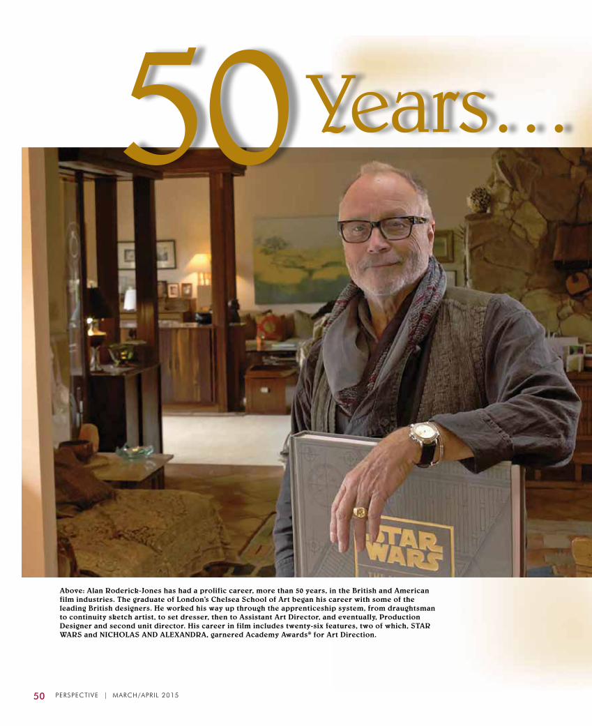
50 PERSPECTIVE | MARCH/APRIL 2015
50Years…
Above: Alan Roderick-Jones has had a prolific career, more than 50 years, in the British and American film industries. The graduate of London’s Chelsea School of Art began his career with some of the leading British designers. He worked his way up through the apprenticeship system, from draughtsman to continuity sketch artist, to set dresser, then to Assistant Art Director, and eventually, Production Designer and second unit director. His career in film includes twenty-six features, two of which, STAR WARS and NICHOLAS AND ALEXANDRA, garnered Academy Awards® for Art Direction.
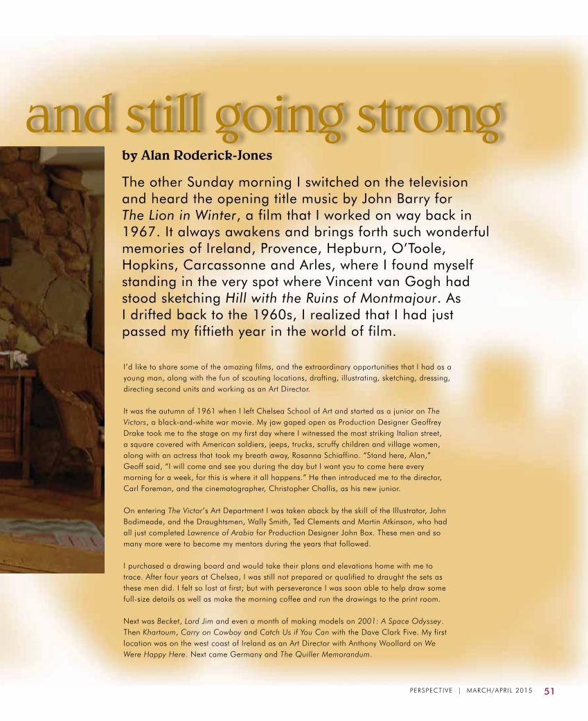
PERSPECTIVE | MARCH/APRIL 2015 51
by Alan Roderick-Jones
Years… and still going strongThe other Sunday morning I switched on the television and heard the opening title music by John Barry for The Lion in Winter, a film that I worked on way back in 1967. It always awakens and brings forth such wonderful memories of Ireland, Provence, Hepburn, O’Toole, Hopkins, Carcassonne and Arles, where I found myself standing in the very spot where Vincent van Gogh had stood sketching Hill with the Ruins of Montmajour. As I drifted back to the 1960s, I realized that I had just passed my fiftieth year in the world of film.
I’d like to share some of the amazing films, and the extraordinary opportunities that I had as a young man, along with the fun of scouting locations, drafting, illustrating, sketching, dressing, directing second units and working as an Art Director. It was the autumn of 1961 when I left Chelsea School of Art and started as a junior on The Victors, a black-and-white war movie. My jaw gaped open as Production Designer Geoffrey Drake took me to the stage on my first day where I witnessed the most striking Italian street, a square covered with American soldiers, jeeps, trucks, scruffy children and village women, along with an actress that took my breath away, Rosanna Schiaffino. “Stand here, Alan,” Geoff said, “I will come and see you during the day but I want you to come here every morning for a week, for this is where it all happens.” He then introduced me to the director, Carl Foreman, and the cinematographer, Christopher Challis, as his new junior. On entering The Victor’s Art Department I was taken aback by the skill of the Illustrator, John Bodimeade, and the Draughtsmen, Wally Smith, Ted Clements and Martin Atkinson, who had all just completed Lawrence of Arabia for Production Designer John Box. These men and so many more were to become my mentors during the years that followed. I purchased a drawing board and would take their plans and elevations home with me to trace. After four years at Chelsea, I was still not prepared or qualified to draught the sets as these men did. I felt so lost at first; but with perseverance I was soon able to help draw some full-size details as well as make the morning coffee and run the drawings to the print room. Next was Becket, Lord Jim and even a month of making models on 2001: A Space Odyssey. Then Khartoum, Carry on Cowboy and Catch Us if You Can with the Dave Clark Five. My first location was on the west coast of Ireland as an Art Director with Anthony Woollard on We Were Happy Here. Next came Germany and The Quiller Memorandum.

52 PERSPECTIVE | MARCH/APRIL 2015
Right: NICHOLAS AND ALEXANDRA (1971), directed
by Franklin Schaffner; John Box, Production Designer;
Alan Roderick-Jones, Assistant Art Director.
Left: THE LION IN WINTER (1968), with Peter O’Toole and Katharine Hepburn; Peter Murton, Art Director; Alan Roderick-Jones, Assistant Art Director.
Left: BECKET (1968), with Richard Burton and Peter O’Toole; John Bryan, Production Designer; Alan Roderick-Jones, Junior Draughtsman.
Right: LORD JIM (1968), with Peter O’Toole and James
Mason; directed by Richard Brooks; Geoffrey Drake,
Production Designer; Alan Roderick-Jones, Draughtsman.
Left: KHARTOUM (1966), with Charlton Heston and Laurence Olivier; John Howell, Art Director; Alan Roderick-Jones, Assistant Art Director.

PERSPECTIVE | MARCH/APRIL 2015 53
One day I had a call from Production Designer Don Ashton, who truly became like a father to me. I worked for him on A Countess From Hong Kong with Charles Chaplin directing Sophia Loren and Marlon Brando, as well as Sir Richard Attenborough’s Young Winston. In between films, Norman Reynolds, Peter Childs, Alan and Les Tompkins, John Graysmark and I were all crammed in Don’s attic over the garage detailing the interiors for hotels including the Mandarin in Hong Kong, and Sheratons in Bangkok, Cairo and London. Don later took off to Hong Kong where he became Asia’s most successful hotel interior designer. I first met Peter Murton who was assisting Ted Haworth on Half a Sixpence on the Shepperton silent stage. Ted introduced us to the first photographic backdrops. A few years later, I was to work with Peter on The Lion in Winter and Nicholas and Alexandra. Next came Three Into Two Won’t Go, directed by Peter Hall, starring Rod Steiger and Claire Bloom.
Then I was off to Màlaga, Spain, sketching continuity for the air-to-air and ocean fights for Fathom. To my surprise, I ended up directing the second unit as my dear friend Peter Medak who was set to direct, fell very ill. So there I was in an Alouette helicopter for five weeks, flying across mountaintops and low over the Mediterranean. Within two weeks of returning to London, I was sent to the middle of the African bush with director Henry Hathaway on The Last Safari, which was not a great movie, but what an experience: living with forty Maasai, twelve Kikuyu carpenters and a white farmer whom I was told by Art Director Maurice Fowler was to be the construction co-coordinator. We were ahead of the unit living in tents, building villages and a ferry across the hippo-infested river, a treehouse, a landing strip for the crew and, of course, we were surrounded by lion, buffalo, giraffe, wild dogs and baboon, all the while being protected by the amazing gentle warrior Maasai, who would catch fish and occasionally spear a small deer for our dining delight. After four months in Africa, I went back to London. I bought myself an Alfa Romeo and headed down to Rome to work on The Adventures of Gerard. What a feast for the eyes, driving up the Via Apia on the old Roman road, past aqueducts and canopy pines to Cinecitta Studios where Federico Fellini was directing Satyricon. Meyer’s Handbook
Above: 2001: A SPACE ODYSSEY (1968), directed by Stanley Kubrick; Anthony Masters, Ernest Archer, Harry Lange, Art Directors; Alan Roderick-Jones, Model Maker.

54 PERSPECTIVE | MARCH/APRIL 2015
Tarascon Castle, the ancient walled city of Carcassonne and various other locations in and around the area known as Provence. This was my third film with Peter O’Toole but my first with Katharine Hepburn, and what a joy she was to see every day, such a great professional actress and an inspiration for the crew. Nicholas and Alexandra, a film set completely in Russia, was my life for two years to the very day. I spent one year at Sam Spiegel’s offices in London and a year in Madrid, Spain. Peter Murton was the Production Designer. Vincent Korda, one of the most acclaimed and respected designers in the 1940s would sit and sketch details for us, then place them on our drawing boards. There was one day that I still remember so clearly, I was drawing the interior plans and elevations for the Winter Palace when Vincent leaned over my shoulder,
of Ornament, the Art Department’s reference bible, was there on every corner in Rome. Ancient buildings, fountains, sculpture by Bellini and Michaelangelo, seemed to enfold me and have never left me since. On returning to England, I found myself in Don Ashton’s attic, laid out for three months sick with contagious hepatitis. So much for the oysters of Anzio. Thin as a rake, I started to work with Peter Murton on The Lion in Winter, researching the period furniture and then drawing it for the carpenters at Shepperton Studios; the majority of it was built there from beechwood. Then to Dublin where the interiors and courtyard of the castle were built at Bray Studios. On completion of the shoot in Ireland, we moved to Arles in France, where we dressed and shot for three weeks in and around the ruins of Montmajour Monastery,
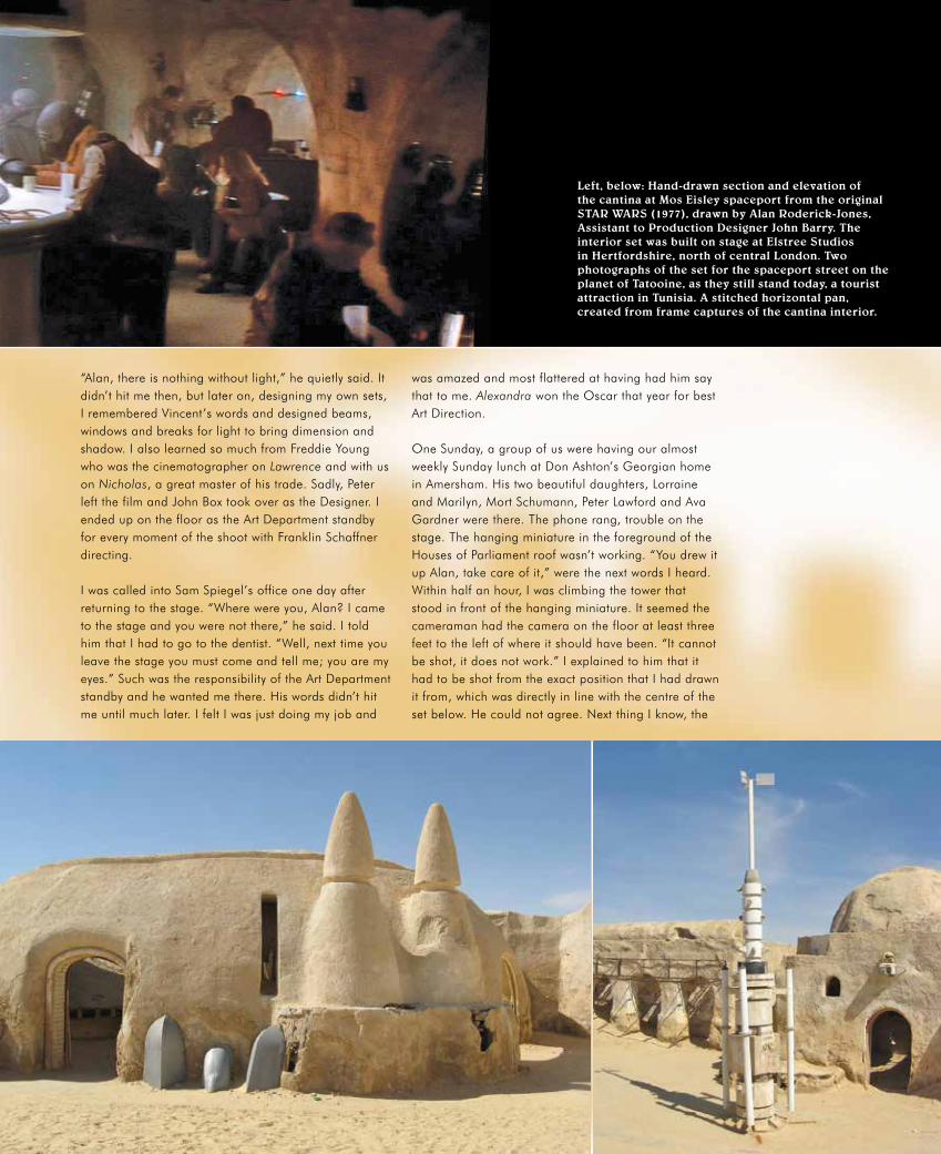
“Alan, there is nothing without light,” he quietly said. It didn’t hit me then, but later on, designing my own sets, I remembered Vincent’s words and designed beams, windows and breaks for light to bring dimension and shadow. I also learned so much from Freddie Young who was the cinematographer on Lawrence and with us on Nicholas, a great master of his trade. Sadly, Peter left the film and John Box took over as the Designer. I ended up on the floor as the Art Department standby for every moment of the shoot with Franklin Schaffner directing. I was called into Sam Spiegel’s office one day after returning to the stage. “Where were you, Alan? I came to the stage and you were not there,” he said. I told him that I had to go to the dentist. “Well, next time you leave the stage you must come and tell me; you are my eyes.” Such was the responsibility of the Art Department standby and he wanted me there. His words didn’t hit me until much later. I felt I was just doing my job and
was amazed and most flattered at having had him say that to me. Alexandra won the Oscar that year for best Art Direction. One Sunday, a group of us were having our almost weekly Sunday lunch at Don Ashton’s Georgian home in Amersham. His two beautiful daughters, Lorraine and Marilyn, Mort Schumann, Peter Lawford and Ava Gardner were there. The phone rang, trouble on the stage. The hanging miniature in the foreground of the Houses of Parliament roof wasn’t working. “You drew it up Alan, take care of it,” were the next words I heard. Within half an hour, I was climbing the tower that stood in front of the hanging miniature. It seemed the cameraman had the camera on the floor at least three feet to the left of where it should have been. “It cannot be shot, it does not work.” I explained to him that it had to be shot from the exact position that I had drawn it from, which was directly in line with the centre of the set below. He could not agree. Next thing I know, the
Left, below: Hand-drawn section and elevation of the cantina at Mos Eisley spaceport from the original STAR WARS (1977), drawn by Alan Roderick-Jones, Assistant to Production Designer John Barry. The interior set was built on stage at Elstree Studios in Hertfordshire, north of central London. Two photographs of the set for the spaceport street on the planet of Tatooine, as they still stand today, a tourist attraction in Tunisia. A stitched horizontal pan, created from frame captures of the cantina interior.

56 PERSPECTIVE | MARCH/APRIL 2015
director Richard Attenborough and the producer Carl Foreman were standing with us. I explained the problem and called Don. When he arrived he saw the problem, immediately picked up the camera and asked me where it should be placed. I showed him…he plunked it down and said one word: “Here.” He turned on his heel and said, “Come on Alan, we are missing a great lunch,” and I followed. That was just one day in the life of Young Winston, and that was Don. What a great mentor and teacher in the skills of Design and Art Direction for film. Soon after Young Winston, having had a somewhat…how can I say this…conscious change. (I later heard that people were asking for me, saying things like “Where is Alan?” “Oh! He is in a cave in the Himalayas.”) Well, I wasn’t. I was on a small twenty-acre farm in Wales with Rachel who later became my wife and life-long companion. There I received a telegram from Jack Mackstead: “Can you come and join us? We are on a project called Papillon and Tony Masters is designing. It will all be filmed on location in Jamaica.” Next thing I know, at the request of director Franklin Schaffner, I am in Montego Bay. I remember drawing the solitary confinement cells and wondering how could any person come up with anything like this and actually place another human being in it. Tony and Franklin did not like the first cliff top that we had found for Steve McQueen to jump off of, and I was sent to search for alternative locations. I spent more than two weeks flying low over the islands of the Caribbean, even landing in Cuba. Guess what; in the end, the original location was used in the film. I never understood why Steve and Dustin did not get their due
Right: The Millennium Falcon from STAR WARS, in Docking Bay 94 at Mos Eisley, built on one of the nine stages at Elstree Studios that the film required. Since the Falcon was too large to move out through the stage’s elephant doors, the interior of Docking Bay 327 aboard the Death Star was built inside the same stage around the spaceship.
awards for best and supporting actors in Papillon.I came to California in 1974 for four months and then returned to Wales, milked the cow, made cheeses, grew organic vegetables and my two children, Ella and Rowan, were born. I designed a few commercials, worked again with Peter Murton and Anthony Pratt on films that were both cancelled, The Micronauts and Young Will Shakespeare. Then came a call from John Barry that took me back down to London to EMI Studios for a project called Star Wars. Who would have guessed on that day, looking at the three broken-apart fighter planes and the junk in the prop room, that it would all become a part of cinematic history? Although not credited on the first film, I did the work of an Art Director, designing, drafting and dressing the cantina, garage, the exterior of the Millennium Falcon hangar, and so much more. A great time was had by all, and John Barry and the crew were so successful that they received the Oscar for Best Art Direction. John sadly passed away from meningitis whilst preparing the second feature; it was a great loss for the world of film design. We sold the farm in Wales and arrived in Malibu. It took almost one year before I found myself back on a film, which was mostly due to not being in the union, even though Ted Haworth tried so hard to get me in. The first film working alongside Brian Eatwell took me back to Kenya for one month. I then had a call from production manager Tom Shaw and within a week I was flying with him to Sri Lanka to design Tarzan, the Ape Man for John and Bo Derek with Richard Harris. The majority of the locations that Tom and I saw upon
The February/March issue of the STAR WARS INSIDER magazine ran an article on one of the unsung heroes of the franchise—Alan Roderick-Jones.

PERSPECTIVE | MARCH/APRIL 2015 57
arriving could only be shot from one angle. With only three weeks to get ready with a local crew, we made do, successfully found what we needed, and—upon arriving—John was more than happy. We ended up in the Seychelles Islands for two weeks, a location that just took one’s breath away with the clarity of the ocean and its golden beaches. I was still unable to join the union. Neither was the cinematographer John Alcott who had recently won an Oscar for Barry Lyndon. The two of us found ourselves in Mexico on Triumphs of a Man Called Horse working again with Richard Harris with Sandy Howard producing. Upon returning to Los Angeles, I designed Deadly Force and Vamp that were both shot locally. Then I was off scouting the coastline of the Adriatic Sea and sailing around the Greek Islands with John and Bo, location hunting again for a film that never saw the light of day, Pirate Annie. Next I spent a few months designing commercials, but was soon back with John and Bo, based in Madrid, traveling north, south, east and west of Spain. I flew to London and Rome to prep and to cast a gypsy girl for Bolero, a movie that was actually nominated for Worst Film of the Decade.
By the time Bolero was completed, I realized that I was barely seeing my family, so I made a choice to design for the world of commercials in Los Angeles. Averaging approximately twenty-five commercials a year from 1985 to 1994, some of which I also directed, I traveled the length and breadth of the continent with various locations in Canada and Mexico. I learned the art of budgeting to almost the penny (as we say in England) and with the previous years of draughting and sketching, found myself able to fulfill all requirements of a designer. It was director and close friend Rick Levine who finally got me signed into the union and later I had to sadly decline The Abyss due to commitments with him. I continued scratching away on the drawing board, illustrating for computer games, designing commercials, painting, writing and designing homes. Often I reflect on the amazing life and friends that the world of Art Direction has given me. Somehow I still manage to work those long hours, having recently completed four Boeing commercials. Who sees the dawn, the sunrises and sunsets, and the vast wonderful variation of the earth’s landscapes as we are so fortunate to have seen? Who has the opportunities to read and research and create environments from all over the globe, and throughout time. Fifty years has been not nearly long enough. ADG
Below: A group of draughtsmen and assistants in 1976 on STAR WARS, left to right: Peter Childs, Alan Roderick-Jones, Harry Lange, Steve Cooper and Ted Ambrose. Bottom: A collection of Mr. Jones’ memorabilia from working on that historic and seminal film which has fundamentally changed the aesthetics, narrative style and economics of Hollywood filmmaking.

production design
58 PERSPECTIVE | MARCH/APRIL 2015
TELEVISION:Sue Chan – WEIRD LONERS – 20th Century FoxLauren Crasco – RED ROAD – Sundance ChannelAnthony T. Fanning – BETTER CALL SAUL – Sony Pictures TelevisionChase Harlan – RED ROAD – Sundance ChannelMichael Hynes – LAB RATS – Disney XDScott P. Murphy – BLOODLINE – Sony PicturesStephan Olson – THE McCARTHYS – Sony PicturesPaul Peters – POWERS – Sony PicturesDenise Pizzini – MARRY ME – Sony PicturesPatti Podesta – POWERS – Sony PicturesGlenda Rovello – THE McCARTHYS – Sony PicturesChristopher Tandon – POWERS – Sony PicturesMichael Whetstone – WEIRD LONERS – 20th Century FoxMichael Wylie – AGENT CARTER – ABC Studios
PRODUCTION DESIGNCREDIT WAIVERSby Laura Kamogawa, Credits Administrator
The following requests to use the Production Design screen credit were granted at its September and October meetings by the ADG Council upon the recommendation of the Production Design Credit Waiver Committee.
THEATRICAL:John Collins – A MERRY FRIGGIN’ CHRISTMAS – Sycamore PicturesHoward Cummings – MAGIC MIKE XXL – Warner Bros. Thomas William Hallbauer – BUS 657 – LionsgateJade Healy – MISSISSIPPI GRIND – Sycamore PicturesJonah Markowitz – HOLLYWOOD ADVENTURES – Enlight PicturesNanci Roberts – THE ROAD WITHIN – ParadigmJennifer Spence – INSIDIOUS: CHAPTER 3 – Focus FeaturesLuca Tranchino – UNFINISHED BUSINESS – 20th Century FoxFreddy Waff – BONE TOMAHAWK – Twilight Riders, LLC
DANNY COLLINSDan Bishop, Production DesignerChristopher Brown, Art DirectorErin Magill, Assistant Art Director
Evan Regester, Graphic DesignerChris Buchinsky, Storyboard ArtistOpens March 6
coming soon
PERSPECTIVE | MARCH/APRIL 2015 59
DRAPERY • STAFF • GRAPHIC DESIGN & SIGN SHOP • HARDWARESPECIAL EFFECTS EQUIPMENT • FURNITURE MANUFACTURING & UPHOLSTERY
Dressed Sets On Time And On Budget • Shop Online
filmmakersdestination.com818.777.2784 800.892.1979
Find Us
FOR ALL YOUR PRODUCTION NEEDS
UNIVERSAL STUDIOSPROPERTY
Universal Studios_Property Ad_ADG Perspective_12.13
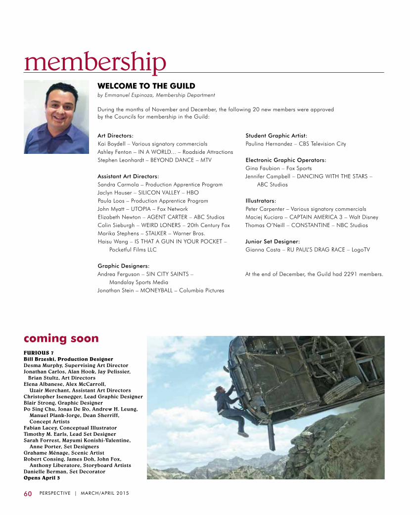
membership
60 PERSPECTIVE | MARCH/APRIL 2015
Art Directors:Kai Boydell – Various signatory commercialsAshley Fenton – IN A WORLD... – Roadside AttractionsStephen Leonhardt – BEYOND DANCE – MTV
Assistant Art Directors:Sandra Carmola – Production Apprentice ProgramJaclyn Hauser – SILICON VALLEY – HBOPaula Loos – Production Apprentice ProgramJohn Myatt – UTOPIA – Fox Network Elizabeth Newton – AGENT CARTER – ABC Studios Colin Sieburgh – WEIRD LONERS – 20th Century FoxMarika Stephens – STALKER – Warner Bros. Haisu Wang – IS THAT A GUN IN YOUR POCKET – Pocketful Films LLC
Graphic Designers:Andrea Ferguson – SIN CITY SAINTS – Mandalay Sports MediaJonathan Stein – MONEYBALL – Columbia Pictures
Student Graphic Artist:Paulina Hernandez – CBS Television City
Electronic Graphic Operators:Gina Faubion – Fox SportsJennifer Campbell – DANCING WITH THE STARS – ABC Studios
Illustrators:Peter Carpenter – Various signatory commercialsMaciej Kuciara – CAPTAIN AMERICA 3 – Walt DisneyThomas O’Neill – CONSTANTINE – NBC Studios
Junior Set Designer:Gianna Costa – RU PAUL’S DRAG RACE – LogoTV
At the end of December, the Guild had 2291 members.
WELCOME TO THE GUILDby Emmanuel Espinoza, Membership Department
During the months of November and December, the following 20 new members were approved by the Councils for membership in the Guild:
coming soonFURIOUS 7Bill Brzeski, Production DesignerDesma Murphy, Supervising Art DirectorJonathan Carlos, Alan Hook, Jay Pelissier, Brian Stultz, Art DirectorsElena Albanese, Alex McCarroll,
Uzair Merchant, Assistant Art DirectorsChristopher Isenegger, Lead Graphic DesignerBlair Strong, Graphic DesignerPo Sing Chu, Jonas De Ro, Andrew H. Leung, Manuel Plank-Jorge, Dean Sherriff, Concept ArtistsFabian Lacey, Conceptual IllustratorTimothy M. Earls, Lead Set DesignerSarah Forrest, Mayumi Konishi-Valentine,
Anne Porter, Set DesignersGrahame Ménage, Scenic ArtistRobert Consing, James Doh, John Fox, Anthony Liberatore, Storyboard ArtistsDanielle Berman, Set DecoratorOpens April 3

PERSPECTIVE | MARCH/APRIL 2015 61
CongratulationsTo All The
Nominees & HonoreesOf The 19th Annual
Art Directors Guild Awards
62 PERSPECTIVE | MARCH/APRIL 2015
NOVEMBER – DECEMBER 2014US $8.00
T H E J O U R N A L O F T H E A R T D I R E C T O R S G U I L D
PERSPECT IVE
calendar
Rates:$40 per year (6 issues) (foreign postage will be added)$32 student/educator (with current ID)
To subscribe, contact:Sandra Howard
[email protected] 762 9995
SUBSCRIBE TO PERSPECTIVE
April 11 – 5-8 PM “Kinship & Family”
Opening Reception @ Gallery 800
March 3 Good Friday
Guild Offices Closed
April 18-19Santa Clarita Cowboy Festival
Old Town Newhall
Designed by Bill Creber, Richard Day, David Hall
US $8.00 JANUARY – FEBRUARY 2015JANUARY – FEBRUARY 2015
T H E J O U R N A L O F T H E A R T D I R E C T O R S G U I L DT H E J O U R N A L O F T H E A R T D I R E C T O R S G U I L D
PERSPECT IVEPERSPECT IVE
US $8.00
US $8.00 MARCH – APRIL 2015
T H E J O U R N A L O F T H E A R T D I R E C T O R S G U I L D
MARCH – APRIL 2015
PERSPECT IVE

PERSPECTIVE | MARCH/APRIL 2015 63
Hollywood Center StudiosHollywood Center Studios
Call for a quote today! 323-860-0000
Space for Big Ideas!

64 PERSPECTIVE | MARCH/APRIL 2015
reshoots
Gangster films are a substantial presence in the history of Hollywood, as least as we look back over that history today, but mobsters and their colorful lives were not on the radar of most audiences until prohibition made their activities front-page news. One of the first—and still one of the best—is shown here in a frame capture alongside a pen, charcoal and ink wash production illustration: director Josef von Sternberg’s silent gangster film, UNDERWORLD (1927), designed by Paramount’s Hans Dreier.
Speaking of Dreier’s approach to designing films in general, curator William Ezelle Jones says, “I am fascinated with what Mr. Dreier brought to the lighting scheme. Each one of the drawings has a very precise lighting design, and the stills show how his [suggestions] were followed.” In several instances, Mr. Jones exhibited the back of one of the illustrations, with Mr. Dreier’s notations specifying camera positions and lighting direction.
Film critic Geoffrey O’Brien writes: “With barely a pause, we find ourselves off the streets and deep in the nocturnal world of the Dreamland Cafe...the place where time is suspended so that the most elemental human confrontations and transactions can play themselves out as dreamlike ritual: the unconscious as nightclub or brothel or casino.”
Screenwriter Ben Hecht tells us in his autobiography: “I made up a movie about a Chicago gunman and his moll, called FEatHERS MCCOy. It was the first gangster movie to bedazzle the movie fans and there were no lies in it—except for a half-dozen sentimental touches introduced by its director, Josef von Sternberg.” Hecht was not happy and asked that his name be removed from the credits, but when the Motion Picture academy announced their first awards for 1927-28, the film won the Oscar for Best Original Screen Story. It became a huge box-office success and sparked a boom in gangster movies.
Photograph courtesy of the Margaret Herrick Library, A.M.P. A.S.®
from its 2005 exhibit Hans Dreier and the Paramount Glow

15 Rewe St., Brooklyn, NY 11211 [email protected]
3210 Vanowen St., Burbank, CA [email protected]
BRIDGEPROPS.COM


