
PeopleSoft Fluid User Interface Programming Fundamentals · PDF filePEOPLESOFT FLUID USER...
47
PeopleSoft Fluid User Interface Programming Fundamentals ORACLE RED PAPER | MAY 2016
Transcript of PeopleSoft Fluid User Interface Programming Fundamentals · PDF filePEOPLESOFT FLUID USER...
PeopleSoft Fluid User Interface Programming Fundamentals O R A C L E R E D P A P E R | M A Y 2 0 1 6
PEOPLESOFT FLUID USER INTERFACE PROGRAMMING FUNDAMENTALS
Disclaimer
This material has not been submitted to any formal Oracle test and is published as is. It has not been
the subject of rigorous review. Oracle assumes no responsibility for its accuracy or completeness. The
use of this information or the implementation of any of these techniques is a customer responsibility
and depends on the customer's ability to evaluate and integrate them into the customer's operational
environment. While each item may have been reviewed by Oracle for accuracy in a specific situation,
there is no guarantee that the same or similar results will be obtained elsewhere. Customers
attempting to adapt these techniques to their own environments do so at their own risk.
Information in this red paper was developed in conjunction with use of the products specified and is
limited in application to those specific hardware and software products and levels.
Oracle may have patents or pending patent applications covering subject matter in this document. The
furnishing of this document does not give you any license to these patents.
PEOPLESOFT FLUID USER INTERFACE PROGRAMMING FUNDAMENTALS
Table of Contents
Introduction 1
Related Materials 1
Overview 1
Who Should Read This Paper? 1
Before You Begin 1
Fluid Pages 1
Component Page Header 1
Component Footer Pages 4
Component Search Pages 5
Real Time Search 5
Keyword Search 5
Custom Search Page 6
Setting Up the Component for Search 6
Component Standard Pages 7
Creating a fluid page 7
Fluid Page Objects 8
Group Boxes 8
Fluid Grids 9
Original Flex Grid 9
List Grid (Unordered) 11
List Grid (Ordered) 12
PEOPLESOFT FLUID USER INTERFACE PROGRAMMING FUNDAMENTALS
Div Grid 13
Other Fluid Grid Considerations 13
Row click 13
Row Selectors 14
Vertical Scrolling 15
Horizontal Scrolling 15
Grid Sorting 17
Application Buttons in the Grid Header 19
Setting the Viewport Meta Tag 21
Confirmation Message 22
Left Side Navigation 22
8.55 Left Side Navigation 25
Page Type – Side Page 1 25
Component Tabs in Side page 26
8.54 Left Side Layout Page 27
Master-Detail Framework 28
Modal Pages 30
Debugging using Chrome Inspect 33
Revision History 41
PEOPLESOFT FLUID USER INTERFACE PROGRAMMING FUNDAMENTALS
Introduction
This red paper provides guidance for PeopleSoft Fluid Development.
Oracle updates this document as needed so that it reflects the most current feedback from the field.
Therefore, the structure, headings, content, and length of this document may vary with each posted
version. To see if the document has been updated since you last downloaded it, compare the date of
your version to the date of the version that is posted on My Oracle Support.
Related Materials
This document does not replace the PeopleTools 8.4x or 8.5x product documentation.
The following product documentation discusses many of the concepts that are related to the
PeopleSoft Fluid User Interface:
» PeopleTools: Fluid User Interface Developer’s Guide
» PeopleTools: PeopleCode API Reference
» PeopleTools: PeopleCode Developer’s Guide
» PeopleTools: PeopleCode Language Reference
PEOPLESOFT FLUID USER INTERFACE PROGRAMMING FUNDAMENTALS
Overview
This paper is meant to be used to get a basis in PeopleSoft Fluid User Interface Development. It is written for
experienced PeopleSoft developers who are using the new development paradigm and want to know new
development techniques in order to create fluid applications. This document will explain how and when to use new
objects as well as how to manipulate them in PeopleCode.
Who Should Read This Paper?
Experienced PeopleSoft Developers familiar with PeopleTools and PeopleCode who wish to develop new
applications using the PeopleSoft Fluid User Interface.
Before You Begin
This document is meant for experienced PeopleSoft Developers. Knowledge of PeopleTools and PeopleCode is
required. You should also have a basic knowledge of HTML5 and CSS3.
Fluid Pages
PeopleSoft Fluid User Interface introduces many new page types that can affect the overall browser window. Some
of these new page types will appear while the component is active such as footer or side pages. Others have special
usage such as a Layout page, which is never used in a component but allows you to base multiple pages on the
same layout.
Component Page Header
A component header on a PeopleSoft fluid page will stay in place when the page is scrolled. All PeopleSoft fluid
components get the system header by default. You can override this header and replace it with your own but here
we will explain how to manipulate the system header only. The system header contains the Page Title, Global
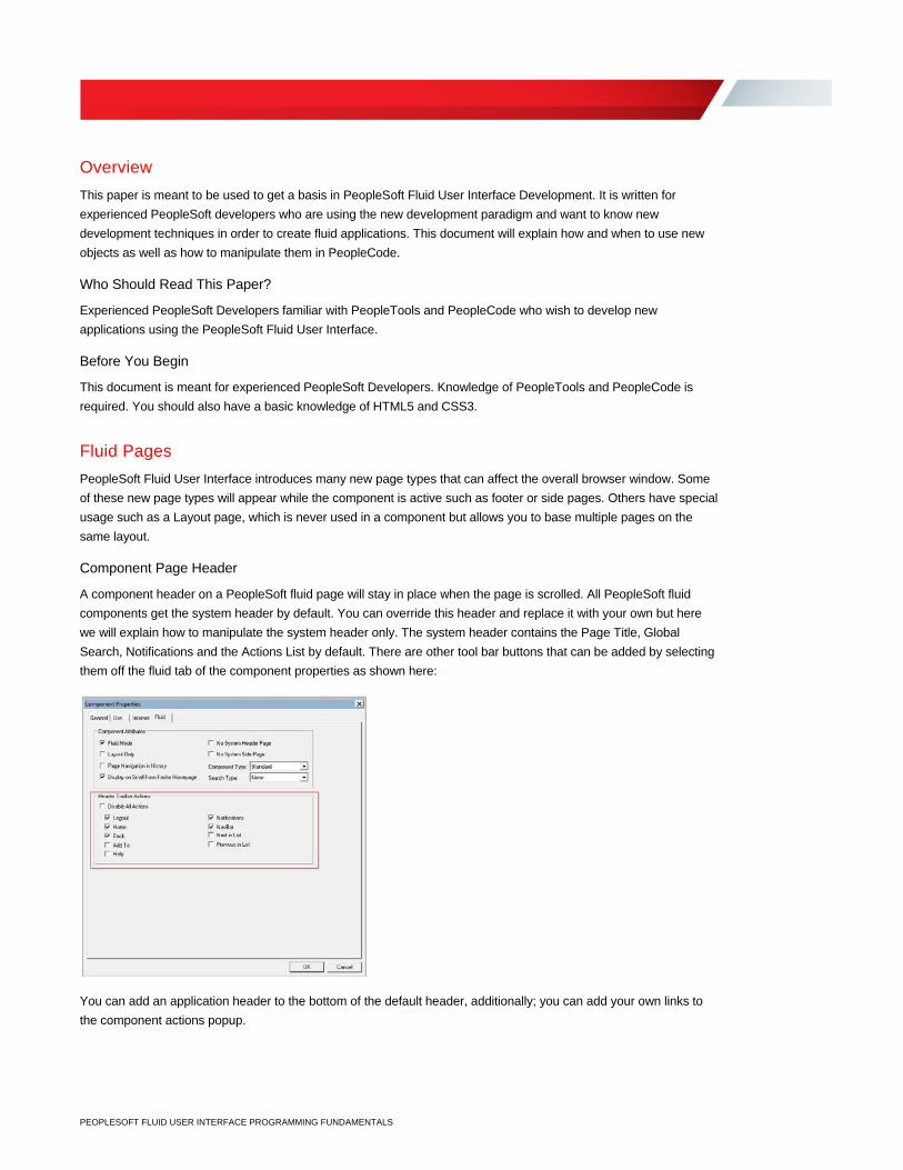
Search, Notifications and the Actions List by default. There are other tool bar buttons that can be added by selecting
them off the fluid tab of the component properties as shown here:
You can add an application header to the bottom of the default header, additionally; you can add your own links to
the component actions popup.
2 | PEOPLESOFT FLUID USER INTERFACE PROGRAMMING FUNDAMENTALS
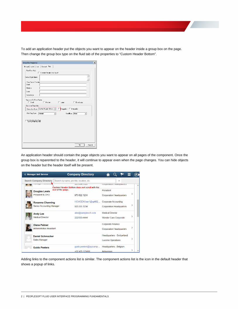
To add an application header put the objects you want to appear on the header inside a group box on the page.
Then change the group box type on the fluid tab of the properties to “Custom Header Bottom”.
An application header should contain the page objects you want to appear on all pages of the component. Once the
group box is reparented to the header, it will continue to appear even when the page changes. You can hide objects
on the header but the header itself will be present.
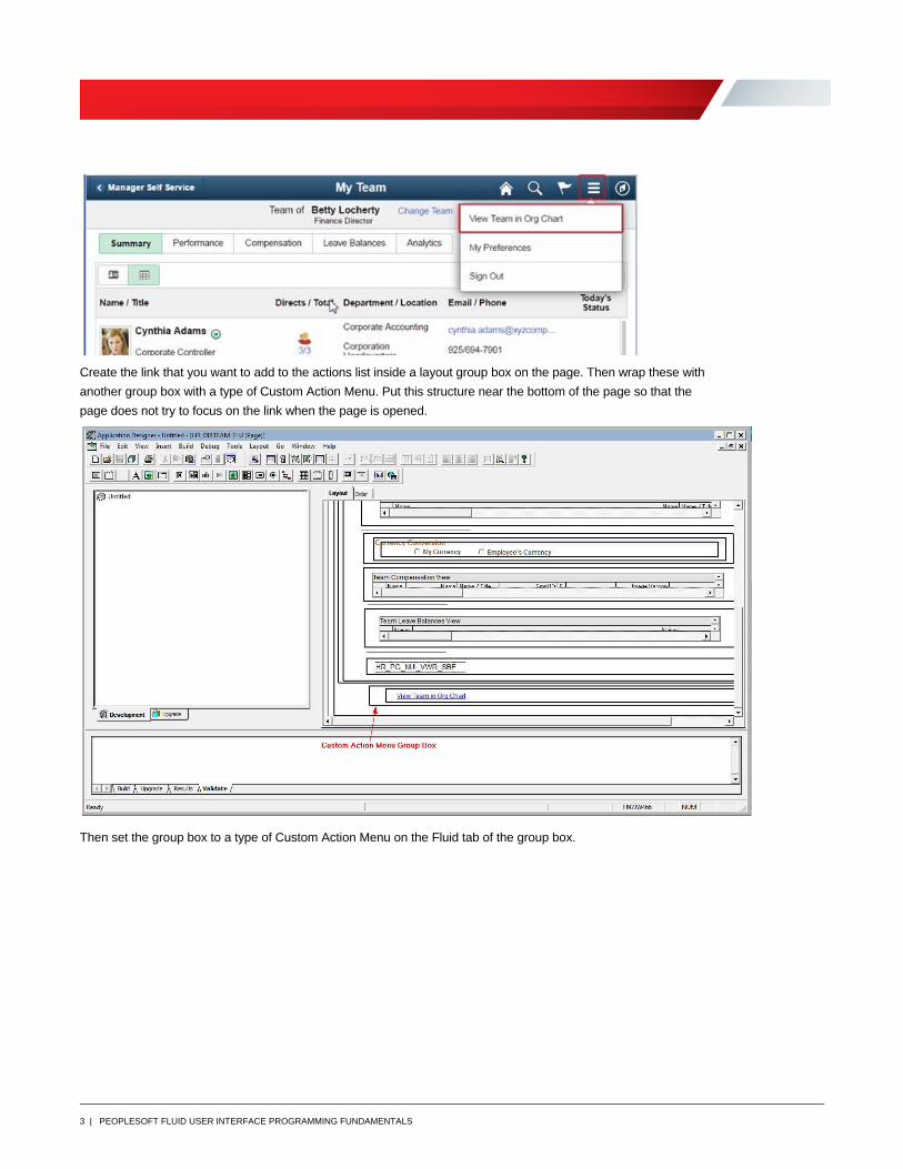
Adding links to the component actions list is similar. The component actions list is the icon in the default header that
shows a popup of links.
3 | PEOPLESOFT FLUID USER INTERFACE PROGRAMMING FUNDAMENTALS
Create the link that you want to add to the actions list inside a layout group box on the page. Then wrap these with
another group box with a type of Custom Action Menu. Put this structure near the bottom of the page so that the
page does not try to focus on the link when the page is opened.
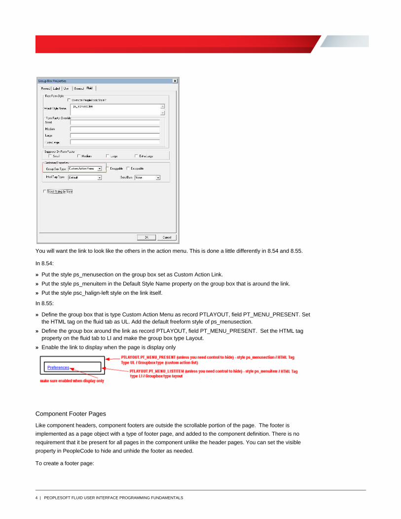
Then set the group box to a type of Custom Action Menu on the Fluid tab of the group box.
4 | PEOPLESOFT FLUID USER INTERFACE PROGRAMMING FUNDAMENTALS
You will want the link to look like the others in the action menu. This is done a little differently in 8.54 and 8.55.
In 8.54:
» Put the style ps_menusection on the group box set as Custom Action Link.
» Put the style ps_menuitem in the Default Style Name property on the group box that is around the link.
» Put the style psc_halign-left style on the link itself.
In 8.55:
» Define the group box that is type Custom Action Menu as record PTLAYOUT, field PT_MENU_PRESENT. Set the HTML tag on the fluid tab as UL. Add the default freeform style of ps_menusection.
» Define the group box around the link as record PTLAYOUT, field PT_MENU_PRESENT. Set the HTML tag property on the fluid tab to LI and make the group box type Layout.
» Enable the link to display when the page is display only
Component Footer Pages
Like component headers, component footers are outside the scrollable portion of the page. The footer is
implemented as a page object with a type of footer page, and added to the component definition. There is no
requirement that it be present for all pages in the component unlike the header pages. You can set the visible
property in PeopleCode to hide and unhide the footer as needed.
To create a footer page:
5 | PEOPLESOFT FLUID USER INTERFACE PROGRAMMING FUNDAMENTALS
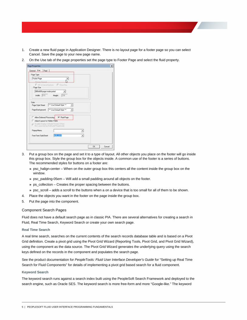
1. Create a new fluid page in Application Designer. There is no layout page for a footer page so you can select Cancel. Save the page to your new page name.
2. On the Use tab of the page properties set the page type to Footer Page and select the fluid property.
3. Put a group box on the page and set it to a type of layout. All other objects you place on the footer will go inside
this group box. Style the group box for the objects inside. A common use of the footer is a series of buttons. The recommended styles for buttons on a footer are:
» psc_halign-center – When on the outer group box this centers all the content inside the group box on the window.
» psc_padding-05em – Will add a small padding around all objects on the footer.
» ps_collection – Creates the proper spacing between the buttons.
» psc_scroll – adds a scroll to the buttons when a on a device that is too small for all of them to be shown.
4. Place the objects you want in the footer on the page inside the group box.
5. Put the page into the component.
Component Search Pages
Fluid does not have a default search page as in classic PIA. There are several alternatives for creating a search in
Fluid, Real Time Search, Keyword Search or create your own search page.
Real Time Search
A real time search, searches on the current contents of the search records database table and is based on a Pivot
Grid definition. Create a pivot grid using the Pivot Grid Wizard (Reporting Tools, Pivot Grid, and Pivot Grid Wizard),
using the component as the data source. The Pivot Grid Wizard generates the underlying query using the search
keys defined on the records in the component and populates the search page.
See the product documentation for PeopleTools: Fluid User Interface Developer’s Guide for “Setting up Real Time
Search for Fluid Components” for details of implementing a pivot grid based search for a fluid component.
Keyword Search
The keyword search runs against a search index built using the PeopleSoft Search Framework and deployed to the
search engine, such as Oracle SES. The keyword search is more free-form and more “Google-like.” The keyword
6 | PEOPLESOFT FLUID USER INTERFACE PROGRAMMING FUNDAMENTALS
search will not reflect changes to the database table until the search indexes are updated. You implement keyword
search for a fluid component using the same steps as you would complete for a classic PIA component.
See the product documentation for PeopleTools: Fluid User Interface Developer’s Guide for “Setting up Keyword
Search for Fluid Components” for details of implementing a Search Framework based search for a fluid component.
Custom Search Page
You can create your own search page and define it as a page type of search page. When you put it in your
component it will run after SearchInit and before SearchSave PeopleCode. You have access to the component
buffer to set fields as needed but the page is not in the component buffer. Therefore, all of the PeopleCode must be
in record field events and not in component PeopleCode events. We recommend that you clone the delivered
search pages (PTS_NUI_SEARCH or PTS_NUI_SEARCH_S) and make the changes you need.
Setting Up the Component for Search
After determining the type of search you will use and setting it up, you have to set up the component with the
properties for the search.
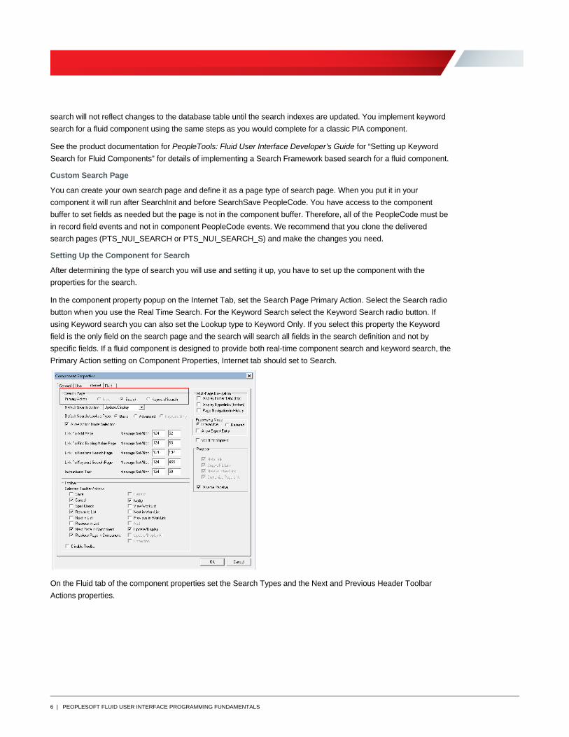
In the component property popup on the Internet Tab, set the Search Page Primary Action. Select the Search radio
button when you use the Real Time Search. For the Keyword Search select the Keyword Search radio button. If
using Keyword search you can also set the Lookup type to Keyword Only. If you select this property the Keyword
field is the only field on the search page and the search will search all fields in the search definition and not by
specific fields. If a fluid component is designed to provide both real-time component search and keyword search, the
Primary Action setting on Component Properties, Internet tab should set to Search.
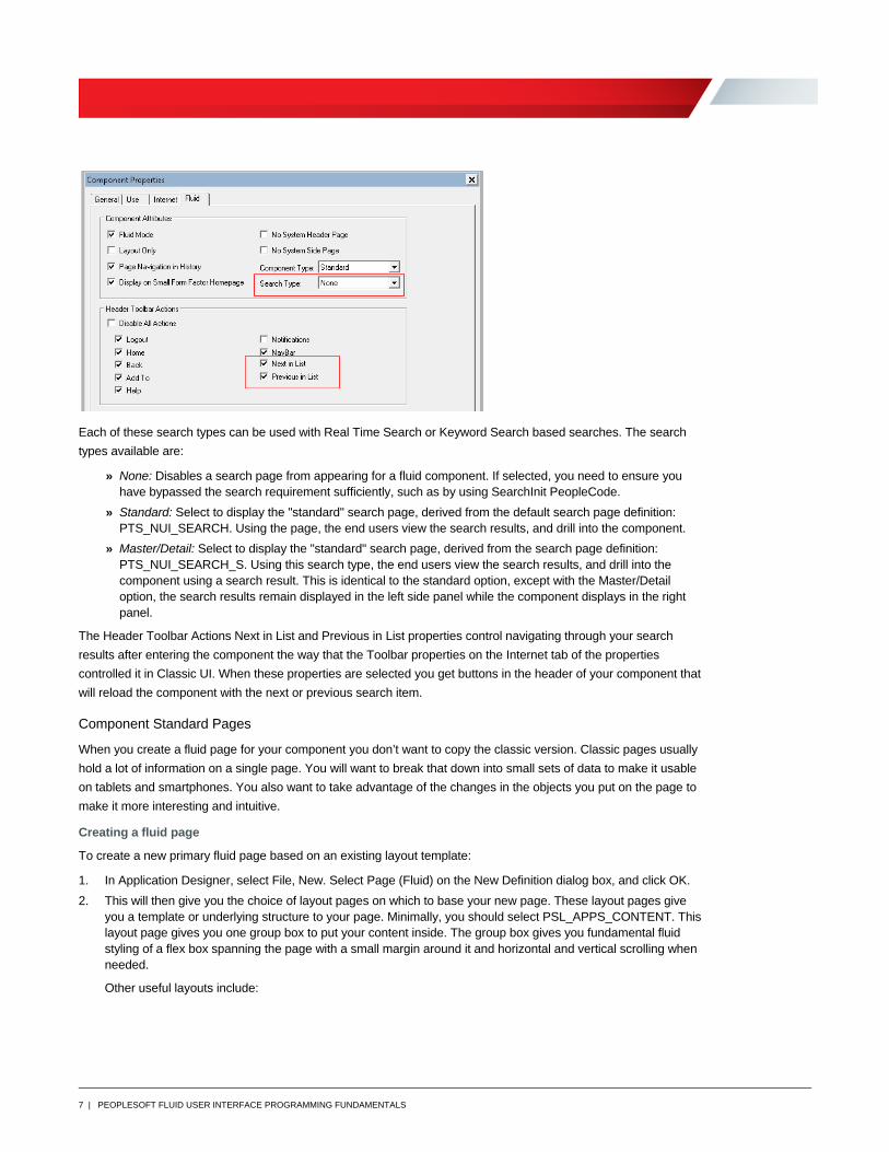
On the Fluid tab of the component properties set the Search Types and the Next and Previous Header Toolbar
Actions properties.
7 | PEOPLESOFT FLUID USER INTERFACE PROGRAMMING FUNDAMENTALS
Each of these search types can be used with Real Time Search or Keyword Search based searches. The search
types available are:
» None: Disables a search page from appearing for a fluid component. If selected, you need to ensure you have bypassed the search requirement sufficiently, such as by using SearchInit PeopleCode.
» Standard: Select to display the "standard" search page, derived from the default search page definition: PTS_NUI_SEARCH. Using the page, the end users view the search results, and drill into the component.
» Master/Detail: Select to display the "standard" search page, derived from the search page definition: PTS_NUI_SEARCH_S. Using this search type, the end users view the search results, and drill into the component using a search result. This is identical to the standard option, except with the Master/Detail option, the search results remain displayed in the left side panel while the component displays in the right panel.
The Header Toolbar Actions Next in List and Previous in List properties control navigating through your search
results after entering the component the way that the Toolbar properties on the Internet tab of the properties
controlled it in Classic UI. When these properties are selected you get buttons in the header of your component that
will reload the component with the next or previous search item.
Component Standard Pages
When you create a fluid page for your component you don’t want to copy the classic version. Classic pages usually
hold a lot of information on a single page. You will want to break that down into small sets of data to make it usable
on tablets and smartphones. You also want to take advantage of the changes in the objects you put on the page to
make it more interesting and intuitive.
Creating a fluid page
To create a new primary fluid page based on an existing layout template:
1. In Application Designer, select File, New. Select Page (Fluid) on the New Definition dialog box, and click OK.
2. This will then give you the choice of layout pages on which to base your new page. These layout pages give you a template or underlying structure to your page. Minimally, you should select PSL_APPS_CONTENT. This layout page gives you one group box to put your content inside. The group box gives you fundamental fluid styling of a flex box spanning the page with a small margin around it and horizontal and vertical scrolling when needed.
Other useful layouts include:
8 | PEOPLESOFT FLUID USER INTERFACE PROGRAMMING FUNDAMENTALS
PSL_TWOPANEL - Used in PeopleTools 8.54 to provide a two-panel layout, typically with navigation on the left
side and the transaction page on the right. See the Left Side Navigation topic later in the document for more
information. Note: This is not recommended when using PeopleTools 8.55.
PSL_2COLUMN_FLOAT - Contains two columns that will collapse into one column when the window narrows
due to browser size, device size or orientation. It sets up the outer container for a two‐column container so the
inner containers can use the psc_columnitem* styles. If using, you need to set styles on the each of the column
containers with one of the following:
psc_column item_1of2 – The child container will span 50% of the parent container. So if you put this style
on both the child group boxes in the layout you will get 2 columns.
psc_columnitem_2of2 – The child container will span 100% of the parent container. So if you put this style
on one the child group boxes in the layout the content of that group box spans the entire parent. Then you
can put the first style on the other group box and it will span half the parent container.
Refer to PeopleSoft Online Help for further additional layouts.
See PeopleTools 8.55: PeopleSoft Fluid User Developers Guide “Creating the Primary Fluid Page.”
3. After selecting your layout page, enter the page name on the Save As dialog box.
4. Indicate whether you’d like to save the PeopleCode associated with the layout page for your new page (Yes/No).
5. Add page objects to the page.
You can put page activate PeopleCode on your page. The PeopleCode processing order for Page Activate is:
1. Header
2. Side
3. Footer
4. Main
Fluid Page Objects
Group Boxes
The role of group boxes on your pages is very different in the PeopleSoft Fluid User Interface. The group box object
has many new types and can be used to create an HTML container that you can style. It also enables you to
reparent objects to the page header or to a grid header. The reparenting is described in the sections on page
headers and grid headers. Some useful group box types are:
Container: Use as a standard container, just as in classic PIA applications, to illustrate groupings of fields. It will
show a header at the top.
Default: Same as Container.
Layout Only: Use for a group box only to contain and position child elements. Use this to isolate and group
elements to apply styling without showing the group box or group box header on the page.
Accordion Vertical/Horizontal/Group Box: Used to implement expandable sections. You will need an outer group
box set to type Accordion GroupBox and then inside that put the group boxes that will open and close with the group
box type of Accordion Vertical or Accordion Horizontal depending on the direction you want it to open and close.
9 | PEOPLESOFT FLUID USER INTERFACE PROGRAMMING FUNDAMENTALS
Related Field Group: Used to create a FIELDSET collection where the LEGEND (the group box header) is
repeated to a screen reader when input type elements are read within the FIELDSET. Typical usage would be when
you have a collection of radio buttons based on the same field.
Fluid Grids
There are three main types of grids in Fluid: Original Flex, List and Div. The flex grid becomes an HTML table object
and List grids create a HTML list construct, while the Div grid generates a HTML div construct.
Original Flex Grid
The flex grid is similar to the grids used in classic PeopleSoft but the column width changes with the available
space. You would use a flex grid for tabular type data. The columns go across the page and generally there is a
column header at the top. In Fluid, group boxes can be added to a row and all fields between a group box and the
next group box or a group box and end of the row, will be stacked within the row. The group box label will show as a
column header. Here is the Open Jobs paglet from classic and how it looks in Fluid with the first two fields group
boxed together along with location and the other fields with a group box around each field.
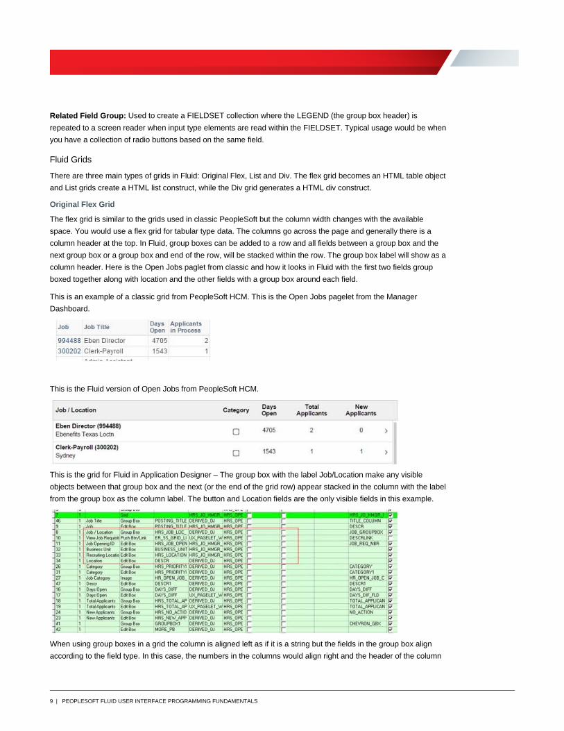
This is an example of a classic grid from PeopleSoft HCM. This is the Open Jobs pagelet from the Manager
Dashboard.
This is the Fluid version of Open Jobs from PeopleSoft HCM.
This is the grid for Fluid in Application Designer – The group box with the label Job/Location make any visible
objects between that group box and the next (or the end of the grid row) appear stacked in the column with the label
from the group box as the column label. The button and Location fields are the only visible fields in this example.
When using group boxes in a grid the column is aligned left as if it is a string but the fields in the group box align
according to the field type. In this case, the numbers in the columns would align right and the header of the column
10 | PEOPLESOFT FLUID USER INTERFACE PROGRAMMING FUNDAMENTALS
would align left. The headers and data have been styled to the center to fix this. To style an entire column of a flex
grid you cannot just style the field, because that does not style the header along with the data. To style the header
as well as the data, do the following:
1. Give the group box field a page field name.
2. Then create a style sheet for our component that contains that style.
TOTAL_APPLICANTS {
text-align: center;
margin: none;
}
3. Finally, in the Post Build or Page Activate PeopleCode add in the style sheet.
AddStyleSheet(StyleSheet.HRS_OPEN_JO_FL);
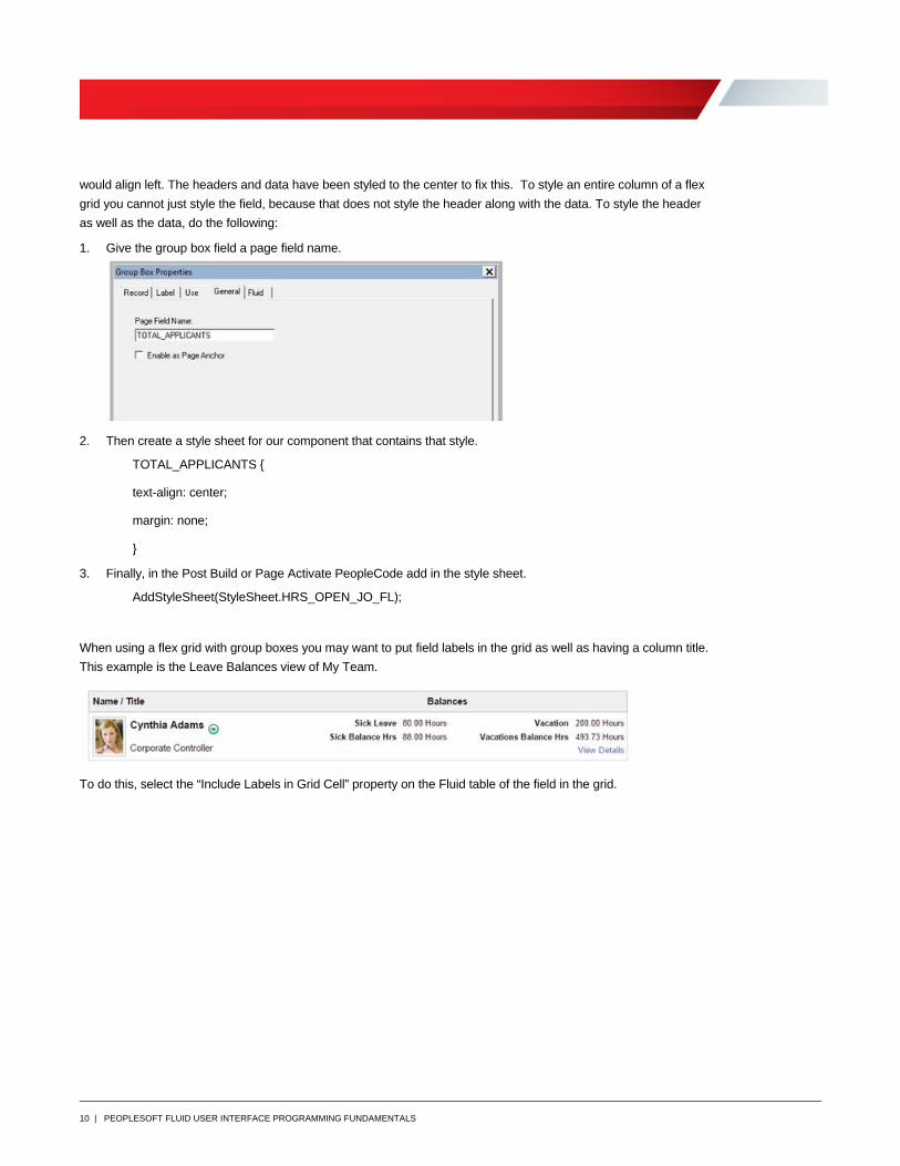
When using a flex grid with group boxes you may want to put field labels in the grid as well as having a column title.
This example is the Leave Balances view of My Team.
To do this, select the “Include Labels in Grid Cell” property on the Fluid table of the field in the grid.
11 | PEOPLESOFT FLUID USER INTERFACE PROGRAMMING FUNDAMENTALS
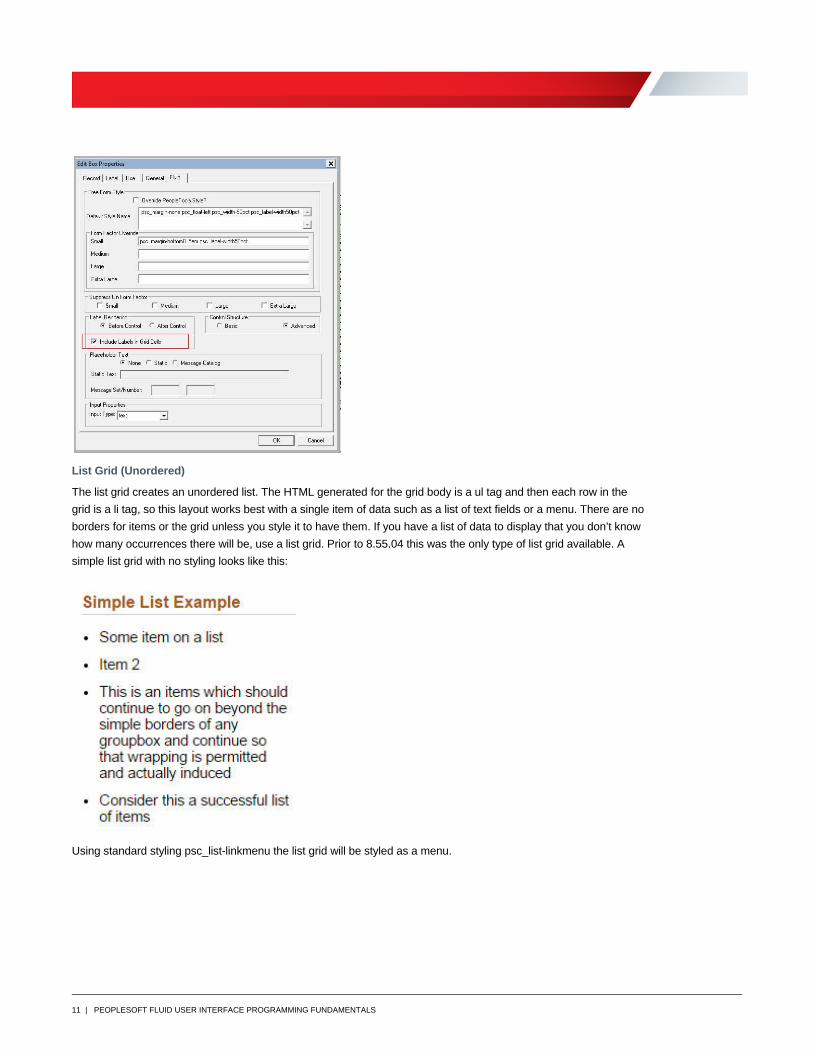
List Grid (Unordered)
The list grid creates an unordered list. The HTML generated for the grid body is a ul tag and then each row in the
grid is a li tag, so this layout works best with a single item of data such as a list of text fields or a menu. There are no
borders for items or the grid unless you style it to have them. If you have a list of data to display that you don’t know
how many occurrences there will be, use a list grid. Prior to 8.55.04 this was the only type of list grid available. A
simple list grid with no styling looks like this:
Using standard styling psc_list-linkmenu the list grid will be styled as a menu.
12 | PEOPLESOFT FLUID USER INTERFACE PROGRAMMING FUNDAMENTALS
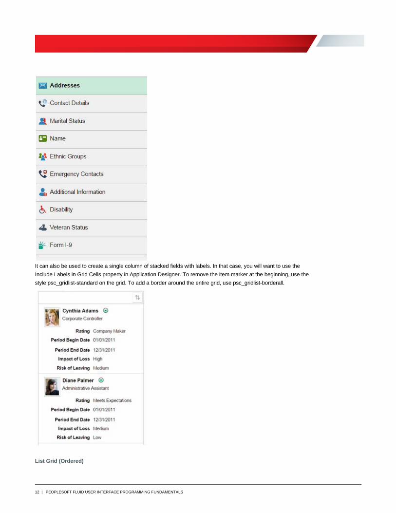
It can also be used to create a single column of stacked fields with labels. In that case, you will want to use the
Include Labels in Grid Cells property in Application Designer. To remove the item marker at the beginning, use the
style psc_gridlist-standard on the grid. To add a border around the entire grid, use psc_gridlist-borderall.
List Grid (Ordered)
13 | PEOPLESOFT FLUID USER INTERFACE PROGRAMMING FUNDAMENTALS
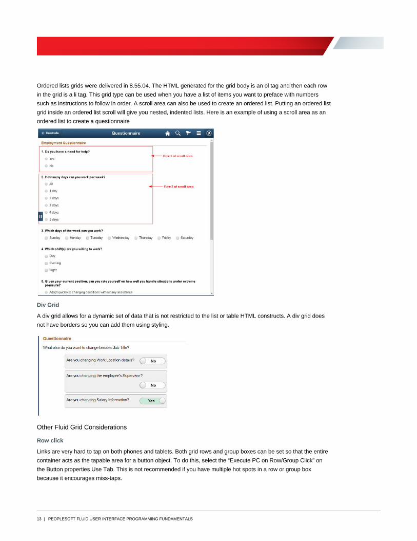
Ordered lists grids were delivered in 8.55.04. The HTML generated for the grid body is an ol tag and then each row
in the grid is a li tag. This grid type can be used when you have a list of items you want to preface with numbers
such as instructions to follow in order. A scroll area can also be used to create an ordered list. Putting an ordered list
grid inside an ordered list scroll will give you nested, indented lists. Here is an example of using a scroll area as an
ordered list to create a questionnaire
Div Grid
A div grid allows for a dynamic set of data that is not restricted to the list or table HTML constructs. A div grid does
not have borders so you can add them using styling.
Other Fluid Grid Considerations
Row click
Links are very hard to tap on both phones and tablets. Both grid rows and group boxes can be set so that the entire
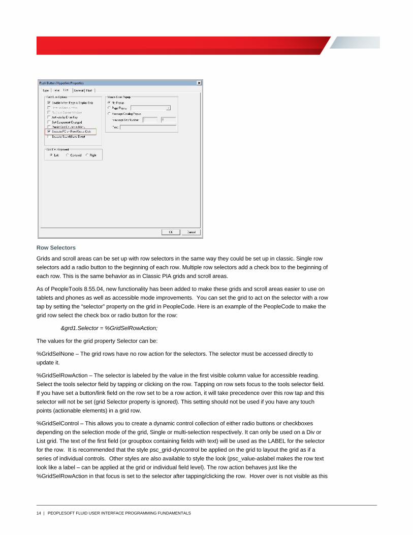
container acts as the tapable area for a button object. To do this, select the “Execute PC on Row/Group Click” on
the Button properties Use Tab. This is not recommended if you have multiple hot spots in a row or group box
because it encourages miss-taps.
14 | PEOPLESOFT FLUID USER INTERFACE PROGRAMMING FUNDAMENTALS
Row Selectors
Grids and scroll areas can be set up with row selectors in the same way they could be set up in classic. Single row
selectors add a radio button to the beginning of each row. Multiple row selectors add a check box to the beginning of
each row. This is the same behavior as in Classic PIA grids and scroll areas.
As of PeopleTools 8.55.04, new functionality has been added to make these grids and scroll areas easier to use on
tablets and phones as well as accessible mode improvements. You can set the grid to act on the selector with a row
tap by setting the “selector” property on the grid in PeopleCode. Here is an example of the PeopleCode to make the
grid row select the check box or radio button for the row:
&grd1.Selector = %GridSelRowAction;
The values for the grid property Selector can be:
%GridSelNone – The grid rows have no row action for the selectors. The selector must be accessed directly to
update it.
%GridSelRowAction – The selector is labeled by the value in the first visible column value for accessible reading.
Select the tools selector field by tapping or clicking on the row. Tapping on row sets focus to the tools selector field.
If you have set a button/link field on the row set to be a row action, it will take precedence over this row tap and this
selector will not be set (grid Selector property is ignored). This setting should not be used if you have any touch
points (actionable elements) in a grid row.
%GridSelControl – This allows you to create a dynamic control collection of either radio buttons or checkboxes
depending on the selection mode of the grid, Single or multi-selection respectively. It can only be used on a Div or
List grid. The text of the first field (or groupbox containing fields with text) will be used as the LABEL for the selector
for the row. It is recommended that the style psc_grid-dyncontrol be applied on the grid to layout the grid as if a
series of individual controls. Other styles are also available to style the look (psc_value-aslabel makes the row text
look like a label – can be applied at the grid or individual field level). The row action behaves just like the
%GridSelRowAction in that focus is set to the selector after tapping/clicking the row. Hover over is not visible as this
15 | PEOPLESOFT FLUID USER INTERFACE PROGRAMMING FUNDAMENTALS
should behave more like individual controls (radio buttons or checkboxes). The default selection does not perform a
server trip (deferred). If the application desires a server trip, the developer can enable a hyperlink as a trigger field
(row action field within the grid) which has PeopleCode to execute on change of the selector (as if a normal tools
radio button/checkbox with a field change). Note that the trigger field is ALWAYS hidden (no special style is
required) and is required to be hidden for the functionality to work properly (never override the trigger field to show it
while in this mode). In addition, if the developer wishes to disable a radio button/checkbox, disabling the trigger field
will also disable the tools selector for that row.
Vertical Scrolling
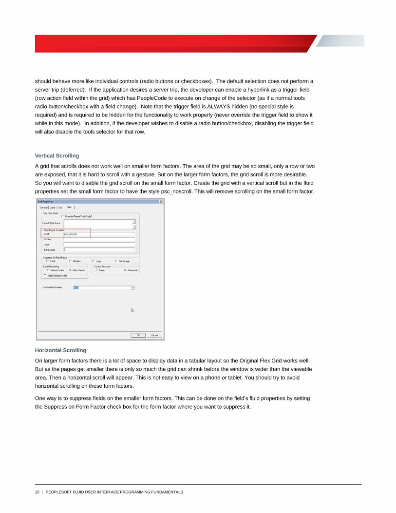
A grid that scrolls does not work well on smaller form factors. The area of the grid may be so small, only a row or two
are exposed, that it is hard to scroll with a gesture. But on the larger form factors, the grid scroll is more desirable.
So you will want to disable the grid scroll on the small form factor. Create the grid with a vertical scroll but in the fluid
properties set the small form factor to have the style psc_noscroll. This will remove scrolling on the small form factor.
Horizontal Scrolling
On larger form factors there is a lot of space to display data in a tabular layout so the Original Flex Grid works well.
But as the pages get smaller there is only so much the grid can shrink before the window is wider than the viewable
area. Then a horizontal scroll will appear. This is not easy to view on a phone or tablet. You should try to avoid
horizontal scrolling on these form factors.
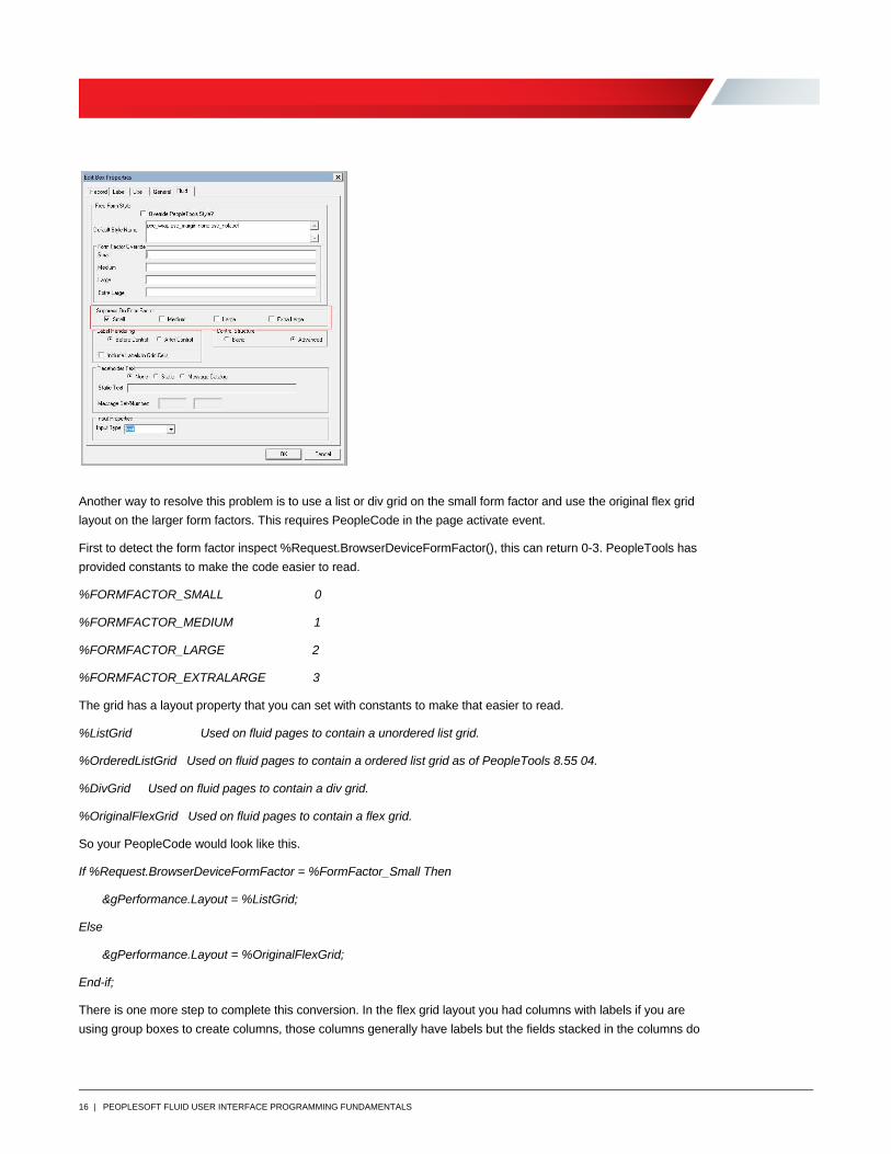
One way is to suppress fields on the smaller form factors. This can be done on the field’s fluid properties by setting
the Suppress on Form Factor check box for the form factor where you want to suppress it.
16 | PEOPLESOFT FLUID USER INTERFACE PROGRAMMING FUNDAMENTALS
Another way to resolve this problem is to use a list or div grid on the small form factor and use the original flex grid
layout on the larger form factors. This requires PeopleCode in the page activate event.
First to detect the form factor inspect %Request.BrowserDeviceFormFactor(), this can return 0-3. PeopleTools has
provided constants to make the code easier to read.
%FORMFACTOR_SMALL 0
%FORMFACTOR_MEDIUM 1
%FORMFACTOR_LARGE 2
%FORMFACTOR_EXTRALARGE 3
The grid has a layout property that you can set with constants to make that easier to read.
%ListGrid Used on fluid pages to contain a unordered list grid.
%OrderedListGrid Used on fluid pages to contain a ordered list grid as of PeopleTools 8.55 04.
%DivGrid Used on fluid pages to contain a div grid.
%OriginalFlexGrid Used on fluid pages to contain a flex grid.
So your PeopleCode would look like this.
If %Request.BrowserDeviceFormFactor = %FormFactor_Small Then
&gPerformance.Layout = %ListGrid;
Else
&gPerformance.Layout = %OriginalFlexGrid;
End-if;
There is one more step to complete this conversion. In the flex grid layout you had columns with labels if you are
using group boxes to create columns, those columns generally have labels but the fields stacked in the columns do
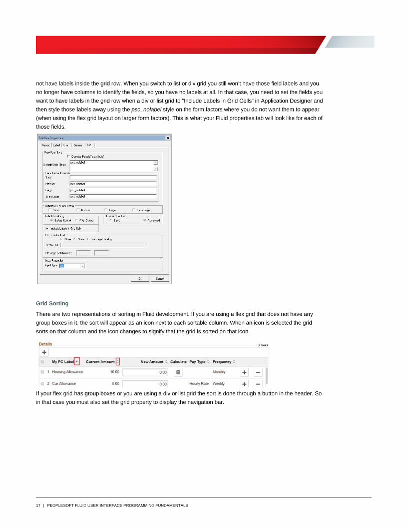
17 | PEOPLESOFT FLUID USER INTERFACE PROGRAMMING FUNDAMENTALS
not have labels inside the grid row. When you switch to list or div grid you still won’t have those field labels and you
no longer have columns to identify the fields, so you have no labels at all. In that case, you need to set the fields you
want to have labels in the grid row when a div or list grid to “Include Labels in Grid Cells” in Application Designer and
then style those labels away using the psc_nolabel style on the form factors where you do not want them to appear
(when using the flex grid layout on larger form factors). This is what your Fluid properties tab will look like for each of
those fields.
Grid Sorting
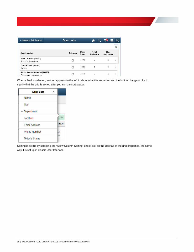
There are two representations of sorting in Fluid development. If you are using a flex grid that does not have any
group boxes in it, the sort will appear as an icon next to each sortable column. When an icon is selected the grid
sorts on that column and the icon changes to signify that the grid is sorted on that icon.
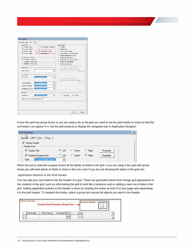
If your flex grid has group boxes or you are using a div or list grid the sort is done through a button in the header. So
in that case you must also set the grid property to display the navigation bar.
18 | PEOPLESOFT FLUID USER INTERFACE PROGRAMMING FUNDAMENTALS
When a field is selected, an icon appears to the left to show what it is sorted on and the button changes color to
signify that the grid is sorted after you exit the sort popup.
Sorting is set up by selecting the “Allow Column Sorting” check box on the Use tab of the grid properties, the same
way it is set up in classic User Interface.
19 | PEOPLESOFT FLUID USER INTERFACE PROGRAMMING FUNDAMENTALS
If your flex grid has group boxes or you are using a div or list grid you need to set the grid header to show so that the
sort button can appear in it. Set the grid property to display the navigation bar in Application Designer.
When the sort is selected a popup shows all the labels on fields in the grid. If you are using a flex grid with group
boxes you will want labels on fields to show in the sort, even if you are not showing the labels in the grid row.
Application Buttons in the Grid Header
You can add your own buttons into the header of a grid. These are generally buttons that change grid appearance or
the contents of the grid, such as reformatting the grid to look like a business card or adding a new row of data to the
grid. Adding application buttons to the header is done by creating the button at level 0 of your page and reparenting
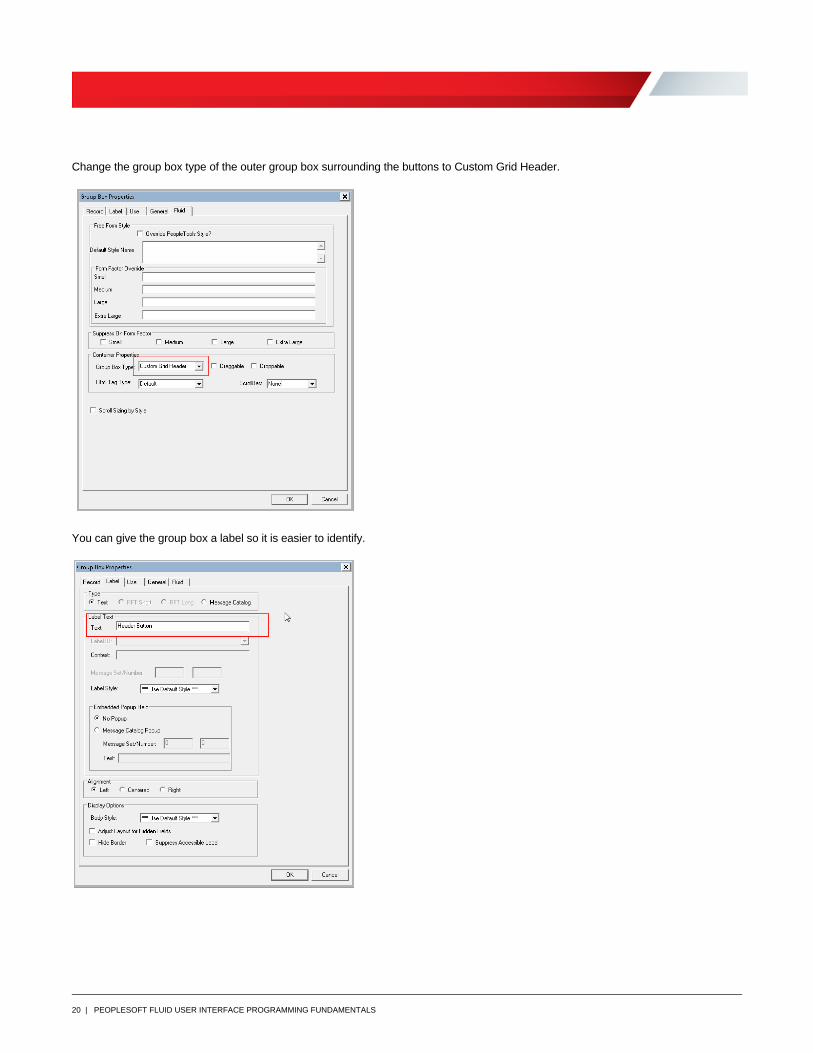
it to the grid header. To reparent the button, place a group box around all objects you want in the header.
20 | PEOPLESOFT FLUID USER INTERFACE PROGRAMMING FUNDAMENTALS
Change the group box type of the outer group box surrounding the buttons to Custom Grid Header.
You can give the group box a label so it is easier to identify.
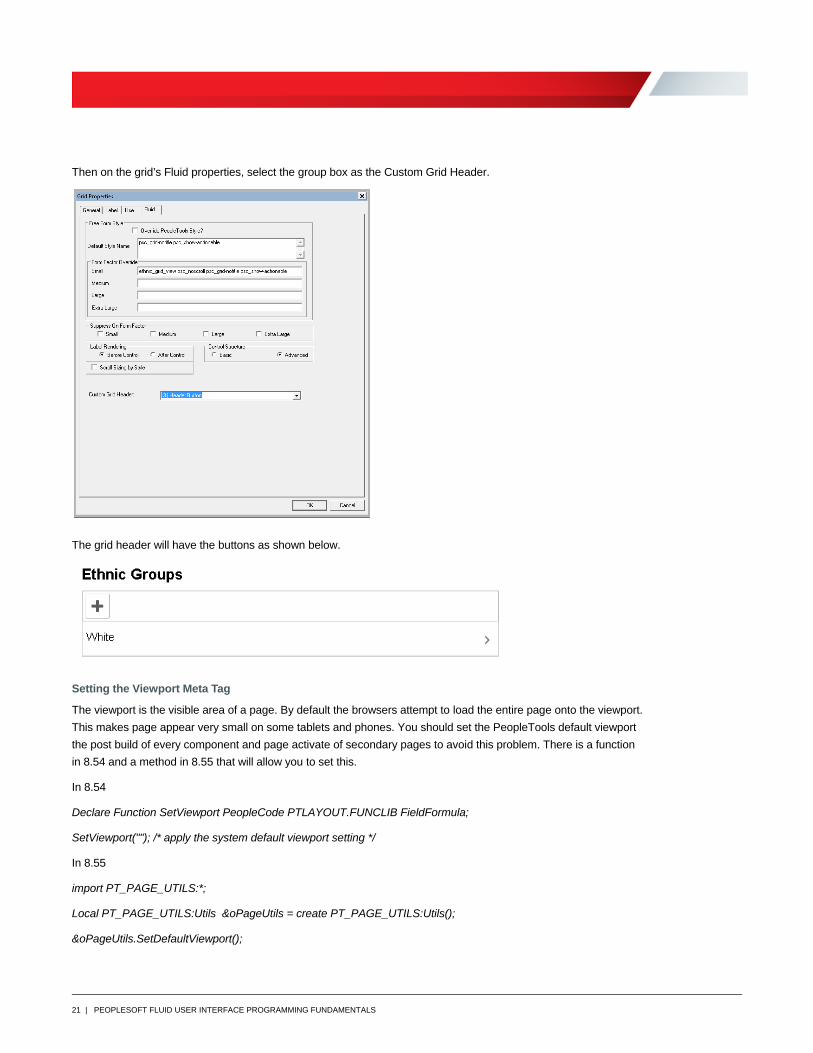
21 | PEOPLESOFT FLUID USER INTERFACE PROGRAMMING FUNDAMENTALS
Then on the grid’s Fluid properties, select the group box as the Custom Grid Header.
The grid header will have the buttons as shown below.
Setting the Viewport Meta Tag
The viewport is the visible area of a page. By default the browsers attempt to load the entire page onto the viewport.
This makes page appear very small on some tablets and phones. You should set the PeopleTools default viewport
the post build of every component and page activate of secondary pages to avoid this problem. There is a function
in 8.54 and a method in 8.55 that will allow you to set this.
In 8.54
Declare Function SetViewport PeopleCode PTLAYOUT.FUNCLIB FieldFormula;
SetViewport(""); /* apply the system default viewport setting */
In 8.55
import PT_PAGE_UTILS:*;
Local PT_PAGE_UTILS:Utils &oPageUtils = create PT_PAGE_UTILS:Utils();
&oPageUtils.SetDefaultViewport();
22 | PEOPLESOFT FLUID USER INTERFACE PROGRAMMING FUNDAMENTALS
Confirmation Message
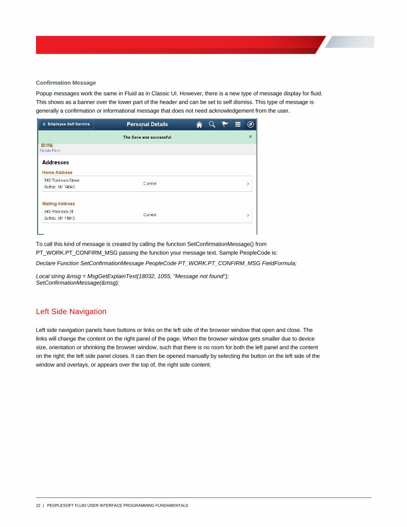
Popup messages work the same in Fluid as in Classic UI. However, there is a new type of message display for fluid.
This shows as a banner over the lower part of the header and can be set to self dismiss. This type of message is
generally a confirmation or informational message that does not need acknowledgement from the user.
To call this kind of message is created by calling the function SetConfirmationMessage() from
PT_WORK.PT_CONFIRM_MSG passing the function your message text. Sample PeopleCode is:
Declare Function SetConfirmationMessage PeopleCode PT_WORK.PT_CONFIRM_MSG FieldFormula; Local string &msg = MsgGetExplainText(18032, 1055, "Message not found"); SetConfirmationMessage(&msg);
Left Side Navigation
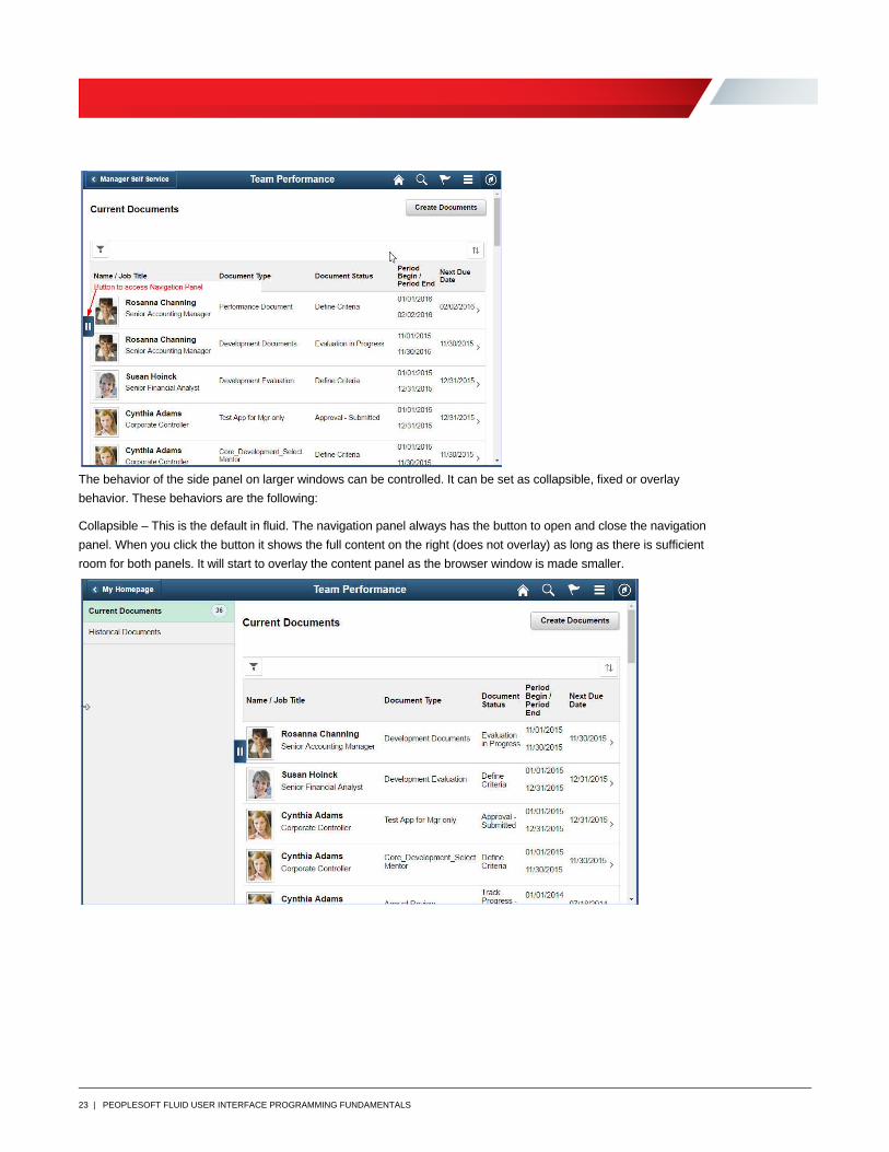
Left side navigation panels have buttons or links on the left side of the browser window that open and close. The
links will change the content on the right panel of the page. When the browser window gets smaller due to device
size, orientation or shrinking the browser window, such that there is no room for both the left panel and the content
on the right; the left side panel closes. It can then be opened manually by selecting the button on the left side of the
window and overlays, or appears over the top of, the right side content.
23 | PEOPLESOFT FLUID USER INTERFACE PROGRAMMING FUNDAMENTALS
The behavior of the side panel on larger windows can be controlled. It can be set as collapsible, fixed or overlay
behavior. These behaviors are the following:
Collapsible – This is the default in fluid. The navigation panel always has the button to open and close the navigation
panel. When you click the button it shows the full content on the right (does not overlay) as long as there is sufficient
room for both panels. It will start to overlay the content panel as the browser window is made smaller.
24 | PEOPLESOFT FLUID USER INTERFACE PROGRAMMING FUNDAMENTALS
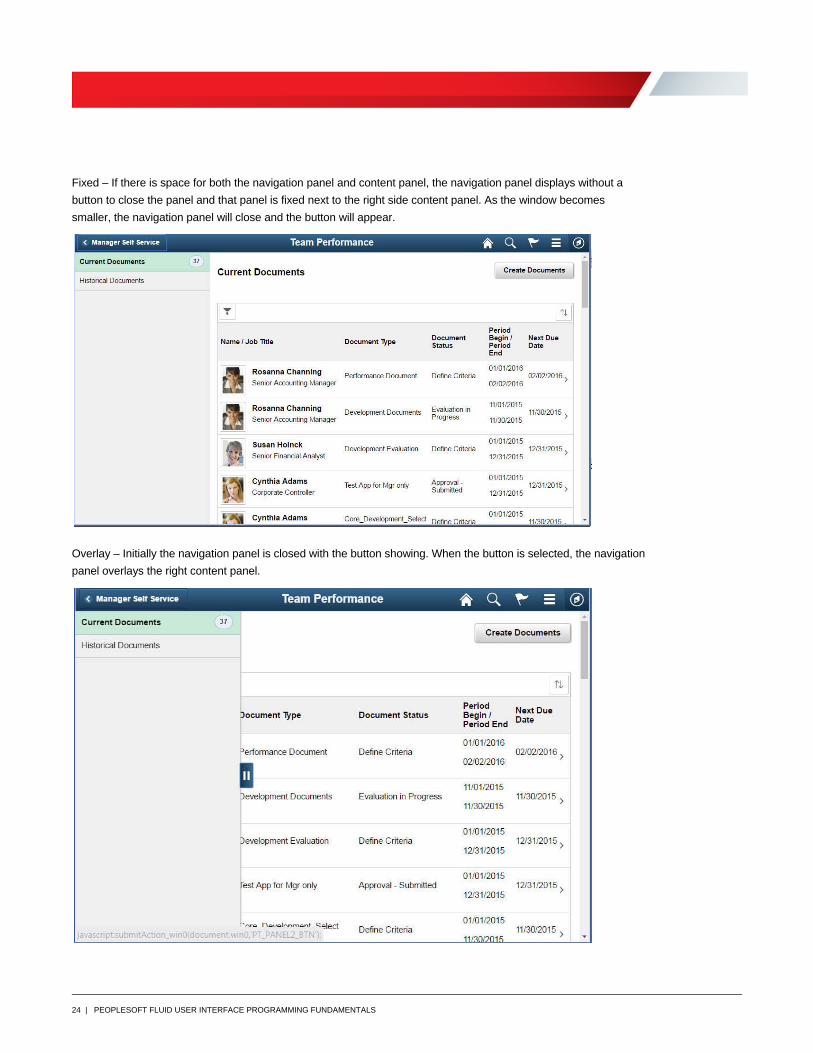
Fixed – If there is space for both the navigation panel and content panel, the navigation panel displays without a
button to close the panel and that panel is fixed next to the right side content panel. As the window becomes
smaller, the navigation panel will close and the button will appear.
Overlay – Initially the navigation panel is closed with the button showing. When the button is selected, the navigation
panel overlays the right content panel.
25 | PEOPLESOFT FLUID USER INTERFACE PROGRAMMING FUNDAMENTALS
This page layout was accomplished differently in PeopleTools 8.54 than in 8.55 or later. In 8.55 you can use a side page to create a navigation panel and the PT_PAGE_UTILS: PanelController application class to control the panel. Additionally, Master-Detail is available to create this type of component and call multiple components. In PeopleTools 8.54 you use a layout page and functions to make the page work. The side navigation in pages created from the layout page in 8.54 that calls multiple pages in a component must all have the same side navigation defined on each page. The side page implementation is only defined once because the navigation is independent of the content.
8.55 Left Side Navigation
Page Type – Side Page 1
In PeopleTools 8.55 you can place your side navigation in a separate page from your content. You define that page with a page type of Side Page 1 and put the page in your component. A Side Page 1 can be used for any content you want but most often it will be used for navigation. This makes the side page a side page for all pages in the component. 1. Create your fluid content pages and place them in your component.
2. Create your side page. In Application Designer, select File, New and from the New Definitions popup select Page (Fluid). Next from the Choose Layout Page popup, select PSL_PANEL_NAV. Save the page to the name you want to use; you will not need to save the PeopleCode.
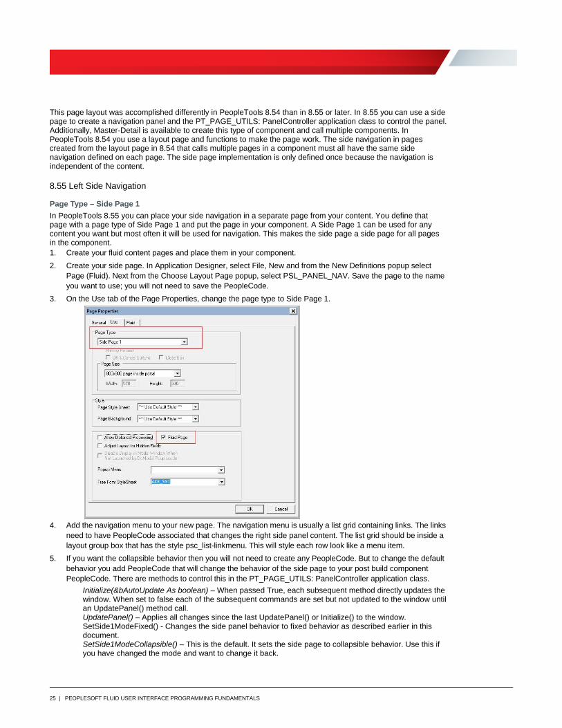
3. On the Use tab of the Page Properties, change the page type to Side Page 1.
4. Add the navigation menu to your new page. The navigation menu is usually a list grid containing links. The links
need to have PeopleCode associated that changes the right side panel content. The list grid should be inside a layout group box that has the style psc_list-linkmenu. This will style each row look like a menu item.
5. If you want the collapsible behavior then you will not need to create any PeopleCode. But to change the default behavior you add PeopleCode that will change the behavior of the side page to your post build component PeopleCode. There are methods to control this in the PT_PAGE_UTILS: PanelController application class.
Initialize(&bAutoUpdate As boolean) – When passed True, each subsequent method directly updates the window. When set to false each of the subsequent commands are set but not updated to the window until an UpdatePanel() method call. UpdatePanel() – Applies all changes since the last UpdatePanel() or Initialize() to the window. SetSide1ModeFixed() - Changes the side panel behavior to fixed behavior as described earlier in this document. SetSide1ModeCollapsible() – This is the default. It sets the side page to collapsible behavior. Use this if you have changed the mode and want to change it back.
26 | PEOPLESOFT FLUID USER INTERFACE PROGRAMMING FUNDAMENTALS
SetSide1ModeOverlay() – Sets the side page to overlay behavior. SetSide1Hidden(&bHidden As boolean) – True will hide the side page and False will show it. UsePersistentOpenModeSide1(&bEnable As boolean) – The behavior of the side panel when the control button is showing is to close the panel when the window is refreshed from a server trip. Use this method to keep the side panel open until the panel is closed either by the user or PeopleCode. SetSide1OpenState(&bOpen As boolean) – Sets the state of the side panel to either open or closed when the window is refreshed from a server trip; true will set it open and false will set it to closed. UseForceOpenModeSide1(&bEnable As boolean) – When a partial refresh happens, the open state that is set when a full page refresh is done, does not happen. This method allows you to set the open state when a partial page refresh happens. If you are using navigation that shows and hides part of a single page, the side page will not close for a navigation button click as it will with a page transfer. You can use this method in PeopleCode that causes the partial page refresh to make the left side panel behave the way you want it to behave.
Example PeopleCode:
import PT_PAGE_UTILS: PanelController;
Local PT_PAGE_UTILS:PanelController &oPC = create PT_PAGE_UTILS:PanelController();
&oPC.Initialize(True); /* initialize for single operation */
&oPC.SetSide1ModeFixed(); /* Change mode to fixed */
6. Add your new page to the component. Make sure you add an Item Label to the page in the component definition. This title is used on the side page open/close button as hover text and will be read by a screen reader in accessible mode.
Component Tabs in Side page
In PeopleTools 8.55 a component with multiple tabs can be set up with left side navigation where the tabs appear as
left side navigation links. To do this:
1. Create your fluid component and on the Internet property tab select “Display Folder Tabs (top)”.
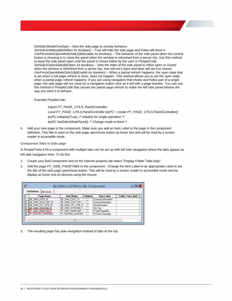
2. Add the page PT_SIDE_PAGETABS to the component. Change the Item Label to an appropriate Label to set the title of the side page open/close button. This will be read by a screen reader in accessible mode and be display as hover text on devices using the mouse.
3. The resulting page has side navigation instead of tabs at the top.
27 | PEOPLESOFT FLUID USER INTERFACE PROGRAMMING FUNDAMENTALS
8.54 Left Side Layout Page
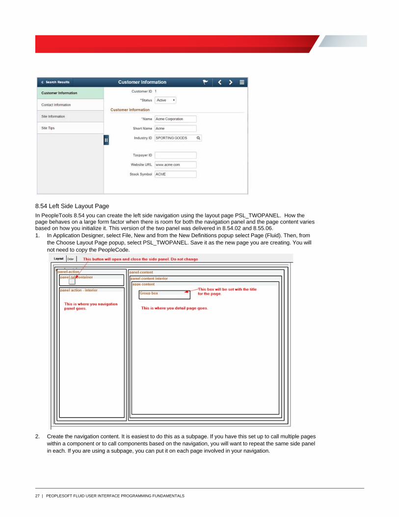
In PeopleTools 8.54 you can create the left side navigation using the layout page PSL_TWOPANEL. How the page behaves on a large form factor when there is room for both the navigation panel and the page content varies based on how you initialize it. This version of the two panel was delivered in 8.54.02 and 8.55.06. 1. In Application Designer, select File, New and from the New Definitions popup select Page (Fluid). Then, from
the Choose Layout Page popup, select PSL_TWOPANEL. Save it as the new page you are creating. You will not need to copy the PeopleCode.
2. Create the navigation content. It is easiest to do this as a subpage. If you have this set up to call multiple pages within a component or to call components based on the navigation, you will want to repeat the same side panel in each. If you are using a subpage, you can put it on each page involved in your navigation.
28 | PEOPLESOFT FLUID USER INTERFACE PROGRAMMING FUNDAMENTALS
The navigation subpage is usually a list grid containing links. The links need to have PeopleCode associated that
will do the transfer between pages or component. The list grid should be inside a layout group box that has the style
psc_list-linkmenu. This will style each row to look like a menu item.
3. There are helpful functions delivered to control this layout. The functions are in the FieldFormula of the PT_TWOPNL_WORK.BUTTON.
initializeTwoPanel(&iType As integer, &bInitialState As boolean, &fldPanelField As Field, &iPanelPos As
integer)
» &iType a numeric value to set the type of panel behavior (0 = default (collapsible), 1 = fixed, 2 =overlay)
» &bInitialState – Boolean ( True = Open, False = Closed ) Sets the state of the navigation panel at start of the component.
» &fldPanelField – Field object. This is only needed if you are using a different navigation panel button than PT_TWOPNL_WORK.BUTTON
» &iPanelPos – Always 0
togglePanel() – Toggles the open/closed state based on the type of panel (field change code put on the tab
button)
setPanelState(&bState as Boolean) – Sets the panel state to open when true (psc_open) or closed when false
(psc_closed).
setContentPanelInfo(&sTitle as string) – Sets the title on the content panel. In accessible mode it also sets the
appropriate aria-label for the title.
setNavigationPanelInfo(&sTitle as String, &sDescription) – Sets the navigation panel with an aria role of
“navigation” for the section.
» Title – String to be used for the tab label/hover (may be empty string to use the default button label)
» Description – Text read by a screen reader when the first focusable field in the navigation panel gets focus. Use this to describe how to use the panel.
Master-Detail Framework
The Master-Detail Framework was delivered in PeopleTools 8.55. It is a powerful tool that is used internally to create
component constructs such as Activity Guides, Fluid WorkCenters, and Navigation Collection Tiles. Master-Detail
shows left side navigation with right side content. The right side content can be both fluid and classic components. It
uses grouplets, group boxes that show content from another source, to call other components and display them on
the right side detail panel. A grouplet is a special type of group box with the properties set so that it will display
information from a URL within that group box or transfer to a URL when the group box is selected. In Master-Detail
the navigation panel contains a grouplet that shows a page you have created containing a list of navigation
“buttons”. When those “buttons” are selected they trigger the display of a predefined URL in the grouplet on the right
side detail. This document will explain how to set up a simple Master-Detail application with a left navigation panel
and right details. There are many more applications for the Master-Detail Framework, see PeopleBooks for more
information.
PeopleTools delivers a component (PT_MDSTARTPAGE_NUI) that you can use to display your Master-Detail
application so all you need to create is the navigation panel component. If you want to clone your own Master-Detail
start page in order to change some of the behavior, you can do that but that is outside the scope of this document.
To create the navigation pane, you create a new component with only the navigation grid included.
1. Create a new fluid page based on the layout PSL_PANEL_NAV and save it as your new page name.
29 | PEOPLESOFT FLUID USER INTERFACE PROGRAMMING FUNDAMENTALS
2. Inside the Navigation panel group box, add a layout group box and a list grid inside that group box.
» The group box that is around your grid should have the style psc_list-linkmenu.
» The grid should be a list grid with no header. It should have a layout group box and one description field in the row. You can add additional fields such as images or counters if you like, set those values in the page activate of this page.
3. Write the page activate PeopleCode to set values and properties for each row of the list grid for the list grid group box and description fields. In each row:
a. You set the label for the row in the description field.
b. You need to set properties in PeopleCode on the group box in each row of your list grid. The properties will determine the URL that will be called and displayed on the right when the row is selected. On the group box field object, set the type of grouplet and whether the grouplet is display only using field object methods. The methods to set the group box properties are:
SetGroupletActionUrl() sets the URL to be called when the grouplet is tapped or selected.
SetGroupletDisplayIn() should be 7 for Master-Detail Fluid and 8 for Master-Detail Classic.
IsGroupletLabelOnly() makes the grouplet action fire when true.
c. Finish your page activate with AddOnLoadScript("DoRowAction();"); It will call Java Script that will load the URL on the first row of the first grid in the right panel. You can pass parameters to this Java Script that will change the row number of the grid to use to display the initial right side content. You can also pass an id for the grid you want to use for this initial display if you have more than on the page. The default is the first row of the first grid on the page.The syntax is
AddOnLoadScript("DoRowAction(" | &nRow",'QE_WORK_REC2$0');");
Here is an example of the People Code:
&Menu = "MENUNAME.HRS_MANAGER_FL";
&Comp = "COMPONENT.HRS_OPEN_JO_FLU";
&Page = "PAGE.HRS_OPEN_JO_FLU";
&sNewUrl = GenerateComponentContentURL(%Portal, %Node, @&Menu, %Market, @&Comp, @&Page, "");
&rs(1).RECORD1. GROUPBOX_01.SetGroupletActionUrl(&sNewUrl);
&rs(1). RECORD1.GROUPBOX_01.SetGroupletDisplayIn(7);
&rs(1). RECORD1..GROUPBOX_01.IsGroupletLabelOnly = True;
&rs(1).RECORD1.DESCR_FLD.VALUE = “Open Jobs”;
AddOnLoadScript("DoRowAction();");
4. Create a fluid component and put the page in it. Then add the component to a menu.
5. Create a new content reference in PeopleTools>Portal>Structure and Content under Fluid Structure>Fluid Pages in a folder such as Manager Self Service or a new one you can create, but it must be under a folder inside of the folder Fluid Pages. The content reference should use the following setup:
» Select the “NoTemplate” checkbox
» Select the “Fluid Mode” checkbox
» Select the “Display on Small Form Factor” checkbox
» Add your Node Name
» URL Type is “PeopleSoft Component”
» Menu Name is “NUI_FRAMEWORK”
» Market is “GBL”
» Component is “PT_MDSTARTPAGE_NUI”
30 | PEOPLESOFT FLUID USER INTERFACE PROGRAMMING FUNDAMENTALS
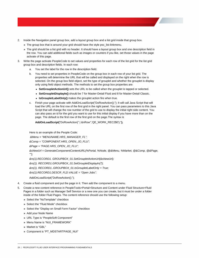
» Additional Parameters are “GMenu=<the name of the menu for your nav component>&GComp=<the name of your nav component>&GPage=<the name of your nav page>&nRow=<row in the list grid you want to open on>. The example below uses TESTMD as the menu, component, and page names.
» Define the security for the content reference.
» Fill in the fluid tab with at least an image that you want associated with the component.
This will result in a content reference that opens the PT_MDSTARTPAGE_NUI component and then put page
TESTMD into the right side navigation. Then trigger the URL set in PeopleCode for Row 1 of the first list grid on
TESTMD. The content reference with be available to be add to home pages and the Nav Bar.
Modal Pages
In the PeopleSoft Fluid Interface, there are two functions to call modals, DoModalPopup and
DoModalComponentPopup. They work very much like the classic functions DoModal and DoModalComponent.
They open a secondary page or component over the current component and the original component cannot be
accessed until exiting the modal. The function syntax for each is as follows:
DoModalPopup(modal_options, Cancel_button_ID, display_only, cached, Page.PAGE_NAME, title, xpos, ypos[,
level, scrollpath, target_row])
DoModalComponentPopup(modal_options, Cancel_button_ID, title, MenuName.menuname,
BarName.BARNAME, ItemName.MENUITEM_NAME, Page.COMPONENT_ITEM_NAME, action,
Record.SHARED_RECORD_NAME [, keylist])
Most of the parameters work the same as the classic version so we won’t review those here. The real difference is
the modal options and cancel button id. These are not required parameters in that you can pass an empty string to
each and the function will perform correctly.
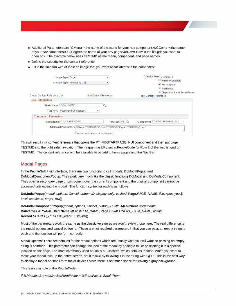
Modal Options: There are defaults for the modal options which are usually what you will want so passing an empty
string is common. This parameter can change the look of the modal by adding a tail or positioning it in a specific
location on the page. The most commonly used option is bFullscreen, which defaults to false. When you want to
make your modal take up the entire screen, set it to true by following it in the string with “@1”. This is the best way
to display a modal on small form factor devices since there is not much space for leaving a gray background.
This is an example of the PeopleCode.
If %Request.BrowserDeviceFormFactor = %FormFactor_Small Then
31 | PEOPLESOFT FLUID USER INTERFACE PROGRAMMING FUNDAMENTALS
&sOptions = "bFullScreen@1";
Else
&sOptions = "";
End-If;
&rc = DoModalPopup(&sOptions, "", False, False, Page.HR_DT_LEAVE_SCF,
GetRow().DERIVED_HR_TEAM.HR_ALL_LEAVE_LINK.Label, - 1, - 1);
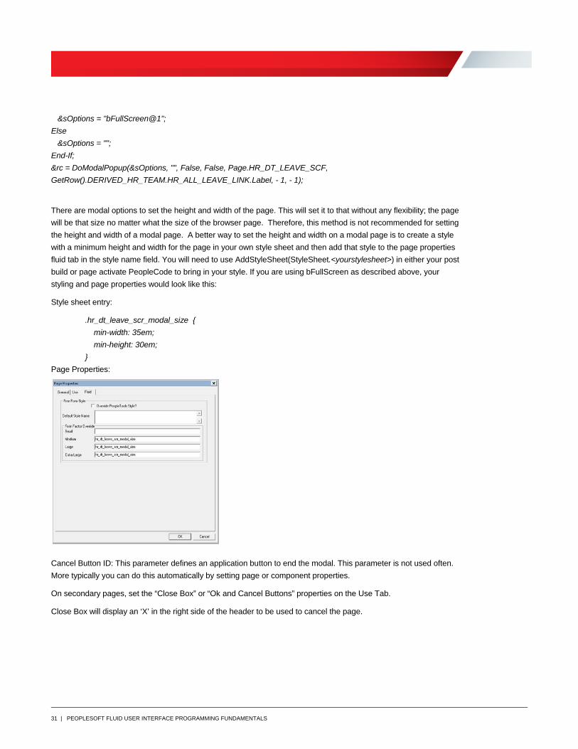
There are modal options to set the height and width of the page. This will set it to that without any flexibility; the page
will be that size no matter what the size of the browser page. Therefore, this method is not recommended for setting
the height and width of a modal page. A better way to set the height and width on a modal page is to create a style
with a minimum height and width for the page in your own style sheet and then add that style to the page properties
fluid tab in the style name field. You will need to use AddStyleSheet(StyleSheet.<yourstylesheet>) in either your post
build or page activate PeopleCode to bring in your style. If you are using bFullScreen as described above, your
styling and page properties would look like this:
Style sheet entry:
.hr_dt_leave_scr_modal_size {
min-width: 35em;
min-height: 30em;
}
Page Properties:
Cancel Button ID: This parameter defines an application button to end the modal. This parameter is not used often.
More typically you can do this automatically by setting page or component properties.
On secondary pages, set the “Close Box” or “Ok and Cancel Buttons” properties on the Use Tab.
Close Box will display an ‘X’ in the right side of the header to be used to cancel the page.
32 | PEOPLESOFT FLUID USER INTERFACE PROGRAMMING FUNDAMENTALS
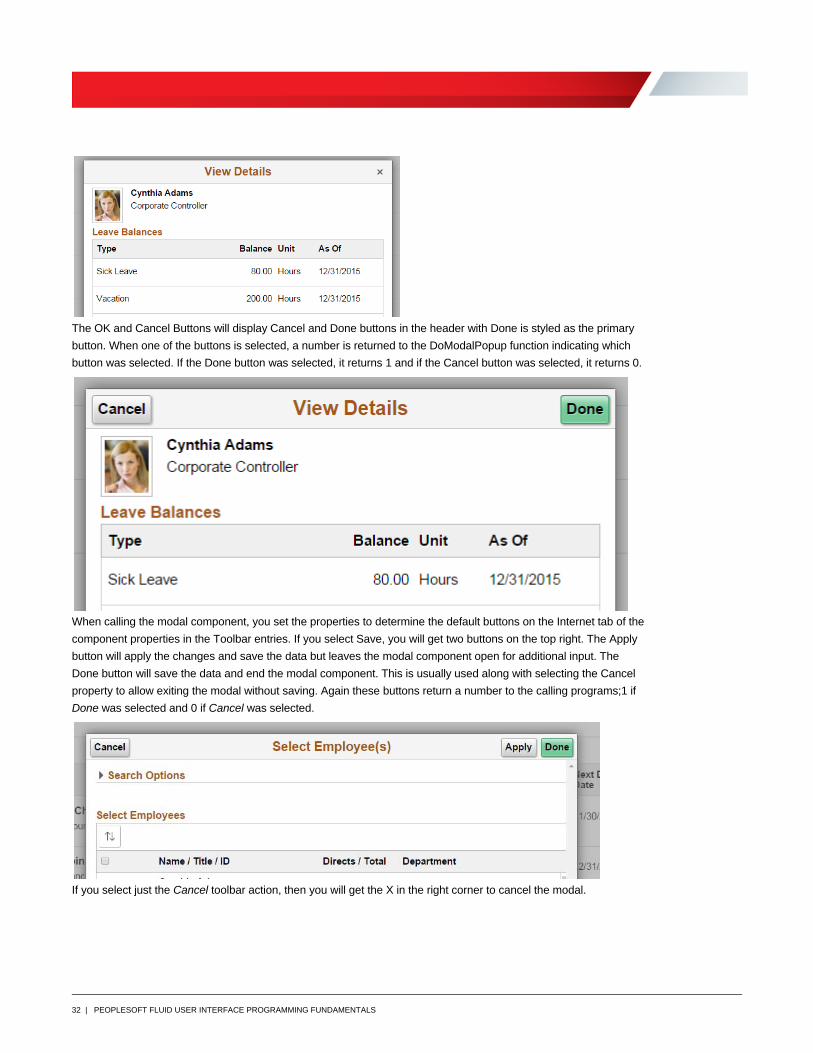
The OK and Cancel Buttons will display Cancel and Done buttons in the header with Done is styled as the primary
button. When one of the buttons is selected, a number is returned to the DoModalPopup function indicating which
button was selected. If the Done button was selected, it returns 1 and if the Cancel button was selected, it returns 0.
When calling the modal component, you set the properties to determine the default buttons on the Internet tab of the
component properties in the Toolbar entries. If you select Save, you will get two buttons on the top right. The Apply
button will apply the changes and save the data but leaves the modal component open for additional input. The
Done button will save the data and end the modal component. This is usually used along with selecting the Cancel
property to allow exiting the modal without saving. Again these buttons return a number to the calling programs;1 if
Done was selected and 0 if Cancel was selected.
If you select just the Cancel toolbar action, then you will get the X in the right corner to cancel the modal.
33 | PEOPLESOFT FLUID USER INTERFACE PROGRAMMING FUNDAMENTALS
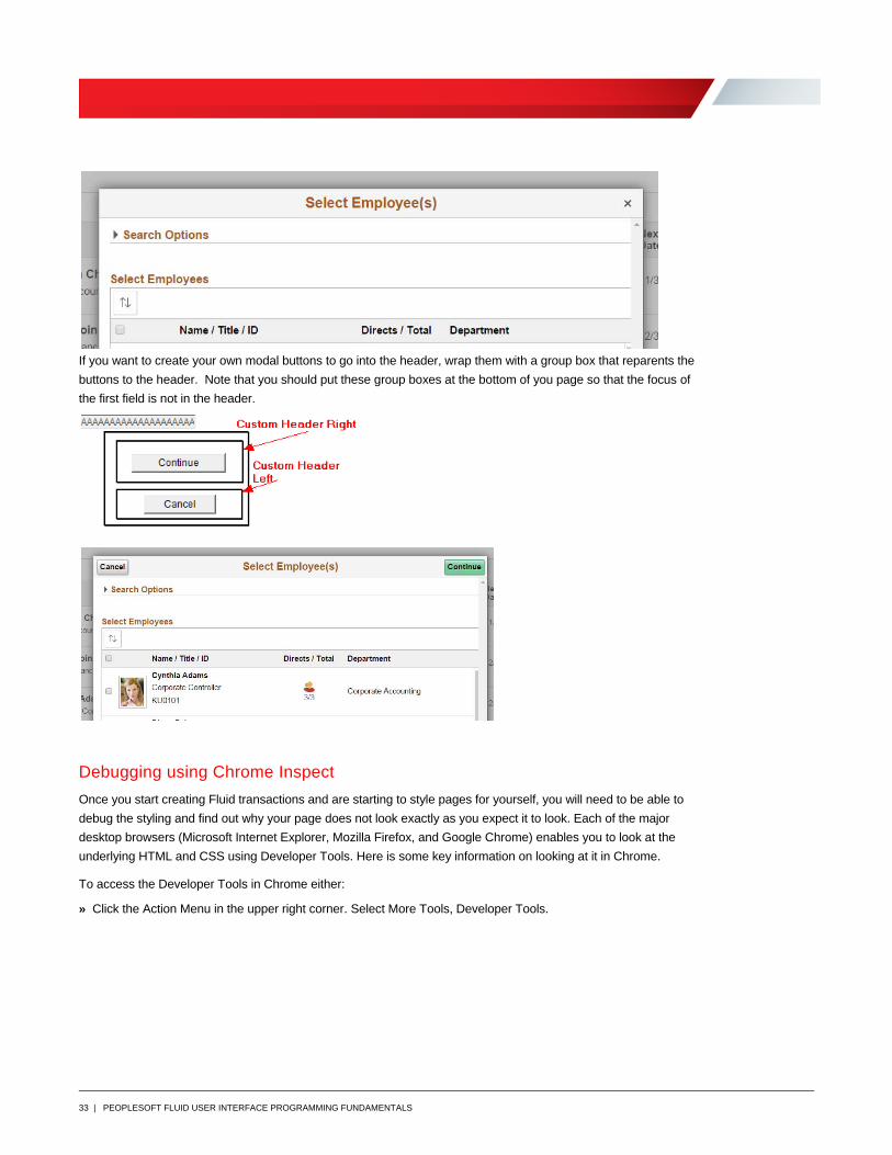
If you want to create your own modal buttons to go into the header, wrap them with a group box that reparents the
buttons to the header. Note that you should put these group boxes at the bottom of you page so that the focus of
the first field is not in the header.
Debugging using Chrome Inspect
Once you start creating Fluid transactions and are starting to style pages for yourself, you will need to be able to
debug the styling and find out why your page does not look exactly as you expect it to look. Each of the major
desktop browsers (Microsoft Internet Explorer, Mozilla Firefox, and Google Chrome) enables you to look at the
underlying HTML and CSS using Developer Tools. Here is some key information on looking at it in Chrome.
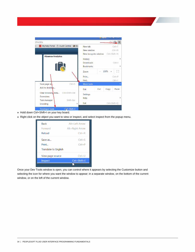
To access the Developer Tools in Chrome either:
» Click the Action Menu in the upper right corner. Select More Tools, Developer Tools.
34 | PEOPLESOFT FLUID USER INTERFACE PROGRAMMING FUNDAMENTALS
» Hold down Ctrl+Shift+I on your key board.
» Right click on the object you want to view or inspect, and select inspect from the popup menu.
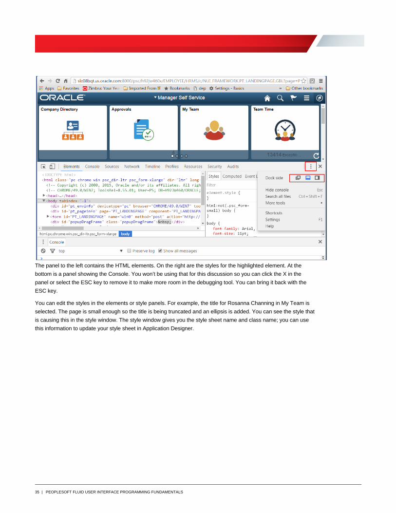
Once your Dev Tools window is open, you can control where it appears by selecting the Customize button and
selecting the icon for where you want the window to appear; in a separate window, on the bottom of the current
window, or on the left of the current window.
35 | PEOPLESOFT FLUID USER INTERFACE PROGRAMMING FUNDAMENTALS
The panel to the left contains the HTML elements. On the right are the styles for the highlighted element. At the
bottom is a panel showing the Console. You won’t be using that for this discussion so you can click the X in the
panel or select the ESC key to remove it to make more room in the debugging tool. You can bring it back with the
ESC key.
You can edit the styles in the elements or style panels. For example, the title for Rosanna Channing in My Team is
selected. The page is small enough so the title is being truncated and an ellipsis is added. You can see the style that
is causing this in the style window. The style window gives you the style sheet name and class name; you can use
this information to update your style sheet in Application Designer.
36 | PEOPLESOFT FLUID USER INTERFACE PROGRAMMING FUNDAMENTALS
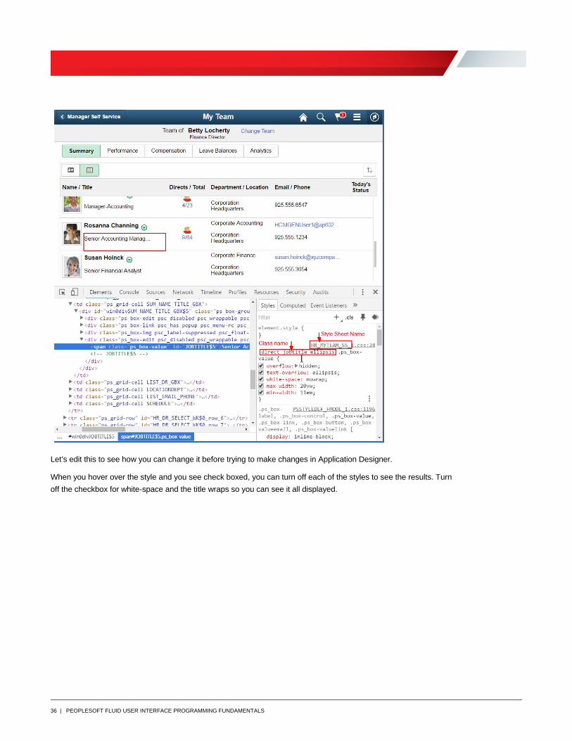
Let’s edit this to see how you can change it before trying to make changes in Application Designer.
When you hover over the style and you see check boxed, you can turn off each of the styles to see the results. Turn
off the checkbox for white-space and the title wraps so you can see it all displayed.

37 | PEOPLESOFT FLUID USER INTERFACE PROGRAMMING FUNDAMENTALS
Another way to edit it would be to click into the white-space value and change it to something you want. It has type
ahead to help you with valid values.
38 | PEOPLESOFT FLUID USER INTERFACE PROGRAMMING FUNDAMENTALS
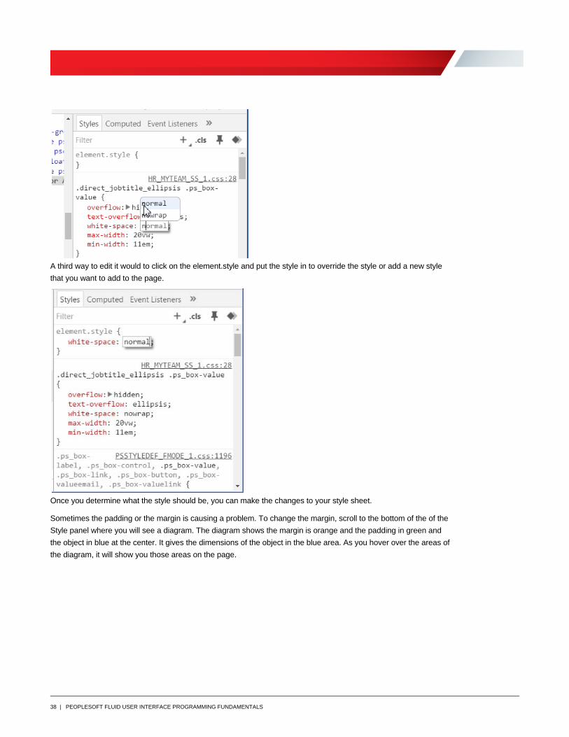
A third way to edit it would to click on the element.style and put the style in to override the style or add a new style
that you want to add to the page.
Once you determine what the style should be, you can make the changes to your style sheet.
Sometimes the padding or the margin is causing a problem. To change the margin, scroll to the bottom of the of the
Style panel where you will see a diagram. The diagram shows the margin is orange and the padding in green and
the object in blue at the center. It gives the dimensions of the object in the blue area. As you hover over the areas of
the diagram, it will show you those areas on the page.
39 | PEOPLESOFT FLUID USER INTERFACE PROGRAMMING FUNDAMENTALS
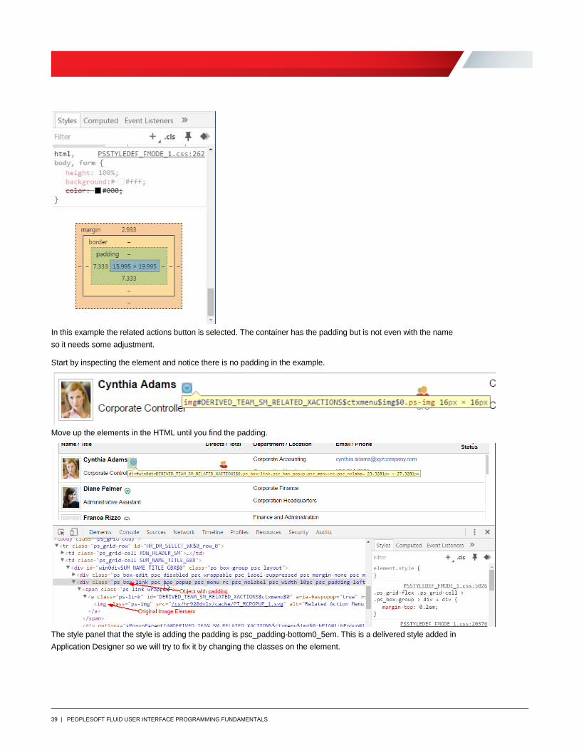
In this example the related actions button is selected. The container has the padding but is not even with the name
so it needs some adjustment.
Start by inspecting the element and notice there is no padding in the example.
Move up the elements in the HTML until you find the padding.
The style panel that the style is adding the padding is psc_padding-bottom0_5em. This is a delivered style added in
Application Designer so we will try to fix it by changing the classes on the element.
40 | PEOPLESOFT FLUID USER INTERFACE PROGRAMMING FUNDAMENTALS
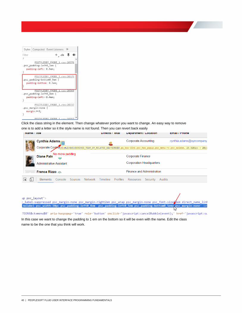
Click the class string in the element. Then change whatever portion you want to change. An easy way to remove
one is to add a letter so it the style name is not found. Then you can revert back easily
In this case we want to change the padding to 1 em on the bottom so it will be even with the name. Edit the class
name to be the one that you think will work.
41 | PEOPLESOFT FLUID USER INTERFACE PROGRAMMING FUNDAMENTALS
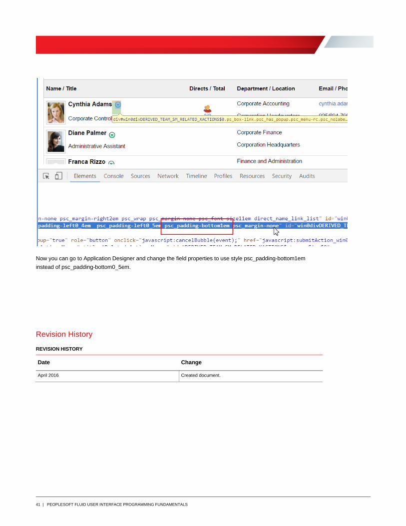
Now you can go to Application Designer and change the field properties to use style psc_padding-bottom1em
instead of psc_padding-bottom0_5em.
Revision History
REVISION HISTORY
Date Change
April 2016 Created document.
Oracle Corporation, World Headquarters
500 Oracle Parkway
Redwood Shores, CA 94065, USA
Worldwide Inquiries
Phone: +1.650.506.7000
Fax: +1.650.506.7200
Copyright © 2016, Oracle and/or its affiliates. All rights reserved. This document is provided for information purposes only, and the contents hereof are subject to change without notice. This document is not warranted to be error-free, nor subject to any other warranties or conditions, whether expressed orally or implied in law, including implied warranties and conditions of merchantability or fitness for a particular purpose. We specifically disclaim any liability with respect to this document, and no contractual obligations are formed either directly or indirectly by this document. This document may not be reproduced or transmitted in any form or by any means, electronic or mechanical, for any purpose, without our prior written permission. Oracle and Java are registered trademarks of Oracle and/or its affiliates. Other names may be trademarks of their respective owners. Intel and Intel Xeon are trademarks or registered trademarks of Intel Corporation. All SPARC trademarks are used under license and are trademarks or registered trademarks of SPARC International, Inc. AMD, Opteron, the AMD logo, and the AMD Opteron logo aretrademarks or registered trademarks of Advanced Micro Devices. UNIX is a registered trademark of The Open Group.0115 PeopleSoft Fluid User Interface Programming Fundamentals May 2016
C O N N E C T W I T H U S
blogs.oracle.com/oracle
facebook.com/oracle
twitter.com/oracle
oracle.com