pAtriCiA rAiLing AnD CArOLinE WALLiS Light painting painting.pdf · It is not known exactly when...
13
InCoRM Journal Vol. 2 Spring-Autumn • 2011 34 In his tribute to Olga Rozanova following her death in November 1918, Aleksandr Rodchenko wrote: Wasn’t it You who wanted to illuminate the world with cascades of colour? Wasn’t it You who designed colour compositions in the air with projectors? ...You thought of creating colour through light.” 1 It is not known exactly when Rozanova began composing paintings with coloured light using projectors but her paintings from 1915 to 1917 give convincing evidence of this. Then, between 1916 and 1919 most of the artists in her group were creating light paintings and this resulted in the April 1919 Moscow exhibition, Non-Objective Creation and Suprematism. It was the high point but only the mid-point for light painting because it continued into the 1920s, culminating, it could be said, with the canvases of the “Projectionists”, those painters of lights from electrical to cosmic. With the light projector Rozanova and her friends discovered a new means for exploring colour and it became one of the sources for the explosion of non-objective colour creations in Russia over the next ten years or so. The other means for capturing colour and light had also been initiated by Olga Rozanova in the use of spinning discs. Being a broad enquiry, this would be the subject of another article. 2 Rozanova, Innovator There is a clue as to when Rozanova was actively creating her first projected light paintings. In a letter that she wrote to Aleksei Kruchenykh of the summer of 1915 she says, “The screen is the only possible medium that can replace the material paints in non-objective painting!” 3 Now, “the screen” is a term found in a number of books on the theory of colour in light because the scientists were using projected beams of coloured light to discover the phenomena of light itself. One of these scientists was the American physicist, Ogden N. Rood, whose Modern Chromatics – Students’ Text- Book of Colour with Applications to Art and Industry was published in New York in 1879, then in French translation in 1881 when it had an enormous impact on the Impressionist and Neo-Impressionist painters. The Russian translation appeared in the 1890s. One of the primary investigations by the scientists was to discover, by experiment, how beams of colours combine and how certain combinations produce white light, a phenomenon known as the complementary colours of light. Rood illustrates this, 1, by showing how the mixing of yellow light and blue light, for example, in the correct proportions, produce white light, the caption reading, “Fig. 45. Two Magic Lanterns casting Yellow and Blue Light on the same Screen where it forms White.” 4 Patricia Railing has published widely on the Russian Avant-Garde. She is Director of Artists • Bookworks that is committed to the publication of reprints of early 20 th century artists’ books and writings. Her Alexandra Exter Paints appeared in October 2011. PATRICIA RAILING AND CAROLINE WALLIS Light Painting Caroline Wallis is a geometrician specialising in meteorology and cosmology. She has co-authored a number of articles on the Russian Avant-Garde with Patricia Railing and contributed to Alexandra Exter Paints.
Transcript of pAtriCiA rAiLing AnD CArOLinE WALLiS Light painting painting.pdf · It is not known exactly when...

InCoRM Journal Vol. 2 Spring-Autumn • 2011
34
In his tribute to Olga Rozanova following her death in November 1918, Aleksandr Rodchenko wrote:
Wasn’t it You who wanted to illuminate the world with cascades of colour?
Wasn’t it You who designed colour compositions in the air with projectors?
...You thought of creating colour through light.”1
It is not known exactly when Rozanova began composing paintings with coloured light using projectors but her paintings from 1915 to 1917 give convincing evidence of this. Then, between 1916 and 1919 most of the artists in her group were creating light paintings and this resulted in the April 1919 Moscow exhibition, Non-Objective Creation and Suprematism. It was the high point but only the mid-point for light painting because it continued into the 1920s, culminating, it could be said, with the canvases of the “Projectionists”, those painters of lights from electrical to cosmic.
With the light projector Rozanova and her friends discovered a new means for exploring colour and it became one of the sources for the explosion of non-objective colour creations in Russia over the next ten years or so. The other means for capturing colour and light had also been initiated by Olga Rozanova in the use of spinning discs. Being a broad enquiry, this would be the subject of another article.2
rozanova, innovator
There is a clue as to when Rozanova was actively creating her first projected light paintings. In a letter that she wrote to Aleksei Kruchenykh of the summer of 1915 she says,
“The screen is the only possible medium that can replace the material paints in non-objective painting!” 3
Now, “the screen” is a term found in a number of books on the theory of colour in light because the scientists were using projected beams of coloured light to discover the phenomena of light itself. One of these scientists was the American physicist, Ogden N. Rood, whose Modern Chromatics – Students’ Text-Book of Colour with Applications to Art and Industry was published in New York in 1879, then in French translation in 1881 when it had an enormous impact on the Impressionist and Neo-Impressionist painters. The Russian translation appeared in the 1890s.
One of the primary investigations by the scientists was to discover, by experiment, how beams of colours combine and how certain combinations produce white light, a phenomenon known as the complementary colours of light. Rood illustrates this, 1, by showing how the mixing of yellow light and blue light, for example, in the correct proportions, produce white light, the caption reading, “Fig. 45. Two Magic Lanterns casting Yellow and Blue Light on the same Screen where it forms White.”4
patricia railing has published widely on the russian Avant-garde.
She is Director of Artists • Bookworks that is committed to the
publication of reprints of early 20th century artists’ books and
writings. Her Alexandra Exter Paints appeared in October 2011.
pAtriCiA rAiLing AnD CArOLinE WALLiS
Light painting
Caroline Wallis is a geometrician specialising in meteorology and
cosmology. She has co-authored a number of articles on the
russian Avant-garde with patricia railing and contributed to
Alexandra Exter Paints.
35
InCoRM Journal Vol. 2 Spring-Autumn • 2011
1 • Ogden Rood, Modern Chromatics, 1879
Herein must lie the seed of an idea – or one similar to it – for Rozanova. From it she could explore, with her artist’s eye, the unlimited possibilities of composing with beams and spots of coloured light. Reading through Rood’s book there are countless descriptions of colour in light that could inspire a painter.
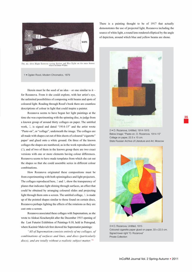
Rozanova seems to have begun her light paintings at the time she was experimenting with the spinning disc, to judge from a known group of around thirty collages on paper. The untitled work, 2, is signed and dated “1914-15” and the artist wrote “Paste-on”, or “collage”, underneath the image. The collages are all made with shapes cut out of thin sheets of coloured “cigarette” paper5 and glued onto a white ground. On three of the known collages the shapes are numbered, as in the work reproduced here (2), and of two of them in the known group there are two exact versions with one or more elements having colour differences. Rozanova seems to have made templates from which she cut out the shapes so that she could assemble series in different colour combinations.
How Rozanova originated these compositions must be from experimenting with both spinningdiscs and light projectors. The collages reproduced here, 2 and 3, show the transparency of planes that indicates light shining through surfaces, an effect that could be obtained by arranging coloured slides and projecting light through them onto a screen. The untitled collage, 3, is made up of the pointed shapes similar to those found on certain discs, Rozanova perhaps lighting the effects of the rotations as they are cast onto a screen.
Rozanova associated these collages with Suprematism, as she wrote to Aleksei Kruchenykh after the December 1915 opening of the Last Futurist Exhibition of Paintings 0.10, held in Petrograd, where Kazimir Malevich first showed his Suprematist paintings:
“All of Suprematism consists entirely of my collages, of combinations of surfaces and lines, and discs (particularly discs), and are totally without a realistic subject matter.”6
There is a painting thought to be of 1917 that actually demonstrates the use of projected light, Rozanova including the source of white light, a round lens rendered elliptical by the angle of depiction, around which blue and yellow beams are shone.
2 • O. Rozanova, Untitled, 1914-1915Below image: “paste-on. O. rozanova. 1914-15”Collage on paper, 22.5 x 15 cm.State russian Archive of Literature and Art, Moscow
3 • O. Rozanova, Untitled, 1915Coloured cigarette paper glued on paper, 33 x 22.5 cm. Signed lower right “O. rozanova”private Collection

36
InCoRM Journal Vol. 2 Spring-Autumn • 2011
4 • O. Rozanova, Non-Objective Painting, 1917Oil on canvas, 84.5 x 62 cm.Museum of Fine Arts, Baku
5 • O. Rozanova, Green Beam, c. 1917Oil on canvas, 71 x 53 cm.george Costakis Collection Museum of Contemporary Art, thessaloniki
This could be an extrapolation, perhaps, of Rood’s diagram (1) showing the separation of blue and yellow light albeit united in the lens of white light. Now the beams fall on surfaces and the mixture of the beams of colour create new colour planes. There are reflections of conical rays of blue light in the lower left corner of the canvas, and there is also refraction which can be seen in the displacement of the vertical yellow band. The depiction of refraction is often seen in other artists’ paintings, notably those of Ivan Kliun (see 8, 9, 10, 11), while Rozanova has incorporated two other features of light painting: transparent planes and a rim of prismatic colours around a lens – which in this case is displaced as it passes through another medium such as glass.7
Rozanova’s ultimate statement is the simple beam of green light. She must have captured this effect by cutting a narrow slit in a sheet of cardboard and placing it in front of the projector lens; through the slit the light would pass onto the white screen as a vertical beam. The beam is darker along its central axis and it shimmers at the edges where the light begins to diffuse the colour.
ivan Kliun paints Light
Ivan Kliun was the artist most fascinated by the many possibilities of painting light. His earliest known dated light paintings are from 1916 and he continued with his light and colour exploration in various groups of works to the end of his life in 1942.
Unfortunately not available in colour reproductions, two of the earliest dated light compositions, 6 and 7, depict a number of transparent planes, both circular and rectangular. A rim of prismatic colour does not often figure in Kliun’s compositions. What does, on the other hand, is another common device for capturing an effect of light. It is an edge of a circle having a feathery appearance while the rest of the shape, depending on the angle of light, is either washed away or revealed, as can be seen in the untitled gouache, 7.
Kliun showed nine paintings in the 1916 Knave of Diamonds exhibition in Moscow and they were listed together as “Non-Objective Creation
(Suprematism)”, with each work given an individual title, some of which refer specifically to light. These include, “On a Red Background”,
“Movement of Light Masses”, and “Specific Weight of the Colour Effect”. The titles reveal that the paintings are concerned with light phenomena and the laws of colour but these titles have not been matched to paintings. There are five known oils on canvas that must belong to this group based on compositional resemblance and the handling of surfaces.
One of these would be the canvas reproduced here, 8.

37
InCoRM Journal Vol. 2 Spring-Autumn • 2011
It is organised around the central white quadrilateral (a rhomboid) behind which are planes of colour on a dark surface – in a darkened room. On the right side of the composition a transparent pale blue circle of light hovers over the edge of the white quadrilateral behind which is a dark blue-black plane. Running down along these blue planes is a thin yellow line at the top of which is a short orange band on the horizontal.
On the left side of the white quadrilateral a small dark red rectangle is adjacent to a saturated red rectangle slipped underneath the white quadrilateral; behind the saturated red rectangle is a dark green circle. Kliun has thus put his light composition together according to the laws of complementary colours – blue and yellow, red and green – and according to the stages between light – the white quadrilateral, which is also a plane of light on the screen – and dark – the ground of the composition.
Hidden within this composition is a famous optical illusion of what appears to be a continuous straight line but which, when interrupted by a plane, is actually displaced in space. It is the phenomenon of how a stick in water appears bent and in light theory this effect is known as refraction.8
This phenomenon is revealed when the painting is diagrammed, 9. Also revealed is that the green circle and the circle inscribed in the white quadrilateral are congruent, establishing a geometrical order to the relationships of the planes.
Refraction of light becomes the very basis of the composition in another of Kliun’s paintings, 10, the watercolour (George Costakis Collection) for it being dated, “XX”, or 1920.
In this untitled painting (State Tretiakov Gallery, Moscow), 10, Kliun was composing with one idea: how the edge of a plane appears to bend as it passes through two beams of light, the complementary green and red, one of them seen shining in a different medium such as a glass lens. This is a single refraction, the line veering off at an angle, while the refraction depicted in the Yaroslavl painting, 8, is a double refraction, the beam of light passing through a medium having two parallel surfaces such as a sheet of glass.
A painting depicting intersecting beams of red and blue light, 12, was titled by Kliun on the back of the canvas, “Non-Objective Composition Based on the Principle of Light-Colour”. Kliun dated the watercolour for it, “1921”.
The large circle of red light is shone over a section of the small blue circle but the colours do not mix; both the red and the blue are intensified but the section does not change colour. This demonstrates that red and blue light do not mix.
On both the red and the blue circles Kliun has ranged areas of colours from light to dark. This demonstrates what the artists called the “weight” of colours as the tonal areas move from translucent (appearing light in weight) through
7 • I. Kliun, Untitled, 1916gouache on grey paper, 30.3 x 22.5 cm.initialled and dated lower right: “i. K. 16”private Collection
6 • I. Kliun, Untitled, 1916Watercolour on brown paper, 28.8 x 14.2 cm.initialled and dated lower left: “i.K. 16”private Collection

InCoRM Journal Vol. 2 Spring-Autumn • 2011
38
8 • I. Kliun, Non-Objective Composition (Suprematism), 1916Oil on canvas, 49 x 44 cm., initialled lower left: “i. Kl”Museum of Artistic Culture, 1920Yaroslavl Art Museum, 1921
10 • I. Kliun, Untitled, 1920Oil on cardboard, 73 x 39 cm.george Costakis Collection, Moscow State tretiakov gallery, Moscow
9 • Detail of 8 • with geometrical structure revealed, showing refraction of the yellow line.
11 • Detail of 10• showing refraction.

39
InCoRM Journal Vol. 2 Spring-Autumn • 2011
saturated (pure and without added light or darkness) to deep where they appear heavy.
The geometrical diagram is determined by the circles and the shadows thrown onto them. What is found is an internal hexagram in the large red circle, one of its sides fixing the position of the small blue circle, Kliun using geometry to reveal order in the composition.
Like Rozanova, Kliun refined his colour explorations down to the most basic by painting a radiant beam of light which he titled, Red Light. Spherical Composition, 14. That he should shift from a planar to a curved surface is significant because it may be the start of an entirely new series of light paintings having extraordinary complexity and ingenuity; it would be the subject for a future article.
Ivan Kliun’s extensive investigations into colour in light as well as light phenomena – reflection, refraction, displacement – were grounded in science. In an untitled and undated manuscript that opens with, “Colour, light, sweetness”, the artist describes how to begin an enquiry into light:
“If, in a darkened room, we project a ray of light through a small aperture, it will appear on the opposite wall as a bright corona. Now, if we place a triangular prism in the path of the ray then we will see the formation of a band containing colours such as red, orange, yellow, green, light blue, blue, and violet. This line is called a spectrum. At first glance it seems as though the spectrum contains only seven colours; however, this is an illusion since, in reality, it is comprised of innumerable colours.
To this day, scientists have been unable to determine exactly how many.”9
This is interesting because it shows that the artist was using the procedures and methods of scientific investigation out of which he drew the sheer beauty of the experience of light and colour phenomena. Kliun was truly the master of light painting in Russian Avant-Garde art.
14 • I. Kliun, Red Light. Spherical Composition, c. 1923Oil on canvas, 69.1 x 68.9 cm.george Costakis CollectionState Museum of Contemporary Art, thessaloniki
12 • I. Kliun, Non-Objective Composition Based on
the Principle of Light-Colour, 1921Oil on cardboard, 99 x 55.5 cm.State tretiakov gallery, Moscow
13 • Geometrical diagram of 12•. The colours are altered by the tracing paper overlay.

InCoRM Journal Vol. 2 Spring-Autumn • 2011
40
Kazimir Malevich’s “research into Colour”
In his 1920, SUPREMATISM . 34 Drawings, Kazimir Malevich writes that in 1917 he did “research into colour”.10 What that research consisted of cannot be understood outside of the context of painting light and so his paintings and drawings thought to be of that year begin to reveal themselves.
Malevich experimented with light phenomena using projectors in a number of ways, producing several groups of paintings that appear unrelated stylistically but in which the use of projectors is clearly the source of the compositions.
Like Kliun, Malevich did a small group of paintings in which light refraction is a key factor. This can be seen in a painting on the back of which Malevich wrote, “Supremus”, to which he added “562”, undoubtedly an inventory number, 15. Here, a ray of red light can be seen to be deflected as it passes obliquely through a medium having two parallel surfaces such as a sheet of glass (16). Also in this painting, as in others of 1917, Malevich has incorporated the shapes of light reflections in the upper right-hand corner.
In another group of two known paintings Malevich described one of them as the “diffusion of the plane” – by which is meant, the plane ofcolour is being “diffused” in light.
If one places a coloured glass slide – say, yellow – in front of a beam of projected light, and then in front of it puts a heavy card in which a small shape has been cut out, the image thrown onto the screen is a large, luminous colour in that shape. The quality and depth of the coloured light is spectacular, it appears to shimmer slightly, and the edges may be sharp or fading, depending on the way the cut-out is held in front of the beam. At an angle, the edge furthest away from the beam begins to dissipate in intensity and sharpness.
The fact that both the known paintings in this group, 17 and 18, have become so much larger than paintings of the previous years could suggest that Malevich was adapting the canvas to his own, physical, experience of the coloured light as it expanded over a large surface. There, the colour literally seems to envelop the viewer, who enters the coloured space as one enters a light work by James Turrell.11 Now the spectator enters the light-filled space of the painting.
Finally, Malevich would draw the logical conclusion of light in his 1918 to early 1919 series referred to as “White on White”. As Varvara Stepanova recorded in her diary of February 1919, Aleksei Gan had said that “Malevich has produced something amazing”.12 This was the result of understanding the conjunction of light as pure forces (electricity and magnetism) and its visible manifestation in the traces of these forces depicted as
15 • K. Malevich, Supremus, 1917Oil on canvas, 88.4 x 64.2 cm.private Collection
16 • Diagram of 15• showing refraction

InCoRM Journal Vol. 2 Spring-Autumn • 2011
4117 • K. Malevich, Supremus, 1917Oil on canvas, 106 x 70.5 cm.Stedelijk Museum, Amsterdam
18 • K. Malevich, Supremus, 1917Oil on canvas, 138 x 78 cm.nikolai Khardzhiev Collection, Moscowprivate Collection
19 • K. Malevich, four “White on White” paintings. part of the installation of the 16th State Exhibition – Kazimir Malevich . His path from impressionism to Suprematism, Moscow, March 1920.
textured shapes revealing “pure and speeding light”. Malevich called these paintings “colourless”, “abstract Suprematism” and “pure, Suprematist non-objectivity”.1
the SUprEMUS Society of Artists
Malevich gave the painting with the large red-brown rectangle, 18, the title, Supremus (written on the back of the canvas). This indicates that it, together with the Stedelijk Museum yellow painting, 19, would belong to works that arose out of the ideas and experiments of the Supremus group of artists. The group was formed in the spring of 1916 and lasted until sometime into 1918.
Known to have belonged to this group were Olga Rozanova, Ivan Kliun, Liubov Popova, Nadezhda Udaltsova, Mikhail Menkov and, of course, Kazimir Malevich. It is thought that Alexandra Exter would come to the meetings as would Aleksandr Rodchenko.
The purpose of the group was to explore theories of light, to discuss the new arts of Cubism, Futurism, and Suprematism, to understand their theory and how they revealed a given artistic consciousness. Perhaps, even, how the given styles were related to the other arts and to a given social consciousness.
The SUPREMUS Society of Artists planned to publish a journal, Supremus, and three issues were prepared, one on each of the three new artistic styles. Unfortunately, the journal

42
InCoRM Journal Vol. 2 Spring-Autumn • 2011
did not appear, although a number of writings and articles have come to light. They do not, however, reveal much more than hints about the artists’ ideas concerning colour and light nor do they refer to the creative processes they were engaged in. So the reason Malevich titled some of his works – and in this instance the large red-brown plane “in dispersion” – must be an important clue. Based on the paintings by three of the artists belonging to the SUPREMUS Society of Artists discussed so far, and on the fact that they are all concerned with painting light during these same years, it may be deduced that theories of
colour and light would also have been part of their discussions, if not the essence of them.
The light paintings of Alexandra Exter and Mikhail Menkov seem to rely almost exclusively on the spinning disc, while Liubov Popova’s Painterly Architectonics of 1918 appear to be inspired by spot lights, but this needs more investigation. For his part, the painting of Aleksandr Rodchenko between 1917 and 1919 is thoroughly informed by light theory and realised in the use of the projector.
20 • A. Rodchenko, Composition No. 61, 1918 From the series, “Concentration of Colour and Forms”Oil on canvas, 40 x 38 cm.Museum of Fine Arts, tula
21 • Geometrical diagram of 20•
22 • Fig. 14 – Triple rainbow C. Flammarion, The Atmosphere, 1874
23 • Geometrical diagram of 22•

43
InCoRM Journal Vol. 2 Spring-Autumn • 2011
Aleksandr rodchenko’s “Concentration of Colour”
Younger than the other artists in the SUPREMUS Society of Artists, Aleksandr Rodchenko first exhibited with them, and others, in Futurists – The Store, organised by Vladimir Tatlin in March 1916, held in Moscow. It was in 1918 that Rodchenko’s painting clearly reveals that he had begun to work with light projectors. This was particularly in a series of paintings that he called, “Concentration of Colour and Forms”, of which as many as ten oils on canvas are known, and there may be others. The “Concentration of Colour and Forms” are created with circles of light projected onto a screen using a variety of techniques.
Composition No. 61, 20, is given this number in the artist’s house list where he annotates it, writing:
“Coloured emission of the mass in contrast to a linear ring.”14
Here, Rodchenko would have shone a beam of yellow light onto a screen in a darkened room, the artist retaining this as the black ground of the canvas. The rim of the projector lens would have thrown its red corona onto the screen as well, which Rodchenko incorporated into the composition.
Now Rodchenko’s experiments with coloured light phenomena using projectors were determined, it would seem, by his interest in atmospheric and cosmic phenomena. He had a number of scientific treatises in his library (in Russian translations), some of them referred to by the artist’s grandson, Alexander Lavrentiev, in his article, “On Priorities and Patents”, published in the catalogue of a large retrospective, Rodchenko, held at the Museum of Modern Art in New York in 1998. These scientific books include The Atmosphere (1871/2; English translation 1874) by the 19th century French meteorologist, Camille Flammarion, and the authoritative treatise, The Sun (1881), by the American physicist, Charles A. Young.15
Rodchenko seems to have been fascinated by the exquisite geometrical perfection of light and cosmic phenomena, a geometrical perfection necessary to their occurrence and, by extension, to natural and cosmic order.
In Flammarion’s, The Atmosphere, there is a woodcut showing a triple rainbow, 22, the rainbow being a phenomenon of the reflection and refraction of light on water crystals in the air.
However perfect it appears in its pristine outlines, the beauty of the triple rainbow is revealed in its perfect geometry, as can be seen in the diagram, 23. It is the same geometry that Rodchenko used for his Composition No. 61, 20 and 21, but it is not the same composition and, indeed, the artist could have found his inspiration in any number of rainbows and halos where the structure is the same.
The yellow circle in the painting is described by Rodchenko as a “coloured emission of the mass”, “emission” strictly meaning the energy released from a source in the form of electromagnetic radiation. Hence Rodchenko is stating specifically that this yellow circle is a beam of projected light. Like Malevich’s textured surfaces in “colourless” Suprematism, Rodchenko handles the colours and surfaces to convey light. The area above the corona is a true lemon yellow while the area within the corona is affected by the lens and veers towards an ochre yellow. Rodchenko has made the yellow circle granular so that light will reflect off it and appear to shimmer slightly. Here lies the reason for the insistence on qualities of textures at the time, faktura: they are means of conveying light as kinds of radiation.
Red coronas, often tinged with yellow, appear in all manner of rainbow and halo phenomena. They are red because they are at the edge of light, as in the sunset; were they at the edge of darkness they would be blue, as at sunrise. This phenomenon is also seen in the prism. In Composition No. 61 the corona is red because the rim of the lens is at the edge of light.
In Composition 56 (or 76), 24, Rodchenko has depicted two circles in which a beam of light casts brightness on the smaller circles and their shadows onto the larger circle. The shapes of the beams of brightness reveal that Rodchenko is projecting the beams onto a convex curved surface, a sphere, and this is demonstrated in the geometrical diagram, 25. Rodchenko has moved from the plane to space.
24 • A. Rodchenko, Composition No. 56/76, 1918(Annotated as “transformation of a plane by Means of Working on its texture”) Oil on canvas, 88.5 x 70.5 cm.State tretiakov gallery, Moscow

InCoRM Journal Vol. 2 Spring-Autumn • 2011
44
25 • Geometrical diagram of 24•
The diagram reveals that the luminous areas on the small black circle are made up of three circles, two of which are congruent and interlocking from their centres. Where the top-most of these small circles touches the circumference of the large black circle, it also intersects the circumference of the larger circle of the adjacent white area. This white circle intersects the black circle as if a circular beam has been projected perpendicular to a spherical surface. The two smallest circles reveal an elliptical shape as if the cone of light was projected upon a spherical surface at another angle.
painting Colour in Light
That Rodchenko was using geometry and its tools – rule and compasses – was remarked on by him in several texts, but he was not always referring to himself alone. In his 1921 article, “The Line”, he writes that,
“non-objectivity...introduced completely new techniques of painting, more expedient for its forms – geometrically simple, clear and precise.... [The] brush...was displaced by the press, the
roller, the drawing-pen, the compasses, etc.”16 Rodchenko then goes on to equate “pure colour” with “the
spectrum” and says that,“Non-objectivity cultivated colour as such and concerned
itself with the full revelation thereof, its processing, its condition, giving it depth, intensity, density, weight, etc.”17
“Colour”, then, means “colour of the spectrum”, which is “colour as such” – i.e., light – while “depth, intensity, density, weight” are the means of revealing light as tones and with various textures – as can be seen in the paintings reproduced herein.
In the “Manifesto of the Suprematists and Non-Objectivists” drafted by Rodchenko for the forthcoming exhibition of April 1919, the 10th State Exhibition - Non-Objective Creation and Suprematism (Moscow), Rodchenko declared triumphantly about his own work,
“People, look, here is my latest feat: the concentration of colour. The world [or The light] of colour.”
Then he goes on to proclaim for the exhibitors:“We are the founders of non-objectivity.Of colour as such.Of tone as such.”18 The contributors to this exhibition were the members
of the SUPREMUS Society of Artists and all the work was Suprematist or Non-Objective. It would have been the first large-scale exhibition of abstract painting, ever, the walls covered with canvases of glowing, shimmering, luminous or brilliant colours and lights painted by Olga Rozanova, Ivan Kliun, Kazimir Malevich, Aleksandr Rodchenko, and others in their group.19
It was an exhibition of “colour as such”, the colours of light rendered in all their radiant variety in accordance with the laws of colour in light, and in accordance with the principles of light itself. In using light projectors the artists were revealing light as they composed with its colours. This is what made their works absolutely non-objective and Suprematist.
In his 1918, “Declaration to the Suprematists”, Kazimir Malevich wrote:
“The world of things [in art] will disappear and colour, sound, letter, and volume will establish their form. A texture, whence the pure and speeding light will enter infinity as a phenomenon of the new realities, will manifest itself.”20
The Non-Objectivist, Varvara Stepanova, saw it in another way –
“Neither canvases nor paints will be necessary in the future and it could be that future creativity will take place with the help of that very same radium: the artist will ‘radiate’ creations on his walls with the aid of some sort of invisible means, without using paints, brushes, canvases. They will glow with extraordinary and hitherto unknown colours... [1919].”21
We would seem to be projected into the future and into the light world of a James Turrell or beyond...

InCoRM Journal Vol. 2 Spring-Autumn • 2011
45
Footnotes
[1] A. Rodchenko, “Arts”, Anarkhia, February 1919, in A. Rodchenko, Experiments for the Future - Diaries, Essays, Letters, and Other Writings, New York: The Museum of Modern Art, 2005, 84.
[2] The use of the disc is discussed at length in P. Railing, Colour into Light – Towards Non-Objective Creation and Suprematism, forthcoming. The disc was wonderfully exploited by Alexandra Exter in her non-objective paintings and costume designs from 1916. See P. Railing, Alexandra Exter Paints, October 2011, Chapter 6.
[3] O. Rozanova, “Letter to Aleksei Kruchenykh”, December 1915, in Amazons of the Russian Avant-Garde, John E. Bowlt and M. Drutt, Editors, London: Royal Academy of Art, 326.
[4] Ogden N. Rood, “On the Mixture of Colours”, Modern Chromatics – Students’ Text-Book of Colour with Applications to Art and Industry, 1879, p. 125. Reprint New York: Van Nostrand Reinhold Company, 1973, 155.
[5] The paper is specifically “cigarette” paper. The cigarette manufacturers, Sobranie, introduced coloured papers and the “Cocktail” slims which became very fashionable in the early 20th century. Their colours included black, white, red, sky blue, yellow, green and lilac, colours that Rozanova used for her collages. They are still manufactured today.
[6] O. Rozanova, “Letter to Aleksei Kruchenykh”, December 1915, in Amazons of the Russian Avant-Garde, John E. Bowlt and M. Drutt, Editors, London: Royal Academy of Art, 326-7.
[7] “Displacement” here is the apparent change of place due to an optical phenomenon rather than to an actual change of place. In light theory a corona may appear displaced when it passes from one medium to another of a different density such as glass.
“Reflection” is the process or act of reflecting something, especially light, sound, or heat. Here it is the image of shapes that appear on a reflecting surface such as the screen.
“Refraction” is the change in direction that occurs when
a wave of energy such as light passes from one medium to another of a different density, for example, from air to a reflecting surface such as glass.
[8] See footnote 7.[9] I. Kliun, “Colour, Light, Sweetness...” in Light and
Colour in the Russian Avant-Garde, The George Costakis Collection from the State Museum of Contemporary Art, Thessaloniki, 2004, 449.
[10] K. Malevich, SUPREMATISM . 34 Drawings, UNOVIS, Vitebsk, 1920. Reprint by Artists . Bookworks, Forest Row, East Sussex, 1990.
[11] Malevich would reinterpret this group of works, as all his Suprematist painting, classifying it as the 4th Phase of Suprematism, The Sensation of Non-Existence, in a manuscript, “Suprematism. The Domination of Pure Abstract and Non-Objective Art. Phases of its Development”, of around 1927. This reinterpretation had been formalised when he was teaching at the Practical Art Institute in Vitebsk between late 1919 and mid 1922. Prior to that – 1917 or 1918 – Malevich had begun to interpret Suprematism as a philosophy of light but as painting, Suprematism was created only with and according to the laws of colour in light and the science of light.
[12] V. Stepanova, “Notes from the Diary on the Preparation and Management of the 10th and 19th State Exhibitions”, “17 February 1919”, in Aleksandr M. Rodchenko & Varvara F. Stepanova: The Future is Our Only Goal, Peter Noever, Editor, London: Prestel, 1991, 124.
[13] K. Malevich, “Declaration of the Suprematists”, 1918, in A Legacy Regained – Nikolai Khardzhiev and the Russian Avant-Garde, St. Petersburg: Palace Editions, 2002, p. 234. “Pure, Suprematist non-objectivity” is quoted from K. Malevich, “Cubism Destroys”, 1918, Ibid., 231.
[14] A. Rodchenko, “A Laboratory Passage Through the Art of Painting and Constructive-Spatial Forms Towards the Industrial Initiative of Constructivism”, in A. Rodchenko, Experiments for the Future – Diaries, Essays, Letters, and Other Writings, New York: The Museum of Modern Art, 2005, 126.
[15] For a demonstration of how Rodchenko was inspired by some scientific phenomena described in these two texts see, P. Railing and C. Wallis, “Beyond the Horizon: Coherent Geometric Systems in Rodchenko‘s Painting”, The Structurist, Saskatoon: University of Saskatchewan, No. 49/50, 2009-2010, 66-73.
[16] A. Rodchenko, “The Line”, in Aleksandr M. Rodchenko

46
InCoRM Journal Vol. 2 Spring-Autumn • 2011
& Varvara F. Stepanova: The Future is Our Only Goal, Peter Noever, Editor, London: Prestel, 1991, 134.
[17] Ibid.[18] A. Rodchenko, “Manifesto of the Suprematists and
Non-Objectivists”, in Ibid., 122.[19] The exhibitors were listed in the catalogue as follows:
Agarykh (V. Stepanova), Alexander Vesnin, N. M. Davydova, I. Kliun, K. Malevich, Liubov Popova, Olga Rozanova, Rodchenko. Apart from Vesnin, each painter contributed a short article and they are found in John E. Bowlt, Editor, Russian Art of the Avant-Garde: Theory and Criticism 1902-1934, New York: The Viking Press, 1976, pp. 138-151.
[20] K. Malevich, “Declaration of the Suprematists”, 1918, in A Legacy Regained – Nikolai Khardzhiev and the Russian Avant-Garde, St. Petersburg: Palace Editions, 2002, 234.
[21] V. Stepanova, “Thoughts on Aleksandr Rodchenko‘s Art”, in Aleksandr M. Rodchenko & Varvara F. Stepanova: The Future is Our Only Goal, Peter Noever, Editor, London: Prestel, 1991, 136.