
Package ‘shinydashboardPlus’ · 2018-07-05 · Maintainer David Granjon Description Extend...
54
Package ‘shinydashboardPlus’ July 5, 2018 Type Package Title Add some 'AdminLTE2' Components to 'shinydashboard' Version 0.5.0 Maintainer David Granjon <[email protected]> Description Extend 'shinydashboard' with 'AdminLTE2' components. 'AdminLTE2' is a free 'Bootstrap 3' dashboard template available at <https://adminlte.io>. Customize boxes, add timelines and a lot more. License GPL-2 Imports shiny, htmltools, shinydashboard Suggests styler (>= 1.0.2), shinyAce, shinyWidgets, shinyjqui, knitr, rmarkdown URL https://github.com/DivadNojnarg/shinydashboardPlus, http://130.60.24.205/shinydashboardPlus/# BugReports https://github.com/DivadNojnarg/shinydashboardPlus/issues Encoding UTF-8 LazyData true RoxygenNote 6.0.1 VignetteBuilder knitr NeedsCompilation no Author David Granjon [aut, cre], Almasaeed Studio [ctb, cph] (AdminLTE2 theme for Bootstrap 3), Winston Chang [ctb, cph] (Functions from shinydashboard), Victor Perrier [ctb] (improved the shinydashboardPlusGallery) Repository CRAN Date/Publication 2018-07-05 15:20:03 UTC 1
Transcript of Package ‘shinydashboardPlus’ · 2018-07-05 · Maintainer David Granjon Description Extend...

Package ‘shinydashboardPlus’July 5, 2018
Type Package
Title Add some 'AdminLTE2' Components to 'shinydashboard'
Version 0.5.0
Maintainer David Granjon <[email protected]>
Description Extend 'shinydashboard' with 'AdminLTE2' components.'AdminLTE2' is a free 'Bootstrap 3' dashboard template availableat <https://adminlte.io>.Customize boxes, add timelines and a lot more.
License GPL-2
Imports shiny, htmltools, shinydashboard
Suggests styler (>= 1.0.2), shinyAce, shinyWidgets, shinyjqui, knitr,rmarkdown
URL https://github.com/DivadNojnarg/shinydashboardPlus,
http://130.60.24.205/shinydashboardPlus/#
BugReports https://github.com/DivadNojnarg/shinydashboardPlus/issues
Encoding UTF-8
LazyData true
RoxygenNote 6.0.1
VignetteBuilder knitr
NeedsCompilation no
Author David Granjon [aut, cre],Almasaeed Studio [ctb, cph] (AdminLTE2 theme for Bootstrap 3),Winston Chang [ctb, cph] (Functions from shinydashboard),Victor Perrier [ctb] (improved the shinydashboardPlusGallery)
Repository CRAN
Date/Publication 2018-07-05 15:20:03 UTC
1

2 R topics documented:
R topics documented:accordion . . . . . . . . . . . . . . . . . . . . . . . . . . . . . . . . . . . . . . . . . . 3accordionItem . . . . . . . . . . . . . . . . . . . . . . . . . . . . . . . . . . . . . . . . 4appButton . . . . . . . . . . . . . . . . . . . . . . . . . . . . . . . . . . . . . . . . . . 5attachmentBlock . . . . . . . . . . . . . . . . . . . . . . . . . . . . . . . . . . . . . . 6blockQuote . . . . . . . . . . . . . . . . . . . . . . . . . . . . . . . . . . . . . . . . . 7boxComment . . . . . . . . . . . . . . . . . . . . . . . . . . . . . . . . . . . . . . . . 8boxPad . . . . . . . . . . . . . . . . . . . . . . . . . . . . . . . . . . . . . . . . . . . 9boxPlus . . . . . . . . . . . . . . . . . . . . . . . . . . . . . . . . . . . . . . . . . . . 10boxProfile . . . . . . . . . . . . . . . . . . . . . . . . . . . . . . . . . . . . . . . . . . 12boxProfileItem . . . . . . . . . . . . . . . . . . . . . . . . . . . . . . . . . . . . . . . 13boxProfileItemList . . . . . . . . . . . . . . . . . . . . . . . . . . . . . . . . . . . . . 14dashboardHeaderPlus . . . . . . . . . . . . . . . . . . . . . . . . . . . . . . . . . . . . 14dashboardLabel . . . . . . . . . . . . . . . . . . . . . . . . . . . . . . . . . . . . . . . 16dashboardPagePlus . . . . . . . . . . . . . . . . . . . . . . . . . . . . . . . . . . . . . 17descriptionBlock . . . . . . . . . . . . . . . . . . . . . . . . . . . . . . . . . . . . . . 18dropdownDivider . . . . . . . . . . . . . . . . . . . . . . . . . . . . . . . . . . . . . . 20dropdownItem . . . . . . . . . . . . . . . . . . . . . . . . . . . . . . . . . . . . . . . . 20dropdownItemList . . . . . . . . . . . . . . . . . . . . . . . . . . . . . . . . . . . . . . 21gradientBox . . . . . . . . . . . . . . . . . . . . . . . . . . . . . . . . . . . . . . . . . 21loadingState . . . . . . . . . . . . . . . . . . . . . . . . . . . . . . . . . . . . . . . . . 22menuIcon . . . . . . . . . . . . . . . . . . . . . . . . . . . . . . . . . . . . . . . . . . 23menuInfo . . . . . . . . . . . . . . . . . . . . . . . . . . . . . . . . . . . . . . . . . . 24navPills . . . . . . . . . . . . . . . . . . . . . . . . . . . . . . . . . . . . . . . . . . . 24navPillsItem . . . . . . . . . . . . . . . . . . . . . . . . . . . . . . . . . . . . . . . . . 25productList . . . . . . . . . . . . . . . . . . . . . . . . . . . . . . . . . . . . . . . . . 26productListItem . . . . . . . . . . . . . . . . . . . . . . . . . . . . . . . . . . . . . . . 27rightSidebar . . . . . . . . . . . . . . . . . . . . . . . . . . . . . . . . . . . . . . . . . 28rightSidebarMenu . . . . . . . . . . . . . . . . . . . . . . . . . . . . . . . . . . . . . . 29rightSidebarMenuItem . . . . . . . . . . . . . . . . . . . . . . . . . . . . . . . . . . . 31rightSidebarTabContent . . . . . . . . . . . . . . . . . . . . . . . . . . . . . . . . . . . 31rightSidebarTabItem . . . . . . . . . . . . . . . . . . . . . . . . . . . . . . . . . . . . 32rightSidebarTabList . . . . . . . . . . . . . . . . . . . . . . . . . . . . . . . . . . . . . 32rigthSidebarPanel . . . . . . . . . . . . . . . . . . . . . . . . . . . . . . . . . . . . . . 32setShadow . . . . . . . . . . . . . . . . . . . . . . . . . . . . . . . . . . . . . . . . . . 33shinydashboardPlusGallery . . . . . . . . . . . . . . . . . . . . . . . . . . . . . . . . . 35socialBox . . . . . . . . . . . . . . . . . . . . . . . . . . . . . . . . . . . . . . . . . . 35socialButton . . . . . . . . . . . . . . . . . . . . . . . . . . . . . . . . . . . . . . . . . 37starBlock . . . . . . . . . . . . . . . . . . . . . . . . . . . . . . . . . . . . . . . . . . 38timelineBlock . . . . . . . . . . . . . . . . . . . . . . . . . . . . . . . . . . . . . . . . 39timelineEnd . . . . . . . . . . . . . . . . . . . . . . . . . . . . . . . . . . . . . . . . . 40timelineItem . . . . . . . . . . . . . . . . . . . . . . . . . . . . . . . . . . . . . . . . . 41timelineItemMedia . . . . . . . . . . . . . . . . . . . . . . . . . . . . . . . . . . . . . 42timelineLabel . . . . . . . . . . . . . . . . . . . . . . . . . . . . . . . . . . . . . . . . 42timelineStart . . . . . . . . . . . . . . . . . . . . . . . . . . . . . . . . . . . . . . . . . 43todoList . . . . . . . . . . . . . . . . . . . . . . . . . . . . . . . . . . . . . . . . . . . 43todoListItem . . . . . . . . . . . . . . . . . . . . . . . . . . . . . . . . . . . . . . . . . 45

accordion 3
userList . . . . . . . . . . . . . . . . . . . . . . . . . . . . . . . . . . . . . . . . . . . 45userListItem . . . . . . . . . . . . . . . . . . . . . . . . . . . . . . . . . . . . . . . . . 47userPost . . . . . . . . . . . . . . . . . . . . . . . . . . . . . . . . . . . . . . . . . . . 47userPostMedia . . . . . . . . . . . . . . . . . . . . . . . . . . . . . . . . . . . . . . . . 49userPostToolItem . . . . . . . . . . . . . . . . . . . . . . . . . . . . . . . . . . . . . . 49userPostToolItemList . . . . . . . . . . . . . . . . . . . . . . . . . . . . . . . . . . . . 50verticalProgress . . . . . . . . . . . . . . . . . . . . . . . . . . . . . . . . . . . . . . . 50widgetUserBox . . . . . . . . . . . . . . . . . . . . . . . . . . . . . . . . . . . . . . . 51
Index 54
accordion AdminLTE2 accordion container
Description
Create an accordion container
Usage
accordion(...)
Arguments
... slot for accordionItem.
Author(s)
David Granjon, <[email protected]>
Examples
if (interactive()) {library(shiny)library(shinydashboard)shinyApp(ui = dashboardPage(dashboardHeader(),dashboardSidebar(),dashboardBody(box(title = "Accordion Demo",accordion(
accordionItem(id = 1,title = "Accordion Item 1",color = "danger",collapsed = TRUE,"This is some text!"
),

4 accordionItem
accordionItem(id = 2,title = "Accordion Item 2",color = "warning",collapsed = FALSE,"This is some text!"
),accordionItem(
id = 3,title = "Accordion Item 3",color = "info",collapsed = FALSE,"This is some text!"
))
)),title = "Accordion"
),server = function(input, output) { })
}
accordionItem AdminLTE2 accordion item
Description
Create an accordion item to put inside an accordion container
Usage
accordionItem(..., id, title = NULL, color = NULL, collapsed = TRUE)
Arguments
... text to write in the item.
id unique item id.
title item title.
color item color: see here for a list of valid colors https://adminlte.io/themes/AdminLTE/pages/UI/general.html.
collapsed Whether to expand or collapse the item. TRUE by default. Set it to FALSE ifyou want to expand it.
Author(s)
David Granjon, <[email protected]>

appButton 5
appButton AdminLTE2 special large button
Description
Create a large button ideal for web applications
Usage
appButton(url = NULL, label = NULL, icon = NULL, enable_badge = FALSE,badgeColor = NULL, badgeLabel = NULL)
Arguments
url if the button should redirect somewhere.
label button label.
icon button icon, if any. Should be written like "fa fa-times".
enable_badge Whether to display a badge on the top-right corner of the button.
badgeColor color of the badge: see here for a list of valid colors https://adminlte.io/themes/AdminLTE/pages/UI/general.html.
badgeLabel text to display in the badge. I personally recommend you to only put numbers.
Author(s)
David Granjon, <[email protected]>
Examples
if (interactive()) {library(shiny)library(shinydashboard)shinyApp(ui = dashboardPage(dashboardHeader(),dashboardSidebar(),dashboardBody(box(title = "App Buttons",status = NULL,appButton(
url = "http://google.com",label = "Users",icon = "fa fa-users",enable_badge = TRUE,badgeColor = "purple",badgeLabel = 891
),
6 attachmentBlock
appButton(label = "Edit",icon = "fa fa-edit",enable_badge = FALSE,badgeColor = NULL,badgeLabel = NULL
),appButton(
label = "Likes",icon = "fa fa-heart-o",enable_badge = TRUE,badgeColor = "red",badgeLabel = 3
))),title = "Buttons"
),server = function(input, output) { })
}
attachmentBlock AdminLTE2 attachment container
Description
Create an attachment container, nice to wrap articles...
Usage
attachmentBlock(..., src = NULL, title = NULL, title_url = NULL)
Arguments
... any element.
src url or path to the image.
title attachment title.
title_url external link.
Author(s)
David Granjon, <[email protected]>

blockQuote 7
Examples
if (interactive()) {library(shiny)library(shinydashboard)shinyApp(ui = dashboardPage(dashboardHeader(),dashboardSidebar(),dashboardBody(box(title = "Attachment example",attachmentBlock(src = "http://kiev.carpediem.cd/data/afisha/o/2d/c7/2dc7670333.jpg",title = "Test",title_url = "http://google.com","This is the content")
)),title = "AttachmentBlock"
),server = function(input, output) { })
}
blockQuote AdminLTE2 block quote
Description
If you want to quote text
Usage
blockQuote(..., side = "left")
Arguments
... any element.
side blockauote orientation. "left" by default, can be set to "right".
Author(s)
David Granjon, <[email protected]>

8 boxComment
Examples
if (interactive()) {library(shiny)library(shinydashboard)shinyApp(ui = dashboardPage(dashboardHeader(),dashboardSidebar(),dashboardBody(box(title = "BlockQuote example",blockQuote("I quote some text here!")
)),title = "blockQuote"
),server = function(input, output) { })
}
boxComment AdminLTE2 box comment
Description
Create box comment
Usage
boxComment(..., src = NULL, title = NULL, date = NULL)
Arguments
... comment content.
src author image, if any.
title comment title.
date date of publication.
Author(s)
David Granjon, <[email protected]>
boxPad 9
boxPad AdminLTE2 vertical block container
Description
Create a vertical container for descriptionBlock.
Usage
boxPad(..., color = NULL, style = NULL)
Arguments
... any element such as descriptionBlock.
color background color: see here for a list of valid colors https://adminlte.io/themes/AdminLTE/pages/UI/general.html.
style custom CSS, if any.
Author(s)
David Granjon, <[email protected]>
Examples
if (interactive()) {library(shiny)library(shinydashboard)shinyApp(ui = dashboardPage(dashboardHeader(),dashboardSidebar(),dashboardBody(box(title = "Box with right pad",status = "warning",fluidRow(
column(width = 6),column(
width = 6,boxPad(
color = "green",descriptionBlock(
header = "8390",text = "VISITS",right_border = FALSE,margin_bottom = TRUE
),descriptionBlock(
header = "30%",text = "REFERRALS",

10 boxPlus
right_border = FALSE,margin_bottom = TRUE
),descriptionBlock(
header = "70%",text = "ORGANIC",right_border = FALSE,margin_bottom = FALSE
))
))
)),title = "boxPad"
),server = function(input, output) { })
}
boxPlus Create a box for the main body of a dashboard
Description
Boxes can be used to hold content in the main body of a dashboard.
Usage
boxPlus(..., title = NULL, footer = NULL, status = NULL,solidHeader = FALSE, background = NULL, width = 6, height = NULL,collapsible = FALSE, collapsed = FALSE, closable = TRUE,enable_label = FALSE, label_text = NULL, label_status = "primary",enable_dropdown = FALSE, dropdown_icon = "wrench", dropdown_menu = NULL,footer_padding = TRUE)
Arguments
... Contents of the box.
title Optional title.
footer Optional footer text.
status The status of the item This determines the item’s background color. Valid sta-tuses are listed in validStatuses.
solidHeader Should the header be shown with a solid color background?
background If NULL (the default), the background of the box will be white. Otherwise, acolor string. Valid colors are listed in validColors.

boxPlus 11
width The width of the box, using the Bootstrap grid system. This is used for row-based layouts. The overall width of a region is 12, so the default valueBoxwidth of 4 occupies 1/3 of that width. For column-based layouts, use NULL forthe width; the width is set by the column that contains the box.
height The height of a box, in pixels or other CSS unit. By default the height scalesautomatically with the content.
collapsible If TRUE, display a button in the upper right that allows the user to collapse thebox.
collapsed If TRUE, start collapsed. This must be used with collapsible=TRUE.
closable If TRUE, display a button in the upper right that allows the user to close the box.
enable_label Whether to display a label in the boxtool.
label_text label text.
label_status status of the box label: "danger", "success", "info", "primary", "warning".enable_dropdown
Whether to display a dropdown menu in the boxtool. FALSE by default.
dropdown_icon Dropdown icon. "wrench" by default.
dropdown_menu List of items in the the boxtool dropdown menu. Use dropdownItemList().
footer_padding TRUE by default: whether the footer has margin or not.
Examples
## Only run this example in interactive R sessionsif (interactive()) {library(shiny)library(shinydashboard)
shinyApp(ui = dashboardPagePlus(
dashboardHeaderPlus(),dashboardSidebar(),dashboardBody(fluidRow(boxPlus(title = "Closable Box with dropdown",closable = TRUE,status = "warning",solidHeader = FALSE,collapsible = TRUE,enable_dropdown = TRUE,dropdown_icon = "wrench",dropdown_menu = dropdownItemList(dropdownItem(url = "http://www.google.com", name = "Link to google"),dropdownItem(url = "#", name = "item 2"),dropdownDivider(),dropdownItem(url = "#", name = "item 3")),p("Box Content")
),

12 boxProfile
boxPlus(title = "Closable box, with label",closable = TRUE,enable_label = TRUE,label_text = 1,label_status = "danger",status = "warning",solidHeader = FALSE,collapsible = TRUE,p("Box Content")
)))),server = function(input, output) {}
)}
boxProfile AdminLTE2 box profile
Description
Create box profile
Usage
boxProfile(..., src = NULL, title = NULL, subtitle = NULL)
Arguments
... any element such as boxProfileItemList.
src profile image, if any.
title title.
subtitle subtitle.
Author(s)
David Granjon, <[email protected]>
Examples
if (interactive()) {library(shiny)library(shinydashboard)shinyApp(ui = dashboardPage(dashboardHeader(),dashboardSidebar(),

boxProfileItem 13
dashboardBody(box(title = "Box with profile",status = "primary",boxProfile(src = "https://adminlte.io/themes/AdminLTE/dist/img/user4-128x128.jpg",title = "Nina Mcintire",subtitle = "Software Engineer",boxProfileItemList(bordered = TRUE,boxProfileItem(title = "Followers",description = 1322),boxProfileItem(title = "Following",description = 543),boxProfileItem(title = "Friends",description = 13287)))
)),title = "boxProfile"
),server = function(input, output) { })
}
boxProfileItem AdminLTE2 box profile item
Description
Create box profile item
Usage
boxProfileItem(title = NULL, description = NULL)
Arguments
title item title.
description item info.

14 dashboardHeaderPlus
Author(s)
David Granjon, <[email protected]>
boxProfileItemList AdminLTE2 box profile item container
Description
Create box profile item list
Usage
boxProfileItemList(..., bordered = FALSE)
Arguments
... slot for boxProfileItem.
bordered Whether the container should have a border or not. FALSE by default.
Author(s)
David Granjon, <[email protected]>
dashboardHeaderPlus Create a header for a dashboard page
Description
A dashboard header can be left blank, or it can include dropdown menu items on the right side.
Usage
dashboardHeaderPlus(..., title = NULL, titleWidth = NULL, disable = FALSE,.list = NULL, enable_rightsidebar = FALSE, rightSidebarIcon = "gears")
Arguments
... Items to put in the header. Should be dropdownMenus.
title An optional title to show in the header bar.. By default, this will also be used asthe title shown in the browser’s title bar. If you want that to be different fromthe text in the dashboard header bar, set the title in dashboardPagePlus.
titleWidth The width of the title area. This must either be a number which specifies thewidth in pixels, or a string that specifies the width in CSS units.
disable If TRUE, don’t display the header bar.

dashboardHeaderPlus 15
.list An optional list containing items to put in the header. Same as the ... argu-ments, but in list format. This can be useful when working with programmati-cally generated items.
enable_rightsidebar
Whether to enable the right sidebar. FALSE by default.rightSidebarIcon
Customize the trigger icon of the right sidebar.
See Also
dropdownMenu
Examples
if (interactive()) {library(shiny)library(shinydashboard)library(shinydashboardPlus)
# A dashboard header with 3 dropdown menusheader <- dashboardHeader(
title = "Dashboard Demo",
# Dropdown menu for messagesdropdownMenu(type = "messages", badgeStatus = "success",
messageItem("Support Team","This is the content of a message.",time = "5 mins"
),messageItem("Support Team",
"This is the content of another message.",time = "2 hours"
),messageItem("New User",
"Can I get some help?",time = "Today"
)),
# Dropdown menu for notificationsdropdownMenu(type = "notifications", badgeStatus = "warning",
notificationItem(icon = icon("users"), status = "info","5 new members joined today"
),notificationItem(icon = icon("warning"), status = "danger",
"Resource usage near limit."),notificationItem(icon = icon("shopping-cart", lib = "glyphicon"),
status = "success", "25 sales made"),notificationItem(icon = icon("user", lib = "glyphicon"),
status = "danger", "You changed your username"
16 dashboardLabel
)),
# Dropdown menu for tasks, with progress bardropdownMenu(type = "tasks", badgeStatus = "danger",
taskItem(value = 20, color = "aqua","Refactor code"
),taskItem(value = 40, color = "green",
"Design new layout"),taskItem(value = 60, color = "yellow",
"Another task"),taskItem(value = 80, color = "red",
"Write documentation")
))
shinyApp(ui = dashboardPagePlus(
dashboardHeaderPlus(),dashboardSidebar(),rightSidebar(),dashboardBody()
),server = function(input, output) { }
)}
dashboardLabel AdminLTE2 label
Description
Create a label
Usage
dashboardLabel(..., status = "primary")
Arguments
... any text.
status label status: "danger", "success", "info", "primary", "warning".
Author(s)
David Granjon, <[email protected]>

dashboardPagePlus 17
Examples
if (interactive()) {library(shiny)library(shinydashboard)shinyApp(ui = dashboardPage(dashboardHeader(),dashboardSidebar(),dashboardBody(dashboardLabel("Label 1", status = "info"))
),server = function(input, output) { })
}
dashboardPagePlus Dashboard Page with a right sidebar
Description
This creates a dashboard page for use in a Shiny app.
Usage
dashboardPagePlus(header, sidebar, body, rightsidebar = NULL, title = NULL,skin = c("blue", "blue-light", "black", "black-light", "purple","purple-light", "green", "green-light", "red", "red-light", "yellow","yellow-light"), collapse_sidebar = FALSE, sidebar_background = NULL)
Arguments
header A header created by dashboardHeaderPlus.
sidebar A sidebar created by dashboardSidebar.
body A body created by dashboardBody.
rightsidebar A right sidebar created by rightSidebar. NULL by default.
title A title to display in the browser’s title bar. If no value is provided, it will try toextract the title from the dashboardHeaderPlus.
skin A color theme. One of "blue", "black", "purple", "green", "red", or "yellow".collapse_sidebar
Whether to collapse the left sidebar. TRUE by default.sidebar_background
Main sidebar background color: either "light" or NULL. NULL by default.
18 descriptionBlock
See Also
dashboardHeaderPlus, dashboardSidebar, dashboardBody.
Examples
if (interactive()) {library(shiny)library(shinydashboard)library(shinydashboardPlus)
shinyApp(ui = dashboardPagePlus(header = dashboardHeaderPlus(enable_rightsidebar = TRUE,rightSidebarIcon = "gears"),sidebar = dashboardSidebar(),body = dashboardBody(),rightsidebar = rightSidebar(),title = "DashboardPage"
),server = function(input, output) { }
)}
descriptionBlock AdminLTE2 description block
Description
Create a description block, perfect for writing statistics
Usage
descriptionBlock(number = NULL, number_color = NULL, number_icon = NULL,header = NULL, text = NULL, right_border = TRUE,margin_bottom = FALSE)
Arguments
number any number.
number_color number color: see here for a list of valid colors https://adminlte.io/themes/AdminLTE/pages/UI/general.html.
number_icon number icon, if any. Should be written like "fa fa-times".
header bold text.
text additional text.

descriptionBlock 19
right_border TRUE by default. Whether to display a right border to separate two blocks. Thelast block on the right should not have a right border.
margin_bottom FALSE by default. Set it to TRUE when the descriptionBlock is used in a box-Pad context.
Author(s)
David Granjon, <[email protected]>
Examples
if (interactive()) {library(shiny)library(shinydashboard)shinyApp(ui = dashboardPage(dashboardHeader(),dashboardSidebar(),dashboardBody(box(solidHeader = FALSE,title = "Status summary",background = NULL,width = 4,status = "danger",footer = fluidRow(
column(width = 6,descriptionBlock(
number = "17%",number_color = "green",number_icon = "fa fa-caret-up",header = "$35,210.43",text = "TOTAL REVENUE",right_border = TRUE,margin_bottom = FALSE
)),column(
width = 6,descriptionBlock(
number = "18%",number_color = "red",number_icon = "fa fa-caret-down",header = "1200",text = "GOAL COMPLETION",right_border = FALSE,margin_bottom = FALSE
))
))

20 dropdownItem
),title = "Description Blocks"
),server = function(input, output) { })
}
dropdownDivider Create a box dropdown divider
Description
Create a box dropdown divider
Usage
dropdownDivider()
Note
Useful to separate 2 sections of dropdown items.
dropdownItem Create a box dropdown item
Description
Create a box dropdown item
Usage
dropdownItem(url = NULL, name = NULL)
Arguments
url Target url or page.
name Menu name.

dropdownItemList 21
dropdownItemList Create a box dropdown item list
Description
Can be used to add dropdown items to a boxtool.
Usage
dropdownItemList(...)
Arguments
... Slot for dropdownItem.
gradientBox AdminLTE2 gradient box
Description
Create an enhanced box
Usage
gradientBox(..., title = NULL, icon = NULL, gradientColor = NULL,boxToolSize = "sm", footer = NULL, width = 6, height = NULL,collapsible = TRUE, closable = FALSE, footer_padding = TRUE)
Arguments
... body content.
title box title.
icon header icon, if any. Should be written like "fa fa-times".
gradientColor color of the box: see here for a list of valid colors https://adminlte.io/themes/AdminLTE/pages/UI/general.html.
boxToolSize size of the toolbox: choose among "xs", "sm", "md", "lg".
footer the box footer.
width box width (between 1 and 12).
height box height.
collapsible If TRUE, display a button in the upper right that allows the user to collapse thebox.
closable If TRUE, display a button in the upper right that allows the user to close the box.
footer_padding TRUE by default: whether the footer has margin or not.

22 loadingState
Author(s)
David Granjon, <[email protected]>
Examples
if (interactive()) {library(shiny)library(shinydashboard)shinyApp(ui = dashboardPage(dashboardHeader(),dashboardSidebar(),dashboardBody(gradientBox(title = "My gradient Box",icon = "fa fa-th",gradientColor = "teal",boxToolSize = "sm",footer = sliderInput("obs","Number of observations:",min = 0, max = 1000, value = 500),"This is a gradient box"),gradientBox(title = "My gradient Box",icon = "fa fa-heart",gradientColor = "maroon",boxToolSize = "xs",closable = TRUE,footer = "The footer goes here. You can include anything","This is a gradient box")
),title = "gradientBox"
),server = function(input, output) { })
}
loadingState AdminLTE2 loading state element
Description
When a section is still work in progress or a computation is running

menuIcon 23
Usage
loadingState()
Note
Loading state can be programmatically used when a conputation is running for instance.
Author(s)
David Granjon, <[email protected]>
Examples
if (interactive()) {library(shiny)library(shinydashboard)shinyApp(ui = dashboardPage(dashboardHeader(),dashboardSidebar(),dashboardBody(box(title = "loading spinner",loadingState())
),title = "Loading State"
),server = function(input, output) { })
}
menuIcon AdminLTE2 menu icon item
Description
Create a nice menu icon to insert in a rightsidebarMenuItem.
Usage
menuIcon(name, color)
Arguments
name Icon name.
color background color: see here for a list of valid colors https://adminlte.io/themes/AdminLTE/pages/UI/general.html.

24 navPills
Author(s)
David Granjon, <[email protected]>
menuInfo AdminLTE2 menu info item
Description
Create a nice menu info to insert in a rightsidebarMenuItem.
Usage
menuInfo(title = NULL, description = NULL)
Arguments
title Menu title.
description Extra informations.
Author(s)
David Granjon, <[email protected]>
navPills AdminLTE2 nav pill container
Description
Create a container for nav elements
Usage
navPills(...)
Arguments
... slot for navPillsItem.
Author(s)
David Granjon, <[email protected]>
navPillsItem 25
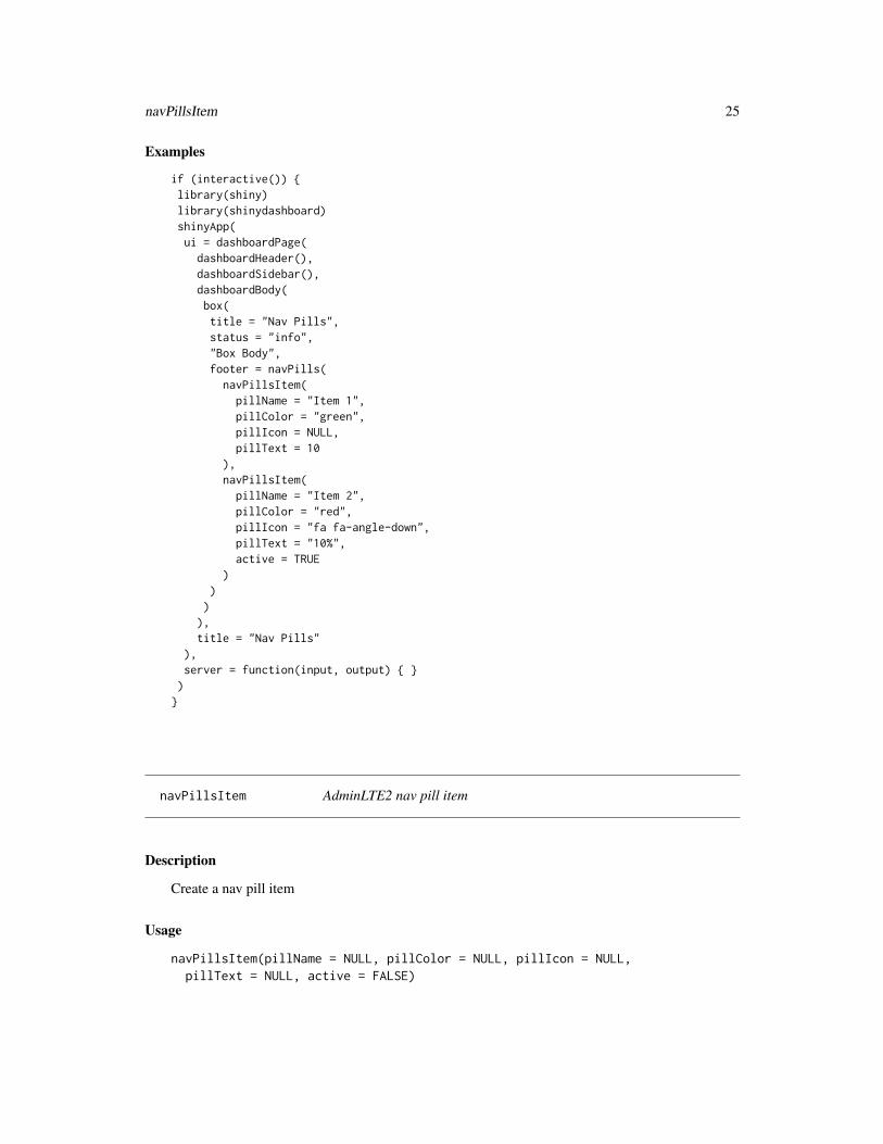
Examples
if (interactive()) {library(shiny)library(shinydashboard)shinyApp(ui = dashboardPage(dashboardHeader(),dashboardSidebar(),dashboardBody(box(title = "Nav Pills",status = "info","Box Body",footer = navPills(
navPillsItem(pillName = "Item 1",pillColor = "green",pillIcon = NULL,pillText = 10
),navPillsItem(
pillName = "Item 2",pillColor = "red",pillIcon = "fa fa-angle-down",pillText = "10%",active = TRUE
))
)),title = "Nav Pills"
),server = function(input, output) { })
}
navPillsItem AdminLTE2 nav pill item
Description
Create a nav pill item
Usage
navPillsItem(pillName = NULL, pillColor = NULL, pillIcon = NULL,pillText = NULL, active = FALSE)

26 productList
Arguments
pillName pill name.
pillColor pill color: see here for a list of valid colors https://adminlte.io/themes/AdminLTE/pages/UI/general.html.
pillIcon pill icon, if any. Should be written like "fa fa-times".
pillText pill text. Can also be a number.
active Whether the item is active or not. FALSE by default.
Author(s)
David Granjon, <[email protected]>
productList AdminLTE2 product list container
Description
Create a container product list elements
Usage
productList(...)
Arguments
... slot for productListItem.
Author(s)
David Granjon, <[email protected]>
Examples
if (interactive()) {library(shiny)library(shinydashboard)shinyApp(ui = dashboardPage(dashboardHeader(),dashboardSidebar(),dashboardBody(box(title = "Product List",status = "primary",productList(
productListItem(src = "http://www.pngmart.com/files/1/Haier-TV-PNG.png",

productListItem 27
productTitle = "Samsung TV",productPrice = "$1800",priceColor = "warning","This is an amazing TV, but I don't like TV!"
),productListItem(
src = "http://icon-park.com/imagefiles/imac.png",productTitle = "Imac 27",productPrice = "$2400",priceColor = "danger","This is were I spend most of my time!"
))
)),title = "Product List"
),server = function(input, output) { })
}
productListItem AdminLTE2 product item
Description
Create a product item
Usage
productListItem(..., src = NULL, productTitle = NULL, productPrice = NULL,priceColor = NULL)
Arguments
... product description.
src image url, if any.
productTitle product name.
productPrice product price.
priceColor price color: see here for a list of valid colors https://adminlte.io/themes/AdminLTE/pages/UI/general.html.
Author(s)
David Granjon, <[email protected]>

28 rightSidebar
rightSidebar AdminLTE2 dashboard right sidebar
Description
This creates a right sidebar.
Usage
rightSidebar(..., background = "dark", width = 230)
Arguments
... slot for rightSidebarTabContent.
background background color: "dark" or "light".
width Sidebar width in pixels. Numeric value expected. 230 by default.
Note
Until a maximum of 5 rightSidebarTabContent inside! AdminLTE 2 does not support more items.
Author(s)
David Granjon, <[email protected]>
Examples
if (interactive()) {library(shiny)library(shinydashboard)shinyApp(ui = dashboardPagePlus(
header = dashboardHeaderPlus(enable_rightsidebar = TRUE,rightSidebarIcon = "gears"),sidebar = dashboardSidebar(),body = dashboardBody(),rightsidebar = rightSidebar(background = "dark",rightSidebarTabContent(id = 1,icon = "desktop",title = "Tab 1",active = TRUE,sliderInput("obs","Number of observations:",min = 0, max = 1000, value = 500

rightSidebarMenu 29
)),rightSidebarTabContent(id = 2,title = "Tab 2",textInput("caption", "Caption", "Data Summary")),rightSidebarTabContent(id = 3,title = "Tab 3",icon = "paint-brush",numericInput("obs", "Observations:", 10, min = 1, max = 100))
),title = "Right Sidebar"
),server = function(input, output) { }
)}
rightSidebarMenu AdminLTE2 right sidebar menu
Description
Create a nice right sidebar menu.
Usage
rightSidebarMenu(...)
Arguments
... Slot for rightsidebarMenuItem.
Author(s)
David Granjon, <[email protected]>
Examples
if (interactive()) {library(shiny)library(shinydashboard)shinyApp(ui = dashboardPagePlus(
header = dashboardHeaderPlus(enable_rightsidebar = TRUE,rightSidebarIcon = "gears"
),

30 rightSidebarMenu
sidebar = dashboardSidebar(),body = dashboardBody(),rightsidebar = rightSidebar(
background = "dark",rightSidebarTabContent(
id = 1,icon = "desktop",title = "Tab 1",active = TRUE,rightSidebarMenu(rightSidebarMenuItem(icon = menuIcon(name = "birthday-cake",color = "red"
),info = menuInfo(title = "Langdon's Birthday",description = "Will be 23 on April 24th")
),rightSidebarMenuItem(icon = menuIcon(name = "user",color = "yellow"),info = menuInfo(title = "Frodo Updated His Profile",description = "New phone +1(800)555-1234")
))
),rightSidebarTabContent(
id = 2,title = "Tab 2",textInput("caption", "Caption", "Data Summary")
),rightSidebarTabContent(
id = 3,icon = "paint-brush",title = "Tab 3",numericInput("obs", "Observations:", 10, min = 1, max = 100)
)),title = "Right Sidebar"
),server = function(input, output) { }
)}

rightSidebarMenuItem 31
rightSidebarMenuItem AdminLTE2 right sidebar menu item
Description
Item to insert in a rightsidebarMenu.
Usage
rightSidebarMenuItem(icon, info)
Arguments
icon Slot for menuIcon.
info Slot for menuInfo.
Author(s)
David Granjon, <[email protected]>
rightSidebarTabContent
AdminLTE2 tab content
Description
This creates a wrapper that will contain rightSidebarTabContent.
Usage
rightSidebarTabContent(..., id, title = NULL, active = FALSE,icon = "database")
Arguments
... any element such as sliderInput, ...
id should be unique.
title content title.
active whether the tab content is active or not. FALSE by default.
icon tab icon.

32 rigthSidebarPanel
rightSidebarTabItem AdminLTE2 right sidebar tab item
Description
This creates a right sidebar tab item to be inserted in a rightSidebarTabList.
Usage
rightSidebarTabItem(id, icon, active)
Arguments
id unique item id.icon tab icon.active Whether the tab item is active or not.
rightSidebarTabList AdminLTE2 right sidebar tab list
Description
This creates a right sidebar tab list.
Usage
rightSidebarTabList(...)
Arguments
... slot that takes all rightSidebarTabContent as input to automatically generate thesame number of items in the tab menu with corresponding icons, ids, ...
rigthSidebarPanel AdminLTE2 wrapper for tab content
Description
This creates a wrapper that will contain rightSidebarTabContent.
Usage
rigthSidebarPanel(...)
Arguments
... slot for rightSidebarTabContent.

setShadow 33
setShadow Custom shadows
Description
Allow to apply a shadow on a given element.
Usage
setShadow(class)
Arguments
class The element to which the shadow should be applied. For example, class is set tobox.
Examples
if (interactive()) {
library(shiny)library(shinyWidgets)library(shinydashboard)library(shinydashboardPlus)
shinyApp(ui = dashboardPagePlus(
header = dashboardHeaderPlus(enable_rightsidebar = TRUE,rightSidebarIcon = "gears"
),sidebar = dashboardSidebar(),body = dashboardBody(tags$h2("Add shadow and hover interactions to any element"),
setShadow("box"),setShadow("info-box"),setShadow("progress"),
fluidRow(boxPlus(
title = "Closable Box with dropdown",closable = TRUE,status = "warning",solidHeader = FALSE,collapsible = TRUE,enable_dropdown = TRUE,dropdown_icon = "wrench",dropdown_menu = dropdownItemList(
dropdownItem(url = "http://www.google.com", name = "Link to google"),

34 setShadow
dropdownItem(url = "#", name = "item 2"),dropdownDivider(),dropdownItem(url = "#", name = "item 3")
),p("Box Content")
),boxPlus(
title = "Closable box, with label",closable = TRUE,enable_label = TRUE,label_text = 1,label_status = "danger",status = "warning",solidHeader = FALSE,collapsible = TRUE,p("Box Content")
)),fluidRow(infoBox("Orders","50","Subtitle", icon = icon("credit-card"))),fluidRow(verticalProgress(value = 10,striped = TRUE,active = TRUE),verticalProgress(
value = 50,active = TRUE,status = "warning",size = "xs"
),verticalProgress(
value = 20,status = "danger",size = "sm",height = "60%"
))
),rightsidebar = rightSidebar(),title = "DashboardPage"
),server = function(input, output) { })
}
shinydashboardPlusGallery 35
shinydashboardPlusGallery
Launch the shinydashboardPlus Gallery
Description
A gallery of all components available in shinydashboardPlus.
Usage
shinydashboardPlusGallery()
Examples
if (interactive()) {
shinydashboardPlusGallery()
}
socialBox AdminLTE2 social box
Description
Create social box
Usage
socialBox(..., src = NULL, title = NULL, subtitle = NULL, width = 6,height = NULL, collapsible = TRUE, closable = TRUE, comments = NULL,footer = NULL, footer_padding = TRUE)
Arguments
... body content. May include attachmentBlock for instance.
src header image, if any.
title box title.
subtitle box subtitle.
width box width (between 1 and 12).
height box height.
collapsible If TRUE, display a button in the upper right that allows the user to collapse thebox.
36 socialBox
closable If TRUE, display a button in the upper right that allows the user to close the box.
comments slot for boxComments.
footer box footer, if any.
footer_padding TRUE by default: whether the footer has margin or not.
Author(s)
David Granjon, <[email protected]>
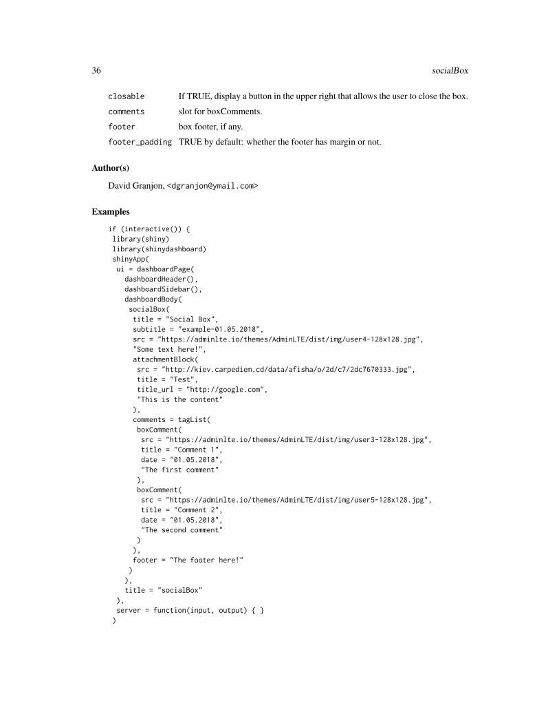
Examples
if (interactive()) {library(shiny)library(shinydashboard)shinyApp(ui = dashboardPage(dashboardHeader(),dashboardSidebar(),dashboardBody(socialBox(title = "Social Box",subtitle = "example-01.05.2018",src = "https://adminlte.io/themes/AdminLTE/dist/img/user4-128x128.jpg","Some text here!",attachmentBlock(src = "http://kiev.carpediem.cd/data/afisha/o/2d/c7/2dc7670333.jpg",title = "Test",title_url = "http://google.com","This is the content"),comments = tagList(boxComment(src = "https://adminlte.io/themes/AdminLTE/dist/img/user3-128x128.jpg",title = "Comment 1",date = "01.05.2018","The first comment"),boxComment(src = "https://adminlte.io/themes/AdminLTE/dist/img/user5-128x128.jpg",title = "Comment 2",date = "01.05.2018","The second comment")),footer = "The footer here!"
)),title = "socialBox"
),server = function(input, output) { })

socialButton 37
}
socialButton AdminLTE2 social button
Description
Create a social button
Usage
socialButton(url, type = NULL)
Arguments
url if the button should redirect somewhere.
type social network name: see here for valid names https://adminlte.io/themes/AdminLTE/pages/UI/buttons.html.
Author(s)
David Granjon, <[email protected]>
Examples
if (interactive()) {library(shiny)library(shinydashboard)shinyApp(ui = dashboardPage(dashboardHeader(),dashboardSidebar(),dashboardBody(box(title = "Social Buttons",status = NULL,socialButton(
url = "http://dropbox.com",type = "dropbox"
),socialButton(
url = "http://github.com",type = "github"
))),title = "Description Blocks"
),

38 starBlock
server = function(input, output) { })
}
starBlock AdminLTE2 starBlock
Description
Create a starBlock item (ideal for rating)
Usage
starBlock(maxstar = 5, grade, color = "yellow")
Arguments
maxstar Maximum number of stars by block.grade Current score. Should be positive and lower or equal to maxstar.color Star color: see validColors() in the documentation.
Author(s)
David Granjon, <[email protected]>
Examples
if (interactive()) {library(shiny)library(shinydashboard)shinyApp(ui = dashboardPage(dashboardHeader(),dashboardSidebar(),dashboardBody(box(title = "Star example",starBlock(grade = 5),starBlock(grade = 5, color = "olive"),starBlock(grade = 1, color = "maroon"),starBlock(grade = 3, color = "teal"))),title = "starBlock"
),server = function(input, output) { })
}

timelineBlock 39
timelineBlock AdminLTE2 timeline block
Description
Create a timeline block
Usage
timelineBlock(..., reversed = TRUE)
Arguments
... slot for timelineLabel or timelineItem.
reversed Whether the timeline is reversed or not.
Author(s)
David Granjon, <[email protected]>
Examples
if (interactive()) {library(shiny)library(shinydashboard)shinyApp(ui = dashboardPage(dashboardHeader(),dashboardSidebar(),dashboardBody(h3("When Reversed = TRUE, can be displayed inside a box"),box(title = "Timeline",status = "info",timelineBlock(timelineEnd(color = "danger"),timelineLabel(2018, color = "teal"),timelineItem(title = "Item 1",icon = "gears",color = "olive",time = "now",footer = "Here is the footer","This is the body"),timelineItem(title = "Item 2",border = FALSE),
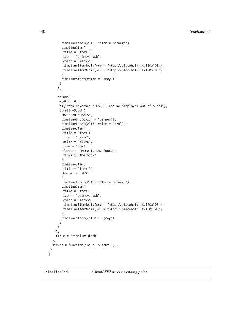
40 timelineEnd
timelineLabel(2015, color = "orange"),timelineItem(title = "Item 3",icon = "paint-brush",color = "maroon",timelineItemMedia(src = "http://placehold.it/150x100"),timelineItemMedia(src = "http://placehold.it/150x100")),timelineStart(color = "gray"))
),
column(width = 6,h3("When Reversed = FALSE, can be displayed out of a box"),timelineBlock(reversed = FALSE,timelineEnd(color = "danger"),timelineLabel(2018, color = "teal"),timelineItem(title = "Item 1",icon = "gears",color = "olive",time = "now",footer = "Here is the footer","This is the body"),timelineItem(title = "Item 2",border = FALSE),timelineLabel(2015, color = "orange"),timelineItem(title = "Item 3",icon = "paint-brush",color = "maroon",timelineItemMedia(src = "http://placehold.it/150x100"),timelineItemMedia(src = "http://placehold.it/150x100")),timelineStart(color = "gray"))
)),title = "timelineBlock"
),server = function(input, output) { })
}
timelineEnd AdminLTE2 timeline ending point

timelineItem 41
Description
Create a timeline ending point
Usage
timelineEnd(icon = "hourglass-end", color = NULL)
Arguments
icon item icon such as "clock-o", "times", ...
color item color: see here for a list of valid colors https://adminlte.io/themes/AdminLTE/pages/UI/general.html.
Author(s)
David Granjon, <[email protected]>
timelineItem AdminLTE2 timeline item
Description
Create a timeline item
Usage
timelineItem(..., icon = NULL, color = NULL, time = NULL, title = NULL,border = TRUE, footer = NULL)
Arguments
... any element such as timeLineItemMedia ...
icon item icon such as "clock-o", "times", ...
color item color: see here for a list of valid colors https://adminlte.io/themes/AdminLTE/pages/UI/general.html.
time item date or time.
title item title.
border Whether to display a border between the header and the body. TRUE by default.
footer item footer if any.
Author(s)
David Granjon, <[email protected]>

42 timelineLabel
timelineItemMedia AdminLTE2 timeline media item
Description
Create a timeline media item
Usage
timelineItemMedia(src = NULL, height = NULL, width = NULL)
Arguments
src media url or path.
height media height in pixels.
width media width in pixels.
Author(s)
David Granjon, <[email protected]>
timelineLabel AdminLTE2 timeline label
Description
Create a timeline label
Usage
timelineLabel(..., color = NULL)
Arguments
... any element.
color label color: see here for a list of valid colors https://adminlte.io/themes/AdminLTE/pages/UI/general.html.
Author(s)
David Granjon, <[email protected]>

timelineStart 43
timelineStart AdminLTE2 timeline starting point
Description
Create a timeline starting point
Usage
timelineStart(icon = "clock-o", color = NULL)
Arguments
icon item icon such as "clock-o", "times", ...
color item color: see here for a list of valid colors https://adminlte.io/themes/AdminLTE/pages/UI/general.html.
Author(s)
David Granjon, <[email protected]>
todoList AdminLTE2 todo list container
Description
Create a todo list container
Usage
todoList(..., sortable = TRUE)
Arguments
... slot for todoListItem.
sortable Whether the list elements are sortable or not.
Author(s)
David Granjon, <[email protected]>

44 todoList
Examples
if (interactive()) {library(shiny)library(shinydashboard)library(shinyjqui)shinyApp(ui = dashboardPage(dashboardHeader(),dashboardSidebar(),dashboardBody(box("Sortable todo list demo",status = "warning",todoList(
todoListItem(label = "Design a nice theme","Some text here"
),todoListItem(
label = "Make the theme responsive","Some text here"
),todoListItem(
checked = TRUE,label = "Let theme shine like a star"
))),box("Simple todo list demo",status = "warning",todoList(sortable = FALSE,
todoListItem(label = "Design a nice theme","Some text here"
),todoListItem(
label = "Make the theme responsive","Some text here"
),todoListItem(
checked = TRUE,label = "Let theme shine like a star"
)))
),title = "Todo Lists"
),server = function(input, output) { })

todoListItem 45
}
todoListItem AdminLTE2 todo list item
Description
Create a todo list item
Usage
todoListItem(..., checked = FALSE, label = NULL)
Arguments
... any element such as labels, ...
checked Whether the list item is checked or not.
label item label.
Author(s)
David Granjon, <[email protected]>
userList AdminLTE2 user list container
Description
Create a user list container
Usage
userList(...)
Arguments
... slot for userListItem.
Author(s)
David Granjon, <[email protected]>
46 userList
Examples
if (interactive()) {library(shiny)library(shinydashboard)shinyApp(ui = dashboardPage(dashboardHeader(),dashboardSidebar(),dashboardBody(box(title = "User List example",status = "success",userList(
userListItem(src = "https://www.rstudio.com/wp-content/uploads/2014/04/shiny.png",user_name = "Shiny",description = "28.04.2018"
),userListItem(
src = "https://www.rstudio.com/wp-content/uploads/2014/04/knitr.png",user_name = "knitr",description = "28.04.2018"
),userListItem(
src = "https://www.rstudio.com/wp-content/uploads/2017/05/rmarkdown.png",user_name = "Rmarkdown",description = "28.04.2018"
),userListItem(
src = "https://www.tidyverse.org/images/hex-tidyverse.png",user_name = "Tidyverse",description = "28.04.2018"
),userListItem(
src = "https://www.rstudio.com/wp-content/uploads/2014/04/tidyr.png",user_name = "tidyr",description = "28.04.2018"
),userListItem(
src = "https://www.rstudio.com/wp-content/uploads/2014/04/packrat.png",user_name = "packrat",description = "28.04.2018"
),userListItem(
src = "https://www.rstudio.com/wp-content/uploads/2014/04/sparklyr.png",user_name = "packrat",description = "28.04.2018"
))
)),title = "User List"

userListItem 47
),server = function(input, output) { })
}
userListItem AdminLTE2 user list item
Description
Create a user list item
Usage
userListItem(src = NULL, user_name = NULL, description = NULL)
Arguments
src image url or path.user_name user name.description any date element.
Author(s)
David Granjon, <[email protected]>
userPost AdminLTE2 user post
Description
Create a user post
Usage
userPost(..., id = NULL, src = NULL, author = NULL, description = NULL,collapsible = TRUE)
Arguments
... post content, slot for userPostToolItemList.id unique id of the post.src profile image, if any.author post author.description post description.collapsible If TRUE, display a button in the upper right that allows the user to collapse the
comment.

48 userPost
Author(s)
David Granjon, <[email protected]>
Examples
if (interactive()) {library(shiny)library(shinydashboard)shinyApp(ui = dashboardPage(dashboardHeader(),dashboardSidebar(),dashboardBody(box(title = "Box with user comment",status = "primary",userPost(id = 1,src = "https://adminlte.io/themes/AdminLTE/dist/img/user1-128x128.jpg",author = "Jonathan Burke Jr.",description = "Shared publicly - 7:30 PM today","Lorem ipsum represents a long-held tradition for designers,typographers and the like. Some people hate it and argue forits demise, but others ignore the hate as they create awesometools to help create filler text for everyone from baconlovers to Charlie Sheen fans.",userPostToolItemList(userPostToolItem(dashboardLabel("item 1")),userPostToolItem(dashboardLabel("item 2", status = "danger"), side = "right"))),userPost(id = 2,src = "https://adminlte.io/themes/AdminLTE/dist/img/user6-128x128.jpg",author = "Adam Jones",description = "Shared publicly - 5 days ago",userPostMedia(src = "https://adminlte.io/themes/AdminLTE/dist/img/photo2.png"),userPostToolItemList(userPostToolItem(dashboardLabel("item 1")),userPostToolItem(dashboardLabel("item 2", status = "danger"), side = "right")))
)),title = "userPost"
),server = function(input, output) { })
}

userPostMedia 49
userPostMedia AdminLTE2 user post media
Description
Create a user post media (image)
Usage
userPostMedia(src = NULL, height = NULL, width = NULL)
Arguments
src image path or url ...
height media height in pixels.
width media width in pixels.
Author(s)
David Granjon, <[email protected]>
userPostToolItem AdminLTE2 user post tool item
Description
Create a user post tool item
Usage
userPostToolItem(..., side = "left")
Arguments
... tool content such as label, button, ...
side tool item orientation: "left" of "right", "left" by default.
Author(s)
David Granjon, <[email protected]>

50 verticalProgress
userPostToolItemList AdminLTE2 user post tool item container
Description
Create a user post tool item container
Usage
userPostToolItemList(...)
Arguments
... slot for userPostToolItem.
Author(s)
David Granjon, <[email protected]>
verticalProgress AdminLTE2 vertical progress bar
Description
This creates a vertical progress bar.
Usage
verticalProgress(value, min = 0, max = 100, height = "40%",striped = FALSE, active = FALSE, status = "primary", size = NULL)
Arguments
value Progress bar value. Must be between min and max.
min Progress bar minimum value (0 by default).
max Progress bar maximum value (100 by default).
height Progress bar default height (40 percent by default).
striped Whether the progress is striped or not. FALSE by default.
active Whether the progress is active or not. FALSE by default.
status Progress bar status. "primary" by default or "warning", "info", "danger" or "suc-cess".
size Progress bar size. NULL by default: "sm", "xs" or "xxs" also available.

widgetUserBox 51
Author(s)
David Granjon, <[email protected]>
Examples
if (interactive()) {library(shiny)library(shinydashboard)shinyApp(ui = dashboardPagePlus(
header = dashboardHeaderPlus(enable_rightsidebar = TRUE,rightSidebarIcon = "gears"
),sidebar = dashboardSidebar(),body = dashboardBody(verticalProgress(value = 10,striped = TRUE,active = TRUE),verticalProgress(value = 50,active = TRUE,status = "warning",size = "xs"),verticalProgress(value = 20,status = "danger",size = "sm",height = "60%")
),rightsidebar = rightSidebar(),title = "Right Sidebar"
),server = function(input, output) { }
)}
widgetUserBox AdminLTE2 widget user box
Description
Create widget user box
52 widgetUserBox
Usage
widgetUserBox(..., title = NULL, subtitle = NULL, type = NULL,background = FALSE, backgroundUrl = NULL, src = NULL, color = NULL,footer = NULL, footer_padding = TRUE, width = 6, height = NULL,boxToolSize = "sm", collapsible = TRUE, closable = FALSE)
Arguments
... body content.
title box title.
subtitle box subtitle.
type NULL by default. Choose the value 2 to try another skin.
background Whether to enable a background image in the box header.
backgroundUrl image url, if any. Background needs to be TRUE.
src header image, if any (this is different of the background image).
color background color: see here for a list of valid colors https://adminlte.io/themes/AdminLTE/pages/UI/general.html.
footer box footer.
footer_padding TRUE by default: whether the footer has margin or not.
width box width (between 1 and 12).
height box height.
boxToolSize size of the toolbox: choose among "xs", "sm", "md", "lg".
collapsible If TRUE, display a button in the upper right that allows the user to collapse thebox.
closable If TRUE, display a button in the upper right that allows the user to close the box.
Author(s)
David Granjon, <[email protected]>
Examples
if (interactive()) {library(shiny)library(shinydashboard)shinyApp(ui = dashboardPage(dashboardHeader(),dashboardSidebar(),dashboardBody(widgetUserBox(title = "Nadia Carmichael",subtitle = "lead Developer",type = 2,src = "https://adminlte.io/themes/AdminLTE/dist/img/user7-128x128.jpg",

widgetUserBox 53
color = "yellow","Some text here!",footer = "The footer here!"
),widgetUserBox(title = "Alexander Pierce",subtitle = "Founder & CEO",type = NULL,src = "https://adminlte.io/themes/AdminLTE/dist/img/user1-128x128.jpg",color = "aqua-active",closable = TRUE,"Some text here!",footer = "The footer here!"
),widgetUserBox(title = "Elizabeth Pierce",subtitle = "Web Designer",type = NULL,src = "https://adminlte.io/themes/AdminLTE/dist/img/user3-128x128.jpg",background = TRUE,
backgroundUrl = "https://www.planwallpaper.com/static/images/744081-background-wallpaper.jpg",closable = TRUE,"Some text here!",footer = "The footer here!"
)),title = "widgetUserBox"
),server = function(input, output) { })
}

Index
accordion, 3accordionItem, 4appButton, 5attachmentBlock, 6
blockQuote, 7boxComment, 8boxPad, 9boxPlus, 10boxProfile, 12boxProfileItem, 13boxProfileItemList, 14
dashboardBody, 17, 18dashboardHeaderPlus, 14, 18dashboardLabel, 16dashboardPagePlus, 14, 17dashboardSidebar, 17, 18descriptionBlock, 18dropdownDivider, 20dropdownItem, 20dropdownItemList, 21dropdownMenu, 14, 15
gradientBox, 21
loadingState, 22
menuIcon, 23menuInfo, 24
navPills, 24navPillsItem, 25
productList, 26productListItem, 27
rightSidebar, 28rightSidebarMenu, 29rightSidebarMenuItem, 31rightSidebarTabContent, 31
rightSidebarTabItem, 32rightSidebarTabList, 32rigthSidebarPanel, 32
setShadow, 33shinydashboardPlusGallery, 35socialBox, 35socialButton, 37starBlock, 38
timelineBlock, 39timelineEnd, 40timelineItem, 41timelineItemMedia, 42timelineLabel, 42timelineStart, 43todoList, 43todoListItem, 45
userList, 45userListItem, 47userPost, 47userPostMedia, 49userPostToolItem, 49userPostToolItemList, 50
validColors, 10validStatuses, 10verticalProgress, 50
widgetUserBox, 51
54