Our Internal Brand In Five Pages - Calico...
6
Our Internal Brand In Five Pages
Transcript of Our Internal Brand In Five Pages - Calico...

Our Internal Brand In Five Pages

Using our brand assets correctly is essential to maintaining consistency in how SSFP Learn is perceived. Doing so differentiates us across the organization, drives engagement with our clients and strengthens our identity.
Overview
1
Our brand is the most visible expression of our department. It communicates our core intent and represents us across all platforms.
This guide contains some basic information and general guidelines for working with the SSFP Learn brand.
For more information, or to download logos and other digital assets, please visit:
gWiz --> SSFP Learn

Please note: the SSFP Learn logo is the only logo approved for internal company use; it should generally be used with the “Unlocking Potential” tagline, however the symbol is approved without the tagline for accent uses. No other logos may be created or used.
For the sake of consistency, our logo may only be applied in a limited number of colors and techniques. In fact, there are a lot of case-specific rules regarding logo usage, but the big ones to keep in mind are:
• The full color logo with tag line is the standardlogo used in most company communications.
• For dark backgrounds use the reverse color logo soas to maintain contrast.
• For instances where a logo is unnecessary, butbranding will add emphasis use the symbol.
Logos are the most visible expression of brands. Once introduced, this icon becomes a consistent representation of the organization across our communications.
Logo
2
Logo usage : color / on dark backgrounds
Logo position : clear space & positioning
Use full color logo on white backgrounds.
Use reverse color logo on dark backgrounds.
FULL COLOR SYMBOLREVERSE COLOR
There must always be sufficient space surrounding the logo to avoid competition from other visual elements and maintain its visual impact. Similarly, the logo should never be placed in a box or other containers (i.e. shapes, drop shadows).
Logo size : clear space & positioning
STANDARD SIZE : 1.5 INCH WIDTH
MINIMUM SIZE : 1 INCH WIDTH
• There must always be sufficient space surroundingthe logo to maintain its visual impact. Also, don’tplace the logo in a box or add a drop shadow.
PMS 2995 R27 G158 B198 R126 G176 B202
PMS 297 R112 G198 B221 R186 G219 B230
PMS 371 R79 G111 B29 R136 G101 B50
PMS 38 3 R178 G187 B33 R240 G227 B197
PMS 550
PMS 290
PMS 7505
PMS 7501
PMS 202 R152 G15 B46 R171 G184 B190
PMS 14 4 R243 G152 B30 R235 G238 B238
PMS 260 R113 G20 B113
PMS 75 43
#1B9EC6 C90 M11 Y0 K0 C38 M4 Y0 K19
#70C6DD C49 M1 Y0 K0 C25 M2 Y0 K0
#4F6F1D C43 M0 Y100 K66 C0 M30 Y60 K55
#B2BB21 C20 M0 Y100 K19 C20 M4 Y20 K6
#7EB0CA
#BADBE6
#8 86532
#F0E 3C5
# 980F2E C0 M100 Y61 K43 C7 M0 Y0 K30
#F3981E C0 M48 Y100 K0 C2 M0 Y0 K5
#711471 C52 M100 Y0 K26
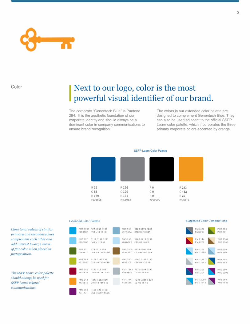
#ABB8 8EThe SSFP Learn color palette should always be used for SSFP Learn related communications.
Close tonal values of similar primary and secondary hues complement each other and add interest to large areas
juxtaposition.
The corporate “Genentech Blue” is Pantone 294. It is the aesthetic foundation of our corporate identity and should always be a dominant color in company communications to ensure brand recognition.
The colors in our extended color palette are designed to complement Genentech Blue. They can also be used adjacent to the official SSFP Learn color palette, which incorporates the three primary corporate colors accented by orange.
Color
Extended Color Palette
#195695 #7E8083 #000000
R 25 R 0R 126G 86 G 0G 129B 149 B 0B 131
Next to our logo, color is the most powerful visual identifier of our brand.
3
Suggested Color Combinations
PMS 424 PMS 38 3
PMS 14 4 PMS 7501
PMS 2995 PMS 260
PMS 294 PMS 371
PMS 202 PMS 7505
PMS 75 43 PMS 75 43
PMS 290
PMS 75 41
PMS 260
PMS 290
PMS 294
PMS 260
PMS 2995
PMS 75 43
PMS 294
PMS 550
PMS 38 3
PMS 2995
PMS 75 41#EBEEEE
SSFP Learn Color Palette
#F3981E
R 243G 152B 30

For official internal communication purposes the fonts used should align with the SSFP Learn logo.
Official communications come in the forms of presentations, websites, posters, email, etc.
Georgia is the serif type used for headlines.
Arial is the sans serif type for subline or body text.
Always utilize official Genentech templates for communication and training purposes. As a complement to official templates SSFP Learn uses two different fonts for our brand:
Arial: a sleek easily read typefaceGeorgia: a strong classic typeface
These fonts reinforce our brand image and convey our message in a style that is professional and engaging.
AaBbCc0123ABCDEFGHIJKLMNOPQRSTUVWXYZ
Maintype 1 : Arial
Maintype 2 : Georgia
When creating internal advertising and promotional materials, Arial is the sans serif type used for body text. Georgia a serif type should be used for titles, headers, and quotes.
For guidelines on the creation of external material, please refer to the corporate Genentech branding team.
These typefaces can be found on all standard computers (PC & Mac) and as a web safe font (i.e. Google Docs)
Type
4
Font choice sends a subtle, yet distinct message and works to maintain a consistent understanding of our brand.
AaBbCc0123ABCDEFGHIJKLMNOPQRSTUVWXYZ 1234567890!?& abcdefghijklmnopqrstuvwxyz
These typefaces can be found on all standard computers (PC & Mac) and as a web safe font (i.e. Google Docs)
When writing, your primary goal should be to convey a specific message as directly and effectively as possible. To help you achieve this goal, we have laid out guidelines for tone, voice and general writing principals.
Clear communication is essential to our organizational success.
Tone + Voice
5
Writing Principles
The Voice and Tone of Internal Communications
When writing for Genentech audiences, apply the following principles to your communications:
• Be factual and truthful. Confirm details.
• Use acronyms sparingly.
• Be literal. The words you use should mean exactly what they say.
• Avoid hyperbole, redundancy and the use of passive language.
• Brevity is the soul of wit.
• Avoid business jargon or "corporate speak" (e.g., words/phrases like "interface," "actualizing,""paradigm shift," "synergy," etc.). Don't use "impact" or other nouns as a verb.
• Be yourself. Be genuine.
Unlike voice, tone may change depending on the circumstances. It is important to know your audience. Craft your writing to reflect their understanding of the subject and the relative importance or seriousness of the information.
The voice of internal communications should be consistent, regardless of the vehicle or source of the information, and should reflect our science-based culture. Writing should be straightforward and informative. If you convey respect for your audience’s time and intelligence, they will respect what you have to say.
Remember, the power of persuasion doesn't come from buzzwords and obscurity. It comes from being honest, straightforward and clear.
For more information on branding or communications, please contact the SSFP Learn Communication team:Rachel CrabtreeHillarie Maddox
Jade Quizon


![SGC rapportomslag mall.ppt [Kompatibilitetsläge] · Christian Hulteberg, Jan Brandin & Andreas Leveau Biofuel-Solution AB Rapport SGC 222 •1102-7371 • ISRN SGC-R-222-SE. SGC:s](https://static.fdocuments.net/doc/165x107/5ce9eb2788c9933e668b8ebb/sgc-rapportomslag-mallppt-kompatibilitetslaege-christian-hulteberg-jan-brandin.jpg)