One-class classiflcation-based control charts for ...
26
One-class classification-based control charts for multivariate process monitoring Thuntee Sukchotrat Department of Industrial and Manufacturing Systems Engineering University of Texas at Arlington Arlington, Texas, USA Seoung Bum Kim * Division of Information Management Engineering Korea University Seoul, Republic of Korea Fugee Tsung Department of Industrial Engineering and Logistics Management Hong Kong University of Science and Technology Clear Water Bay, Kowloon, Hong Kong * Corresponding author E-mail: [email protected]
Transcript of One-class classiflcation-based control charts for ...

One-class classification-based control charts for multivariate process
monitoring
Thuntee SukchotratDepartment of Industrial and Manufacturing Systems Engineering
University of Texas at ArlingtonArlington, Texas, USA
Seoung Bum Kim∗
Division of Information Management EngineeringKorea University
Seoul, Republic of Korea
Fugee TsungDepartment of Industrial Engineering and Logistics Management
Hong Kong University of Science and TechnologyClear Water Bay, Kowloon, Hong Kong
∗Corresponding authorE-mail: [email protected]

Abstract
One-class classification problems have attracted a great deal of attention from various disciplines.
In the present study, we attempt to extend the scope of application of the one-class classification
technique to statistical process control (SPC) problems. We propose new multivariate control charts
that apply the effectiveness of one-class classification to improvement of Phase I and Phase II anal-
ysis in SPC. In the proposed control charts, we use a monitoring statistic that represents the degree
of being an outlier as obtained through one-class classification. The control limits of the proposed
charts are established based on the empirical level of significance on the percentile, estimated by the
bootstrap method. A simulation study was conducted to illustrate limitations of current one-class
classification control charts and demonstrate the effectiveness of our proposed control charts.
Keywords: Data Mining; Hotelling’s T 2; Multivariate Process; One-Class Classification Method;
Statistical Process Control.

1 Introduction
Statistical process control (SPC) is one of the widely used techniques for quality control. The basic
objective of SPC is to quickly detect the occurrence of special cause variation, so that the process can
be investigated and corrective action may be taken before quality deteriorates and defective units are
produced (Stoumbos et al., 2000). One of the important tools in SPC is a control chart that monitors
the performance of a process over time to maintain the process in-control. In general, control chart
problems in SPC can be divided into two phases (Woodall, 2000; Woodall and Montgomery, 1999).
Phase I analysis tries to isolate the in-control (baseline) data from an unknown historical data set
and establish the control limits for future monitoring (Zhang and Albin, 2007). Phase II analysis
monitors the process using control charts derived from the “cleaned” in-control data set from Phase
I analysis. With a simple plot of a set of monitoring statistics that are derived from the original
samples, the control chart can effectively determine whether or not a process is in a state of control.
Examples of monitoring statistics include the sample average and the sample range. In addition
to the monitoring statistics, another important component of control charts is control limits, which
often are calculated based on the probabilistic distribution of the monitoring statistic.
Hotelling extended the univariate control chart to handle multivariate problems (Hotelling, 1947).
Hotelling’s T 2 chart (T 2 chart) is a multivariate control chart that can monitor a multivariate process
efficiently. T 2 charts use the T 2 statistic computed from the following equation:
T 2 = (x− x̄)TS−1(x− x̄), (1)
where x̄ and S are a sample mean vector and a sample covariance matrix determined from the
in-control (Phase I) data. The T 2 statistic measures the distance between an observation and
the scaled-mean estimated from the in-control data. Given that x follows a multivariate normal
distribution, the T 2 statistic follows an F distribution (Mason and Young, 2002). In T 2 charts, the
100α% tail-area of an F distribution is used as the control limit, where α is the user-specified level
1
of significance. It is known that T 2 charts can effectively control type I and type II error rates when
the underlying distribution of the process data is the multivariate normal distribution (Lowry and
Montgomery, 1995). However, the distributional assumption of T 2 charts restrict their applicability
to the nonnormal data, which can be found in many modern industries. A number of nonparametric
control charts have been developed to address the limitation of the distributional assumptions (Bakir,
2006; Chakraborti et al., 2001; Kim et al., 2007; Liu et al., 2004; Qiu, 2008). However, no consensus
exists about which of them best satisfies all conditions encountered in modern process systems. A
detailed review of nonparametric control charts is beyond the scope of this paper.
As the limitations of current SPC techniques become increasingly obvious in the face of ever
more complex processes, data mining algorithms, because of their proven capabilities to effectively
analyze and manage large amount of data, have the potential to resolve the challenging problems in
SPC. Despite the enormous popularity of data mining studies that have been conducted on a variety
of applications, few efforts have been made to integrate data mining algorithms with SPC (Chinnam,
2002; Cook and Chiu, 1998; Hu et al., 2007; Hwang et al., 2005; Smith, 1994). In particular, one-class
classification methods share a common goal with control charts because both methods assume that
the in-control group (target group) is the only population and can be used for measuring the degree
of abnormality of new observations. Several studies have been undertaken recently with the goal
of implementing one-class classification algorithms as an alternative to traditional control charts.
Sun and Tsung (2003) proposed kernel distance-based charts (K charts) based on a support vector
data description (SVDD) algorithm. SVDD is a modified version of the original support vector
machines (SVMs) for solving one-class classification problems. K charts use a monitoring statistic
derived from the distance between the new observation and the decision boundary generated by the
SVDD algorithm. The control limits of K charts are established and adjusted from a parameter in
the SVDD algorithm. Sun and Tsung’s study revealed that K charts perform better than T 2 charts
when the data deviate from normality. Kumar et al. (2006) used another one-class SVM technique to
2

construct robust K charts through normalized monitoring statistics. They showed that, in addition to
the flexibility of nonnormal data, robust K charts can efficiently handle autocorrelated process data.
Further, one-class SVM-based control charts have been applied to detect anomalies in computer-
networking applications (Zhang et al., 2007). It is clearly laudable that the aforementioned studies
proposed to use the monitoring statistic from the one-class SVM method. Thus, the construction of
the charts does not require any distribution assumptions. However, they did not suggest an efficient
way to establish the control limits, one of the major components in control charts.
This paper makes contributions in two aspects. First, we propose an efficient way to establish
the control limits necessary to improve the existing one-class SVM-based control charts. Second, we
propose new one-class classification-based control charts based on a k-nearest algorithm. Simulation
studies were conducted to demonstrate the effectiveness of the proposed approaches in both the
Phase I and Phase II analyses.
2 Support Vector Data Description (SVDD)-Based Control Charts
2.1 The SVDD Algorithm
An SVM is one of the supervised learning algorithms popularly used for both regression and classi-
fication problems. SVMs use geometric properties and obtain a separating hyperplane by solving a
convex optimization problem that simultaneously minimizes the generalization error and maximizes
the geometric margin between the classes (Vapnik, 1998). Nonlinear SVM models can be constructed
from kernel functions such as linear, polynomial, and radial basis functions, etc. SVDD is a mix-
ture of SVM and the data description method for solving one-class classification problems (Tax and
Duin, 2004). SVDD provides a hypersphere boundary around the data. A brief summary of the
SVDD algorithm is as follows: Let a be the center of the hypersphere. Let R2 be the radius of the
hypersphere (i.e., the distance from a to the boundary). Let xi = [xi1, xi2, . . . , xip]T , for i = 1, 2,
3

. . ., N be a sequence of p-variate training (target) observations. SVDD boundaries are constructed
to minimize the volume of the hypersphere while maximizing the training observations captured by
the hypersphere (Tax and Duin, 2004). That is, the problem is to:
Minimize R2 + C
N∑
i=1
ξi, (2)
with the constraint:
‖xi − a‖2 ≤ R2 + ξi, (3)
where ξi > 0 is the slack variable that allows x to be outside the hypersphere. R2 is the distance
from a to the boundary of the hypersphere. C controls the trade-off between the volume of the
hypersphere and the misclassification errors. Tax and Duin (2004) defined a user-specified parameter
f that represents the fraction of the training data outside the decision boundary.
f =1
NC, (4)
where N is the number of target observations. For instance, 80% of the training data points are
supposed to be included in the SVDD boundary constructed with f = 0.20. When f is increased
from 0.20 to 0.30, the volume of the hypersphere becomes smaller but the misclassification error in
the target class becomes larger.
The problem in (2) can be solved by the following Lagrangian:
L(R,a, αi, γi, ξi) = R2 + C
N∑
i=1
ξi −N∑
i=1
αi{R2 + ξi − (‖xi − a‖2)} −N∑
i=1
γiξi, (5)
where αi ≥ 0 and γi ≥ 0 are the Lagrange multipliers. Setting partial derivatives of L with respect
to R, a, and ξi and set to zero provides the following constraints:
N∑
i=1
αi = 1, (6)
a =N∑
i=1
αixi, (7)
4
αi = C − γi. (8)
When substituting these constraints to (5), the optimization problem becomes:
L =∑
i
αi(xi · xj)−∑
ij
αiαj(xi · xj). (9)
The solution, the set of αi, i = 1, 2, . . . , N , can be obtained by maximizing (9) subject to 0 ≤ αi ≤ C
and∑N
i=1 αi = 1.
Like conventional SVM, the SVDD algorithm can generate more flexible decision boundaries by
replacing inner product with kernel functions. For example, the following Gaussian kernel function
can be replaced with the inner product in (9):
K(xi · xj) = exp(−‖xi − xj‖S2
), (10)
where S > 0 is the width of the Gaussian kernel that controls the complexity of the SVDD boundary.
Given a testing data point z, D2 that measures the distance between z and the center, a can be
calculated by the following equation:
D2 = K(z · z)− 2∑
i
αiK(z · xi) +∑
ij
αiαjK(xi · xj). (11)
For classification, a new observation z is classified as the target when D2 is less than or equal to R2.
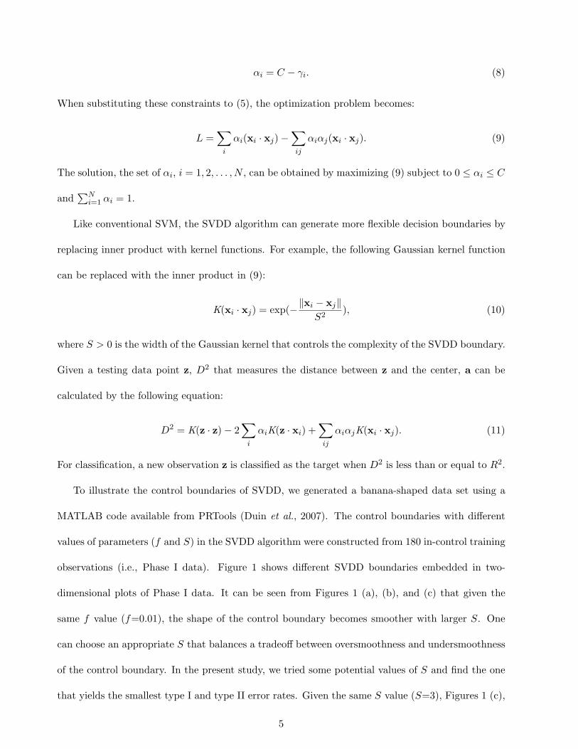
To illustrate the control boundaries of SVDD, we generated a banana-shaped data set using a
MATLAB code available from PRTools (Duin et al., 2007). The control boundaries with different
values of parameters (f and S) in the SVDD algorithm were constructed from 180 in-control training
observations (i.e., Phase I data). Figure 1 shows different SVDD boundaries embedded in two-
dimensional plots of Phase I data. It can be seen from Figures 1 (a), (b), and (c) that given the
same f value (f=0.01), the shape of the control boundary becomes smoother with larger S. One
can choose an appropriate S that balances a tradeoff between oversmoothness and undersmoothness
of the control boundary. In the present study, we tried some potential values of S and find the one
that yields the smallest type I and type II error rates. Given the same S value (S=3), Figures 1 (c),
5
(d), (e), and (f) show that the control boundary becomes tighter to the volume centroid with the
larger f .
2.2 Existing Control Chart Methods based on the SVDD Algorithm
Several studies have implemented one-class classification methods in SPC problems. Sun and Tsung
(2003) proposed K charts to handle nonnormality problems by using the kernel distances obtained
from the SVDD algorithm. They proposed to establish and adjust the control limits of the K chart
by using f (or C), one of the parameters of the SVDD algorithm. Kumar et al. (2006) proposed
robust K charts, which are similar to K charts but use normalized kernel distances. One-class SVM-
based control charts were applied for anomaly detection in computer networks (Zhang et al., 2007).
Although the aforementioned control charts use slightly different monitoring statistics, they are all
based on the one-class SVM method.
One-class SVM (OC-SVM)-based control charts can be constructed by plotting monitoring statis-
tics (D2) that measure the distance between new observations and the center of the hypersphere.
The control limits (R2) of OC-SVM charts are determined by f (or C). In other words, error rates
in OC-SVM charts are adjusted by f . Large f values tend to yield a larger type I error rate because
the algorithm utilizes less training data inside the boundary.
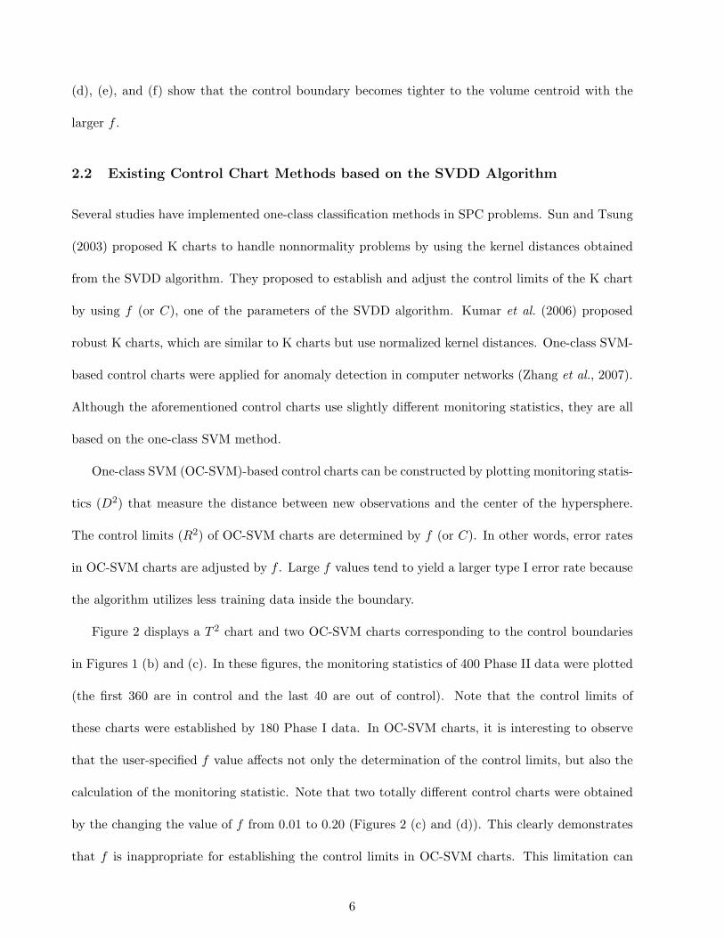
Figure 2 displays a T 2 chart and two OC-SVM charts corresponding to the control boundaries
in Figures 1 (b) and (c). In these figures, the monitoring statistics of 400 Phase II data were plotted
(the first 360 are in control and the last 40 are out of control). Note that the control limits of
these charts were established by 180 Phase I data. In OC-SVM charts, it is interesting to observe
that the user-specified f value affects not only the determination of the control limits, but also the
calculation of the monitoring statistic. Note that two totally different control charts were obtained
by the changing the value of f from 0.01 to 0.20 (Figures 2 (c) and (d)). This clearly demonstrates
that f is inappropriate for establishing the control limits in OC-SVM charts. This limitation can
6

be explained by Figure 1, showing that completely different control boundaries were obtained by
changing the value of f from 0.01 to 0.20. As a consequence, an observation detected as out of
control (or in control) may no longer be detected as out of control (or in control) as a reaction to the
use of different values of f . In contrast, T 2 charts use the controlling value α that is independent of
the monitoring statistic, T 2. Thus, the ellipse boundary of T 2 always captures more out-of-controls
and yields a higher type I error rate with a larger α (Figures 1 (b) and (c)). Further, the same values
of monitoring statistics are plotted in the T 2 chart regardless of α (Figure 2 (a)).
2.3 New Design Strategy of OC-SVM Charts Based on the Bootstrap
To address the limitation of the current OC-SVM control charts, we propose a new design strategy
to establish the control limits in OC-SVM charts. We call the proposed chart D2 charts. The
control limits of D2 charts are established and adjusted based on a percentile value, estimated by
the bootstrap method. The bootstrap is one of the widely used resampling methods to provide
statistical estimates when the population distribution is unknown (Efron and Tibshirani, 1993).
In traditional control charts, the control limits are determined based on the underlying distri-
bution of the monitoring statistic with the user-specified value (e.g., type I error rate). In contrast,
the distribution of monitoring statistic of a D2 chart is unknown due to its nonparametric nature.
This motivates us to develop an appropriate nonparametric procedure to establish the control limit.
First, D2 values (monitoring statistics) of Phase I observations of size N are obtained through the
SVDD algorithm. Second, we take B bootstrap samplings and compute the percentile values of
interest from each bootstrap sample of size N drawn with replacement from D2 values of Phase I
observations. Finally, the control limit is determined by taking average of B percentile values.
The following is a more explicit description of the bootstrap procedure to establish the control
limits of the D2 chart:
1. Compute the D2 statistics of Phase I observations of size N using (11) and generate B inde-
7

−10 −5 0 5 10 15−15
−10
−5
0
5
10
x1
x 2
Training DataSVDD (f=.01, S=10)
(a) f=0.01 and S=10
−10 −5 0 5 10 15−15
−10
−5
0
5
10
x1
x 2
Training DataSVDD (f=.01, S=5)
(b) f=0.01 and S=5
−10 −5 0 5 10 15−15
−10
−5
0
5
10
x1
x 2
Training DataSVDD (f=.01, S=3)
(c) f=0.01 and S=3
−10 −5 0 5 10 15−15
−10
−5
0
5
10
x1
x 2
Training DataSVDD (f=.20, S=3)
(d) f=0.20 and S=3
−10 −5 0 5 10 15−15
−10
−5
0
5
10
x1
x 2
Training DataSVDD (f=.50, S=3)
(e) f=0.50 and S=3
−10 −5 0 5 10 15−15
−10
−5
0
5
10
x1
x 2
Training DataSVDD (f=.80, S=3)
(f) f=0.80 and S=3
Figure 1: Control boundaries of SVDD obtained from different values of parameters
0 50 100 150 200 250 300 350 4000
2
4
6
8
10
12
Observation
T2
CL.20
CL.10
In−ControlOut−of−Control
(a) T 2 chart
0 50 100 150 200 250 300 350 4000.85
0.9
0.95
1
1.05
1.1
Observation
D2
R2f=.01
In−ControlOut−of−Control
(b) OC-SVM chart (f=0.01, S=3)
0 50 100 150 200 250 300 350 4000.8
0.85
0.9
0.95
1
1.05
1.1
1.15
1.2
Observation
D2
R2f=.20
In−ControlOut−of−Control
(c) OC-SVM chart (f=0.20, S=3)
Figure 2: T 2 and OC-SVM charts with the statistics and the control limits corresponding to the
control boundaries in Figures 1 (c) and (d)
8

pendent bootstrap samples. Let D2j1, D
2j2, . . . , D
2jN be a sequence of N D2 statistics from the
jth bootstrap sample (for j = 1, ..., B).
2. For each bootstrap sample, given a user specified α (0 < α ≤ 1) and the ordered D2 values
(D2j(1) < D2
j(2) < · · · < D2j(N)), D2
j(i) is the ith largest value of N D2 values in the jth bootstrap
sample where i is a roundup number of N · α.
3. Calculate the control limit (CL) by taking average of the ith largest values (i.e., 100 · (1−α)th
percentile values) in each of B bootstrap samples: CL=∑B
j=1 D2j(i)/B.
4. Monitoring Phase II observations: Declare the observations out of control if the corresponding
D2 values exceed the control limit.
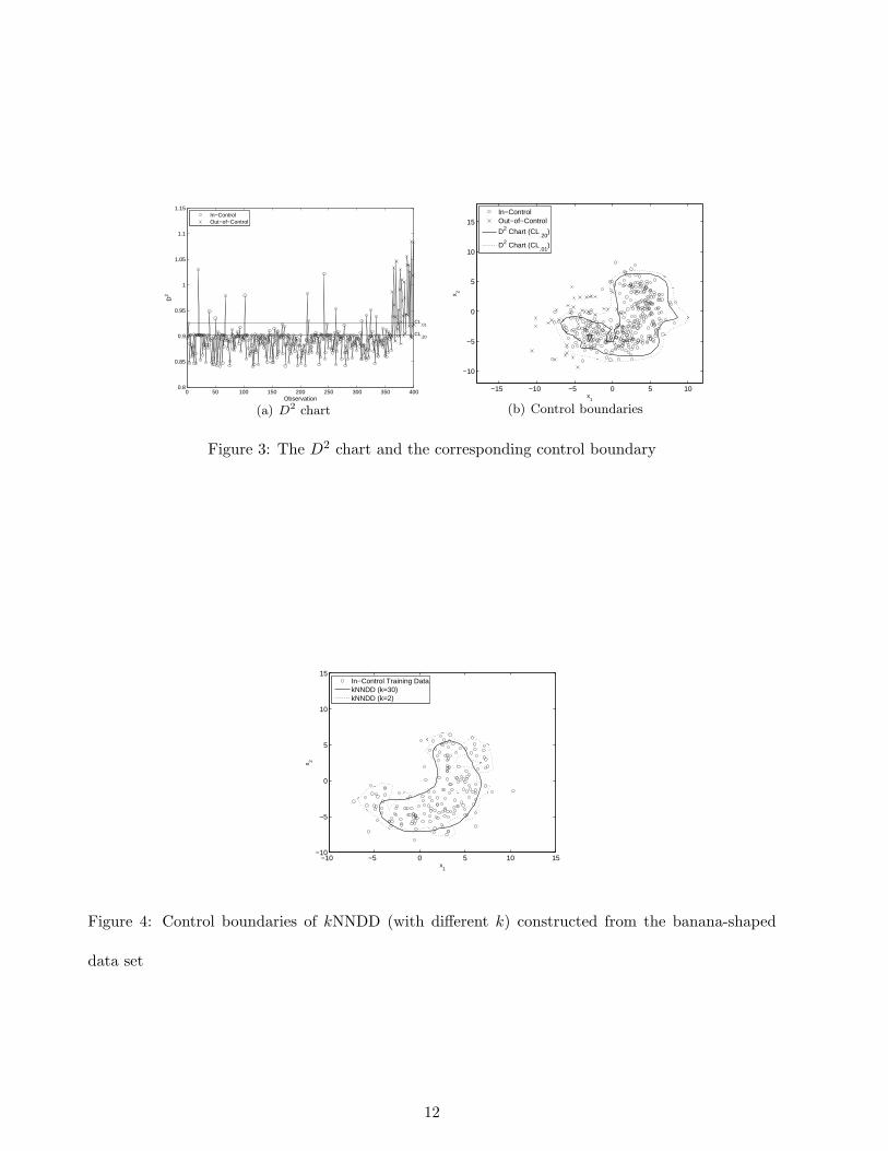
Figure 3 displays the D2 chart and the corresponding control boundary. In the D2 control chart,
180 in-control observations were used to estimate the control limits (bootstrap-based 99th and 80th
percentiles of the D2 statistics) and 400 D2 statistics from Phase II observations were plotted. Figure
3 (b) shows the corresponding control boundary generated from the D2 chart in Figure 3 (a). It
can be seen that by increasing the α value from 0.01 to 0.20, more out-of-control observations were
detected.
3 k-Nearest Neighbors Data Description (kNNDD)-Based Control
Charts
The SVDD algorithm involves an optimization problem that requires a high computational load
during the training process. The SVDD algorithm requires around 4.06 hours in one of our machines
to train the model using 4,000 bivariate observations. Because of the high computational cost, D2
charts may not be efficient for a process that needs frequent retraining. In order to address this
computational burden, we propose a new one-class classification-based control chart called a K2
9

chart. The algorithm used in a K2 chart requires about 5.42 seconds (on the same machine as
the SVDD algorithm) to complete 4,000 bivariate training observations. K2 charts are based on a
k-nearest neighbors data description (kNNDD) method that solves one-class classification problems
by estimating the local density of the data using a nearest neighbors algorithm (Breunig et al., 2000;
Tax, 2001). A brief description of the kNNDD algorithm is presented in the following section.
3.1 kNNDD Algorithm
Let NNi(z) be the ith nearest neighbor training observation of a data point z that needs to be
classified (or monitored). Let V be the volume of the hypersphere containing i nearest neighbor
training observations. Let N be the size of the training set. The local density of z can be determined
by:
d(z) =i/N
V ‖z−NNi(z)‖ . (12)
Similarly, the local density of NNi(z) can be determined by:
d(NNi(z)) =i/N
V ‖NNi(z)−NNi(NNi(z))‖ , (13)
where NNi(NNi(z)) is the ith nearest neighbor of NNi(z) in the same training set. The kNNDD
algorithm classifies z as the target class when the ratio of its local density of z (12) to the local
density of NNi(z) (13) is greater than or equal to 1, which can be explained as follows:
d(z)d(NNi(z))
=‖NNi(z)−NNi(NNi(z))‖
‖z−NNi(z)‖ ≥ 1. (14)
To make the algorithm more robust, the average of k distances is considered (for i = 1, ..., k). Thus,
(14) becomes:∑k
i=1 ‖NNi(z)−NNi(NNi(z))‖∑ki=1 ‖z−NNi(z)‖
≥ 1. (15)
In the kNNDD algorithm, the size of nearest neighbor, k, affects its performance. Figure 4 displays
the control boundaries obtained by kNNDD with two different values of k. Decision boundary with
10

k = 30 is fairly smooth compared to the control boundary obtained by using k = 2. One can search
possible values of k and find an appropriate one that compromises a tradeoff between oversmoothness
and undersmoothness of the control boundary. A previous study indicated that the proper range of
k in the kNNDD algorithm is between 10 to 50 (Breunig et al., 2000).
3.2 K2 Charts
To construct K2 charts, the average distance between z and k nearest observations is calculated as
follows:
K2 =∑k
i=1 ‖z−NNi(z)‖k
. (16)
K2 values are then used as monitoring statistics. The control limits of a K2 chart are obtained by
the bootstrap percentile procedure as we proposed in D2 charts (Please see Section 2.3). Here is the
detailed summary of the bootstrap percentile procedure for K2 charts.
1. Compute the D2 statistics of Phase I observations of size N using (11) and generate B inde-
pendent bootstrap samples. Let K2j1,K
2j2, . . . , K
2jN be a sequence of N K2 statistics from the
jth bootstrap sample (for j = 1, ..., B).
2. For each bootstrap sample, given a user specified α (0 < α ≤ 1) and the ordered K2 values
(K2j(1) < K2
j(2) < · · · < K2j(N)), K2
j(i) is the ith largest value of N K2 values in the jth bootstrap
sample where i is a roundup number of N · α.
3. Calculate the control limit (CL) by taking average of the ith largest values (i.e., 100 · (1−α)th
percentile values) in each of B bootstrap samples: CL=∑B
j=1 K2j(i)/B.
4. Monitoring Phase II observations: Declare the observations out of control if the corresponding
K2 values exceed the control limit.
Figure 5 displays the K2 chart (k=30) and the corresponding control boundary from the banana-
shaped data set. Two different control limits were calculated by estimated percentiles (99th and
11
0 50 100 150 200 250 300 350 4000.8
0.85
0.9
0.95
1
1.05
1.1
1.15
Observation
D2
CL.20
CL.01
In−ControlOut−of−Control
(a) D2 chart
−15 −10 −5 0 5 10
−10
−5
0
5
10
15
x1
x 2
In−ControlOut−of−Control
D2 Chart (CL.20
)
D2 Chart (CL.01
)
(b) Control boundaries
Figure 3: The D2 chart and the corresponding control boundary
−10 −5 0 5 10 15−10
−5
0
5
10
15
x1
x 2
In−Control Training DatakNNDD (k=30)kNNDD (k=2)
Figure 4: Control boundaries of kNNDD (with different k) constructed from the banana-shaped
data set
12

80th) from 5,000 bootstrap samples of 180 K2 statistics. For monitoring Phase II observations, the
K2 value of each Phase II observation was plotted. Figure 5 (b) displays the control boundaries
corresponding to the control limits embedded in a two-dimensional plot of the Phase II observations,
showing that control charts become more sensitive as α increases.
4 Simulation Study
4.1 Simulation Setup
A simulation study was conducted to compare the performance among D2, K2, T 2, and OC-SVM
charts. We generated the data based on the bivariate normal, bivariate t, and bivariate gamma and
a banana-shaped data set. For D2 and OC-SVM charts, we used the width of Gaussian kernel, S=1
for the normal, t, and gamma cases and S=3 for the banana-shaped data. For K2 charts, we used
k=30. One thousand Phase II observations (900 in-control and 100 out-of-control) were monitored
based on the control limits that were established by 200 Phase I observations. Let µ0 and Σ0 be the
mean vector and the covariance matrix of the in-control data. Let µ1 = µ0 + δ be the mean vector
of the out-of-control data. The magnitude of the shift δ is represented by the following noncentrality
parameter λ:
λ =√
δTΣ-10 δ. (17)
To generate the out-of-control data for the bivariate normal, bivariate t, and bivariate gamma
distributions, two types of mean shifts (i.e., the medium mean shift λ = 2 and the large mean shift
λ = 3) were considered. At a certain value of λ, all variables are shifted equally. Note that we do not
consider the change in variance. We generated two different angles of banana shapes that represent
the in-control and out-of-control data (please see Duin et al., 2007, for more details on generating
the banana-shaped data set). The summary of simulation scenarios is described as follows:
• N2, λ = 2: The medium-mean-shift case of the bivariate normal distribution with
13

µ0 =[
0 0
]and Σ0 =
1 .35
.35 1
.
• N2, λ = 3: The large-mean-shift case of the bivariate normal distribution with
µ0 =[
0 0
]and Σ0 =
1 .35
.35 1
.
• t2(3), λ = 2: The medium-mean-shift case of the bivariate t distribution with three degrees of
freedom.
• t2(3), λ = 3: The large-mean-shift case of the bivariate t distribution with three degrees of
freedom.
• Gam2(1, 1), λ = 2: The medium-mean-shift case of the bivariate gamma distribution with the
shape and scale parameters, where both of them are one.
• Gam2(1, 1), λ = 3: The large-mean-shift case of the bivariate gamma distribution with with
the shape and scale parameters, where both of them are one.
• Banana-Shaped: A banana-shaped data set with two different angles.
4.2 Control Limits
In contrast to existing OC-SVM charts that use the parameter f of the SVDD algorithm to adjust
the control limits, the control limits of D2 and K2 charts are adjusted by the percentile, which is
estimated by the bootstrap method. Figures 6 and 7 show how actual type I and type II error
rates in the D2, K2, T 2, and OC-SVM charts are controlled by the controlling factors (α or f),
indicated in the x-axes. We used the average values of actual type I and type II error rates from 100
simulation runs. The standard errors of 100 simulations are relatively small (between .02 and .06),
demonstrating that 100 simulations are enough to draw the meaningful conclusion. We presented
the results for only N2 and Gam2(1, 1) scenarios, respectively, as examples of normal and nonnormal
14

cases. In general, as the controlling factor increases, all control charts produced larger type I error
rates but produced smaller type II error rates. The particularly strong positive correlation between
the actual type I error rate and the controlling factor is desired. The proposed D2 and K2 charts
satisfy this condition in both normal and nonnormal cases, but T 2 charts satisfy this condition in
only normal cases. In both normal and nonnormal cases, OC-SVM charts failed to provide strong
linear correlation between the actual type I error rate and the controlling factor. Moreover, type I
and type II error rates may not be properly controlled by f as the size of target observations goes up
in OC-SVM charts. Figure 8 shows OC-SVM charts, constructed from the N2 with λ = 2 scenario
using 300 and 400 target observations. It can be observed that type I and type II error rates seem
to be constant over the different values of f . As we defined earlier in (4), f represents the fraction of
the target data outside the decision boundary and has an inverse relationship with the total number
of target observations. Thus, with the large number of target observations, the fraction of the target
data (f) plays a little role in changing the control boundary, leading to relatively constant type I
and type II error rates. These demonstrate that f is an inappropriate choice as the controlling factor
in OC-SVM charts.
4.3 Performance Comparisons
The average values of type I and type II error rates from 100 simulation runs among D2, K2, T 2,
and OC-SVM charts were compared. The control chart that yields a lower type II error rate is
considered a better method if the type I error rate is similar. Figures 9 displays the average rates of
type I and type II error under all the simulation scenarios studied.
The result shows that the D2 and K2 charts produced smaller type II error rates than the T 2
chart, given similar type I error rates in the gamma and banana-shaped data scenarios. In the
normal and t cases, all methods provide comparable performances. The range of standard errors
of 100 simulation is between .02 and .08 for the normal, t, and Gamma cases, while much larger
15

0 50 100 150 200 250 300 350 4000
5
10
15
20
25
30
Observation
K2
CL.20
CL.01
In−ControlOut−of−Control
(a) K2 chart
−15 −10 −5 0 5 10
−10
−5
0
5
10
15
x1
x 2
In−ControlOut−of−Control
K2 Chart (CL.20
)
K2 Chart (CL.01
)
(b) Control boundaries
Figure 5: The K2 chart and the corresponding control boundary
0 0.2 0.4 0.6 0.8 10
0.1
0.2
0.3
0.4
0.5
0.6
0.7
0.8
0.9
1
α
Err
or R
ate
Type I Error RateType II Error Rate
(a) D2 chart
0 0.2 0.4 0.6 0.8 10
0.1
0.2
0.3
0.4
0.5
0.6
0.7
0.8
0.9
1
α
Err
or R
ate
Type I Error RateType II Error Rate
(b) K2 chart
0 0.2 0.4 0.6 0.8 10
0.1
0.2
0.3
0.4
0.5
0.6
0.7
0.8
0.9
1
α
Err
or R
ate
Type I Error RateType II Error Rate
(c) T 2 chart
0 0.2 0.4 0.6 0.8 10
0.1
0.2
0.3
0.4
0.5
0.6
0.7
0.8
0.9
1
f
Err
or R
ate
Type I Error RateType II Error Rate
(d) OC-SVM chart
Figure 6: Average type I and type II error rates from D2, K2, T 2, and OC-SVM charts (N2 with λ
= 2 scenario)
16

0 0.2 0.4 0.6 0.8 10
0.1
0.2
0.3
0.4
0.5
0.6
0.7
0.8
0.9
1
α
Err
or R
ate
Type I Error RateType II Error Rate
(a) D2 chart
0 0.2 0.4 0.6 0.8 10
0.1
0.2
0.3
0.4
0.5
0.6
0.7
0.8
0.9
1
α
Err
or R
ate
Type I Error RateType II Error Rate
(b) K2 chart
0 0.2 0.4 0.6 0.8 10
0.1
0.2
0.3
0.4
0.5
0.6
0.7
0.8
0.9
1
α
Err
or R
ate
Type I Error RateType II Error Rate
(c) T 2 chart
0 0.2 0.4 0.6 0.8 10
0.1
0.2
0.3
0.4
0.5
0.6
0.7
0.8
0.9
1
f
Err
or R
ate
Type I Error RateType II Error Rate
(d) OC-SVM chart
Figure 7: Average type I and type II error rates from D2, K2, T 2, and OC-SVM charts (Gam2(1, 1)
with λ = 2 scenario)
0 0.2 0.4 0.6 0.8 10
0.1
0.2
0.3
0.4
0.5
0.6
0.7
0.8
0.9
1
f
Err
or R
ate
Type I Error RateType II Error Rate
(a) Using 300 Phase I Observations
0 0.2 0.4 0.6 0.8 10
0.1
0.2
0.3
0.4
0.5
0.6
0.7
0.8
0.9
1
f
Err
or R
ate
Type I Error RateType II Error Rate
(b) Using 400 Phase I Observations
Figure 8: Average type I and type II error rates from OC-SVM charts when the number of Phase I
observations is large (N2 with λ = 2 scenario)
17

0 0.2 0.4 0.6 0.8 10
0.1
0.2
0.3
0.4
0.5
0.6
0.7
0.8
0.9
1
Type I Error Rate (α)
Typ
e II
Err
or R
ate
(β)
D2 Chart
K2 Chart
T2 ChartOCSVM Chart
(a) N2 with λ = 2 scenario
0 0.2 0.4 0.6 0.8 10
0.1
0.2
0.3
0.4
0.5
0.6
0.7
0.8
0.9
1
Type I Error Rate (α)
Typ
e II
Err
or R
ate
(β)
D2 Chart
K2 Chart
T2 ChartOCSVM Chart
(b) N2 with λ = 3 scenario
0 0.2 0.4 0.6 0.8 10
0.1
0.2
0.3
0.4
0.5
0.6
0.7
0.8
0.9
1
Type I Error Rate (α)
Typ
e II
Err
or R
ate
(β)
D2 Chart
K2 Chart
T2 ChartOCSVM Chart
(c) t2(3) with λ = 2 scenario
0 0.2 0.4 0.6 0.8 10
0.1
0.2
0.3
0.4
0.5
0.6
0.7
0.8
0.9
1
Type I Error Rate (α)
Typ
e II
Err
or R
ate
(β)
D2 Chart
K2 Chart
T2 ChartOCSVM Chart
(d) t2(3) with λ = 3 scenario
0 0.2 0.4 0.6 0.8 10
0.1
0.2
0.3
0.4
0.5
0.6
0.7
0.8
0.9
1
Type I Error Rate (α)
Typ
e II
Err
or R
ate
(β)
D2 Chart
K2 Chart
T2 ChartOCSVM Chart
(e) Gam2(1, 1) with λ = 2 scenario
0 0.2 0.4 0.6 0.8 10
0.1
0.2
0.3
0.4
0.5
0.6
0.7
0.8
0.9
1
Type I Error Rate (α)
Typ
e II
Err
or R
ate
(β)
D2 Chart
K2 Chart
T2 ChartOCSVM Chart
(f) Gam2(1, 1) with λ = 3 scenario
0 0.2 0.4 0.6 0.8 10
0.1
0.2
0.3
0.4
0.5
0.6
0.7
0.8
0.9
1
Type I Error Rate (α)
Typ
e II
Err
or R
ate
(β)
D2 Chart
K2 Chart
T2 ChartOCSVM Chart
(g) Banana-shaped scenario
Figure 9: Type I and type II error rates of the D2, K2, T 2, and OC-SVM charts under the simulation
scenarios studied
18

standard errors were obtained from OC-SVM (between .10 and .26). It should be noted that OC-
SVM charts produce very irregular type II error rates over type I error rates. Consequently, it is
difficult to compare the performance of OC-SVM with other charts.
5 Phase I Application of D2 and K2 Charts
Phase I analysis separates the in-control data from the historical data set, which is a mixture of
the in-control and out-of-control data, in order to establish the reliable control limits for monitoring
future observations. A simulation study was conducted to show the applicability of D2 and K2
charts for Phase I problems. We compared the performance of the D2 and K2 charts with the
existing Phase I method that recursively removes the observations that exceed the control limits
until no out-of-control observations are detected. In multivariate processes, this recursive procedure
is performed by the Hotelling’s T 2 control chart in the Phase I application (Montgomery, 2005).
We generated 200 historical observations from the bivariate normal, bivariate t, and bivariate
gamma distributions and a banana-shaped data set. We assigned 20 observations (out of 200) to
be out of control where two different noncentrality parameters, λ=2 and λ = 3, were used for the
bivariate normal, bivariate t, and bivariate gamma distributions. For the banana-shaped data set,
two different angles of banana shapes were used to represent the in-control and out-of-control data.
The D2 and K2 charts were constructed with all 200 observations. The control charts removed the
historical observations in which the statistics exceed the control limits. Analogous to D2 and K2
charts for Phase II analysis, 100 × (1 − α)th bootstrap percentiles of the D2 and K2 statistics of
the historical data were used as control limits in Phase I analysis. The remaining observations were
defined as in control. The observations that were actually in control but incorrectly removed were
type I errors. The remaining observations that were actually out of control were type II errors.
We compared the performances of the D2 and K2 charts with the recursive T 2 in terms of
type I and type II error rates (average values from 100 simulation runs). Table 1 shows that the
19

performances of the D2 and K2 charts are slightly better than recursive T 2 under the normal
and t scenarios but they are comparable. Because the Hotelling’s T 2 chart can effectively handle
multivariate normal data, the recursive T 2 is also an appropriate method in normal distribution cases
of Phase I analysis. However, in the gamma and banana-shaped data scenarios, the D2 and K2 charts
produced smaller type II error rates than the recursive T 2 method. This clearly demonstrates that
D2 and K2 charts are effective approaches to use for Phase I analysis in both normal and nonnormal
cases.
6 Conclusions
We have proposed new multivariate control charts based on one-class classification algorithms. The
proposed D2 and K2 charts obtain their monitoring statistics from the SVDD and kNNDD al-
gorithms. The control limits are derived from the bootstrap-estimated percentile of monitoring
statistics. The proposed control charts, because of their data-driven nature, can effectively describe
reality, reflect the unique characteristics of the data being monitored, and require a minimal set of
assumptions to construct a control chart. The comparative study from the simulated data shows
that performances of the D2 and K2 charts were comparable to T 2 charts in the normal distribution
case. However, D2 and K2 charts outperformed T 2 charts in nonnormal distribution cases. More-
over, we demonstrated the applicability and effectiveness of the D2 and K2 chart techniques for
Phase I problems. There are several interesting directions for future research. One such direction is
to extend our study to other one-class classification methodologies. Further research also can develop
more efficient ways to establish control limits. A more comprehensive simulation study should be
conducted to evaluate the efficacy and consequences of various scenarios, including the impact of
variance changes.
20

Table 1: Average values of type I error rate (α) and type II error rate (β) of the D2 chart, the
K2 chart, and the recursive T 2 in Phase I application (average values of standard errors are shown
inside the parentheses)
D2 K2 T 2
Scenarios α β α β α β
N2, λ = 2 .1869 .3630 .1829 .3485 .1892 .3865
(.0128) (.0994) (.0124) (.1065) (.0566) (.1354)
N2, λ = 3 .2124 .0800 .2183 .0825 .2137 .0915
(.0103) (.0674) (.0097) (.0561) (.0664) (.0810)
t2(3), λ = 2 .2219 .6830 .2144 .6790 .2248 .7165
(.0119) (.0932) (.0122) (.0970) (.0426) (.1071)
t2(3), λ = 3 .2038 .6290 .1995 .6375 .2069 .6230
(.0132) (.0949) (.0126) (.1013) (.0444) (.1436)
Gam2(1), λ = 2 .1996 .2410 .2101 .2825 .2089 .3250
(.0171) (.1307) (.0140) (.1196) (.0596) (.1969)
Gam2(1), λ = 3 .2204 .0380 .2208 .0715 .2335 .1200
(.0100) (.0556) (.0116) (.0905) (.0781) (.1482)
Banana-Shaped .1751 .1680 .1771 .0865 .1791 .2380
(.0118) (.0886) (.0127) (.0721) (.1026) (.1211)
21

References
Bakir, S., (2006) Distribution-free quality control charts based on signed-rank-like statistics. Communications
in Statistics: Theory and Methods, 35, 743–757.
Breunig, M.M., Kriegel, H.P., Ng, R.T. and Sander, J. (2000) LOF: identifying density-based local outliers.
in Proceedings of the ACM SIGMOD 2000 international conference on management of data, 29, pp.
93–104.
Chakraborti, S., Van Der Laan, P. and Bakir, S.T. (2001) Nonparametric control chart: an overview and some
results. Journal of Quality Technology, 33(3), 304–315.
Chinnam, R.B. (2003) Support vector machines for recognizing shifts in correlated and other manufacturing
processes. International Journal of Production Research, 40(17), 4449–4466.
Cook, D.F. and Chiu, C.C. (1998) Using radial basis function neural networks to recognize shifts in correlated
manufacturing process parameters. IIE Transactions, 30(3), 227–234.
Duin, R.P.W., Juszczak, P., Paclik, P., Pekalska, E., de Ridder, D. and Tax, D.M.J. (2007) PRTools4: The
Matlab Toolbox for Pattern Recognition. Available at http://www.prtools.org/, accessed November 2007.
Efron, B. and Tibshirani, R. (1993) An Introduction to the Bootstrap. Chapman & Hall/CRC, Boca Raton,
FL.
Hotelling, H. (1947) Multivariate quality control in Techniques of Statistical Analysis, Eisenhart, C., Hastay,
M.W., and Wills, W.A. (eds), McGraw-Hill, New York, NY, pp. 111–184.
Hu, J., Gunger, G. and Tuv, E. (2007) Tuned artificial contrasts to detect signals. International Journal of
Production Research, 23(1), 5527–5534.
Hwang, W.Y., Runger, G. and Tuv, E. (2005) Multivariate statistical process control with artificial contrasts.
IIE Transactions, 39(6), 659–669.
Kim, S.H., Alexopoulos, C., Tsui, K.L. and Wilson, J.R. (2007) A distribution-free tabular CUSUM chart for
autocorrelated data. IIE Transactions, 39(3), 317–330.
22

Kumar, S., Choudhary, A.K., Kumar, M., Shankar, R. and Tiwari, M.K. (2006) Kernel distance-based robust
support vector methods and its application in developing a robust K-chart. International Journal of
Production Research, 44(1), 77–96.
Liu, R.Y., Singh, K. and Teng, J.H. (2004) DDMA-charts: nonparametric multivariate moving average control
charts based on data depth. Allgemeines Statistisches Archiv, 88(2), 235–258.
Lowry, C.A. and Montgomery, D.C. (1995) A review of multivariate control charts. IIE Transactions, 27(6),
800–810.
Mason, R.L. and Young, J.C. (2002) Multivariate Statistical Process Control with Industrial Applications.
American Statistical Association and Society for Industrial and Applied Mathematics, Philadelphia, PA.
Montgomery, D.C. (2005) Introduction to Statistical Quality Control, fifth edition. Wiley, New York, NY.
Qiu, P. (2008) Distribution-free multivariate process control based on log-linear modeling. IIE Transactions,
40(7), 664–677.
Smith, A.E. (1994) X and R control chart interpretation using neural computing. International Journal of
Production Research, 32(2), 309–320.
Stoumbos, Z.G., Reynolds, M.R., Ryan, T.P. and Woodall, W.H. (2000) The state of statistical process control
as we proceed into the 21st century. Journal of the American Statistical Association, 95, 992–998.
Sun, R. and Tsung, F. (2003) A kernel-distance-based multivariate control chart using support vector methods.
International Journal of Production Research, 41(13), 2975–2989.
Tax, D.M.J. (2001) One-class classification: concept-learning in the absence of counter-examples. PhD thesis,
Delf University of Technology, Netherlands.
Tax, D.M.J. and Duin, R.P.W. (2004) Support vector data description. Machine Learning, 54(1), 45–66.
Vapnik, V.N. (1998) Statistical Learning Theory. Wiley, New York, NY.
Woodall, W.H. (2000) Controversies and contradictions in statistical process control. Journal of Quality Tech-
nology, 32(4), 341–350.
23

Woodall, W.H. and Montgomery, D.C. (1999) Research issues and ideas in statistical process control. Journal
of Quality Technology, 31(4), 376–386.
Zhang, H. and Albin, S. (2007) Determining the number of operational modes in baseline multivariate SPC
data. IIE Transactions, 39(12), 1103–1110.
Zhang, Z., Zhu, X. and Jin, J. (2007) SVC-based multivariate control charts for automatic anomaly detection in
computer networks. in Proceedings of the Third International Conference on Autonomic and Autonomous
Systems.
24