
Olx case study
17
ux case study olx mobile app
Transcript of Olx case study

ux case study
olx mobile app

Hello I am Jeetendra
ux ui visual designer

about me
Passionate about designing brands, creating lasting impressions and crafting
beautiful solutions.
Studied Graphic Design from Govt. College of Art & Craft and Rabindra Bharati
University, kolkata and continues to develop skills in User Experience Design.

initial brief
OLX - free classifieds app that lets buy and sell second-hand goods locally.

first appearance
OLX asks to check for location. This is good because then the app can use that to
customise my home screen experience. Maybe show recent listings in popular
categories. Maybe show some good deals, or listings getting the most clicks. All
this would really help to decrease the exits from home screen and engage the user
more.
The app could not figure out my location automatically so prompted me to
manually choose the country, state, city and area.

home screen A generic home
screen that is dull
and uninteresting.
Multiple icon colour,
looking like rainbow.
losing user attention.
some colors are so
dull it cannot visible
at high contrast
display.
While there are multiple forms
of the condition, red/green color
blindness is the most common

Reparation of menu
at main navigation.
1. Mobile and
Electronic and be
combine together as
Electronics &
Appliance.
2. Car and Bikes
combines together
into Autos.
The observation…that the
number of objects an average
person can hold in working
memory is about seven.
Miller’s Law
main navigation
menu reparation

main navigation
Listed navigation is
present at home
screen. Each list
contain icon and
text. While the icon
size is variable. It
should be same. The
spacing between
icon and text
required more space.
Here Bikes create more
dominancy, due to it bigger
appearance.

main navigation
user interaction
While long tap on the
list menu the tap
color changed and
it's too dark the
badge items
disappear / not
readable.
Improper colour style causes
accessibility issue.
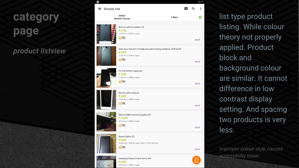
category page
product listview
list type product
listing. While colour
theory not properly
applied. Product
block and
background colour
are similar. It cannot
difference in low
contrast display
setting. And spacing
two products is very
less.
Improper colour style causes
accessibility issue.

category page
product gridview
Grid type product
listing. Product block
and background
colour are similar.
Grid view is much
better than list view.
Improper colour style causes
accessibility issue.

category page
navigation
Confusing
navigation. Unable to
understand the uses.
It look like tab, but it
not. all three are
different. There is no
demarcation
between the links /
menu.
Recognition rather than recall:
Minimize the user's memory
load by making objects, actions,
and options visible. The user
should not have to remember
information from one part of the
dialogue to another.

Product page
product details
Visibility of system
status is missing.
Products headline
required on top
rather than the
image bottom.
Improper colour style causes
accessibility issue.

Product page
product details
Navigation icon lost
due to dark
background.
Consistency and standards
missing!

Submit a Free Ad
Create advt form
There is no way to
undo a text edit on
Android! Avoid
pissing the user off
by giving him no
choice to revert to an
earlier state
User control and freedom
missing.

Overall the user experience is average. It's required to improve the design.
Negative space is required.
Tap area is too less.
Need to improve products listing page, it's too dull (list view)
Some usability issue is there.
Visibility of system status often unavailable.
conclusion


![[Case Study] OLX India leverages InMobi to acquire high-quality users at 50% lower costs](https://static.fdocuments.net/doc/165x107/5a64a6ac7f8b9a27568b835f/case-study-olx-india-leverages-inmobi-to-acquire-high-quality-users-at-50.jpg)