Objectives Understand how visuals are classified Learn about signs and symbols Study the basics of...
31
-
Upload
destiny-okey -
Category
Documents
-
view
214 -
download
0
Transcript of Objectives Understand how visuals are classified Learn about signs and symbols Study the basics of...

Objectives
• Understand how visuals are classified• Learn about signs and symbols• Study the basics of designing icons• Become familiar with media, methods, and visualization• Learn about image creation, selection, and manipulation• Grasp visualizing form• Acquaint yourself with drawing for designers and graphic
interpretations• Begin to learn about designing with color• Apprehend storytelling through visualization

Definitions
• Images is a broad term encompassing a great variety of representational, abstract, or nonobjective images—photographs, illustrations, drawings, paintings, prints, pictographs, signs, symbols, maps, diagrams, optical illusions, patterns, and graphic elements and marks; images are also called visuals.
• A color scheme is a harmonious color combination employed by a designer.
• A sign is a visual mark or a part of language that denotes another thing.
• An icon is a visual to represent objects, actions, and concepts. • An index is sign that signifies through a direct relationship
between the sign and the object, without describing or resembling the thing signified.
• A symbol is a visual that has an arbitrary or conventional relationship between the signifier and the thing signified.

Visualization and Color
• Steps in the process of conceptualization, visualization, and composition can happen simultaneously or with great overlap, with back and forth, modifying a concept as you make discoveries while visualizing. During the course of visualization, you will find your
preliminary decisions are subject to change. You may find your initial impulse overridden by intuition
during the process, by a critique, by practical matters related to image quality, time, budget, by a happy accident that altered your thinking, or by any number of factors.

Image Classifications and Depictions
• Graphic designers work with two main components: type and images. Images is a broad term encompassing a great
variety of representational, abstract, or nonobjective images—photographs, illustrations, drawings, paintings, prints, pictographs, signs, symbols, maps, diagrams, optical illusions, patterns, and graphic elements and marks; images are also called visuals.
Classifying images helps you understand the range and how to depict them to meet your communication goals.

• Classifications include: Notation Pictograph Silhouette Linear
Contour Light and Shadow Naturalistic Expressionistic
Image Classifications and Depictions

• There are three basic classifications of depiction as they directly refer to and then move away from what we see in nature: Representational Abstraction Nonobjective
Image Classifications and Depictions

About Signs and Symbols
• Graphic design signifies. Graphic design represents. Graphic design communicates.
• From the theory of semiotics, the study of signs and symbols, we get a classification of signs—what they mean and how they are used in graphic design. Sign Icon Index Symbol

About Signs and Symbols
Use of Signs and Symbols• Signs and symbols serve many
functions and purposes in graphic design, whether as a stand-alone image, or most often as componentsof a design solution.
• So much information must be universally understood, crossing language and cultural barriers. Signs or icons in the form of
pictographs—visual, nonverbal communication—are characterized by elemental forms. These graphics depict universal, immediately recognizable objects, places, human gestures, and actions; also called pictograms.
The Talk Chart© The Design Studio at Kean University

Icon Design
• Icons and icon systems are used for print, environmental graphics, or screen. They have become more ubiquitous due to the proliferation of screen media and their significant roles in websites, mobile apps and more.
• Across media, you have many of the same considerations: Who is the audience ? At what size will the icons be seen? What is the context and where will the icons be seen—on
screen, close-up, lighted, from a distance, in print? At which perspective or angle?
What are the communication goals? What do the icons represent—actions, figures, places, objects, creatures?
How reductive or elemental do they need to be to work? Totally no-frills?
Are the icons part of a system? Which style will work across the system and is appropriate
for the entire design project?
Icon Design
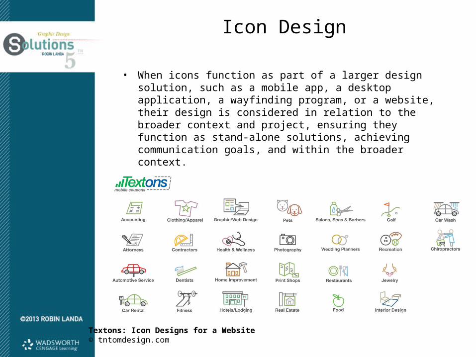
• When icons function as part of a larger design solution, such as a mobile app, a desktop application, a wayfinding program, or a website, their design is considered in relation to the broader context and project, ensuring they function as stand-alone solutions, achieving communication goals, and within the broader context.
Textons: Icon Designs for a Website© tntomdesign.com

Icon Design
• Designing a system requires a clear design concept and a consistent use of scale, perspective, shapes, and formal elements, such as line, color, and texture.
• Icon Design Tips: Accurately depict the shape of the object Aim for elemental form Represent an image from its most characteristic angle Select commonly recognizable images Select color and/or values for impact, legibility, meaning,
brand storytelling, and context Treat all icons in a system consistently Use a consistent single light source on all icon objects Icons should work well on both white and black backgrounds. Scale the icon for different sizes

Media, Methods, and Visualization
• After you generate a design concept or several concepts for an assignment, you consider the content, which is the required text and image components. Then you make preliminary decisions about: Media and Methods: How
the graphic components will be created, visualized, and displayed on screen or in print.
Mode of Visualization and/or Style: This is how you will render and execute the visuals and type for a project
Avila/Weeks Dance: Poster© Luba Lukova

Media, Methods, and Visualization
• You can create imagery using a multitude of tools and media.• Broad categories of producing and creating images:
Illustration Photography Graphic interpretation Collage Photomontage Mixed media Motion graphics Diagram

Creating, Selecting, and Manipulating Images
• Imagery is either created by the designer, commissioned from an illustrator or photographer, selected by the designer from among obtainable stock imagery or the client’s archives, or found by the designer.
• When a budget does not allow for commissioning an illustrator or photographer, you can turn to available archives of preexisting illustrations or photographs, referred to as stock, which can be licensed for a project from stock houses. When you create your own image, you are in control. When you select a stock image, you either accept the
image as is—as someone else conceived, visualized, and composed it—or alter it, assuming the stock image provides rights for such alterations.
Some designers employ found imagery, utilizing openly available imagery or objects in environments, public domain, or copyright-free images.
Creating, Selecting, and Manipulating Images
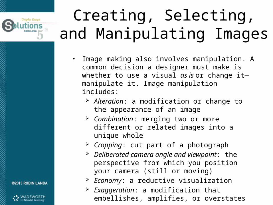
• Image making also involves manipulation. A common decision a designer must make is whether to use a visual as is or change it—manipulate it. Image manipulation includes: Alteration: a modification or change to the appearance of
an image Combination: merging two or more different or related
images into a unique whole Cropping: cut part of a photograph Deliberated camera angle and viewpoint: the perspective
from which you position your camera (still or moving) Economy: a reductive visualization Exaggeration: a modification that embellishes, amplifies,
or overstates Silhouette: removing the background of an image leaving
only the outline of an object or figure

Basics of Visualizing Form
Sharpness Versus Diffusion• Sharpness is characterized by clarity of form. Diffusion is
characterized by blurred forms and boundaries.
Accuracy Versus Distortion• Viewers believe an object or subject to be accurately depicted
when it conforms with what they know or to common knowledge of that form. When an object or subject is twisted, stretched, bent, warped, buckled, or significantly altered from its normal appearance, it is distorted.
Economy Versus Intricacy• Economy refers to stripping down visuals to fundamental
forms, reducing them, using as little description and as few details as possible for denotation. Intricacy is based on complexity, on the use of many component parts and/or details to describe and visually communicate.

Basics of Visualizing Form
Subtle Versus Bold• Subtlety can be created through low contrast, muted color
palettes or tints, static compositions, transparencies, layering, limiting typefaces and alignment, and atmospheric perspective. Boldness can be conveyed with big, brassy, aggressive movements and compositions, saturated color palettes, thick lines, high contrast, cropping, or images that are near.
• Related to this is understatement versus exaggeration.
Predictable Versus Spontaneous• Pattern, symmetry, absolute consistency of elements and their
treatment, stable compositions, even weights, among other things would be considered predictable. Sketchiness, abrupt movements, asymmetry, changes in pace, staccato lines, open forms, changes in case, or blurring of edges could communicate spontaneity.

Basics of Visualizing Form
Opaque Versus Transparent• Opaque elements are dense, seemingly solid, and not seen
through. Elements, type, and visuals can be transparent, which means see-through from one image to another, from one letterform to another, or from one color to another.
Linear Versus Painterly Modes• A linear mode is characterized by a predominant use of lines to
describe forms or shapes within a composition. In graphic design, painterly modes are characterized by the use of color and value to describe shapes and forms, relying on visible, broad, or a sketchy description of form.

Basics of Visualizing Form
Hard Edge Versus Brushy• In painting, hard-edge visualization is almost diametrically
opposed to works in a brushy, painterly style.
Proximate Vision Versus Distant Vision: Modes of Representation• All images are rendered in focus and in detail in proximate
vision regardless of whether they are near or far in space. • In distant vision, the effect of the atmosphere between the
artist’s (and viewer’s) vision and the thing seen is in evidence. There is one point of focus with surrounding elements somewhat obscured.
Singularity Versus Juxtaposition• You can juxtapose two or more images for contrast or in a
synergistic way.

Drawing for Designers and Graphic Interpretations
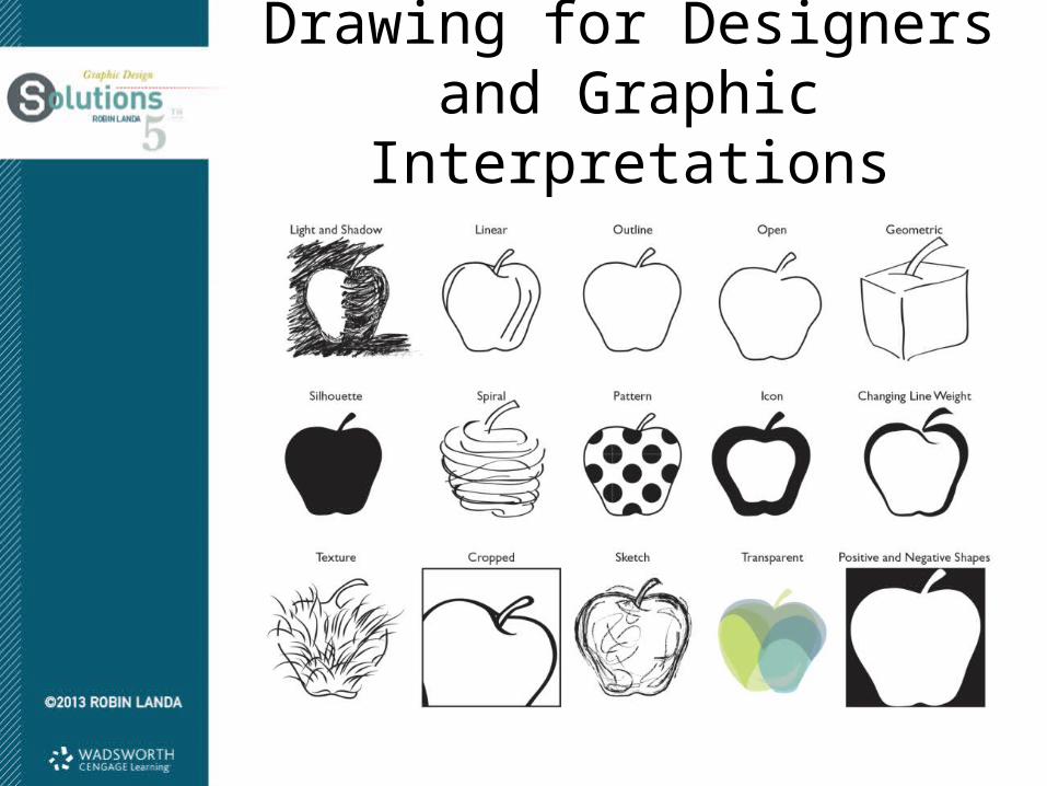
• Designers utilize a variety of visualizing techniques; they also use visualizing as a creative process of visual thinking and during concept development and design development.
• Visualizing techniques include: Line Drawing Contour Drawing Elemental Flat Shape Tonal Drawing Sketches Rendering Cartoon Drawing Caricaturing
Drawing for Designers and Graphic Interpretations

Presentation: Margins, Rules, Borders, Cropping, and Bleeds:• How you present a visual
affects communication.• Will you crop it? Bleed it?
Isolate it? Juxtapose it? Frame it? How will the visual be presented on the page?
• Considerations include: Margins Rules Borders Cropping Bleed or full bleed
Presentation

• Responses to color vary depending on culture, region, gender, and personal preferences.
• Color is elusive; its meaning is tied to specific experiential contexts.• It has optical properties that change.• Color is physical and also lives in the digital realm.
Using Color

Relationships on the Pigment Color Wheel• Essential color relationships start with
the pigment color wheel, which diagrams basic color harmonies.
• The three primary colors on the color wheel are red, blue, and yellow When used together as a color
palette, this basic group of pigment primaries is bold and elemental or expresses nostalgia or childlike innocence.
• The secondary colors in pigment (orange, green, and violet) are mixtures of the primaries. They have less hue contrast among
themselves than the primary group because they are mixtures; they yield a less bold relationship.
Using Color

• Mixtures of the pigment primaries and secondaries yield interval colors between the two: blue (primary) + green (secondary) = blue-green (interval). These three sets of color groups (primary, secondary, and
interval) comprise the basic pigment color wheel, which we use as a guide for mixing and for harmonious color combinations.
• The role of neutrals (white, black, and gray) in color relationships varies depending on amounts, position, and the hues they accompany; they are also called achromatic colors.
Using Color

Color Temperature• A hue may be warm or cool in temperature, which refers to
whether the color looks hot or cold. The temperature of a color is not absolute but can fluctuate
depending on the strength of the dominant hue of a color. Saturation and value also affect temperature.
• For student designers, when mixing colors, it is best practice to use a color palette that is either cool or warm, especially for representational imagery.
• Cool and warm colors in opposition on the color wheel seem to create visual tension or spatial “push-and-pull” effects when composed together.
Using Color

Color Schemes• Color schemes based on hues at full saturation and of middle value.
Monochromatic color schemes employ only one hue. Analogous color schemes employ three adjacent hues. Complementary color schemes are based on a relationship between
any two opposing hues on the pigment color wheel. Split complementary color schemes include three hues: one color
plus the two colors adjacent to its complement on the color wheel. Triadic color schemes include three colors that are at equal distance
from each other on the color wheel. Tetradic color schemes are composed of four colors in two sets of
complements (a double complementary). Cool colors are the blue, green, and violet hues located
approximately on the left half of the pigment color wheel. Warm colors are the red, orange, and yellow hues located
approximately on the right half of the color wheel.
Using Color

• Every image tells a story through its subject, visualization, and composition. And every aspect of that image—color, light and
shadow, details, angle/point of view, value contrast—all contribute to the nature of the story: what you leave in an image, what you edit out—how you frame it, whether you crop it, and so on.
All images tell stories—the story the visual artist, director, or writer intends—and the story the viewer gleans from it and brings to it.
A Final Word on Visualization: Storytelling

Summary
• Graphic designers work with two main components: type and images.
• Images is a broad term encompassing a great variety of representational, abstract, or nonobjective images—photographs, illustrations, drawings, paintings, prints, pictographs, signs, symbols, maps, diagrams, optical illusions, patterns, and graphic elements and marks; images are also called visuals.
• Steps in the process of conceptualization, visualization, and composition can happen simultaneously or with great overlap, with back and forth, modifying a concept as you make discoveries while visualizing.
• Classifying images helps you understand the range and how to depict them to meet your communication goals.

Summary
• After you generate a design concept or several concepts for an assignment, you consider the content, which is the required text and image components.
• You can create imagery using a multitude of tools and media.
• Drawing as visualizing for graphic design, in which communication is primary, is different from drawing as a fine art discipline, in which form and personal expression are primary, although similar competencies are necessary.
• Responses to color vary depending on culture, region, gender, and personal preferences.
• Color is physical and also lives in the digital realm.
• Every image tells a story through its subject, visualization, and composition.


![+[Nouveaux]+ Visuals](https://static.fdocuments.net/doc/165x107/568bde9a1a28ab2034ba1925/nouveaux-visuals.jpg)