NME DPS with notes attached
10
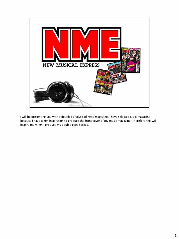
I will be presenting you with a detailed analysis of NME magazine. I have selected NME magazine because I have taken inspiration to produce the front cover of my music magazine. Therefore this will inspire me when I produce my double page spread. 1
-
Upload
ritavrinda -
Category
Documents
-
view
275 -
download
2
description
Transcript of NME DPS with notes attached
I will be presenting you with a detailed analysis of NME magazine. I have selected NME magazine because I have taken inspiration to produce the front cover of my music magazine. Therefore this will inspire me when I produce my double page spread.
1
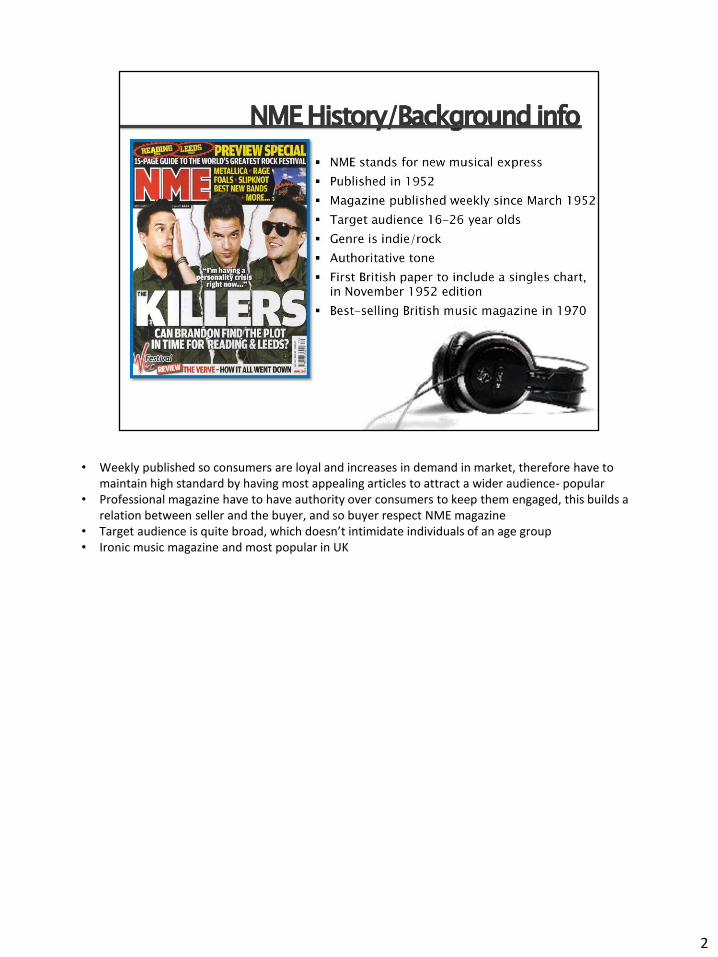
• Weekly published so consumers are loyal and increases in demand in market, therefore have to maintain high standard by having most appealing articles to attract a wider audience- popular
• Professional magazine have to have authority over consumers to keep them engaged, this builds a relation between seller and the buyer, and so buyer respect NME magazine
• Target audience is quite broad, which doesn’t intimidate individuals of an age group • Ironic music magazine and most popular in UK
2
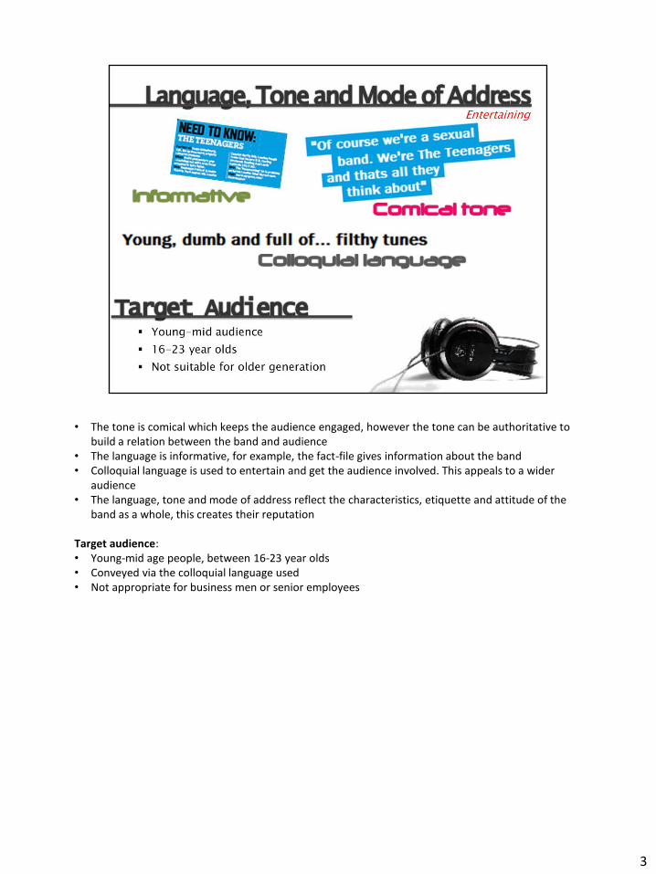
• The tone is comical which keeps the audience engaged, however the tone can be authoritative to build a relation between the band and audience
• The language is informative, for example, the fact-file gives information about the band • Colloquial language is used to entertain and get the audience involved. This appeals to a wider
audience • The language, tone and mode of address reflect the characteristics, etiquette and attitude of the
band as a whole, this creates their reputation Target audience: • Young-mid age people, between 16-23 year olds • Conveyed via the colloquial language used • Not appropriate for business men or senior employees
3

• In comparison to NME house colour, which is red, this double page spread challenges the colour scheme, however, this works for the current article presented in the magazine
• Monochrome colours include black, blue and white which connotes a natural and tranquil mood. This reassures the audience that this article is unintimidating
• The colours are limited which makes the article more effective as there are less distraction on the page, therefore the readers attention is on the image and article. This works well with the image and the contrasting colours attract a wider audience.
• The colour blue connotes an indie genre and it is the primary colour of the magazine double page spread, therefore it creates excitement. The casual vibe makes this article approachable to a wider audience as the colours indicate it is a relaxing article which is also conveyed by the image on the left page
• The colours black and white are contrasting which relates to a young-mid age audience, however this article is legible by an older audience as the colours are subtle which doesn’t provoke or neglect a certain age group
4

• A heavy font is used to highlight the drop cap, leading quote and article title which reflects the significance of these key elements which unchallenged the conventions in magazines
• The article title has used a typewriter style typeface, which is a serif font. We can denote that this indicates an exclusive article which whereby attracts a wider audience
• The drop cap is a heavy sans-serif font which creates boldness to the article and therefore appeals to the target audience.
• The leading text is bold and short which leaves a suspense for the reader. This draws the audience to the title and automatically leads them to the main image due to efficient eye-flow.
• The body text is sans-serif which makes it easier to read and understands. This is essential for this article has the audience will be able to build a relationship with ‘the teenagers’. This is suitable for the readers as they can increase their knowledge about the band. Therefore the body text doesn’t distract the reader but it highlights the new band
• The typefaces used in this article are different from previous articles in this magazine issue, which suggests that the article is exclusive. This creates a positive publicity for the band and instantly the reader will acknowledge that ‘the teenagers’ are a new band in the music industry
5

• The article title is a heavy serif font which reflect positive and direct communication with the audience, telling them the content of the article
• The anchor is represent the end of our natural eye flow and gives the reader references for further queries. The NME anchor is consistent which makes it recognisable and user friendly
• The ‘c’ shape is an unchallenged convention because it reflects efficient eye-flow and makes the information more effective along with the images. This is related to the western culture of reading.
• The eye-flow starts at the article title which introduces the band and swifts to the left, reading the button and become appeal by the image and then we see the fact-file which gives brief information about the band. Finally we red the article and end at the anchor. Slide eight:
• The leading text in this article reflects the characteristic of the band; we can suggest that the target audience would be young individual from the age of 16-21 year olds
• The caption in this article are for informative than comical to assist the readers with brief background about this band
• A sidebar is used to give the audience related articles to do with other artists. This keeps the audience inclined to the magazine
• The pull quote in this article represents the language and attitude of the band. • The gutter leaves a space which differentiates the text from the image • The NME LOVES button is a regular feature which is used in the magazine to highlight the most
popular and best rated articles. Therefore this will attract and appeal to a wider audience. • The article is written in columns which makes it user friendly as it makes the text easier to read.
This enforces efficient eye-flow. The text is on the right page which abides the conventions. This is natural and draws attention to the image
• The key elements on this page are highlighted in blue, for example, the pull quote, article title and fact-file. The audience are aware of the key points they need to know, in order to relate to the article
• The fact-file structures the page and gives an insight to the readers about the band. It introduces
6
‘the teenagers’ and prepares the reader for the article
6
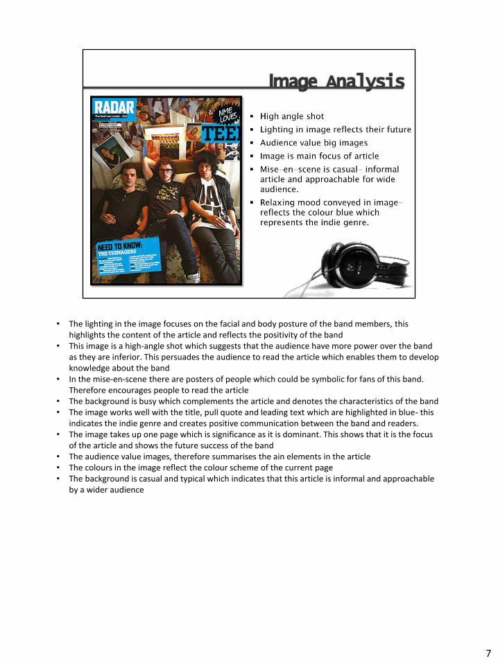
• The lighting in the image focuses on the facial and body posture of the band members, this highlights the content of the article and reflects the positivity of the band
• This image is a high-angle shot which suggests that the audience have more power over the band as they are inferior. This persuades the audience to read the article which enables them to develop knowledge about the band
• In the mise-en-scene there are posters of people which could be symbolic for fans of this band. Therefore encourages people to read the article
• The background is busy which complements the article and denotes the characteristics of the band • The image works well with the title, pull quote and leading text which are highlighted in blue- this
indicates the indie genre and creates positive communication between the band and readers. • The image takes up one page which is significance as it is dominant. This shows that it is the focus
of the article and shows the future success of the band • The audience value images, therefore summarises the ain elements in the article • The colours in the image reflect the colour scheme of the current page • The background is casual and typical which indicates that this article is informal and approachable
by a wider audience
7
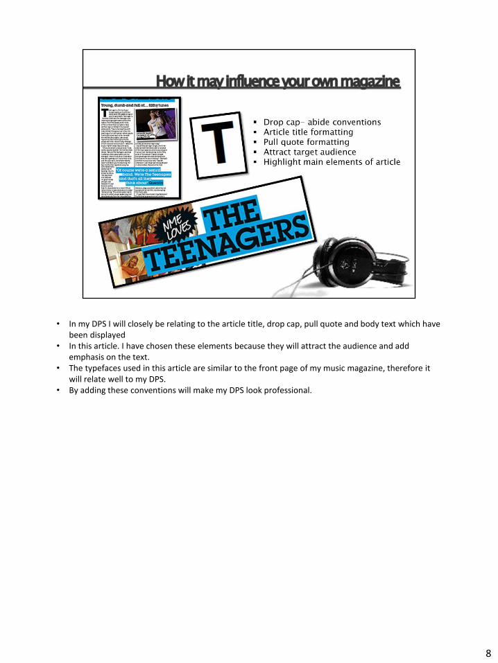
• In my DPS I will closely be relating to the article title, drop cap, pull quote and body text which have been displayed
• In this article. I have chosen these elements because they will attract the audience and add emphasis on the text.
• The typefaces used in this article are similar to the front page of my music magazine, therefore it will relate well to my DPS.
• By adding these conventions will make my DPS look professional.
8

9