
NinTex Forms 2010 Help
110
Nintex Forms 2010 Help © 2008 Nintex LLC, All rights reserved | www.nintex.com | [email protected] | 1 | 110 . Errors and omissions excepted. © 2012 Nintex USA LLC, All rights reserved. Errors and omissions excepted. Nintex Forms 2010 Help Last updated: Friday, 26 October 2012 1 Administration and Configuration 1.1 Licensing settings 1.2 Activating Nintex Forms 1.3 Web Application activation settings 1.4 Manage device layouts 1.5 Associating templates to device layouts 1.6 Manage form controls 1.7 Manage database 1.8 Live Forms settings 1.9 Installing Nintex Live 1.10 View Live forms 2 Controls 2.1 Button 2.2 Choice 2.3 Rich Text 2.4 Hyperlink 2.5 Image 2.6 Label 2.7 Date Time 2.8 Border 2.9 List Item 2.10 List Lookup 2.11 Multi Line Textbox 2.12 Page Viewer 2.13 Panel 2.14 People 2.15 Single Line Textbox 2.16 Yes-No 2.17 Workflow Diagram 2.18 List View 2.19 List Attachment 2.20 Repeating section 2.21 Recurrence 2.22 Calculated Value 2.23 Managed Metadata 2.24 External Data Column 3 Using the Form Designer 3.1 Getting started with the form designer 3.2 Shortcut keys 3.3 Importing and exporting forms 3.4 Controls In Use 3.5 Connecting Controls to fields or variables
description
NinTex Forms 2010 Help
Transcript of NinTex Forms 2010 Help

Nintex Forms 2010 Help
© 2008 Nintex LLC, All rights reserved
| www.nintex.com | [email protected] | 1 | 110
. Errors and omissions excepted.
© 2012 Nintex USA LLC, All rights reserved. Errors and omissions excepted.
Nintex Forms 2010 Help
Last updated: Friday, 26 October 2012
1 Administration and Configuration
1.1 Licensing settings
1.2 Activating Nintex Forms
1.3 Web Application activation settings
1.4 Manage device layouts
1.5 Associating templates to device layouts
1.6 Manage form controls
1.7 Manage database
1.8 Live Forms settings
1.9 Installing Nintex Live
1.10 View Live forms
2 Controls
2.1 Button
2.2 Choice
2.3 Rich Text
2.4 Hyperlink
2.5 Image
2.6 Label
2.7 Date Time
2.8 Border
2.9 List Item
2.10 List Lookup
2.11 Multi Line Textbox
2.12 Page Viewer
2.13 Panel
2.14 People
2.15 Single Line Textbox
2.16 Yes-No
2.17 Workflow Diagram
2.18 List View
2.19 List Attachment 2.20 Repeating section
2.21 Recurrence
2.22 Calculated Value
2.23 Managed Metadata
2.24 External Data Column
3 Using the Form Designer
3.1 Getting started with the form designer
3.2 Shortcut keys
3.3 Importing and exporting forms
3.4 Controls In Use
3.5 Connecting Controls to fields or variables

Nintex Forms 2010 Help
© 2008 Nintex LLC, All rights reserved
| www.nintex.com | [email protected] | 2 | 110
. Errors and omissions excepted.
© 2012 Nintex USA LLC, All rights reserved. Errors and omissions excepted.
3.6 Designing a form for a mobile device
3.7 Inserting reference fields
3.8 Inline functions
3.9 Control Settings
3.10 Saving and publishing forms
3.11 Form and Layout settings
3.12 Live Settings
3.13 Linked Controls
3.14 Designing forms in Nintex Workflow
3.15 CSS Styles
3.16 Formula Builder
3.17 Inline functions usage examples
3.18 Rules
3.19 Previewing a Form
3.20 Runtime Functions
4 Form Interaction with SharePoint
4.1 Configuring the Start Site Workflow Webpart 4.2 Configuring the List Form Web Part 4.3 Designing forms for SharePoint external lists

Nintex Forms 2010 Help
© 2008 Nintex LLC, All rights reserved
| www.nintex.com | [email protected] | 3 | 110
. Errors and omissions excepted.
© 2012 Nintex USA LLC, All rights reserved. Errors and omissions excepted.
1 Administration and Configuration
1.1 Licensing settings
Nintex Forms 2010 uses a license file (.nlf) for server licensing. A single license file is used to store information about all
servers in a farm that are licensed for Nintex Forms 2010.
Importing the License
To import a license:
1. In Central Administration, navigate to Nintex Forms Management and click Licensing.
2. On the Licensing page, click the Import button.
3. In the License file section, click the Browse button to locate the license file. Once the license file has been located,
click the Import button.
4. The Licensing information will then be displayed.
Related Topics
Installing Nintex Live
Activating Nintex Forms
Manage database
Getting started with the form designer
Please contact our sales team for licensing advice at [email protected].
1.2 Activating Nintex Forms
To design forms using Nintex Forms, feature activation is required on the site collection.
The Nintex Forms 2010 Prerequisites Feature must be activated before activating other Nintex Forms features.

Nintex Forms 2010 Help
© 2008 Nintex LLC, All rights reserved
| www.nintex.com | [email protected] | 4 | 110
. Errors and omissions excepted.
© 2012 Nintex USA LLC, All rights reserved. Errors and omissions excepted.
Activating 'Nintex Forms 2010 Prerequisites Feature' for the Site Collection
To activate Nintex Forms 2010 Prerequisites Feature in a site collection:
1. Navigate to the Site Collection home page.
2. In the Site Actions menu, click on Site Settings.
3. In the Site Collection Administration group, click on Site collection features.
4. In the Nintex Forms 2010 Prerequisites Feature section, click on the Activate button.
After a short delay, the page will refresh and the status will become Active.
Activating 'Nintex Forms 2010 for Nintex Workflow' for the Site Collection
Activate the Nintex Forms 2010 for Nintex Workflow site collection feature to design start forms and task forms in Nintex
Workflow 2010.
Note: Nintex Workflow 2010 must be installed and configured prior to activating this feature.
To activate Nintex Forms 2010 for Nintex Workflow in a site collection:
1. Navigate to the Site Collection home page.
2. In the Site Actions menu, click on Site Settings.
3. In the Site Collection Administration group, click on Site collection features.
4. In the Nintex Forms 2010 for Nintex Workflow section, click on the Activate button.
After a short delay, the page will refresh and the status will become Active.
Activating 'Nintex Forms 2010 for SharePoint List Forms' for the Site Collection
Activate the Nintex Forms 2010 for SharePoint List Forms site collection feature to use Nintex Forms to design
SharePoint list forms.
To activate Nintex Forms 2010 for SharePoint List Forms in a site collection:
1. Navigate to the Site Collection home page.
2. In the Site Actions menu, click on Site Settings.
3. In the Site Collection Administration group, click on Site collection features.

Nintex Forms 2010 Help
© 2008 Nintex LLC, All rights reserved
| www.nintex.com | [email protected] | 5 | 110
. Errors and omissions excepted.
© 2012 Nintex USA LLC, All rights reserved. Errors and omissions excepted.
4. In the Nintex Forms 2010 for SharePoint List Forms section, click on the Activate button.
After a short delay, the page will refresh and the status will become Active.
Activating 'Nintex Live Forms' for the Site Collection
Activate the Nintex Live Forms site collection feature to allow Nintex Forms designers to publish forms to Nintex Live.
Note: The Nintex Live Forms option must also be enabled in the Central Administration Live Forms settings when activating
this feature.
To activate Nintex Live Forms in a site collection:
1. Navigate to the Site Collection home page.
2. In the Site Actions menu, click on Site Settings.
3. In the Site Collection Administration group, click on Site collection features.
4. In the Nintex Live Forms section, click on the Activate button.
After a short delay, the page will refresh and the status will become Active.
Related Topics
Getting started with the form designer
Live Forms settings
Importing and exporting forms
Configuring the Start Site Workflow Webpart
1.3 Web Application activation settings
To activate Nintex Forms on a Web Application, the Nintex Forms 2010 solution must be installed and deployed on the
Web Application.
Activating Nintex Forms 2010 on the Web Application
To activate Nintex Forms 2010 solution on the Web Application:
1. Navigate to SharePoint Central Administration.

Nintex Forms 2010 Help
© 2008 Nintex LLC, All rights reserved
| www.nintex.com | [email protected] | 6 | 110
. Errors and omissions excepted.
© 2012 Nintex USA LLC, All rights reserved. Errors and omissions excepted.
2. In the Quick Launch menu, click Application Management.
3. In the Web Applications section, click the Manage web applications link.
4. Select the Web Application that Nintex Forms 2010 is to be deployed to.
5. In the Web Applications Ribbon, click on Manage Features.
6. In the Manage Web Application Features dialog, click Activate on the Nintex Forms 2010 feature.
After a short delay, the page will refresh and the status will become Active.
Related Topics
Activating Nintex Forms
Installing Nintex Live
Getting started with the form designer
1.4 Manage device layouts
The Manage device layouts page allows the addition, removal and configuration of layouts that are targeted to devices. In
addition, a template can be associated with a device layout. Refer to Associating templates to device layouts for more
information.
This page displays a summary view of the configured layout options targeted to the device.
Device Layouts
Adding a new device layout
To add a new device layout:
Click the Add device link under the list of configured device layouts.
The Device Details page is displayed as follows:
Device Name: Name of the device layout that is displayed to the form designer.
User Agent(s): The regular expressions used by the device to associate a layout with a particular browser.

Nintex Forms 2010 Help
© 2008 Nintex LLC, All rights reserved
| www.nintex.com | [email protected] | 7 | 110
. Errors and omissions excepted.
© 2012 Nintex USA LLC, All rights reserved. Errors and omissions excepted.
Sequence: The display order of the layout buttons in the Nintex Forms 2010 Ribbon.
Height (Pixels): The recommended height of the layout in pixels. This will be the default height of the layout.
Width (Pixels): The recommended width of the layout in pixels. This will be the default width of the layout.
Icon URL: The URL of the icon displayed in the Ribbon.
Show on Ribbon: Displays the icon as a button in the layout section of the Ribbon.
Show on Ribbon in Preview mode: Displays the icon as a button in the layout section on the Ribbon when
previewing a designed form.
Default Device: When the form designer is first opened the default device will be displayed. If this is the only device
found, the default device will be used at runtime.
Use Template: Use the uploaded template for this layout if available.
Deleting an existing device layout
To delete a device layout:
Click the delete icon on the right-hand side of the listed device layout.
Note: There is no warning to confirm deletion at this stage.
Related Topics
Associating templates to device layouts
Form and Layout settings
Designing a form for a mobile device
Getting started with the form designer
1.5 Associating templates to device layouts
A template is a saved form definition that is used to apply default settings for newly created form layouts.
A form export file (.xml) is used to import templates. A template will be added for each layout in the exported form definition.
For example: A form is exported with a Default layout, iPad layout and a Smart Phone layout. Whenever one of these three
layouts are created, the template settings will be applied.

Nintex Forms 2010 Help
© 2008 Nintex LLC, All rights reserved
| www.nintex.com | [email protected] | 8 | 110
. Errors and omissions excepted.
© 2012 Nintex USA LLC, All rights reserved. Errors and omissions excepted.
Uploading a template
1. Navigate to Nintex Forms Management and select Manage device layouts.
2. In the Templates section, click the Browse button.
3. Navigate to the saved form export file (xml), select the file and click Open.
4. Click the Upload button.
Once a template has been uploaded, the device templates that were found within the form export file will be listed below the
Browse button.
To deactivate a template for one or more specific device layout(s), deselect the Use Template setting in Manage device
layouts.
Note: Only one template may be applied for the farm. Uploading a template file will clear all existing templates and apply
only the layouts found in the most recent file uploaded.
Note: The following items are all included as part of the template.
All configured device layouts
All controls that are on the layouts
Custom CSS styles
Changes made to default Nintex Forms CSS styles
Confirmation message and Cancel message templates defined in Live Settings.
Related Topics
Importing and exporting forms
Getting started with the form designer
Form and Layout settings
Manage device layouts

Nintex Forms 2010 Help
© 2008 Nintex LLC, All rights reserved
| www.nintex.com | [email protected] | 9 | 110
. Errors and omissions excepted.
© 2012 Nintex USA LLC, All rights reserved. Errors and omissions excepted.
1.6 Manage form controls
The Manage Form Controls page lists all of the installed controls that are available for use when designing a form. Further
details on developing and registering additional controls are provided in the Nintex Forms 2010 SDK.
For more information on the functionality of the individual controls please refer to the Control help topics.
Related Topics
Control Settings
Controls In Use
Connecting Controls to fields or variables
Linked Controls
1.7 Manage database
The Manage database page can be used to configure the database that will store Nintex Forms configuration and
application settings.
Database settings
The Nintex Forms installation requires a single database to store the server specific configuration settings. A new database
or an existing database can be used.
Use of the default database server and database name is recommended for most cases. Refer to the administrator's guide
for advanced scenarios where specifying database information is required.
Use of Windows authentication is strongly recommended. To use SQL authentication, specify the credentials which will be
used to connect to the database.
To create a new database:
1. Specify the name of the SQL Server database server, the name of the database and select the authentication settings.
To connect to an existing database:

Nintex Forms 2010 Help
© 2008 Nintex LLC, All rights reserved
| www.nintex.com | [email protected] | 10 | 110
. Errors and omissions excepted.
© 2012 Nintex USA LLC, All rights reserved. Errors and omissions excepted.
1. Specify the name of the SQL Server database server where the database is located, the name of the
existing database and select the authentication settings.
Failover server
The database may be associated with a failover server that is used in with SQL Server database mirroring.
Related Topics
Manage device layouts
Licensing settings
Manage form controls
Live Forms settings
View Live forms
1.8 Live Forms settings
Use the Live Forms settings page to enable or disable the ability to publish forms to Nintex Live, and allow or disallow
anonymous user access.
Note: Ensure that the Nintex Live Framework and the certificates required to enable connectivity to Nintex Live have been
installed.
If the "Install Nintex Live" option was not selected during Nintex Forms 2010 installation, manually install and deploy the
?nintexlivecore.wsp?.
To enable Nintex Live Forms
Note: A database for Nintex Forms must be provisioned before Nintex Live Forms can be enabled. Refer to Manage
database for more information.
1. In Central Administration, navigate to Nintex Forms Management.
2. Click on Live Forms settings.
3. In the Enable Nintex Live Forms section, click on Enable.

Nintex Forms 2010 Help
© 2008 Nintex LLC, All rights reserved
| www.nintex.com | [email protected] | 11 | 110
. Errors and omissions excepted.
© 2012 Nintex USA LLC, All rights reserved. Errors and omissions excepted.
Note: When Nintex Live Forms is disabled, forms already published to Nintex Live will remain active. Live Form submissions
will be held in the Nintex Live message queue until retrieved or cleared*. Re-enabling Nintex Live Forms will retrieve and
process all stored form submissions.
To disable all forms published to Nintex Live, please see View Live forms for more information.
*Nintex will endeavour to hold and deliver all undelivered forms, however, periodic clearing of stale content may be
necessary. Please contact Nintex if you have special requirements for holding content or clearing held content.
To allow anonymous forms submissions
1. Under Central Administration, navigate to Nintex Forms Management.
2. Click on Live Forms settings.
3. In the Allow anonymous form submissions, select Yes.
4. In the warning dialog, click the OK button.
Note: Allowing anonymous form submissions may require Microsoft server internet licensing.
Related Topics
Installing Nintex Live
View Live forms
Web Application activation settings
Live Settings
Saving and publishing forms
Manage database
1.9 Installing Nintex Live
Nintex Live is a hosted service provided by Nintex.
The Nintex Live Framework and certificates are required to enable connectivity to Nintex Live.
The Nintex Live components must be installed to enable the Nintex Live features of Nintex Forms 2010. These
features allow form designers to publish designated forms to Nintex Live. Nintex Live Forms can be accessed by internet
users, either anonymously or via 3rd party authentication providers.

Nintex Forms 2010 Help
© 2008 Nintex LLC, All rights reserved
| www.nintex.com | [email protected] | 12 | 110
. Errors and omissions excepted.
© 2012 Nintex USA LLC, All rights reserved. Errors and omissions excepted.
Installing the Nintex Live components
The following steps are required to manually install the Nintex Live Framework and certificates if the "Install Nintex Live"
option was not selected during Nintex Forms 2010 installation. The SharePoint PowerShell Command Prompt must be used
to install the components.
To launch the SharePoint PowerShell Command Prompt:
1. Login to the server that is running the Central Administration service as a SharePoint administrator.
2. Click the Start menu and navigate to All Programs > Microsoft SharePoint 2010 Products > SharePoint 2010
Management Shell.
Installing the Nintex Live Framework
In the SharePoint PowerShell Command Prompt, type:
CD "C:\Program Files\Nintex\Nintex Forms 2010"
Note: The default installation path is "C:\Program Files\Nintex\Nintex Forms 2010", replace with actual location if installed to
a different location.
Add-SPSolution -LiteralPath "C:\Program Files\Nintex\Nintex Forms 2010\NintexLiveCore.wsp"
Install-SPSolution -Identity "1ddec2be-094d-4a9b-b9e1-fdca27b07646" -GACDeployment -Force
Note: Wait for the solution to be deployed. Check the status of the solution deployment in the Central Administration >
System Settings > Manage farm solutions page.
Install-SPFeature -SolutionId "1ddec2be-094d-4a9b-b9e1-fdca27b07646" -AllExistingFeatures -Force
Remove-PSSnapin Microsoft.SharePoint.PowerShell
Add-PSSnapin Microsoft.SharePoint.PowerShell
Install-LiveService
Importing the Nintex Live certificates
In the SharePoint PowerShell Command Prompt type:
CD "C:\Program Files\Nintex\Nintex Forms 2010\Certs"

Nintex Forms 2010 Help
© 2008 Nintex LLC, All rights reserved
| www.nintex.com | [email protected] | 13 | 110
. Errors and omissions excepted.
© 2012 Nintex USA LLC, All rights reserved. Errors and omissions excepted.
Note: The default installation path is "C:\Program Files\Nintex\Nintex Forms 2010", replace with actual location if installed to
a different location.
.\CertificateUpload.ps1
Related Topics
Live Forms settings
View Live forms
Activating Nintex Forms
1.10 View Live forms
The View Live forms page displays list forms and workflow start forms that are currently published to Nintex Live. Forms
can be viewed or removed.
Use the Select form type drop down to display the different form types available.
The list displays the following:
Site: The site the form is in.
Form: The name of the list and content type, or the workflow, that the form is associated with.
Published: The date the form was published to Nintex Live.
Expires: The date the form will expire. Once the form expires, a user will no longer be able to view or submit the form
in Nintex Live.
View: The link to view the form published to Nintex Live.
To remove a form published to Nintex Live
1. Select the form by checking it.
2. Click on Remove. In the confirmation dialog, click OK.

Nintex Forms 2010 Help
© 2008 Nintex LLC, All rights reserved
| www.nintex.com | [email protected] | 14 | 110
. Errors and omissions excepted.
© 2012 Nintex USA LLC, All rights reserved. Errors and omissions excepted.
Note: Removing the form does not uncheck the "Publish to Nintex Live" option in the Live Settings. If the form is published
again, it will be republished to Nintex Live.
Note: If the form is removed from Nintex Live and then republished, the Live Form URL will revert to the original URL when
first published.
Related Topics
Live Settings
Saving and publishing forms
Installing Nintex Live
View Live forms
Live Forms settings

Nintex Forms 2010 Help
© 2008 Nintex LLC, All rights reserved
| www.nintex.com | [email protected] | 15 | 110
. Errors and omissions excepted.
© 2012 Nintex USA LLC, All rights reserved. Errors and omissions excepted.
2 Controls
2.1 Button
The Button Control
The Button control can be used to initiate an action, such as submitting a form or initiating a custom JavaScript.
Control Settings
Note: Several settings allow Yes, No or Expression to be selected. Expression allows a formula to be constructed from
reference tokens and functions. The expression must resolve to a Yes/No value at runtime to be valid. If the
expression does not resolve to a Yes/No value it will revert to the default.
Note: For an extensive list of the control properties Ribbon, including descriptions, refer to the Control Properties Ribbon.
General
Button action: This selects the function of the button. Select JavaScript to specify custom functionality.
Button type: Select the display type for the button.
Button label: The text to display on the button.
Appearance
Visible: Hide or show control at runtime.
Horizontal width: The width of the control as a %, pixel or point value.
Vertical width: The height of the control as a %, pixel or point value.
CSS class: The CSS class to apply to the control. This is used to apply advanced styling options. The Custom
CSS class is defined in Form Settings (refer to Form and Layout settings).

Nintex Forms 2010 Help
© 2008 Nintex LLC, All rights reserved
| www.nintex.com | [email protected] | 16 | 110
. Errors and omissions excepted.
© 2012 Nintex USA LLC, All rights reserved. Errors and omissions excepted.
Ribbon
Show on ribbon: Show this button on the Ribbon toolbar (if available) in addition to the form.
Ribbon icon URL: If shown on the Ribbon toolbar, specify the URL of the icon (32x32px) to use.
Ribbon button order: Determines the order in which buttons will appear on the ribbon toolbar.
Ribbon button group name: The name of the Ribbon toolbar group to display the button.
Advanced
Visible when in view mode: Hide or show the control in view mode.
If Yes is selected:
View mode text: The text displayed on the button when the form is in view mode.
Enable when in view mode: Allow the button to operate when the form is in view mode.
Causes validation: Apply validation for JavaScript button types.
Client click: The JavaScript to execute when the user clicks the button.
Connected to: The field to bind the input control to.
If a selection is made in the List Columns:
Value returned: The value to return when the button is clicked.
Data type returned: The data type of the returned value when the button is clicked.
Confirmation message: When the user clicks on the button during runtime, they will be prompted with this message
prior to the buttons functionality being processed.
Resize at runtime: Allow the control to dynamically adjust its size, and adjust the form length and position of other
controls accordingly.

Nintex Forms 2010 Help
© 2008 Nintex LLC, All rights reserved
| www.nintex.com | [email protected] | 17 | 110
. Errors and omissions excepted.
© 2012 Nintex USA LLC, All rights reserved. Errors and omissions excepted.
Related Topics:
Getting started with the form designer
Controls In Use
Control Settings
Connecting Controls to fields or variables
Shortcut keys
Inserting reference fields
Control Properties Ribbon
2.2 Choice
The Choice Control
The Choice control can be used to make a single or multiple selection on a form.
Control Settings
Note: Several settings allow Yes, No or Expression to be selected. Expression allows a formula to be constructed from
reference tokens and functions. The expression must resolve to a Yes/No value at runtime to be valid. If the
expression does not resolve to a Yes/No value it will revert to the default.
Note: For an extensive list of the control properties Ribbon, including descriptions, refer to the Control Properties Ribbon.
General
Name: The name of the control. The name is used for comparison validation and other control references.
Connected to: The field to bind the input control to.
Display format: Select the type of choice control to display. (Option buttons / Checkbox / List / Drop down)
Choices: Enter the choices to be displayed.
Default value: Set a default value for the control. This value will only be used if a default value has not been specified
in the column or variable selected in the Connected to setting.
Arrange choices: Items can be arranged across then down or down then across.

Nintex Forms 2010 Help
© 2008 Nintex LLC, All rights reserved
| www.nintex.com | [email protected] | 18 | 110
. Errors and omissions excepted.
© 2012 Nintex USA LLC, All rights reserved. Errors and omissions excepted.
Number of columns: Number of columns to use to display the specified choices.
Column alignment: Align the choices in fixed columns or allow them to float.
Appearance
Visible: Hide or show the control at runtime.
Enabled: Enable the control to receive user input when the form is in input mode.
Control CSS class: The CSS class to apply to the inner elements of the control.
CSS class: The CSS class to apply to the control. This is used to apply advanced styling options. The Custom
CSS class is defined in Form Settings (refer to Form and Layout settings).
Validation
Required: The form will not submit unless this control is completed correctly.
If Yes is selected:
Required error message appears: The error message to display when the required field is not specified.
Data Type: The data type to convert to during validation.
Use custom validation: Enables the value entered into the control to be validated by a JavaScript function.
If Yes is selected:
Custom validation function: Specify the JavaScript function name for the client side custom validation. Note: The
JavaScript function is to be specified in the Custom JavaScript section within the form's Settings.
Custom error message: The error message to display when an invalid value is entered.
Advanced
Help text: Help text that will be displayed to the user as a tooltip to guide the completion of the form.
Control mode: Force control to be in Edit mode, Display mode, or set to Auto.
Store Client ID in JavaScript variable: A JavaScript variable will be created that references the Client ID of this
control.
If Yes is selected:

Nintex Forms 2010 Help
© 2008 Nintex LLC, All rights reserved
| www.nintex.com | [email protected] | 19 | 110
. Errors and omissions excepted.
© 2012 Nintex USA LLC, All rights reserved. Errors and omissions excepted.
Client ID JavaScript variable name: The name of the variable to store the Client ID in.
Resize at runtime: Allow the control to dynamically adjust its size, and adjust the form length and position of other
controls accordingly.
Related Topics
Getting started with the form designer
Control Settings
Controls In Use
Connecting Controls to fields or variables
Shortcut keys
Yes-No Control
Inserting reference fields
Control Properties Ribbon
2.3 Rich Text
The Rich Text Control
Use Rich Text to display formatted text, pictures, hyperlinks and tables on a form.
Control Settings
Note: Several settings allow Yes, No or Expression to be selected. Expression allows a formula to be constructed from
reference tokens and functions. The expression must resolve to a Yes/No value at runtime to be valid. If the
expression does not resolve to a Yes/No value it will revert to the default.
Note: For an extensive list of the control properties Ribbon, including descriptions, refer to the Control Properties Ribbon.
General
To enter or edit content, click in the text area.

Nintex Forms 2010 Help
© 2008 Nintex LLC, All rights reserved
| www.nintex.com | [email protected] | 20 | 110
. Errors and omissions excepted.
© 2012 Nintex USA LLC, All rights reserved. Errors and omissions excepted.
Appearance
Visible: Hide or show the control at runtime.
CSS class: The CSS class to apply to the control. This is used to apply advanced styling options. The Custom
CSS class is defined in Form Settings (refer to Form and Layout settings).
Advanced
Resize at runtime: Allow the control to dynamically adjust its size, and adjust the form length and position of other
controls accordingly.
Related Topics:
Getting started with the form designer
Control Settings
Controls In Use
Inserting reference fields
Shortcut keys
Multi Line Textbox
Single Line Textbox
Inserting reference fields
2.4 Hyperlink
The Hyperlink Control
The Hyperlink control can be used to enter a hyperlink URL and display text.
Control Settings
Note: Several settings allow Yes, No or Expression to be selected. Expression allows a formula to be constructed from
reference tokens and functions. The expression must resolve to a Yes/No value at runtime to be valid. If the
expression does not resolve to a Yes/No value it will revert to the default.

Nintex Forms 2010 Help
© 2008 Nintex LLC, All rights reserved
| www.nintex.com | [email protected] | 21 | 110
. Errors and omissions excepted.
© 2012 Nintex USA LLC, All rights reserved. Errors and omissions excepted.
Note: For an extensive list of the control properties Ribbon, including descriptions, refer to the Control Properties Ribbon.
General
Name: The name of the control. This name is used for comparison validation and other control references.
Connected to: The field to bind the input control to.
Appearance
Visible: Hide or show the control at runtime.
Enabled: Enable the control to receive user input when the form is in input mode.
Control CSS class: The CSS class to apply to the inner input control.
CSS class: The CSS class to apply to the control. This is used to apply advanced styling options. The Custom
CSS class is defined in Form Settings (refer to Form and Layout settings)
Validation
Required: The form will not submit unless this control is completed correctly.
If Yes is selected:
Required error message: The error message to display when the required field is not specified.
Use custom validation: Enables the value entered into the control to be validated by a JavaScript function.
If Yes is selected:
Custom validation function: Specify the JavaScript function name for the client side custom validation. Note: The
JavaScript function is to be specified in the Custom JavaScript section within the form's Settings.
Custom error message: The error message to display when the required field is not specified.
Advanced
Help text: Help text that will be displayed to the user as a tooltip to guide the completion of the form.
Control Mode: Force control to be in Edit mode, Display mode, or set to Auto.

Nintex Forms 2010 Help
© 2008 Nintex LLC, All rights reserved
| www.nintex.com | [email protected] | 22 | 110
. Errors and omissions excepted.
© 2012 Nintex USA LLC, All rights reserved. Errors and omissions excepted.
Store Client ID in JavaScript variable: A JavaScript variable will be created that references the Client ID of this
control.
If Yes is selected:
Client ID JavaScript variable name: The name of the variable to store the Client ID in.
Resize at runtime: Allow the control to dynamically adjust its size, and adjust the form length and position of other
controls accordingly.
Related Topics
Getting started with the form designer
Control Settings
Controls In Use
Connecting Controls to fields or variables
Shortcut keys
Inserting reference fields
Control Properties Ribbon
2.5 Image
The Image Control
The Image control can be used to display an image on a form.
Control Settings
Note: Several settings allow Yes, No or Expression to be selected. Expression allows a formula to be constructed from
reference tokens and functions. The expression must resolve to a Yes/No value at runtime to be valid. If the
expression does not resolve to a Yes/No value it will revert to the default.
Note: For an extensive list of the control properties Ribbon, including descriptions, refer to the Control Properties Ribbon.

Nintex Forms 2010 Help
© 2008 Nintex LLC, All rights reserved
| www.nintex.com | [email protected] | 23 | 110
. Errors and omissions excepted.
© 2012 Nintex USA LLC, All rights reserved. Errors and omissions excepted.
General
Image URL: The URL for the image.
Alternate text: The alternate text to display to aid accessibility.
Appearance
Visible: Hide or show the control at runtime.
Horizontal width: The width of the control in %, pixel or point value.
Vertical height: The height of the control in %, pixel or point value.
CSS class: The CSS class to apply to the control. This is used to apply advanced styling options. The Custom
CSS class is defined in Form Settings (refer to Form and Layout settings).
Advanced
Resize at runtime: Allow the control to dynamically adjust its size, and adjust the form length and position of other
controls accordingly.
Related Topics
Getting started with the form designer
Control Settings
Controls In Use
Label
Shortcut keys
Inserting reference fields
Control Properties Ribbon

Nintex Forms 2010 Help
© 2008 Nintex LLC, All rights reserved
| www.nintex.com | [email protected] | 24 | 110
. Errors and omissions excepted.
© 2012 Nintex USA LLC, All rights reserved. Errors and omissions excepted.
2.6 Label
The Label Control
The Label control can be used to place text anywhere on the form. Labels are often placed next to other controls to describe
the associated control.
Control Settings
Note: Several settings allow Yes, No or Expression to be selected. Expression allows a formula to be constructed from
reference tokens and functions. The expression must resolve to a Yes/No value at runtime to be valid. If the
expression does not resolve to a Yes/No value it will revert to the default.
Note: For an extensive list of the control properties Ribbon, including descriptions, refer to the Control Properties Ribbon.
General
To enter or edit content, click in the text area.
Associated control: Select the control that this label describes. This is used for web browser accessibility.
Note: By default, when a Label is associated to a bound control (a control that is associated to a column or workflow
variable), the default value of the label will reflect the name of the column or workflow variable the control is bound to.
Appearance
Visible: Hide or show the control at runtime.
CSS class: The CSS class to apply to the control. This is used to apply advanced styling options. The Custom
CSS class is defined in Form Settings (refer to Form and Layout settings)
Advanced
Resize at runtime: Allow the control to dynamically adjust its size, and adjust the form length and position of other
controls accordingly.

Nintex Forms 2010 Help
© 2008 Nintex LLC, All rights reserved
| www.nintex.com | [email protected] | 25 | 110
. Errors and omissions excepted.
© 2012 Nintex USA LLC, All rights reserved. Errors and omissions excepted.
Related Topics
Getting started with the form designer
Control Settings
Controls In Use
Inserting reference fields
Shortcut keys
Image
Control Properties Ribbon
2.7 Date Time
The Date/ Time Control
The Date/ Time control can be used to either enter a date and time or select a date from a calendar display.
Control Settings
Note: Several settings allow Yes, No or Expression to be selected. Expression allows a formula to be constructed from
reference tokens and functions. The expression must resolve to a Yes/No value at runtime to be valid. If the
expression does not resolve to a Yes/No value it will revert to the default.
Note: For an extensive list of the control properties Ribbon, including descriptions, refer to the Control Properties Ribbon.
General
Name: The name of the control. The name is used for comparison validation and other control references.
Connected to: The field to bind the input control to.
Default value: Set a default value for the display. This value will only be used if a default value has not been specified
in the column or variable in the Connected to setting.
If Selected date option:
Selected date: Select a specific date.
Date only: Show the date only without the time.
Nintex Forms 2010 Help
© 2008 Nintex LLC, All rights reserved
| www.nintex.com | [email protected] | 26 | 110
. Errors and omissions excepted.
© 2012 Nintex USA LLC, All rights reserved. Errors and omissions excepted.
Appearance
Visible: Hide or show the control at runtime.
Enabled: Enable the control to receive user input when the form is in input mode.
Control CSS class: The CSS class to apply to the inner input control.
CSS class: The CSS class to apply to the control. This is used to apply advanced styling options. The Custom
CSS class is defined in Form Settings (refer to Form and Layout settings).
Validation
Required: The form will not submit unless this control is completed correctly.
If Yes is selected:
Required error message: The error message to display when the required field is not specified.
Compare to: Enables the value entered into the control to be validated against a specified value, or the current value
in another control.
If Control is selected:
Compare operator: Select the type of comparison to perform.
Control to compare: Select the control to compare to.
Compare validation error message: The error message to display when an invalid value is entered.
If Value is selected:
Compare operator: Select the type of comparison to perform.
Value to compare: A fixed constant value to compare against the current value of the control.
Compare validation error message: The error message to display when an invalid value is entered.
Use range validation: Enables the value entered into the control to be validated against a specified maximum and
minimum value.
If Yes is selected:
Maximum value: The maximum valid value.
Minimum value: The minimum valid value.
Nintex Forms 2010 Help
© 2008 Nintex LLC, All rights reserved
| www.nintex.com | [email protected] | 27 | 110
. Errors and omissions excepted.
© 2012 Nintex USA LLC, All rights reserved. Errors and omissions excepted.
Range validation error message: The error message to display when an invalid value is entered.
Use a regular expression: Enables the value entered into the control to be validated against a regular expression.
If Yes is selected:
Regular expression: The regular expression string for validating the input against.
Regular expression validation message: The error message to display when an invalid value is entered.
Use custom validation: Enables the value entered into the control to be validated by a JavaScript function.
If Yes is selected:
Custom validation function: Specify the JavaScript function name for the client side custom validation. Note: The
JavaScript function is to be specified in the Custom JavaScript section within the form's Settings.
Custom error message: The error message to display when an invalid value is entered.
Advanced
Help text: Help text that will be displayed to the user as a tooltip to guide the completion of the form.
Control Mode: Force control to be in Edit mode, Display mode, or set to Auto.
Convert empty string to null: Convert to a null value if the control contains an empty string.
Null display text: If the bound value is null, this text will be displayed instead.
String Format: The string format to apply to the displayed value.
Store Client ID in JavaScript variable: A JavaScript variable will be created that references the Client ID of this
control.
If Yes is selected:
Client ID JavaScript variable name: The name of the variable to store the Client ID in.
Resize at runtime: Allow the control to dynamically adjust its size, and adjust the form length and position of other
controls accordingly.

Nintex Forms 2010 Help
© 2008 Nintex LLC, All rights reserved
| www.nintex.com | [email protected] | 28 | 110
. Errors and omissions excepted.
© 2012 Nintex USA LLC, All rights reserved. Errors and omissions excepted.
Related Topics
Getting started with the form designer
Control Settings
Controls In Use
Connecting Controls to fields or variables
Shortcut keys
Control Properties Ribbon
2.8 Border
The Border Control
The Border control can be used to display a line along one or more borders of the control.
Control Settings
Note: Several settings allow Yes, No or Expression to be selected. Expression allows a formula to be constructed from
reference tokens and functions. The expression must resolve to a Yes/No value at runtime to be valid. If the
expression does not resolve to a Yes/No value it will revert to the default.
Note: For an extensive list of the control properties Ribbon, including descriptions, refer to the Control Properties Ribbon.
General
Color: The color of the line.
Width (Pixels): The width of the line in pixels.
Position: Specify one or more borders to display.
Appearance
Visible: Hide or show the control at runtime.
CSS class: The CSS class to apply to the control. This is used to apply advanced styling options. The Custom
CSS class is defined in Form Settings (refer to Form and Layout settings)

Nintex Forms 2010 Help
© 2008 Nintex LLC, All rights reserved
| www.nintex.com | [email protected] | 29 | 110
. Errors and omissions excepted.
© 2012 Nintex USA LLC, All rights reserved. Errors and omissions excepted.
Advanced
Resize at runtime: Allow the control to dynamically adjust its size, and adjust the form length and position of other
controls accordingly.
Related Topics
Getting started with the form designer
Control Settings
Controls In Use
Shortcut keys
Control Properties Ribbon
2.9 List Item
The List Item Control
The List Item control can be used to display an item from a SharePoint list.
Control Settings
Note: Several settings allow Yes, No or Expression to be selected. Expression allows a formula to be constructed from
reference tokens and functions. The expression must resolve to a Yes/No value at runtime to be valid. If the
expression does not resolve to a Yes/No value it will revert to the default.
Note: For an extensive list of the control properties Ribbon, including descriptions, refer to the Control Properties Ribbon.
General
List: The ID or name of the list.
List Item ID: The ID of the item in the list to display.
Appearance
Visible: Hide or show the control at runtime.

Nintex Forms 2010 Help
© 2008 Nintex LLC, All rights reserved
| www.nintex.com | [email protected] | 30 | 110
. Errors and omissions excepted.
© 2012 Nintex USA LLC, All rights reserved. Errors and omissions excepted.
CSS Class: The CSS class to apply to the control. This is used to apply advanced styling options. The Custom
CSS class is defined in Form Settings (refer to Form and Layout settings)
Advanced
Show error message at runtime if list item not found: Displays the SharePoint error message at runtime if the item
cannot be found.
Resize at runtime: Allow the control to dynamically adjust its size, and adjust the form length and position of other
controls accordingly.
Related Topics
Getting started with the form designer
Control Settings
Controls In Use
List View
List Attachment
List Lookup
Shortcut keys
Inserting reference fields
Control Properties Ribbon
2.10 List Lookup
The List Lookup Control
The List Lookup control allows users to make selections based on values in a SharePoint list. The selection the user makes
can be used to filter the available values in another List Lookup control on the form.

Nintex Forms 2010 Help
© 2008 Nintex LLC, All rights reserved
| www.nintex.com | [email protected] | 31 | 110
. Errors and omissions excepted.
© 2012 Nintex USA LLC, All rights reserved. Errors and omissions excepted.
Control Settings
Note: Several settings allow Yes, No or Expression to be selected. Expression allows a formula to be constructed from
reference tokens and functions. The expression must resolve to a Yes/No value at runtime to be valid. If the
expression does not resolve to a Yes/No value it will revert to the default.
Note: For an extensive list of the control properties Ribbon, including descriptions, refer to the Control Properties Ribbon.
General
Name: The name of the control. This name is used for comparison validation and other control settings.
Connected to: The field to bind the input control to.
Source SharePoint site: The ID or the URL of the SharePoint site that contains the source list.
Source List: The list name or ID of the source SharePoint list.
Source View: The SharePoint view to source the items from.
List column name: The name of the column to show in the lookup control.
Allow multiple values: Allows the user to select multiple values in the control.
Appearance
Visible: Hide or show the control at runtime.
Enabled: Enable the control to receive user input at runtime.
Control CSS class: The CSS class to apply to the inner input control.
CSS class: The CSS class to apply to the control. This is used to apply advanced styling options. The Custom
CSS class is defined in Form Settings (refer to Form and Layout settings)
Filtering
Filter available selections: Filter the selections in the dropdown by another control on the page or by a specific
value.
If By a controls value is selected:

Nintex Forms 2010 Help
© 2008 Nintex LLC, All rights reserved
| www.nintex.com | [email protected] | 32 | 110
. Errors and omissions excepted.
© 2012 Nintex USA LLC, All rights reserved. Errors and omissions excepted.
Where field: The field in the source list to apply the filter to.
Filtered by control: The control on the current form to filter the available items by.
If By a specified value is selected:
Where field: the field in the source list to apply the filter to.
Filtered by value: The value to filter the available items by.
Validation
Required: The form will not submit unless this control is completed correctly.
Use custom validation: Enables custom JavaScript validation for the control.
If Yes is selected:
Custom validation function: Specify the JavaScript function name for the client side custom validation. Note: The
JavaScript function is to be specified in the Custom JavaScript section within the form's Settings.
Custom error message: The error message to display when an invalid value is entered.
Advanced
Help text: Help text that will be displayed to the user as a tooltip to guide the completion of the form.
Control Mode: Force control to be in Edit mode, Display mode, or set to Auto.
Store Client ID in JavaScript variable: A JavaScript Variable will be created that references the Client ID of this
control.
If Yes is selected:
Client ID JavaScript variable name: The name of the variable to store the Client ID in.
Resize at runtime: Allow the control to dynamically adjust its size, and adjust the form length and position of other
controls accordingly.

Nintex Forms 2010 Help
© 2008 Nintex LLC, All rights reserved
| www.nintex.com | [email protected] | 33 | 110
. Errors and omissions excepted.
© 2012 Nintex USA LLC, All rights reserved. Errors and omissions excepted.
Related Topics
Getting started with the form designer
Control Settings
Controls In Use
Connecting Controls to fields or variables
List Attachment
List Item
List View
Shortcut keys
Inserting reference fields
Control Properties Ribbon
2.11 Multi Line Textbox
The Multi Line Textbox Control
The Multi Line Textbox control allows users to enter plain text on the form.
Control Settings
Note: Several settings allow Yes, No or Expression to be selected. Expression allows a formula to be constructed from
reference tokens and functions. The expression must resolve to a Yes/No value at runtime to be valid. If the
expression does not resolve to a Yes/No value it will revert to the default.
Note: For an extensive list of the control properties Ribbon, including descriptions, refer to the Control Properties Ribbon.
General
Name: The name of the control. The name is used for comparison validation and other control references.
Connected to: The field to bind the input control to.
Default value: Set a default value for the control. This value will only be used if a default value has not been specified
in the column or variable selected in the Connected to setting.

Nintex Forms 2010 Help
© 2008 Nintex LLC, All rights reserved
| www.nintex.com | [email protected] | 34 | 110
. Errors and omissions excepted.
© 2012 Nintex USA LLC, All rights reserved. Errors and omissions excepted.
Rich Text: Allow rich text format to be entered.
If Yes is selected:
Specify the type of text to allow: Select rich text, or Enhanced rich text.
Appearance
Visible: Hide or show the control at runtime.
Enabled: Enable the control to receive user input when the form is in input mode.
Control CSS class: The CSS class to apply to the inner input control.
CSS class: The CSS class to apply to the control. This is used to apply advanced styling options. The Custom
CSS class is defined in Form Settings (refer to Form and Layout settings)
Validation
Required: The form will not submit unless this control is completed correctly.
If Yes is selected:
Required error message: The error message to display when the required field is not specified.
Use custom validation: Enables the value entered into the control to be validated by a JavaScript function.
If Yes is selected:
Custom validation function: Specify the JavaScript function name for the client side custom validation. Note: The
JavaScript function is to be specified in the Custom JavaScript section within the form's Settings.
Custom error message: The error message to display when an invalid value is entered.
Advanced
Help text: Help text that will be displayed to the user as a tooltip to guide the completion of the form.
Control Mode: Force control to be in Edit mode, Display mode, or set to Auto.
Convert empty string to null: Convert to a null value if the control contains an empty string.

Nintex Forms 2010 Help
© 2008 Nintex LLC, All rights reserved
| www.nintex.com | [email protected] | 35 | 110
. Errors and omissions excepted.
© 2012 Nintex USA LLC, All rights reserved. Errors and omissions excepted.
Null display text: If the bound value is null, this text will be displayed instead.
String format: The string format to apply to the displayed value.
Store Client ID in JavaScript variable: A JavaScript variable will be created that references the Client ID of this
control.
If Yes is selected:
Client ID JavaScript variable name: The name of the variable to store the Client ID in.
Resize at runtime: Allow the control to dynamically adjust its size, and adjust the form length and position of other
controls accordingly.
Related Topics
Getting started with the form designer
Control Settings
Controls In Use
Connecting Controls to fields or variables
Single Line Textbox
Rich Text
Shortcut keys
Inserting reference fields
Control Properties Ribbon
2.12 Page Viewer
The Page Viewer Control
The Page Viewer control can be used to display a page on a form. The page viewer control works as an iframe and allows a
view of a page or document to be included within the control.
Note: Some mobile devices and security settings may not support the display of a page from another website within a Nintex
Form.

Nintex Forms 2010 Help
© 2008 Nintex LLC, All rights reserved
| www.nintex.com | [email protected] | 36 | 110
. Errors and omissions excepted.
© 2012 Nintex USA LLC, All rights reserved. Errors and omissions excepted.
Control Settings
Note: Several settings allow Yes, No or Expression to be selected. Expression allows a formula to be constructed from
reference tokens and functions. The expression must resolve to a Yes/No value at runtime to be valid. If the
expression does not resolve to a Yes/No value it will revert to the default.
Note: For an extensive list of the control properties Ribbon, including descriptions, refer to the Control Properties Ribbon.
General
Source: The URL of the page/document to show in the page viewer.
Appearance
Visible: Hide or show the control at runtime.
CSS class: The CSS class to apply to the control. This is used to apply advanced styling options. The Custom
CSS class is defined in Form Settings (refer to Form and Layout settings).
Advanced
Resize at runtime: Allow the control to dynamically adjust its size, and adjust the form length and position of other
controls accordingly.
Related Topics
Getting started with the form designer
Control Settings
Controls In Use
Shortcut keys
Inserting reference fields
Control Properties Ribbon

Nintex Forms 2010 Help
© 2008 Nintex LLC, All rights reserved
| www.nintex.com | [email protected] | 37 | 110
. Errors and omissions excepted.
© 2012 Nintex USA LLC, All rights reserved. Errors and omissions excepted.
2.13 Panel
The Panel Control
The Panel control can be used to group controls together and optionally display a label and a border around the group.
To group controls together:
1. Drag and drop a Panel control onto the Forms Designer.
2. Drag and drop any controls which are to be grouped and place inside the Panel control.
3. Configure the controls as desired.
Note: In design mode, controls grouped within a Panel control can be moved around the form canvas collectively.
Control Settings
Note: Several settings allow Yes, No or Expression to be selected. Expression allows a formula to be constructed from
reference tokens and functions. The expression must resolve to a Yes/No value at runtime to be valid. If the
expression does not resolve to a Yes/No value it will revert to the default.
Note: For an extensive list of the control properties Ribbon, including descriptions, refer to the Control Properties Ribbon.
General
Title: The title of the panel. If a title is supplied, the panel will render as a HTML fieldset.
Border style: The style for the border.
Border width (Pixels): The width of the border in pixels. Set to zero to hide the border.
Border color: The color for the border.
Background image: The image to set for the background.
Appearance
Visible: Hide or show the control in runtime.
CSS class: The CSS class to apply to the control. This is used to apply advanced styling options. The Custom
CSS class is defined in Form Settings (refer to Form and Layout settings)

Nintex Forms 2010 Help
© 2008 Nintex LLC, All rights reserved
| www.nintex.com | [email protected] | 38 | 110
. Errors and omissions excepted.
© 2012 Nintex USA LLC, All rights reserved. Errors and omissions excepted.
Advanced
Resize at runtime: Allow the control to dynamically adjust its size, and adjust the form length and position of other
controls accordingly.
Related Topics
Getting started with the form designer
Control Settings
Controls In Use
Shortcut keys
Inserting reference fields
Control Properties Ribbon
2.14 People
The People Control
The People control allows users to browse and select users from the SharePoint profile database.
Control Settings
Note: Several settings allow Yes, No or Expression to be selected. Expression allows a formula to be constructed from
reference tokens and functions. The expression must resolve to a Yes/No value at runtime to be valid. If the
expression does not resolve to a Yes/No value it will revert to the default.
Note: For an extensive list of the control properties Ribbon, including descriptions, refer to the Control Properties Ribbon.
General
Name: The name of the control. The name is used for comparison validation and other control references.
Connected to: The field to bind the input control to.
Default value: Set a default value for the control. This value will only be used if a default value has not been specified
in the column or variable selected in the Connected to setting.

Nintex Forms 2010 Help
© 2008 Nintex LLC, All rights reserved
| www.nintex.com | [email protected] | 39 | 110
. Errors and omissions excepted.
© 2012 Nintex USA LLC, All rights reserved. Errors and omissions excepted.
Multi selections: Allow multiple users to be selected.
Appearance
Display buttons below text box: Display the buttons below the text box rather than on the right hand side.
Rows to display: The number of rows to display in the text box.
Visible: Hide or show the control in runtime.
Enabled: Enable the control to receive user input when the form is in input mode.
Control CSS class: The CSS class to apply to the inner elements of the control.
CSS class: The CSS class to apply to the control. This is used to apply advanced styling options. The Custom
CSS class is defined in Form Settings (refer to Form and Layout settings).
Validation
Required: The form will not submit unless this control is completed correctly.
If Yes is selected:
Required error message: The error message to display when the required field is not specified.
Use custom validation: Enables the value entered into the control to be validated by a JavaScript function.
If Yes is selected:
Custom validation function: Specify the JavaScript function name for the client side custom validation. Note: The
JavaScript function is to be specified in the Custom JavaScript section within the form's Settings.
Custom error message: The error message to display when an invalid value is entered.
Advanced
Entities to include: The available user entity types that can be specified.
Maximum entities: The maximum number of users/ groups that can be selected if multiple selection is allowed.
SharePoint group: Filter the available entities by a specific SharePoint group.
Help text: Help text that will be displayed to the user as a tooltip to guide the completion of the form.

Nintex Forms 2010 Help
© 2008 Nintex LLC, All rights reserved
| www.nintex.com | [email protected] | 40 | 110
. Errors and omissions excepted.
© 2012 Nintex USA LLC, All rights reserved. Errors and omissions excepted.
Control Mode: Force control to be in Edit mode, Display mode, or set to Auto.
Store Client ID in JavaScript variable: A JavaScript variable will be created that references the Client ID of this
control.
If Yes is selected:
Client ID JavaScript variable name: The name of the variable to store the Client ID in.
Resize at runtime: Allow the control to dynamically adjust its size, and adjust the form length and position of other
controls accordingly.
Related Topics
Getting started with the form designer
Control Settings
Controls In Use
Connecting Controls to fields or variables
Shortcut keys
Inserting reference fields
Control Properties Ribbon
2.15 Single Line Textbox
The Single Line Textbox Control
The Single Line Textbox control allows users to enter plain text on a form.
Control Settings
Note: Several settings allow Yes, No or Expression to be selected. Expression allows a formula to be constructed from
reference tokens and functions. The expression must resolve to a Yes/No value at runtime to be valid. If the
expression does not resolve to a Yes/No value it will revert to the default.
Note: For an extensive list of the control properties Ribbon, including descriptions, refer to the Control Properties Ribbon.
Nintex Forms 2010 Help
© 2008 Nintex LLC, All rights reserved
| www.nintex.com | [email protected] | 41 | 110
. Errors and omissions excepted.
© 2012 Nintex USA LLC, All rights reserved. Errors and omissions excepted.
General
Name: The name of the control. The name is used for comparison validation and other control references.
Connected to: The field to bind the input control to.
Default value: Set a default value for the control. The value will only be used if a default value has not been specified
in the column or variable selected in the Connected to setting.
Data Type: The data type to convert to during validation.
Appearance
Visible: Hide or show the control at runtime.
Enabled: Enable the control to receive user input when the form is in input mode.
Control CSS class: The CSS class to apply to the inner elements of the control.
CSS class: The CSS class to apply to the control. This is used to apply advanced styling options. The Custom
CSS class is defined in Form Settings (refer to Form and Layout settings).
Validation
Compare to: Enables the value entered into the control to be validated against a specified value, or the current value
in another control.
If Control is selected:
Compare operator: Select the type of comparison to perform.
Control to compare: Select the control to compare to.
Compare validation error message: The error message to display when an invalid value is entered.
If Value is selected:
Compare operator: Select the type of comparison to perform.
Value to compare: A fixed constant value to compare against the current value of the control.
Compare validation error message: The error message to display when an invalid value is entered.

Nintex Forms 2010 Help
© 2008 Nintex LLC, All rights reserved
| www.nintex.com | [email protected] | 42 | 110
. Errors and omissions excepted.
© 2012 Nintex USA LLC, All rights reserved. Errors and omissions excepted.
Use range validation: Enables the value entered into the control to be validated against a specified maximum and
minimum value.
If Yes is selected:
Maximum value: The maximum valid value.
Minimum value: The minimum valid value.
Range validation error message: The error message to display when an invalid value is entered.
Use a regular expression: Enables the value entered into the control to be validated against a regular expression.
If Yes is selected:
Regular expression: The regular expression string for validating the input against.
Regular expression validation message: The error message to display when an invalid value is entered.
Use custom validation: Enables the value entered into the control to be validated by a JavaScript function.
If Yes is selected:
Custom validation function: Specify the JavaScript function name for the client side custom validation. Note: The
JavaScript function is to be specified in the Custom JavaScript section within the form's Settings.
Custom error message: The error message to display when an invalid value is entered.
Advanced
Max length: The maximum length of the text that can be entered.
Password: Hide the password text with asterisks.
Help text: Help text that will be displayed to the user as a tooltip to guide the completion of the form.
Control Mode: Force control to be in Edit mode, Display mode, or set to Auto.
Convert empty string to null: Convert to a null value if the control contains an empty string.

Nintex Forms 2010 Help
© 2008 Nintex LLC, All rights reserved
| www.nintex.com | [email protected] | 43 | 110
. Errors and omissions excepted.
© 2012 Nintex USA LLC, All rights reserved. Errors and omissions excepted.
Null display text: If the bound value is null, this text will be displayed instead.
String Format: The string format to apply to the value.
Store Client ID in JavaScript variable: A JavaScript variable will be created that references the Client ID of this
control.
If Yes is selected:
Client ID JavaScript variable name: The name of the variable to store the Client ID in.
Resize at runtime: Allow the control to dynamically adjust its size, and adjust the form length and position of other
controls accordingly.
Related Topics
Getting started with the form designer
Control Settings
Connecting Controls to fields or variables
Controls In Use
Shortcut keys
Rich Text
Multi Line Textbox
Inserting reference fields
Control Properties Ribbon
2.16 Yes-No
The Yes/No Control
The Yes /No control allows users to check or uncheck a box to show that an item has been selected.
Control Settings
Note: Several settings allow Yes, No or Expression to be selected. Expression allows a formula to be constructed from
reference tokens and functions. The expression must resolve to a Yes/No value at runtime to be valid. If the
expression does not resolve to a Yes/No value it will revert to the default.

Nintex Forms 2010 Help
© 2008 Nintex LLC, All rights reserved
| www.nintex.com | [email protected] | 44 | 110
. Errors and omissions excepted.
© 2012 Nintex USA LLC, All rights reserved. Errors and omissions excepted.
Note: For an extensive list of the control properties Ribbon, including descriptions, refer to the Control Properties Ribbon.
General
Name: The name of the control. The name is used for comparison validation and other control references.
Connected to: The field to bind the input control to.
Text: The text to display next to the checkbox.
Default value: Set a default value for the control. This value will only be used if a default value has not been
specified in the column or variable selected in the Connected to setting.
Appearance
Visible: Hide or show the control at runtime.
Enabled: Enable the control to receive the user input when the form is in input mode.
Control CSS class: The CSS class to apply to the inner elements of the control.
CSS class: The CSS class to apply to the control. This is used to apply advanced styling options. The Custom
CSS class is defined in Form Settings (refer to Form and Layout settings).
Validation
Required: The form will not submit unless this control is completed correctly.
If Yes is selected:
Required error message: The error message to display when the required field is not specified.
Use custom validation: Enables the value entered into the control to be validated by a JavaScript function.
If Yes is selected:
Custom validation function: Specify the JavaScript function name for the client side custom validation. Note: The
JavaScript function is to be specified in the Custom JavaScript section within the form's Settings.
Custom error message: The error message to display when an invalid value is entered.

Nintex Forms 2010 Help
© 2008 Nintex LLC, All rights reserved
| www.nintex.com | [email protected] | 45 | 110
. Errors and omissions excepted.
© 2012 Nintex USA LLC, All rights reserved. Errors and omissions excepted.
Advanced
Help text: Help text that will be displayed to user as a tooltip to guide completion of the form.
Control Mode: Force control to be in Edit mode, Display mode, or set to Auto.
Store Client ID in JavaScript variable: A JavaScript variable will be created that references the Client ID of this
control.
If Yes is selected:
Client ID JavaScript variable name: The name of the variable to store the Client ID in.
Resize at runtime: Allow the control to dynamically adjust its size, and adjust the form length and position of other
controls accordingly.
Related Topics
Getting started with the form designer
Control Settings
Controls In Use
Connecting Controls to fields or variables
Choice Control
Inserting reference fields
Control Properties Ribbon
2.17 Workflow Diagram
The Workflow Diagram Control
The Workflow Diagram control can be used to display a Nintex Workflow on a form.
Note: The Nintex workflow diagram control will only appear if Nintex Workflow 2010 has been installed and configured.
Control Settings
Note: Several settings allow Yes, No or Expression to be selected. Expression allows a formula to be constructed from
reference tokens and functions. The expression must resolve to a Yes/No value at runtime to be valid. If the
expression does not resolve to a Yes/No value it will revert to the default.
Nintex Forms 2010 Help
© 2008 Nintex LLC, All rights reserved
| www.nintex.com | [email protected] | 46 | 110
. Errors and omissions excepted.
© 2012 Nintex USA LLC, All rights reserved. Errors and omissions excepted.
Note: For an extensive list of the control properties Ribbon, including descriptions, refer to the Control Properties Ribbon.
General
Load from context: Display the workflow diagram based on the context of the form.
Note: Using this control on a start form will load a preview for the current workflow, a task form will show the status of the
current task's workflow and a list form will show the state of the current running workflow (if there are multiple workflows
running, SharePoint will look for the first workflow for that list item) or the first completed workflow.
For more information on manually configuring the workflow diagram to display, refer to manual configuration scenarios.
Workflow Instance ID: The ID of a workflow instance.
Workflow name: The name of the workflow to display.
SharePoint list: The ID or name of the list if required.
List Item ID: The ID of the list item if required.
Appearance
Visible: Hide or show the control at runtime.
CSS class: The CSS class to apply for the control. This is used to apply advanced styling options. The Custom
CSS class is defined in Form Settings (refer to Form and Layout settings).
Advanced
Resize at runtime: Allow the control to dynamically adjust its size, and adjust the form size and position of other
controls accordingly.
Manual configuration scenarios
To display a diagram for a workflow on a list item (will look for the first workflow for the list item), specify the following:
Nintex Forms 2010 Help
© 2008 Nintex LLC, All rights reserved
| www.nintex.com | [email protected] | 47 | 110
. Errors and omissions excepted.
© 2012 Nintex USA LLC, All rights reserved. Errors and omissions excepted.
SharePoint list
List Item ID
Workflow name
To display a diagram for a specific running/completed workflow on a list item, specify the following:
Workflow Instance ID
SharePoint list
List Item ID
To display a diagram for a site workflow, specify the following:
Workflow name
To display a diagram for a specific running / completed site workflow, specify the following:
Workflow instance ID
Related Topics
Getting started with the form designer
Control Settings
Controls In Use
Inserting reference fields
Control Properties Ribbon
2.18 List View
The List View Control
The List View control can be used to display a SharePoint List and optionally specify the List view to display.
Control Settings
Note: Several settings allow Yes, No or Expression to be selected. Expression allows a formula to be constructed from
reference tokens and functions. The expression must resolve to a Yes/No value at runtime to be valid. If the
expression does not resolve to a Yes/No value it will revert to the default.

Nintex Forms 2010 Help
© 2008 Nintex LLC, All rights reserved
| www.nintex.com | [email protected] | 48 | 110
. Errors and omissions excepted.
© 2012 Nintex USA LLC, All rights reserved. Errors and omissions excepted.
Note: For an extensive list of the control properties Ribbon, including descriptions, refer to the Control Properties Ribbon.
General
Source SharePoint site: The URL or GUID of the SharePoint site the list is in.
List: The ID or name of the list.
View Name: The name of the view in the list that is displayed. If not specified, the default view will be displayed.
Appearance
Visible: Hide or show the control at runtime.
CSS class: The CSS class to apply to the control. This is used to apply advanced styling options. The Custom
CSS class is defined in Form Settings (refer to Form and Layout settings)
Advanced
Resize at runtime: Allow the control to dynamically adjust its size, and adjust the form length and position of other
controls accordingly.
Related Topics
Getting started with the form designer
Control Settings
Controls In Use
List Attachment
List Item
List Lookup
Shortcut keys
Inserting reference fields
Control Properties Ribbon

Nintex Forms 2010 Help
© 2008 Nintex LLC, All rights reserved
| www.nintex.com | [email protected] | 49 | 110
. Errors and omissions excepted.
© 2012 Nintex USA LLC, All rights reserved. Errors and omissions excepted.
2.19 List Attachment
The List Attachment Control
The List Attachment control allows users to attach files to the SharePoint list item.
Control Settings
Note: Several settings allow Yes, No or Expression to be selected. Expression allows a formula to be constructed from
reference tokens and functions. The expression must resolve to a Yes/No value at runtime to be valid. If the
expression does not resolve to a Yes/No value it will revert to the default.
Note: For an extensive list of the control properties Ribbon, including descriptions, refer to the Control Properties Ribbon.
General
Name: The name of the control. The name is used for comparison validation and other control references.
Appearance
Visible: Hide or show the control at runtime.
CSS class: The CSS class to apply to the control. This is used to apply advanced styling options. The Custom
CSS class is defined in Form Settings (refer to Form and Layout settings).
Advanced
Resize at runtime: Allow the control to dynamically adjust its size, and adjust the form length and position of other
controls accordingly.
Related Topics
Getting started with the form designer
Control Settings
Controls In Use
List Item

Nintex Forms 2010 Help
© 2008 Nintex LLC, All rights reserved
| www.nintex.com | [email protected] | 50 | 110
. Errors and omissions excepted.
© 2012 Nintex USA LLC, All rights reserved. Errors and omissions excepted.
List View
List Lookup
Shortcut keys
Inserting reference fields
Control Properties Ribbon
2.20 Repeating section
The Repeating Section Control
The Repeating Section is a control that can contain a set of other controls, and allows a user of the
form to insert multiple instances (rows) of the set as required. A typical use is an expenses form where each row is an
expense item.
Control Settings
Note: Several settings allow Yes, No or Expression to be selected. Expression allows a formula to be constructed from
reference tokens and functions. The expression must resolve to a Yes/No value at runtime to be valid. If the
expression does not resolve to a Yes/No value it will revert to the default.
Note: For an extensive list of the control properties Ribbon, including descriptions, refer to the Control Properties Ribbon.
General
Name: The name of the control. The name is used for comparison validation and other control references.
Connected to: The field to bind the input control to.
Title: The title of the panel. If a title is supplied, the panel will render as a HTML fieldset.
Text for add row icon: The text for add row item.
Default rows: The default number of rows to be displayed.
Minimum rows: The minimum number of rows to be displayed.
Maximum rows: The maximum number of rows to be displayed.

Nintex Forms 2010 Help
© 2008 Nintex LLC, All rights reserved
| www.nintex.com | [email protected] | 51 | 110
. Errors and omissions excepted.
© 2012 Nintex USA LLC, All rights reserved. Errors and omissions excepted.
Appearance
Visible: Hide or show the control at runtime.
Border color: The color of the border.
Border style: The style of the border.
Display border: Hide or show a border around the control.
Item CSS class: The CSS item to apply to the item.
Alternate item CSS class: The CSS class to apply to every alternate item (row).
CSS class: The CSS class to apply to the control. This is used to apply advanced styling options. The Custom
CSS class is defined in Form Settings (refer to Form and Layout settings).
Advanced
Resize at runtime: Allow the control to dynamically adjust its size, and adjust the form length and position of other
controls accordingly.
Related Topics
Getting started with the form designer
Control Settings
Controls In Use
Connecting Controls to fields or variables
Shortcut keys
Inserting reference fields
Control Properties Ribbon
2.21 Recurrence
The Recurrence Control
The Recurrence control allows a user to make the calendar item a repeating event. A user can edit the reoccurrence
pattern when filling in the form.

Nintex Forms 2010 Help
© 2008 Nintex LLC, All rights reserved
| www.nintex.com | [email protected] | 52 | 110
. Errors and omissions excepted.
© 2012 Nintex USA LLC, All rights reserved. Errors and omissions excepted.
Note: The Recurrence control is only available when a form is designed from a Calendar list.
Control Settings
Note: For an extensive list of the control properties Ribbon, including descriptions, refer to the Control Properties Ribbon.
General
Visible: Hide or show the control at runtime.
CSS class: The CSS class to apply to the control. This is used to apply advanced styling options. The Custom
CSS class is defined in Form Settings (refer to Form and Layout settings).
Advanced
Resize at runtime: Allow the control to dynamically adjust its size and adjust the form size and position of other
controls accordingly.
Related Topics
Getting started with the form designer
Control Settings
Controls In Use
Shortcut keys
Inserting reference fields
Control Properties Ribbon

Nintex Forms 2010 Help
© 2008 Nintex LLC, All rights reserved
| www.nintex.com | [email protected] | 53 | 110
. Errors and omissions excepted.
© 2012 Nintex USA LLC, All rights reserved. Errors and omissions excepted.
2.22 Calculated Value
The Calculated Value Control
The Calculated Value control performs a calculation or concatenation (depending on the data type of the values used within
the Formula Builder) and displays the result at run time.
Control Settings
Note: For an extensive list of the control properties Ribbon, including descriptions, refer to the Control Properties Ribbon.
General
Formula: The runtime formula to be calculated. Use the Formula Builder to create the formula.
Name: The name of the control. The name is used for comparison validation and other control references.
Connected to: The field to bind the input control to.
Save as data type: The data type to convert to when the form is saved.
If Decimal is selected:
Decimal places: The number of decimal places.
Show as percentage: Format the value as a percentage.
If Decimal or Integer is selected:
Use thousand separator: Whether to use a thousand separator
Value prefix: The prefix for the value.
Value suffix: The suffix for the value.
Recalculate formula on view mode: Recalculate the value when the form is displayed in view mode at run time.
Appearance
Visible: Hide or show the control at run time.
Enabled: Enable the control to receive user input at run time.
Control CSS class: The CSS class to apply to the inner elements of the control.

Nintex Forms 2010 Help
© 2008 Nintex LLC, All rights reserved
| www.nintex.com | [email protected] | 54 | 110
. Errors and omissions excepted.
© 2012 Nintex USA LLC, All rights reserved. Errors and omissions excepted.
CSS class: The CSS class to apply to the control. This is used to apply advanced styling options. The Custom CSS
class is defined in Form Settings (Form and Layout settings).
Advanced
Help text: Text that will be displayed to the user as a tooltip to guide the completion of the form.
Control Mode: Force control to be in Edit mode, Display mode, or set to Auto.
Convert empty string to null: Convert to a null value if the control contains an empty string.
Null display text: If the bound value is null, this value will be displayed instead.
Store Client ID in JavaScript variable: A JavaScript Variable will be created that references the Client ID of this
control.
If Yes is selected:
Client ID JavaScript variable name: The name of the variable to store the Client ID in.
Resize at runtime: Allow the control to dynamically adjust its size, and adjust the form size and position of other
controls accordingly.
Related Topics
Getting started with the form designer
Control Settings
Controls In Use
Shortcut keys
Inserting reference fields
Formula Builder
Control Properties Ribbon

Nintex Forms 2010 Help
© 2008 Nintex LLC, All rights reserved
| www.nintex.com | [email protected] | 55 | 110
. Errors and omissions excepted.
© 2012 Nintex USA LLC, All rights reserved. Errors and omissions excepted.
2.23 Managed Metadata
The Managed Metadata Control
Managed metadata is a hierarchical collection of managed terms that must be defined within SharePoint prior to use in
Nintex Forms. For more information on managed metadata refer to http://technet.microsoft.com/en-
us/library/ee424402.aspx.
The Managed Metadata control retrieves these managed terms from your SharePoint environment. Once a data selection
has been configured, users can select values from a list of set terms, allowing for more accurate selections.
Control Settings
Note: For an extensive list of the control properties Ribbon, including descriptions, refer to the Control Properties Ribbon.
General
Name: The name of the control. The name is used for comparison validation and other control references.
Connected to: The field to bind the input control to.
Term set: The term set to be used. Click on a term to select the first level of the hierarchy to show in the control. All
levels below the term selected will be seen when users choose a value.
Allow multiple values: Specify whether the column will allow more than one value. Note: allowing multiple values will
prevent sorting in list views.
Allow fill in: Select whether users will be permitted to add values to the term set. (Only open term sets will allow 'Fill-
in')
Appearance
Visible: Hide or show the control at runtime.
Enabled: Enable the control to receive user input at runtime.
Control CSS class: The CSS class to apply to the inner input control.
CSS class: The CSS class to apply to the control. This is used to apply advanced styling options. The Custom
CSS class is defined in Form Settings (refer to Form and Layout settings).

Nintex Forms 2010 Help
© 2008 Nintex LLC, All rights reserved
| www.nintex.com | [email protected] | 56 | 110
. Errors and omissions excepted.
© 2012 Nintex USA LLC, All rights reserved. Errors and omissions excepted.
Validation
Required: The form will not submit unless this control is completed correctly.
Use custom validation: Enables the custom JavaScript validation for the control.
Advanced
Help text: Text that will be displayed to the user as a tooltip to guide the completion of the form.
Control Mode: Force control to be in Edit mode, Display mode, or set to Auto.
Store Client ID in JavaScript variable: A JavaScript variable will be created that references the Client ID of this
control.
If Yes is selected:
Client ID JavaScript variable name: The name of the variable to store the Client ID in.
Resize at runtime: Allow the control to dynamically adjust its size, and adjust the form size and position of other
controls accordingly.
Related Topics
Getting started with the form designer
Control Settings
Controls In Use
Shortcut keys
Inserting reference fields
Control Properties Ribbon
Nintex Forms 2010 Help
© 2008 Nintex LLC, All rights reserved
| www.nintex.com | [email protected] | 57 | 110
. Errors and omissions excepted.
© 2012 Nintex USA LLC, All rights reserved. Errors and omissions excepted.
2.24 External Data Column
The External Data Column Control
The External Data Column control enables users to add data from external content types to standard SharePoint lists. Just
like an external list, the external data column can display data from any external content type. For more information on
external data columns, refer to http://msdn.microsoft.com/en-us/library/ee558737.aspx.
Note: To use the external data column, the external content type must first be configured. For more information on setting up
external content types, refer to http://msdn.microsoft.com/en-us/library/ff728816.aspx.
Control Settings
Note: For an extensive list of the control properties Ribbon, including descriptions, refer to the Control Properties Ribbon.
General
Name: The name of the control. The name is used for comparison validation and other control references.
Connected to: The field to bind the control to.
External Content Type: Use the external content type picker to choose a content type.
Field to be displayed: The field name from the external content type to be displayed.
Appearance
Dialog Text: The text to display in the dialog box.
Visible: Hide or show the control at runtime.
Enabled: Enable the control to receive user input during runtime.
Control CSS class: The CSS class to apply to the inner elements of the control.
CSS class: The CSS class to apply to the control. This is used to apply advanced styling options. The Custom
CSS class is defined in Form Settings (refer to Form and Layout settings).

Nintex Forms 2010 Help
© 2008 Nintex LLC, All rights reserved
| www.nintex.com | [email protected] | 58 | 110
. Errors and omissions excepted.
© 2012 Nintex USA LLC, All rights reserved. Errors and omissions excepted.
Validation
Required: The form will not submit unless this control is completed correctly.
Use custom validation: Enables the custom JavaScript validation for the control.
Advanced
Help text: Text that will be displayed to the user as a tooltip to guide the completion of the form.
Control Mode: Force control to be in Edit mode, Display mode, or set to Auto.
Store Client ID in JavaScript variable: A JavaScript variable will be created that references the Client ID of this
control.
If Yes is selected:
Client ID JavaScript variable name: The name of the variable to store the Client ID in.
Resize at runtime: Allow the control to dynamically adjust its size, and adjust the form size and position of other
controls accordingly.
Related Topics
Getting started with the form designer
Control Settings
Controls In Use
Shortcut keys
Inserting reference fields
Control Properties Ribbon

Nintex Forms 2010 Help
© 2008 Nintex LLC, All rights reserved
| www.nintex.com | [email protected] | 59 | 110
. Errors and omissions excepted.
© 2012 Nintex USA LLC, All rights reserved. Errors and omissions excepted.
3 Using the Form Designer
3.1 Getting started with the form designer
Getting started with the Nintex Forms designer
The Nintex Forms designer allows you to create customized forms within your SharePoint environment quickly and easily.
Forms can be consumed on most common mobile devices such as Smart Phones, Windows Phones, iPhones, Androids and
iPads. Once a form has been designed in one layout, the forms designer will automatically generate the form on other
devices which are selected. You can also publish the form to the cloud with one click, refer to Saving and publishing forms.
Note: For information on how to create a new form for a list or a content type, refer to Create a Form below.
The Form Designer screen
The designer screen contains four main areas. The Ribbon at the top, the Form Controls toolbox on the left, the Controls
In Use and Rules panes on the right (hidden by default) and the form design canvas in the center.
The Form Controls toolbox
The controls toolbox displays the controls which can be added to forms in the design canvas. The controls are divided into
categories of related control types and preconfigured controls.
Click the heading of a category to view the controls in that group. The default categories are:
General: Unconfigured controls.
SharePoint: Unconfigured controls specific to SharePoint.
Content Type Columns*: Preconfigured controls for each column in the underlying content type.
List Columns: Preconfigured controls for each column in the underlying SharePoint List.
Task Columns*: Preconfigured controls for each column in the underlying SharePoint Workflow Tasks List.
Workflow Variables*: Preconfigured controls for each Nintex Workflow variable in the underlying workflow.
* shown only if designing a form for Nintex Workflow.
Nintex Forms 2010 Help
© 2008 Nintex LLC, All rights reserved
| www.nintex.com | [email protected] | 60 | 110
. Errors and omissions excepted.
© 2012 Nintex USA LLC, All rights reserved. Errors and omissions excepted.
The preconfigured controls are automatically generated for content type columns, list columns, task columns and workflow
variables that are related to the form. The Connected to property is automatically set to the corresponding related column or
variable.
Resizing and hiding/unhiding the toolbox
To resize the pane: Click and drag on the expander bar on the inside edge of the toolbox.
To hide the toolbox: Click the drawing pin icon located on the top right corner of the toolbox header. The toolbox will
collapse, leaving a visible tab.
To access the toolbox: Hover over the tab. The toolbox will be visible while the mouse remains over it and will be
hidden when the mouse is moved away.
To make the toolbox remain visible: Click the drawing pin icon to pin the panel open.
Adding controls to the design canvas
To begin designing a form, add controls to the canvas and configure each control.
1. Drag a control from the toolbox and drop it into position onto the design canvas.
OR
2. Right-click on the design canvas, select Insert Control and select the required control from the list.
Note:
The Insert Control option is only available if the mouse is over an area which is free of other controls.
Use the arrow keys to reposition a control once it is on the design canvas.
Selecting Controls
Select any control on the canvas by left-clicking with the mouse on it.
To select multiple controls:
Hold down the CTRL button and left-click with the mouse to select additional controls
Click and drag to highlight all controls within the area

Nintex Forms 2010 Help
© 2008 Nintex LLC, All rights reserved
| www.nintex.com | [email protected] | 61 | 110
. Errors and omissions excepted.
© 2012 Nintex USA LLC, All rights reserved. Errors and omissions excepted.
Configuring controls
Please refer to Control Settings for more information on configuring a control.
Controls In Use pane
The Controls In Use pane provides a view of all of the controls which have been added to all of the layouts configured for the
form. This is particularly helpful when forms contain numerous controls and layouts, and when replicating control(s) from one
layout to another.
Please refer to Controls In Use for more information on the Controls In Use pane.
Rules pane
The Rules pane can be used to add dynamic formatting, visibility or editability changes to controls within any form based on
defined conditions.
Please refer to Rules for more information on the Rules pane.
The Ribbons
At the top of the designer screen are two Nintex Forms 2010 Ribbons: Design and Tools. The options and related Help
topics are all listed below.
Design Ribbon
Save: Please refer to Saving and publishing forms.
Publish: Please refer to Saving and publishing forms.
Preview: Clicking Preview will display how the form will be rendered in the various configured device layouts. Please
refer to Previewing a Form.
Close: Clicking Close will close the form designer and return to the original location. If the current form has not been
saved, a prompt will appear to save before closing. If the form is not saved, the unsaved work will be lost.
Reset: Clicking Reset will reset the current form to the original, auto-generated state.
Delete Form: Clicking Delete will delete the current form. This will also restore the default form that was in use before
a Nintex form was created.
Clear All: Clicking Clear All will remove all of the controls on the Default layout and delete all additional layouts.

Nintex Forms 2010 Help
© 2008 Nintex LLC, All rights reserved
| www.nintex.com | [email protected] | 62 | 110
. Errors and omissions excepted.
© 2012 Nintex USA LLC, All rights reserved. Errors and omissions excepted.
Import: Please refer to Importing and exporting forms.
Export: Please refer to Importing and exporting forms.
Clipboard options: Provides the option to Cut / Copy and Paste controls onto the current layout or to a different
layout. Shortcut keys are available for the clipboard options.
Create Column: The Create Column button allows a column to be added to the current list.
Settings: Please refer to Form and Layout settings.
Live Settings: Please refer to Live Settings. (shown only if Nintex Live Forms has been enabled).
Device Layouts: Click on a device to create a form layout targeted to that device, or to switch between existing
layouts. The Layout device buttons appear greyed out when the layout has not yet been created and active when the
layout has been created. Additional device layouts can be added, please refer to Manage device layouts.
Replace With Layout: Clicking Replace With Layout allows a selected layout to replace the current layout. This will
discard all controls on the current layout and add all controls from the selected layout.
Delete Layout: Clicking Delete Layout will delete the current layout and return to the default layout.
Workflow Settings: Allows changes to be made to workflows that are associated with this list. Alternatively, use to
add a workflow to the list.
Controls in Use: Displays the Controls In Use pane.
Rules: Displays the Rules pane.
Workflow Variables: Create workflow variables and start data (only if designing a form in Nintex Workflow). Please
refer to the Nintex Workflow Help file.
Ribbon Extras
Undo icon: Undo the last action. A stack of up to 50 undo actions is available.
Note: Changes to Rules cannot be undone; with the exception of deleting a rule.
Redo icon: Reverses the most recent Undo action.

Nintex Forms 2010 Help
© 2008 Nintex LLC, All rights reserved
| www.nintex.com | [email protected] | 63 | 110
. Errors and omissions excepted.
© 2012 Nintex USA LLC, All rights reserved. Errors and omissions excepted.
Creating a form
To create a new form for a List:
1. Select the List tab on the List Tools Ribbon.
2. In the Customize List group, click the Nintex Forms button to edit the default list form. If the list contains multiple content
types, click the drop- down and select Customize the [Content Type] Form from the menu options.
To create a new form in Nintex Workflow (requires Nintex Workflow to be installed and configured), refer to Designing
forms in Nintex Workflow for more information.
The Nintex Forms designer will open in the current window.
To create a new form for a Content Type:
1. Navigate to the content type's information page (e.g. Site Actions > Site Settings > Site Content Types).
2. In the Settings section, click on Edit form with Nintex Forms.
The Nintex Forms designer will open in the current window.
Note: All lists using the content type will inherit the designed Nintex form.
Related Topics
Controls In Use
Control Settings
Form and Layout settings
Saving and publishing forms
Importing and exporting forms
Live Forms settings
Manage device layouts
Designing forms in Nintex Workflow
Rules

Nintex Forms 2010 Help
© 2008 Nintex LLC, All rights reserved
| www.nintex.com | [email protected] | 64 | 110
. Errors and omissions excepted.
© 2012 Nintex USA LLC, All rights reserved. Errors and omissions excepted.
3.2 Shortcut keys
Shortcut Keys
A shortcut key is a combination of keys that executes a specific function or command within the Nintex Forms application.
The following are the shortcut keys that are available for use when designing a form in Nintex Forms:
Shortcut keys Description
Ctrl + Shift + A Select all controls on the layout
Ctrl + Shift + C Copy the selected control(s) to the clipboard
Ctrl + Shift + X Remove the selected control(s) and copy to the clipboard
Ctrl + Shift + V Paste the copy/cut control(s) from the clipboard
Ctrl + Shift + B Bring the selected control(s) to the front
Ctrl + Shift + S Send the selected control(s) to the back
Ctrl + Z Undo last action
Ctrl + Y Redo most recent undo
Delete Delete the selected control(s)
Related Topics
Getting started with the form designer
Linked Controls
Control Settings
Controls In Use

Nintex Forms 2010 Help
© 2008 Nintex LLC, All rights reserved
| www.nintex.com | [email protected] | 65 | 110
. Errors and omissions excepted.
© 2012 Nintex USA LLC, All rights reserved. Errors and omissions excepted.
3.3 Importing and exporting forms
Importing and Exporting Forms
Nintex forms can be imported and exported to the local file system as '.xml' files. This is useful when copying forms from one
server to another or for other file transfer scenarios.
The exported file can then be imported into a different SharePoint List, workflow action or another workflow, or as a
template. When exporting a form, all of the configured device layouts are included in the export file. This results in all
device layouts being imported when importing the file as a form or as a template. Please refer to Associating templates to
device layouts for more information.
Exporting a form
To export the form:
1. Select the Export button from the Nintex Forms 2010 Ribbon in the form designer.
2. Click the Save button and follow the standard procedure for downloading and saving files from the web browser
(consult the web browser documentation for more information on downloading and saving files).
Importing a form
Note: When importing a form it will overwrite any of the current form design.
1. Select the Import button from the Nintex Forms 2010 Ribbon in the form designer.
2. If there are unsaved changes to the form, a warning message dialog will appear.
3. Click OK.
4. Use the Browse button to locate the Nintex Forms export file (.xml) to upload.
5. Click the Import button from the Ribbon.
Note: When exporting a Nintex Workflow that includes forms edited in Nintex Forms, the forms will be included in the Nintex
Workflow export file(.nwf).

Nintex Forms 2010 Help
© 2008 Nintex LLC, All rights reserved
| www.nintex.com | [email protected] | 66 | 110
. Errors and omissions excepted.
© 2012 Nintex USA LLC, All rights reserved. Errors and omissions excepted.
Related Topics
Associating templates to device layouts
Form and Layout settings
Saving and publishing forms
3.4 Controls In Use
Controls in Use
The Controls In Use pane can be used to easily identify which controls are:
On all layouts
Not on the current layout
On a specific layout
To open the Controls in Use pane
In the Nintex Workflow 2010 Design Ribbon, click on the Controls in Use button.
Selecting a control not on the current layout
The control will appear dimmed in the Controls In Use pane.
When dragging onto the current layout, the cursor tooltip will display ?Add to layout?. This will create a Linked
Control.
Selecting a control already on the current layout
The control will appear active in the Controls In Use pane.
When dragging onto the current layout, the cursor tooltip will display ?Create a copy of...?. This will create a stand-
alone copy of the Control.

Nintex Forms 2010 Help
© 2008 Nintex LLC, All rights reserved
| www.nintex.com | [email protected] | 67 | 110
. Errors and omissions excepted.
© 2012 Nintex USA LLC, All rights reserved. Errors and omissions excepted.
Related Topics
Getting started with the form designer
Control Settings
Linked Controls
Rules
3.5 Connecting Controls to fields or variables
Connecting controls to fields or variables
Use the Connected to property when specifying the field (list column) or workflow variable that the control will read and
store data to. (This is also known as "binding? the control to the field or variable).
Note: If the form has been saved and changes are made to a field (list column) or workflow variable that is Connected to a
control, the control on the form will not be updated. Either manually make the changes to the control settings, or remove the
control from the form and re-add the pre-configured control onto the form using the Controls Toolbox. An example would
be the choices available for selection in a Choice control. The Choice control on the form will retain the same values
as when the form was saved.
Setting the Connected to property
1. Configure the list column, workflow variables (only available when designing forms in Nintex Workflow) or task content
types.
2. Select the control and use the Connected to drop down in the Ribbon or set the Connected to property in the
Control Settings dialog.
Note: If a default value is specified for the field or workflow variable that the control is being Connected to, this value will
overwrite any default value specified for the control.
Note: Form controls are not always required to be bound to a column or workflow variable. If the control is not bound, the
form can still be published and information collected. The information collected in the form control will be saved within the

Nintex Forms 2010 Help
© 2008 Nintex LLC, All rights reserved
| www.nintex.com | [email protected] | 68 | 110
. Errors and omissions excepted.
© 2012 Nintex USA LLC, All rights reserved. Errors and omissions excepted.
form even though it is not bound to a column or workflow variable. In order to view the collected information, open the form
in view mode.
Related Topics
Getting started with the form designer
Control Settings
Inserting reference fields
Linked Controls
3.6 Designing a form for a mobile device
Designing a Form for Mobile Devices
Layouts allow a form to be targeted to different mobile devices using defined screen dimensions set in the Manage device
layouts settings.
To create a form layout for a device
Click the desired layout button (i.e. Smartphone, WP7, iPad) in the Nintex Forms 2010 Ribbon.
The first time a device layout is selected for a form, the controls currently on the default layout will be copied to the selected
device layout.
Add or remove controls as required and adjust the position, size, and settings of the controls to suit the device layout.
Note: The Controls In Use panel may be helpful in identifying controls that are in use on other layouts which are not on the
current layout.
Related Topics
Getting started with the form designer
Importing and exporting forms
Manage device layouts
Controls In Use
Saving and publishing forms

Nintex Forms 2010 Help
© 2008 Nintex LLC, All rights reserved
| www.nintex.com | [email protected] | 69 | 110
. Errors and omissions excepted.
© 2012 Nintex USA LLC, All rights reserved. Errors and omissions excepted.
3.7 Inserting reference fields
Inserting Reference Fields
Insert Reference can be used to create dynamic values to be used in settings or displayed as text. Reference tokens and
functions are calculated at runtime and the resulting values are used in the form.
To insert a reference
In the Insert Reference dialog, select the reference category and double-click on an item from the list. Add any
required text or function arguments and click OK.
OR
Select the item and click on the OK button.
Insert Reference Dialog
Reference information is divided into categories:
Common: The common category includes general tokens and properties specific to the context of the list item, or
the workflow and the current task within the workflow (requires Nintex Workflow).
Item Properties: Item properties are the columns available for the list item.
Workflow Constants: Workflow Constants are values that have been set globally for Nintex Workflow on a web farm,
site collection or site level that can be used within workflows.
Inline Functions: Allows for additional processing on a text or value, calculated at the time the form is loaded. Refer
to inline functions for more information.
Runtime Functions: Allows for additional processing on a text or value, calculated at the time the form is loaded and
when any changes occur in fields within the form. Refer to Runtime Functions for more information.
Workflow Variables: These are the workflow variables configured for the workflow.
Note: The Workflow Constants and Workflow Variables categories are only available when designing a form in Nintex
Workflow.

Nintex Forms 2010 Help
© 2008 Nintex LLC, All rights reserved
| www.nintex.com | [email protected] | 70 | 110
. Errors and omissions excepted.
© 2012 Nintex USA LLC, All rights reserved. Errors and omissions excepted.
'Common' Lookup References
These references are available in the Common tab:
Approval URL (via Nintex Live): The Nintex Live URL to the task response form for the current task.
Current Date: The current date.
Current Time: The current time.
Is Display Mode: Returns true if the form is in display or view only mode.
Is Edit Mode: Returns true if the form is in edit mode.
Is New Mode: Returns true if the form is in new mode.
Is Nintex Live: Returns true where the form is displayed using Nintex Live Forms.
Item Display Name: The display name of the current list item.
Item URL: The URL of the current list item.
List ID: The unique ID of the current list.
List Name: The name of the current list.
New Line: The new line character.
Site Collection ID: The ID of the current site collection.
Site ID: The ID of the current site.
Site Name: The title of the current site.
Tab: The tab character.
Web URL: The full URL of the current site.
Note: Additional references are available when designing a form in Nintex Workflow. Please refer to the Nintex Workflow
help file for more information.
Related Topics
Getting started with the form designer
Inline functions
Inline functions usage examples

Nintex Forms 2010 Help
© 2008 Nintex LLC, All rights reserved
| www.nintex.com | [email protected] | 71 | 110
. Errors and omissions excepted.
© 2012 Nintex USA LLC, All rights reserved. Errors and omissions excepted.
3.8 Inline functions
Inline Functions
In any text input that supports inserting reference fields, an inline function can be entered which will be resolved to a value
at runtime.
A number of functions are provided out of the box.
Functions can also be used as arguments for other functions.
Function behavior
The parsing engine replaces any inserted reference tokens first, and then the resulting text is evaluated for functions.
If a function contains another function as an argument, the inner most function will be evaluated first.
As reference tokens are replaced first, the reference token can also contain function syntax that will be evaluated.
Functions cannot refer to named controls.
Function reference
And
Returns true if the first function and the second function returns true.
Usage
fn-And(greaterthan(value1,value2), lessthan(value3,value4))
Arguments
function1: A function which returns a boolean (true/false) value.
function2: A function which returns a boolean (true/false) value.

Nintex Forms 2010 Help
© 2008 Nintex LLC, All rights reserved
| www.nintex.com | [email protected] | 72 | 110
. Errors and omissions excepted.
© 2012 Nintex USA LLC, All rights reserved. Errors and omissions excepted.
Contains
Returns true if the first argument contains (at the beginning, at the end, or anywhere within) the second argument.
Usage
fn-Contains(value1, value2)
Arguments
value1: A string value that might contain value2.
value2: A string value that might be contained in value1.
DoesMemberExistInAudience
Returns true if the current user belongs to the SharePoint audience.
Usage
fn-DoesMemberExistInAudience(SharePointAudience)
Argument
SharePoint Audience: The string value of the SharePoint audience to evaluate if the current user is a part of.
EndsWith
Returns true if the first argument ends with the second argument.
Usage
fn-EndsWith(value1, value2)
Arguments

Nintex Forms 2010 Help
© 2008 Nintex LLC, All rights reserved
| www.nintex.com | [email protected] | 73 | 110
. Errors and omissions excepted.
© 2012 Nintex USA LLC, All rights reserved. Errors and omissions excepted.
value1: A string value that might end with value2.
value2: A string value that might be used at the end of value1.
Equals
Returns true if the second argument is equal to the first argument.
Usage
fn-Equals(value1, value2)
Arguments
value1: A string value that value2 is to be compared to.
value2: A string value to compare to value1.
GreaterThan
Returns true if the second argument is greater than the first argument.
Usage
fn-GreaterThan(value1, value2)
Arguments
value1: An integer value that value2 might be greater than.
value2: An integer value that might be greater than value1.
GreaterThanOrEqual
Returns true if the second argument is greater than or equal to the first argument.
Usage
fn-GreaterThanOrEqual(value1, value2)
Arguments
value1: An integer value that value2 might be greater than or equal to.
Nintex Forms 2010 Help
© 2008 Nintex LLC, All rights reserved
| www.nintex.com | [email protected] | 74 | 110
. Errors and omissions excepted.
© 2012 Nintex USA LLC, All rights reserved. Errors and omissions excepted.
value2: An integer value that might be greater than or equal to value1.
IsCurrentUser
Returns true if the current user is the same user specified in the string argument.
Usage
fn-IsCurrentUser(username)
Argument
username: The string value to evaluate if it matches the current username. The username includes the domain name.
e.g. crestan\johndoe
IsDate
Returns true if the argument is a date.
Usage
fn-IsDate(value)
Argument
value: The string value to evaluate if it is in a date format.
IsMemberOfGroup
Returns true if the current user belongs to the Windows / SharePoint group specified in the string argument.
Usage
fn-IsMemberOfGroup(groupname)
Argument
groupname: The string value of the SharePoint group name to evaluate if the current user is a member of.

Nintex Forms 2010 Help
© 2008 Nintex LLC, All rights reserved
| www.nintex.com | [email protected] | 75 | 110
. Errors and omissions excepted.
© 2012 Nintex USA LLC, All rights reserved. Errors and omissions excepted.
IsNullOrEmpty
Returns true if the argument is empty or null.
Usage
fn-IsNullOrEmpty(value)
Argument
value: The string value to evaluate if it's empty or null.
IsNumeric
Returns true if the argument is a number.
Usage
fn-IsNumeric(value)
Argument
value: The string value to evaluate if it is a number.
LessThan
Returns true if the second argument is less than the first argument.
Usage
fn-LessThan(value1, value2)
Arguments
value1: An integer value that value2 might be less than.
value2: An integer value that might be less than value1.
Nintex Forms 2010 Help
© 2008 Nintex LLC, All rights reserved
| www.nintex.com | [email protected] | 76 | 110
. Errors and omissions excepted.
© 2012 Nintex USA LLC, All rights reserved. Errors and omissions excepted.
LessThanOrEqual
Returns true if the second argument is less than or equal to the first argument.
Usage
fn-LessThanOrEqual(value1, value2)
Arguments
value1: An integer value that value2 might be less than or equal to.
value2: An integer value that might be less than or equal to value1.
Not
Returns the reverse of the boolean value. If value is true, then the function returns false. If value is false, function will return
true. Use when you want to make sure a value is not equal to one particular value.
Usage
fn-Not(bool value)
Argument
Bool value: A value that evaluates to either true or false.
Or
Returns true if either the first function or the second function returns true.
Usage
fn-Or(greaterthan(value1,value2), lessthan(value3,value4))
Arguments
function1: A function which returns a boolean (true/false) value.
function2: A function which returns a boolean (true/false) value.

Nintex Forms 2010 Help
© 2008 Nintex LLC, All rights reserved
| www.nintex.com | [email protected] | 77 | 110
. Errors and omissions excepted.
© 2012 Nintex USA LLC, All rights reserved. Errors and omissions excepted.
StartsWith
Returns true if the first argument starts with the second argument.
Usage
fn-StartsWith(value1, value2)
Arguments
value1: A string value that might start with value2.
value2: A string value that might be used at the start of value1.
SubString
Extracts and returns a portion of text from a string.
Usage
fn-SubString(sourceString, startIndex, length)
Arguments
sourceString: The entire string.
startIndex: The starting character (1-based).
length: The number of characters to include.
Related Topics
Inserting reference fields
Inline functions usage examples
3.9 Control Settings
Opening Control Settings
When a control is on the form, there are three ways to open the control settings:

Nintex Forms 2010 Help
© 2008 Nintex LLC, All rights reserved
| www.nintex.com | [email protected] | 78 | 110
. Errors and omissions excepted.
© 2012 Nintex USA LLC, All rights reserved. Errors and omissions excepted.
Double-click anywhere on the control.
Right-click anywhere on the control and select Settings.
Select a control and click Control Settings in the Control Properties Ribbon.
Note: If a control has mandatory settings, a message will appear to show which settings require configuration.
Note: In addition to the tooltip warning message, a yellow warning bar will appear at the top of the design canvas. This will
alert the form designer that one or more controls on the form contain incomplete configurations. It will not be possible to
publish the form or the associated Nintex Workflow if any of the form's controls have incomplete configurations.
Related Topics
Getting started with the form designer
Connecting Controls to fields or variables
Controls In Use
Border
Button
Calculated Value
Choice
Date Time
External Data Column
Rich Text
Hyperlink
Image
Label
List Attachment
List Item
List View
List Lookup
Managed Metadata
Multi Line Textbox
Page Viewer
Panel
People
Nintex Forms 2010 Help
© 2008 Nintex LLC, All rights reserved
| www.nintex.com | [email protected] | 79 | 110
. Errors and omissions excepted.
© 2012 Nintex USA LLC, All rights reserved. Errors and omissions excepted.
Recurrence
Repeating section
Single Line Textbox
Workflow Diagram
Yes/No
3.10 Saving and publishing forms
Saving and Publishing Forms
A form must be published in order to make it available to users. Published forms are automatically saved. Use the Save
button to save changes to the form design without publishing.
In addition to the standard SharePoint publishing, forms can also be published to Nintex Live, an internet hosted service. For
information on publishing to Nintex Live, refer to Publishing forms to Nintex Live below.
Saving a form
To save a form:
1. In the Nintex Forms 2010 Ribbon, click the Save button.
2. A progress indicator will display while the saving process occurs. If designing and editing a form in Nintex Workflow
using Nintex Forms, a confirmation dialog is displayed when the form is saved.
3. A Form saved successfully message will be displayed just below the Ribbon at the top right of the design canvas.
Note: If designing and editing a form in Nintex Workflow using Nintex Forms, only the Save button is available in the form
designer Ribbon. The form is published when the workflow is published. Refer to Designing forms in Nintex Workflow for
more information.
Publishing a form
Before a form becomes available to users within SharePoint lists and libraries, it must be published.
Note: If there are any form or control settings that have not been configured, the Publish button will be disabled.
To publish a form:
1. In the Nintex forms 2010 Ribbon, click the Publish button. The Confirm publishing dialog will open.

Nintex Forms 2010 Help
© 2008 Nintex LLC, All rights reserved
| www.nintex.com | [email protected] | 80 | 110
. Errors and omissions excepted.
© 2012 Nintex USA LLC, All rights reserved. Errors and omissions excepted.
2. The Confirm publishing dialog displays the device specific layouts that will be published with the form, and the Live
Settings configuration for the form (if Nintex Live Forms has been enabled). The Live Settings configurations can be
changed by clicking on the Change link.
3. Click Publish.
4. This may take a few seconds. A Form published successfully message will display.
Note: The form is automatically saved before it is published. It is not necessary to Save and then Publish a form.
Note: If a published form has controls that are connected to columns, workflow variables or labels that are associated to a
bound control; property changes made to the columns or workflow variables will be automatically synchronized to the Nintex
form without needing to republish the form.
Publishing forms to Nintex Live
In addition to the standard SharePoint publishing, forms can also be published to Nintex Live to provide access via the
internet.
Note: Only the following form types can be published to Nintex Live:
List new item form
Site workflow start form (requires Nintex Workflow 2010)
Workflow task form (requires Nintex Workflow 2010)
To configure settings for Nintex Live publishing:
1. In the Nintex Forms 2010 Ribbon, click on the Live Settings.
2. In the Live Settings dialog, select the Publish to Nintex Live option. Refer to Live Settings help topic for more
information.
3. Once all desired Live Settings options have been set, click Save.
To publish a form to Nintex Live:
1. Ensure that settings for Nintex Live publishing have been configured and follow the steps outlined above in Publishing
a form.

Nintex Forms 2010 Help
© 2008 Nintex LLC, All rights reserved
| www.nintex.com | [email protected] | 81 | 110
. Errors and omissions excepted.
© 2012 Nintex USA LLC, All rights reserved. Errors and omissions excepted.
Important
If a published form has controls that are connected to columns, workflow variables or labels that are associated to a bound
control; property changes made to the columns or workflow variables will be automatically synchronized to the Nintex form
without needing to republish the form. However, if the form has already been published to Nintex Live, it must be
republished to Nintex Live for the changes to reflect on the Live form.
If a workflow is configured to start when a new item is created:
When a list form is submitted by an anonymous user, the workflow will run under the identity of the form designer.
When a list form is submitted by an authenticated user, the workflow will try to run using the authenticated user's
credentials if the user can be found in Active Directory. If the user credentials cannot be found, the workflow will run
under the identity of the form designer. If the user is found but has no access to the list, the workflow will run under the
identity of the form designer.
Unsupported features
The following are controls that cannot be rendered by Nintex Live. These controls will not appear in the form when viewed
via Nintex Live:
External Data Column
Managed Metadata
Recurrence
People
List Item
List Lookup
List View
Workflow Diagram
Note: Task delegation scenarios are not supported in Nintex Live. If a workflow task form has a delegation link, it will be
hidden.

Nintex Forms 2010 Help
© 2008 Nintex LLC, All rights reserved
| www.nintex.com | [email protected] | 82 | 110
. Errors and omissions excepted.
© 2012 Nintex USA LLC, All rights reserved. Errors and omissions excepted.
Related Topics
Live Settings
Getting started with the form designer
Designing forms in Nintex Workflow
Form and Layout settings
3.11 Form and Layout settings
Form and Layout Settings
The Settings dialog includes settings that apply to the current layout, and advanced settings that apply to the form in
general.
General
Grid cell height (pixels): The height of the grid cells on the current layout.
Grid cell width (pixels): The width of the grid cells on the current layout.
Canvas height (pixels): The height of the current layout.
Canvas weight (pixels): The width of the current layout.
Snap to grid: When this setting is set to Yes, all controls on the layout are automatically positioned to the nearest
gridline.
Show grid lines: When this setting is set to Yes, the grid lines on the designer canvas will be displayed.
Appearance
Layout CSS class: The CSS classes to apply to the layout at runtime. The styles for a CSS class can be defined in
the Custom CSS section.
Font family: The default font for all controls on the layout.
Font size (pt): The default font size for all controls on the layout.
Background colour: The background color for the layout.
Font color: The default text color for all controls on the layout.

Nintex Forms 2010 Help
© 2008 Nintex LLC, All rights reserved
| www.nintex.com | [email protected] | 83 | 110
. Errors and omissions excepted.
© 2012 Nintex USA LLC, All rights reserved. Errors and omissions excepted.
Horizontal alignment: The default text alignment for all controls on the layout.
Background image URL: The URL of an image to use as the background of the layout.
Background image repeat: Specify if the background image will repeat.
Form CSS class: The CSS classes to apply to all layouts for the form at runtime. The styles for a CSS class can be
defined in the Custom CSS section.
Advanced
Redirect URL: The URL to redirect to after the form has been submitted successfully.
Target user agents: The user agents used to determine when this layout is used at runtime. Enter each user agent on
a new line.
Custom CSS includes: The URLs to the custom CSS files to include at runtime. Enter each URL to the custom CSS
on a new line.
Custom JavaScript Includes: The URLs to the custom JavaScript files to include at runtime. Enter each URL to the
custom JavaScript on a new line.
Custom CSS
Custom CSS styles to be included with the form at runtime. All custom CSS styles defined, can be used for a
single layout (Layout CSS class), all layouts (Form CSS class) and individual controls (Control CSS class).
By default, the Nintex Forms CSS styles used by all forms are provided. For more information on CSS classes used in
Nintex Forms, please refer to CSS Styles.
Custom JavaScript
Custom JavaScript to be included with the form to process runtime logic.
Related Topics
Getting started with the form designer
Importing and exporting forms
Saving and publishing forms

Nintex Forms 2010 Help
© 2008 Nintex LLC, All rights reserved
| www.nintex.com | [email protected] | 84 | 110
. Errors and omissions excepted.
© 2012 Nintex USA LLC, All rights reserved. Errors and omissions excepted.
Control Settings
Inserting reference fields
3.12 Live Settings
Live Settings
In addition to the standard SharePoint publishing, forms can be published to Nintex Live. Use the Live Settings option
to configure settings for Nintex Live publishing.
Note: The Live Settings option is only enabled when Nintex Live Forms is enabled in Central Administration and the feature
is activated on the site collection.
General
Publish to Nintex Live: When this setting is checked, the form will be published to the Nintex Live form hosting
service (Nintex Live Forms).
URL: This is the URL to access the form and will only be shown after the initial publish. The form URL is unique and
will remain the same even if the form is unpublished and republished to Nintex Live.
Shorten URL: When this setting is checked, the URL to the published form will be shortened using the Nintex URL
shortening service (http://ntx.lv). Note: The shortened URL provided is case-sensitive.
Allow anonymous access: When this setting is checked, anonymous users are allowed to view and submit the form.
Note: This setting is disabled by default. Refer to Live Forms settings for more information.
Users: Provide the email address of user(s) that are allowed to view and submit the form. The email address needs to
be registered to a service provider in order for the specified user(s) to authenticate themselves. Nintex live will then be
able to determine if the user viewing and submitting the form is as specified. Note: This setting is only available when
Allow anonymous access is not checked. If specifying a group (SharePoint / Active Directory), the first 50 users
resolved from the group will be used. After the form is published, if a new user is added to the group, the form must be
published again for the new user to have access to the form.
Submissions per user: The number of times a single user can submit the form. Note: This setting is only available
when Allow anonymous access is not checked.

Nintex Forms 2010 Help
© 2008 Nintex LLC, All rights reserved
| www.nintex.com | [email protected] | 85 | 110
. Errors and omissions excepted.
© 2012 Nintex USA LLC, All rights reserved. Errors and omissions excepted.
Maximum submissions: The total number of times the form can be submitted. Note: This setting is only available
when Allow anonymous access is checked.
Form Expiry Date: The date when the form can no longer be viewed or submitted.
Default time zone: The time zone the form will default to when accessed through Nintex Live. Any date/time entered
using the live form will be stored according to this time zone unless overridden by the user filling out the form.
Cancel message
The message to be displayed to the user when a form submission is cancelled.
Confirmation message
The message to be displayed to the user after the form is submitted successfully.
Publishing the form to Nintex Live
Refer to Saving and publishing forms for more information.
Related Topics
Live Forms settings
Installing Nintex Live
Activating Nintex Forms
View Live forms
Saving and publishing forms
3.13 Linked Controls
Linked Controls
A Linked Control is a control that exists on more than one device layout. Any changes (formatting, settings) made to the
control on one layout will affect all layouts containing that control.
A Linked Control is created whenever a control is copied from one layout to another layout that does not already contain a
copy of that control.

Nintex Forms 2010 Help
© 2008 Nintex LLC, All rights reserved
| www.nintex.com | [email protected] | 86 | 110
. Errors and omissions excepted.
© 2012 Nintex USA LLC, All rights reserved. Errors and omissions excepted.
When a control is copied to a layout already containing a copy, it is created as a stand-alone copy. Settings changed on this
copy will not affect other copies.
A linked control occurs by default when:
It is the first time a device layout is selected for a form. All controls are copied from the default layout to the selected
device layout.
Using the Controls In Use pane and adding a control that is not on the current layout.
Using the Replace With Layout option in the Ribbon. All existing controls are deleted and all controls from the
selected layout are copied to the current layout.
Identifying linked controls
1. Open the control settings dialog.
2. An information message at the top of the status bar will display, This is a linked control. These settings will affect
all layouts containing this control.
OR
1. When a control is selected on the design canvas, a link/chain icon will display in the center of the control.
To unlink a control
Linked Controls cannot be unlinked directly. To achieve the desired effect, create a second copy of the control on the same
layout, and then delete the Linked Control.
Related Topics
Controls In Use
Getting started with the form designer
Control Settings
Form and Layout settings

Nintex Forms 2010 Help
© 2008 Nintex LLC, All rights reserved
| www.nintex.com | [email protected] | 87 | 110
. Errors and omissions excepted.
© 2012 Nintex USA LLC, All rights reserved. Errors and omissions excepted.
3.14 Designing forms in Nintex Workflow
Designing forms in Nintex Workflow
Nintex Forms 2010 can be used to edit and design workflow start forms and task forms from within Nintex Workflow 2010.
Note: To design forms using Nintex Forms in Nintex Workflow, the Nintex Forms 2010 for Nintex Workflow site collection
feature must be activated. Refer to Activating Nintex Forms for more information.
The following Nintex Workflow forms can be edited using Nintex Forms:
Start form (list and site workflow)
Assign Flexi task
Request approval
Request review
Request data
Note: Nintex Forms does not support editing and designing Nintex Workflow forms in User Defined Actions.
Designing and editing Nintex Workflow forms
To design or edit Nintex Workflow forms using Nintex Forms:
1. Open the Workflow Settings dialog (start forms), or the action settings dialog for one of the user request actions
listed above (task forms).
2. In the Ribbon, select Edit Task Form or Edit Start Form, then select Edit with Nintex Forms.
3. The Nintex Forms designer will open in a new dialog. Edit the form as required. Refer to Getting started with the form
designer for more information.
4. Save the form once completed. No publish option is available in the Nintex Forms designer as the form is published
when the workflow is published.
Note: To revert back to the default SharePoint form, set the Form type property to Default. The form created with Nintex
Forms will be retained in the system and can be re-attached at any time by setting the Form type property back to Nintex
Forms.

Nintex Forms 2010 Help
© 2008 Nintex LLC, All rights reserved
| www.nintex.com | [email protected] | 88 | 110
. Errors and omissions excepted.
© 2012 Nintex USA LLC, All rights reserved. Errors and omissions excepted.
Important
When designing start forms - The start form is auto-generated. All workflow variables that are set to Show on start form
are added to the form when the form is first edited in Nintex Forms. Once the form has been saved, any new workflow
variables that are set to Show on start form will not be displayed on the form. To add the new workflow variable onto the
form, drag and drop the control from the Workflow Variable group in the Form Controls toolbox onto the form canvas.
When designing task forms for Assign Flexi task - The task form is auto-generated. The Outcomes are automatically
added to the Decision choice control when the form is first edited in Nintex Forms. Once the form has been saved, any
changes to the Outcomes will not be reflected in the Decision choice control. The values in the Decision choice control must
be updated manually.
When designing task forms for Request data action - To create a new content type to collect data, the workflow must be
saved and published. On publishing, the content type and columns specified are created. The task form can then be edited.
The task form is auto-generated. All columns specified for the content type are automatically added to the form. Once the
form has been saved, any new columns added to the content type will not be displayed on the form. A control must be
added manually to the form and the Connected to setting must be set to the new content type column.
Shared forms
When a workflow action containing a form created with Nintex Forms is copied and pasted, each action will share the
form by default.
When the form is edited, a dialog message will confirm whether a separate instance of the form should be created.
Clicking OK will create a copy of the shared form. Changes to the form from this point onwards will apply only to this
action. The original form will not be modified.
Clicking Cancel will edit the shared form. Changes will affect this action and all other actions using this form.
Note: Once a separate instance of the form has been created and saved, the action cannot will not be able to revert back to
the original shared form.
Publishing workflow forms to Nintex Live
Task forms (list and site workflow), and start forms (site workflow only), created with Nintex Forms can be published to
Nintex Live.
To publish a form to Nintex Live, configure the forms Live Settings and save the form.
On a site workflow start form, the form is published to Nintex Live when the workflow is published.

Nintex Forms 2010 Help
© 2008 Nintex LLC, All rights reserved
| www.nintex.com | [email protected] | 89 | 110
. Errors and omissions excepted.
© 2012 Nintex USA LLC, All rights reserved. Errors and omissions excepted.
On a task form, the form is published to Nintex Live when the workflow action is executed.
To provide assignees with the URL to access the Nintex Live Form:
Add the reference Approval URL (via Nintex Live) into the workflow action's Task Notification setting. Refer
to Inserting reference fields for more information.
Important
When a site workflow start form is submitted by an anonymous user, the workflow will run under the identity of the form
designer.
When a site workflow start form is submitted by an authenticated user, the workflow will try to run using the authenticated
user's credentials if the user can be found in Active Directory. If the user credentials cannot be found, the workflow will run
under the identity of the form designer. If the user is found but has no access to the site, the workflow will run under the
identity of the form designer.
Related Topics
Activating Nintex Forms
Getting started with the form designer
Live Settings
Saving and publishing forms
Inserting reference fields
3.15 CSS Styles
CSS Styles
CSS stands for Cascading Style Sheets. Styles can be used to define how elements (including controls) on a form are
displayed. Refer to w3schools.com for more information on CSS.
Note: Customizing the CSS styles is an advanced feature and should be approached with caution.
The following are the CSS styles that can be defined in the Custom CSS section within the Form and Layout settings when
designing a form in Nintex Forms:

Nintex Forms 2010 Help
© 2008 Nintex LLC, All rights reserved
| www.nintex.com | [email protected] | 90 | 110
. Errors and omissions excepted.
© 2012 Nintex USA LLC, All rights reserved. Errors and omissions excepted.
CSS class Description
.nf-form-input The upper most level DIV of controls that can accept a value.
.nf-filler-control-inner
The DIV that is below the upper most level DIV on any control.
.nf-form-label The upper most level DIV of each label control on a layout.
.nf-textbox-wrapper
The parent element of the Single Line Textbox control.
.nf-section The upper most DIV of any control.
.nf-section-bottom The line below the last input control on a layout.
.nf-mobile-form The outer DIV of mobile device layouts.
.nf-item The odd numbered rows in the repeater control.
.nf-item-alternating
The even numbered rows in the repeater control.
.nf-non-dialog-outer
The outer DIV of the entire layout when it is loaded into a new tab/window instead of a SharePoint modal dialog.
.nf-filler-wrapper-outer
The first child DIV of the outer-most DIV.
.nf-filler-wrapper The first child DIV of .nf-filler-wrapper-outer.
.nf-repeater-row All the rows in the repeater control.
.nf-container-inner The first child DIV of the parent DIV generated around a control.
.nf-image The image control.
.nf-label-control The label control.
.nf-form-footer The footer information used by list forms and task forms.
.nf-form-line The inside of the footer that draws a line to show the end of the form.
.nf-validation-summary
The DIV used to display any validation errors on the form.
.nf-error-highlight The DIV used to highlight a control that contains validation errors.

Nintex Forms 2010 Help
© 2008 Nintex LLC, All rights reserved
| www.nintex.com | [email protected] | 91 | 110
. Errors and omissions excepted.
© 2012 Nintex USA LLC, All rights reserved. Errors and omissions excepted.
Related Topics
Form and Layout settings
Getting started with the form designer
Control Settings
3.16 Formula Builder
Formula Builder
Formula Builder can be used to create calculated and concatenated values which can be displayed using a calculated value
control which will display at run time. The Formula Builder is different from inline functions as the inline functions are
resolved on form load at run time.
Formula behavior
Depending on the composition of the formula, the value that is displayed in the calculated value control will always calculate
to reflect the current values entered in named controls that are included in the formula.
The formula builder supports Named Controls. A Named Control is when a control that has been added to the form is given
a name. Most controls can be named by setting the Name property within the General section of the control.
If the data type of all the values in the formula is a number, the formula will calculate the value.
String concatenations can be created by including the "+" symbol between named controls and string or number values.
Using the Runtime Functions
The runtime functions can be used to perform calculations for a set of values.
Examples of use:
To add two named controls called "intValue1" and "intValue2": intValue1+intValue2
To total all the values for a named control called "decAmount" that is within a repeating section: sum(decAmount)
To create a concatenation of a named control called "txtValue1" that holds a string value and a number: 1+txtValue1 ;
Note other string values can be added to create other expressions. e.g. 1+"-"+txtValue1

Nintex Forms 2010 Help
© 2008 Nintex LLC, All rights reserved
| www.nintex.com | [email protected] | 92 | 110
. Errors and omissions excepted.
© 2012 Nintex USA LLC, All rights reserved. Errors and omissions excepted.
Related Topics
Calculated Value
Inserting reference fields
Control Settings
Runtime Functions
3.17 Inline functions usage examples
Inline function usage scenarios
The following are examples on how to toggle the appearance (visible or enabled) of a control using an expression:
To show or hide a control when the form is in new or edit mode: fn-Or(Is New Mode, Is Edit Mode)
To show or hide a control when the form is in edit mode and the user is a member of the SharePoint group named
Finance: fn-And(fn-IsMemberOfGroup(Finance), Is Edit Mode)
Related Topics
Inserting reference fields
Inline functions
3.18 Rules
Rules
Overview
Rules can be used to add dynamic formatting, visibility or editability changes to controls within any form based on defined
conditions.
Nintex Forms 2010 Help
© 2008 Nintex LLC, All rights reserved
| www.nintex.com | [email protected] | 93 | 110
. Errors and omissions excepted.
© 2012 Nintex USA LLC, All rights reserved. Errors and omissions excepted.
Opening the Rules pane
To open the Rules pane, select the Rules button on the Nintex Forms 2010 Design Ribbon. Alternatively, select Add Rule in
the Control Properties Ribbon.
By default, the Rules pane will show only those rules which are associated with every control currently selected. To show all
rules included in the form, check the "Show all rules" box.
Adding Rules
1. Select the control or group of controls you would like to assign a rule to.
2. Click the Add Rule button in the Control Properties Ribbon, or the Add New Rule button in the Rules pane.
3. Create rule.
4. The newly created rule will be assigned to all the controls which were selected.
Note: Once Add new rule is selected, the rule is automatically created. To delete a rule, click on the drop-down menu
beside the rule and select Delete rule.
Editing Rules
Name
The name of the selected rule. The name can be changed in the Name field on the Rules pane.
Condition
The condition that will trigger the rule is set in the Condition field. The formula here must resolve to the value of TRUE for the
instruction on the rule to be triggered, any other value will be treated as a FALSE value and the rule will not be
triggered. The formula builder button (to the right of the Condition field) can be used to aid construction of condition
formulas.
Syntax for conditions can include any variables available in the formula builder; including Item Properties and Named
Controls. Runtime functions and standard mathematical symbols can be used to manipulate or compare values for the
purpose of crafting a condition. In addition, the following symbols can be used as comparison operators.
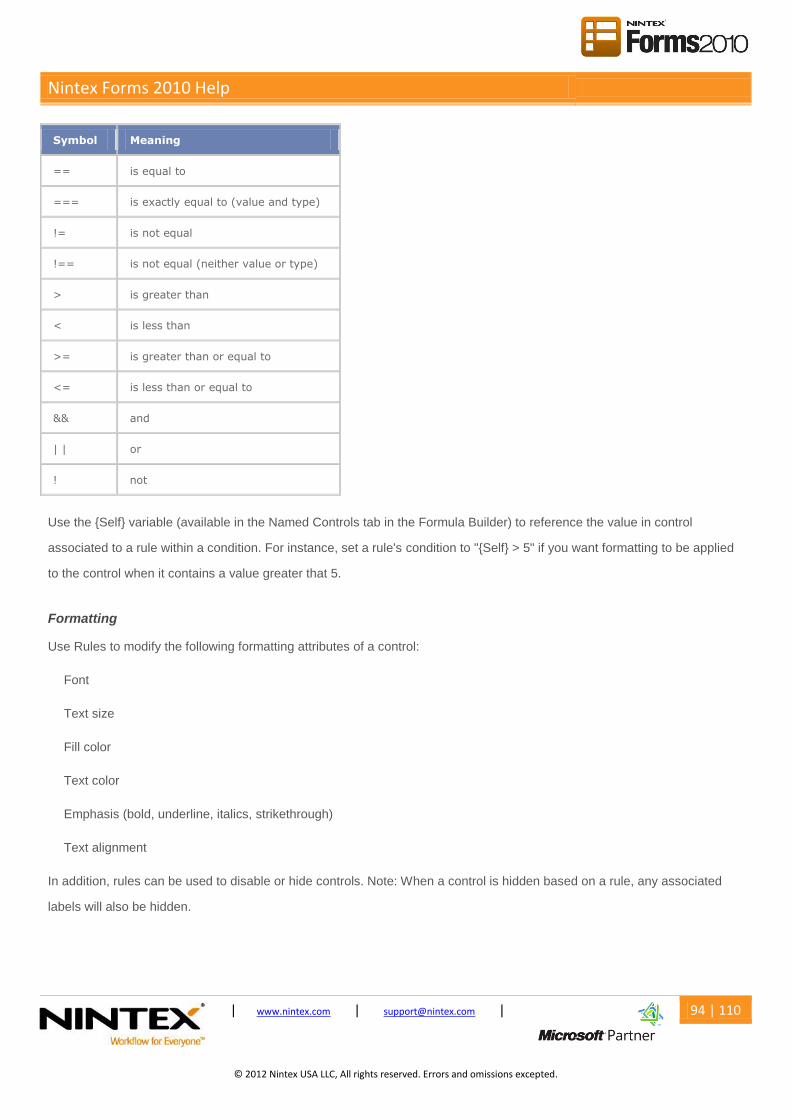
Nintex Forms 2010 Help
© 2008 Nintex LLC, All rights reserved
| www.nintex.com | [email protected] | 94 | 110
. Errors and omissions excepted.
© 2012 Nintex USA LLC, All rights reserved. Errors and omissions excepted.
Symbol Meaning
== is equal to
=== is exactly equal to (value and type)
!= is not equal
!== is not equal (neither value or type)
> is greater than
< is less than
>= is greater than or equal to
<= is less than or equal to
&& and
| | or
! not
Use the {Self} variable (available in the Named Controls tab in the Formula Builder) to reference the value in control
associated to a rule within a condition. For instance, set a rule's condition to "{Self} > 5" if you want formatting to be applied
to the control when it contains a value greater that 5.
Formatting
Use Rules to modify the following formatting attributes of a control:
Font
Text size
Fill color
Text color
Emphasis (bold, underline, italics, strikethrough)
Text alignment
In addition, rules can be used to disable or hide controls. Note: When a control is hidden based on a rule, any associated
labels will also be hidden.

Nintex Forms 2010 Help
© 2008 Nintex LLC, All rights reserved
| www.nintex.com | [email protected] | 95 | 110
. Errors and omissions excepted.
© 2012 Nintex USA LLC, All rights reserved. Errors and omissions excepted.
Rule Order
To re-order the rules in the rules pane, drag and drop a rule into the desired position. Alternatively, click the drag texture on
the rule you want to move and then click to where it is destined to be moved to.
Note: Rules are executed in the order they appear in the Rules pane. If a control has more than one rule applied to it, the
rules will execute in the order set in the rules pane.
Additional Functions
Click on the drop-down menu next to each rule to access additional functions.
Additional Functions Description
Select associated controls
Selection of controls (and the Controls in Use pane) will be reset to all those controls on the current device layout associated with the current rule.
Add to selected controls Add the current rule to all of the selected controls.
Remove from selected
controls
Remove the current rule from all selected controls.
Send to top Rule will be moved to the top of the list of rules.
Send to bottom Rule will be moved to the bottom of the list of rules.
Delete rule Rule will be deleted from the form.
Rules and Repeating Sections
A control within a repeating section may be associated with rules. These rules may include conditions which refer to
controls in the same repeating section or controls outside of the repeating section.
However, controls outside the repeating section cannot include conditions which refer to controls within repeating sections;
these conditions will always evaluate to FALSE.
Notifications
The "checked controls" icon will appear beside the rule title in "Show all rules" mode to indicate this rule is associated with
all the controls currently selected.

Nintex Forms 2010 Help
© 2008 Nintex LLC, All rights reserved
| www.nintex.com | [email protected] | 96 | 110
. Errors and omissions excepted.
© 2012 Nintex USA LLC, All rights reserved. Errors and omissions excepted.
An "attention" icon will appear in the formatting section of the Rules pane to indicate that some currently unselected controls
are associated with this rule. This serves as a reminder that some unselected controls will be affected by any changes to this
rule.
3.19 Previewing a Form
Previewing a Form
To preview a form, select the Preview button on the Nintex Forms 2010 Design Ribbon.
The preview settings dialog will appear before the preview is displayed.
Device: Select the device you would like to preview the form on. Note: This will use the most appropriate device layout
as already defined. If a layout for the specific device has not yet been created for the form, the next most appropriate
alternate device layout will be used to render the form. ?
Platform: Some controls appear and behave differently depending on whether you are viewing the form through
SharePoint's own framework (local) or using Nintex Live. This option allows you to choose which rendering you wish to
preview.?
Mode: Forms can be displayed in New, Edit and Display modes. Each of these may render and behave differently.
Note: Nintex Live only supports "New" mode. ?
Note: While viewing a preview, notifications may appear at the top of the preview itself. To close these, select "Close" in
the bottom right-hand corner.
If data is entered during preview form, this will not be saved.
3.20 Runtime Functions
Runtime Functions
and
Returns TRUE where both logical arguments are true. If either are false, returns FALSE.

Nintex Forms 2010 Help
© 2008 Nintex LLC, All rights reserved
| www.nintex.com | [email protected] | 97 | 110
. Errors and omissions excepted.
© 2012 Nintex USA LLC, All rights reserved. Errors and omissions excepted.
Usage
and(boolean1, boolean2)
avg
Returns the average value of a set of values.
Usage
avg([set of values])
contains
Returns TRUE where string contains the element.
Usage
contains(string,element)
count
Returns the number of rows in which a control that has a value (not blank) appears within a repeating section.
Usage
count(control)
currency
Returns the formatted currency string for the specified value.
Usage
currency(value)

Nintex Forms 2010 Help
© 2008 Nintex LLC, All rights reserved
| www.nintex.com | [email protected] | 98 | 110
. Errors and omissions excepted.
© 2012 Nintex USA LLC, All rights reserved. Errors and omissions excepted.
currentRowNumber
Returns the row number of the Repeating Section the control is contained within.
Usage
currentRowNumber(Control)
dateDiffDays
Returns the number of whole days between date1 and date2.
Usage
dateDiffDays(date1, date2)
dateDiffHours
Returns the number of whole hours between date1 and date2.
Usage
dateDiffHours(date1, date2)
dateDiffMinutes
Returns the number of whole minutes between date1 and date2.
Usage
dateDiffMinutes(date1, date2)
endsWith
Returns TRUE where element is at the end of string.
Usage
endWith(string, element)

Nintex Forms 2010 Help
© 2008 Nintex LLC, All rights reserved
| www.nintex.com | [email protected] | 99 | 110
. Errors and omissions excepted.
© 2012 Nintex USA LLC, All rights reserved. Errors and omissions excepted.
equals
Returns TRUE where two items are of equal value.
Usage
equals (value1, value2)
formatDate
Returns the date in the specified format.
Usage
formatDate(date, format)
The specified format can incorporate structures such as "dd/MM/yyyy" or "dddd", "dd MMM". The components of these
structures include:
Element Description Example (in US date format)
"dd" Day of month 6/15/2009 1:45:30 PM -> 15
"ddd" Day of week (Single Letter) 6/15/2009 1:45:30 PM -> M
"dddd" Day of week (Full) 6/15/2009 1:45:30 PM -> Monday
"MM" Month (Numeric) 6/15/2009 1:45:30 PM -> 6
"MMM" Month (Short) 6/15/2009 1:45:30 PM -> Jun
"MMMM" Month (Full) 6/15/2009 1:45:30 PM -> June
"yyyy" Year 6/15/2009 1:45:30 PM -> 2009
"hh" Hours (12 Hour) 6/15/2009 1:45:30 PM -> 1
"hh" Hours (24 hour) 6/15/2009 1:45:30 PM -> 13
"mm" Minutes 6/15/2009 1:45:30 PM -> 45
"tt" AM or PM 6/15/2009 1:45:30 PM -> PM
Alternatively, single character format specifiers can be used.
Format Specifier Description Example (in US date format)
"d" Short date pattern 6/15/2009 1:45:30 PM -> 6/15/2009

Nintex Forms 2010 Help
© 2008 Nintex LLC, All rights reserved
| www.nintex.com | [email protected] | 100 | 110
. Errors and omissions excepted.
© 2012 Nintex USA LLC, All rights reserved. Errors and omissions excepted.
"D" Long date pattern 6/15/2009 1:45:30 PM -> Monday, June 15, 2009
"M", "m" Month/day pattern 6/15/2009 1:45:30 PM -> June 15
"s" Sortable date/time pattern 6/15/2009 1:45:30 PM -> 2009-06-15T13:45:30
"t" Short time pattern 6/15/2009 1:45:30 PM -> 1:45PM
"T" Long time pattern 6/15/2009 1:45:30 PM -> 1:45:30PM
"Y", "y" Year month pattern 6/15/2009 1:45:30 PM -> June, 2009
greaterThan
Returns TRUE where value1 is greater than value2.
Usage
greaterThan(value1, value2)
greaterThanOrEqual
Returns TRUE where value1 is greater than or equal to value2.
Usage
GreaterThanOrEqual(value1,value2)
if
Checks whether a condition is met, and returns one value if true, and another value if false.
Usage
if(logical_test, value_if_true, value_if_false)
inArray
Returns TRUE where the collection contains the entire specified element.
Usage

Nintex Forms 2010 Help
© 2008 Nintex LLC, All rights reserved
| www.nintex.com | [email protected] | 101 | 110
. Errors and omissions excepted.
© 2012 Nintex USA LLC, All rights reserved. Errors and omissions excepted.
inArray(collection, element)
isDate
Returns TRUE where the value is a valid date.
Usage
isDate(value)
isNullOrEmpty
Returns TRUE where value has no data content.
Usage
isNullOrEmpty(value)
isNumeric
Returns TRUE where the value is a valid number.
Usage
isNumeric(value)
length
Returns the length of a string.
Usage
length(string)
lessThan
Returns TRUE where value1 is less than value2.
Nintex Forms 2010 Help
© 2008 Nintex LLC, All rights reserved
| www.nintex.com | [email protected] | 102 | 110
. Errors and omissions excepted.
© 2012 Nintex USA LLC, All rights reserved. Errors and omissions excepted.
Usage
lessThan(value1,value2)
lessThanOrEqual
Returns TRUE where value1 is less than or equal to value2.
Usage
LessThanOrEqual(value1,value2)
max
Returns the maximum value found in a set of values.
Usage
max([set of values])
min
Returns the minimum value found in a set of values.
Usage
min([set of values])
not
Returns the logical reverse of the argument.
Usage
not(boolean)
or
Returns TRUE where either logical arguments are true. Returns FALSE when both values are False.

Nintex Forms 2010 Help
© 2008 Nintex LLC, All rights reserved
| www.nintex.com | [email protected] | 103 | 110
. Errors and omissions excepted.
© 2012 Nintex USA LLC, All rights reserved. Errors and omissions excepted.
Usage
or(boolean1, boolean2)
replace
Replace part of a string that matches a regular expression pattern (replacePattern) with replacement.
Usage
replace(textToModify, replacePattern, replacement)
rows
Returns the number of rows a control appears in within a repeating section.
Usage
rows(control)
startsWith
Returns TRUE where element is at the beginning of the value.
Usage
startsWith(string, element)
subString
Returns a part of the string from the character position start for the specified length in characters. The first character is
position 0.
Usage
subString(string, start, length)
sum
Returns the result of all the values in a set being added together.
Nintex Forms 2010 Help
© 2008 Nintex LLC, All rights reserved
| www.nintex.com | [email protected] | 104 | 110
. Errors and omissions excepted.
© 2012 Nintex USA LLC, All rights reserved. Errors and omissions excepted.
Usage
sum([set of values])
toLower
Converts a string to lower case.
Usage
toLower(string)
toTitleCase
Converts a string to title case, with the first letter of each word capitalized.
Usage
toTitleCase(string)
toUpper
Converts a string to upper case.
Usage
toUpper(string)
trim
Removes any leading and trailing spaces from a string.
Usage
trim(string)
Related Topics
Inline functions

Nintex Forms 2010 Help
© 2008 Nintex LLC, All rights reserved
| www.nintex.com | [email protected] | 105 | 110
. Errors and omissions excepted.
© 2012 Nintex USA LLC, All rights reserved. Errors and omissions excepted.

Nintex Forms 2010 Help
© 2008 Nintex LLC, All rights reserved
| www.nintex.com | [email protected] | 106 | 110
. Errors and omissions excepted.
© 2012 Nintex USA LLC, All rights reserved. Errors and omissions excepted.
4 Form Interaction with SharePoint
4.1 Configuring the Start Site Workflow Webpart
The Nintex Forms Start Site Workflow web part is used to display a site workflow start form that was created using Nintex
Forms.
Adding a Start Site Workflow Web Part to a Page
To add a site workflow start form web part to a page:
1. Navigate to the SharePoint page that the Web Part will be added to.
2. Select the Page tab and click on the Edit button on the Ribbon.
3. Select the Insert tab and click on the Web Part button on the Ribbon.
4. In the Categories, select Nintex Forms 2010. Under Web Parts, select Start Site Workflow from the list of options.
5. Click the Add button.
6. On the upper right corner of the web part, click the drop-down icon to open the Web Part menu, then click on Edit Web
Part.
7. Use the Select the site workflow to start drop down to select the desired workflow.
8. Select the option to Refresh form on submit to reopen the form in a blank state with a Confirmation message, or
deselect the option and enter the Redirect URL. Note: The Appearance, Layout and Advanced options are the same
as other SharePoint Web Parts, refer to SharePoint Help Files for more information.
9. The Appearance, Layout and Advanced options are the same as other SharePoint Web Parts.Click OK.
10. Click on the Page tab. Save and close the page.
11. The Nintex Form will now display on the page.

Nintex Forms 2010 Help
© 2008 Nintex LLC, All rights reserved
| www.nintex.com | [email protected] | 107 | 110
. Errors and omissions excepted.
© 2012 Nintex USA LLC, All rights reserved. Errors and omissions excepted.
Related Topics
Designing forms in Nintex Workflow
Getting started with the form designer
Configuring the List Form Web Part
4.2 Configuring the List Form Web Part
The Nintex Forms List Form Web Part allows you to embed a list form designed using Nintex Forms on a page.
List Form Web Part Settings
Form Mode: Show the List Form in new, edit or display mode.
Site URL: The Site URL to retrieve the List item information from.
Redirect URL: The URL to redirect to after the form has been submitted.
Confirmation message: The confirmation message to be displayed after the form has been submitted.
List Name/ID: The List Name/ID to retrieve the form from.
If Edit or Display is selected for the Form Mode:
Item ID: The ID of the specific item in the list to retrieve.
If New is selected for the Form Mode:
Content Type: The content type name/ID of the to be displayed.
Adding a List Form Web Part to a Page
To add a list form web part to a SharePoint page:
1. Navigate to the SharePoint page that the Web Part will be added to.
2. Select the Page tab and click on the Edit button on the Ribbon.
3. Select the Insert tab and click on the Web Part button on the Ribbon.

Nintex Forms 2010 Help
© 2008 Nintex LLC, All rights reserved
| www.nintex.com | [email protected] | 108 | 110
. Errors and omissions excepted.
© 2012 Nintex USA LLC, All rights reserved. Errors and omissions excepted.
4. Locate the Categories section and select Nintex Forms 2010. In the Web Parts section, select List Form.
5. Click the Add button.
6. On the upper right corner of the web part, click the drop-down icon to open the Web Part menu, then click on Edit Web
Part.
7. Configure the List Form settings. Note: The Appearance, Layout and Advanced options are the same as other
SharePoint Web Parts, refer to SharePoint Help Files for more information.
8. Click OK.
9. Click on the Page tab. Save and close the page.
10. The Nintex Form will now display on the page.
List Form Web Part usage scenarios
Connected to a List View Web Part
A List Form Web Part can be connected to a List View Web Part. This allows the user to easily edit or view an item in a
list. When an item is selected in the List View Web Part, the List Form Web Part will display the item that was selected.
Note: The two web parts need to be on the same SharePoint page.
To configure the List Form Web Part as a connectable web part:
1. On the web part, select the drop-down menu on the right-hand side of the Web Part.
2. Select Connections and Get Row From.
3. The available List View Web Parts will appear in the list. Select the desired List View Web Part to be connected to.
Note: A List Form web part may only be connected to one List View Web Part. To connect to another List View Web Part,
the connected List View Web Part must be disconnected. To disconnect from the List View Web Part, open the List Form
Web Part's drop-down menu and select Connections. Untick the connected List View Web Part.
List Form Web Part in Edit/Display mode
When a List Form is set to Edit mode, the form may be edited in the SharePoint page. When a List Form is set to Display
mode the form may only be viewed in the SharePoint page and cannot be edited.

Nintex Forms 2010 Help
© 2008 Nintex LLC, All rights reserved
| www.nintex.com | [email protected] | 109 | 110
. Errors and omissions excepted.
© 2012 Nintex USA LLC, All rights reserved. Errors and omissions excepted.
To configure the List Form Web Part in edit or display mode:
1. Select the drop-down menu on the Web Part and click on Edit Web Part.
2. Select either Edit or Display in the Form Mode menu.
3. Provide the List Name/ID and the Content Type/ID. Click OK.
Note: If the list has not been enabled for management of content types, in the Content Type/ID, type in 'Item'.
List Form Web Part in New mode
When a List Form is set to New mode, a new List Form will appear when the SharePoint page is accessed.
To configure the List Form Web Part in new mode:
1. Select the drop-down menu on the Web Part and click on Edit Web Part.
2. Select New in the Form Mode menu.
3. Provide the List Name/ID and the Content Type/ID. Click OK.
Note: If the list has not been enabled for management of content types, in the Content Type/ID, type in 'Item'.
Related Topics
Getting started with the form designer
Configuring the Start Site Workflow Webpart
4.3 Designing forms for SharePoint external lists
Nintex Forms supports designing the form of a SharePoint external list (External Content Type). For more information on
SharePoint External List (External Content Type), refer to http://msdn.microsoft.com/en-us/library/ee558737.aspx.
Designing a form for SharePoint External List
1. Configure and set up the SharePoint external list in your SharePoint environment. For more information on setting up a
SharePoint external list, please refer to http://msdn.microsoft.com/en-us/library/ff728816.aspx.

Nintex Forms 2010 Help
© 2008 Nintex LLC, All rights reserved
| www.nintex.com | [email protected] | 110 | 110
. Errors and omissions excepted.
© 2012 Nintex USA LLC, All rights reserved. Errors and omissions excepted.
2. Once the SharePoint external list has been configured, design the form using Nintex Forms as per a standard
SharePoint list. Refer to Getting started with the form designer for more information on designing a Nintex form.
Note: When designing a Nintex form for a SharePoint external list, the form designer has the ability to change the controls of
the external data columns which otherwise would have limited users to just a single line textbox when using the out of the
box SharePoint external list.
Important
Nintex Forms does not support the ID column when designing forms for a SharePoint external list. It is recommended
that the external content type manages the ID creation.
Publishing to Nintex Live is not supported when designing a Nintex form for a SharePoint external list.
Related Topics
Getting started with the form designer
Designing forms in Nintex Workflow