
NightLightsandRegionalIncomeInequalityin Africa Story/Africa/afr... · Anthony Mveyange †...
25
Night Lights and Regional Income Inequality in Africa * Anthony Mveyange † Department of Business and Economics University of Southern Denmark Abstract This paper presents evidence that supports the use night light data to estimate regional income inequality in Africa. A comparison of traditional and night light data from Brazil and South Africa lend credence to this fact. The study finds evidence of declining, but high inequality trends across 42 African countries over 2000 - 2012 period. Regression estimates of β and σ-convergence on regional inequality confirm these trends. Further investigation reveals the role of between than within inequality as a key driver. The findings also show variations across geographical subdivisions; indicating the sensitivity of inequality to regional peculiarities. Key Words: Regional income inequality, Night light, Africa JEL Codes: I132, R10, O550 1 Introduction Economists have, in recent years, disagreed on the trends of income inequality and poverty in Africa. For-instance, Sala-i Martin and Pinkovskiy (2010) and Sala-i Martin (2006) claim that income inequality has been declining. By contrast, Palma (2011) and Milanovic (2002) argue that income inequality has been rising across countries, including Africa. Not surprisingly, this striking difference has something to do with data sources and methods; Deaton (2005) compares surveys and national accounts data and concludes that there is a potential "large-scale underestimation" of national accounts data relative to survey data in sub-Saharan Africa. 1 This * Acknowledgements: I am grateful to UNU-WIDER’s funding, access and use of its facilities for the entire period of my research visit in Helsinki, Finland. I also extend special thanks to the Department of Business and Economics at the University of Southern Denmark for a generous 3-years funding of my Ph.D studies which has culminated into, among others, the development of this paper. I have enormously benefited from comments, critiques and discussions with my Ph.D thesis supervisors Prof. Peter Sandholt Jensen and Prof. Thomas Barnebeck Andersen, my UNU-WIDER mentor Prof. Channing Arndt; Prof. Jukka Pirttila (UNU-WIDER); Juan Miguel Villa (University of Manchester); Smriti Sharma (Delhi School of Economics) and the participants of UNU-WIDER internal seminar when the preliminary version of the paper was presented. Errors and Omissions are mine. † A Ph.D Economics candidate. Corresponding email: [email protected] 1 Deaton (2005) also argues that despite recent innovations that have seen significant improvement in the collection of income and consumption data from both surveys and national accounts, these controversies are far from over. For example by comparing the standard deviation of the ratio of mean income and mean consumption derived from survey data he finds survey data from sub-Saharan Africa quite "problematic" due to high variance in the data. 1
Transcript of NightLightsandRegionalIncomeInequalityin Africa Story/Africa/afr... · Anthony Mveyange †...
Night Lights and Regional Income Inequality inAfrica∗
Anthony Mveyange†
Department of Business and EconomicsUniversity of Southern Denmark
AbstractThis paper presents evidence that supports the use night light data to estimate regional
income inequality in Africa. A comparison of traditional and night light data from Braziland South Africa lend credence to this fact. The study finds evidence of declining, buthigh inequality trends across 42 African countries over 2000 - 2012 period. Regressionestimates of β and σ-convergence on regional inequality confirm these trends. Furtherinvestigation reveals the role of between than within inequality as a key driver. The findingsalso show variations across geographical subdivisions; indicating the sensitivity of inequalityto regional peculiarities.
Key Words: Regional income inequality, Night light, AfricaJEL Codes: I132, R10, O550
1 Introduction
Economists have, in recent years, disagreed on the trends of income inequality and povertyin Africa. For-instance, Sala-i Martin and Pinkovskiy (2010) and Sala-i Martin (2006) claimthat income inequality has been declining. By contrast, Palma (2011) and Milanovic (2002)argue that income inequality has been rising across countries, including Africa. Not surprisingly,this striking difference has something to do with data sources and methods; Deaton (2005)compares surveys and national accounts data and concludes that there is a potential "large-scaleunderestimation" of national accounts data relative to survey data in sub-Saharan Africa.1 This∗Acknowledgements: I am grateful to UNU-WIDER’s funding, access and use of its facilities for the entire
period of my research visit in Helsinki, Finland. I also extend special thanks to the Department of Businessand Economics at the University of Southern Denmark for a generous 3-years funding of my Ph.D studies whichhas culminated into, among others, the development of this paper. I have enormously benefited from comments,critiques and discussions with my Ph.D thesis supervisors Prof. Peter Sandholt Jensen and Prof. ThomasBarnebeck Andersen, my UNU-WIDER mentor Prof. Channing Arndt; Prof. Jukka Pirttila (UNU-WIDER);Juan Miguel Villa (University of Manchester); Smriti Sharma (Delhi School of Economics) and the participants ofUNU-WIDER internal seminar when the preliminary version of the paper was presented. Errors and Omissionsare mine.†A Ph.D Economics candidate. Corresponding email: [email protected] (2005) also argues that despite recent innovations that have seen significant improvement in the
collection of income and consumption data from both surveys and national accounts, these controversies are farfrom over. For example by comparing the standard deviation of the ratio of mean income and mean consumptionderived from survey data he finds survey data from sub-Saharan Africa quite "problematic" due to high variancein the data.
1

lack of consistent and reliable data has limited analysis of income inequality in Africa2. The goalof this paper is to estimate recent regional income inequality trends in Africa using a relativelynew, reliable and consistently available data - night lights.
The analysis builds on a simple observation that night light data (henceforth light for conve-nience) have recently been used as a proxy for income and growth (see, Henderson et al., 2012;Chen and Nordhaus, 2011). Recent inclination towards using these data for economic analyses3
speak volume of their tractability. It is, thus, unsurprising that one of the most current discussionis whether we can also use them to estimate distribution of wealth and income across countries(see, Elvidge et al., 2012). This discussion is timely; especially in view of data limitations4
This paper pays particular attention to the potentiality of light data in estimating regionalincome inequality, which for convenience I also refer to, henceforth, as regional inequality. Idemonstrate the tractability of light data in two ways; by comparing the changes and performingcorrelation analysis of the inequality indicators computed using light relative to traditional data.As justified shortly, I employ both traditional and light data from Brazil and South Africa tothis endeavour. The analysis from these two countries suggest that light can be an informative5
indicator in and of itself in estimating regional inequality. As it turns out, this sets stage forusing light data in an attempt to empirically estimate regional inequality in Africa.
Regional level analysis of inequality in Africa is interesting for several reasons. In this study,however, two stand out. First, it resonates Fields and Schultz (1980) who note its utility for"planning development policies aimed at alleviating poverty, gauging the degree of country’slabour market integration, understanding the pattern of population movements, predicting futureurbanization and characterizing the poor". This, undoubtedly, is relevant given profoundlyreverberating concerns on income inequality and poverty trends in the region. Finally, muchif not all, of existing evidence on income inequality in Africa has primarily relied on countryor supranational as unit of analysis. This tends to miss out on the typical income inequalityevolutions at local scales. Taking advantage of the spatial nature of the light data, hence, makesthe analysis at regional level conveniently possible.
To make a case for light data I begin by demonstrating that to the extent light-based regionalinequality indicators behave closely to traditional ones they can qualify to be used as proxy forregional inequality. Again, data from Brazil and South Africa are used for this analysis. In fact,the choice of these two countries is made possible by the availability of both traditional income(both at individual and regional level) and light data making it feasible to compute comparableregional inequality indicators. Hence, consistent with both Henderson et al. (2012) and Elvidgeet al. (2012) who also construct Gini6, I additionally compute a widely known decomposable
2A view that is also shared by Bourguignon and Morrisson (2002) and Palma (2011) for countries from sub-Saharan Africa included in their estimation sample.
3For-example a Papaioannou (2013) and Alesina et al. (2012) use light to estimate income per capita; Ebeneret al. (2005) use light as proxy of wealth, and Villa (2014) use light to approximate growth of Colombianmunicipalities.
4The lack of data has compelled researchers to resort to a variety of data imputations and calibration methods.Yet, their underlying assumptions are strong and highly questionable. Moreover, it is possible to also argue thatthe existing controversy is, perhaps, also explained by these different imputations and calibration methods that,of course, have proved to be useful for approximating the missing data for analysis of income inequality.
5The general consensus in economics is that inequality is hard to measure, perhaps uniquely difficult. As amatter of fact, even if we observed nominal income perfectly, we would not necessarily know the actual purchasingpower of the agents that we observe. Purchasing power frequently differs across space and may evolve differentiallyacross the income distribution through time.
6In principle, the calculation of Gini in this paper is similar to Elvidge et al. (2012)’s construction of the nightlight development index (NLDI) at sub-national level, an index that is, technically, to be treated as a measure ofincome inequality than development.
2
inequality indicator - the mean-log deviation (MLD). The choice of MLD follows Anand (1983)who speaks highly of its tractability: decomposability and consistent interpretation of betweenand within inequality7.
I then build on Barro and Sala-i Martin (1990)’s convergence idea to test the cross sectionaldispersion of regional inequality. Barro and Sala-i Martin (1990) classify convergence broadlyinto two terms: the β-convergence also famously known as the "unconditional convergence"to describe a negative co-efficient on initial income excluding the relevant controls and the σ-convergence also dubbed as "conditional convergence" which entails the inclusion of the relevantspecific controls in explaining the negative coefficient on initial income. While i retain the twounderlying notions of convergence, the empirical specification slightly departs from convergencein income to convergence in regional inequality - with convergence defined as cross-sectionaldispersion in regional inequality. In particular, as shown later, I model this convergence asa check to the observed trends of regional inequality. The underlying conjecture here is thatunderstanding the evolution of regional inequality is necessary but not sufficient for policy. Thus,this part sheds insights on the potential drivers of the observed trends in regional inequality,perhaps meaningful for policy. In the end, an empirical illustration with a set of 171 regionsacross 10 countries, for which data are available for the period 2000 - 2012 is carried out.
Three key findings are offered in this paper. First, tracking light-based indicators over theperiod 2000 - 2012 across 42 countries, the study finds evidence of declining, though still relativelyhigh, regional inequality trends in Africa. This is consistent with Sala-i Martin (2006) andSala-i Martin and Pinkovskiy (2010). Regression estimates of β and σ-convergence confirmthese trends. Potential explanation for this result is that recent per capita income and growthincreases in Africa have also allowed individuals to consume more light (the relationship betweenincome and light is detailed in section 3) in the process reducing regional inequality. Second,these trends are driven by between rather than within regional income inequality8 suggestingpolicy attention towards the latter. Finally, there is substantial variation across geographicalsubdivisions, indicating the sensitivity of regional income inequality to regional peculiarities.This holds also for mineral rich and poor as well as land locked and coastal countries. Perhapsthe designing of regional economic policy packages in Africa derives utility from this finding.
This paper, by using light data, is the first to offer most recent and consistent insights ofregional inequality estimates and patterns in Africa. The paper is also a contribution to a newburgeoning literature that uses light to analyse global poverty trends. If anything, it provides aballpark estimate of recent regional inequality trends in Africa.
The rest of the paper proceeds as follows. Section 2 presents the related literatures. Section3 describes the link between lights and regional inequality. This section introduces the readerto the conceptual link between light and regional inequality. Building on this link section 4presents the empirical specification. This is folowed by section 5 which describes the data usedfor empirical analysis. Results are presented in section 6. Section 7 concludes.
7The choice of Gini follows the standard practice in the income inequality literature.8Also consistent with a recent worldbank inequality monitoring report available here: http://blogs.
worldbank.org/developmenttalk/monitoring-inequality.html
3

2 Related Literatures
There is a large volume of published studies on income inequality. This volume dates back toKuznets (1955) who uncovers the forces behind the evolution of inequality and Mincer (1958) whoquantifies the effect of human capital accumulation on personal income distribution. These twoseminal studies have sparked a profuse of both theoretical and empirical research for the past 6decades, all mainly geared to understand the conceptual and empirical intricacies associated withincome inequality. Of utmost relevance in these intricacies is income inequality measurement,which has received phenomenal attention in the literature. Jenkins and Micklewright (2009)argue that most of this attention has to do with the type and quality of the available data9.
As mentioned earlier, much of what we know and read about income inequality in recenttimes, has largely been dominated by, broadly speaking, two strands of empirical literature.The first strand claims declining trends in income inequality and poverty in the developingworld; for Africa this particularly the case for the period 1995 - 2007. This strand uses nationalaccounts to make this argument. Again, Sala-i Martin and Pinkovskiy (2010) and Sala-i Martin(2006) are the main pioneers of this strand. More recently, moreover, Pinkovskiy and Sala-iMartin (2014) bluntly argue that national accounts statistics are "superior10 measure of trueincome" in projecting world poverty relative to households surveys. Nevertheless, as Deaton(2005) argues, the main criticism of this strand is that it tends to impose an upward bias inestimating consumption - consumption in the national accounts includes items that the poor donot consume. This clearly biases poverty and inequality estimates.
Suffice it to say that the generalisability of this strand is, in fact, problematic. This isexemplified in a study, for example, by Bourguignon and Morrisson (2002) who use historicalnational accounts data to show that the levels of income inequality was as high as 0.50 Ginipercentage point since the the beginning of the 19th century. Similarly, more recently Palma(2011) examines within inequality by deciles across countries to offer an interesting conclusion:
There are two opposite forces at work. One is "centrifugal", and leads to an increaseddiversity in the shares appropriated by the top 10 and bottom 40 per cent. The otheris "centripetal", and leads to a growing uniformity in the income-share appropriatedby deciles 5 to 9, pp.21-23
Clearly, this remarkable difference in results signal differences in the choice of the underlyingestimation methods, among other factors.
The second strand, on the contrary, uses household surveys data to show that income in-equality, generally, rose across countries, including Africa. This view is firmly held by Milanovic(2002) who quantifies a 0.3 percentage points rise in Gini between 1988 and 1993 across 91countries. In this endeavour Chen and Ravallion (2010) also conclude that "the cost of living inpoor countries is higher than was thought, implying greater poverty at any given poverty line"including countries in Africa. Their inference is based on household survey data. Of course, theirconclusion is on poverty; albeit, simple deduction and intuition of their conclusion can safely belinked to increasing inequality - else equal, more poverty reflects underlying income inequality.The main limitation of this strand, to quote Bhalla (2002), is that "household surveys are mostly
9Thanks to Atkinson (1970) for reigniting the importance of measuring income inequality to track its levelsand evolution over time.
10Even though they are agnostic about the precise reasons why this is so, Pinkovskiy and Sala-i Martin (p.4,2014)
4

biased towards the poor as the richer household are less likely to participate in the surveys".This, then tends to impose a downward bias on poverty and inequality estimates.
The evidence so far presented lend credence to differences in existing empirical literatures.As Jenkins and Micklewright (2009) put, "the picture of inequality and poverty in different partsof the world is not the same as it was in the 1970s" despite these differences. To this, theyargue that accurately capturing the levels and trends of income inequality between and withincountries has reinforced much of the recent empirical literature.
An illustration to this remark is a recent World bank report on inequality monitoring11
summarized in figure 1 and 2. Figure 1 shows an overall decline in total inequality, as measuredby the mean log deviations of household consumption prior 2004 and increasing between 2005and 2008; with much of the evolution being, arguably, explained by income inequality betweencountries.
Figure 1: Total Income Inequality Trends in the developing world; 1980-2008
Figure 2: Within Income Inequality Trends in the developing world; 1980-2008
Source: Martin Ravalion and Shaohua Chen worldbank blog, see footnote 10.
On the contrary, figure 2 indicates that the evolution of within inequality, referred to as a11http://blogs.worldbank.org/developmenttalk/monitoring-inequality.html
5

measure of "inequality performance" is continent specific. Notably, while sub-Saharan Africaranks second after Latin America in terms of the severity of average within inequality, no cleartrend is observed over time. By contrast, declining trends on average within inequality areobserved in Northern Africa which happens to also have by far less income inequality relative tothe rest of sub-Saharan Africa.
A resounding message here is that income inequality tends to be (sub)continental specific12.However, one element remains unclear from these two figures; what are the triggers of inequal-ity differences between sub-Saharan Africa and Northern Africa? Moreover, further analysisof regional inequality at relevant geographical sub-groups in sub-Saharan Africa is called for.This study takes into account these pertinent gaps. Before proceeding to the discussion of therelationship between light and regional inequality, a briefly detour to literatures that have usedlight data is presented.
On the nature of light data, how they are processed and their applications a few recentstudies13 deserve a mention. Henderson et al. (2012) convincingly show that lights are highlycorrelated with GDP growth of rates, to the extent they can be used for analysis at disaggregatedgeographical units. Elvidge et al. (2011), noting the distinct light patterns across countries,provide evidence that closely supports the hypothesis that light data are highly correlated withconventional measures of output. Also, Chen and Nordhaus (2011) find that "luminosity hasinformational value to countries with low-quality statistical system" justifying their use in theabsence of traditional output data.
Other studies that document the use of light to approximate economic activities at sub-national level include Levin and Duke (2012) who compare Israel and the West bank to show thatdifferences in lights reflects the underlying differences in sub-national socio-economic activitiesacross the two countries and Sutton et al. (2007) who use light data for India, China, Turkeyand United States to estimate GDP per capital at local scales. While all these studies standout for their pioneering work in applying light for economic analyses, they do not use light toaddress inequality and poverty.
A few studies, nonetheless, have used light data to address issues of concern in income in-equality and poverty. Elvidge et al. (2009) use light data to construct a global poverty map.Similarly, Elvidge et al. (2012) develop a "night light development index" to measure humandevelopment and track the distribution of wealth and income across countries. More recently,Pinkovskiy and Sala-i Martin (2014) use light to approximate weights used to show that na-tional accounts better predict global poverty relative to household surveys. To the best of myknowledge, these three papers are the main frontiers in advocating the use of light data to offerinsights on poverty and income inequality.
Even so their analyses are different in scope and time when compared to this study. First,none of these studies approximate income inequality in Africa on its own. On the contrary, thescope of these studies has been on a global scale using countries as units of analysis. Muchless, Pinkovskiy and Sala-i Martin (2014) and Elvidge et al. (2009)’s focus on estimating globalpoverty and not inequality. Second, analyses of these studies are time invariant; for-exampleElvidge et al. (2009) and Elvidge et al. (2012) analyses are, respectively, for 2004 and 2006.This limits the understanding of the inequality trends and their associated triggers overtime.
12Remotely supporting the choice of regions as units of analysis in this study13Pinkovskiy and Sala-i Martin (2014) also provide a good synopsis of the light data, the data generating
process and their uses
6

Albeit, Elvidge et al. (2012) come closer to estimating income inequality using Gini. Yet, theirconclusion that light do not seem to measure inequality because of the weak correlation betweenincome and light Gini is non-robust in view of the cross-sectional and time-invariant nature oftheir analytical framework.
This study, thus, differs from its predecessors in several ways. First, it focuses mainly onAfrica. Second, it uses regions as unit of analysis in addition to evaluating regional inequalitytrends over time. Third and most important, the study includes a light-based decomposablemeasures of regional income inequality to pin down the sources of the observed regional inequality,an element absent in previous studies. And finally, unlike the previous studies, this studycombines both traditional and light data together with regression techniques to explain themechanisms behind the observed trends in regional inequality in Africa. The section that followsdescribes the conceptual relation between light and regional inequality.
3 Lights and regional inequality
Several studies have used light as a proxy for income per capita; Papaioannou (2013) and Alesinaet al. (2012) are recent studies in this case. Interestingly, Ebener et al. (2005) use light to estimatecountry and sub-national level distribution of income per capita and as a proxy of wealth acrosscountries. These studies inform the conceptual link between light and regional inequality. Thislink is further reinforced by Henderson et al. (2012)’s assertion;
Intensity of night lights reflects outdoor and some indoor use of lights. More gen-erally, however, consumption of nearly all goods in the evening requires lights. Asincome rises, so does lights usage per person, in both consumption activities and manyinvestment activities. Obviously, this is a complex relationship, and we abstract fromsuch issues as public versus private lighting, relative contributions of consumptionversus investment, and the relationship between daytime and night time consumptionand investment, p.999.
It is not unreasonable to think of several possible mechanisms through which light can measureregional inequality. The simplest and perhaps coherent one, however, lies on light being a proxyfor income per capita and wealth. A study by Elvidge et al. (2009), distinctly, reinforces thisconjecture. Their main underlying assumption - of interest for understanding the relationshipbetween light and regional inequality - is that "area with higher population counts in developingcountries would be poorly lit and therefore have higher percentages of poor people". The mostdirect implication of this conjecture, therefore, is that to the extent that lights are positive andstrong correlates of income per capita regions that are poorly lit will tend to have low incomeper capita and hence less wealthy.
To formalize this while abstracting from unobserved heterogeneities and controlling for pop-ulation sizes, I hypothesize that regions that tend to be highly lit, in per capita terms, tend tohave high income per capita and hence are wealthier relative to regions that are less so. Byextension, it is thus plausible that regional variation in income per capita is an ideal candidatesfor estimating and understanding regional inequality. The findings by Ebener et al. (2005) thatmeasures of light are positive and strong correlates of the GDP both at country and sub-nationallevel lend credence to this contention.
7

Important questions remain to be answered though. For-example should light be treated asmeasure of income or consumption? Through the lens of Henderson et al. (2012)’s assertion,it is unclear whether or not light-based inequality indicators measure consumption or incomeinequality. This contextual difference is, regardless, rather trivial; the conclusions are closelythe same whether light is treated as income or consumption as long as it abides with Hendersonet al. (2012)’s abstraction. That is, else equal consumption of light is a function of income.
And what does it mean for inequality dispersion if light increases faster relative to income?Perhaps this question is best answered if configured as a response to the curvature of lightrelative to income upon which consumption of light depends. As shown in the results section, inprinciple, unlike the concavity assumption revered in the standard micro-economics of incomeand consumption, consumption of light may not adhere to this standard wisdom. Arguably,consumption of light relative to income tends to be convex: higher income are associated withmore consumption of light. Henderson et al. (2012) and Elvidge et al. (2012) confirms this byshowing that rich countries tend to have more light per capita relative to poor countries. Thiswill, obviously, tend to bias the convergence of light-based inequality indicators. The empiricaltreatment of this fact is demonstrated in section 4. The next sub-section applies the deducedconceptual framework to show how regional inequality indices are empirically computed.
3.1 Regional inequality indices
The main assumption here is that to generate regional inequality indices, one has to exploitlight per capita variations at a lower geographical administrative unit to region. For-instance,a district or municipality, c.f. section 5. For consistency and without loss of generality, I treatdistricts across countries as the lower geographical administrative unit14 whose variations areused to compute both regional inequality indices. Consider the conceptual framework in turn.
Let the extracted sum of light in a given district be denoted as Γi,j,d,t for all i = 1, ..., n;j = 1, ...,m; and d = 1, ..., w where i is a country; j is a region; d is a district and t is all yearsfrom 2000 to 2012.
Similarly, let the total population in a given district be denoted as Ωi,j,d,t again for alli = 1, ..., n; j = 1, ...,m; and d = 1, ..., w where i, j, d and t retain their respective definitions.Suppressing subscripts i and t, light per capita by district is given as Γd
Ωd. Similarly, the district
share of population in each region j is given as Ωd∑w
1Ωd
.Suppose the distribution of the extracted light per capita by district is given as,
Θd = f( Γd
Ωd) (1)
The distribution of light per capita by region is, thus, given as
Θj = f( Ωd∑w1 Ωd
∗ Θd) (2)
From equation 2, we see that a change in regional inequality is a result of changes in the districtlight per capita distribution, Θd, and its fraction in the regional population size, Ωd∑w
1Ωd
, amongother factors. The above specifications build on Ghosh et al. (2010)’s assertion that spatial
14Of course I name them district for convenience. In reality they are named differently in different countries.In terms of geographical administrative units they are classified as administrative unit 2
8

unanimity, among others, in the units of analysis is particularly useful for cross-sectional analysisthat employs light data.
For easy of exposition, still suppressing subscripts i and t, let us define N =∑w
1 Ωd as totalpopulation in a district; Yd = Γd
Ωdas light per capita by district; Ωd∑w
1Ωd
as district population
share in a region and Yd =∑w
1Γd∑w
1d
as average light by districts.
Therefore, the indices15 are calculated as follows;
Ginij = 1 + 1N
− [ 2Yd ∗N2
] ∗ [∑
(N − i+ 1) ∗ Yd] (3)
MLDj =∑
fd ∗ ln[ Yd
Yd] (4)
4 Empirical specification
The empirical model of interest is
∆Ineqmp = γ1Ψq + γ2log(Light)q + γ3(log(Light))2
q + γ4Xq + γ5∆Y earp + γ6CYr + ηq (5)
Where p = (i, j, CY, 2012); q = (i, j, CY ); r = (i, j); ∆Ineq =m2012−mCY capturing regionaldispersion in inequality in a country; m stands for either Gini or MLD; i is a country; j is a regionor district; CY is the census year; Ψ is initial Gini or MLD; Light is light per capita (a proxy forincome per capita); ∆Y ear refers to the total number of years from census year to 2012; X is acolumn vector of regional covariates. That is, the share of urban population, the share of total andfemales employment; population density, share of electricity non-use. All these are in naturallogarithms - whose coefficients are interpreted as semi-elasticities. Other covariates includeeducation indicator - sex ratio in secondary education; sex ratio in employment; sub-continentdummies; and a column vector of constants. The covariates are extracted from the IntegratedPublic Use Microdata Series (IPUMS) International overseen by Minnesota Population Center16
c.f. section 5. The main coefficient of interest is γ1 with γ1 < 0 interpreted as convergence andγ1 > 0 as divergence in cross-sectional dispersion of regional inequality.
The empirical analysis is cross-sectional in nature; informed by the convergence hypothesis,the analysis seeks to test both β and σ-convergence in regional inequality dispersion. Becauseof its set-up, the empirical model bypasses potential reverse causality concerns, making it viableto invoke OLS as an estimation technique.
Because of the differences in data generating processes between light and IPUMS data, theirrespective error structures are bound to differ. An analysis by Henderson et al. (2012) and morerecently by Pinkovskiy and Sala-i Martin (2014) reinforces this idea. Hence, in OLS regressionsframework this can be summed as;
Cov(ηlighti,j , ηIP UMS
i,j ) = 0 (6)
Following the standard i.i.d assumption in the OLS regressions, equation 6 above guaranteesthat the error structure is independently distributed but not conditionally identically distributed
15If the indices are to be computed for districts only then subscript j is to be treated as a district and d is toreplaced by municipality.
16The Integrated Public Use Microdata Series: Version 6.2 [Machine-readable database]. Minneapolis: Univer-sity of Minnesota, 2013
9

- a classical violation of the common variance assumption. This is unsurprising for light data.Suppose from 1 and 2 we have;
Θd = f( Γd
Ωd) ∼ (0, σ2
d) (7)
Θj = f( Ωd∑w1 Ωd
∗ Θd) ∼ (0, σ2j ) (8)
Given the cross-sectional nature of equation 5, it follows by construction that the errorstructure is heteroskedastic;
εq ∼ (0, σ2i,j) (9)
It is logical to assume common error variance within regions across countries, but in this caseit is difficult to imagine light per capita data having constant variance over time between regions.In fact, we expect the error variance to be higher in regions with higher radiance of light percapita relative to those that are less so. Therefore, lights’ error structure is independently butnot identically distributed across regions. To address the unequal variance problem, I invoke theHuber-White-sandwich estimator for robust standard errors estimation.
Further, to derive consistent and unbiased coefficient estimates, I need to control for potentialconfounding factors. The model accommodates this. First, it accounts for the variation in yearsfrom which the country specific IPUMS data were extracted. This is done by introducing yeardummies that control for any potential coefficient bias that could originate from this variation.Second, the model also accounts for the time dispersion between years from which the countryspecific IPUMS data were extracted to 2012. Since the analysis is cross-sectional, this timedispersion accounts for any hidden time-trending bias. Third, it also takes into account potentialbiases that could arise because of countries geographical location differences. To control for this,the model uses sub-continent dummies to filter out potential biases. Table 1 summarizes thedefinition of all the variables used in the empirical analysis.
Table 1: Variables definition
Variables Definition
Log lightThe amount of regional night light divided by the regionaltotal population in the year of survey measured in logs
log Population density The regional total population per square kilometres
log UrbanizationThe regional ratio of urban dwelling populations in a to totalpopulation in a country by the census year measured in logs
Sex-ratio secondary education The regional ratio of female to male with secondary education by regions
Sex-ratio employmentThe ratio of female to male whose response was yes to a question onemployment during the census
log Electricity non-use shareThe regional share of people whose response was no to a question on theaccess and use of electricity during the census measured in logs
log Employment shareThe regional share of people whose response was yes to a questionon employment during the census measured in logs
log Female employment shareThe regional share of females whose response was yes to a questionon employment during the census measured in logs
∆Year The total change in years from census year used for analysis to 2012
Finally, I check the functional specification for each variable of interest. Except for lightper capita, population density, urban population and employment for which log specification isappropriate, the rest of the covariates assume their identity specification. Moreover, the modelalso includes the square of the log of light per capita to account for the curvature of light relative
10

to income. As noted above, this captures the extent to which a further increase in regional lightper capita can explain regional inequality dispersion. Further, the analysis also entails the testfor model specifications. Ramsey’s RESET model specification tests are therefore reported.
5 Data
5.1 Light Data
A detailed account of the nature, processes and light data application is deferred to the keystudies mention in section 2. However, their extraction, cleaning and computations follows theprocedure outlined by Lowe (2014). This process has two elements. The first entails extractingand cleaning light for Brazil and South Africa to justify its relevance in estimating regional in-equality. As noted earlier, the idea here is to calculate and compare inequality indices calculatedusing both light and traditional data in both countries. Hence, on the one hand data for SouthAfrica are extracted at municipal level for 2001 and 2007 to allow more variation and minimizethe small sample limitation17. I then calculate inequality indicators at district level used forcomparison with census-based district level indices. On the other hand, light data for Brazil areextracted between 2000 and 2010. Moreover, light extraction is done at municipality level andused to compute inequality indices at state level. This serves two purposes: first it allows thecomparison of light-based with state level regional inequality indices from census data for theyear 2000 and 2010, and second it also permits the same comparison with municipal level GDPdata for the period between 2000 and 2010. GDP data from Brazil were extracted from Brazilstatistical bureau18
The second element extends the geographical coverage to include 42 countries in Africa. Thisresulted to the extraction of the sum of light for 5617 geographical administrative units, which forconvenience and consistency I refer to them as districts, for the period 2000 - 2012. The mainsource for light data used in all analyses is the US Defence Meteorological Satellite ProgramOperational Linescan System (DMSP-OLS) archived by the National Oceanic and AtmosphericAdministration (NOAA)19. GIS data on the geographical administrative units are extracted fromthe global administrative areas database (GADM)20 and GIS geographical boundaries that comewith IPUMS data.
5.2 Population Data
To calculate light per capita by district or municipality, population data that match the lightdata in both geographical reference and spatial resolution are needed. On these two fronts,Landscan global population data is an ideal source in this case. A detailed account of these datacan freely be accessed at Oak Ridge National Laboratory21.
A point worth noting here is that both light and Landscan population data share one tractablefeature: they are 30 arc second grids products (equivalent to a resolution of 0.86 sq. km fromthe equator) which, by far, is the finest spatial resolution. Armed with this advantage, I am
17South Africa has only 9 provinces. South African municipal demarcation board http://www.demarcation.org.za/ is the main source for the district and municipal administrative units.
18http://www.ipeadata.gov.br19http://ngdc.noaa.gov/eog/dmsp/downloadV4composites.html20http://www.gadm.org/21http://web.ornl.gov/sci/landscan/landscan_data_avail.shtml
11
able to calculate light per capita by district or municipality, respectively, for Brazil and SouthAfrica and for all districts in the full sample. Per capita calculations based on GDP data arealso extended to Municipalities in Brazil.
Eventually, I am able to extract inequality indicators for 26 states in Brazil (the country hasa total of 5314 municipalities) for the period 2000-2010, 3622 districts in South Africa (for 2001and 2007 census the country had a total of 225 municipalities) and and 622 regions across 42countries23 for the period 2000-2012.
5.3 Other Data
The IPUMS data permits the extraction of the relevant data for 10 African countries with whichdata is available24. Two rules dictated the choice of a country into the estimation sample. First,the available IPUMS data must match both the time frame in the Landscan and light data - theperiod 2000-2012. Second, since the analysis is cross-sectional and stretches to 2012 for whichdata on outcome variables are available, I use latest census data to extract and pair the necessarycovariates25.
Variables of interest are regional shares of employment, education, and share of urban pop-ulations by region as a proxy for urbanization. These variables that have been documented tobe among the key determinants of income inequality dynamics26. Except for urbanization, Ialso calculate regional sex-ratio (female to male) in employment and in secondary education andregional total and females shares.
Because of its unique connection to night lights, I also construct a proxy for regional shareof electricity non-use. The non-use of electricity is accounted for because of the variation inthe consumption of electricity which is the main source of night light. Berliant and Weiss(2013) motivates this idea to address omitted bias inherently confounding light-based co-efficientestimates. Consistent and reliable data on electricity consumption are practically hard to findin Africa. To get close to approximating this variable, however, I use the a binary response onwhether individuals used electricity during the census in the IPUMS data to construct a proxyfor regional level electricity non-use shares. This does not capture actual electricity non-use, stillit minimizes potential co-efficient biases.
6 Results
6.1 Light as an alternative data source
Table 2 and 3 summarizes changes in inequality indicators for South Africa and Brazil respec-tively. A comparison of these changes reveals the hypothesized patterns of traditional and light-based inequality indicators. Generally, inequality indicators (based on Gini and total MLD)27
22South Africa has 44 district, I lose 8 districts because of the miss match in geo-graphical referencing systembetween census (IPUMS) data and South African municipal demarcation board
23The Stata code "ineqdeco" permits the extraction of both within and between inequality indicators for MLD.Gini is calculated using and "ineqdec0" which also accounts for zero observations.
24I wish to also acknowledge the statistical offices from 10 African countries that provided the underlyingIPUMS data.
25For example, South Africa has census for 2001 and 2007. For this analysis only 2007 is considered.26For-example in line with Mincer (1958), Stiglitz (1973) shows how education can exacerbate inequality; and
Kanbur and Zhuang (2013) demonstrate how urbanization can affect inequality in Asia.27Calculations of both Gini and MLD for census and GDP data was based on real per capita income by districts
or municipalities. The data were deflated using CPIs on respective months of census and GDP years
12

decline for both census and light data - the magnitude varies because of the differences in datagenerating processes and perhaps periods. A similar and interesting observation also holds forBrazil when light-based indicators are compared with those based on aggregated municipal GDPdata.
Decomposing the regional inequality further, the results reveal a somewhat inconsistent ob-servation. For South Africa, within inequality appears to increase with census as opposed to adecline shown with light data. The same inconsistency is observed for between inequality - lightindicators are barely unchanged for between inequality while census data show a modest decline.For Brazil, within inequality appears to fall across board except for between inequality whichdeclined for census and municipal GDP data, but increased for light data. It is not clear whatis driving these differences. For the empirical analysis, however, we are interested in Gini andtotal MLD which are consistent.
Table 2: District inequality changes in South Africa
Source Year Gini MLDTotal Within Between
Census data 2001 0.380 0.260 0.057 0.2022007 0.326 0.185 0.068 0.117
Light 2001 0.410 0.339 0.145 0.1942007 0.400 0.325 0.130 0.194
Table 3: State inequality changes in Brazil
Source Year Gini MLDTotal Within Between
Census data 2000 0.275 0.138 0.068 0.0692010 0.260 0.111 0.054 0.058
Light data 2000 0.475 0.421 0.402 0.0192010 0.419 0.361 0.338 0.024
Municipal GDP data 2000 0.412 0.312 0.179 0.1332010 0.391 0.272 0.171 0.101
If we now turn to the evidence of the correlations of these inequality indicators, figure 3,4 and 5 visually present the correlations of Gini and total MLD for all the data sources. Aninteresting observation to emerge from visual inspection of these figures is a positive correlationof inequality indicators generated from all three data sources. This visual inspection, however,does not tell us anything about the size of the correlation co-efficient and its level of statisticalsignificance.
13

Figure 3: Census Vs. Light Data Scatter plot: 2001 and 2007 in South Africa
0.2
.4.6
.8
0 .1 .2 .3 .4
Gini: census data
Gini: light data Fitted values
Panel 1: Gini
0.5
11.5
0 .1 .2 .3
MLD: census data
MLD: light data Fitted values
Panel 2: Mean log Deviation (MLD)
Source: Author’s calculations
Figure 4: Census Vs. Light Data Scatter plot: 2000 and 2010 in Brazil
.2.3
.4.5
.6
0 .1 .2 .3
Gini: census data
Gini: light data Fitted values
Panel 1: Gini
0.2
.4.6
0 .05 .1 .15
MLD: census data
MLD: light data Fitted values
Panel 2: Mean log deviation (MLD)
Source: Author’s calculations
Figure 5: Regional GDP Vs. Light Data Scatter plot: 2000-2010 in Brazil
0.2
.4.6
.8
.1 .2 .3 .4 .5
Gini: regional GDP data
Gini: light data Fitted values
Panel 1: Gini
0.2
.4.6
.81
0 .1 .2 .3 .4
MLD: regional GDP data
MLD: light data Fitted values
Panel 2: Mean log deviation (MLD)
Source: Author’s calculations
14

The correlation co-efficient and its statistical significance is interesting because it forms thebasis of whether light-based regional inequality indicators can indeed be used for the overallestimation of regional inequality in Africa. This analysis is presented in table 4, 5 and 6.
Table 4: Correlation Table: Census Vs. Light Data - South Africa
Gini light Gini census MLD light MLD censusGini light 1Gini census 0.340∗∗ 1MLD light 0.921∗∗∗ 0.318∗∗ 1MLD census 0.287∗ 0.954∗∗∗ 0.292∗ 1∗ p < 0.05, ∗∗ p < 0.01, ∗∗∗ p < 0.001
Table 5: Correlation Table: Census Vs. Light Data - Brazil
Gini light Gini census MLD light MLD censusGini light 1Gini census 0.452∗∗∗ 1MLD light 0.932∗∗∗ 0.266 1MLD census 0.443∗∗∗ 0.955∗∗∗ 0.287∗ 1∗ p < 0.05, ∗∗ p < 0.01, ∗∗∗ p < 0.001
Table 6: Correlation Table: Municipal Vs. Light Data - Brazil
Gini light Gini state MLD light MLD stateGini light 1Gini state 0.433∗∗∗ 1MLD light 0.927∗∗∗ 0.239∗∗∗ 1MLD state 0.383∗∗∗ 0.941∗∗∗ 0.239∗∗∗ 1∗ p < 0.05, ∗∗ p < 0.01, ∗∗∗ p < 0.001
The tables reveal statistically significant correlations between light-based Gini and MLDagainst Gini and MLD measured by both census and municipal GDP data. This is also intuitivelyconsistent with the changes in Gini and MLD in table 2 and 3. Correlations of Gini appear tobe modest for South Africa, but slightly improves for Brazil. Despite the statistical significance,correlations for MLD is modest in both countries.
Taken together, these results suggest a statistically strong but modest association existingbetween traditional and light-based regional inequality indicators. This justifies the use of thelatter - in a sense of informative indicators - as proxy for regional inequality for empirical anal-ysis. The next sub-section builds on this evidence to present the trends of light-based regionalinequality in Africa.
15

6.2 Regional Inequality Trends in Africa: Light Data, 2000-2012
Table 7 reports the number of regions and countries used in the empirical analysis by theirgeographical subdivision. This sample is more than 75 percent of all countries in Africa. Un-doubtedly, it is large enough for meaningful and representative inferences.
Table 7: Regions by their Geographical Subdivisions
Number of Regions Number CountriesEastern Africa 212 14Central Africa 81 6Northern Africa 93 4Southern Africa 31 3Western Africa 205 15All of Africa 622 42Coastal Countries 397 31Landlocked Countries 225 11Mineral Rich Countries 296 20Mineral Poor Countries 326 22
Figure 6 pictures the trends of light based Gini and MLD for the period between 2000 and2012 in the 622 regions across the 42 African countries. The results indicate a relatively highbut declining regional inequality in Africa. This is consistent for both the Gini and the meanlog deviation (MLD).
Figure 6: Income Inequality Trends in Africa; 2000-2012
.74
.75
.76
.77
.78
.79
2000 2005 2010 2015
year
Panel 1: Gini
0.5
11.5
2
2000 2005 2010 2015
year
Total Within
Between
Panel 2: MLD
Source: Author’s calculations
Visual inspection of figure 6 suggests a dramatic decline in the Gini coefficients for the pastdecade. Similarly, though not as dramatic as Gini, MLD reveals slow declining trends of totalregional inequality in Africa. Suggestively, MLD’s decline is mainly driven by between regions
16

inequality. Within regional income inequality appears to almost stay constant, an indicationthat inequality performance within regions and countries is rather low.
The trends, however, vary when Africa is subdivided into sub-regions, into mineral rich andinto land locked countries, c.f. figures 7 - 15 in the appendices. Figure 7 and 12 show, withdramatic swings, inequality in Eastern Africa and mineral rich countries declined consistentlyover the period 2000 -2012. By contrast, figure 8, 9, and 11 respectively indicate that countriesin the Central, North and West Africa experienced declining trends circa 2007 - just before therecent financial crisis - and peaks during crisis time. Notably, figure 10 reveals a rather dramaticupward trend in the Southern Africa regions.
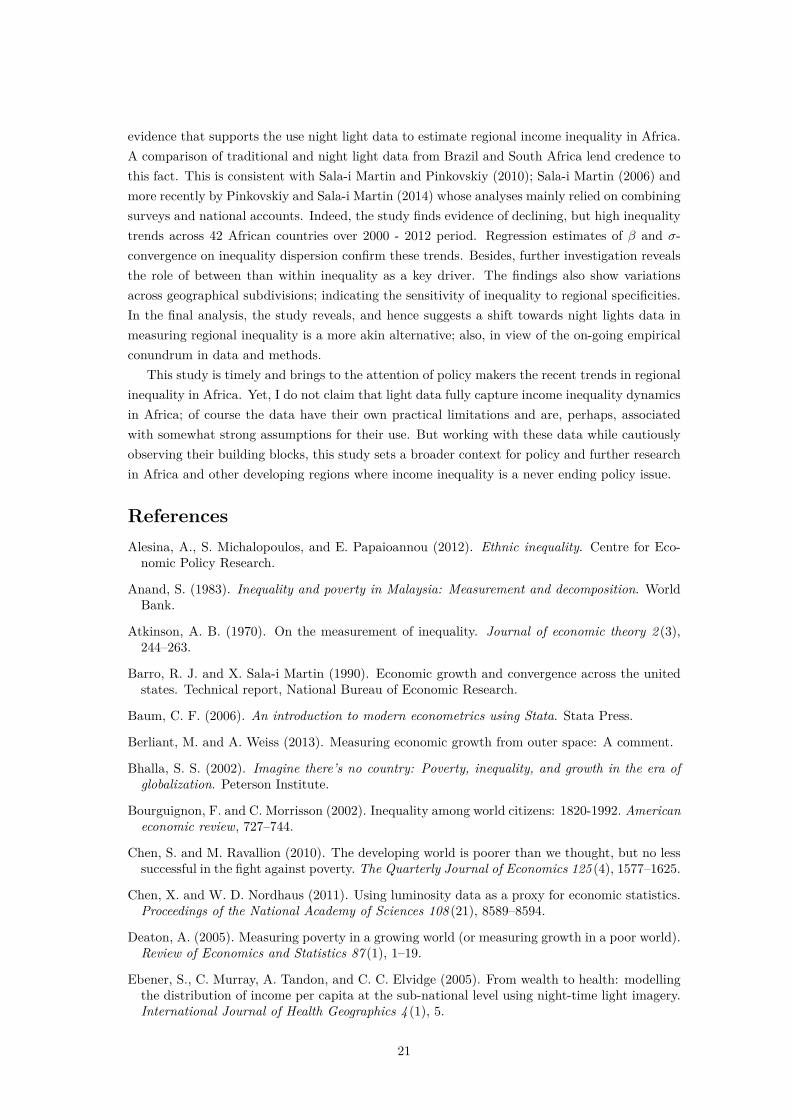
So far we have said little about mineral rich or poor as well as land locked or coastal countries.Analysis on mineral poor countries c.f. figure 13 yet makes no difference to that of Central, Northand West Africa. The same holds for land locked and coastal countries c.f. figure 14 and 15 -with the exception to declining trends, circa 2010 onwards.
A comparison of the regional inequality using MLD also reveals a diverse but consistentpicture. Except for the Southern Africa region where none of the MLD decomposable compo-nents show changes in regional inequality, the remaining regional subdivisions show substantialchanges. For sure, MLD declined in the East, Central and Western Africa. This pattern is similarin mineral rich and land locked and coastal countries. The most vivid result from these trendsis that the overall downward spiral seem to be mainly driven by regional inequality betweenregions rather within regions. This finding resonates a similar conclusion by Sala-i Martin andPinkovskiy (2010) and Sala-i Martin (2006). However, it is at odd with a recent World bankreport on inequality monitoring28 which show increasing inequality (measured by total MLD) insub-Saharan Africa and declining inequality in Northern Africa. For Northern Africa this study,indeed, shows inequality to be on the rise circa 2008.
In general, despite the downward spiral in regional inequality, the results unambiguouslyshow inequality of performance within regions and, by extension countries, in Africa is ratherlow. The importance of relevant policy prescriptions to circumvent this situation cannot beover-emphasized. The next sub-section closes the results section by presenting the regressionresults.
6.3 Convergence and Predictors of Dispersion in Regional Inequality
Table 8: Summary of countries, regions and census year
Country Regions Census yearBurkina Faso 30 2006
Cameroon 10 2005Ghana 10 2000Kenya 8 2009Malawi 27 2008Rwanda 10 2002Senegal 11 2002
South Africa 9 2007Tanzania 26 2002Uganda 30 2002
Total 171
Table 8 reports the summary of countries, regions and census years for the sample that was28http://blogs.worldbank.org/developmenttalk/monitoring-inequality.html
17
used for regression analysis. The table shows a total of 171 regions across 10 countries in Africawere used for analysis.
Table 9 and 10 report the regression output based on equation 5. Column 1 reports the β-convergence while columns 2-4 report the σ-convergence. Finally, column 5 and 6 present furtherchecks of the conditional convergence by introducing other different covariates. The results arequite revealing in several ways. First, strong evidence of both β and σ-convergence in dispersionof regional inequality is revealed. This is true when I control for the shares in electricity non-useand the time distance between census year and 2012 - column 2 or update with log of lightper capita - column 3 or with the rest of the covariates - column 4. Precisely, the convergencecoefficient increases by 0.115, 0.14 and 14.9 points for Gini and 0.064, 0.08 and 0.077 for MLDwhen moving, respectively, from column 1 to 2, 3 and 4. These upward point co-efficient changesroughly remain constant when covariates are updated as a robust check in column 5 and 6.
Overall, a 1 percent increase in initial Gini leads to an average of 0.52 and about 0.65percent β and σ convergence of regional inequality dispersion respectively. In the same spirit,initial MLD leads to 0.68 and about 0.74 percent convergence. While these results reveal ahighly statistically strong conditional relative to unconditional convergence in regional inequalitydispersion, they make one point quite clear: the higher the level of initial regional inequality thefaster is the convergence (in both senses) of the changes in regional inequality over subsequentyears. Meanwhile, MLD appears to apparently predict faster convergence than Gini.
Turning now to the regression estimates on the covariates, the most interesting result toemerge from the covariates are the coefficients of log of light per capita and its square. As alludedto in the empirical specification section, I am not surprised by this result: since consumption oflight is a function of income it is indeed unsurprising to observe a convex relationship betweenlight per capita (a proxy of income per capita) and regional inequality dispersion. Of coursewith higher income (arguably a recent phenomena in Africa) people are likely to consume morelight eventually reducing regional inequality dispersion. As shown in table 9 and 10 regionalinequality dispersion is less semi-elastic to light per capita increases both for Gini or MLD. Infact, it is even less and less semi-elastic to further increases in light per capita. Comparing thesesemi-elasticities between Gini and MLD, however, reveals same story: MLD tends to have higherestimates of semi-elasticities relative to Gini.
With respect to other covariates, I find, except for regional share of electricity non-use whichis quite robust almost across all specifications, the time magnitude between census year and 2012(∆Year) and sex-ratio in secondary education to be non-robust. Robustness of the electricitynon-use shares is also quite telling and intuitive. In fact, a 1 percentage point increase in thisvariable leads to divergence in regional inequality dispersion by slightly above 0.05 points. Apossible explanation to this is straight forward: the more the number of people with no accessto electricity the higher the dispersion of income based on light data. This is both intuitive andlogical given that inequality indicators are also light-based. Coefficient estimates on ∆Year andfemale to male ratio in secondary education have closely the same divergence interpretations,except they are non-robust: efficiency disappears in some specifications. I find the rest of theother covariates to be statistically immeasurable. In all the regression estimates I control foryears dummies and sub-continental dummies to rid coefficients of potential biases.
To test if the model in equation 5 is misspecified when taken to data, I invoke the Ramsey’sRESET model misspecification tests. As depicted in the regression tables, the test does notreject the null hypothesis of no model’s omitted variables in all Gini and MLD specifications.
18

This purges our coefficients estimates from doubts making them meaningful for inference.
Table 9: Inequality in Africa: Light GiniDependent Variable: ∆Gini
Model 1 Model 2 Model 3 Model 4 Model 5 Model 6Initial Gini -0.519∗∗∗ -0.634∗∗∗ -0.659∗∗∗ -0.668∗∗∗ -0.656∗∗∗ -0.658∗∗∗
[0.069] [0.075] [0.079] [0.078] [0.077] [0.077]∆Year 0.008 0.023∗∗∗ 0.023∗∗∗ 0.012 0.019∗∗ 0.019∗∗
[0.007] [0.007] [0.008] [0.009] [0.009] [0.009]log(Electricity non-use shares) 0.098∗∗∗ 0.096∗∗∗ 0.075∗∗∗ 0.059∗ 0.057∗
[0.021] [0.023] [0.024] [0.035] [0.034]log(Light per capita) -0.214∗∗ -0.261∗∗∗ -0.290∗∗∗ -0.288∗∗∗
[0.089] [0.093] [0.094] [0.092]log(Light per capita)2 -0.014∗∗ -0.017∗∗ -0.018∗∗∗ -0.018∗∗∗
[0.006] [0.006] [0.007] [0.007]log(Population density) 0.002 -0.001 -0.001
[0.012] [0.013] [0.013]log(Urban population shares) 0.029 0.023 0.024
[0.020] [0.020] [0.020]Sex-ratio secondary education 0.158 0.224∗∗ 0.218∗
[0.124] [0.112] [0.113]Sex-ratio employment 0.104
[0.076]log(Total employment shares) 0.024
[0.030]log(Female employment shares) 0.026
[0.028]Constant 0.146∗∗ 0.374∗∗∗ -0.388 -0.775∗∗ -0.858∗∗ -0.841∗∗
[0.066] [0.077] [0.289] [0.332] [0.332] [0.325]N 171 171 169 166 166 166R2 0.318 0.400 0.431 0.464 0.457 0.458F-Stat 7.999 8.693 7.456 6.662 6.448 6.487Ramsey RESET (p-value) 0.7054 0.5934 0.2079 0.2904 0.4471 0.3972Year dummy Yes Yes Yes Yes Yes YesSub-continent dummy Yes Yes Yes Yes Yes YesStandard errors in bracketsRegressions are based on a cross section of 10 countries in Africa∗ p < 0.1, ∗∗ p < 0.05, ∗∗∗ p < 0.01
19

Table 10: Inequality in Africa: Light Mean Log Deviation (MLD)Dependent Variable: ∆MLD
Model 1 Model 2 Model 3 Model 4 Model 5 Model 6Initial MLD -0.677∗∗∗ -0.741∗∗∗ -0.757∗∗∗ -0.754∗∗∗ -0.743∗∗∗ -0.744∗∗∗
[0.061] [0.072] [0.074] [0.073] [0.073] [0.073]∆Year 0.011 0.034∗∗ 0.033∗∗ 0.009 0.023 0.024
[0.013] [0.014] [0.014] [0.017] [0.016] [0.016]log(Electricity non-use shares) 0.157∗∗∗ 0.151∗∗∗ 0.107∗∗∗ 0.116∗ 0.101
[0.038] [0.039] [0.041] [0.064] [0.063]log(Light per capita) -0.374∗∗∗ -0.472∗∗∗ -0.506∗∗∗ -0.515∗∗∗
[0.125] [0.145] [0.143] [0.141]log(Light per capita)2 -0.024∗∗∗ -0.030∗∗∗ -0.031∗∗∗ -0.032∗∗∗
[0.009] [0.010] [0.010] [0.010]log(Population density) 0.014 0.012 0.010
[0.021] [0.023] [0.023]log(Urban population shares) 0.052 0.042 0.042
[0.034] [0.033] [0.033]Sex-ratio secondary education 0.272 0.413∗ 0.410∗
[0.237] [0.212] [0.213]Sex-ratio employment 0.234
[0.142]log(Total employment shares) 0.007
[0.056]log(Female employment shares) 0.023
[0.051]Constant 0.216∗ 0.537∗∗∗ -0.809∗ -1.640∗∗∗ -1.715∗∗∗ -1.735∗∗∗
[0.117] [0.133] [0.417] [0.558] [0.540] [0.534]N 171 171 169 166 166 166R2 0.485 0.535 0.555 0.585 0.576 0.576F-stat 16.776 13.766 11.853 9.259 9.183 9.256Ramsey RESET (p-value) 0.7637 0.7842 0.5375 0.1030 0.2212 0.2062Year dummy Yes Yes Yes Yes Yes YesSub-continent dummy Yes Yes Yes Yes Yes YesStandard errors in bracketsRegressions are based on a cross section of 11 countries in Africa∗ p < 0.1, ∗∗ p < 0.05, ∗∗∗ p < 0.01
In summary, in addition to the their potential for informing policy, results in this sub-sectionalso confirm the potentiality of light data in estimating regional income inequality, the caveatbeing it is also a proxy for income per capita and wealth.
7 Conclusion
This paper explores the potentiality of light data in estimating regional inequality. Buildingon their resourcefulness as good proxy for economic activities; particularly, income per capitaand wealth, I use these data to show their tractability and eventually estimate regional in-equality in Africa where available evidences point to lack of reliable and consistent data whichhave, arguably, been shown to impede the analysis of income inequality hence exacerbating thedisquieting disagreements on the actual trends of inequality and poverty in the continent.
The main contribution of this paper is its use of light data to try to answer a question ofa broader concern and context for policy - estimating regional inequality. This paper presents
20
evidence that supports the use night light data to estimate regional income inequality in Africa.A comparison of traditional and night light data from Brazil and South Africa lend credence tothis fact. This is consistent with Sala-i Martin and Pinkovskiy (2010); Sala-i Martin (2006) andmore recently by Pinkovskiy and Sala-i Martin (2014) whose analyses mainly relied on combiningsurveys and national accounts. Indeed, the study finds evidence of declining, but high inequalitytrends across 42 African countries over 2000 - 2012 period. Regression estimates of β and σ-convergence on inequality dispersion confirm these trends. Besides, further investigation revealsthe role of between than within inequality as a key driver. The findings also show variationsacross geographical subdivisions; indicating the sensitivity of inequality to regional specificities.In the final analysis, the study reveals, and hence suggests a shift towards night lights data inmeasuring regional inequality is a more akin alternative; also, in view of the on-going empiricalconundrum in data and methods.
This study is timely and brings to the attention of policy makers the recent trends in regionalinequality in Africa. Yet, I do not claim that light data fully capture income inequality dynamicsin Africa; of course the data have their own practical limitations and are, perhaps, associatedwith somewhat strong assumptions for their use. But working with these data while cautiouslyobserving their building blocks, this study sets a broader context for policy and further researchin Africa and other developing regions where income inequality is a never ending policy issue.
ReferencesAlesina, A., S. Michalopoulos, and E. Papaioannou (2012). Ethnic inequality. Centre for Eco-nomic Policy Research.
Anand, S. (1983). Inequality and poverty in Malaysia: Measurement and decomposition. WorldBank.
Atkinson, A. B. (1970). On the measurement of inequality. Journal of economic theory 2 (3),244–263.
Barro, R. J. and X. Sala-i Martin (1990). Economic growth and convergence across the unitedstates. Technical report, National Bureau of Economic Research.
Baum, C. F. (2006). An introduction to modern econometrics using Stata. Stata Press.
Berliant, M. and A. Weiss (2013). Measuring economic growth from outer space: A comment.
Bhalla, S. S. (2002). Imagine there’s no country: Poverty, inequality, and growth in the era ofglobalization. Peterson Institute.
Bourguignon, F. and C. Morrisson (2002). Inequality among world citizens: 1820-1992. Americaneconomic review, 727–744.
Chen, S. and M. Ravallion (2010). The developing world is poorer than we thought, but no lesssuccessful in the fight against poverty. The Quarterly Journal of Economics 125 (4), 1577–1625.
Chen, X. and W. D. Nordhaus (2011). Using luminosity data as a proxy for economic statistics.Proceedings of the National Academy of Sciences 108 (21), 8589–8594.
Deaton, A. (2005). Measuring poverty in a growing world (or measuring growth in a poor world).Review of Economics and Statistics 87 (1), 1–19.
Ebener, S., C. Murray, A. Tandon, and C. C. Elvidge (2005). From wealth to health: modellingthe distribution of income per capita at the sub-national level using night-time light imagery.International Journal of Health Geographics 4 (1), 5.
21

Elvidge, C., K. Baugh, S. Anderson, P. Sutton, and T. Ghosh (2012). The night light developmentindex (nldi): a spatially explicit measure of human development from satellite data. SocialGeography 7 (1).
Elvidge, C., P. Sutton, K. Baugh, D. Ziskin, T. Ghosh, and S. Anderson (2011). National trendsin satellite observed lighting: 1992-2009. In AGU Fall Meeting Abstracts, Volume 1, pp. 03.
Elvidge, C. D., P. C. Sutton, T. Ghosh, B. T. Tuttle, K. E. Baugh, B. Bhaduri, and E. Bright(2009). A global poverty map derived from satellite data. Computers & Geosciences 35 (8),1652–1660.
Fields, G. S. and T. P. Schultz (1980). Regional inequality and other sources of income variationin colombia. Economic Development and Cultural Change, 447–467.
Ghosh, T., R. L. Powell, C. D. Elvidge, K. E. Baugh, P. C. Sutton, and S. Anderson (2010). Shed-ding light on the global distribution of economic activity. The Open Geography Journal 3 (1),148–161.
Henderson, J. V., A. Storeygard, and D. N. Weil (2012). Measuring economic growth from outerspace. American Economic Review 102 (2), 994–1028.
Jenkins, S. P. and J. Micklewright (2009). New directions in the analysis of inequality andpoverty. Oxford University Press.
Kanbur, R. and J. Zhuang (2013). Urbanization and inequality in asia. Asian DevelopmentReview 30 (1), 131–147.
Kuznets, S. (1955). Economic growth and income inequality. The American economic review,1–28.
Levin, N. and Y. Duke (2012). High spatial resolution night-time light images for demographicand socio-economic studies. Remote Sensing of Environment 119, 1–10.
Lowe, M. (2014). Night lights and arcgis: A brief guide. Technical report, MIT.
Milanovic, B. (2002). True world income distribution, 1988 and 1993: First calculation basedon household surveys alone. The economic journal 112 (476), 51–92.
Mincer, J. (1958). Investment in human capital and personal income distribution. The journalof political economy, 281–302.
Palma, J. G. (2011). Homogeneous middles vs. heterogeneous tails, and the end of the Śinverted-uŠ: It’s all about the share of the rich. Development and Change 42 (1), 87–153.
Papaioannou, E. (2013). National institutions and subnational development in africa. TheQuarterly Journal of Economics 129 (1), 151–213.
Pinkovskiy, M. and X. Sala-i Martin (2014). Lights, camera,... income!: Estimating poverty usingnational accounts, survey means, and lights. Technical report, National Bureau of EconomicResearch.
Sala-i Martin, X. (2006). The world distribution of income: falling poverty andĚ convergence,period. The Quarterly Journal of Economics 121 (2), 351–397.
Sala-i Martin, X. and M. Pinkovskiy (2010). African poverty is falling... much faster than youthink! Technical report, National Bureau of Economic Research.
Stiglitz, J. E. (1973). Education and inequality. The ANNALS of the American Academy ofPolitical and Social Science 409 (1), 135–145.
Sutton, P. C., C. D. Elvidge, and T. Ghosh (2007). Estimation of gross domestic productat sub-national scales using nighttime satellite imagery. International Journal of EcologicalEconomics & Statistics 8 (S07), 5–21.
Villa, J. M. (2014). Social transfer and growth: The missing evidence from luminosity. Technicalreport, UNU-WIDER.
22

Appendices
Figure 7: Income Inequality Trends in East Africa; 2000-2012
.6.6
5.7
.75
2000 2005 2010 2015
year
Panel 1: Gini
.2.4
.6.8
11
.2
2000 2005 2010 2015
year
Total Within
Between
Panel 2: MLD
Source: Author’s calculations
Figure 8: Income Inequality Trends in Central Africa; 2000-2012
.78
.8.8
2.8
4
2000 2005 2010 2015
year
Panel 1: Gini
.51
1.5
2
2000 2005 2010 2015
year
Total WIthin
Between
Panel 2: MLD
Source: Author’s calculations
Figure 9: Income Inequality Trends in Northern Africa; 2000-2012
.52
.54
.56
.58
.6.6
2
2000 2005 2010 2015
year
Panel 1: Gini
0.2
.4.6
.8
2000 2005 2010 2015
year
Total Within
Between
Panel 2: MLD
Source: Author’s calculations
23

Figure 10: Income Inequality Trends in Southern Africa; 2000-2012
.40
5.4
1.4
15
.42
.42
5.4
3
2000 2005 2010 2015
year
Panel 1: Gini
0.1
.2.3
.4
2000 2005 2010 2015
year
Total Within
Between
Panel 2: MLD
Source: Author’s calculations
Figure 11: Income Inequality Trends in Western Africa; 2000-2012
.6.6
5.7
.75
2000 2005 2010 2015
year
Panel 1: Gini
.4.6
.81
1.2
2000 2005 2010 2015
year
Total Within
Between
Panel 2: MLD
Source: Author’s calculations
Figure 12: Income Inequality Trends in Mineral Rich Countries in Africa; 2000-2012
.72
.74
.76
.78
.8
2000 2005 2010 2015
year
Panel 1: Gini
.51
1.5
2
2000 2005 2010 2015
year
Total Within
Between
Panel 2: MLD
Source: Author’s calculations
24
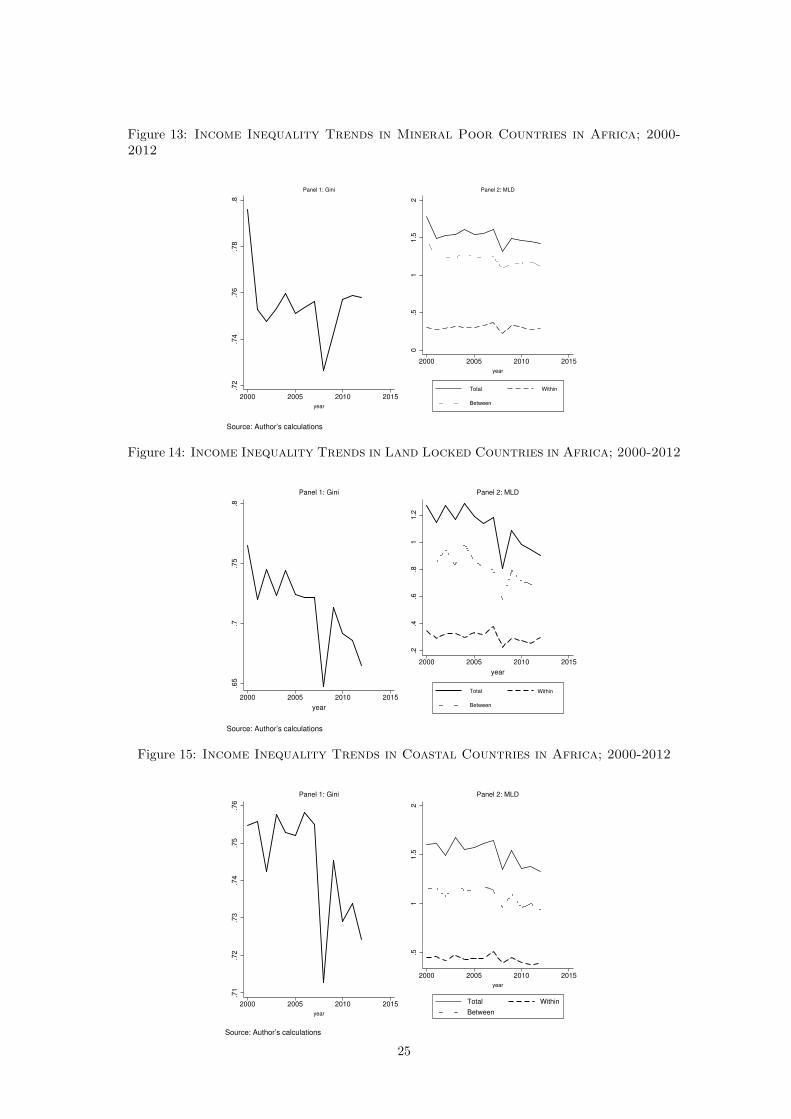
Figure 13: Income Inequality Trends in Mineral Poor Countries in Africa; 2000-2012
.72
.74
.76
.78
.8
2000 2005 2010 2015
year
Panel 1: Gini
0.5
11.5
2
2000 2005 2010 2015
year
Total Within
Between
Panel 2: MLD
Source: Author’s calculations
Figure 14: Income Inequality Trends in Land Locked Countries in Africa; 2000-2012
.65
.7.7
5.8
2000 2005 2010 2015
year
Panel 1: Gini
.2.4
.6.8
11.2
2000 2005 2010 2015
year
Total Within
Between
Panel 2: MLD
Source: Author’s calculations
Figure 15: Income Inequality Trends in Coastal Countries in Africa; 2000-2012
.71
.72
.73
.74
.75
.76
2000 2005 2010 2015
year
Panel 1: Gini
.51
1.5
2
2000 2005 2010 2015
year
Total Within
Between
Panel 2: MLD
Source: Author’s calculations
25
![[AFR] Revista AFR N 023](https://static.fdocuments.net/doc/165x107/5571f9f7497959916990e502/afr-revista-afr-n-023.jpg)


![[AFR] Revista AFR Nº 093](https://static.fdocuments.net/doc/165x107/577d26191a28ab4e1ea0465c/afr-revista-afr-no-093.jpg)