Network Visualisation With 3D Metaphors - Rhodes University
93
Network Visualisation With 3D Metaphors Thesis Submitted in partial fulfilment of the requirements of the degree Bachelor of Science (Honours) of Rhodes University By Melekam Asrat Tsegaye Computer Science Department November 2001
Transcript of Network Visualisation With 3D Metaphors - Rhodes University

Network Visualisation With 3D Metaphors
Thesis
Submitted in partial fulfilment
of the requirements of the degree
Bachelor of Science (Honours)
of Rhodes University
By
Melekam Asrat Tsegaye
Computer Science Department
November 2001
2
Abstract
Large amounts of data flow over today’s networks. Tracking this data, processing and visualising it
will enable the identification of problem areas and better usage of network devices. Currently most
network analysis tools present their data using tables populated with text or at best 2D graphs. A
better alternative is to use 3D metaphors for visualising network data. This paper investigates the
use of a number of 3D metaphors for visualising network data in a VR environment.

3
Acknowledgements
Thanks to Prof. Shaun Bangay, my supervisor, for his guidance throughout the project. A special
thanks to Guy Antony Halse for proof reading drafts of this document and for his input during the
course of the year.

4
Contents
1 Introduction .................................................................................................................................... 8 1.1 Overview ................................................................................................................................... 8
1.2 The Need for 3D Visualisation of Networks............................................................................. 8
1.3 Our Approach............................................................................................................................ 8
1.4 The Test Visualisation System.................................................................................................. 9
1.5 Data Sources.............................................................................................................................. 9
1.6 3D Visualisation Methods Investigated .................................................................................... 9
1.7 Issues and Problems Involved ................................................................................................. 10
2 3D Network Visualisation, a Theoretical Background ............................................................. 11 2.1 Metaphors................................................................................................................................ 11
2.1.1 Source and Target Domains ............................................................................................. 11 2.1.2 Magic Features ................................................................................................................. 12 2.1.3 Mismatches....................................................................................................................... 13 2.1.4 The Desktop Metaphor..................................................................................................... 13 2.1.5 From the Desktop to Virtual Reality ................................................................................ 14
2.1.5.1 Virtual Reality ........................................................................................................... 14
2.2 3D Visualisation...................................................................................................................... 14 2.2.1 Problems with 3D Visualisations ..................................................................................... 15 2.2.2 Colour Selection for Visualisation ................................................................................... 15
2.2.2.1 Weaknesses of the RGB Colour Model .................................................................... 16 2.2.2.2 The HSV Colour Model ............................................................................................ 16 2.2.2.3 Selecting Colours ...................................................................................................... 17
2.2.3 3D Visualisation Software ............................................................................................... 18
2.3 Network Monitoring................................................................................................................ 20 2.3.1 SNMP............................................................................................................................... 20
2.3.1.1 Different Versions of SNMP..................................................................................... 21 2.3.1.2 UCD-SNMP .............................................................................................................. 21
2.3.2 Web Server and Proxy Log File Monitoring.................................................................... 21 2.3.3 Packet Monitoring ............................................................................................................ 22 2.3.4 The Round Robin Tool (RRDtool) .................................................................................. 22 2.3.5 Greatdane ......................................................................................................................... 24
2.3.5.1 Implementation.......................................................................................................... 24 2.3.5.1 Components............................................................................................................... 25 2.3.5.2 Threading .................................................................................................................. 25
2.4 Visualisation Research ............................................................................................................ 25
3.0 Designing a 3D Network Visualisation System....................................................................... 27
5
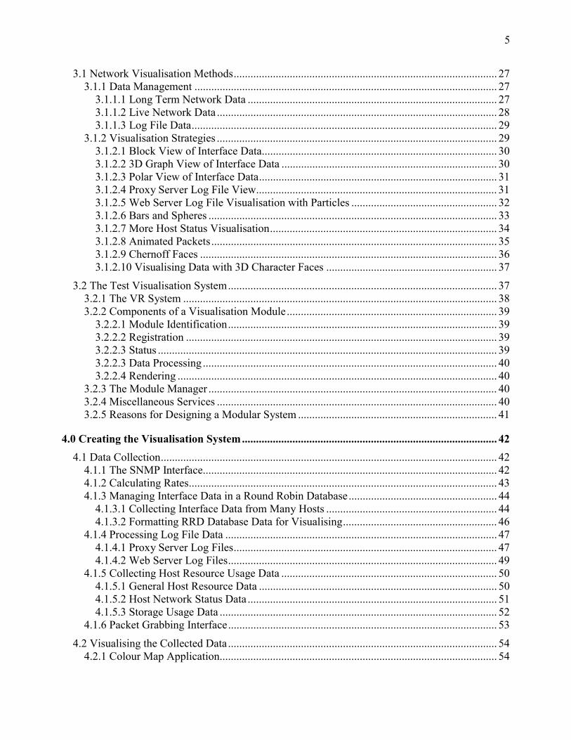
3.1 Network Visualisation Methods.............................................................................................. 27 3.1.1 Data Management ............................................................................................................ 27
3.1.1.1 Long Term Network Data ......................................................................................... 27 3.1.1.2 Live Network Data .................................................................................................... 28 3.1.1.3 Log File Data............................................................................................................. 29
3.1.2 Visualisation Strategies .................................................................................................... 29 3.1.2.1 Block View of Interface Data.................................................................................... 30 3.1.2.2 3D Graph View of Interface Data ............................................................................. 30 3.1.2.3 Polar View of Interface Data..................................................................................... 31 3.1.2.4 Proxy Server Log File View...................................................................................... 31 3.1.2.5 Web Server Log File Visualisation with Particles .................................................... 32 3.1.2.6 Bars and Spheres ....................................................................................................... 33 3.1.2.7 More Host Status Visualisation................................................................................. 34 3.1.2.8 Animated Packets...................................................................................................... 35 3.1.2.9 Chernoff Faces .......................................................................................................... 36 3.1.2.10 Visualising Data with 3D Character Faces ............................................................. 37
3.2 The Test Visualisation System................................................................................................ 37 3.2.1 The VR System ................................................................................................................ 38 3.2.2 Components of a Visualisation Module........................................................................... 39
3.2.2.1 Module Identification................................................................................................ 39 3.2.2.2 Registration ............................................................................................................... 39 3.2.2.3 Status ......................................................................................................................... 39 3.2.2.3 Data Processing ......................................................................................................... 40 3.2.2.4 Rendering .................................................................................................................. 40
3.2.3 The Module Manager ....................................................................................................... 40 3.2.4 Miscellaneous Services .................................................................................................... 40 3.2.5 Reasons for Designing a Modular System ....................................................................... 41
4.0 Creating the Visualisation System........................................................................................... 42 4.1 Data Collection........................................................................................................................ 42
4.1.1 The SNMP Interface......................................................................................................... 42 4.1.2 Calculating Rates.............................................................................................................. 43 4.1.3 Managing Interface Data in a Round Robin Database..................................................... 44
4.1.3.1 Collecting Interface Data from Many Hosts ............................................................. 44 4.1.3.2 Formatting RRD Database Data for Visualising....................................................... 46
4.1.4 Processing Log File Data ................................................................................................. 47 4.1.4.1 Proxy Server Log Files.............................................................................................. 47 4.1.4.2 Web Server Log Files................................................................................................ 49
4.1.5 Collecting Host Resource Usage Data ............................................................................. 50 4.1.5.1 General Host Resource Data ..................................................................................... 50 4.1.5.2 Host Network Status Data ......................................................................................... 51 4.1.5.3 Storage Usage Data ................................................................................................... 52
4.1.6 Packet Grabbing Interface................................................................................................ 53
4.2 Visualising the Collected Data................................................................................................ 54 4.2.1 Colour Map Application................................................................................................... 54
6
4.2.2 Blocks............................................................................................................................... 54 4.2.3 3D Graph View ................................................................................................................ 56 4.2.4 Polar View........................................................................................................................ 57 4.2.5 Log File Data Views ........................................................................................................ 58
4.2.5.1 Visualising Data with Particles ................................................................................. 58 4.2.5.2 Proxy Log File Summary View ................................................................................ 60
4.2.6 Bars and Spheres .............................................................................................................. 61 4.2.7 Animated Pyramids .......................................................................................................... 62 4.2.8 Visualisation with Facial Expressions ............................................................................. 63 4.2.9 Visualisation with Other 3D Objects ............................................................................... 64
4.3 The Visualisation System........................................................................................................ 65 4.3.1 Interfacing with the VR System....................................................................................... 66
4.3.1.1 User Navigation......................................................................................................... 67 4.3.2 A Visualisation Module ................................................................................................... 67
4.3.2.1 Visualisation Module Interface (VMI)...................................................................... 68 4.3.3 The Module Manager ....................................................................................................... 69
4.3.3.1 Dynamic Object Loading .......................................................................................... 69 4.3.3.2 Dynamic Loading of Visualisation Modules ............................................................ 70 4.3.3.3 The Module Control GUI (mcGUI) .......................................................................... 72
4.3.4 Common System Objects ................................................................................................. 73 4.3.4.1 The Texture Manager ................................................................................................ 73 4.3.4.2 Text to Speech (TTS) ................................................................................................ 73 4.3.4.3 MotionControl........................................................................................................... 74
4.3.4.3.1 BezierCoordinate................................................................................................ 75 4.3.4.3.2 FallingBody........................................................................................................ 75
4.3.4.3.3 MotionControl use Example .................................................................................. 76 4.3.4.4 Camera Control ............................................................................................................. 77 4.3.4.5 Utility Objects ............................................................................................................... 78 4.3.4.6 Configuration Management........................................................................................... 78
5.0 Results ........................................................................................................................................ 79 5.1 3D Graph View ....................................................................................................................... 79
5.2 Polar Graph View.................................................................................................................... 80
5.3 Interface Data Visualisation .................................................................................................... 81
5.4 System Resource Visualisation with Blocks and Cubes ......................................................... 82
5.5 Web Server Log File Visualisation with Particles .................................................................. 83
5.6 Storage Device Usage Visualisation ....................................................................................... 83
5.7 IP state Visualisation Using a Chernoff Face.......................................................................... 84
5.8 ICMP State Visualisation with a Water Tank ......................................................................... 85
5.9 Packet Visualisation ................................................................................................................ 85
5.10 Presenting a 3D Proxy Log File Summary ........................................................................... 86

7
5.11 Interface Device Visualisation .............................................................................................. 87
5.12 The Visualisation System...................................................................................................... 88
6 Conclusion..................................................................................................................................... 89
7 Future Research ........................................................................................................................... 90
References ........................................................................................................................................ 91
8
1 Introduction
1.1 Overview
• Chapter 1, this chapter, is a summary of the paper.
• Chapter 2 presents a theoretical background on 3D network visualisation. Here we discuss
the use of metaphors, virtual reality, colour selection for visualisation, current research, 3D
visualisation software and the standards and tools we have chosen for monitoring
networks.
• Chapter 3 focuses on network data collection methods, visualisation approaches and the
design of a 3D visualising system.
• Chapter 4 describes the implementation of components that collect data, visualise data and
the visualisation system itself.
• Chapter 5 presents results from network data visualisations that were performed using the
various visualisation approaches that were discussed in chapter 3.
• In Chapter 6 we present our conclusions.
• Chapter 7 lists future 3D visualisation research areas.
1.2 The Need for 3D Visualisation of Networks
A large amount of data flows throughout our networks. If this data could be seen in visual form it
would help greatly in understanding how our networks are affected by it. A growing number of
applications exist that attempt to do this. A large majority of these applications offer two
dimensional representations of various network data. Others offer three dimensional views of the
data. Although the addition of the third dimension helps, it still does not allow for easy analysis of
data with a large number of independent variables and doesn’t offer users a 3D environment where
they can move around and examine their data closely.
1.3 Our Approach
This paper investigates the use of 3D objects, their properties and characteristics as metaphors for
visualising network data. By using 3D objects already familiar to human beings we want to make
looking at network data and understanding it a much simpler process than it is at the moment.

9
In this paper we focus on
• Network data collection
• Visualisation of this network data using 3D metaphors and traditional 3D graphs, their
design and implementation
• The design and implementation of a modular visualisation system
1.4 The Test Visualisation System
A modular system was designed and implemented to allow easy exploration and creation of
visualisation modules. All visualisation modules implement a uniform interface that allows them to
be recognised by the visualisation control system. This system is built on top of a Virtual Reality
system, code-named Greatdane, developed by the Rhodes University Virtual Reality Special
Interest Group (VRSIG). This enables the output from visualisation modules to be observed
through a VR output device such as a head mounted display (HMD).
1.5 Data Sources
The data for our this investigation consists of host resource usage data such as memory, CPU and
disk space usage, log file data from web and proxy servers, packets grabbed live off the wire and
network traffic data flowing through network interfaces. All log files were processed internally by a
specific module written for analysing and visualising that log file. SNMP was used to monitor
network devices such as servers and switches and the data collected was stored in a round robin
database. Packet capturing was done using Libpcap and visualisation done based on packet header
information.
1.6 3D Visualisation Methods Investigated
Using the test visualisation system, visualisation modules were developed that feed off the data
collected. We looked at representation of system load using spheres and bars, web server log file
view using a particle system, wire and polar views of RRD data and visualisation of data using
facial expressions. We also animated packets as we grabbed them off the wire and classified them.
A set of system variables that affect system load were identified and 3D visual representations
based on these was created.

10
1.7 Issues and Problems Involved
The VR system used is constructed using the Java programming language. Parts of this system are
written using C/C++ that make the test system platform dependent. SNMP version one was used
throughout since this is the most widely implemented version of the protocol on SNMP agents. The
use of already existing log file analysers was looked at. Most of the log analysers produced
summarised output in HTML format and were not very helpful except for checking the correctness
of the analysis done by the test system. Multithreading was introduced to Greatdane, which is a
single thread system, using Java’s default synchronisation.

11
2 3D Network Visualisation, a Theoretical Background
2.1 Metaphors
A metaphor is a mapping of knowledge about a familiar domain in terms of elements and their
relationships with each other to elements and their relationships in an unfamiliar domain [Preece et
al, 1994]. The aim is that familiarity in one domain will enable easier understanding of the elements
and their relationships in the unfamiliar one. For example if an individual comes in contact with PC
for the first time and doesn't know what it is, perhaps the individual recognises the monitor and
thinks it’s a TV screen, and hears the PC's sound card producing a sound similar to that produced
by a fire truck, based on the individual’s prior knowledge, the most likely interpretation of the
event would be that the situation isn't quite right and it would be best to vacate the building. The
common element from the familiar domain, the fire truck, and unfamiliar domain, the PC, would be
the siren.
Table 2.1 Examples of applications and associated metaphors. [Preece et al, 1994] Application Metaphor Familiar knowledge
OS Gui Desktop Office tasks, file management
Word processor Typewriter Document processing with a typewriter
Spreadsheet Ledger sheet Experience working with an accounting ledger/
Math sheet
Email Client/Server Postman/Post office Use of postal services
2.1.1 Source and Target Domains
Gentner et al [Gentner et al, 1996] discuss the familiar domain as the source domain and the
unfamiliar domain as the target domain (Figure 2.1) and highlight three problems with metaphors,
lets take as an example a book from the real world and a software document.
1. The target domain has features not in the source domain
e.g. we can conveniently store the software version of a large book as a file on a floppy disk or
email it to our friends.
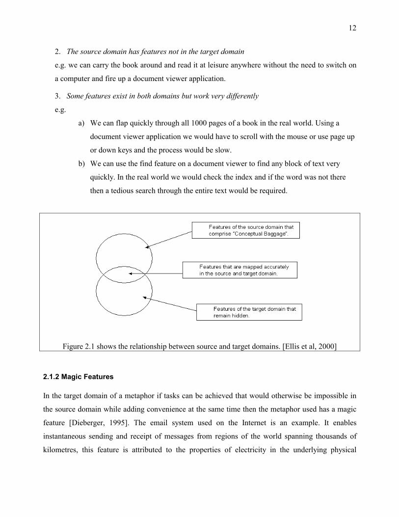
12
2. The source domain has features not in the target domain
e.g. we can carry the book around and read it at leisure anywhere without the need to switch on
a computer and fire up a document viewer application.
3. Some features exist in both domains but work very differently
e.g.
a) We can flap quickly through all 1000 pages of a book in the real world. Using a
document viewer application we would have to scroll with the mouse or use page up
or down keys and the process would be slow.
b) We can use the find feature on a document viewer to find any block of text very
quickly. In the real world we would check the index and if the word was not there
then a tedious search through the entire text would be required.
Figure 2.1 shows the relationship between source and target domains. [Ellis et al, 2000]
2.1.2 Magic Features
In the target domain of a metaphor if tasks can be achieved that would otherwise be impossible in
the source domain while adding convenience at the same time then the metaphor used has a magic
feature [Dieberger, 1995]. The email system used on the Internet is an example. It enables
instantaneous sending and receipt of messages from regions of the world spanning thousands of
kilometres, this feature is attributed to the properties of electricity in the underlying physical

13
implementation of the network hardware. In contrast in the source domain instantaneous mail
delivery does not happen.
2.1.3 Mismatches
The user's familiarity with elements and their interactions in the source domain of a metaphor will
not always match up to the behaviour of elements in the target domain. When this happens a
metaphorical mismatch has occurred [Ellis et al, 2000]. This often happens on computer systems.
When a computer user deletes a confidential file from his computer's hard drive he expects it to
have been erased. In reality that does not happen. The deleted file is recoverable and when the user
learns of this fact he begins to distrust the metaphor. Ellis et al point out that the effect of
metaphoric mismatches are not always negative and might make users’ better understand their
system. In the above example the user might enquire further and learn of tools that enable him to
erase his files completely.
2.1.4 The Desktop Metaphor
The desktop metaphor is the most widely used metaphor on computer systems that have graphical
user interfaces. Desktops, icons, windows scrollbars and folders are some of the objects that are
used. Users store their useful data in files, and those files are placed in folders just like they would
in an office cabinet in the real world. There are obvious differences with real world counter parts
such as space limitations, whereas on a computer system there is a large amount of "virtual" storage
space available, occupying a small area, considerably large areas would be required to store the
same amount of data in an office.
Some desktops have an icon representing a trashcan on which unwanted data can be dropped onto,
again simulating the real world process of throwing away rubbish in a trashcan. Apple's Mac OS
extended this metaphor and made it’s desktop such that users could drag icons representing their
floppy drives onto a trashcan and the system would then eject the disk from its drive. This
extension was rejected by Hayes [Hayes, 2000] as it lead to confusion amongst users. Users
misinterpreted the metaphor as meaning “delete the contents of this disk by dragging it onto a
trashcan”.

14
2.1.5 From the Desktop to Virtual Reality
The problem with systems based on the desktop metaphor is that they attempt to represent three
dimensional objects from the real world as two dimensional objects on a flat 2D screen. This
problem is compounded with the reality that many computer systems come equipped with a
keyboard and mouse all of which are 2D input devices and encourage application developers to
continue to develop 2D applications. Nielsen [Nielsen, 1998] in his discussion mentions how
difficult it is to control 3D space with interaction techniques such as scrolling. Representation of
real world objects on screen with resolutions that do not allow sufficient detail for objects being
rendered also doesn't help. This could all change with the availability of powerful CPUs and GPUs
on the market such as the Pentium 4 and GForce 3.
2.1.5.1 Virtual Reality
Virtual reality offers presence simulation to users [Gobbetti et al, 1998] and is much more than just
a 3D interface. Ideally it immerses users in an environment that provides sensory feedback
allowing visual, depth, sound, touch, position, force and olfactory perception. The advantage of
virtual reality is that it enables users to interact closely with objects in a virtual environment in the
same way as they would in the real world. For example scientists studying DNA strands can
manipulate virtual representations of DNA molecules, surgeons can operate remotely on patients
and gamers can play their games in a world that simulates environments close to reality.
In order to have a virtual world integrated with the physical world there needs to be improvements
made in hardware such as displays and input devices, an integration of VR systems with existing
systems such as AI, voice, DBMSs and better ways to visualise data and effective abstractions for
visualisation [Hibbard, 1999].
2.2 3D Visualisation
The volume of data that flows through computer systems over periods of time is huge. Traditional
approaches that attempt to track and analyse the flow of this data such as log files and databases
that yield textual results are not sufficient. 3D visualisation is the process of constructing 3D
graphical representations of data to enable the analysis and manipulation of data in 3D space and is
15
well suited to this task. By selecting a suitable visualisation metaphor a 3D representation can be
constructed to give meaning to the data.
2.2.1 Problems with 3D Visualisations
Although 3D visualisations can be of great help in looking at data they may not always present an
accurate view of the data [Zeleznik, 1998] due to the complexities involved in rendering a
representation for every piece of data being processed. Often it is necessary to summarise the
dataset and lose detail for a summary of the dataset's properties. Depending on the application area,
losing detail may or may not be acceptable.
3D Visualisations use the 3 axes x, y, z to display datasets that have 3 variables. For datasets with a
larger number of variables colour, the shape of objects their characteristics and behaviour can be
used. If colour and object characteristics are not selected carefully they can be confusing to users.
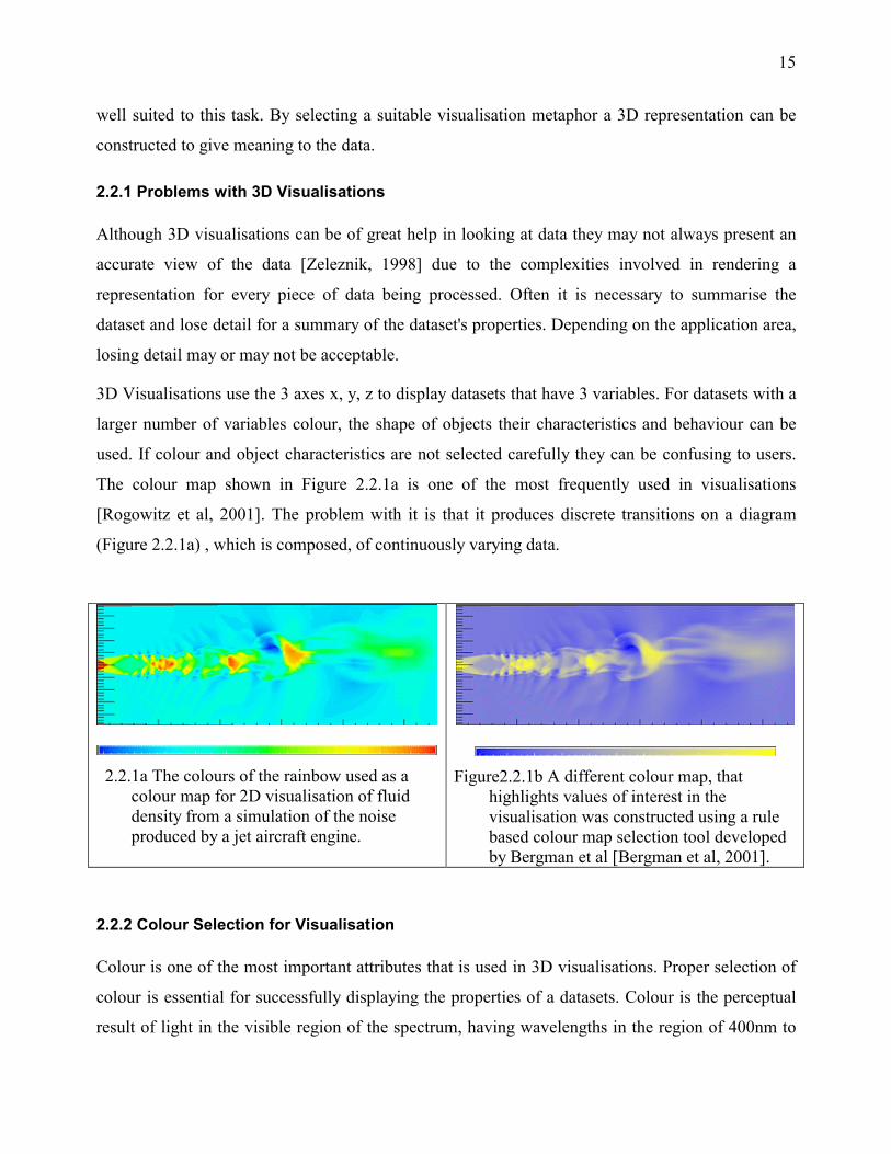
The colour map shown in Figure 2.2.1a is one of the most frequently used in visualisations
[Rogowitz et al, 2001]. The problem with it is that it produces discrete transitions on a diagram
(Figure 2.2.1a) , which is composed, of continuously varying data.
2.2.1a The colours of the rainbow used as a
colour map for 2D visualisation of fluid density from a simulation of the noise produced by a jet aircraft engine.
Figure2.2.1b A different colour map, that
highlights values of interest in the visualisation was constructed using a rule based colour map selection tool developed by Bergman et al [Bergman et al, 2001].
2.2.2 Colour Selection for Visualisation
Colour is one of the most important attributes that is used in 3D visualisations. Proper selection of
colour is essential for successfully displaying the properties of a datasets. Colour is the perceptual
result of light in the visible region of the spectrum, having wavelengths in the region of 400nm to

16
700nm, incident upon the retina [Poynton, 1997]. Computer hardware uses colour from the RGB
colour space. This colour space is represented as cube in 3d space with axis x, y, z ranging from 0
to 1. (Figure2.2.2)
2.2.2.1 Weaknesses of the RGB Colour Model
Using this colour space for visualisation is not recommended for the following reasons
1. It is device dependent since all monitors produce equivalent colours.
2. It is not a perceptually uniform colour space i.e. there is no relation between the distance of
any two values on the RGB cube (Figure 2.2.2.1) and how different the two colours appear
to an observer [Watt, 1989]. It is thus necessary to use a perceptual colour model.
3. The RGB cube does not describe all colours perceivable by humans.
Figure 2.2.2.1 The RGB colour space forms a
unit Cube.
Figure 2.2.2.2a. The HSV colour model is
described by a cone.
2.2.2.2 The HSV Colour Model
We use the hue-saturation-value (HSV) model, which is controlled by perceptually based variables,
to select colours. The H value determines colour distinctions e.g. red, blue, yellow etc. The S value
determines the intensity of the colour. The V value determines the lightness of the colour [Watt,
1989]. Figure 2.2.2.2b shows one possible user interface implementation. In realty the HSV space
is represented by the cone shown in Figure 2.2.2.2a.

17
Figure 2.2.2.2b. A user interface for the HSV colour model. (GTK)
Varying the hue tab will enable selection of colour around the face of the cone, varying the
saturation will enable selection of colour from the centre of the cone to the outside of the circle,
direction being dependent on the hue value, hence the values of hue range from 0 to 360. Varying
the value will select colours on the line from the bottom of the cone up to the face of the cone, the
radius being dependent on the saturation value.
2.2.2.3 Selecting Colours
Appropriate colours for use in a visualisation need to be selected and a colour map constructed so
that these can be used by the visualisation system at runtime. Bergman et al [Bergman et al, 2001]
at the IBM Thomas J. Watson Research Centre have constructed taxonomy of colour map
construction that is dependent on the data types to be visualised, the representation task and users'
perception of colour (Table 2.2.2.3). They have experimental evidence (Figure2.2.2.3) that shows
that the luminance mechanism in human vision is tuned for data with high spatial frequency and the
hue mechanism tuned for data with low spatial frequency.
Table 2.2.2.3 Taxonomy of colour map selection Data type Spatial frequency Highlighting
Ratio/ intervals High Large colour range for highlighted features
Low Small colour for highlighted features
Ordinal High Increase luminance of highlighted area
Low Increase saturation of highlighted area
Nominal Any Increase luminance or saturation of
highlighted area
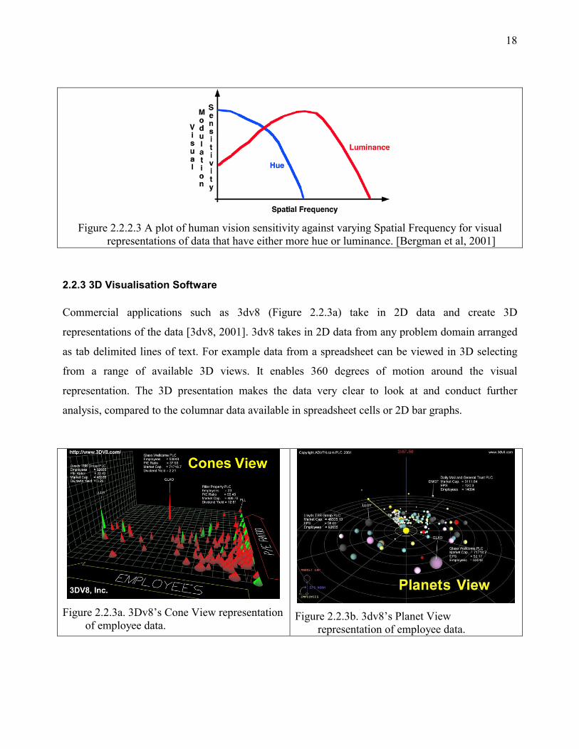
18
Figure 2.2.2.3 A plot of human vision sensitivity against varying Spatial Frequency for visual
representations of data that have either more hue or luminance. [Bergman et al, 2001]
2.2.3 3D Visualisation Software
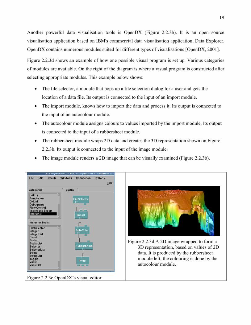
Commercial applications such as 3dv8 (Figure 2.2.3a) take in 2D data and create 3D
representations of the data [3dv8, 2001]. 3dv8 takes in 2D data from any problem domain arranged
as tab delimited lines of text. For example data from a spreadsheet can be viewed in 3D selecting
from a range of available 3D views. It enables 360 degrees of motion around the visual
representation. The 3D presentation makes the data very clear to look at and conduct further
analysis, compared to the columnar data available in spreadsheet cells or 2D bar graphs.
Figure 2.2.3a. 3Dv8’s Cone View representation
of employee data.
Figure 2.2.3b. 3dv8’s Planet View
representation of employee data.
19
Another powerful data visualisation tools is OpenDX (Figure 2.2.3b). It is an open source
visualisation application based on IBM's commercial data visualisation application, Data Explorer.
OpenDX contains numerous modules suited for different types of visualisations [OpenDX, 2001].
Figure 2.2.3d shows an example of how one possible visual program is set up. Various categories
of modules are available. On the right of the diagram is where a visual program is constructed after
selecting appropriate modules. This example below shows:
• The file selector, a module that pops up a file selection dialog for a user and gets the
location of a data file. Its output is connected to the input of an import module.
• The import module, knows how to import the data and process it. Its output is connected to
the input of an autocolour module.
• The autocolour module assigns colours to values imported by the import module. Its output
is connected to the input of a rubbersheet module.
• The rubbersheet module wraps 2D data and creates the 3D representation shown on Figure
2.2.3b. Its output is connected to the input of the image module.
• The image module renders a 2D image that can be visually examined (Figure 2.2.3b).
Figure 2.2.3c OpenDX’s visual editor
Figure 2.2.3d A 2D image wrapped to form a
3D representation, based on values of 2D data. It is produced by the rubbersheet module left, the colouring is done by the autocolour module.

20
OpenDX's architecture allows very easy visualisation of data for users, by allowing them to
manipulate modules as shown in Figure 2.2.3c.
2.3 Network Monitoring
In section 2.2 we mentioned the need for visualising data that flows to and from network devices in
3D. To be able to accomplish this task we investigated commonly available standards and tools for
monitoring networks. This section presents a summary of these.
2.3.1 SNMP
The simple network management protocol (SNMP) is a widely used network management protocol.
A manager operates a console from where he controls various SNMP enabled network devices
(SNMP agents) e.g. PCs, switches, routers. A Management Information Base (MIB), a virtual
database, is used to store state values of the various devices of the SNMP agents (RFC 1213). The
MIB is organised like an upside down tree. The leaf nodes of the tree contain the object instances
whose values are accessed and read from/written to by a manager. This scheme is known as the
Structure of Management Information (SMI) and is defined in RFC 1155 [Stevens, 1994].
Figure 2.3.1a. Full OID for the systemDescr variable
iso.org.dod.internet.mgmt.mib11.system.sysDescr.0
1 3 6 1 2 1 1 1 0
retrieving the value using ucd snmp’s snmpget app > [melekam@csh12]snmpget rucus.ru.ac.za public 1.1.0
> system.sysDescr.0 = FreeBSD rucus.ru.ac.za 4.4-RELEASE FreeBSD 4.4-RELEASE #0: Tue Oct i386
A leaf node is identified by the sequence of numbers used to traverse the tree. SNMP v1 protocol
(RFC 1157) defines 5 operations that can be used for interaction with an SNMP agent. These are
Get, Set, GetNext, GetResponse and Trap. For example the value of the system description variable
(sysDescr) in Figure 2.3.1a, can be accessed as Get 1.3.6.1.2.1.1.0. The SNMP management station

21
and agents exchange Protocol Data Units (PDUs). The PDUs are defined using Abstract Syntax
Notation (ASN.1).
2.3.1.1 Different Versions of SNMP
The initial SNMP standard SNMPv1, defined simple operations such as get and set. There was no
way to get multiple object values with a single request. To retrieve 100 values from an agent we
would have to send 100 get requests. SNMP PDUs were exchanged by agents and managers using
a very weak form of authentication, one based on the hostname of the SNMP entity and a string
value referred to as a community string. Before replying to a request an agent would check that the
community string is valid and the hostname of the manager is from a valid network block. The
community string is exchanged over the wire in clear text thus anyone can get hold of it.
To improve v1 an SNMPv2 standard was proposed in 1996. It added bulk transfer operations such
as snmpbulkget and offered other enhancements such as manager to manager comunication but still
did not incorporate better authentication mechanisms [Stallings, 2001]. To address this another
standard SNMPv3 was proposed in 1998. It adds better access control and encryption. Despite its
problems SNMPv1 still remains the most widely implemented version and still remains the only
version that has been fully standardized.
2.3.1.2 UCD-SNMP
There are a number of SNMP libraries available and one of the most popular is UCD SNMP [UCD
SNMP, 2001]. The UCD SNMP project is an implementation of SNMP v1, v2 and v3. It is
available for wide variety of platforms on both windows and Unix. It consists of an agent, a C
library, applications for reading or setting object values in an MIB and other tools such are a GUI
for browsing an MIB. This is the library that is used in this project.
2.3.2 Web Server and Proxy Log File Monitoring
SNMP allows us to monitor network devices remotely but for monitoring local traffic such as web
server and proxy server traffic, analysis of log files generated by web and proxy servers locally is
necessary. The proxy and web servers we looked at use the common log file format (CLF).

22
CLF is defined by the W3C consortium as
remotehost rfc931 authuser [date] "request" status bytes
Table 2.3.2 Common log file format fields [W3C, 2001]. remotehost Remote hostname (or IP number if DNS hostname is not available, or if
DNSLookup is Off.
rfc931 The remote login name of the user.
authuser The username as which the user has authenticated himself.
[date] Date and time of the request.
"request" The request line exactly as it came from the client.
Status The HTTP status code returned to the client.
Bytes The content-length of the document transferred.
2.3.3 Packet Monitoring
Besides devices polled by SNMP and log file formats we also attempt to visualise packet traffic
flowing on a network. Viewing packets visually will make it easy for system administrators to
observe what is on their network and is a better alternative to text-based packet grabbing tools such
as Tcpdump. Libpcap [Libpcap, 2001] is C library for putting a network device in promiscuous
mode and grabbing packets. When a network interface is in promiscuous mode it will pick all
packets instead of only those addressed to it. Using this mode we can grab packets, examine their
headers, make a decision on what type of packet they are and produce a visual representation of
them.
2.3.4 The Round Robin Tool (RRDtool)
The round robin database [RRDtool, 2001] is a database used to store time dependent data. The
database is set up by specifying a number of data sources and achieves. The archives are used to
store values from data sources. Data sources can be of type counter, gauge, absolute, derive.
• A counter stores values that are continuously incremented and wrap around at some
implementation dependent upper value e.g. 32 bit values at the 4GB boundary.
• A gauge is used for absolute values e.g. temperature changes, available disk space.

23
• An absolute data type is similar to the counter data type except that it is for counters that
change their values frequently. Since rapid changes in the value of the counter would result
in the counter wrapping around frequently, the counter is reset every time it is accessed.
• The derive data type stores the derivative of the values from the last reading to the current
reading i.e. the rate of change of the values, no overflow checks are done.
A consolidation function is applied to each data source before being stored in an archive. Available
consolidation functions are AVERAGE, MIN, MAX and LAST.
Figure 2.3.4. A round robin database with 2 data sources and 3 archives per data source. As data
come in the pointer moves to the right and wraps around to the beginning when the archive is full, overwriting old data.
At creation time the number of values to be kept in an archive is known and a fixed size database is
set up. Each time a value is added into the database a pointer moves to the next value to be entered.
When the last value is entered the pointer will wrap around to the beginning of the archive and old
values will be overwritten. Hence if an archive is set up to keep 24 hourly average values, the
archive will be overwritten at the beginning of each day. Setting up a number of archives
depending on the desired granularity of the data to be collected is recommended. Figure 2.3.4
illustrates an RRD database layout.

24
2.3.5 Greatdane
This project was conducted on a VR system (Greatdane) that enables depth and sound perception
with input control based on existing 2D devices such as a mouse and a 3D device that uses
polhemus trackers, a device that tracks 3D coordinates in space. Greatdane is a product of the
Rhodes University Virtual Reality Special Interest Group (VRSIG). It consists of components for
performing common tasks such as networking components that allow for transmission of objects
from one host to another, device interfaces for system devices such as input and output devices and
components that offer visual representation and threading services.
Figure 2.3.5 shows one possible configuration of a VR application on Greatdane.
2.3.5.1 Implementation
The primary implementation language used in Greatdane is Java. Some components of the system
that the Java compiler (gcj) cannot handle, such as 3D rendering are implemented in C/C++
through Java's native interface (JNI). The advantage of using a language such as Java is that it
enables the component writer to focus more on the problem than having to worry about low level
details such as memory allocation and de-allocation. Greatdane has definitions for graphics
primitives that can be used to represent points in 3D space, vectors, rotations and colours. The
vector structure for example supports common operations done on vectors like the dot product and
cross product.

25
2.3.5.1 Components
Greatdane as shown on Figure 2.3.5 is component based. All objects (visual representations) that
reside in the virtual world have an object identifier, which is used to track them and manipulate
their size, orientation and location. Data sources and data receivers (sinks) are components in the
system that have a thread of execution and have a set of input and output ports. Connections can be
set up between sources and sinks and once established data is passed from the source of a
connection to its sink. For example looking at Figure 2.3.5 the source could be the user handler
component and the sink the VR output device. When a user produces an event, e.g. roaming around
the world, data associated with that event is passed from the user handler to the VR output device.
2.3.5.2 Threading
Greatdane is a cooperative multitasking environment. What this means is that there is a single
thread of execution and system components have to cooperate with each other and cannot make
blocking calls as doing so will hang the execution of the system thread at that point. Effects of this
will immediately be experienced by users as the user display will be too slow to update and the
system becomes unresponsive.
2.4 Visualisation Research
The user interface research centre at Xerox Parc [Parc, 2001] has a number of examples of 3D
metaphors used for visualising data. These include using tubes and disks to represent the World
Wide Web, a hyperbolic browser used for browsing hierarchical data and other visualisations.
Muitmo3D [Muitmo3D, 2001] offers a variety of 3D devices and a 3D visual operating system with
a 3D interface. The proposed GUI components of the visual operating system are all 3D unlike
current 2D GUIs. The 3Dsia project [3Dsia, 2001] is an open source network visualisation project
that aims to produce a 3D environment that is intuitive to use.
The Electronic visualization laboratory [EVL, 2001] runs various visualisation projects, including
3D visualisations for data mining, and applications that use the CAVE VR environment e.g. Tele-
immersion apps. The On-line Library of Information Visualization Environments [Olive, 2001] is a
comprehensive visualisation library. Its network visualisation section is concerned with finding
ways for representing large network data. The Cooperative Association for Internet Data Analysis

26
[CAIDA, 2001] has graphs that attempt to visualise Internet connectivity around the world. The
graphs are all 2D. Cybernet [Cybernet, 2001] is a project that focuses on network management
using 3D metamorphic worlds. It has very good examples of how network data can be visualised in
3D. Examples are a 3D representation of NFS (network file system) operation using buildings and
rooms that contain furniture. They represent each subnet as a town with many buildings i.e. a city
metaphor.

27
3.0 Designing a 3D Network Visualisation System
A 3D network visualisation system is designed here using metaphors that exploit users’ familiarity
of 3D objects. The source domain is the real world whose elements are 3D dimensional objects.
The destination domain is a domain within which a lot of network data exists. We want to map
objects from the source domain to the destination domain and use them to represent network data,
to make network data as easy to interpret as the messages conveyed by 3D objects in the real world.
3.1 Network Visualisation Methods
The process of network visualisation involves data identification, collection, processing and
visualisation. For visualising the processed data, effective visualisation strategies need to be
thought out. The goal is to present the processed data in a format that is easily comprehensible to
human beings to enable them to make use of it.
3.1.1 Data Management
Three categories of data are looked at. These are long-term time dependent network data such as
data flowing on the network over a period of time e.g. a day, month or year, live network data such
as the current status of a particular network device and those that can either be long-term or live,
for example log file data.
3.1.1.1 Long Term Network Data
An example of long-term network data is network interface traffic data. When a person goes to a
website and downloads software, all 650MB of it, this data may pass through various routers and
switches before it finally arrives at the user's machine. Each interface device the data passes
through keeps a count of every byte of data that passes trough it. This is the data that we refer to as
interface traffic data. If thousands of people are transferring data at the same time, we can have a
look at how overloaded that device is by seeing its activity visually.
The values of counter data are queried from the device being observed periodically and the
difference between, the current counter value and the last counter value divided by the polling
period, is stored in a database. The database should be flexible enough to handle large amount of

28
time dependent data. If polling is done every second and the counter is 32bit then disk space
requirements for data storage are as follows:
for 1 day there needs to be: (4bytes*60*60*24)/1000 = 345.6 KB
for 1 month: 345.6KB *31 days ~ 10MB.
for a year: 12 months * 10MB = 120 MB.
for a switch with 20 ports: 20 * 120MB = 2.4GB.
for 100 switches: 100 * 2.4GB = 240GB.
Clearly the storage requirements are very large. Disk space usage can be reduced by decreasing the
polling period. If polling is done every five minutes disk space requirement for a days worth of data
would be
(4bytes*60*0.2*24)/1000 = 1.152 KB.
That is a massive reduction of space requirement from 345KB. Further reductions can be made by
keeping averages of values. For example if 12 readings are taken in 1 hour, then these can be
averaged and just one value kept, thus the space usage will now be
(4bytes*1*24)/1000 = 0.096 KB.
The above is much less space than before. This is the method we use to store long-term data
collected from devices such as switch. If the transfer rate is 64KB/second at one moment in time,
this value is not used to render a visual representation, instead this value is divide by a set threshold
e.g. if the threshold is 128KB/second then the load would be 64/128 (0.5).
3.1.1.2 Live Network Data
Nearly every operating system comes with a tool for monitoring process, CPU and memory usage
on a system. On Unix environments examples of programs that do this are top and ps, which
produce results in textual form. On Windows NT systems there is the task manager that displays
this information and draws 2D graphs. Doing it over the network to monitor multiple devices at the
same time is much more interesting.
Millions of packets flow over the wire that connects network nodes. System administrators have
traditionally used packet-grabbing programs such as Tcpdump and Ethereal to see what is on their

29
network. Both of these and many other similar tools display information for packets they capture as
text. This text scrolls over the screen, and often has to be saved to disk and closely examined.
Packets are an example of live network data that we look at.
Live network data is collected by polling devices periodically. It is used, then immediately
discarded. Not every value has to be discarded, the last n values can be kept and used if they
influence the current data value that is going to be visualised. This sort of data is kept in memory in
a list structure. In the case of process, CPU and memory usage status data, the list can be accessed
sequentially from beginning to end while rendering. The entire list would also be updated every
time new data is polled. For collecting packet information, a queue would be more appropriate. The
queue size would be set to a desired size and new packets added to the end of the queue and old
values removed from the start of the queue.
3.1.1.3 Log File Data
A proxy acts as a cache for most frequently used HTTP documents and is shared by multiple users.
The goal is to track the usage of the cache by every user and the overall cache usage. The log file
analysis process involves reading the log file line by line and tracking the number and size of files
downloaded by each user, the overall size of downloads though the cache by all users, the different
content types and methods used to fetch documents from the cache. The log file can contain a days
worth of log data, a years worth or live data that is being updated as users access the proxy server.
Since most of the time the frequency of appearance of items in a log file is tracked, hash tables kept
in memory are suitable for processing log file data. The hash tables are updated as log file data is
read line by line. It is also helpful to keep the data in a hierarchy of tables representing time periods
e.g. there could be a year table that refers to 12 monthly tables, and these in turn refer to 30 tables
each.
3.1.2 Visualisation Strategies
Once the data has been collected and processed the next step is visualisation. The data can be
presented using metaphors or it can be presented directly using traditional approaches such as 3D
graphs. Using metaphors is a much better way since it exploits users’ familiarity in common 3D
objects and uses object attributes and characteristics for representing data.

30
3.1.2.1 Block View of Interface Data
Block view uses a metaphor where the value collected from a network interface device is
represented by a rectangular block as shown on Figure 3.1.2.1. The width of the block represents
the current transfer rate, network nodes with multiple interfaces can be represented by stacks of
these blocks. The blocks are coloured to emphasize the transfer rate through that interface.
Different stacked blocks can represent different network nodes. All can be rendered at the same
time and the load on the various network nodes can be compared visually.
Figure 3.1.2.1 Block view of interface data. The figure represents a host with 6 devices.
Block view is useful for looking at a summary of status values from many hosts at the same time.
Although it is used to visualise live network interface traffic data, block view is suitable for
presenting any type of data that can be expressed as a percentage.
3.1.2.2 3D Graph View of Interface Data
This view presents a visualisation of the data, by plotting a 3D graph representation. The 3D
representation is coloured to show the range of values of transfer rates. It allows a better alternative
to 2D graphs because 3D graphs are more appealing and easier to look at for users. If there are 24
values stored in a database for the last 24 hours then we can render a graph with 24 values. The x-
axis represents time and the y-axis the transfer rate. Better still if there are 24 x 31 values for each
day of the month the z-axis can be used to represent days. All 31 averages can then be rendered and
we can see how the traffic shaped for the particular device for a whole month.
31
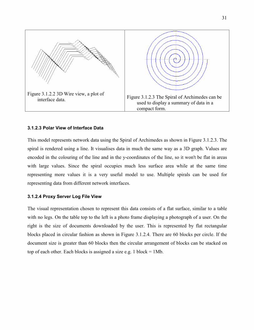
Figure 3.1.2.2 3D Wire view, a plot of
interface data.
Figure 3.1.2.3 The Spiral of Archimedes can be
used to display a summary of data in a compact form.
3.1.2.3 Polar View of Interface Data
This model represents network data using the Spiral of Archimedes as shown in Figure 3.1.2.3. The
spiral is rendered using a line. It visualises data in much the same way as a 3D graph. Values are
encoded in the colouring of the line and in the y-coordinates of the line, so it won't be flat in areas
with large values. Since the spiral occupies much less surface area while at the same time
representing more values it is a very useful model to use. Multiple spirals can be used for
representing data from different network interfaces.
3.1.2.4 Proxy Server Log File View
The visual representation chosen to represent this data consists of a flat surface, similar to a table
with no legs. On the table top to the left is a photo frame displaying a photograph of a user. On the
right is the size of documents downloaded by the user. This is represented by flat rectangular
blocks placed in circular fashion as shown in Figure 3.1.2.4. There are 60 blocks per circle. If the
document size is greater than 60 blocks then the circular arrangement of blocks can be stacked on
top of each other. Each blocks is assigned a size e.g. 1 block = 1Mb.

32
Figure 3.4.2.1 Proxy log file summary view.
On the centre of the display is a summary of content types represented by a colour block for each
content type. Next to each of these coloured blocks is a rectangular block, coloured to show the
percentage of that content type out of all documents processed by the proxy. So for example if the
content type is image, then its percentage would be calculated as total size of all images divide by
total size of all documents. The percentage can be used to pick a colour value from a colour map. In
a similar way the document fetch methods are displayed next to the content types. Two examples of
proxy document fetch methods are GET and POST. Using this visualisation model the information
visualised is:
• Usage summary of the proxy for a specified user or all users, for 1 day
• Usage summary of the proxy for a specified user for one month, for all days of the month.
• Usage summary of the proxy for a year, one for all months of the year
where "usage summary" is a user photograph (where applicable), total size of documents
downloaded, the various content types of the data and the various method types of the data. This
view of the log file data is much easier to interpret than thousands of lines of log file lines that
scroll on a text console.
3.1.2.5 Web Server Log File Visualisation with Particles
A web server log file stores logs of visitors to a website. It contains data such as the domain of the
visitor e.g. csh12.cs.ru.ac.za, the document accessed, the time it was accessed and various other
fields. In this section we focus on visualising the domain data using particles. We have a particle
system that can contain a specified number of particles. The particle-generating algorithm generates
33
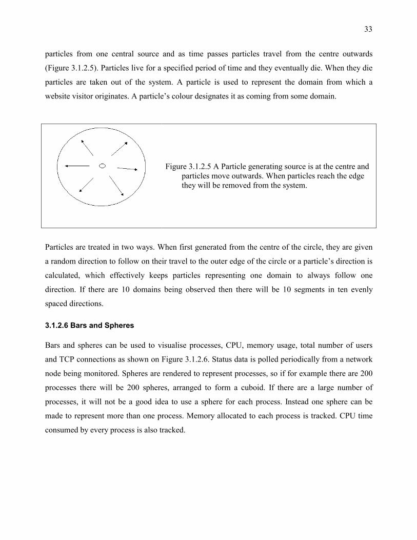
particles from one central source and as time passes particles travel from the centre outwards
(Figure 3.1.2.5). Particles live for a specified period of time and they eventually die. When they die
particles are taken out of the system. A particle is used to represent the domain from which a
website visitor originates. A particle’s colour designates it as coming from some domain.
Figure 3.1.2.5 A Particle generating source is at the centre and particles move outwards. When particles reach the edge they will be removed from the system.
Particles are treated in two ways. When first generated from the centre of the circle, they are given
a random direction to follow on their travel to the outer edge of the circle or a particle’s direction is
calculated, which effectively keeps particles representing one domain to always follow one
direction. If there are 10 domains being observed then there will be 10 segments in ten evenly
spaced directions.
3.1.2.6 Bars and Spheres
Bars and spheres can be used to visualise processes, CPU, memory usage, total number of users
and TCP connections as shown on Figure 3.1.2.6. Status data is polled periodically from a network
node being monitored. Spheres are rendered to represent processes, so if for example there are 200
processes there will be 200 spheres, arranged to form a cuboid. If there are a large number of
processes, it will not be a good idea to use a sphere for each process. Instead one sphere can be
made to represent more than one process. Memory allocated to each process is tracked. CPU time
consumed by every process is also tracked.

34
Figure 3.1.2.6 Bars and Spheres used for representing
system resource usage
Bars are rendered to show
• The percentage of CPU time
used
• The percentage of memory used
• The number of active users
• The number active TCP
connections
The Spheres represent processes.
3.1.2.7 More Host Status Visualisation
Host status visualisation can be expanded to include the system attributes listed below
Network interface device states
• Transfer rate, incoming and out going
• Speed of each interface e.g. 10/100Mb
• State if each device e.g. up or down
• Error rates
IP state
ICMP state
Just about any 3D object can be used to represent the above data, it is left to a designer’s
imagination as to what kind of object to use e.g. let’s use a stack of boxes to represent network
interface devices. The number of boxes forming the stack would be equivalent to the number of
network interface devices present on the host being observed. Each box has components that
describe the properties listed above. The stack of boxes can be made to move following some pre-
defined cyclical path, unless there is a problem on the network e.g. one of the interface devices is
down, in which case the stack stops moving to give an immediate indication to observers that there
is something wrong.

35
Figure 3.1.2.6 Cubes used to display ICMP traffic state
An example of another object that can be used is a water tank. On top of the water tank are three
cubes all linked by lines. They move in an interesting and visually appealing way. They do this to
draw an observer's attention. Figure 3.1.2.7 shows the arrangement of the cubes. Cube3 is always
moving, the other two move at designated times. Cube1 moves when the host receives any ICMP
request from outside. Cube2 moves when the host sends ICMP traffic to the outside and receives
echoes for sent ICMP requests. The water in the tank only moves when the host receives excessive
ICMP traffic, such as when it being ping flooded. If there are any ICMP transmission errors, the
lines joining the cubes do not appear.
3.1.2.8 Animated Packets
Packets are grabbed off the wire, their header examined, a colour assigned to them to classify what
type of packet they are and tiled on a surface as shown on Figure 3.5.5.1. The packet stream is
generated from a rectangular box, this box resembles a switch, but we look at it as a box. A packet
Figure 3.1.2.8 Packets being represented as pyramids tiled on a surface. The packets are animated
as they enter the packet pool.

36
is represented by a pyramid. The pyramid's faces show the various properties of the packet: type,
source port, and destination port.
The packet life cycle has four stages. The first stage is when it gets grabbed from the wire (baby),
the second stage is when its about to join other grabbed packets (young), the third is when it is on
the ground tiled with other packets (mature), the fourth is when the packet is taken out of the
captured packet pool (dead). The tile grows in the z direction and forms a window view of the last n
packets that were captured. Due to the properties of a pyramid, which has four visible faces,
looking from one direction will show us one property such as packet type, looking from another
direction will show another. Packets filters can be used like they are with packet capturing
programs such as Tcpdump [Tcpdump, 2001]. Packets grabbed from different filters can be
displayed together and compared.
3.1.2.9 Chernoff Faces
Figure 3.5.6.1 Chernoff faces allow data with
multiple number of variables to be visualised by encoding data in Head Shape, Eye Shape, Nose Size, Mouth Vertical Offset, Ear Shape, Mouth Width, Mouth Openness
Routing table size Data received Unknown protocols Incoming with address errors Incoming with header errors Incoming discarded Incoming deliveries Out going requests Out going discarded Out going no routes Forwarding
The 11 variables we want to visualise with a Chernoff face.
Human beings are good at recognising faces and interpreting facial expressions. This familiarity
can be exploited by using facial expressions to represent data. The idea of using faces to represent
data was proposed in 1971 by Prof. Herman Chernoff and is a well-known method for visualising
data. Here we want use this method for visualising IP state data that is described by 11 variables as
shown on Figure 3.5.6.1.
37
The values of the various facial properties listed are changed in response to a change in a variable.
For example if the right eye size is varied in response to the rate of transfer of incoming IP data and
the left eye for rate of transfer of outgoing IP data, all that is required is to observe the shape of the
eyes for tracking transfer rates.
3.1.2.10 Visualising Data with 3D Character Faces
This from of visualisation is achieved by having a number of 3D character faces showing various
ranges of emotions. If, for example, there are 10 faces and the input data values range from 0 to 1,
representing percentages, then we pick face 1 if the data value falls between 0 and 0.1 and face 10
if the data value falls in the range 0.9 to 1.0. We test this method here to for visualising hard drive
space usage of remote machines. The 3D character images are prepared in such a way that the
range of emotions shown on each face starts from one end of the emotion scale and move to the
other e.g. Face 1 is happy and smiley, Face 10 is sad. Sad faces would represent hard drives with
100% usage.
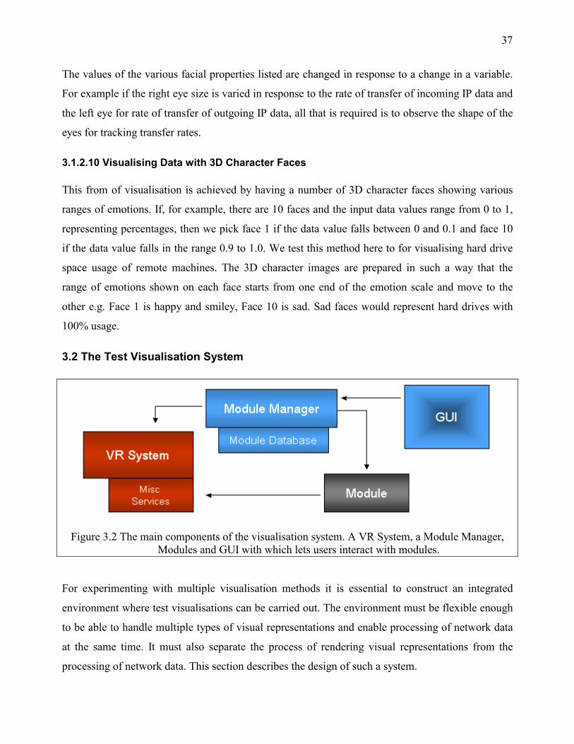
3.2 The Test Visualisation System
Figure 3.2 The main components of the visualisation system. A VR System, a Module Manager,
Modules and GUI with which lets users interact with modules.
For experimenting with multiple visualisation methods it is essential to construct an integrated
environment where test visualisations can be carried out. The environment must be flexible enough
to be able to handle multiple types of visual representations and enable processing of network data
at the same time. It must also separate the process of rendering visual representations from the
processing of network data. This section describes the design of such a system.

38
The main components of the test visualisation system are shown on Figure 3.2. It is built on a VR
system and consists of various visualisation modules, a module manager and a GUI for interacting
with the module manager. We refer to an entity that processes data and produces a visual
representation as a module. To produce visual representations the metaphor that is used is an
environment that contains simple 3D objects familiar to human beings. The visual representation is
not atomic. It can for example be made up of ten cubes, twenty spheres or five aeroplanes. Visual
representation here implies the collective effect achieved by having all those objects together.
3.2.1 The VR System
The VR system coordinates the rendering of visual representations and handles user input. Visual
representations can be placed in the VR Environment and users can interact with visual
representations by navigating in the world and having a closer look at the data being visualised.
Navigation in is necessary because multiple visual representations populate the world and users
need to move to parts of the environment at will. The visualisation system permits navigation in the
virtual environment in the +-X, +-Y and +-Z directions simultaneously. This allows observers of
the output of modules the freedom to examine them from any direction and to move naturally in the
environment. Users can also control the speed with which they move around the environment. Ease
of navigation is dependent on the availability of a suitable 3D input device. All visualisations in the
VR Environment have a location, scale and orientation.
Figure 3.2.2 Components of a visualisation module

39
3.2.2 Components of a Visualisation Module
To the system a module is a black box. Modules can have data sources that they visualise which, is
their main function, or they can simply perform other functions in the virtual environment such as
rendering decorative features like a landscape. Figure 3.2.2 shows what a module looks like.
3.2.2.1 Module Identification
Since there are multiple modules (black boxes) being tracked by the module manager, each module
must have some sort of identifier to distinctly identify it (black boxes with ids). A module’s name,
assigned to it by its creator (module author), is used to identify it. All modules expose this identifier
to the module manager, which can query for it at anytime. When a module is created by a module
author, the author can embed inside a module, a textual description of what the module does and
when and by whom the module was written. This information must also be accessible to the
module manager.
3.2.2.2 Registration
Registration is the process of creating a new module and updating the module database. It is
performed by the module manager. Every module must expose a registration mechanism to the
system. During the registration process a module provides the system its attributes i.e. location,
scale and orientation within the virtual environment. The module manager will, after generating a
numerical visual representation identifier, register the module with the VR system. The VR system
is also given the module’s scale, location and orientation. The module itself is added to the module
manager’s database.
3.2.2.3 Status
A module has two states. It can either be active i.e. processing data and producing graphical output
or inactive, not doing anything. While in the inactive state the module's visual output is invisible to
observers in the virtual environment. Every module gets created in the de-active state and must
expose a way for activation and deactivation to the module manager. All modules must also
provide a way to query for a module’s status i.e. to find out if it is active or not.

40
3.2.2.3 Data Processing
This is where the module processes network data. Data has to be processed before any visualisation
is done. Modules can create as many threads as they like to process data but the task of
synchronising the threads is left to them. This part of a module is not under the control of the
visualisation system. Once registered and activated a module may start up threads and start the
processing of data. This activity will be suspended when the module is in the de-active state.
3.2.2.4 Rendering
All modules must expose a way for the VR system to tell them to render themselves periodically.
The rendering of visual representations must be performed as fast as possible to keep the frame rate
at which the VR system renders its output high.
3.2.3 The Module Manager
The module manger manages modules. It does not know about the existence of any module when it
is created. What it knows is where to find modules e.g. a module home directory or a URL. This
allows modules to reside both locally or remotely. Once started up it looks for modules and
registers them. The module manager handles requests from users through the GUI. The GUI lists
all available modules and a description of each. It also allows users to activate or deactivate
modules effectively taking them out of the virtual environment. Modules are loaded up in the
inactive state thus they have to be explicitly be enabled by users.
3.2.4 Miscellaneous Services
The Visualisation system allows modules to access services such as texture management, camera
control, speech synthesis and system status information. These are globally visible to all modules.
This way common services can be shared by all modules instead of each one implementing its own.
Since modules can have their own threads of execution, they use the system status service to find
out if the system is live or not, if it isn’t they will end whatever work they where doing.

41
3.2.5 Reasons for Designing a Modular System
Performing visualisation of network data requires whoever is designing a visualisation metaphor to
use their creativity to produce a visual representation that is useful and at the same time appealing
to users. A system where each visualisation is created by a module speeds up the process of
creating and testing a particular visualisation strategy. There is no need to write an entire system
from scratch every time a new idea needs to be tested, a visualisation module can be created to test
ones ideas independently of the system. Future developers do not have to waste time figuring out
how a VR system works, they can create visualisation modules and use them with the existing
system. System complexity is also reduced.
42
4.0 Creating the Visualisation System
This section describes implementation of the visualisation system discussed in chapter 3.
Implementation is done using the Java programming language with key interfaces being
implemented in C. The GNU java compiler gcj is used for compiling java sources. It uses the
Compiled Native Interface (CNI) which means java sources get compiled down to machine
dependent object code rather than platform independent byte code. Since gcj is still in development
it does not support the full set of functionality provided by Sun’s JDK e.g. AWT. OpenGL is used
to perform all 3D rendering. Where possible OpenGL display lists are used to speed up rendering.
4.1 Data Collection
Data to be used for visualisation is collected from a number of sources. Interface traffic data and
host resource usage data was collected using SNMP from remote hosts. Packets were grabbed off
the wire using Libpcap, which is a C packet-grabbing library.
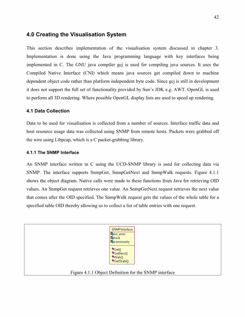
4.1.1 The SNMP Interface
An SNMP interface written in C using the UCD-SNMP library is used for collecting data via
SNMP. The interface supports SnmpGet, SnmpGetNext and SnmpWalk requests. Figure 4.1.1
shows the object diagram. Native calls were made to these functions from Java for retrieving OID
values. An SnmpGet request retrieves one value. An SnmpGetNext request retrieves the next value
that comes after the OID specified. The SnmpWalk request gets the values of the whole table for a
specified table OID thereby allowing us to collect a list of table entries with one request.
Figure 4.1.1 Object Definition for the SNMP interface

43
An instance of the SNMPInterface is initialised by supplying the name of a host that is going to be
monitored and an SNMP community string for that host. Once initialised host and community
strings do not have to be supplied since the interface keeps state for each host.
Once a Get, GetNext or Walk request have been issued appropriate values are returned i.e. the Get
operation returns a single value and the Walk operation returns a list of table entries. The Walk
operation is very useful because one operation can be used to get multiple values e.g. The number
of incoming bytes processed by all interface devices on a host can be retrieved by issuing a
Walk(interfaces.ifTable.ifEntry.ifInOctets) request and the list returned can then be processed for
visualisation. If an error occurs the interface will set an internal error flag which can be queried by
whoever is making use of it.
4.1.2 Calculating Rates
Often values from a network device were collected by polling the device using SNMP e.g. the
number of incoming bytes that were processed by the network interface device. This value on its
own is not very meaningful. What is more interesting is the rate of change of this value.
Calculated as
Rate =(vn-vl)/(tn – tl)
where
vn=the new value obtained
vl=the last value obtained
tn=time now
tl=time of last poll
In addition it is necessary to calculate a percentage value
Percentage = rate/user_supplied_threshold.
The percentage value is what’s used for visualising data. The user supplied threshold is a value
specified by the user interpreting the visualisation. For example when monitoring transfer rates,
values may range from 10 bytes/second to 1MB/second. The user can specify a threshold value e.g.
300KB/second and this would make all values above 300KB have the same weight as

44
300KB/second. It allows users to control the range of values that they want to observe. At other
times direct values are visualised e.g. the number for processes running on a host.
4.1.3 Managing Interface Data in a Round Robin Database
RRDtool [RRDtool, 2001] is a database tool where the database size is known at creation time and
remains fixed throughout its life. This database is used to store interface data. For creating such a
database to hold interface data, the maximum period for which the database will hold data before
old data is overwritten has to be determined. For this investigation the period is a year. RRDtool
can also be used to produce 2D image outputs of the data in the database. This feature can be used
for monitoring the data while its being collected. RRDtool has a number of internal functions, of
those the following were used
create – for creating the database
update - for populating the database
graph - for producing 2D graphs from the data
fetch - for extracting data from the database
4.1.3.1 Collecting Interface Data from Many Hosts
An external C program is used for collecting data from multiple hosts and storing it in an RRD
database, Figure 4.1.3.1a. This is done because there is no API for accessing RRD databases from
Java. The program has five modes of execution. In the first mode it parses a configuration file and
verifies that the configuration file is valid. An XML configuration file is used for this
implementation. The XML parser used is implemented using the DOM model for parsing XML
files. It sucks in a configuration file and presents it as a tree structure from which values can be
retrieved. The configuration file specifies where the RRDtool program could be found, a list of
hosts to poll interface data from and where to store RRD databases and images.
A host entry in a configuration file contains options for creating, updating and generating graphs
from, a database. Multiple graph sections can exist since a host can have multiple graphs generated
for it e.g. daily, weekly, monthly, yearly. In create mode it creates databases for each host and
collects interface information from each host via SNMP, storing this information to a second
configuration file.

45
Figure 4.1.3.1a Object diagram for NetMon, a C program, used to collect, store and graph traffic
data. Handles multiple hosts with an XML configuration file.
In update mode the configuration file containing hosts and their interface descriptions is loaded and
used to update their databases. The update mode is run every five minutes as a cron job. It uses the
SNMP interface written for the system to collect incoming and outgoing data. The program only
needs to be run in html generation mode once. This would generate html page skeletons for each
host. The html page allows browsing of 2D graphs. The graph generation mode is run as a cron job
every five minutes to produce 2D graphs from the data in the database. The implemented
application, NetMon is shown on Figure 4.1.3.1b. It displays a list of hosts being monitored, their
interface devices and 2D graphs of the data being collected.

46
Figure 4.1.3.1b Network interface data collection and observation with NetMon.
4.1.3.2 Formatting RRD Database Data for Visualising
There is no way to access RRD databases directly from Java or C. RRDtool's fetch function is used
to retrieve data manually using a Perl script. The Perl script outputs the data as a text file, which
can easily be read from a Java program. A text file is created for each year, month and day
containing collected values for those periods. The object diagram shown on Figure 4.1.3.2 shows
objects used for processing the generated text files.
InterfaceData is a single unit of data e.g. incoming and outgoing interface traffic data.
DataContainer is a list of InterfaceData units for some time period. YearlyRRDData is a year table
that stores monthly tables and a summary (averages) of one year’s traffic data. MontlyRRDData is
a month table that stores daily tables for each day of the month and a summary for that month.

47
DailyRRDData is a daily table that stores a day’s worth of traffic data. This way traffic data for an
entire year can be processed.
Figure 4.1.3.1 Processing RRD data for an entire year
4.1.4 Processing Log File Data
Log file data is collected from local servers that run a proxy server. The log file can contain entries
for the last hour, a day, month or year. The maximum log file size that can be processed is
dependent on system memory size.
4.1.4.1 Proxy Server Log Files
Here analysis of log file data from Squid Version 4.2 is looked at. A typical line from the log file
looks like the following. It is broken into three lines for clarity.
2001 6 17 3:0:1 62 146.231.29.2 TCP_REFRESH_HIT/200 3585 GET
http://www.weathersa.co.za/fcast/maxmin.htm cobra
TIMEOUT_DEFAULT_PARENT/wwwproxy.ru.ac.za text/html

48
Entries from a log file are read line by line and the following fields extracted. Everything else is
ignored.
date - 2001 6 17
document - http://www.weathersa.co.za/fcast/maxmin.htm
document fetch method - GET
user - cobra
document size - 3585 bytes
content type - text/html
The date field is used for arranging data in periods of time. In the above case the data would refer
to entry yearlyTable.month[6].day[17]. Objects are used to represent the user, document, content
type and document fetch method. Each user object keeps a hash table of documents, content types
and fetch methods.
Figure 4.1.4.1 Object diagram used for processing proxy log file data.

49
Figure 4.1.4.1 shows all objects used for processing the log file. A hash table of proxy users is kept
by the DailyProxyTable. The key for this hash table is a username. MonthlyProxyTable keeps user
data for each day and YearlyProxyTable keeps user data for each month. For the example above
user cobra’s record is accessed from year.month[17].day[6] and that user’s document, content and
fetch method hash tables updated. If the user is a new one, a new record is created.
Each of the tables for day, month and year keep their own total of documents processed. When it is
time to render a visual representation of the data, depending on the view selected, the DataDisplay
object renders a representation. It uses a DataView interface to get contents, methods, URLs, and
total downloads. It renders a surface, on which a user's frame is rendered. The DataDisplay tells
every object obtained through DataView to render themselves.
When calculating percentages, daily, monthly and yearly totals are used to divide values to obtain
an appropriate percentage, which can then be used to calculate the right offset from a colour map
for use on a visual represenation. The DisplayConfig object’s attributes are used to position proxy
statistics displays in the virtual environment. Its values are set up by the ProxyLogFile, the main
object that loads up the log file for analysis.
4.1.4.2 Web Server Log Files
The steps used for the detailed analysis of proxy log file data described in 4.1.4.1, can be repeated
for web server log files. Instead, we use web server log file data for another purpose. Web server
log files, those from Apache, contain lines of the form
61-225-77-156.hinet-ip.hinet.net - - [21/Oct/2001:02:31:28 +0200] "GET ...
The hostname field i.e. 61-225-77-156.hinet-ip.hinet.net is chosen for visualisation with particles.
The log file is read line by line and can be a live log file or an old log file. The end of the hostname,
".net" is used for identifying domains.

50
4.1.5 Collecting Host Resource Usage Data
This section looks at various OID’s from the SNMP MIB that can be used for monitoring resource
usage from multiple hosts on a network. The focus is only on OID’s that are used with the test
visualisation system. All OID values are collected by polling hosts periodically using the SNMP
interface.
4.1.5.1 General Host Resource Data
The number of processes running on a host, memory allocated to each host and CPU time
consumed by each process are kept in the SNMP MIB. The OID’s for these resources are shown on
table 4.1.5.1. These values give an idea as to how heavily a machine is being used. MIB entries
such as tcpCurrEstab are important variables because they let us have a general view of TCP
network load on the host. Total memory allocated to all possesses is calculated and divided by
physical ram size to calculate memory usage.
Table 4.1.5.1 SNMP MIB entries used for system resource monitoring
host.hrSystem.hrSystemProcesses.0 total number of processes
host.hrStorage.hrMemorySize.0 physical ram size
host.hrSystem.hrSystemNumUsers.0 number of users
tcp.tcpCurrEstab.0 active TCP connection count
host.hrSWRunPerf.hrSWRunPerfTable.
hrSWRunPerfEntry.hrSWRunPerfCPU.x
CPU time used by each process
host.hrSWRunPerf.hrSWRunPerfTable.
hrSWRunPerfEntry.hrSWRunPerfMem.x
memory allocated to each process
host.hrSWRun.hrSWRunTable.
hrSWRunEntry.hrSWRunIndex.x
and id for each process

51
The algorithm used to track the resources is as flows
get total_processes
get total users
get live_tcp_conns
total_memory_use=0; total_cpu_use=0;
for each process
{ get process memory usage
total_memory_use+=process memory usage
get process CPU usage
total_cpu_use+=process CPU usage
}
memory_usage = total_memory_usage/physical_ram_size
cpu_usage = total_cpu_usage / user_specified_upper_threshhold
tcp_connection_percentage = live_tcp_conns / user_specified_threshold
logged_on_user_percentage = user_count / user_specified_threshold
4.1.5.2 Host Network Status Data
The SNMP MIB also contains detailed network traffic status data. The data obtained is similar to
that produced by the unix netstat program. Table 4.1.5.2 lists those MIB entries that we want to
observe. Values include interface device status such as transfer speed of the device and whether it
is up or not.
The ICMP table contains data on ICMP traffic state. OID’s such as icmpInEchos let us observe
ICMP traffic which are useful for checking to see if a host is getting an unusual amount of ICMP
data as can happen when a host is being ping flooded or in a similar denial of service (DOS) attack.
IP is the most widely used protocol on most networks. The OID’s selected enable observing of a
machine’s IP traffic state.

52
Table 4.1.5.2. OID’s used for monitoring host status data.
Interfaces interfaces.ifNumber interfaces.ifTable.ifEntry.ifIndex interfaces.ifTable.ifEntry.ifSpeed interfaces.ifTable.ifEntry.ifInOctet interfaces.ifTable.ifEntry.ifOutOctets interfaces.ifTable.ifEntry.ifOperStatus interfaces.ifTable.ifEntry.ifInErrors interfaces.ifTable.ifEntry.ifOutErrors icmp data icmp.icmpInMsgs icmp.icmpOutMsgs icmp.icmpInErrors icmp.icmpOutErrors icmp.icmpInEchos icmp.icmpInEchoReps
Ipdata ip.ipRouteTable.ipRouteEntry.ipRouteDest ip.ipInReceives ip.ipOutRequests ip.ipOutNoRoutes ip.ipInUnknownProtos ip.ipInAddrErrors ip.ipInHdrErrors ip.ipInDiscards ip.ipInDelivers ip.ipOutNoRoutes ip.ipOutDiscards ip.ipForwarding
4.1.5.3 Storage Usage Data
Storage space utilisation data can be obtained from the SNMP MIB by observing the following
OID’s
host.hrStorage.hrStorageTable.hrStorageEntry.hrStorageSize
host.hrStorage.hrStorageTable.hrStorageEntry.hrStorageType
host.hrStorage.hrStorageTable.hrStorageEntry.hrStorageUsed
A walk of the SNMP MIB tree to read values from the hrStorageSize table will return all table
entries. The count returned is gives a total of how many devices are available. This and
hrStorageType are queried only once at start up. The values returned for hrStorageType are used to
select only fixed storage devices i.e. hrStorageFixedDisk types, since hrStorageEntry contains other
entries such as ram, and swap space. Only fixed storage devices are monitored here. The value for
hrStorageUsed, for each device is monitored periodically.

53
Space usage is monitored as follows
for each storage device
{ device[i]_usage =
isnmp.walk(host.hrStorage.hrStorageTable.hrStorageEntry.hrStorageUsed);
device[i]_percentage_usage = device[i]_usage / device[i]_disk_size
}
device[i]_disk_size, is obtained at start up,. I is the ith disk on the host
4.1.6 Packet Grabbing Interface
A packet grabbing interface written in C is used to enable capturing of packets from the wire using
Libpcap. Figure 4.1.6 shows a packet object. Native calls from this interface are made from Java to
capture raw packets. When a packet is grabbed only TCP, UDP, ARP and ICMP packets are
identified all others are regarded as unknown. When a raw packet is grabbed, its Ethernet header is
inspected to determine if it contains ARP, ICMP or IP data. If ARP or ICMP then the process of
identification stops here, if it is an IP packet, the IP header is inspected to see if it contains UDP of
TCP data. If neither the packet is marked as unidentified otherwise source and destination ports are
identified.
Figure 4.1.6 A packet object definition

54
4.2 Visualising the Collected Data
4.2.1 Colour Map Application
Colour is used by every visualisation method for representing the value of some network data item.
Colour maps were constructed outside of the visualisation system using GIMP’s [GIMP, 2001]
gradient tool shown on Figure 4.2.1.
This approach for creating colour maps gives maximum flexibility, allowing the changing of colour
maps without the need for recompiling any part of the system. Texture map coordinates in the
range 0 to 1 can be used in OpenGL. Values to be visualised are always expressed as percentages.
That percentage is used to pick a colour from an appropriate location on the colour map, if a colour
corresponding to that percentage is going to be used by some 3D object.
Figure 4.2.1 GIMP’s gradient editing tool was used to create colour maps.
4.2.2 Blocks
Stacks of blocks rendered as shown on Figure 4.2.2 can be used for representing a range of items.
Three variables can be represented using this visualisation method. The first is in the colouring of
each block, the second in the width of each block and the third is the number of blocks stacked
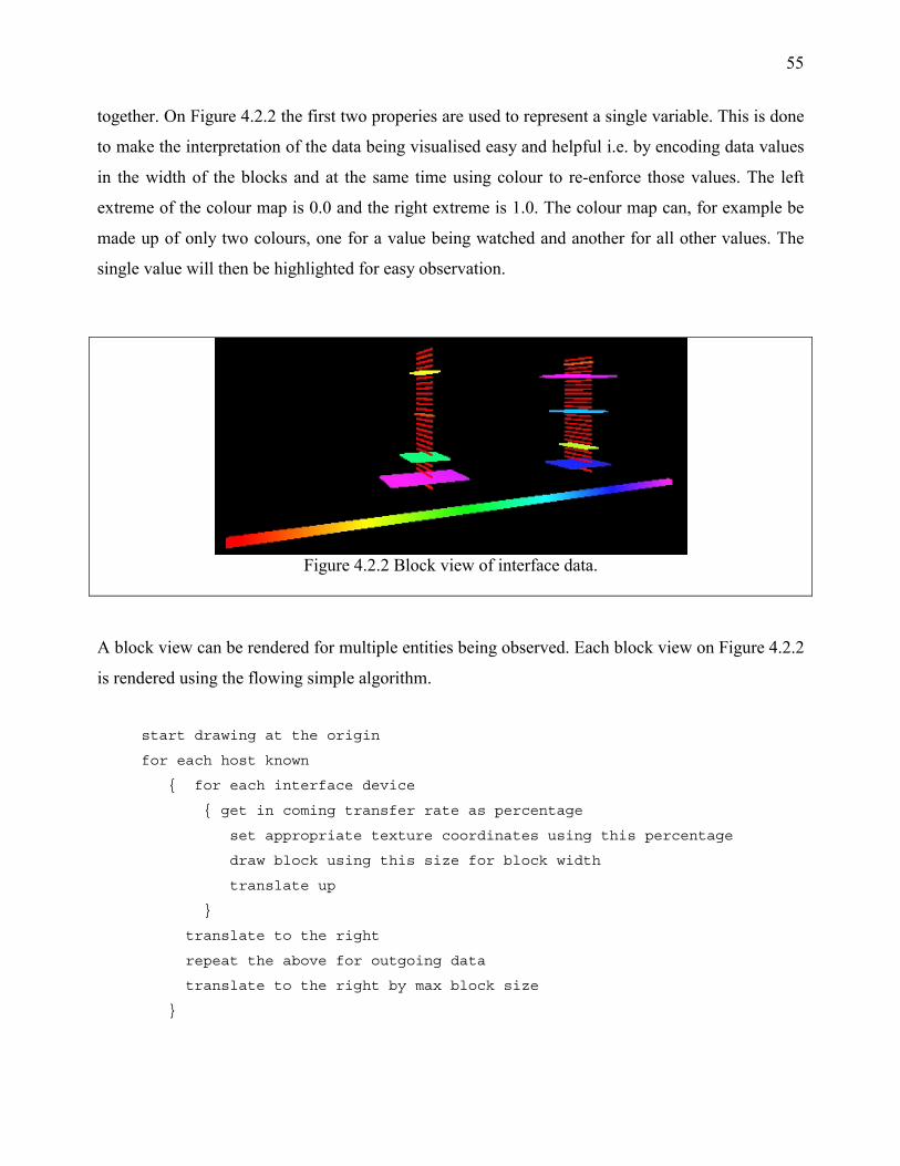
55
together. On Figure 4.2.2 the first two properies are used to represent a single variable. This is done
to make the interpretation of the data being visualised easy and helpful i.e. by encoding data values
in the width of the blocks and at the same time using colour to re-enforce those values. The left
extreme of the colour map is 0.0 and the right extreme is 1.0. The colour map can, for example be
made up of only two colours, one for a value being watched and another for all other values. The
single value will then be highlighted for easy observation.
Figure 4.2.2 Block view of interface data.
A block view can be rendered for multiple entities being observed. Each block view on Figure 4.2.2
is rendered using the flowing simple algorithm.
start drawing at the origin
for each host known
{ for each interface device
{ get in coming transfer rate as percentage
set appropriate texture coordinates using this percentage
draw block using this size for block width
translate up
}
translate to the right
repeat the above for outgoing data
translate to the right by max block size
}
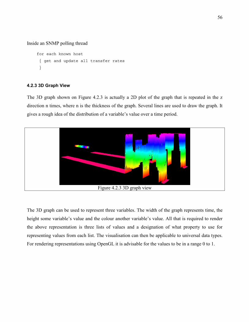
56
Inside an SNMP polling thread
for each known host
{ get and update all transfer rates
}
4.2.3 3D Graph View
The 3D graph shown on Figure 4.2.3 is actually a 2D plot of the graph that is repeated in the z
direction n times, where n is the thickness of the graph. Several lines are used to draw the graph. It
gives a rough idea of the distribution of a variable’s value over a time period.
Figure 4.2.3 3D graph view
The 3D graph can be used to represent three variables. The width of the graph represents time, the
height some variable’s value and the colour another variable’s value. All that is required to render
the above representation is three lists of values and a designation of what property to use for
representing values from each list. The visualisation can then be applicable to universal data types.
For rendering representations using OpenGL it is advisable for the values to be in a range 0 to 1.

57
The 3D graph view is rendered using the following, inefficient algorithm
Render n times, where n is thickness
{ GL.Begin(GL.GL_LINE_STRIP)
for each value in a list
{ y = next_data_value
set texture coordinate to y , y+0.01
GL.Vertex(x,y,z)
x+= some_suitable_offset.
}
GL.End();
z-= some_suitable_offset
}
It is inefficient because it would have been easier to render each vertex n times from inside the
second for loop instead of traversing the list n times, but use of the GL.LINE_STRIP operation
restricts us to a list of points and it will not be possible to do the latter which would introduce other
points outside this list.
4.2.4 Polar View
The polar view shown on Figure 4.2.4 represents data in much the same way as the 3D view
discussed in section 4.2.3 but presents the data in a more compact way. Values get rendered starting
from the centre of the circle using the following algorithm.
render a line using the following points
GL.Begin(GL.LINE_STRIP)
for each element in a list of data
{ x = Math.sin(theta)*distance;
z = Math.cos(theta)*distance;
get a percentage value from the list of data
y=next_data_value;
set texture coordinates from the percentage i.e y,y+0.01
GL.Vertex(x,y,z)
increase distance and theta
}
GL.End()

58
Figure 4.2.4 The spiral of Archimedes used to represent data
Polar view can represent data with three variables. The colour of the line at particular segment, the
vertical offset of the line and distance of a segment from the centre. Earlier values are nearer the
centre. A fourth variable could possibly be added by counting the number of circular segments.
Multiple spirals can be rendered using a colour map that highlights values of interest.
4.2.5 Log File Data Views
Here implementation of two ways for visualising log file data are discussed. Although these
visualisation methods may be applicable to other types of data, we are interested in using them to
visualise log file data.
4.2.5.1 Visualising Data with Particles
A Particle system consists of n particles and a Particle Manager. Each particle can have any desired
behaviour but this is likely result in a random visual display. Coordinating the behaviour of
particles is desirable. The particle system on Figure 4.2.5.1a is produced by assigning each particle
a direction in the range 0 to 360 degrees that it would use to move to the outer edge of the circle.
Each particle is also assigned a colour when it is added to the particle manager. Three properties of
the particle system that could be used for representing variables have just been identified, particle
direction, colour and radius of the circle.
While particles move outwards from the centre, varied gravity can be applied to them thus the
display won’t be very flat. The gravity value could also be used to encode a fourth variable. The

59
velocity with which particles move is another variable. The following simple algorithm is used to
generate the particle system shown on Figure 4.2.5.1a.
Figure 4.2.5.1a Particle direction and colour used for visualising data
Figure 4.2.5.1b Object diagram for the particle system
For each element in from a data set
{ create a particle with(colour=variable1,direction=variable2)
add the particle to the particle Manager
}
Particle velocity, gravity and circular radius of the system are kept constant.
Each particle is intelligent and knows how to render itself. The particle manager tells every particle
it knows about to render itself periodically. It also tells all particles to vary thier own attributes e.g.
makes each particle move outwards by varying its postion, changes gravity values etc. The object
model shown on Figure 4.2.5.1b show the relationship of the particle manager to particles and a
visualisation module. Each particle manager interacts with particles as follows:
to render the particle system
for each particle the particle manager knows
{ particle.render()
}
to change the age of particles
for each particle the particle manager knows
{ particle.thread()
}
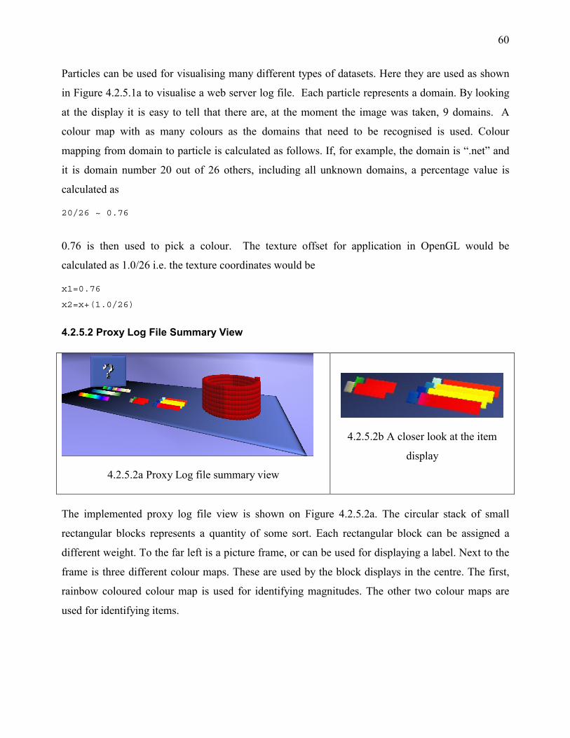
60
Particles can be used for visualising many different types of datasets. Here they are used as shown
in Figure 4.2.5.1a to visualise a web server log file. Each particle represents a domain. By looking
at the display it is easy to tell that there are, at the moment the image was taken, 9 domains. A
colour map with as many colours as the domains that need to be recognised is used. Colour
mapping from domain to particle is calculated as follows. If, for example, the domain is “.net” and
it is domain number 20 out of 26 others, including all unknown domains, a percentage value is
calculated as
20/26 ~ 0.76
0.76 is then used to pick a colour. The texture offset for application in OpenGL would be
calculated as 1.0/26 i.e. the texture coordinates would be
x1=0.76
x2=x+(1.0/26)
4.2.5.2 Proxy Log File Summary View
4.2.5.2a Proxy Log file summary view
4.2.5.2b A closer look at the item
display
The implemented proxy log file view is shown on Figure 4.2.5.2a. The circular stack of small
rectangular blocks represents a quantity of some sort. Each rectangular block can be assigned a
different weight. To the far left is a picture frame, or can be used for displaying a label. Next to the
frame is three different colour maps. These are used by the block displays in the centre. The first,
rainbow coloured colour map is used for identifying magnitudes. The other two colour maps are
used for identifying items.

61
The model as shown on Figure 4.2.5.2a can represent multiple variables. It is called Proxy Log file
view because it was first used for displaying proxy log file data. It can be used for displaying a
summary of other data as well.
The surface is rendered using a flat quad, but the texture applied on the quad gives it a 3D look.
The components on the centre, Figure 4.2.5.2b, consist of a long rectangular block, which displays
the value of a variable by using colour map one. The left edge of this rectangular block contains a
small square block used for identifying items.
4.2.6 Bars and Spheres
Figure 4.2.6 3D Using bars and spheres to present a summary of data
Bars and spheres are an example of usage of simple 3D objects to represent data. The display on
Figure 4.2.6 shows an implementation. There are five variables being represented. Four by block
height and the fifth by the number of spheres rendered. The level of detail used for rendering the
spheres is very low, that’s why they their edges have only five sides. The emphasis here is on the
ease of interpreting the values presented by the model. The spheres are rendered as follows
For each item out of n items
{ GL.SolidSphere(1.0,5,5)
move sphere to x,y,z
change x
change z of necessary i.e. start another row
}

62
The bars are rendered using a custom cube renderer. Each cube is then deformed in the y direction
to give the appearance shown on Figure 4.2.6. The maximum extent of the bars is represented by
the thin white blocks to give an idea of what the maximum height that can be achieved by a bar is.
4.2.7 Animated Pyramids
A pyramid has five faces, counting the base of a pyramid, Figure 4.2.7a shows an implementation
where four of the visible faces are used for representing packets. This display is useful for
representing data that “flows” i.e. data that changes frequently. Each pyramid is an intelligent
object that knows how to render itself and has four colours, one for each of its visible face. A
manager manages a list of pyramids.
Figure 4.2.7a A visual representation that uses pyramids to represent network data
Figure 4.2.7b shows the object diagram used for the pyramid visualisation system
Pyramids are assigned a position when they are created. This position is changed periodically so
that the pyramids are arranged as shown on Figure 4.2.7a. When pyramids enter the system they are
represented by spheres and as they land on to the surface they turn back into a pyramid, this is done
to make the display more appealing.
The two bars help to group the set of pyramids, thus multiple displays can be used at the same time
to represent different sets of data. Each pyramid is rendered using four triangles. Figure 4.2.7b
shows the object model used to manage lists of pyramids, every pyramid’s age and location would
be changed in the thread method. The pyramid manager is responsible for removing pyramids from

63
the system when their age passes a specified time value e.g. after five minutes. This system can be
looked at as a particle system where particles are pyramids. A visualisation module can manage
multiple pyramid managers thus allowing the representation of multiple datasets.
4.2.8 Visualisation with Facial Expressions
Visualisation with facial expressions is suitable for visualising summaries of datasets. Examples 3D
character faces that can be used to visualise data are shown on Figure 4.2.8. All data values to be
visualised are supplied as percentages. Since three faces are used here, face1 can represent data
values in the range 0 to 33%, face2 to for data in the range 33 to 66% and face3 for data in the
range 66 to 100%. This order can be reversed if desired i.e. face1 represents data in the range 100
to 66% etc.
Figure 4.2.8 3D Using character faces to visualise data.
All faces to be used must be of equal size for this implementation. A face is then displayed for each
percentage value. The following algorithm is used for 3D character face visualisation:
face_width =1/n
For each value in a data set
{ offset = face_width*data_value
set x1,x2 texture coordinates to (offset, offset+face_width)
render face display
}

64
An image file containing 3D character faces can be saved with alpha values, allowing the rendering
of only the face outline by using alpha testing. Once the image file is loaded, when rendering, an
appropriate alpha function is used e.g.
GL.AlphaFunc(GL.GL_NOTEQUAL alpha_value);
GL.Enable(GL.GL_ALPHA_TEST);
draw stuff with texture on
GL.Disable(GL.GL.GL_ALPHA_TEST);
4.2.9 Visualisation with Other 3D Objects
As an example network interface devices are represented as stacked boxes, which move along a
bezier curve, if one interface device fails there will be no movement. A colour map is used to
display interface device transfer speeds and error rates on the sides of a box. At the top of the stack
of boxes total interface device traffic is represented as a deformed sphere environment mapped with
a texture. Near the stack of boxes, IP status data is represented using a Chernoff face. The various
value to face-feature mappings are shown on Table 4.2.9. Face components are rendered using
deformed spheres.
Table 4.2.9. IP data to face feature mappings. Appendix C lists the meanings of the OIDs.
IpRouteDestRate Head smoothness ipInDeliverRate nose length ipInUnknownProtosRate left eye width ipInReceiveRate mouth width ipInHdrErrorRate left eye height ipOutRequestRate mouth height ipOutDiscardRate right eye width ipInAddrErrorRate ear width ipOutDiscardRate right eye height ipOutNoRouteRate ear height ipRouteDestRate nose height and width ipForwarding face colour
ICMP data is represented using a water tank and three cubes connected by lines. The three cubes
move using a bezier curve, defined to be a straight line. The cubes are always rotating, randomly
about the x, y and z-axis. The water is created using an animated texture as shown on Figure 4.2.9.
It only moves when there is a lot of ICMP traffic, typically occurs when the icmpInEchoRate is
rising very fast. In this implementation it happens when the echo rate rises by more than 300%. If
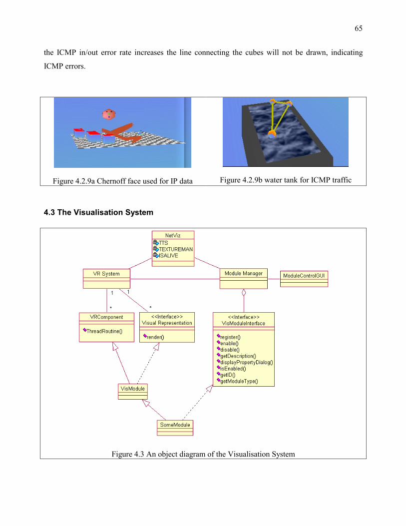
65
the ICMP in/out error rate increases the line connecting the cubes will not be drawn, indicating
ICMP errors.
Figure 4.2.9a Chernoff face used for IP data
Figure 4.2.9b water tank for ICMP traffic
4.3 The Visualisation System
Figure 4.3 An object diagram of the Visualisation System

66
The system developed for testing visualisations is shown on Figure 4.3. It consists of a VR sub
system, various visualisation modules and a module manager. The module manager manages
multiple visualisation modules. It offers a GUI to user, which enables them to interact with
modules. The VR System provides input and output facilities.
4.3.1 Interfacing with the VR System
Greatdane, the VR system is shown as a single object in Figure 4.3, instead it in itself is a large
system. Figure 4.3.1 shows the major components of the VR System. It is made up of components
that perform various tasks. The VREnvironment is a database of all Components and
VisualRepresentations that have a presence in the virtual environment. Objects in the
VREnvironment are identified by an objectID e.g. the VRUserActor, which represents a user in the
virtual environment has an object ID. VRInputOutputDevice is a device used to render visual
representations. User-input is handled by this object as well. VRSink is a rendering object for all
VisualRepresentations known by the VREnvironment hence is attached to the
VRInputOutputDevice and the VREnvironment.
Figure 4.3.1 Greatdane, the VR system
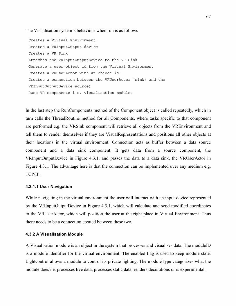
67
The Visualisation system’s behaviour when run is as follows
Creates a Virtual Environment
Creates a VRInputOutput device
Creates a VR Sink
Attaches the VRInputOutputDevice to the VR Sink
Generate a user object id from the Virtual Environment
Creates a VRUserActor with an object id
Creates a connection between the VRUserActor (sink) and the
VRInputOutputDevice source)
Runs VR components i.e. visualisation modules
In the last step the RunComponents method of the Component object is called repeatedly, which in
turn calls the ThreadRoutine method for all Components, where tasks specific to that component
are performed e.g. the VRSink component will retrieve all objects from the VREnvironment and
tell them to render themselves if they are VisualRepresentations and positions all other objects at
their locations in the virtual environment. Connection acts as buffer between a data source
component and a data sink component. It gets data from a source component, the
VRInputOutputDevice in Figure 4.3.1, and passes the data to a data sink, the VRUserActor in
Figure 4.3.1. The advantage here is that the connection can be implemented over any medium e.g.
TCP/IP.
4.3.1.1 User Navigation
While navigating in the virtual environment the user will interact with an input device represented
by the VRInputOutputDevice in Figure 4.3.1, which will calculate and send modified coordinates
to the VRUserActor, which will position the user at the right place in Virtual Environment. Thus
there needs to be a connection created between these two.
4.3.2 A Visualisation Module
A Visualisation module is an object in the system that processes and visualises data. The moduleID
is a module identifier for the virtual environment. The enabled flag is used to keep module state.
Lightcontrol allows a module to control its private lighting. The moduleType categorizes what the
module does i.e. processes live data, processes static data, renders decorations or is experimental.

68
4.3.2.1 Visualisation Module Interface (VMI)
All Visualisation modules must implement a uniform set of methods to qualify them as a
visualisation module. These methods are encapsulated by the following Java interface declaration,
which was defined for the visualisation system.
interface VisModuleInterface
{
void register(objectID id)
ModuleDesc getDescription()
void enable()
void disable()
public boolean isEnabled()
public void displayConfigurationDialog()
objectID getID()
int getModuleType()
}
How VisModuleInterface fits in the whole system is shown on Figure 3.1. The register (objectID)
method is called by the module manager when it loads up modules. Its implementation should have
the following structure
save the objectID as the moduleID
register the moduleID, the modules location, orientation, scale with the Virtual
Environment.
do internal initialisation
A module does not need to keep attributes such as location and scale, it can query these at anytime
from the VR Environment using its moduleID. A call to the getDescription() method asks a module
to return a description of itself. A module description consists of the module's name, the author for
module, copyright if any, and a brief description of what the module does. In this way modules are
self describing.
The enable and disable methods should set the module's internal state flag appropriately.
Additionally they allow modules to perform a task before/after being disabled or enabled.
isEnabled is used to check the status of the above variables. The displayConfigurationDialog()
69
method should popup a dialog box that will allow users to set various module parameters. It is there
for future expandability, it is not implemented by any of the modules created for the visualisation
system. getID() returns the module's VR Environment ID the getModuleType the modules
category.
4.3.3 The Module Manager
The module manager as its name suggests, manages modules. When the module manager is
initialised it will scan for java objects in the modules/ directory, as it expects to find visualisation
modules here. Object files have a “.o” extension. Code Listing 4.3.3 shows the tasks the module
manager performs at start up
Code Listing 4.3.3 Tasks performed by the module manager at start up
Get a list of files from the modules/ directory
for each file in the list
{ if(it ends in extension “.o”)
{ check that it is a visualisation module
if(yes)
{ create an instance of the module
generate a VREnvironment ID i.e. moduleID
call module.register(moduleID)
add module instance to the manager's list
}
}
}
4.3.3.1 Dynamic Object Loading
Dynamic object loading allows creation of an object instance from a class that has not been defined
at compile time. The class is defined at a later time and only its name is supplied to the dynamic
loader at runtime. For example, normally an object in Java would be defined as the follows
class SomeVisualisationModule
{ SomeVisualisationModule () {}
...
}
70
and used later as
public static void main (String args [])
{ SomeVisualisationModule vm = new SomeVisualisationModule ();
...
}
With dynamic object loading the following is possible
public static void main (String args [])
{ Class dyn = Class.forName("SomeVisualisationModule ");
Unknown object = (Unknown) dyn.newInstance();
}
This will allow loading of a class defined after compile time from storage but the class template
does not exit before compile time, so how do its methods get identified at compile time? Of what
type will the newly created object be? The object identification problem is be solved by using an
interface definition for SomeVisualisationModule that is known at compile time e.g.
Interface SomeVisualisationModuleInterface
{ render();
processdata();
}
4.3.3.2 Dynamic Loading of Visualisation Modules
Java supports dynamic object loading and this is used by the visualisation system. The advantages
of dynamic module loading are
• The main visualisation system is compiled only once
• New modules are written and compiled independently of the main system
• Changes made to a particular module do not affect the whole system
• Many visualisation modules can be added to the system with zero modification to the main
system

71
The process of module loading performed by the module manager is shown on Code Listing
4.3.3.2. Java has another very useful feature called reflection. Reflection allows discovery of
methods, attributes and other class information from loaded classes at runtime. The module
manager uses this feature to see if the Java class definition it is loading at runtime implements the
VisModuleInterface if not, the template is ignored.
Code Listing 4.3.3.2 Checking for interface names at run time, and loading modules into the system
For each file in modules/ that ends with .o
{ Class dyn = Class.forName(modulename);
Class [] interface = dyn.getInterfaces()
for each interface
{ if(interface[i].getName().equals("VisModuleInterface"))
{ this class implements the visualisation module interface
}
}
if(this class implements the visualisation module interface)
{ VismoduleInterface module = (VismoduleInterface) dyn.newInstance();
module.register(new_moduleID);
add module to manager's list
}
}

72
4.3.3.3 The Module Control GUI (mcGUI)
Figure 4.3.3.3 Module Control GUI (mcGUI)
The module manager is also responsible for creating the mcGUI , shown on Figure 4.3.3.3. The
mcGUI lists all currently loaded modules and allows users to enable/disable them. It also lists
descriptions of each module as the user selects a module. It has sliders for controlling navigation
speeds while the user moves in the VR Environment. It is implemented using the QT graphics
toolkit. This toolkit comes with a C++ library so all accesses to it are done natively. The module
manager initialises the mcGUI and gives the name of each module to the mcGUI as it loads them.
The module list is kept in a tree view control, the module description in a textbox; and the
enable/disable button is a checkbox.
Table 4.4.3.1 GUI events handled by the mcGUI
Control Event Action Checkbox Clicked Enable / Disable module TreeView Tree node clicked Get selected module description and
display in textbox. Sliders Values changed Set Y and XZ navigation sensitivity Window Close Box Clicked Shutdown System

73
There are two layers to the mcGUI. A Java object (ModuleControl) and a C implementation
(ModuleControlimp). When a user generates events by interacting with the mcGUI, messages are
sent by the QT GUI library to the object implemented in C (ModuleControlimp), which knows
about the Java implemented object ModuleControl. Table 4.3.3.3 shows all events handled by
mcGUI.
4.3.4 Common System Objects
4.3.4.1 The Texture Manager
There is a single texture manager, which all modules use to create textures. The process of creating
textures involves reading the texture file from a file on disk into to memory and getting an
identifier for the texture from the OpenGL texture loader. This identifier is used in OpenGL for
using the texture as
enable(texture id)
do all drawing that uses this texture
disable(texturing)
The texture manager keeps a list of all textures it creates, if a request is made for an already
existing texture it will return that same texture id instead of reloading the texture from disk and
using up valuable memory. The texture manager can handle loading of gif images. Since these only
allow 256 colours at any one time, png image loading functionality has been added to it. png
images can handle up to 24 bit images i.e. more than 16 million colours.
4.3.4.2 Text to Speech (TTS)
The text to speech interface enables the visualisation system to synthesise speech for certain system
functions. This way system messages are more appealing and accessible to users, who do not want
to read console messages. Speech is a natural way of communicating with users. The TTS engine is
implemented using two TTS engines, IBM's ViaVoice and the Festival system from University of
Edinburgh in the UK. IBM's ViaVoice TTS engine is much faster but does not work on all systems,
when it does not, the slightly slower Festival TTS engine is used. The uniform TTS interface called
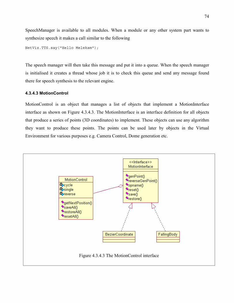
74
SpeechManager is available to all modules. When a module or any other system part wants to
synthesize speech it makes a call similar to the following
NetViz.TTS.say("Hello Melekam");
The speech manager will then take this message and put it into a queue. When the speech manager
is initialised it creates a thread whose job it is to check this queue and send any message found
there for speech synthesis to the relevant engine.
4.3.4.3 MotionControl
MotionControl is an object that manages a list of objects that implement a MotionInterface
interface as shown on Figure 4.3.4.3. The MotionInterface is an interface definition for all objects
that produce a series of points (3D coordinates) to implement. These objects can use any algorithm
they want to produce these points. The points can be used later by objects in the Virtual
Environment for various purposes e.g. Camera Control, Dome generation etc.
Figure 4.3.4.3 The MotionControl interface
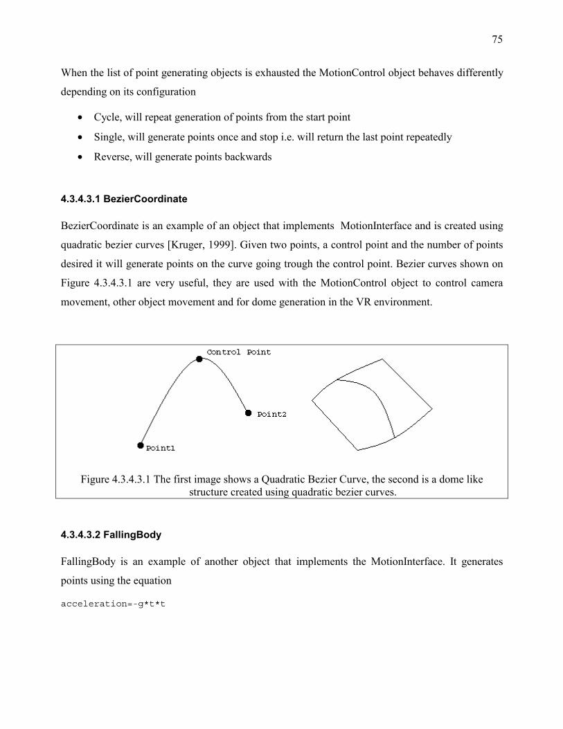
75
When the list of point generating objects is exhausted the MotionControl object behaves differently
depending on its configuration
• Cycle, will repeat generation of points from the start point
• Single, will generate points once and stop i.e. will return the last point repeatedly
• Reverse, will generate points backwards
4.3.4.3.1 BezierCoordinate
BezierCoordinate is an example of an object that implements MotionInterface and is created using
quadratic bezier curves [Kruger, 1999]. Given two points, a control point and the number of points
desired it will generate points on the curve going trough the control point. Bezier curves shown on
Figure 4.3.4.3.1 are very useful, they are used with the MotionControl object to control camera
movement, other object movement and for dome generation in the VR environment.
Figure 4.3.4.3.1 The first image shows a Quadratic Bezier Curve, the second is a dome like structure created using quadratic bezier curves.
4.3.4.3.2 FallingBody
FallingBody is an example of another object that implements the MotionInterface. It generates
points using the equation
acceleration=-g*t*t
76
To use it requires a value for g(gravity), the start time, and a y-coordinate to start at. For example,
using it with the motion interface it is possible simulate a space ship taking off from a landing bay
using a positive value for g.
4.3.4.3.3 MotionControl use Example
Code listing 4.3.4.3.3 shows an example of a MotionControl definition that can be used to generate
a series of points that will make an object move in a straight line in the z direction then turn right
using two concatenated bezier curve segments and rise up using points generated by the
FallingBody object.
Code listing 4.3.4.3.3 MotionControl object usage example
create a bezier curve with a startpoint, control point and endpoint, moves object in the z direction BezierCoordinate goStraightForward = new BezierCoordinate (
new Point3D(0,0,0),
new Point3D(0,0,-1),
new Point3D(0,0,-2))
create another bezier curve with a startpoint, control point and endpoint, moves object in the x direction BezierCoordinate turnright = new BezierCoordinate(
new Point3D(0,0,-2),
new Point3D(1,0,-2),
new Point3D(2,0,-2)
)
Create a FallingBody object with gravity = 10m/s, timeinterval=0.01s, starts at y=0 and ends at y=3. Makes the object rise up since start y coordinate is less than end y coordinate FallingBody riseup = new FallingBody(10.0, 0.01,
new Point3D(2,0,-2),
new Point3D(2,3,-2) )
)
create a MotionInterface with the above objects MotionInterface mi [] = { goStraightForward, turnright, riseup }

77
Finally create the MotionControl giving it a list of motion interfaces MotionControl mc = new MotionControl(mi)
Use it in some object‘s render method Point3D point = mc.getNextPoint()
render object at point.
4.3.4.4 Camera Control
A VRCameraMotionDevice has been added to the VR system and is capable of switching a user's
view automatically, based on a pre-defined path. The path is generated by a MotionControl object.
VRCameraMotionDevice is a VRComponent similar to VRUserActor, shown on Figure 4.3.1.
When using this camera device. The connection between VRUserActor and VRInputOutputDevice
is broken and a new one is constructed as shown in Figure 4.3.4.4a. Connection gets location and
orientation data from VRInputOutputDevice and pass it to VRCameraMotionDevice, which
changes the VRInputOutputDevice’s output.
Figure 4.3.4.4a Camera device Implementation Figure 4.3.4.4b Camera Motion Calculation
The Camera device requires a target to aim at while moving. The camera’s orientation is
determined by calculating the vector from the position of the camera to the target being looked at,
V1 on Figure 4.3.4.4b, and doing a quaternion division of the orientation vector V2 by V1. The
result is a new quaternion that can be used to set the camera’s orientation. A quaternion describes a
rotation about a vector i.e. consists of an angle and a vector. The new quaternion is created with V3
and theta shown on Figure 4.3.4.4b.
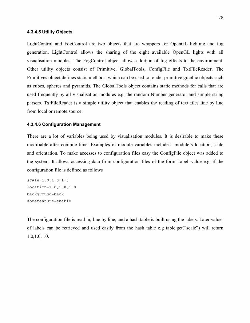
78
4.3.4.5 Utility Objects
LightControl and FogControl are two objects that are wrappers for OpenGL lighting and fog
generation. LightControl allows the sharing of the eight available OpenGL lights with all
visualisation modules. The FogControl object allows addition of fog effects to the environment.
Other utility objects consist of Primitive, GlobalTools, ConfigFile and TxtFileReader. The
Primitives object defines static methods, which can be used to render primitive graphic objects such
as cubes, spheres and pyramids. The GlobalTools object contains static methods for calls that are
used frequently by all visualisation modules e.g. the random Number generator and simple string
parsers. TxtFileReader is a simple utility object that enables the reading of text files line by line
from local or remote source.
4.3.4.6 Configuration Management
There are a lot of variables being used by visualisation modules. It is desirable to make these
modifiable after compile time. Examples of module variables include a module’s location, scale
and orientation. To make accesses to configuration files easy the ConfigFile object was added to
the system. It allows accessing data from configuration files of the form Label=value e.g. if the
configuration file is defined as follows
scale=1.0,1.0,1.0
location=1.0,1.0,1.0
background=back
somefeature=enable
The configuration file is read in, line by line, and a hash table is built using the labels. Later values
of labels can be retrieved and used easily from the hash table e.g table.get(“scale”) will return
1.0,1.0,1.0.
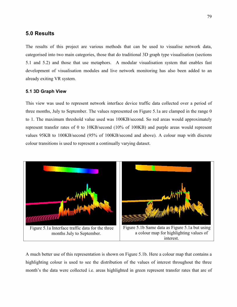
79
5.0 Results
The results of this project are various methods that can be used to visualise network data,
categorised into two main categories, those that do traditional 3D graph type visualisation (sections
5.1 and 5.2) and those that use metaphors. A modular visualisation system that enables fast
development of visualisation modules and live network monitoring has also been added to an
already exiting VR system.
5.1 3D Graph View
This view was used to represent network interface device traffic data collected over a period of
three months, July to September. The values represented on Figure 5.1a are clamped in the range 0
to 1. The maximum threshold value used was 100KB/second. So red areas would approximately
represent transfer rates of 0 to 10KB/second (10% of 100KB) and purple areas would represent
values 95KB to 100KB/second (95% of 100KB/second and above). A colour map with discrete
colour transitions is used to represent a continually varying dataset.
Figure 5.1a Interface traffic data for the three
months July to September.
Figure 5.1b Same data as Figure 5.1a but using
a colour map for highlighting values of interest.
A much better use of this representation is shown on Figure 5.1b. Here a colour map that contains a
highlighting colour is used to see the distribution of the values of interest throughout the three
month’s the data were collected i.e. areas highlighted in green represent transfer rates that are of

80
approximately 30-35KB/second (30-35% of 100KB/second). The first graph represents incoming
transfer rate, the second outgoing transfer rate.
Figure 5.1c 2D Incoming and outgoing data plotted by RRDtool
Figure 5.1c shows the same data as it appears on a 2D graph generated by RRDtool [RRDtool,
2001]. The 3D graph representation is much better than the RRDtool’s graph as it allows,
navigation in a 3D Environment and the use of colour maps for highlighting values of interest.
RRDtool’s graph is more informative at first glance since it includes text labels. We do not believe
a lot of text is suitable for use in a 3D environment, instead using attributes of objects to convey
values is much better thus the 3D graphs plotted don’t include any text.
5.2 Polar Graph View
The polar graph view shown in Figure 5.2a is used to visualise the same interface traffic data
visualised in section 5.1. It is slightly more difficult to interpret than the 3D graph view but is more
compact. The centre of the circle represents the beginning of the dataset. The flat and red areas
show where interface data transfer rates are low. Just by looking at the diagram we can see that
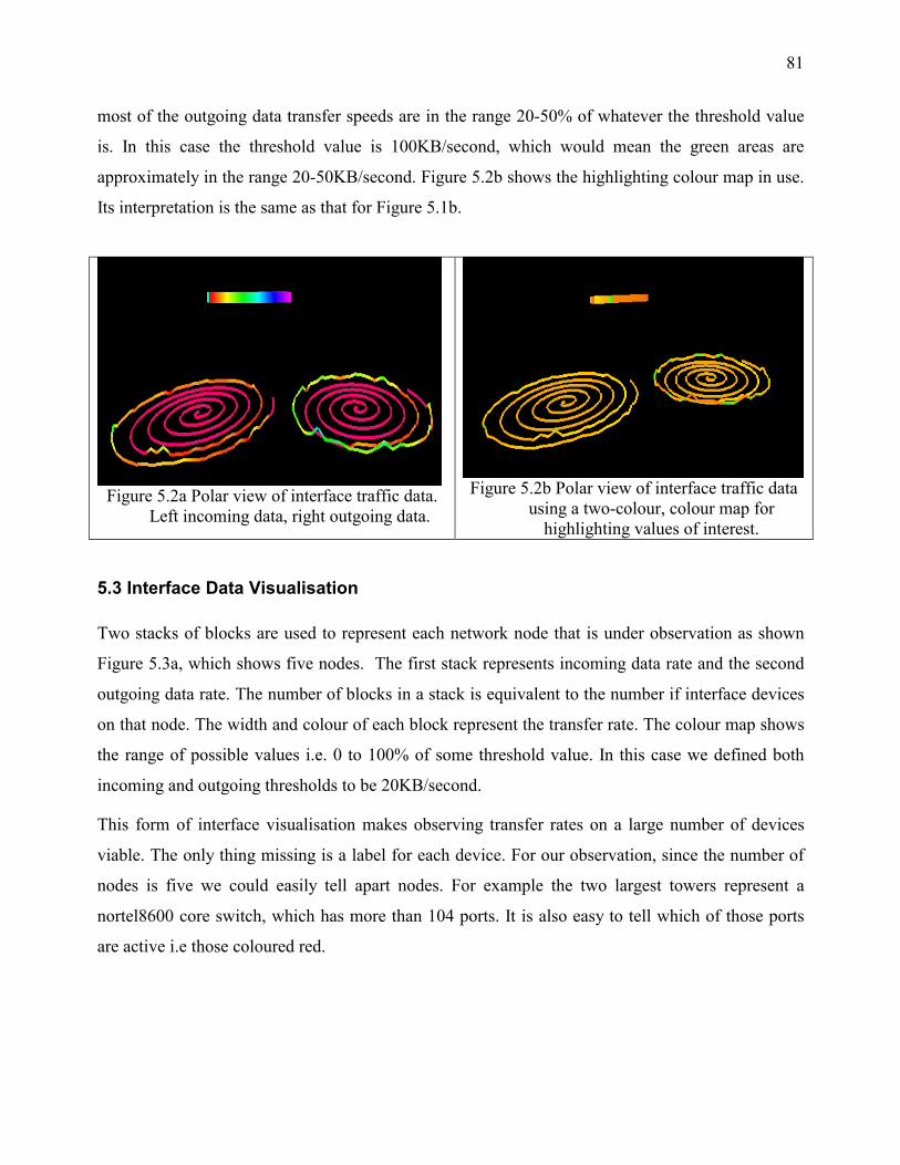
81
most of the outgoing data transfer speeds are in the range 20-50% of whatever the threshold value
is. In this case the threshold value is 100KB/second, which would mean the green areas are
approximately in the range 20-50KB/second. Figure 5.2b shows the highlighting colour map in use.
Its interpretation is the same as that for Figure 5.1b.
Figure 5.2a Polar view of interface traffic data.
Left incoming data, right outgoing data.
Figure 5.2b Polar view of interface traffic data
using a two-colour, colour map for highlighting values of interest.
5.3 Interface Data Visualisation
Two stacks of blocks are used to represent each network node that is under observation as shown
Figure 5.3a, which shows five nodes. The first stack represents incoming data rate and the second
outgoing data rate. The number of blocks in a stack is equivalent to the number if interface devices
on that node. The width and colour of each block represent the transfer rate. The colour map shows
the range of possible values i.e. 0 to 100% of some threshold value. In this case we defined both
incoming and outgoing thresholds to be 20KB/second.
This form of interface visualisation makes observing transfer rates on a large number of devices
viable. The only thing missing is a label for each device. For our observation, since the number of
nodes is five we could easily tell apart nodes. For example the two largest towers represent a
nortel8600 core switch, which has more than 104 ports. It is also easy to tell which of those ports
are active i.e those coloured red.
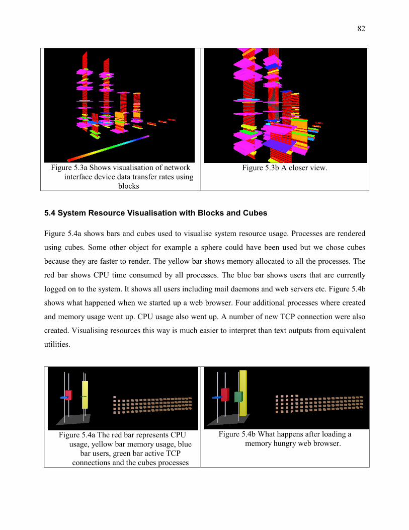
82
Figure 5.3a Shows visualisation of network
interface device data transfer rates using blocks
Figure 5.3b A closer view.
5.4 System Resource Visualisation with Blocks and Cubes
Figure 5.4a shows bars and cubes used to visualise system resource usage. Processes are rendered
using cubes. Some other object for example a sphere could have been used but we chose cubes
because they are faster to render. The yellow bar shows memory allocated to all the processes. The
red bar shows CPU time consumed by all processes. The blue bar shows users that are currently
logged on to the system. It shows all users including mail daemons and web servers etc. Figure 5.4b
shows what happened when we started up a web browser. Four additional processes where created
and memory usage went up. CPU usage also went up. A number of new TCP connection were also
created. Visualising resources this way is much easier to interpret than text outputs from equivalent
utilities.
Figure 5.4a The red bar represents CPU usage, yellow bar memory usage, blue
bar users, green bar active TCP connections and the cubes processes
Figure 5.4b What happens after loading a memory hungry web browser.
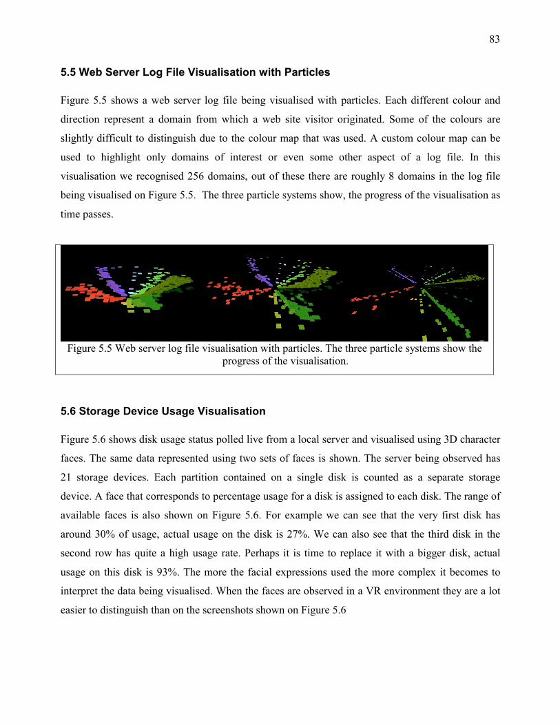
83
5.5 Web Server Log File Visualisation with Particles
Figure 5.5 shows a web server log file being visualised with particles. Each different colour and
direction represent a domain from which a web site visitor originated. Some of the colours are
slightly difficult to distinguish due to the colour map that was used. A custom colour map can be
used to highlight only domains of interest or even some other aspect of a log file. In this
visualisation we recognised 256 domains, out of these there are roughly 8 domains in the log file
being visualised on Figure 5.5. The three particle systems show, the progress of the visualisation as
time passes.
Figure 5.5 Web server log file visualisation with particles. The three particle systems show the progress of the visualisation.
5.6 Storage Device Usage Visualisation
Figure 5.6 shows disk usage status polled live from a local server and visualised using 3D character
faces. The same data represented using two sets of faces is shown. The server being observed has
21 storage devices. Each partition contained on a single disk is counted as a separate storage
device. A face that corresponds to percentage usage for a disk is assigned to each disk. The range of
available faces is also shown on Figure 5.6. For example we can see that the very first disk has
around 30% of usage, actual usage on the disk is 27%. We can also see that the third disk in the
second row has quite a high usage rate. Perhaps it is time to replace it with a bigger disk, actual
usage on this disk is 93%. The more the facial expressions used the more complex it becomes to
interpret the data being visualised. When the faces are observed in a VR environment they are a lot
easier to distinguish than on the screenshots shown on Figure 5.6
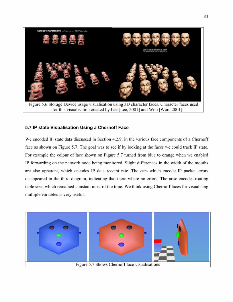
84
Figure 5.6 Storage Device usage visualisation using 3D character faces. Character faces used
for this visualisation created by Lee [Lee, 2001] and Woo [Woo, 2001].
5.7 IP state Visualisation Using a Chernoff Face
We encoded IP state data discussed in Section 4.2.9, in the various face components of a Chernoff
face as shown on Figure 5.7. The goal was to see if by looking at the faces we could track IP state.
For example the colour of face shown on Figure 5.7 turned from blue to orange when we enabled
IP forwarding on the network node being monitored. Slight differences in the width of the mouths
are also apparent, which encodes IP data receipt rate. The ears which encode IP packet errors
disappeared in the third diagram, indicating that there where no errors. The nose encodes routing
table size, which remained constant most of the time. We think using Chernoff faces for visualising
multiple variables is very useful.
Figure 5.7 Shows Chernoff face visualisations

85
5.8 ICMP State Visualisation with a Water Tank
The first figure on Figure 5.8 shows the state of the water tank at the start of our experiment. The
cube in the centre is always moving. When incoming ICMP echo traffic was generated by pinging
an external host, the third cube started moving to the left as shown in the second figure. The first
cube was also made to move by generating outgoing ICMP echo traffic by pinging our host from an
external machine as shown on the third figure. The lines only appear if there are no ICMP packet
transmission errors. Ping flooding our host made the water in the tank flow.
Table 5.8 ICMP state traffic visualisation with a water tank.
5.9 Packet Visualisation
Figure 5.9a shows four filters being used to capture packets from a network. The filter syntax used
is the same as that used by Tcpdump. The packets originate from a box and are arranged on the
ground as shown on Figure 5.9b. The yellow packets are ICMP packets, the blue ones are ARP
packets and those with green faces are UDP packets. All grey packets are unidentified packets. This
is another example of use of 3D metaphors for visualising network data. It is so much easier to
interpret than textual outputs from equivalent utilities. Even users unfamiliar with low-level
networking details can quickly adopt and use it to observe their network.
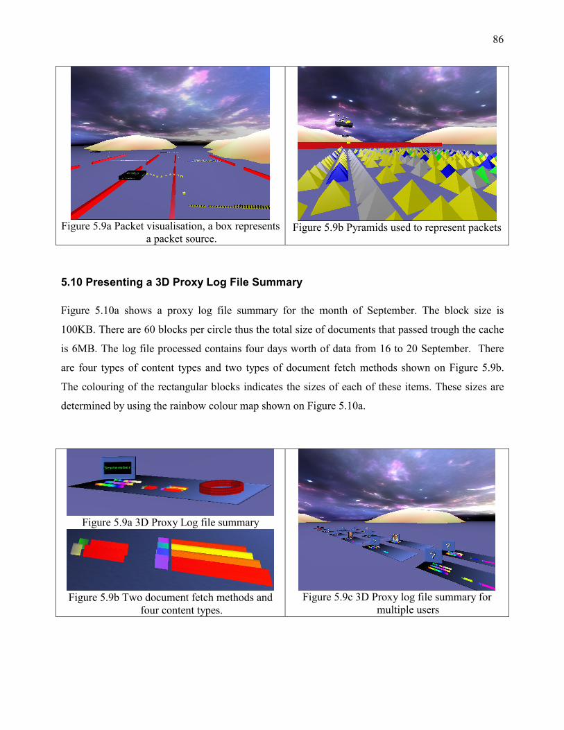
86
Figure 5.9a Packet visualisation, a box represents
a packet source.
Figure 5.9b Pyramids used to represent packets
5.10 Presenting a 3D Proxy Log File Summary
Figure 5.10a shows a proxy log file summary for the month of September. The block size is
100KB. There are 60 blocks per circle thus the total size of documents that passed trough the cache
is 6MB. The log file processed contains four days worth of data from 16 to 20 September. There
are four types of content types and two types of document fetch methods shown on Figure 5.9b.
The colouring of the rectangular blocks indicates the sizes of each of these items. These sizes are
determined by using the rainbow colour map shown on Figure 5.10a.
Figure 5.9a 3D Proxy Log file summary
Figure 5.9b Two document fetch methods and
four content types.
Figure 5.9c 3D Proxy log file summary for
multiple users

87
Summaries for each user of the cache for the sixth of September are shown on Figure 5.10c as they
appear in the virtual environment. There is a photo frame that identifies each user and the size of
documents that they accessed through the cache. This summary is a lot easier to interpret than
tables of summarised numbers outputted by log file analysers.
5.11 Interface Device Visualisation
A host with four interface devices is shown on Figure 5.11. A box represents an interface device.
All the interface devices are labelled as having a maximum transfer rate of 100MB/second. One of
them is down, the one with a red square indicator. The blue sphere on top of the stack of boxes
shows the total traffic flow, both incoming and outgoing through all the devices. Separate incoming
and outgoing transfer rates are shown by the rectangular blocks on the sides of the boxes. These can
be interpreted using the rainbow colour map on Figure 5.11.
Figure 5.11 Shows a host with four network interface devices.
In the first diagram the fourth device has a transfer rate of around 10-50%. The colour map used
isn’t a very good one but helps if we wanted to observe such large ranges. The others are
transferring very little data. If all devices are active the stack of boxes moves along the curved path.
In this example one device is down so the stack of boxes is stationary. This visualisation allows us
to keep an eye on the state of interface devices on a host of interest. It is very easy to interpret and
can be used by someone with very little knowledge of network management.

88
5.12 The Visualisation System
The visualisation system developed for this project is modular and was used to produce all the
visualisations discussed earlier. Figure 5.12 shows the system containing a dome environment, a
terrain, water body and a spaceship. These are just modules that know how to render those 3D
components. The module control GUI is also shown. The controller takes a large amount of screen
space and isn’t very convenient at low resolutions. Here the screen resolution is 1024x768. It takes
nearly a quarter of the screen. As the number if modules in the environment increases, the
rendering speed of the system decreases. This is a consequence of using a single thread for
rendering all objects sequentially. Hence is a limitation of our system. We think this system is not
very realistic needs to be improved.
Figure 5.12 The visualisation system with 3D objects and the module control GUI.

89
6 Conclusion
The world around us is three-dimensional. The raw network data we try to analyse and work with
everyday is described by multiple variables. By mapping 3D objects and their interactions from the
real world to an artificial one and relating these multiple variables to the attributes 3D objects we
can better represent network data instead of the 2D graphs and tabulated textual data that most
people work with today.
In this paper we have shown that we can move away from current unnatural ways of working with
network data by using 3D objects familiar to human beings to represent network data. 3D
metaphoric network visualisation simplifies the process of managing and understanding network
data. It further reduces the learning curve needed for interpreting the data.
90
7 Future Research
The field of 3D visualisation is still in early stages of development. With the recent advancement in
3D graphics hardware there is a move towards using 3D environments for visualisations. Areas that
need to be explored are
• Realistic network visualisation. The focus throughout this project has been on using simple
3D objects for visualising network data. The use of more realistic objects and environments
will make the network data easier to interpret.
• 3D visualisation of algorithms and program execution. Seeing program execute visually
will enable us to create better programs and improve exiting algorithms. It may even
simplify the solving of new problems and speedup the creation of new algorithms.
• 3D User interfaces. Currently every graphical operating system has a 2D user interface e.g.
Windows XP, Apples Aqua UI etc. The module controller for our project is totally 2D. How
can we move away from 2D user interfaces towards more natural 3D UI interfaces?

91
References
[3Disa, 2001] 3Disa, http://threedsia.sourceforge.net/, 2001.
[3dv8Inc, 2001] 3dv8Inc, 3dv8
http://www.3dv8.com, 2001.
[Bergman et al,
2001]
Bergman LD, Rogowitz BE and Treinish LA, Rule-based Tool for Assisting
Colormap Selection, A Rule-based Tool for Assisting Colormap Selection
http://www.research.ibm.com/dx/proceedings/pravda/index.htm, 2001.
[Carter, 1999] Carter PR, A brief history of GUI
http://www.mindspring.com/~prcarter/gui.html, 1999.
[CAIDA, 2001] CAIDA,
http://www.caida.org/analysis/topology/as_core_network/AS_Network.xml,
2001.
[Cybernet, 2001] Cybernet, http://www.eurecom.fr/~abel/cybernet/, 2001.
[Dieberger,
1995]
Dieberger A, On Magic Features in (Spatial) Metaphors
http://www.mindspring.com/~juggle5/Writings/Publications/magic_features.ht
ml, 1995.
[Ellis et al, 2000] Ellis K and Blashki K, Creating Metaphors to Empower the User
http://www.its.monash.edu.au/spusc/papers/kirstenellis.html, 2000.
[EVL, 2001] The Electronic Visualisation Laboratory,
http://www.evl.uic.edu/research/index.html, 2001.
[Hayes, 2000] Hayes BC, Interface Hall of Shame
http://www.iarchitect.com/metaphor.htm, 2000.
[Hibbard, 1999] Hibbard B, Top Ten Visualization Problems
Computer Graphics, ACM SIGGRAPH, Vol.33 No.2,
http://www.siggraph.org/publications/newsletter/v33n2/columns/hibbard.html,
May 1999.
[Gentner, 1996] Gentner D and Nielsen J, The Anti-Mac Interface
http://www.acm.org/cacm/AUG96/antimac.htm, 1996.
[GIMP, 2001] The GIMP, http://www.gimp.org, 2001.
[Gobbetti, 1998] Gobbetti E and Scateni R, Virtual reality: Past, present, and future
92
http://www.crs4.it/vvr/bib/papers/vr-report98.pdf, 1998.
[Kruger, 1999] Kruger G, Curved Surfaces Using Bézier Patches,
http://www.gamasutra.com/features/19990611/bezier_01.htm, 1999
[Lee, 2001] 3D Characters, http://www.3dcharacter.com/, 2001.
[Libpcap, 2001] Libpcap, Pcap Library
http://www.tcpdump.org, 2001.
[Muitmo3D,
2001]
Muitmo3D, http://atwww.hhi.de/~blick/index.html, 2001.
[Nielsen, 1998] Nielsen J, Jakob Nielsen's Alertbox for November 15, 1998: 2D is Better Than
3D
http://www.useit.com/alertbox/981115.html, 1998.
[Nielsen, 1998] Nielsen J, Readers' Comments on 3D User Interfaces
http://www.useit.com/alertbox/981115_comments.html, 1998.
[Olive, 2001] Olive, http://www.otal.umd.edu/Olive, 2001.
[OpenDx, 2001] OpenDx
http://www.opendx.org, 2001.
[Parc, 2001] Xerox Parc user interface group,
http://www.parc.xerox.com/istl/projects/uir/projects/InformationVisualization.h
tml, 2001.
[Raskin, 2000] Raskin J, The Humane Interface, new directions for designing interactive
systems
Addison Wesley, 2000.
[ Rogowitz et al,
2001]
Rogowitz BE and Treinish LA, How NOT to Lie with Visualization
http://www.research.ibm.com/dx/proceedings/pravda/truevis.htm, 2001.
[RRDtool, 2001] RRDtool, The Round Robin Database Tool
http://www.rrdtool.org, 2001.
[Poynton, 1997] Poynton C, Poynton's Colour FAQ
http://www.inforamp.net/~poynton/notes/colour_and_gamma/ColorFAQ.html,
1997.
[Preece et al,
1994]
Preece J, Rogers Y, Sharp H, Benyon D, Holland S and Carey T, Human
Computer Interaction

93
Addison Wesley, 1994.
[Stallings, 1998] Stallings W, Security comes to SNMP: The New SNMPv3 Proposed Internet
Standards, The Internet Protocol Journal Volume 1, Number 3,
http://www.cisco.com/warp/public/759/ipj_3.pdf, December 1998.
[Stevens, 1994] Stevens WR, TCP/IP Illustrated, Volume 1, The Protocols
Addison Wesley, 1994.
[Sun, 2001] Sun, Reflection, http://java.sun.com/products/jdk/1.1/docs/guide/reflection/,
2001
[UCD-SNMP,
2001]
UCD-SNMP library
http://www.net-snmp.org, 2001.
[Watt, 1989] Watt A, Fundamentals of Three-Dimensional Computer Graphics
Addison Wesley, 1989.
[W3c, 1995] W3c, Logging Control in W3c httpd,
http://www.w3.org/Daemon/User/Config/Logging.html, 1995.
[Wilson et al,
1998]
Wilson D, Rauch T, and Paige J, Generating metaphors for graphical user
interfaces
http://www.firelily.com/opinions/metaphor.html, 1998.
[Woo, 2001] Art Gallery, http://www.raph.com/3dartists/artgallery/ag-ap328.html, 2001.
[Zeleznik, 1998] Zeleznik MP, 3D Visualization: What Does it Mean?
http://opendx.npaci.edu/publications/medical/vispaper/pres.html, 1998.