National Freight Demand Study - transport.govt.nz · National Freight Demand Study Ensuring our...
301
National Freight Demand Study Ensuring our transport system helps New Zealand thrive March 2014
Transcript of National Freight Demand Study - transport.govt.nz · National Freight Demand Study Ensuring our...
National Freight D
emand Study
Ensuring our transport system helps New Zealand thrive
March 2014
ISBN: 978-0-478-07260-0
Submitted by Deloitte in association with:
Richard Paling Consulting
Murray King & Francis Small Consulting
Cooper Associates
An important note for the reader
The views, opinions, findings, and conclusions or recommendations expressed in this report are strictly those of the author(s). The material included is the output of the author's research and should not be construed in any way as policy adopted by the Ministry of Transport or any other Crown agency, although it may be used in the formulation of future policy.
The Ministry takes no responsibility for any errors or omissions in, or for the correctness of, the information contained in the report.
Table of Contents
Contents
EXECUTIVE SUMMARY ..................................................................................................................................... 1
INTRODUCTION ................................................................................................................................................. 1 APPROACH TO THE STUDY ................................................................................................................................... 1 THE SCALE OF THE FREIGHT TASK .......................................................................................................................... 2 DRIVERS OF THE FREIGHT TASK ............................................................................................................................. 2 THE FREIGHT TASK IN DETAIL ............................................................................................................................... 3 FREIGHT AND INTERNATIONAL TRADE ..................................................................................................................... 8 CHANGES FROM 2006-07 .................................................................................................................................. 9 DRIVERS OF GROWTH ...................................................................................................................................... 11 FORECASTS OF THE FUTURE FREIGHT TASK ............................................................................................................ 12
1 INTRODUCTION ..................................................................................................................................... 19
1.1 SETTING THE SCENE ............................................................................................................................. 19 1.2 THE STRUCTURE OF THIS REPORT ............................................................................................................ 20 1.3 ACKNOWLEDGEMENTS ......................................................................................................................... 21 1.4 GLOSSARY ......................................................................................................................................... 21
2 APPROACH TO THE STUDY ..................................................................................................................... 22
2.1 INTRODUCTION ................................................................................................................................... 22 2.2 INFORMATION FROM PUBLISHED SOURCES ................................................................................................ 22 2.3 ASSESSMENT OF PRESENT DAY FLOWS ..................................................................................................... 23 2.4 EVOLUTION OF THE FREIGHT SECTOR AND CHANGES IN THE LEVEL OF DEMAND .................................................. 24
3 2012 COMMODITY MOVEMENTS IN DETAIL .......................................................................................... 25
3.1 INTRODUCTION ................................................................................................................................... 25 3.2 MILK AND DAIRY PRODUCTS-LIQUID MILK ................................................................................................ 25 3.3 MILK AND DAIRY PRODUCTS: MANUFACTURED DAIRY PRODUCTS ................................................................... 35 3.4 LOG, TIMBER AND WOOD PRODUCTS ...................................................................................................... 41 3.5 LIVESTOCK ......................................................................................................................................... 66 3.6 MEAT AND MEAT BY-PRODUCTS ............................................................................................................ 75 3.7 HORTICULTURE PRODUCTS .................................................................................................................... 85 3.8 OTHER AGRICULTURAL PRODUCTS ........................................................................................................... 94 3.9 MOVEMENTS OF OTHER AGRICULTURAL PRODUCTS ..................................................................................... 98 3.10 WOOL ............................................................................................................................................ 101 3.11 FISH............................................................................................................................................... 106 3.12 COAL ............................................................................................................................................. 110 3.13 PETROLEUM..................................................................................................................................... 117 3.14 AGGREGATE ..................................................................................................................................... 123 3.15 LIMESTONE, CEMENT, CONCRETE AND FERTILISER ..................................................................................... 132 3.16 STEEL AND ALUMINIUM ...................................................................................................................... 142 3.17 OTHER MANUFACTURED GOODS .......................................................................................................... 146 3.18 RETAILING ....................................................................................................................................... 153 3.19 COURIERS AND POST .......................................................................................................................... 163 3.20 IMPORTED CARS ............................................................................................................................... 167 3.21 OTHER MINERALS ............................................................................................................................. 173 3.22 WASTE ........................................................................................................................................... 177
4 OVERALL FREIGHT PATTERNS IN 2012 .................................................................................................. 184
4.1 INTRODUCTION ................................................................................................................................. 184 4.2 MODAL ESTIMATES ........................................................................................................................... 185 4.3 COMPARISON AGAINST OBSERVED FLOWS ............................................................................................... 191 4.4 ESTIMATES OF MODAL SPLITS BY MOVEMENT .......................................................................................... 192 4.5 MODAL SPLITS BY COMMODITY ............................................................................................................ 194 4.6 AVERAGE LENGTH OF HAUL BY MODE .................................................................................................... 197 4.7 MOVEMENTS ASSOCIATED WITH INTERNATIONAL TRADE ............................................................................ 199
5 CHANGES FROM 2006-07 ..................................................................................................................... 203
5.1 TOTAL FREIGHT MOVEMENTS .............................................................................................................. 203 5.2 CHANGES IN FLOWS FOR KEY COMMODITIES ............................................................................................ 204 5.3 CHANGES IN RAIL FLOWS .................................................................................................................... 212 5.4 CHANGES FOR OTHER MODES .............................................................................................................. 219
6 TRENDS AND DRIVERS ......................................................................................................................... 222
6.1 INTRODUCTION ................................................................................................................................. 222 6.2 TRENDS AND FACTORS DRIVING CHANGE ................................................................................................ 223 6.3 EXTERNAL IMPACTS – THE EFFECTS OF THE GFC AND CLIMATIC CHANGES ....................................................... 224 6.4 THE RESURGENCE OF RAIL ................................................................................................................... 226 6.5 CHANGES TO OTHER TRANSPORT MODES ............................................................................................... 227 6.6 REDUCING THE COSTS OF TRANSPORT .................................................................................................... 228 6.7 MORE SOPHISTICATED SUPPLY CHAINS ................................................................................................... 231 6.8 CONSTRAINTS ON OPERATIONS ............................................................................................................. 234 6.9 OPPORTUNITIES ................................................................................................................................ 236 6.10 ENVIRONMENTAL ISSUES ..................................................................................................................... 238 6.11 OTHER FACTORS: THE CHRISTCHURCH EARTHQUAKES ................................................................................ 238 6.12 OVERALL ASSESSMENT ....................................................................................................................... 239
7 FUTURE GROWTH OF FREIGHT DEMAND ............................................................................................. 241
7.1 INTRODUCTION ................................................................................................................................. 241 7.2 APPROACH TO THE ASSESSMENT OF FUTURE FREIGHT DEMAND .................................................................... 241 7.3 UNDERLYING ECONOMIC FORECASTS ...................................................................................................... 244 7.4 OVERALL FORECASTS BY COMMODITY .................................................................................................... 250 7.5 TOTAL FREIGHT FORECASTS BY REGION................................................................................................... 275 7.6 FREIGHT FORECASTS BY MODE ............................................................................................................. 279 7.7 MOVEMENTS OF EXPORTED AND IMPORTED COMMODITIES ......................................................................... 287
8 SENSITIVITY TESTING ........................................................................................................................... 289
8.1 INTRODUCTION AND SCOPE ................................................................................................................. 289 8.2 RESULTS OF THE SENSITIVITY TESTS ........................................................................................................ 289
9 APPENDICES......................................................................................................................................... 295
9.1 APPENDIX A – EXPORTS/IMPORTS BY BROAD COMMODITY GROUP BY PORT 2012 ........................................... 295 9.2 APPENDIX B – GLOSSARY .................................................................................................................... 297
1
Executive Summary
Introduction
The movement of freight plays a vital role in a modern economy. The freight task in New Zealand is substantial, moving the equivalent of about 50 tonnes per year for each member of the population. Given the size of the freight task and its importance throughout the economy especially in supporting the movement of exports where the costs and quality of freight transport services may be particularly critical, effective planning is important to ensure that the freight sector is able deliver effective support for the wide range of activities in the agricultural industrial and commercial sectors. This planning needs to be supported by an understanding of the sector and of the different activities which it encompasses.
The National Freight Demands Study undertaken in 2008 (2008 NFDS) was possibly the first attempt to provide a comprehensive understanding of the sector and to provide forecasts of future activity at both a nationwide and regional level which could be used as the basis for this planning. However with the passage of time the results have become outdated, especially given the advent of the global economic crisis which emerged just as the study was being completed. This study therefore updates the earlier work and also takes the opportunity to expand the analysis, taking account of additional experience in this area and including additional sources of data particularly those derived from the Freight Information Gathering System (FIGS) developed by the Ministry of Transport. These were not available for the earlier work.
Approach to the Study
In order to examine the freight task in detail, 29 commodity movements were identified and investigated separately. This represents an expansion over the 17 commodities identified for the 2008 NFDS. For each of these commodities, information was built up from a wide range of published and unpublished sources and this was supported by discussions with a large number of participants in the freight sector. The steps involved for each commodity followed the broad approach undertaken in the earlier NFDS and included:-
Identifying the total size of the market and where possible the regional distribution ofactivities
Determining the linkages between the areas where the goods are produced or importedand where they are consumed or exported.
This was undertaken for each commodity and the totals were then compared against control totals in tonne-km terms derived from external sources for each mode, and the extent of the shortfall estimated. This amounted to about 8 per cent of the total. The total estimated tonne-kms and tonnes derived from the commodity analysis were adjusted to bring them into balance with the control totals, taking account of the traffic which had possibly not been identified elsewhere and a General Freight commodity was defined to cover this traffic. This was assumed to be comprised of intra-regional movements. Details of total rail and coastal shipping movements were obtained and subtracted from the adjusted totals to give the total road movements and these were checked against observed traffic counts to confirm that they provided a satisfactory match.

2
The Scale of the Freight Task
Our estimates of the scale of the current freight task are set out in Table 1.
Table 1 The Freight Task in 2012
Tonnes Tonne-kms
Mode Million tonnes Per cent of total Billion tonne-kms Per cent of total
Rail 16.1 7% 4.2 16%
Coastal shipping 4.3 2% 3.6 14%
Road transport 215.6 91% 18.5 70%
Total 236.0 100% 26.3 100%
Road is the dominant mode in terms of both tonnes and tonne-kms accounting for 91 per cent of tonnes moved and 70 per cent of tonne-kms. This is illustrated in Figure 1
Figure 1 The Freight Task in 2012 by Mode
Drivers of the Freight Task
A number of factors are affecting the freight task, some of these factors are the result of international events and others are driven by the domestic market:-
The effects of the Global Financial Crisis which has had a particularly marked impact on the demand for movement of building materials and also to a lesser extent for manufactured and retail goods, and
The growth in the volumes transported of a range of agricultural products, especially logs and timber, and milk and dairy products. These in particular have contributed to an increase of over 50 per cent in total export volumes from 2006-07 to 2012.
The freight industry is responding in a number of ways:-
Changes in international shipping patterns which have affected the balance of traffic between Auckland and Tauranga and have also affected movements through some of the smaller ports such as Timaru and New Plymouth
Tonnes Tonne kms
3
The development of more sophisticated methods of product distribution especially for supermarket and other retail goods through the use of distribution centres and online inventory management to help manage stock-holding and transport delivery costs and to ensure high levels of product availability at all parts of the distribution chain. These have been supported by the development of transport solutions integrated across the whole supply chain from raw material to finished product, and in turn both of these have been assisted by improvements in data availability from sourcing through to final delivery
A growing desire to apply environmentally sustainable solutions to the movement of freight, which has encouraged a shift to rail transport
Investment in both road and rail and the introduction of High Productivity Motor Vehicles (HPMVs,) all of which allow more efficient freight operations and reductions in costs.
Emerging trends such as the growth in online shopping, improved data and information systems, increasingly congested urban road and rail networks and changes in international shipping services are forcing the freight sector to reassess the way it operates and to innovate to meet customer needs and improve efficiency. Online shopping, for example, places new challenges on traditional supply chains under which goods have been shipped from manufacturers in reasonably large size consignments (full container load), to distribution centres, from where they are deconsolidated and transferred to retail outlets. The consumer collects the goods and transports them to the final destination. Now the consumer is increasingly cutting out the retail step in the chain and seeking to have the goods delivered to the home. This presents considerable challenges for the freight sector which has to innovate and adapt to meet this new demand. As more detailed data becomes accessible, the freight sector is identifying ways in which this information can be utilised to improve operational efficiency, including fleet scheduling, vehicle management, and capacity utilisation. Furthermore, improved information is assisting in more efficient stock management, order picking and overall supply chain management. Better information about traffic flows is also assisting operators to schedule services during off peak periods which results in faster transit times, improved vehicle utilisation and higher productivity. The freight sector is highly competitive with a large number of operators. This means as freight owners continue to push the sector for efficiencies, the market will continue to respond and adapt through innovation.
The Freight Task in Detail
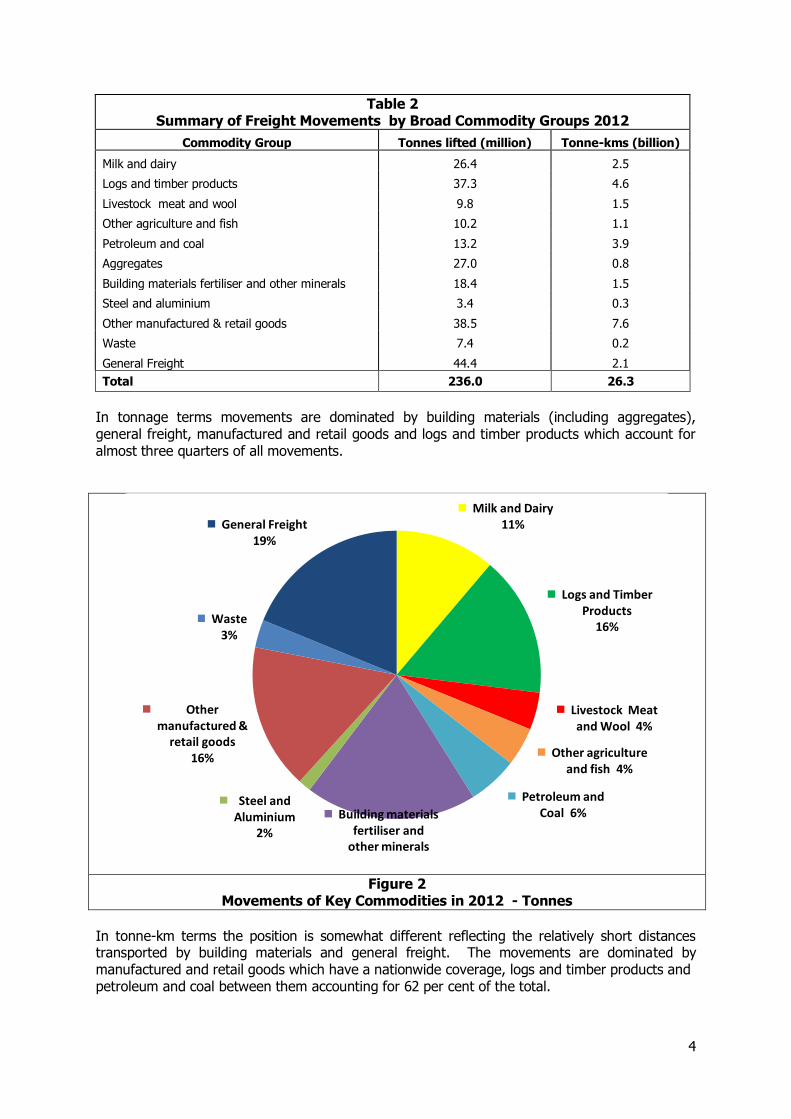
The commodities have been combined into broad groups and the 2012 Freight Flows estimated for each are set out in Table 2, and Figure 2 and 3.
4
Table 2 Summary of Freight Movements by Broad Commodity Groups 2012
Commodity Group Tonnes lifted (million) Tonne-kms (billion)
Milk and dairy 26.4 2.5
Logs and timber products 37.3 4.6
Livestock meat and wool 9.8 1.5
Other agriculture and fish 10.2 1.1
Petroleum and coal 13.2 3.9
Aggregates 27.0 0.8
Building materials fertiliser and other minerals 18.4 1.5
Steel and aluminium 3.4 0.3
Other manufactured & retail goods 38.5 7.6
Waste 7.4 0.2
General Freight 44.4 2.1
Total 236.0 26.3
In tonnage terms movements are dominated by building materials (including aggregates), general freight, manufactured and retail goods and logs and timber products which account for almost three quarters of all movements.
Figure 2 Movements of Key Commodities in 2012 - Tonnes
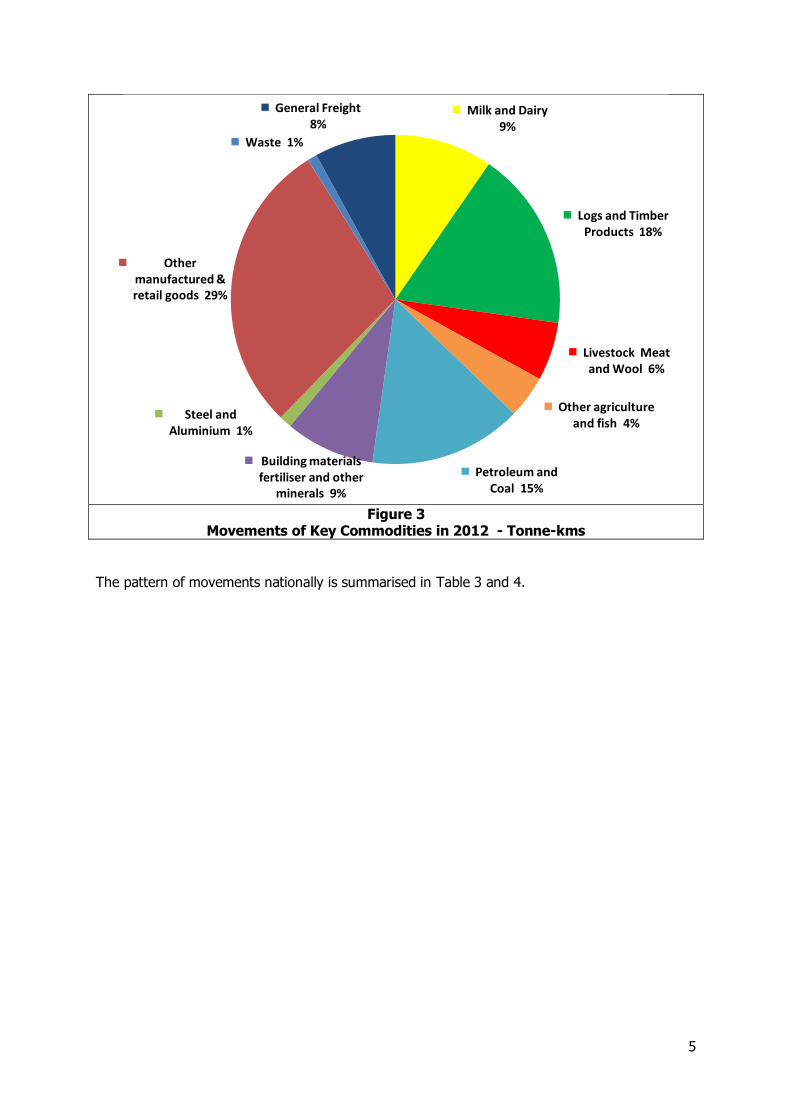
In tonne-km terms the position is somewhat different reflecting the relatively short distances transported by building materials and general freight. The movements are dominated by manufactured and retail goods which have a nationwide coverage, logs and timber products and petroleum and coal between them accounting for 62 per cent of the total.
Milk and Dairy 11%
Logs and Timber Products
16%
Livestock Meat and Wool 4%
Other agriculture and fish 4%
Petroleum and Coal 6% Building materials
fertiliser and other minerals
19%
Steel and Aluminium
2%
Other manufactured &
retail goods 16%
Waste 3%
General Freight 19%
5
Figure 3
Movements of Key Commodities in 2012 - Tonne-kms
The pattern of movements nationally is summarised in Table 3 and 4.
Milk and Dairy 9%
Logs and Timber Products 18%
Livestock Meat and Wool 6%
Other agriculture and fish 4%
Petroleum and Coal 15%
Building materials fertiliser and other
minerals 9%
Steel and Aluminium 1%
Other manufactured & retail goods 29%
Waste 1%
General Freight 8%
6
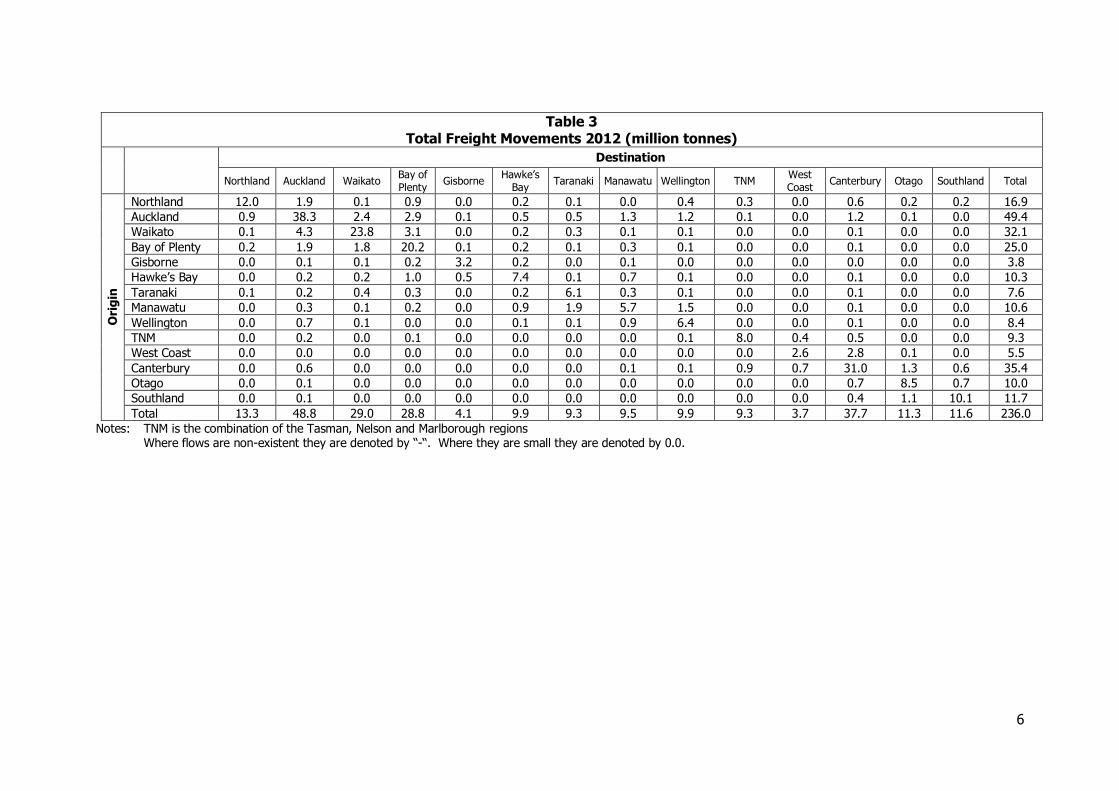
Table 3 Total Freight Movements 2012 (million tonnes)
Destination
Northland Auckland Waikato Bay of Plenty
Gisborne Hawke’s
Bay Taranaki Manawatu Wellington TNM
West Coast
Canterbury Otago Southland Total
Ori
gin
Northland 12.0 1.9 0.1 0.9 0.0 0.2 0.1 0.0 0.4 0.3 0.0 0.6 0.2 0.2 16.9
Auckland 0.9 38.3 2.4 2.9 0.1 0.5 0.5 1.3 1.2 0.1 0.0 1.2 0.1 0.0 49.4
Waikato 0.1 4.3 23.8 3.1 0.0 0.2 0.3 0.1 0.1 0.0 0.0 0.1 0.0 0.0 32.1
Bay of Plenty 0.2 1.9 1.8 20.2 0.1 0.2 0.1 0.3 0.1 0.0 0.0 0.1 0.0 0.0 25.0
Gisborne 0.0 0.1 0.1 0.2 3.2 0.2 0.0 0.1 0.0 0.0 0.0 0.0 0.0 0.0 3.8
Hawke’s Bay 0.0 0.2 0.2 1.0 0.5 7.4 0.1 0.7 0.1 0.0 0.0 0.1 0.0 0.0 10.3
Taranaki 0.1 0.2 0.4 0.3 0.0 0.2 6.1 0.3 0.1 0.0 0.0 0.1 0.0 0.0 7.6
Manawatu 0.0 0.3 0.1 0.2 0.0 0.9 1.9 5.7 1.5 0.0 0.0 0.1 0.0 0.0 10.6
Wellington 0.0 0.7 0.1 0.0 0.0 0.1 0.1 0.9 6.4 0.0 0.0 0.1 0.0 0.0 8.4
TNM 0.0 0.2 0.0 0.1 0.0 0.0 0.0 0.0 0.1 8.0 0.4 0.5 0.0 0.0 9.3
West Coast 0.0 0.0 0.0 0.0 0.0 0.0 0.0 0.0 0.0 0.0 2.6 2.8 0.1 0.0 5.5
Canterbury 0.0 0.6 0.0 0.0 0.0 0.0 0.0 0.1 0.1 0.9 0.7 31.0 1.3 0.6 35.4
Otago 0.0 0.1 0.0 0.0 0.0 0.0 0.0 0.0 0.0 0.0 0.0 0.7 8.5 0.7 10.0
Southland 0.0 0.1 0.0 0.0 0.0 0.0 0.0 0.0 0.0 0.0 0.0 0.4 1.1 10.1 11.7
Total 13.3 48.8 29.0 28.8 4.1 9.9 9.3 9.5 9.9 9.3 3.7 37.7 11.3 11.6 236.0
Notes: TNM is the combination of the Tasman, Nelson and Marlborough regions Where flows are non-existent they are denoted by “-“. Where they are small they are denoted by 0.0.
7
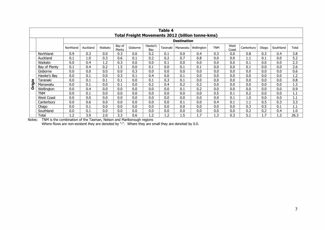
Table 4 Total Freight Movements 2012 (billion tonne-kms)
Destination
Northland Auckland Waikato Bay of
Plenty Gisborne
Hawke’s
Bay Taranaki Manawatu Wellington TNM
West
Coast Canterbury Otago Southland Total
Ori
gin
Northland 0.9 0.3 0.0 0.3 0.0 0.2 0.1 0.0 0.4 0.3 0.0 0.8 0.3 0.4 3.8
Auckland 0.1 1.0 0.3 0.6 0.1 0.2 0.2 0.7 0.8 0.0 0.0 1.1 0.1 0.0 5.2
Waikato 0.0 0.4 1.2 0.3 0.0 0.0 0.1 0.0 0.0 0.0 0.0 0.1 0.0 0.0 2.3
Bay of Plenty 0.1 0.4 0.2 1.5 0.0 0.1 0.0 0.1 0.1 0.0 0.0 0.1 0.0 0.0 2.6
Gisborne 0.0 0.0 0.0 0.0 0.3 0.0 0.0 0.0 0.0 0.0 0.0 0.0 0.0 0.0 0.6
Hawke’s Bay 0.0 0.1 0.0 0.3 0.1 0.4 0.0 0.1 0.0 0.0 0.0 0.0 0.0 0.0 1.2
Taranaki 0.0 0.1 0.1 0.1 0.0 0.1 0.3 0.1 0.0 0.0 0.0 0.0 0.0 0.0 0.8
Manawatu 0.0 0.1 0.0 0.1 0.0 0.2 0.4 0.2 0.2 0.0 0.0 0.0 0.0 0.0 1.3
Wellington 0.0 0.4 0.0 0.0 0.0 0.0 0.0 0.1 0.2 0.0 0.0 0.0 0.0 0.0 0.9
TNM 0.0 0.1 0.0 0.0 0.0 0.0 0.0 0.0 0.0 0.5 0.1 0.2 0.0 0.0 1.1
West Coast 0.0 0.0 0.0 0.0 0.0 0.0 0.0 0.0 0.0 0.0 0.1 1.0 0.0 0.0 1.1
Canterbury 0.0 0.6 0.0 0.0 0.0 0.0 0.0 0.1 0.0 0.4 0.1 1.1 0.5 0.3 3.3
Otago 0.0 0.1 0.0 0.0 0.0 0.0 0.0 0.0 0.0 0.0 0.0 0.3 0.5 0.1 1.1
Southland 0.0 0.1 0.0 0.0 0.0 0.0 0.0 0.0 0.0 0.0 0.0 0.2 0.2 0.4 1.0
Total 1.2 3.9 2.0 3.3 0.6 1.2 1.2 1.5 1.7 1.3 0.3 5.1 1.7 1.3 26.3
Notes: TNM is the combination of the Tasman, Nelson and Marlborough regions Where flows are non-existent they are denoted by “-“. Where they are small they are denoted by 0.0.
8
Freight flows in tonnage terms are dominated by shorter distance movements within regions. There are also substantial flows in both directions between Auckland and Waikato and Bay of Plenty, reflecting the roles of the ports of Auckland and Tauranga in serving wider markets and the role of Auckland as a major market and distribution hub. This latter role of Auckland as a national distribution hub is also reflected in the flows to Manawatu and Wellington, and to Canterbury. In the South Island there are substantial flows into Canterbury from West Coast, reflecting the movement of coal, and smaller movements from other South Island regions reflecting the more general role of Canterbury as a port and market. The relatively large flows outbound from Canterbury demonstrate its role as the main distribution hub for the South Island.
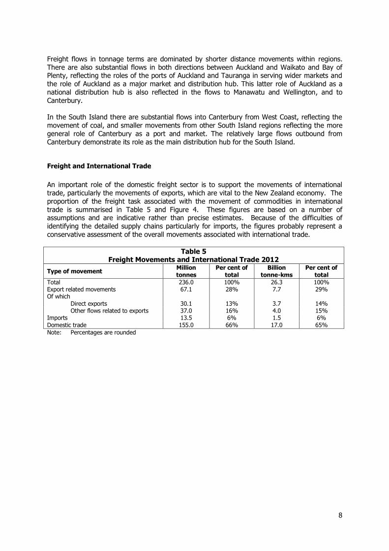
Freight and International Trade
An important role of the domestic freight sector is to support the movements of international trade, particularly the movements of exports, which are vital to the New Zealand economy. The proportion of the freight task associated with the movement of commodities in international trade is summarised in Table 5 and Figure 4. These figures are based on a number of assumptions and are indicative rather than precise estimates. Because of the difficulties of identifying the detailed supply chains particularly for imports, the figures probably represent a conservative assessment of the overall movements associated with international trade.
Table 5 Freight Movements and International Trade 2012
Type of movement Million tonnes
Per cent of total
Billion tonne-kms
Per cent of total
Total 236.0 100% 26.3 100% Export related movements 67.1 28% 7.7 29% Of which
Direct exports 30.1 13% 3.7 14% Other flows related to exports 37.0 16% 4.0 15%
Imports 13.5 6% 1.5 6% Domestic trade 155.0 66% 17.0 65%
Note: Percentages are rounded
9
Figure 4 Freight Movements and International Trade 2012 (million tonnes)
Of the total freight volumes identified in 2012, it is estimated that about 30 per cent of both tonnes and tonne-kms are associated with export products at some point along the supply chain. Over time this share is forecast to decline slightly with the constrained growth in a number of the key agricultural sectors which contribute to the major export movements. Imports are expected remain broadly constant. Overall movements associated with international trade are estimated to represent over a third of total domestic freight movements and as indicated above the share may be greater.
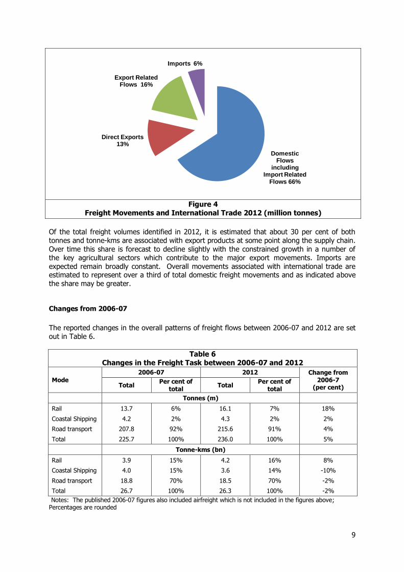
Changes from 2006-07
The reported changes in the overall patterns of freight flows between 2006-07 and 2012 are set out in Table 6.
Table 6 Changes in the Freight Task between 2006-07 and 2012
Mode
2006-07 2012 Change from 2006-7
(per cent) Total Per cent of
total Total
Per cent of total
Tonnes (m)
Rail 13.7 6% 16.1 7% 18%
Coastal Shipping 4.2 2% 4.3 2% 2%
Road transport 207.8 92% 215.6 91% 4%
Total 225.7 100% 236.0 100% 5%
Tonne-kms (bn)
Rail 3.9 15% 4.2 16% 8%
Coastal Shipping 4.0 15% 3.6 14% -10%
Road transport 18.8 70% 18.5 70% -2%
Total 26.7 100% 26.3 100% -2%
Notes: The published 2006-07 figures also included airfreight which is not included in the figures above; Percentages are rounded
Domestic Flows
including Import Related
Flows 66%
Direct Exports 13%
Export Related Flows 16%
Imports 6%
10
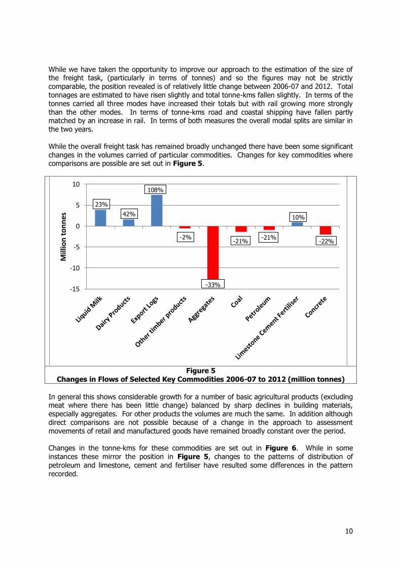
While we have taken the opportunity to improve our approach to the estimation of the size of the freight task, (particularly in terms of tonnes) and so the figures may not be strictly comparable, the position revealed is of relatively little change between 2006-07 and 2012. Total tonnages are estimated to have risen slightly and total tonne-kms fallen slightly. In terms of the tonnes carried all three modes have increased their totals but with rail growing more strongly than the other modes. In terms of tonne-kms road and coastal shipping have fallen partly matched by an increase in rail. In terms of both measures the overall modal splits are similar in the two years. While the overall freight task has remained broadly unchanged there have been some significant changes in the volumes carried of particular commodities. Changes for key commodities where comparisons are possible are set out in Figure 5.
Figure 5
Changes in Flows of Selected Key Commodities 2006-07 to 2012 (million tonnes)
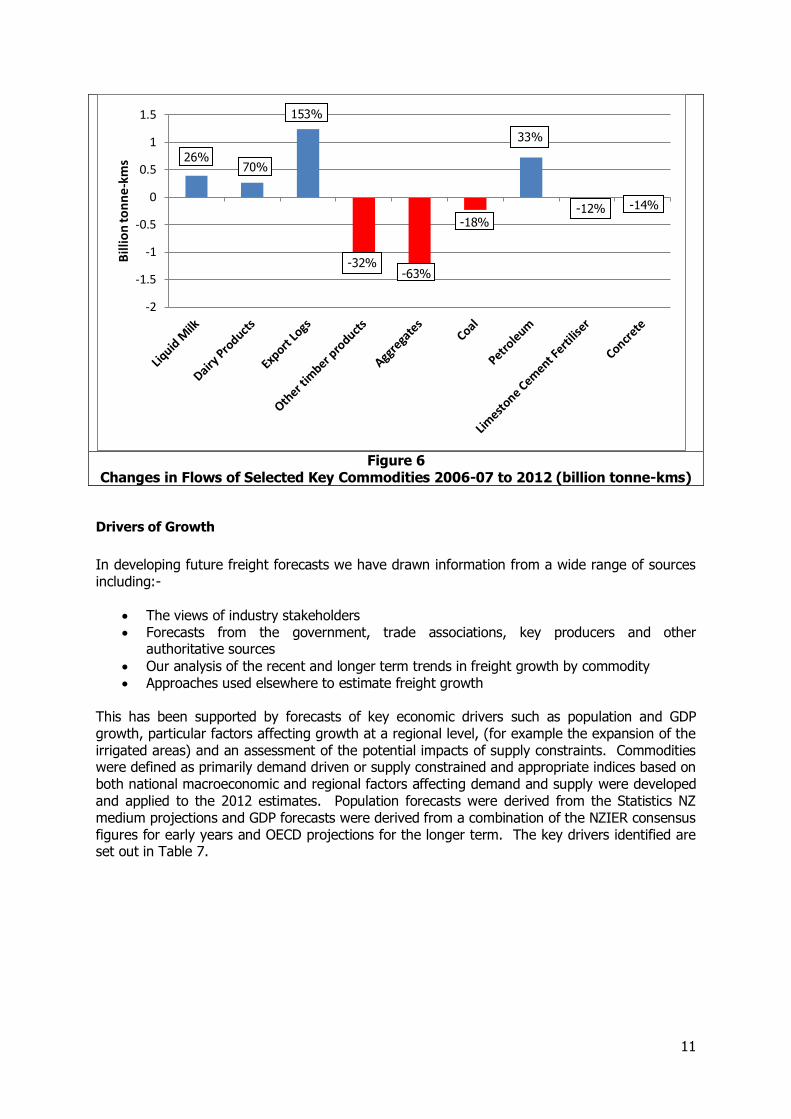
In general this shows considerable growth for a number of basic agricultural products (excluding meat where there has been little change) balanced by sharp declines in building materials, especially aggregates. For other products the volumes are much the same. In addition although direct comparisons are not possible because of a change in the approach to assessment movements of retail and manufactured goods have remained broadly constant over the period. Changes in the tonne-kms for these commodities are set out in Figure 6. While in some instances these mirror the position in Figure 5, changes to the patterns of distribution of petroleum and limestone, cement and fertiliser have resulted some differences in the pattern recorded.
-15
-10
-5
0
5
10
Mill
ion
to
nn
es
-22% -21%
-33%
-2%
108%
42%
23%
-21%
10%
11
Figure 6
Changes in Flows of Selected Key Commodities 2006-07 to 2012 (billion tonne-kms)
Drivers of Growth
In developing future freight forecasts we have drawn information from a wide range of sources including:-
The views of industry stakeholders Forecasts from the government, trade associations, key producers and other
authoritative sources
Our analysis of the recent and longer term trends in freight growth by commodity Approaches used elsewhere to estimate freight growth
This has been supported by forecasts of key economic drivers such as population and GDP growth, particular factors affecting growth at a regional level, (for example the expansion of the irrigated areas) and an assessment of the potential impacts of supply constraints. Commodities were defined as primarily demand driven or supply constrained and appropriate indices based on both national macroeconomic and regional factors affecting demand and supply were developed and applied to the 2012 estimates. Population forecasts were derived from the Statistics NZ medium projections and GDP forecasts were derived from a combination of the NZIER consensus figures for early years and OECD projections for the longer term. The key drivers identified are set out in Table 7.
-2
-1.5
-1
-0.5
0
0.5
1
1.5B
illio
n to
nn
e-k
ms
-14%
-18%
-63% -32%
153%
70% 26%
33%
-12%
12
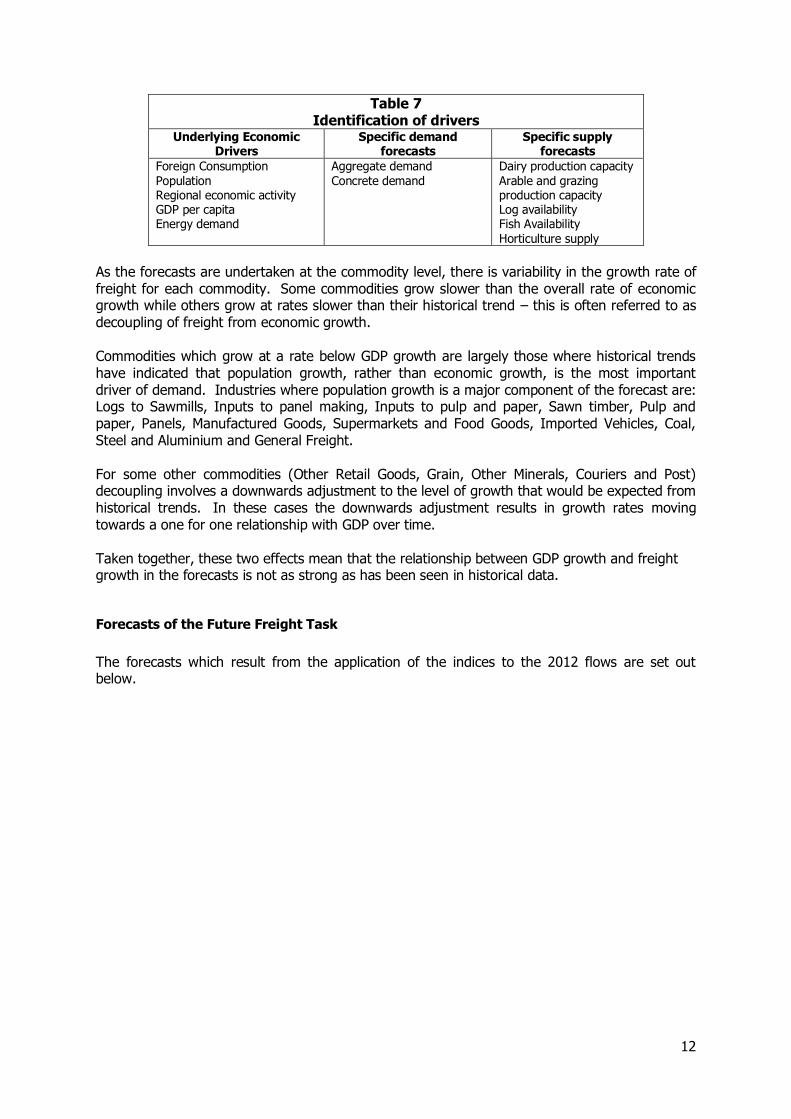
Table 7 Identification of drivers
Underlying Economic Drivers
Specific demand forecasts
Specific supply forecasts
Foreign Consumption Population Regional economic activity GDP per capita Energy demand
Aggregate demand Concrete demand
Dairy production capacity Arable and grazing production capacity Log availability Fish Availability Horticulture supply
As the forecasts are undertaken at the commodity level, there is variability in the growth rate of freight for each commodity. Some commodities grow slower than the overall rate of economic growth while others grow at rates slower than their historical trend – this is often referred to as decoupling of freight from economic growth. Commodities which grow at a rate below GDP growth are largely those where historical trends have indicated that population growth, rather than economic growth, is the most important driver of demand. Industries where population growth is a major component of the forecast are: Logs to Sawmills, Inputs to panel making, Inputs to pulp and paper, Sawn timber, Pulp and paper, Panels, Manufactured Goods, Supermarkets and Food Goods, Imported Vehicles, Coal, Steel and Aluminium and General Freight. For some other commodities (Other Retail Goods, Grain, Other Minerals, Couriers and Post) decoupling involves a downwards adjustment to the level of growth that would be expected from historical trends. In these cases the downwards adjustment results in growth rates moving towards a one for one relationship with GDP over time. Taken together, these two effects mean that the relationship between GDP growth and freight growth in the forecasts is not as strong as has been seen in historical data.
Forecasts of the Future Freight Task
The forecasts which result from the application of the indices to the 2012 flows are set out below.
13
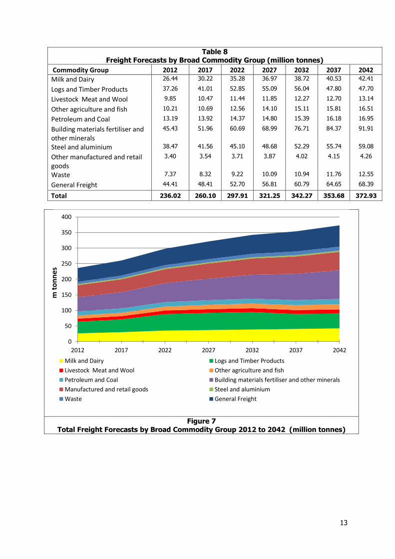
Table 8 Freight Forecasts by Broad Commodity Group (million tonnes)
Commodity Group 2012 2017 2022 2027 2032 2037 2042
Milk and Dairy 26.44 30.22 35.28 36.97 38.72 40.53 42.41
Logs and Timber Products 37.26 41.01 52.85 55.09 56.04 47.80 47.70
Livestock Meat and Wool 9.85 10.47 11.44 11.85 12.27 12.70 13.14
Other agriculture and fish 10.21 10.69 12.56 14.10 15.11 15.81 16.51
Petroleum and Coal 13.19 13.92 14.37 14.80 15.39 16.18 16.95
Building materials fertiliser and other minerals
45.43 51.96 60.69 68.99 76.71 84.37 91.91
Steel and aluminium 38.47 41.56 45.10 48.68 52.29 55.74 59.08
Other manufactured and retail goods
3.40 3.54 3.71 3.87 4.02 4.15 4.26
Waste 7.37 8.32 9.22 10.09 10.94 11.76 12.55
General Freight 44.41 48.41 52.70 56.81 60.79 64.65 68.39
Total 236.02 260.10 297.91 321.25 342.27 353.68 372.93
Figure 7 Total Freight Forecasts by Broad Commodity Group 2012 to 2042 (million tonnes)
0
50
100
150
200
250
300
350
400
2012 2017 2022 2027 2032 2037 2042
m t
on
nes
Milk and Dairy Logs and Timber Products
Livestock Meat and Wool Other agriculture and fish
Petroleum and Coal Building materials fertiliser and other minerals
Manufactured and retail goods Steel and aluminium
Waste General Freight
14
Overall we forecast that the freight task in terms of tonnage will increase by around 58 per cent over the next 30 years. The rate of growth by commodity differs widely with logs and timber products expected to increase and then decline as the logs harvest reaches its maximum and then starts to fall. Livestock meat and wool also shows limited growth relative to the overall forecast position. We do however forecast very substantial growth in building materials and also in dairy products, the latter reflecting productivity growth offsetting the effects of increasing constraints on the land available. Manufactured and retail goods are expected to grow by the average rate, with a balance between limited growth in manufacturing and food retailing offset by strong growth in other retail flows. Of significance is the forecast growth in tonne-km as set out in Table 9 and Figure 8.
15
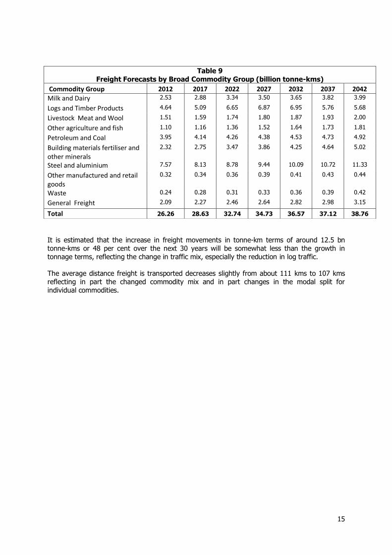
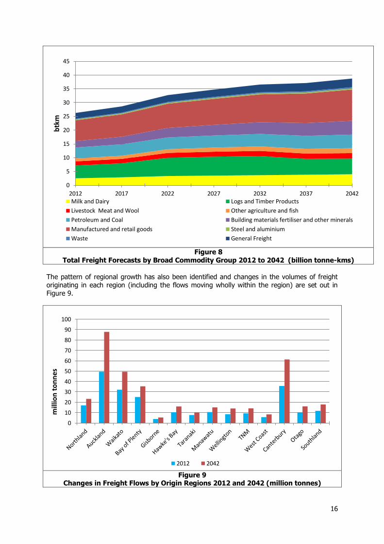
It is estimated that the increase in freight movements in tonne-km terms of around 12.5 bn tonne-kms or 48 per cent over the next 30 years will be somewhat less than the growth in tonnage terms, reflecting the change in traffic mix, especially the reduction in log traffic. The average distance freight is transported decreases slightly from about 111 kms to 107 kms reflecting in part the changed commodity mix and in part changes in the modal split for individual commodities.
Table 9 Freight Forecasts by Broad Commodity Group (billion tonne-kms)
Commodity Group 2012 2017 2022 2027 2032 2037 2042
Milk and Dairy 2.53 2.88 3.34 3.50 3.65 3.82 3.99
Logs and Timber Products 4.64 5.09 6.65 6.87 6.95 5.76 5.68
Livestock Meat and Wool 1.51 1.59 1.74 1.80 1.87 1.93 2.00
Other agriculture and fish 1.10 1.16 1.36 1.52 1.64 1.73 1.81
Petroleum and Coal 3.95 4.14 4.26 4.38 4.53 4.73 4.92
Building materials fertiliser and other minerals
2.32 2.75 3.47 3.86 4.25 4.64 5.02
Steel and aluminium 7.57 8.13 8.78 9.44 10.09 10.72 11.33
Other manufactured and retail goods
0.32 0.34 0.36 0.39 0.41 0.43 0.44
Waste 0.24 0.28 0.31 0.33 0.36 0.39 0.42
General Freight 2.09 2.27 2.46 2.64 2.82 2.98 3.15
Total 26.26 28.63 32.74 34.73 36.57 37.12 38.76
16
Figure 8
Total Freight Forecasts by Broad Commodity Group 2012 to 2042 (billion tonne-kms)
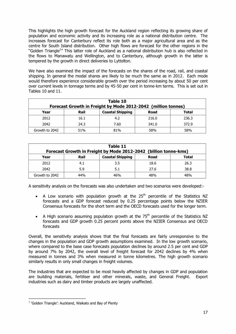
The pattern of regional growth has also been identified and changes in the volumes of freight originating in each region (including the flows moving wholly within the region) are set out in Figure 9.
Figure 9
Changes in Freight Flows by Origin Regions 2012 and 2042 (million tonnes)
0
5
10
15
20
25
30
35
40
45
2012 2017 2022 2027 2032 2037 2042
btk
m
Milk and Dairy Logs and Timber Products
Livestock Meat and Wool Other agriculture and fish
Petroleum and Coal Building materials fertiliser and other minerals
Manufactured and retail goods Steel and aluminium
Waste General Freight
0
10
20
30
40
50
60
70
80
90
100
mill
ion
to
nn
es
2012 2042
17
This highlights the high growth forecast for the Auckland region reflecting its growing share of population and economic activity and its increasing role as a national distribution centre. The increases forecast for Canterbury reflect its role both as a major agricultural area and as the centre for South Island distribution. Other high flows are forecast for the other regions in the “Golden Triangle1” This latter role of Auckland as a national distribution hub is also reflected in the flows to Manawatu and Wellington, and to Canterbury, although growth in the latter is tempered by the growth in direct deliveries to Lyttelton. We have also examined the impact of the forecasts on the shares of the road, rail, and coastal shipping. In general the modal shares are likely to be much the same as in 2012. Each mode would therefore experience considerable growth over the period increasing by about 50 per cent over current levels in tonnage terms and by 45-50 per cent in tonne-km terms. This is set out in Tables 10 and 11.
Table 10 Forecast Growth in Freight by Mode 2012-2042 (million tonnes)
Year Rail Coastal Shipping Road Total
2012 16.1 4.2 216.0 236.3
2042 24.3 7.60 341.0 372.9
Growth to 2042 51% 81% 58% 58%
Table 11 Forecast Growth in Freight by Mode 2012-2042 (billion tonne-kms)
Year Rail Coastal Shipping Road Total
2012 4.1 3.5 18.6 26.3
2042 5.9 5.1 27.6 38.8
Growth to 2042 44% 46% 48% 48%
A sensitivity analysis on the forecasts was also undertaken and two scenarios were developed:-
A Low scenario with population growth at the 25th percentile of the Statistics NZ forecasts and a GDP forecast reduced by 0.25 percentage points below the NZIER Consensus forecasts for the short term and the OECD forecasts used for the longer term.
A High scenario assuming population growth at the 75th percentile of the Statistics NZ forecasts and GDP growth 0.25 percent points above the NZIER Consensus and OECD forecasts
Overall, the sensitivity analysis shows that the final forecasts are fairly unresponsive to the changes in the population and GDP growth assumptions examined. In the low growth scenario, where compared to the base case forecasts population declines by around 2.5 per cent and GDP by around 7% by 2042, the overall level of freight forecast for 2042 declines by 4% when measured in tonnes and 3% when measured in tonne kilometres. The high growth scenario similarly results in only small changes in freight volumes. The industries that are expected to be most heavily affected by changes in GDP and population are building materials, fertiliser and other minerals, waste, and General Freight. Export industries such as dairy and timber products are largely unaffected.
1 ‘Golden Triangle’: Auckland, Waikato and Bay of Plenty

18
The regions with the largest changes are Wellington and Auckland. These regions are those with large populations and more limited primary production and so are most heavily affected by changes in domestic economic activity.
19
1 Introduction
1.1 Setting the Scene
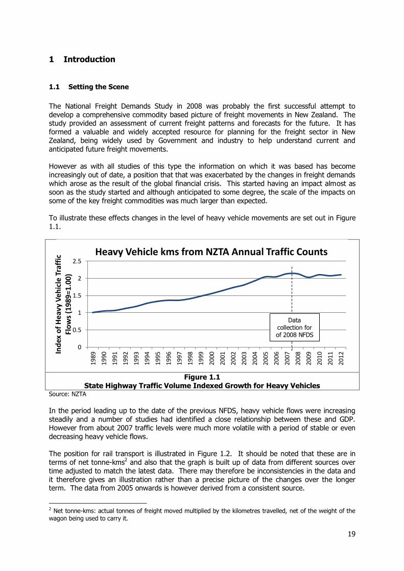
The National Freight Demands Study in 2008 was probably the first successful attempt to develop a comprehensive commodity based picture of freight movements in New Zealand. The study provided an assessment of current freight patterns and forecasts for the future. It has formed a valuable and widely accepted resource for planning for the freight sector in New Zealand, being widely used by Government and industry to help understand current and anticipated future freight movements. However as with all studies of this type the information on which it was based has become increasingly out of date, a position that that was exacerbated by the changes in freight demands which arose as the result of the global financial crisis. This started having an impact almost as soon as the study started and although anticipated to some degree, the scale of the impacts on some of the key freight commodities was much larger than expected. To illustrate these effects changes in the level of heavy vehicle movements are set out in Figure 1.1.
Figure 1.1
State Highway Traffic Volume Indexed Growth for Heavy Vehicles Source: NZTA
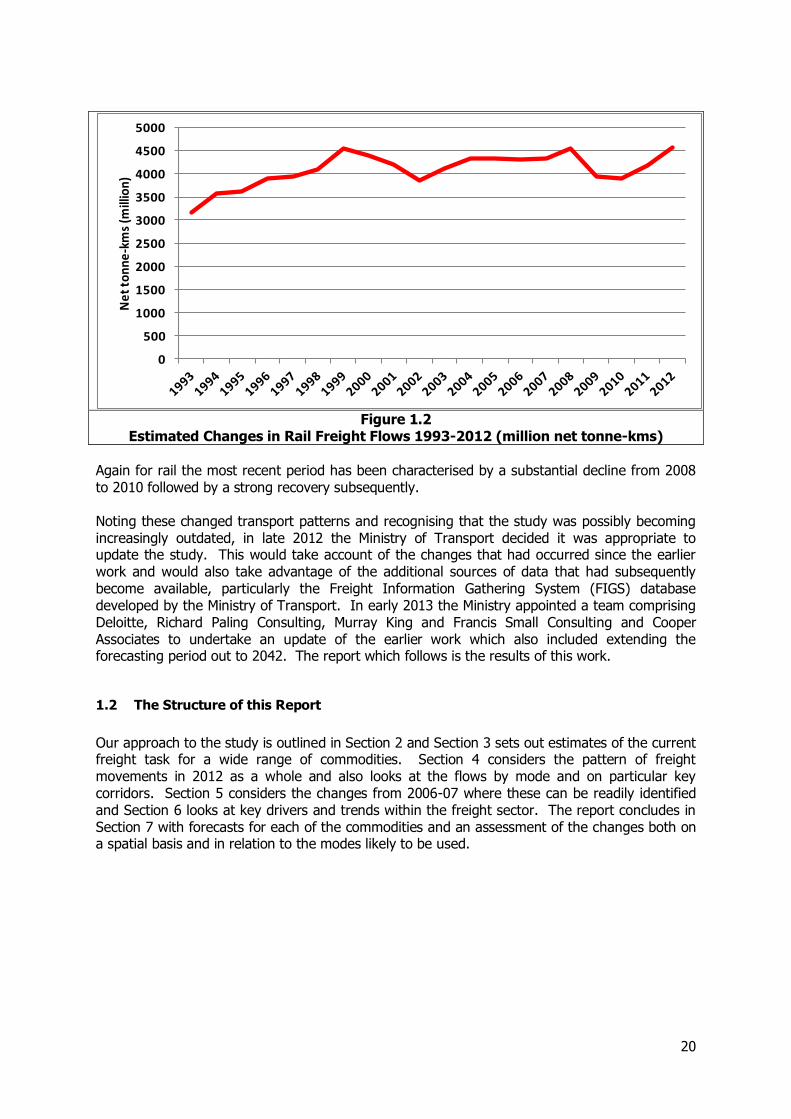
In the period leading up to the date of the previous NFDS, heavy vehicle flows were increasing steadily and a number of studies had identified a close relationship between these and GDP. However from about 2007 traffic levels were much more volatile with a period of stable or even decreasing heavy vehicle flows. The position for rail transport is illustrated in Figure 1.2. It should be noted that these are in terms of net tonne-kms2 and also that the graph is built up of data from different sources over time adjusted to match the latest data. There may therefore be inconsistencies in the data and it therefore gives an illustration rather than a precise picture of the changes over the longer term. The data from 2005 onwards is however derived from a consistent source.
2 Net tonne-kms: actual tonnes of freight moved multiplied by the kilometres travelled, net of the weight of the wagon being used to carry it.
0
0.5
1
1.5
2
2.5
1989
1990
1991
1992
1993
1994
1995
1996
1997
1998
1999
2000
2001
2002
2003
2004
2005
2006
2007
2008
2009
2010
2011
2012
Ind
ex o
f H
eavy
Veh
icle
Tra
ffic
Fl
ow
s (1
989=
1.00
)
Heavy Vehicle kms from NZTA Annual Traffic Counts
Data collection for of 2008 NFDS
20
Figure 1.2
Estimated Changes in Rail Freight Flows 1993-2012 (million net tonne-kms)
Again for rail the most recent period has been characterised by a substantial decline from 2008 to 2010 followed by a strong recovery subsequently. Noting these changed transport patterns and recognising that the study was possibly becoming increasingly outdated, in late 2012 the Ministry of Transport decided it was appropriate to update the study. This would take account of the changes that had occurred since the earlier work and would also take advantage of the additional sources of data that had subsequently become available, particularly the Freight Information Gathering System (FIGS) database developed by the Ministry of Transport. In early 2013 the Ministry appointed a team comprising Deloitte, Richard Paling Consulting, Murray King and Francis Small Consulting and Cooper Associates to undertake an update of the earlier work which also included extending the forecasting period out to 2042. The report which follows is the results of this work.
1.2 The Structure of this Report
Our approach to the study is outlined in Section 2 and Section 3 sets out estimates of the current freight task for a wide range of commodities. Section 4 considers the pattern of freight movements in 2012 as a whole and also looks at the flows by mode and on particular key corridors. Section 5 considers the changes from 2006-07 where these can be readily identified and Section 6 looks at key drivers and trends within the freight sector. The report concludes in Section 7 with forecasts for each of the commodities and an assessment of the changes both on a spatial basis and in relation to the modes likely to be used.
0
500
1000
1500
2000
2500
3000
3500
4000
4500
5000N
et
ton
ne
-km
s (m
illio
n)

21
1.3 Acknowledgements
In undertaking this study we would like to acknowledge the assistance we have received from almost all those we have approached with interests in the freight sector in New Zealand. Developing reliable statistical information on which to base the planning of the sector is widely recognised as a major issue and there was widespread support for work which aimed to provide this. We would particularly like to thank those organisations who were able to respond to our questionnaire and supplementary questions in detail including road, rail and coastal shipping operators, producers, manufacturers and retailers, courier companies and those responsible for the provision of infrastructure, including particularly roads, railways and ports. We acknowledge the effort and resources that this must have involved.
1.4 Glossary
A glossary of terms used is in Appendix B.
22
2 Approach to the Study
2.1 Introduction
The purpose of the study is to provide a detailed assessment of domestic freight flows by all modes in 2012 and using these to produce forecasts of freight demands for the period up to 2042. To a large extent this follows the approach adopted for the earlier NFDS, although the opportunity has been taken to recognise additional sources of data that have become available since 2008, particularly the FIGS database developed by the Ministry of Transport and the National Animal Identification & Tracking (NAIT) database providing information on the movement of livestock. In the course of this update we have investigated and provided estimates for a wider range of commodities, extending the list of 17 developed for the 2008 NFDS to 29. We have also taken into account additional steps in the distribution chain in particular the movements of goods to and from distribution centres (DCs) rather than assuming direct delivery of outputs to the final customer. These changes enabled us to cover a greater part of the overall freight task, with the identified commodity flows now accounting for 92 per cent of total tonne-kms, compared to about 67 per cent in the earlier study. This availability of additional data and further consideration of the supply chains means that in some areas direct comparisons between the results of the 2008 NFDS and the 2013 version is not possible. However where such a comparison is realistic or alternative sources of data are available, we have discussed the changes that have taken place in Section 5. In addition to using published and unpublished data we have consulted with a wide range of stakeholders with interests in the freight sector including the owners of the goods, the transporters of the goods and those responsible for providing infrastructure. This has not only provided additional information but has also allowed us to better understand the statistical data available. In defining the domestic freight task we have included the movements of exports between their origin and the first port where they are loaded onto a vessel but have not taken into account any subsequent transhipment at another port. A similar position has been taken for imports where only the move from the final port of disembarkation and the inland destination has been considered. We have however included in our analysis the movement of purely domestic cargoes by coastal shipping either by domestic or international vessels.
2.2 Information from Published Sources
Published and unpublished data, particularly on the total outputs for individual commodities was derived from a number of sources. This included direct information, either from the appropriate agencies directly or from other sources particularly on the Internet. The type of data which was available varied widely from detailed quantitative information to more qualitative data about the general patterns of operation of key industries. Examples of sources of data of this type include:- Statistics NZ for a wide range of data Ministry of Transport especially for FIGS data
23
Ministry for Primary Industries Ministry of Business, Innovation, and Employment New Zealand Forest Owners Association (NZFOA) Meat and Wool Economic Service Livestock Information Council (LIC) (for dairy statistics) New Zealand Horticulture NZTA for traffic flow and vehicle ownership Port companies for details of their movements KiwiRail In other instances, specific companies who control a large part of the market often provide detailed information about their activities. An example of this is material on the movement of coal produced by Solid Energy. The information on the Solid Energy website identifies the source of production, the volume produced at that location, the main market and the main method or methods of transportation. What this information does not include is the pattern of distribution of the more minor flows which in some instances may amount to a substantial total and the published data was therefore supplemented by the results of the interview programme. Further information was gained from company reports and other material on company websites.
2.3 Assessment of Present Day Flows
Our approach to the estimation of current day flows aimed to collect both general and detailed statistical material about their operations from a wide selection of the key players within the freight sector. This was combined with the statistical material to try to bring together as comprehensive a picture as possible of freight movements within New Zealand. The steps involved were typically:-
The total size of the market was identified using published and unpublished statistical material. This could relate to both the volumes available for distribution and the locations where the goods are consumed or exported
Where possible the results of the interview surveys were used to identify the linkages between the areas where goods are produced or imported and those where they are consumed or exported. Where this information was not fully available we built up estimates using a combination of the limited statistical information and our knowledge of the operations of the sector
The estimates of movement on a commodity by commodity basis were combined and then compared with information on total estimated freight flows built up from information on rail and coastal shipping movements and the estimated volume of road traffic derived from Road User Charge (RUC) data3. From this we were able to identify the extent to which the information we had collected for the specific commodities fell short of the overall totals for all commodities and movements combined, and an adjustment factor linking the estimates for the selected commodities with the forecasts for the sector as a whole was determined. The additional undefined traffic is denoted as “General Freight” in the rest of this report.
3 Transport Monitoring Indicator Framework 2008 Version 1, Ministry of Transport
24
After applying this adjustment factor to the total pattern of flows, rail and coastal shipping movements were subtracted to get an estimate of the pattern of movement by road transport. Information from this was then compared with road traffic counts in order to assess the reliability of the adjusted matrix. Given the approach taken and the differences which could occur, the results were considered to be reasonably robust.
While the approach broadly followed that of the earlier NFDS we have taken the opportunity to bring together a wider range of data and investigate a wider range of commodities than was undertaken in 2008. This coupled with our greater understanding of the sector means that this work is more than a simple update of the 2008 study but extends this to provide a more robust basis for forecasting future conditions.
2.4 Evolution of the Freight Sector and Changes in the Level of Demand
The surveys also sought to identify the way in which the freight sector is likely to evolve over the future in relation to changing patterns of demand, changes in the way in which freight might be handled and any constraints and issues which might impinge on this process. In developing future forecasts, these views of the respondents were combined with an appreciation of the data on recent trends and likely developments to produce estimates of future output and transport requirements for each of the major commodity groups identified. Where possible these were reviewed against alternative commodity forecasts produced by the appropriate government agencies, trade associations and producers. Forecasts for each of the commodities identified were produced for the 5 year periods up to 2042. These took into account both the impacts of general economic trends, which included the expected growth in population, employment and world trade and also factors specific to the commodities incorporating the effects of supply constraints and particular developments at a regional level. In addition recognition was made of the increasing trend for freight growth to be “de-coupled” from economic growth reflecting the increasing share of economic activity being taken up by the services sector with relatively low freight requirements. Overall longer-term forecasts were produced for movements by rail and coastal shipping. These combined forecasts of the total growth of the sectors identified with an assessment of the way in which the rail or coastal shipping share might change over time, either in response to specific developments or to general changes in the modal position.
25
3 2012 Commodity Movements in Detail
3.1 Introduction
As discussed in the previous section, in order to assess the current patterns of freight movements in New Zealand we have examined the demands for a number of separate identified commodities. These are listed in Table 3.1. It should be noted that this list includes a number of commodities not examined separately in the earlier NFDS, and the extended list allows a better understanding of the freight sector as whole.
Table 3.1 Commodities examined in detail
Liquid Milk Fish
Manufactured Dairy Products Meat and Meat By-products
Export logs Livestock
Logs to Sawmills Horticulture
Inputs to panel making Grain
Inputs to pulp and paper Other Agriculture
Sawn timber Coal
Pulp and paper Petroleum
Panels Limestone, Cement, Fertiliser
Manufactured Goods Concrete
Supermarkets and Food Goods Aggregate
Other Retail Goods Steel and Aluminium
Imported Vehicles Other Minerals
Waste Couriers and Post
Wool
For each of these we have used a series of published and unpublished sets of data, supplemented by the results of the interview programme and our own knowledge of the sector to develop estimates of the patterns of flows both in terms of the tonnes lifted and the tonne-kms generated.
3.2 Milk and Dairy Products-Liquid Milk
3.2.1 Introduction and Scale of the Sector The dairy industry is a very important part of the NZ economy and liquid milk and manufactured dairy products represent a significant part of the national freight task. The movements of liquid milk in 2012 were estimated to amount to about 21 million tonnes (or 9 per cent of the total) and 1.9 billion tonne-kms The main movements are the transport of liquid milk from farms to dairy processing plants although there are also significant movements between dairy concentration and processing plants. In addition there are also movements of liquid milk between plants mainly to make the best use of the facilities in operation especially at the beginning and end of the main milk season when there is insufficient supply to allow all plants to be used economically. The industry is dominated by Fonterra who in 2012 processed almost 90 per cent of the total milk production. There are a number of smaller operations within New Zealand either operating in specific locations, such as Westland Milk or producing more specialised products.

26
3.2.2 Information Sources Information on the dairy sector and the movements generated has been obtained from interviews with and data supplied by:-
Fonterra Westland Milk Open Country Mirika Tatua
This has been supplemented by information from publicly available sources including the New Zealand Dairy Statistics published by the Livestock Improvement Corporation (LIC) and material from transport companies and a range of company Annual Reports.
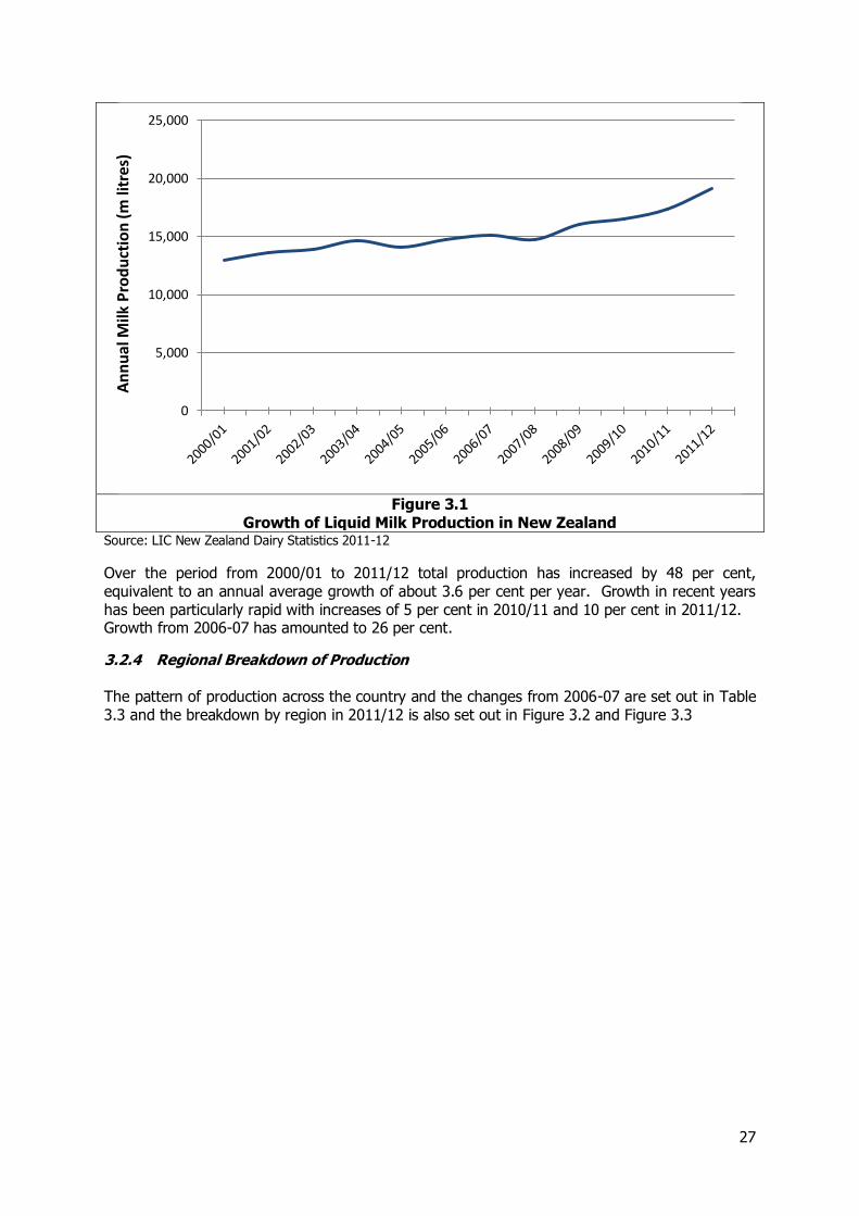
3.2.3 Liquid Milk Production In 2011-12 total milk production in New Zealand was 19.1 billion litres equivalent to about 19.7 million tonnes. This has been growing steadily over recent years as illustrated in Table 3.2 and Figure 3.1.
Table 3.2 Growth of Liquid Milk Production in New Zealand
Year Million litres
2000/01 12,925
2001/02 13,607
2002/03 13,906
2003/04 14,599
2004/05 14,103
2005/06 14,702
2006/07 15,134
2007/08 14,745
2008/09 16,044
2009/10 16,483
2010/11 17,339
2011/12 19,129
Source: LIC New Zealand Dairy Statistics 2011-12
27
Figure 3.1
Growth of Liquid Milk Production in New Zealand Source: LIC New Zealand Dairy Statistics 2011-12
Over the period from 2000/01 to 2011/12 total production has increased by 48 per cent, equivalent to an annual average growth of about 3.6 per cent per year. Growth in recent years has been particularly rapid with increases of 5 per cent in 2010/11 and 10 per cent in 2011/12. Growth from 2006-07 has amounted to 26 per cent.
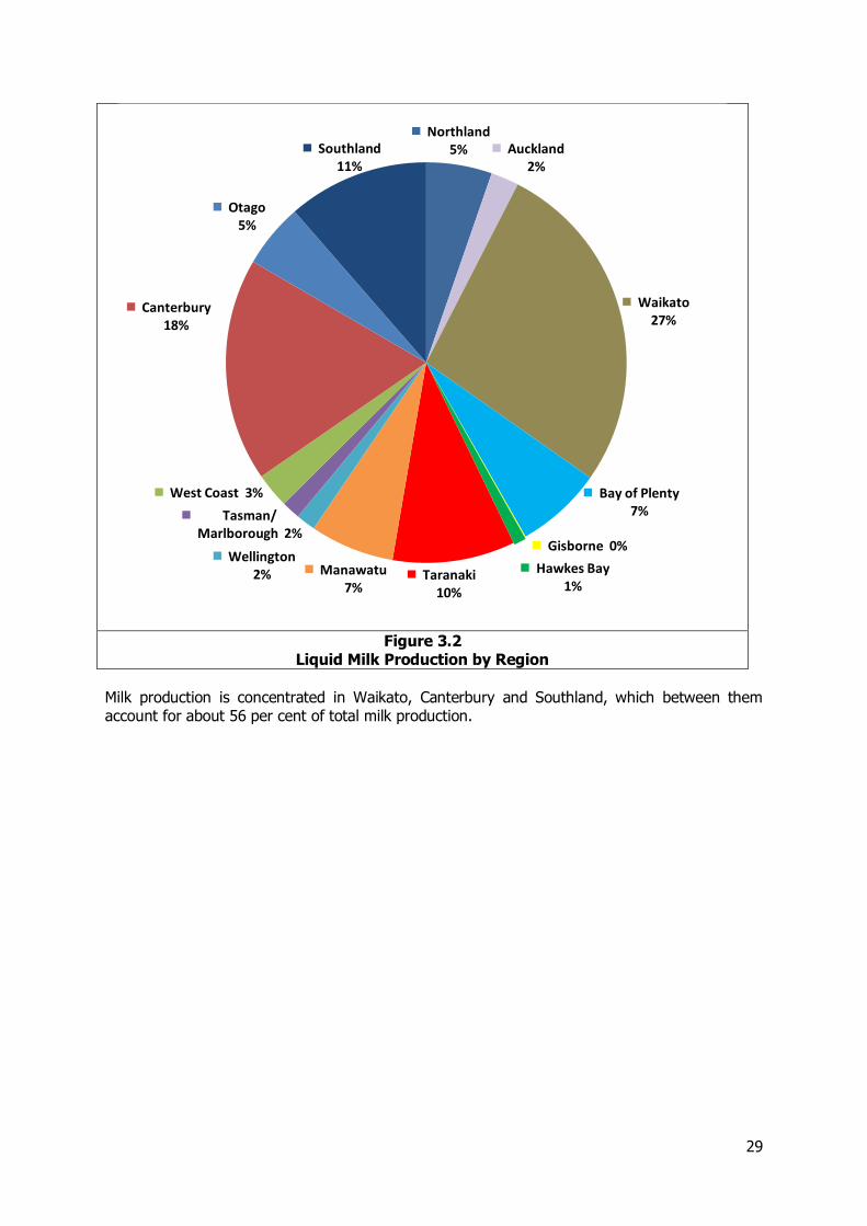
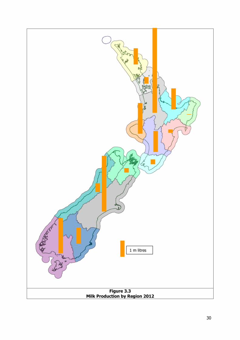
3.2.4 Regional Breakdown of Production The pattern of production across the country and the changes from 2006-07 are set out in Table 3.3 and the breakdown by region in 2011/12 is also set out in Figure 3.2 and Figure 3.3
0
5,000
10,000
15,000
20,000
25,000A
nn
ual
Milk
Pro
du
ctio
n (
m li
tres
)

28
Table 3.3 Liquid Milk Production by Region
Region
Liquid milk production 2006-07
Total production 2011/12 Total production 2006/07 Growth 2006/07 to 2011/12 Million litres
Million tonnes
Per cent of total
Million litres
Northland 1014.4 1.04 5.3% 905.9 12%
Auckland 430.1 0.44 2.2% 410.9 5%
Waikato 5202.5 5.36 27.2% 4,520.7 15%
Bay of Plenty 1338.6 1.38 7.0% 1,235.0 8%
Gisborne 15.7 0.02 0.1% 5.0 214%
Hawke’s Bay 189.4 0.20 1.0% 148.3 28%
Taranaki 1890.0 1.95 9.9% 1,706.8 11%
Manawatu-Wanganui 1298.8 1.34 6.8% 1,066.1 22%
Wellington 301.1 0.31 1.6% 264.4 14%
Total North Island 11,680.6 12.03 61.1% 10263.1 14%
TNM 287.0 0.30 1.5% 301.8 -5%
West Coast 538.8 0.55 2.8% 456.0 18%
Canterbury 3445.9 3.55 18.0% 2002.9 72%
Otago 994.9 1.02 5.2% 700.4 42%
Southland 2181.4 2.25 11.4% 1,410.1 55%
Total South Island 7448.0 7.67 38.9% 5871.2 53%
Total 19,128.6 19.70 100.0% 15,134.20 26%
Source: Consultants estimates based LIC New Zealand Dairy Statistics 2011-12 and earlier analysis Note: TNM is the combination of the Tasman, Nelson and Marlborough regions
29
Figure 3.2
Liquid Milk Production by Region
Milk production is concentrated in Waikato, Canterbury and Southland, which between them account for about 56 per cent of total milk production.
Northland 5% Auckland
2%
Waikato 27%
Bay of Plenty 7%
Gisborne 0%
Hawkes Bay 1%
Taranaki 10%
Manawatu 7%
Wellington 2%
Tasman/ Marlborough 2%
West Coast 3%
Canterbury 18%
Otago 5%
Southland 11%
30
Figure 3.3 Milk Production by Region 2012
1 m litres
31
In the 5 years since the NFDS total production nationally has increased by 26 per cent but the growth has been concentrated in the South Island where production overall has increased by about 53 per cent. This reflects substantial growth in Canterbury and Southland which in turn reflects substantial conversion to dairy farming in these regions. In the North Island growth has typically been more modest at 14 per cent overall and with similar growth in the Waikato, the largest producer. Milk production has also grown very substantially in Gisborne but from a very low base and still only represents 0.01 per cent of national production. The change in the pattern of dairy production has implications for the manufacture of dairy products and the routes used to transport both liquid milk and manufactured dairy products.
3.2.5 Imports and Exports There are no significant international movements of liquid milk before the processing stage.
3.2.6 Patterns of Demand Milk is a relatively low-value product and so it is normally only moved from the farm to the nearest dairy factory or collection point. The main dairy factories and collection points with information about their capacity or throughput where available are set out in Table 3.4.
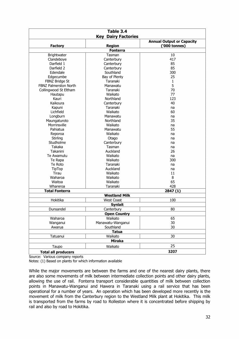
32
Table 3.4 Key Dairy Factories
Factory Region Annual Output or Capacity
(‘000 tonnes)
Fonterra
Brightwater Tasman 10 Clandeboye Canterbury 417 Darfield 1 Canterbury 85 Darfield 2 Canterbury 85 Edendale Southland 300
Edgecumbe Bay of Plenty 25 FBNZ Bridge St Taranaki 1
FBNZ Palmerston North Manawatu 5 Collingwood St Eltham Taranaki 70
Hautapu Waikato 77 Kauri Northland 123
Kaikoura Canterbury 40 Kapuni Taranaki na Lichfield Waikato 60 Longburn Manawatu na
Maungaturoto Northland 35 Morrinsville Waikato na Pahiatua Manawatu 55 Reporoa Waikato na Stirling Otago na
Studholme Canterbury na Takaka Tasman na Takanini Auckland 26
Te Awamutu Waikato na Te Rapa Waikato 300 Te Roto Taranaki na TipTop Auckland na Tirau Waikato 11
Waharoa Waikato 8 Waitoa Waikato 65
Whareroa Taranaki 428
Total Fonterra 2847 (1)
Westland Milk
Hokitika West Coast 100
Synlait
Dunsandel Canterbury 80
Open Country
Waharoa Waikato 65 Wanganui Manawatu-Wanganui 30 Awarua Southland 30
Tatua
Tatuanui Waikato 30
Miraka
Taupo Waikato 25
Total all producers 3207 Source: Various company reports Notes: (1) Based on plants for which information available
While the major movements are between the farms and one of the nearest dairy plants, there are also some movements of milk between intermediate collection points and other dairy plants, allowing the use of rail. Fonterra transport considerable quantities of milk between collection points in Manawatu-Wanganui and Hawera in Taranaki using a rail service that has been operational for a number of years. An operation which has been developed more recently is the movement of milk from the Canterbury region to the Westland Milk plant at Hokitika. This milk is transported from the farms by road to Rolleston where it is concentrated before shipping by rail and also by road to Hokitika.
33
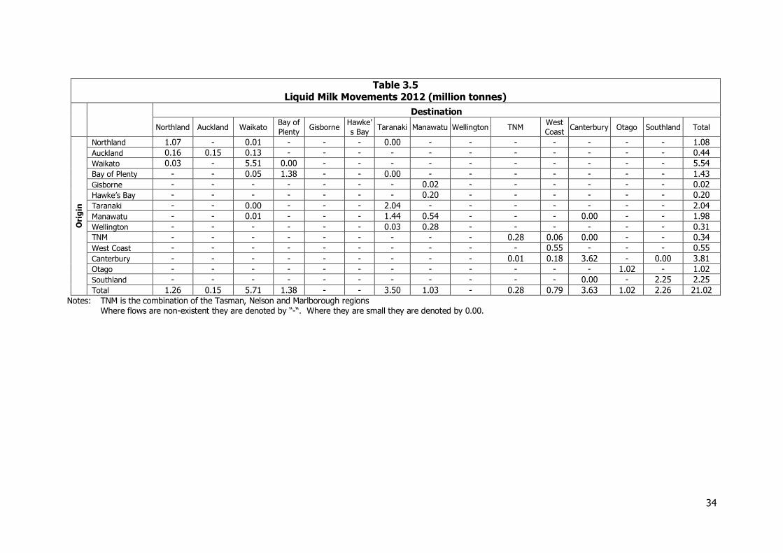
Away from the peak season, in the face of decreasing milk availability, Fonterra limits the numbers of plants in operation to ensure an economic throughput through those remaining open. There is therefore a need to transport liquid milk between these to enable efficient use to be made of the plant available. There is also some supply of liquid milk collected by Fonterra to other producers. Taking all these flows into account, the estimated patterns of movement for liquid milk are set out in Table 3.5.
34
Table 3.5 Liquid Milk Movements 2012 (million tonnes)
Destination
Northland Auckland Waikato Bay of
Plenty Gisborne
Hawke’
s Bay Taranaki Manawatu Wellington TNM
West
Coast Canterbury Otago Southland Total
Ori
gin
Northland 1.07 - 0.01 - - - 0.00 - - - - - - - 1.08
Auckland 0.16 0.15 0.13 - - - - - - - - - - - 0.44
Waikato 0.03 - 5.51 0.00 - - - - - - - - - - 5.54
Bay of Plenty - - 0.05 1.38 - - 0.00 - - - - - - - 1.43
Gisborne - - - - - - - 0.02 - - - - - - 0.02
Hawke’s Bay - - - - - - - 0.20 - - - - - - 0.20
Taranaki - - 0.00 - - - 2.04 - - - - - - - 2.04
Manawatu - - 0.01 - - - 1.44 0.54 - - - 0.00 - - 1.98
Wellington - - - - - - 0.03 0.28 - - - - - - 0.31 TNM - - - - - - - - - 0.28 0.06 0.00 - - 0.34
West Coast - - - - - - - - - - 0.55 - - - 0.55
Canterbury - - - - - - - - - 0.01 0.18 3.62 - 0.00 3.81
Otago - - - - - - - - - - - - 1.02 - 1.02
Southland - - - - - - - - - - - 0.00 - 2.25 2.25
Total 1.26 0.15 5.71 1.38 - - 3.50 1.03 - 0.28 0.79 3.63 1.02 2.26 21.02
Notes: TNM is the combination of the Tasman, Nelson and Marlborough regions Where flows are non-existent they are denoted by “-“. Where they are small they are denoted by 0.00.
35
3.2.7 Use of Different Modes The majority of movements of liquid milk are by road but rail is used for the movements of product between collection points in Manawatu-Wanganui and the dairy plant at Hawera, between Tuamarina in Marlborough and Clandeboye in Canterbury and between Christchurch and Hokitika. There are also smaller movements between other Fonterra processing plants.
3.3 Milk and Dairy Products: Manufactured Dairy Products
3.3.1 Introduction and Scale of the Sector It is estimated that in 2012, exports of dairy products represented about 22 per cent of the value of total New Zealand commodity exports illustrating the importance of this sector to the national economy. Reflecting this, the volumes moved are also fairly substantial amounting to 5.4 million tonnes or 0.6 billion tonne-kms. The movements of dairy products comprise internal movements of product between the manufacturing plants and facilities either for storage along the distribution chain or for completing the process of producing the final product with for example the storage of cheese to allow it to nature. As indicated above the industry is dominated by Fonterra, with other manufacturers having a relatively small part of the market.
3.3.2 Information Sources Information on the dairy sector and the movements generated has been obtained from interviews with and information supplied by:-
Fonterra/Dairy Transport Logistics Westland Milk Open Country Tatua Miraka
This has been supplemented by information from annual reports and other website material and from information from transport companies.
3.3.3 International Trade in Dairy Products The volumes of dairy products moved through New Zealand ports in 2012 are set out in Table 3.6.
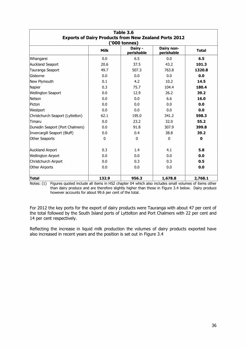
36
Table 3.6 Exports of Dairy Products from New Zealand Ports 2012
(‘000 tonnes)
Milk Dairy -
perishable Dairy non-perishable
Total
Whangarei 0.0 6.5 0.0 6.5
Auckland Seaport 20.6 37.5 43.2 101.3
Tauranga Seaport 49.7 507.3 763.8 1320.8
Gisborne 0.0 0.0 0.0 0.0
New Plymouth 0.1 4.2 10.2 14.5
Napier 0.3 75.7 104.4 180.4
Wellington Seaport 0.0 12.9 26.2 39.2
Nelson 0.0 0.0 6.6 16.0
Picton 0.0 0.0 0.0 0.0
Westport 0.0 0.0 0.0 0.0
Christchurch Seaport (Lyttelton) 62.1 195.0 341.2 598.3
Timaru 0.0 23.2 32.0 55.2
Dunedin Seaport (Port Chalmers) 0.0 91.8 307.9 399.8
Invercargill Seaport (Bluff) 0.0 0.4 38.8 39.2
Other Seaports 0 0 0 0
Auckland Airport 0.3 1.4 4.1 5.8
Wellington Airport 0.0 0.0 0.0 0.0
Christchurch Airport 0.0 0.3 0.3 0.5
Other Airports 0.0 0.0 0.0 0.0
Total 132.9 956.3 1,678.8 2,768.1
Notes: (1) Figures quoted include all items in HS2 chapter 04 which also includes small volumes of items other than dairy produce and are therefore slightly higher than those in Figure 3.4 below. Dairy produce however accounts for about 99.6 per cent of the total.
For 2012 the key ports for the export of dairy products were Tauranga with about 47 per cent of the total followed by the South Island ports of Lyttelton and Port Chalmers with 22 per cent and 14 per cent respectively. Reflecting the increase in liquid milk production the volumes of dairy products exported have also increased in recent years and the position is set out in Figure 3.4
37
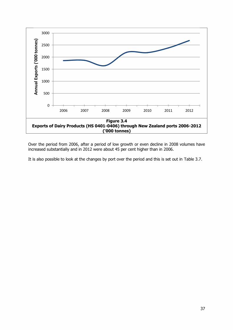
Figure 3.4
Exports of Dairy Products (HS 0401-0406) through New Zealand ports 2006-2012 (‘000 tonnes)
Over the period from 2006, after a period of low growth or even decline in 2008 volumes have increased substantially and in 2012 were about 45 per cent higher than in 2006. It is also possible to look at the changes by port over the period and this is set out in Table 3.7.
0
500
1000
1500
2000
2500
3000
2006 2007 2008 2009 2010 2011 2012
An
nu
al E
xpo
rts
('00
0 to
nn
es)
38
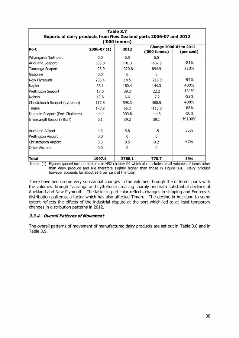
Table 3.7 Exports of dairy products from New Zealand ports 2006-07 and 2012
(‘000 tonnes)
Port 2006-07 (1) 2012 Change 2006-07 to 2012
(‘000 tonnes) (per cent)
Whangarei/Northport 0.0 6.5 6.5
Auckland Seaport 533.8 101.3 -432.5 -81%
Tauranga Seaport 425.9 1320.8 894.9 210%
Gisborne 0.0 0 0
New Plymouth 233.4 14.5 -218.9 -94%
Napier 36.1 180.4 144.3 400%
Wellington Seaport 17.0 39.2 22.2 131%
Nelson 13.8 6.6 -7.2 -52%
Christchurch Seaport (Lyttelton) 117.8 598.3 480.5 408%
Timaru 170.2 55.2 -115.0 -68%
Dunedin Seaport (Port Chalmers) 444.4 399.8 -44.6 -10%
Invercargill Seaport (Bluff) 0.1 39.2 39.1 39100%
Auckland Airport 4.3 5.8 1.5 35%
Wellington Airport 0.0 0 0
Christchurch Airport 0.3 0.5 0.2 67%
Other Airports 0.0 0 0
Total 1997.4 2768.1 770.7 39% Notes: (1) Figures quoted include all items in HS2 chapter 04 which also includes small volumes of items other
than dairy produce and are therefore slightly higher than those in Figure 3.4. Dairy produce however accounts for about 99.6 per cent of the total.
There have been some very substantial changes in the volumes through the different ports with the volumes through Tauranga and Lyttelton increasing sharply and with substantial declines at Auckland and New Plymouth. The latter in particular reflects changes in shipping and Fonterra’s distribution patterns, a factor which has also affected Timaru. The decline in Auckland to some extent reflects the effects of the industrial dispute at the port which led to at least temporary changes in distribution patterns in 2012.
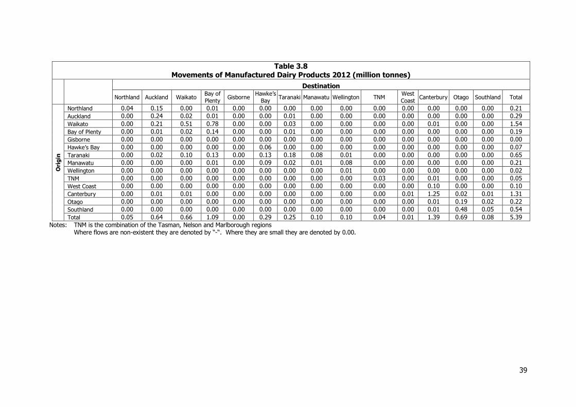
3.3.4 Overall Patterns of Movement The overall patterns of movement of manufactured dairy products are set out in Table 3.8 and in Table 3.9.
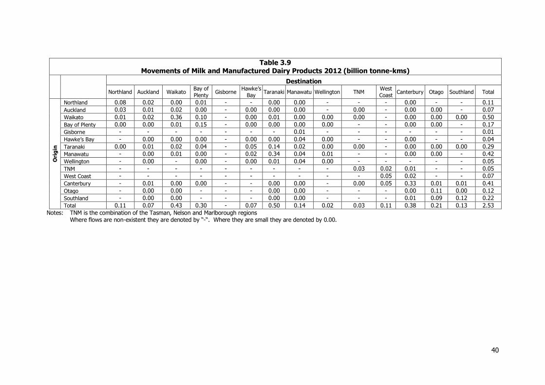
39
Table 3.8 Movements of Manufactured Dairy Products 2012 (million tonnes)
Destination
Northland Auckland Waikato Bay of
Plenty Gisborne
Hawke’s
Bay Taranaki Manawatu Wellington TNM
West
Coast Canterbury Otago Southland Total
Ori
gin
Northland 0.04 0.15 0.00 0.01 0.00 0.00 0.00 0.00 0.00 0.00 0.00 0.00 0.00 0.00 0.21
Auckland 0.00 0.24 0.02 0.01 0.00 0.00 0.01 0.00 0.00 0.00 0.00 0.00 0.00 0.00 0.29
Waikato 0.00 0.21 0.51 0.78 0.00 0.00 0.03 0.00 0.00 0.00 0.00 0.01 0.00 0.00 1.54
Bay of Plenty 0.00 0.01 0.02 0.14 0.00 0.00 0.01 0.00 0.00 0.00 0.00 0.00 0.00 0.00 0.19
Gisborne 0.00 0.00 0.00 0.00 0.00 0.00 0.00 0.00 0.00 0.00 0.00 0.00 0.00 0.00 0.00
Hawke’s Bay 0.00 0.00 0.00 0.00 0.00 0.06 0.00 0.00 0.00 0.00 0.00 0.00 0.00 0.00 0.07
Taranaki 0.00 0.02 0.10 0.13 0.00 0.13 0.18 0.08 0.01 0.00 0.00 0.00 0.00 0.00 0.65
Manawatu 0.00 0.00 0.00 0.01 0.00 0.09 0.02 0.01 0.08 0.00 0.00 0.00 0.00 0.00 0.21
Wellington 0.00 0.00 0.00 0.00 0.00 0.00 0.00 0.00 0.01 0.00 0.00 0.00 0.00 0.00 0.02
TNM 0.00 0.00 0.00 0.00 0.00 0.00 0.00 0.00 0.00 0.03 0.00 0.01 0.00 0.00 0.05
West Coast 0.00 0.00 0.00 0.00 0.00 0.00 0.00 0.00 0.00 0.00 0.00 0.10 0.00 0.00 0.10
Canterbury 0.00 0.01 0.01 0.00 0.00 0.00 0.00 0.00 0.00 0.00 0.01 1.25 0.02 0.01 1.31
Otago 0.00 0.00 0.00 0.00 0.00 0.00 0.00 0.00 0.00 0.00 0.00 0.01 0.19 0.02 0.22
Southland 0.00 0.00 0.00 0.00 0.00 0.00 0.00 0.00 0.00 0.00 0.00 0.01 0.48 0.05 0.54
Total 0.05 0.64 0.66 1.09 0.00 0.29 0.25 0.10 0.10 0.04 0.01 1.39 0.69 0.08 5.39
Notes: TNM is the combination of the Tasman, Nelson and Marlborough regions Where flows are non-existent they are denoted by “-“. Where they are small they are denoted by 0.00.
40
Table 3.9 Movements of Milk and Manufactured Dairy Products 2012 (billion tonne-kms)
Destination
Northland Auckland Waikato Bay of
Plenty Gisborne
Hawke’s
Bay Taranaki Manawatu Wellington TNM
West
Coast Canterbury Otago Southland Total
Ori
gin
Northland 0.08 0.02 0.00 0.01 - - 0.00 0.00 - - - 0.00 - - 0.11
Auckland 0.03 0.01 0.02 0.00 - 0.00 0.00 0.00 - 0.00 - 0.00 0.00 - 0.07
Waikato 0.01 0.02 0.36 0.10 - 0.00 0.01 0.00 0.00 0.00 - 0.00 0.00 0.00 0.50
Bay of Plenty 0.00 0.00 0.01 0.15 - 0.00 0.00 0.00 0.00 - - 0.00 0.00 - 0.17
Gisborne - - - - - - - 0.01 - - - - - - 0.01
Hawke’s Bay - 0.00 0.00 0.00 - 0.00 0.00 0.04 0.00 - - 0.00 - - 0.04
Taranaki 0.00 0.01 0.02 0.04 - 0.05 0.14 0.02 0.00 0.00 - 0.00 0.00 0.00 0.29
Manawatu - 0.00 0.01 0.00 - 0.02 0.34 0.04 0.01 - - 0.00 0.00 - 0.42
Wellington - 0.00 - 0.00 - 0.00 0.01 0.04 0.00 - - - - - 0.05
TNM - - - - - - - - - 0.03 0.02 0.01 - - 0.05
West Coast - - - - - - - - - - 0.05 0.02 - - 0.07
Canterbury - 0.01 0.00 0.00 - - 0.00 0.00 - 0.00 0.05 0.33 0.01 0.01 0.41
Otago - 0.00 0.00 - - - 0.00 0.00 - - - 0.00 0.11 0.00 0.12
Southland - 0.00 0.00 - - - 0.00 0.00 - - - 0.01 0.09 0.12 0.22
Total 0.11 0.07 0.43 0.30 - 0.07 0.50 0.14 0.02 0.03 0.11 0.38 0.21 0.13 2.53
Notes: TNM is the combination of the Tasman, Nelson and Marlborough regions Where flows are non-existent they are denoted by “-“. Where they are small they are denoted by 0.00.
41
3.3.5 Use of Different Modes Manufactured dairy products are carried by both road and rail with a relatively high proportion by rail. For 2012, rail transported about 48 per cent of the total tonnage.
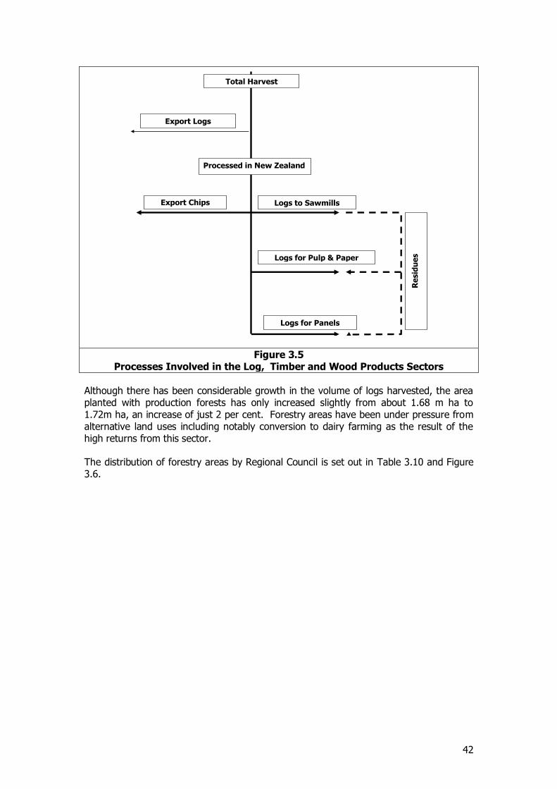
3.4 Log, Timber and Wood Products
3.4.1 Introduction and Scale of the Sector Forestry and forest products form an important component of the freight task in New Zealand and in the 2008 NFDS were estimated to account for almost 15 per cent of the total freight task in tonnage terms. Since then there has been considerable growth in the volumes of timber harvested as forests planted in the 1980s reach maturity. The logs harvested are used in a number of ways including:-
Direct export as logs or wood chips
Inputs to sawmilling
Inputs to pulp and paper manufacture
Inputs to panel manufacture.
Each of these activities together with the outputs from sawmilling and panel manufacture is considered in this section. This section also considers the bulk paper products from paper making, newsprint, uncoated paper, tissue, kraft paper and paperboard (HS categories 4801 to 4805), but more sophisticated paper products are considered elsewhere. An illustration of the patterns of flows within the sector is set out in Figure 3.5.
42
Figure 3.5 Processes Involved in the Log, Timber and Wood Products Sectors
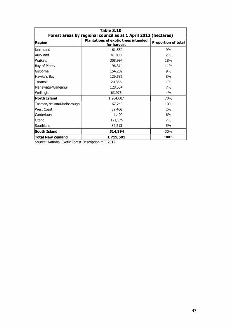
Although there has been considerable growth in the volume of logs harvested, the area planted with production forests has only increased slightly from about 1.68 m ha to 1.72m ha, an increase of just 2 per cent. Forestry areas have been under pressure from alternative land uses including notably conversion to dairy farming as the result of the high returns from this sector. The distribution of forestry areas by Regional Council is set out in Table 3.10 and Figure 3.6.
Total Harvest
Processed in New Zealand
Export Logs
Export Chips
Logs for Pulp & Paper
Logs to Sawmills
Logs for Panels
Re
sid
ue
s
43
Table 3.10 Forest areas by regional council as at 1 April 2012 (hectares)
Region Plantations of exotic trees intended
for harvest Proportion of total
Northland 161,559 9%
Auckland 41,000 2%
Waikato 308,994 18%
Bay of Plenty 196,314 11%
Gisborne 154,289 9%
Hawke's Bay 129,586 8%
Taranaki 20,356 1%
Manawatu-Wanganui 128,534 7%
Wellington 63,975 4%
North Island 1,204,607 70%
Tasman/Nelson/Marlborough 167,240 10%
West Coast 32,466 2%
Canterbury 111,400 6%
Otago 121,575 7%
Southland 82,213 5%
South Island 514,894 30%
Total New Zealand 1,719,501 100%
Source: National Exotic Forest Description MPI 2012
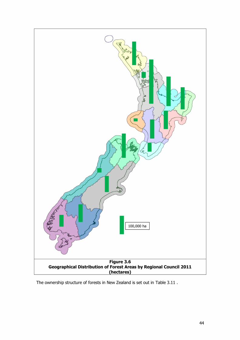
44
Figure 3.6
Geographical Distribution of Forest Areas by Regional Council 2011 (hectares)
The ownership structure of forests in New Zealand is set out in Table 3.11 .
100,000 ha
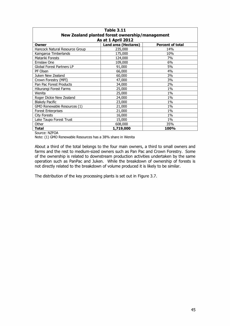
45
Table 3.11 New Zealand planted forest ownership/management
As at 1 April 2012 Owner Land area (Hectares) Percent of total
Hancock Natural Resource Group 235,000 14%
Kaingaroa Timberlands 175,000 10%
Matariki Forests 124,000 7%
Ernslaw One 109,000 6%
Global Forest Partners LP 91,000 5%
PF Olsen 66,000 4%
Juken New Zealand 60,000 3%
Crown Forestry (MPI) 47,000 3%
Pan Pac Forest Products 34,000 2%
Hikurangi Forest Farms 25,000 1%
Wenita 25,000 1%
Roger Dickie New Zealand 24,000 1%
Blakely Pacific 23,000 1%
GMO Renewable Resources (1) 21,000 1%
Forest Enterprises 21,000 1%
City Forests 16,000 1%
Lake Taupo Forest Trust 15,000 1%
Other 608,000 35%
Total 1,719,000 100%
Source: NZFOA Note: (1) GMO Renewable Resources has a 38% share in Wenita
About a third of the total belongs to the four main owners, a third to small owners and farms and the rest to medium-sized owners such as Pan Pac and Crown Forestry. Some of the ownership is related to downstream production activities undertaken by the same operation such as PanPac and Juken. While the breakdown of ownership of forests is not directly related to the breakdown of volume produced it is likely to be similar. The distribution of the key processing plants is set out in Figure 3.7.
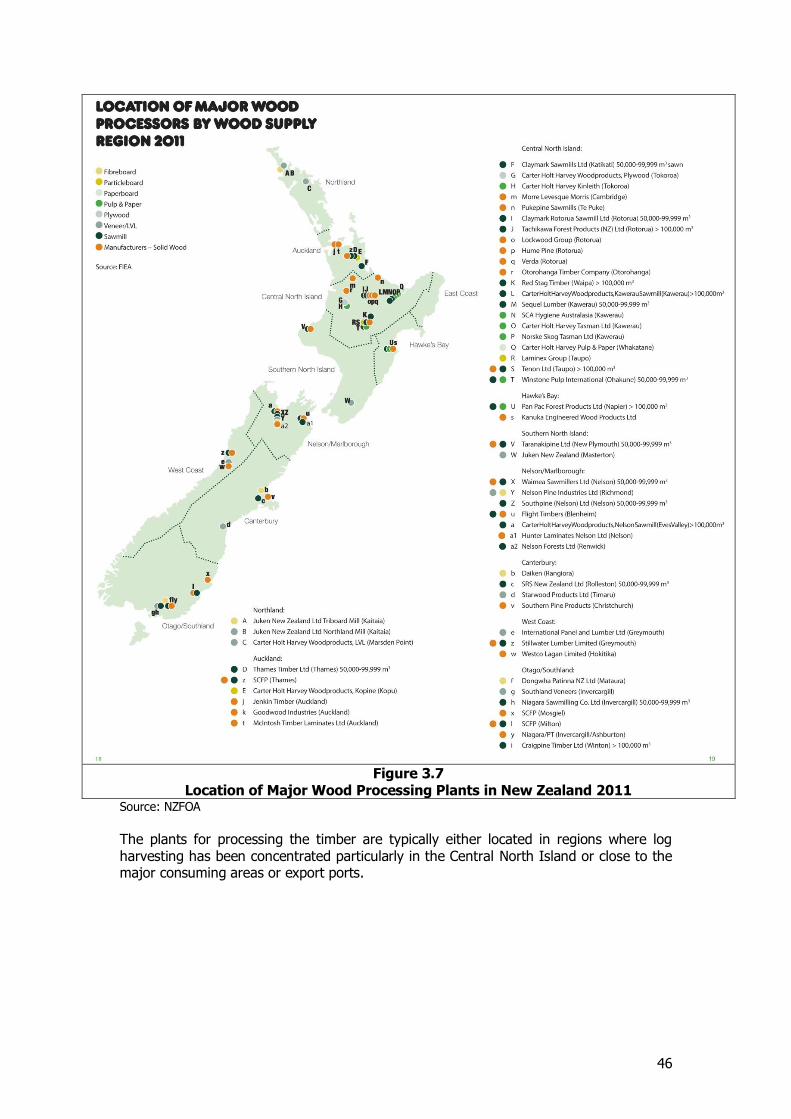
46
Figure 3.7
Location of Major Wood Processing Plants in New Zealand 2011 Source: NZFOA
The plants for processing the timber are typically either located in regions where log harvesting has been concentrated particularly in the Central North Island or close to the major consuming areas or export ports.
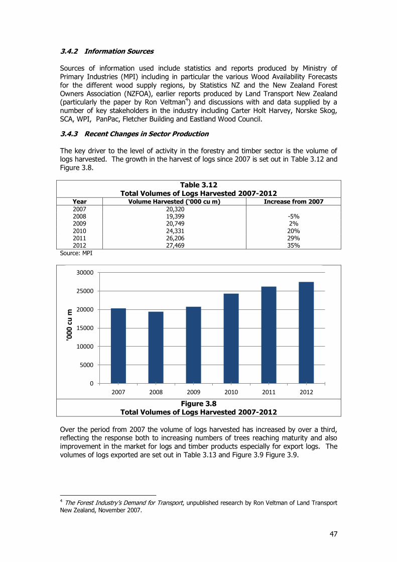
47
3.4.2 Information Sources Sources of information used include statistics and reports produced by Ministry of Primary Industries (MPI) including in particular the various Wood Availability Forecasts for the different wood supply regions, by Statistics NZ and the New Zealand Forest Owners Association (NZFOA), earlier reports produced by Land Transport New Zealand (particularly the paper by Ron Veltman4) and discussions with and data supplied by a number of key stakeholders in the industry including Carter Holt Harvey, Norske Skog, SCA, WPI, PanPac, Fletcher Building and Eastland Wood Council.
3.4.3 Recent Changes in Sector Production The key driver to the level of activity in the forestry and timber sector is the volume of logs harvested. The growth in the harvest of logs since 2007 is set out in Table 3.12 and Figure 3.8.
Table 3.12 Total Volumes of Logs Harvested 2007-2012
Year Volume Harvested (‘000 cu m) Increase from 2007
2007 20,320 2008 19,399 -5% 2009 20,749 2% 2010 24,331 20% 2011 26,206 29% 2012 27,469 35%
Source: MPI
Figure 3.8
Total Volumes of Logs Harvested 2007-2012
Over the period from 2007 the volume of logs harvested has increased by over a third, reflecting the response both to increasing numbers of trees reaching maturity and also improvement in the market for logs and timber products especially for export logs. The volumes of logs exported are set out in Table 3.13 and Figure 3.9 Figure 3.9.
4 The Forest Industry’s Demand for Transport, unpublished research by Ron Veltman of Land Transport New Zealand, November 2007.
0
5000
10000
15000
20000
25000
30000
2007 2008 2009 2010 2011 2012
'000
cu
m
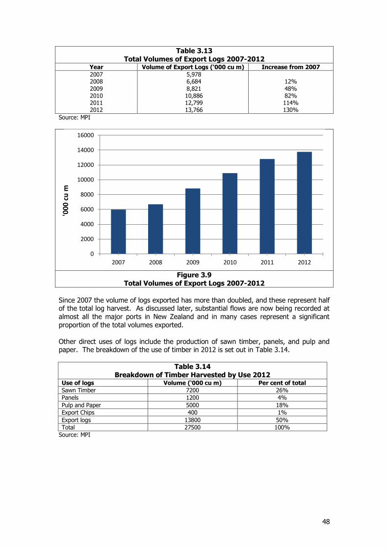
48
Table 3.13 Total Volumes of Export Logs 2007-2012
Year Volume of Export Logs (‘000 cu m) Increase from 2007
2007 5,978 2008 6,684 12% 2009 8,821 48% 2010 10,886 82% 2011 12,799 114% 2012 13,766 130%
Source: MPI
Figure 3.9
Total Volumes of Export Logs 2007-2012
Since 2007 the volume of logs exported has more than doubled, and these represent half of the total log harvest. As discussed later, substantial flows are now being recorded at almost all the major ports in New Zealand and in many cases represent a significant proportion of the total volumes exported. Other direct uses of logs include the production of sawn timber, panels, and pulp and paper. The breakdown of the use of timber in 2012 is set out in Table 3.14.
Table 3.14 Breakdown of Timber Harvested by Use 2012
Use of logs Volume (‘000 cu m) Per cent of total
Sawn Timber 7200 26%
Panels 1200 4%
Pulp and Paper 5000 18%
Export Chips 400 1%
Export logs 13800 50%
Total 27500 100%
Source: MPI
0
2000
4000
6000
8000
10000
12000
14000
16000
2007 2008 2009 2010 2011 2012
'000
cu
m
49
This represents a somewhat different pattern of activity compared to 2006-07 with a much higher share of logs being exported (50 per cent compared with 35 per cent in 2006-07) and a lower share of logs to sawmills (26 per cent compared to 41 per cent) and to panel products (4 per cent compared to 8 per cent). This reflects the effects of the economic downturn especially in construction, which is a major market for timber products, and the increasing international demand and easier transport conditions for export logs.
3.4.4 Regional breakdown of production The regional production of logs for 2012 is set out in Table 3.15. While there is some inconsistency between the numbers produced by different sources reflecting the different approaches used to collect data and the different time periods concerned, these are considered to represent a reasonably accurate assessment of the position for 2012. The figures are based on the regional distribution derived from the Agricultural Census which cover the period to March 2012 but adjusted to meet the total estimates produced by MPI.
Table 3.15 Logs Harvested by Region 2012
Region Volume (‘000 cu m) Per cent of total
Northland 3,425 12%
Auckland 925 3%
Waikato 3,550 13%
BOP 6,975 25%
Gisborne 1,725 6%
Hawke’s Bay 2,900 11%
Taranaki 175 1%
Manawatu-Wanganui 1,450 5%
Wellington 575 2%
Nelson/Tasman/Marlborough 2,450 9%
West Coast 325 1%
Canterbury 825 3%
Otago 1,375 5%
Southland 875 3%
Total 27,550 100%
North Island 21,725 79%
South Island 5,825 21%
Source: MPI and Consultants Estimates
The breakdown of log production by region is also illustrated in Figure 3.10 below. The dominance of the central North Island (Waikato and Bay of Plenty) is clear, accounting for almost 40 per cent of the total. Northland and Hawke’s Bay each produce a further 11-12 per cent.
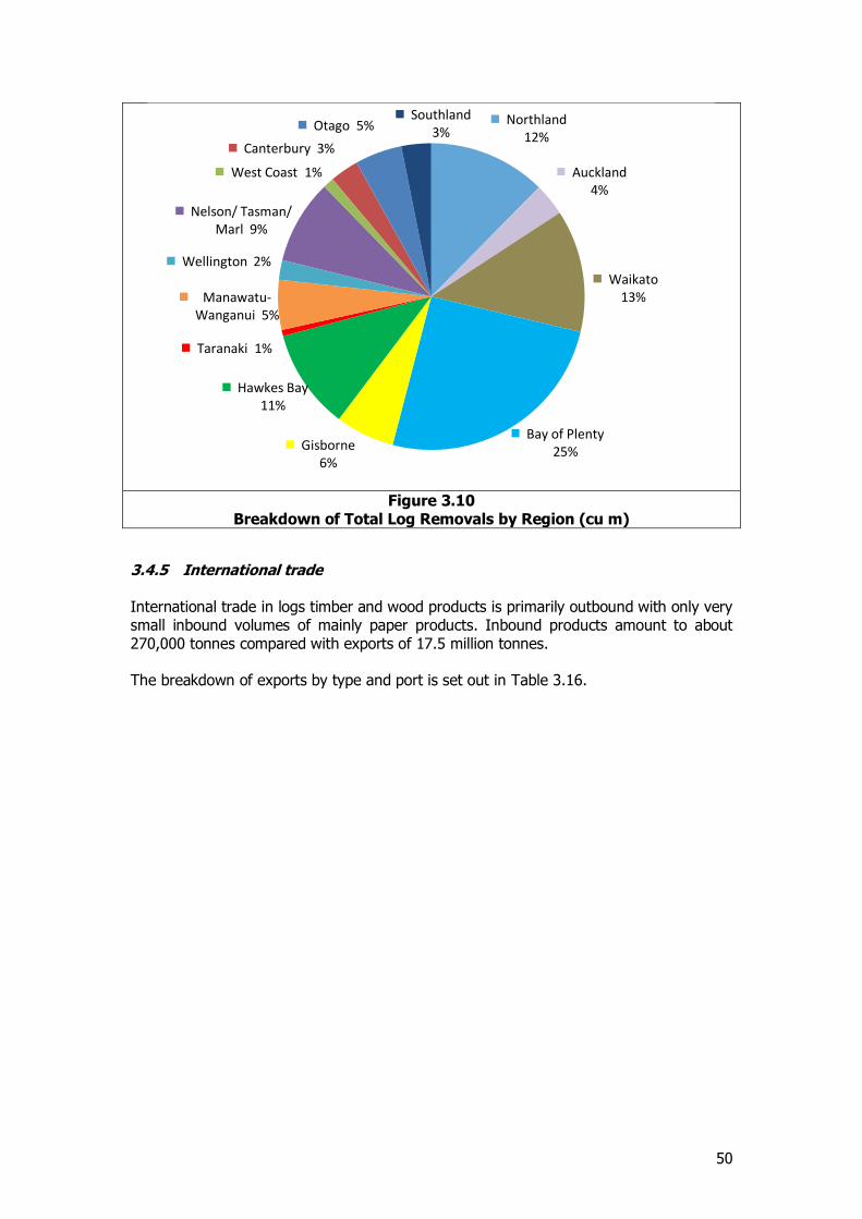
50
Figure 3.10
Breakdown of Total Log Removals by Region (cu m)
3.4.5 International trade International trade in logs timber and wood products is primarily outbound with only very small inbound volumes of mainly paper products. Inbound products amount to about 270,000 tonnes compared with exports of 17.5 million tonnes. The breakdown of exports by type and port is set out in Table 3.16.
Northland 12%
Auckland 4%
Waikato 13%
Bay of Plenty 25% Gisborne
6%
Hawkes Bay 11%
Taranaki 1%
Manawatu-Wanganui 5%
Wellington 2%
Nelson/ Tasman/ Marl 9%
West Coast 1%
Canterbury 3%
Otago 5% Southland
3%
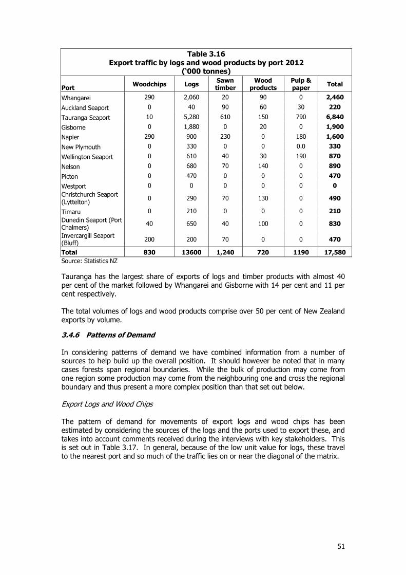
51
Table 3.16 Export traffic by logs and wood products by port 2012
(‘000 tonnes)
Port Woodchips Logs
Sawn timber
Wood products
Pulp & paper
Total
Whangarei 290 2,060 20 90 0 2,460
Auckland Seaport 0 40 90 60 30 220
Tauranga Seaport 10 5,280 610 150 790 6,840
Gisborne 0 1,880 0 20 0 1,900
Napier 290 900 230 0 180 1,600
New Plymouth 0 330 0 0 0.0 330
Wellington Seaport 0 610 40 30 190 870
Nelson 0 680 70 140 0 890
Picton 0 470 0 0 0 470
Westport 0 0 0 0 0 0
Christchurch Seaport (Lyttelton)
0 290 70 130 0 490
Timaru 0 210 0 0 0 210
Dunedin Seaport (Port Chalmers)
40 650 40 100 0 830
Invercargill Seaport (Bluff)
200 200 70 0 0 470
Total 830 13600 1,240 720 1190 17,580
Source: Statistics NZ
Tauranga has the largest share of exports of logs and timber products with almost 40 per cent of the market followed by Whangarei and Gisborne with 14 per cent and 11 per cent respectively. The total volumes of logs and wood products comprise over 50 per cent of New Zealand exports by volume.
3.4.6 Patterns of Demand In considering patterns of demand we have combined information from a number of sources to help build up the overall position. It should however be noted that in many cases forests span regional boundaries. While the bulk of production may come from one region some production may come from the neighbouring one and cross the regional boundary and thus present a more complex position than that set out below. Export Logs and Wood Chips The pattern of demand for movements of export logs and wood chips has been estimated by considering the sources of the logs and the ports used to export these, and takes into account comments received during the interviews with key stakeholders. This is set out in Table 3.17. In general, because of the low unit value for logs, these travel to the nearest port and so much of the traffic lies on or near the diagonal of the matrix.
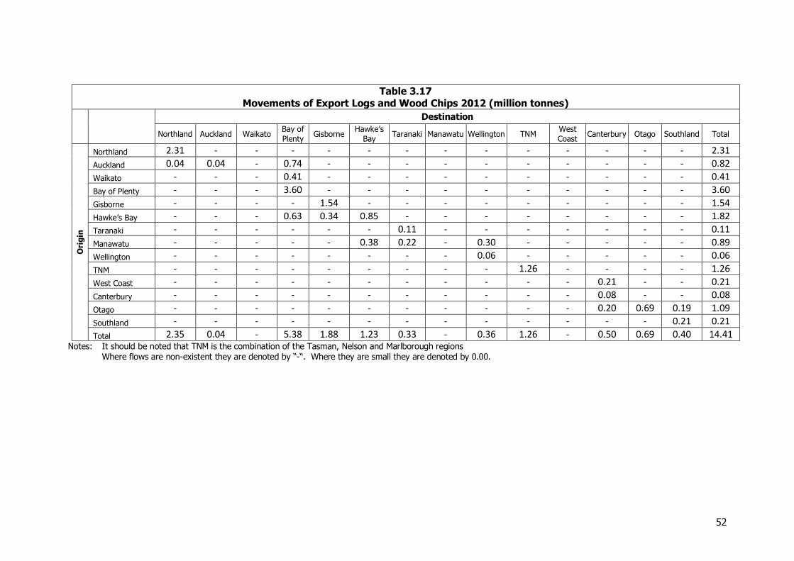
52
Table 3.17 Movements of Export Logs and Wood Chips 2012 (million tonnes)
Destination
Northland Auckland Waikato Bay of
Plenty Gisborne
Hawke’s
Bay Taranaki Manawatu Wellington TNM
West
Coast Canterbury Otago Southland Total
Ori
gin
Northland 2.31 - - - - - - - - - - - - - 2.31
Auckland 0.04 0.04 - 0.74 - - - - - - - - - - 0.82
Waikato - - - 0.41 - - - - - - - - - - 0.41
Bay of Plenty - - - 3.60 - - - - - - - - - - 3.60
Gisborne - - - - 1.54 - - - - - - - - - 1.54
Hawke’s Bay - - - 0.63 0.34 0.85 - - - - - - - - 1.82
Taranaki - - - - - - 0.11 - - - - - - - 0.11
Manawatu - - - - - 0.38 0.22 - 0.30 - - - - - 0.89
Wellington - - - - - - - - 0.06 - - - - - 0.06
TNM - - - - - - - - - 1.26 - - - - 1.26
West Coast - - - - - - - - - - - 0.21 - - 0.21
Canterbury - - - - - - - - - - - 0.08 - - 0.08
Otago - - - - - - - - - - - 0.20 0.69 0.19 1.09
Southland - - - - - - - - - - - - - 0.21 0.21
Total 2.35 0.04 - 5.38 1.88 1.23 0.33 - 0.36 1.26 - 0.50 0.69 0.40 14.41
Notes: It should be noted that TNM is the combination of the Tasman, Nelson and Marlborough regions Where flows are non-existent they are denoted by “-“. Where they are small they are denoted by 0.00.
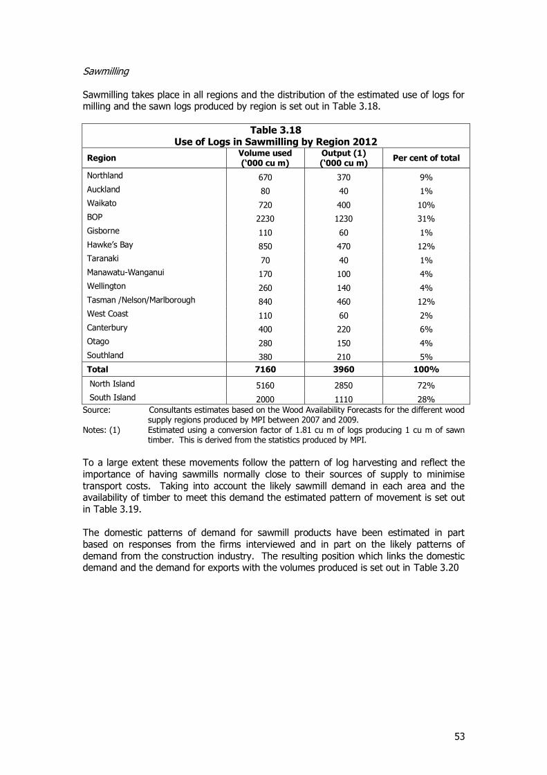
53
Sawmilling Sawmilling takes place in all regions and the distribution of the estimated use of logs for milling and the sawn logs produced by region is set out in Table 3.18.
Table 3.18 Use of Logs in Sawmilling by Region 2012
Region Volume used (‘000 cu m)
Output (1) (‘000 cu m)
Per cent of total
Northland 670 370 9%
Auckland 80 40 1%
Waikato 720 400 10%
BOP 2230 1230 31%
Gisborne 110 60 1%
Hawke’s Bay 850 470 12%
Taranaki 70 40 1%
Manawatu-Wanganui 170 100 4%
Wellington 260 140 4%
Tasman /Nelson/Marlborough 840 460 12%
West Coast 110 60 2%
Canterbury 400 220 6%
Otago 280 150 4%
Southland 380 210 5%
Total 7160 3960 100%
North Island 5160 2850 72%
South Island 2000 1110 28%
Source: Consultants estimates based on the Wood Availability Forecasts for the different wood supply regions produced by MPI between 2007 and 2009.
Notes: (1) Estimated using a conversion factor of 1.81 cu m of logs producing 1 cu m of sawn timber. This is derived from the statistics produced by MPI.
To a large extent these movements follow the pattern of log harvesting and reflect the importance of having sawmills normally close to their sources of supply to minimise transport costs. Taking into account the likely sawmill demand in each area and the availability of timber to meet this demand the estimated pattern of movement is set out in Table 3.19. The domestic patterns of demand for sawmill products have been estimated in part based on responses from the firms interviewed and in part on the likely patterns of demand from the construction industry. The resulting position which links the domestic demand and the demand for exports with the volumes produced is set out in Table 3.20
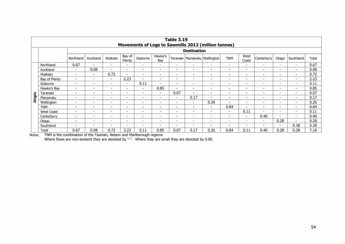
54
Table 3.19 Movements of Logs to Sawmills 2012 (million tonnes)
Destination
Northland Auckland Waikato Bay of
Plenty Gisborne
Hawke’s
Bay Taranaki Manawatu Wellington TNM
West
Coast Canterbury Otago Southland Total
Ori
gin
Northland 0.67 - - - - - - - - - - - - - 0.67
Auckland - 0.08 - - - - - - - - - - - - 0.08
Waikato - - 0.72 - - - - - - - - - - - 0.72
Bay of Plenty - - - 2.23 - - - - - - - - - - 2.23
Gisborne - - - - 0.11 - - - - - - - - - 0.11
Hawke’s Bay - - - - - 0.85 - - - - - - - - 0.85
Taranaki - - - - - - 0.07 - - - - - - - 0.07
Manawatu - - - - - - - 0.17 - - - - - - 0.17
Wellington - - - - - - - - 0.26 - - - - - 0.26
TNM - - - - - - - - - 0.84 - - - - 0.84
West Coast - - - - - - - - - - 0.11 - - - 0.11
Canterbury - - - - - - - - - - - 0.40 - - 0.40
Otago - - - - - - - - - - - - 0.28 - 0.28
Southland - - - - - - - - - - - - - 0.38 0.38
Total 0.67 0.08 0.72 2.23 0.11 0.85 0.07 0.17 0.26 0.84 0.11 0.40 0.28 0.38 7.16
Notes: TNM is the combination of the Tasman, Nelson and Marlborough regions Where flows are non-existent they are denoted by “-“. Where they are small they are denoted by 0.00.
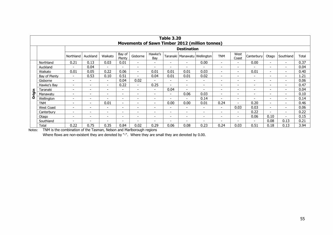
55
Table 3.20 Movements of Sawn Timber 2012 (million tonnes)
Destination
Northland Auckland Waikato Bay of
Plenty Gisborne
Hawke’s
Bay Taranaki Manawatu Wellington TNM
West
Coast Canterbury Otago Southland Total
Ori
gin
Northland 0.21 0.13 0.03 0.01 - - - - 0.00 - - 0.00 - - 0.37
Auckland - 0.04 - - - - - - - - - - - - 0.04
Waikato 0.01 0.05 0.22 0.06 - 0.01 0.01 0.01 0.03 - - 0.01 - - 0.40
Bay of Plenty - 0.53 0.10 0.51 - 0.04 0.01 0.01 0.02 - - - - - 1.21
Gisborne - - - 0.04 0.02 - - - - - - - - - 0.06
Hawke’s Bay - - - 0.22 - 0.25 - - - - - - - - 0.47
Taranaki - - - - - - 0.04 - - - - - - - 0.04
Manawatu - - - - - - - 0.06 0.03 - - - - - 0.10
Wellington - - - - - - - - 0.14 - - - - - 0.14
TNM - - 0.01 - - - 0.00 0.00 0.01 0.24 - 0.20 - - 0.46
West Coast - - - - - - - - - - 0.03 0.03 - - 0.06
Canterbury - - - - - - - - - - - 0.22 - - 0.22
Otago - - - - - - - - - - - 0.06 0.10 - 0.15
Southland - - - - - - - - - - - - 0.08 0.13 0.21
Total 0.22 0.75 0.35 0.84 0.02 0.29 0.06 0.08 0.23 0.24 0.03 0.51 0.18 0.13 3.94
Notes: TNM is the combination of the Tasman, Nelson and Marlborough regions Where flows are non-existent they are denoted by “-“. Where they are small they are denoted by 0.00.
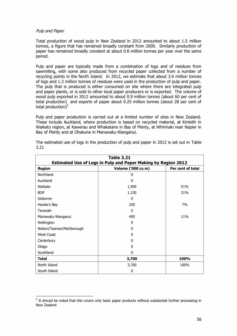
56
Pulp and Paper Total production of wood pulp in New Zealand in 2012 amounted to about 1.5 million tonnes, a figure that has remained broadly constant from 2000. Similarly production of paper has remained broadly constant at about 0.8 million tonnes per year over the same period. Pulp and paper are typically made from a combination of logs and of residues from sawmilling, with some also produced from recycled paper collected from a number of recycling points in the North Island. In 2012, we estimate that about 3.6 million tonnes of logs and 1.3 million tonnes of residues were used in the production of pulp and paper. The pulp that is produced is either consumed on site where there are integrated pulp and paper plants, or is sold to other local paper producers or is exported. The volume of wood pulp exported in 2012 amounted to about 0.9 million tonnes (about 60 per cent of total production) and exports of paper about 0.25 million tonnes (about 28 per cent of total production)5 Pulp and paper production is carried out at a limited number of sites in New Zealand. These include Auckland, where production is based on recycled material, at Kinleith in Waikato region, at Kawerau and Whakatane in Bay of Plenty, at Whirinaki near Napier in Bay of Plenty and at Ohakune in Manawatu-Wanganui. The estimated use of logs in the production of pulp and paper in 2012 is set out in Table 3.21
Table 3.21 Estimated Use of Logs in Pulp and Paper Making by Region 2012
Region Volume (‘000 cu m) Per cent of total
Northland 0
Auckland 0
Waikato 1,900 51%
BOP 1,150 31%
Gisborne 0
Hawke’s Bay 250 7%
Taranaki 0
Manawatu-Wanganui 400 11%
Wellington 0
Nelson/Tasman/Marlborough 0
West Coast 0
Canterbury 0
Otago 0
Southland 0
Total 3,700 100%
North Island 3,700 100%
South Island 0
5 It should be noted that this covers only basic paper products without substantial further processing in New Zealand

57
The estimated overall pattern of the movement of inputs and outputs of pulp and paper making is set out in Table 3.22. This takes into account the movement of product into the pulp and paper mills, the distribution of the output of these to export and domestic markets and also the pattern of distribution of imports.
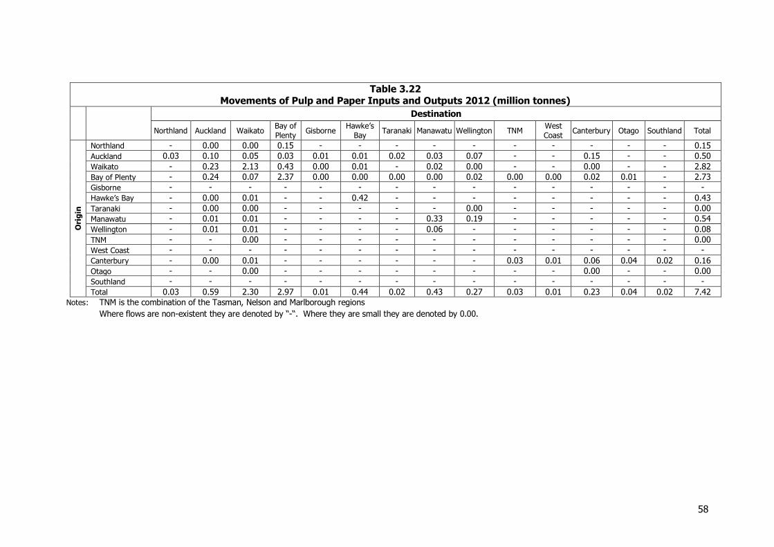
58
Table 3.22 Movements of Pulp and Paper Inputs and Outputs 2012 (million tonnes)
Destination
Northland Auckland Waikato Bay of
Plenty Gisborne
Hawke’s
Bay Taranaki Manawatu Wellington TNM
West
Coast Canterbury Otago Southland Total
Ori
gin
Northland - 0.00 0.00 0.15 - - - - - - - - - - 0.15
Auckland 0.03 0.10 0.05 0.03 0.01 0.01 0.02 0.03 0.07 - - 0.15 - - 0.50
Waikato - 0.23 2.13 0.43 0.00 0.01 - 0.02 0.00 - - 0.00 - - 2.82
Bay of Plenty - 0.24 0.07 2.37 0.00 0.00 0.00 0.00 0.02 0.00 0.00 0.02 0.01 - 2.73
Gisborne - - - - - - - - - - - - - - -
Hawke’s Bay - 0.00 0.01 - - 0.42 - - - - - - - - 0.43
Taranaki - 0.00 0.00 - - - - - 0.00 - - - - - 0.00
Manawatu - 0.01 0.01 - - - - 0.33 0.19 - - - - - 0.54
Wellington - 0.01 0.01 - - - - 0.06 - - - - - - 0.08
TNM - - 0.00 - - - - - - - - - - - 0.00
West Coast - - - - - - - - - - - - - - -
Canterbury - 0.00 0.01 - - - - - - 0.03 0.01 0.06 0.04 0.02 0.16
Otago - - 0.00 - - - - - - - - 0.00 - - 0.00
Southland - - - - - - - - - - - - - - -
Total 0.03 0.59 2.30 2.97 0.01 0.44 0.02 0.43 0.27 0.03 0.01 0.23 0.04 0.02 7.42
Notes: TNM is the combination of the Tasman, Nelson and Marlborough regions Where flows are non-existent they are denoted by “-“. Where they are small they are denoted by 0.00.
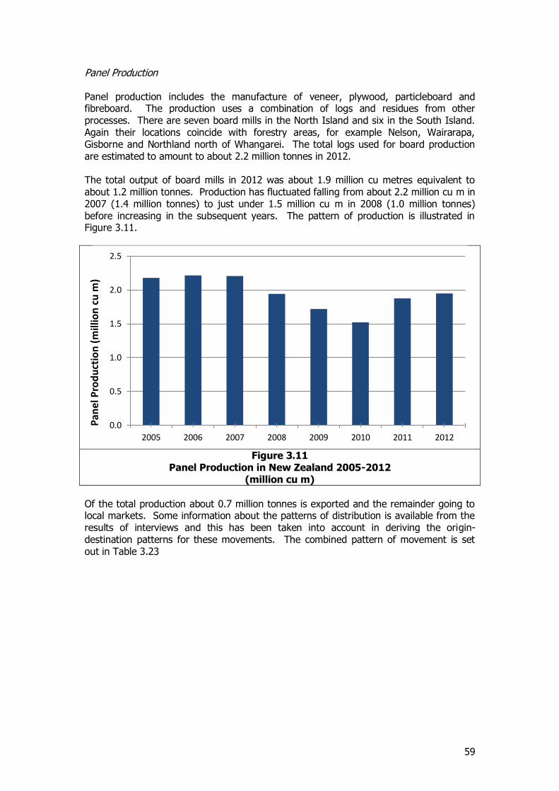
59
Panel Production Panel production includes the manufacture of veneer, plywood, particleboard and fibreboard. The production uses a combination of logs and residues from other processes. There are seven board mills in the North Island and six in the South Island. Again their locations coincide with forestry areas, for example Nelson, Wairarapa, Gisborne and Northland north of Whangarei. The total logs used for board production are estimated to amount to about 2.2 million tonnes in 2012. The total output of board mills in 2012 was about 1.9 million cu metres equivalent to about 1.2 million tonnes. Production has fluctuated falling from about 2.2 million cu m in 2007 (1.4 million tonnes) to just under 1.5 million cu m in 2008 (1.0 million tonnes) before increasing in the subsequent years. The pattern of production is illustrated in Figure 3.11.
Figure 3.11
Panel Production in New Zealand 2005-2012 (million cu m)
Of the total production about 0.7 million tonnes is exported and the remainder going to local markets. Some information about the patterns of distribution is available from the results of interviews and this has been taken into account in deriving the origin-destination patterns for these movements. The combined pattern of movement is set out in Table 3.23
0.0
0.5
1.0
1.5
2.0
2.5
2005 2006 2007 2008 2009 2010 2011 2012
Pan
el P
rod
uct
ion
(m
illio
n c
u m
)
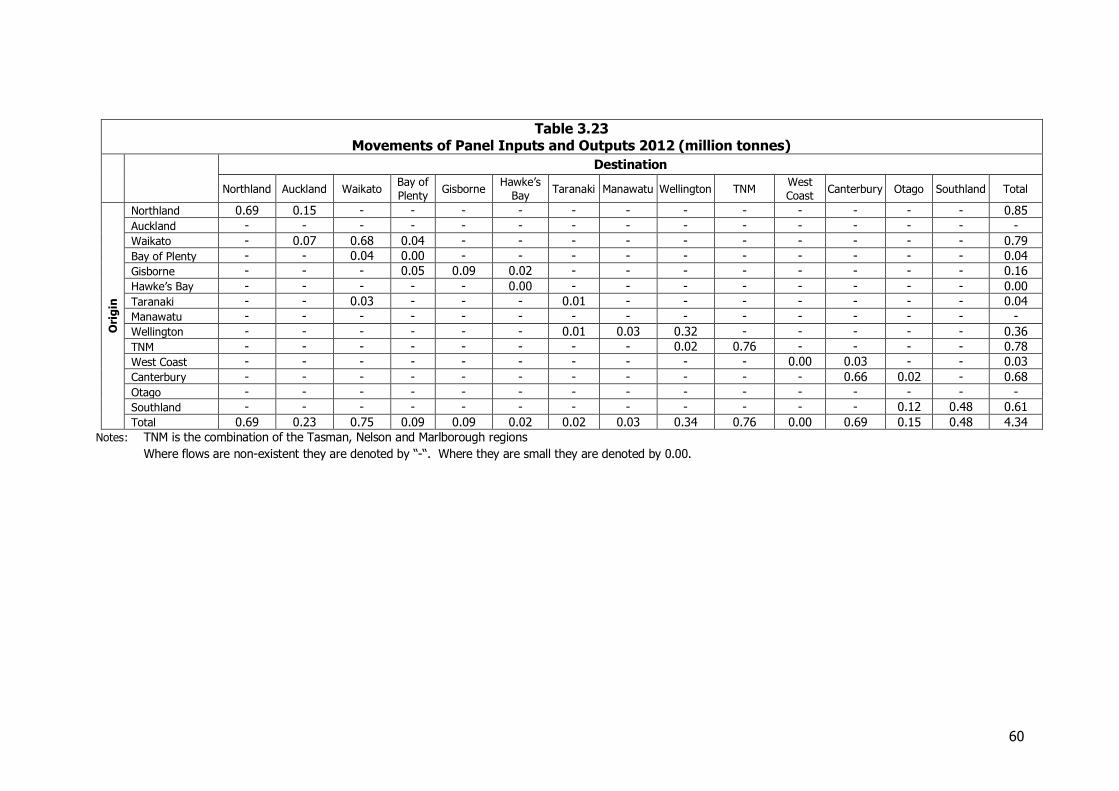
60
Table 3.23 Movements of Panel Inputs and Outputs 2012 (million tonnes)
Destination
Northland Auckland Waikato Bay of
Plenty Gisborne
Hawke’s
Bay Taranaki Manawatu Wellington TNM
West
Coast Canterbury Otago Southland Total
Ori
gin
Northland 0.69 0.15 - - - - - - - - - - - - 0.85
Auckland - - - - - - - - - - - - - - -
Waikato - 0.07 0.68 0.04 - - - - - - - - - - 0.79
Bay of Plenty - - 0.04 0.00 - - - - - - - - - - 0.04
Gisborne - - - 0.05 0.09 0.02 - - - - - - - - 0.16
Hawke’s Bay - - - - - 0.00 - - - - - - - - 0.00
Taranaki - - 0.03 - - - 0.01 - - - - - - - 0.04
Manawatu - - - - - - - - - - - - - - -
Wellington - - - - - - 0.01 0.03 0.32 - - - - - 0.36
TNM - - - - - - - - 0.02 0.76 - - - - 0.78
West Coast - - - - - - - - - - 0.00 0.03 - - 0.03
Canterbury - - - - - - - - - - - 0.66 0.02 - 0.68
Otago - - - - - - - - - - - - - - -
Southland - - - - - - - - - - - - 0.12 0.48 0.61
Total 0.69 0.23 0.75 0.09 0.09 0.02 0.02 0.03 0.34 0.76 0.00 0.69 0.15 0.48 4.34
Notes: TNM is the combination of the Tasman, Nelson and Marlborough regions Where flows are non-existent they are denoted by “-“. Where they are small they are denoted by 0.00.
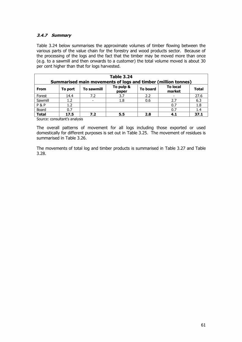
61
3.4.7 Summary Table 3.24 below summarises the approximate volumes of timber flowing between the various parts of the value chain for the forestry and wood products sector. Because of the processing of the logs and the fact that the timber may be moved more than once (e.g. to a sawmill and then onwards to a customer) the total volume moved is about 30 per cent higher than that for logs harvested.
Table 3.24 Summarised main movements of logs and timber (million tonnes)
From To port To sawmill To pulp &
paper To board
To local market
Total
Forest 14.4 7.2 3.7 2.2 - 27.6
Sawmill 1.2 - 1.8 0.6 2.7 6.3
P & P 1.2 0.7 1.8
Board 0.7 0.7 1.4
Total 17.5 7.2 5.5 2.8 4.1 37.1
Source: consultant’s analysis
The overall patterns of movement for all logs including those exported or used domestically for different purposes is set out in Table 3.25. The movement of residues is summarised in Table 3.26. The movements of total log and timber products is summarised in Table 3.27 and Table 3.28.
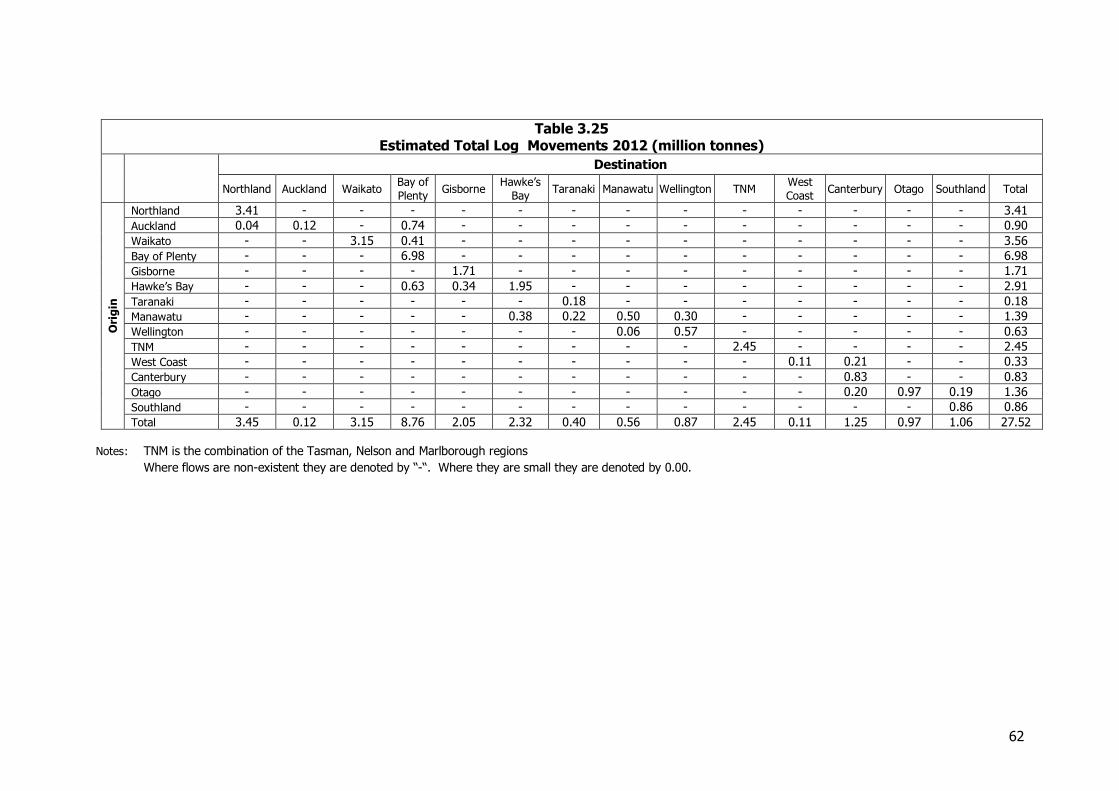
62
Table 3.25 Estimated Total Log Movements 2012 (million tonnes)
Destination
Northland Auckland Waikato Bay of
Plenty Gisborne
Hawke’s
Bay Taranaki Manawatu Wellington TNM
West
Coast Canterbury Otago Southland Total
Ori
gin
Northland 3.41 - - - - - - - - - - - - - 3.41
Auckland 0.04 0.12 - 0.74 - - - - - - - - - - 0.90
Waikato - - 3.15 0.41 - - - - - - - - - - 3.56
Bay of Plenty - - - 6.98 - - - - - - - - - - 6.98
Gisborne - - - - 1.71 - - - - - - - - - 1.71
Hawke’s Bay - - - 0.63 0.34 1.95 - - - - - - - - 2.91
Taranaki - - - - - - 0.18 - - - - - - - 0.18
Manawatu - - - - - 0.38 0.22 0.50 0.30 - - - - - 1.39
Wellington - - - - - - - 0.06 0.57 - - - - - 0.63
TNM - - - - - - - - - 2.45 - - - - 2.45
West Coast - - - - - - - - - - 0.11 0.21 - - 0.33
Canterbury - - - - - - - - - - - 0.83 - - 0.83
Otago - - - - - - - - - - - 0.20 0.97 0.19 1.36
Southland - - - - - - - - - - - - - 0.86 0.86
Total 3.45 0.12 3.15 8.76 2.05 2.32 0.40 0.56 0.87 2.45 0.11 1.25 0.97 1.06 27.52
Notes: TNM is the combination of the Tasman, Nelson and Marlborough regions Where flows are non-existent they are denoted by “-“. Where they are small they are denoted by 0.00.
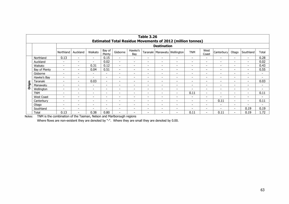
63
Table 3.26 Estimated Total Residue Movements of 2012 (million tonnes)
Destination
Northland Auckland Waikato Bay of
Plenty Gisborne
Hawke’s
Bay Taranaki Manawatu Wellington TNM
West
Coast Canterbury Otago Southland Total
Ori
gin
Northland 0.13 - - 0.15 - - - - - - - - - - 0.28
Auckland - - - 0.02 - - - - - - - - - - 0.02
Waikato - - 0.31 0.12 - - - - - - - - - - 0.43
Bay of Plenty - - 0.04 0.51 - - - - - - - - - - 0.55
Gisborne - - - - - - - - - - - - - - -
Hawke’s Bay - - - - - - - - - - - - - - -
Taranaki - - 0.03 - - - - - - - - - - - 0.03
Manawatu - - - - - - - - - - - - - - -
Wellington - - - - - - - - - - - - - - -
TNM - - - - - - - - - 0.11 - - - - 0.11
West Coast - - - - - - - - - - - - - - -
Canterbury - - - - - - - - - - - 0.11 - - 0.11
Otago - - - - - - - - - - - - - - -
Southland - - - - - - - - - - - - - 0.19 0.19
Total 0.13 - 0.38 0.80 - - - - - 0.11 - 0.11 - 0.19 1.72
Notes: TNM is the combination of the Tasman, Nelson and Marlborough regions Where flows are non-existent they are denoted by “-“. Where they are small they are denoted by 0.00.
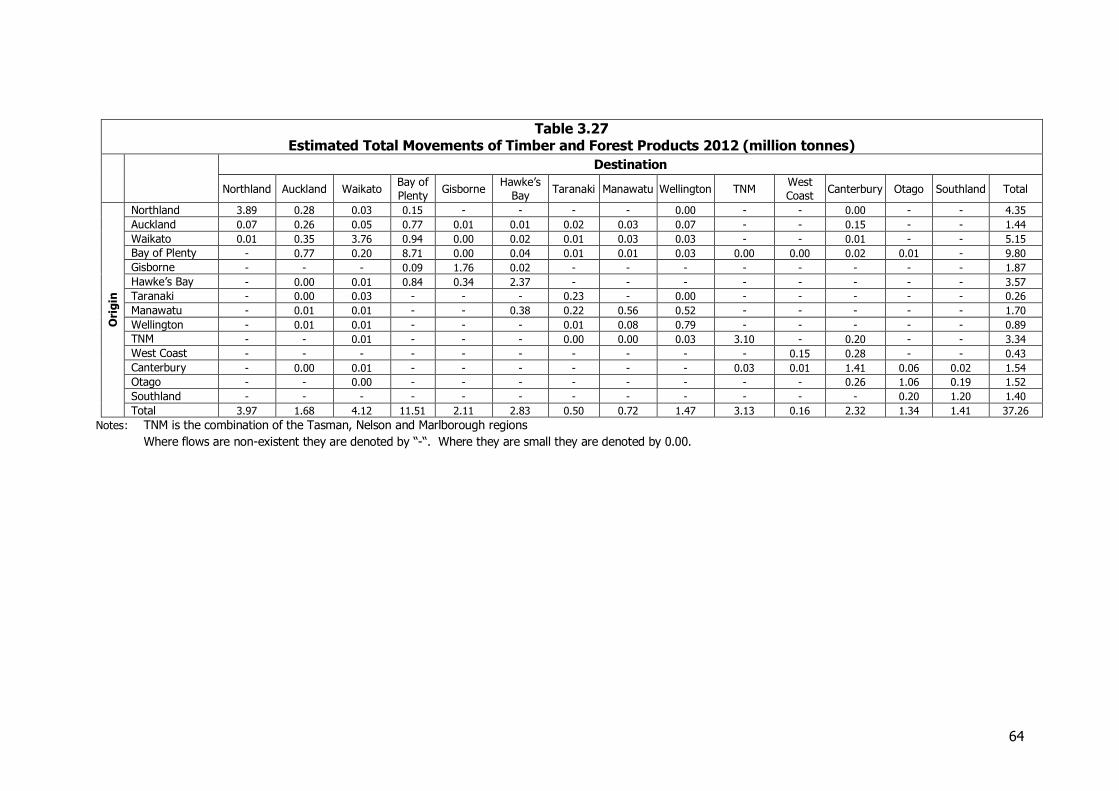
64
Table 3.27 Estimated Total Movements of Timber and Forest Products 2012 (million tonnes)
Destination
Northland Auckland Waikato Bay of
Plenty Gisborne
Hawke’s
Bay Taranaki Manawatu Wellington TNM
West
Coast Canterbury Otago Southland Total
Ori
gin
Northland 3.89 0.28 0.03 0.15 - - - - 0.00 - - 0.00 - - 4.35
Auckland 0.07 0.26 0.05 0.77 0.01 0.01 0.02 0.03 0.07 - - 0.15 - - 1.44
Waikato 0.01 0.35 3.76 0.94 0.00 0.02 0.01 0.03 0.03 - - 0.01 - - 5.15
Bay of Plenty - 0.77 0.20 8.71 0.00 0.04 0.01 0.01 0.03 0.00 0.00 0.02 0.01 - 9.80
Gisborne - - - 0.09 1.76 0.02 - - - - - - - - 1.87
Hawke’s Bay - 0.00 0.01 0.84 0.34 2.37 - - - - - - - - 3.57
Taranaki - 0.00 0.03 - - - 0.23 - 0.00 - - - - - 0.26
Manawatu - 0.01 0.01 - - 0.38 0.22 0.56 0.52 - - - - - 1.70
Wellington - 0.01 0.01 - - - 0.01 0.08 0.79 - - - - - 0.89
TNM - - 0.01 - - - 0.00 0.00 0.03 3.10 - 0.20 - - 3.34
West Coast - - - - - - - - - - 0.15 0.28 - - 0.43
Canterbury - 0.00 0.01 - - - - - - 0.03 0.01 1.41 0.06 0.02 1.54
Otago - - 0.00 - - - - - - - - 0.26 1.06 0.19 1.52
Southland - - - - - - - - - - - - 0.20 1.20 1.40
Total 3.97 1.68 4.12 11.51 2.11 2.83 0.50 0.72 1.47 3.13 0.16 2.32 1.34 1.41 37.26
Notes: TNM is the combination of the Tasman, Nelson and Marlborough regions Where flows are non-existent they are denoted by “-“. Where they are small they are denoted by 0.00.
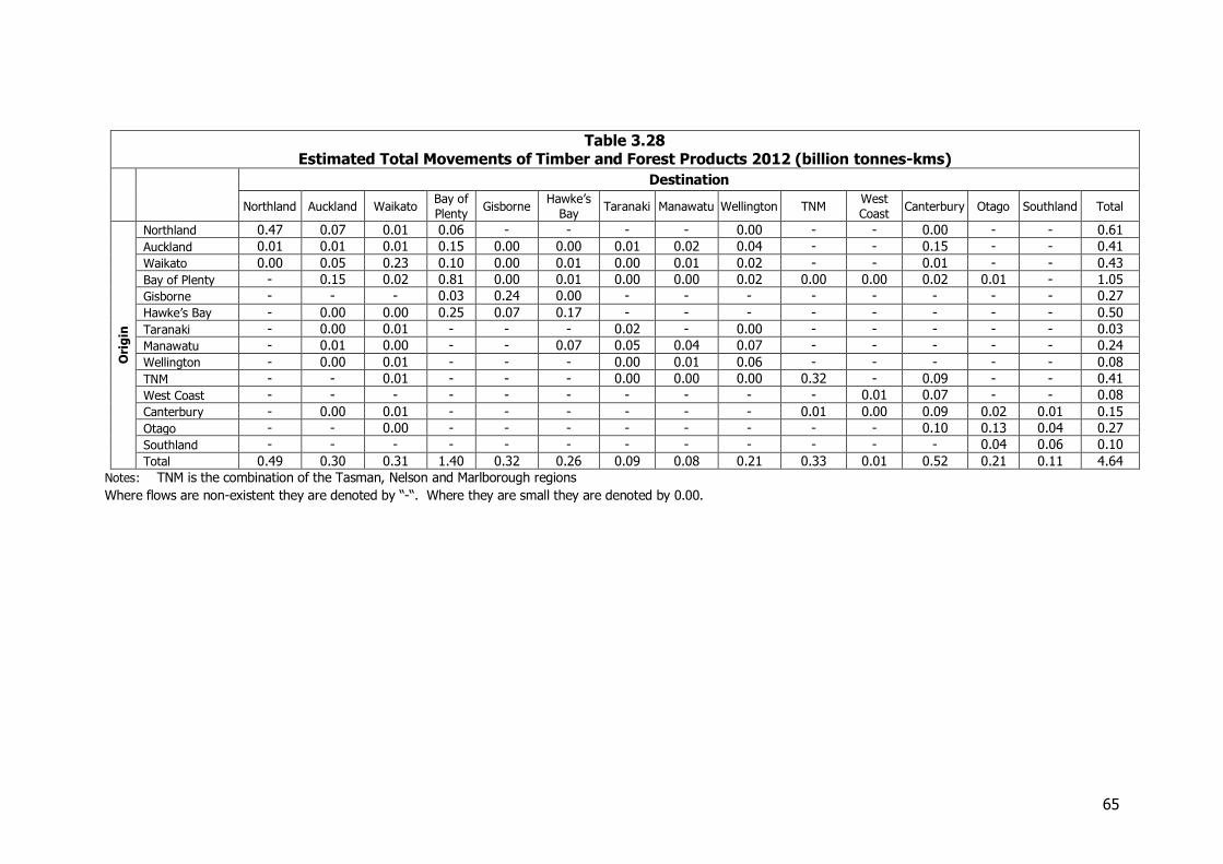
65
Table 3.28 Estimated Total Movements of Timber and Forest Products 2012 (billion tonnes-kms)
Destination
Northland Auckland Waikato Bay of
Plenty Gisborne
Hawke’s
Bay Taranaki Manawatu Wellington TNM
West
Coast Canterbury Otago Southland Total
Ori
gin
Northland 0.47 0.07 0.01 0.06 - - - - 0.00 - - 0.00 - - 0.61
Auckland 0.01 0.01 0.01 0.15 0.00 0.00 0.01 0.02 0.04 - - 0.15 - - 0.41
Waikato 0.00 0.05 0.23 0.10 0.00 0.01 0.00 0.01 0.02 - - 0.01 - - 0.43
Bay of Plenty - 0.15 0.02 0.81 0.00 0.01 0.00 0.00 0.02 0.00 0.00 0.02 0.01 - 1.05
Gisborne - - - 0.03 0.24 0.00 - - - - - - - - 0.27
Hawke’s Bay - 0.00 0.00 0.25 0.07 0.17 - - - - - - - - 0.50
Taranaki - 0.00 0.01 - - - 0.02 - 0.00 - - - - - 0.03
Manawatu - 0.01 0.00 - - 0.07 0.05 0.04 0.07 - - - - - 0.24
Wellington - 0.00 0.01 - - - 0.00 0.01 0.06 - - - - - 0.08
TNM - - 0.01 - - - 0.00 0.00 0.00 0.32 - 0.09 - - 0.41
West Coast - - - - - - - - - - 0.01 0.07 - - 0.08
Canterbury - 0.00 0.01 - - - - - - 0.01 0.00 0.09 0.02 0.01 0.15
Otago - - 0.00 - - - - - - - - 0.10 0.13 0.04 0.27
Southland - - - - - - - - - - - - 0.04 0.06 0.10
Total 0.49 0.30 0.31 1.40 0.32 0.26 0.09 0.08 0.21 0.33 0.01 0.52 0.21 0.11 4.64
Notes: TNM is the combination of the Tasman, Nelson and Marlborough regions Where flows are non-existent they are denoted by “-“. Where they are small they are denoted by 0.00.
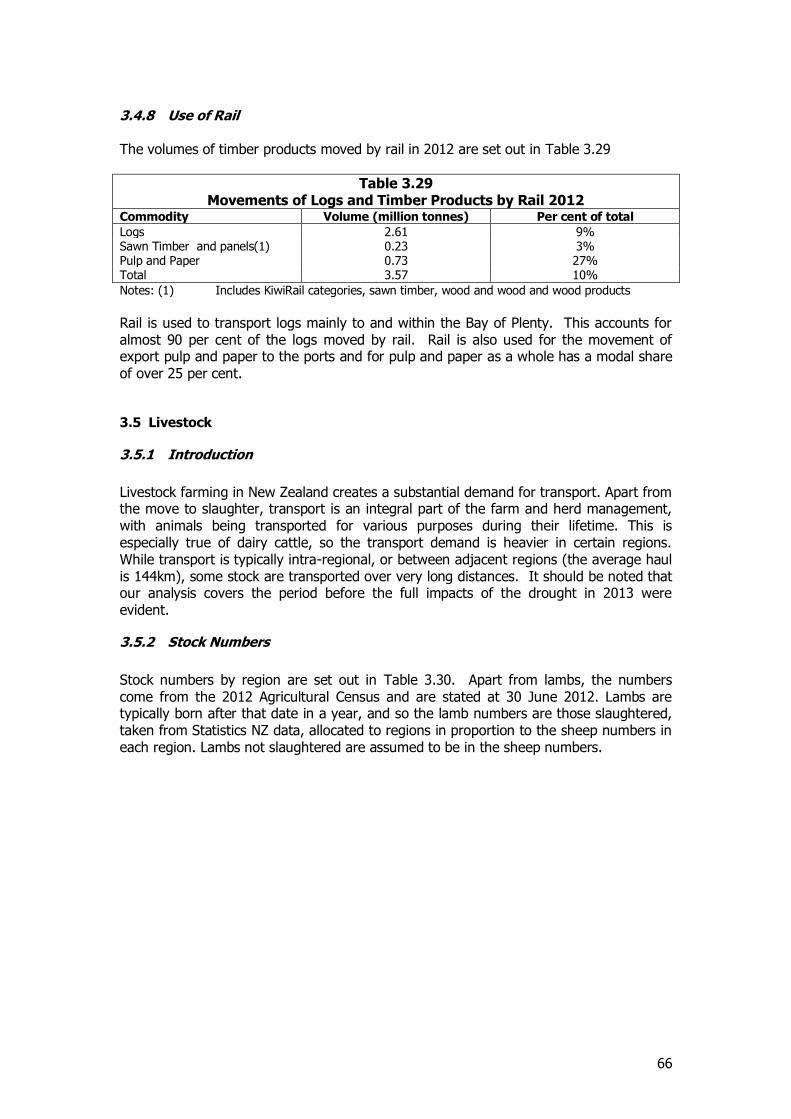
66
3.4.8 Use of Rail The volumes of timber products moved by rail in 2012 are set out in Table 3.29
Table 3.29 Movements of Logs and Timber Products by Rail 2012
Commodity Volume (million tonnes) Per cent of total
Logs 2.61 9% Sawn Timber and panels(1) 0.23 3% Pulp and Paper 0.73 27% Total 3.57 10%
Notes: (1) Includes KiwiRail categories, sawn timber, wood and wood and wood products
Rail is used to transport logs mainly to and within the Bay of Plenty. This accounts for almost 90 per cent of the logs moved by rail. Rail is also used for the movement of export pulp and paper to the ports and for pulp and paper as a whole has a modal share of over 25 per cent.
3.5 Livestock
3.5.1 Introduction
Livestock farming in New Zealand creates a substantial demand for transport. Apart from the move to slaughter, transport is an integral part of the farm and herd management, with animals being transported for various purposes during their lifetime. This is especially true of dairy cattle, so the transport demand is heavier in certain regions. While transport is typically intra-regional, or between adjacent regions (the average haul is 144km), some stock are transported over very long distances. It should be noted that our analysis covers the period before the full impacts of the drought in 2013 were evident.
3.5.2 Stock Numbers
Stock numbers by region are set out in Table 3.30. Apart from lambs, the numbers come from the 2012 Agricultural Census and are stated at 30 June 2012. Lambs are typically born after that date in a year, and so the lamb numbers are those slaughtered, taken from Statistics NZ data, allocated to regions in proportion to the sheep numbers in each region. Lambs not slaughtered are assumed to be in the sheep numbers.
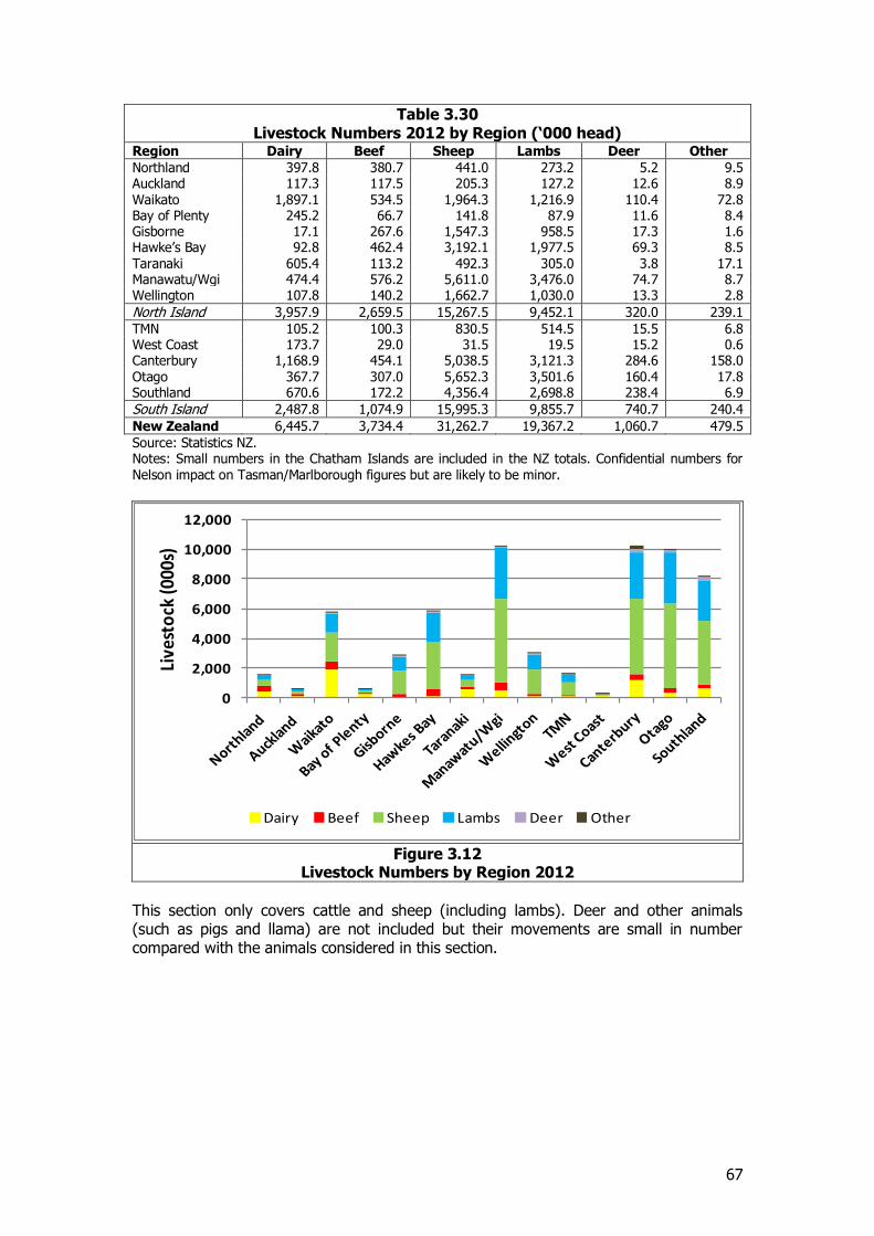
67
Table 3.30 Livestock Numbers 2012 by Region (‘000 head)
Region Dairy Beef Sheep Lambs Deer Other
Northland 397764 38719 44955 5158 9536 397.8 380.7 441.0 273.2 5.2 9.5 Auckland 117281 117.3 117.5 205.3 127.2 12.6 8.9 Waikato 1,897.1 534.5 1,964.3 1,216.9 110.4 72.8 Bay of Plenty 245.2 66.7 141.8 87.9 11.6 8.4 Gisborne 17.1 267.6 1,547.3 958.5 17.3 1.6 Hawke’s Bay 92.8 462.4 3,192.1 1,977.5 69.3 8.5 Taranaki 605.4 113.2 492.3 305.0 3.8 17.1 Manawatu/Wgi 474.4 576.2 5,611.0 3,476.0 74.7 8.7 Wellington 107.8 140.2 1,662.7 1,030.0 13.3 2.8
North Island 3,957.9 2,659.5 15,267.5 9,452.1 320.0 239.1
TMN 105.2 100.3 830.5 514.5 15.5 6.8 West Coast 173.7 29.0 31.5 19.5 15.2 0.6 Canterbury 1,168.9 454.1 5,038.5 3,121.3 284.6 158.0 Otago 367.7 307.0 5,652.3 3,501.6 160.4 17.8 Southland 670.6 172.2 4,356.4 2,698.8 238.4 6.9
South Island 2,487.8 1,074.9 15,995.3 9,855.7 740.7 240.4
New Zealand 6,445.7 3,734.4 31,262.7 19,367.2 1,060.7 479.5
Source: Statistics NZ. Notes: Small numbers in the Chatham Islands are included in the NZ totals. Confidential numbers for Nelson impact on Tasman/Marlborough figures but are likely to be minor.
Figure 3.12
Livestock Numbers by Region 2012
This section only covers cattle and sheep (including lambs). Deer and other animals (such as pigs and llama) are not included but their movements are small in number compared with the animals considered in this section.
0
2,000
4,000
6,000
8,000
10,000
12,000
Live
sto
ck (0
00s)
Dairy Beef Sheep Lambs Deer Other
68
3.5.3 Sources of Information and Methodology
In NFDS 2008 information on livestock movement was sparse and the material was limited to movements to slaughter. In 2012 the National Animal Identification and Tracing Act (“NAIT”) was passed. This set up a mandatory system of registration of animals and their movement. Cattle were in the scheme for the beginning, and deer were added from March 2013. Apart from some short distance movements between farms in common ownership, each individual movement of these animals must be recorded electronically and stored on a central computer. Even though the primary purpose of the system is biosecurity, the data gathered is a powerful source of information on livestock movements. The Act recognises that statistics are a valuable output of the system. NAIT was originally administered by an agency under the Ministry of Primary Industries also called NAIT, but this has merged with another entity and the combined body is now called OSPRI (Operational Solutions for Primary Industries). We are grateful for their cooperation with the study. The information on cattle (and deer) is recorded on a farm by farm basis, along with movements to and from other facilities like sale yards, export holding facilities, and meat processing works. The data is classified by post code and by territorial local authority (“TLA”). While in principle data is available at both these levels, using the post code level would have multiplied the data, and was likely to reveal details of individual farmers. The Act stresses the need for privacy. As well, data can be classified according to the type of origin and destination (farm, saleyard, meatworks, etc.). At a TLA level (and even regional level in some cases) this would have revealed data about individual facilities. So the data for this study was all movements, without classification, from TLA to TLA. Some breakdown of the type of movement is given below, without origin and destination detail. Since the study is about distances as well as weight, and tonne-km are an important output, the data was analysed in terms of TLA origins and destinations, with distances assessed within and between TLAs, and later added into regions. This results in a more accurate assessment of the tonne-kilometres than would have been possible by analysis at regional level alone. The data was for the first year of NAIT operation, from July 2012 to June 2013. As such it is an estimate of the 2012 year. The take up by farmers was also gradual, so the numbers represented as movements by the data will be underrepresented. They have been adjusted by reference to the animals registered under NAIT at the end of each quarter, and with the overall herd size as recorded by the 2012 Agricultural Census. While some movements are seasonal, the gradual increase in coverage is less likely to have impacted on the pattern of movements than on the overall total. The data is in head (number of animals) so a representative weight for a live animal was derived from information from Beef and Lamb. The data suggest that each cattle animal is moved 1.7 times a year on average.
69
NAIT does not cover sheep, so their numbers were taken from the 2012 Agricultural Census, with lambs (for slaughter) added on the basis of information from Beef and Lamb and allocated to TLA on the basis of sheep numbers. There remains little information on sheep movements both in terms of where they move and also how often they move. The movements were assessed with the help of the author of a survey done for animal welfare purposes (a MPI Veterinarian) who was able to make reasonable estimates of the distances moved, in broad distance bands. This was applied to the origins of the sheep and lambs (from the census) to estimate destinations. Regard was paid to slaughter facilities (a list supplied by Beef and Lamb), which are not necessarily in the same regions where the sheep are grown, and the estimates were balanced against slaughter figures by region (from Statistics NZ). This can only be an estimate, as sheep are moved for management purposes as well as for slaughter. Adult sheep were assumed to move every 2 years, and lambs once a year (to slaughter). While both cattle and lamb movements are estimated, the estimate for cattle is much firmer. Any error in the sheep estimate is likely to be less important. Sheep total 31m, at about 50kg each, and are assumed to travel 0.5 times a year, about 820,000 tonnes. Lambs for slaughter total 19m but travel once in a year’s lifetime, with a total weight 750,000 tonnes. A cattle beast (including dairy) weighs about 9 times a sheep, so while there are only a third as many cattle as sheep (a fifth including lambs), their impact on weight carried is much greater, and their movements total 7.5 million tonnes.
3.5.4 Nature of Movement
As noted, cattle and sheep are managed by transporting them between properties as well as for slaughter. Sheep move from farm to farm for fattening and for slaughter, but probably only two or three times during their lifetime. Beef cattle are likely to have similar patterns to sheep. Deer are more sensitive and do not move much during their life. Cows, on the other hand, are transported more frequently than sheep as a result of intensive management practices. A cow may:-
Be born on a farm Be transported to another “support” farm to be fattened and mated before being
sent to the original (or other) farm for calving and then milking
Be moved off the dairy farm to winter grazing each year, over quite substantial hauls (so called “grazing off”)
Be moved back to the dairy farm in the same year Be moved to new owners or new locations for sharemilkers, possibly once a year Be moved to slaughter at the end of their life.
The trend to dairying is likely to increase transport demand from the livestock industry. Data from NAIT also reveals a complex pattern of movement, at least for cattle. The following table is for the whole of New Zealand for the 2012-13 year, but has not been adjusted for the gradual uptake.
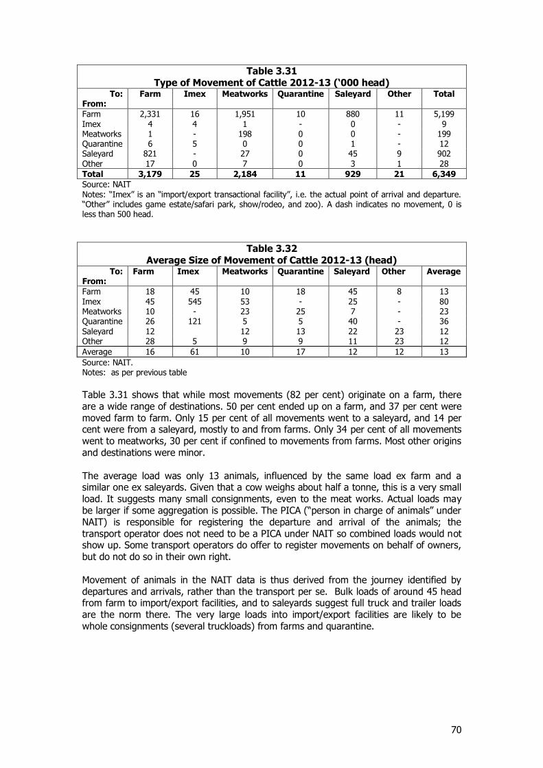
70
Table 3.31 Type of Movement of Cattle 2012-13 (‘000 head)
To: From:
Farm Imex Meatworks Quarantine Saleyard Other Total
Farm 2,331 16 1,951 10 880 11 5,199 Imex 4 4 1 - 0 - 9 Meatworks 1 - 198 0 0 - 199 Quarantine 6 5 0 0 1 - 12 Saleyard 821 - 27 0 45 9 902 Other 17 0 7 0 3 1 28
Total 3,179 25 2,184 11 929 21 6,349
Source: NAIT Notes: “Imex” is an “import/export transactional facility”, i.e. the actual point of arrival and departure. “Other” includes game estate/safari park, show/rodeo, and zoo). A dash indicates no movement, 0 is less than 500 head.
Table 3.32 Average Size of Movement of Cattle 2012-13 (head)
To: From:
Farm Imex Meatworks Quarantine Saleyard Other Average
Farm 18 45 10 18 45 8 13 Imex 45 545 53 - 25 - 80 Meatworks 10 - 23 25 7 - 23 Quarantine 26 121 5 5 40 - 36 Saleyard 12 12 13 22 23 12 Other 28 5 9 9 11 23 12
Average 16 61 10 17 12 12 13
Source: NAIT. Notes: as per previous table
Table 3.31 shows that while most movements (82 per cent) originate on a farm, there are a wide range of destinations. 50 per cent ended up on a farm, and 37 per cent were moved farm to farm. Only 15 per cent of all movements went to a saleyard, and 14 per cent were from a saleyard, mostly to and from farms. Only 34 per cent of all movements went to meatworks, 30 per cent if confined to movements from farms. Most other origins and destinations were minor. The average load was only 13 animals, influenced by the same load ex farm and a similar one ex saleyards. Given that a cow weighs about half a tonne, this is a very small load. It suggests many small consignments, even to the meat works. Actual loads may be larger if some aggregation is possible. The PICA (“person in charge of animals” under NAIT) is responsible for registering the departure and arrival of the animals; the transport operator does not need to be a PICA under NAIT so combined loads would not show up. Some transport operators do offer to register movements on behalf of owners, but do not do so in their own right. Movement of animals in the NAIT data is thus derived from the journey identified by departures and arrivals, rather than the transport per se. Bulk loads of around 45 head from farm to import/export facilities, and to saleyards suggest full truck and trailer loads are the norm there. The very large loads into import/export facilities are likely to be whole consignments (several truckloads) from farms and quarantine.
71
3.5.5 International Trade
The movement type tables suggest that international trade in livestock is very limited. Data from port statistics for 2012 confirm this. Total exports were 12,817 tonnes, most of which were cattle from Napier (8,600 tonnes) and Timaru (2,390 tonnes). The rest, along with 500 tonnes of imports, was largely handled through airports and consisted mostly of horses. Livestock movements are almost entirely domestic (although as they largely support export industries, they are export-related).
3.5.6 Major Movements
Overall the matrices show that some 8.5 million tonnes of cattle and sheep are moved annually. Cattle make up the bulk, 6.9 million tonnes or 81 per cent, and sheep and lambs 1.6 million tonnes (19 per cent). In terms of tonne kilometres, the total of 1.2bn is dominated by cattle, 1.0bn. The overall average haul is 144 km (cattle 145 km, sheep 137 km). The matrices show the overall pattern of movement for all cattle and sheep together. The discussion below highlights the major patterns for cattle and sheep separately. Most cattle movements in terms of tonnes take place within regions, 4.7 million tonnes, or 68 per cent of all cattle movements. They move an average of 63 km, so they represent 0.3 billion tonne-kms, only 29 per cent of total tonne-kms. The South Island average intra-regional distance is higher at 72 km, influenced by the size of the Canterbury region. Outside the internal regional flows, movements in the North Island totalled 1.5 million tonnes and 0.4 billion tonne-kms, with an average haul of 251 km, about the distance from Waikato to Hawke’s Bay or Manawatu. For the South Island the equivalent figures are 0.5 million tonnes, 0.2 billion tonne-kms, and 324 km (Canterbury to Otago). Note that the distances are based on TLA to TLA distances, so reflect the relative number of cattle in each TLA. There are substantial flows between the North and South Islands, but at much lower levels, 0.07m southbound and 0.1m northbound, with average distances 1000 km southbound and 800 km northbound. There are some very long flows recorded, for example from Southland to Northland, 1860 km, and Bay of Plenty to Southland, 1550 km, though the volumes are low. The patterns for cattle were derived from NAIT data, so represent actual movements. There is no such information for sheep, so the movement had to be assessed using the distance bands referred to above. These were that 60 per cent of sheep moved under 150 km, 20 per cent 150-300 km, and 20 per cent over 300 km. These were applied to regional totals of sheep, along with information on slaughter locations and volumes, by region. In principle it was assumed that shorter distances to plants would be favoured, subject to supply to each region matching the slaughter output. The pattern for sheep movements were the outcome of this process, rather than being derived from actual data. Nevertheless, the patterns do relate well to those of cattle, suggesting that if empirical data were available, it would not be too different. The same average distances within the region and between regions as for cattle were used.
72
55 per cent of sheep movements are internal to their regions, representing 28 per cent of tonne-kms, with an average haul of 68 km. Movements in the North Island outside the internal regional flows totalled 0.36 million tonnes, and in the South Island 0.31 million tonnes for average hauls of 213 and 223 km respectively. Including internal flows, volumes in the South Island totalled 0.80 million tonnes and in the North Island 0.74 million tonnes. Interisland flows were minimal.
3.5.7 Mode of Transport
All livestock is transported internally by road. There is no rail movement of livestock, nor coastal shipping (except from the Chathams or across Cook Strait). International trade is by ship and air, but as noted this is limited.
3.5.8 Comparison with NFDS 2008
As noted the 2008 estimate of livestock was for part of the market only, so comparisons are not possible.
3.5.9 Interregional Movement Patterns
These are set out in Table 3.33 and Table 3.34.
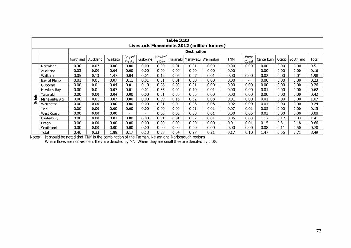
73
Table 3.33 Livestock Movements 2012 (million tonnes)
Destination
Northland Auckland Waikato Bay of
Plenty Gisborne
Hawke’
s Bay Taranaki Manawatu Wellington TNM
West
Coast Canterbury Otago Southland Total
Ori
gin
Northland 0.36 0.07 0.06 0.00 0.00 0.00 0.01 0.01 0.00 0.00 0.00 0.00 0.00 0.00 0.51
Auckland 0.03 0.09 0.04 0.00 0.00 0.00 0.00 0.00 0.00 0.00 - 0.00 0.00 0.00 0.16
Waikato 0.05 0.13 1.47 0.04 0.01 0.12 0.06 0.07 0.01 0.00 0.00 0.02 0.00 0.01 1.98
Bay of Plenty 0.01 0.01 0.07 0.11 0.01 0.01 0.01 0.00 0.00 0.00 - 0.00 0.00 0.00 0.23
Gisborne 0.00 0.01 0.04 0.01 0.10 0.08 0.00 0.01 0.00 0.00 0.00 0.00 0.00 0.00 0.26
Hawke’s Bay 0.00 0.01 0.07 0.01 0.01 0.35 0.04 0.10 0.01 0.00 0.00 0.01 0.00 0.00 0.62
Taranaki 0.00 0.00 0.04 0.00 0.00 0.01 0.30 0.05 0.00 0.00 0.00 0.00 0.00 0.00 0.42
Manawatu/Wgi 0.00 0.01 0.07 0.00 0.00 0.09 0.16 0.62 0.08 0.01 0.00 0.01 0.00 0.00 1.07
Wellington 0.00 0.00 0.00 0.00 0.00 0.01 0.04 0.08 0.08 0.02 0.00 0.01 0.00 0.00 0.24
TNM 0.00 0.00 0.00 0.00 0.00 0.00 0.00 0.01 0.01 0.07 0.01 0.05 0.00 0.00 0.15
West Coast 0.00 0.00 0.00 - - 0.00 0.00 0.00 0.01 0.00 0.05 0.02 0.00 0.00 0.08
Canterbury 0.00 0.00 0.02 0.00 0.00 0.01 0.01 0.02 0.01 0.05 0.03 1.12 0.12 0.03 1.41
Otago 0.00 0.00 0.00 0.00 0.00 0.00 0.00 0.00 0.00 0.01 0.01 0.15 0.31 0.18 0.66
Southland 0.00 0.00 0.00 0.00 0.00 0.00 0.00 0.00 0.00 0.00 0.00 0.08 0.11 0.50 0.70
Total 0.46 0.33 1.89 0.17 0.13 0.68 0.64 0.97 0.21 0.17 0.10 1.47 0.55 0.71 8.49
Notes: It should be noted that TNM is the combination of the Tasman, Nelson and Marlborough regions Where flows are non-existent they are denoted by “-“. Where they are small they are denoted by 0.00.
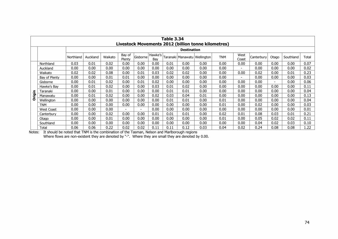
74
Table 3.34 Livestock Movements 2012 (billion tonne kilometres)
Destination
Northland Auckland Waikato Bay of
Plenty Gisborne
Hawke’s
Bay Taranaki Manawatu Wellington TNM
West
Coast Canterbury Otago Southland Total
Ori
gin
Northland 0.03 0.01 0.02 0.00 0.00 0.00 0.01 0.00 0.00 0.00 0.00 0.00 0.00 0.00 0.07
Auckland 0.00 0.00 0.00 0.00 0.00 0.00 0.00 0.00 0.00 0.00 - 0.00 0.00 0.00 0.02
Waikato 0.02 0.02 0.08 0.00 0.01 0.03 0.02 0.02 0.00 0.00 0.00 0.02 0.00 0.01 0.23
Bay of Plenty 0.00 0.00 0.01 0.01 0.00 0.00 0.00 0.00 0.00 0.00 - 0.00 0.00 0.00 0.03
Gisborne 0.00 0.01 0.02 0.00 0.01 0.02 0.00 0.00 0.00 0.00 0.00 0.00 - 0.00 0.06
Hawke’s Bay 0.00 0.01 0.02 0.00 0.00 0.03 0.01 0.02 0.00 0.00 0.00 0.00 0.00 0.00 0.11
Taranaki 0.00 0.00 0.01 0.00 0.00 0.00 0.01 0.01 0.00 0.00 0.00 0.00 0.00 0.00 0.04
Manawatu 0.00 0.01 0.02 0.00 0.00 0.02 0.03 0.04 0.01 0.00 0.00 0.00 0.00 0.00 0.13
Wellington 0.00 0.00 0.00 0.00 0.00 0.00 0.01 0.01 0.00 0.01 0.00 0.00 0.00 0.00 0.04
TNM 0.00 0.00 0.00 0.00 0.00 0.00 0.00 0.00 0.00 0.01 0.00 0.02 0.00 0.00 0.03
West Coast 0.00 0.00 0.00 - - 0.00 0.00 0.00 0.00 0.00 0.00 0.00 0.00 0.00 0.01
Canterbury 0.00 0.00 0.02 0.00 0.00 0.01 0.01 0.01 0.00 0.02 0.01 0.08 0.03 0.01 0.21
Otago 0.00 0.00 0.01 0.00 0.00 0.00 0.00 0.00 0.00 0.01 0.00 0.05 0.02 0.02 0.11
Southland 0.00 0.00 0.00 0.00 0.00 0.00 0.00 0.00 0.00 0.00 0.00 0.04 0.02 0.03 0.10
Total 0.06 0.06 0.22 0.02 0.02 0.11 0.11 0.12 0.03 0.04 0.02 0.24 0.08 0.08 1.22
Notes: It should be noted that TNM is the combination of the Tasman, Nelson and Marlborough regions Where flows are non-existent they are denoted by “-“. Where they are small they are denoted by 0.00.
75
3.6 Meat and Meat By-Products
3.6.1 Introduction Meat and its by-products contribute around 10 per cent of New Zealand’s export earnings, with beef and lamb contributing close to 50 per cent each respectively of earnings from this sector. Beef volumes have remained reasonably static in recent years though the sector is facing pressure from declining returns and pressure on land from dairy. Similar pressures on the sheep and lamb sector have seen steadily declining sheep numbers in recent years. Ovine livestock head in 2012 numbered approximately 31 million, a 21 per cent decline on the 40 million head in 2002.6 This decline in sheep numbers is somewhat countered by improved productivity, both in lambing percentage (121 per cent in 2011-12 cf 113 per cent in 2001-02) and average lamb weights (18.7 kg in 2011-12 cf 16.9 kg in 2001-02)7. The meat sector has grappled with a number of structural issues in recent years and is working towards a more collaborative response to address the challenge of declining economic returns. There is consensus within the industry that the sector must focus on profitability through improved farming practices, higher yielding products and targeted marketing. Consequently, as land for meat and wool production is squeezed by dairy conversions, volumes in the sector are likely to remain flat while the focus shifts to improving productivity, growing and creating products that the market wants and coordinating efforts across the supply chain.
3.6.2 Information Sources The main sources of published information on the movements of meat are:
Statistics NZ Beef + Lamb NZ Ministry for Primary Industries KiwiRail Port companies
As noted in NFDS2008, the meat sector remains highly sensitive to the release of commercial information and, while participants were willing to discuss developments in general terms, the meat processing companies were unwilling to provide production and movement data to support the study. Consequently alternative approaches were used to estimate patterns of movements using production and export statistics provided primarily by Statistics NZ and Beef and Lamb NZ.
3.6.3 Composition of the Freight Task Meat production is dominated by beef and lamb, with pork the third largest meat by production volume. While beef and lamb is export driven, pork production is purely grown for domestic consumption because of limitations on the cross border movements.
6 Beef + Lamb, NZ, Compendium of New Zealand Farm Facts, 2013 7 Beef + Lamb NZ, Compendium of New Zealand Farm Facts, 2013
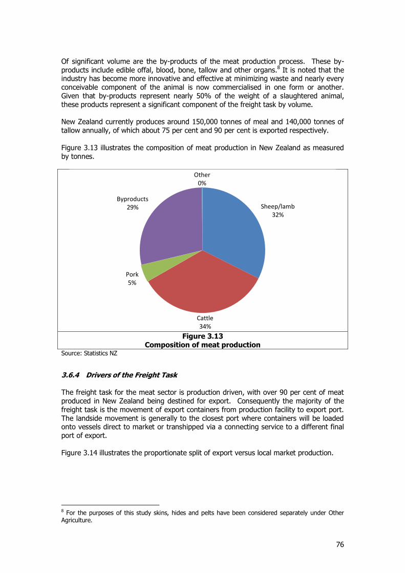
76
Of significant volume are the by-products of the meat production process. These by-products include edible offal, blood, bone, tallow and other organs.8 It is noted that the industry has become more innovative and effective at minimizing waste and nearly every conceivable component of the animal is now commercialised in one form or another. Given that by-products represent nearly 50% of the weight of a slaughtered animal, these products represent a significant component of the freight task by volume. New Zealand currently produces around 150,000 tonnes of meal and 140,000 tonnes of tallow annually, of which about 75 per cent and 90 per cent is exported respectively. Figure 3.13 illustrates the composition of meat production in New Zealand as measured by tonnes.
Figure 3.13
Composition of meat production Source: Statistics NZ
3.6.4 Drivers of the Freight Task The freight task for the meat sector is production driven, with over 90 per cent of meat produced in New Zealand being destined for export. Consequently the majority of the freight task is the movement of export containers from production facility to export port. The landside movement is generally to the closest port where containers will be loaded onto vessels direct to market or transhipped via a connecting service to a different final port of export. Figure 3.14 illustrates the proportionate split of export versus local market production.
8 For the purposes of this study skins, hides and pelts have been considered separately under Other Agriculture.
Sheep/lamb 32%
Cattle 34%
Pork 5%
Byproducts 29%
Other 0%
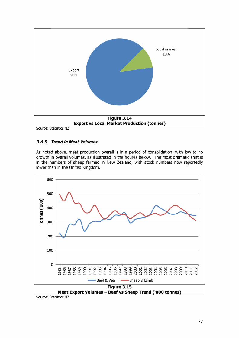
77
Figure 3.14
Export vs Local Market Production (tonnes) Source: Statistics NZ
3.6.5 Trend in Meat Volumes As noted above, meat production overall is in a period of consolidation, with low to no growth in overall volumes, as illustrated in the figures below. The most dramatic shift is in the numbers of sheep farmed in New Zealand, with stock numbers now reportedly lower than in the United Kingdom.
Figure 3.15
Meat Export Volumes – Beef vs Sheep Trend (‘000 tonnes) Source: Statistics NZ
Export 90%
Local market 10%
0
100
200
300
400
500
600
1985
1986
1987
1988
1989
1990
1991
1992
1993
1994
1995
1996
1997
1998
1999
2000
2001
2002
2003
2004
2005
2006
2007
2008
2009
2010
2011
2012
Ton
nes
('0
00)
Beef & Veal Sheep & Lamb
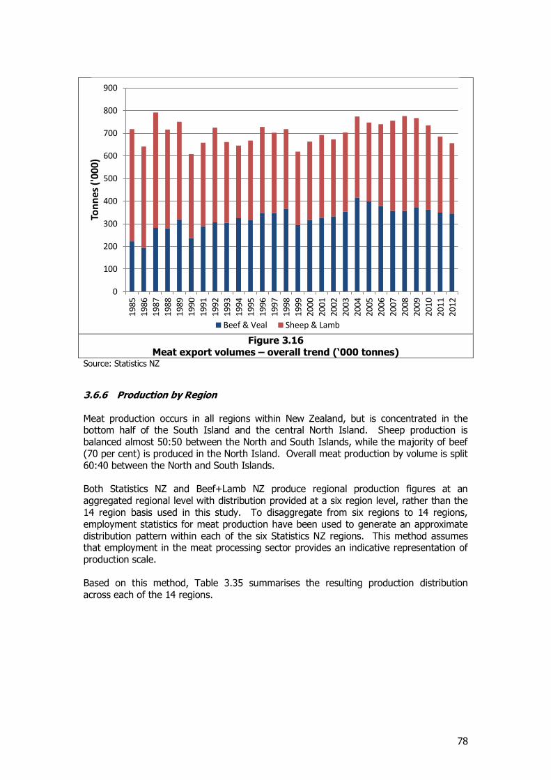
78
Figure 3.16
Meat export volumes – overall trend (‘000 tonnes) Source: Statistics NZ
3.6.6 Production by Region Meat production occurs in all regions within New Zealand, but is concentrated in the bottom half of the South Island and the central North Island. Sheep production is balanced almost 50:50 between the North and South Islands, while the majority of beef (70 per cent) is produced in the North Island. Overall meat production by volume is split 60:40 between the North and South Islands. Both Statistics NZ and Beef+Lamb NZ produce regional production figures at an aggregated regional level with distribution provided at a six region level, rather than the 14 region basis used in this study. To disaggregate from six regions to 14 regions, employment statistics for meat production have been used to generate an approximate distribution pattern within each of the six Statistics NZ regions. This method assumes that employment in the meat processing sector provides an indicative representation of production scale. Based on this method, Table 3.35 summarises the resulting production distribution across each of the 14 regions.
0
100
200
300
400
500
600
700
800
900
1985
1986
1987
1988
1989
1990
1991
1992
1993
1994
1995
1996
1997
1998
1999
2000
2001
2002
2003
2004
2005
2006
2007
2008
2009
2010
2011
2012
Ton
ne
s ('
00
0)
Beef & Veal Sheep & Lamb
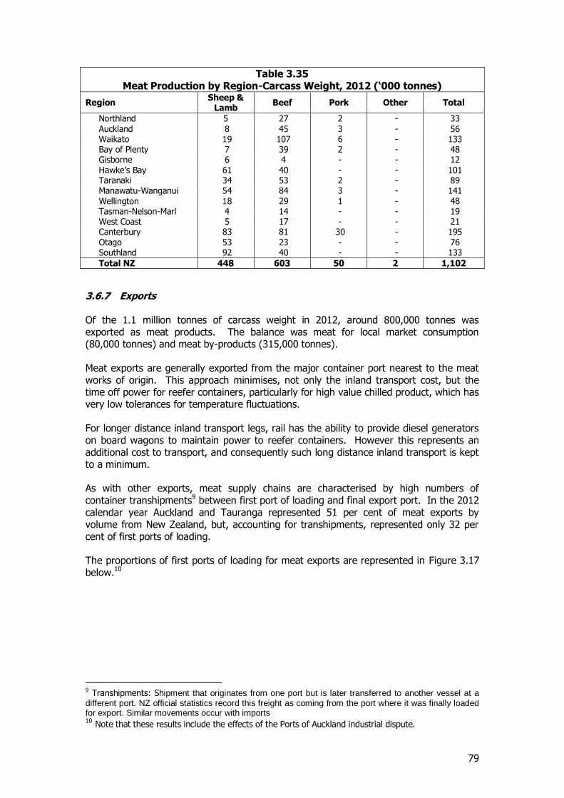
79
Table 3.35 Meat Production by Region-Carcass Weight, 2012 (‘000 tonnes)
Region Sheep &
Lamb Beef Pork Other Total
Northland 5 27 2 - 33 Auckland 8 45 3 - 56 Waikato 19 107 6 - 133 Bay of Plenty 7 39 2 - 48 Gisborne 6 4 - - 12 Hawke’s Bay 61 40 - - 101 Taranaki 34 53 2 - 89 Manawatu-Wanganui 54 84 3 - 141 Wellington 18 29 1 - 48 Tasman-Nelson-Marl 4 14 - - 19 West Coast 5 17 - - 21 Canterbury 83 81 30 - 195 Otago 53 23 - - 76 Southland 92 40 - - 133
Total NZ 448 603 50 2 1,102
3.6.7 Exports Of the 1.1 million tonnes of carcass weight in 2012, around 800,000 tonnes was exported as meat products. The balance was meat for local market consumption (80,000 tonnes) and meat by-products (315,000 tonnes). Meat exports are generally exported from the major container port nearest to the meat works of origin. This approach minimises, not only the inland transport cost, but the time off power for reefer containers, particularly for high value chilled product, which has very low tolerances for temperature fluctuations. For longer distance inland transport legs, rail has the ability to provide diesel generators on board wagons to maintain power to reefer containers. However this represents an additional cost to transport, and consequently such long distance inland transport is kept to a minimum. As with other exports, meat supply chains are characterised by high numbers of container transhipments9 between first port of loading and final export port. In the 2012 calendar year Auckland and Tauranga represented 51 per cent of meat exports by volume from New Zealand, but, accounting for transhipments, represented only 32 per cent of first ports of loading. The proportions of first ports of loading for meat exports are represented in Figure 3.17 below.10
9 Transhipments: Shipment that originates from one port but is later transferred to another vessel at a different port. NZ official statistics record this freight as coming from the port where it was finally loaded for export. Similar movements occur with imports 10 Note that these results include the effects of the Ports of Auckland industrial dispute.
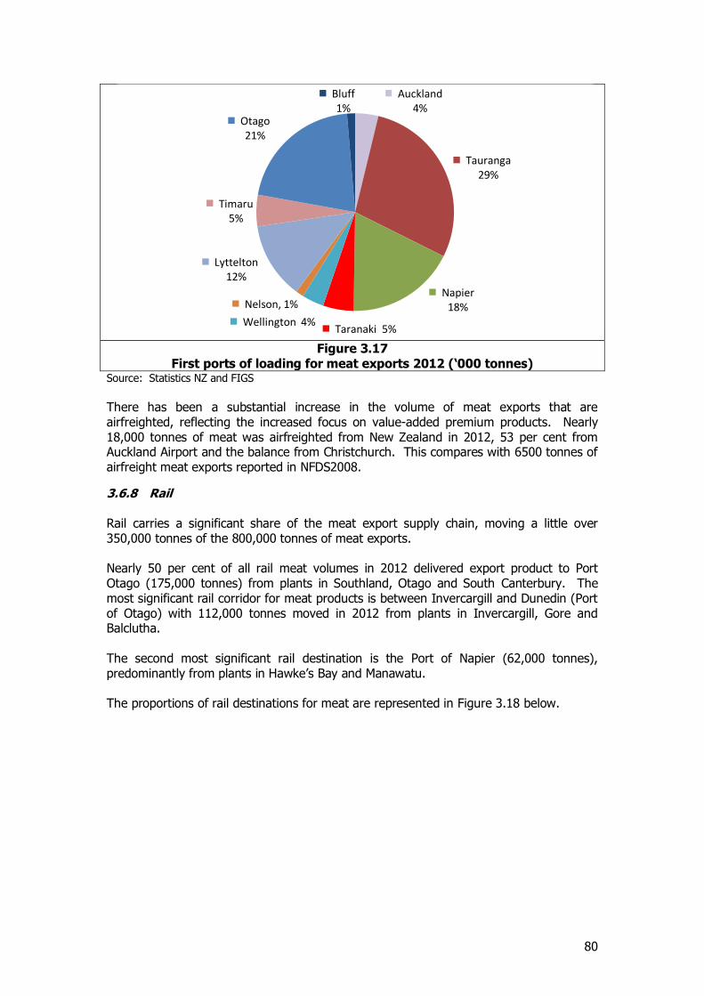
80
Figure 3.17
First ports of loading for meat exports 2012 (‘000 tonnes) Source: Statistics NZ and FIGS
There has been a substantial increase in the volume of meat exports that are airfreighted, reflecting the increased focus on value-added premium products. Nearly 18,000 tonnes of meat was airfreighted from New Zealand in 2012, 53 per cent from Auckland Airport and the balance from Christchurch. This compares with 6500 tonnes of airfreight meat exports reported in NFDS2008.
3.6.8 Rail Rail carries a significant share of the meat export supply chain, moving a little over 350,000 tonnes of the 800,000 tonnes of meat exports. Nearly 50 per cent of all rail meat volumes in 2012 delivered export product to Port Otago (175,000 tonnes) from plants in Southland, Otago and South Canterbury. The most significant rail corridor for meat products is between Invercargill and Dunedin (Port of Otago) with 112,000 tonnes moved in 2012 from plants in Invercargill, Gore and Balclutha. The second most significant rail destination is the Port of Napier (62,000 tonnes), predominantly from plants in Hawke’s Bay and Manawatu. The proportions of rail destinations for meat are represented in Figure 3.18 below.
Auckland 4%
Tauranga 29%
Napier 18%
Taranaki 5% Wellington 4%
Nelson, 1%
Lyttelton 12%
Timaru 5%
Otago 21%
Bluff 1%
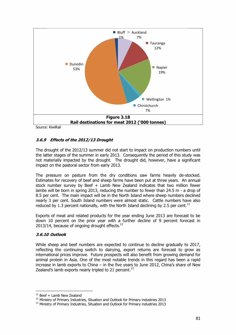
81
Figure 3.18
Rail destinations for meat 2012 (‘000 tonnes) Source: KiwiRail
3.6.9 Effects of the 2012/13 Drought The drought of the 2012/13 summer did not start to impact on production numbers until the latter stages of the summer in early 2013. Consequently the period of this study was not materially impacted by the drought. The drought did, however, have a significant impact on the pastoral sector from early 2013. The pressure on pasture from the dry conditions saw farms heavily de-stocked. Estimates for recovery of beef and sheep farms have been put at three years. An annual stock number survey by Beef + Lamb New Zealand indicates that two million fewer lambs will be born in spring 2013, reducing the number to fewer than 24.5 m - a drop of 8.5 per cent. The main impact will be in the North Island where sheep numbers declined nearly 3 per cent. South Island numbers were almost static. Cattle numbers have also reduced by 1.3 percent nationally, with the North Island declining by 2.5 per cent.11 Exports of meat and related products for the year ending June 2013 are forecast to be down 10 percent on the prior year with a further decline of 9 percent forecast in 2013/14, because of ongoing drought effects.12
3.6.10 Outlook While sheep and beef numbers are expected to continue to decline gradually to 2017, reflecting the continuing switch to dairying, export returns are forecast to grow as international prices improve. Future prospects will also benefit from growing demand for animal protein in Asia. One of the most notable trends in this regard has been a rapid increase in lamb exports to China – in the five years to June 2012, China’s share of New Zealand’s lamb exports nearly tripled to 21 percent.13
11 Beef + Lamb New Zealand 12 Ministry of Primary Industries, Situation and Outlook for Primary industries 2013 13 Ministry of Primary Industries, Situation and Outlook for Primary industries 2013
Auckland 7%
Tauranga 12%
Napier 19%
Wellington 1%
Chirstchurch 7%
Dunedin 53%
Bluff 1%
82
3.6.11 Movements of Meat and Meat By-products The estimated origin-destination pattern of meat and meat by-products (export and local market) by tonnes and tonne-kms is set out in Table 3.36 and Table 3.37.
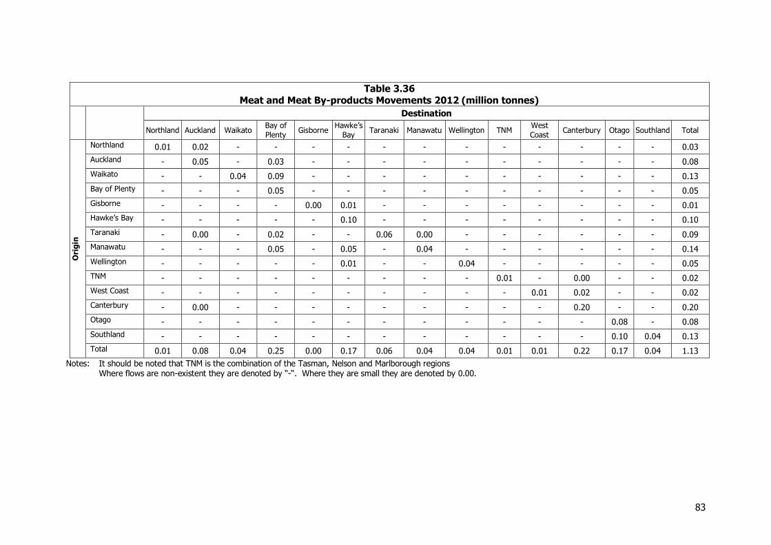
83
Table 3.36 Meat and Meat By-products Movements 2012 (million tonnes)
Destination
Northland Auckland Waikato Bay of
Plenty Gisborne
Hawke’s
Bay Taranaki Manawatu Wellington TNM
West
Coast Canterbury Otago Southland Total
Ori
gin
Northland 0.01 0.02 - - - - - - - - - - - - 0.03
Auckland - 0.05 - 0.03 - - - - - - - - - - 0.08
Waikato - - 0.04 0.09 - - - - - - - - - - 0.13
Bay of Plenty - - - 0.05 - - - - - - - - - - 0.05
Gisborne - - - - 0.00 0.01 - - - - - - - - 0.01
Hawke’s Bay - - - - - 0.10 - - - - - - - - 0.10
Taranaki - 0.00 - 0.02 - - 0.06 0.00 - - - - - - 0.09
Manawatu - - - 0.05 - 0.05 - 0.04 - - - - - - 0.14
Wellington - - - - - 0.01 - - 0.04 - - - - - 0.05
TNM - - - - - - - - - 0.01 - 0.00 - - 0.02
West Coast - - - - - - - - - - 0.01 0.02 - - 0.02
Canterbury - 0.00 - - - - - - - - - 0.20 - - 0.20
Otago - - - - - - - - - - - - 0.08 - 0.08
Southland - - - - - - - - - - - - 0.10 0.04 0.13
Total 0.01 0.08 0.04 0.25 0.00 0.17 0.06 0.04 0.04 0.01 0.01 0.22 0.17 0.04 1.13
Notes: It should be noted that TNM is the combination of the Tasman, Nelson and Marlborough regions Where flows are non-existent they are denoted by “-“. Where they are small they are denoted by 0.00.
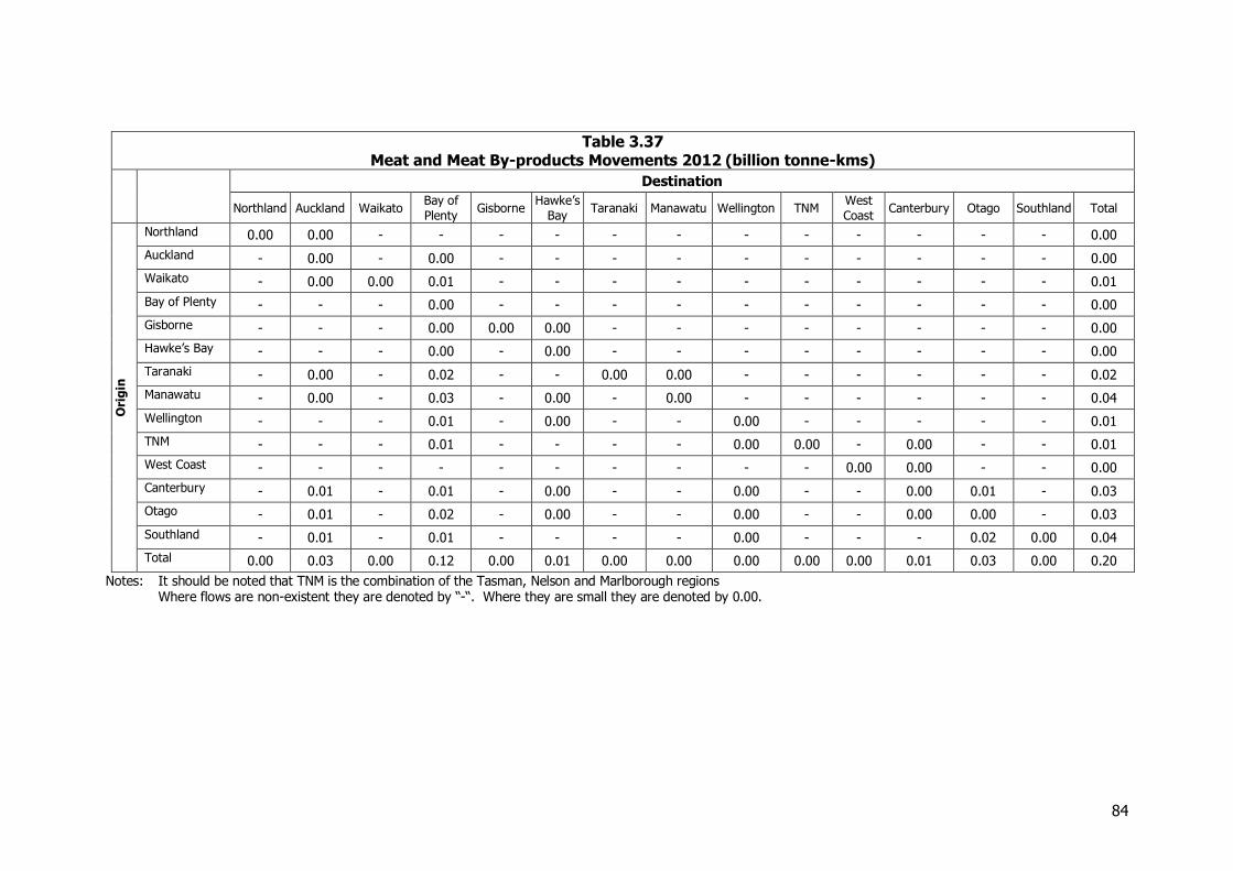
84
Table 3.37 Meat and Meat By-products Movements 2012 (billion tonne-kms)
Destination
Northland Auckland Waikato Bay of
Plenty Gisborne
Hawke’s
Bay Taranaki Manawatu Wellington TNM
West
Coast Canterbury Otago Southland Total
Ori
gin
Northland 0.00 0.00 - - - - - - - - - - - - 0.00
Auckland - 0.00 - 0.00 - - - - - - - - - - 0.00
Waikato - 0.00 0.00 0.01 - - - - - - - - - - 0.01
Bay of Plenty - - - 0.00 - - - - - - - - - - 0.00
Gisborne - - - 0.00 0.00 0.00 - - - - - - - - 0.00
Hawke’s Bay - - - 0.00 - 0.00 - - - - - - - - 0.00
Taranaki - 0.00 - 0.02 - - 0.00 0.00 - - - - - - 0.02
Manawatu - 0.00 - 0.03 - 0.00 - 0.00 - - - - - - 0.04
Wellington - - - 0.01 - 0.00 - - 0.00 - - - - - 0.01
TNM - - - 0.01 - - - - 0.00 0.00 - 0.00 - - 0.01
West Coast - - - - - - - - - - 0.00 0.00 - - 0.00
Canterbury - 0.01 - 0.01 - 0.00 - - 0.00 - - 0.00 0.01 - 0.03
Otago - 0.01 - 0.02 - 0.00 - - 0.00 - - 0.00 0.00 - 0.03
Southland - 0.01 - 0.01 - - - - 0.00 - - - 0.02 0.00 0.04
Total 0.00 0.03 0.00 0.12 0.00 0.01 0.00 0.00 0.00 0.00 0.00 0.01 0.03 0.00 0.20
Notes: It should be noted that TNM is the combination of the Tasman, Nelson and Marlborough regions Where flows are non-existent they are denoted by “-“. Where they are small they are denoted by 0.00.
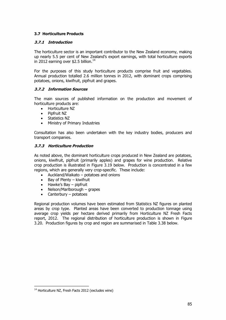
85
3.7 Horticulture Products
3.7.1 Introduction The horticulture sector is an important contributor to the New Zealand economy, making up nearly 5.5 per cent of New Zealand’s export earnings, with total horticulture exports in 2012 earning over $2.5 billion.14 For the purposes of this study horticulture products comprise fruit and vegetables. Annual production totalled 2.6 million tonnes in 2012, with dominant crops comprising potatoes, onions, kiwifruit, pipfruit and grapes.
3.7.2 Information Sources The main sources of published information on the production and movement of horticulture products are:
Horticulture NZ Pipfruit NZ Statistics NZ Ministry of Primary Industries
Consultation has also been undertaken with the key industry bodies, producers and transport companies.
3.7.3 Horticulture Production As noted above, the dominant horticulture crops produced in New Zealand are potatoes, onions, kiwifruit, pipfruit (primarily apples) and grapes for wine production. Relative crop production is illustrated in Figure 3.19 below. Production is concentrated in a few regions, which are generally very crop-specific. These include:
Auckland/Waikato – potatoes and onions Bay of Plenty – kiwifruit Hawke’s Bay – pipfruit Nelson/Marlborough – grapes Canterbury – potatoes
Regional production volumes have been estimated from Statistics NZ figures on planted areas by crop type. Planted areas have been converted to production tonnage using average crop yields per hectare derived primarily from Horticulture NZ Fresh Facts report, 2012. The regional distribution of horticulture production is shown in Figure 3.20. Production figures by crop and region are summarised in Table 3.38 below.
14 Horticulture NZ, Fresh Facts 2012 (excludes wine)
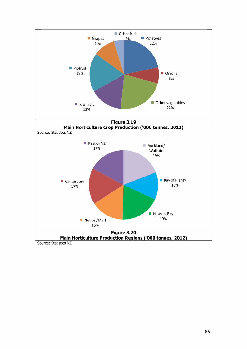
86
Figure 3.19
Main Horticulture Crop Production (‘000 tonnes, 2012) Source: Statistics NZ
Figure 3.20
Main Horticulture Production Regions (‘000 tonnes, 2012) Source: Statistics NZ
Potatoes 22%
Onions 8%
Other vegetables 22%
Kiwifruit 15%
Pipfruit 18%
Grapes 10%
Other fruit 5%
Auckland/ Waikato
19%
Bay of Plenty 13%
Hawkes Bay 19% Nelson/Marl
15%
Canterbury 17%
Rest of NZ 17%
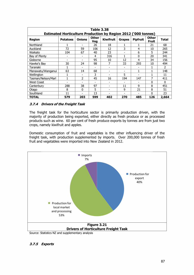
87
Table 3.38 Estimated Horticulture Production by Region 2012 (‘000 tonnes)
Region Potatoes Onions Other Veg
Kiwifruit Grapes Pipfruit Other Fruit
Total
Northland 1 - 26 18 1 1 21 68
Auckland 72 59 106 12 3 4 10 265
Waikato 104 67 40 23 - 6 5 244
Bay of Plenty - - 4 316 1 0 20 341
Gisborne - - 95 10 12 4 34 156
Hawke's Bay 30 24 98 7 33 293 10 494
Taranaki 1 - - - - - 1 2
Manawatu/Wanganui 63 14 68 - - 1 1 148
Wellington 1 - 3 - 5 - 1 11
Tasman/Nelson/Marl 1 2 45 16 194 147 7 411
West Coast - - - - - - 0 0
Canterbury 288 38 97 - 11 9 8 451
Otago 8 0 5 - 9 21 8 51
Southland 11 - 13 - - - 0 23
TOTAL 579 203 599 402 270 485 126 2,664
3.7.4 Drivers of the Freight Task The freight task for the horticulture sector is primarily production driven, with the majority of production being exported, either directly as fresh produce or as processed products such as wine. 60 per cent of fresh produce exports by tonnes are from just two crops, namely kiwifruit and apples. Domestic consumption of fruit and vegetables is the other influencing driver of the freight task, with production supplemented by imports. Over 200,000 tonnes of fresh fruit and vegetables were imported into New Zealand in 2012.
Figure 3.21
Drivers of Horticulture Freight Task Source: Statistics NZ and supplementary analysis
3.7.5 Exports
Production for export
40%
Production for local market
and processing 53%
Imports 7%
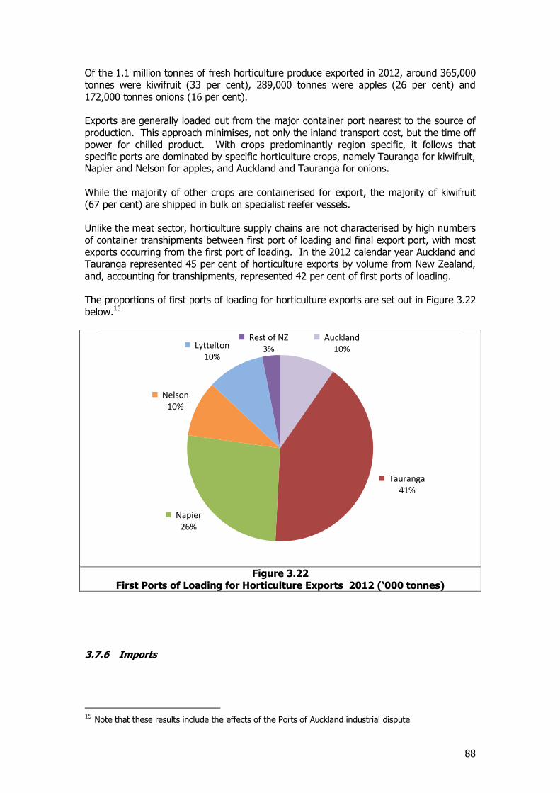
88
Of the 1.1 million tonnes of fresh horticulture produce exported in 2012, around 365,000 tonnes were kiwifruit (33 per cent), 289,000 tonnes were apples (26 per cent) and 172,000 tonnes onions (16 per cent). Exports are generally loaded out from the major container port nearest to the source of production. This approach minimises, not only the inland transport cost, but the time off power for chilled product. With crops predominantly region specific, it follows that specific ports are dominated by specific horticulture crops, namely Tauranga for kiwifruit, Napier and Nelson for apples, and Auckland and Tauranga for onions. While the majority of other crops are containerised for export, the majority of kiwifruit (67 per cent) are shipped in bulk on specialist reefer vessels. Unlike the meat sector, horticulture supply chains are not characterised by high numbers of container transhipments between first port of loading and final export port, with most exports occurring from the first port of loading. In the 2012 calendar year Auckland and Tauranga represented 45 per cent of horticulture exports by volume from New Zealand, and, accounting for transhipments, represented 42 per cent of first ports of loading. The proportions of first ports of loading for horticulture exports are set out in Figure 3.22 below.15
Figure 3.22
First Ports of Loading for Horticulture Exports 2012 (‘000 tonnes)
3.7.6 Imports
15 Note that these results include the effects of the Ports of Auckland industrial dispute
Auckland 10%
Tauranga 41%
Napier 26%
Nelson 10%
Lyttelton 10%
Rest of NZ 3%
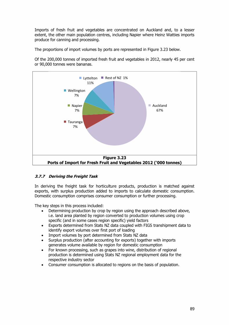
89
Imports of fresh fruit and vegetables are concentrated on Auckland and, to a lesser extent, the other main population centres, including Napier where Heinz Watties imports produce for canning and processing. The proportions of import volumes by ports are represented in Figure 3.23 below. Of the 200,000 tonnes of imported fresh fruit and vegetables in 2012, nearly 45 per cent or 90,000 tonnes were bananas.
Figure 3.23
Ports of Import for Fresh Fruit and Vegetables 2012 (‘000 tonnes)
3.7.7 Deriving the Freight Task In deriving the freight task for horticulture products, production is matched against exports, with surplus production added to imports to calculate domestic consumption. Domestic consumption comprises consumer consumption or further processing. The key steps in this process included:
Determining production by crop by region using the approach described above, i.e. land area planted by region converted to production volumes using crop specific (and in some cases region specific) yield factors
Exports determined from Stats NZ data coupled with FIGS transhipment data to identify export volumes over first port of loading
Import volumes by port determined from Stats NZ data Surplus production (after accounting for exports) together with imports
generates volume available by region for domestic consumption
For known processing, such as grapes into wine, distribution of regional production is determined using Stats NZ regional employment data for the respective industry sector
Consumer consumption is allocated to regions on the basis of population.
Auckland 67%
Tauranga 7%
Napier 7%
Wellington 7%
Lyttelton 11%
Rest of NZ 1%
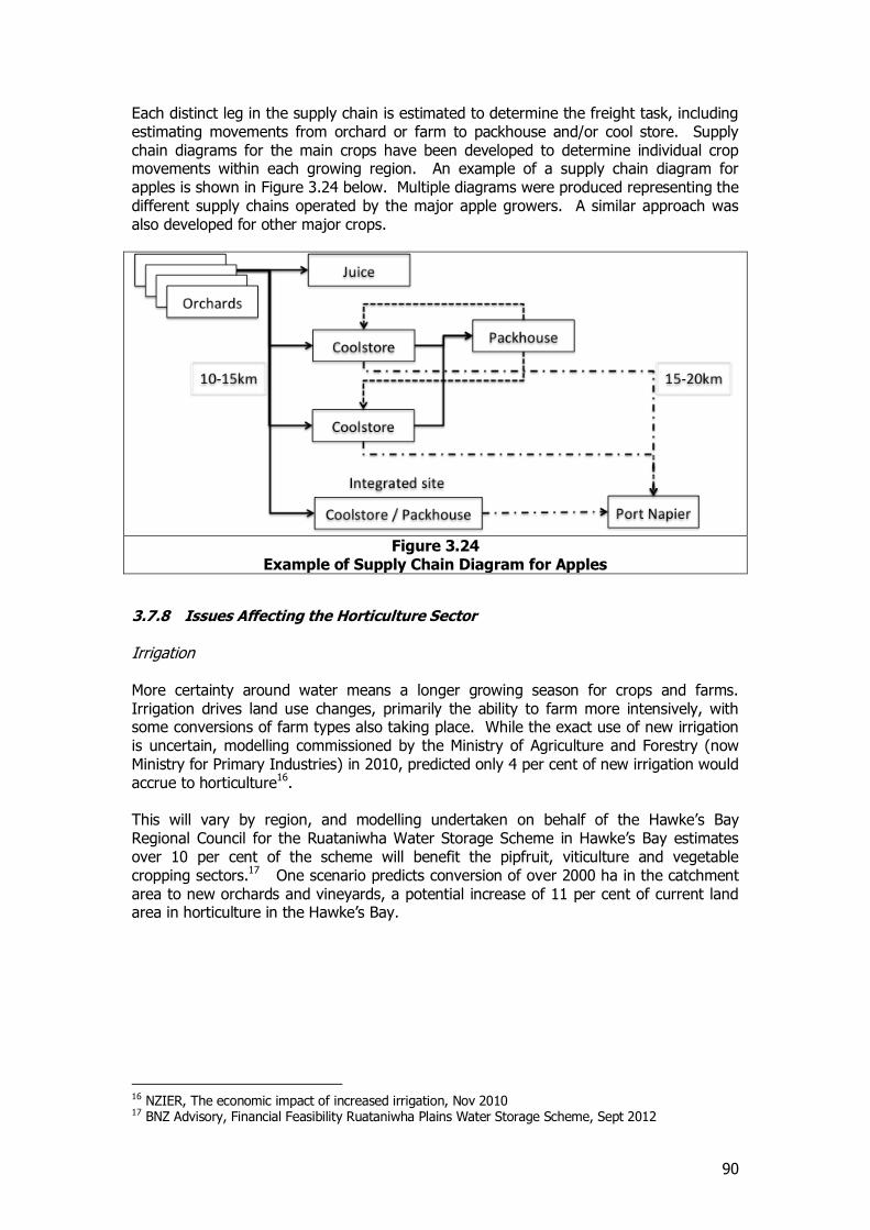
90
Each distinct leg in the supply chain is estimated to determine the freight task, including estimating movements from orchard or farm to packhouse and/or cool store. Supply chain diagrams for the main crops have been developed to determine individual crop movements within each growing region. An example of a supply chain diagram for apples is shown in Figure 3.24 below. Multiple diagrams were produced representing the different supply chains operated by the major apple growers. A similar approach was also developed for other major crops.
Figure 3.24
Example of Supply Chain Diagram for Apples
3.7.8 Issues Affecting the Horticulture Sector Irrigation More certainty around water means a longer growing season for crops and farms. Irrigation drives land use changes, primarily the ability to farm more intensively, with some conversions of farm types also taking place. While the exact use of new irrigation is uncertain, modelling commissioned by the Ministry of Agriculture and Forestry (now Ministry for Primary Industries) in 2010, predicted only 4 per cent of new irrigation would accrue to horticulture16. This will vary by region, and modelling undertaken on behalf of the Hawke’s Bay Regional Council for the Ruataniwha Water Storage Scheme in Hawke’s Bay estimates over 10 per cent of the scheme will benefit the pipfruit, viticulture and vegetable cropping sectors.17 One scenario predicts conversion of over 2000 ha in the catchment area to new orchards and vineyards, a potential increase of 11 per cent of current land area in horticulture in the Hawke’s Bay.
16 NZIER, The economic impact of increased irrigation, Nov 2010 17 BNZ Advisory, Financial Feasibility Ruataniwha Plains Water Storage Scheme, Sept 2012
91
Kiwifruit Psa disease Pseudomonas syrigae actinidae (Psa) is a bacterial canker disease specific to kiwifruit. It was first confirmed in the Bay of Plenty in 2010 and it is estimated to now be present in over one-third of New Zealand orchards. The advent of the disease has slowed growth in the sector and substantial resource is being diverted to containment and identification of Psa resistant cultivars. Gold kiwifruit tend to be more susceptible while the dominant Hayward variety (green kiwifruit) appears to be relatively tolerant. Despite the setback from Psa the sector is expecting nearly double production over the next twelve years mainly in the Bay of Plenty and Gisborne regions.
3.7.9 Movements of Horticulture Products The estimated origin-destination pattern of horticulture products (fresh fruit and vegetables) by tonnes and tonne-kms is set out in Table 3.39 and Table 3.40.
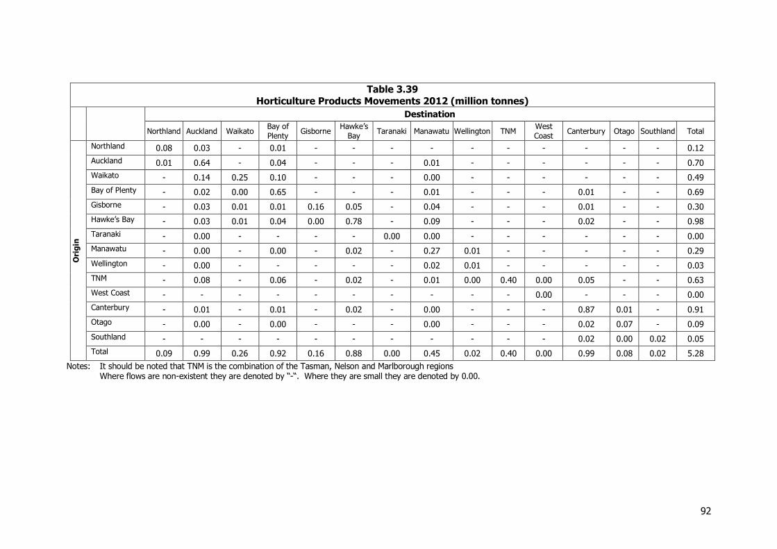
92
Table 3.39 Horticulture Products Movements 2012 (million tonnes)
Destination
Northland Auckland Waikato Bay of
Plenty Gisborne
Hawke’s
Bay Taranaki Manawatu Wellington TNM
West
Coast Canterbury Otago Southland Total
Ori
gin
Northland 0.08 0.03 - 0.01 - - - - - - - - - - 0.12
Auckland 0.01 0.64 - 0.04 - - - 0.01 - - - - - - 0.70
Waikato - 0.14 0.25 0.10 - - - 0.00 - - - - - - 0.49
Bay of Plenty - 0.02 0.00 0.65 - - - 0.01 - - - 0.01 - - 0.69
Gisborne - 0.03 0.01 0.01 0.16 0.05 - 0.04 - - - 0.01 - - 0.30
Hawke’s Bay - 0.03 0.01 0.04 0.00 0.78 - 0.09 - - - 0.02 - - 0.98
Taranaki - 0.00 - - - - 0.00 0.00 - - - - - - 0.00
Manawatu - 0.00 - 0.00 - 0.02 - 0.27 0.01 - - - - - 0.29
Wellington - 0.00 - - - - - 0.02 0.01 - - - - - 0.03
TNM - 0.08 - 0.06 - 0.02 - 0.01 0.00 0.40 0.00 0.05 - - 0.63
West Coast - - - - - - - - - - 0.00 - - - 0.00
Canterbury - 0.01 - 0.01 - 0.02 - 0.00 - - - 0.87 0.01 - 0.91
Otago - 0.00 - 0.00 - - - 0.00 - - - 0.02 0.07 - 0.09
Southland - - - - - - - - - - - 0.02 0.00 0.02 0.05
Total 0.09 0.99 0.26 0.92 0.16 0.88 0.00 0.45 0.02 0.40 0.00 0.99 0.08 0.02 5.28
Notes: It should be noted that TNM is the combination of the Tasman, Nelson and Marlborough regions Where flows are non-existent they are denoted by “-“. Where they are small they are denoted by 0.00.
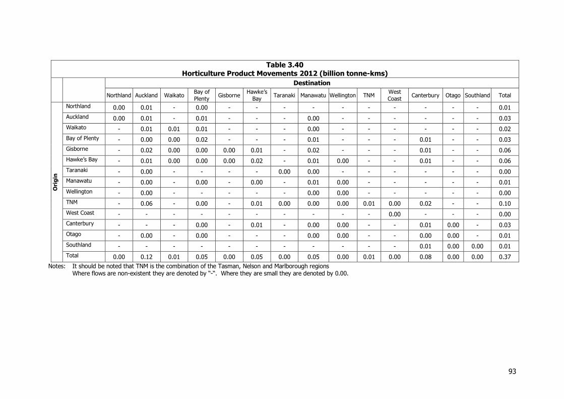
93
Table 3.40 Horticulture Product Movements 2012 (billion tonne-kms)
Destination
Northland Auckland Waikato Bay of
Plenty Gisborne
Hawke’s
Bay Taranaki Manawatu Wellington TNM
West
Coast Canterbury Otago Southland Total
Ori
gin
Northland 0.00 0.01 - 0.00 - - - - - - - - - - 0.01
Auckland 0.00 0.01 - 0.01 - - - 0.00 - - - - - - 0.03
Waikato - 0.01 0.01 0.01 - - - 0.00 - - - - - - 0.02
Bay of Plenty - 0.00 0.00 0.02 - - - 0.01 - - - 0.01 - - 0.03
Gisborne - 0.02 0.00 0.00 0.00 0.01 - 0.02 - - - 0.01 - - 0.06
Hawke’s Bay - 0.01 0.00 0.00 0.00 0.02 - 0.01 0.00 - - 0.01 - - 0.06
Taranaki - 0.00 - - - - 0.00 0.00 - - - - - - 0.00
Manawatu - 0.00 - 0.00 - 0.00 - 0.01 0.00 - - - - - 0.01
Wellington - 0.00 - - - - - 0.00 0.00 - - - - - 0.00
TNM - 0.06 - 0.00 - 0.01 0.00 0.00 0.00 0.01 0.00 0.02 - - 0.10
West Coast - - - - - - - - - - 0.00 - - - 0.00
Canterbury - - - 0.00 - 0.01 - 0.00 0.00 - - 0.01 0.00 - 0.03
Otago - 0.00 - 0.00 - - - 0.00 0.00 - - 0.00 0.00 - 0.01
Southland - - - - - - - - - - - 0.01 0.00 0.00 0.01
Total 0.00 0.12 0.01 0.05 0.00 0.05 0.00 0.05 0.00 0.01 0.00 0.08 0.00 0.00 0.37
Notes: It should be noted that TNM is the combination of the Tasman, Nelson and Marlborough regions Where flows are non-existent they are denoted by “-“. Where they are small they are denoted by 0.00.
94
3.8 Other agricultural products
3.8.1 Introduction “Other Agriculture” seeks to capture other agriculture products not covered within meat and horticulture. For the purposes of this study, the following products are covered within this section:
Cereals (wheat, barley, maize) Palm kernel expeller (PKE) Sugar Vegetable oils Hides and skins Other
The respective volumes of these commodities (production plus imports) are illustrated in Figure 3.25 below.
Figure 3.25
Volumes of Other Agricultural Commodities 2012 (‘000 tonnes)
3.8.2 Cereals Cereals include the primary arable crops of wheat, barley and maize. Production is concentrated mainly on the plains in the South Island, predominantly in Canterbury. In the year ended June 2012, wheat was harvested from 54,900 hectares18, barley from 66,300 hectares, and maize from 20,200 hectares19. Cereal crops are grown for human consumption (where it is milled into flour, malt and other staple food ingredients) and as feed crops for livestock.
18 Since 2007, the area of New Zealand land dedicated to growing wheat has increased 35 percent to 54,800 hectares in 2012. Over the same time period, wheat production increased 42 percent to 488,600 tonnes. Source: Ministry for Primary Industries, Situation and Outlook for Primary Industries, 2013 19 Beef + Lamb, NZ, Compendium of New Zealand Farm Facts, 2013
0
200
400
600
800
1,000
1,200
1,400
1,600
1,800
2,000
Cereals PKE Raw sugar Vege oils Hides & skins Other
'000
to
nn
es
95
Production figures and volume splits between milling and stockfeed are shown in Table 3.41 below.
Table 3.41 Cereal Production and End Use 2012 (‘000 tonnes)
Use Wheat Barley Maize Total
For milling 157 70 0 227 For feedstock 332 369 211 912
Total 489 439 211 1,139
Source: Statistics NZ and Arable Industry Marketing Initiative, Survey of cereal areas and volumes, Jul 2013
Table 3.42 Cereal Production by Region 2012 (‘000 tonnes)
Region Wheat Barley Maize Total
Northland 0 0 6 6 Auckland 0 0 19 19 Waikato 1 2 49 52 Bay of Plenty 0 0 31 31 Gisborne 0 0 29 29 Hawke’s Bay 2 10 36 48 Taranaki 0 1 2 3 Manawatu-Wanganui 7 24 29 60 Wellington 5 12 4 21 TNM 1 4 0 5 West Coast 0 0 0 0 Canterbury 436 311 4 751 Otago 15 38 1 54 Southland 21 36 0 57
Total 489 439 211 1,139
Source: Statistics NZ
As illustrated in Table 3.42 above, the majority of wheat and barley is grown in the South Island, predominantly Canterbury, while the majority of maize production is concentrated in the North Island. Local production of cereal crops are supplemented by imports, with some 600,000 tonnes of cereal products imported into New Zealand in 2012. Wheat is the dominant import with 460,000 tonnes imported, primarily through Auckland and Tauranga in 2012. Due to the concentration of production in Canterbury, there are significant south to north transport flows for cereal products as wheat and barley are moved north for milling and stockfeed. Rail carried around 80,000 tonnes of cereal products in 2012 with almost 70,000 tonnes of movements from the Canterbury area to the North Island. Nearly 47,000 tonnes was moved by rail from the Ashburton region to Manawatu, transporting barley to Marton for malting.
3.8.3 PKE Palm kernel expeller (PKE) or Palm kernel meal (PKM) is a by-product from the extraction of oil from the kernel of the palm seeds of the oil palm. The kernels are found inside the shell of the fruit after flesh has been stripped away. PKE is the mashed solid part of the seed kernels left remaining after oil extraction.20
20 Ministry for Primary Industries, Palm Kernel Imports Q and A’s, Jul 2013
96
PKE has been imported as a stock feed for more than 10 years, particularly for dairy cows. In the last few years quantities have increased significantly in line with the increase in dairying activity. In 2012, 1.4 million tonnes of PKE were imported into New Zealand, up from 362,000 tonnes in 2007 and virtually nothing in 2000. Imports are concentrated on ports closest to New Zealand’s major dairy producing regions. Regional consumption of PKE has been estimated by loosely correlating consumption to dairy herd population share by region. Regional distribution patterns have then been estimated by matching import volumes by port to nearest and neighbouring centres of dairy herd population. Import volumes and consumption estimates by region are shown in Table 3.43 below.
Table 3.43 PKE Import and Consumption by Region 2012 (‘000 tonnes)
Region Import volume Dairy herd Consumption
estimate
Northland 39 6% 89 Auckland 44 2% 26 Waikato 0 29% 420 Bay of Plenty 763 4% 54 Gisborne 0 0% 3 Hawke’s Bay 0 1% 20 Taranaki 305 9% 134 Manawatu-Wanganui 0 7% 106 Wellington 1 2% 24 TNM 0 1% 16 West Coast 0 3% 39 Canterbury 174 18% 262 Otago 0 6% 82 Southland 105 10% 149
Total 1,430 100% 1,430
Source: Statistics NZ
3.8.4 Sugar New Zealand imports approximately 335,000 tonnes of sugar per annum. Of this nearly 250,000 tonnes is imported into Auckland with the majority of around 200,000 tonnes imported directly into the Chelsea Sugar factory at Birkenhead. Sugar is imported into a variety of ports as shown in Table 3.44 below. In estimating the freight task for sugar it is assumed that sugar is destined for further processing, either to be refined or as a food ingredient, in the city of import.
Table 3.44 Sugar Imports by Port 2012 (‘000 tonnes)
Port Import volume
Auckland 248 Tauranga 52 Napier 2 Wellington 3 Lyttelton 9 Timaru 1 Otago 13 Bluff 7
Total 335
Source: Statistics NZ
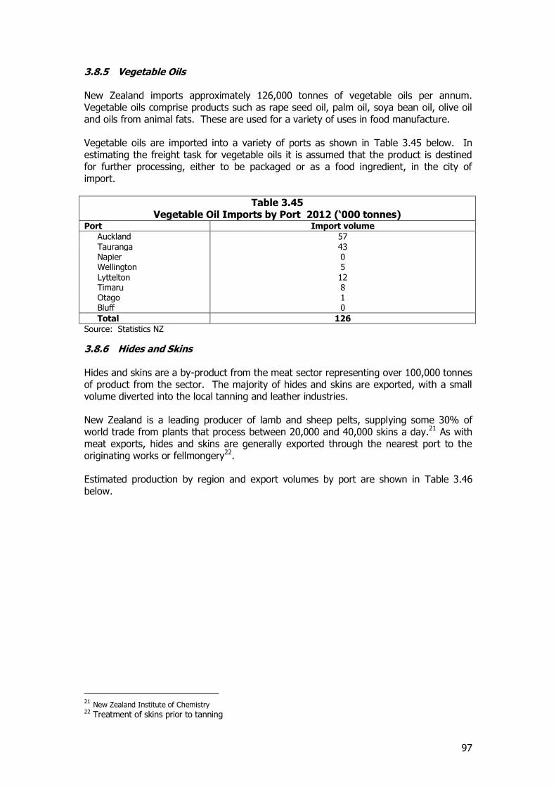
97
3.8.5 Vegetable Oils New Zealand imports approximately 126,000 tonnes of vegetable oils per annum. Vegetable oils comprise products such as rape seed oil, palm oil, soya bean oil, olive oil and oils from animal fats. These are used for a variety of uses in food manufacture. Vegetable oils are imported into a variety of ports as shown in Table 3.45 below. In estimating the freight task for vegetable oils it is assumed that the product is destined for further processing, either to be packaged or as a food ingredient, in the city of import.
Table 3.45 Vegetable Oil Imports by Port 2012 (‘000 tonnes)
Port Import volume
Auckland 57 Tauranga 43 Napier 0 Wellington 5 Lyttelton 12 Timaru 8 Otago 1 Bluff 0
Total 126
Source: Statistics NZ
3.8.6 Hides and Skins Hides and skins are a by-product from the meat sector representing over 100,000 tonnes of product from the sector. The majority of hides and skins are exported, with a small volume diverted into the local tanning and leather industries. New Zealand is a leading producer of lamb and sheep pelts, supplying some 30% of world trade from plants that process between 20,000 and 40,000 skins a day.21 As with meat exports, hides and skins are generally exported through the nearest port to the originating works or fellmongery22. Estimated production by region and export volumes by port are shown in Table 3.46 below.
21 New Zealand Institute of Chemistry 22 Treatment of skins prior to tanning
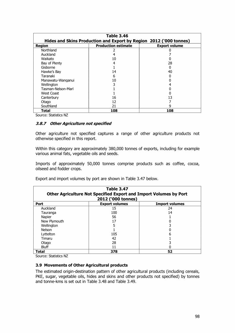
98
Table 3.46 Hides and Skins Production and Export by Region 2012 (‘000 tonnes)
Region Production estimate Export volume
Northland 2 0 Auckland 4 7 Waikato 10 0 Bay of Plenty 4 28 Gisborne 1 0 Hawke’s Bay 14 40 Taranaki 6 0 Manawatu-Wanganui 10 0 Wellington 3 4 Tasman-Nelson-Marl 1 0 West Coast 1 0 Canterbury 16 13 Otago 12 7 Southland 21 9
Total 108 108
Source: Statistics NZ
3.8.7 Other Agriculture not specified Other agriculture not specified captures a range of other agriculture products not otherwise specified in this report. Within this category are approximately 380,000 tonnes of exports, including for example various animal fats, vegetable oils and seeds. Imports of approximately 50,000 tonnes comprise products such as coffee, cocoa, oilseed and fodder crops. Export and import volumes by port are shown in Table 3.47 below.
Table 3.47 Other Agriculture Not Specified Export and Import Volumes by Port
2012 (‘000 tonnes) Port Export volumes Import volumes
Auckland 15 24 Tauranga 100 14 Napier 56 1 New Plymouth 17 0 Wellington 5 3 Nelson 1 0 Lyttelton 105 6 Timaru 42 1 Otago 28 3 Bluff 11 0
Total 378 52
Source: Statistics NZ
3.9 Movements of Other Agricultural products
The estimated origin-destination pattern of other agricultural products (including cereals, PKE, sugar, vegetable oils, hides and skins and other products not specified) by tonnes and tonne-kms is set out in Table 3.48 and Table 3.49.
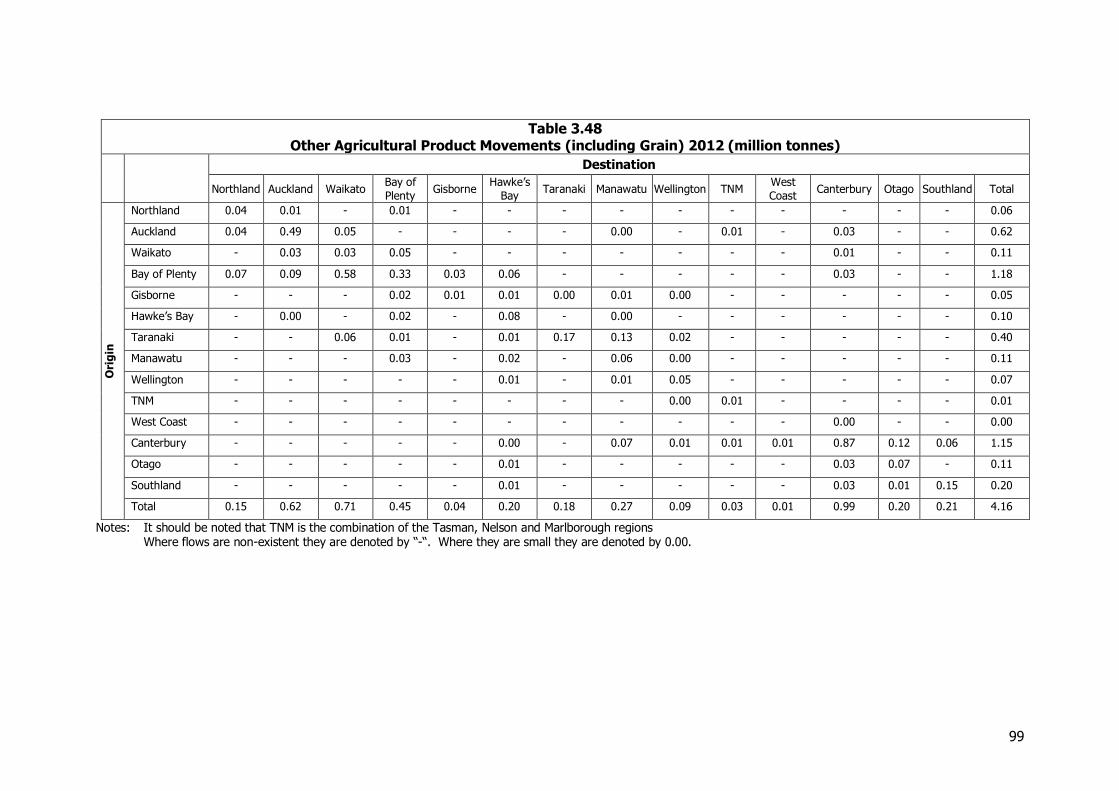
99
Table 3.48 Other Agricultural Product Movements (including Grain) 2012 (million tonnes)
Destination
Northland Auckland Waikato Bay of
Plenty Gisborne
Hawke’s
Bay Taranaki Manawatu Wellington TNM
West
Coast Canterbury Otago Southland Total
Ori
gin
Northland 0.04 0.01 - 0.01 - - - - - - - - - - 0.06
Auckland 0.04 0.49 0.05 - - - - 0.00 - 0.01 - 0.03 - - 0.62
Waikato - 0.03 0.03 0.05 - - - - - - - 0.01 - - 0.11
Bay of Plenty 0.07 0.09 0.58 0.33 0.03 0.06 - - - - - 0.03 - - 1.18
Gisborne - - - 0.02 0.01 0.01 0.00 0.01 0.00 - - - - - 0.05
Hawke’s Bay - 0.00 - 0.02 - 0.08 - 0.00 - - - - - - 0.10
Taranaki - - 0.06 0.01 - 0.01 0.17 0.13 0.02 - - - - - 0.40
Manawatu - - - 0.03 - 0.02 - 0.06 0.00 - - - - - 0.11
Wellington - - - - - 0.01 - 0.01 0.05 - - - - - 0.07
TNM - - - - - - - - 0.00 0.01 - - - - 0.01
West Coast - - - - - - - - - - - 0.00 - - 0.00
Canterbury - - - - - 0.00 - 0.07 0.01 0.01 0.01 0.87 0.12 0.06 1.15
Otago - - - - - 0.01 - - - - - 0.03 0.07 - 0.11
Southland - - - - - 0.01 - - - - - 0.03 0.01 0.15 0.20
Total 0.15 0.62 0.71 0.45 0.04 0.20 0.18 0.27 0.09 0.03 0.01 0.99 0.20 0.21 4.16
Notes: It should be noted that TNM is the combination of the Tasman, Nelson and Marlborough regions Where flows are non-existent they are denoted by “-“. Where they are small they are denoted by 0.00.
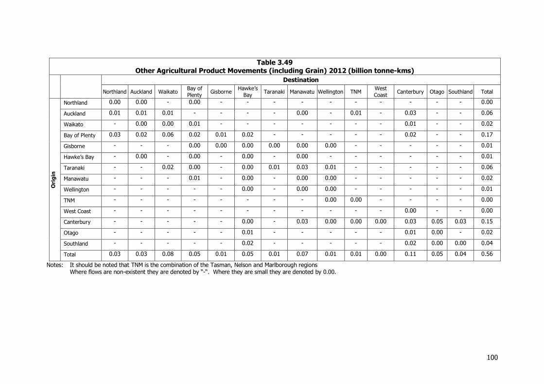
100
Table 3.49 Other Agricultural Product Movements (including Grain) 2012 (billion tonne-kms)
Destination
Northland Auckland Waikato Bay of
Plenty Gisborne
Hawke’s
Bay Taranaki Manawatu Wellington TNM
West
Coast Canterbury Otago Southland Total
Ori
gin
Northland 0.00 0.00 - 0.00 - - - - - - - - - - 0.00
Auckland 0.01 0.01 0.01 - - - - 0.00 - 0.01 - 0.03 - - 0.06
Waikato - 0.00 0.00 0.01 - - - - - - - 0.01 - - 0.02
Bay of Plenty 0.03 0.02 0.06 0.02 0.01 0.02 - - - - - 0.02 - - 0.17
Gisborne - - - 0.00 0.00 0.00 0.00 0.00 0.00 - - - - - 0.01
Hawke’s Bay - 0.00 - 0.00 - 0.00 - 0.00 - - - - - - 0.01
Taranaki - - 0.02 0.00 - 0.00 0.01 0.03 0.01 - - - - - 0.06
Manawatu - - - 0.01 - 0.00 - 0.00 0.00 - - - - - 0.02
Wellington - - - - - 0.00 - 0.00 0.00 - - - - - 0.01
TNM - - - - - - - - 0.00 0.00 - - - - 0.00
West Coast - - - - - - - - - - - 0.00 - - 0.00
Canterbury - - - - - 0.00 - 0.03 0.00 0.00 0.00 0.03 0.05 0.03 0.15
Otago - - - - - 0.01 - - - - - 0.01 0.00 - 0.02
Southland - - - - - 0.02 - - - - - 0.02 0.00 0.00 0.04
Total 0.03 0.03 0.08 0.05 0.01 0.05 0.01 0.07 0.01 0.01 0.00 0.11 0.05 0.04 0.56
Notes: It should be noted that TNM is the combination of the Tasman, Nelson and Marlborough regions Where flows are non-existent they are denoted by “-“. Where they are small they are denoted by 0.00.
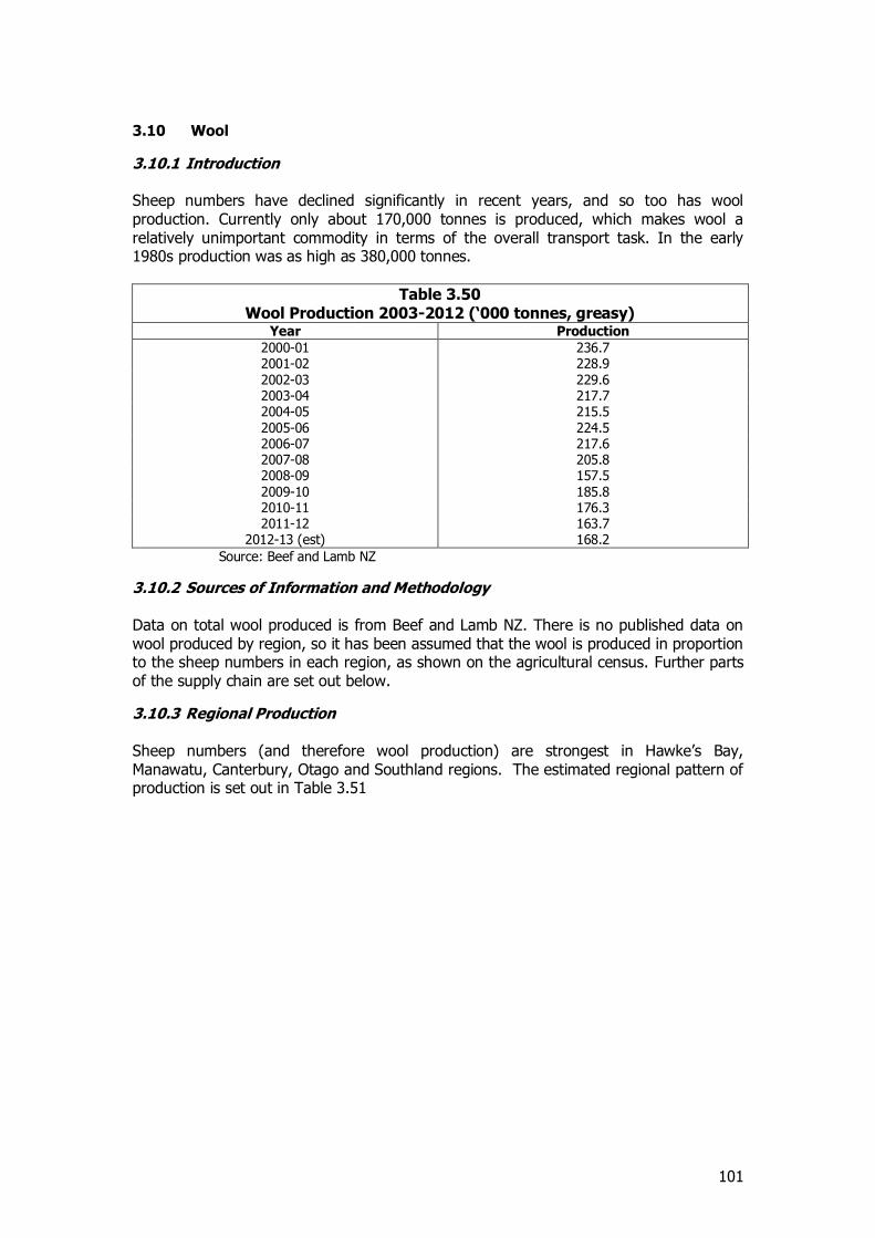
101
3.10 Wool
3.10.1 Introduction Sheep numbers have declined significantly in recent years, and so too has wool production. Currently only about 170,000 tonnes is produced, which makes wool a relatively unimportant commodity in terms of the overall transport task. In the early 1980s production was as high as 380,000 tonnes.
Table 3.50 Wool Production 2003-2012 (‘000 tonnes, greasy)
Year Production
2000-01 236.7 2001-02 228.9 2002-03 229.6 2003-04 217.7 2004-05 215.5 2005-06 224.5 2006-07 217.6 2007-08 205.8 2008-09 157.5 2009-10 185.8 2010-11 176.3 2011-12 163.7
2012-13 (est) 168.2
Source: Beef and Lamb NZ
3.10.2 Sources of Information and Methodology Data on total wool produced is from Beef and Lamb NZ. There is no published data on wool produced by region, so it has been assumed that the wool is produced in proportion to the sheep numbers in each region, as shown on the agricultural census. Further parts of the supply chain are set out below.
3.10.3 Regional Production Sheep numbers (and therefore wool production) are strongest in Hawke’s Bay, Manawatu, Canterbury, Otago and Southland regions. The estimated regional pattern of production is set out in Table 3.51
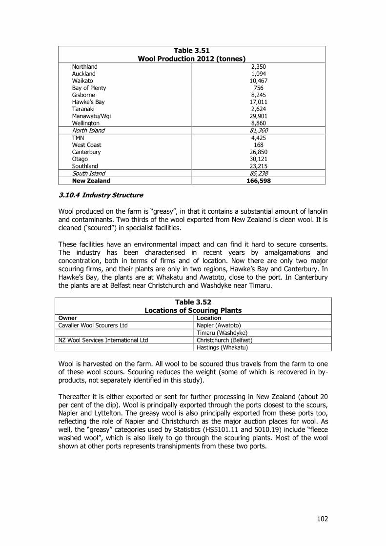
102
Table 3.51 Wool Production 2012 (tonnes)
Northland 2,350 Auckland 1,094 Waikato 10,467 Bay of Plenty 756 Gisborne 8,245 Hawke’s Bay 17,011 Taranaki 2,624 Manawatu/Wgi 29,901 Wellington 8,860
North Island 81,360 TMN 4,425 West Coast 168 Canterbury 26,850 Otago 30,121 Southland 23,215
South Island 85,238 New Zealand 166,598
3.10.4 Industry Structure Wool produced on the farm is “greasy”, in that it contains a substantial amount of lanolin and contaminants. Two thirds of the wool exported from New Zealand is clean wool. It is cleaned (‘scoured”) in specialist facilities. These facilities have an environmental impact and can find it hard to secure consents. The industry has been characterised in recent years by amalgamations and concentration, both in terms of firms and of location. Now there are only two major scouring firms, and their plants are only in two regions, Hawke’s Bay and Canterbury. In Hawke’s Bay, the plants are at Whakatu and Awatoto, close to the port. In Canterbury the plants are at Belfast near Christchurch and Washdyke near Timaru.
Table 3.52 Locations of Scouring Plants
Owner Location
Cavalier Wool Scourers Ltd Napier (Awatoto)
Timaru (Washdyke)
NZ Wool Services International Ltd Christchurch (Belfast)
Hastings (Whakatu)
Wool is harvested on the farm. All wool to be scoured thus travels from the farm to one of these wool scours. Scouring reduces the weight (some of which is recovered in by-products, not separately identified in this study). Thereafter it is either exported or sent for further processing in New Zealand (about 20 per cent of the clip). Wool is principally exported through the ports closest to the scours, Napier and Lyttelton. The greasy wool is also principally exported from these ports too, reflecting the role of Napier and Christchurch as the major auction places for wool. As well, the “greasy” categories used by Statistics (HS5101.11 and 5010.19) include “fleece washed wool”, which is also likely to go through the scouring plants. Most of the wool shown at other ports represents transhipments from these two ports.
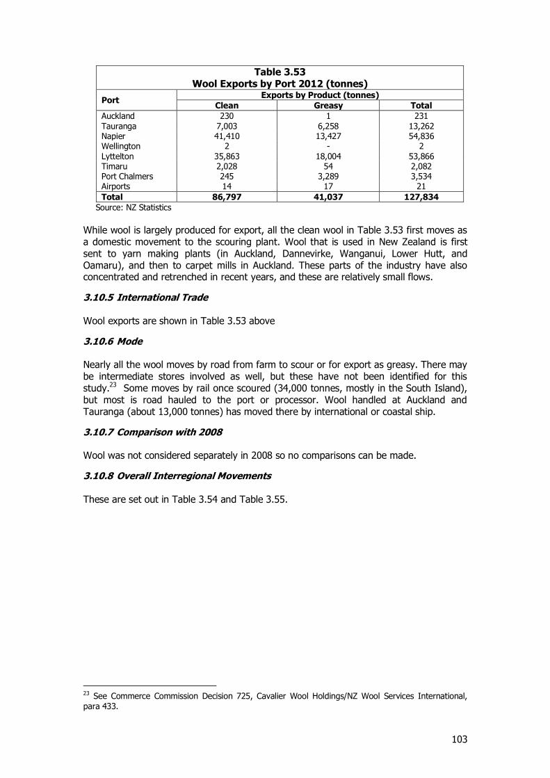
103
Table 3.53 Wool Exports by Port 2012 (tonnes)
Port Exports by Product (tonnes)
Clean Greasy Total
Auckland 230 1 231 Tauranga 7,003 6,258 13,262 Napier 41,410 13,427 54,836 Wellington 2 - 2 Lyttelton 35,863 18,004 53,866 Timaru 2,028 54 2,082 Port Chalmers 245 3,289 3,534 Airports 14 17 21
Total 86,797 41,037 127,834
Source: NZ Statistics
While wool is largely produced for export, all the clean wool in Table 3.53 first moves as a domestic movement to the scouring plant. Wool that is used in New Zealand is first sent to yarn making plants (in Auckland, Dannevirke, Wanganui, Lower Hutt, and Oamaru), and then to carpet mills in Auckland. These parts of the industry have also concentrated and retrenched in recent years, and these are relatively small flows.
3.10.5 International Trade Wool exports are shown in Table 3.53 above
3.10.6 Mode Nearly all the wool moves by road from farm to scour or for export as greasy. There may be intermediate stores involved as well, but these have not been identified for this study.23 Some moves by rail once scoured (34,000 tonnes, mostly in the South Island), but most is road hauled to the port or processor. Wool handled at Auckland and Tauranga (about 13,000 tonnes) has moved there by international or coastal ship.
3.10.7 Comparison with 2008 Wool was not considered separately in 2008 so no comparisons can be made.
3.10.8 Overall Interregional Movements These are set out in Table 3.54 and Table 3.55.
23 See Commerce Commission Decision 725, Cavalier Wool Holdings/NZ Wool Services International, para 433.
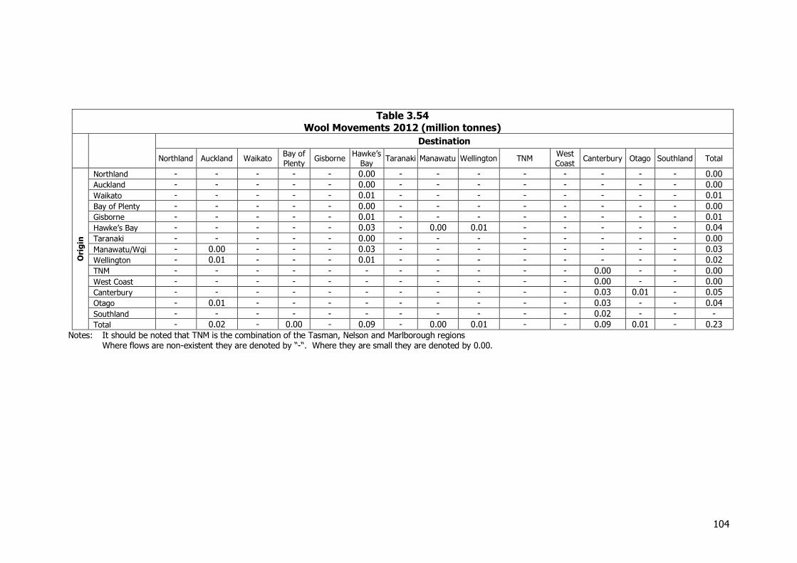
104
Table 3.54 Wool Movements 2012 (million tonnes)
Destination
Northland Auckland Waikato Bay of
Plenty Gisborne
Hawke’s
Bay Taranaki Manawatu Wellington TNM
West
Coast Canterbury Otago Southland Total
Ori
gin
Northland - - - - - 0.00 - - - - - - - - 0.00
Auckland - - - - - 0.00 - - - - - - - - 0.00
Waikato - - - - - 0.01 - - - - - - - - 0.01
Bay of Plenty - - - - - 0.00 - - - - - - - - 0.00
Gisborne - - - - - 0.01 - - - - - - - - 0.01
Hawke’s Bay - - - - - 0.03 - 0.00 0.01 - - - - - 0.04
Taranaki - - - - - 0.00 - - - - - - - - 0.00
Manawatu/Wgi - 0.00 - - - 0.03 - - - - - - - - 0.03
Wellington - 0.01 - - - 0.01 - - - - - - - - 0.02
TNM - - - - - - - - - - - 0.00 - - 0.00
West Coast - - - - - - - - - - - 0.00 - - 0.00
Canterbury - - - - - - - - - - - 0.03 0.01 - 0.05
Otago - 0.01 - - - - - - - - - 0.03 - - 0.04
Southland - - - - - - - - - - - 0.02 - - -
Total - 0.02 - 0.00 - 0.09 - 0.00 0.01 - - 0.09 0.01 - 0.23
Notes: It should be noted that TNM is the combination of the Tasman, Nelson and Marlborough regions Where flows are non-existent they are denoted by “-“. Where they are small they are denoted by 0.00.
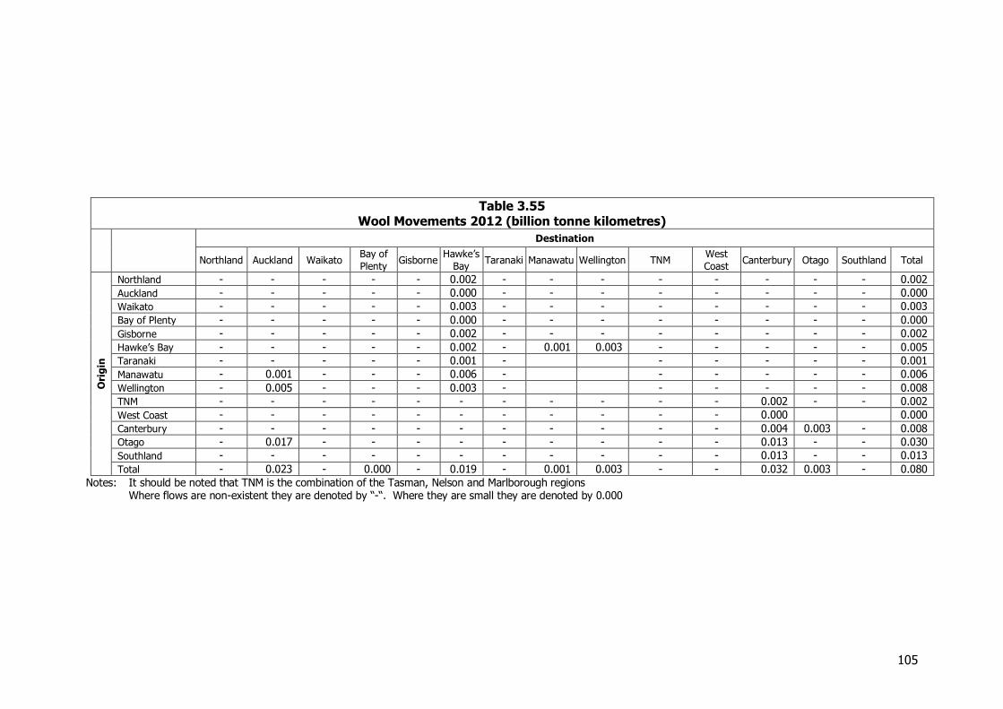
105
Table 3.55 Wool Movements 2012 (billion tonne kilometres)
Destination
Northland Auckland Waikato Bay of
Plenty Gisborne
Hawke’s
Bay Taranaki Manawatu Wellington TNM
West
Coast Canterbury Otago Southland Total
Ori
gin
Northland - - - - - 0.002 - - - - - - - - 0.002
Auckland - - - - - 0.000 - - - - - - - - 0.000
Waikato - - - - - 0.003 - - - - - - - - 0.003
Bay of Plenty - - - - - 0.000 - - - - - - - - 0.000
Gisborne - - - - - 0.002 - - - - - - - - 0.002
Hawke’s Bay - - - - - 0.002 - 0.001 0.003 - - - - - 0.005
Taranaki - - - - - 0.001 - - - - - - 0.001
Manawatu - 0.001 - - - 0.006 - - - - - - 0.006
Wellington - 0.005 - - - 0.003 - - - - - - 0.008
TNM - - - - - - - - - - - 0.002 - - 0.002
West Coast - - - - - - - - - - - 0.000 0.000
Canterbury - - - - - - - - - - - 0.004 0.003 - 0.008
Otago - 0.017 - - - - - - - - - 0.013 - - 0.030
Southland - - - - - - - - - - - 0.013 - - 0.013
Total - 0.023 - 0.000 - 0.019 - 0.001 0.003 - - 0.032 0.003 - 0.080
Notes: It should be noted that TNM is the combination of the Tasman, Nelson and Marlborough regions Where flows are non-existent they are denoted by “-“. Where they are small they are denoted by 0.000
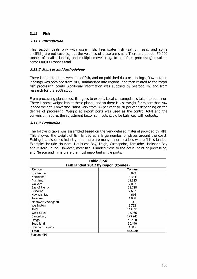
106
3.11 Fish
3.11.1 Introduction This section deals only with ocean fish. Freshwater fish (salmon, eels, and some shellfish) are not covered, but the volumes of these are small. There are about 450,000 tonnes of seafish landed, and multiple moves (e.g. to and from processing) result in some 600,000 tonnes total.
3.11.2 Sources and Methodology There is no data on movements of fish, and no published data on landings. Raw data on landings was obtained from MPI, summarised into regions, and then related to the major fish processing points. Additional information was supplied by Seafood NZ and from research for the 2008 study. From processing plants most fish goes to export. Local consumption is taken to be minor. There is some weight loss at these plants, and so there is less weight for export than raw landed weight. Conversion ratios vary from 33 per cent to 70 per cent depending on the degree of processing. Weight at export ports was used as the control total and the conversion ratio as the adjustment factor so inputs could be balanced with outputs.
3.11.3 Production The following table was assembled based on the very detailed material provided by MPI. This showed the weight of fish landed at a large number of places around the coast. Fishing is a dispersed industry, and there are many minor locations where fish is landed. Examples include Houhora, Doubtless Bay, Leigh, Castlepoint, Tarakohe, Jacksons Bay and Milford Sound. However, most fish is landed close to the actual point of processing, and Nelson and Timaru are the most important single ports.
Table 3.56 Fish landed 2012 by region (tonnes)
Region Tonnes
Unidentified 3,893 Northland 4,334 Auckland 12,823 Waikato 2,052 Bay of Plenty 32,728 Gisborne 2,637 Hawke’s Bay 4,616 Taranaki 1,058 Manawatu/Wanganui 23 Wellington 3,752 TMN 143,891 West Coast 15,966 Canterbury 149,941 Otago 43,450 Southland 30,440 Chatham Islands 1,315 Total 452,920
Source: MPI

107
3.11.4 Industry Structure Fish is caught by a large number of independent fishers, which supply processors (and local markets) and by large trawlers working for the major firms. There are 5 major firms in NZ as set out in Table 3.57
Table 3.57 Fish Processors
Firm Main Plant Locations
Sealord Nelson, Auckland
Sanford Auckland, Tauranga, Timaru, Bluff
Talleys Motueka, Timaru, Westport
Independent Fisheries Christchurch (under review Oct 2013)
United Fisheries Christchurch
3.11.5 Mode of Transport Landed fish is transported to the processing plant by road transport. In some cases, the distance is very short, and in Timaru and Nelson in particular the plants are actually on the port. From the plant the fish is transported in containers to the major ports (95 per cent is exported frozen by sea though some is also flown out). This is largely by road transport, sometimes just cross the wharf, but there are also rail flows, for example from Timaru to Dunedin and Christchurch. There is also extensive movement especially from Nelson by coastal vessel to Auckland and Tauranga for onward export. About 170,000 tonnes is also carried in international ships for transhipment to other ships, mostly at Tauranga, and principally from Nelson and Canterbury. These transhipment moves are not shown on the origin-destination matrix.
3.11.6 Comparison with NFDS 2008 Fish was not separately identified in 2008 so comparisons are not possible.
3.11.7 Total Movements in 2012 Total movements in 2012 are set out in Table 3.58 and Table 3.59
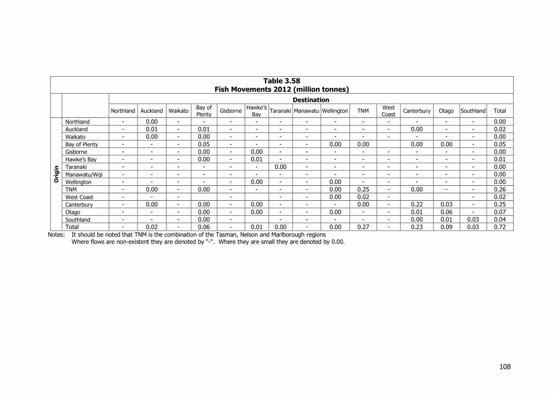
108
Table 3.58 Fish Movements 2012 (million tonnes)
Destination
Northland Auckland Waikato Bay of
Plenty Gisborne
Hawke’s
Bay Taranaki Manawatu Wellington TNM
West
Coast Canterbury Otago Southland Total
Ori
gin
Northland - 0.00 - - - - - - - - - - - - 0.00
Auckland - 0.01 - 0.01 - - - - - - - 0.00 - - 0.02
Waikato - 0.00 - 0.00 - - - - - - - - - - 0.00
Bay of Plenty - - - 0.05 - - - - 0.00 0.00 0.00 0.00 - 0.05
Gisborne - - - 0.00 - 0.00 - - - - - - - - 0.00
Hawke’s Bay - - - 0.00 - 0.01 - - - - - - - - 0.01
Taranaki - - - - - - 0.00 - - - - - - - 0.00
Manawatu/Wgi - - - - - - - - - - - - - - 0.00
Wellington - - - - - 0.00 - - 0.00 - - - - - 0.00
TNM - 0.00 - 0.00 - - - - 0.00 0.25 - 0.00 - - 0.26
West Coast - - - - - - 0.00 0.02 - - 0.02
Canterbury - 0.00 - 0.00 - 0.00 - - - 0.00 - 0.22 0.03 - 0.25
Otago - - - 0.00 - 0.00 - - 0.00 - - 0.01 0.06 - 0.07
Southland - - - 0.00 - - - - - - 0.00 0.01 0.03 0.04
Total - 0.02 - 0.06 - 0.01 0.00 - 0.00 0.27 - 0.23 0.09 0.03 0.72
Notes: It should be noted that TNM is the combination of the Tasman, Nelson and Marlborough regions Where flows are non-existent they are denoted by “-“. Where they are small they are denoted by 0.00.
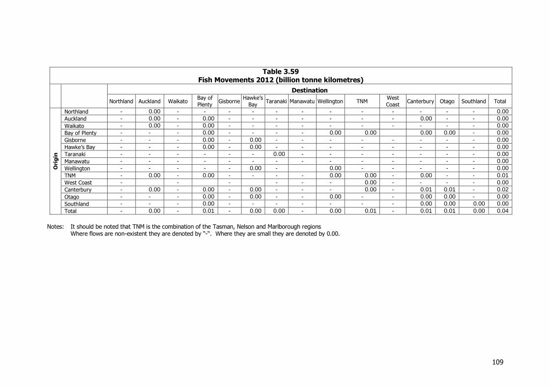
109
Table 3.59 Fish Movements 2012 (billion tonne kilometres)
Destination
Northland Auckland Waikato Bay of
Plenty Gisborne
Hawke’s
Bay Taranaki Manawatu Wellington TNM
West
Coast Canterbury Otago Southland Total
Ori
gin
Northland - 0.00 - - - - - - - - - - - - 0.00
Auckland - 0.00 - 0.00 - - - - - - - 0.00 - - 0.00
Waikato - 0.00 - 0.00 - - - - - - - - - - 0.00
Bay of Plenty - - - 0.00 - - - - 0.00 0.00 0.00 0.00 - 0.00
Gisborne - - - 0.00 - 0.00 - - - - - - - - 0.00
Hawke’s Bay - - - 0.00 - 0.00 - - - - - - - - 0.00
Taranaki - - - - - - 0.00 - - - - - - - 0.00
Manawatu - - - - - - - - - - - - - - 0.00
Wellington - - - - - 0.00 - 0.00 - - - - - 0.00
TNM - 0.00 - 0.00 - - - - 0.00 0.00 - 0.00 - - 0.01
West Coast - - - - - - 0.00 - - - - 0.00
Canterbury - 0.00 - 0.00 - 0.00 - - - 0.00 - 0.01 0.01 - 0.02
Otago - - - 0.00 - 0.00 - - 0.00 - - 0.00 0.00 - 0.00
Southland - - - 0.00 - - - - - - - 0.00 0.00 0.00 0.00
Total - 0.00 - 0.01 - 0.00 0.00 - 0.00 0.01 - 0.01 0.01 0.00 0.04
Notes: It should be noted that TNM is the combination of the Tasman, Nelson and Marlborough regions Where flows are non-existent they are denoted by “-“. Where they are small they are denoted by 0.00.
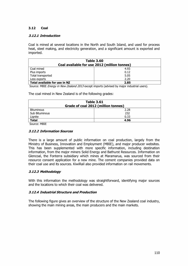
110
3.12 Coal
3.12.1 Introduction
Coal is mined at several locations in the North and South Island, and used for process heat, steel making, and electricity generation, and a significant amount is exported and imported.
Table 3.60 Coal available for use 2012 (million tonnes)
Coal mined 4.93 Plus imports 0.12 Total transported 5.05 Less exports 2.20
Total available for use in NZ 2.85
Source: MBIE Energy in New Zealand 2013 except imports (advised by major industrial users).
The coal mined in New Zealand is of the following grades:
Table 3.61 Grade of coal 2012 (million tonnes)
Bituminous 2.28 Sub Bituminous 232 Lignite 0.33
Total 4.96
Source: MBIE
3.12.2 Information Sources
There is a large amount of public information on coal production, largely from the Ministry of Business, Innovation and Employment (MBIE), and major producer websites. This has been supplemented with more specific information, including destination information, from the major miners Solid Energy and Bathurst Resources. Information on Glencoal, the Fonterra subsidiary which mines at Maramarua, was sourced from their resource consent application for a new mine. The cement companies provided data on their coal use and its sources. KiwiRail also provided information on rail movements.
3.12.3 Methodology
With this information the methodology was straightforward, identifying major sources and the locations to which their coal was delivered.
3.12.4 Industrial Structure and Production
The following figure gives an overview of the structure of the New Zealand coal industry, showing the main mining areas, the main producers and the main markets.
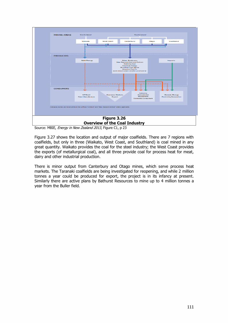
111
Figure 3.26
Overview of the Coal Industry Source: MBIE, Energy in New Zealand 2013, Figure C1, p 23
Figure 3.27 shows the location and output of major coalfields. There are 7 regions with coalfields, but only in three (Waikato, West Coast, and Southland) is coal mined in any great quantity. Waikato provides the coal for the steel industry; the West Coast provides the exports (of metallurgical coal), and all three provide coal for process heat for meat, dairy and other industrial production. There is minor output from Canterbury and Otago mines, which serve process heat markets. The Taranaki coalfields are being investigated for reopening, and while 2 million tonnes a year could be produced for export, the project is in its infancy at present. Similarly there are active plans by Bathurst Resources to mine up to 4 million tonnes a year from the Buller field.
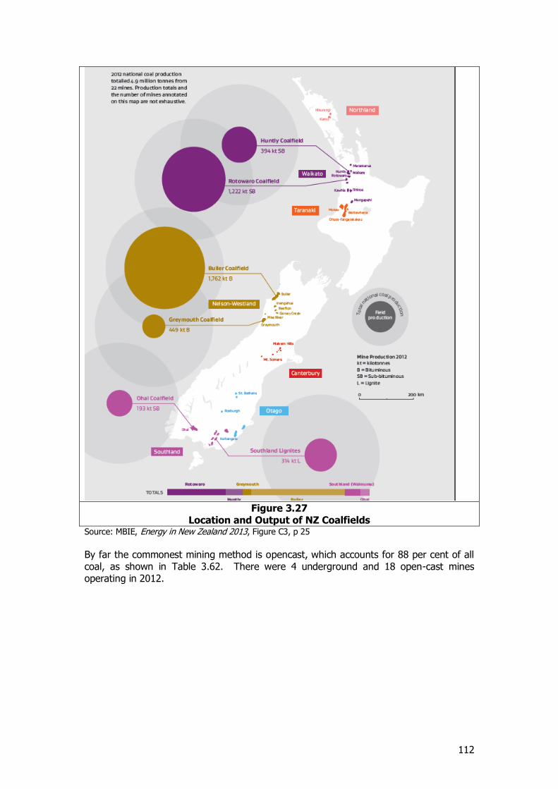
112
Figure 3.27
Location and Output of NZ Coalfields Source: MBIE, Energy in New Zealand 2013, Figure C3, p 25 By far the commonest mining method is opencast, which accounts for 88 per cent of all coal, as shown in Table 3.62. There were 4 underground and 18 open-cast mines operating in 2012.
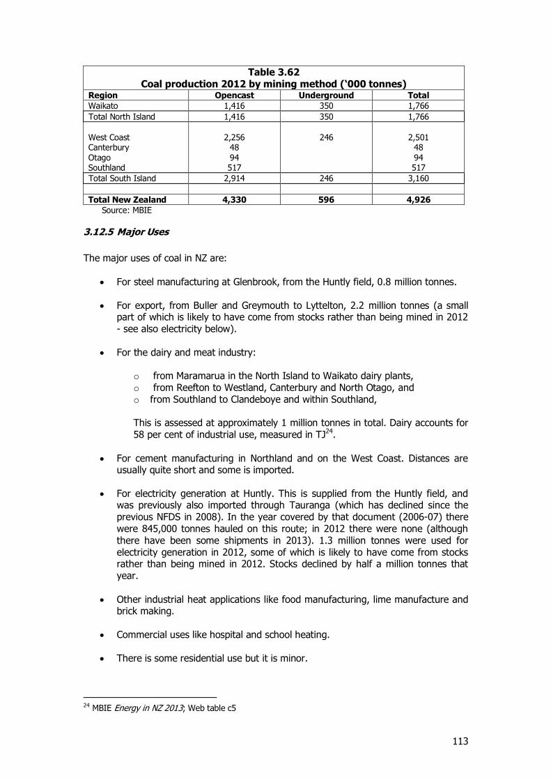
113
Table 3.62 Coal production 2012 by mining method (‘000 tonnes)
Region Opencast Underground Total
Waikato 1,416 350 1,766
Total North Island 1,416 350 1,766
West Coast 2,256 246 2,501 Canterbury 48 48 Otago 94 94 Southland 517 517
Total South Island 2,914 246 3,160
Total New Zealand 4,330 596 4,926
Source: MBIE
3.12.5 Major Uses
The major uses of coal in NZ are:
For steel manufacturing at Glenbrook, from the Huntly field, 0.8 million tonnes.
For export, from Buller and Greymouth to Lyttelton, 2.2 million tonnes (a small part of which is likely to have come from stocks rather than being mined in 2012 - see also electricity below).
For the dairy and meat industry:
o from Maramarua in the North Island to Waikato dairy plants, o from Reefton to Westland, Canterbury and North Otago, and o from Southland to Clandeboye and within Southland, This is assessed at approximately 1 million tonnes in total. Dairy accounts for 58 per cent of industrial use, measured in TJ24.
For cement manufacturing in Northland and on the West Coast. Distances are usually quite short and some is imported.
For electricity generation at Huntly. This is supplied from the Huntly field, and was previously also imported through Tauranga (which has declined since the previous NFDS in 2008). In the year covered by that document (2006-07) there were 845,000 tonnes hauled on this route; in 2012 there were none (although there have been some shipments in 2013). 1.3 million tonnes were used for electricity generation in 2012, some of which is likely to have come from stocks rather than being mined in 2012. Stocks declined by half a million tonnes that year.
Other industrial heat applications like food manufacturing, lime manufacture and brick making.
Commercial uses like hospital and school heating.
There is some residential use but it is minor.
24 MBIE Energy in NZ 2013; Web table c5
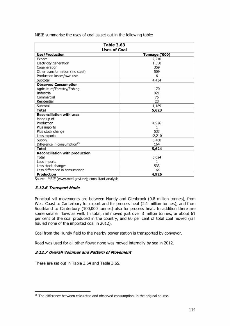
114
MBIE summarise the uses of coal as set out in the following table:
Table 3.63 Uses of Coal
Use/Production Tonnage (‘000)
Export 2,210 Electricity generation 1,350 Cogeneration 359 Other transformation (inc steel) 509 Production losses/own use 6
Subtotal 4,434
Observed Consumption Agriculture/Forestry/Fishing 170 Industrial 921 Commercial 75 Residential 23
Subtotal 1,189
Total 5,623
Reconciliation with uses Made up of: Production 4,926 Plus imports 1 Plus stock change 533 Less exports -2,210
Supply 5,460 Difference in consumption25 164
Total 5,624
Reconciliation with production Total 5,624 Less imports 1 Less stock changes 533 Less difference in consumption 164
Production 4,926
Source: MBIE (www.med.govt.nz); consultant analysis
3.12.6 Transport Mode
Principal rail movements are between Huntly and Glenbrook (0.8 million tonnes), from West Coast to Canterbury for export and for process heat (2.1 million tonnes); and from Southland to Canterbury (100,000 tonnes) also for process heat. In addition there are some smaller flows as well. In total, rail moved just over 3 million tonnes, or about 61 per cent of the coal produced in the country, and 60 per cent of total coal moved (rail hauled none of the imported coal in 2012). Coal from the Huntly field to the nearby power station is transported by conveyor. Road was used for all other flows; none was moved internally by sea in 2012.
3.12.7 Overall Volumes and Pattern of Movement
These are set out in Table 3.64 and Table 3.65.
25 The difference between calculated and observed consumption, in the original source.
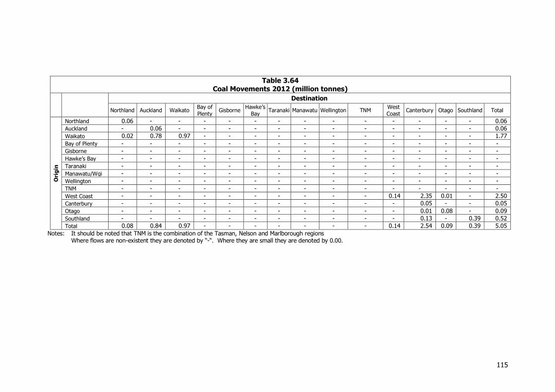
115
Table 3.64 Coal Movements 2012 (million tonnes)
Destination
Northland Auckland Waikato Bay of
Plenty Gisborne
Hawke’s
Bay Taranaki Manawatu Wellington TNM
West
Coast Canterbury Otago Southland Total
Ori
gin
Northland 0.06 - - - - - - - - - - - - - 0.06
Auckland - 0.06 - - - - - - - - - - - - 0.06
Waikato 0.02 0.78 0.97 - - - - - - - - - - - 1.77
Bay of Plenty - - - - - - - - - - - - - - -
Gisborne - - - - - - - - - - - - - - -
Hawke’s Bay - - - - - - - - - - - - - - -
Taranaki - - - - - - - - - - - - - - -
Manawatu/Wgi - - - - - - - - - - - - - - -
Wellington - - - - - - - - - - - - - - -
TNM - - - - - - - - - - - - - - -
West Coast - - - - - - - - - - 0.14 2.35 0.01 - 2.50
Canterbury - - - - - - - - - - - 0.05 - - 0.05
Otago - - - - - - - - - - - 0.01 0.08 - 0.09
Southland - - - - - - - - - - - 0.13 - 0.39 0.52
Total 0.08 0.84 0.97 - - - - - - - 0.14 2.54 0.09 0.39 5.05
Notes: It should be noted that TNM is the combination of the Tasman, Nelson and Marlborough regions Where flows are non-existent they are denoted by “-“. Where they are small they are denoted by 0.00.
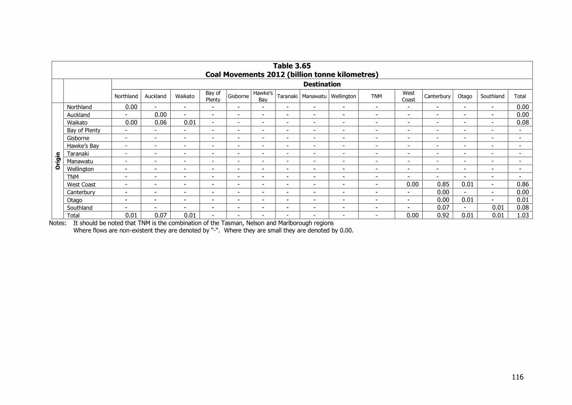
116
Table 3.65 Coal Movements 2012 (billion tonne kilometres)
Destination
Northland Auckland Waikato Bay of
Plenty Gisborne
Hawke’s
Bay Taranaki Manawatu Wellington TNM
West
Coast Canterbury Otago Southland Total
Ori
gin
Northland 0.00 - - - - - - - - - - - - - 0.00
Auckland - 0.00 - - - - - - - - - - - - 0.00
Waikato 0.00 0.06 0.01 - - - - - - - - - - - 0.08
Bay of Plenty - - - - - - - - - - - - - - -
Gisborne - - - - - - - - - - - - - - -
Hawke’s Bay - - - - - - - - - - - - - - -
Taranaki - - - - - - - - - - - - - - -
Manawatu - - - - - - - - - - - - - - -
Wellington - - - - - - - - - - - - - - -
TNM - - - - - - - - - - - - - - -
West Coast - - - - - - - - - - 0.00 0.85 0.01 - 0.86
Canterbury - - - - - - - - - - - 0.00 - - 0.00
Otago - - - - - - - - - - - 0.00 0.01 - 0.01
Southland - - - - - - - - - - - 0.07 - 0.01 0.08
Total 0.01 0.07 0.01 - - - - - - - 0.00 0.92 0.01 0.01 1.03
Notes: It should be noted that TNM is the combination of the Tasman, Nelson and Marlborough regions Where flows are non-existent they are denoted by “-“. Where they are small they are denoted by 0.00.
117
3.13 Petroleum
3.13.1 Introduction Crude oil is refined at Marsden Point into diesel and petrol, along with other products like jet fuel, bitumen and heavier fuel oils. This is distributed around New Zealand by pipeline or coastal tankers. A significant amount is also imported directly into major ports. The principal pipeline deliveries are from Marsden Point to Wiri and from Wiri to Auckland airport, along with minor lines for shipping and aircraft in Wellington. These do not impact on land transport facilities and are excluded from the origin-destination matrices.
3.13.2 Sources of Information and Methodology The primary sources of information were the petroleum distributing companies. All the major firms provided detailed origin-destination flows, and so did a number of the minor firms. These were amalgamated to ensure no one firm’s information was made public. The information was provided as distribution from each major terminal, which are at the same locations as the ports. In the case of Canterbury, Christchurch and Timaru information was separately available, which made the distance and tonne-km calculations more precise, but they have been amalgamated in the final matrices. Coastal Oil Logistics Ltd (COLL) provided data on the total fuel arriving at each port, assembled from information provided by its oil company shareholders. This included all products, so the total of all the firms’ information (some of which excluded jet fuel and minor products) was adjusted to match the information supplied by COLL. Some otherwise unidentified flows, such as sales through supermarkets, were also picked up in this way. Gull, which does not use the distribution systems of the major companies, provided its own import and distribution data. FIGS provides data on coastal movement of oil products which are also sourced from COLL. Subtracting these from the overall COLL data gives the imported product. FIGS also has data on the movement of crude from New Plymouth to Marsden Point, which was included in the matrix. On land in Taranaki there is considerable movement of crude oil to the port. Much of this is by pipeline and not included, but a report prepared by MWH for NZTA26 identified some 360,000t of movement by road, which is also included.
3.13.3 Industry Structure The oil distribution industry in New Zealand consists of 3 major international firms, Chevron, Mobil, and BP, the New Zealand owned Z Energy, and a number of minor players, like Challenge, Gasoline Alley and supermarket chains, which receive their fuel via the majors. Gull is outside this system and directly imports its own supplies. The relative size of the participants in the industry is shown in Table 3.66 in terms of the number of service stations operated under key brands.
26 MWH, High Productivity Motor Vehicle (HPMV) Route Assessment Report-Taranaki Region 7, report to NZTA, 2011, p 11
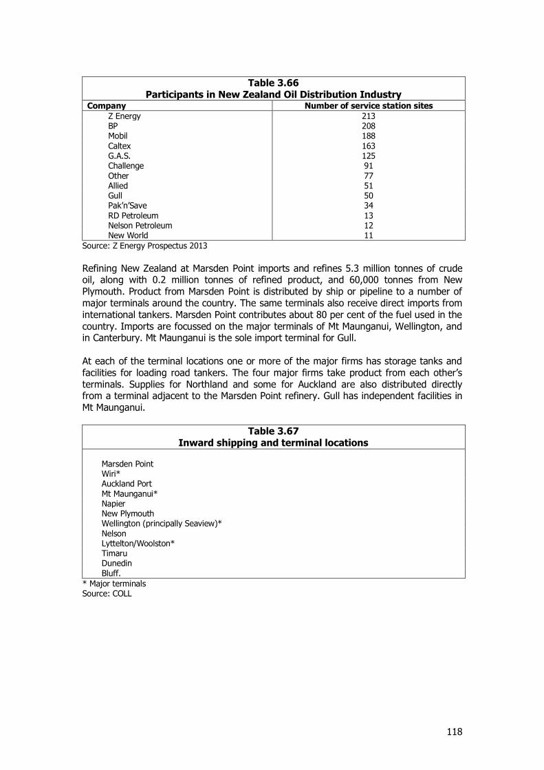
118
Table 3.66 Participants in New Zealand Oil Distribution Industry
Company Number of service station sites
Z Energy 213 BP 208 Mobil 188 Caltex 163 G.A.S. 125 Challenge 91 Other 77 Allied 51 Gull 50 Pak’n’Save 34 RD Petroleum 13 Nelson Petroleum 12 New World 11
Source: Z Energy Prospectus 2013
Refining New Zealand at Marsden Point imports and refines 5.3 million tonnes of crude oil, along with 0.2 million tonnes of refined product, and 60,000 tonnes from New Plymouth. Product from Marsden Point is distributed by ship or pipeline to a number of major terminals around the country. The same terminals also receive direct imports from international tankers. Marsden Point contributes about 80 per cent of the fuel used in the country. Imports are focussed on the major terminals of Mt Maunganui, Wellington, and in Canterbury. Mt Maunganui is the sole import terminal for Gull. At each of the terminal locations one or more of the major firms has storage tanks and facilities for loading road tankers. The four major firms take product from each other’s terminals. Supplies for Northland and some for Auckland are also distributed directly from a terminal adjacent to the Marsden Point refinery. Gull has independent facilities in Mt Maunganui.
Table 3.67 Inward shipping and terminal locations
Marsden Point Wiri* Auckland Port Mt Maunganui* Napier New Plymouth Wellington (principally Seaview)* Nelson Lyttelton/Woolston* Timaru Dunedin Bluff.
* Major terminals Source: COLL
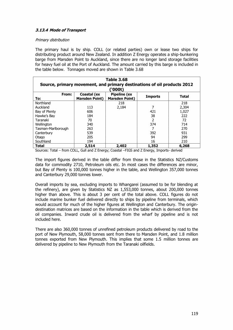
119
3.13.4 Mode of Transport Primary distribution The primary haul is by ship. COLL (or related parties) own or lease two ships for distributing product around New Zealand. In addition Z Energy operates a ship-bunkering barge from Marsden Point to Auckland, since there are no longer land storage facilities for heavy fuel oil at the Port of Auckland. The amount carried by this barge is included in the table below. Tonnages moved are shown in Table 3.68
Table 3.68 Source, primary movement, and primary destinations of oil products 2012
(‘000t) From:
To: Coastal (ex
Marsden Point) Pipeline (ex
Marsden Point) Imports Total
Northland 218 218 Auckland 113 2,184 7 2,304 Bay of Plenty 606 421 1,027 Hawke’s Bay 184 38 222 Taranaki 70 2 72 Wellington 340 374 714 Tasman-Marlborough 263 7 270 Canterbury 539 392 931 Otago 205 94 299 Southland 194 16 210
Total 2,514 2,402 1,352 6,268
Sources: Total – from COLL, Gull and Z Energy; Coastal –FIGS and Z Energy, Imports- derived
The import figures derived in the table differ from those in the Statistics NZ/Customs data for commodity 2710, Petroleum oils etc. In most cases the differences are minor, but Bay of Plenty is 100,000 tonnes higher in the table, and Wellington 357,000 tonnes and Canterbury 29,000 tonnes lower. Overall imports by sea, excluding imports to Whangarei (assumed to be for blending at the refinery), are given by Statistics NZ as 1,553,000 tonnes, about 200,000 tonnes higher than above. This is about 3 per cent of the total above. COLL figures do not include marine bunker fuel delivered directly to ships by pipeline from terminals, which would account for much of the higher figures at Wellington and Canterbury. The origin-destination matrices are based on the information in the table which is derived from the oil companies. Inward crude oil is delivered from the wharf by pipeline and is not included here. There are also 360,000 tonnes of unrefined petroleum products delivered by road to the port of New Plymouth, 58,000 tonnes sent from there to Marsden Point, and 1.8 million tonnes exported from New Plymouth. This implies that some 1.5 million tonnes are delivered by pipeline to New Plymouth from the Taranaki oilfields.
120
Secondary distribution Secondary distribution takes place from the terminals set out in Table 3.67. Some is by pipeline, principally the pipeline from Wiri to Auckland airport27, but the great majority is distributed by road directly to the network of service stations. Most flows out from the terminal to what might be conventionally thought as the hinterland of each port. However, there are a number of flows beyond the hinterlands, as the firms optimise their stocks and supply chains. Some examples are from Mt Maunganui as far as Manawatu and Wellington, Wellington to Hawke's Bay, Nelson to Canterbury, and Southland to Canterbury. Gull distributes across the North Island by road from Mt Maunganui. Rail is not used for distribution of these petroleum products.
3.13.5 Overall Interregional Movements These are set out in Table 3.69 and Table 3.70.
27 There are also pipelines from Miramar to Wellington airport, and Lyttelton to Woolston.
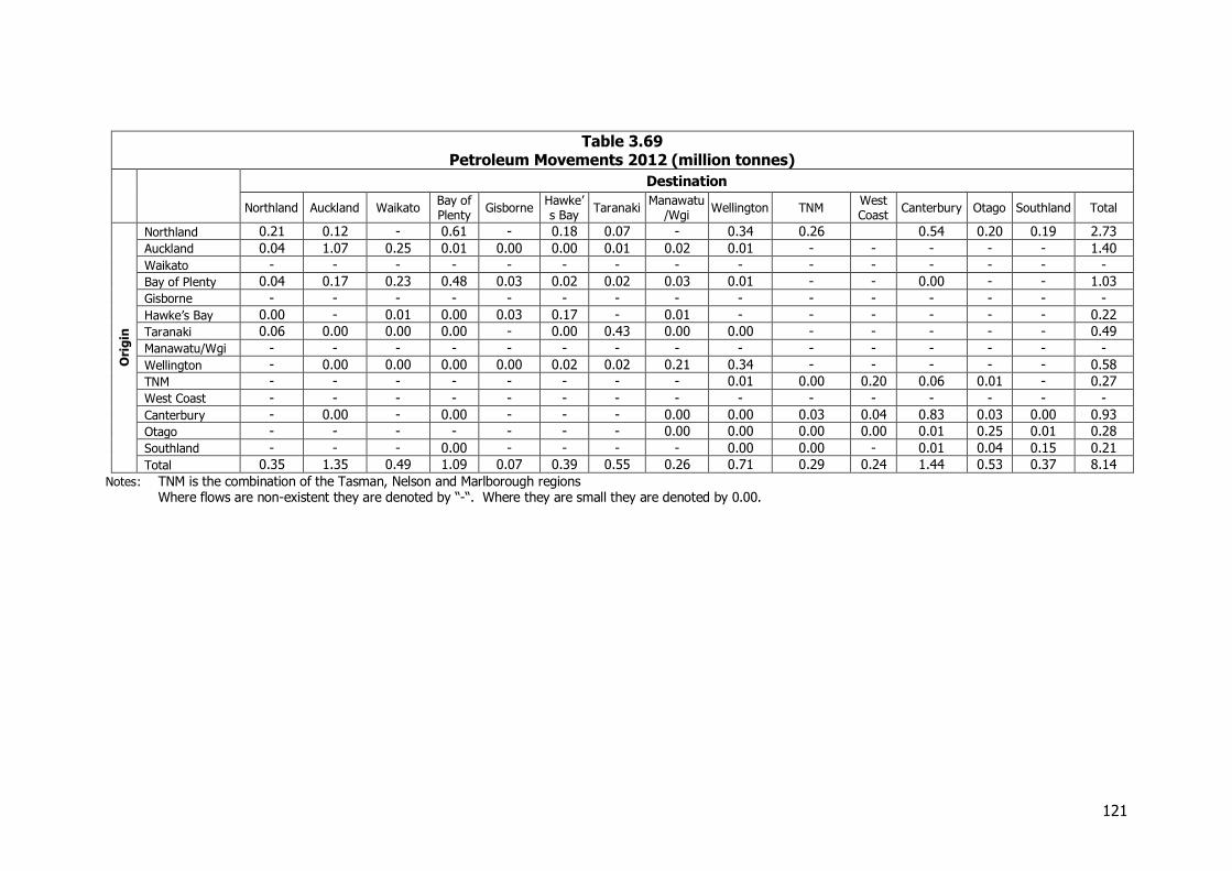
121
Table 3.69 Petroleum Movements 2012 (million tonnes)
Destination
Northland Auckland Waikato Bay of Plenty
Gisborne Hawke’s Bay
Taranaki Manawatu
/Wgi Wellington TNM
West Coast
Canterbury Otago Southland Total
Ori
gin
Northland 0.21 0.12 - 0.61 - 0.18 0.07 - 0.34 0.26 0.54 0.20 0.19 2.73
Auckland 0.04 1.07 0.25 0.01 0.00 0.00 0.01 0.02 0.01 - - - - - 1.40
Waikato - - - - - - - - - - - - - - -
Bay of Plenty 0.04 0.17 0.23 0.48 0.03 0.02 0.02 0.03 0.01 - - 0.00 - - 1.03
Gisborne - - - - - - - - - - - - - - -
Hawke’s Bay 0.00 - 0.01 0.00 0.03 0.17 - 0.01 - - - - - - 0.22
Taranaki 0.06 0.00 0.00 0.00 - 0.00 0.43 0.00 0.00 - - - - - 0.49
Manawatu/Wgi - - - - - - - - - - - - - - -
Wellington - 0.00 0.00 0.00 0.00 0.02 0.02 0.21 0.34 - - - - - 0.58
TNM - - - - - - - - 0.01 0.00 0.20 0.06 0.01 - 0.27
West Coast - - - - - - - - - - - - - - -
Canterbury - 0.00 - 0.00 - - - 0.00 0.00 0.03 0.04 0.83 0.03 0.00 0.93
Otago - - - - - - - 0.00 0.00 0.00 0.00 0.01 0.25 0.01 0.28
Southland - - - 0.00 - - - - 0.00 0.00 - 0.01 0.04 0.15 0.21
Total 0.35 1.35 0.49 1.09 0.07 0.39 0.55 0.26 0.71 0.29 0.24 1.44 0.53 0.37 8.14
Notes: TNM is the combination of the Tasman, Nelson and Marlborough regions Where flows are non-existent they are denoted by “-“. Where they are small they are denoted by 0.00.
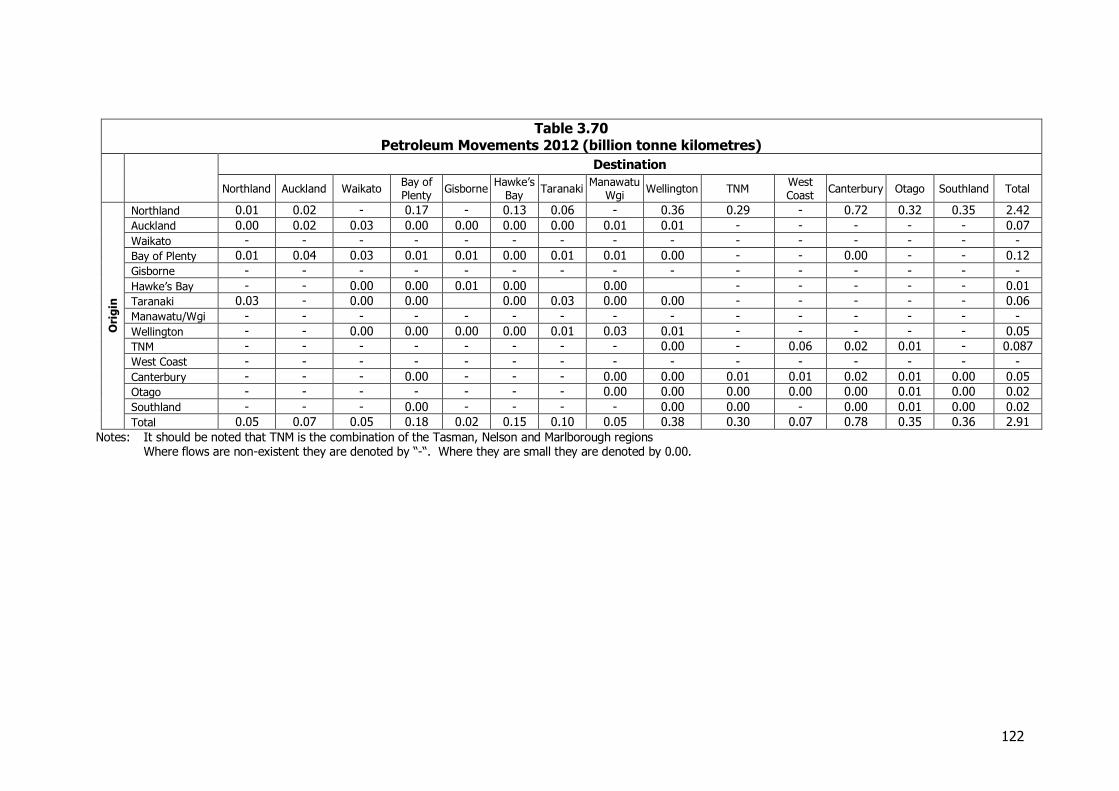
122
Table 3.70 Petroleum Movements 2012 (billion tonne kilometres)
Destination
Northland Auckland Waikato Bay of Plenty
Gisborne Hawke’s
Bay Taranaki
Manawatu Wgi
Wellington TNM West Coast
Canterbury Otago Southland Total
Ori
gin
Northland 0.01 0.02 - 0.17 - 0.13 0.06 - 0.36 0.29 - 0.72 0.32 0.35 2.42
Auckland 0.00 0.02 0.03 0.00 0.00 0.00 0.00 0.01 0.01 - - - - - 0.07
Waikato - - - - - - - - - - - - - - -
Bay of Plenty 0.01 0.04 0.03 0.01 0.01 0.00 0.01 0.01 0.00 - - 0.00 - - 0.12
Gisborne - - - - - - - - - - - - - - -
Hawke’s Bay - - 0.00 0.00 0.01 0.00 0.00 - - - - - 0.01
Taranaki 0.03 - 0.00 0.00 0.00 0.03 0.00 0.00 - - - - - 0.06
Manawatu/Wgi - - - - - - - - - - - - - - -
Wellington - - 0.00 0.00 0.00 0.00 0.01 0.03 0.01 - - - - - 0.05
TNM - - - - - - - - 0.00 - 0.06 0.02 0.01 - 0.087
West Coast - - - - - - - - - - - - - - -
Canterbury - - - 0.00 - - - 0.00 0.00 0.01 0.01 0.02 0.01 0.00 0.05
Otago - - - - - - - 0.00 0.00 0.00 0.00 0.00 0.01 0.00 0.02
Southland - - - 0.00 - - - - 0.00 0.00 - 0.00 0.01 0.00 0.02
Total 0.05 0.07 0.05 0.18 0.02 0.15 0.10 0.05 0.38 0.30 0.07 0.78 0.35 0.36 2.91
Notes: It should be noted that TNM is the combination of the Tasman, Nelson and Marlborough regions Where flows are non-existent they are denoted by “-“. Where they are small they are denoted by 0.00.
123
3.14 Aggregate
3.14.1 Introduction
Aggregate remains New Zealand’s most mined mineral, at 27 million tonnes, about 6 tonnes per head of population. It is widely used in roading, farming, and commercial and residential construction. It is a short-haul commodity, being of low value, and the doubling of cost every 30 km hauled noted in 2008 is still widely cited although the availability of backhauls can reduce this considerably. Most aggregate is still mined and produced locally. Some regions are deficient in good quality aggregate, so there is some cross-border movement to those regions. As well, certain aggregates have valuable properties, such as skid resistance, which means they can be moved over much longer distances, albeit in small quantities. In the 2008 NFDS there was considerable movement assessed from Waikato and Northland into Auckland, and growth was predicted for this. However, while Auckland’s central resources are mined out, or quarantined through planning rules, there have been major quarries opened in the south of the region and applications are current for further quarries in the north and south of the region. In addition there has been a downturn in demand since 2006 (the data used for the 2008 study), so more of this demand has been able to be satisfied locally. Movement from outside the borders of Auckland is assessed at much lower levels than in 2008.
3.14.2 Information Sources
Aggregate production data comes from MBIE. Further information came from quarry owners, especially in terms of cross-border movements, and from evidence supporting planning applications. Because of the low value and short distance hauls, most aggregate has been assumed to be consumed in the region of production, with an assessment made of cross border movements.
3.14.3 Industry Structure
The structure of the industry is much the same as in 2008, with the same major companies dominating the industry, and the same range of size of quarry from the very large to the very small. There are about 500 active quarries in New Zealand, 150 owned by major producers like Winstones (26) Holcim, J Swap, Higgins, Downers and a number of others, 100 owned by local authorities, and the remainder by small firms and individuals.28
28 Margaret McCrone, Freeman Media
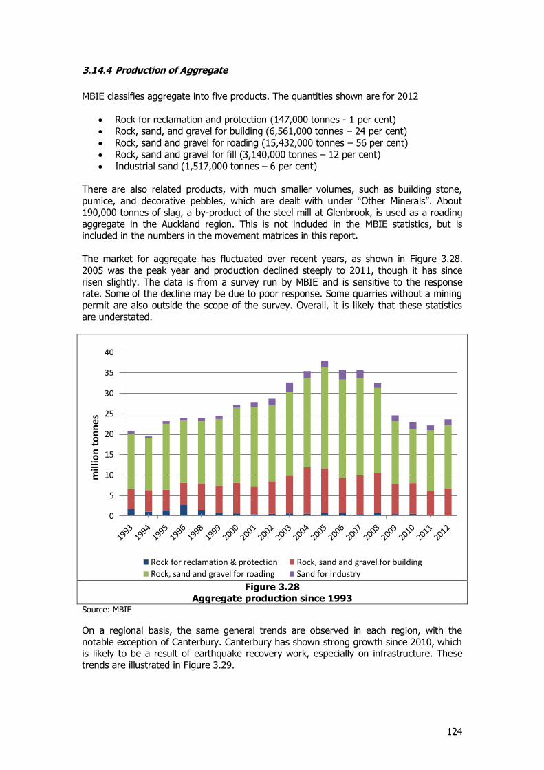
124
3.14.4 Production of Aggregate
MBIE classifies aggregate into five products. The quantities shown are for 2012
Rock for reclamation and protection (147,000 tonnes - 1 per cent) Rock, sand, and gravel for building (6,561,000 tonnes – 24 per cent) Rock, sand and gravel for roading (15,432,000 tonnes – 56 per cent) Rock, sand and gravel for fill (3,140,000 tonnes – 12 per cent) Industrial sand (1,517,000 tonnes – 6 per cent)
There are also related products, with much smaller volumes, such as building stone, pumice, and decorative pebbles, which are dealt with under “Other Minerals”. About 190,000 tonnes of slag, a by-product of the steel mill at Glenbrook, is used as a roading aggregate in the Auckland region. This is not included in the MBIE statistics, but is included in the numbers in the movement matrices in this report. The market for aggregate has fluctuated over recent years, as shown in Figure 3.28. 2005 was the peak year and production declined steeply to 2011, though it has since risen slightly. The data is from a survey run by MBIE and is sensitive to the response rate. Some of the decline may be due to poor response. Some quarries without a mining permit are also outside the scope of the survey. Overall, it is likely that these statistics are understated.
Figure 3.28
Aggregate production since 1993 Source: MBIE
On a regional basis, the same general trends are observed in each region, with the notable exception of Canterbury. Canterbury has shown strong growth since 2010, which is likely to be a result of earthquake recovery work, especially on infrastructure. These trends are illustrated in Figure 3.29.
0
5
10
15
20
25
30
35
40
mill
ion
to
nn
es
Rock for reclamation & protection Rock, sand and gravel for building
Rock, sand and gravel for roading Sand for industry
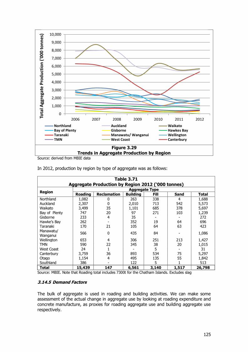
125
Figure 3.29
Trends in Aggregate Production by Region Source: derived from MBIE data
In 2012, production by region by type of aggregate was as follows:
Table 3.71 Aggregate Production by Region 2012 (‘000 tonnes)
Region Aggregate Type
Roading Reclamation Building Fill Sand Total
Northland 1,082 0 263 338 4 1,688 Auckland 2,307 0 2,010 713 542 5,573 Waikato 3,499 35 1,101 685 378 5,697 Bay of Plenty 747 20 97 271 103 1,239 Gisborne 233 4 35 - - 272 Hawke’s Bay 262 - 352 19 64 696 Taranaki 170 21 105 64 63 423 Manawatu/ Wanganui
566 0 435 84 - 1,086
Wellington 653 4 306 251 213 1,427 TMN 590 22 345 38 20 1,015 West Coast 24 1 - 5 - 31 Canterbury 3,759 36 893 534 75 5,297 Otago 1,154 4 495 135 55 1,842 Southland 386 - 122 5 1 513
Total 15,439 147 6,561 3,140 1,517 26,798
Source: MBIE. Note that Roading total includes 7300t for the Chatham Islands. Excludes slag
3.14.5 Demand Factors
The bulk of aggregate is used in roading and building activities. We can make some assessment of the actual change in aggregate use by looking at roading expenditure and concrete manufacture, as proxies for roading aggregate use and building aggregate use respectively.
0
1,000
2,000
3,000
4,000
5,000
6,000
7,000
8,000
9,000
10,000
2006 2007 2008 2009 2010 2011 2012
Tota
l Agg
rega
te P
rod
uct
ion
('0
00 t
on
nes
)
Northland Auckland WaikatoBay of Plenty Gisborne Hawkes BayTaranaki Manawatu/ Wanganui WellingtonTMN West Coast Canterbury
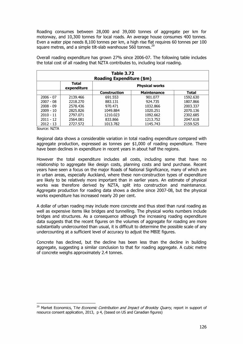
126
Roading consumes between 28,000 and 39,000 tonnes of aggregate per km for motorway, and 10,300 tonnes for local roads. An average house consumes 400 tonnes. Even a water pipe needs 8,100 tonnes per km, a high rise flat requires 60 tonnes per 100 square metres, and a simple tilt-slab warehouse 560 tonnes.29 Overall roading expenditure has grown 27% since 2006-07. The following table includes the total cost of all roading that NZTA contributes to, including local roading.
Table 3.72 Roading Expenditure ($m)
Total expenditure
Physical works
Construction Maintenance Total
2006 - 07 2139.466 691.553 901.077 1592.630 2007 - 08 2218.270 883.131 924.735 1807.866 2008 - 09 2578.436 970.471 1032.866 2003.337 2009 - 10 2825.826 1049.884 1020.251 2070.136 2010 - 11 2797.071 1210.023 1092.662 2302.685 2011 - 12 2564.081 833.866 1213.752 2047.618 2012 - 13 2727.572 1013.782 1145.743 2159.525
Source: NZTA
Regional data shows a considerable variation in total roading expenditure compared with aggregate production, expressed as tonnes per $1,000 of roading expenditure. There have been declines in expenditure in recent years in about half the regions. However the total expenditure includes all costs, including some that have no relationship to aggregate like design costs, planning costs and land purchase. Recent years have seen a focus on the major Roads of National Significance, many of which are in urban areas, especially Auckland, where these non-construction types of expenditure are likely to be relatively more important than in earlier years. An estimate of physical works was therefore derived by NZTA, split into construction and maintenance. Aggregate production for roading data shows a decline since 2007-08, but the physical works expenditure has increased nearly 20 per cent. A dollar of urban roading may include more concrete and thus steel than rural roading as well as expensive items like bridges and tunnelling. The physical works numbers include bridges and structures. As a consequence although the increasing roading expenditure data suggests that the recent figures on the volumes of aggregate for roading are more substantially undercounted than usual, it is difficult to determine the possible scale of any undercounting at a sufficient level of accuracy to adjust the MBIE figures. Concrete has declined, but the decline has been less than the decline in building aggregate, suggesting a similar conclusion to that for roading aggregate. A cubic metre of concrete weighs approximately 2.4 tonnes.
29 Market Economics, The Economic Contribution and Impact of Brookby Quarry, report in support of resource consent application, 2013, p 4, (based on US and Canadian figures)
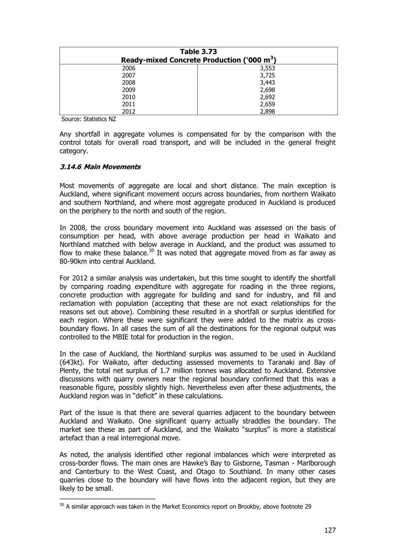
127
Table 3.73 Ready-mixed Concrete Production (‘000 m3) 2006 3,553 2007 3,725 2008 3,443 2009 2,698 2010 2,692 2011 2,659 2012 2,898
Source: Statistics NZ
Any shortfall in aggregate volumes is compensated for by the comparison with the control totals for overall road transport, and will be included in the general freight category.
3.14.6 Main Movements
Most movements of aggregate are local and short distance. The main exception is Auckland, where significant movement occurs across boundaries, from northern Waikato and southern Northland, and where most aggregate produced in Auckland is produced on the periphery to the north and south of the region. In 2008, the cross boundary movement into Auckland was assessed on the basis of consumption per head, with above average production per head in Waikato and Northland matched with below average in Auckland, and the product was assumed to flow to make these balance.30 It was noted that aggregate moved from as far away as 80-90km into central Auckland. For 2012 a similar analysis was undertaken, but this time sought to identify the shortfall by comparing roading expenditure with aggregate for roading in the three regions, concrete production with aggregate for building and sand for industry, and fill and reclamation with population (accepting that these are not exact relationships for the reasons set out above). Combining these resulted in a shortfall or surplus identified for each region. Where these were significant they were added to the matrix as cross-boundary flows. In all cases the sum of all the destinations for the regional output was controlled to the MBIE total for production in the region. In the case of Auckland, the Northland surplus was assumed to be used in Auckland (643kt). For Waikato, after deducting assessed movements to Taranaki and Bay of Plenty, the total net surplus of 1.7 million tonnes was allocated to Auckland. Extensive discussions with quarry owners near the regional boundary confirmed that this was a reasonable figure, possibly slightly high. Nevertheless even after these adjustments, the Auckland region was in “deficit” in these calculations. Part of the issue is that there are several quarries adjacent to the boundary between Auckland and Waikato. One significant quarry actually straddles the boundary. The market see these as part of Auckland, and the Waikato “surplus” is more a statistical artefact than a real interregional move. As noted, the analysis identified other regional imbalances which were interpreted as cross-border flows. The main ones are Hawke’s Bay to Gisborne, Tasman - Marlborough and Canterbury to the West Coast, and Otago to Southland. In many other cases quarries close to the boundary will have flows into the adjacent region, but they are likely to be small.
30 A similar approach was taken in the Market Economics report on Brookby, above footnote 29
128
Certain products flow longer distances. Aggregate with high polished stone values (“PSV”) is valuable as a skid-resistant top seal for roads, but is supplied by a limited number of quarries. It therefore can travel long distances but is used in relatively small quantities. An estimate of flows is included. Estimates of rail ballast movements are also included. This is also small, at 300,000 tonnes pa. Overall, closer scrutiny of cross-border flows has reduced their number and amount compared to 2006-07, and as a result of this and the overall reduction in output, the net tonne kilometre figures are substantially less than in 2006-07.
3.14.7 Mode of Transport
Nearly all aggregate moves by truck, apart from small amounts of railway ballast (some of which also moves by truck). While it is a bulk product well suited to line haul by rail, the short distances transported and distributed destinations make rail impracticable. A study of potential aggregate movement from Huntly to Auckland31 in 2010 found that access to rail at Huntly added cost, as did the need for a distribution terminal in Auckland. While the line haul cost by rail was competitive, the overall move was cheaper by road. These conclusions were in the context of the high flows then forecast from Waikato to Auckland. Only minimal amounts of aggregate are exported or imported.
3.14.8 Comparison with 2006-07
The data is from the same source, so the significant reduction (of about 13 million tonnes) is as surveyed by MBIE. Overall trends are set out in Figure 3.28 above. Local producers agree that the Auckland market had turned down through 2012, and as a result the region was more self-sufficient. The Market Economics report on Brookby Quarry (Whitford) expansion suggests that current plans for Auckland growth could rapidly return the numbers to 2006-07 levels in Auckland, in order to supply new construction.32
3.14.9 Future
Roading NZ commissioned a report from Philippa Black, Geology, School of Environment at Auckland University, to give an inventory of available resources in the North Island. (A similar report for the South Island is in preparation). This report33 suggests that high quality aggregate is limited to certain types of greywacke, which is not abundant in every region. This suggests that in future flows of aggregate will get longer (and costlier) than currently; on the other hand the report suggests that lesser quality rock could satisfactorily be used and that the roading industry should consider reducing the specifications to allow a wider range of sources to be used.
31 R Paling et al , Waikato Aggregates Distribution Costs Study, Stage 1 analysis, Report for Waikato Regional Council, 2010 32 Market Economics, see footnote 29, pp 9-10 33 Philippa M. Black, Geologic Inventory of North Island Aggregate Resources: Influences on Engineering Materials Properties, Geology, School of the Environment, University of Auckland, 2009. From www.roadingnz.org.nz.

129
The report’s finding suggest pressures in opposite directions with increases in transport distances if specifications remain unchanged but with the potential to reduce these if specifications are downgraded. It is however worth noting the potential long term impact if specifications remain as they are today and transport distances increase. Aggregate is forecast in relation to the GDP and building forecasts in this NFDS report, with no change in the current pattern of supply and use regions.
3.14.10 Overall Movement in 2012
The position that results for 2012 is set out in Table 3.74 and Table 3.75
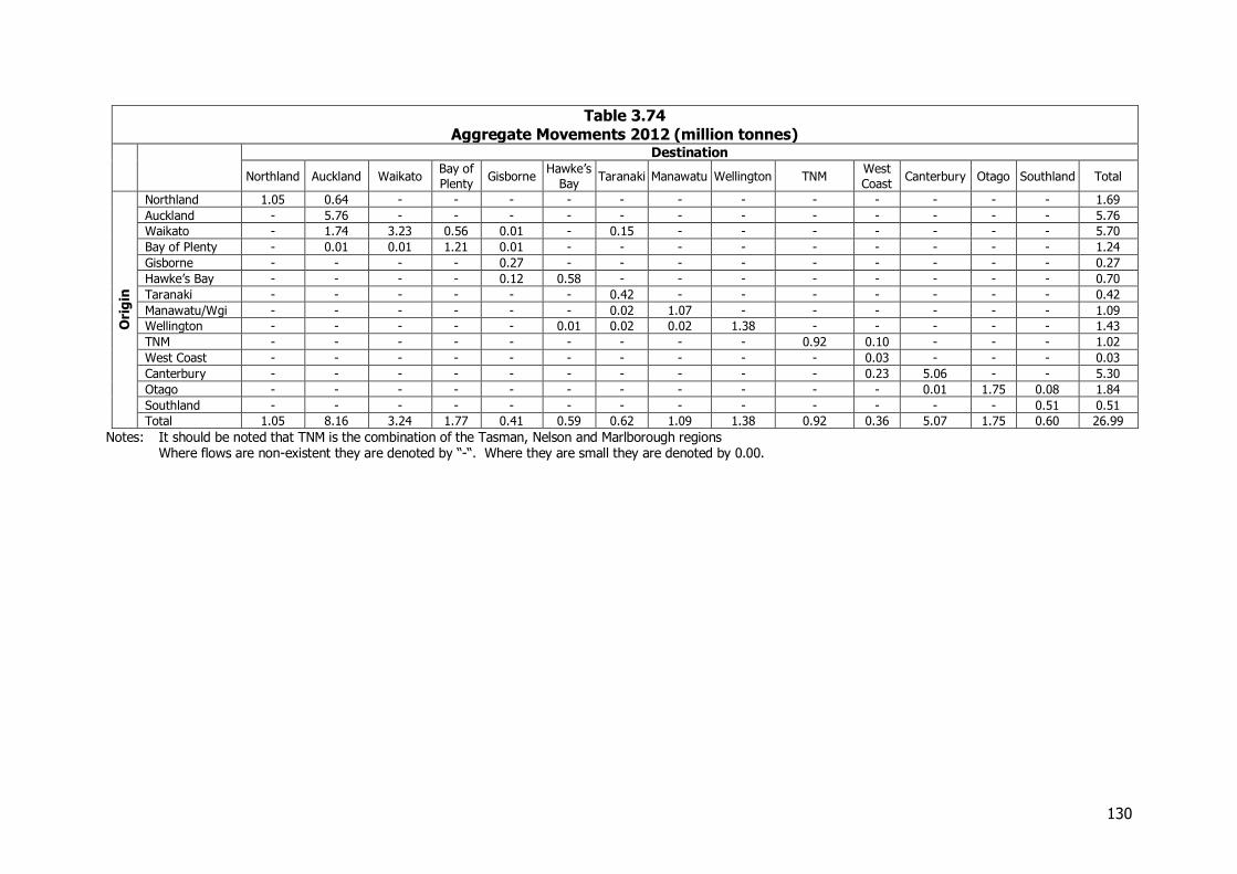
130
Table 3.74 Aggregate Movements 2012 (million tonnes)
Destination
Northland Auckland Waikato Bay of
Plenty Gisborne
Hawke’s
Bay Taranaki Manawatu Wellington TNM
West
Coast Canterbury Otago Southland Total
Ori
gin
Northland 1.05 0.64 - - - - - - - - - - - - 1.69
Auckland - 5.76 - - - - - - - - - - - - 5.76
Waikato - 1.74 3.23 0.56 0.01 - 0.15 - - - - - - - 5.70
Bay of Plenty - 0.01 0.01 1.21 0.01 - - - - - - - - - 1.24
Gisborne - - - - 0.27 - - - - - - - - - 0.27
Hawke’s Bay - - - - 0.12 0.58 - - - - - - - - 0.70
Taranaki - - - - - - 0.42 - - - - - - - 0.42
Manawatu/Wgi - - - - - - 0.02 1.07 - - - - - - 1.09
Wellington - - - - - 0.01 0.02 0.02 1.38 - - - - - 1.43
TNM - - - - - - - - - 0.92 0.10 - - - 1.02
West Coast - - - - - - - - - - 0.03 - - - 0.03
Canterbury - - - - - - - - - - 0.23 5.06 - - 5.30
Otago - - - - - - - - - - - 0.01 1.75 0.08 1.84
Southland - - - - - - - - - - - - - 0.51 0.51
Total 1.05 8.16 3.24 1.77 0.41 0.59 0.62 1.09 1.38 0.92 0.36 5.07 1.75 0.60 26.99
Notes: It should be noted that TNM is the combination of the Tasman, Nelson and Marlborough regions Where flows are non-existent they are denoted by “-“. Where they are small they are denoted by 0.00.
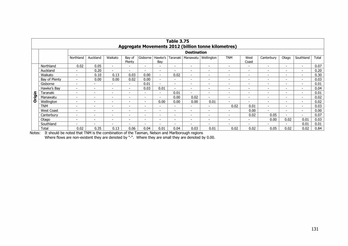
131
Table 3.75 Aggregate Movements 2012 (billion tonne kilometres)
Destination
Northland Auckland Waikato Bay of
Plenty
Gisborne Hawke’s
Bay
Taranaki Manawatu Wellington TNM West
Coast
Canterbury Otago Southland Total
Ori
gin
Northland 0.02 0.05 - - - - - - - - - - - - 0.07
Auckland - 0.20 - - - - - - - - - - - - 0.20
Waikato - 0.10 0.13 0.03 0.00 - 0.02 - - - - - - - 0.30
Bay of Plenty - 0.00 0.00 0.02 0.00 - - - - - - - - - 0.03
Gisborne - - - - 0.01 - - - - - - - - - 0.01
Hawke’s Bay - - - - 0.03 0.01 - - - - - - - - 0.04
Taranaki - - - - - - 0.01 - - - - - - - 0.01
Manawatu - - - - - - 0.00 0.02 - - - - - - 0.02
Wellington - - - - - 0.00 0.00 0.00 0.01 - - - - - 0.02
TNM - - - - - - - - - 0.02 0.01 - - - 0.03
West Coast - - - - - - - - - - 0.00 - - - 0.00
Canterbury - - - - - - - - - - 0.02 0.05 - - 0.07
Otago - - - - - - - - - - - 0.00 0.02 0.01 0.03
Southland - - - - - - - - - - - - - 0.01 0.01
Total 0.02 0.35 0.13 0.06 0.04 0.01 0.04 0.03 0.01 0.02 0.02 0.05 0.02 0.02 0.84
Notes: It should be noted that TNM is the combination of the Tasman, Nelson and Marlborough regions Where flows are non-existent they are denoted by “-“. Where they are small they are denoted by 0.00.
132
3.15 Limestone, Cement, Concrete and Fertiliser
3.15.1 Introduction This group of commodities is generally about bulk powder commodities, plus the derivative concrete. The primary reason for the amalgamation is however to protect confidentiality. Limestone remains the second most mined mineral after aggregate. Production is assessed at 4.2 million tonnes per year. It is quarried for cement manufacture in Northland and the West Coast, for industry principally in Northland, Waikato, and Otago; and for agriculture in all regions except Bay of Plenty and Taranaki. It is therefore a ubiquitous mineral like aggregate, and like aggregate is not of high value, so transport distances are short. Like aggregate, it varies in purity and uses needing higher purity stone, like high-end industrial products, are located in fewer places than agricultural lime. Unlike aggregate, though, there is industrial refining and manufacture of more processed products which can be transported long distances. It is used as an agent in steel making and gold refining (and some is also exported for that purpose). It is also used as a filler (e.g. in paper making), for water purification and for road stabilisation. Limestone is also used as a soft rock for dairy races and other farm tracks, crossing over into the aggregate market, which also supplies soft rock for these purposes. Cement is produced at Portland in Northland (by Golden Bay Cement, a Fletcher Group company) and at Cape Foulwind near Westport (by Holcim, a Swiss-based multinational). Fertiliser is manufactured by Ballance and Ravensdown, at a number of locations, and is also imported. Raw materials for phosphate-based fertiliser production (phosphate rock and sulphur) are mainly imported, and phosphate plants are located at or near ports. Urea, a nitrogenous fertiliser, is produced from natural gas at Kapuni in Taranaki. Concrete has a very short shelf life and can only travel short distances, so is produced at many locations throughout the country. Some 2.9 million cubic metres or 7 million tonnes were produced in 2012.
3.15.2 Sources of Information and Methodology
Information on limestone production comes from MBIE, in the same Industrial Minerals series as aggregate. Like aggregates, it suffers from a poor response rate to a survey, and the 2012 figures appeared to be unreasonably low. The numbers have been adjusted by referral to Statistics NZ data on lime applied to farms, from the 2012 Agricultural Census, and similar data for earlier years, and by adding estimated production for Waikato industrial lime producers, drawing on information supplied by them. Information on movement patterns was supplied by some producers, from export data, and from rail data, as well as estimates based on the agricultural use. Dolomite for agriculture has been included as limestone. Serpentine, a related rock, is dealt with in Other Minerals. Cement information was supplied by the producers, including information on other inputs to the process like gypsum. It included very detailed data on both primary and secondary distribution. Company websites were also accessed.
133
Similarly information on fertiliser manufacture and distribution was provided by the two main producers. Inputs to the process, and imports of finished product, were obtained from Statistics NZ/Customs port data and statistics data on fertiliser spread on farms was also used. Company websites again supplied useful data. Statistics NZ has a quarterly series on ready mix concrete production by region. Gaps in the regional data were estimated. Ready mixed concrete is likely to be close to all concrete produced, apart from very small scale uses. Statistics NZ also provided numbers of plants and firms.
3.15.3 Industry Structure
The industry structure is little different from in 2008. There are now about 70 main limestone quarries, producing varying volumes. The major producers are still Holcim and Omya with Ravensdown also a large producer. There are a number of second tier operators like Avoca Lime in Northland, and Websters and Hatuma Lime in Hawke’s Bay. Holcim produce both industrial lime, for steel making and gold processing, and for export, and agricultural lime, at principal plants near Otorohanga and Palmerston (in the South Island). Omya produces over 100,000 tonnes per year from its Te Kuiti factory, mainly high-end inputs to other industries like paint and paper making. Hatuma are agricultural lime producers, and have developed a product combining both superphosphate and lime, called “Dicalcic”, which is marketed across the country by Ballance. Figure 3.30 shows the distribution of limestone quarries across the country.
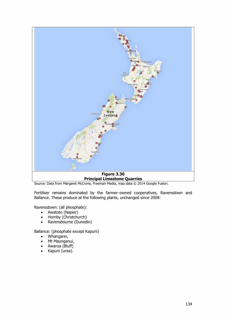
134
Figure 3.30
Principal Limestone Quarries Source: Data from Margaret McCrone, Freeman Media, map data © 2014 Google Fusion.
Fertiliser remains dominated by the farmer–owned cooperatives, Ravensdown and Ballance. These produce at the following plants, unchanged since 2008: Ravensdown: (all phosphate):
Awatoto (Napier) Hornby (Christchurch) Ravensbourne (Dunedin)
Ballance: (phosphate except Kapuni)
Whangarei, Mt Maunganui, Awaroa (Bluff) Kapuni (urea).
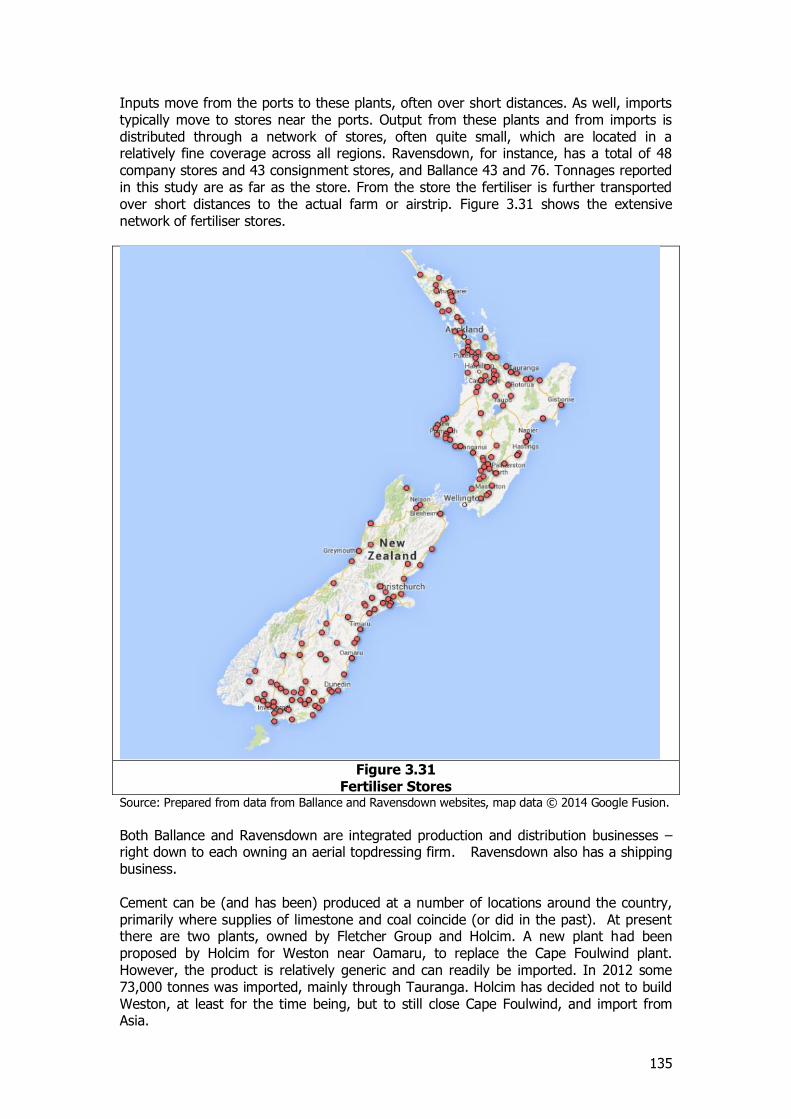
135
Inputs move from the ports to these plants, often over short distances. As well, imports typically move to stores near the ports. Output from these plants and from imports is distributed through a network of stores, often quite small, which are located in a relatively fine coverage across all regions. Ravensdown, for instance, has a total of 48 company stores and 43 consignment stores, and Ballance 43 and 76. Tonnages reported in this study are as far as the store. From the store the fertiliser is further transported over short distances to the actual farm or airstrip. Figure 3.31 shows the extensive network of fertiliser stores.
Figure 3.31
Fertiliser Stores Source: Prepared from data from Ballance and Ravensdown websites, map data © 2014 Google Fusion.
Both Ballance and Ravensdown are integrated production and distribution businesses – right down to each owning an aerial topdressing firm. Ravensdown also has a shipping business. Cement can be (and has been) produced at a number of locations around the country, primarily where supplies of limestone and coal coincide (or did in the past). At present there are two plants, owned by Fletcher Group and Holcim. A new plant had been proposed by Holcim for Weston near Oamaru, to replace the Cape Foulwind plant. However, the product is relatively generic and can readily be imported. In 2012 some 73,000 tonnes was imported, mainly through Tauranga. Holcim has decided not to build Weston, at least for the time being, but to still close Cape Foulwind, and import from Asia.
136
The impact of this on the distribution pattern is not yet clear. Holcim has called for bids for ports to offer it services for cement imports. It is understood that the cement will be a backload cargo for log ships in the Asian trade, and very cheap rates are being offered. A potential single port could receive these shipments, with distribution around New Zealand from that port (which would shift the primary source from Westport to a new port, but leave the rest of the distribution pattern largely unchanged). If the cement is imported in clinker form a crushing plant would have to be established at the port or nearby. Alternatively the long haul ship could call at a number of ports, thus changing the primary distribution by coastal ship to one using the international ships, with potentially further downstream changes, such as more use of land transport. It is understood that the extra shipping costs for multiple port calls would not be significant. It is assumed for the purpose of the forecasts that the single port of entry option will be chosen, using a Canterbury port. Ready mixed concrete is produced at 191 sites throughout the country in 2012 compared 183 reported in the 2008 NFDS for 2006-07. Some 112 are owned by Fletchers or Holcim and associated companies, with the remainder mainly locally owned businesses. There were 41 firms active in the industry in 2012, compared to 52 in 2006-07. Over the period from 2006-07 there has therefore been some concentration in the numbers of firms but an expansion in the number of sites. This expansion in the number of sites has also extended to 2013 with 197 sites now in operation. The concrete, cement, and aggregate businesses still show an important level of integration, including reinforcing steel in the case of Fletchers.
3.15.4 Production
Limestone MBIE categorises limestone into
Limestone and marl for cement ( 1,796,701 tonnes) Limestone for agriculture (1,020,157 tonnes) Limestone for industry (318,661 tonnes) Dolomite, a third agricultural and two-thirds industrial (120,039 tonnes)
The figures appeared to be deficient in some regions, and were adjusted as discussed above. Reported industrial lime production was increased by 577,000 tonnes in the Waikato, on the basis of information from producers and from the previous study. Agricultural lime was increased in a number of regions, by 591,000 tonnes overall, on the basis of the lime spread information from Statistics NZ. Some limestone is produced as building stone, mainly in Oamaru. The official production figures do not identify building stone by type of stone, but the Otago production of 6000 tonnes is likely to include limestone.
137
Table 3.76
Limestone Production 2012, adjusted (‘000 tonnes)
Region Use
Cement Agriculture Industry Total
Northland 1,015 183 147 1,345 Auckland - 67 1 68 Waikato - 388 546 934 Bay of Plenty - - - - Gisborne - 7 - 7 Hawke’s Bay - 125 5 130 Taranaki - - - - Manawatu-Wanganui - 6 3 9 Wellington - 75 - 75 Tasman/Marlborough/Nelson - 42 20 62 West Coast 782 77 3 862 Canterbury - 159 17 176 Otago - 199 40 239 Southland - 318 - 318
Total 1,797 1,646 782 4,225
Source: NZ PAM, consultant estimates. Note: includes agricultural and industrial dolomite in the relevant columns
Fertiliser There are no official statistics on fertiliser production, though the Agricultural census does give the quantities used (originating from both local production and imports) in the year ending June 2012, a total of 2.2 million tonnes. As shown in the footnotes, the distinction between phosphatic and nitrogenous is not a pure one; some have elements of both:
Phosphatic - 1.342 million tonnes34 Nitrogenous - 0.828 million tonnes35
Over 1.1 million tonnes of fertiliser are imported (see Table 3.78). Fertiliser inputs (phosphate rock and sulphur or sulphuric acid) are imported through Marsden Point, Mt Maunganui, Napier, Lyttelton, Dunedin (where the plant has its own wharf) and Bluff. In the case of Whangarei, the oil refinery produces sulphur as a by-product, and this is used at the fertiliser works instead of imported sulphur. Cement
Total production of cement is about 1.1 million tonnes. Figures for the individual plants are confidential. Gypsum and limestone are included in this section. Coal is used to fire the kilns, and is dealt with in the coal section. Concrete Concrete production occurs in all regions. Data from Statistics NZ is shown below, with estimates made of regions that are confidential in the data source. Statistics NZ’s combined regions have been expanded to all regions, on the basis of population. The original data is in cubic metres, converted at 2.4 tonnes per cubic metre.
34 Diammonium phosphate, superphosphate, potassic superphosphate 35 Urea, ammonium sulphate, other nitrogenous fertilisers
138
Table 3.77 Ready Mixed Concrete Production (‘000 tonnes)
Northland 199 Auckland 2,158 Waikato 663 Bay of Plenty 451 Gisborne 53 Hawke’s Bay 176 Taranaki 118 Manawatu-Wanganui 249 Wellington 526 Tasman- Marlborough 367 West Coast 86 Canterbury 1,470 Otago 294 Southland 145
Total ,6955
Source: Statistics NZ, consultant estimates for some regions
3.15.5 International Trade
There are only limited quantities of limestone imported or exported. Omya still imports some limestone, but did not in 2012 as it had sufficient stocks. Some 67,000 tonnes are exported from Otorohanga to New Guinea through Tauranga. 73,000 tonnes of cement are imported as noted above. Cement is also exported, principally to the Pacific. In 2012 there were 132,000 tonnes exported, nearly all from Auckland. Substantial quantities of fertiliser are imported.
Table 3.78 International Trade in Fertiliser 2012 (‘000 tonnes)
Port Imports Exports
Whangarei 9 - Auckland 12 2 Tauranga 215 8 Gisborne - - Napier 45 0 New Plymouth 105 - Wellington 1 0 Nelson 50 Lyttelton 332 6 Timaru 176 - Dunedin 44 - Bluff 144 - Total 1,133 17
Source: Statistics NZ. Excludes raw materials
3.15.6 Mode of Transport
Cement Cement is primarily distributed from Portland and Westport by company owned ships. These serve the ports shown in Table 3.79. Nearly all the production from both Westport and Portland initially moves by ship. There is some direct distribution in Northland, West Coast and Nelson from the plant, and primary distribution by road transport from Portland to Auckland, and by rail and road from Westport to Sockburn in Christchurch.
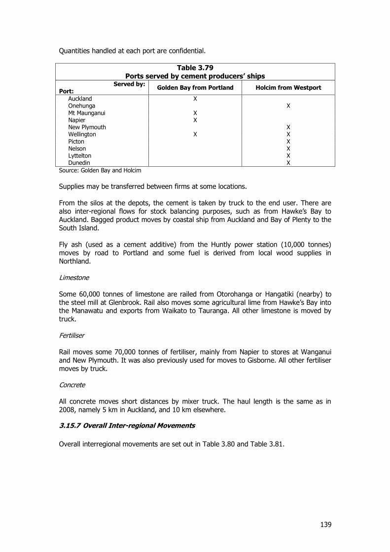
139
Quantities handled at each port are confidential.
Table 3.79 Ports served by cement producers’ ships
Served by: Port:
Golden Bay from Portland Holcim from Westport
Auckland X Onehunga X Mt Maunganui X Napier X New Plymouth X Wellington X X Picton X Nelson X Lyttelton X Dunedin X
Source: Golden Bay and Holcim
Supplies may be transferred between firms at some locations. From the silos at the depots, the cement is taken by truck to the end user. There are also inter-regional flows for stock balancing purposes, such as from Hawke’s Bay to Auckland. Bagged product moves by coastal ship from Auckland and Bay of Plenty to the South Island. Fly ash (used as a cement additive) from the Huntly power station (10,000 tonnes) moves by road to Portland and some fuel is derived from local wood supplies in Northland. Limestone Some 60,000 tonnes of limestone are railed from Otorohanga or Hangatiki (nearby) to the steel mill at Glenbrook. Rail also moves some agricultural lime from Hawke’s Bay into the Manawatu and exports from Waikato to Tauranga. All other limestone is moved by truck. Fertiliser Rail moves some 70,000 tonnes of fertiliser, mainly from Napier to stores at Wanganui and New Plymouth. It was also previously used for moves to Gisborne. All other fertiliser moves by truck. Concrete All concrete moves short distances by mixer truck. The haul length is the same as in 2008, namely 5 km in Auckland, and 10 km elsewhere.
3.15.7 Overall Inter-regional Movements
Overall interregional movements are set out in Table 3.80 and Table 3.81.
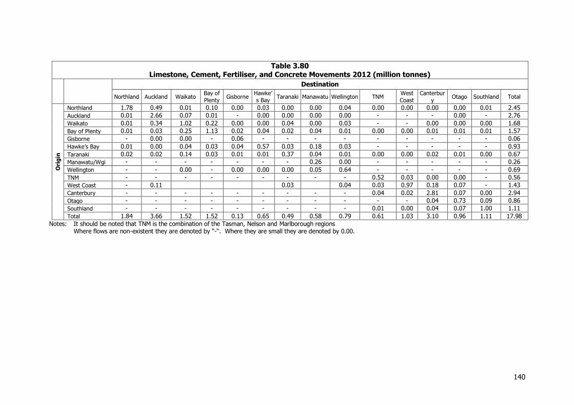
140
Table 3.80 Limestone, Cement, Fertiliser, and Concrete Movements 2012 (million tonnes)
Destination
Northland Auckland Waikato Bay of
Plenty Gisborne
Hawke’
s Bay Taranaki Manawatu Wellington TNM
West
Coast
Canterbur
y Otago Southland Total
Ori
gin
Northland 1.78 0.49 0.01 0.10 0.00 0.03 0.00 0.00 0.04 0.00 0.00 0.00 0.00 0.01 2.45
Auckland 0.01 2.66 0.07 0.01 - 0.00 0.00 0.00 0.00 - - - 0.00 - 2.76
Waikato 0.01 0.34 1.02 0.22 0.00 0.00 0.04 0.00 0.03 - - 0.00 0.00 0.00 1.68
Bay of Plenty 0.01 0.03 0.25 1.13 0.02 0.04 0.02 0.04 0.01 0.00 0.00 0.01 0.01 0.01 1.57
Gisborne - 0.00 0.00 - 0.06 - - - - - - - - - 0.06
Hawke’s Bay 0.01 0.00 0.04 0.03 0.04 0.57 0.03 0.18 0.03 - - - - - 0.93
Taranaki 0.02 0.02 0.14 0.03 0.01 0.01 0.37 0.04 0.01 0.00 0.00 0.02 0.01 0.00 0.67
Manawatu/Wgi - - - - - - - 0.26 0.00 - - - - - 0.26
Wellington - - 0.00 - 0.00 0.00 0.00 0.05 0.64 - - - - - 0.69
TNM - - - - - - - - - 0.52 0.03 0.00 0.00 - 0.56
West Coast - 0.11 0.03 0.04 0.03 0.97 0.18 0.07 - 1.43
Canterbury - - - - - - - - - 0.04 0.02 2.81 0.07 0.00 2.94
Otago - - - - - - - - - - - 0.04 0.73 0.09 0.86
Southland - - - - - - - - - 0.01 0.00 0.04 0.07 1.00 1.11
Total 1.84 3.66 1.52 1.52 0.13 0.65 0.49 0.58 0.79 0.61 1.03 3.10 0.96 1.11 17.98
Notes: It should be noted that TNM is the combination of the Tasman, Nelson and Marlborough regions Where flows are non-existent they are denoted by “-“. Where they are small they are denoted by 0.00.
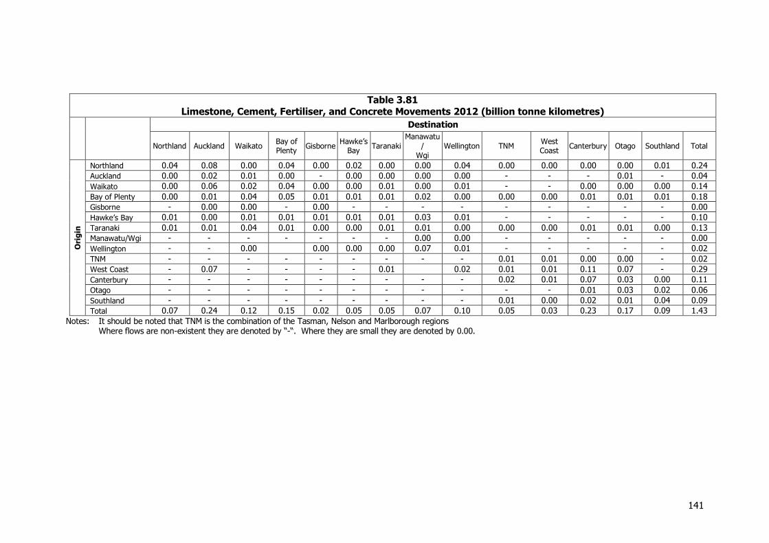
141
Table 3.81 Limestone, Cement, Fertiliser, and Concrete Movements 2012 (billion tonne kilometres)
Destination
Northland Auckland Waikato Bay of Plenty
Gisborne Hawke’s
Bay Taranaki
Manawatu
/
Wgi
Wellington TNM West Coast
Canterbury Otago Southland Total
Ori
gin
Northland 0.04 0.08 0.00 0.04 0.00 0.02 0.00 0.00 0.04 0.00 0.00 0.00 0.00 0.01 0.24
Auckland 0.00 0.02 0.01 0.00 - 0.00 0.00 0.00 0.00 - - - 0.01 - 0.04
Waikato 0.00 0.06 0.02 0.04 0.00 0.00 0.01 0.00 0.01 - - 0.00 0.00 0.00 0.14
Bay of Plenty 0.00 0.01 0.04 0.05 0.01 0.01 0.01 0.02 0.00 0.00 0.00 0.01 0.01 0.01 0.18
Gisborne - 0.00 0.00 - 0.00 - - - - - - - - - 0.00
Hawke’s Bay 0.01 0.00 0.01 0.01 0.01 0.01 0.01 0.03 0.01 - - - - - 0.10
Taranaki 0.01 0.01 0.04 0.01 0.00 0.00 0.01 0.01 0.00 0.00 0.00 0.01 0.01 0.00 0.13
Manawatu/Wgi - - - - - - - 0.00 0.00 - - - - - 0.00
Wellington - - 0.00 0.00 0.00 0.00 0.07 0.01 - - - - - 0.02
TNM - - - - - - - - - 0.01 0.01 0.00 0.00 - 0.02
West Coast - 0.07 - - - - 0.01 0.02 0.01 0.01 0.11 0.07 - 0.29
Canterbury - - - - - - - - - 0.02 0.01 0.07 0.03 0.00 0.11
Otago - - - - - - - - - - - 0.01 0.03 0.02 0.06
Southland - - - - - - - - - 0.01 0.00 0.02 0.01 0.04 0.09
Total 0.07 0.24 0.12 0.15 0.02 0.05 0.05 0.07 0.10 0.05 0.03 0.23 0.17 0.09 1.43
Notes: It should be noted that TNM is the combination of the Tasman, Nelson and Marlborough regions Where flows are non-existent they are denoted by “-“. Where they are small they are denoted by 0.00.
142
3.16 Steel and Aluminium
3.16.1 Introduction
Three companies are involved in producing basic metals in New Zealand. This section covers the production of steel from ironsands by BlueScope Steel at Glenbrook in South Auckland, of reinforcing steel from scrap by Pacific Steel at Otahuhu in Auckland, and aluminium from imported alumina by NZ Aluminium Smelters at Bluff. It also covers the movement of the basic products, and trade in them and in scrap.
3.16.2 Sources of Information and Methodology
BlueScope Steel provided detail on their production and movement. There was also good public information available from a shareholder presentation. Pacific Steel and NZ Aluminium Smelters (“NZAS”) did not provide information so estimates were made. In both cases 2012 production was publicly available; for Pacific Steel this was assumed to have the same distribution patterns as in 2008. Most of the output of the aluminium smelter is exported, and recorded in the NZ Statistics/Customs port data. Information on the company’s website, and rail traffic information, also assisted. Scrap and other trade were sourced from the Statistics NZ port data.
3.16.3 Production
BlueScope Steel produces 625,000 tonnes of steel, for the following markets:
Export - 320,000 tonnes Auckland - 248,000 tonnes Rest of North Island – 26,000 tonnes South Island – 31,000 tonnes
The company also exports ironsand. The operation at Taharoa in the Waikato produces 1.3 million tonnes for the Japanese market. This is moved entirely by pipeline to an offshore loading buoy and is not included here. In addition the company exported 200,000 tonnes of ironsand from Waikato North Head, through Auckland Port. The company also produces a range of by-products, such as slags and oxides, aggregate, and scrap metal, totalling 260,000t. These essentially move to markets within the Auckland region or to Auckland port. Aggregate is included in the aggregate section. Major inputs to steel making include coal and limestone which are covered in the respective sections. There is a range of other inputs, local and imported that total 39,000 tonnes. Pacific Steel produces 265,000 tonnes of reinforcing steel and coil (about 90 per cent of the output) and wire (10 per cent), using 300,000 tonnes of scrap sourced largely from Auckland including from BlueScope. Its products are mainly for the domestic market although about 40 per cent is exported. It should be noted that exports may be diverted to Christchurch for the next few years to help with rebuilding although this impact is likely to be largely over by 2017.
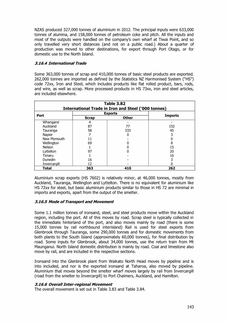
143
NZAS produced 327,000 tonnes of aluminium in 2012. The principal inputs were 633,000 tonnes of alumina, and 158,000 tonnes of petroleum coke and pitch. All the inputs and most of the outputs were handled on the company’s own wharf at Tiwai Point, and so only travelled very short distances (and not on a public road.) About a quarter of production was moved to other destinations, for export through Port Otago, or for domestic use to the North Island.
3.16.4 International Trade
Some 363,000 tonnes of scrap and 410,000 tonnes of basic steel products are exported. 262,000 tonnes are imported as defined by the Statistics NZ Harmonised System (“HS”) code 72xx, Iron and Steel, which includes products like flat rolled product, bars, rods, and wire, as well as scrap. More processed products in HS 73xx, iron and steel articles, are included elsewhere.
Table 3.82 International Trade in Iron and Steel (‘000 tonnes)
Port Exports
Imports Scrap Other
Whangarei 4 - - Auckland 87 77 152 Tauranga 58 333 45 Napier 7 0 3 New Plymouth 11 - 0 Wellington 69 0 8 Nelson 1 0 15 Lyttelton 97 0 20 Timaru 1 - 16 Dunedin 16 - 3 Invercargill 12 - 0
Total 363 410 262
Aluminium scrap exports (HS 7602) is relatively minor, at 46,000 tonnes, mostly from Auckland, Tauranga, Wellington and Lyttelton. There is no equivalent for aluminium like HS 72xx for steel, but basic aluminium products similar to those in HS 72 are minimal in imports and exports, apart from the output of the smelter.
3.16.5 Mode of Transport and Movement
Some 1.1 million tonnes of ironsand, steel, and steel products move within the Auckland region, including the port. All of this moves by road. Scrap steel is typically collected in the immediate hinterland of the port, and also moves mainly by road (there is some 15,000 tonnes by rail northbound interisland) Rail is used for steel exports from Glenbrook through Tauranga, some 290,000 tonnes and for domestic movements from both plants to the South Island (approximately 60,000 tonnes), for final distribution by road. Some inputs for Glenbrook, about 34,000 tonnes, use the return train from Mt Maunganui. North Island domestic distribution is mainly by road. Coal and limestone also move by rail, and are included in the respective sections. Ironsand into the Glenbrook plant from Waikato North Head moves by pipeline and is into included, and nor is the exported ironsand at Taharoa, also moved by pipeline. Aluminium that moves beyond the smelter wharf moves largely by rail from Invercargill (road from the smelter to Invercargill) to Port Chalmers, Auckland, and Hamilton.
3.16.6 Overall Inter-regional Movement The overall movement is set out in Table 3.83 and Table 3.84.
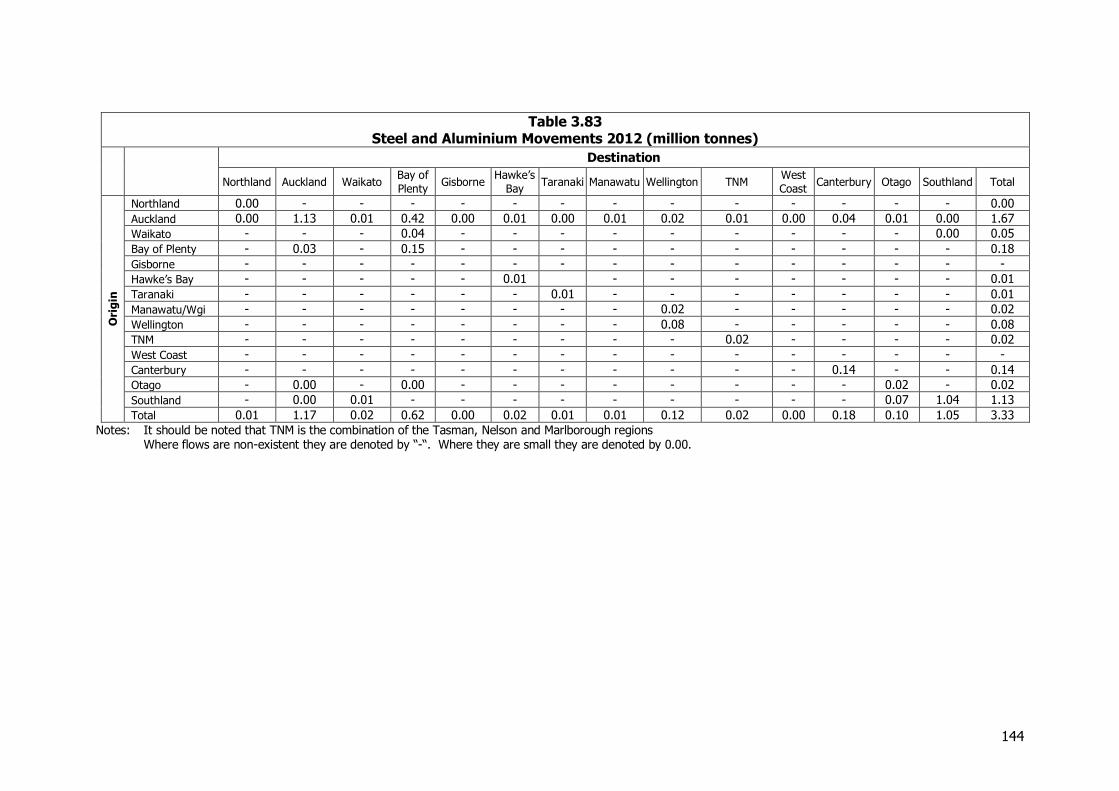
144
Table 3.83 Steel and Aluminium Movements 2012 (million tonnes)
Destination
Northland Auckland Waikato Bay of
Plenty Gisborne
Hawke’s
Bay Taranaki Manawatu Wellington TNM
West
Coast Canterbury Otago Southland Total
Ori
gin
Northland 0.00 - - - - - - - - - - - - - 0.00
Auckland 0.00 1.13 0.01 0.42 0.00 0.01 0.00 0.01 0.02 0.01 0.00 0.04 0.01 0.00 1.67
Waikato - - - 0.04 - - - - - - - - - 0.00 0.05
Bay of Plenty - 0.03 - 0.15 - - - - - - - - - - 0.18
Gisborne - - - - - - - - - - - - - - -
Hawke’s Bay - - - - - 0.01 - - - - - - - 0.01
Taranaki - - - - - - 0.01 - - - - - - - 0.01
Manawatu/Wgi - - - - - - - - 0.02 - - - - - 0.02
Wellington - - - - - - - - 0.08 - - - - - 0.08
TNM - - - - - - - - - 0.02 - - - - 0.02
West Coast - - - - - - - - - - - - - - -
Canterbury - - - - - - - - - - - 0.14 - - 0.14
Otago - 0.00 - 0.00 - - - - - - - - 0.02 - 0.02
Southland - 0.00 0.01 - - - - - - - - - 0.07 1.04 1.13
Total 0.01 1.17 0.02 0.62 0.00 0.02 0.01 0.01 0.12 0.02 0.00 0.18 0.10 1.05 3.33
Notes: It should be noted that TNM is the combination of the Tasman, Nelson and Marlborough regions Where flows are non-existent they are denoted by “-“. Where they are small they are denoted by 0.00.
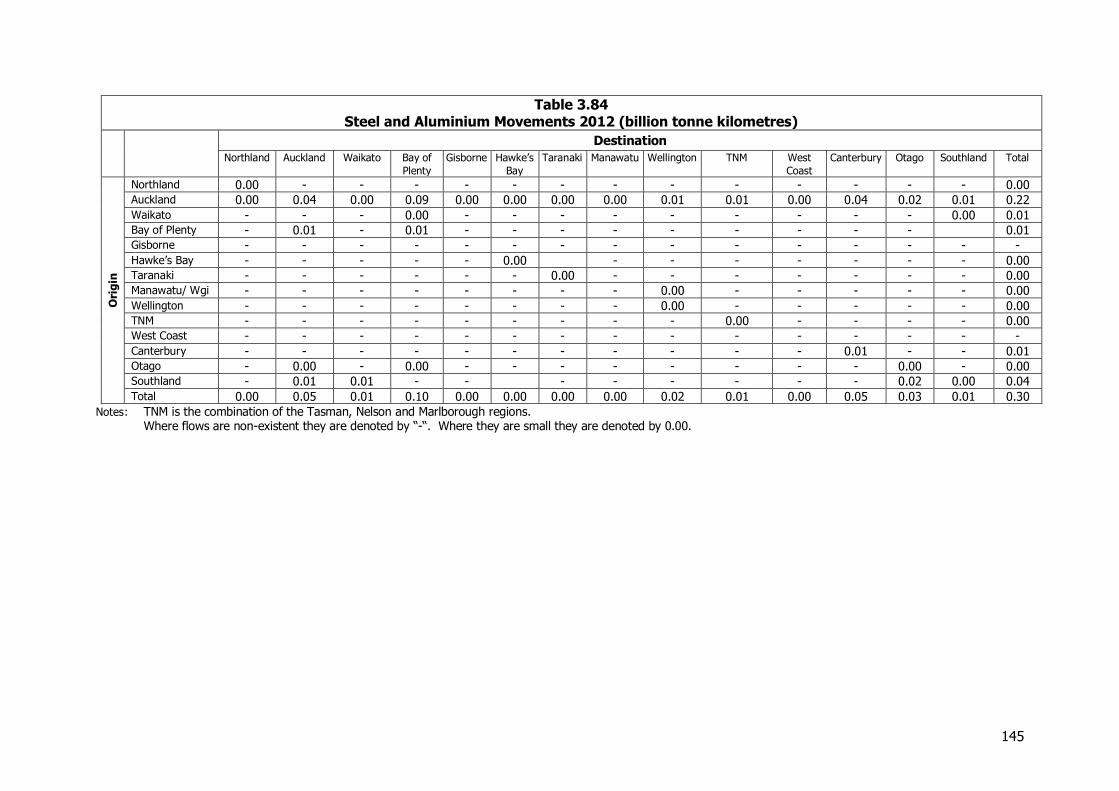
145
Table 3.84 Steel and Aluminium Movements 2012 (billion tonne kilometres)
Destination
Northland Auckland Waikato Bay of
Plenty
Gisborne Hawke’s
Bay
Taranaki Manawatu Wellington TNM West
Coast
Canterbury Otago Southland Total
Ori
gin
Northland 0.00 - - - - - - - - - - - - - 0.00 Auckland 0.00 0.04 0.00 0.09 0.00 0.00 0.00 0.00 0.01 0.01 0.00 0.04 0.02 0.01 0.22 Waikato - - - 0.00 - - - - - - - - - 0.00 0.01 Bay of Plenty - 0.01 - 0.01 - - - - - - - - - 0.01 Gisborne - - - - - - - - - - - - - - - Hawke’s Bay - - - - - 0.00 - - - - - - - 0.00 Taranaki - - - - - - 0.00 - - - - - - - 0.00 Manawatu/ Wgi - - - - - - - - 0.00 - - - - - 0.00 Wellington - - - - - - - - 0.00 - - - - - 0.00 TNM - - - - - - - - - 0.00 - - - - 0.00 West Coast - - - - - - - - - - - - - - - Canterbury - - - - - - - - - - - 0.01 - - 0.01 Otago - 0.00 - 0.00 - - - - - - - - 0.00 - 0.00 Southland - 0.01 0.01 - - - - - - - - 0.02 0.00 0.04 Total 0.00 0.05 0.01 0.10 0.00 0.00 0.00 0.00 0.02 0.01 0.00 0.05 0.03 0.01 0.30
Notes: TNM is the combination of the Tasman, Nelson and Marlborough regions. Where flows are non-existent they are denoted by “-“. Where they are small they are denoted by 0.00.
146
3.17 Other Manufactured Goods
3.17.1 Introduction
The movements of other manufactured goods are particularly difficult to estimate since there is no information on the total volumes of manufactured goods produced in New Zealand to form a control total for the estimation exercise and no data on the volumes involved or transported at a regional or even a national level. For this reason they were excluded from the 2008 NFDS. For the current updating, an approach has been developed which brings together data from a number of sources to provide insights into the total size of the sector in tonnage terms and into patterns of movements of the goods produced. These include published statistical material from a variety of sources and the results of interviews which have been used to get a general appreciation of the patterns of movement. The material used includes:-
Estimates of the total value of output by manufacturing subsector published by Statistics New Zealand through the Infoshare database
Information on imports and exports by port and the average unit values for these Information on the numbers employed by subsector Additional material on specific commodities considered elsewhere in the current NFDS
update to avoid double counting.
The distribution of total manufacturing employment, population or GDP by region used to estimate the domestic demand for the product.
The approach uses information on the values of the output of broad sectors within manufacturing including:-
Food manufacturing (other than dairy and meat processing) Textile, leather, clothing, and footwear manufacturing Wood and paper product manufacturing Printing Chemical, polymer, and rubber product manufacturing Non-metallic mineral product manufacturing Metal product manufacturing Transport equipment, machinery, and equipment manufacturing Furniture and other manufacturing.
Given the need to use a range of data sources, with the potential for overlap between the individual subsectors, it is considered that the totals are more reliable than the estimates for the individual commodities. For this reason, only the aggregated estimates of the movements of the commodities have been reported.
3.17.2 Recent Trends in Manufacturing Output Growth in the total output of the manufactured sector in New Zealand has typically been fairly flat over recent years but with a decline following the onset of the Global Financial Crisis which does not yet seem to be being reversed. The patterns of expenditure in real terms for the sector as a whole (excluding dairy and meat products) is set out in Figure 3.32
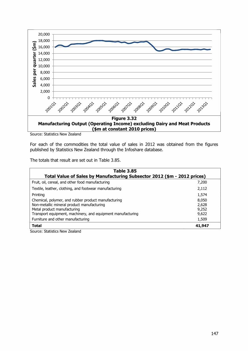
147
Figure 3.32
Manufacturing Output (Operating Income) excluding Dairy and Meat Products ($m at constant 2010 prices)
Source: Statistics New Zealand
For each of the commodities the total value of sales in 2012 was obtained from the figures published by Statistics New Zealand through the Infoshare database. The totals that result are set out in Table 3.85.
Table 3.85 Total Value of Sales by Manufacturing Subsector 2012 ($m - 2012 prices)
Fruit, oil, cereal, and other food manufacturing 7,200
Textile, leather, clothing, and footwear manufacturing 2,112
Printing 1,574
Chemical, polymer, and rubber product manufacturing 8,050 Non-metallic mineral product manufacturing 2,628 Metal product manufacturing 9,252 Transport equipment, machinery, and equipment manufacturing 9,622
Furniture and other manufacturing 1,509
Total 41,947
Source: Statistics New Zealand
0
2,000
4,000
6,000
8,000
10,000
12,000
14,000
16,000
18,000
20,000Sa
les
per
qu
arte
r ($
m)

148
3.17.3 Estimating the Flows of Manufactured Goods The process developed for each of these commodities comprises the following steps:-
Determine the total value of output of the subsector.
Correct the total to allow for commodities considered separately. This affected the metal product manufacturing which included the production of steel and aluminium and the chemical industry which includes the manufacture of fertiliser and cement.
Determine the appropriate value per tonne of output based on import and export prices.
Estimate total production based on average price.
Estimate total imports and exports to allow the availability of demand in NZ to be determined.
Allocate the domestic production by employment within the sub-sector by region based on information from Statistics NZ.
Combine domestic production with imports to allow the total availability to be defined, from which exports are removed in order to determine the balance available for NZ users.
Estimate the split of production for export by region.
Allocate to ports using information on the volumes exported. As far as possible adjustments were made to allow for the recording of exports at other than their initial point of loading where export cargoes are transhipped.
Identify an appropriate regional pattern of demand based on manufacturing employment, GDP or population by region.
Estimate the production which is either consumed within the region or which is sent directly to distribution centres (DCs) primarily in Auckland or Christchurch. The proportion consumed within the region is assumed to be related to the average price with lower value goods having a higher propensity to be consumed locally.
Distribute the remaining volumes of output on the basis of the estimated regional pattern of demand but taking into account the barrier to movement presented by the Cook Strait.
Identify shortfalls of demand from direct delivery and satisfy these with goods distributed on each island from the appropriate DC.
Aggregate flows to give overall movement patterns.
This process is summarised in Figure 3.33
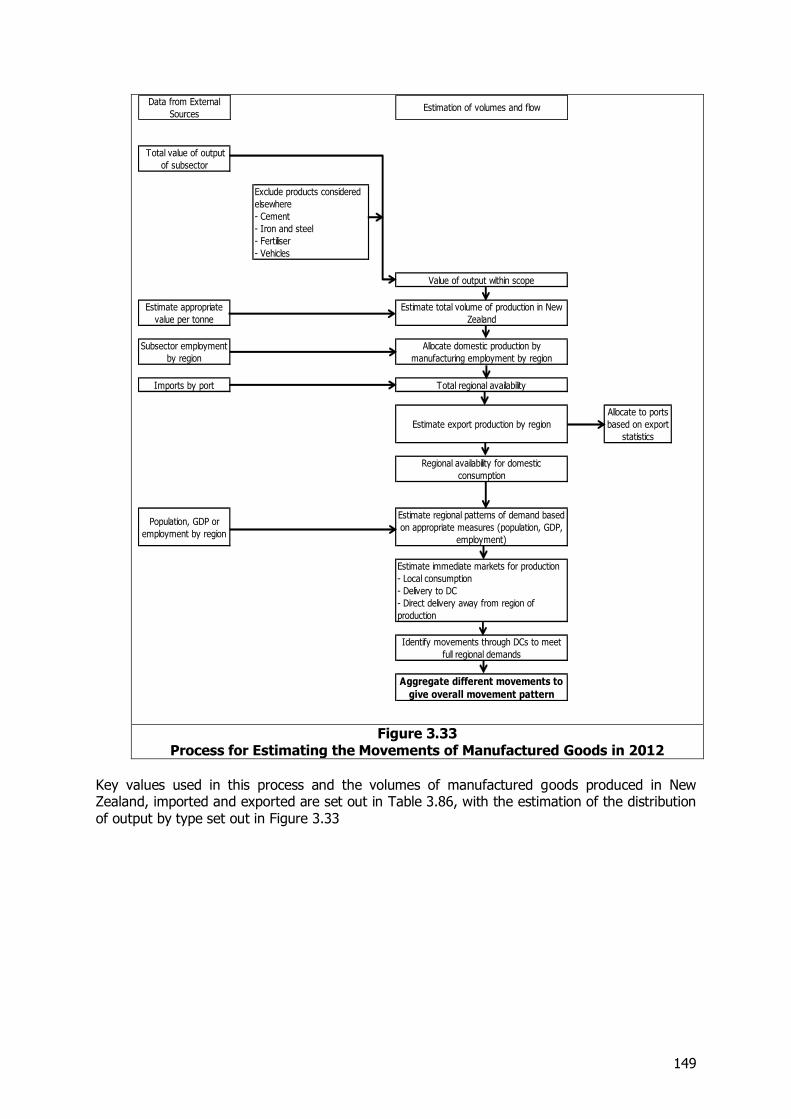
149
Figure 3.33
Process for Estimating the Movements of Manufactured Goods in 2012
Key values used in this process and the volumes of manufactured goods produced in New Zealand, imported and exported are set out in Table 3.86, with the estimation of the distribution of output by type set out in Figure 3.33
Data from External
SourcesEstimation of volumes and flow
Total value of output
of subsector
Exclude products considered
elsewhere
- Cement
- Iron and steel
- Fertiliser
- Vehicles
Value of output within scope
Estimate appropriate
value per tonne
Estimate total volume of production in New
Zealand
Subsector employment
by region
Allocate domestic production by
manufacturing employment by region
Imports by port Total regional availability
Estimate export production by region
Allocate to ports
based on export
statistics
Regional availability for domestic
consumption
Population, GDP or
employment by region
Estimate regional patterns of demand based
on appropriate measures (population, GDP,
employment)
Estimate immediate markets for production
- Local consumption
- Delivery to DC
- Direct delivery away from region of
production
Identify movements through DCs to meet
full regional demands
Aggregate different movements to
give overall movement pattern
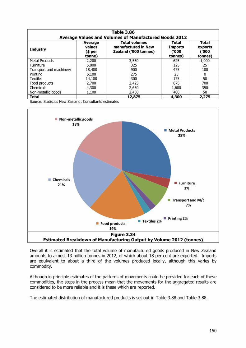
150
Table 3.86 Average Values and Volumes of Manufactured Goods 2012
Industry
Average values ($ per tonne)
Total volumes manufactured in New Zealand (‘000 tonnes)
Total Imports
(‘000 tonnes)
Total exports (‘000
tonnes)
Metal Products 2,200 3,550 625 1,000 Furniture 5,000 325 125 25 Transport and machinery 18,400 900 475 100 Printing 6,100 275 25 0 Textiles 14,100 300 175 50 Food products 2,700 2,425 875 700 Chemicals 4,300 2,650 1,600 350 Non-metallic goods 1,100 2,450 400 50
Total 12,875 4,300 2,275
Source: Statistics New Zealand; Consultants estimates
Figure 3.34
Estimated Breakdown of Manufacturing Output by Volume 2012 (tonnes)
Overall it is estimated that the total volume of manufactured goods produced in New Zealand amounts to almost 13 million tonnes in 2012, of which about 18 per cent are exported. Imports are equivalent to about a third of the volumes produced locally, although this varies by commodity. Although in principle estimates of the patterns of movements could be provided for each of these commodities, the steps in the process mean that the movements for the aggregated results are considered to be more reliable and it is these which are reported. The estimated distribution of manufactured products is set out in Table 3.88 and Table 3.88.
Metal Products 28%
Furniture 3%
Transport and M/c 7%
Printing 2% Textiles 2%
Food products 19%
Chemicals 21%
Non-metallic goods 18%
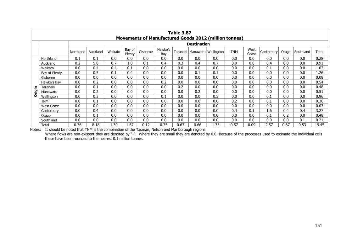
151
Table 3.87 Movements of Manufactured Goods 2012 (million tonnes)
Destination
Northland Auckland Waikato Bay of
Plenty Gisborne
Hawke’s
Bay Taranaki Manawatu Wellington TNM
West
Coast Canterbury Otago Southland Total
Ori
gin
Northland 0.1 0.1 0.0 0.0 0.0 0.0 0.0 0.0 0.0 0.0 0.0 0.0 0.0 0.0 0.28
Auckland 0.2 5.8 0.7 1.0 0.1 0.4 0.3 0.4 0.7 0.0 0.0 0.4 0.0 0.0 9.91
Waikato 0.0 0.4 0.4 0.1 0.0 0.0 0.0 0.0 0.0 0.0 0.0 0.1 0.0 0.0 1.02
Bay of Plenty 0.0 0.5 0.1 0.4 0.0 0.0 0.0 0.1 0.1 0.0 0.0 0.0 0.0 0.0 1.26
Gisborne 0.0 0.0 0.0 0.0 0.0 0.0 0.0 0.0 0.0 0.0 0.0 0.0 0.0 0.0 0.08
Hawke’s Bay 0.0 0.2 0.0 0.0 0.0 0.2 0.0 0.0 0.0 0.0 0.0 0.0 0.0 0.0 0.54
Taranaki 0.0 0.1 0.0 0.0 0.0 0.0 0.2 0.0 0.0 0.0 0.0 0.0 0.0 0.0 0.48
Manawatu 0.0 0.2 0.0 0.0 0.0 0.0 0.0 0.2 0.0 0.0 0.0 0.0 0.0 0.0 0.51
Wellington 0.0 0.3 0.0 0.0 0.0 0.1 0.0 0.0 0.5 0.0 0.0 0.1 0.0 0.0 0.96
TNM 0.0 0.1 0.0 0.0 0.0 0.0 0.0 0.0 0.0 0.2 0.0 0.1 0.0 0.0 0.36
West Coast 0.0 0.0 0.0 0.0 0.0 0.0 0.0 0.0 0.0 0.0 0.0 0.0 0.0 0.0 0.07
Canterbury 0.0 0.4 0.0 0.0 0.0 0.0 0.0 0.0 0.0 0.4 0.1 1.6 0.4 0.4 3.27
Otago 0.0 0.1 0.0 0.0 0.0 0.0 0.0 0.0 0.0 0.0 0.0 0.1 0.2 0.0 0.48
Southland 0.0 0.0 0.0 0.0 0.0 0.0 0.0 0.0 0.0 0.0 0.0 0.0 0.0 0.1 0.21
Total 0.36 8.18 1.30 1.67 0.12 0.75 0.63 0.66 1.35 0.57 0.09 2.57 0.67 0.53 19.45
Notes: It should be noted that TNM is the combination of the Tasman, Nelson and Marlborough regions Where flows are non-existent they are denoted by “-“. Where they are small they are denoted by 0.0. Because of the processes used to estimate the individual cells these have been rounded to the nearest 0.1 million tonnes.
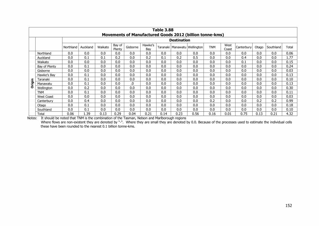
152
Table 3.88 Movements of Manufactured Goods 2012 (billion tonne-kms)
Destination
Northland Auckland Waikato Bay of
Plenty Gisborne
Hawke’s
Bay Taranaki Manawatu Wellington TNM
West
Coast Canterbury Otago Southland Total
Ori
gin
Northland 0.0 0.0 0.0 0.0 0.0 0.0 0.0 0.0 0.0 0.0 0.0 0.0 0.0 0.0 0.06
Auckland 0.0 0.1 0.1 0.2 0.0 0.2 0.1 0.2 0.5 0.0 0.0 0.4 0.0 0.0 1.77
Waikato 0.0 0.0 0.0 0.0 0.0 0.0 0.0 0.0 0.0 0.0 0.0 0.1 0.0 0.0 0.15
Bay of Plenty 0.0 0.1 0.0 0.0 0.0 0.0 0.0 0.0 0.0 0.0 0.0 0.0 0.0 0.0 0.24
Gisborne 0.0 0.0 0.0 0.0 0.0 0.0 0.0 0.0 0.0 0.0 0.0 0.0 0.0 0.0 0.03
Hawke’s Bay 0.0 0.1 0.0 0.0 0.0 0.0 0.0 0.0 0.0 0.0 0.0 0.0 0.0 0.0 0.13
Taranaki 0.0 0.1 0.0 0.0 0.0 0.0 0.0 0.0 0.0 0.0 0.0 0.0 0.0 0.0 0.10
Manawatu 0.0 0.1 0.0 0.0 .0 0.0 0.0 0.0 0.0 0.0 0.0 0.0 0.0 0.0 0.13
Wellington 0.0 0.2 0.0 0.0 0.0 0.0 0.0 0.0 0.0 0.0 0.0 0.0 0.0 0.0 0.30
TNM 0.0 0.1 0.0 0.0 0.0 0.0 0.0 0.0 0.0 0.0 0.0 0.0 0.0 0.0 0.11
West Coast 0.0 0.0 0.0 0.0 0.0 0.0 0.0 0.0 0.0 0.0 0.0 0.0 0.0 0.0 0.03
Canterbury 0.0 0.4 0.0 0.0 0.0 0.0 0.0 0.0 0.0 0.2 0.0 0.0 0.2 0.2 0.99
Otago 0.0 0.1 0.0 0.0 0.0 0.0 0.0 0.0 0.0 0.0 0.0 0.0 0.0 0.0 0.18
Southland 0.0 0.1 0.0 0.0 0.0 0.0 0.0 0.0 0.0 0.0 0.0 0.0 0.0 0.0 0.10
Total 0.06 1.39 0.13 0.29 0.04 0.21 0.14 0.23 0.56 0.16 0.01 0.75 0.13 0.21 4.32
Notes: It should be noted that TNM is the combination of the Tasman, Nelson and Marlborough regions Where flows are non-existent they are denoted by “-“. Where they are small they are denoted by 0.0. Because of the processes used to estimate the individual cells these have been rounded to the nearest 0.1 billion tonne-kms.
153
3.18 Retailing
3.18.1 Introduction There is no available information on the freight flows associated with retailing for which the supply chains can be particularly complex. Information on expenditure is available from Statistics NZ by type of expenditure and with some disaggregation by region. This information has been combined with interviews with some of the key firms involved in the sector to bring together a picture of the retail sector as whole. For the purpose of the analysis the retail sector has been considered in three main areas, supermarkets and food retailing, non-food retailing and the distribution of imported vehicles. Movements of petroleum products are considered separately.
3.18.2 Information Sources The information on the scale of the retail sector has been obtained from a range of sources including:-
Data from Statistics New Zealand
Discussions with key companies involved including Foodstuffs in Auckland, Wellington and Christchurch, Progressive, The Warehouse and Mitre10 and other major retailers
Discussions with members of the road transport industry who transport many of the goods for the firms in the sector both to distribution centres, between distribution centres and ultimately to the stores
Company reports and websites.
Information derived from the pallet database
3.18.3 Patterns of Distribution within the Sector Distribution centres have always played an important role in the supply chains for the retail sector. To an increasing degree the major chains are now handling a greater share of the deliveries to their retail outlets through their own distribution centres rather than having goods delivered directly by suppliers. These distribution centres are typically located in one or more of the major centres of Auckland, Christchurch and Palmerston North or Wellington. Some of this handling involves storage of the goods in these centres, but there is also a trend to cross-docking which is where goods are despatched immediately on receipt. By routing these through the distribution centre there is more control over the supply chain and stores are able to benefit from the economies of scale offered by high volume distribution. Cross docking is particularly prevalent for the franchised operations where the individual stores have more control of their purchases, but is also being used for company owned stores. In the earlier NFDS we noted that an emerging trend was for imported goods for direct delivery to the various retail chains to be landed at a port close to the distribution centre from which the goods would subsequently be despatched. This trend seems to have continued over the period from 2006-07 and regional direct deliveries have become more important. This is being enhanced by measures to control cargoes from the point of despatch which ensures that goods are packed in containers in a way which facilitates their unloading at the end of the journey.
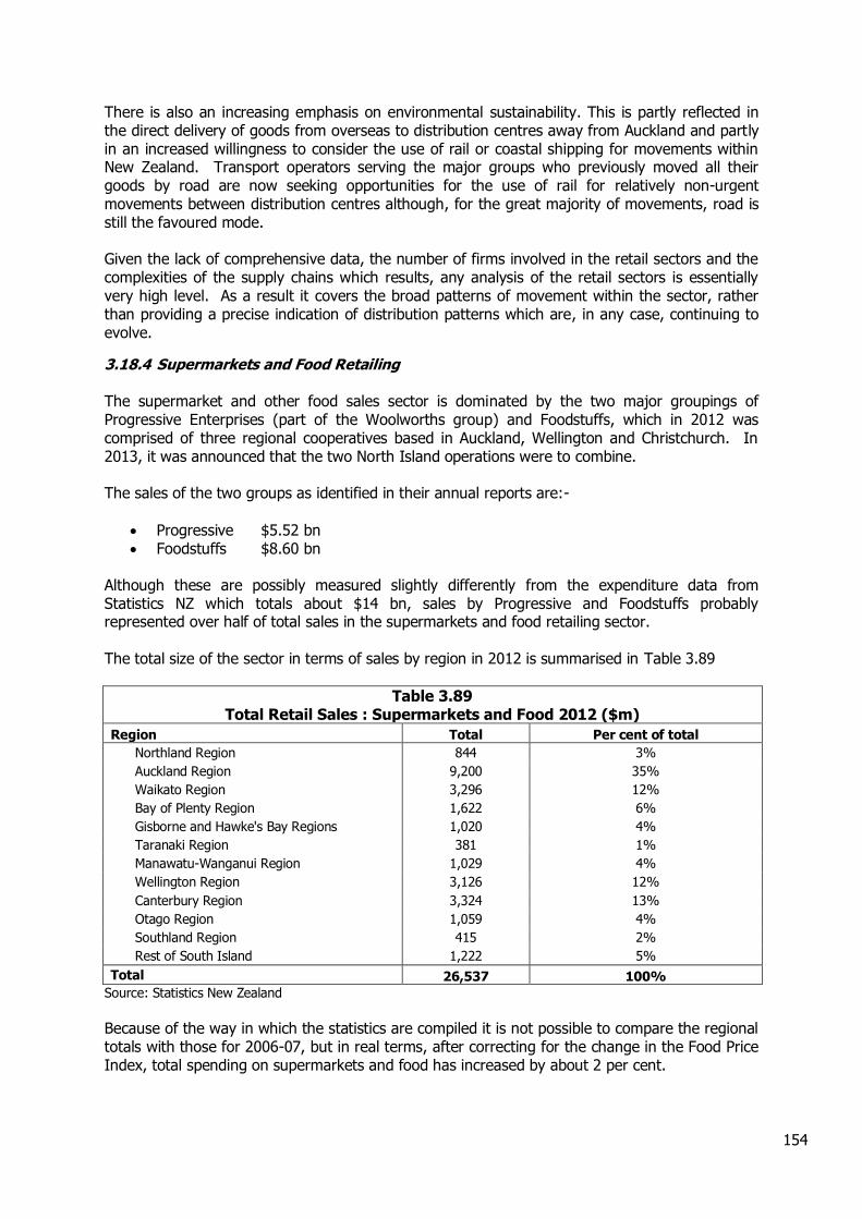
154
There is also an increasing emphasis on environmental sustainability. This is partly reflected in the direct delivery of goods from overseas to distribution centres away from Auckland and partly in an increased willingness to consider the use of rail or coastal shipping for movements within New Zealand. Transport operators serving the major groups who previously moved all their goods by road are now seeking opportunities for the use of rail for relatively non-urgent movements between distribution centres although, for the great majority of movements, road is still the favoured mode. Given the lack of comprehensive data, the number of firms involved in the retail sectors and the complexities of the supply chains which results, any analysis of the retail sectors is essentially very high level. As a result it covers the broad patterns of movement within the sector, rather than providing a precise indication of distribution patterns which are, in any case, continuing to evolve.
3.18.4 Supermarkets and Food Retailing The supermarket and other food sales sector is dominated by the two major groupings of Progressive Enterprises (part of the Woolworths group) and Foodstuffs, which in 2012 was comprised of three regional cooperatives based in Auckland, Wellington and Christchurch. In 2013, it was announced that the two North Island operations were to combine. The sales of the two groups as identified in their annual reports are:-
Progressive $5.52 bn Foodstuffs $8.60 bn
Although these are possibly measured slightly differently from the expenditure data from Statistics NZ which totals about $14 bn, sales by Progressive and Foodstuffs probably represented over half of total sales in the supermarkets and food retailing sector. The total size of the sector in terms of sales by region in 2012 is summarised in Table 3.89
Table 3.89 Total Retail Sales : Supermarkets and Food 2012 ($m)
Region Total Per cent of total
Northland Region 844 3%
Auckland Region 9,200 35%
Waikato Region 3,296 12%
Bay of Plenty Region 1,622 6%
Gisborne and Hawke's Bay Regions 1,020 4%
Taranaki Region 381 1%
Manawatu-Wanganui Region 1,029 4%
Wellington Region 3,126 12%
Canterbury Region 3,324 13%
Otago Region 1,059 4%
Southland Region 415 2%
Rest of South Island 1,222 5%
Total 26,537 100%
Source: Statistics New Zealand
Because of the way in which the statistics are compiled it is not possible to compare the regional totals with those for 2006-07, but in real terms, after correcting for the change in the Food Price Index, total spending on supermarkets and food has increased by about 2 per cent.
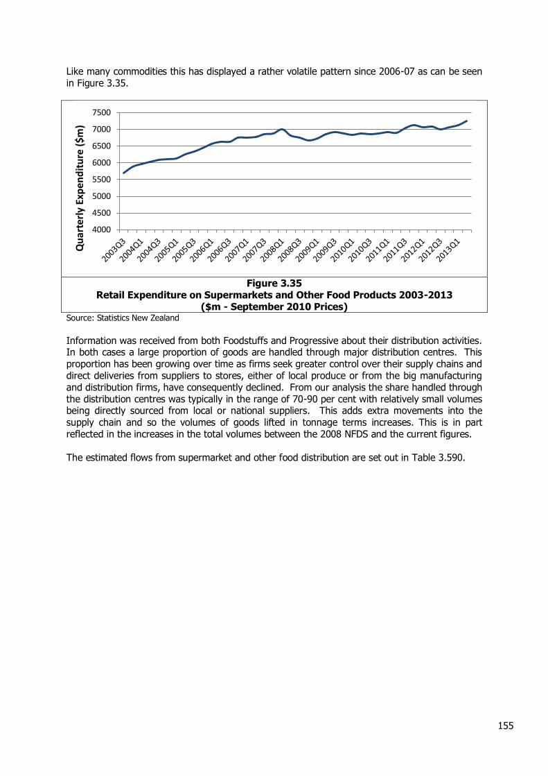
155
Like many commodities this has displayed a rather volatile pattern since 2006-07 as can be seen in Figure 3.35.
Figure 3.35
Retail Expenditure on Supermarkets and Other Food Products 2003-2013 ($m - September 2010 Prices)
Source: Statistics New Zealand
Information was received from both Foodstuffs and Progressive about their distribution activities. In both cases a large proportion of goods are handled through major distribution centres. This proportion has been growing over time as firms seek greater control over their supply chains and direct deliveries from suppliers to stores, either of local produce or from the big manufacturing and distribution firms, have consequently declined. From our analysis the share handled through the distribution centres was typically in the range of 70-90 per cent with relatively small volumes being directly sourced from local or national suppliers. This adds extra movements into the supply chain and so the volumes of goods lifted in tonnage terms increases. This is in part reflected in the increases in the total volumes between the 2008 NFDS and the current figures. The estimated flows from supermarket and other food distribution are set out in Table 3.590.
4000
4500
5000
5500
6000
6500
7000
7500
Qu
arte
rly
Exp
end
itu
re (
$m)
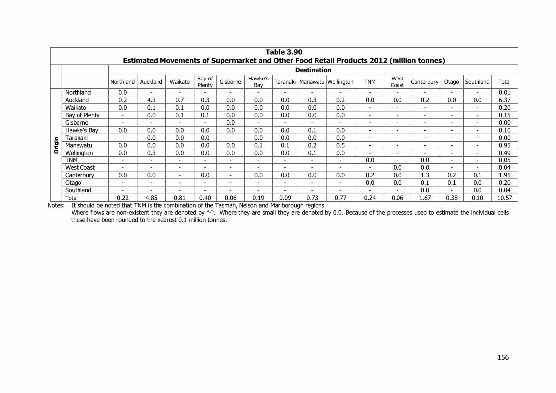
156
Table 3.90 Estimated Movements of Supermarket and Other Food Retail Products 2012 (million tonnes)
Destination
Northland Auckland Waikato Bay of
Plenty Gisborne
Hawke’s
Bay Taranaki Manawatu Wellington TNM
West
Coast Canterbury Otago Southland Total
Ori
gin
Northland 0.0 - - - - - - - - - - - - - 0.01
Auckland 0.2 4.3 0.7 0.3 0.0 0.0 0.0 0.3 0.2 0.0 0.0 0.2 0.0 0.0 6.37
Waikato 0.0 0.1 0.1 0.0 0.0 0.0 0.0 0.0 0.0 - - - - - 0.20
Bay of Plenty - 0.0 0.1 0.1 0.0 0.0 0.0 0.0 0.0 - - - - - 0.15
Gisborne - - - - 0.0 - - - - - - - - - 0.00
Hawke’s Bay 0.0 0.0 0.0 0.0 0.0 0.0 0.0 0.1 0.0 - - - - - 0.10
Taranaki - 0.0 0.0 0.0 - 0.0 0.0 0.0 0.0 - - - - - 0.00
Manawatu 0.0 0.0 0.0 0.0 0.0 0.1 0.1 0.2 0.5 - - - - - 0.95
Wellington 0.0 0.3 0.0 0.0 0.0 0.0 0.0 0.1 0.0 - - - - - 0.49
TNM - - - - - - - - - 0.0 - 0.0 - - 0.05
West Coast - - - - - - - - - - 0.0 0.0 - - 0.04
Canterbury 0.0 0.0 - 0.0 - 0.0 0.0 0.0 0.0 0.2 0.0 1.3 0.2 0.1 1.95
Otago - - - - - - - - - 0.0 0.0 0.1 0.1 0.0 0.20
Southland - - - - - - - - - - - 0.0 - 0.0 0.04
Total 0.22 4.85 0.81 0.40 0.06 0.19 0.09 0.73 0.77 0.24 0.06 1.67 0.38 0.10 10.57
Notes: It should be noted that TNM is the combination of the Tasman, Nelson and Marlborough regions Where flows are non-existent they are denoted by “-“. Where they are small they are denoted by 0.0. Because of the processes used to estimate the individual cells these have been rounded to the nearest 0.1 million tonnes.
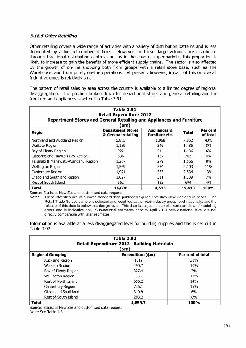
157
3.18.5 Other Retailing Other retailing covers a wide range of activities with a variety of distribution patterns and is less dominated by a limited number of firms. However for these, large volumes are distributed through traditional distribution centres and, as in the case of supermarkets, this proportion is likely to increase to gain the benefits of more efficient supply chains. The sector is also affected by the growth of on-line shopping both from groups with a retail store base, such as The Warehouse, and from purely on-line operations. At present, however, impact of this on overall freight volumes is relatively small. The pattern of retail sales by area across the country is available to a limited degree of regional disaggregation. The position broken down for department stores and general retailing and for furniture and appliances is set out in Table 3.91.
Table 3.91 Retail Expenditure 2012
Department Stores and General Retailing and Appliances and Furniture ($m)
Region Department Stores & General retailing
Appliances & furniture etc.
Total Per cent of total
Northland and Auckland Region 5,885 1,968 7,852 40%
Waikato Region 1,139 346 1,485 8%
Bay of Plenty Region 922 214 1,136 6%
Gisborne and Hawke's Bay Region 536 167 703 4%
Taranaki & Manawatu-Wanganui Region 1,287 279 1,566 8%
Wellington Region 1,569 534 2,103 11%
Canterbury Region 1,971 563 2,534 13%
Otago and Southland Region 1,027 311 1,339 7%
Rest of South Island 562 133 694 4%
Total 14,898 4,515 19,413 100%
Source: Statistics New Zealand customised data request Notes These statistics are of a lower standard than published figures Statistics New Zealand releases. The
Retail Trade Survey sample is selected and weighted at the retail industry group level nationally, and the release of this data is below that design level. This data is subject to sample, non-sample and modelling errors and is indicative only. Sub-national estimates prior to April 2010 below national level are not directly comparable with later estimates.
Information is available at a less disaggregated level for building supplies and this is set out in Table 3.92
Table 3.92 Retail Expenditure 2012 Building Materials
($m)
Regional Grouping Expenditure ($m) Per cent of total
Auckland Region 1519 31%
Waikato Region 490.7 10%
Bay of Plenty Region 327.4 7%
Wellington Region 536 11%
Rest of North Island 656.2 14%
Canterbury Region 736.1 15%
Otago and Southland 310.9 6%
Rest of South Island 283.2 6%
Total 4,859.7 100%
Source: Statistics New Zealand customised data request Note: See Table 1.3
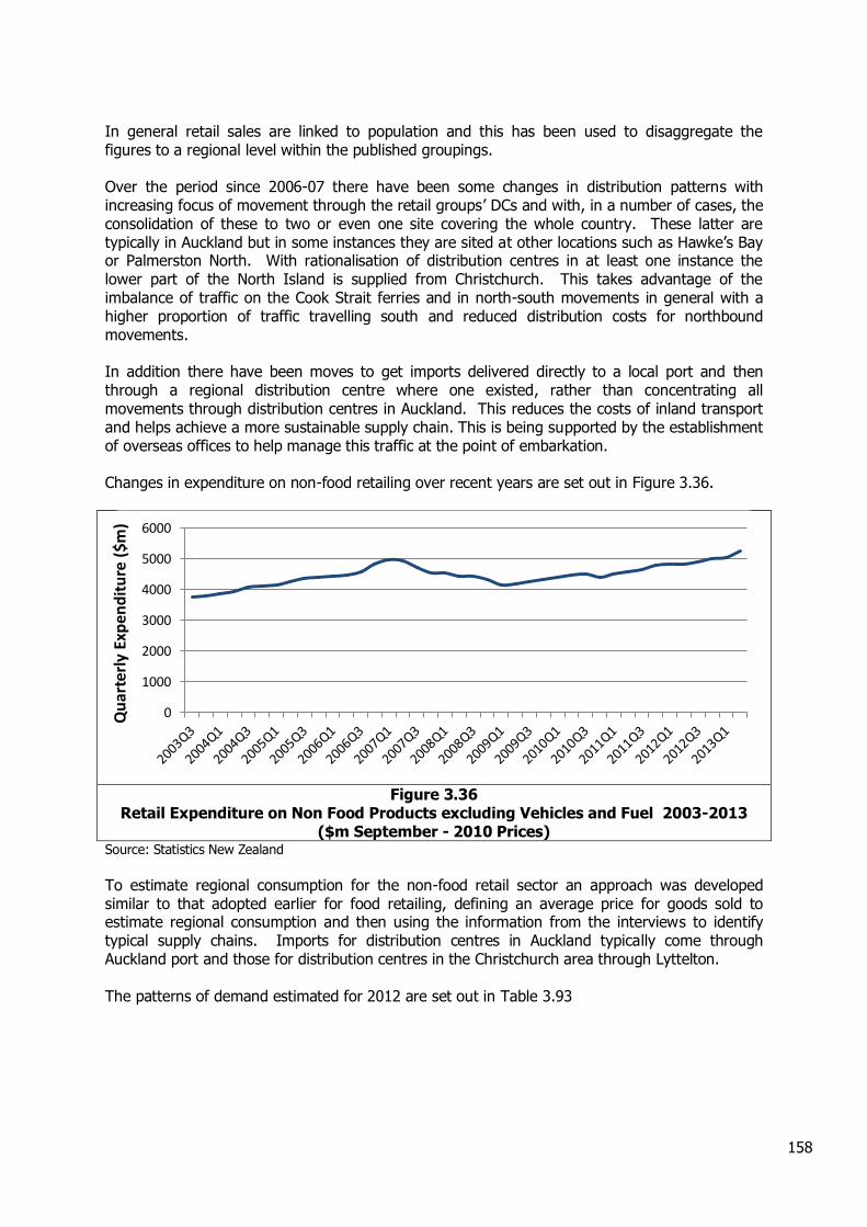
158
In general retail sales are linked to population and this has been used to disaggregate the figures to a regional level within the published groupings. Over the period since 2006-07 there have been some changes in distribution patterns with increasing focus of movement through the retail groups’ DCs and with, in a number of cases, the consolidation of these to two or even one site covering the whole country. These latter are typically in Auckland but in some instances they are sited at other locations such as Hawke’s Bay or Palmerston North. With rationalisation of distribution centres in at least one instance the lower part of the North Island is supplied from Christchurch. This takes advantage of the imbalance of traffic on the Cook Strait ferries and in north-south movements in general with a higher proportion of traffic travelling south and reduced distribution costs for northbound movements. In addition there have been moves to get imports delivered directly to a local port and then through a regional distribution centre where one existed, rather than concentrating all movements through distribution centres in Auckland. This reduces the costs of inland transport and helps achieve a more sustainable supply chain. This is being supported by the establishment of overseas offices to help manage this traffic at the point of embarkation. Changes in expenditure on non-food retailing over recent years are set out in Figure 3.36.
Figure 3.36
Retail Expenditure on Non Food Products excluding Vehicles and Fuel 2003-2013 ($m September - 2010 Prices)
Source: Statistics New Zealand
To estimate regional consumption for the non-food retail sector an approach was developed similar to that adopted earlier for food retailing, defining an average price for goods sold to estimate regional consumption and then using the information from the interviews to identify typical supply chains. Imports for distribution centres in Auckland typically come through Auckland port and those for distribution centres in the Christchurch area through Lyttelton. The patterns of demand estimated for 2012 are set out in Table 3.93
0
1000
2000
3000
4000
5000
6000
Qu
arte
rly
Exp
end
itu
re (
$m)
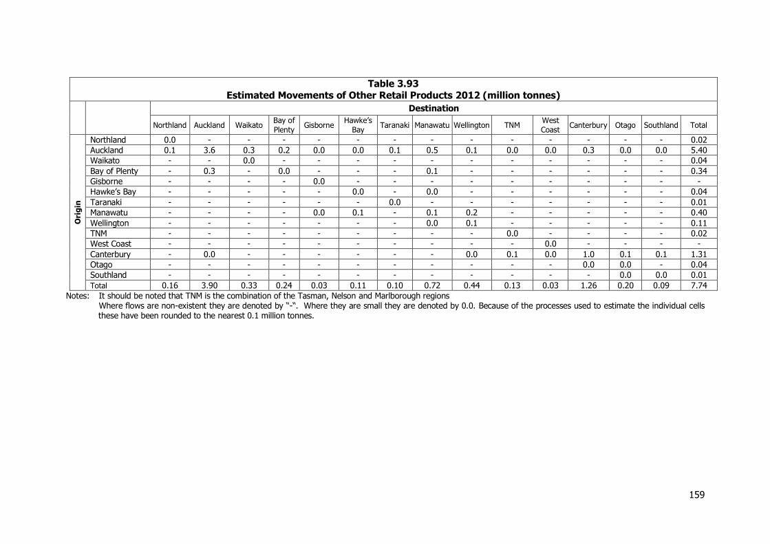
159
Table 3.93 Estimated Movements of Other Retail Products 2012 (million tonnes)
Destination
Northland Auckland Waikato Bay of
Plenty Gisborne
Hawke’s
Bay Taranaki Manawatu Wellington TNM
West
Coast Canterbury Otago Southland Total
Ori
gin
Northland 0.0 - - - - - - - - - - - - - 0.02
Auckland 0.1 3.6 0.3 0.2 0.0 0.0 0.1 0.5 0.1 0.0 0.0 0.3 0.0 0.0 5.40
Waikato - - 0.0 - - - - - - - - - - - 0.04
Bay of Plenty - 0.3 - 0.0 - - - 0.1 - - - - - - 0.34
Gisborne - - - - 0.0 - - - - - - - - - -
Hawke’s Bay - - - - - 0.0 - 0.0 - - - - - - 0.04
Taranaki - - - - - - 0.0 - - - - - - - 0.01
Manawatu - - - - 0.0 0.1 - 0.1 0.2 - - - - - 0.40
Wellington - - - - - - - 0.0 0.1 - - - - - 0.11
TNM - - - - - - - - - 0.0 - - - - 0.02
West Coast - - - - - - - - - - 0.0 - - - -
Canterbury - 0.0 - - - - - - 0.0 0.1 0.0 1.0 0.1 0.1 1.31
Otago - - - - - - - - - - - 0.0 0.0 - 0.04
Southland - - - - - - - - - - - - 0.0 0.0 0.01
Total 0.16 3.90 0.33 0.24 0.03 0.11 0.10 0.72 0.44 0.13 0.03 1.26 0.20 0.09 7.74
Notes: It should be noted that TNM is the combination of the Tasman, Nelson and Marlborough regions Where flows are non-existent they are denoted by “-“. Where they are small they are denoted by 0.0. Because of the processes used to estimate the individual cells these have been rounded to the nearest 0.1 million tonnes.
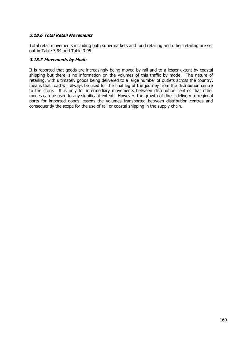
160
3.18.6 Total Retail Movements Total retail movements including both supermarkets and food retailing and other retailing are set out in Table 3.94 and Table 3.95.
3.18.7 Movements by Mode It is reported that goods are increasingly being moved by rail and to a lesser extent by coastal shipping but there is no information on the volumes of this traffic by mode. The nature of retailing, with ultimately goods being delivered to a large number of outlets across the country, means that road will always be used for the final leg of the journey from the distribution centre to the store. It is only for intermediary movements between distribution centres that other modes can be used to any significant extent. However, the growth of direct delivery to regional ports for imported goods lessens the volumes transported between distribution centres and consequently the scope for the use of rail or coastal shipping in the supply chain.
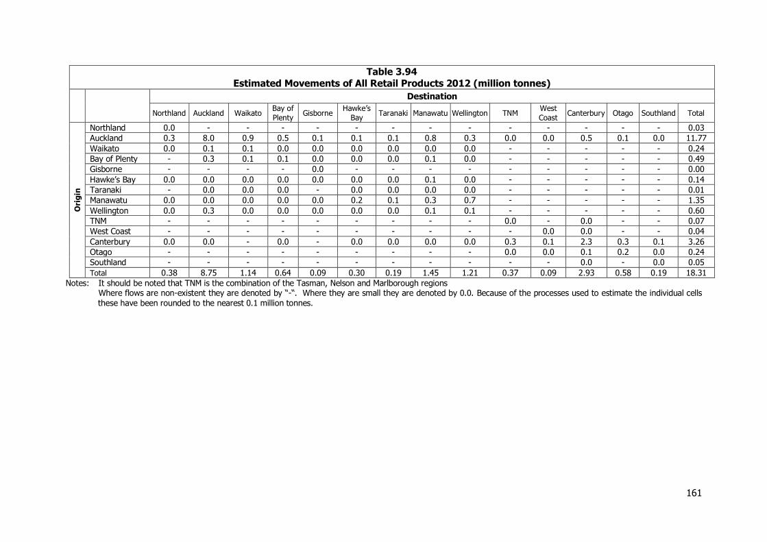
161
Table 3.94 Estimated Movements of All Retail Products 2012 (million tonnes)
Destination
Northland Auckland Waikato Bay of
Plenty Gisborne
Hawke’s
Bay Taranaki Manawatu Wellington TNM
West
Coast Canterbury Otago Southland Total
Ori
gin
Northland 0.0 - - - - - - - - - - - - - 0.03
Auckland 0.3 8.0 0.9 0.5 0.1 0.1 0.1 0.8 0.3 0.0 0.0 0.5 0.1 0.0 11.77
Waikato 0.0 0.1 0.1 0.0 0.0 0.0 0.0 0.0 0.0 - - - - - 0.24
Bay of Plenty - 0.3 0.1 0.1 0.0 0.0 0.0 0.1 0.0 - - - - - 0.49
Gisborne - - - - 0.0 - - - - - - - - - 0.00
Hawke’s Bay 0.0 0.0 0.0 0.0 0.0 0.0 0.0 0.1 0.0 - - - - - 0.14
Taranaki - 0.0 0.0 0.0 - 0.0 0.0 0.0 0.0 - - - - - 0.01
Manawatu 0.0 0.0 0.0 0.0 0.0 0.2 0.1 0.3 0.7 - - - - - 1.35
Wellington 0.0 0.3 0.0 0.0 0.0 0.0 0.0 0.1 0.1 - - - - - 0.60
TNM - - - - - - - - - 0.0 - 0.0 - - 0.07
West Coast - - - - - - - - - - 0.0 0.0 - - 0.04
Canterbury 0.0 0.0 - 0.0 - 0.0 0.0 0.0 0.0 0.3 0.1 2.3 0.3 0.1 3.26
Otago - - - - - - - - - 0.0 0.0 0.1 0.2 0.0 0.24
Southland - - - - - - - - - - - 0.0 - 0.0 0.05
Total 0.38 8.75 1.14 0.64 0.09 0.30 0.19 1.45 1.21 0.37 0.09 2.93 0.58 0.19 18.31
Notes: It should be noted that TNM is the combination of the Tasman, Nelson and Marlborough regions Where flows are non-existent they are denoted by “-“. Where they are small they are denoted by 0.0. Because of the processes used to estimate the individual cells these have been rounded to the nearest 0.1 million tonnes.
162
Table 3.95 Estimated Movements of All Retail Products 2012 (billion tonne-kms)
Destination
Northland Auckland Waikato Bay of
Plenty Gisborne
Hawke’s
Bay Taranaki Manawatu Wellington TNM
West
Coast Canterbury Otago Southland Total
Ori
gin
Northland 0.0 - - - - - - - - - - - - - 0.00
Auckland 0.1 0.2 0.1 0.1 0.0 0.0 0.0 0.4 0.2 0.0 0.0 0.5 0.1 0.0 1.86
Waikato 0.0 0.0 0.0 0.0 0.0 0.0 0.0 0.0 0.0 - - - - - 0.03
Bay of Plenty - 0.1 0.0 0.0 0.0 0.0 0.0 0.0 0.0 - - - - - 0.09
Gisborne - - - - 0.0 - - - - - - - - - 0.00
Hawke’s Bay 0.0 0.0 0.0 0.0 0.0 0.0 0.0 0.0 0.0 - - - - - 0.03
Taranaki - 0.0 0.0 0.0 - 0.0 0.0 0.0 0.0 - - - - - 0.00
Manawatu 0.0 0.0 0.0 0.0 0.0 0.0 0.0 0.0 0.1 - - - - - 0.20
Wellington 0.0 0.2 0.0 0.0 0.0 0.0 0.0 0.0 0.0 - - - - - 0.25
TNM - - - - - - - - - 0.0 - 0.0 - - 0.01
West Coast - - - - - - - - - - 0.0 0.0 - - 0.01
Canterbury 0.0 0.0 - 0.0 - 0.0 0.0 0.0 0.0 0.1 0.0 0.1 0.1 0.1 0.49
Otago - - - - - - - - - 0.0 0.0 0.0 0.0 0.0 0.03
Southland - - - - - - - - - - - 0.0 - 0.0 0.02
Total 0.06 0.53 0.14 0.12 0.04 0.07 0.06 0.52 0.32 0.16 0.03 0.62 0.22 0.12 3.00
Notes: It should be noted that TNM is the combination of the Tasman, Nelson and Marlborough regions Where flows are non-existent they are denoted by “-“. Where they are small they are denoted by 0.0. Because of the processes used to estimate the individual cells these have been rounded to the nearest 0.1 billion tonne-kms.
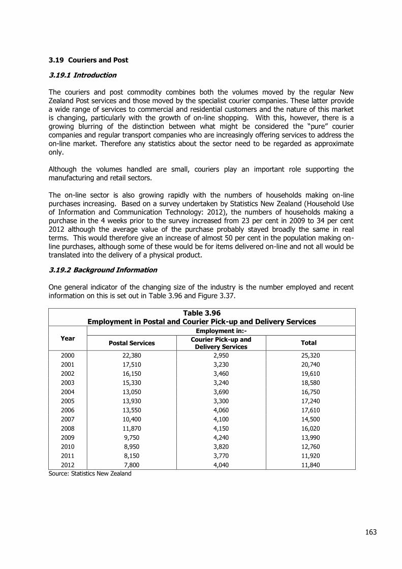
163
3.19 Couriers and Post
3.19.1 Introduction The couriers and post commodity combines both the volumes moved by the regular New Zealand Post services and those moved by the specialist courier companies. These latter provide a wide range of services to commercial and residential customers and the nature of this market is changing, particularly with the growth of on-line shopping. With this, however, there is a growing blurring of the distinction between what might be considered the “pure” courier companies and regular transport companies who are increasingly offering services to address the on-line market. Therefore any statistics about the sector need to be regarded as approximate only. Although the volumes handled are small, couriers play an important role supporting the manufacturing and retail sectors. The on-line sector is also growing rapidly with the numbers of households making on-line purchases increasing. Based on a survey undertaken by Statistics New Zealand (Household Use of Information and Communication Technology: 2012), the numbers of households making a purchase in the 4 weeks prior to the survey increased from 23 per cent in 2009 to 34 per cent 2012 although the average value of the purchase probably stayed broadly the same in real terms. This would therefore give an increase of almost 50 per cent in the population making on-line purchases, although some of these would be for items delivered on-line and not all would be translated into the delivery of a physical product.
3.19.2 Background Information One general indicator of the changing size of the industry is the number employed and recent information on this is set out in Table 3.96 and Figure 3.37.
Table 3.96 Employment in Postal and Courier Pick-up and Delivery Services
Year Employment in:-
Postal Services Courier Pick-up and
Delivery Services Total
2000 22,380 2,950 25,320
2001 17,510 3,230 20,740
2002 16,150 3,460 19,610
2003 15,330 3,240 18,580
2004 13,050 3,690 16,750
2005 13,930 3,300 17,240
2006 13,550 4,060 17,610
2007 10,400 4,100 14,500
2008 11,870 4,150 16,020
2009 9,750 4,240 13,990
2010 8,950 3,820 12,760
2011 8,150 3,770 11,920
2012 7,800 4,040 11,840
Source: Statistics New Zealand

164
Figure 3.37
Employment in Postal and Courier Pick-up and Delivery Services
In general, while the numbers employed in the postal service have declined substantially, the numbers employed as couriers have only fallen slightly from 2006-07. Estimates of the size of the combined postal and courier market have been based on the estimates made for 2006-07 taking into account the drop in the volumes carried by New Zealand Post. Their annual reports state that this volume is down from about 1 billion items in 2006-07 to 0.77 billion items in 2012. Discussions with one of the major courier companies has also suggested that the scale of the courier market has declined slightly, broadly in line with the fall in employment in the sector, which interestingly suggests that the growth on on-line shopping has not provided a sufficient boost to the courier industry to offset decreases in other areas.
3.19.3 Total Volumes Transported Taking into account the changes in the volumes handled by NZ Post and by the courier companies compared to those reported in the 2008 NFDS, the estimated total volumes handled in 2012 are set out in Table 3.597 and Table 3.98. As in the 2008 NFDS this excludes movements within each of the regions.
0
5000
10000
15000
20000
25000
30000
2000 2001 2002 2003 2004 2005 2006 2007 2008 2009 2010 2011 2012
Nu
mb
ers
emp
loye
d
Courier Services Postal Services
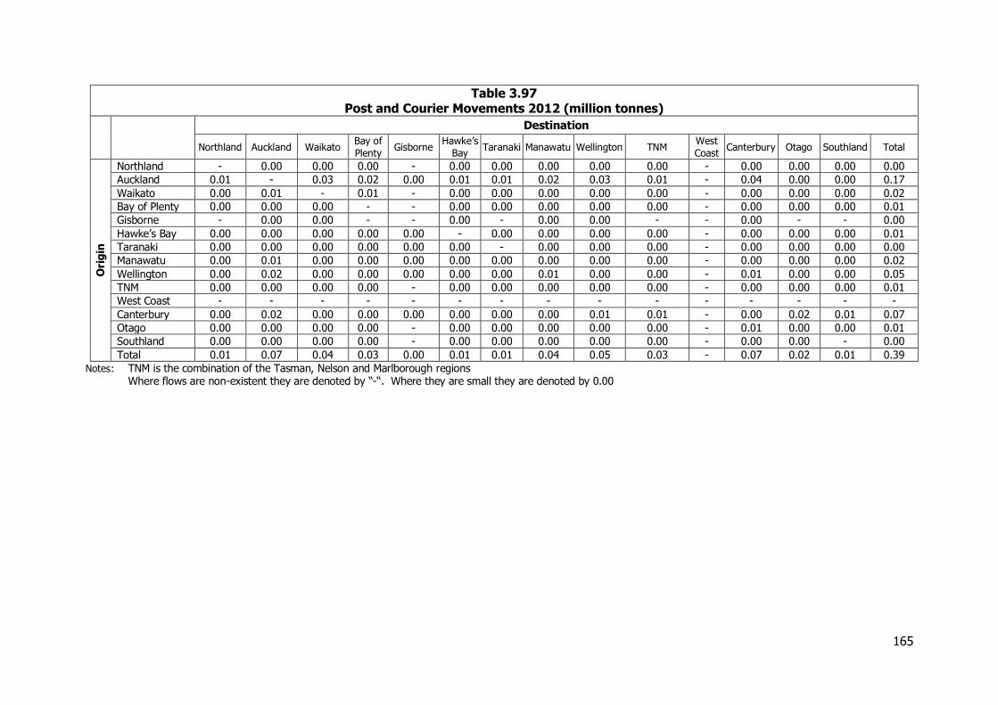
165
Table 3.97 Post and Courier Movements 2012 (million tonnes)
Destination
Northland Auckland Waikato Bay of
Plenty Gisborne
Hawke’s
Bay Taranaki Manawatu Wellington TNM
West
Coast Canterbury Otago Southland Total
Ori
gin
Northland - 0.00 0.00 0.00 - 0.00 0.00 0.00 0.00 0.00 - 0.00 0.00 0.00 0.00
Auckland 0.01 - 0.03 0.02 0.00 0.01 0.01 0.02 0.03 0.01 - 0.04 0.00 0.00 0.17
Waikato 0.00 0.01 - 0.01 - 0.00 0.00 0.00 0.00 0.00 - 0.00 0.00 0.00 0.02
Bay of Plenty 0.00 0.00 0.00 - - 0.00 0.00 0.00 0.00 0.00 - 0.00 0.00 0.00 0.01
Gisborne - 0.00 0.00 - - 0.00 - 0.00 0.00 - - 0.00 - - 0.00
Hawke’s Bay 0.00 0.00 0.00 0.00 0.00 - 0.00 0.00 0.00 0.00 - 0.00 0.00 0.00 0.01
Taranaki 0.00 0.00 0.00 0.00 0.00 0.00 - 0.00 0.00 0.00 - 0.00 0.00 0.00 0.00
Manawatu 0.00 0.01 0.00 0.00 0.00 0.00 0.00 0.00 0.00 0.00 - 0.00 0.00 0.00 0.02
Wellington 0.00 0.02 0.00 0.00 0.00 0.00 0.00 0.01 0.00 0.00 - 0.01 0.00 0.00 0.05
TNM 0.00 0.00 0.00 0.00 - 0.00 0.00 0.00 0.00 0.00 - 0.00 0.00 0.00 0.01
West Coast - - - - - - - - - - - - - - -
Canterbury 0.00 0.02 0.00 0.00 0.00 0.00 0.00 0.00 0.01 0.01 - 0.00 0.02 0.01 0.07
Otago 0.00 0.00 0.00 0.00 - 0.00 0.00 0.00 0.00 0.00 - 0.01 0.00 0.00 0.01
Southland 0.00 0.00 0.00 0.00 - 0.00 0.00 0.00 0.00 0.00 - 0.00 0.00 - 0.00
Total 0.01 0.07 0.04 0.03 0.00 0.01 0.01 0.04 0.05 0.03 - 0.07 0.02 0.01 0.39
Notes: TNM is the combination of the Tasman, Nelson and Marlborough regions Where flows are non-existent they are denoted by “-“. Where they are small they are denoted by 0.00
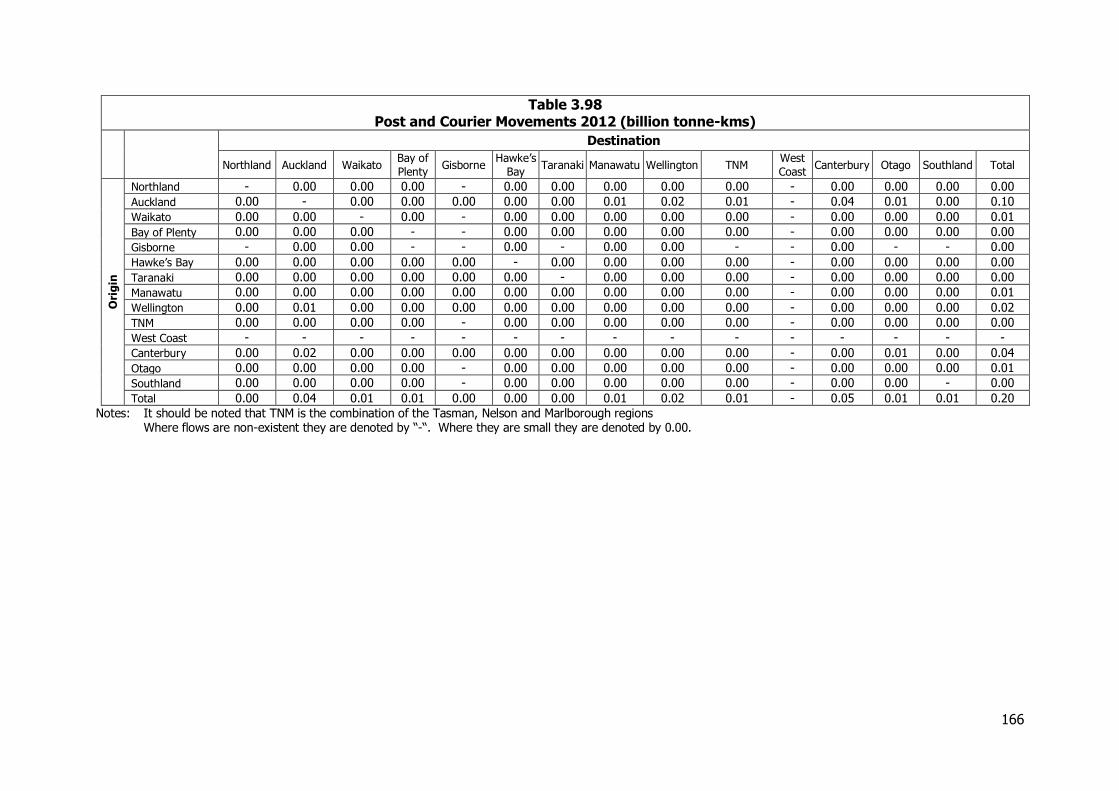
166
Table 3.98 Post and Courier Movements 2012 (billion tonne-kms)
Destination
Northland Auckland Waikato Bay of
Plenty Gisborne
Hawke’s
Bay Taranaki Manawatu Wellington TNM
West
Coast Canterbury Otago Southland Total
Ori
gin
Northland - 0.00 0.00 0.00 - 0.00 0.00 0.00 0.00 0.00 - 0.00 0.00 0.00 0.00
Auckland 0.00 - 0.00 0.00 0.00 0.00 0.00 0.01 0.02 0.01 - 0.04 0.01 0.00 0.10
Waikato 0.00 0.00 - 0.00 - 0.00 0.00 0.00 0.00 0.00 - 0.00 0.00 0.00 0.01
Bay of Plenty 0.00 0.00 0.00 - - 0.00 0.00 0.00 0.00 0.00 - 0.00 0.00 0.00 0.00
Gisborne - 0.00 0.00 - - 0.00 - 0.00 0.00 - - 0.00 - - 0.00
Hawke’s Bay 0.00 0.00 0.00 0.00 0.00 - 0.00 0.00 0.00 0.00 - 0.00 0.00 0.00 0.00
Taranaki 0.00 0.00 0.00 0.00 0.00 0.00 - 0.00 0.00 0.00 - 0.00 0.00 0.00 0.00
Manawatu 0.00 0.00 0.00 0.00 0.00 0.00 0.00 0.00 0.00 0.00 - 0.00 0.00 0.00 0.01
Wellington 0.00 0.01 0.00 0.00 0.00 0.00 0.00 0.00 0.00 0.00 - 0.00 0.00 0.00 0.02
TNM 0.00 0.00 0.00 0.00 - 0.00 0.00 0.00 0.00 0.00 - 0.00 0.00 0.00 0.00
West Coast - - - - - - - - - - - - - - -
Canterbury 0.00 0.02 0.00 0.00 0.00 0.00 0.00 0.00 0.00 0.00 - 0.00 0.01 0.00 0.04
Otago 0.00 0.00 0.00 0.00 - 0.00 0.00 0.00 0.00 0.00 - 0.00 0.00 0.00 0.01
Southland 0.00 0.00 0.00 0.00 - 0.00 0.00 0.00 0.00 0.00 - 0.00 0.00 - 0.00
Total 0.00 0.04 0.01 0.01 0.00 0.00 0.00 0.01 0.02 0.01 - 0.05 0.01 0.01 0.20
Notes: It should be noted that TNM is the combination of the Tasman, Nelson and Marlborough regions Where flows are non-existent they are denoted by “-“. Where they are small they are denoted by 0.00.
167
The results in Table 3.97 and Table 3.98 highlight the importance of Auckland as a major source or destination for this traffic. Canterbury and Christchurch is also an important location and the traffic handled by these two regions amounts to over 80 per cent of the national total. Other important recipients of courier traffic include Waikato, Manawatu and Wellington, the last of which is also an important generator of traffic.
3.19.4 The Importance of Courier Traffic While there is no information available on the value of post and courier movements and indeed for many of the movements, particularly of urgent documents, a value would be difficult to determine reliably, the value of goods moved by air through Auckland airport has been examined to give some possible indications of the scale of the value of this traffic. In 2012, goods exported or imported through the airport averaged about $78,000 per tonne, very considerably higher than the value of international trade as a whole at about $1,700 per tonne. While internal courier movements will probably not have a value as high as this, it does indicate the potential importance of this sector to supporting industrial and commercial activity as well as supplying goods for New Zealand households.
3.20 Imported Cars
3.20.1 Introduction Imported cars comprise both new vehicles and used vehicles imported mainly from Japan. They are imported through a range of ports, although the majority, over 75 per cent, enter the country through Auckland. Other ports handling significant volumes of imported vehicles include Tauranga, Napier, Wellington, Nelson, Lyttelton and Dunedin. In general these are for local distribution although all new Hondas are imported through Nelson, where the Honda assembly plant was previously located. While other, heavier vehicles are also imported these are usually distributed under their own power and so have been excluded from the analysis. The main sources of data used to estimate the movements of imported cars include:-
Customs and Infoshare data from Statistics NZ Registration data from NZTA
This was supplemented by discussions with the major distributor of imported vehicles.
3.20.2 Historical Changes in Vehicle Imports The volumes of cars imported over the period from 2000 are set out in Figure 3.38.
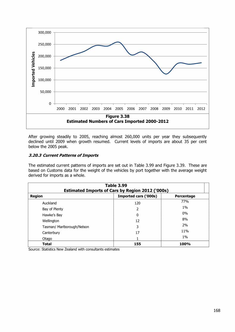
168
Figure 3.38
Estimated Numbers of Cars Imported 2000-2012
After growing steadily to 2005, reaching almost 260,000 units per year they subsequently declined until 2009 when growth resumed. Current levels of imports are about 35 per cent below the 2005 peak.
3.20.3 Current Patterns of Imports The estimated current patterns of imports are set out in Table 3.99 and Figure 3.39. These are based on Customs data for the weight of the vehicles by port together with the average weight derived for imports as a whole.
Table 3.99 Estimated Imports of Cars by Region 2012 (‘000s)
Region Imported cars (‘000s) Percentage
Auckland 120 77%
Bay of Plenty 2 1%
Hawke’s Bay 0 0%
Wellington 12 8%
Tasman/ Marlborough/Nelson 3 2%
Canterbury 17 11%
Otago 1 1%
Total 155 100%
Source: Statistics New Zealand with consultants estimates
0
50,000
100,000
150,000
200,000
250,000
300,000
2000 2001 2002 2003 2004 2005 2006 2007 2008 2009 2010 2011 2012
Imp
ort
ed V
ehic
les
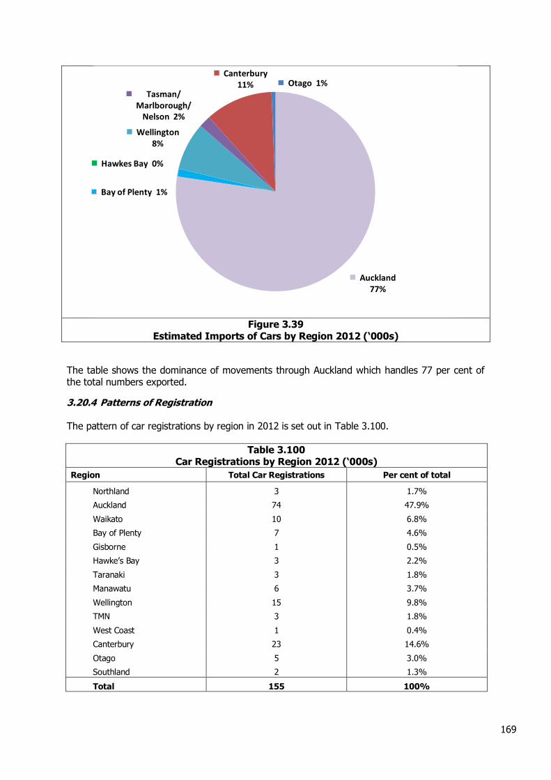
169
Figure 3.39
Estimated Imports of Cars by Region 2012 (‘000s)
The table shows the dominance of movements through Auckland which handles 77 per cent of the total numbers exported.
3.20.4 Patterns of Registration The pattern of car registrations by region in 2012 is set out in Table 3.100.
Table 3.100 Car Registrations by Region 2012 (‘000s)
Region Total Car Registrations Per cent of total
Northland 3 1.7%
Auckland 74 47.9%
Waikato 10 6.8%
Bay of Plenty 7 4.6%
Gisborne 1 0.5%
Hawke’s Bay 3 2.2%
Taranaki 3 1.8%
Manawatu 6 3.7%
Wellington 15 9.8%
TMN 3 1.8%
West Coast 1 0.4%
Canterbury 23 14.6%
Otago 5 3.0%
Southland 2 1.3%
Total 155 100%
Auckland 77%
Bay of Plenty 1%
Hawkes Bay 0%
Wellington 8%
Tasman/ Marlborough/
Nelson 2%
Canterbury 11% Otago 1%
170
Again Auckland dominates the numbers of registrations of new and imported used vehicles with about 50 per cent of the national total. This may reflect large organisations based in Auckland registering all their vehicles there even though they may be used elsewhere in the country.
3.20.5 Patterns of Movement Typically the majority of cars imported through Auckland are moved to distribution centres in the city with about 30 per cent being delivered directly to retailers. For other ports with the exception of Nelson it has been assumed that all vehicles are delivered directly to the retailer. For Nelson the imports of Honda cars are all delivered to the manufacturers’ distribution centre with subsequent distribution across the country. Assuming an average weight per vehicle of 1.34 tonnes derived from comparison of the total numbers imported and their weight, the patterns of movement for 2012 are set out in Table 3.101 and Table 3.102.
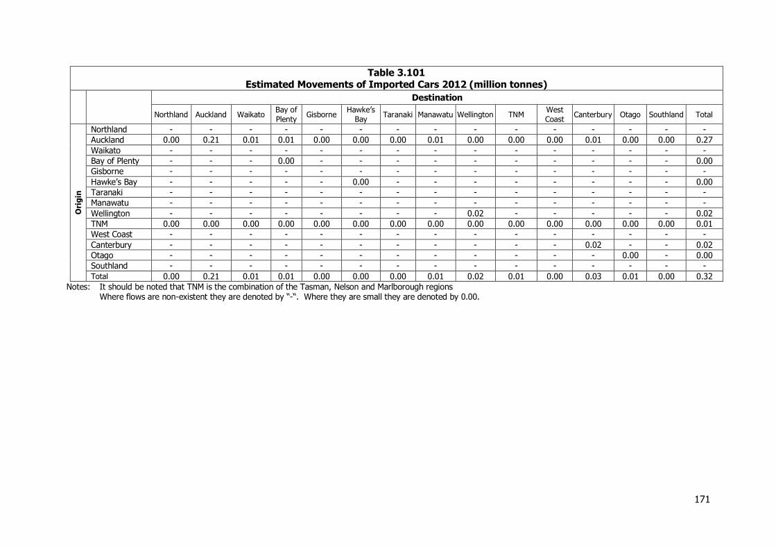
171
Table 3.101 Estimated Movements of Imported Cars 2012 (million tonnes)
Destination
Northland Auckland Waikato Bay of
Plenty Gisborne
Hawke’s
Bay Taranaki Manawatu Wellington TNM
West
Coast Canterbury Otago Southland Total
Ori
gin
Northland - - - - - - - - - - - - - - -
Auckland 0.00 0.21 0.01 0.01 0.00 0.00 0.00 0.01 0.00 0.00 0.00 0.01 0.00 0.00 0.27
Waikato - - - - - - - - - - - - - - -
Bay of Plenty - - - 0.00 - - - - - - - - - - 0.00
Gisborne - - - - - - - - - - - - - - -
Hawke’s Bay - - - - - 0.00 - - - - - - - - 0.00
Taranaki - - - - - - - - - - - - - - -
Manawatu - - - - - - - - - - - - - - -
Wellington - - - - - - - - 0.02 - - - - - 0.02
TNM 0.00 0.00 0.00 0.00 0.00 0.00 0.00 0.00 0.00 0.00 0.00 0.00 0.00 0.00 0.01
West Coast - - - - - - - - - - - - - - -
Canterbury - - - - - - - - - - - 0.02 - - 0.02
Otago - - - - - - - - - - - - 0.00 - 0.00
Southland - - - - - - - - - - - - - - -
Total 0.00 0.21 0.01 0.01 0.00 0.00 0.00 0.01 0.02 0.01 0.00 0.03 0.01 0.00 0.32
Notes: It should be noted that TNM is the combination of the Tasman, Nelson and Marlborough regions Where flows are non-existent they are denoted by “-“. Where they are small they are denoted by 0.00.

172
Table 3.102 Estimated Movements of Imported Cars 2012 (billion tonne-kms)
Destination
Northland Auckland Waikato Bay of
Plenty Gisborne
Hawke’s
Bay Taranaki Manawatu Wellington TNM
West
Coast Canterbury Otago Southland Total
Ori
gin
Northland - - - - - - - - - - - - - - -
Auckland 0.00 0.01 0.00 0.00 0.00 0.00 0.00 0.00 0.00 0.00 0.00 0.01 0.01 0.00 0.04
Waikato - - - - - - - - - - - - - - -
Bay of Plenty - - - 0.00 - - - - - - - - - - 0.00
Gisborne - - - - - - - - - - - - - - -
Hawke’s Bay - - - - - 0.00 - - - - - - - - 0.00
Taranaki - - - - - - - - - - - - - - -
Manawatu - - - - - - - - - - - - - - -
Wellington - - - - - - - - 0.00 - - - - - 0.00
TNM 0.00 0.00 0.00 0.00 0.00 0.00 0.00 0.00 0.00 0.00 0.00 0.00 0.00 0.00 0.00
West Coast - - - - - - - - - - - - - - -
Canterbury - - - - - - - - - - - 0.00 - - 0.00
Otago - - - - - - - - - - - - 0.00 - 0.00
Southland - - - - - - - - - - - - - - -
Total 0.00 0.01 0.00 0.00 0.00 0.00 0.00 0.00 0.00 0.00 0.00 0.01 0.01 0.00 0.04
Notes: It should be noted that TNM is the combination of the Tasman, Nelson and Marlborough regions Where flows are non-existent they are denoted by “-“. Where they are small they are denoted by 0.00
173
3.21 Other Minerals
3.21.1 Introduction This section deals with a range of industrial minerals other than aggregate, limestone, ironsand, and coal, which are dealt with in other sections. Many are only mined in small quantities, but include precious minerals like gold (8 tonnes exported through Christchurch Airport, worth $59 million per tonne). Vanadium was included as an "other mineral" in the 2008 NFDS but it is now dealt with in the steel section. “Other minerals” also include more basic commodities like clay and pumice.
3.21.2 Information and Methodology The primary source of information on this sector is the Industrial Minerals series of MBIE, supplemented with information from producers. The location of the mines and markets is basically the same as was identified in the 2008 NFDS. Some of the minerals are mined in small quantities, and comparison with earlier years suggests some undercounting in the MBIE data. KiwiRail data was also used.
3.21.3 Industrial Structure Most of these minerals are mined in small scale mines or quarries, individually owned, with some larger and multi-national enterprises (like Imerys Tableware and Oceania Gold) also involved.
3.21.4 Production Estimates of production are in Table 3.103. For comparison, estimates for 2011 are given for minerals where MBIE provides the data.
Table 3.103 Other Minerals Production 2011 and 2012 (‘000 tonnes)
Mineral Production Main site or
region End uses
2011 2012
Pumice 229 72 Bay of Plenty Stock races, lightweight concrete Decorative Pebbles 22 25 Otago Paving, building China Clay 12 11 Northland Ceramics Clay for bricks, pottery 20 72 Waikato Bricks and tiles Silica Sand 109 73 Canterbury Paving, moulding Gold Concentrate 59 Reefton Refined gold Serpentine 41 37 Aria (Waikato) Fertiliser additive Building stone 0 9 Otago Building Zeolite/Perlite 70 Waikato Horticulture, Pet litter, stock races Amorphous Silica 20 2 Rotorua Cement additive Bentonite 0 2 Canterbury Drilling, cosmetics
Sources: MBIE and producers, KiwiRail.
3.21.5 Trade Refined china clay is exported through Auckland and Tauranga. Gold is exported, once refined, through Auckland and Christchurch Airports. Small quantities of zeolite, perlite, and bentonite are also exported. Imports of other minerals are chiefly inputs to the cement (gypsum) and fertiliser industries (phosphate rock and sulphur) and are dealt with in those sections. Gypsum is also imported into Auckland (121,000 tonnes) and Christchurch (50,000 tonnes), for the manufacture of wallboard. Tables 3.104 and 3.105 also include flows of a confidential mineral.
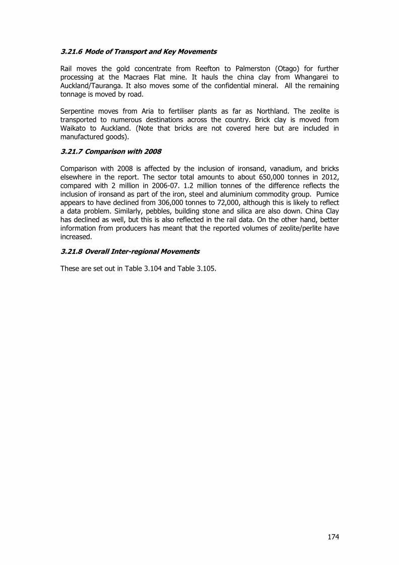
174
3.21.6 Mode of Transport and Key Movements Rail moves the gold concentrate from Reefton to Palmerston (Otago) for further processing at the Macraes Flat mine. It hauls the china clay from Whangarei to Auckland/Tauranga. It also moves some of the confidential mineral. All the remaining tonnage is moved by road. Serpentine moves from Aria to fertiliser plants as far as Northland. The zeolite is transported to numerous destinations across the country. Brick clay is moved from Waikato to Auckland. (Note that bricks are not covered here but are included in manufactured goods).
3.21.7 Comparison with 2008 Comparison with 2008 is affected by the inclusion of ironsand, vanadium, and bricks elsewhere in the report. The sector total amounts to about 650,000 tonnes in 2012, compared with 2 million in 2006-07. 1.2 million tonnes of the difference reflects the inclusion of ironsand as part of the iron, steel and aluminium commodity group. Pumice appears to have declined from 306,000 tonnes to 72,000, although this is likely to reflect a data problem. Similarly, pebbles, building stone and silica are also down. China Clay has declined as well, but this is also reflected in the rail data. On the other hand, better information from producers has meant that the reported volumes of zeolite/perlite have increased.
3.21.8 Overall Inter-regional Movements These are set out in Table 3.104 and Table 3.105.
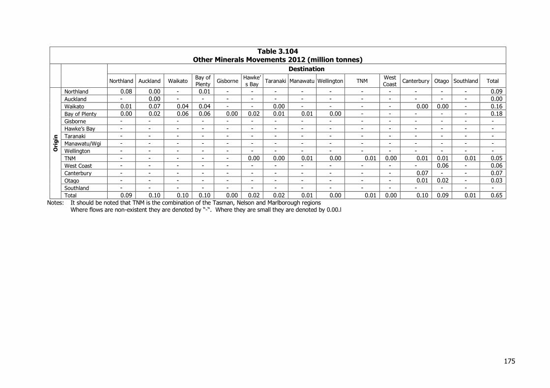
175
Table 3.104 Other Minerals Movements 2012 (million tonnes)
Destination
Northland Auckland Waikato Bay of
Plenty Gisborne
Hawke’
s Bay Taranaki Manawatu Wellington TNM
West
Coast Canterbury Otago Southland Total
Ori
gin
Northland 0.08 0.00 - 0.01 - - - - - - - - - - 0.09
Auckland - 0.00 - - - - - - - - - - - - 0.00
Waikato 0.01 0.07 0.04 0.04 - - 0.00 - - - - 0.00 0.00 - 0.16
Bay of Plenty 0.00 0.02 0.06 0.06 0.00 0.02 0.01 0.01 0.00 - - - - - 0.18
Gisborne - - - - - - - - - - - - - - -
Hawke’s Bay - - - - - - - - - - - - - - -
Taranaki - - - - - - - - - - - - - - -
Manawatu/Wgi - - - - - - - - - - - - - - -
Wellington - - - - - - - - - - - - - - -
TNM - - - - - 0.00 0.00 0.01 0.00 0.01 0.00 0.01 0.01 0.01 0.05
West Coast - - - - - - - - - - - - 0.06 - 0.06
Canterbury - - - - - - - - - - - 0.07 - - 0.07
Otago - - - - - - - - - - - 0.01 0.02 - 0.03
Southland - - - - - - - - - - - - - - -
Total 0.09 0.10 0.10 0.10 0.00 0.02 0.02 0.01 0.00 0.01 0.00 0.10 0.09 0.01 0.65
Notes: It should be noted that TNM is the combination of the Tasman, Nelson and Marlborough regions Where flows are non-existent they are denoted by “-“. Where they are small they are denoted by 0.00.l
176
Table 3.105 Other Minerals Movements 2012 (billion tonne kilometres)
Destination
Northland Auckland Waikato Bay of
Plenty Gisborne
Hawke’s
Bay Taranaki Manawatu Wellington TNM
West
Coast Canterbury Otago Southland Total
Ori
gin
Northland 0.00 0.00 - 0.00 - - - - - - - - - - 0.01
Auckland - 0.00 - - - - - - - - - - - - 0.00
Waikato 0.00 0.01 0.00 0.01 - - 0.00 - - - - 0.00 0.00 - 0.02
Bay of Plenty 0.00 0.00 0.01 0.00 0.00 0.01 0.00 0.00 0.00 - - - - - 0.03
Gisborne - - - - - - - - - - - - - - -
Hawke’s Bay - - - - - - - - - - - - - - -
Taranaki - - - - - - - - - - - - - - -
Manawatu - - - - - - - - - - - - - - -
Wellington - - - - - - - - - - - - - - -
TNM - - - - - 0.00 0.00 0.00 0.00 0.00 0.00 0.00 0.01 0.01 0.02
West Coast - - - - - - - - - - - - 0.03 - 0.03
Canterbury - - - - - - - - - - - 0.01 - - 0.01
Otago - - - - - - - - - - - 0.00 0.00 - 0.00
Southland - - - - - - - - - - - - - - 0.00
Total 0.01 0.01 0.01 0.01 0.00 0.01 0.01 0.00 0.00 0.00 0.00 0.01 0.04 0.01 0.12
Notes: It should be noted that TNM is the combination of the Tasman, Nelson and Marlborough regions Where flows are non-existent they are denoted by “-“. Where they are small they are denoted by 0.00.
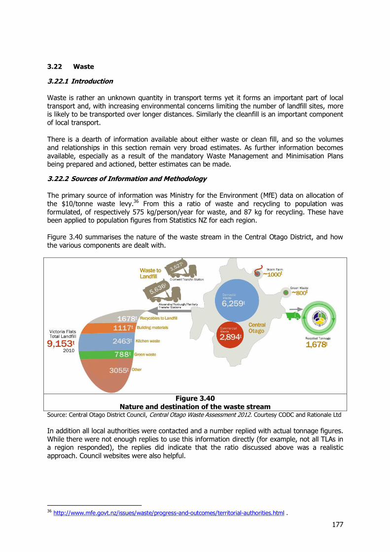
177
3.22 Waste
3.22.1 Introduction Waste is rather an unknown quantity in transport terms yet it forms an important part of local transport and, with increasing environmental concerns limiting the number of landfill sites, more is likely to be transported over longer distances. Similarly the cleanfill is an important component of local transport. There is a dearth of information available about either waste or clean fill, and so the volumes and relationships in this section remain very broad estimates. As further information becomes available, especially as a result of the mandatory Waste Management and Minimisation Plans being prepared and actioned, better estimates can be made.
3.22.2 Sources of Information and Methodology The primary source of information was Ministry for the Environment (MfE) data on allocation of the $10/tonne waste levy.36 From this a ratio of waste and recycling to population was formulated, of respectively 575 kg/person/year for waste, and 87 kg for recycling. These have been applied to population figures from Statistics NZ for each region. Figure 3.40 summarises the nature of the waste stream in the Central Otago District, and how the various components are dealt with.
Figure 3.40
Nature and destination of the waste stream Source: Central Otago District Council, Central Otago Waste Assessment 2012. Courtesy CODC and Rationale Ltd In addition all local authorities were contacted and a number replied with actual tonnage figures. While there were not enough replies to use this information directly (for example, not all TLAs in a region responded), the replies did indicate that the ratio discussed above was a realistic approach. Council websites were also helpful.
36 http://www.mfe.govt.nz/issues/waste/progress-and-outcomes/territorial-authorities.html .

178
For cleanfill a similar approach has been taken. In this case there are no official figures, although some cleanfill is registered by MBIE under “other”. However, information received from quarry and cleanfill operators in Auckland enabled an estimate to be made of the overall Auckland market for cleanfill of about 1.1m cubic metres, or 1.65 million tonnes (at 1.5 tonne/m3). On a per head basis this is 1.09 tonnes/person/year, but because of the estimated nature this was rounded to 1 tonne. This ratio was then used to estimate the volume in all regions. Cleanfill is not as closely regulated as waste, so data is even harder to come by. It can be a permitted activity in a plan. Even a register of sites is difficult to find in a region. Nevertheless, some contact was made with cleanfill operators outside Auckland and their data suggests the ratio was broadly right. There have been very significant quantities generated by the Christchurch earthquake, especially of cleanfill (see Section 6.11). The data on which the estimate of waste per head was calculated was for 2012, and thus would not have included the one-off spike in Christchurch.
3.22.3 Structure of the Industry The waste industry is dominated by two large international firms, Envirowaste and Transpacific (incorporating Waste Management). These have their own landfills, such as Redvale in Auckland, owned by Transpacific, and Hampton Downs in the Waikato, owned by Envirowaste. They often also contract for local authorities’ waste collection and disposal activities. Transpacific has announced its intention to sell its NZ business. These and other large privately run landfills accept council and third party collections, and gather their waste from a large area. The principal such activities are Hampton Downs (near Mercer) and Leach’s at Tirohia, near Paeroa in the Waikato, Bonny Glen (near Marton) in Manawatu, Kate Valley (near Waipara) in Canterbury, and Winton in Southland. Only in the case of the Waikato landfills is movement interregional. These received waste from Auckland, Waikato, Bay of Plenty, and Gisborne. Hampton Downs receives 600,000 tonnes of waste a year, and Tirohia 120,000. The nature of the waste business is moving towards well designed large landfills, with appropriate consents. Older landfills and unconsented ones are being closed, with the result that there can be few in a region and waste has to move longer distances. This map from the Waikato Region illustrates this point.
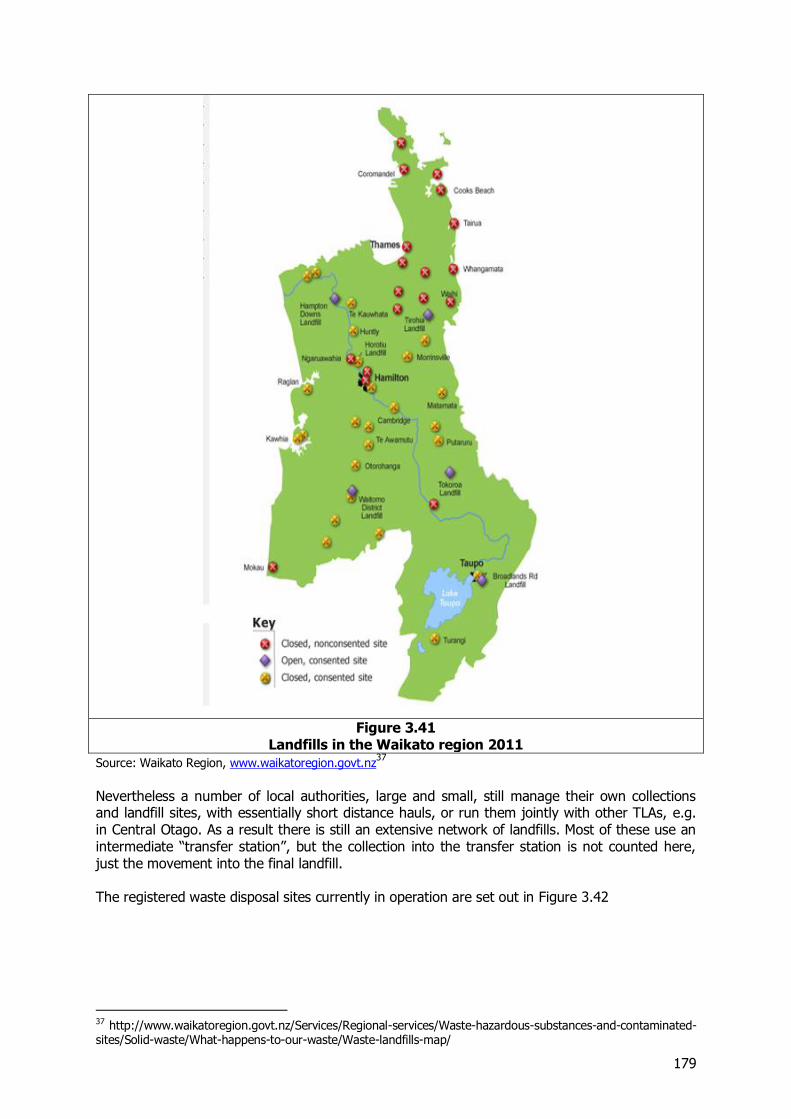
179
Figure 3.41
Landfills in the Waikato region 2011
Source: Waikato Region, www.waikatoregion.govt.nz37
Nevertheless a number of local authorities, large and small, still manage their own collections and landfill sites, with essentially short distance hauls, or run them jointly with other TLAs, e.g. in Central Otago. As a result there is still an extensive network of landfills. Most of these use an intermediate “transfer station”, but the collection into the transfer station is not counted here, just the movement into the final landfill. The registered waste disposal sites currently in operation are set out in Figure 3.42
37 http://www.waikatoregion.govt.nz/Services/Regional-services/Waste-hazardous-substances-and-contaminated-sites/Solid-waste/What-happens-to-our-waste/Waste-landfills-map/
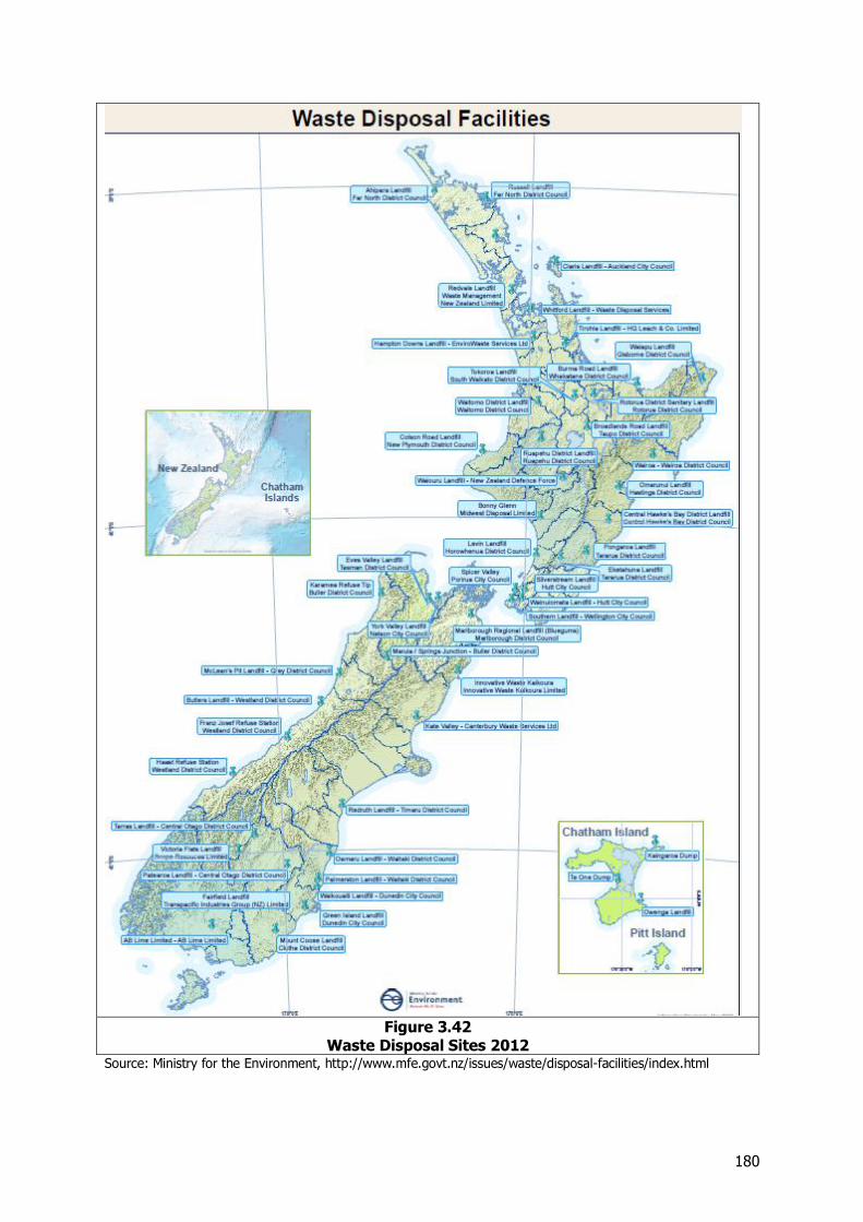
180
Figure 3.42
Waste Disposal Sites 2012 Source: Ministry for the Environment, http://www.mfe.govt.nz/issues/waste/disposal-facilities/index.html
181
Cleanfill sites are less organised. Cleanfills tend to be quarries or similar workings where fill can be usefully dumped, although formal landfills also take cleanfill. The operators may be demolition contractors or the site owners looking for fill. Often quarry and cleanfill operators are the same, as one commodity provides a back load for the other, reducing unit costs and extending the range that can be served. In addition cleanfill can be used to rehabilitate the quarry. This is about to happen on a very large scale in Auckland, with the spoil from the Waterview tunnels being dumped in an old quarry at Wiri.
3.22.4 Volumes of Waste On the ratio basis, the total volume of waste is 2.5 million tonnes, and of recycling 385,000 tonnes. Cleanfill is estimated at 4.4 million tonnes. Regional distribution is as follows.
Table 3.106 Waste production 2012 (‘000 tonnes)
Region Waste Recycling Cleanfill Total
Northland 91 14 158 263 Auckland 867 131 1508 2506 Waikato 237 36 413 686 Bay of Plenty 162 24 281 466 Gisborne 27 4 47 78 Hawke’s Bay 89 13 155 257 Taranaki 63 10 110 184 Manawatu - Wgi 134 20 232 386 Wellington 282 43 490 815 TNM 81 12 141 234 West Coast 19 3 33 55 Canterbury 333 50 579 961 Otago 110 17 192 319 Southland 55 8 95 158
Total 2549 385 4433 7367 Notes: TNM is the combination of the Tasman, Nelson and Marlborough regions
3.22.5 Movement and Mode Waste moves entirely by road transport. In those cases where the TLA provides its own landfill, distances are short, typically 10-20 km. Where there are larger landfills which serve a whole region, the distances travelled within regions are longer, typically 40-60 km. Waste for the Waikato landfills can travel long distances and Gisborne’s waste goes 375 km to Leach’s. Recycled material also travels by road, although some of the final products may move by rail or coastal shipping in the guise of freight forwarding. The recycling stream includes glass, plastics, paper and other products. Most is exported, and it is assumed that it goes via the nearest major container port. The export flows of waste paper, steel, and aluminium, dealt with in the respective sections. However, some detail was provided in the waste plan of an Otago TLA, which identified the individual products, and which sent its scrap glass to Auckland. Glass was approximately 10 per cent of the recycling, so it has been assumed that 10% of each region’s recycling moves to Auckland. Cleanfill is essentially carried short distances by local traffic, (typically 10-20 km) apart from Auckland where it moves a little further (with some minor cross boundary moves). It all moves by road.
3.22.6 Comparison with 2008 The commodity was not separately identified in 2008 so comparisons are not possible.
3.22.7 Origin and Destination
The movements of waste for 2012 are set out in Table 3.107 and Table 3.108
182
Table 3.107 Waste Movements 2012 (million tonnes)
Destination
Northland Auckland Waikato Bay of
Plenty Gisborne
Hawke’
s Bay Taranaki Manawatu Wellington TNM
West
Coast Canterbury Otago Southland Total
Ori
gin
Northland 0.25 0.01 - - - - - - - - - - - - 0.26
Auckland - 2.38 0.13 - - - - - - - - - - - 2.51
Waikato - 0.04 0.65 - - - - - - - - - - - 0.69
Bay of Plenty - 0.00 0.16 0.30 - - - - - - - - - - 0.47
Gisborne - 0.00 0.03 - 0.05 - - - - - - - - - 0.08
Hawke’s Bay - 0.00 - - - 0.26 - - - - - - - - 0.26
Taranaki - 0.00 - 0.01 - - 0.17 - - - - - - - 0.18
Manawatu/Wgi - 0.00 - - - - - 0.37 0.02 - - - - - 0.39
Wellington - 0.00 - - - - - - 0.81 - - - - - 0.81
TNM - 0.00 - - - - - - - 0.22 - 0.01 - - 0.23
West Coast - - - - - - - - - 0.05 0.00 - - 0.05
Canterbury - 0.01 - - - - - - - - - 0.96 - - 0.96
Otago - 0.00 - - - - - - - - - - 0.32 - 0.32
Southland - 0.00 - - - - - - - - - - 0.01 0.15 0.16
Total 0.25 2.45 0.97 0.31 0.05 0.26 0.17 0.37 0.83 0.22 0.05 0.97 0.32 0.15 7.37
Notes: It should be noted that TNM is the combination of the Tasman, Nelson and Marlborough regions Where flows are non-existent they are denoted by “-“. Where they are small they are denoted by 0.00
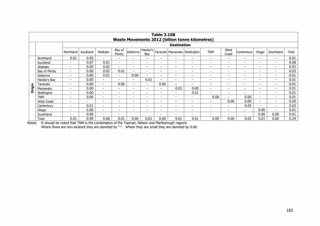
183
Table 3.108 Waste Movements 2012 (billion tonne kilometres)
Destination
Northland Auckland Waikato Bay of
Plenty Gisborne
Hawke’s
Bay Taranaki Manawatu Wellington TNM
West
Coast Canterbury Otago Southland Total
Ori
gin
Northland 0.01 0.00 - - - - - - - - - - - - 0.01
Auckland - 0.07 0.01 - - - - - - - - - - - 0.08
Waikato - 0.00 0.02 - - - - - - - - - - - 0.02
Bay of Plenty - 0.00 0.02 0.01 - - - - - - - - - - 0.03
Gisborne - 0.00 0.01 - 0.00 - - - - - - - - - 0.01
Hawke’s Bay - 0.00 - - - 0.01 - - - - - - - - 0.01
Taranaki - 0.00 - 0.00 - - 0.00 - - - - - - - 0.01
Manawatu - 0.00 - - - - - 0.01 0.00 - - - - - 0.01
Wellington - 0.00 - - - - - - 0.01 - - - - - 0.01
TNM - 0.00 - - - - - - - 0.00 - 0.00 - - 0.01
West Coast - - - - - - - - - - 0.00 0.00 - - 0.00
Canterbury - 0.01 - - - - - - - - - 0.03 - - 0.03
Otago - 0.00 - - - - - - - - - - 0.00 - 0.01
Southland - 0.00 - - - - - - - - 0.00 0.00 0.01
Total 0.01 0.09 0.06 0.01 0.00 0.01 0.00 0.01 0.01 0.00 0.00 0.03 0.01 0.00 0.24
Notes: It should be noted that TNM is the combination of the Tasman, Nelson and Marlborough regions Where flows are non-existent they are denoted by “-“. Where they are small they are denoted by 0.00.
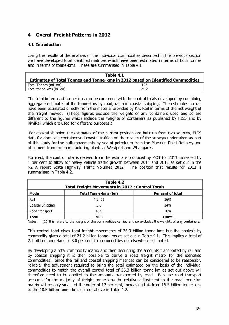
184
4 Overall Freight Patterns in 2012
4.1 Introduction
Using the results of the analysis of the individual commodities described in the previous section we have developed total identified matrices which have been estimated in terms of both tonnes and in terms of tonne-kms. These are summarised in Table 4.1
Table 4.1 Estimates of Total Tonnes and Tonne-kms in 2012 based on Identified Commodities
Total Tonnes (million) 192 Total tonne-kms (billion) 24.2
The total in terms of tonne-kms can be compared with the control totals developed by combining aggregate estimates of the tonne-kms by road, rail and coastal shipping. The estimates for rail have been estimated directly from the material provided by KiwiRail in terms of the net weight of the freight moved. (These figures exclude the weights of any containers used and so are different to the figures which include the weights of containers as published by FIGS and by KiwiRail which are used for different purposes.) For coastal shipping the estimates of the current position are built up from two sources, FIGS data for domestic containerised coastal traffic and the results of the surveys undertaken as part of this study for the bulk movements by sea of petroleum from the Marsden Point Refinery and of cement from the manufacturing plants at Westport and Whangarei. For road, the control total is derived from the estimate produced by MOT for 2011 increased by 1 per cent to allow for heavy vehicle traffic growth between 2011 and 2012 as set out in the NZTA report State Highway Traffic Volumes 2012. The position that results for 2012 is summarised in Table 4.2.
Table 4.2 Total Freight Movements in 2012 : Control Totals
Mode Total Tonne-kms (bn) Per cent of total
Rail 4.2 (1) 16%
Coastal Shipping 3.6 14%
Road transport 18.5 70%
Total 26.3 100%
Notes: (1) This refers to the weight of the commodities carried and so excludes the weights of any containers.
This control total gives total freight movements of 26.3 billion tonne-kms but the analysis by commodity gives a total of 24.2 billion tonne-kms as set out in Table 4.1. This implies a total of 2.1 billion tonne-kms or 8.0 per cent for commodities not elsewhere estimated. By developing a total commodity matrix and then deducting the amounts transported by rail and by coastal shipping it is then possible to derive a road freight matrix for the identified commodities. Since the rail and coastal shipping matrices can be considered to be reasonably reliable, the adjustment required to bring the total estimated on the basis of the individual commodities to match the overall control total of 26.3 billion tonne-km as set out above will therefore need to be applied to the amounts transported by road. Because road transport accounts for the majority of freight tonne-kms the relative adjustment to the road tonne-km matrix will be only small, of the order of 12 per cent, increasing this from 16.5 billion tonne-kms to the 18.5 billion tonne-kms set out above in Table 4.2.
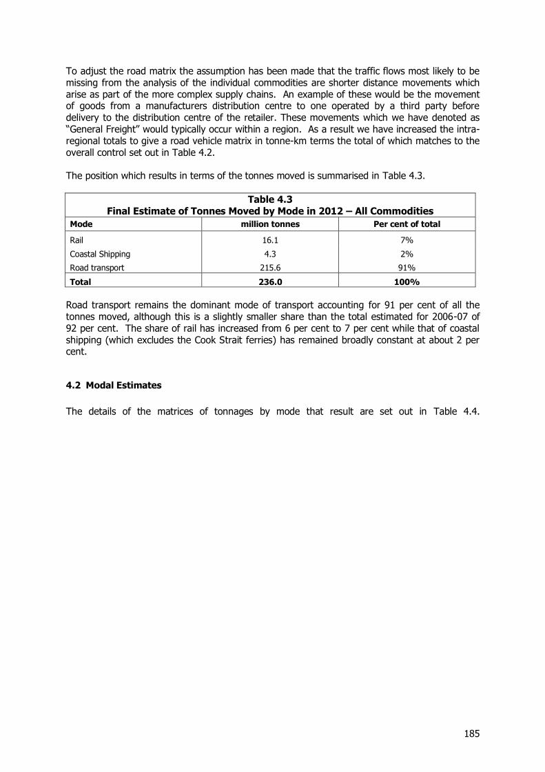
185
To adjust the road matrix the assumption has been made that the traffic flows most likely to be missing from the analysis of the individual commodities are shorter distance movements which arise as part of the more complex supply chains. An example of these would be the movement of goods from a manufacturers distribution centre to one operated by a third party before delivery to the distribution centre of the retailer. These movements which we have denoted as “General Freight” would typically occur within a region. As a result we have increased the intra-regional totals to give a road vehicle matrix in tonne-km terms the total of which matches to the overall control set out in Table 4.2. The position which results in terms of the tonnes moved is summarised in Table 4.3.
Table 4.3 Final Estimate of Tonnes Moved by Mode in 2012 – All Commodities
Mode million tonnes Per cent of total
Rail 16.1 7%
Coastal Shipping 4.3 2%
Road transport 215.6 91%
Total 236.0 100%
Road transport remains the dominant mode of transport accounting for 91 per cent of all the tonnes moved, although this is a slightly smaller share than the total estimated for 2006-07 of 92 per cent. The share of rail has increased from 6 per cent to 7 per cent while that of coastal shipping (which excludes the Cook Strait ferries) has remained broadly constant at about 2 per cent.
4.2 Modal Estimates
The details of the matrices of tonnages by mode that result are set out in Table 4.4.
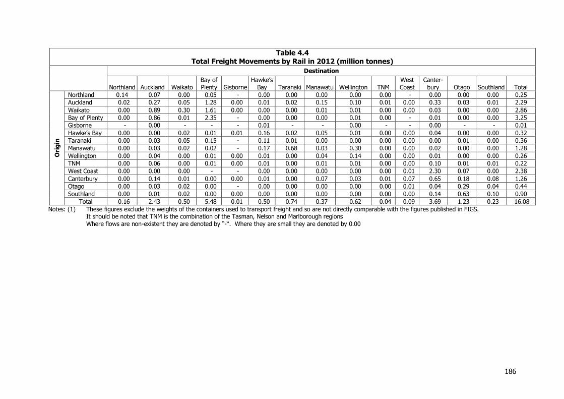
186
Table 4.4 Total Freight Movements by Rail in 2012 (million tonnes)
Destination
Northland Auckland Waikato Bay of Plenty Gisborne
Hawke’s Bay Taranaki Manawatu Wellington TNM
West Coast
Canter-bury Otago Southland Total
Ori
gin
Northland 0.14 0.07 0.00 0.05 - 0.00 0.00 0.00 0.00 0.00 - 0.00 0.00 0.00 0.25
Auckland 0.02 0.27 0.05 1.28 0.00 0.01 0.02 0.15 0.10 0.01 0.00 0.33 0.03 0.01 2.29
Waikato 0.00 0.89 0.30 1.61 0.00 0.00 0.00 0.01 0.01 0.00 0.00 0.03 0.00 0.00 2.86
Bay of Plenty 0.00 0.86 0.01 2.35 - 0.00 0.00 0.00 0.01 0.00 - 0.01 0.00 0.00 3.25
Gisborne - 0.00 - - - 0.01 - - 0.00 - - 0.00 - - 0.01
Hawke’s Bay 0.00 0.00 0.02 0.01 0.01 0.16 0.02 0.05 0.01 0.00 0.00 0.04 0.00 0.00 0.32
Taranaki 0.00 0.03 0.05 0.15 - 0.11 0.01 0.00 0.00 0.00 0.00 0.00 0.01 0.00 0.36
Manawatu 0.00 0.03 0.02 0.02 - 0.17 0.68 0.03 0.30 0.00 0.00 0.02 0.00 0.00 1.28
Wellington 0.00 0.04 0.00 0.01 0.00 0.01 0.00 0.04 0.14 0.00 0.00 0.01 0.00 0.00 0.26
TNM 0.00 0.06 0.00 0.01 0.00 0.01 0.00 0.01 0.01 0.00 0.00 0.10 0.01 0.01 0.22
West Coast 0.00 0.00 0.00 - - 0.00 0.00 0.00 0.00 0.00 0.01 2.30 0.07 0.00 2.38
Canterbury 0.00 0.14 0.01 0.00 0.00 0.01 0.00 0.07 0.03 0.01 0.07 0.65 0.18 0.08 1.26
Otago 0.00 0.03 0.02 0.00 - 0.00 0.00 0.00 0.00 0.00 0.01 0.04 0.29 0.04 0.44
Southland 0.00 0.01 0.02 0.00 0.00 0.00 0.00 0.00 0.00 0.00 0.00 0.14 0.63 0.10 0.90
Total 0.16 2.43 0.50 5.48 0.01 0.50 0.74 0.37 0.62 0.04 0.09 3.69 1.23 0.23 16.08
Notes: (1) These figures exclude the weights of the containers used to transport freight and so are not directly comparable with the figures published in FIGS. It should be noted that TNM is the combination of the Tasman, Nelson and Marlborough regions
Where flows are non-existent they are denoted by “-“. Where they are small they are denoted by 0.00
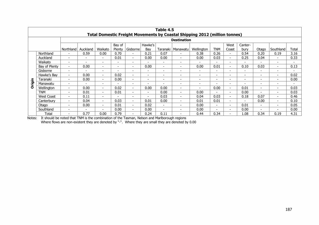
187
Table 4.5 Total Domestic Freight Movements by Coastal Shipping 2012 (million tonnes)
Destination
Northland Auckland Waikato Bay of Plenty Gisborne
Hawke’s Bay Taranaki Manawatu Wellington TNM
West Coast
Canter-bury Otago Southland Total
Ori
gin
Northland - 0.59 0.00 0.70 - 0.21 0.07 - 0.38 0.26 - 0.54 0.20 0.19 3.16
Auckland - - - 0.01 - 0.00 0.00 - 0.00 0.03 - 0.25 0.04 - 0.33
Waikato - - - - - - - - - - - - - - -
Bay of Plenty - 0.00 - - - 0.00 - - 0.00 0.01 - 0.10 0.03 - 0.13
Gisborne - - - - - - - - - - - - - - -
Hawke’s Bay - 0.00 - 0.02 - - - - - - - - - - 0.02
Taranaki - 0.00 - 0.00 - - - - - - - - - - 0.00
Manawatu - - - - - - - - - - - - - - -
Wellington - 0.00 - 0.02 - 0.00 0.00 - - 0.00 - 0.01 - - 0.03
TNM - 0.01 - 0.01 - - 0.00 - 0.00 - - 0.00 - - 0.03
West Coast - 0.11 - - - - 0.03 - 0.04 0.03 - 0.18 0.07 - 0.46
Canterbury - 0.04 - 0.03 - 0.01 0.00 - 0.01 0.01 - - 0.00 - 0.10
Otago - 0.00 - 0.01 - 0.02 - - 0.00 - - 0.01 - - 0.05
Southland - - - 0.00 - 0.00 - - 0.00 - - 0.00 - - 0.00
Total - 0.77 0.00 0.79 - 0.24 0.11 - 0.44 0.34 - 1.08 0.34 0.19 4.31
Notes: It should be noted that TNM is the combination of the Tasman, Nelson and Marlborough regions Where flows are non-existent they are denoted by “-“. Where they are small they are denoted by 0.00
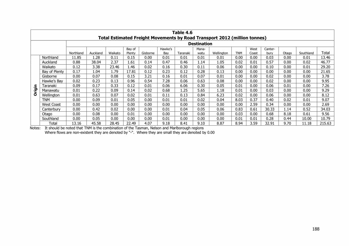
188
Table 4.6 Total Estimated Freight Movements by Road Transport 2012 (million tonnes)
Destination
Northland Auckland Waikato
Bay of
Plenty Gisborne
Hawke’s
Bay Taranaki
Mana-
watu Wellington TNM
West
Coast
Canter-
bury Otago Southland Total
Ori
gin
Northland 11.85 1.28 0.11 0.15 0.00 0.01 0.01 0.01 0.01 0.00 0.00 0.03 0.00 0.01 13.46
Auckland 0.88 38.04 2.37 1.61 0.14 0.47 0.46 1.14 1.05 0.02 0.01 0.57 0.00 0.02 46.77
Waikato 0.12 3.38 23.46 1.46 0.02 0.16 0.30 0.11 0.06 0.00 0.00 0.10 0.00 0.01 29.20
Bay of Plenty 0.17 1.04 1.79 17.81 0.12 0.23 0.12 0.28 0.13 0.00 0.00 0.00 0.00 0.00 21.65
Gisborne 0.00 0.07 0.08 0.15 3.21 0.16 0.01 0.07 0.01 0.00 0.00 0.02 0.00 0.00 3.78
Hawke’s Bay 0.02 0.23 0.13 0.96 0.54 7.28 0.06 0.63 0.08 0.00 0.00 0.02 0.00 0.00 9.95
Taranaki 0.09 0.17 0.33 0.12 0.01 0.06 6.06 0.30 0.05 0.01 0.00 0.06 0.01 0.00 7.26
Manawatu 0.01 0.22 0.09 0.14 0.02 0.68 1.25 5.65 1.18 0.01 0.00 0.03 0.00 0.00 9.29
Wellington 0.01 0.63 0.07 0.02 0.01 0.11 0.13 0.84 6.23 0.02 0.00 0.06 0.00 0.00 8.12
TNM 0.00 0.09 0.01 0.05 0.00 0.01 0.01 0.02 0.04 8.03 0.37 0.40 0.02 0.01 9.07
West Coast 0.00 0.00 0.00 0.00 0.00 0.00 0.00 0.00 0.00 0.00 2.59 0.34 0.00 0.00 2.69
Canterbury 0.00 0.42 0.02 0.00 0.00 0.01 0.04 0.05 0.06 0.83 0.61 30.33 1.14 0.52 34.03
Otago 0.00 0.08 0.00 0.01 0.00 0.00 0.00 0.00 0.00 0.03 0.00 0.68 8.18 0.61 9.56
Southland 0.00 0.05 0.00 0.00 0.00 0.01 0.00 0.00 0.00 0.01 0.01 0.28 0.44 10.00 10.79
Total 13.16 45.58 28.45 22.49 4.07 9.18 8.41 9.10 8.87 8.94 3.59 32.91 9.70 11.18 215.63
Notes: It should be noted that TNM is the combination of the Tasman, Nelson and Marlborough regions Where flows are non-existent they are denoted by “-“. Where they are small they are denoted by 0.00
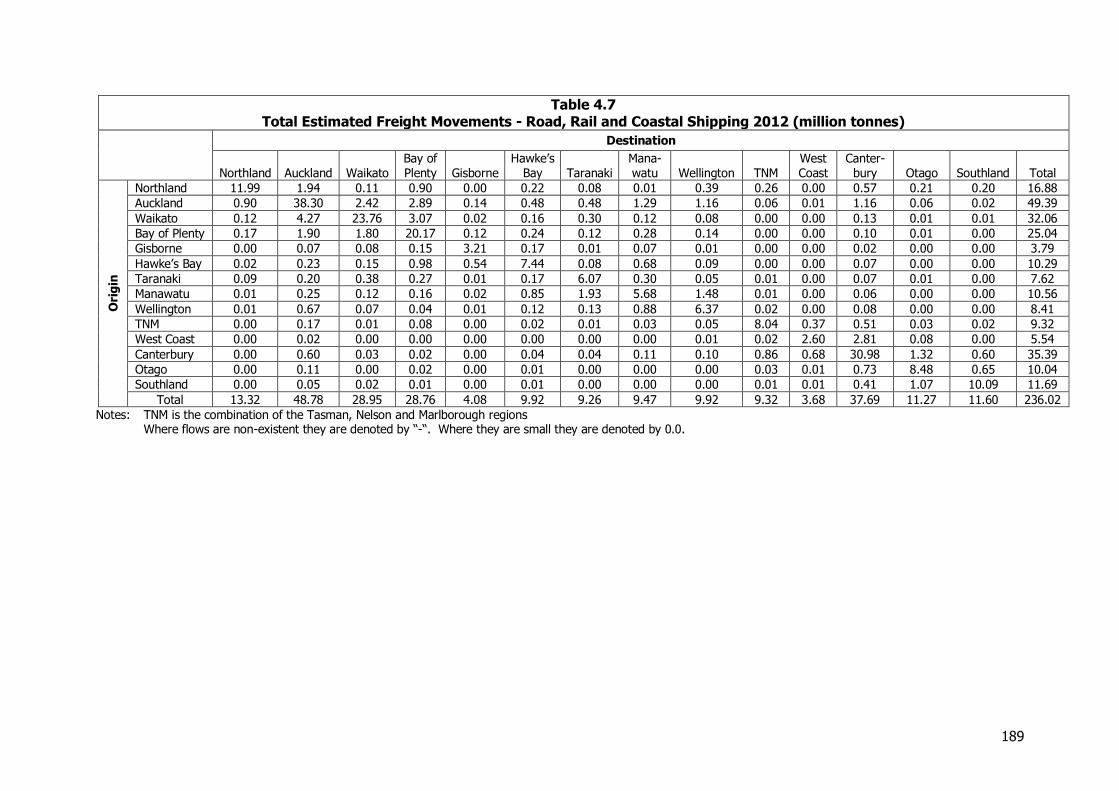
189
Table 4.7 Total Estimated Freight Movements - Road, Rail and Coastal Shipping 2012 (million tonnes)
Destination
Northland Auckland Waikato Bay of Plenty Gisborne
Hawke’s Bay Taranaki
Mana-watu Wellington TNM
West Coast
Canter-bury Otago Southland Total
Ori
gin
Northland 11.99 1.94 0.11 0.90 0.00 0.22 0.08 0.01 0.39 0.26 0.00 0.57 0.21 0.20 16.88
Auckland 0.90 38.30 2.42 2.89 0.14 0.48 0.48 1.29 1.16 0.06 0.01 1.16 0.06 0.02 49.39
Waikato 0.12 4.27 23.76 3.07 0.02 0.16 0.30 0.12 0.08 0.00 0.00 0.13 0.01 0.01 32.06
Bay of Plenty 0.17 1.90 1.80 20.17 0.12 0.24 0.12 0.28 0.14 0.00 0.00 0.10 0.01 0.00 25.04
Gisborne 0.00 0.07 0.08 0.15 3.21 0.17 0.01 0.07 0.01 0.00 0.00 0.02 0.00 0.00 3.79
Hawke’s Bay 0.02 0.23 0.15 0.98 0.54 7.44 0.08 0.68 0.09 0.00 0.00 0.07 0.00 0.00 10.29
Taranaki 0.09 0.20 0.38 0.27 0.01 0.17 6.07 0.30 0.05 0.01 0.00 0.07 0.01 0.00 7.62
Manawatu 0.01 0.25 0.12 0.16 0.02 0.85 1.93 5.68 1.48 0.01 0.00 0.06 0.00 0.00 10.56
Wellington 0.01 0.67 0.07 0.04 0.01 0.12 0.13 0.88 6.37 0.02 0.00 0.08 0.00 0.00 8.41
TNM 0.00 0.17 0.01 0.08 0.00 0.02 0.01 0.03 0.05 8.04 0.37 0.51 0.03 0.02 9.32
West Coast 0.00 0.02 0.00 0.00 0.00 0.00 0.00 0.00 0.01 0.02 2.60 2.81 0.08 0.00 5.54
Canterbury 0.00 0.60 0.03 0.02 0.00 0.04 0.04 0.11 0.10 0.86 0.68 30.98 1.32 0.60 35.39
Otago 0.00 0.11 0.00 0.02 0.00 0.01 0.00 0.00 0.00 0.03 0.01 0.73 8.48 0.65 10.04
Southland 0.00 0.05 0.02 0.01 0.00 0.01 0.00 0.00 0.00 0.01 0.01 0.41 1.07 10.09 11.69
Total 13.32 48.78 28.95 28.76 4.08 9.92 9.26 9.47 9.92 9.32 3.68 37.69 11.27 11.60 236.02
Notes: TNM is the combination of the Tasman, Nelson and Marlborough regions Where flows are non-existent they are denoted by “-“. Where they are small they are denoted by 0.0.
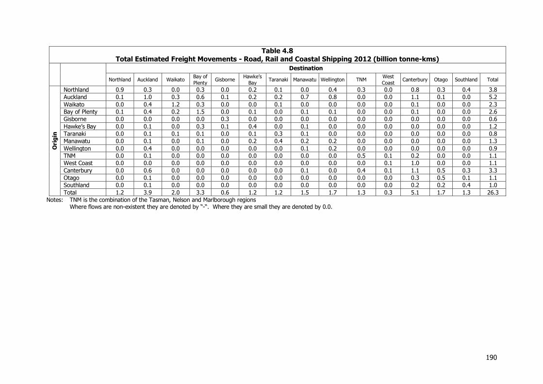
190
Table 4.8 Total Estimated Freight Movements - Road, Rail and Coastal Shipping 2012 (billion tonne-kms)
Destination
Northland Auckland Waikato Bay of
Plenty Gisborne
Hawke’s
Bay Taranaki Manawatu Wellington TNM
West
Coast Canterbury Otago Southland Total
Ori
gin
Northland 0.9 0.3 0.0 0.3 0.0 0.2 0.1 0.0 0.4 0.3 0.0 0.8 0.3 0.4 3.8
Auckland 0.1 1.0 0.3 0.6 0.1 0.2 0.2 0.7 0.8 0.0 0.0 1.1 0.1 0.0 5.2
Waikato 0.0 0.4 1.2 0.3 0.0 0.0 0.1 0.0 0.0 0.0 0.0 0.1 0.0 0.0 2.3
Bay of Plenty 0.1 0.4 0.2 1.5 0.0 0.1 0.0 0.1 0.1 0.0 0.0 0.1 0.0 0.0 2.6
Gisborne 0.0 0.0 0.0 0.0 0.3 0.0 0.0 0.0 0.0 0.0 0.0 0.0 0.0 0.0 0.6
Hawke’s Bay 0.0 0.1 0.0 0.3 0.1 0.4 0.0 0.1 0.0 0.0 0.0 0.0 0.0 0.0 1.2
Taranaki 0.0 0.1 0.1 0.1 0.0 0.1 0.3 0.1 0.0 0.0 0.0 0.0 0.0 0.0 0.8
Manawatu 0.0 0.1 0.0 0.1 0.0 0.2 0.4 0.2 0.2 0.0 0.0 0.0 0.0 0.0 1.3
Wellington 0.0 0.4 0.0 0.0 0.0 0.0 0.0 0.1 0.2 0.0 0.0 0.0 0.0 0.0 0.9
TNM 0.0 0.1 0.0 0.0 0.0 0.0 0.0 0.0 0.0 0.5 0.1 0.2 0.0 0.0 1.1
West Coast 0.0 0.0 0.0 0.0 0.0 0.0 0.0 0.0 0.0 0.0 0.1 1.0 0.0 0.0 1.1
Canterbury 0.0 0.6 0.0 0.0 0.0 0.0 0.0 0.1 0.0 0.4 0.1 1.1 0.5 0.3 3.3
Otago 0.0 0.1 0.0 0.0 0.0 0.0 0.0 0.0 0.0 0.0 0.0 0.3 0.5 0.1 1.1
Southland 0.0 0.1 0.0 0.0 0.0 0.0 0.0 0.0 0.0 0.0 0.0 0.2 0.2 0.4 1.0
Total 1.2 3.9 2.0 3.3 0.6 1.2 1.2 1.5 1.7 1.3 0.3 5.1 1.7 1.3 26.3
Notes: TNM is the combination of the Tasman, Nelson and Marlborough regions Where flows are non-existent they are denoted by “-“. Where they are small they are denoted by 0.0.
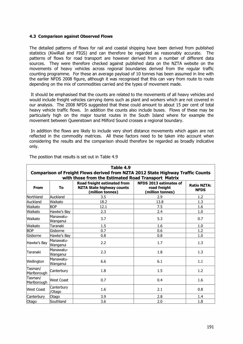
191
4.3 Comparison against Observed Flows
The detailed patterns of flows for rail and coastal shipping have been derived from published statistics (KiwiRail and FIGS) and can therefore be regarded as reasonably accurate. The patterns of flows for road transport are however derived from a number of different data sources. They were therefore checked against published data on the NZTA website on the movements of heavy vehicles across regional boundaries derived from the regular traffic counting programme. For these an average payload of 10 tonnes has been assumed in line with the earlier NFDS 2008 figure, although it was recognised that this can vary from route to route depending on the mix of commodities carried and the types of movement made. It should be emphasised that the counts are related to the movements of all heavy vehicles and would include freight vehicles carrying items such as plant and workers which are not covered in our analysis. The 2008 NFDS suggested that these could amount to about 15 per cent of total heavy vehicle traffic flows. In addition the counts also include buses. Flows of these may be particularly high on the major tourist routes in the South Island where for example the movement between Queenstown and Milford Sound crosses a regional boundary. In addition the flows are likely to include very short distance movements which again are not reflected in the commodity matrices. All these factors need to be taken into account when considering the results and the comparison should therefore be regarded as broadly indicative only. The position that results is set out in Table 4.9
Table 4.9 Comparison of Freight Flows derived from NZTA 2012 State Highway Traffic Counts
with those from the Estimated Road Transport Matrix
From To Road freight estimated from NZTA State highway counts
(million tonnes)
NFDS 2013 estimates of road freight
(million tonnes)
Ratio NZTA: NFDS
Northland Auckland 3.5 2.9 1.2
Auckland Waikato 18.2 13.8 1.3
Waikato BOP 12.1 7.5 1.6
Waikato Hawke’s Bay 2.3 2.4 1.0
Waikato Manawatu-Wanganui
3.7 5.3 0.7
Waikato Taranaki 1.5 1.6 1.0
BOP Gisborne 0.7 0.6 1.2
Gisborne Hawke’s Bay 0.8 0.8 1.0
Hawke’s Bay Manawatu-Wanganui
2.2 1.7 1.3
Taranaki Manawatu-Wanganui
2.3 1.8 1.3
Wellington Manawatu-Wanganui
6.6 6.1 1.1
Tasman/ Marlborough
Canterbury 1.8 1.5 1.2
Tasman/ Marlborough
West Coast 0.7 0.4 1.6
West Coast Canterbury /Otago
1.6 2.1 0.8
Canterbury Otago 3.9 2.8 1.4
Otago Southland 3.6 2.0 1.8

192
In general, there appears to be a reasonable match between the two approaches to estimation, given the uncertainties attached to the interpretation of the observed road transport flows and the difficulties of determining the exact routes that longer distance traffic will take. The estimates were also checked against the movements across the Cook Strait. The forecasts of total freight at about 1.8 million tonnes match the volumes estimated to be carried by the operators. Overall the results of the analysis suggest that estimates of the total commodity movements for 2012 provide a reasonable representation of the actual movements and provide a satisfactory basis for the subsequent analysis
4.4 Estimates of Modal Splits by Movement
Using the information set out in the tables above it is possible to estimate the modal shares for particular movements and in Table 4.10 we set out the proportion of the total estimated flows on a tonnage basis for 2012 which are carried by rail or coastal shipping. In setting out the information we have concentrated on the major flows and have excluded movements of 0.1 million tonnes or less. For these the comparisons may not be reliable because of the way in which the total estimates have been created. Even with this restriction there are a couple of movements where the modal split for rail and coastal shipping is greater than one but these are in respect of small flows between the North and South Islands or in the case of movements through Nelson may reflect flows that are actually coming from other regions. Looking at the major movements some of the key highlights include:
Rail and coastal shipping are estimated to carry about 50 per cent of the total freight between Auckland and Canterbury, but only 38 per cent of movements in the reverse direction.
Between Auckland and Bay of Plenty, rail carries about 44 per cent of the freight from Auckland and about 45 percent of the total in the reverse direction. This reflects the movements of containers to and from Metroport as well as exports of steel
Rail has a high share, 52 per cent, of the freight traffic between Waikato and Bay of Plenty, which reflects the movements of logs and timber products and of dairy products. The share in the reverse direction is however very small, reflecting the different nature of the commodities moved.
Rail has a high share of the movements between West Coast and Canterbury, reflecting the movements of coal and to a lesser extent dairy products
Rail also plays a significant role of movements within Bay of Plenty where it has a share of 12 per cent reflecting the high volumes of logging traffic. For the internal movements in other regions the share is generally small of the order of 3 per cent of less.
Coastal shipping plays an important role for movements between Northland and Auckland reflecting the movements of petroleum and (although much of this comes by pipeline) and cement.
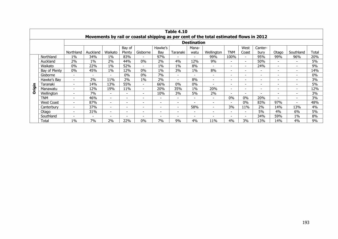
193
Table 4.10 Movements by rail or coastal shipping as per cent of the total estimated flows in 2012
Destination
Northland Auckland Waikato Bay of Plenty Gisborne
Hawke’s Bay Taranaki
Mana-watu Wellington TNM
West Coast
Canter-bury Otago Southland Total
Ori
gin
Northland 1% 34% 1% 83% - 97% - - 99% 100% - 95% 99% 96% 20%
Auckland 2% 1% 2% 44% 0% 2% 4% 12% 9% - - 50% - - 5%
Waikato 0% 22% 1% 52% - 1% 1% 8% - - - 24% - - 9%
Bay of Plenty 0% 45% 1% 12% 0% 1% 3% 1% 8% - - - - - 14%
Gisborne - - - 0% 0% 7% - - - - - - - - 0%
Hawke’s Bay - 2% 11% 2% 1% 2% - 8% - - - - - - 3%
Taranaki - 14% 13% 55% - 66% 0% 0% - - - - - - 5%
Manawatu - 12% 19% 11% - 20% 35% 1% 20% - - - - - 12%
Wellington - 7% - - - 10% 3% 5% 2% - - - - - 3%
TNM - 46% - - - - - - - 0% 0% 20% - - 3%
West Coast - 87% - - - - - - - - 0% 83% 97% - 48%
Canterbury - 37% - - - - - 58% - 3% 11% 2% 14% 13% 4%
Otago - 31% - - - - - - - - - 5% 4% 6% 5%
Southland - - - - - - - - - - - 34% 59% 1% 8%
Total 1% 7% 2% 22% 0% 7% 9% 4% 11% 4% 3% 13% 14% 4% 9%
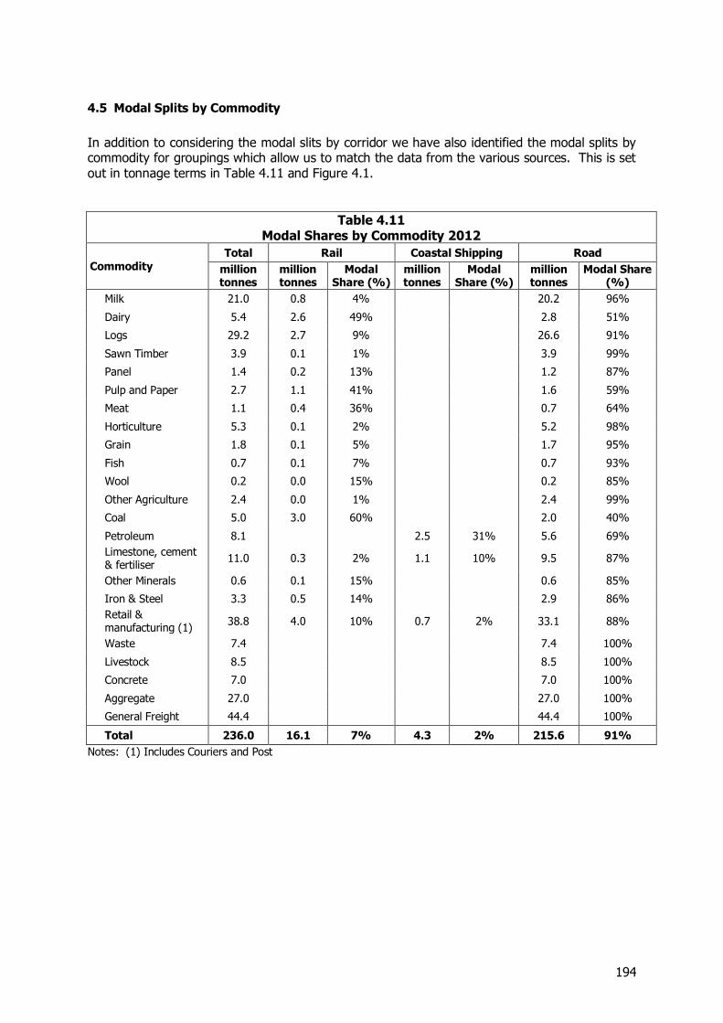
194
4.5 Modal Splits by Commodity
In addition to considering the modal slits by corridor we have also identified the modal splits by commodity for groupings which allow us to match the data from the various sources. This is set out in tonnage terms in Table 4.11 and Figure 4.1.
Table 4.11 Modal Shares by Commodity 2012
Commodity Total Rail Coastal Shipping Road
million tonnes
million tonnes
Modal Share (%)
million tonnes
Modal Share (%)
million tonnes
Modal Share (%)
Milk 21.0 0.8 4% 20.2 96%
Dairy 5.4 2.6 49% 2.8 51%
Logs 29.2 2.7 9% 26.6 91%
Sawn Timber 3.9 0.1 1% 3.9 99%
Panel 1.4 0.2 13% 1.2 87%
Pulp and Paper 2.7 1.1 41% 1.6 59%
Meat 1.1 0.4 36% 0.7 64%
Horticulture 5.3 0.1 2% 5.2 98%
Grain 1.8 0.1 5% 1.7 95%
Fish 0.7 0.1 7% 0.7 93%
Wool 0.2 0.0 15% 0.2 85%
Other Agriculture 2.4 0.0 1% 2.4 99%
Coal 5.0 3.0 60% 2.0 40%
Petroleum 8.1 2.5 31% 5.6 69%
Limestone, cement & fertiliser
11.0 0.3 2% 1.1 10% 9.5 87%
Other Minerals 0.6 0.1 15% 0.6 85%
Iron & Steel 3.3 0.5 14% 2.9 86%
Retail & manufacturing (1)
38.8 4.0 10% 0.7 2% 33.1 88%
Waste 7.4 7.4 100%
Livestock 8.5 8.5 100%
Concrete 7.0 7.0 100%
Aggregate 27.0 27.0 100%
General Freight 44.4 44.4 100%
Total 236.0 16.1 7% 4.3 2% 215.6 91%
Notes: (1) Includes Couriers and Post
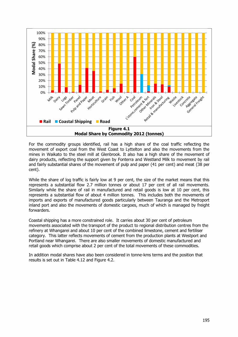
195
Figure 4.1
Modal Share by Commodity 2012 (tonnes)
For the commodity groups identified, rail has a high share of the coal traffic reflecting the movement of export coal from the West Coast to Lyttelton and also the movements from the mines in Waikato to the steel mill at Glenbrook. It also has a high share of the movement of dairy products, reflecting the support given by Fonterra and Westland Milk to movement by rail and fairly substantial shares of the movement of pulp and paper (41 per cent) and meat (38 per cent). While the share of log traffic is fairly low at 9 per cent, the size of the market means that this represents a substantial flow 2.7 million tonnes or about 17 per cent of all rail movements. Similarly while the share of rail in manufactured and retail goods is low at 10 per cent, this represents a substantial flow of about 4 million tonnes. This includes both the movements of imports and exports of manufactured goods particularly between Tauranga and the Metroport inland port and also the movements of domestic cargoes, much of which is managed by freight forwarders. Coastal shipping has a more constrained role. It carries about 30 per cent of petroleum movements associated with the transport of the product to regional distribution centres from the refinery at Whangarei and about 10 per cent of the combined limestone, cement and fertiliser category. This latter reflects movements of cement from the production plants at Westport and Portland near Whangarei. There are also smaller movements of domestic manufactured and retail goods which comprise about 2 per cent of the total movements of these commodities.
In addition modal shares have also been considered in tonne-kms terms and the position that results is set out in Table 4.12 and Figure 4.2.
0%
10%
20%
30%
40%
50%
60%
70%
80%
90%
100%M
od
al S
har
e (%
)
Rail Coastal Shipping Road
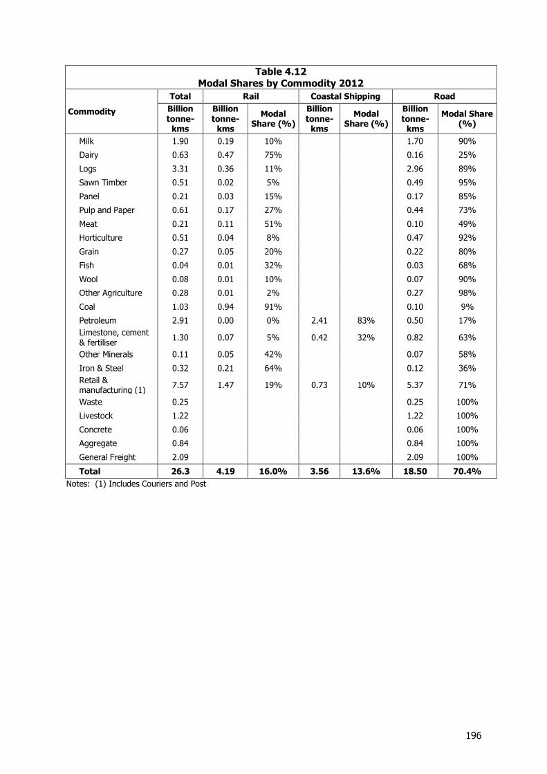
196
Table 4.12 Modal Shares by Commodity 2012
Commodity
Total Rail Coastal Shipping Road
Billion tonne-
kms
Billion tonne-
kms
Modal Share (%)
Billion tonne-
kms
Modal Share (%)
Billion tonne-
kms
Modal Share (%)
Milk 1.90 0.19 10% 1.70 90%
Dairy 0.63 0.47 75% 0.16 25%
Logs 3.31 0.36 11% 2.96 89%
Sawn Timber 0.51 0.02 5% 0.49 95%
Panel 0.21 0.03 15% 0.17 85%
Pulp and Paper 0.61 0.17 27% 0.44 73%
Meat 0.21 0.11 51% 0.10 49%
Horticulture 0.51 0.04 8% 0.47 92%
Grain 0.27 0.05 20% 0.22 80%
Fish 0.04 0.01 32% 0.03 68%
Wool 0.08 0.01 10% 0.07 90%
Other Agriculture 0.28 0.01 2% 0.27 98%
Coal 1.03 0.94 91% 0.10 9%
Petroleum 2.91 0.00 0% 2.41 83% 0.50 17%
Limestone, cement & fertiliser
1.30 0.07 5% 0.42 32% 0.82 63%
Other Minerals 0.11 0.05 42% 0.07 58%
Iron & Steel 0.32 0.21 64% 0.12 36%
Retail & manufacturing (1)
7.57 1.47 19% 0.73 10% 5.37 71%
Waste 0.25 0.25 100%
Livestock 1.22 1.22 100%
Concrete 0.06 0.06 100%
Aggregate 0.84 0.84 100%
General Freight 2.09 2.09 100%
Total 26.3 4.19 16.0% 3.56 13.6% 18.50 70.4%
Notes: (1) Includes Couriers and Post
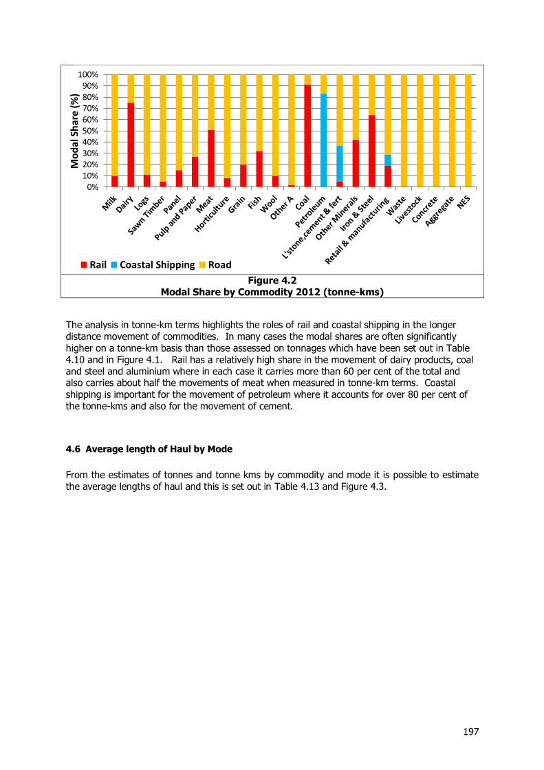
197
Figure 4.2
Modal Share by Commodity 2012 (tonne-kms)
The analysis in tonne-km terms highlights the roles of rail and coastal shipping in the longer distance movement of commodities. In many cases the modal shares are often significantly higher on a tonne-km basis than those assessed on tonnages which have been set out in Table 4.10 and in Figure 4.1. Rail has a relatively high share in the movement of dairy products, coal and steel and aluminium where in each case it carries more than 60 per cent of the total and also carries about half the movements of meat when measured in tonne-km terms. Coastal shipping is important for the movement of petroleum where it accounts for over 80 per cent of the tonne-kms and also for the movement of cement.
4.6 Average length of Haul by Mode
From the estimates of tonnes and tonne kms by commodity and mode it is possible to estimate the average lengths of haul and this is set out in Table 4.13 and Figure 4.3.
0%10%20%30%40%50%60%70%80%90%
100%M
od
al S
har
e (%
)
Rail Coastal Shipping Road

198
Table 4.13 Estimated Average Length of Haul by Mode and Commodity 2012 (kms)
Commodity Group All Modes Rail Coastal Shipping Road
Milk 90 237 84 Dairy 116 180 57 Logs 113 124 111 Sawn Timber 131 418 127 Panel 152 184 147 Pulp and Paper 221 146 272 Meat 183 259 138 Horticulture 96 369 90 Grain 154 669 132 Fish 54 239 41 Wool 351 246 350 Other A 113 291 111 Coal 205 309 47 Petroleum 358 966 90 L'stone ,cement & fert 120 246 380 85 Other Minerals 177 495 108 Iron & Steel 95 437 39 Retail & manufacturing 195 362 1040 162 Waste 33 33 Livestock 143 143 Concrete 8 8 Aggregate 31 31 General Freight 47 47
All Commodities 111 260 828 86
Figure 4.3
Estimated Average Length of Haul by Mode and Commodity 2012 (kms)
Overall the average length of haul in 2012 by all modes was estimated at 111 kms but with significant differences by mode:-
0
200
400
600
800
1000
1200
Ave
rage
Le
ngt
h o
f Hau
l (km
s)
Road All Modes Rail Coastal Shipping
199
The average distance for goods transported by road are somewhat below the average with an average of 86 kms reflecting the relatively high share of shorter distance movements in the urban areas and within regions generally for which road is the dominant mode.
The average distance for rail is 260 kms reflecting the advantages this mode has for longer distance movements where the relatively low costs of trunk haulage give it an advantage over road
The average distance for coastal shipping is over 800 kms reflecting the nationwide distribution of petroleum and cement from locations in the extreme north and west of the country and the longer distance movement of manufactured products, primarily between Auckland and Christchurch.
There are also very substantial differences in the distances transported for the individual commodities ranging from an average of less than 10 kms for the movement of concrete and just over 30 kms for the movement of aggregate and waste, both low value products, to over 350 kms for the movement of petroleum, reflecting the main source of supply at the refinery at Marsden Point in Northland, which serves the whole country.
4.7 Movements Associated with International Trade
International trade plays a very important part in the New Zealand economy and role of the freight sector in supporting this particularly in relation to the movement of exports is set out in Table 4.14. This considers freight movements in four main categories:-
Direct exports - the movements of goods to the ports before being transported overseas
Other movements associated with the commodities ultimately being exported. This would for example include the movement of liquid milk to dairy plants for manufacture into products which were ultimately exported and also intermediate movements along the supply chain for commodities bound for export.
Imported products moved from the port of entry to their first domestic destination. The data available does not allow the comprehensive assessment of the subsequent movement of these imports.
Goods moved wholly in New Zealand not directly connected with exports.
The commodity categories for which the shares have been defined are based on the details of the commodities themselves and may not therefore always align exactly with the broad 2 digit definitions developed by Statistics NZ for foreign trade data It should be noted that the estimates of imports and exports exclude freight moved by pipeline. These excluded movements would for example include direct exports of methanol, other petroleum products and ironsand which are delivered directly by pipeline. The figures in Table 4.14 similarly exclude imports of crude petroleum to the refinery at Marsden Point again moved by pipeline. In addition although we have identified in Table 4.13 the volumes of waste products exported, it should be noted that these would in practice be recorded under other commodity definitions and these are therefore excluded from the overall export totals.
200
These figures are based on a number of assumptions and should be regarded as indicative rather than providing precise estimates. They do however give an indication of the importance of international trade movements in overall freight flows in New Zealand. It should also be noted that the figures only consider commodities which are ultimately exported or the first leg of import movements. As a consequence the movements of commodities which ultimately support exports such as the coal used in dairy factories which are producing goods for export are treated as domestic flows. The figures therefore represent a minimum assessment of the importance of international trade in freight movements. In addition the movement of livestock reflects flows associated with the dairy industry, the meat industry and the wool industry. Because dairy cows and sheep bred for wool will eventually be slaughtered it is difficult to identify reliably the exact linkages to the dairy, meat and wool industries and we have therefore not broken down livestock movements into these individual components. Suffice it to say however there are substantial movements of livestock associated with the dairy industry of which a high proportion would be export related.
Table 4.14 Freight Traffic Associated with Exports, Imports and Domestic Trade 2012
(million tonnes)
Commodity Group Total Total Export
Related Flows Direct
Exports Other Export Related Flows
Domestic Flows
Imports
Milk and dairy 26.4 23.8 2.8 21.0 2.6 0.0 Wood 37.3 24.9 17.6 7.4 11.7 0.6 Livestock 8.5 7.5 0.0 7.5 1.0 0.0 Meat and wool 1.4 1.1 1.1 0.0 0.2 0.0 Other ag and fish 10.2 3.3 2.3 1.1 4.1 2.7 Petroleum and coal 13.2 2.2 2.2 0.0 9.5 1.5 Building materials 45.4 0.3 0.3 0.0 42.9 2.5 Steel and aluminium 3.4 1.6 1.5 0.1 1.5 0.3 Manufactured and retail 38.5 2.3 2.3 0.0 30.4 5.8 Waste 7.4 0.4 0.3 0.0 7.0 0.0 General Freight 44.4 0.0 0.0 0.0 44.4 0.0
Total 236.0 67.1(1) 30.1 (1) 37.0 155.4 13.5
Per cent of total 100% 28% 13% 16% 66% 6%
Notes: (1) As noted above this total has been adjusted to avoid double counting of exports of waste material (2) Percentages have been rounded
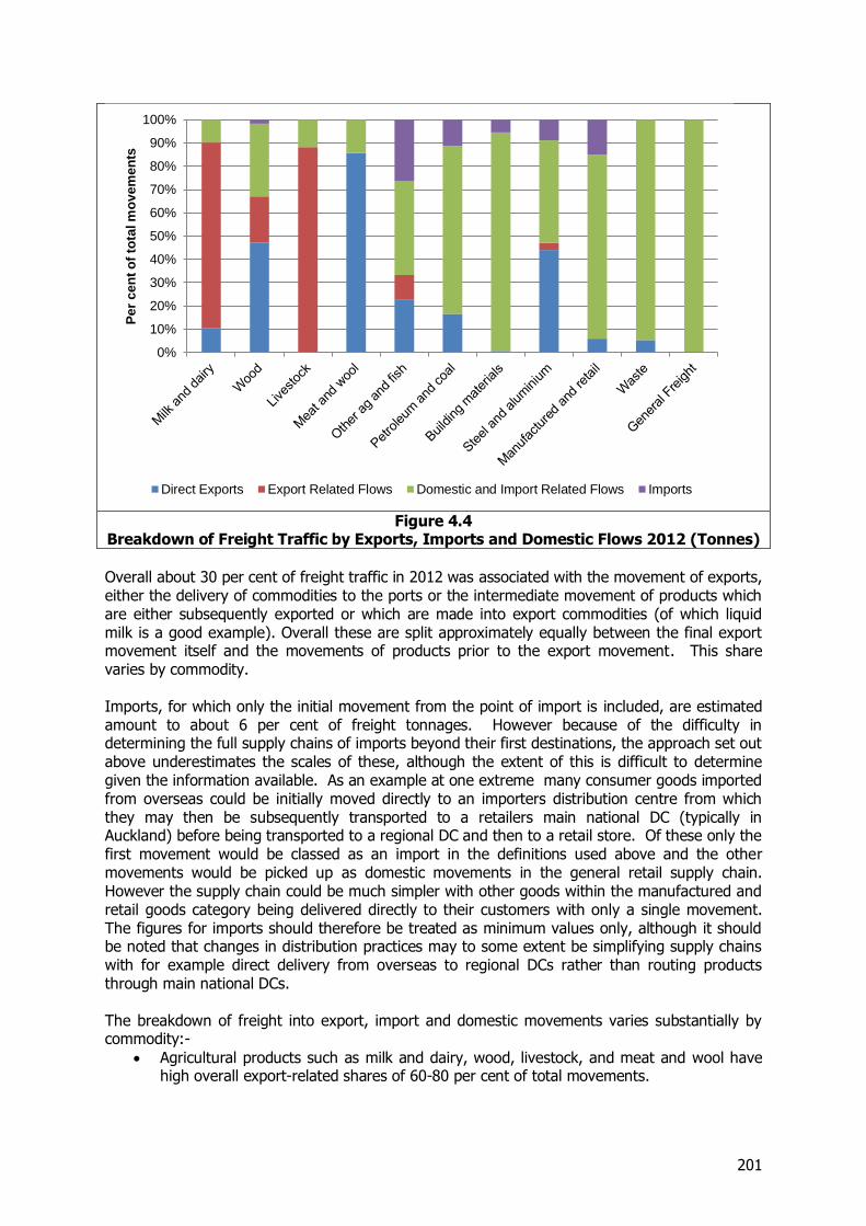
201
Figure 4.4
Breakdown of Freight Traffic by Exports, Imports and Domestic Flows 2012 (Tonnes)
Overall about 30 per cent of freight traffic in 2012 was associated with the movement of exports, either the delivery of commodities to the ports or the intermediate movement of products which are either subsequently exported or which are made into export commodities (of which liquid milk is a good example). Overall these are split approximately equally between the final export movement itself and the movements of products prior to the export movement. This share varies by commodity. Imports, for which only the initial movement from the point of import is included, are estimated amount to about 6 per cent of freight tonnages. However because of the difficulty in determining the full supply chains of imports beyond their first destinations, the approach set out above underestimates the scales of these, although the extent of this is difficult to determine given the information available. As an example at one extreme many consumer goods imported from overseas could be initially moved directly to an importers distribution centre from which they may then be subsequently transported to a retailers main national DC (typically in Auckland) before being transported to a regional DC and then to a retail store. Of these only the first movement would be classed as an import in the definitions used above and the other movements would be picked up as domestic movements in the general retail supply chain. However the supply chain could be much simpler with other goods within the manufactured and retail goods category being delivered directly to their customers with only a single movement. The figures for imports should therefore be treated as minimum values only, although it should be noted that changes in distribution practices may to some extent be simplifying supply chains with for example direct delivery from overseas to regional DCs rather than routing products through main national DCs. The breakdown of freight into export, import and domestic movements varies substantially by commodity:-
Agricultural products such as milk and dairy, wood, livestock, and meat and wool have high overall export-related shares of 60-80 per cent of total movements.
0%
10%
20%
30%
40%
50%
60%
70%
80%
90%
100%P
er
cen
t o
f to
tal m
ovem
en
ts
Direct Exports Export Related Flows Domestic and Import Related Flows Imports
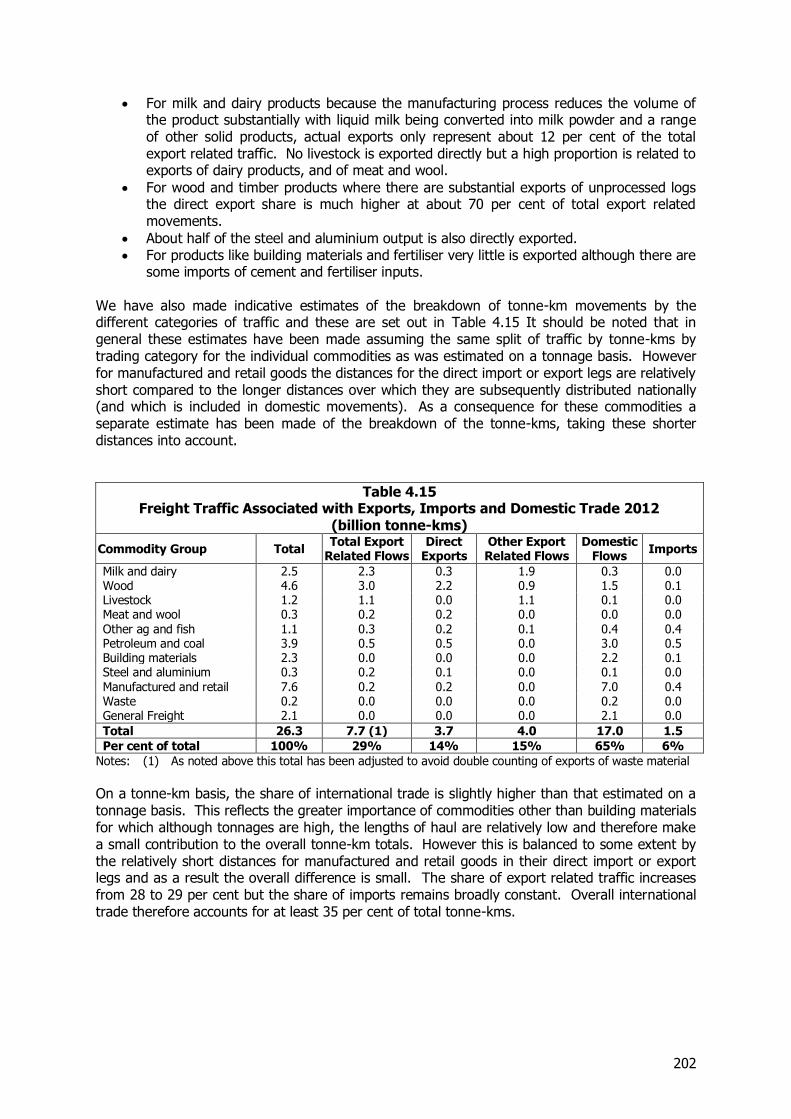
202
For milk and dairy products because the manufacturing process reduces the volume of the product substantially with liquid milk being converted into milk powder and a range of other solid products, actual exports only represent about 12 per cent of the total export related traffic. No livestock is exported directly but a high proportion is related to exports of dairy products, and of meat and wool.
For wood and timber products where there are substantial exports of unprocessed logs the direct export share is much higher at about 70 per cent of total export related movements.
About half of the steel and aluminium output is also directly exported. For products like building materials and fertiliser very little is exported although there are
some imports of cement and fertiliser inputs. We have also made indicative estimates of the breakdown of tonne-km movements by the different categories of traffic and these are set out in Table 4.15 It should be noted that in general these estimates have been made assuming the same split of traffic by tonne-kms by trading category for the individual commodities as was estimated on a tonnage basis. However for manufactured and retail goods the distances for the direct import or export legs are relatively short compared to the longer distances over which they are subsequently distributed nationally (and which is included in domestic movements). As a consequence for these commodities a separate estimate has been made of the breakdown of the tonne-kms, taking these shorter distances into account.
Table 4.15 Freight Traffic Associated with Exports, Imports and Domestic Trade 2012
(billion tonne-kms)
Commodity Group Total Total Export
Related Flows Direct
Exports Other Export Related Flows
Domestic Flows
Imports
Milk and dairy 2.5 2.3 0.3 1.9 0.3 0.0 Wood 4.6 3.0 2.2 0.9 1.5 0.1 Livestock 1.2 1.1 0.0 1.1 0.1 0.0 Meat and wool 0.3 0.2 0.2 0.0 0.0 0.0 Other ag and fish 1.1 0.3 0.2 0.1 0.4 0.4 Petroleum and coal 3.9 0.5 0.5 0.0 3.0 0.5 Building materials 2.3 0.0 0.0 0.0 2.2 0.1 Steel and aluminium 0.3 0.2 0.1 0.0 0.1 0.0 Manufactured and retail 7.6 0.2 0.2 0.0 7.0 0.4 Waste 0.2 0.0 0.0 0.0 0.2 0.0 General Freight 2.1 0.0 0.0 0.0 2.1 0.0
Total 26.3 7.7 (1) 3.7 4.0 17.0 1.5
Per cent of total 100% 29% 14% 15% 65% 6%
Notes: (1) As noted above this total has been adjusted to avoid double counting of exports of waste material
On a tonne-km basis, the share of international trade is slightly higher than that estimated on a tonnage basis. This reflects the greater importance of commodities other than building materials for which although tonnages are high, the lengths of haul are relatively low and therefore make a small contribution to the overall tonne-km totals. However this is balanced to some extent by the relatively short distances for manufactured and retail goods in their direct import or export legs and as a result the overall difference is small. The share of export related traffic increases from 28 to 29 per cent but the share of imports remains broadly constant. Overall international trade therefore accounts for at least 35 per cent of total tonne-kms.
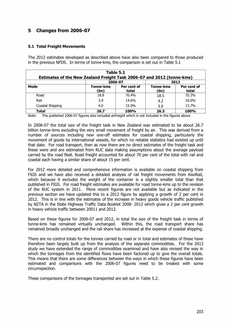
203
5 Changes from 2006-07
5.1 Total Freight Movements
The 2012 estimates developed as described above have also been compared to those produced in the previous NFDS. In terms of tonne-kms, the comparison is set out in Table 5.1
Table 5.1 Estimates of the New Zealand Freight Task 2006-07 and 2012 (tonne-kms)
2006-07 2012
Mode Tonne-kms (bn)
Per cent of total
Tonne-kms (bn)
Per cent of total
Road 18.8 70.4% 18.5 70.3%
Rail 3.9 14.6% 4.2 16.0%
Coastal Shipping 4.0 15.0% 3.6 13.7%
Total 26.7 100% 26.3 100%
Note: The published 2006-07 figures also included airfreight which is not included in the figures above
In 2006-07 the total size of the freight task in New Zealand was estimated to be about 26.7 billion tonne–kms excluding the very small movement of freight by air. This was derived from a number of sources including new one-off estimates for coastal shipping, particularly the movement of goods by international vessels, for which no reliable statistics had existed up until that date. For road transport, then as now there are no direct estimates of the freight task and these were and are estimated from RUC data making assumptions about the average payload carried by the road fleet. Road freight accounted for about 70 per cent of the total with rail and coastal each having a similar share of about 15 per cent. For 2012 more detailed and comprehensive information is available on coastal shipping from FIGS and we have also received a detailed analysis of rail freight movements from KiwiRail, which because it excludes the weight of the container is a slightly smaller total than that published in FIGS. For road freight estimates are available for road tonne-kms up to the revision of the RUC system in 2011. More recent figures are not available but as indicated in the previous section we have updated this to a 2012 figure by applying a growth of 2 per cent in 2012. This is in line with the estimates of the increase in heavy goods vehicle traffic published by NZTA in the State Highway Traffic Data Booklet 2008- 2012 which gives a 2 per cent growth in heavy vehicle traffic between 20011 and 2012. Based on these figures for 2006-07 and 2012, in total the size of the freight task in terms of tonne-kms has remained virtually unchanged. Within this, the road transport share has remained broadly unchanged and the rail share has increased at the expense of coastal shipping. There are no control totals for the tonnes carried by road or in total and estimates of these have therefore been largely built up from the analysis of the separate commodities. For the 2013 study we have extended the range of commodities examined and have also revised the way in which the tonnages from the identified flows have been factored up to give the overall totals. This means that there are some differences between the ways in which these figures have been estimated and comparisons with the 2006-07 figures need to be treated with some circumspection. These comparisons of the tonnages transported are set out in Table 5.2.
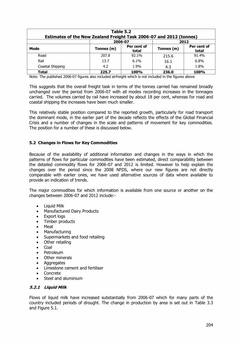
204
Table 5.2 Estimates of the New Zealand Freight Task 2006-07 and 2012 (tonnes)
2006-07 2012
Mode Tonnes (m) Per cent of
total Tonnes (m)
Per cent of total
Road 207.8 92.1% 215.6 91.4%
Rail 13.7 6.1% 16.1 6.8%
Coastal Shipping 4.2 1.9% 4.3 1.8%
Total 225.7 100% 236.0 100%
Note: The published 2006-07 figures also included airfreight which is not included in the figures above
This suggests that the overall freight task in terms of the tonnes carried has remained broadly unchanged over the period from 2006-07 with all modes recording increases in the tonnages carried. The volumes carried by rail have increased by about 18 per cent, whereas for road and coastal shipping the increases have been much smaller. This relatively stable position compared to the reported growth, particularly for road transport the dominant mode, in the earlier part of the decade reflects the effects of the Global Financial Crisis and a number of changes in the scale and patterns of movement for key commodities. The position for a number of these is discussed below.
5.2 Changes in Flows for Key Commodities
Because of the availability of additional information and changes in the ways in which the patterns of flows for particular commodities have been estimated, direct comparability between the detailed commodity flows for 2006-07 and 2012 is limited. However to help explain the changes over the period since the 2008 NFDS, where our new figures are not directly comparable with earlier ones, we have used alternative sources of data where available to provide an indication of trends. The major commodities for which information is available from one source or another on the changes between 2006-07 and 2012 include:-
Liquid Milk Manufactured Dairy Products Export logs Timber products Meat Manufacturing Supermarkets and food retailing Other retailing Coal Petroleum Other minerals Aggregates Limestone cement and fertiliser Concrete Steel and aluminium
5.2.1 Liquid Milk Flows of liquid milk have increased substantially from 2006-07 which for many parts of the country included periods of drought. The change in production by area is set out in Table 3.3 and Figure 5.1.
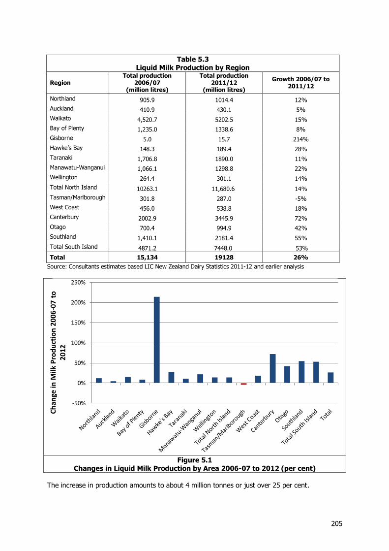
205
Table 5.3 Liquid Milk Production by Region
Region Total production
2006/07 (million litres)
Total production 2011/12
(million litres)
Growth 2006/07 to 2011/12
Northland 905.9 1014.4 12%
Auckland 410.9 430.1 5%
Waikato 4,520.7 5202.5 15%
Bay of Plenty 1,235.0 1338.6 8%
Gisborne 5.0 15.7 214%
Hawke’s Bay 148.3 189.4 28%
Taranaki 1,706.8 1890.0 11%
Manawatu-Wanganui 1,066.1 1298.8 22%
Wellington 264.4 301.1 14%
Total North Island 10263.1 11,680.6 14%
Tasman/Marlborough 301.8 287.0 -5%
West Coast 456.0 538.8 18%
Canterbury 2002.9 3445.9 72%
Otago 700.4 994.9 42%
Southland 1,410.1 2181.4 55%
Total South Island 4871.2 7448.0 53%
Total 15,134 19128 26%
Source: Consultants estimates based LIC New Zealand Dairy Statistics 2011-12 and earlier analysis
Figure 5.1
Changes in Liquid Milk Production by Area 2006-07 to 2012 (per cent)
The increase in production amounts to about 4 million tonnes or just over 25 per cent.
-50%
0%
50%
100%
150%
200%
250%
Ch
ange
in M
ilk P
rod
uct
ion
200
6-0
7 to
20
12
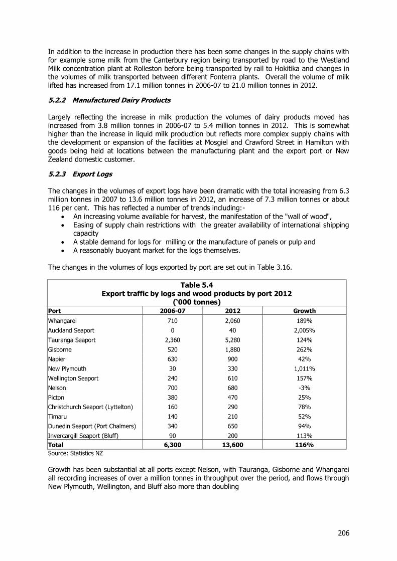
206
In addition to the increase in production there has been some changes in the supply chains with for example some milk from the Canterbury region being transported by road to the Westland Milk concentration plant at Rolleston before being transported by rail to Hokitika and changes in the volumes of milk transported between different Fonterra plants. Overall the volume of milk lifted has increased from 17.1 million tonnes in 2006-07 to 21.0 million tonnes in 2012.
5.2.2 Manufactured Dairy Products Largely reflecting the increase in milk production the volumes of dairy products moved has increased from 3.8 million tonnes in 2006-07 to 5.4 million tonnes in 2012. This is somewhat higher than the increase in liquid milk production but reflects more complex supply chains with the development or expansion of the facilities at Mosgiel and Crawford Street in Hamilton with goods being held at locations between the manufacturing plant and the export port or New Zealand domestic customer.
5.2.3 Export Logs The changes in the volumes of export logs have been dramatic with the total increasing from 6.3 million tonnes in 2007 to 13.6 million tonnes in 2012, an increase of 7.3 million tonnes or about 116 per cent. This has reflected a number of trends including:-
An increasing volume available for harvest, the manifestation of the "wall of wood", Easing of supply chain restrictions with the greater availability of international shipping
capacity
A stable demand for logs for milling or the manufacture of panels or pulp and A reasonably buoyant market for the logs themselves.
The changes in the volumes of logs exported by port are set out in Table 3.16.
Table 5.4 Export traffic by logs and wood products by port 2012
(‘000 tonnes) Port 2006-07 2012 Growth
Whangarei 710 2,060 189%
Auckland Seaport 0 40 2,005%
Tauranga Seaport 2,360 5,280 124%
Gisborne 520 1,880 262%
Napier 630 900 42%
New Plymouth 30 330 1,011%
Wellington Seaport 240 610 157%
Nelson 700 680 -3%
Picton 380 470 25%
Christchurch Seaport (Lyttelton) 160 290 78%
Timaru 140 210 52%
Dunedin Seaport (Port Chalmers) 340 650 94%
Invercargill Seaport (Bluff) 90 200 113%
Total 6,300 13,600 116%
Source: Statistics NZ
Growth has been substantial at all ports except Nelson, with Tauranga, Gisborne and Whangarei all recording increases of over a million tonnes in throughput over the period, and flows through New Plymouth, Wellington, and Bluff also more than doubling
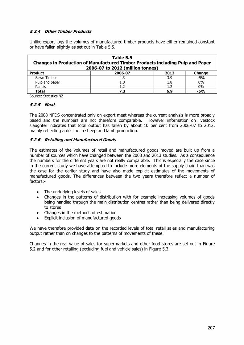
207
5.2.4 Other Timber Products Unlike export logs the volumes of manufactured timber products have either remained constant or have fallen slightly as set out in Table 5.5.
Table 5.5 Changes in Production of Manufactured Timber Products including Pulp and Paper
2006-07 to 2012 (million tonnes) Product 2006-07 2012 Change
Sawn Timber 4.3 3.9 -9% Pulp and paper 1.8 1.8 0% Panels 1.2 1.2 0%
Total 7.3 6.9 -5%
Source: Statistics NZ
5.2.5 Meat The 2008 NFDS concentrated only on export meat whereas the current analysis is more broadly based and the numbers are not therefore comparable. However information on livestock slaughter indicates that total output has fallen by about 10 per cent from 2006-07 to 2012, mainly reflecting a decline in sheep and lamb production.
5.2.6 Retailing and Manufactured Goods The estimates of the volumes of retail and manufactured goods moved are built up from a number of sources which have changed between the 2008 and 2013 studies. As a consequence the numbers for the different years are not really comparable. This is especially the case since in the current study we have attempted to include more elements of the supply chain than was the case for the earlier study and have also made explicit estimates of the movements of manufactured goods. The differences between the two years therefore reflect a number of factors:-
The underlying levels of sales Changes in the patterns of distribution with for example increasing volumes of goods
being handled through the main distribution centres rather than being delivered directly to stores
Changes in the methods of estimation Explicit inclusion of manufactured goods
We have therefore provided data on the recorded levels of total retail sales and manufacturing output rather than on changes to the patterns of movements of these. Changes in the real value of sales for supermarkets and other food stores are set out in Figure 5.2 and for other retailing (excluding fuel and vehicle sales) in Figure 5.3
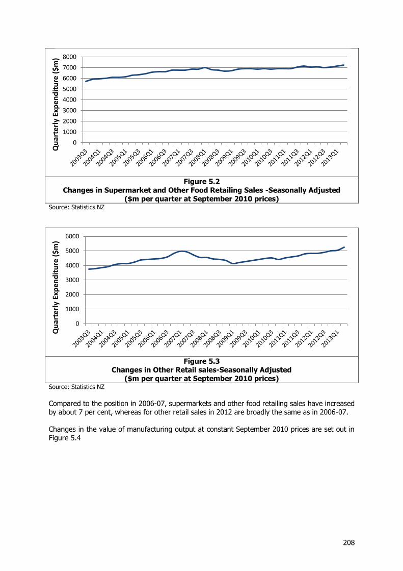
208
Figure 5.2
Changes in Supermarket and Other Food Retailing Sales -Seasonally Adjusted ($m per quarter at September 2010 prices)
Source: Statistics NZ
Figure 5.3
Changes in Other Retail sales-Seasonally Adjusted ($m per quarter at September 2010 prices)
Source: Statistics NZ
Compared to the position in 2006-07, supermarkets and other food retailing sales have increased by about 7 per cent, whereas for other retail sales in 2012 are broadly the same as in 2006-07. Changes in the value of manufacturing output at constant September 2010 prices are set out in Figure 5.4
0
1000
2000
3000
4000
5000
6000
7000
8000Q
uar
terl
y Ex
pen
dit
ure
($m
)
0
1000
2000
3000
4000
5000
6000
Qu
arte
rly
Exp
end
itu
re (
$m)
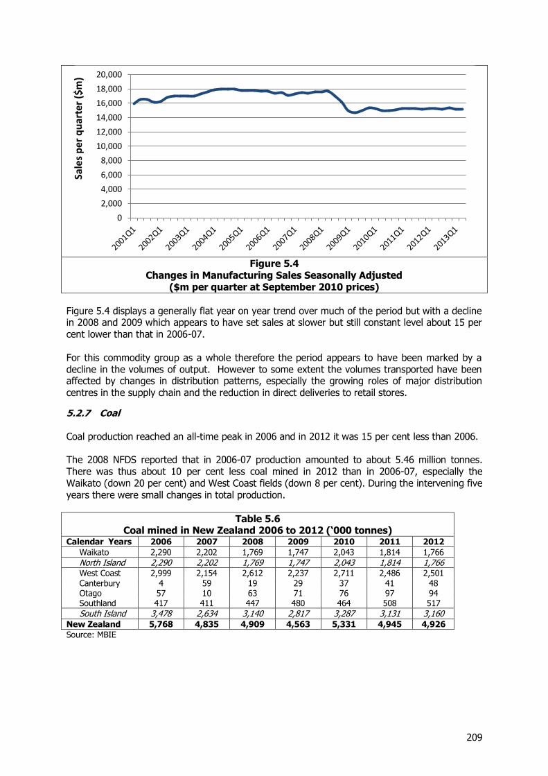
209
Figure 5.4
Changes in Manufacturing Sales Seasonally Adjusted ($m per quarter at September 2010 prices)
Figure 5.4 displays a generally flat year on year trend over much of the period but with a decline in 2008 and 2009 which appears to have set sales at slower but still constant level about 15 per cent lower than that in 2006-07. For this commodity group as a whole therefore the period appears to have been marked by a decline in the volumes of output. However to some extent the volumes transported have been affected by changes in distribution patterns, especially the growing roles of major distribution centres in the supply chain and the reduction in direct deliveries to retail stores.
5.2.7 Coal Coal production reached an all-time peak in 2006 and in 2012 it was 15 per cent less than 2006. The 2008 NFDS reported that in 2006-07 production amounted to about 5.46 million tonnes. There was thus about 10 per cent less coal mined in 2012 than in 2006-07, especially the Waikato (down 20 per cent) and West Coast fields (down 8 per cent). During the intervening five years there were small changes in total production.
Table 5.6 Coal mined in New Zealand 2006 to 2012 (‘000 tonnes)
Calendar Years 2006 2007 2008 2009 2010 2011 2012
Waikato 2,290 2,202 1,769 1,747 2,043 1,814 1,766
North Island 2,290 2,202 1,769 1,747 2,043 1,814 1,766 West Coast 2,999 2,154 2,612 2,237 2,711 2,486 2,501 Canterbury 4 59 19 29 37 41 48 Otago 57 10 63 71 76 97 94 Southland 417 411 447 480 464 508 517
South Island 3,478 2,634 3,140 2,817 3,287 3,131 3,160 New Zealand 5,768 4,835 4,909 4,563 5,331 4,945 4,926
Source: MBIE
0
2,000
4,000
6,000
8,000
10,000
12,000
14,000
16,000
18,000
20,000Sa
les
per
qu
arte
r ($
m)
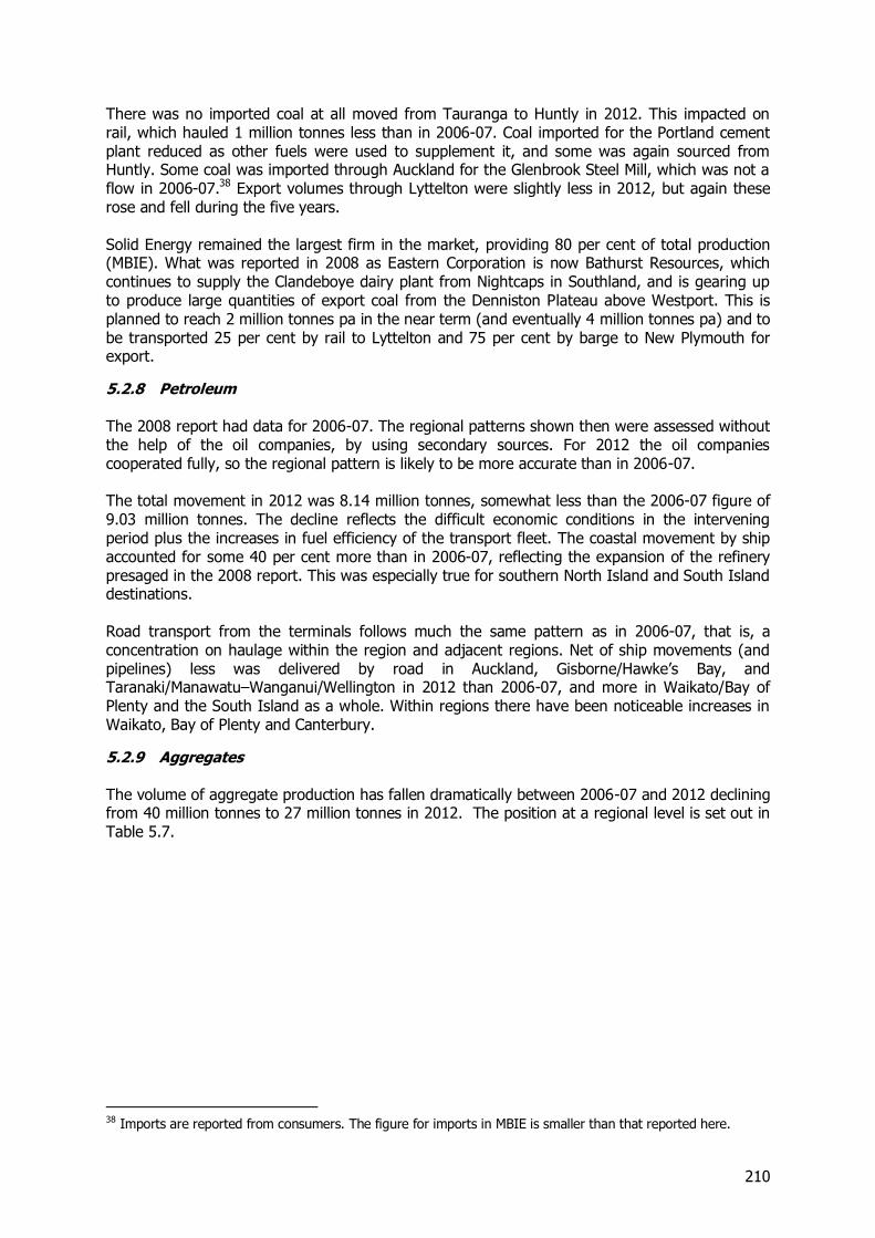
210
There was no imported coal at all moved from Tauranga to Huntly in 2012. This impacted on rail, which hauled 1 million tonnes less than in 2006-07. Coal imported for the Portland cement plant reduced as other fuels were used to supplement it, and some was again sourced from Huntly. Some coal was imported through Auckland for the Glenbrook Steel Mill, which was not a flow in 2006-07.38 Export volumes through Lyttelton were slightly less in 2012, but again these rose and fell during the five years. Solid Energy remained the largest firm in the market, providing 80 per cent of total production (MBIE). What was reported in 2008 as Eastern Corporation is now Bathurst Resources, which continues to supply the Clandeboye dairy plant from Nightcaps in Southland, and is gearing up to produce large quantities of export coal from the Denniston Plateau above Westport. This is planned to reach 2 million tonnes pa in the near term (and eventually 4 million tonnes pa) and to be transported 25 per cent by rail to Lyttelton and 75 per cent by barge to New Plymouth for export.
5.2.8 Petroleum The 2008 report had data for 2006-07. The regional patterns shown then were assessed without the help of the oil companies, by using secondary sources. For 2012 the oil companies cooperated fully, so the regional pattern is likely to be more accurate than in 2006-07. The total movement in 2012 was 8.14 million tonnes, somewhat less than the 2006-07 figure of 9.03 million tonnes. The decline reflects the difficult economic conditions in the intervening period plus the increases in fuel efficiency of the transport fleet. The coastal movement by ship accounted for some 40 per cent more than in 2006-07, reflecting the expansion of the refinery presaged in the 2008 report. This was especially true for southern North Island and South Island destinations. Road transport from the terminals follows much the same pattern as in 2006-07, that is, a concentration on haulage within the region and adjacent regions. Net of ship movements (and pipelines) less was delivered by road in Auckland, Gisborne/Hawke’s Bay, and Taranaki/Manawatu–Wanganui/Wellington in 2012 than 2006-07, and more in Waikato/Bay of Plenty and the South Island as a whole. Within regions there have been noticeable increases in Waikato, Bay of Plenty and Canterbury.
5.2.9 Aggregates The volume of aggregate production has fallen dramatically between 2006-07 and 2012 declining from 40 million tonnes to 27 million tonnes in 2012. The position at a regional level is set out in Table 5.7.
38 Imports are reported from consumers. The figure for imports in MBIE is smaller than that reported here.
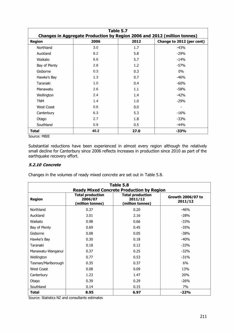
211
Table 5.7 Changes in Aggregate Production by Region 2006 and 2012 (million tonnes)
Region 2006 2012 Change to 2012 (per cent)
Northland 3.0 1.7 -43%
Auckland 8.2 5.8 -29%
Waikato 6.6 5.7 -14%
Bay of Plenty 2.8 1.2 -57%
Gisborne 0.3 0.3 0%
Hawke’s Bay 1.3 0.7 -46%
Taranaki 1.0 0.4 -60%
Manawatu 2.6 1.1 -58%
Wellington 2.4 1.4 -42%
TNM 1.4 1.0 -29%
West Coast 0.6 0.0 -
Canterbury 6.3 5.3 -16%
Otago 2.7 1.8 -33%
Southland 0.9 0.5 -44%
Total 40.2 27.0 -33%
Source: MBIE
Substantial reductions have been experienced in almost every region although the relatively small decline for Canterbury since 2006 reflects increases in production since 2010 as part of the earthquake recovery effort.
5.2.10 Concrete Changes in the volumes of ready mixed concrete are set out in Table 5.8.
Table 5.8 Ready Mixed Concrete Production by Region
Region Total production
2006/07 (million tonnes)
Total production 2011/12
(million tonnes)
Growth 2006/07 to 2011/12
Northland 0.37 0.20 -46%
Auckland 3.01 2.16 -28%
Waikato 0.98 0.66 -33%
Bay of Plenty 0.69 0.45 -35%
Gisborne 0.08 0.05 -38%
Hawke’s Bay 0.30 0.18 -40%
Taranaki 0.18 0.12 -33%
Manawatu-Wanganui 0.37 0.25 -32%
Wellington 0.77 0.53 -31%
Tasman/Marlborough 0.35 0.37 6%
West Coast 0.08 0.09 13%
Canterbury 1.23 1.47 20%
Otago 0.39 0.29 -26%
Southland 0.14 0.15 7%
Total 8.95 6.97 -22%
Source: Statistics NZ and consultants estimates
212
Overall production nationally has fallen by about just over 20 per cent although the declines have been concentrated on the North Island regions and in all of these, concrete production has fallen. By way of contrast for most of the South Island regions there has been some growth especially in Christchurch which as in the case of aggregates discussed above probably reflects the beginning of reconstruction following the earthquakes.
5.2.11 Limestone Cement and Fertiliser The overall total for this group of commodities increased by about 10 per cent between 2006/07 and 2012 with a total volume of 10.9 million tonnes in 2012 compared with 9.9 million tonnes earlier. However within that there are some changes in individual commodities:-
Limestone production has gone down 0.8 million tonnes, about 16 per cent, which is at least partly likely to be a result of information issues.
Cement production decreased by about 0.3 million tonnes, although recorded cement movements increased by 0.35 million tonnes, because of more detail on flows within regions.
Fertiliser movement is up 1.6 million tonnes again through better information on flows within regions. Nitrogenous fertiliser spread has increased although superphosphate has gone down. Imports have risen by 6 per cent.
5.2.12 Steel and Aluminium Steel volumes are about 20 per cent higher than in 2008. Both the New Zealand Steel and Pacific Steel plants have increased output, which accounts for about half the increase. The other half is the new movement of ironsand for export via Auckland. Aluminium has risen substantially, mainly reflecting the more detailed recording of the movements of imports and exports to and from the Tiwai Point wharf.
5.2.13 Overall Position The changes between 2006-07 and 2012 reflect a number of different components, with the key agricultural products of milk and dairy products and logs and timber products growing sharply, retailing and manufacturing, meat and fuels remaining constant or declining slightly and volumes of building materials falling sharply. As indicated at the beginning of this section the overall effect is to leave the freight task broadly unchanged.
5.3 Changes in Rail Flows
5.3.1 Introduction In addition to considering changes in commodity flows between 2006-07 and 2012, we have also examined the changes in the patterns of rail flows especially since these have increased significantly. In 2006-07, excluding the weight of containers, rail hauled 13.7 million net tonnes of freight, and generated 3.9 billion net tonne kilometres39. The average length of haul was 283km. Rail had a 6 per cent market share of tonnes, and 15 per cent of tonne-kms, reflecting its advantages in hauling commodities over longer distances. In 2012, rail hauled 16.1m net tonnes of freight, an increase of 17 per cent, and generated 4.2 billion tonne-kms (up 8 per cent). The average haul was 261km.
39 It should be noted that these figures are slightly different to those published in FIGS which include the weight of containers.
213
As rail has grown, its market share has increased slightly, to 7 per cent of tonnes and 16 per cent of tonne-kms. On the basis of the figures in Table 5.1 and Table 5.2 these gains appear to be from both road transport and coastal shipping in terms of tonne-kms but all three modes have increased slightly in terms of tonnes. The 8 per cent reduction of average haul suggests that the shorter hauls have become relatively more important for rail than the longer. This is in part due to the changing commodity mix on rail and in part to reductions in haul lengths for specific commodities.
5.3.2 Changes by Route The growth on rail is not even across all routes. The main growth in tonnes has occurred on the following routes. Again these figures reflect different rates of growth for different commodities. Tonnage growth in excess of 0.25 million tonnes has occurred on the following routes:
Auckland to Bay of Plenty (613,000 tonnes) - Metroport, also impacted by the POAL40 strike
Waikato to Bay of Plenty (693,000 tonnes) - Exports of dairy products and logs Within the Bay of Plenty (992,000 tonnes) - Logs Within Canterbury (295,000 tonnes) - Export of dairy product, and centralisation on
Lyttelton On the other hand, some routes declined in volume. Those with reductions of more than 250,000 tonnes include:-
Waikato to Auckland (a decline of 297,000 tonnes) - Dairy products, probably an artefact of the POAL strike, impacting on Fonterra’s export port choice.
Bay of Plenty to Waikato (852,000 tonnes) - No imported coal for Genesis Huntly moved in 2012
Within Taranaki (270,000 tonnes) - Substitution of Napier and northern ports for New Plymouth for dairy exports
5.3.3 General Trends Some general trends can be seen at work:
The overall importance of dairying and forestry to the rail system.
The significant changes in the way Fonterra handles exports. Its focus on fewer and different ports and development of major distribution centres in Hamilton and Mosgiel have created additional work for rail.
The major increase in export log movement. This is not only due to the overall increase
in log exports, but also to the fact that KiwiRail has more capacity to haul the logs.
The growth of Metroport.
Some increase in distribution traffic south along the main trunk. KiwiRail has invested in new large containers for this traffic, improved services and reliability of timekeeping, and leased land at major terminals for freight forwarders to build depots.
40 POAL – Ports of Auckland
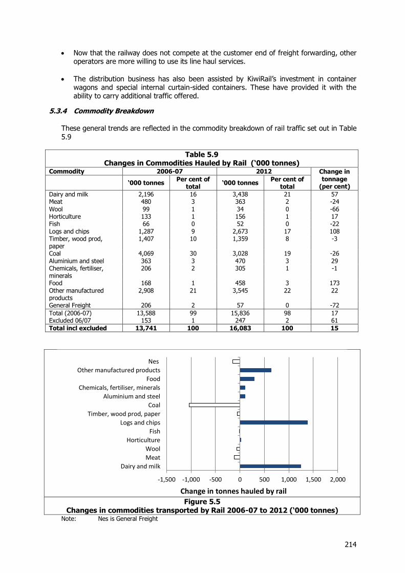
214
Now that the railway does not compete at the customer end of freight forwarding, other operators are more willing to use its line haul services.
The distribution business has also been assisted by KiwiRail’s investment in container wagons and special internal curtain-sided containers. These have provided it with the ability to carry additional traffic offered.
5.3.4 Commodity Breakdown These general trends are reflected in the commodity breakdown of rail traffic set out in Table 5.9
Table 5.9 Changes in Commodities Hauled by Rail (‘000 tonnes)
Commodity 2006-07 2012 Change in tonnage
(per cent)
‘000 tonnes Per cent of
total ‘000 tonnes
Per cent of total
Dairy and milk 2,196 16 3,438 21 57 Meat 480 3 363 2 -24 Wool 99 1 34 0 -66 Horticulture 133 1 156 1 17 Fish 66 0 52 0 -22 Logs and chips 1,287 9 2,673 17 108 Timber, wood prod, paper
1,407 10 1,359 8 -3
Coal 4,069 30 3,028 19 -26 Aluminium and steel 363 3 470 3 29 Chemicals, fertiliser, minerals
206 2 305 1 -1
Food 168 1 458 3 173 Other manufactured products
2,908 21 3,545 22 22
General Freight 206 2 57 0 -72
Total (2006-07) 13,588 99 15,836 98 17 Excluded 06/07 153 1 247 2 61
Total incl excluded 13,741 100 16,083 100 15
Figure 5.5
Changes in commodities transported by Rail 2006-07 to 2012 (‘000 tonnes) Note: Nes is General Freight
-1,500 -1,000 -500 0 500 1,000 1,500 2,000
Dairy and milk
Meat
Wool
Horticulture
Fish
Logs and chips
Timber, wood prod, paper
Coal
Aluminium and steel
Chemicals, fertiliser, minerals
Food
Other manufactured products
Nes
Change in tonnes hauled by rail
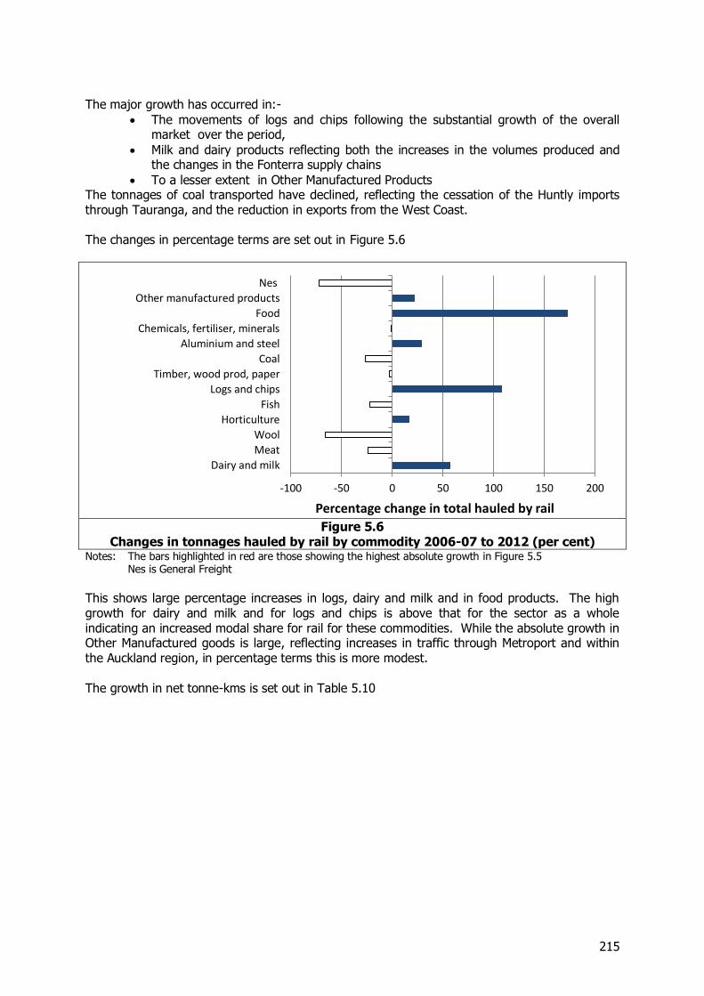
215
The major growth has occurred in:-
The movements of logs and chips following the substantial growth of the overall market over the period,
Milk and dairy products reflecting both the increases in the volumes produced and the changes in the Fonterra supply chains
To a lesser extent in Other Manufactured Products The tonnages of coal transported have declined, reflecting the cessation of the Huntly imports through Tauranga, and the reduction in exports from the West Coast. The changes in percentage terms are set out in Figure 5.6
Figure 5.6
Changes in tonnages hauled by rail by commodity 2006-07 to 2012 (per cent) Notes: The bars highlighted in red are those showing the highest absolute growth in Figure 5.5 Nes is General Freight
This shows large percentage increases in logs, dairy and milk and in food products. The high growth for dairy and milk and for logs and chips is above that for the sector as a whole indicating an increased modal share for rail for these commodities. While the absolute growth in Other Manufactured goods is large, reflecting increases in traffic through Metroport and within the Auckland region, in percentage terms this is more modest. The growth in net tonne-kms is set out in Table 5.10
-100 -50 0 50 100 150 200
Dairy and milk
Meat
Wool
Horticulture
Fish
Logs and chips
Timber, wood prod, paper
Coal
Aluminium and steel
Chemicals, fertiliser, minerals
Food
Other manufactured products
Nes
Percentage change in total hauled by rail
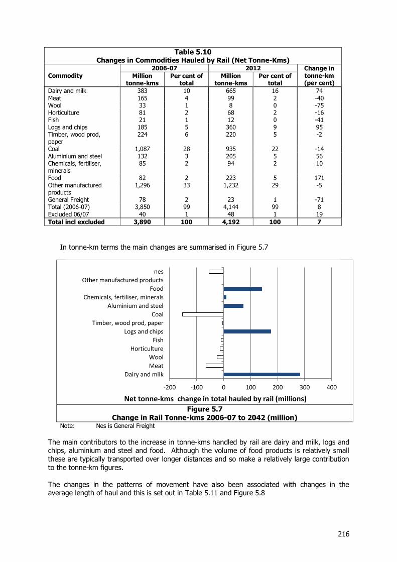
216
Table 5.10 Changes in Commodities Hauled by Rail (Net Tonne-Kms)
Commodity
2006-07 2012 Change in tonne-km (per cent)
Million tonne-kms
Per cent of total
Million tonne-kms
Per cent of total
Dairy and milk 383 10 665 16 74 Meat 165 4 99 2 -40 Wool 33 1 8 0 -75 Horticulture 81 2 68 2 -16 Fish 21 1 12 0 -41 Logs and chips 185 5 360 9 95 Timber, wood prod, paper
224 6 220 5 -2
Coal 1,087 28 935 22 -14 Aluminium and steel 132 3 205 5 56 Chemicals, fertiliser, minerals
85 2 94 2 10
Food 82 2 223 5 171 Other manufactured products
1,296 33 1,232 29 -5
General Freight 78 2 23 1 -71 Total (2006-07) 3,850 99 4,144 99 8 Excluded 06/07 40 1 48 1 19
Total incl excluded 3,890 100 4,192 100 7
In tonne-km terms the main changes are summarised in Figure 5.7
Figure 5.7
Change in Rail Tonne-kms 2006-07 to 2042 (million) Note: Nes is General Freight
The main contributors to the increase in tonne-kms handled by rail are dairy and milk, logs and chips, aluminium and steel and food. Although the volume of food products is relatively small these are typically transported over longer distances and so make a relatively large contribution to the tonne-km figures. The changes in the patterns of movement have also been associated with changes in the average length of haul and this is set out in Table 5.11 and Figure 5.8
-200 -100 0 100 200 300 400
Dairy and milk
Meat
Wool
Horticulture
Fish
Logs and chips
Timber, wood prod, paper
Coal
Aluminium and steel
Chemicals, fertiliser, minerals
Food
Other manufactured products
nes
Net tonne-kms change in total hauled by rail (millions)
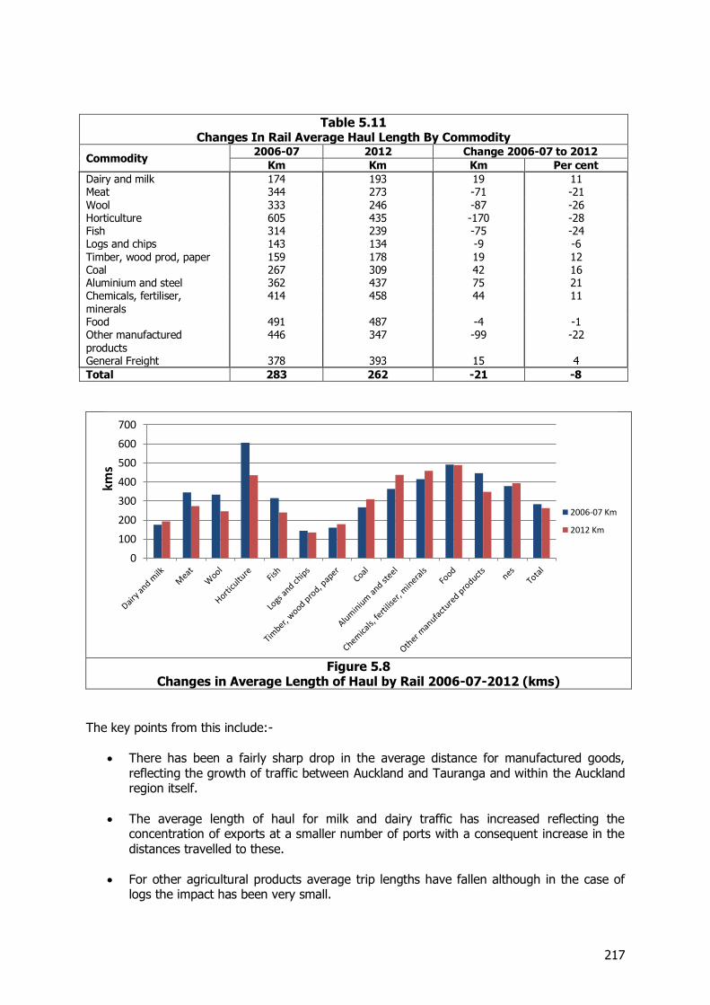
217
Table 5.11 Changes In Rail Average Haul Length By Commodity
Commodity 2006-07 2012 Change 2006-07 to 2012
Km Km Km Per cent
Dairy and milk 174 193 19 11 Meat 344 273 -71 -21 Wool 333 246 -87 -26 Horticulture 605 435 -170 -28 Fish 314 239 -75 -24 Logs and chips 143 134 -9 -6 Timber, wood prod, paper 159 178 19 12 Coal 267 309 42 16 Aluminium and steel 362 437 75 21 Chemicals, fertiliser, minerals
414 458 44 11
Food 491 487 -4 -1 Other manufactured products
446 347 -99 -22
General Freight 378 393 15 4
Total 283 262 -21 -8
Figure 5.8
Changes in Average Length of Haul by Rail 2006-07-2012 (kms)
The key points from this include:-
There has been a fairly sharp drop in the average distance for manufactured goods, reflecting the growth of traffic between Auckland and Tauranga and within the Auckland region itself.
The average length of haul for milk and dairy traffic has increased reflecting the concentration of exports at a smaller number of ports with a consequent increase in the distances travelled to these.
For other agricultural products average trip lengths have fallen although in the case of
logs the impact has been very small.
0
100
200
300
400
500
600
700
kms
2006-07 Km
2012 Km
218
The lengths of haul for logs and dairy which make up a large part of the increase in traffic are relatively small at 134 and 193 km respectively. The substantial increase in these commodities will therefore have reduced the average length of haul for all commodities.
Overall for rail, volumes have increased mainly as the result of increased movements of primary products for which national production has risen sharply. However the average distances transported have become less.
5.3.5 Use of the Rail Network Overall the rail system is much busier than in 2006-07, especially in the Auckland – Waikato – Tauranga “golden triangle”.
Traffic to, from, and through the Auckland, Waikato, and Bay of Plenty regions totalled 7.6 million tonnes in 2006-07, 55 per cent of the total traffic on the system. In 2012 this traffic had increased to 9.2 million tonnes, or 57 per cent of the larger total. It has grown by 21 per cent, much faster than the average 17 per cent for the system as a whole.
Traffic within the Bay of Plenty, essentially logs and wood products from East of Tauranga to the port, grew by 992,000t or 73 per cent.
Traffic on the Hamilton- Tauranga line (through the Kaimai tunnel) grew by 16 per cent, from 3.5 to 4 million tonnes, and 25 per cent of the total system traffic travelled on it in each of the years.
Other growth areas included:
In 2006-07, traffic to, from, or through Canterbury amounted to 4.6 million tonnes, or 33 per cent of the system total. The tonnage remained at 4.6 million tonnes in 2012, but it had fallen to 28 per cent of the national total.
The central NIMT (between Te Kuiti and Taumarunui) grew by 6 per cent to 2012, but the increase was small in tonnage terms and the total for each year remains at about 1.4 million tonnes. Because of its limited growth, its share of the national total dropped from 10 to 9 per cent. Train loads on this route are limited because of gradients, but they have recently been increased to 1700t gross.
The Hawke’s Bay line grew significantly, as a result of the transfer of Fonterra traffic to
Napier. It grew over 40 per cent, but still only carried 639,000t in 2012. Since 2012 a further 200,000t has been added to this line as the traffic from Winstone Pulp International at Karioi and Tangiwai has transferred to Napier port from Wellington.
The network has reduced since 2006-07 by the closure of the Stratford – Okahukura line, which provided a direct connection from Taranaki to Auckland. The traffic that might have used this route, to and from Waikato and north and east of there, totalled 119,000 tonnes in 2006-07. Not all this traffic did use this route, as even with the line in place, some traffic still ran via Palmerston North. Now all traffic uses the latter route. This has not impeded growth at all, as the Taranaki-north segment of traffic totalled 251,000t in 2012. In 2008 the route south from Hawera was opened to hi-cube containers, by the removal of a restrictive tunnel, enabling movement of all Fonterra’s traffic that way. Part of the change in traffic to the north is also due to the cessation of using New Plymouth port for Fonterra’s traffic.
219
The diversion of the output of the Whareroa (Hawera) and other plants from New Plymouth and from the Stratford – Okahukura line, coupled with the bulk milk traffic (itself increased), put some pressure on the capacity of the route west of Marton. This has been dealt with by building an additional crossing loop near Hawera, and by the enhancement of the signalling system between Marton and Wanganui, which is now centralised traffic control, which allows faster movement of trains through this section than the previous track warrant control system. During 2012 the Napier-Gisborne line closed as a result of storm damage. Comparisons between the years are thus not meaningful. However the line carried very little traffic in 2006-07 and its closure has had no impact on the overall position of rail. Another pinch point on the network has been the section between Hamilton and Tauranga. As noted above, traffic has grown substantially through the Kaimai tunnel, despite the cessation of coal movements. Not counted in that growth is the additional traffic from Fonterra’s plants at Lichfield, Waitoa, Morrinsville and Hautapu to Hamilton. This is all taken by rail to Hamilton for consolidation and packing through the Crawford St store, built since 2006-07. From there it is railed to either POAL or POT41. The total traffic on the line was closing on the overall capacity of 2 trains per hour, so works have been carried out to double its capacity. These have consisted of providing additional or lengthened crossing loops, with the last one completed at Apata in March 2013. This doubling of capacity has been achieved at relatively modest cost, of the order of $12m. If further capacity is required, further loops could be constructed or extended. Other incremental capacity improvements have included increasing removing restrictive tunnels in the Manawatu Gorge, raising axle loads on the Hokitika Branch, and as part of improvements aimed at suburban trains, double tracking from McKays to Waikanae, and raising speeds south of Paekakariki.
5.4 Changes for Other Modes
In addition to the detailed analysis undertaken for rail a more aggregated analysis has been undertaken for the changes in the movements by road and coastal shipping. This is set out in Table 5.12 and
41 POT: Port of Tauranga
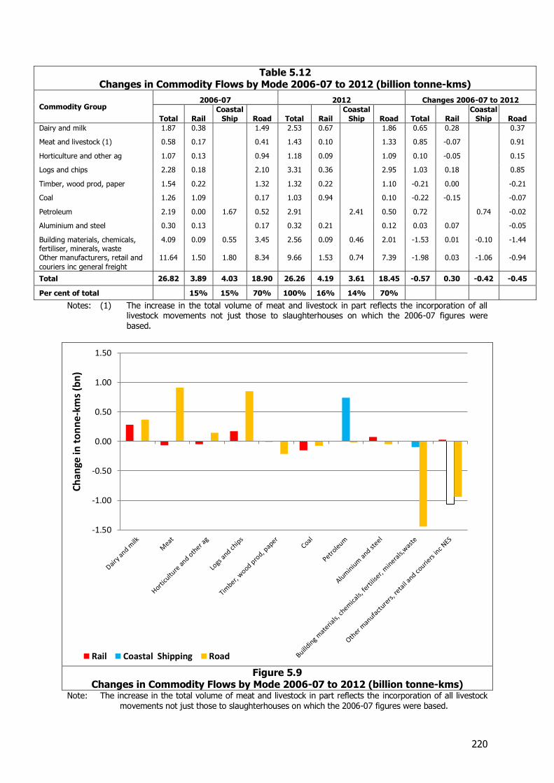
220
Table 5.12 Changes in Commodity Flows by Mode 2006-07 to 2012 (billion tonne-kms)
Commodity Group 2006-07 2012 Changes 2006-07 to 2012
Total Rail
Coastal
Ship Road Total Rail
Coastal
Ship Road Total Rail
Coastal
Ship Road
Dairy and milk 1.87 0.38 1.49 2.53 0.67 1.86 0.65 0.28 0.37
Meat and livestock (1) 0.58 0.17 0.41 1.43 0.10 1.33 0.85 -0.07 0.91
Horticulture and other ag 1.07 0.13 0.94 1.18 0.09 1.09 0.10 -0.05 0.15
Logs and chips 2.28 0.18 2.10 3.31 0.36 2.95 1.03 0.18 0.85
Timber, wood prod, paper 1.54 0.22 1.32 1.32 0.22 1.10 -0.21 0.00 -0.21
Coal 1.26 1.09 0.17 1.03 0.94 0.10 -0.22 -0.15 -0.07
Petroleum 2.19 0.00 1.67 0.52 2.91 2.41 0.50 0.72 0.74 -0.02
Aluminium and steel 0.30 0.13 0.17 0.32 0.21 0.12 0.03 0.07 -0.05
Building materials, chemicals, fertiliser, minerals, waste
4.09 0.09 0.55 3.45 2.56 0.09 0.46 2.01 -1.53 0.01 -0.10 -1.44
Other manufacturers, retail and
couriers inc general freight
11.64 1.50 1.80 8.34 9.66 1.53 0.74 7.39 -1.98 0.03 -1.06 -0.94
Total 26.82 3.89 4.03 18.90 26.26 4.19 3.61 18.45 -0.57 0.30 -0.42 -0.45
Per cent of total 15% 15% 70% 100% 16% 14% 70%
Notes: (1) The increase in the total volume of meat and livestock in part reflects the incorporation of all livestock movements not just those to slaughterhouses on which the 2006-07 figures were based.
Figure 5.9
Changes in Commodity Flows by Mode 2006-07 to 2012 (billion tonne-kms) Note: The increase in the total volume of meat and livestock in part reflects the incorporation of all livestock
movements not just those to slaughterhouses on which the 2006-07 figures were based.
-1.50
-1.00
-0.50
0.00
0.50
1.00
1.50
Ch
ange
in t
on
ne
-km
s (b
n)
Rail Coastal Shipping Road
221
For road the volumes of the main agricultural products has increased over the period from 2006-07 to 2012, but this has been more than matched by decreases in movements of building materials and manufactured and retail goods which have fallen sharply with the reduction in economic activity following the GFC. For coastal shipping there has been a substantial increase in the volumes of petroleum carried, as increased output from the Marsden Point refinery has replaced imported product, but this has been counterbalanced by a reduction in cement and in manufactured and retail goods.
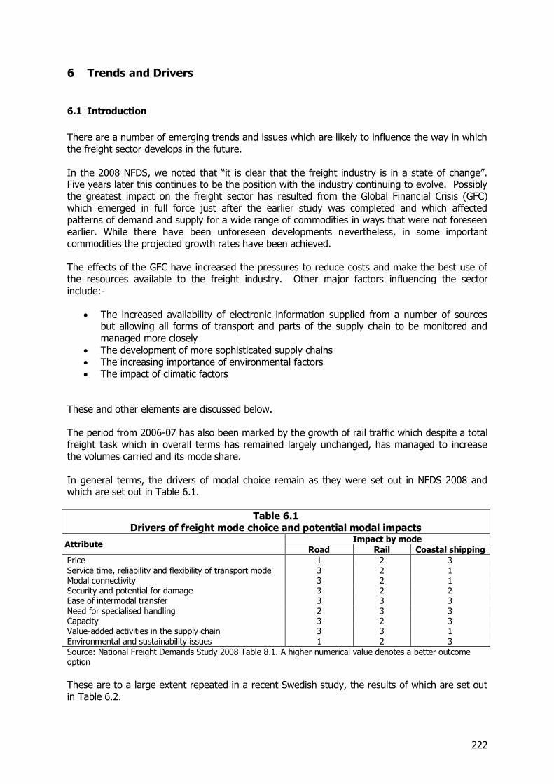
222
6 Trends and Drivers
6.1 Introduction
There are a number of emerging trends and issues which are likely to influence the way in which the freight sector develops in the future. In the 2008 NFDS, we noted that “it is clear that the freight industry is in a state of change”. Five years later this continues to be the position with the industry continuing to evolve. Possibly the greatest impact on the freight sector has resulted from the Global Financial Crisis (GFC) which emerged in full force just after the earlier study was completed and which affected patterns of demand and supply for a wide range of commodities in ways that were not foreseen earlier. While there have been unforeseen developments nevertheless, in some important commodities the projected growth rates have been achieved. The effects of the GFC have increased the pressures to reduce costs and make the best use of the resources available to the freight industry. Other major factors influencing the sector include:-
The increased availability of electronic information supplied from a number of sources but allowing all forms of transport and parts of the supply chain to be monitored and managed more closely
The development of more sophisticated supply chains The increasing importance of environmental factors The impact of climatic factors
These and other elements are discussed below. The period from 2006-07 has also been marked by the growth of rail traffic which despite a total freight task which in overall terms has remained largely unchanged, has managed to increase the volumes carried and its mode share. In general terms, the drivers of modal choice remain as they were set out in NFDS 2008 and which are set out in Table 6.1.
Table 6.1 Drivers of freight mode choice and potential modal impacts
Attribute Impact by mode
Road Rail Coastal shipping
Price 1 2 3 Service time, reliability and flexibility of transport mode 3 2 1 Modal connectivity 3 2 1 Security and potential for damage 3 2 2 Ease of intermodal transfer 3 3 3 Need for specialised handling 2 3 3 Capacity 3 2 3 Value-added activities in the supply chain 3 3 1 Environmental and sustainability issues 1 2 3
Source: National Freight Demands Study 2008 Table 8.1. A higher numerical value denotes a better outcome option
These are to a large extent repeated in a recent Swedish study, the results of which are set out in Table 6.2.
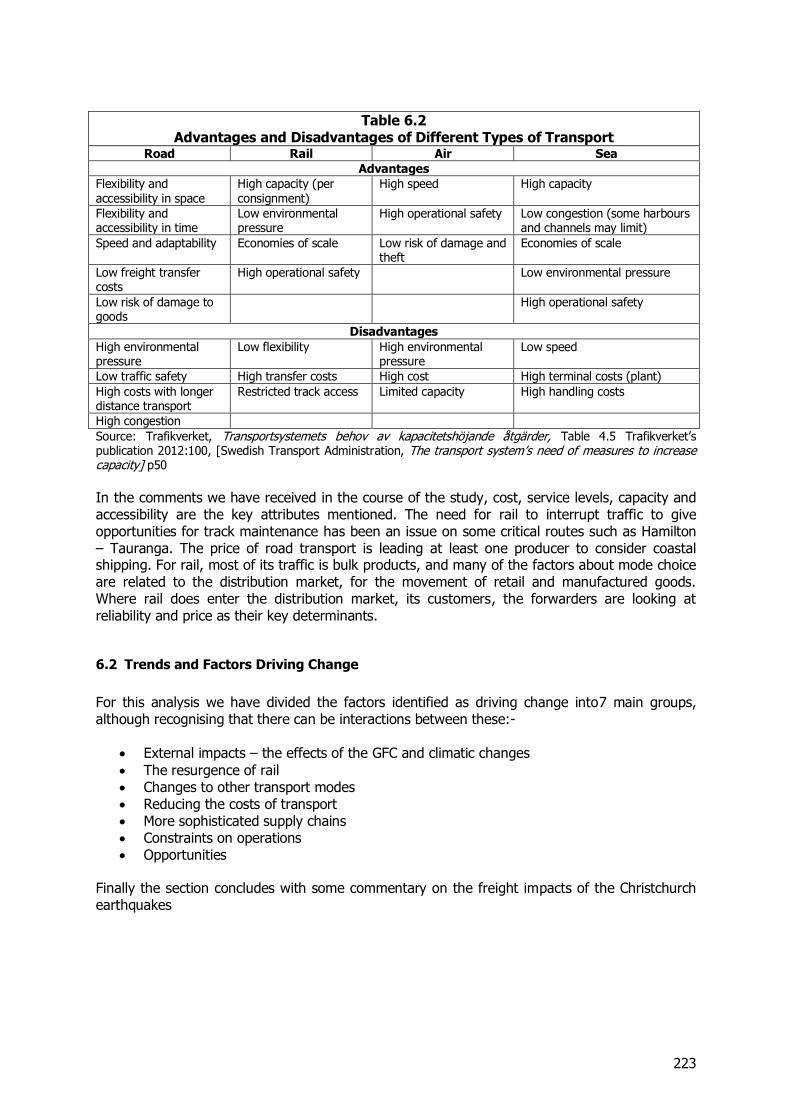
223
Table 6.2 Advantages and Disadvantages of Different Types of Transport
Road Rail Air Sea
Advantages
Flexibility and accessibility in space
High capacity (per consignment)
High speed High capacity
Flexibility and accessibility in time
Low environmental pressure
High operational safety Low congestion (some harbours and channels may limit)
Speed and adaptability Economies of scale Low risk of damage and theft
Economies of scale
Low freight transfer costs
High operational safety Low environmental pressure
Low risk of damage to goods
High operational safety
Disadvantages
High environmental pressure
Low flexibility High environmental pressure
Low speed
Low traffic safety High transfer costs High cost High terminal costs (plant)
High costs with longer distance transport
Restricted track access Limited capacity High handling costs
High congestion
Source: Trafikverket, Transportsystemets behov av kapacitetshöjande åtgärder, Table 4.5 Trafikverket’s publication 2012:100, [Swedish Transport Administration, The transport system’s need of measures to increase capacity] p50
In the comments we have received in the course of the study, cost, service levels, capacity and accessibility are the key attributes mentioned. The need for rail to interrupt traffic to give opportunities for track maintenance has been an issue on some critical routes such as Hamilton – Tauranga. The price of road transport is leading at least one producer to consider coastal shipping. For rail, most of its traffic is bulk products, and many of the factors about mode choice are related to the distribution market, for the movement of retail and manufactured goods. Where rail does enter the distribution market, its customers, the forwarders are looking at reliability and price as their key determinants.
6.2 Trends and Factors Driving Change
For this analysis we have divided the factors identified as driving change into7 main groups, although recognising that there can be interactions between these:-
External impacts – the effects of the GFC and climatic changes
The resurgence of rail Changes to other transport modes Reducing the costs of transport More sophisticated supply chains Constraints on operations Opportunities
Finally the section concludes with some commentary on the freight impacts of the Christchurch earthquakes
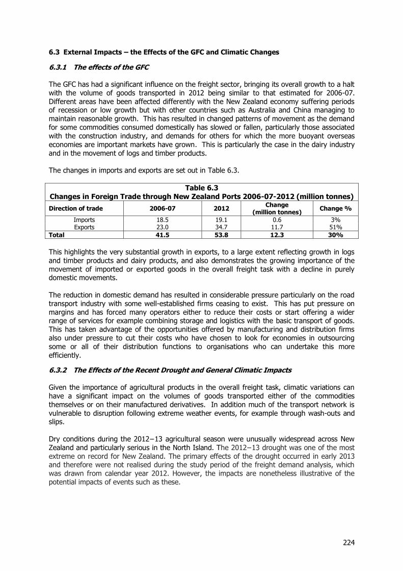
224
6.3 External Impacts – the Effects of the GFC and Climatic Changes
6.3.1 The effects of the GFC The GFC has had a significant influence on the freight sector, bringing its overall growth to a halt with the volume of goods transported in 2012 being similar to that estimated for 2006-07. Different areas have been affected differently with the New Zealand economy suffering periods of recession or low growth but with other countries such as Australia and China managing to maintain reasonable growth. This has resulted in changed patterns of movement as the demand for some commodities consumed domestically has slowed or fallen, particularly those associated with the construction industry, and demands for others for which the more buoyant overseas economies are important markets have grown. This is particularly the case in the dairy industry and in the movement of logs and timber products. The changes in imports and exports are set out in Table 6.3.
Table 6.3 Changes in Foreign Trade through New Zealand Ports 2006-07-2012 (million tonnes)
Direction of trade 2006-07 2012 Change
(million tonnes) Change %
Imports 18.5 19.1 0.6 3% Exports 23.0 34.7 11.7 51%
Total 41.5 53.8 12.3 30%
This highlights the very substantial growth in exports, to a large extent reflecting growth in logs and timber products and dairy products, and also demonstrates the growing importance of the movement of imported or exported goods in the overall freight task with a decline in purely domestic movements. The reduction in domestic demand has resulted in considerable pressure particularly on the road transport industry with some well-established firms ceasing to exist. This has put pressure on margins and has forced many operators either to reduce their costs or start offering a wider range of services for example combining storage and logistics with the basic transport of goods. This has taken advantage of the opportunities offered by manufacturing and distribution firms also under pressure to cut their costs who have chosen to look for economies in outsourcing some or all of their distribution functions to organisations who can undertake this more efficiently.
6.3.2 The Effects of the Recent Drought and General Climatic Impacts Given the importance of agricultural products in the overall freight task, climatic variations can have a significant impact on the volumes of goods transported either of the commodities themselves or on their manufactured derivatives. In addition much of the transport network is vulnerable to disruption following extreme weather events, for example through wash-outs and slips. Dry conditions during the 2012−13 agricultural season were unusually widespread across New Zealand and particularly serious in the North Island. The 2012−13 drought was one of the most extreme on record for New Zealand. The primary effects of the drought occurred in early 2013 and therefore were not realised during the study period of the freight demand analysis, which was drawn from calendar year 2012. However, the impacts are nonetheless illustrative of the potential impacts of events such as these.
225
Effects on the transport sector from the drought included increased movements of livestock to slaughter as farmers de-stocked and increased movements of supplementary feed. Conversely there were reduced movements of fertiliser and lower milk production as dairy cows were dried off early. While there was increased pressure on the transport system from increased livestock movements, the main choke points were in fact the works, resulting in large numbers of animals being transported to the South Island works due to congestion through the North Island works. While animals headed south, feed such as hay headed north to Hawke’s Bay, Tauranga and Auckland. Pacifica is reported to have shipped in excess of 550 TEU42 of hay to the North Island and the Interislander reported movements of 80,000 cu m during a seven week period43. Estimates for recovery of beef and sheep farms have been put at three years. An annual stock number survey by Beef + Lamb New Zealand indicates that two million fewer lambs will be born in spring 2013, reducing the number to fewer than 24.5 m - a drop of 8.5 per cent. The main impact will be in the North Island where sheep numbers declined nearly 3 per cent. South Island numbers were almost static. Cattle numbers have also reduced by 1.3 percent nationally, with the North Island declining by 2.5 per cent.44 Exports of meat, wool, hides and skins for the year ending June 2013 are forecast to be down 10 percent on the prior year with a further decline of 9 percent forecast in 2013-14, because of ongoing drought effects.45 New Zealand milk solids production in 2012-13 will experience its first year-on-year decline for six years, as a result of the drought.46 There have also been reported to be impacts on manufacturing of food products as the effects of the reduced production of milk in particular work their way through the production chain. Broader effects in the short term will see lower output and demand as the drought is estimated to have taken 0.7 percentage points off New Zealand’s economic output this year, primarily through foregone production and impacts on electricity generation47, while annual real GDP could be lowered by 0.3 – 0.6 per cent48. Agriculture and primary manufacturing are the sectors that are most affected by the drought with a consequent reduction in transport demand likely to be felt throughout the sector. Figures from Statistics New Zealand for the period to June 2013 indicate that agricultural output had fallen by 10.4 per cent from a peak at the end of 2012 and that food beverage and tobacco manufacturing had declined by 3.8 per cent.49 While the effects of the drought will reduce demand for rural transport in particular over the next 2-3 years as the sector recovers, reports indicate there is not expected to be a material long term impact. However with drought events predicted to become more frequent the potential for similar fluctuations in freight demand will also become more frequent and potentially prolonged in future.
42 TEU: Twenty-foot equivalent shipping container 43 FTD magazine, June-July 13 44 Beef + Lamb New Zealand 45 Ministry of Primary Industries, Situation and Outlook for Primary industries 2013 46 Ministry of Primary Industries, Situation and Outlook for Primary industries 2013 47 ASB Quarterly Economic Forecast, May 2013 48 RBNZ Analytical Notes; Drying out: Investigating the economic effects of drought in New Zealand, June 2013 49 Drought slows economic growth Statistics New Zealand 19 September 2013
226
More immediate climatic effects can also affect the function of both the road and rail transport networks, with a number of closures occurring as the result of adverse weather. With global warming it is likely that the frequency and duration of these disruptions will increase with a consequent impact on supply chain reliability. While improvements in the data available to drivers and transport companies discussed later may help to mitigate some of these impacts by giving advance warnings of disruption and identifying alternative routes if these are available, there may be a need to hold more goods along the supply chain to reduce any impacts of disruptive events. While weather disruption to road and rail networks and sea and air services is nothing new and considerable effort has been made in recent years to improve the resilience of these, the greater severity of future weather effects may offset the effectiveness of these efforts.
6.4 The Resurgence of Rail
6.4.1 Changes in Volumes Carried The period since 2006-07 has been marked by a resurgence in the volumes carried by rail despite an overall demand for freight transport that has remained broadly static. The increases in the totals volumes carried by rail and the tonne-km travelled are set out in Table 6.4.
Table 6.4 Changes in Rail Freight Movements 2006-07 to 2012
2006-07 2012 Change Change (per cent)
Total tonnes (m) 13.7 16.1 2.3 17% Total tonne-km (bn) 3.9 4.2 0.3 8% Note: these figures are based on the weight of the freight carried and do not include the weight of containers
6.4.2 Changes in International Shipping Patterns have Implications for Domestic Freight Movements
There have been a number of changes to shipping patterns over the period which has had implications for internal freight movements and rail has benefited from several changes to port call patterns over the time. These include:-
Metroport has grown strongly as more lines chose to call at Tauranga. The increase during 2012 also reflects the impact of the strike at Ports of Auckland. In late 2011, prior to the strike, there were 3 return trains per day. During the strike and its aftermath there were up to 7 trains a day each way. There are currently 4 trains a day.
The switch by Fonterra from New Plymouth to other ports to take advantage of the greater flexibility and range of shipping services there replaced a short haul by rail with a long haul.
Concentration of Fonterra shipping on Lyttelton replaced a short road haul from Clandeboye to Timaru, with a longer rail haul from Temuka to Lyttelton.
227
As Auckland and Tauranga have the greatest range of services calling, more traffic is focussed in them from around the country. Much of this is carried by coastal shipping but long distance rail movements into Tauranga have also increased. In the case of Bay of Plenty, rail traffic from south of Waikato has increased substantially by 2012. The great bulk of these movements will be port traffic. Interestingly, the North Island component of this rail flow has risen substantially and the South Island movements of international freight have declined substantially. Most of the North Island part is traffic from Taranaki. Long distance movements into Auckland declined, possibly because of the strike, but the region also generates non-port traffic which is difficult to separate.
6.5 Changes to Other Transport Modes
6.5.1 Roads
Since 2006-07, possibly the main change to the highway network has been the development of the Roads of National Significance (RoNS), including the improvements to the State Highway network in Auckland. The first of these improvements was the opening of the Northern Gateway toll road extending the Auckland Northern Motorway (SH1) to the north to Puhoi which introduced the first tolled section of State Highway with toll collection via automatic vehicle recognition rather than a manual approach. The anecdotal evidence is that this has been well received by the road transport industry with the benefits offered by the new route more than offsetting the costs of the toll. The network through Auckland has also been improved by the opening of the Victoria Park Tunnel on SH1 one of the components of the RoNS. The RoNS programme also includes the upgrade of the rest of the route from Puhoi to Wellsford to provide a better connection between Northland and Auckland and the rest of New Zealand. Work is proceeding on the completion of the Western Ring Road, again one of the RoNS, providing an alternative route through Auckland avoiding the central area, although this latter has not impacted on the freight traffic patterns in 2012. Other components of the RoNS programme which are on-going and which while not complete in 2012 will potentially affect future freight patterns include:-
Waikato Expressway (SH1) – Construction currently being undertaken on major sections of this
Tauranga Eastern Link (SH2) – Construction proceeding
Wellington Northern Corridor-(SH1) - In planning stage
Christchurch Motorways – In planning stage
These are all key strategic freight routes and are expected to have particular benefits for movements serving the major centres and the ports of Auckland, Tauranga, Wellington and Christchurch/Lyttelton. These schemes would benefit road freight and may therefore to some extent switch the balance between road transport and other freight modes, although the scale of this is uncertain and in practice may be only small.
228
6.5.2 Changes in Road User Charges
In August 2012 the Road User Charges Act came into effect. This amended the previous system where the charge was based on the estimated gross weight of the loaded vehicle to one based on its maximum permissible gross weight. This has had a variable impact on road transport operators depending on the extent to which vehicles are filled with some transporting commodities which have relatively low densities reporting substantial increases in costs.
6.5.3 Changes in Coastal Shipping Patterns
The main changes which have occurred in the coastal shipping industry since 2006-07 include:-
The lengthening of the Aratere, one of the InterIsland fleet by about 25 per cent
The expansion of the capacity of the Straits Shipping fleet
The change in service patterns offered by Pacifica.
In 2006-07 Pacifica was operating a 2 ship service, one between the main Auckland port, Wellington and Lyttelton and a second self-geared vessel linking Onehunga with Lyttelton and then Nelson and New Plymouth on the return trip. In part because of operational difficulties, services into Onehunga ceased in 2012 (and therefore to some extent will be included in the 2012 data). The service is currently operated by two vessels, Spirit of Endurance (444 TEU) which operates between the main Auckland port and Lyttelton, Nelson and Tauranga, and the second, Spirit of Independence (363 TEU) operating between Auckland, Lyttelton, Nelson and New Plymouth. We understand that much of the work of these vessels is concerned with the transhipment of containers on international movements, where there has been considerable recent growth. This is however is outside the scope of our analysis.
6.6 Reducing the Costs of Transport
6.6.1 Introduction
Reducing or at least managing the costs of transport has been a recurrent theme and a key driver in the industry. To some extent this theme pervades many of the others identified but a potentially important factor in this has been the increase in maximum permitted vehicle weights which allows the road transport industry to gain from the greater productivity of their vehicles and staff.
6.6.2 Use of Heavier Goods Vehicles
Increasing the payload on road goods vehicles allows more efficient use to be made both of the vehicle and its driver and can therefore help to reduce transport costs. The rules governing the maximum weights and dimensions of heavy goods vehicles were amended in 2010 with the introduction of the concept of the High Productivity Motor Vehicle (HPMV).
229
Two changes to the existing regulations were made, one permitting longer but not heavier goods vehicles and the second permitting increased payloads depending on the axle configuration. While increasing the length of goods vehicles has a relatively minor impact on road wear, heavier vehicles on the other hand may create additional wear on road pavements and cause damage to structures. As a consequence although the Government has changed the rules governing maximum vehicle weights, the use of these is currently restricted to specific routes where the structures are capable of carrying the additional loads. To increase the potential productivity benefits and recognising that a proportion of the demand for HPMVs is for vehicles with relatively small increases in vehicle mass over the standard 44 tonnes, NZTA in September 2013 has introduced the concept of a 50MAX HPMV. This has a slightly different axle configuration to that normally required for an HPMV, requiring vehicles to be fitted with an additional axle. With these vehicles, operators would be able to use virtually the entire State Highway network except where there are restrictions in respect of particular structures (for example the Auckland Harbour Bridge), and permitting for specific routes would not be required. It is intended that a similar freedom to operate on the local road network will also be available. All the changes proposed, increases in length with no weight increase, full HPMVs and the more weight restricted 50MAX add to the efficiency of road transport. This has three possible implications:-
Since a fixed freight task can be carried in fewer vehicles, the numbers of road goods vehicles may be reduced with impacts on traffic flows and environmental impacts. Given however that only a relatively small proportion of total heavy goods movements are likely to switch to HPMV use, this effect is likely to be very limited.
By reducing the costs of road transport, its ability to compete with rail and coastal shipping will potentially increase. However many HPMV applications are for commodity movements for which rail or coastal shipping is not a competitor because of the particular nature of the product or the movements involved. Changes to the HPMV rules do however facilitate the transport by road of containers and it is here where competition is likely to be most pronounced. The changes to the dimension rule also facilitate the movement of consumer goods where it is the volume of the goods vehicle rather than its payload capacity which has previously limited the loads carried and again for these movements, especially for the longer distance flows between the main urban centres there may be some modal impact. To date the statistics available do not allow a judgement to be made on the possible scale of this, although again any effects are likely to be modest
Changes to the costs of transport and the ability to carry more substantial loads may result in some changes in supply chains.
Overall however while making a useful contribution to the reduction of the costs of transport, the effects of the changes to the rules governing maximum vehicle weights are likely to have only a limited impact on overall freight flows although there may be some small changes in the modal split between road transport and other modes.
230
6.6.3 Rail Initiatives Rail has with its Turnaround Plan reduced costs through restructuring and standardising on equipment and procedures. It has also improved its services, particularly in the key domestic corridor southbound from Auckland, with a strong focus on train performance and reliability. It has as well improved capacity, both through significant investment in wagons and locomotives, and more incrementally through infrastructure improvements. Rail capacity has been raised by some parties interviewed as an issue. This is a rather static view of what rail can do. In most cases the actual line capacity is not a problem, and additional trains can readily be run, without any infrastructure investment. The next step up is usually by improving signalling systems or adding and lengthening crossing loops. These are achieved at relatively modest costs. Line capacity issues that require actual new track capacity on a route are likely to be limited to avoiding peak hour passenger train congestion, notably in Auckland, and will be relatively short. The most likely, now being planned, is Otahuhu to Wiri, is about 7km. Capacity improvements since 2006-07 have included:-
Doubling the capacity of the Hamilton-Tauranga line as noted above
Adding a crossing loop, upgrading signalling, and removing a restrictive tunnel on the Taranaki line
Removing restrictive tunnels in the Manawatu Gorge
Upgrading axle loads (to 18 tonnes) on the line to Hokitika
Running heavier and longer trains on many routes Until recently, KiwiRail’s ability to serve new customers and the growth in existing customers was constrained by lack of rolling stock. KiwiRail’s investment in rolling stock has overcome this problem and enabled markets outside the container market to also get additional capacity, by cascading wagons previously used as container wagons. It is also possible to increase rail’s capacity and lower its costs by increasing the axle load from 18 to 20 tonnes, at least on heavily trafficked lines like Auckland to Tauranga. A recent Swedish study50 noted that raising axle loads by the same ratio as 18 to 20, albeit from a higher base, could improve a wide range of costs by 10% overall. A higher axle load would, according to the report:-
Improve wagon productivity Improve the ratio of net to gross weight (i.e. more freight hauled per tonne of tare) Improve terminal handling Increase the effectiveness of loading and unloading sites Increase the effectiveness of marshalling yards Allow an increase of train weight within a given length (lessening the importance of the
crossing loop length constraint)
Increase network capacity.
50 Trafikverket, Transportsystemets behov av kapacitetshöjande åtgärder, Trafikverket’s publication 2012:100, p 108 [Swedish Transport Administration, The transport system’s need of measures to increase capacity].
231
The report also claimed a 20 per cent gain in costs by improving clearances, which would be difficult in New Zealand. Into the future, there are further potential technical improvements that could also be done.
6.7 More Sophisticated Supply Chains
6.7.1 Changes in Logistics Patterns for Supermarket and Retail Distribution The distribution of goods into supermarkets has been affected by a number of trends as the operators aim to improve the reliability and cost effectiveness of their supply chains. Increasingly supermarkets have limited space available for storage and therefore rely on frequent and reliable deliveries to ensure that they maintain a full range of stocked items on their shelves. To achieve this the supermarket groups are increasing their control over the complete supply chain, increasing the range of commodities that are handled through their centralised distribution systems and even extending their operations to include the pick up of goods from suppliers. Because of environmental constraints on the one hand and the problems of traffic congestion on the other, the times at which goods can be delivered to stores is becoming more constrained and drivers are typically given fairly narrow time windows within which goods can be delivered. This puts a degree of pressure back on to the road transport industry to be able to meet these constraints but has been facilitated by improved vehicle management and scheduling made possible by improved ITS and GPS systems. Compounding this issue is the move for supermarkets and retail groups to reduce the number of DCs they operate. In many instances the whole country is served by just two DCs one in the North Island usually Auckland and one in the South Island at Christchurch. In some instances the imbalance of traffic between North and South Islands and the relatively low costs for northbound movements has made it economic to serve the parts of the lower North Island from DCs in the South Island. The increase in the potential length of supply chains means that planning for disruptions to these, as for example might result from adverse weather conditions becomes more important and may require buffer stocks to be held at some point in the supply chain. In order to reduce transport costs the level of interaction between these DCs may be limited with goods being imported or supplied by local providers directly into each. This helps reduce the costs of transport by avoiding the movement of goods by land and across the Cook Strait. This has also been coupled with moves to manage more directly the import of goods by setting up offices in the areas where imports are sourced to manage their transport more effectively. This helps to ensure that containers are loaded with the mix of commodities required by the recipients of the goods and that they are delivered in a timely fashion. As an example of the response to the different pressures affecting the retail sector Foodstuffs Auckland and Foodstuffs Wellington merged their operations from the beginning of September 2013. Foodstuffs Wellington had also recently rationalised their own distribution system, focussing their activities at modern sophisticated DCs in Palmerston North and closing the distribution operation in Wellington

232
6.7.2 Integrated Transport Solutions Shippers in the manufacturing and retail industries, which have relatively small volumes, have long been able to use third parties like freight forwarders to give them critical mass to access bulk and cheap transport. More recently, specialist logistics providers, called 3rd and 4th party logistics – or even 5th party, – may take over the total management of the logistics function to save costs and enable the use of modern techniques supported by the increased availability of data discussed below. Most freight in New Zealand is not of this type. Our major exporters have traditionally done these tasks themselves. In the case of Fonterra, production exceeds sales in some periods, so the product has to be stored. Use of multiple stores, which was the previous pattern, generated multiple trips for freight. Fonterra has reviewed their network of stores and built two large facilities for storage, aggregation, and packing of their export cargoes. From these (Crawford St in Hamilton, and at Mosgiel near Dunedin) the products go to export. A recent development has been building of further storage at the individual dairy plants, with the Hamilton and Mosgiel facilities doing less of the storage role and more of aggregation and packing one. The use of rail from these facilities allows containers to be packed to their maximum payload in controlled conditions and hence allows savings to be made in international shipping costs. Typically the major exporters looked after their own transport requirements. Now Fonterra and Carter Holt Harvey have set up independent businesses, Dairy Transport Logistics, and Netlogix respectively, to organise, rationalise, and secure the best rates and quality for the whole company’s outbound traffic (and some inbound movements) by road, rail and coastal shipping. These perform a similar role to independent third party logistics providers, or rather 4th party, as they do not own any transport assets (nor logistics assets such as stores) but contract with other firms to provide these and the appropriate services. By their nature, they are likely to seek to minimise the number of firms they have to deal with, and so will tend to support larger companies. Interestingly, the producing companies still manage the transport of key major inputs, raw milk and logs, where the supply chains are much simpler. At a higher level still, Kotahi seeks to combine the output of Fonterra and Silver Fern Farms (and any other company that wishes to join) in terms of seeking lower freight rates (and better services) from international shipping firms and potentially even major inland transport firms. While these export commodities are important contributors to the transport task, there remains substantial business outside them, in commodities like aggregate, livestock, iron and steel, limestone, concrete and fertiliser which continue in the more traditional relationship with their transport providers, or indeed do it in-house.
6.7.3 Improvements in Data Availability Improvements in the availability of data for management information systems and fleet management can permit more efficient operation and management of vehicle fleets and their loads and so can help to reduce the costs of transport or provide more sophisticated supply chain products. This is clearly an on-going trend which initially at least will favour the larger operators with the resources required to install and benefit from new systems of information capture and analysis.
233
This improved data supports the development of integrated logistics packages where operators offer combinations of transport and storage which allow suppliers to contract out these operations in entirety. By providing services to more than one supplier of goods opportunities for economies arise either from sharing warehouse space and benefitting from sophisticated stock management systems or from more efficient vehicle utilisation and possibly the opportunity to achieve broadly balanced flows of goods. Better data available to drivers can help them achieve efficient vehicle use by improving route planning both on a regular basis and also on occasions when transport routes are disrupted. Again this helps to reduce costs and supports a more reliable freight transport product.
6.7.4 Container Weights and Packing or Unpacking Containers at Ports There have been issues with weights declared for containers, so that ship operators, road transporters, and rail have inadvertently carried containers weighing more than stated, with potential safety impacts. The International Maritime Organisation (IMO) has recently announced it will strictly enforce weighing of containers (or weighing of the contents). More attention to this might see more containers carried by rail because of its higher limits, or greater use of “pack at port” although the increasing use of road vehicles operating as HPMVs would provide some increased flexibility for road transport to handle these flows. Packing or unpacking at the port enables the inland mode to load to its maximum without being restricted by container dimensions or alternatively it allows containers for international shipment to be packed to a higher weight than can be transported efficiently by road. For road, this might mean it can carry much more than a single TEU load of exports even though it could not carry two full TEUs of a particular commodity. If there is now better information on the weight of containers, then truck operators may choose not to carry heavier ones. They will then have to move by rail, or be packed at the port. Packing or unpacking at the port also allows savings to be made in container demurrage charges and also enables sophisticated equipment to be used for unpacking particular types of commodities which it would not be economic for a single shipper to acquire. An example of this was the unpacking of long aluminium slabs which need specialist equipment to unload from containers but which would be uneconomic for the ultimate receiver of the goods to purchase. Already a substantial volume of exports is packed at the ports (or nearby). It is also a way of improving container turnaround, as the container does not spend time travelling inland. Speeding turnaround may reduce the numbers (and cost) in the container fleet. Internationally, there are about 3 containers for every available ship slot. Much of the time spent by a container is in fact idle.51 However, the biggest constraint to packing at port is the availability of on-dock land to accommodate storage and packing operations.
51 J-P Rodriquez, “The repositioning of empty containers” in The Geography of Transport Systems, 3ed, New York, Routledge, 2013. See http://people.hofstra.edu/geotrans/eng/ch5en/appl5en/ch5a3en.html
234
6.8 Constraints on Operations
6.8.1 Driver Shortages for Rail and Road A shortage of drivers has been a long running problem for the transport industry particularly for road transport and with the increasing age of the workforce, the problem is becoming more acute. For KiwiRail the position was being exacerbated by the skill being in international demand, especially in Australia, and by the significant training regime required. At one stage, trains were being cancelled through lack of drivers. However, KiwiRail has now been able to recruit and train sufficient additional drivers to cope with the increased demand in most places. The driver shortage problem is now impacting on road transport where the problems are possibly more severe. The task of driving a truck has become more demanding in recent years, because of the sophistication of the vehicles themselves, and because the driver now also may have to attend to quality control issues en route, such as driving with attention to the risk of the commodity or damage to it, e.g. temperature monitoring. Operators are themselves subject to regulatory (safety) pressures that prompt the need for more sophisticated drivers. Long distance driving has also become less attractive to employees, partly through the antisocial hours and having to live away from home, and because driving has become more difficult with increasing traffic levels. The shortage has become so significant that road transport interests have protested to the government about proposals to downgrade the immigration status of truck drivers, potentially affecting about 400 drivers, out of a total driver number of about 25,000. The problem is worst in Auckland, Waikato and Canterbury, and a number of operators have had to park up trucks as a consequence.52 This problem may constrain the growth of road transport, or at least alter its relative price if operators need to pay more to attract candidates of sufficient calibre. It may impact especially in sectors with strong growth, like forestry. Similar driver shortages are happening in a number of other countries, such as Australia, the USA and Canada To attempt to address this issue and to maximise the value that can be obtained from drivers a number of operators are increasing their use of rail for the long haul routes where this is an option. This allows the drivers available to be used on routes for which there is no modal alternative and for which in practice margins may be higher. This may also reduce the antisocial aspects of road transport with drivers having closer contacts with their home bases and being able to return to their home every night or at least more frequently and as a consequence make the industry more attractive to new workers. Despite these measures the shortage of drivers is likely to remain a constraint on the industry and one that may get worse as the economy recovers and alternative opportunities for employment becomes available. It is likely that this will tend to raise the costs of road transport and may limit the scale of operations of the industry and will place a premium of the effective use of the resources available.
52 Source: Road Transport Forum survey
235
6.8.2 Congestion and Constraints in Urban Areas The problems arising from the growing shortages of drivers are exacerbated by increasing congestion in the main urban areas which limit the productivity of vehicles and their drivers. While measures to aid road freight movements are being introduced in some locations with for example trucks being able to bypass ramp signals at a number of locations on the Auckland motorway network, general congestion levels across the network as a whole are increasing. A number of firms interviewed indicated that over time they had been forced to employ additional drivers to maintain levels of service, especially for activities which require vehicles to be on the road in the extending peak periods. One possible approach to alleviate the problem of congestion is for an increasing number of movements to take place at night when the roads are less congested. This allows much better use to be made of the vehicle and driver (although possibly contributing to the unsocial aspects of the job as discussed in the previous section). Extensive use of this approach is made in transferring containers from the port to intermediate holding areas for example operated by Tapper Transport in Auckland and POAL at Wiri. However operating at night especially away from the main motorway network can raise environmental and amenity issues especially if goods are to be delivered to or collected from premises that involve movements through residential areas. It may also be resisted by receivers of the goods who either have to have staff available to receive the commodities or to have special arrangements so that the delivery can be left in a safe location. While some firms adopt one or other of these approaches, for others there is resistance to this approach. In these cases this often means that ideally goods should be delivered in the morning at the start of the working day involving the vehicle having to travel in peak traffic conditions and increasing the costs of the operation. The problem of congestion on urban networks is not solely confined to road transport but is becoming an issue for rail transport especially with the increased focus on commuter rail services. The paths available for freight during the day are becoming more restricted with a greater emphasis on movements before the morning peak and after the evening peak since even between these it may be difficult to insert freight trains into what will still be a high frequency passenger operation. However outside the peak periods, the environmental and amenity problems from heavy freight trains will be felt more acutely. To support passenger rail operation and reduce the demand for car travel, transit orientated development with expansion of residential properties close to rail stations is being encouraged. However those living in such developments may be affected by the movement of heavy freight trains through the night and there may therefore be reverse sensitivity issues and pressure to restrict these night time movements. In addition as is the case for road transport, for an element of rail freight delivering the goods at the right time is important. As an example, for goods moved between Wellington and Auckland, the need to arrive early in the working day means that trains arrive in Auckland at about 8:30 am so potentially interacting with the morning peak for passenger services. Services running into Wellington from Auckland are similarly scheduled to arrive in the morning peak. Services running later as for example to the South Island may potentially cause environmental issues if they pass close to developments alongside the rail line in quieter periods.
236
6.9 Opportunities
6.9.1 On-Line Shopping Another potentially major change which is affecting the retail and distribution sector is the growth of on-line shopping. This is arising from a range of sources including auction houses such as TradeMe, dedicated on-line retailers and from conventional retailers moving into on-line sales, “bricks and clicks”. For this last group, this requires a change in focus from having relatively large quantities of goods delivered to stores and then taken away by customers to a system when goods are despatched in small quantities to a wide range of destinations. The delivery of these goods is posing a number of challenges for the distribution industry with the increasing growth of small scale deliveries to private addresses. While this potentially creates opportunities for the road transport industry, there are challenges with domestic delivery especially of relatively small value items since it is often difficult to determine a time when it is convenient for the goods to be delivered. Typically courier operations in an early morning are serving commercial customers who need the goods for their daily operations, but later deliveries during the working day to households may not be successful if the occupants are at work. These can incur additional costs if the initial delivery attempt is not successful. One way round this problem is the delivery of goods to a secure delivery point or pod in a location which is either adjacent to peoples place of work allowing them to pick the items up during the working day or to a location which is convenient to their home, so allowing the goods to be delivered at any time and without the need for repeat attempts. These approaches are currently being trialled, but again systems need to be developed to allow the most effective use to be made of this approach and to minimise any additional costs. To the extent that deliveries can be consolidated the delivery task is made much easier and this may also permit the use of larger vehicles.
6.9.2 Impacts of Improved Irrigation Systems More certainty around water for irrigation means a longer growing season for crops and farms. This has a flow on impact to transport as production volumes increase, farming inputs increase and general economic activity lifts. Irrigation NZ estimate irrigated land is at least three times more productive than dry land. The gains from irrigation accrue predominantly to the farm sector, through improved productivity/yield per hectare. Off-farm processing and support industries (including transport) expand in line with the farm sector. Irrigation drives land use changes, primarily the ability to farm more intensively, with some conversions of farm types also taking place. While the exact use of the irrigated land is uncertain, modelling undertaken by New Zealand Institute of Economic Research (NZIER) on behalf of Ministry of Agriculture and Fisheries (MAF) in 201053, estimated land-use changes would generate a net revenue gain of approximately $6,000 per hectare in Canterbury and $1,300 per hectare in Hawke’s Bay at the farm-gate. This would see increased agricultural output processed and exported at the world market price. The same report modelled an increase in export earnings of $1.4 billion a year by 2018 and $4 billion a year by 2026 (an increase of 17 per cent over 2009 earnings in real terms).
53 NZIER, The economic impact of increased irrigation, Nov 2010
237
Of the 340,000 new hectares earmarked for irrigation, the NZIER modelling assumed that the resulting land use change would see 42 per cent of the area go to dairying, 16 per cent to mixed livestock, 27 per cent to arable (cropping), 11 per cent to dairy support and 4 per cent to horticulture. This is supported by a range of alternative forecasts for the Canterbury Region which also put the dairying share at about 50 per cent. In July 2013 Crown Irrigation Investments Limited, a government agency, was established to work with backers of new irrigation schemes. Crown Irrigation will act as a bridging investor for regional water infrastructure projects with $80 million set aside in the 2013 Budget. 420,000 hectares of new irrigated land could be made available for a variety of uses over time, as well as improvements to the reliability of current irrigation54. Approximate figures by region quoted by Crown Irrigation include:
Canterbury – 260,000 ha Hawke’s Bay – 40,000 ha Wellington – 30,000 ha Marlborough – 6000 ha
It should be noted that alternative sources have different estimates of the potential areas to be irrigated. As an example of the potential impacts of these schemes, in Hawke’s Bay, the Ruataniwha Water Storage Scheme (alternatively estimated at 20-30,000ha) will benefit pastoral farming, pipfruit and viticulture. Napier Port predict the lift in output from these sectors to increase exports through the port by 15-20,000 TEU per annum, an 8-10% increase.
Table 6.5 Proposed and Consented Irrigation Schemes
Scheme Location Area irrigated Timing
Ruataniwha Water Storage Scheme
Central Hawke’s Bay 20,000-30,000ha (in
addition to 6,000ha already under irrigation)
Completion 2017
Wairarapa Water Use Project
Wairarapa 30,000 hectares Feasibility study planned
for 2014 Flaxbourne Community Irrigation
Marlborough 2500ha Consented 2011
Wairau Valley Water Enhancement Scheme
Wairau Valley 6000ha
Central Plains Water (CPWL)
Mid/Central Canterbury 30,000ha Construction start 2013
Mayfield Hinds Irrigation Ltd
Mid/Central Canterbury 32,000ha Enhancements to existing
scheme Barrhill Chertsey Irrigation Scheme
Mid/Central Canterbury 40,000ha (currently
10,000ha) Expansion of existing
Hunter Downs Irrigation South Canterbury 40,000ha Consented 2011
54 Business Growth Agenda, Building Infrastructure report, 2012
238
6.10 Environmental Issues
Although costs and reliability remain important issues in the movement of freight and the choice of mode and route, environmental issues and the desire to minimise the carbon footprint of the goods transported are increasingly impacting on the sector. In a recent report on Sustainable Procurement55 it was stated that…“New Zealand companies are also selecting – or deselecting- suppliers based on their sustainable performance. Nearly three quarters of the Business Council’s member companies – whose annual sales equate to about $59 billion and 43 per cent of gross domestic product - are including or planning to include social and environmental criteria in supplier terms and conditions.” In the same report industry recognised that this could lead to some increase in costs. Companies which are attempting to reduce their carbon footprint and reporting the steps they have taken and the consequences include inter alia The Warehouse, Express Couriers, Fonterra and Progressive. To some extent measures to reduce environmental impact can favour rail or coastal shipping which are perceived as environmentally friendly modes and certainly encourage the option of using these alternatives to be considered in choosing modes and suppliers. An example is the removals firm Crown Relocations, which now use rail extensively for long haul household removals, and point to the environmental issues in their marketing. The former disadvantage rail faced in this market, damage to possessions caused by multiple handling, has been overcome by the use of containers, and a substantial volume is now hauled by rail. For road transport especially for the larger operators the effect has also been to encourage the use of vehicles with low polluting Euro 5 or even Euro 6 engines. While to some extent this increases the costs of road transport it does improve the quality of service offered, and as indicated above there appears to be a greater willingness to pay for more environmentally sustainable solutions, particularly if they impact on a company’s reputation in the market.
6.11 Other Factors: The Christchurch Earthquakes
The Christchurch earthquakes appear to have had a minimal impact on the bulk of transport in the region, once the road and rail networks were re-established and the port reopened. Major flows of exports and commodities like fuel have continued. There have however been significant impacts from the demolition work and another set of impacts is arising from reconstruction. Our study is at a regional level, and much of the region and its production were unaffected in any major way by the earthquakes. We can however look at rail and port data for Christchurch and Lyttelton for the two periods. Rail traffic into Christchurch grew by 4% between the two periods. Declines in coal and freight forwarding were offset by very strong dairy growth. Traffic outwards from Christchurch shows a small decline, but the levels of traffic are only about half a million tonnes in each year. Export traffic through the port was 3.3 million tonnes in 2006-07, and 3.7 million tonnes in 2010-11, before the earthquakes. In calendar 2012 it was 4.1 million tonnes. Imports have shown similar resilience, with 2012 up on both 2006-07 and 2010-11. The only indicator of earthquake issues here is the decline in freight forwarding by rail, but issues of data comparability may limit the assessment of this.
55 Sustainable Procurement In Government - Opportunities for business” New Zealand Business Council for Sustainable
Development, April 2009``
239
Within Christchurch the impact has obviously been much greater. Two major impacts are the demolition and disposal of the material, which has to be transported, and the materials for reconstruction, especially aggregate, cement, steel, timber, wallboard and glass. An estimate of the demolition quantities in 2011 was given in a presentation by Gareth James of Transpacific Industries. This was a downwards revision from earlier estimates. He estimated that there would be 4.25 million tonnes of material, of which 2 million tonnes would go to Port of Lyttelton for reclamation; 1 million tonnes would go to the official Burwood processing sites, and 1.25 million tonnes would go to smaller local sites. Half a million tonnes of the Burwood material would go onwards to Kate Valley landfill. Half a million tonnes could be recycled. In fact more has gone to Lyttelton and smaller local sites (often informal) than planned. The quantity moved to Burwood only totalled 0.5 million tonnes, and very little has gone to the Kate Valley landfill (65 km north).56 The demolition task started after the first major earthquake, intensified after the one in February 2011, and is now essentially complete, apart from some red-zoned houses. Most was moved in the months immediately following the earthquakes, and by 2012 the bulk of it had been moved. The waste and recycling estimates in the matrices in the report do not include a direct estimate of this material, as it is a one off, and in any case the estimates are based on a per head model, representing normal household and commercial waste. Quantities of inputs to the recovery effort have been calculated for infrastructure rebuild, but not for the buildings. For infrastructure, the major quantities are:
4 million tonnes of aggregate 300,000t of asphalt 175,000t of concrete 6,000t of reinforcing steel.57
It is reasonable to expect unusually large quantities of material also for the buildings. However, the impact will be spread over many more years than the demolition, although the expectation is that a substantial proportion will be finished within 5 years of the earthquakes (2016). Aggregates will be locally sourced, as there are good supplies available. Cement will come from Westport by ship or rail; at least until Holcim close the Westport plant. Steel and glass will come from Auckland or imports through Lyttelton; wallboard is manufactured in Christchurch and increased output will mean increased imports of gypsum (or direct imports of wallboard). Timber is likely to be sourced from neighbouring regions as well as Canterbury.
6.12 Overall Assessment
The examination of the trends and factors affecting the freight sector confirm as in our earlier study that the industry is in a state of change. Since 2006-07 the industry has faced a number of external shocks including the global financial crisis, the Christchurch earthquake and the more recent drought which have impacted on it to varying degrees.
56 G James, “Recycling Christchurch” WasteMINZ Conference 2011. See http://www.wasteminz.org.nz/wp-content/uploads/2a.James_.pdf, slide 19, and pers comm. 57 S Wright, “Stronger Christchurch Infrastructure Rebuild Team (SCIRT)”, Slide 13, See http://www.growwellington.co.nz/portals/6/files/WellCan/SCIRT%20WellCan%20Presentat
ion%20040313.pdf
240
Coupled with these have been changes to the industry itself with improved levels of data availability, the introduction of HPMVs and more efficient rail operations, changes in distribution patterns and the development of more sophisticated supply chains. Patterns of operation have also been affected by the constraints presented by increased congestion in urban areas, driver shortages and the greater weight being attached to the environmental consequences of the movement of freight. Although the overall freight task appears to have changed little since 2006-07 at least in terms of the tonne-km transported, major and possibly related features have been the growth of foreign trade especially exports and the growth of rail. To some extent the growth of rail reflects increases in output for some of the major commodities handled, particularly milk and dairy and logs and in part increases in modal shares for these. These commodities have also formed a large component in the growth of exports. The growth of rail has been assisted by the growing desire for environmentally sustainable freight solutions and also by driver shortages in the road transport industry. The management of supply chains has also evolved in response to a number of pressures. The need to keep costs low has resulted in imported goods being increasingly landed near to where they are to be consumed with increasing imports direct into Lyttelton rather than through Auckland with onward distribution by road rail or coastal shipping. The management of supply chains has become more sophisticated with the availability of improved information, the expansion of existing transport operators into logistics and the development of specialist providers. The overall picture is of continuing evolution of the freight sector reflecting the changes in the demands placed upon it and the desire to make best use of the resources which it has available.
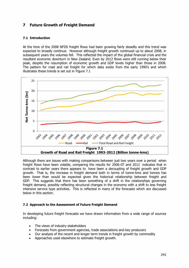
241
7 Future Growth of Freight Demand
7.1 Introduction
At the time of the 2008 NFDS freight flows had been growing fairly steadily and this trend was expected to broadly continue. However although freight growth continued up to about 2008, in subsequent years the volumes fell. This reflected the impact of the global financial crisis and the resultant economic downturn in New Zealand. Even by 2012 flows were still running below their peak, despite the resumption of economic growth and GDP levels higher than those in 2008. The pattern for road and rail freight for which data exists from the early 1990’s and which illustrates these trends is set out in Figure 7.1
Figure 7.1
Growth of Road and Rail Freight 1993-2012 (Billion tonne-kms)
Although there are issues with making comparisons between just two years over a period when freight flows have been volatile, comparing the results for 2006-07 and 2012 indicates that in contrast to earlier years there appears to have been a decoupling of freight growth and GDP growth. That is, the increase in freight demand both in terms of tonne-kms and tonnes has been lower than would be expected given the historical relationship between freight and GDP. This suggests that there has been something of a shift in the relationships governing freight demand, possibly reflecting structural changes in the economy with a shift to less freight intensive service type activities. This is reflected in many of the forecasts which are discussed below in this section.
7.2 Approach to the Assessment of Future Freight Demand
In developing future freight forecasts we have drawn information from a wide range of sources including:
The views of industry stakeholders
Forecasts from government agencies, trade associations and key producers Our analysis of the recent and longer term trends in freight growth by commodity Approaches used elsewhere to estimate freight growth.
0
5
10
15
20
25
Net
To
nn
e-k
ms
(bn
)
Road Rail Total Road and Rail Freight
242
This has been supported by forecasts of key economic drivers such as population and GDP growth, particular factors affecting growth at a regional level, (for example the expansion of the irrigated areas) and an assessment of the potential impacts of supply constraints. The detail of the approaches we have used for each of the commodities is discussed below. In developing the forecasts we have assumed a broad “business as usual” scenario. This assumes the continuation of existing trends and supply chains, especially for the movements associated with imports and exports and no allowance has been made for major changes in the patterns of these flows which might result, for example from major rationalisation of international shipping services. The overall approach to the forecast has been to take the initial 2012 origin destination tables and create forecasting indices for each industry in each region. These indices take into account macroeconomic trends, microeconomic drivers and known industry plans. The process can be broken into the following steps:
Allocate industries to be either demand or supply driven For each industry define the drivers which cause its growth over time Generate forecasts for each driver Translate the forecasts for each driver into a forecast for each industry.
The first step in the forecasting process was to assign each industry to being either primarily demand driven or primarily supply driven. This step helps in assigning drivers to each industry. The allocation was largely based on an understanding of the industry and whether it was likely to experience binding supply constraints. This allocation is set out in Table 7.1
Table 7.1 Allocation of Industries
Demand Driven Supply Driven
Logs to sawmills Inputs to panel making Inputs to pulp and paper Sawn timber Pulp and paper Panels Manufactured goods Supermarkets and Food Goods Other Retail Goods Imported Vehicles Waste Coal Petroleum Limestone, Cement, Fertiliser Concrete Aggregate Steel and Aluminium Other Minerals Couriers and Post
Liquid Milk Manufactured Dairy Export Logs Wool Fish Livestock Meat and Meat By-products Horticulture Grain Other Agriculture
The next step in developing the forecasts was to identify a group of relevant forecasts that could be applied to each industry. The list of potential forecasts is summarised below. Although the causes of freight demand are far more complex than the small group of forecasts listed below, the aim of this process was to identify a manageable group of forecasts where each could be analysed in some detail.
243
Underlying economic forecasts o Foreign Consumption o Population o Regional economic activity o GDP per capita o Energy demand
Specific demand forecasts o Aggregate demand o Concrete demand
Specific supply forecasts o Dairy production capacity o Arable and grazing production capacity o Log availability o Fish availability o Horticulture supply
A detailed forecast was then developed for each item above. These forecasts are described in more detail in the sections below. The final step in the forecasting process was to calculate the forecasts for each industry. Given the relationships established between industries, drivers of change and the forecasts, the calculation of the forecast was simply an arithmetic exercise of calculating weighted average growth rates for each industry based on growth rates of drivers associated with it. The relationship between industries and forecasts is described in detail in the following sections. However, the following table provides a general overview of the relationship that has been used. This table simplifies some of the actual relationships by tracing them through to their final implication. For example, in constructing the forecasts, coal is linked to other industries but, ultimately, the forecasts underlying it are largely related to population and foreign consumption. The table below therefore presents the ultimate forecasting indexes that are used for each industry. Following the preparation of the forecasts we have been advised of some minor changes in the volumes of some of the commodities in 2012. While these have been incorporated into the detailed analyses of flows in Section 3, the impacts of the new figures are very small and the forecasts are therefore based on the earlier figures.
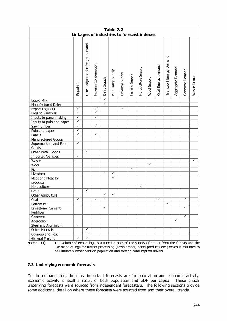
244
Table 7.2 Linkages of industries to forecast indexes
Popula
tion
GD
P -
adju
sted for
freig
ht
dem
and
Fore
ign C
onsu
mption
Dairy S
upply
Non-D
airy
Supply
Fore
stry
Supply
Fis
hin
g S
upply
Hort
iculture
Supply
Wool Supply
Coal Energ
y d
em
and
Tra
nsp
ort
Energ
y D
em
and
Aggre
gate
Dem
and
Concr
ete
Dem
and
Wast
e D
em
and
Liquid Milk
Manufactured Dairy
Export Logs (1) () ()
Logs to Sawmills
Inputs to panel making
Inputs to pulp and paper
Sawn timber
Pulp and paper
Panels
Manufactured Goods
Supermarkets and Food Goods
Other Retail Goods
Imported Vehicles
Waste
Wool
Fish
Livestock
Meat and Meat By-products
Horticulture
Grain
Other Agriculture
Coal
Petroleum
Limestone, Cement, Fertiliser
Concrete
Aggregate
Steel and Aluminium
Other Minerals
Couriers and Post
General Freight
Notes: (1) The volume of export logs is a function both of the supply of timber from the forests and the use made of logs for further processing (sawn timber, panel products etc.) which is assumed to be ultimately dependent on population and foreign consumption drivers
7.3 Underlying economic forecasts
On the demand side, the most important forecasts are for population and economic activity. Economic activity is itself a result of both population and GDP per capita. These critical underlying forecasts were sourced from independent forecasters. The following sections provide some additional detail on where these forecasts were sourced from and their overall trends.
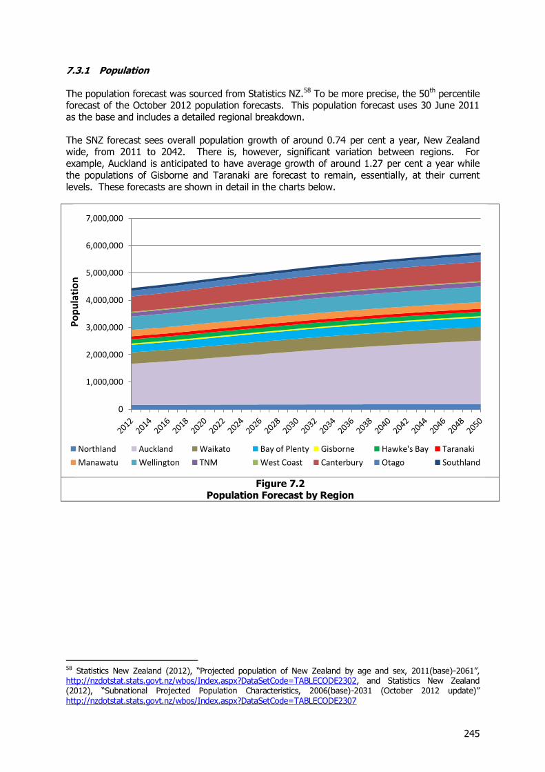
245
7.3.1 Population The population forecast was sourced from Statistics NZ.58 To be more precise, the 50th percentile forecast of the October 2012 population forecasts. This population forecast uses 30 June 2011 as the base and includes a detailed regional breakdown. The SNZ forecast sees overall population growth of around 0.74 per cent a year, New Zealand wide, from 2011 to 2042. There is, however, significant variation between regions. For example, Auckland is anticipated to have average growth of around 1.27 per cent a year while the populations of Gisborne and Taranaki are forecast to remain, essentially, at their current levels. These forecasts are shown in detail in the charts below.
Figure 7.2
Population Forecast by Region
58 Statistics New Zealand (2012), “Projected population of New Zealand by age and sex, 2011(base)-2061”, http://nzdotstat.stats.govt.nz/wbos/Index.aspx?DataSetCode=TABLECODE2302, and Statistics New Zealand (2012), “Subnational Projected Population Characteristics, 2006(base)-2031 (October 2012 update)” http://nzdotstat.stats.govt.nz/wbos/Index.aspx?DataSetCode=TABLECODE2307
0
1,000,000
2,000,000
3,000,000
4,000,000
5,000,000
6,000,000
7,000,000
Po
pu
lati
on
Northland Auckland Waikato Bay of Plenty Gisborne Hawke's Bay Taranaki
Manawatu Wellington TNM West Coast Canterbury Otago Southland
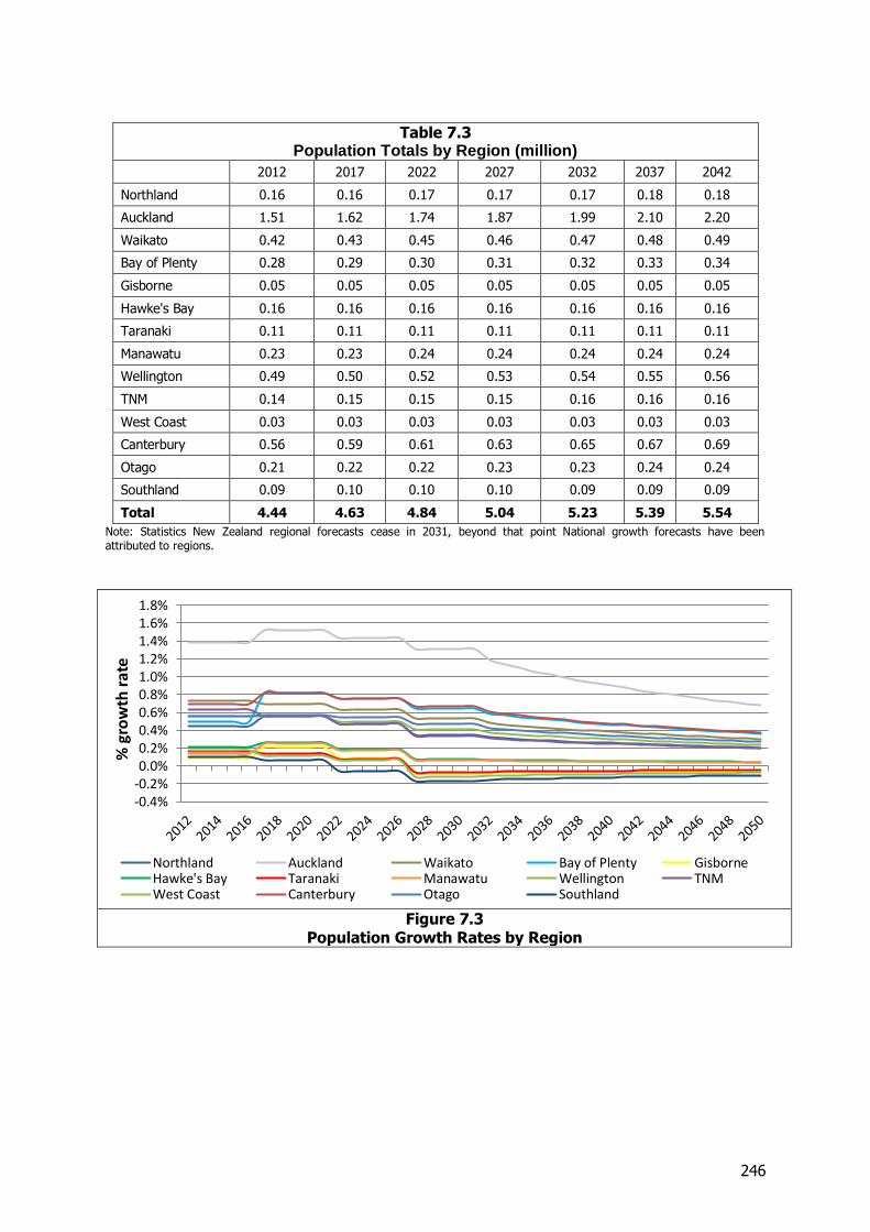
246
Table 7.3 Population Totals by Region (million)
2012 2017 2022 2027 2032 2037 2042
Northland 0.16 0.16 0.17 0.17 0.17 0.18 0.18
Auckland 1.51 1.62 1.74 1.87 1.99 2.10 2.20
Waikato 0.42 0.43 0.45 0.46 0.47 0.48 0.49
Bay of Plenty 0.28 0.29 0.30 0.31 0.32 0.33 0.34
Gisborne 0.05 0.05 0.05 0.05 0.05 0.05 0.05
Hawke's Bay 0.16 0.16 0.16 0.16 0.16 0.16 0.16
Taranaki 0.11 0.11 0.11 0.11 0.11 0.11 0.11
Manawatu 0.23 0.23 0.24 0.24 0.24 0.24 0.24
Wellington 0.49 0.50 0.52 0.53 0.54 0.55 0.56
TNM 0.14 0.15 0.15 0.15 0.16 0.16 0.16
West Coast 0.03 0.03 0.03 0.03 0.03 0.03 0.03
Canterbury 0.56 0.59 0.61 0.63 0.65 0.67 0.69
Otago 0.21 0.22 0.22 0.23 0.23 0.24 0.24
Southland 0.09 0.10 0.10 0.10 0.09 0.09 0.09
Total 4.44 4.63 4.84 5.04 5.23 5.39 5.54
Note: Statistics New Zealand regional forecasts cease in 2031, beyond that point National growth forecasts have been attributed to regions.
Figure 7.3
Population Growth Rates by Region
-0.4%-0.2%0.0%0.2%0.4%0.6%0.8%1.0%1.2%1.4%1.6%1.8%
% g
row
th r
ate
Northland Auckland Waikato Bay of Plenty GisborneHawke's Bay Taranaki Manawatu Wellington TNMWest Coast Canterbury Otago Southland
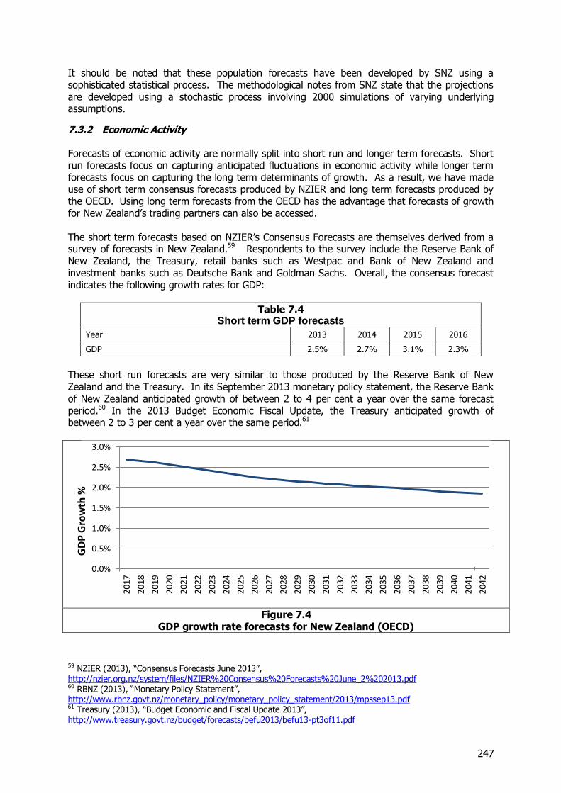
247
It should be noted that these population forecasts have been developed by SNZ using a sophisticated statistical process. The methodological notes from SNZ state that the projections are developed using a stochastic process involving 2000 simulations of varying underlying assumptions.
7.3.2 Economic Activity Forecasts of economic activity are normally split into short run and longer term forecasts. Short run forecasts focus on capturing anticipated fluctuations in economic activity while longer term forecasts focus on capturing the long term determinants of growth. As a result, we have made use of short term consensus forecasts produced by NZIER and long term forecasts produced by the OECD. Using long term forecasts from the OECD has the advantage that forecasts of growth for New Zealand’s trading partners can also be accessed. The short term forecasts based on NZIER’s Consensus Forecasts are themselves derived from a survey of forecasts in New Zealand.59 Respondents to the survey include the Reserve Bank of New Zealand, the Treasury, retail banks such as Westpac and Bank of New Zealand and investment banks such as Deutsche Bank and Goldman Sachs. Overall, the consensus forecast indicates the following growth rates for GDP:
Table 7.4 Short term GDP forecasts
Year 2013 2014 2015 2016
GDP 2.5% 2.7% 3.1% 2.3%
These short run forecasts are very similar to those produced by the Reserve Bank of New Zealand and the Treasury. In its September 2013 monetary policy statement, the Reserve Bank of New Zealand anticipated growth of between 2 to 4 per cent a year over the same forecast period.60 In the 2013 Budget Economic Fiscal Update, the Treasury anticipated growth of between 2 to 3 per cent a year over the same period.61
Figure 7.4
GDP growth rate forecasts for New Zealand (OECD)
59 NZIER (2013), “Consensus Forecasts June 2013”, http://nzier.org.nz/system/files/NZIER%20Consensus%20Forecasts%20June_2%202013.pdf 60 RBNZ (2013), “Monetary Policy Statement”, http://www.rbnz.govt.nz/monetary_policy/monetary_policy_statement/2013/mpssep13.pdf 61 Treasury (2013), “Budget Economic and Fiscal Update 2013”, http://www.treasury.govt.nz/budget/forecasts/befu2013/befu13-pt3of11.pdf
0.0%
0.5%
1.0%
1.5%
2.0%
2.5%
3.0%
2017
2018
2019
2020
2021
2022
2023
2024
2025
2026
2027
2028
2029
2030
2031
2032
2033
2034
2035
2036
2037
2038
2039
2040
2041
2042
GD
P G
row
th %
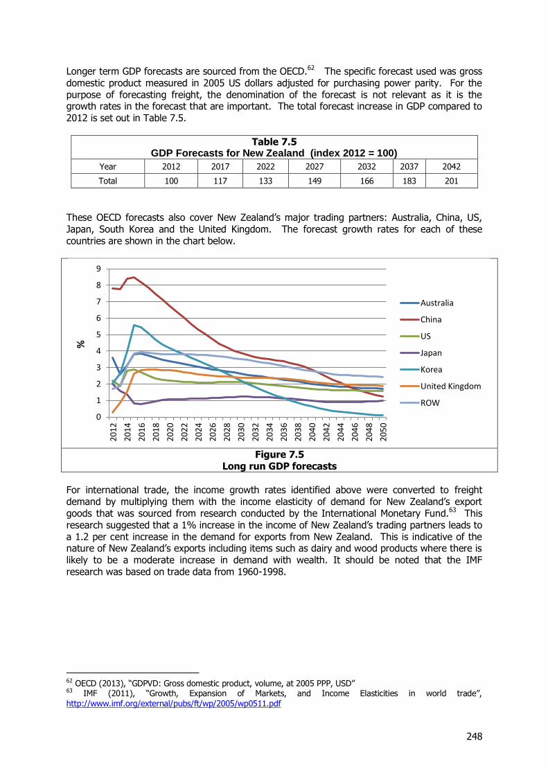
248
Longer term GDP forecasts are sourced from the OECD.62 The specific forecast used was gross domestic product measured in 2005 US dollars adjusted for purchasing power parity. For the purpose of forecasting freight, the denomination of the forecast is not relevant as it is the growth rates in the forecast that are important. The total forecast increase in GDP compared to 2012 is set out in Table 7.5.
Table 7.5 GDP Forecasts for New Zealand (index 2012 = 100)
Year 2012 2017 2022 2027 2032 2037 2042
Total 100 117 133 149 166 183 201
These OECD forecasts also cover New Zealand’s major trading partners: Australia, China, US, Japan, South Korea and the United Kingdom. The forecast growth rates for each of these countries are shown in the chart below.
Figure 7.5
Long run GDP forecasts
For international trade, the income growth rates identified above were converted to freight demand by multiplying them with the income elasticity of demand for New Zealand’s export goods that was sourced from research conducted by the International Monetary Fund.63 This research suggested that a 1% increase in the income of New Zealand’s trading partners leads to a 1.2 per cent increase in the demand for exports from New Zealand. This is indicative of the nature of New Zealand’s exports including items such as dairy and wood products where there is likely to be a moderate increase in demand with wealth. It should be noted that the IMF research was based on trade data from 1960-1998.
62 OECD (2013), “GDPVD: Gross domestic product, volume, at 2005 PPP, USD” 63 IMF (2011), “Growth, Expansion of Markets, and Income Elasticities in world trade”, http://www.imf.org/external/pubs/ft/wp/2005/wp0511.pdf
0
1
2
3
4
5
6
7
8
9
2012
2014
2016
2018
2020
2022
2024
2026
2028
2030
2032
2034
2036
2038
2040
2042
2044
2046
2048
2050
%
Australia
China
US
Japan
Korea
United Kingdom
ROW
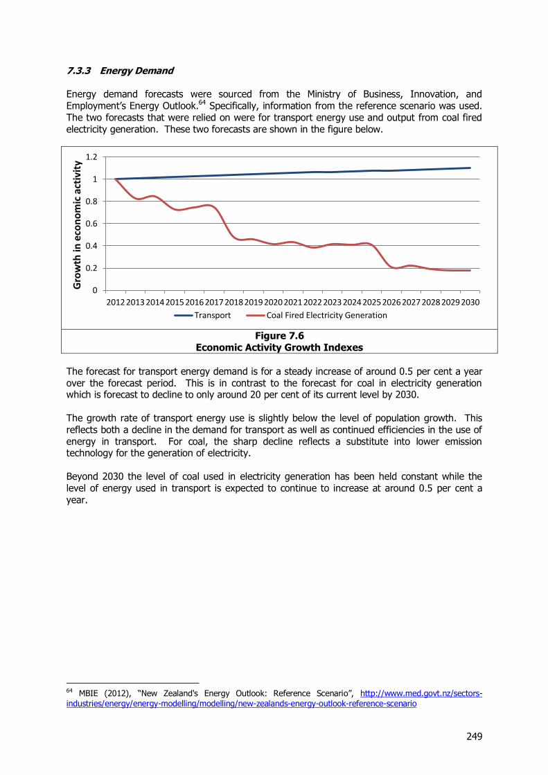
249
7.3.3 Energy Demand Energy demand forecasts were sourced from the Ministry of Business, Innovation, and Employment’s Energy Outlook.64 Specifically, information from the reference scenario was used. The two forecasts that were relied on were for transport energy use and output from coal fired electricity generation. These two forecasts are shown in the figure below.
Figure 7.6
Economic Activity Growth Indexes
The forecast for transport energy demand is for a steady increase of around 0.5 per cent a year over the forecast period. This is in contrast to the forecast for coal in electricity generation which is forecast to decline to only around 20 per cent of its current level by 2030. The growth rate of transport energy use is slightly below the level of population growth. This reflects both a decline in the demand for transport as well as continued efficiencies in the use of energy in transport. For coal, the sharp decline reflects a substitute into lower emission technology for the generation of electricity. Beyond 2030 the level of coal used in electricity generation has been held constant while the level of energy used in transport is expected to continue to increase at around 0.5 per cent a year.
64 MBIE (2012), “New Zealand's Energy Outlook: Reference Scenario”, http://www.med.govt.nz/sectors-industries/energy/energy-modelling/modelling/new-zealands-energy-outlook-reference-scenario
0
0.2
0.4
0.6
0.8
1
1.2
2012 2013 2014 2015 2016 2017 2018 2019 2020 2021 2022 2023 2024 2025 2026 2027 2028 2029 2030
Gro
wth
in e
con
om
ic a
ctiv
ity
Transport Coal Fired Electricity Generation

250
7.4 Overall Forecasts by Commodity
7.4.1 Introduction The underlying economic forecasts discussed above set a foundation on which the specific forecasts for each commodity were constructed. For many of the commodities a customised forecast was produced to reflect either specific supply side constraints or unique economic conditions. Each commodity is considered in more detail in its own section below.
7.4.2 Milk and Dairy Products-Liquid Milk and Manufactured Dairy Products As discussed above, liquid and manufactured dairy products were identified as being a supply constrained industry and were forecast based on an analysis of the ability to increase output in that industry. The capacity to increase the supply of dairy goods is a combination of three factors:
Supply of new land due to irrigation Conversion of land from other agricultural uses Increased productivity.
As land use patterns vary from region to region, the supply side calculation for dairy was done at a regional level. The first consideration was the increase in irrigated land. This was based on current plans for increased irrigation in different regions. In line with a number of studies, it was assumed that 50 per cent of the increase in irrigated land would be used for dairying. This gave the following increases in land due to irrigation:
Table 7.6 Assumed Increased Dairying Land with Irrigation (Ha)
Region 2013-2017 2018-2022 2023-2042
Hawke’s Bay 6,250 6,250
Wellington 7,500 7,500
Canterbury 50,000 100,000
Southland 24,803 24,803 24,803
In addition to this, there is the potential for increased dairying land by conversion from other agricultural uses. The assessment of this was based on an analysis of historical trends in each region. Areas that have seen higher rates of increase in dairy land use were assigned higher expected increases in the forecast. The assumed rate of increase is shown in the table below.

251
Table 7.7 Assumed Increased Dairying Land due to Altered Land Use (per cent pa)
Region Observed Change
2007-2012
Forecast Future Change
2013-2017 2018-2022 2023-2042
Northland 0.4% - - -
Auckland 0.5% - - -
Waikato 1.5% 1.0% 0.5% -
Bay of Plenty 0.4% - - -
Gisborne 1.9% 2.0% 1.0% -
Hawke's Bay 5.0% 5.0% 2.5% -
Taranaki 0.1% - - -
Manawatu 2.6% 2.0% 1.0% -
Wellington 3.3% 1.0% 0.5% -
TMN 0.1% - - -
West Coast 2.6% 2.0% 1.0% -
Canterbury 8.4% 5.0% 2.5% -
Otago 6.2% 5.0% 2.5% -
Southland (1) 9.5% - - -
Note: (1) The growth for Southland in response to changing land use is included in the figures in Table 7.6
These land use forecasts were then combined with an overall forecast of agricultural productivity improvements. Productivity improvements from 2013-2017 were selected to ensure that the forecast growth rates matched those in the Ministry for Primary Industries’ forecasts published in the Situation and Outlook for Primary Industries.65 Productivity growth rates beyond 2017 were initially set at 1 per cent a year. This aligns with estimates by Robertson66 on non- genetic productivity improvements possible in New Zealand dairy farming. In the longer term (2023 and beyond) this growth rate was halved to reflect likely diminishing returns to productivity investment. Taken together, these three factors imply an overall change in dairy supply for each region. This is summarised in Figure 7.7.
65 MPI (2013), “Situation and Outlook for Primary industries”, http://www.mpi.govt.nz/Portals/0/Documents/about-maf/2013-sopi-report-web.pdf 66 Robertson, M. (2010), “Agricultural productivity in Australia and New Zealand: trends, constraints and opportunities”,http://www.grassland.org.nz/publications/nzgrassland_publication_11.pdf
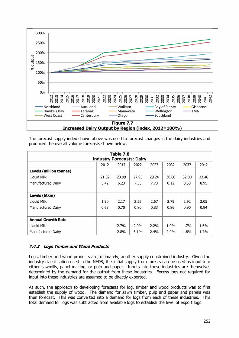
252
Figure 7.7
Increased Dairy Output by Region (index, 2012=100%)
The forecast supply index shown above was used to forecast changes in the dairy industries and produced the overall volume forecasts shown below.
Table 7.8 Industry Forecasts: Dairy
2012 2017 2022 2027 2032 2037 2042
Levels (million tonnes)
Liquid Milk 21.02 23.99 27.93 29.24 30.60 32.00 33.46
Manufactured Dairy 5.42 6.23 7.35 7.73 8.12 8.53 8.95
Levels (btkm)
Liquid Milk 1.90 2.17 2.55 2.67 2.79 2.92 3.05
Manufactured Dairy 0.63 0.70 0.80 0.83 0.86 0.90 0.94
Annual Growth Rate
Liquid Milk - 2.7% 2.9% 2.2% 1.9% 1.7% 1.6%
Manufactured Dairy - 2.8% 3.1% 2.4% 2.0% 1.8% 1.7%
7.4.3 Logs Timber and Wood Products Logs, timber and wood products are, ultimately, another supply constrained industry. Given the industry classification used in the NFDS, the initial supply from forests can be used as input into either sawmills, panel making, or pulp and paper. Inputs into these industries are themselves determined by the demand for the output from these industries. Excess logs not required for input into these industries are assumed to be directly exported. As such, the approach to developing forecasts for log, timber and wood products was to first establish the supply of wood. The demand for sawn timber, pulp and paper and panels was then forecast. This was converted into a demand for logs from each of these industries. This total demand for logs was subtracted from available logs to establish the level of export logs.
0%
50%
100%
150%
200%
250%
300%
2012
2013
2014
2015
2016
2017
2018
2019
2020
2021
2022
2023
2024
2025
2026
2027
2028
2029
2030
2031
2032
2033
2034
2035
2036
2037
2038
2039
2040
2041
2042
% o
utp
ut
Northland Auckland Waikato Bay of Plenty GisborneHawke's Bay Taranaki Manawatu Wellington TMNWest Coast Canterbury Otago Southland
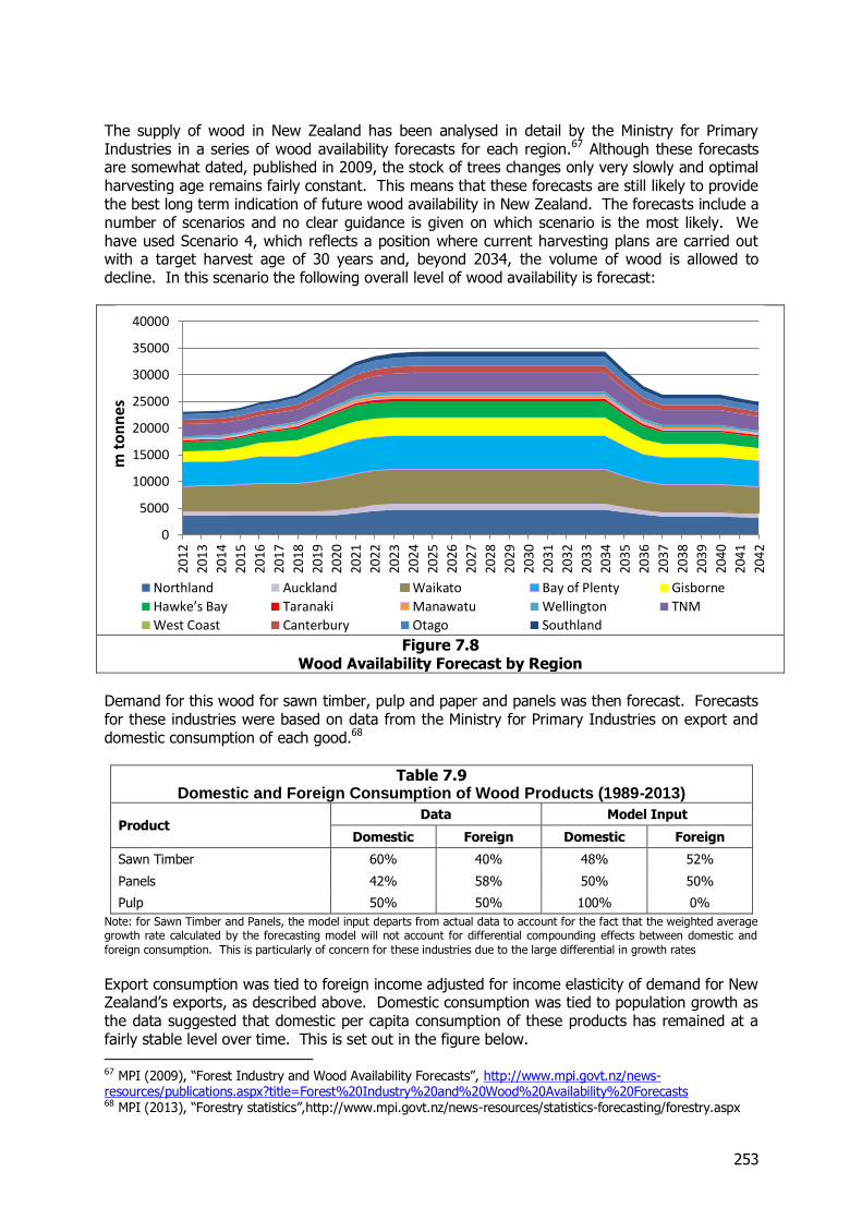
253
The supply of wood in New Zealand has been analysed in detail by the Ministry for Primary Industries in a series of wood availability forecasts for each region.67 Although these forecasts are somewhat dated, published in 2009, the stock of trees changes only very slowly and optimal harvesting age remains fairly constant. This means that these forecasts are still likely to provide the best long term indication of future wood availability in New Zealand. The forecasts include a number of scenarios and no clear guidance is given on which scenario is the most likely. We have used Scenario 4, which reflects a position where current harvesting plans are carried out with a target harvest age of 30 years and, beyond 2034, the volume of wood is allowed to decline. In this scenario the following overall level of wood availability is forecast:
Figure 7.8
Wood Availability Forecast by Region
Demand for this wood for sawn timber, pulp and paper and panels was then forecast. Forecasts for these industries were based on data from the Ministry for Primary Industries on export and domestic consumption of each good.68
Table 7.9 Domestic and Foreign Consumption of Wood Products (1989-2013)
Product Data Model Input
Domestic Foreign Domestic Foreign
Sawn Timber 60% 40% 48% 52%
Panels 42% 58% 50% 50%
Pulp 50% 50% 100% 0%
Note: for Sawn Timber and Panels, the model input departs from actual data to account for the fact that the weighted average growth rate calculated by the forecasting model will not account for differential compounding effects between domestic and
foreign consumption. This is particularly of concern for these industries due to the large differential in growth rates
Export consumption was tied to foreign income adjusted for income elasticity of demand for New Zealand’s exports, as described above. Domestic consumption was tied to population growth as the data suggested that domestic per capita consumption of these products has remained at a fairly stable level over time. This is set out in the figure below.
67 MPI (2009), “Forest Industry and Wood Availability Forecasts”, http://www.mpi.govt.nz/news-resources/publications.aspx?title=Forest%20Industry%20and%20Wood%20Availability%20Forecasts 68 MPI (2013), “Forestry statistics”,http://www.mpi.govt.nz/news-resources/statistics-forecasting/forestry.aspx
0
5000
10000
15000
20000
25000
30000
35000
40000
2012
2013
2014
2015
2016
2017
2018
2019
2020
2021
2022
2023
2024
2025
2026
2027
2028
2029
2030
2031
2032
2033
2034
2035
2036
2037
2038
2039
2040
2041
2042
m t
on
nes
Northland Auckland Waikato Bay of Plenty Gisborne
Hawke’s Bay Taranaki Manawatu Wellington TNM
West Coast Canterbury Otago Southland
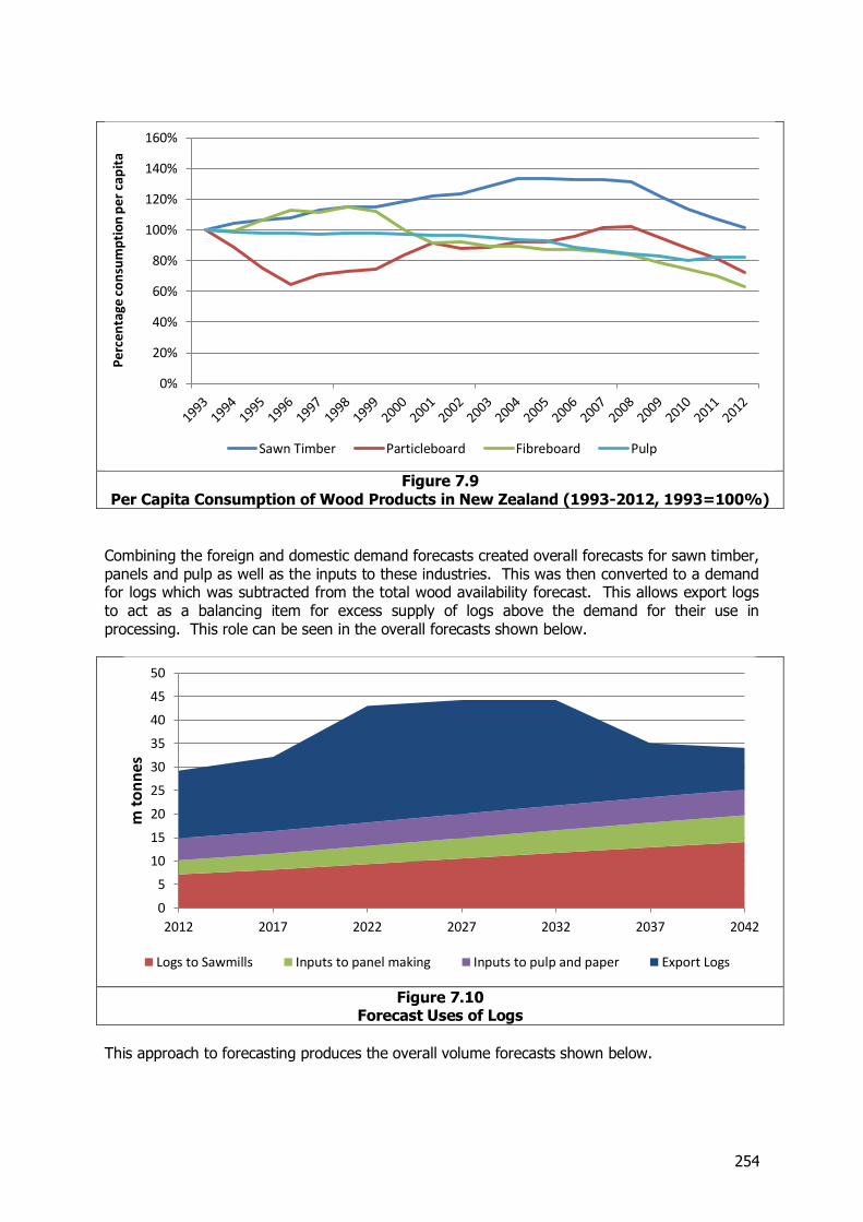
254
Figure 7.9
Per Capita Consumption of Wood Products in New Zealand (1993-2012, 1993=100%)
Combining the foreign and domestic demand forecasts created overall forecasts for sawn timber, panels and pulp as well as the inputs to these industries. This was then converted to a demand for logs which was subtracted from the total wood availability forecast. This allows export logs to act as a balancing item for excess supply of logs above the demand for their use in processing. This role can be seen in the overall forecasts shown below.
Figure 7.10
Forecast Uses of Logs
This approach to forecasting produces the overall volume forecasts shown below.
0%
20%
40%
60%
80%
100%
120%
140%
160%
Pe
rce
nta
ge c
on
sum
pti
on
pe
r ca
pit
a
Sawn Timber Particleboard Fibreboard Pulp
0
5
10
15
20
25
30
35
40
45
50
2012 2017 2022 2027 2032 2037 2042
m t
on
nes
Logs to Sawmills Inputs to panel making Inputs to pulp and paper Export Logs
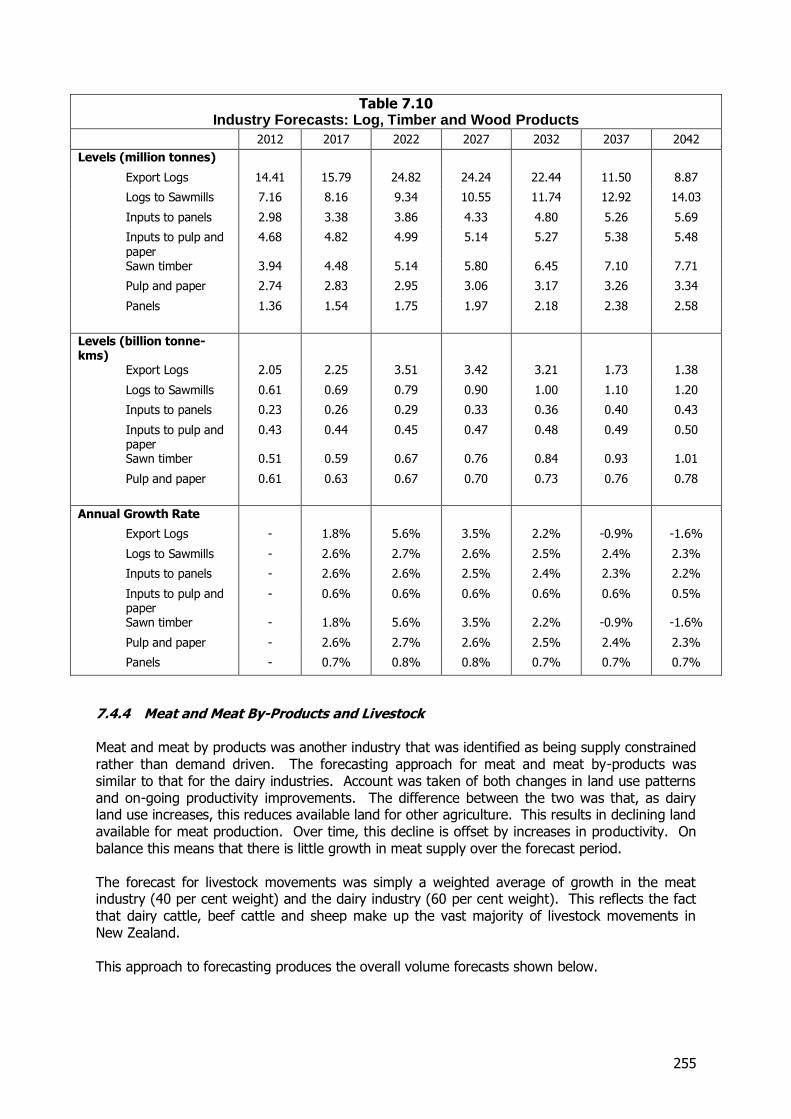
255
Table 7.10 Industry Forecasts: Log, Timber and Wood Products
2012 2017 2022 2027 2032 2037 2042
Levels (million tonnes)
Export Logs 14.41 15.79 24.82 24.24 22.44 11.50 8.87
Logs to Sawmills 7.16 8.16 9.34 10.55 11.74 12.92 14.03
Inputs to panels 2.98 3.38 3.86 4.33 4.80 5.26 5.69
Inputs to pulp and paper
4.68 4.82 4.99 5.14 5.27 5.38 5.48
Sawn timber 3.94 4.48 5.14 5.80 6.45 7.10 7.71
Pulp and paper 2.74 2.83 2.95 3.06 3.17 3.26 3.34
Panels 1.36 1.54 1.75 1.97 2.18 2.38 2.58
Levels (billion tonne-kms)
Export Logs 2.05 2.25 3.51 3.42 3.21 1.73 1.38
Logs to Sawmills 0.61 0.69 0.79 0.90 1.00 1.10 1.20
Inputs to panels 0.23 0.26 0.29 0.33 0.36 0.40 0.43
Inputs to pulp and paper
0.43 0.44 0.45 0.47 0.48 0.49 0.50
Sawn timber 0.51 0.59 0.67 0.76 0.84 0.93 1.01
Pulp and paper 0.61 0.63 0.67 0.70 0.73 0.76 0.78
Annual Growth Rate
Export Logs - 1.8% 5.6% 3.5% 2.2% -0.9% -1.6%
Logs to Sawmills - 2.6% 2.7% 2.6% 2.5% 2.4% 2.3%
Inputs to panels - 2.6% 2.6% 2.5% 2.4% 2.3% 2.2%
Inputs to pulp and paper
- 0.6% 0.6% 0.6% 0.6% 0.6% 0.5%
Sawn timber - 1.8% 5.6% 3.5% 2.2% -0.9% -1.6%
Pulp and paper - 2.6% 2.7% 2.6% 2.5% 2.4% 2.3%
Panels - 0.7% 0.8% 0.8% 0.7% 0.7% 0.7%
7.4.4 Meat and Meat By-Products and Livestock Meat and meat by products was another industry that was identified as being supply constrained rather than demand driven. The forecasting approach for meat and meat by-products was similar to that for the dairy industries. Account was taken of both changes in land use patterns and on-going productivity improvements. The difference between the two was that, as dairy land use increases, this reduces available land for other agriculture. This results in declining land available for meat production. Over time, this decline is offset by increases in productivity. On balance this means that there is little growth in meat supply over the forecast period. The forecast for livestock movements was simply a weighted average of growth in the meat industry (40 per cent weight) and the dairy industry (60 per cent weight). This reflects the fact that dairy cattle, beef cattle and sheep make up the vast majority of livestock movements in New Zealand. This approach to forecasting produces the overall volume forecasts shown below.
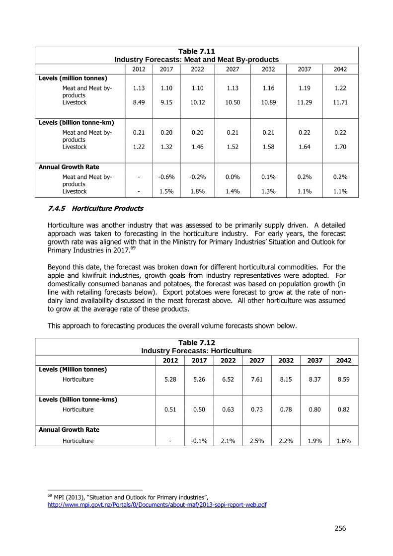
256
Table 7.11 Industry Forecasts: Meat and Meat By-products
2012 2017 2022 2027 2032 2037 2042
Levels (million tonnes)
Meat and Meat by-products
1.13 1.10 1.10 1.13 1.16 1.19 1.22
Livestock 8.49 9.15 10.12 10.50 10.89 11.29 11.71
Levels (billion tonne-km)
Meat and Meat by-products
0.21 0.20 0.20 0.21 0.21 0.22 0.22
Livestock 1.22 1.32 1.46 1.52 1.58 1.64 1.70
Annual Growth Rate
Meat and Meat by-products
- -0.6% -0.2% 0.0% 0.1% 0.2% 0.2%
Livestock - 1.5% 1.8% 1.4% 1.3% 1.1% 1.1%
7.4.5 Horticulture Products Horticulture was another industry that was assessed to be primarily supply driven. A detailed approach was taken to forecasting in the horticulture industry. For early years, the forecast growth rate was aligned with that in the Ministry for Primary Industries’ Situation and Outlook for Primary Industries in 2017.69 Beyond this date, the forecast was broken down for different horticultural commodities. For the apple and kiwifruit industries, growth goals from industry representatives were adopted. For domestically consumed bananas and potatoes, the forecast was based on population growth (in line with retailing forecasts below). Export potatoes were forecast to grow at the rate of non-dairy land availability discussed in the meat forecast above. All other horticulture was assumed to grow at the average rate of these products. This approach to forecasting produces the overall volume forecasts shown below.
Table 7.12 Industry Forecasts: Horticulture
2012 2017 2022 2027 2032 2037 2042
Levels (Million tonnes)
Horticulture 5.28 5.26 6.52 7.61 8.15 8.37 8.59
Levels (billion tonne-kms)
Horticulture 0.51 0.50 0.63 0.73 0.78 0.80 0.82
Annual Growth Rate
Horticulture - -0.1% 2.1% 2.5% 2.2% 1.9% 1.6%
69 MPI (2013), “Situation and Outlook for Primary industries”, http://www.mpi.govt.nz/Portals/0/Documents/about-maf/2013-sopi-report-web.pdf
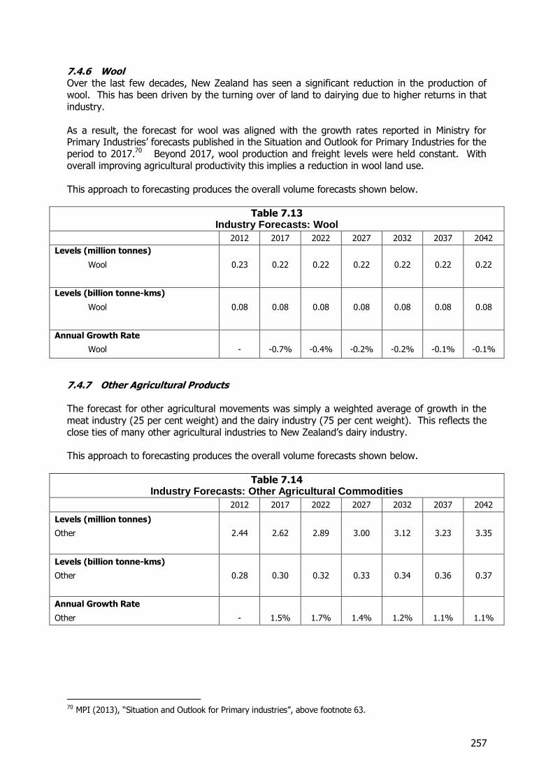
257
7.4.6 Wool Over the last few decades, New Zealand has seen a significant reduction in the production of wool. This has been driven by the turning over of land to dairying due to higher returns in that industry. As a result, the forecast for wool was aligned with the growth rates reported in Ministry for Primary Industries’ forecasts published in the Situation and Outlook for Primary Industries for the period to 2017.70 Beyond 2017, wool production and freight levels were held constant. With overall improving agricultural productivity this implies a reduction in wool land use. This approach to forecasting produces the overall volume forecasts shown below.
Table 7.13 Industry Forecasts: Wool
2012 2017 2022 2027 2032 2037 2042
Levels (million tonnes)
Wool 0.23 0.22 0.22 0.22 0.22 0.22 0.22
Levels (billion tonne-kms)
Wool 0.08 0.08 0.08 0.08 0.08 0.08 0.08
Annual Growth Rate
Wool - -0.7% -0.4% -0.2% -0.2% -0.1% -0.1%
7.4.7 Other Agricultural Products The forecast for other agricultural movements was simply a weighted average of growth in the meat industry (25 per cent weight) and the dairy industry (75 per cent weight). This reflects the close ties of many other agricultural industries to New Zealand’s dairy industry. This approach to forecasting produces the overall volume forecasts shown below.
Table 7.14 Industry Forecasts: Other Agricultural Commodities
2012 2017 2022 2027 2032 2037 2042
Levels (million tonnes)
Other 2.44 2.62 2.89 3.00 3.12 3.23 3.35
Levels (billion tonne-kms)
Other 0.28 0.30 0.32 0.33 0.34 0.36 0.37
Annual Growth Rate
Other - 1.5% 1.7% 1.4% 1.2% 1.1% 1.1%
70 MPI (2013), “Situation and Outlook for Primary industries”, above footnote 63.
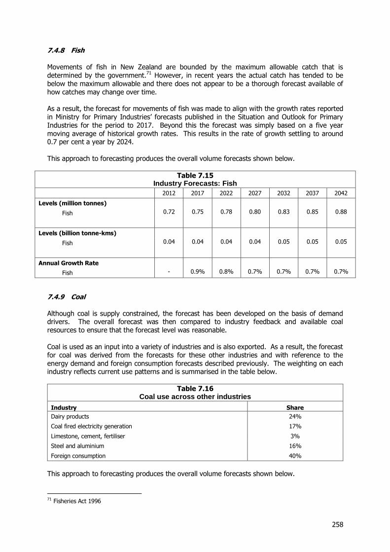
258
7.4.8 Fish Movements of fish in New Zealand are bounded by the maximum allowable catch that is determined by the government.71 However, in recent years the actual catch has tended to be below the maximum allowable and there does not appear to be a thorough forecast available of how catches may change over time. As a result, the forecast for movements of fish was made to align with the growth rates reported in Ministry for Primary Industries’ forecasts published in the Situation and Outlook for Primary Industries for the period to 2017. Beyond this the forecast was simply based on a five year moving average of historical growth rates. This results in the rate of growth settling to around 0.7 per cent a year by 2024. This approach to forecasting produces the overall volume forecasts shown below.
Table 7.15 Industry Forecasts: Fish
2012 2017 2022 2027 2032 2037 2042
Levels (million tonnes)
Fish 0.72 0.75 0.78 0.80 0.83 0.85 0.88
Levels (billion tonne-kms)
Fish 0.04 0.04 0.04 0.04 0.05 0.05 0.05
Annual Growth Rate
Fish - 0.9% 0.8% 0.7% 0.7% 0.7% 0.7%
7.4.9 Coal Although coal is supply constrained, the forecast has been developed on the basis of demand drivers. The overall forecast was then compared to industry feedback and available coal resources to ensure that the forecast level was reasonable. Coal is used as an input into a variety of industries and is also exported. As a result, the forecast for coal was derived from the forecasts for these other industries and with reference to the energy demand and foreign consumption forecasts described previously. The weighting on each industry reflects current use patterns and is summarised in the table below.
Table 7.16 Coal use across other industries
Industry Share
Dairy products 24%
Coal fired electricity generation 17%
Limestone, cement, fertiliser 3%
Steel and aluminium 16%
Foreign consumption 40%
This approach to forecasting produces the overall volume forecasts shown below.
71 Fisheries Act 1996
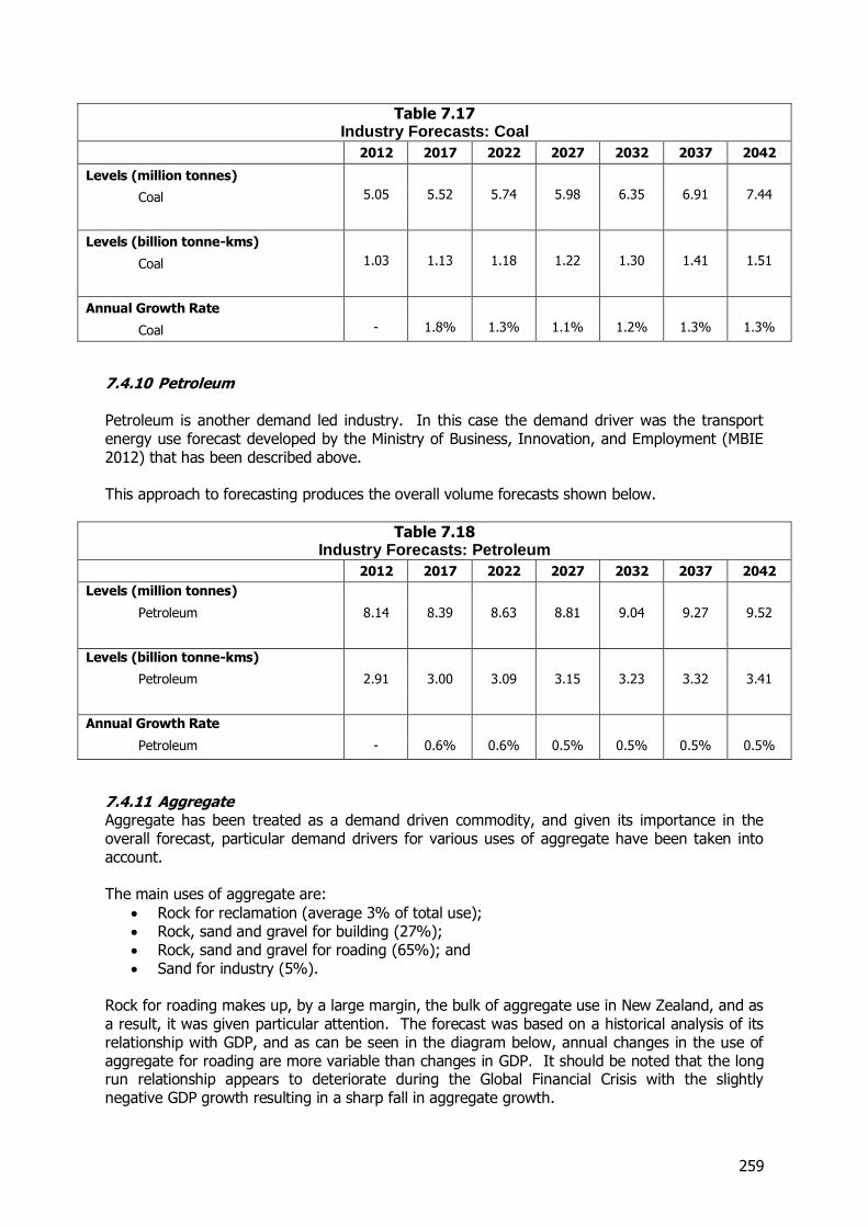
259
Table 7.17 Industry Forecasts: Coal
2012 2017 2022 2027 2032 2037 2042
Levels (million tonnes)
Coal 5.05 5.52 5.74 5.98 6.35 6.91 7.44
Levels (billion tonne-kms)
Coal 1.03 1.13 1.18 1.22 1.30 1.41 1.51
Annual Growth Rate
Coal - 1.8% 1.3% 1.1% 1.2% 1.3% 1.3%
7.4.10 Petroleum Petroleum is another demand led industry. In this case the demand driver was the transport energy use forecast developed by the Ministry of Business, Innovation, and Employment (MBIE 2012) that has been described above. This approach to forecasting produces the overall volume forecasts shown below.
Table 7.18 Industry Forecasts: Petroleum
2012 2017 2022 2027 2032 2037 2042
Levels (million tonnes)
Petroleum 8.14 8.39 8.63 8.81 9.04 9.27 9.52
Levels (billion tonne-kms)
Petroleum 2.91 3.00 3.09 3.15 3.23 3.32 3.41
Annual Growth Rate
Petroleum - 0.6% 0.6% 0.5% 0.5% 0.5% 0.5%
7.4.11 Aggregate Aggregate has been treated as a demand driven commodity, and given its importance in the overall forecast, particular demand drivers for various uses of aggregate have been taken into account. The main uses of aggregate are:
Rock for reclamation (average 3% of total use); Rock, sand and gravel for building (27%); Rock, sand and gravel for roading (65%); and Sand for industry (5%).
Rock for roading makes up, by a large margin, the bulk of aggregate use in New Zealand, and as a result, it was given particular attention. The forecast was based on a historical analysis of its relationship with GDP, and as can be seen in the diagram below, annual changes in the use of aggregate for roading are more variable than changes in GDP. It should be noted that the long run relationship appears to deteriorate during the Global Financial Crisis with the slightly negative GDP growth resulting in a sharp fall in aggregate growth.
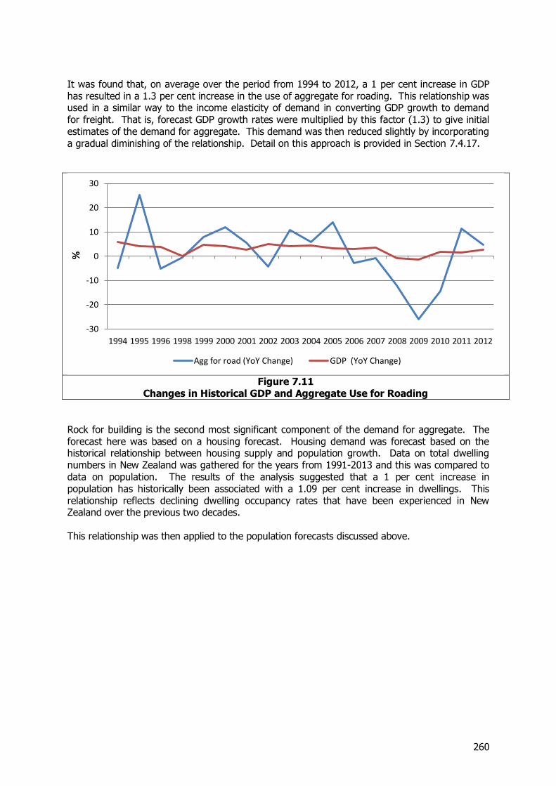
260
It was found that, on average over the period from 1994 to 2012, a 1 per cent increase in GDP has resulted in a 1.3 per cent increase in the use of aggregate for roading. This relationship was used in a similar way to the income elasticity of demand in converting GDP growth to demand for freight. That is, forecast GDP growth rates were multiplied by this factor (1.3) to give initial estimates of the demand for aggregate. This demand was then reduced slightly by incorporating a gradual diminishing of the relationship. Detail on this approach is provided in Section 7.4.17.
Figure 7.11
Changes in Historical GDP and Aggregate Use for Roading
Rock for building is the second most significant component of the demand for aggregate. The forecast here was based on a housing forecast. Housing demand was forecast based on the historical relationship between housing supply and population growth. Data on total dwelling numbers in New Zealand was gathered for the years from 1991-2013 and this was compared to data on population. The results of the analysis suggested that a 1 per cent increase in population has historically been associated with a 1.09 per cent increase in dwellings. This relationship reflects declining dwelling occupancy rates that have been experienced in New Zealand over the previous two decades. This relationship was then applied to the population forecasts discussed above.
-30
-20
-10
0
10
20
30
1994 1995 1996 1998 1999 2000 2001 2002 2003 2004 2005 2006 2007 2008 2009 2010 2011 2012
%
Agg for road (YoY Change) GDP (YoY Change)
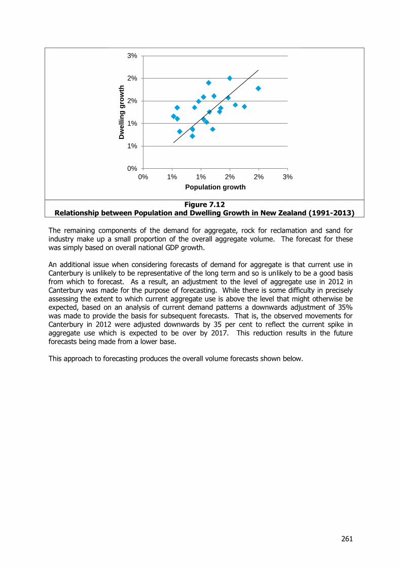
261
Figure 7.12
Relationship between Population and Dwelling Growth in New Zealand (1991-2013)
The remaining components of the demand for aggregate, rock for reclamation and sand for industry make up a small proportion of the overall aggregate volume. The forecast for these was simply based on overall national GDP growth. An additional issue when considering forecasts of demand for aggregate is that current use in Canterbury is unlikely to be representative of the long term and so is unlikely to be a good basis from which to forecast. As a result, an adjustment to the level of aggregate use in 2012 in Canterbury was made for the purpose of forecasting. While there is some difficulty in precisely assessing the extent to which current aggregate use is above the level that might otherwise be expected, based on an analysis of current demand patterns a downwards adjustment of 35% was made to provide the basis for subsequent forecasts. That is, the observed movements for Canterbury in 2012 were adjusted downwards by 35 per cent to reflect the current spike in aggregate use which is expected to be over by 2017. This reduction results in the future forecasts being made from a lower base. This approach to forecasting produces the overall volume forecasts shown below.
0%
1%
1%
2%
2%
3%
0% 1% 1% 2% 2% 3%
Dw
ellin
g g
row
th
Population growth
262
Table 7.19 Industry Forecasts: Aggregate
2012 2017 2022 2027 2032 2037 2042
Levels (million tonnes)
Aggregate 26.99 29.60 33.86 38.08 42.28 46.50 50.69
Levels (billion tonne-kms)
Aggregate 0.84 0.96 1.10 1.24 1.38 1.51 1.65
Annual Growth Rate
Aggregate - 1.9% 2.3% 2.3% 2.3% 2.2% 2.1%
7.4.12 Limestone, Cement and Fertiliser As for coal, this industry was forecast based on the uses of its output. As a grouping of industries, these outputs are extremely varied. Limestone is used in the production of Lime which makes its way into agricultural uses, cement and construction. Fertiliser is used in agricultural production while cement is used in the production of concrete. As a result this forecast was based on a weighted average of the forecasts for dairy (60 per cent) and concrete (40 per cent). This approach to forecasting produces the overall volume forecasts shown below. It should be noted that the figures for 2012 are based on the position with the pattern of flows assuming that Holcim cement plant at Westport has been phased out and so are slightly different to the figures set out in Section 3.
Table 7.20 Industry Forecasts: Limestone, Cement and Fertiliser
2012 2017 2022 2027 2032 2037 2042
Levels (million tonnes)
Limestone, cement and fertiliser
10.83 13.08 15.45 17.50 19.04 20.53 21.98
Levels (billion tonne-kms)
Limestone, cement and fertiliser
1.30 1.58 2.12 2.35 2.57 2.78 2.99
Annual Growth Rate
Limestone, cement and fertiliser (1)
- 3.9% 3.6% 3.3% 2.9% 2.6% 2.4%
Note: (1) The growth rate is based on the underlying growth in demand and assumes that the Holcim plant at Westport has been phased out
263
7.4.13 Concrete The forecast for concrete was developed in a very similar manner to that for aggregate for roading use. The historical relationship between the use of concrete and GDP growth was analysed based on data from 1992 to 2012. This analysis indicated that, historically, a 1 per cent increase in GDP has been associated with a 2.2 per cent increase in the use of concrete. This relationship is much stronger than that seen in most other industries in this analysis. The forecast was also adjusted for the anticipated weakening in the relationship between freight demand and income, explained in more detail in section 7.4.17. An additional issue when considering concrete forecasts is that as in the case of the demand for aggregate current use in Canterbury is unlikely to be representative of the long term and so is unlikely to be a good basis from which to forecast. As a result, an adjustment to the level of concrete use in 2012 in Canterbury was made for the purpose of forecasting. While there is some difficulty in precisely assessing the extent to which current concrete use is above the level that might otherwise be expected, based on an analysis of current demand patterns a downwards adjustment of 35 per cent was made to provide the basis for subsequent forecasts. That is, the observed movements for Canterbury in 2012 were adjusted downwards by 35 per cent to reflect the current spike in aggregate use which is expected to be over by 2017. This reduction results in the future forecasts being made from a lower base. This adjustment is in line with that undertaken for aggregates. This approach to forecasting produces the overall volume forecasts shown below.
Table 7.21 Industry Forecasts: Concrete
2012 2017 2022 2027 2032 2037 2042
Levels (million tonnes)
Concrete 6.97 8.53 10.51 12.43 14.31 16.14 17.91
Levels (billion tonne-kms)
Concrete 0.06 0.07 0.09 0.10 0.12 0.13 0.15
Annual Growth Rate
Concrete - 4.1% 4.2% 3.9% 3.7% 3.4% 3.2%
7.4.14 Steel and Aluminium Steel and aluminium were treated as demand driven commodities. Their demand was expected to grow in line with population growth. This reflects long run relationships between development and steel demand, where it is found that per capita consumption of steel tends to be relatively constant at higher income levels. This is shown in research by the Australian Treasury.72
72http://www.treasury.gov.au/PublicationsAndMedia/Publications/2012/Economic-Roundup-Issue-1/Report/global-commodity-markets
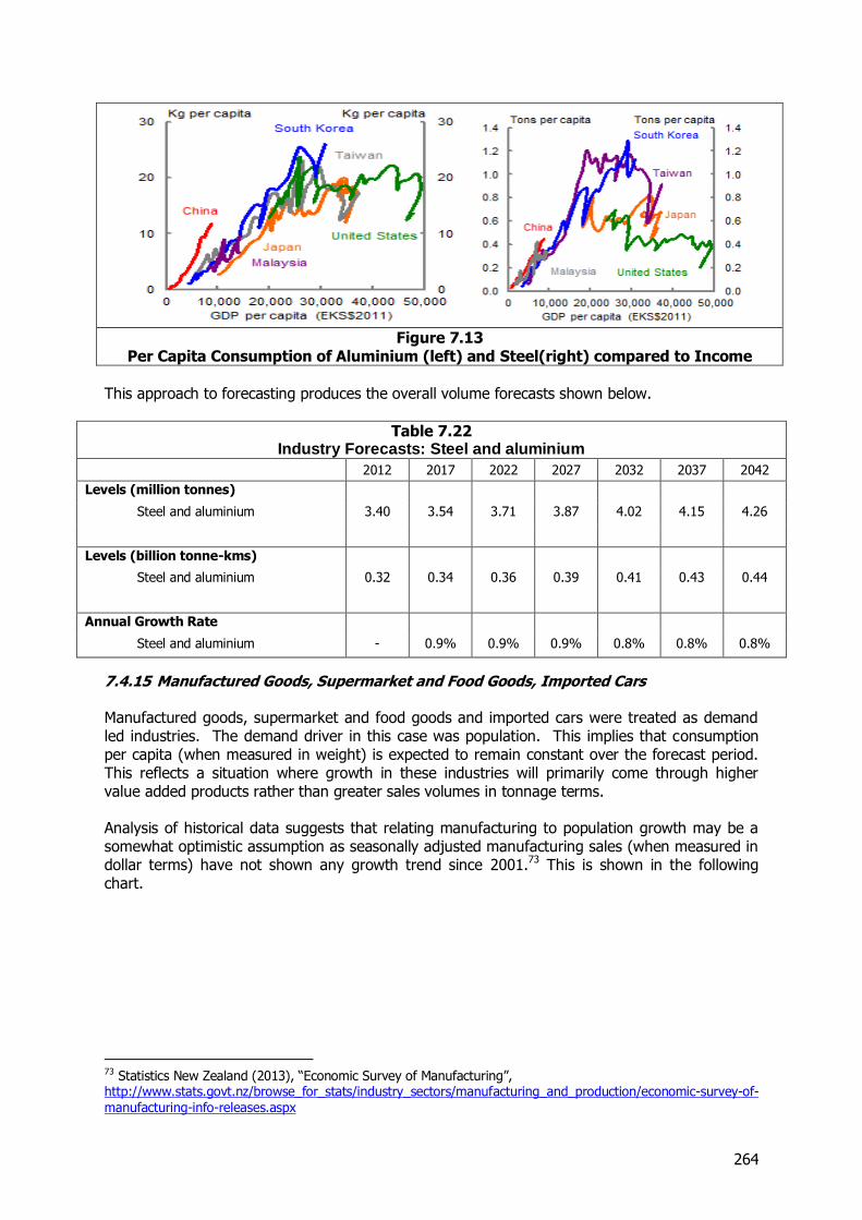
264
Figure 7.13
Per Capita Consumption of Aluminium (left) and Steel(right) compared to Income
This approach to forecasting produces the overall volume forecasts shown below.
Table 7.22 Industry Forecasts: Steel and aluminium
2012 2017 2022 2027 2032 2037 2042
Levels (million tonnes)
Steel and aluminium 3.40 3.54 3.71 3.87 4.02 4.15 4.26
Levels (billion tonne-kms)
Steel and aluminium 0.32 0.34 0.36 0.39 0.41 0.43 0.44
Annual Growth Rate
Steel and aluminium - 0.9% 0.9% 0.9% 0.8% 0.8% 0.8%
7.4.15 Manufactured Goods, Supermarket and Food Goods, Imported Cars Manufactured goods, supermarket and food goods and imported cars were treated as demand led industries. The demand driver in this case was population. This implies that consumption per capita (when measured in weight) is expected to remain constant over the forecast period. This reflects a situation where growth in these industries will primarily come through higher value added products rather than greater sales volumes in tonnage terms. Analysis of historical data suggests that relating manufacturing to population growth may be a somewhat optimistic assumption as seasonally adjusted manufacturing sales (when measured in dollar terms) have not shown any growth trend since 2001.73 This is shown in the following chart.
73 Statistics New Zealand (2013), “Economic Survey of Manufacturing”, http://www.stats.govt.nz/browse_for_stats/industry_sectors/manufacturing_and_production/economic-survey-of-manufacturing-info-releases.aspx
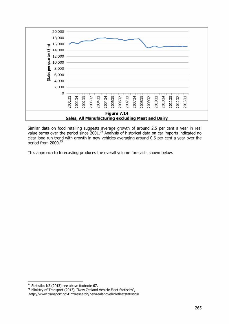
265
Figure 7.14
Sales, All Manufacturing excluding Meat and Dairy
Similar data on food retailing suggests average growth of around 2.5 per cent a year in real value terms over the period since 2001.74 Analysis of historical data on car imports indicated no clear long run trend with growth in new vehicles averaging around 0.6 per cent a year over the period from 2000.75 This approach to forecasting produces the overall volume forecasts shown below.
74 Statistics NZ (2013) see above footnote 67. 75 Ministry of Transport (2013), “New Zealand Vehicle Fleet Statistics”, http://www.transport.govt.nz/research/newzealandvehiclefleetstatistics/
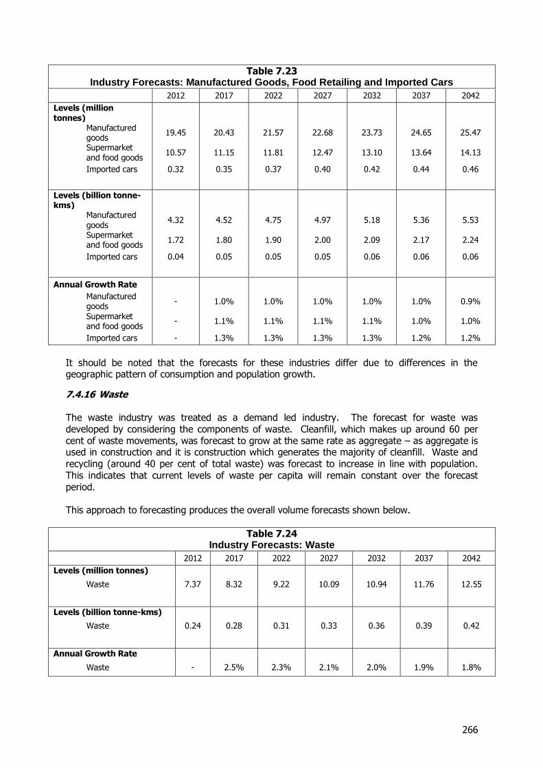
266
Table 7.23 Industry Forecasts: Manufactured Goods, Food Retailing and Imported Cars
2012 2017 2022 2027 2032 2037 2042
Levels (million tonnes)
Manufactured goods
19.45 20.43 21.57 22.68 23.73 24.65 25.47
Supermarket and food goods
10.57 11.15 11.81 12.47 13.10 13.64 14.13
Imported cars 0.32 0.35 0.37 0.40 0.42 0.44 0.46
Levels (billion tonne-kms)
Manufactured goods
4.32 4.52 4.75 4.97 5.18 5.36 5.53
Supermarket and food goods
1.72 1.80 1.90 2.00 2.09 2.17 2.24
Imported cars 0.04 0.05 0.05 0.05 0.06 0.06 0.06
Annual Growth Rate
Manufactured goods
- 1.0% 1.0% 1.0% 1.0% 1.0% 0.9%
Supermarket and food goods
- 1.1% 1.1% 1.1% 1.1% 1.0% 1.0%
Imported cars - 1.3% 1.3% 1.3% 1.3% 1.2% 1.2%
It should be noted that the forecasts for these industries differ due to differences in the geographic pattern of consumption and population growth.
7.4.16 Waste The waste industry was treated as a demand led industry. The forecast for waste was developed by considering the components of waste. Cleanfill, which makes up around 60 per cent of waste movements, was forecast to grow at the same rate as aggregate – as aggregate is used in construction and it is construction which generates the majority of cleanfill. Waste and recycling (around 40 per cent of total waste) was forecast to increase in line with population. This indicates that current levels of waste per capita will remain constant over the forecast period. This approach to forecasting produces the overall volume forecasts shown below.
Table 7.24 Industry Forecasts: Waste
2012 2017 2022 2027 2032 2037 2042
Levels (million tonnes)
Waste 7.37 8.32 9.22 10.09 10.94 11.76 12.55
Levels (billion tonne-kms)
Waste 0.24 0.28 0.31 0.33 0.36 0.39 0.42
Annual Growth Rate
Waste - 2.5% 2.3% 2.1% 2.0% 1.9% 1.8%
267
7.4.17 Grain, Other Minerals, Other Retail Goods and Couriers and Post These four industry groups, although diverse, were forecast using the same forecasting index, income growth with an adjustment for the relationship between income and general freight demand. This is an extremely generic forecasting index and is appropriate for use with these small, mixed industries. Some background detail on the relationship between freight and economic activity is useful to understand this approach. It should be noted that the approach described below is only applied to Grain, Other Minerals, Other Retail Goods and Couriers and Post. Considering the relationship between GDP and freight, there are two forces which can drive freight demand apart from a direct relationship to GDP growth. In the positive direction, freight demand has historically tended to grow faster than GDP growth. In economic terms this relates to the income elasticity of demand and historically, freight has been a ‘superior’ good with an income elasticity in excess of 1. However, over time it is expected that the relationship between income and freight demand may deteriorate to the point where it becomes a ‘unitary’ good – where a 1 per cent increase in income leads to a 1 per cent increase in freight demand. This reflects a number of factors including the changing make-up of GDP with an increasing importance of service type activities which have relatively low freight generating characteristics. For domestic consumption, IMF research suggested that a 1 per cent increase in income in New Zealand leads to a 1.56 per cent increase in imports.76 In the absence of detailed studies on the income elasticity of domestic freight for New Zealand, this figure was used an indication of the income elasticity of demand for freight in New Zealand. It should be noted that this IMF paper, although published in 2011 relies on data for the years from 1960-1998. An additional adjustment was made to reflect the anticipated weakening in the relationship between freight demand and income. The potential for a weakening relationship between income and freight demand in New Zealand has not been investigated in detail. However, the Australian Bureau of Infrastructure, Transport and Regional Economics (BITRE) has undertaken detailed analysis for Australia.77 This was converted into an elasticity relationship to allow it to be transferred to the circumstances of New Zealand. The relationship suggests that, after accounting for both the income elasticity of freight demand and the weakening of this relationship that is forecast by BITRE, income and freight demand are expected to be growing at around the same rate by 2050. This means that, in the intervening period, the expected relationship between income growth and freight demand growth decreases from the current value of a multiple 1.56 to 1. Considering how this forecasting approach can apply to Other Retail Goods and Couriers and Post in more detail, there is evidence of continued increases of demand with income. Following the end of the global financial crisis there has been strong growth in the value of sales of non-food retail goods of around 6% per year (on average). It is also likely that, over the long run as internet purchases come to replace traditional retailing, changes in the couriers and post industry will be most strongly tied with changes in other retail goods.
76 IMF (2011), “Growth, Expansion of Markets, and Income Elasticities in world trade”, http://www.imf.org/external/pubs/ft/wp/2005/wp0511.pdf 77 BITRE (2010), “Multimodal Interstate Freight in Australia”, http://www.bitre.gov.au/publications/2010/files/report_120.pdf
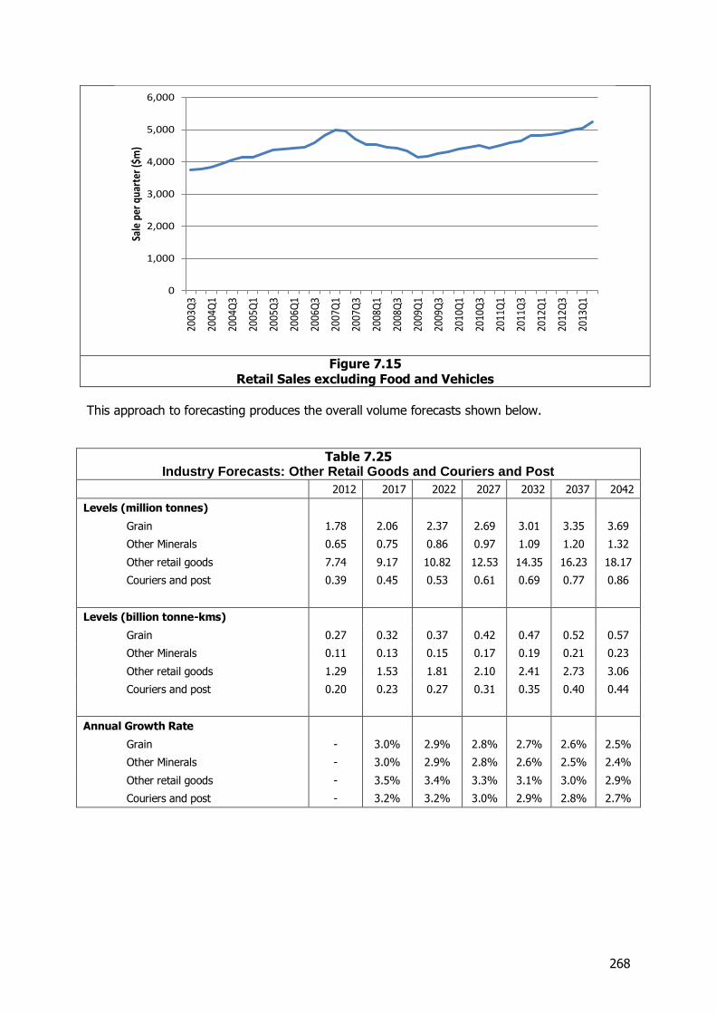
268
Figure 7.15
Retail Sales excluding Food and Vehicles
This approach to forecasting produces the overall volume forecasts shown below.
Table 7.25 Industry Forecasts: Other Retail Goods and Couriers and Post
2012 2017 2022 2027 2032 2037 2042
Levels (million tonnes)
Grain 1.78 2.06 2.37 2.69 3.01 3.35 3.69
Other Minerals 0.65 0.75 0.86 0.97 1.09 1.20 1.32
Other retail goods 7.74 9.17 10.82 12.53 14.35 16.23 18.17
Couriers and post 0.39 0.45 0.53 0.61 0.69 0.77 0.86
Levels (billion tonne-kms)
Grain 0.27 0.32 0.37 0.42 0.47 0.52 0.57
Other Minerals 0.11 0.13 0.15 0.17 0.19 0.21 0.23
Other retail goods 1.29 1.53 1.81 2.10 2.41 2.73 3.06
Couriers and post 0.20 0.23 0.27 0.31 0.35 0.40 0.44
Annual Growth Rate
Grain - 3.0% 2.9% 2.8% 2.7% 2.6% 2.5%
Other Minerals - 3.0% 2.9% 2.8% 2.6% 2.5% 2.4%
Other retail goods - 3.5% 3.4% 3.3% 3.1% 3.0% 2.9%
Couriers and post - 3.2% 3.2% 3.0% 2.9% 2.8% 2.7%
0
1,000
2,000
3,000
4,000
5,000
6,000
2003
Q3
2004
Q1
2004
Q3
2005
Q1
2005
Q3
2006
Q1
2006
Q3
2007
Q1
2007
Q3
2008
Q1
2008
Q3
2009
Q1
2009
Q3
2010
Q1
2010
Q3
2011
Q1
2011
Q3
2012
Q1
2012
Q3
2013
Q1
Sale
per
qua
rter
($m
)
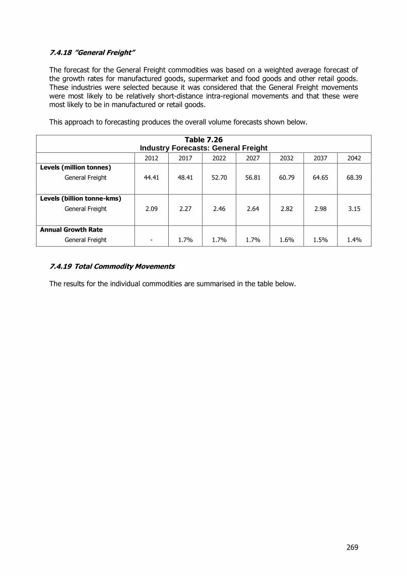
269
7.4.18 ”General Freight” The forecast for the General Freight commodities was based on a weighted average forecast of the growth rates for manufactured goods, supermarket and food goods and other retail goods. These industries were selected because it was considered that the General Freight movements were most likely to be relatively short-distance intra-regional movements and that these were most likely to be in manufactured or retail goods. This approach to forecasting produces the overall volume forecasts shown below.
Table 7.26 Industry Forecasts: General Freight
2012 2017 2022 2027 2032 2037 2042
Levels (million tonnes)
General Freight 44.41 48.41 52.70 56.81 60.79 64.65 68.39
Levels (billion tonne-kms)
General Freight 2.09 2.27 2.46 2.64 2.82 2.98 3.15
Annual Growth Rate
General Freight - 1.7% 1.7% 1.7% 1.6% 1.5% 1.4%
7.4.19 Total Commodity Movements The results for the individual commodities are summarised in the table below.
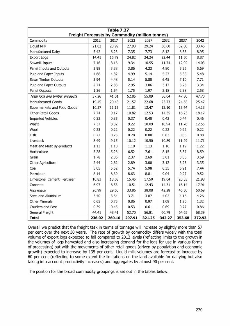
270
Table 7.27 Freight Forecasts by Commodity (million tonnes)
Commodity 2012 2017 2022 2027 2032 2037 2042
Liquid Milk 21.02 23.99 27.93 29.24 30.60 32.00 33.46
Manufactured Dairy 5.42 6.23 7.35 7.73 8.12 8.53 8.95
Export Logs 14.41 15.79 24.82 24.24 22.44 11.50 8.87
Sawmill Inputs 7.16 8.16 9.34 10.55 11.74 12.92 14.03
Panel Inputs and Outputs 2.98 3.38 3.86 4.33 4.80 5.26 5.69
Pulp and Paper Inputs 4.68 4.82 4.99 5.14 5.27 5.38 5.48
Sawn Timber Outputs 3.94 4.48 5.14 5.80 6.45 7.10 7.71
Pulp and Paper Outputs 2.74 2.83 2.95 3.06 3.17 3.26 3.34
Panel Outputs 1.36 1.54 1.75 1.97 2.18 2.38 2.58
Total logs and timber products 37.26 41.01 52.85 55.09 56.04 47.80 47.70
Manufactured Goods 19.45 20.43 21.57 22.68 23.73 24.65 25.47
Supermarkets and Food Goods 10.57 11.15 11.81 12.47 13.10 13.64 14.13
Other Retail Goods 7.74 9.17 10.82 12.53 14.35 16.23 18.17
Imported Vehicles 0.32 0.35 0.37 0.40 0.42 0.44 0.46
Waste 7.37 8.32 9.22 10.09 10.94 11.76 12.55
Wool 0.23 0.22 0.22 0.22 0.22 0.22 0.22
Fish 0.72 0.75 0.78 0.80 0.83 0.85 0.88
Livestock 8.49 9.15 10.12 10.50 10.89 11.29 11.71
Meat and Meat By-products 1.13 1.10 1.10 1.13 1.16 1.19 1.22
Horticulture 5.28 5.26 6.52 7.61 8.15 8.37 8.59
Grain 1.78 2.06 2.37 2.69 3.01 3.35 3.69
Other Agriculture 2.44 2.62 2.89 3.00 3.12 3.23 3.35
Coal 5.05 5.52 5.74 5.98 6.35 6.91 7.44
Petroleum 8.14 8.39 8.63 8.81 9.04 9.27 9.52
Limestone, Cement, Fertiliser 10.83 13.08 15.45 17.50 19.04 20.53 21.98
Concrete 6.97 8.53 10.51 12.43 14.31 16.14 17.91
Aggregate 26.99 29.60 33.86 38.08 42.28 46.50 50.69
Steel and Aluminium 3.40 3.54 3.71 3.87 4.02 4.15 4.26
Other Minerals 0.65 0.75 0.86 0.97 1.09 1.20 1.32
Couriers and Post 0.39 0.45 0.53 0.61 0.69 0.77 0.86
General Freight 44.41 48.41 52.70 56.81 60.79 64.65 68.39
Total 236.02 260.10 297.91 321.25 342.27 353.68 372.93
Overall we predict that the freight task in terms of tonnage will increase by slightly more than 57 per cent over the next 30 years. The rate of growth by commodity differs widely with the total volume of export logs expected to fall compared to 2012 levels (reflecting limits to the growth in the volumes of logs harvested and also increasing demand for the logs for use in various forms of processing) but with the movements of other retail goods (driven by population and economic growth) expected to increase by 135 per cent. Liquid milk volumes are forecast to increase by 60 per cent (reflecting to some extent the limitations on the land available for dairying but also taking into account productivity increases) and aggregates by almost 90 per cent. The position for the broad commodity groupings is set out in the tables below.
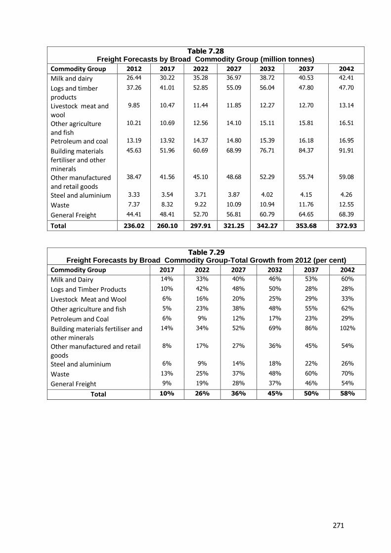
271
Table 7.28 Freight Forecasts by Broad Commodity Group (million tonnes)
Commodity Group 2012 2017 2022 2027 2032 2037 2042
Milk and dairy 26.44 30.22 35.28 36.97 38.72 40.53 42.41
Logs and timber products
37.26 41.01 52.85 55.09 56.04 47.80 47.70
Livestock meat and wool
9.85 10.47 11.44 11.85 12.27 12.70 13.14
Other agriculture and fish
10.21 10.69 12.56 14.10 15.11 15.81 16.51
Petroleum and coal 13.19 13.92 14.37 14.80 15.39 16.18 16.95
Building materials fertiliser and other minerals
45.63 51.96 60.69 68.99 76.71 84.37 91.91
Other manufactured and retail goods
38.47 41.56 45.10 48.68 52.29 55.74 59.08
Steel and aluminium 3.33 3.54 3.71 3.87 4.02 4.15 4.26
Waste 7.37 8.32 9.22 10.09 10.94 11.76 12.55
General Freight 44.41 48.41 52.70 56.81 60.79 64.65 68.39
Total 236.02 260.10 297.91 321.25 342.27 353.68 372.93
Table 7.29 Freight Forecasts by Broad Commodity Group-Total Growth from 2012 (per cent)
Commodity Group 2017 2022 2027 2032 2037 2042
Milk and Dairy 14% 33% 40% 46% 53% 60%
Logs and Timber Products 10% 42% 48% 50% 28% 28%
Livestock Meat and Wool 6% 16% 20% 25% 29% 33%
Other agriculture and fish 5% 23% 38% 48% 55% 62%
Petroleum and Coal 6% 9% 12% 17% 23% 29%
Building materials fertiliser and other minerals
14% 34% 52% 69% 86% 102%
Other manufactured and retail goods
8% 17% 27% 36% 45% 54%
Steel and aluminium 6% 9% 14% 18% 22% 26%
Waste 13% 25% 37% 48% 60% 70%
General Freight 9% 19% 28% 37% 46% 54%
Total 10% 26% 36% 45% 50% 58%
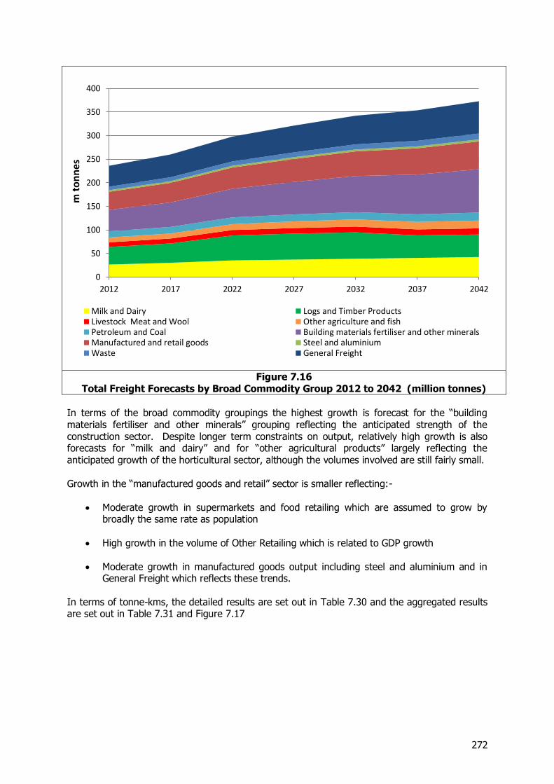
272
Figure 7.16 Total Freight Forecasts by Broad Commodity Group 2012 to 2042 (million tonnes)
In terms of the broad commodity groupings the highest growth is forecast for the “building materials fertiliser and other minerals” grouping reflecting the anticipated strength of the construction sector. Despite longer term constraints on output, relatively high growth is also forecasts for “milk and dairy” and for “other agricultural products” largely reflecting the anticipated growth of the horticultural sector, although the volumes involved are still fairly small. Growth in the “manufactured goods and retail” sector is smaller reflecting:-
Moderate growth in supermarkets and food retailing which are assumed to grow by broadly the same rate as population
High growth in the volume of Other Retailing which is related to GDP growth
Moderate growth in manufactured goods output including steel and aluminium and in General Freight which reflects these trends.
In terms of tonne-kms, the detailed results are set out in Table 7.30 and the aggregated results are set out in Table 7.31 and Figure 7.17
0
50
100
150
200
250
300
350
400
2012 2017 2022 2027 2032 2037 2042
m t
on
nes
Milk and Dairy Logs and Timber ProductsLivestock Meat and Wool Other agriculture and fishPetroleum and Coal Building materials fertiliser and other mineralsManufactured and retail goods Steel and aluminiumWaste General Freight
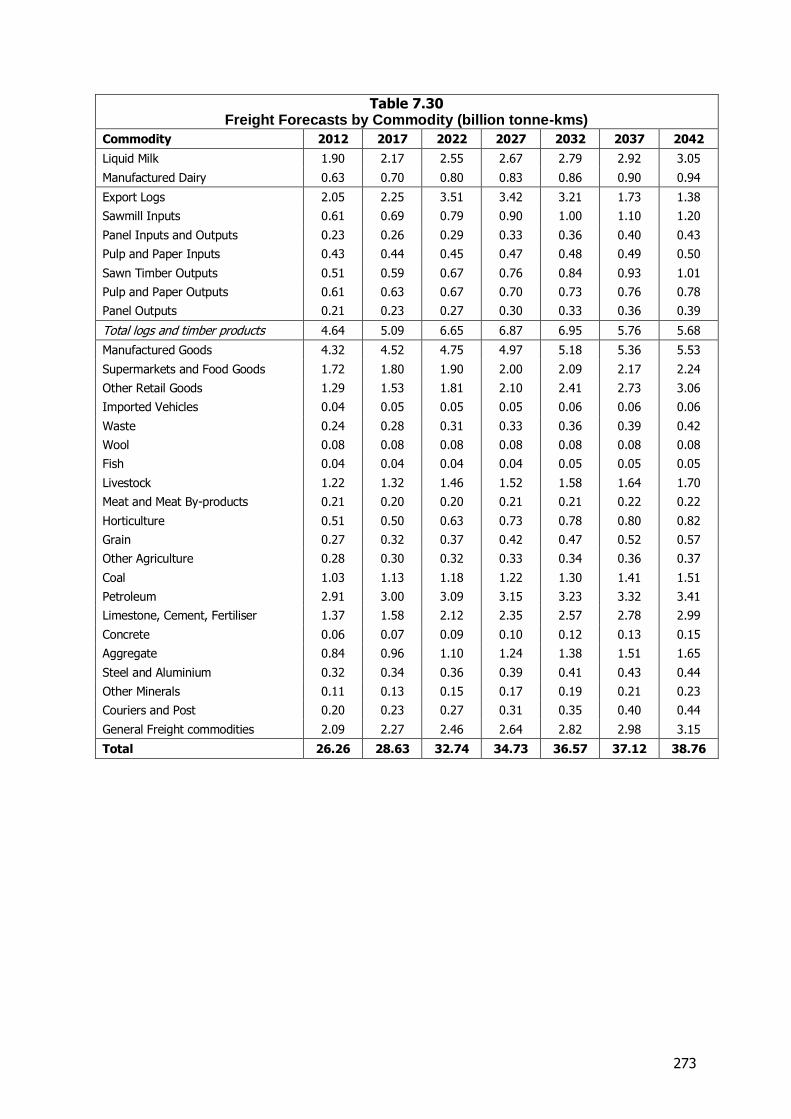
273
Table 7.30 Freight Forecasts by Commodity (billion tonne-kms)
Commodity 2012 2017 2022 2027 2032 2037 2042
Liquid Milk 1.90 2.17 2.55 2.67 2.79 2.92 3.05
Manufactured Dairy 0.63 0.70 0.80 0.83 0.86 0.90 0.94
Export Logs 2.05 2.25 3.51 3.42 3.21 1.73 1.38
Sawmill Inputs 0.61 0.69 0.79 0.90 1.00 1.10 1.20
Panel Inputs and Outputs 0.23 0.26 0.29 0.33 0.36 0.40 0.43
Pulp and Paper Inputs 0.43 0.44 0.45 0.47 0.48 0.49 0.50
Sawn Timber Outputs 0.51 0.59 0.67 0.76 0.84 0.93 1.01
Pulp and Paper Outputs 0.61 0.63 0.67 0.70 0.73 0.76 0.78
Panel Outputs 0.21 0.23 0.27 0.30 0.33 0.36 0.39
Total logs and timber products 4.64 5.09 6.65 6.87 6.95 5.76 5.68
Manufactured Goods 4.32 4.52 4.75 4.97 5.18 5.36 5.53
Supermarkets and Food Goods 1.72 1.80 1.90 2.00 2.09 2.17 2.24
Other Retail Goods 1.29 1.53 1.81 2.10 2.41 2.73 3.06
Imported Vehicles 0.04 0.05 0.05 0.05 0.06 0.06 0.06
Waste 0.24 0.28 0.31 0.33 0.36 0.39 0.42
Wool 0.08 0.08 0.08 0.08 0.08 0.08 0.08
Fish 0.04 0.04 0.04 0.04 0.05 0.05 0.05
Livestock 1.22 1.32 1.46 1.52 1.58 1.64 1.70
Meat and Meat By-products 0.21 0.20 0.20 0.21 0.21 0.22 0.22
Horticulture 0.51 0.50 0.63 0.73 0.78 0.80 0.82
Grain 0.27 0.32 0.37 0.42 0.47 0.52 0.57
Other Agriculture 0.28 0.30 0.32 0.33 0.34 0.36 0.37
Coal 1.03 1.13 1.18 1.22 1.30 1.41 1.51
Petroleum 2.91 3.00 3.09 3.15 3.23 3.32 3.41
Limestone, Cement, Fertiliser 1.37 1.58 2.12 2.35 2.57 2.78 2.99
Concrete 0.06 0.07 0.09 0.10 0.12 0.13 0.15
Aggregate 0.84 0.96 1.10 1.24 1.38 1.51 1.65
Steel and Aluminium 0.32 0.34 0.36 0.39 0.41 0.43 0.44
Other Minerals 0.11 0.13 0.15 0.17 0.19 0.21 0.23
Couriers and Post 0.20 0.23 0.27 0.31 0.35 0.40 0.44
General Freight commodities 2.09 2.27 2.46 2.64 2.82 2.98 3.15
Total 26.26 28.63 32.74 34.73 36.57 37.12 38.76
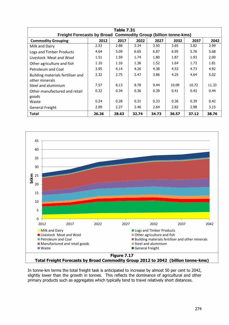
274
Table 7.31 Freight Forecasts by Broad Commodity Group (billion tonne-kms)
Commodity Grouping 2012 2017 2022 2027 2032 2037 2042
Milk and Dairy 2.53 2.88 3.34 3.50 3.65 3.82 3.99
Logs and Timber Products 4.64 5.09 6.65 6.87 6.95 5.76 5.68
Livestock Meat and Wool 1.51 1.59 1.74 1.80 1.87 1.93 2.00
Other agriculture and fish 1.10 1.16 1.36 1.52 1.64 1.73 1.81
Petroleum and Coal 3.95 4.14 4.26 4.38 4.53 4.73 4.92
Building materials fertiliser and other minerals
2.32 2.75 3.47 3.86 4.25 4.64 5.02
Steel and aluminium 7.57 8.13 8.78 9.44 10.09 10.72 11.33
Other manufactured and retail goods
0.32 0.34 0.36 0.39 0.41 0.43 0.44
Waste 0.24 0.28 0.31 0.33 0.36 0.39 0.42
General Freight 2.09 2.27 2.46 2.64 2.82 2.98 3.15
Total 26.26 28.63 32.74 34.73 36.57 37.12 38.76
Figure 7.17
Total Freight Forecasts by Broad Commodity Group 2012 to 2042 (billion tonne-kms)
In tonne-km terms the total freight task is anticipated to increase by almost 50 per cent to 2042, slightly lower than the growth in tonnes. This reflects the dominance of agricultural and other primary products such as aggregates which typically tend to travel relatively short distances.
0
5
10
15
20
25
30
35
40
45
2012 2017 2022 2027 2032 2037 2042
btk
m
Milk and Dairy Logs and Timber ProductsLivestock Meat and Wool Other agriculture and fishPetroleum and Coal Building materials fertiliser and other mineralsManufactured and retail goods Steel and aluminiumWaste General Freight
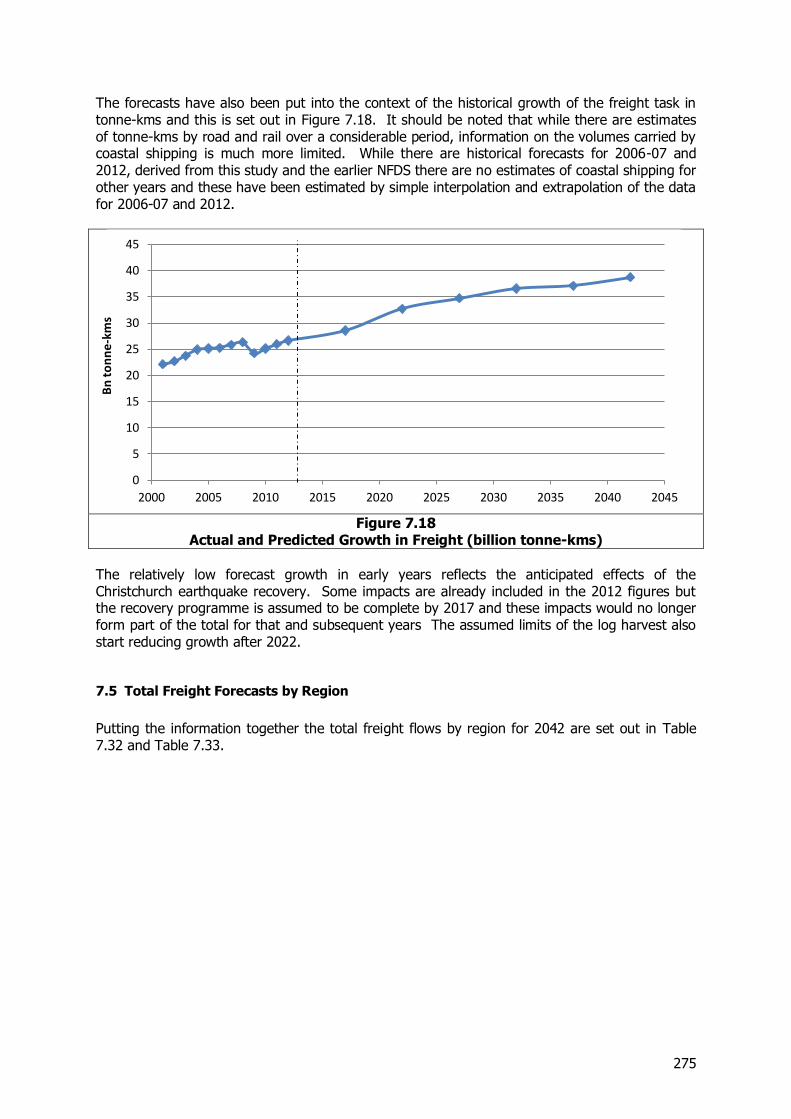
275
The forecasts have also been put into the context of the historical growth of the freight task in tonne-kms and this is set out in Figure 7.18. It should be noted that while there are estimates of tonne-kms by road and rail over a considerable period, information on the volumes carried by coastal shipping is much more limited. While there are historical forecasts for 2006-07 and 2012, derived from this study and the earlier NFDS there are no estimates of coastal shipping for other years and these have been estimated by simple interpolation and extrapolation of the data for 2006-07 and 2012.
Figure 7.18
Actual and Predicted Growth in Freight (billion tonne-kms)
The relatively low forecast growth in early years reflects the anticipated effects of the Christchurch earthquake recovery. Some impacts are already included in the 2012 figures but the recovery programme is assumed to be complete by 2017 and these impacts would no longer form part of the total for that and subsequent years The assumed limits of the log harvest also start reducing growth after 2022.
7.5 Total Freight Forecasts by Region
Putting the information together the total freight flows by region for 2042 are set out in Table 7.32 and Table 7.33.
0
5
10
15
20
25
30
35
40
45
2000 2005 2010 2015 2020 2025 2030 2035 2040 2045
Bn
to
nn
e-k
ms
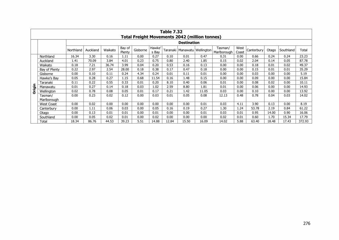
276
Table 7.32 Total Freight Movements 2042 (million tonnes)
Destination
Northland Auckland Waikato Bay of
Plenty Gisborne
Hawke’
s Bay Taranaki Manawatu Wellington
Tasman/
Marlborough
West
Coast Canterbury Otago Southland Total
Ori
gin
Northland 16.34 3.30 0.16 1.11 0.00 0.27 0.10 0.01 0.47 0.31 0.00 0.66 0.24 0.24 23.23
Auckland 1.41 70.09 3.84 4.01 0.23 0.75 0.80 2.40 1.85 0.15 0.02 2.04 0.14 0.05 87.78
Waikato 0.18 7.21 36.74 3.99 0.04 0.20 0.53 0.16 0.13 0.00 0.00 0.18 0.01 0.02 49.37
Bay of Plenty 0.22 2.97 2.54 28.00 0.18 0.38 0.17 0.47 0.18 0.00 0.00 0.15 0.01 0.01 35.29
Gisborne 0.00 0.10 0.11 0.24 4.34 0.24 0.01 0.11 0.01 0.00 0.00 0.03 0.00 0.00 5.19
Hawke’s Bay 0.05 0.28 0.27 1.15 0.68 11.54 0.16 1.48 0.15 0.00 0.00 0.09 0.00 0.00 15.84
Taranaki 0.11 0.22 0.55 0.33 0.01 0.20 8.10 0.40 0.06 0.01 0.00 0.08 0.02 0.00 10.11
Manawatu 0.01 0.27 0.14 0.18 0.03 1.02 2.59 8.80 1.81 0.01 0.00 0.06 0.00 0.00 14.93
Wellington 0.02 0.78 0.08 0.05 0.01 0.17 0.21 1.42 11.05 0.03 0.00 0.10 0.00 0.00 13.92
Tasman/
Marlborough
0.00 0.23 0.02 0.12 0.00 0.03 0.01 0.05 0.08 12.13 0.48 0.78 0.04 0.03 14.02
West Coast 0.00 0.02 0.00 0.00 0.00 0.00 0.00 0.00 0.01 0.03 4.11 3.90 0.13 0.00 8.19
Canterbury 0.00 1.11 0.06 0.03 0.00 0.05 0.16 0.19 0.27 1.30 1.24 53.78 2.19 0.84 61.22
Otago 0.00 0.13 0.01 0.01 0.00 0.01 0.00 0.00 0.01 0.03 0.01 0.95 14.00 0.90 16.06
Southland 0.00 0.05 0.02 0.01 0.00 0.02 0.00 0.00 0.00 0.02 0.01 0.60 1.70 15.34 17.79
Total 18.34 86.76 44.53 39.23 5.51 14.88 12.84 15.50 16.09 14.02 5.88 63.40 18.48 17.43 372.93
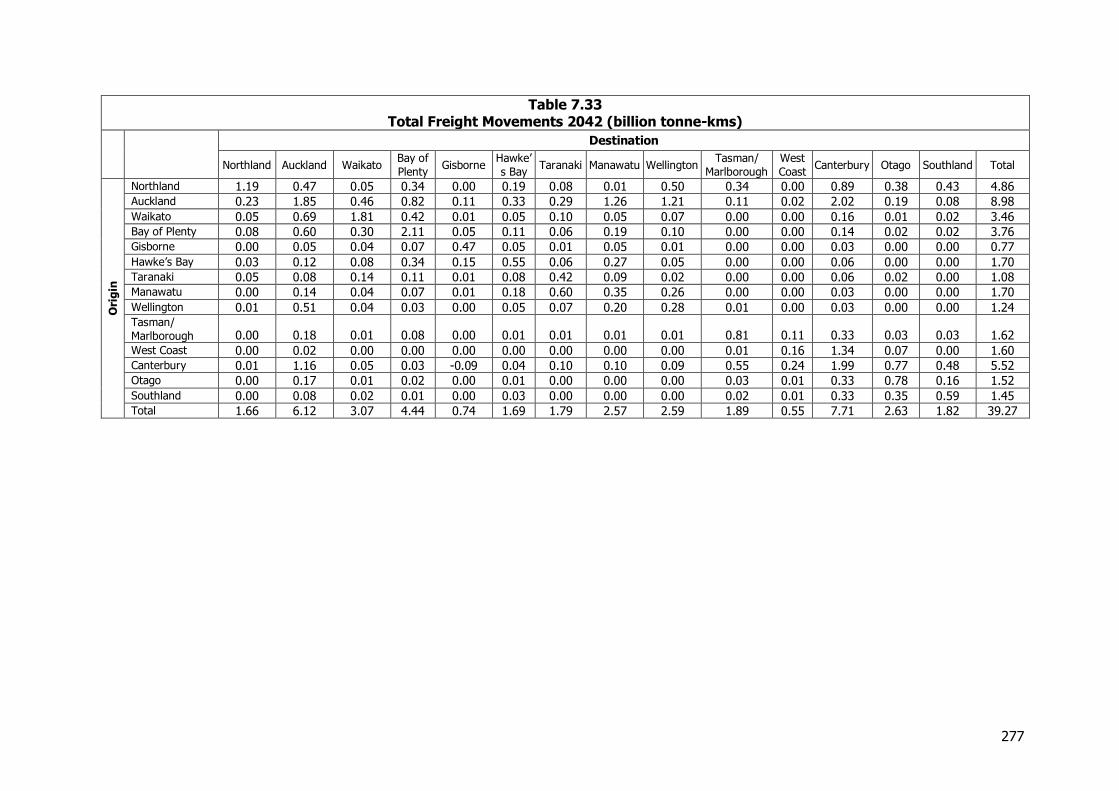
277
Table 7.33 Total Freight Movements 2042 (billion tonne-kms)
Destination
Northland Auckland Waikato Bay of
Plenty Gisborne
Hawke’
s Bay Taranaki Manawatu Wellington
Tasman/
Marlborough
West
Coast Canterbury Otago Southland Total
Ori
gin
Northland 1.19 0.47 0.05 0.34 0.00 0.19 0.08 0.01 0.50 0.34 0.00 0.89 0.38 0.43 4.86
Auckland 0.23 1.85 0.46 0.82 0.11 0.33 0.29 1.26 1.21 0.11 0.02 2.02 0.19 0.08 8.98
Waikato 0.05 0.69 1.81 0.42 0.01 0.05 0.10 0.05 0.07 0.00 0.00 0.16 0.01 0.02 3.46
Bay of Plenty 0.08 0.60 0.30 2.11 0.05 0.11 0.06 0.19 0.10 0.00 0.00 0.14 0.02 0.02 3.76
Gisborne 0.00 0.05 0.04 0.07 0.47 0.05 0.01 0.05 0.01 0.00 0.00 0.03 0.00 0.00 0.77
Hawke’s Bay 0.03 0.12 0.08 0.34 0.15 0.55 0.06 0.27 0.05 0.00 0.00 0.06 0.00 0.00 1.70
Taranaki 0.05 0.08 0.14 0.11 0.01 0.08 0.42 0.09 0.02 0.00 0.00 0.06 0.02 0.00 1.08
Manawatu 0.00 0.14 0.04 0.07 0.01 0.18 0.60 0.35 0.26 0.00 0.00 0.03 0.00 0.00 1.70
Wellington 0.01 0.51 0.04 0.03 0.00 0.05 0.07 0.20 0.28 0.01 0.00 0.03 0.00 0.00 1.24
Tasman/
Marlborough 0.00 0.18 0.01 0.08 0.00 0.01 0.01 0.01 0.01 0.81 0.11 0.33 0.03 0.03 1.62
West Coast 0.00 0.02 0.00 0.00 0.00 0.00 0.00 0.00 0.00 0.01 0.16 1.34 0.07 0.00 1.60
Canterbury 0.01 1.16 0.05 0.03 -0.09 0.04 0.10 0.10 0.09 0.55 0.24 1.99 0.77 0.48 5.52
Otago 0.00 0.17 0.01 0.02 0.00 0.01 0.00 0.00 0.00 0.03 0.01 0.33 0.78 0.16 1.52
Southland 0.00 0.08 0.02 0.01 0.00 0.03 0.00 0.00 0.00 0.02 0.01 0.33 0.35 0.59 1.45
Total 1.66 6.12 3.07 4.44 0.74 1.69 1.79 2.57 2.59 1.89 0.55 7.71 2.63 1.82 39.27
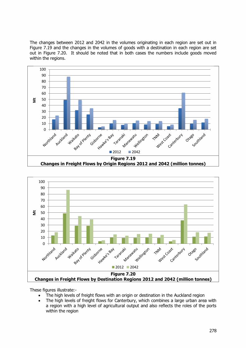
278
The changes between 2012 and 2042 in the volumes originating in each region are set out in Figure 7.19 and the changes in the volumes of goods with a destination in each region are set out in Figure 7.20. It should be noted that in both cases the numbers include goods moved within the regions.
Figure 7.19
Changes in Freight Flows by Origin Regions 2012 and 2042 (million tonnes)
Figure 7.20
Changes in Freight Flows by Destination Regions 2012 and 2042 (million tonnes)
These figures illustrate:-
The high levels of freight flows with an origin or destination in the Auckland region The high levels of freight flows for Canterbury, which combines a large urban area with
a region with a high level of agricultural output and also reflects the roles of the ports within the region
0
10
20
30
40
50
60
70
80
90
100
Mt
2012 2042
0
10
20
30
40
50
60
70
80
90
100
Mt
2012 2042
279
The high levels of freight activity in the other regions in the Golden Triangle (Waikato and the Bay of Plenty).
7.6 Freight Forecasts by Mode
7.6.1 Introduction and approach In addition to the estimates of total future demand we have also made estimates of the volumes likely to be carried by the three main modes of road, rail and coastal shipping. In determining these we have initially assumed that the existing mode shares by commodity would be carried forward and have then reviewed these results in the light of recent experience and known changes in future patterns of transport movements.
7.6.2 Current and Future Modal Shares The current modal shares of road, rail and coastal shipping in tonnage terms are set out in Table 7.34.
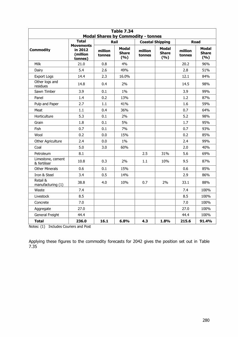
280
Table 7.34 Modal Shares by Commodity - tonnes
Commodity
Total Movements
in 2012 (million tonnes)
Rail Coastal Shipping Road
million tonnes
Modal Share (%)
million tonnes
Modal Share (%)
million tonnes
Modal Share (%)
Milk 21.0 0.8 4% 20.2 96%
Dairy 5.4 2.6 49% 2.8 51%
Export Logs 14.4 2.3 16.0% 12.1 84%
Other logs and residues
14.8 0.4 2% 14.5 98%
Sawn Timber 3.9 0.1 1% 3.9 99%
Panel 1.4 0.2 13% 1.2 87%
Pulp and Paper 2.7 1.1 41% 1.6 59%
Meat 1.1 0.4 36% 0.7 64%
Horticulture 5.3 0.1 2% 5.2 98%
Grain 1.8 0.1 5% 1.7 95%
Fish 0.7 0.1 7% 0.7 93%
Wool 0.2 0.0 15% 0.2 85%
Other Agriculture 2.4 0.0 1% 2.4 99%
Coal 5.0 3.0 60% 2.0 40%
Petroleum 8.1 2.5 31% 5.6 69%
Limestone, cement & fertiliser
10.8 0.3 2% 1.1 10% 9.5 87%
Other Minerals 0.6 0.1 15% 0.6 85%
Iron & Steel 3.4 0.5 14% 2.9 86%
Retail & manufacturing (1)
38.8 4.0 10% 0.7 2% 33.1 88%
Waste 7.4 7.4 100%
Livestock 8.5 8.5 100%
Concrete 7.0 7.0 100%
Aggregate 27.0 27.0 100%
General Freight 44.4 44.4 100%
Total 236.0 16.1 6.8% 4.3 1.8% 215.6 91.4%
Notes: (1) Includes Couriers and Post
Applying these figures to the commodity forecasts for 2042 gives the position set out in Table 7.35
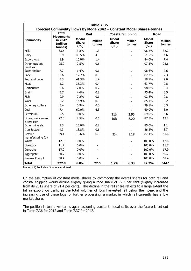
281
Table 7.35 Forecast Commodity Flows by Mode 2042 – Constant Modal Shares-tonnes
Commodity
Total Movements
in 2042 (million tonnes)
Rail Coastal Shipping Road
Modal Share (%)
million tonnes
Modal Share (%)
million tonnes
Modal Share (%)
million tonnes
Milk 33.5 3.8% 1.3 - 96.2% 32.2
Dairy 8.9 48.5% 4.3 - 51.5% 4.6
Export logs 8.9 16.0% 1.4 - 84.0% 7.4
Other logs and residues
25.2 2.5% 0.6 97.5% 24.6
Sawn timber 7.7 1.4% 0.1 - 98.6% 7.6
Panel 2.6 12.7% 0.3 - 87.3% 2.3
Pulp and paper 3.3 41.3% 1.4 - 58.7% 2.0
Meat 1.2 36.3% 0.4 - 63.7% 0.8
Horticulture 8.6 2.0% 0.2 - 98.0% 8.4
Grain 3.7 4.6% 0.2 - 95.4% 3.5
Fish 0.9 7.2% 0.1 - 92.8% 0.8
Wool 0.2 14.9% 0.0 - 85.1% 0.2
Other agriculture 3.4 0.9% 0.0 - 99.1% 3.3
Coal 7.4 60.0% 4.5 - 40.0% 3.0
Petroleum 9.5 0.0% - 31% 2.95 69.0% 6.6
Limestone, cement & fertiliser
22.0 2.5% 0.5 10% 2.20 87.5% 19.2
Other minerals 1.3 15.0% 0.2 - 85.0% 1.1
Iron & steel 4.3 13.8% 0.6 - 86.2% 3.7
Retail & manufacturing (1)
59.1 10.6% 6.3 2% 1.18 87.4% 51.6
Waste 12.6 0.0% - - 100.0% 12.6
Livestock 11.7 0.0% - - 100.0% 11.7
Concrete 17.9 0.0% - - 100.0% 17.9
Aggregate 50.7 0.0% - - 100.0% 50.7
General Freight 68.4 0.0% - - 100.0% 68.4
Total 372.9 6.0% 22.5 1.7% 6.33 92.3% 344.1
Notes: (1) Includes Couriers and Post
On the assumption of constant modal shares by commodity the overall shares for both rail and coastal shipping would decline slightly giving a road share of 92.3 per cent (slightly increased from its 2012 share of 91.4 per cent). The decline in the rail share reflects to a large extent the fall in export log traffic as the total volumes of logs harvested fall below their peak and the increasing use of these logs for further processing, a market in which rail currently has a low market share. The position in tonne-km terms again assuming constant modal splits over the future is set out in Table 7.36 for 2012 and Table 7.37 for 2042.
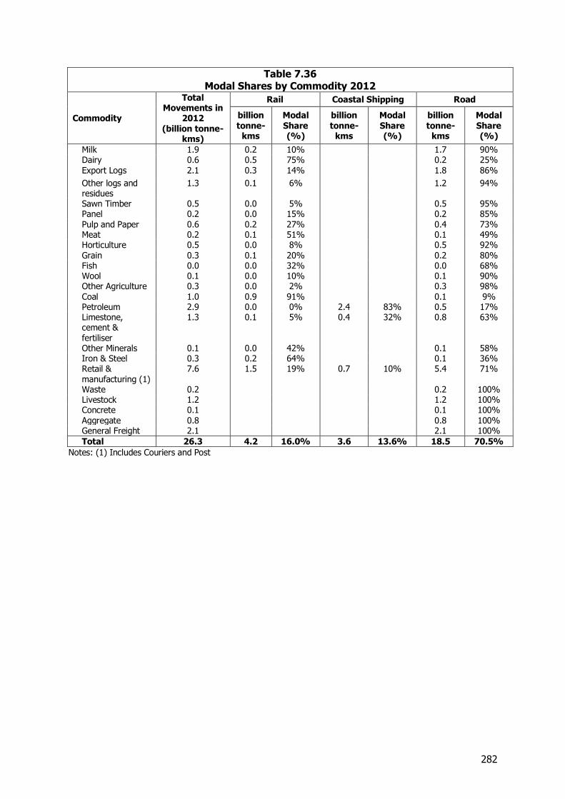
282
Table 7.36 Modal Shares by Commodity 2012
Commodity
Total Movements in
2012 (billion tonne-
kms)
Rail Coastal Shipping Road
billion tonne-
kms
Modal Share (%)
billion tonne-
kms
Modal Share (%)
billion tonne-
kms
Modal Share (%)
Milk 1.9 0.2 10% 1.7 90% Dairy 0.6 0.5 75% 0.2 25% Export Logs 2.1 0.3 14% 1.8 86%
Other logs and residues
1.3 0.1 6% 1.2 94%
Sawn Timber 0.5 0.0 5% 0.5 95% Panel 0.2 0.0 15% 0.2 85% Pulp and Paper 0.6 0.2 27% 0.4 73% Meat 0.2 0.1 51% 0.1 49% Horticulture 0.5 0.0 8% 0.5 92% Grain 0.3 0.1 20% 0.2 80% Fish 0.0 0.0 32% 0.0 68% Wool 0.1 0.0 10% 0.1 90% Other Agriculture 0.3 0.0 2% 0.3 98% Coal 1.0 0.9 91% 0.1 9% Petroleum 2.9 0.0 0% 2.4 83% 0.5 17% Limestone, cement & fertiliser
1.3 0.1 5% 0.4 32% 0.8 63%
Other Minerals 0.1 0.0 42% 0.1 58% Iron & Steel 0.3 0.2 64% 0.1 36% Retail & manufacturing (1)
7.6 1.5 19% 0.7 10% 5.4 71%
Waste 0.2 0.2 100% Livestock 1.2 1.2 100% Concrete 0.1 0.1 100% Aggregate 0.8 0.8 100% General Freight 2.1 2.1 100%
Total 26.3 4.2 16.0% 3.6 13.6% 18.5 70.5%
Notes: (1) Includes Couriers and Post
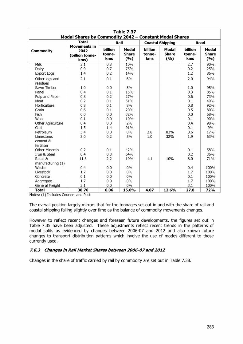
283
Table 7.37 Modal Shares by Commodity 2042 – Constant Modal Shares
Commodity
Total Movements in
2042 (billion tonne-
kms)
Rail Coastal Shipping Road
billion tonne-
kms
Modal Share (%)
billion tonne-
kms
Modal Share (%)
billion tonne-
kms
Modal Share (%)
Milk 3.1 0.3 10% 2.7 90% Dairy 0.9 0.7 75% 0.2 25% Export Logs 1.4 0.2 14% 1.2 86%
Other logs and residues
2.1 0.1 6% 2.0 94%
Sawn Timber 1.0 0.0 5% 1.0 95% Panel 0.4 0.1 15% 0.3 85% Pulp and Paper 0.8 0.2 27% 0.6 73% Meat 0.2 0.1 51% 0.1 49% Horticulture 0.8 0.1 8% 0.8 92% Grain 0.6 0.1 20% 0.5 80% Fish 0.0 0.0 32% 0.0 68% Wool 0.1 0.0 10% 0.1 90% Other Agriculture 0.4 0.0 2% 0.4 98% Coal 1.5 1.4 91% 0.1 9% Petroleum 3.4 0.0 0% 2.8 83% 0.6 17% Limestone, cement & fertiliser
3.0 0.2 5% 1.0 32% 1.9 63%
Other Minerals 0.2 0.1 42% 0.1 58% Iron & Steel 0.4 0.3 64% 0.2 36% Retail & manufacturing (1)
11.3 2.2 19% 1.1 10% 8.0 71%
Waste 0.4 0.0 0% 0.4 100% Livestock 1.7 0.0 0% 1.7 100% Concrete 0.1 0.0 0% 0.1 100% Aggregate 1.7 0.0 0% 1.7 100% General Freight 3.1 0.0 0% 3.1 100%
Total 38.76 6.06 15.6% 4.87 12.6% 27.8 72%
Notes: (1) Includes Couriers and Post
The overall position largely mirrors that for the tonnages set out in and with the share of rail and coastal shipping falling slightly over time as the balance of commodity movements changes. However to reflect recent changes and foreseen future developments, the figures set out in Table 7.35 have been adjusted. These adjustments reflect recent trends in the patterns of modal splits as evidenced by changes between 2006-07 and 2012 and also known future changes to transport distribution patterns which involve the use of modes different to those currently used.
7.6.3 Changes in Rail Market Shares between 2006-07 and 2012 Changes in the share of traffic carried by rail by commodity are set out in Table 7.38.
284
Table 7.38 Rail market shares, 2012 and 2006-07
Commodity Share of tonnes (%) Share of net tonne km (%)
2006-07 2012 2006-07 2012
Liquid milk 4 4 9 10
Dairy Manufacture 41 49 68 79
Coal 64 60 86 91
Export Logs 17 16 17 14
Export Meat 54 46 70 52
Food/Manufacturing 9 11 18 20
Because a different set of definitions was used in 2006-07 the definition of meat and logs in this table is confined to the export part of the sectors, in which rail is more active.
7.6.4 Changes in Rail Modal Splits by Commodity For manufactured dairy products, the share carried by rail has increased from 41 per cent in 2006-07 to 49 per cent in 2012, an increase in modal share of about 20 per cent. This is likely to be a consequence of concentration on fewer ports, and the aggregation of traffic into the hubs at Hamilton and Mosgiel. Concentration and aggregation of cargo is likely to continue, and as dairying expands in regions like Canterbury and Southland, so would the use of hubs which support increased movement by rail. While the relatively rapid rate of increase in rail modal share experienced over the past 5 years is unlikely to continue at the same rate, some continued increase is likely and we suggest that the 2008 prediction of a further 20 per cent growth is a useful guide, albeit over a longer time period to 2042. This would give rail a 60 per cent share in that year and the increase in modal share would be equivalent to an increase of almost 1 million tonnes pa in 2042. The share of rail in liquid milk movement has risen from 3.6 to 3.9 per cent. This reflects the use of rail for markets other than the bulk haul from Hawke’s Bay and Manawatu to Whareroa, including interisland transfers for Fonterra. While there are more possibilities for such moves (such as in Canterbury and Southland), the moves to create more major plants closer to the supply suggest that the share is unlikely to grow. Coal output is expected to grow by about 2.4 million tonnes over the forecast period, to 7.4 million tonnes. The export market is likely to grow faster than the overall market however, and rail is a key part of the export market. Much of the growth will come from Bathurst Resources’ base forecast of 2 million tonnes pa for their new mine on the Denniston Plateau, 25 per cent of which is intended to be railed to Lyttelton and 75 per cent sent by barge to New Plymouth. On this basis rail will gain an extra 0.5 million tonnes, but 1.5 million of the total forecast increase of 2.4 million tonnes will go by coastal shipping. Ignoring the short rail journey from the mine to Westport for shipping, the tonnage carried by coastal shipping would amount to 1.5 million tonnes, road about 2 million tonnes as now, with rail carrying 4 million tonnes about a third more than now. The relative shares will be coastal shipping 20 per cent, road 27 per cent, and rail 54 per cent (down from 60 per cent now). This reduces rail haulage relative to the constant shares prediction by 0.4 million tonnes. Rail’s share of export logs has declined slightly to 16 per cent, although its share of net tonne kilometres for this commodity has dropped even more, suggesting rail is addressing more short distance markets. Further moves into this part of the market are likely. However rail does not provide services at all in some regions, like Gisborne and Nelson, and different growth rates in the regions could move the share around. A constant modal share has therefore been assumed.
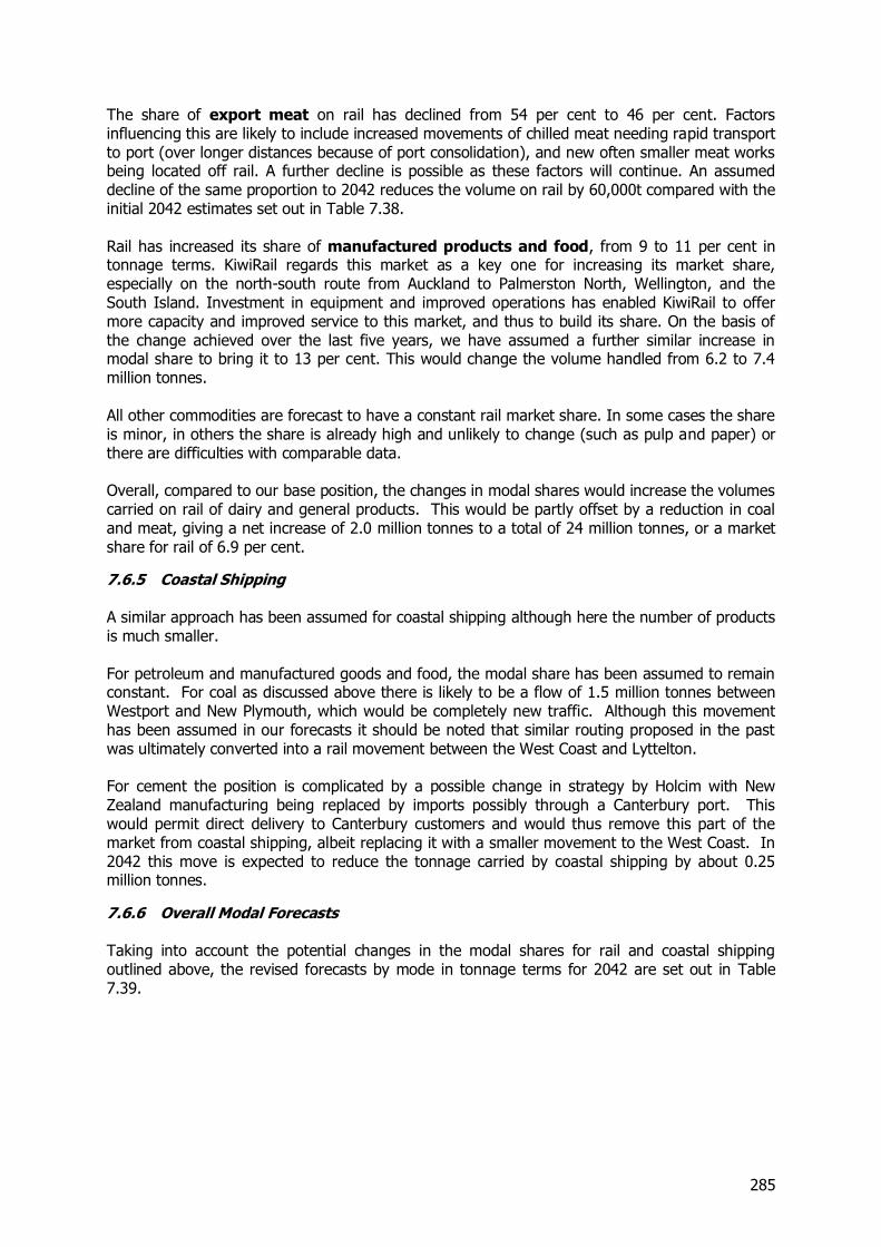
285
The share of export meat on rail has declined from 54 per cent to 46 per cent. Factors influencing this are likely to include increased movements of chilled meat needing rapid transport to port (over longer distances because of port consolidation), and new often smaller meat works being located off rail. A further decline is possible as these factors will continue. An assumed decline of the same proportion to 2042 reduces the volume on rail by 60,000t compared with the initial 2042 estimates set out in Table 7.38. Rail has increased its share of manufactured products and food, from 9 to 11 per cent in tonnage terms. KiwiRail regards this market as a key one for increasing its market share, especially on the north-south route from Auckland to Palmerston North, Wellington, and the South Island. Investment in equipment and improved operations has enabled KiwiRail to offer more capacity and improved service to this market, and thus to build its share. On the basis of the change achieved over the last five years, we have assumed a further similar increase in modal share to bring it to 13 per cent. This would change the volume handled from 6.2 to 7.4 million tonnes. All other commodities are forecast to have a constant rail market share. In some cases the share is minor, in others the share is already high and unlikely to change (such as pulp and paper) or there are difficulties with comparable data. Overall, compared to our base position, the changes in modal shares would increase the volumes carried on rail of dairy and general products. This would be partly offset by a reduction in coal and meat, giving a net increase of 2.0 million tonnes to a total of 24 million tonnes, or a market share for rail of 6.9 per cent.
7.6.5 Coastal Shipping A similar approach has been assumed for coastal shipping although here the number of products is much smaller. For petroleum and manufactured goods and food, the modal share has been assumed to remain constant. For coal as discussed above there is likely to be a flow of 1.5 million tonnes between Westport and New Plymouth, which would be completely new traffic. Although this movement has been assumed in our forecasts it should be noted that similar routing proposed in the past was ultimately converted into a rail movement between the West Coast and Lyttelton. For cement the position is complicated by a possible change in strategy by Holcim with New Zealand manufacturing being replaced by imports possibly through a Canterbury port. This would permit direct delivery to Canterbury customers and would thus remove this part of the market from coastal shipping, albeit replacing it with a smaller movement to the West Coast. In 2042 this move is expected to reduce the tonnage carried by coastal shipping by about 0.25 million tonnes.
7.6.6 Overall Modal Forecasts Taking into account the potential changes in the modal shares for rail and coastal shipping outlined above, the revised forecasts by mode in tonnage terms for 2042 are set out in Table 7.39.
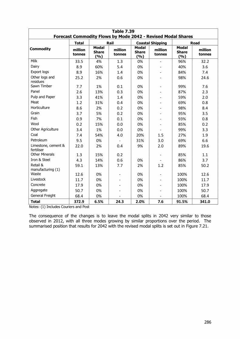
286
Table 7.39 Forecast Commodity Flows by Mode 2042 - Revised Modal Shares
Commodity
Total Rail Coastal Shipping Road
million tonnes
Modal Share (%)
million tonnes
Modal Share (%)
million tonnes
Modal Share (%)
million tonnes
Milk 33.5 4% 1.3 0% - 96% 32.2
Dairy 8.9 60% 5.4 0% - 40% 3.6
Export logs 8.9 16% 1.4 0% - 84% 7.4
Other logs and residues
25.2 2% 0.6 0% - 98% 24.6
Sawn Timber 7.7 1% 0.1 0% - 99% 7.6
Panel 2.6 13% 0.3 0% - 87% 2.3
Pulp and Paper 3.3 41% 1.4 0% - 59% 2.0
Meat 1.2 31% 0.4 0% - 69% 0.8
Horticulture 8.6 2% 0.2 0% - 98% 8.4
Grain 3.7 5% 0.2 0% - 95% 3.5
Fish 0.9 7% 0.1 0% - 93% 0.8
Wool 0.2 15% 0.0 0% - 85% 0.2
Other Agriculture 3.4 1% 0.0 0% - 99% 3.3
Coal 7.4 54% 4.0 20% 1.5 27% 1.9
Petroleum 9.5 0% - 31% 3.0 69% 6.6
Limestone, cement & fertiliser
22.0 2% 0.4 9% 2.0 89% 19.6
Other Minerals 1.3 15% 0.2 - 85% 1.1
Iron & Steel 4.3 14% 0.6 0% - 86% 3.7
Retail & manufacturing (1)
59.1 13% 7.7 2% 1.2 85% 50.2
Waste 12.6 0% - 0% - 100% 12.6
Livestock 11.7 0% - 0% - 100% 11.7
Concrete 17.9 0% - 0% - 100% 17.9
Aggregate 50.7 0% - 0% - 100% 50.7
General Freight 68.4 0% - 0% - 100% 68.4
Total 372.9 6.5% 24.3 2.0% 7.6 91.5% 341.0
Notes: (1) Includes Couriers and Post
The consequence of the changes is to leave the modal splits in 2042 very similar to those observed in 2012, with all three modes growing by similar proportions over the period. The summarised position that results for 2042 with the revised modal splits is set out in Figure 7.21.
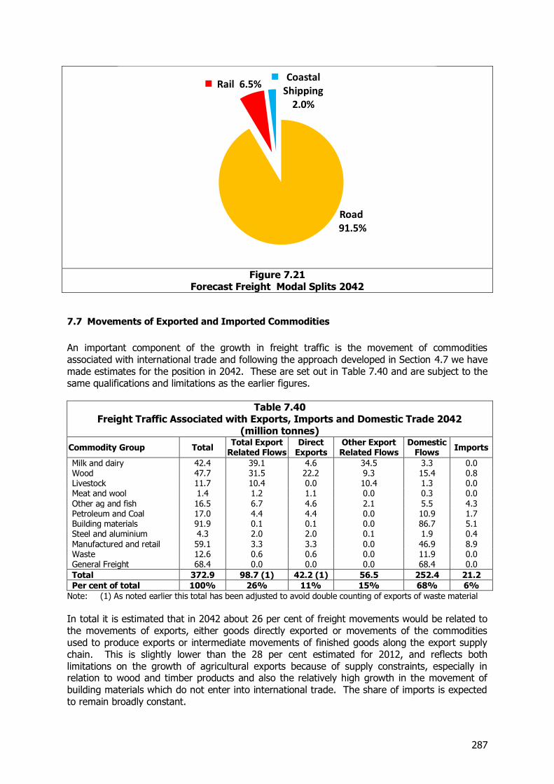
287
Figure 7.21
Forecast Freight Modal Splits 2042
7.7 Movements of Exported and Imported Commodities
An important component of the growth in freight traffic is the movement of commodities associated with international trade and following the approach developed in Section 4.7 we have made estimates for the position in 2042. These are set out in Table 7.40 and are subject to the same qualifications and limitations as the earlier figures.
Table 7.40 Freight Traffic Associated with Exports, Imports and Domestic Trade 2042
(million tonnes)
Commodity Group Total Total Export
Related Flows Direct
Exports Other Export Related Flows
Domestic Flows
Imports
Milk and dairy 42.4 39.1 4.6 34.5 3.3 0.0 Wood 47.7 31.5 22.2 9.3 15.4 0.8 Livestock 11.7 10.4 0.0 10.4 1.3 0.0 Meat and wool 1.4 1.2 1.1 0.0 0.3 0.0 Other ag and fish 16.5 6.7 4.6 2.1 5.5 4.3 Petroleum and Coal 17.0 4.4 4.4 0.0 10.9 1.7 Building materials 91.9 0.1 0.1 0.0 86.7 5.1 Steel and aluminium 4.3 2.0 2.0 0.1 1.9 0.4 Manufactured and retail 59.1 3.3 3.3 0.0 46.9 8.9 Waste 12.6 0.6 0.6 0.0 11.9 0.0 General Freight 68.4 0.0 0.0 0.0 68.4 0.0
Total 372.9 98.7 (1) 42.2 (1) 56.5 252.4 21.2
Per cent of total 100% 26% 11% 15% 68% 6%
Note: (1) As noted earlier this total has been adjusted to avoid double counting of exports of waste material
In total it is estimated that in 2042 about 26 per cent of freight movements would be related to the movements of exports, either goods directly exported or movements of the commodities used to produce exports or intermediate movements of finished goods along the export supply chain. This is slightly lower than the 28 per cent estimated for 2012, and reflects both limitations on the growth of agricultural exports because of supply constraints, especially in relation to wood and timber products and also the relatively high growth in the movement of building materials which do not enter into international trade. The share of imports is expected to remain broadly constant.
Road 91.5%
Rail 6.5% Coastal
Shipping 2.0%
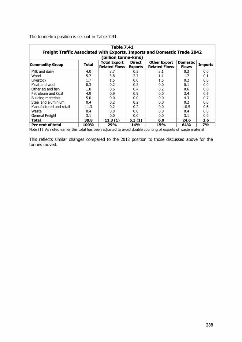
288
The tonne-km position is set out in Table 7.41
Table 7.41 Freight Traffic Associated with Exports, Imports and Domestic Trade 2042
(billion tonne-kms)
Commodity Group Total Total Export
Related Flows Direct
Exports Other Export Related Flows
Domestic Flows
Imports
Milk and dairy 4.0 3.7 0.5 3.1 0.3 0.0 Wood 5.7 3.8 2.7 1.1 1.7 0.1 Livestock 1.7 1.5 0.0 1.5 0.2 0.0 Meat and wool 0.3 0.2 0.2 0.0 0.1 0.0 Other ag and fish 1.8 0.6 0.4 0.2 0.6 0.6 Petroleum and Coal 4.9 0.9 0.9 0.0 3.4 0.6 Building materials 5.0 0.0 0.0 0.0 4.3 0.7 Steel and aluminium 0.4 0.2 0.2 0.0 0.2 0.0 Manufactured and retail 11.3 0.2 0.2 0.0 10.5 0.6 Waste 0.4 0.0 0.0 0.0 0.4 0.0 General Freight 3.1 0.0 0.0 0.0 3.1 0.0
Total 38.8 11.3 (1) 5.3 (1) 6.0 24.6 2.6
Per cent of total 100% 29% 14% 15% 64% 7%
Note (1) As noted earlier this total has been adjusted to avoid double counting of exports of waste material
This reflects similar changes compared to the 2012 position to those discussed above for the tonnes moved.
289
8 Sensitivity Testing
8.1 Introduction and Scope
In order to assess the extent to which the forecasts of future freight demands are likely to change in the light of changed economic circumstances two sensitivity tests have been undertaken. These comprise:-
A Low scenario with population growth at the 25th percentile of the Statistics NZ forecasts and a GDP forecast reduced by 0.25 percentage points below the NZIER Consensus forecasts for the short term and the OECD forecasts used for the longer term.
A High scenario assuming population growth at the 75th percentile of the Statistics NZ forecasts and GDP growth 0.25 percent points above the NZIER Consensus and OECD forecasts.
The effect of these assumptions is to give a New Zealand population in 2041 in a range of 5.37 to 5.66 million compared to a central estimate of 5.51 million, a range of approximately +/- 2.5 per cent. The alternative GDP forecasts would give low and high estimates of cumulative growth by 2042 of 187 per cent to 216 per cent compared to the central case of 201 per cent (this represents a deviation of -7.0% and +7.4% respectively).
8.2 Results of the Sensitivity Tests
The effects of the alternative scenarios in tonnage terms in 2042 are set out in Table 8.1 and Table 8.2.
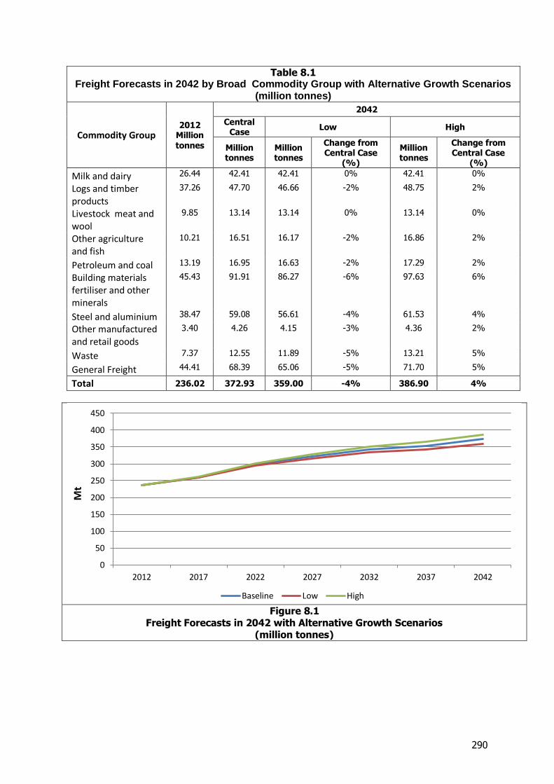
290
Table 8.1 Freight Forecasts in 2042 by Broad Commodity Group with Alternative Growth Scenarios
(million tonnes)
Commodity Group 2012
Million tonnes
2042
Central Case
Low High
Million tonnes
Million tonnes
Change from Central Case
(%)
Million tonnes
Change from Central Case
(%)
Milk and dairy 26.44 42.41 42.41 0% 42.41 0%
Logs and timber products
37.26 47.70 46.66 -2% 48.75 2%
Livestock meat and wool
9.85 13.14 13.14 0% 13.14 0%
Other agriculture and fish
10.21 16.51 16.17 -2% 16.86 2%
Petroleum and coal 13.19 16.95 16.63 -2% 17.29 2%
Building materials fertiliser and other minerals
45.43 91.91 86.27 -6% 97.63 6%
Steel and aluminium 38.47 59.08 56.61 -4% 61.53 4%
Other manufactured and retail goods
3.40 4.26 4.15 -3% 4.36 2%
Waste 7.37 12.55 11.89 -5% 13.21 5%
General Freight 44.41 68.39 65.06 -5% 71.70 5%
Total 236.02 372.93 359.00 -4% 386.90 4%
Figure 8.1
Freight Forecasts in 2042 with Alternative Growth Scenarios (million tonnes)
0
50
100
150
200
250
300
350
400
450
2012 2017 2022 2027 2032 2037 2042
Mt
Baseline Low High

291
Table 8.2 Freight Forecasts in 2042 by Broad Commodity Group with Alternative Growth
Scenarios (billion tonne-kms)
Commodity Group
2012 Billion tonne-
kms
2042
Central Case
Low High
Billion tonne-
kms
Billion tonne-
kms
Change from Central Case
(%)
Billion tonne-
kms
Change from Central Case
(%)
Milk and dairy 2.53 3.99 3.99 0% 3.99 0%
Logs and timber products
4.64 5.68 5.59 -2% 5.78 2%
Livestock meat and wool
1.51 2.00 2.00 0% 2.00 0%
Other agriculture and fish
1.10 1.81 1.77 -3% 1.86 3%
Petroleum and coal 3.95 4.92 4.85 -1% 4.99 1%
Building materials fertiliser and other minerals
2.32 5.02 4.78 -5% 5.25 5%
Steel and aluminium 7.57 11.33 10.87 -4% 11.79 4%
Other manufactured and retail goods
0.32 0.44 0.43 -3% 0.45 2%
Waste 0.24 0.42 0.39 -5% 0.44 5%
General Freight 2.09 3.15 2.99 -5% 3.30 5%
Total 26.26 38.76 37.66 -3% 39.85 3%
Figure 8.2
Freight Forecasts in 2042 with Alternative Growth Scenarios (billion tonne-kms)
0
5
10
15
20
25
30
35
40
45
2012 2017 2022 2027 2032 2037 2042
bill
ion
to
nn
e-k
ms
Baseline Low High
292
Overall, the sensitivity analysis shows that the final forecasts are fairly unresponsive to changes in input assumptions. In the low case, compared to the base position population declines by around 2.5 per cent and GDP declines by around 7 per cent by 2042. As a consequence, compared to the base position the overall level of freight forecast for 2042 declines by 4 per cent when measured in tonnes and 3 per cent when measured in tonne kilometres. Further, as is shown in the charts above, differences in the forecasts are almost indiscernible until the 2030s. The limited variations in the freight forecasts reflect in part the limited variation in the key population and GDP assumptions which drive many of the non-agricultural commodity forecasts and in part the supply side factors which are the basis for growth for many of the key agricultural commodities. The industries that are most heavily affected by changes in GDP and population are:-
Building materials, fertiliser and other minerals Waste, and General Freight
These industries are most affected as their forecasts are directly linked to domestic economic activity as set out in section 7.2 and to some extent reflect specific experience in recent years. For example:
The use of building materials is almost entirely domestic and sharp declines in aggregate, cement and concrete use were seen during the Global Financial Crisis.
Increases in waste are strongly linked to both population growth and building activity with less people and less building activity occurring in a scenario with lower population and lower economic activity than it is natural that the amount of waste generated will also grow more slowly.
However even here the differences are only small. The overall decline or growth in the forecasts for these industries, 5%, is equivalent to the forecast decline or growth in GDP per capita (which is an outcome of the changes in both population and economic activity). Although not shown in the results above, the regions where the effects are largest are Wellington and Auckland. This reflects the fact that these regions are major population centres of New Zealand without large primary industries and so are most heavily affected by changes in domestic economic activity. This can be compared to regions such as Taranaki and Gisborne which have a high proportion of their freight activity accounted for by export oriented industries (Milk and Forestry respectively) and where the changes in flows in the alternative scenarios are relatively small. In general the largest differences are for intra-regional trade, but in terms of inter-regional trade, the largest changes are between Waikato and Auckland mainly reflecting the level of movements of aggregate between the two. The matrices of the total tonnages moved in 2042 for the two scenarios are set out in Table 8.3 and Table 8.4
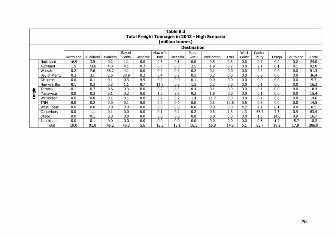
293
Table 8.3 Total Freight Tonnages in 2042 - High Scenario
(million tonnes) Destination
Northland Auckland Waikato Bay of Plenty Gisborne
Hawke’s Bay Taranaki
Mana-watu Wellington TNM
West Coast
Canter-bury Otago Southland Total
Ori
gin
Northland 16.9 3.5 0.2 1.1 0.0 0.3 0.1 0.0 0.5 0.3 0.0 0.7 0.2 0.2 24.0
Auckland 1.5 73.6 4.0 4.1 0.2 0.8 0.8 2.5 1.9 0.2 0.0 2.1 0.1 0.1 92.0
Waikato 0.2 7.6 38.2 4.1 0.0 0.2 0.6 0.2 0.1 0.0 0.0 0.2 0.0 0.0 51.3
Bay of Plenty 0.2 3.1 2.6 28.9 0.2 0.4 0.2 0.5 0.2 0.0 0.0 0.2 0.0 0.0 36.4
Gisborne 0.0 0.1 0.1 0.3 4.5 0.2 0.0 0.1 0.0 0.0 0.0 0.0 0.0 0.0 5.3
Hawke’s Bay 0.1 0.3 0.3 1.1 0.7 11.9 0.2 1.5 0.2 0.0 0.0 0.1 0.0 0.0 16.3
Taranaki 0.1 0.2 0.6 0.3 0.0 0.2 8.3 0.4 0.1 0.0 0.0 0.1 0.0 0.0 10.4
Manawatu 0.0 0.3 0.1 0.2 0.0 1.0 2.6 9.2 1.9 0.0 0.0 0.1 0.0 0.0 15.4
Wellington 0.0 0.8 0.1 0.1 0.0 0.2 0.2 1.4 11.7 0.0 0.0 0.1 0.0 0.0 14.6
TNM 0.0 0.2 0.0 0.1 0.0 0.0 0.0 0.0 0.1 12.6 0.5 0.8 0.0 0.0 14.5
West Coast 0.0 0.0 0.0 0.0 0.0 0.0 0.0 0.0 0.0 0.0 4.2 4.1 0.1 0.0 8.5
Canterbury 0.0 1.1 0.1 0.0 0.0 0.1 0.2 0.2 0.3 1.3 1.3 55.7 2.3 0.9 63.4
Otago 0.0 0.1 0.0 0.0 0.0 0.0 0.0 0.0 0.0 0.0 0.0 1.0 14.6 0.9 16.7
Southland 0.0 0.1 0.0 0.0 0.0 0.0 0.0 0.0 0.0 0.0 0.0 0.6 1.7 15.7 18.2
Total 19.0 91.0 46.2 40.3 5.6 15.3 13.1 16.1 16.8 14.5 6.1 65.7 19.2 17.9 386.9

294
Table 8.4 Total Freight Tonnages in 2042 - Low Scenario
(million tonnes) Destination
Northland Auckland Waikato Bay of Plenty Gisborne
Hawke’s Bay Taranaki
Mana-watu Wellington TNM
West Coast
Canter-bury Otago Southland Total
Ori
gin
Northland 15.8 3.2 0.2 1.1 0.0 0.3 0.1 0.0 0.5 0.3 0.0 0.7 0.2 0.2 22.5
Auckland 1.4 66.6 3.7 3.9 0.2 0.7 0.8 2.3 1.8 0.1 0.0 1.9 0.1 0.0 83.6
Waikato 0.2 6.9 35.3 3.9 0.0 0.2 0.5 0.2 0.1 0.0 0.0 0.2 0.0 0.0 47.4
Bay of Plenty 0.2 2.8 2.5 27.1 0.2 0.4 0.2 0.4 0.2 0.0 0.0 0.1 0.0 0.0 34.2
Gisborne 0.0 0.1 0.1 0.2 4.2 0.2 0.0 0.1 0.0 0.0 0.0 0.0 0.0 0.0 5.1
Hawke’s Bay 0.0 0.3 0.3 1.2 0.7 11.1 0.2 1.5 0.1 0.0 0.0 0.1 0.0 0.0 15.4
Taranaki 0.1 0.2 0.5 0.3 0.0 0.2 7.9 0.4 0.1 0.0 0.0 0.1 0.0 0.0 9.9
Manawatu 0.0 0.3 0.1 0.2 0.0 1.0 2.6 8.4 1.8 0.0 0.0 0.1 0.0 0.0 14.5
Wellington 0.0 0.8 0.1 0.1 0.0 0.2 0.2 1.4 10.4 0.0 0.0 0.1 0.0 0.0 13.3
TNM 0.0 0.2 0.0 0.1 0.0 0.0 0.0 0.0 0.1 11.7 0.5 0.8 0.0 0.0 13.5
West Coast 0.0 0.0 0.0 0.0 0.0 0.0 0.0 0.0 0.0 0.0 4.0 3.8 0.1 0.0 7.9
Canterbury 0.0 1.1 0.1 0.0 0.0 0.1 0.2 0.2 0.3 1.3 1.2 51.8 2.1 0.8 59.0
Otago 0.0 0.1 0.0 0.0 0.0 0.0 0.0 0.0 0.0 0.0 0.0 0.9 13.4 0.9 15.5
Southland 0.0 0.1 0.0 0.0 0.0 0.0 0.0 0.0 0.0 0.0 0.0 0.6 1.7 14.9 17.3
Total 17.7 82.5 42.9 38.1 5.4 14.4 12.6 14.9 15.3 13.5 5.7 61.1 17.8 17.0 359.0
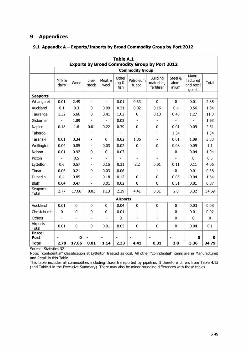
295
9 Appendices
9.1 Appendix A – Exports/Imports by Broad Commodity Group by Port 2012
Table A.1 Exports by Broad Commodity Group by Port 2012
Commodity Group
Milk & dairy
Wood Live-stock
Meat & wool
Other ag & fish
Petroleum & coal
Building materials, fertiliser
Steel & alum-inium
Manu-factured and retail
goods
Total
Seaports
Whangarei 0.01 2.49 - - 0.01 0.33 0 0 0.01 2.85
Auckland 0.1 0.3 0 0.09 0.21 0.02 0.16 0.4 0.56 1.84
Tauranga 1.32 6.66 0 0.41 1.02 0 0.13 0.48 1.27 11.3
Gisborne - 1.89 - - 0.03 - - - - 1.93
Napier 0.18 1.6 0.01 0.22 0.39 0 0 0.01 0.09 2.51
Taharoa - - - - - - - 1.34 - 1.34
Taranaki 0.01 0.34 - 0 0.02 1.86 - 0.01 1.09 3.33
Wellington 0.04 0.85 - 0.03 0.02 0 0 0.08 0.09 1.1
Nelson 0.01 0.92 0 0 0.07 - - 0 0.04 1.04
Picton - 0.5 - - - - - - 0 0.5
Lyttelton 0.6 0.57 - 0.15 0.31 2.2 0.01 0.11 0.11 4.06
Timaru 0.06 0.21 0 0.03 0.06 - - 0 0.01 0.38
Dunedin 0.4 0.85 - 0.18 0.12 0 0 0.05 0.04 1.64
Bluff 0.04 0.47 - 0.01 0.02 0 0 0.31 0.01 0.87
Seaports Total
2.77 17.66 0.01 1.13 2.29 4.41 0.31 2.8 3.32 34.69
Airports
Auckland 0.01 0 0 0 0.04 0 0 0 0.03 0.08
Christchurch 0 0 0 0 0.01 - - 0 0.01 0.02
Others - - - - 0 - - 0 0 0
Airports Total
0.01 0 0 0.01 0.05 0 0 0 0.04 0.1
Parcel Post - 0 - - - - - - 0 0
Total 2.78 17.66 0.01 1.14 2.33 4.41 0.31 2.8 3.36 34.79
Source: Statistics NZ. Note: “confidential” classification at Lyttelton treated as coal. All other “confidential” items are in Manufactured and Retail in this Table. This table includes all commodities including those transported by pipeline. It therefore differs from Table 4.13 (and Table 4 in the Executive Summary). There may also be minor rounding differences with those tables.
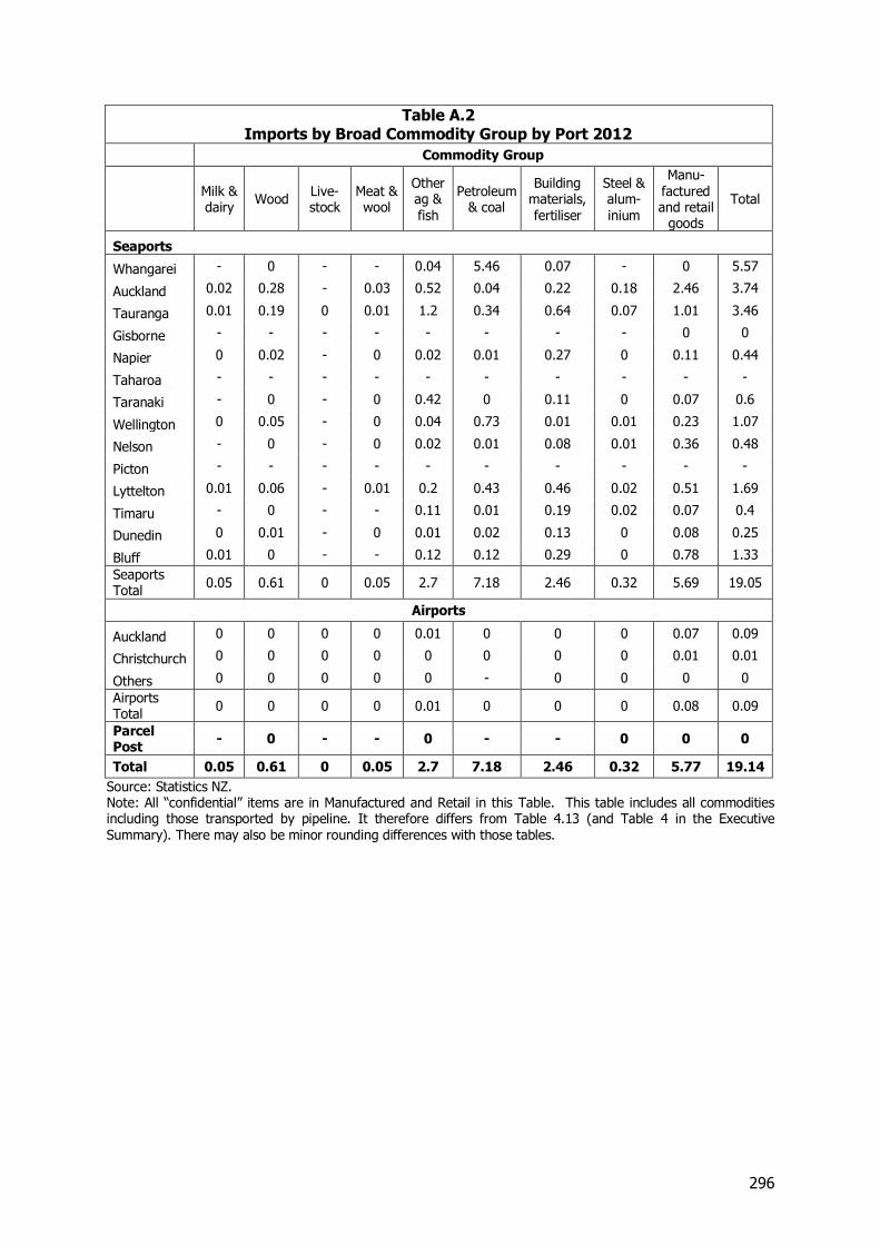
296
Table A.2 Imports by Broad Commodity Group by Port 2012
Commodity Group
Milk & dairy
Wood Live-stock
Meat & wool
Other ag & fish
Petroleum & coal
Building materials, fertiliser
Steel & alum-inium
Manu-factured and retail
goods
Total
Seaports
Whangarei - 0 - - 0.04 5.46 0.07 - 0 5.57
Auckland 0.02 0.28 - 0.03 0.52 0.04 0.22 0.18 2.46 3.74
Tauranga 0.01 0.19 0 0.01 1.2 0.34 0.64 0.07 1.01 3.46
Gisborne - - - - - - - - 0 0
Napier 0 0.02 - 0 0.02 0.01 0.27 0 0.11 0.44
Taharoa - - - - - - - - - -
Taranaki - 0 - 0 0.42 0 0.11 0 0.07 0.6
Wellington 0 0.05 - 0 0.04 0.73 0.01 0.01 0.23 1.07
Nelson - 0 - 0 0.02 0.01 0.08 0.01 0.36 0.48
Picton - - - - - - - - - -
Lyttelton 0.01 0.06 - 0.01 0.2 0.43 0.46 0.02 0.51 1.69
Timaru - 0 - - 0.11 0.01 0.19 0.02 0.07 0.4
Dunedin 0 0.01 - 0 0.01 0.02 0.13 0 0.08 0.25
Bluff 0.01 0 - - 0.12 0.12 0.29 0 0.78 1.33
Seaports Total
0.05 0.61 0 0.05 2.7 7.18 2.46 0.32 5.69 19.05
Airports
Auckland 0 0 0 0 0.01 0 0 0 0.07 0.09
Christchurch 0 0 0 0 0 0 0 0 0.01 0.01
Others 0 0 0 0 0 - 0 0 0 0
Airports Total
0 0 0 0 0.01 0 0 0 0.08 0.09
Parcel Post
- 0 - - 0 - - 0 0 0
Total 0.05 0.61 0 0.05 2.7 7.18 2.46 0.32 5.77 19.14
Source: Statistics NZ. Note: All “confidential” items are in Manufactured and Retail in this Table. This table includes all commodities including those transported by pipeline. It therefore differs from Table 4.13 (and Table 4 in the Executive Summary). There may also be minor rounding differences with those tables.
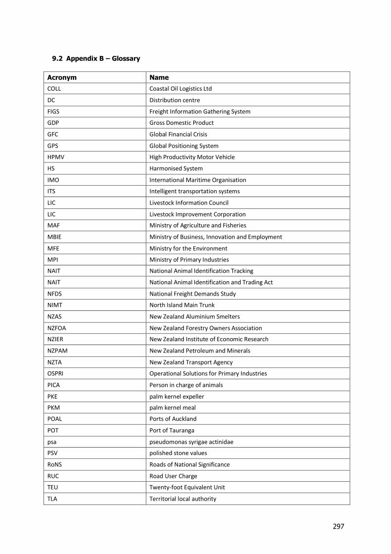
297
9.2 Appendix B – Glossary
Acronym Name
COLL Coastal Oil Logistics Ltd
DC Distribution centre
FIGS Freight Information Gathering System
GDP Gross Domestic Product
GFC Global Financial Crisis
GPS Global Positioning System
HPMV High Productivity Motor Vehicle
HS Harmonised System
IMO International Maritime Organisation
ITS Intelligent transportation systems
LIC Livestock Information Council
LIC Livestock Improvement Corporation
MAF Ministry of Agriculture and Fisheries
MBIE Ministry of Business, Innovation and Employment
MFE Ministry for the Environment
MPI Ministry of Primary Industries
NAIT National Animal Identification Tracking
NAIT National Animal Identification and Trading Act
NFDS National Freight Demands Study
NIMT North Island Main Trunk
NZAS New Zealand Aluminium Smelters
NZFOA New Zealand Forestry Owners Association
NZIER New Zealand Institute of Economic Research
NZPAM New Zealand Petroleum and Minerals
NZTA New Zealand Transport Agency
OSPRI Operational Solutions for Primary Industries
PICA Person in charge of animals
PKE palm kernel expeller
PKM palm kernel meal
POAL Ports of Auckland
POT Port of Tauranga
psa pseudomonas syrigae actinidae
PSV polished stone values
RoNS Roads of National Significance
RUC Road User Charge
TEU Twenty-foot Equivalent Unit
TLA Territorial local authority