My magazine research task (Muse - NME)
8
Johanna Becker Johanna Becker
-
Upload
hannifrieda -
Category
Marketing
-
view
101 -
download
0
Transcript of My magazine research task (Muse - NME)

Johanna Becker Johanna Becker
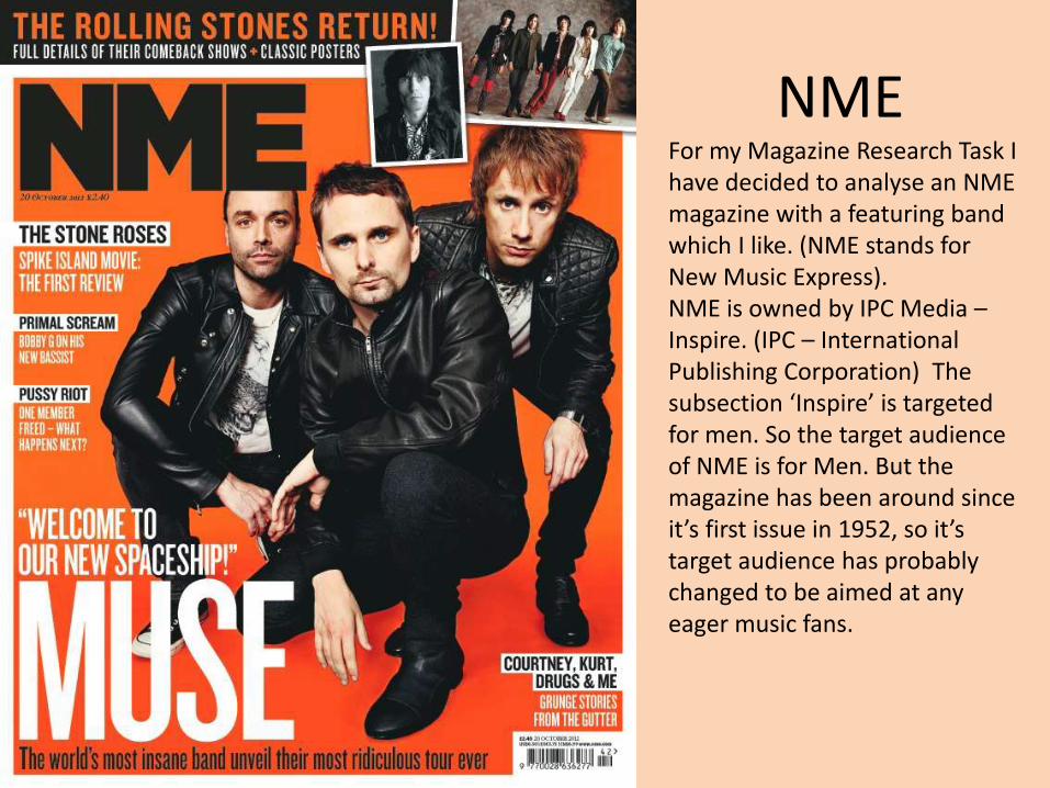
NME For my Magazine Research Task I have decided to analyse an NME magazine with a featuring band which I like. (NME stands for New Music Express). NME is owned by IPC Media –Inspire. (IPC – International Publishing Corporation) The subsection ‘Inspire’ is targeted for men. So the target audience of NME is for Men. But the magazine has been around since it’s first issue in 1952, so it’s target audience has probably changed to be aimed at any eager music fans.

NME Sale Figures
“The IPC Media title, which celebrated its 60th birthday two years ago and unveiled a new look last year, had an average print sale of 18,184 in the second half of 2013, according to the latest Audit Bureau of Circulations figures published on Thursday”.
But it wasn’t just NME which didn’t sell much;
“Q, once the biggest-selling music magazine, which sold more than 200,000 at the turn of the century, just kept its head above the 50,000 mark.”
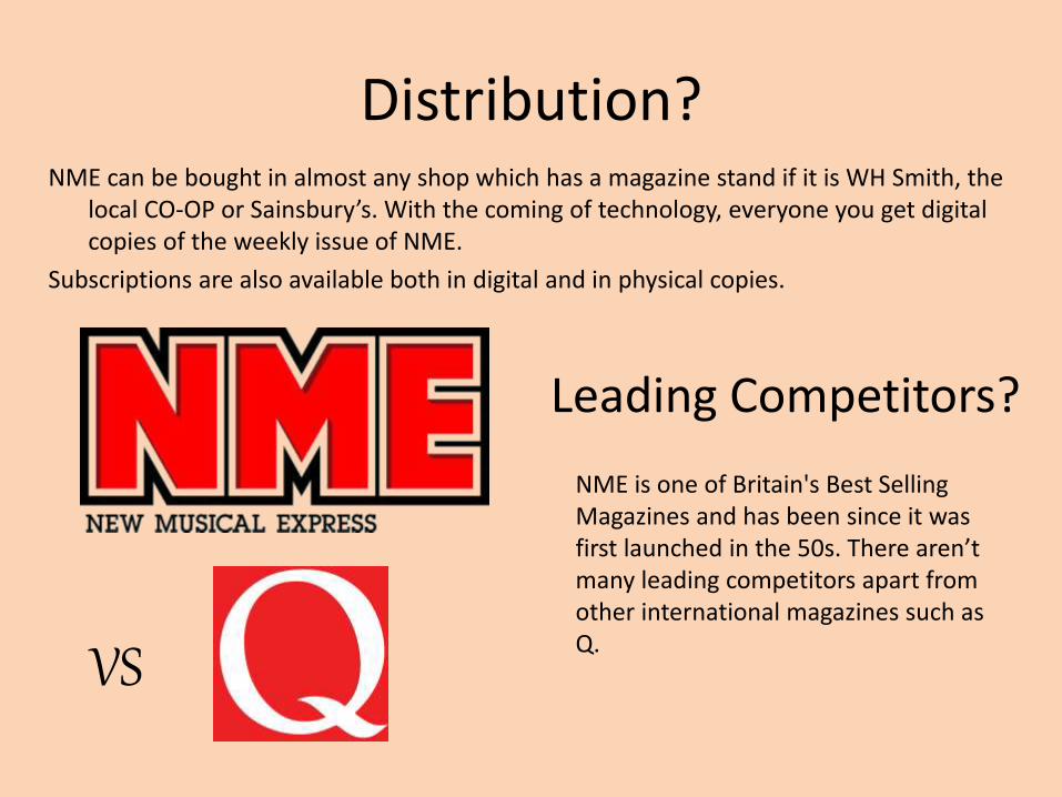
Distribution? NME can be bought in almost any shop which has a magazine stand if it is WH Smith, the
local CO-OP or Sainsbury’s. With the coming of technology, everyone you get digital copies of the weekly issue of NME.
Subscriptions are also available both in digital and in physical copies.
Leading Competitors?
NME is one of Britain's Best Selling Magazines and has been since it was first launched in the 50s. There aren’t many leading competitors apart from other international magazines such as Q.
VS ?
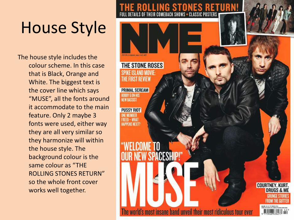
House Style
The house style includes the colour scheme. In this case that is Black, Orange and White. The biggest text is the cover line which says “MUSE”, all the fonts around it accommodate to the main feature. Only 2 maybe 3 fonts were used, either way they are all very similar so they harmonize will within the house style. The background colour is the same colour as “THE ROLLING STONES RETURN” so the whole front cover works well together.

Main cover feature at the top left of Contents page
Recurring Contents title throughout every issue (house style)
Subscription info – “cheap” prices highlighted for effect
Other pages under “plus”
Many different fonts – House style broken? But nice effect
COVERLINE link
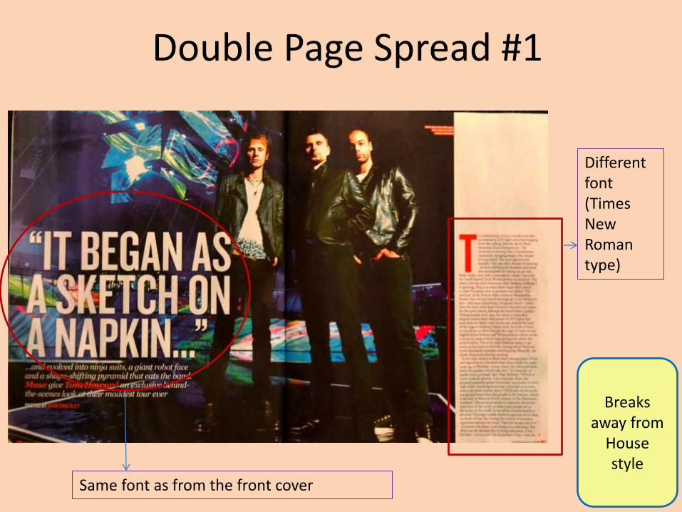
Double Page Spread #1
Same font as from the front cover
Different font (Times New Roman type)
Breaks away from
House style

Double Page Spread #2 & #3
Orange House Style is back House style font
Bio’s of band members