
Music magazine evaluation
41
MUSIC MAGAZINE EVALUATION Kelsi-Leigh Lewis
Transcript of Music magazine evaluation

MUSIC MAGAZINE EVALUATIONKelsi-Leigh Lewis

QUESTION 1: WHO WOULD BE THE AUDIENCE FOR YOUR MEDIA PRODUCT?
My target audience will be particularly those aged 16-30 years old, both male and female. The reason for this is because my magazine will include the latest events etc. which I believe are more appealing for this age range but do not single out one specific gender.
I chose this audience because I felt like, as a 16 year old, it would be easier to produce something that could appeal to myself and would be something I can personally relate to. This way, I would be able to evaluate the successfulness of my music magazine in relation to what I would think of as an effective product for the target audience.

My ideal reader would be Jemima. She is 23 and lives in Gloucestershire. She attends many festivals and loves House Music specifically. She is in full-time employment and has a medium amount of disposable income to spend on herself and those close to her. Being a regular buyer of music magazines and CD’s, she spends most of her spare money on these items to ensure she has the latest music. Jemima loves reading because she loves to know the upcoming festivals. This way she can book her tickets and prepare herself for what she loves. She also loves knowing about the latest gossip in the music industry before it goes mainstream, like new albums/songs, event and life stories. Jemima enjoys sharing her new found information with those in her friendships circle. Her friendship circle is full of people with very similar attitudes towards music, and therefore she has no problem finding anyone to join her at festivals or to engage in a conversation about the newest album to be released. Jemima has good knowledge of digital technology, is a regular social networker and uses online services frequently, mainly for social purposes. She regularly goes to parties with her friends and often invites them round hers for a few drinks and music. As a lover of festivals, Jemima is an open-minding experience seeker and listens to a variety of music. She enjoys hearing new artists for the first time, and likes to discuss whether she feels they have potential to make it big in the music industry within her friendship circle. Although she is a huge music fan, Jemima has many other interests such as TV and film, sport and fashion.

I did not use any research to decide my target audience or support my decision, because I had already got enough information about my 16-30 year old target audience due to being a 16 year old myself. I felt confident enough in my own ability to know what my target audience would be looking for in a music magazine, and therefore felt it was inappropriate to spend my time accumulating data I was already knowledgeable of.

https://www.google.co.uk/search?q=Q+magazine+front+covers&biw=704&bih=771&tbm=isch&tbo=u&source=univ&sa=X&ei=qRYIVd3bB4TtaNqhgMAL&ved=0CCAQsAQ | At the beginning of my research I looked at other front covers to try and inspire my thoughts – which at this point were not very developed, but instead bland and unexciting. I decided to focus on Q magazine as I thought the layout was most appealing, and copied a handful of images into a PowerPoint so I could reflect on them throughout the production of my music magazine.
http://www.clashmusic.com/feature/jay-z-interview | For my double page spread article, I chose to do an interview. I got my inspiration from an interview with Jay-Z, found in an edition of ‘Clash’ magazine.

QUESTION 2: HOW DID YOU ATTRACT/ADDRESS YOUR AUDIENCE?
I identified their needs and desires by putting myself in their shoes – being a 16 year old myself I could easily create the knowledge of what I would need to include in my magazine to satisfy the younger area of my target audience. The older area of my target audience was a slight grey area for me, as I had no idea what a 25-30 year old would enjoy. Therefore I feel like I would have met the needs and desires more for the 16-24 year old range, and less so for the 25-30 year olds.
I went on to meeting their needs by ensuring the models, font, colours and information was all appropriate and appealing for 16-30 year old’s.

The models I used are an example of where I had the audience in mind when producing my music magazine. I used a group of young males when photographing, and chose the best from a variety of shots. As I feel like my target audience is of a young age range I felt like they needed to feel as if they could feature in the magazine – I wanted them to be able to picture themselves being the main feature of the front cover, or have a double page spread all about them and their life.

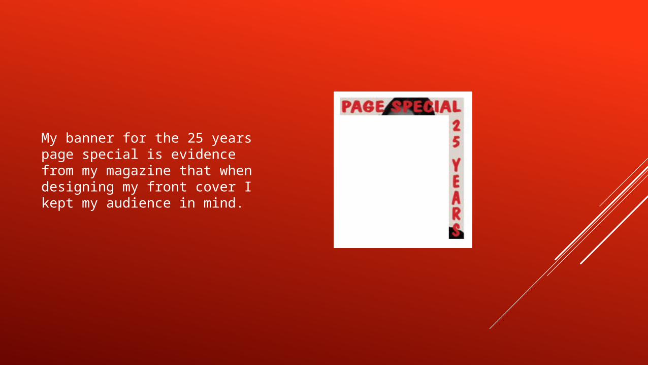
My banner for the 25 years page special is evidence from my magazine that when designing my front cover I kept my audience in mind.

I also included information about an upcoming festival which appeals to my target audience, making it evident that I had my audience in mind when producing this.
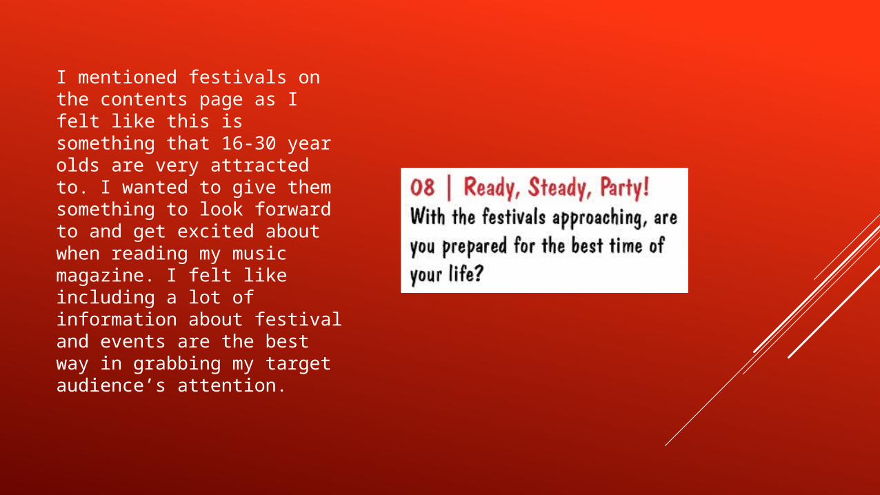
I mentioned festivals on the contents page as I felt like this is something that 16-30 year olds are very attracted to. I wanted to give them something to look forward to and get excited about when reading my music magazine. I felt like including a lot of information about festival and events are the best way in grabbing my target audience’s attention.
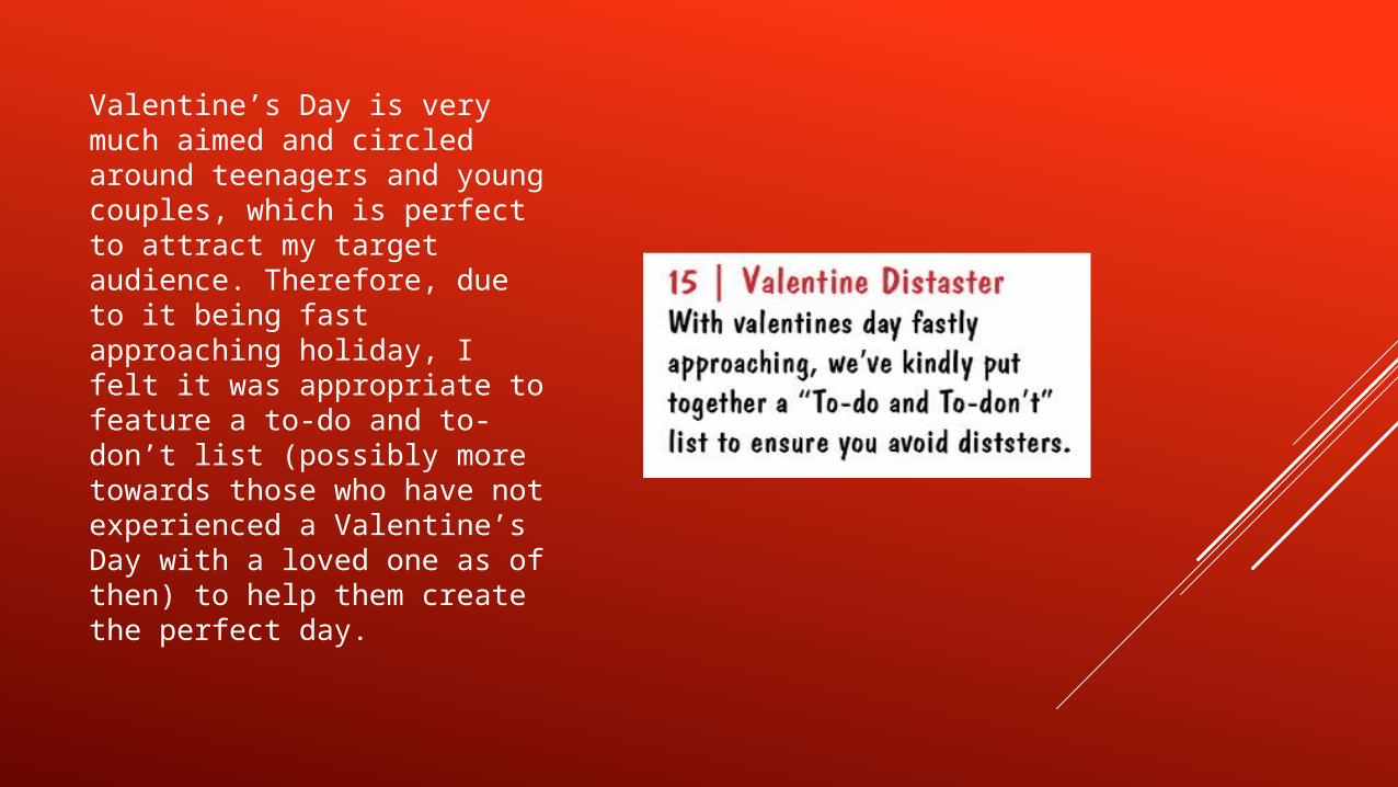
Valentine’s Day is very much aimed and circled around teenagers and young couples, which is perfect to attract my target audience. Therefore, due to it being fast approaching holiday, I felt it was appropriate to feature a to-do and to-don’t list (possibly more towards those who have not experienced a Valentine’s Day with a loved one as of then) to help them create the perfect day.

The Cheltenham Festival of Racing is a very famous and popular event across the UK. People come from all over the world to experience the buzz and fantastic atmosphere (and come back slightly more broke than they were when they arrived). This reason backs up my reasoning for including this in my contents page, while at the same time involving and attracting my target audience.

QUESTION 3: HOW DOES YOUR MEDIA PRODUCT REPRESENT PARTICULAR SOCIAL GROUPS?

Gender: All of my photos are including male models, yet this does not represent my target audience – both males and females are targeted for my music magazine. The images of stylish, confident males will encourage the male population of my target audience to aspire to be like them in their looks and attitudes. They will be intrigued by them and will want to know more about where they get their clothing from, tips on how to style their hair in a similar way and how to boost their confidence. On the other hand, these males will satisfy the eyes of the female readers and in turn, these females will give their attention to my music magazine. The females will be engaged in my music magazine and will want to read more about the lifestyle of these males, learning of their private life and personal facts that others who do not read my magazine may not be aware of.
Ethnicity: I have not incorporated ethnicity within my music magazine as I do not want to aim it to one certain ethnic group or make one ethnic group feel like the music magazine is not directed for them, making them feel singled out.
Disability: Like ethnicity, I do not want to aim it at either an able-bodied audience or disabled audience. I don’t want disability to be a factor that has to be specific to read my music magazine. I want all to feel welcome to consume my product and all enjoy it equally. The only disability I feel would be difficult to reach out to with my music magazine is those who are visually-impaired, as I do not have any braille incorporated within my music magazine.

QUESTION 4: IN WHAT WAY DOES YOUR MEDIA PRODUCT USE, DEVELOP OR CHALLENGE FORMS AND CONVENTIONS OF REAL MEDIA PRODUCTS?

Banner: Using the idea from an image of an existing magazine I found through a search engine, I decided that my music magazine would be a special 25 year anniversary issue for ‘SuperSonic’, and that there would be a page dedicated to the history of ‘SuperSonic’. I felt like this would be a good idea as, if the magazine was real and published, it would engage the readers to see how things have changed over time but also what has remained the same. For those that had been buying the magazine all their lives (or possibly since it was released) it would be a good memorabilia for them as it would have a combination of all things ‘SuperSonic’. It would also hopefully spring some good past experiences to mind related to my music magazine.

Colour scheme: Typically, music magazines would follow a colour scheme rather than just having a huge variety of conflicting colours. I stuck to using black and red as I felt like they reflected each other well and were also colours that contributed to my image that I decided to use for my double page spread, so therefore there would be no clashes in colours between the text and images.

Font scheme: Similarly to the colour scheme, you typically see only two or three font types used throughout the entire magazine, and I felt like this would be something that would only work this way. I did not feel confident enough to use a mass amount of different font styles and agree that they work together and complement each other, diverting me to stick to this existing convention with no alterations.

Bar code, price, date and issue: When researching different existing music magazine’s for inspiration I noticed it was natural to have the barcode apparent, typically on the front cover, with the price, date and issue close by. Therefore I decided it would be a good idea to follow this to give the front cover more detail. There was not much thought put into producing the bar code, creating a price, date and issue and positioning these in a location that readers were aware of due to this being an existing convention already. So it was just a case of applying it to my music magazine. I kept the price quiet small, so it wasn’t too obvious as I was unsure as to whether the target audience would agree that this price is worth the information and detail that they get from SuperSonic. This way the readers would not get put off by the price initially, before they have had a chance to observe the product.
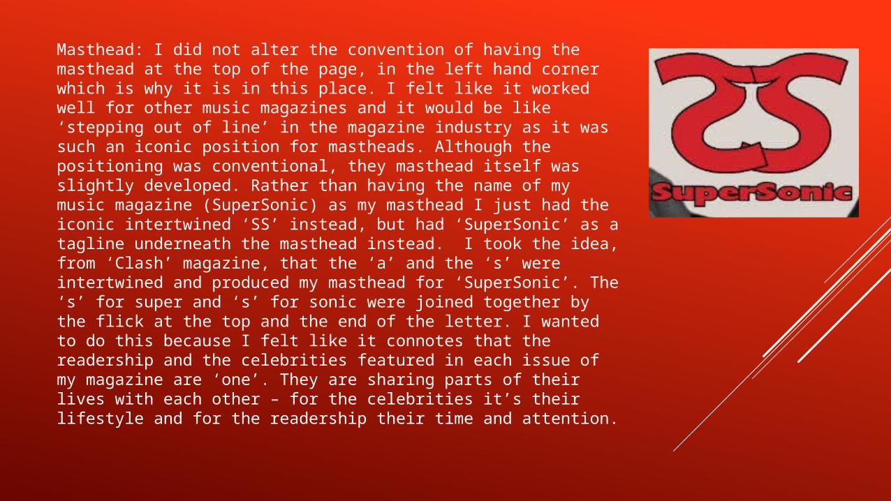
Masthead: I did not alter the convention of having the masthead at the top of the page, in the left hand corner which is why it is in this place. I felt like it worked well for other music magazines and it would be like ‘stepping out of line’ in the magazine industry as it was such an iconic position for mastheads. Although the positioning was conventional, they masthead itself was slightly developed. Rather than having the name of my music magazine (SuperSonic) as my masthead I just had the iconic intertwined ‘SS’ instead, but had ‘SuperSonic’ as a tagline underneath the masthead instead. I took the idea, from ‘Clash’ magazine, that the ‘a’ and the ‘s’ were intertwined and produced my masthead for ‘SuperSonic’. The ‘s’ for super and ‘s’ for sonic were joined together by the flick at the top and the end of the letter. I wanted to do this because I felt like it connotes that the readership and the celebrities featured in each issue of my magazine are ‘one’. They are sharing parts of their lives with each other – for the celebrities it’s their lifestyle and for the readership their time and attention.
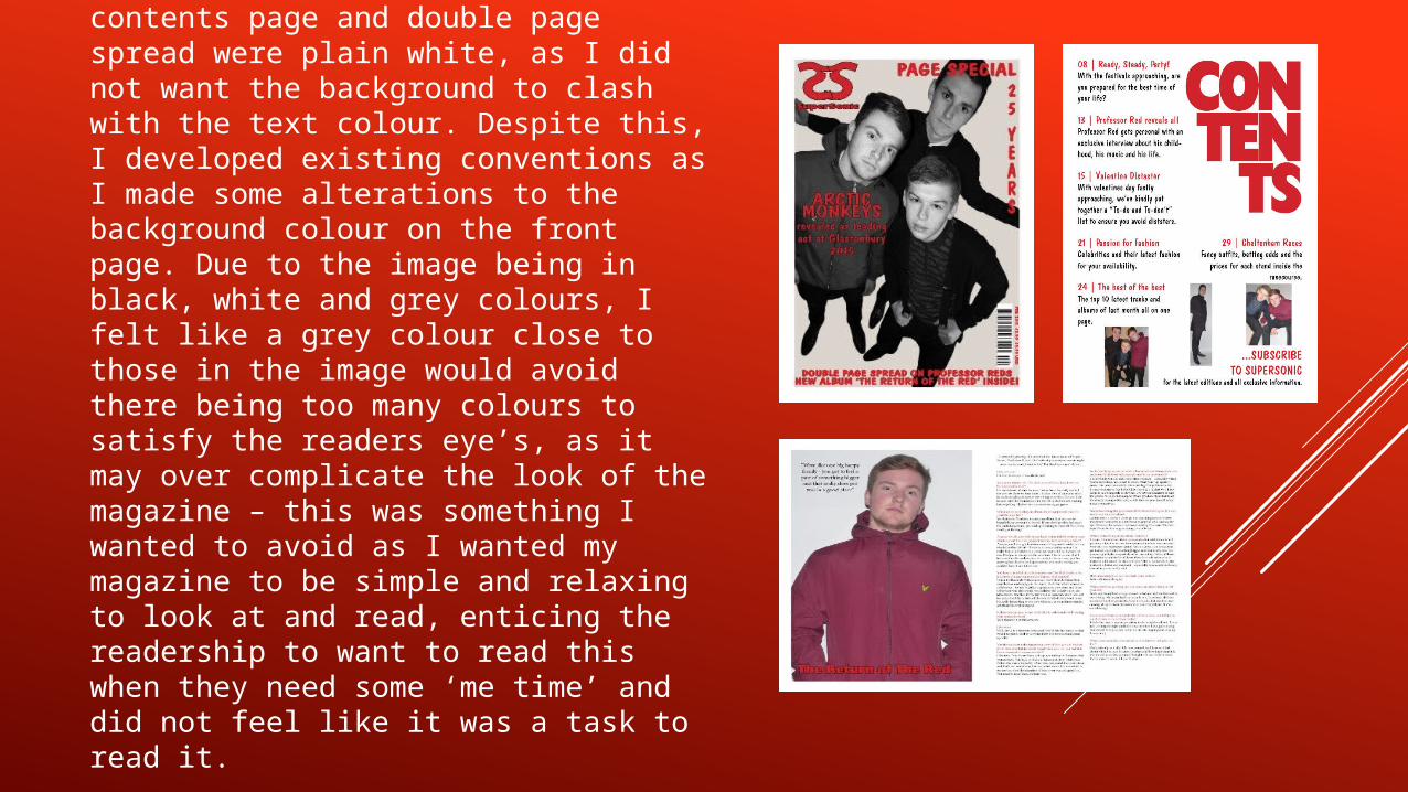
Background: The background on my contents page and double page spread were plain white, as I did not want the background to clash with the text colour. Despite this, I developed existing conventions as I made some alterations to the background colour on the front page. Due to the image being in black, white and grey colours, I felt like a grey colour close to those in the image would avoid there being too many colours to satisfy the readers eye’s, as it may over complicate the look of the magazine – this was something I wanted to avoid as I wanted my magazine to be simple and relaxing to look at and read, enticing the readership to want to read this when they need some ‘me time’ and did not feel like it was a task to read it.

QUESTION 5: WHAT KIND OF MEDIA INSTITUTIONS MIGHT DISTRIBUTE YOUR MEDIA PRODUCT AND WHY?
In terms of publication and distribution I would contact big name distributors and see if they have a gap in the market for my product. I do not believe this would prove difficult due to such originality within my music magazine, and the many interesting and alluring information I feature inside.

I think the product would be printed because, as a 16 year old myself, I would want to have a physical, paperback copy rather than just a visual one. I believe the reason for this is because it is more social as you can look at the magazine with a group of friends and can cut out, highlight etc. any information or interesting events that you desire.

I would also make mobile apps that enables you to access copies of the music magazine through computerised devices such as phone, laptops, iPads etc. Although I mentioned previously that I believe a printed product would be more appealing to the majority of my target audience, I do want to appeal the whole of my target audience – rather than just the majority. Therefore making a visual, mobile product would appeal to the remaining minority of my target audience.

I would use the internet and social media to tease my readers and give them sneak previews of interviews and articles that will feature in the next issue. This will encourage the readership to share information with their other friends on social media sites, enlarging our readership further.

QUESTION 6: WHAT HAVE YOU LEARNT ABOUT TECHNOLOGIES FROM THE PROCESS OF CONSTRUCTING THIS PRODUCT?

The first software I involved in producing my music magazine was PowerPoint. This was used to present my inspirations, media pack for Q magazine and layout ideas, font/colour scheme ideas and how I want my target audience to see my music magazine.

I used the school camera (a Panasonic Lumic, DMC – FZ 200) to take the photo’s I included on my front cover and double page spread. The reason for this is because it was quick and easy to access and upload the photos, and was actually the only camera I had access to – I do not have my own camera, or one that could produce high quality images. I also learnt how to use props, clothing, the lighting, the backdrop and the positioning of the models to enhance an image. This was used to produce an image of high quality.

My next step was planning out my double page spread article. To do so, I used a word document. This was quick and simple as Microsoft Word is a software I use very regularly and therefore are very skilled in using it, despite not needing much skill to just plan then type up the finalised article.

I used two main software’s within the school to make a variety of changes to my images, text etc. These were Photoshop and InDesign.
Photoshop was used mainly to edit the images I had taken – this included changing the colours of the image and resizing it. I feel like my skills in using Photoshop have improved greatly due to having to spend a lot of time on the software throughout the course of producing my music magazine. I have learnt how to make specific changes to the presentation of an image, which can drastically change how an image will look.
While using InDesign, I changed the size of the text that would feature on my front cover, contents page and double page spread, the colour of the text and the layout/positioning of this on the page. I was only aware of the basic skills that could be applied using InDesign, which meant I had a great deal to learn to enable me to use this to its full potential. I used these skills I learned in a multitude of areas.
This project opened my eyes as to which software and what technology is best suited for specific tasks. It helped me to pick the software that I would be able to get the best possible results out of, and have given my more knowledge that I can apply to other tasks in the future.

QUESTION 7: LOOKING BACK AT YOUR PRELIMINARY TASK, WHAT DO YOU FEEL YOU HAVE LEARNT IN THE PROGRESSION FROM IT TO THE FULL PRODUCT?

MASTHEAD
School Magazine
The masthead for my music magazine was very similar to the masthead I created for my school magazine. They both had the main masthead and then a line of text underneath. I followed this technique from my school magazine through to the music magazine because I felt like this worked well and included everything I wanted it to without taking up too much room.
Music Magazine

CONTENTS LIST
School Magazine
My contents list is identical in my school magazine and music magazine as I really liked the layout and felt like it was clear and obvious in terms of what you would find on what page. I used the colours differently in each magazine, but feel like the music magazine is more satisfying to the eye and a plain background with coloured text is clearer than a coloured background and plain text.
Music Magazine

ISSUE NUMBER
School Magazine
I also included the issue number on the contents page in the school magazine but on the front cover in the music magazine. I felt like having the issue number on the contents page was inappropriate as I believed it did not belong there, but instead on the front cover with the barcode and price. Therefore I changed the positioning when producing my music magazine.
Music Magazine


