
MS-6549 Wellcome Brand Guidelines · Our brand Guidelines / April 2016. Brand philosophy Wellcome...
12
Our brand Guidelines / April 2016
Transcript of MS-6549 Wellcome Brand Guidelines · Our brand Guidelines / April 2016. Brand philosophy Wellcome...
Our brandGuidelines / April 2016
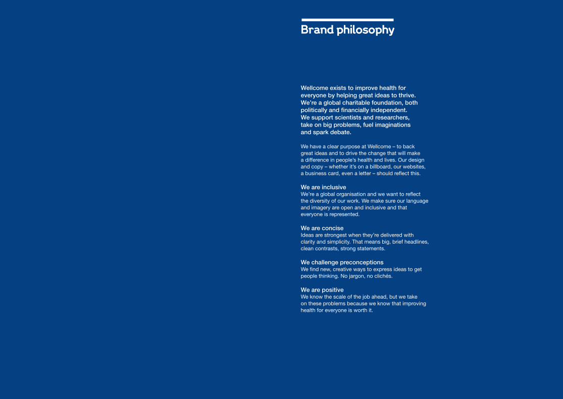
Brand philosophy
Wellcome exists to improve health for everyone by helping great ideas to thrive. We’re a global charitable foundation, both politically and financially independent. We support scientists and researchers, take on big problems, fuel imaginations and spark debate.
We have a clear purpose at Wellcome – to back great ideas and to drive the change that will make a difference in people’s health and lives. Our design and copy – whether it’s on a billboard, our websites, a business card, even a letter – should reflect this.
We are inclusive We’re a global organisation and we want to reflect the diversity of our work. We make sure our language and imagery are open and inclusive and that everyone is represented.
We are concise Ideas are strongest when they’re delivered with clarity and simplicity. That means big, brief headlines, clean contrasts, strong statements.
We challenge preconceptions We find new, creative ways to express ideas to get people thinking. No jargon, no clichés.
We are positiveWe know the scale of the job ahead, but we take on these problems because we know that improving health for everyone is worth it.
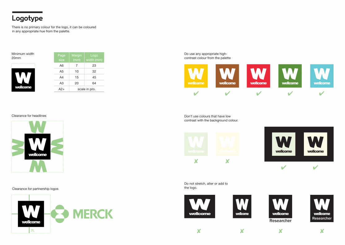
LogotypeThere is no primary colour for the logo, it can be coloured in any appropriate hue from the palette.
Page size
Margin (mm)
Logo width (mm)
A6 7 23
A5 10 32
A4 15 45
A3 20 64
A2+ scale in pro.
Clearance for headlines
Clearance for partnership logos
Minimum width20mm
Do use any appropriate high-contrast colour from the palette
Don’t use colours that have low contrast with the background colour.
Do not stretch, alter or add to the logo.
Researcher
2L
Researcher
✔ ✔ ✔ ✔
✔
✘✘✘
✔
✘
✔
✘ ✘
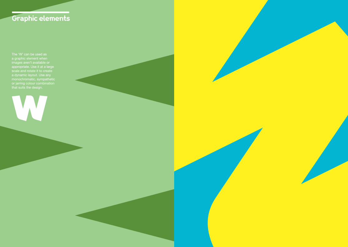
Graphic elements
The ‘W’ can be used as a graphic element when images aren’t available or appropriate. Use it at a large scale and rotate it to create a dynamic layout. Use any monochromatic, sympathetic or jarring colour combination that suits the design.

ABCDEFGHIJKLMNOPQRSTUVWXYZabcdefghijklmnopqrstuvwxyz
ABCDEFGHIJKLMNOPQRSTUVWXYZabcdefghijklmnopqrstuvwxyz
ABCDEFGHIJKLMNOPQRSTUVWXYZ
abcdefghi jk lmnopqrstuvwxyz
Wellcome Bold Positioning (top)
Positioning (bottom)
Helvetica Neue Bold
Helvetica Neue Roman
A centred headline can go here
A right-aligned headline can
go here
A left-aligned headline can go here
2L
A left-aligned headline can go here
A right-aligned headline can
go here
A centred headline can
go here
Ella volorrRemporro verion porepre proreris evenisi il molorro dolupidignis sit dolorias dollandaeModiti ad quae porpore volore num utatem ea nonsequos nonse illes dolo oditis maiost auta sum ipit maionseque que et remporr oreserior.
wellcome.ac.uk
Ella volorrRemporro verion porepre proreris evenisi
il molorro dolupidignis sit dolorias dollandaeModiti
ad quae porpore volore num utatem ea nonsequos nonse illes dolo oditis maiost auta sum ipit maionseque que et
remporr oreserior.
wellcome.ac.uk
Ella volorrRemporro verion porepre proreris evenisi il molorro dolupidignis sit dolorias dollandaeModiti ad quae porpore volore num utatem ea nonsequos
nonse illes dolo oditis maiost auta sum ipit maionseque que et remporr oreserior.
wellcome.ac.uk
TypographyWe have a display face for headlines and a secondary typeface for all other text.

C67 M0 Y18 K0 3115 U
C59 M4 Y95 K27
7742 U
C22 M0 Y9 K0 628 U
C16 M2 Y14 K4
5665 U
C14 M36 Y34 K0 7613 U
C15 M62 Y87 K30
7594 U
Colour: printThere is no primary colour for the logo. It can be coloured in any appropriate hue from the palette as long as there is good contrast with the background.
C0 M19 Y100 K0
116 U
C6 M26 Y97 K15
1245 U
C36 M35 Y83 K61 Black 2U
C59 M0 Y69 K62
7735 U
C0 M17 Y30 K0 712 U
C99 M75 Y3 K25
281 U
C32 M4 Y1 K0
277 U
C8 M74 Y62 K
7418 U
C0 M45 Y30 K0 177 U
C0 M18 Y10 K0
7605 U
C0 M0 Y93 K0
Pan Yellow U
C0 M0 Y35 K0
100 U
C0 M0 Y15 K0
C100 M0 Y27 K1 532 U
C98 M60 Y33 K47 296 U
C41 M0 Y58 K0
359 U
C26 M0 Y40 K0
7486 U
C8 M0 Y16 K0
7485 U
C20 M80 Y74 K72
359 U +15K
C0 M50 Y100 K0
151 U
C12 M88 Y67 K34 202 U
C0 M0 Y0 K80
C0 M96 Y80 K0
199 U
C0 M0 Y0 K40
C0 M50 Y100 K0
151 U
C0 M26 Y53 K0 149 U
C0 M14 Y43 K0
1345 U
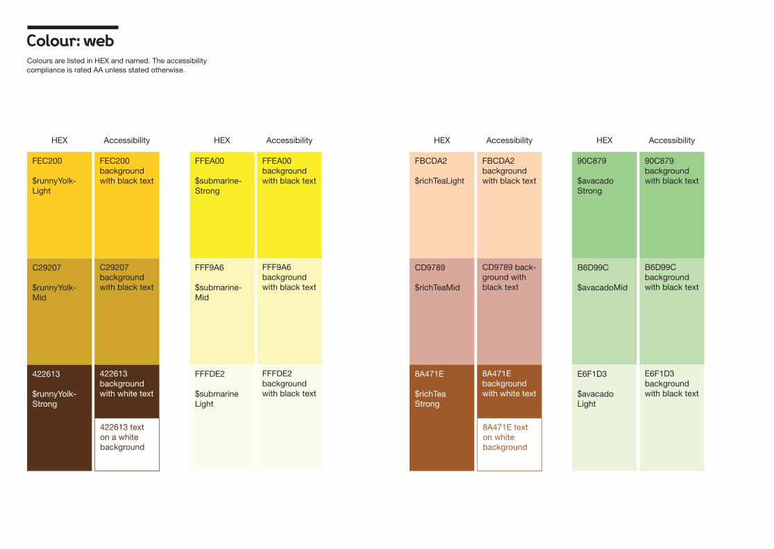
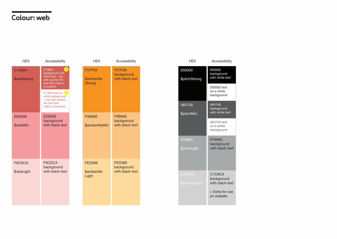
Colour: webColours are listed in HEX and named. The accessibility compliance is rated AA unless stated otherwise.
FEC200
$runnyYolk-Light
C29207
$runnyYolk-Mid
422613
$runnyYolk-Strong
FEC200 background with black text
Accessibility AccessibilityAccessibility AccessibilityHEX HEXHEX HEX
C29207 background with black text
422613 text on a white background
422613 background with white text
FFEA00
$submarine-Strong
FFEA00 background with black text
FFF9A6
$submarine-Mid
FFFDE2
$submarine Light
FFF9A6 background with black text
FFFDE2 background with black text
FBCDA2
$richTeaLight
FBCDA2 background with black text
CD9789
$richTeaMid
CD9789 back-ground with black text
8A471E
$richTea Strong
8A471E text on white background
8A471E background with white text
90C879
$avacado Strong
90C879 background with black text
B6D99C
$avacadoMid
E6F1D3
$avacado Light
B6D99C background with black text
E6F1D3 background with black text

Colour: web
Accessibility AccessibilityAccessibility AccessibilityHEX HEXHEX HEX
C2D5C8
$sherwood-Light
C2D5C8 background with black text
2A512C
$sherwood-Strong
2A512C text on white background
2A512C background with white text
4C8026
$sherwood-Mid
4C8026 text on white background – caution AA and AAA (18pt+) Compliant
4C8026 background with white text – cau-tion AA and AAA (18pt+) Compliant
009BB2
$boraBora Strong
009BB2 background with black text – use with caution AA and AAA (18pt+) Compliant
60C0CE
$boraBoraMid
BAE2E2
$boraBora-Light
D6EEEE
$boraBora-Lighter
60C0CE background with black text
BAE2E2 background with black text
D6EEEE background with black text
+ Extra for use on website
003170
$doubleDen-imStrong
9ACDED
$doubleDen-imLight
9ACDED background with black text
002E45$double DenimStrong
003170 text on white background
002E45 text on white background
003170 back-ground with white text
002E45 background with white text
FF0F2D
$broguesLight
FF0F2D background with black text – use with caution AA and AAA (18pt+) Compliant
40120D
$brogues Strong
40120D text on a white background
40120D background with white text
831E29
$broguesMid
831E29 text on a white background
831E29 background with white text
Colour: web
ED858E
$rareMid
F9CDCA
$rareLight
ED858E background with black text
F9CDCA background with black text
C14844
$rareStrong
C14844 text on white background – use with caution AA and AAA (18pt+) Compliant
C14844 background with white text – use with caution AA and AAA (18pt+) Compliant
AccessibilityHEX AccessibilityAccessibility HEXHEX
F07F0A
$amberAle Strong
F07F0A background with black text
F9B66E
$amberAleMid
FED389
$amberAle Light
F9B66E background with black text
FED389 background with black text
97999C
$pitchLight
C7C8C9
$pitchLighter
000000
$pitchStrong
000000 text on a white background
000000 background with white text
464749
$pitchMid
464749 text on a white background
464749 background with white text
97999C background with black text
C7C8C9 background with black text
+ Extra for use on website

Imagery
Inviting imagery lies at the heart of the brand. We’ll show the humanity within Wellcome by focusing on people not just things.
We’ll show scientists, children, artists, teachers, historians and archivists creating and doing the research that they’re passionate about.
© Ben McMahon
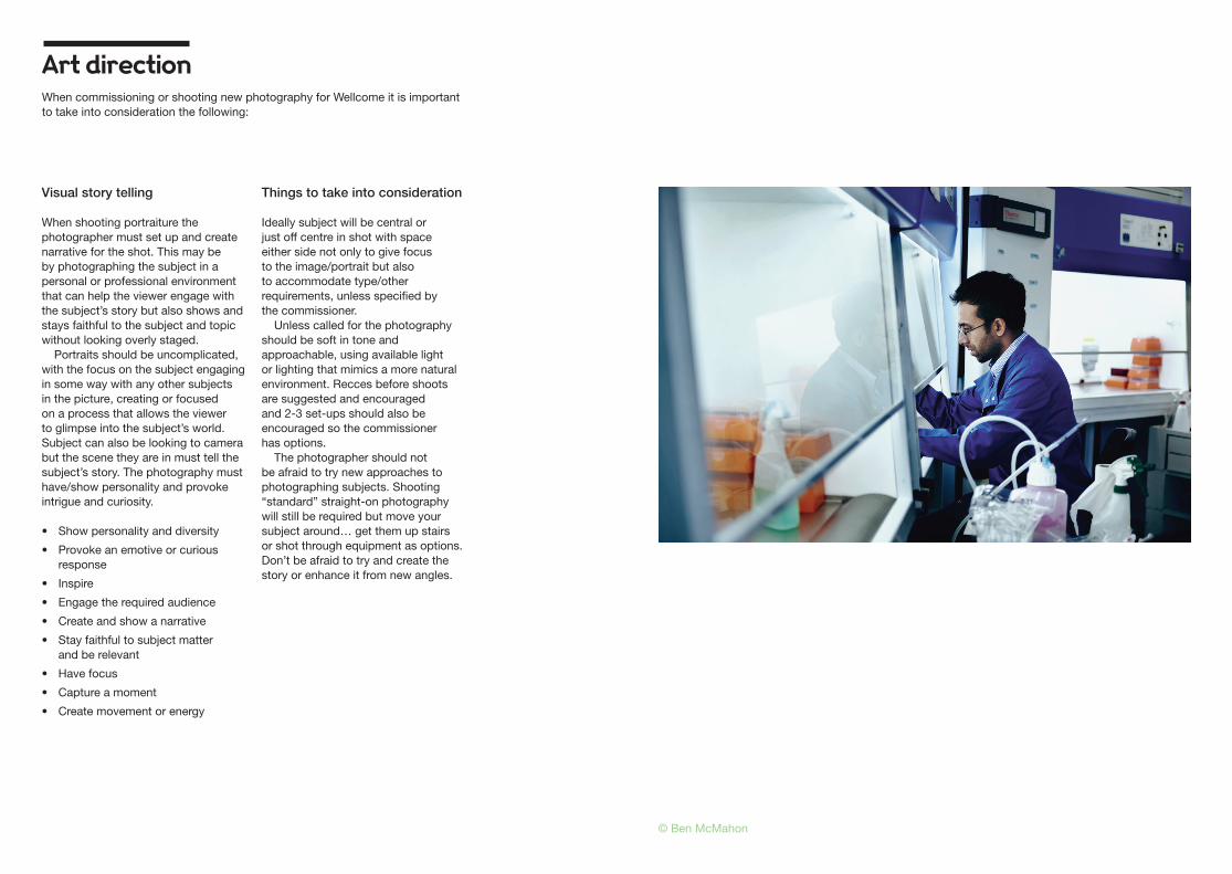
Art direction
Visual story telling
When shooting portraiture the photographer must set up and create narrative for the shot. This may be by photographing the subject in a personal or professional environment that can help the viewer engage with the subject’s story but also shows and stays faithful to the subject and topic without looking overly staged.
Portraits should be uncomplicated, with the focus on the subject engaging in some way with any other subjects in the picture, creating or focused on a process that allows the viewer to glimpse into the subject’s world. Subject can also be looking to camera but the scene they are in must tell the subject’s story. The photography must have/show personality and provoke intrigue and curiosity.
• Show personality and diversity
• Provoke an emotive or curious response
• Inspire
• Engage the required audience
• Create and show a narrative
• Stay faithful to subject matter and be relevant
• Have focus
• Capture a moment
• Create movement or energy
Things to take into consideration
Ideally subject will be central or just off centre in shot with space either side not only to give focus to the image/portrait but also to accommodate type/other requirements, unless specified by the commissioner.
Unless called for the photography should be soft in tone and approachable, using available light or lighting that mimics a more natural environment. Recces before shoots are suggested and encouraged and 2-3 set-ups should also be encouraged so the commissioner has options.
The photographer should not be afraid to try new approaches to photographing subjects. Shooting “standard” straight-on photography will still be required but move your subject around… get them up stairs or shot through equipment as options. Don’t be afraid to try and create the story or enhance it from new angles.
When commissioning or shooting new photography for Wellcome it is important to take into consideration the following:
© Ben McMahon