Monitoring HIV/AIDS Programs: Participant Guide
31
Monitoring HIV/AIDS Programs: Participant Guide A USAID Resource for Prevention, Care and Treatment Core Module 2: Collecting, Analyzing and Using Monitoring Data Night 1: Entering Data into the Global Spreadsheet Night 2: Descriptive Statistics and Charts September 2004 Family Health International
Transcript of Monitoring HIV/AIDS Programs: Participant Guide
Monitoring HIV/AIDS Programs: Participant Guide A USAID Resource for Prevention, Care and Treatment
Core Module 2: Collecting, Analyzing and Using Monitoring Data Night 1: Entering Data into the Global Spreadsheet Night 2: Descriptive Statistics and Charts September 2004 Family Health International

In July 2011, FHI became FHI 360.
FHI 360 is a nonprofit human development organization dedicated to improving lives in lasting ways by advancing integrated, locally driven solutions. Our staff includes experts in health, education, nutrition, environment, economic development, civil society, gender, youth, research and technology – creating a unique mix of capabilities to address today’s interrelated development challenges. FHI 360 serves more than 60 countries, all 50 U.S. states and all U.S. territories.
Visit us at www.fhi360.org.

© 2004 Family Health International (FHI). All rights reserved. This book may be freely reviewed, quoted, reproduced or translated, in full or in part, provided the source is acknowledged. This publication was funded by USAID’s Implementing AIDS Prevention and Care (IMPACT) Project, which is managed by FHI under Cooperative Agreement HRN-A-00-97-00017-00
Table of Contents Collecting, Analyzing, and Using Monitoring Data Learning Objectives......................................................................................................1 Tools for Monitoring .....................................................................................................2 Maintaining Data Quality................................................................................................3 Data Analysis .............................................................................................................4 Night 1: Entering Data into the Global Spreadsheet Learning Objectives......................................................................................................6 Basic Excel Activities 1: Preventing Duplicate Entries in Cells or Ranges.......................................7 Basic Excel Activities 2: Preventing Accidental Overtyping in Cells or Ranges............................... 10 Basic Excel Activities 3: Creating a List of Allowed Entries ..................................................... 11 Basic Excel Activities 4: Dealing with Valid Duplicates .......................................................... 12 Basic Excel Activities 5: Out-of-Range Entries .................................................................... 16 Night 2: Descriptive Statistics and Charts Learning Objectives ................................................................................................... 18 Creating Pivot Tables.................................................................................................. 19 Creating Charts: Bar Charts, Pie Charts, and Others ............................................................ 21 Basic Analysis: Frequencies, Means, and Other Tips ............................................................. 24 Exercises................................................................................................................. 25
Core Module 2: 1 Collecting, Analyzing and Using Monitoring Data
CORE MODULE 2: Collecting, Analyzing, and Using Monitoring Data
Learning Objectives The goal of this workshop is to build the skills of participants in data collection, analysis, and use for monitoring their programs.
At the end of this session, participants will be able to:
• Name the major steps in planning for data collection, analysis, and use • Map data flow and identify who is responsible for monitoring the quality of data • Name several tools for data collection program monitoring • Better understand how to check, analyze, interpret, and present data • Better understand how to use results for decision-making, advocacy, and program improvement
Core Module 2: 2 Collecting, Analyzing and Using Monitoring Data
Tools for Monitoring
Various research methods can be implemented to monitor and evaluate programs. A common way to distinguish between methods is to classify them as either quantitative or qualitative methods.
• Quantitative methods are those that generally rely on structured or standardized approaches to collect and analyze numerical data. Almost any evaluation or research question can be investigated using quantitative methods, because most phenomena can be measured numerically. Some common quantitative methods include the population census, population-based surveys, and standard components of health facility surveys, including the facility census, provider interviews, provider-client observations, and client exit interviews.
• Qualitative methods are those that generally rely on a variety of semi-structured or open-ended methods to produce in-depth, descriptive information. Common qualitative methods include focus group discussions and in-depth interviews.
Quantitative methods and qualitative methods can be used in complementary fashion to investigate the same phenomenon.
• One might use open-ended, exploratory (qualitative) methods to investigate what issues
are most important and the language to use in a structured questionnaire. • Alternatively, one might implement a survey and find unusual results that cannot be
explained by the survey, but that might be better explained through open-ended focus group discussions or in-depth interviews of a subgroup of survey respondents.
• In addition, one might implement qualitative and quantitative methods simultaneously to gain both numeric and descriptive information about the same topic.
Data Collection Tools
While a method refers to the scientific design or approach to a monitoring, evaluation, or research activity, a data collection tool refers to the instrument used to record the information that will be gathered through a particular method.
Tools are central to quantitative data collection because quantitative methods rely on structured, standardized instruments such as questionnaires. Tools such as open-ended questionnaires or checklists are often also used in qualitative data collection as a way to guide a relatively standardized implementation of a qualitative method.
Tools may be used or administered by program staff or may be self-administered (that is, the program participant or client fills in the answers on the tool). If tools are to be self-administered, there should be procedures in place to collect the data from clients who are illiterate. Space, privacy, and confidentiality issues should be observed.
Core Module 2: 3 Collecting, Analyzing and Using Monitoring Data
Monitoring Tools Summary Some common monitoring and evaluation tools include: sign-in (registration) logs; registration (enrollment, intake) forms; checklists; program activity forms; logs and tally sheets; patient charts; and structured questionnaires.
Sign-in or registration logs. Every client who enters the facility is required to “sign in.” Note: If the clinic provides services that may be associated with stigma (e.g., VCT or STI services), measures should be taken to maintain the confidentiality of the information on the log.
Other types of logs may be developed as a way to track program activities daily. Examples of such forms include laboratory, counseling, or other activity logs. They are easy to use for recording a set of minimal data; they are inexpensive and efficient (no need to file), and data are easy to retrieve.
Registration forms may also be known as enrollment forms or intake forms and generally are used to collect personal (name or ID number) and demographic (e.g., age or sex) information.
Checklists can be used as an aid to observers who are monitoring events, procedures, or services.
Program activity forms vary substantially, but are often designed specifically to collect basic information (output indicators) about program activities.
Tally sheets are used to compile raw data from logs on a periodic basis.
Monthly summary forms are also used to compile raw data from other forms on a periodic basis.
Patient records/charts can provide a wealth of information about the content and quality of services. However, patient charts are not inherently intended to be used as a program monitoring tool. Patient charts may be incomplete and/or difficult to read.
Open-ended questionnaires are often used in qualitative data collection methods as a way to guide an in-depth interview or a focus group discussion to seek descriptive information.
Semi-structured questionnaires are often used in quantitative methods as a way to gather information by asking standardized questions in a structured format.
Are there tools that others have used that we have not discussed?
Are there any questions or comments?
Maintaining Data Quality
Summary of Data Quality Data quality is important because the quality of the data determines the usefulness of the results. There are many ways to ensure data quality. Most of these measures rely on good planning and supervision. Following are some ways that programs might ensure good data quality:
• Developing clear goals, objectives, indicators, and research questions • Planning for data collection and analysis • Pre-testing methods/tools • Training staff in monitoring and evaluation, data collection • Creating ownership and belief in data collection among responsible staff • Incorporating data quality checks at all stages
• Are forms complete?
Core Module 2: 4 Collecting, Analyzing and Using Monitoring Data
• Are answers clearly written? • Are answers consistent? • Are figures tallied correctly?
• Checking data quality regularly • Taking steps to address identified errors • Documenting any changes and improving the data collection system as necessary
After information has been collected from the field, it is usually entered into a computer. At this stage, more quality checks are necessary because there are some common sources of error that arise during data entry. Following are some common sources of error:
• Transposition—An example is when 39 is entered as 93. Transposition errors are usually caused by typing mistakes.
• Copying errors—One example is when 1 is entered as 7; another is when the number 0 is entered as the letter O.
• Coding errors—Putting in the wrong code. For example, an interview subject circled 1 = Yes,
but the coder copied 2 (which = No) during coding.
• Routing errors—Routing errors result when a person filling out a form places the number in the wrong part or wrong order.
• Consistency errors—Consistency errors occur when two or more responses on the same
questionnaire are contradictory. For example, if the birth date and age are inconsistent.
• Range errors—Range errors occur when a number lies outside the range of probable or possible values.
What to do when mistakes or inconsistencies are found. First, determine the source of the error. If the error arises from a data coding or entry error, it can be resolved in the office. If the entry is unclear, missing, or otherwise suspicious, it may be necessary to contact field staff for correction or verification. Once the source of the error is identified, the data should be corrected, if possible.
Data Analysis
Introduction to Data Analysis The purpose of data analysis is:
• To check whether we are achieving program objectives • To summarize data and generate new objectives • Others
Core Module 2: 5 Collecting, Analyzing and Using Monitoring Data
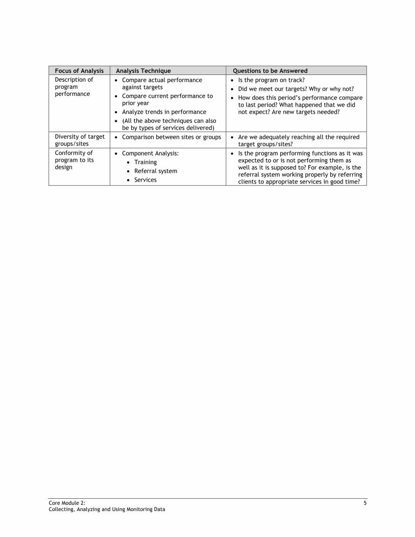
Focus of Analysis Analysis Technique Questions to be Answered Description of program performance
• Compare actual performance against targets
• Compare current performance to prior year
• Analyze trends in performance • (All the above techniques can also
be by types of services delivered)
• Is the program on track? • Did we meet our targets? Why or why not? • How does this period’s performance compare
to last period? What happened that we did not expect? Are new targets needed?
Diversity of target groups/sites
• Comparison between sites or groups • Are we adequately reaching all the required target groups/sites?
Conformity of program to its design
• Component Analysis: • Training • Referral system • Services
• Is the program performing functions as it was expected to or is not performing them as well as it is supposed to? For example, is the referral system working properly by referring clients to appropriate services in good time?
Core Module 2: 28 Collecting, Analyzing and Using Monitoring Data
CORE MODULE 2:
Night 1: Entering Data into the Global Spreadsheet
Learning Objectives At the end of this session, participants will be able to:
• Understand the functions and utilities of the global spreadsheet • Enter data on the activities of implementing partners into the global spreadsheet • Set validation rules for preventing duplicates • Set validation rules for preventing accidental overtyping • Create a list of allowed entries into the spreadsheet (e.g., for: Type of Partner Agency,
Funder, and Target Group) • Set validation rules for preventing out-of-range entries
Core Module 2: 29 Collecting, Analyzing and Using Monitoring Data
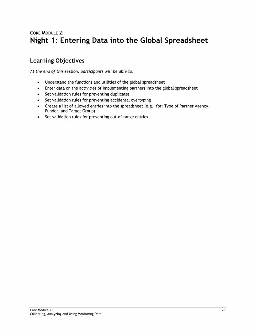
Overview and Introduction to Global Spreadsheet and Indicators
Review and Short Description of Items in Global Spreadsheet
A portion of the spreadsheet used for behavior change communication (BCC) is reproduced below.
Basic Excel Activities 1: Preventing Duplicate Entries in Cells or Ranges
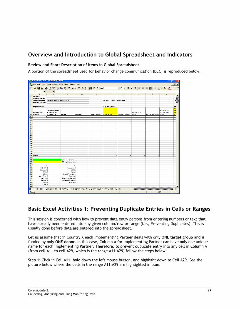
This session is concerned with how to prevent data entry persons from entering numbers or text that have already been entered into any given column/row or range (i.e., Preventing Duplicates). This is usually done before data are entered into the spreadsheet. Let us assume that in Country X each Implementing Partner deals with only ONE target group and is funded by only ONE donor. In this case, Column A for Implementing Partner can have only one unique name for each Implementing Partner. Therefore, to prevent duplicate entry into any cell in Column A (from cell A11 to cell A29, which is the range A11:A29) follow the steps below: Step 1: Click in Cell A11, hold down the left mouse button, and highlight down to Cell A29. See the picture below where the cells in the range A11:A29 are highlighted in blue.
Core Module 2: 30 Collecting, Analyzing and Using Monitoring Data
Step 2: From the top menu click on Data, then choose Validation. See the picture that follows.
Core Module 2: 31 Collecting, Analyzing and Using Monitoring Data
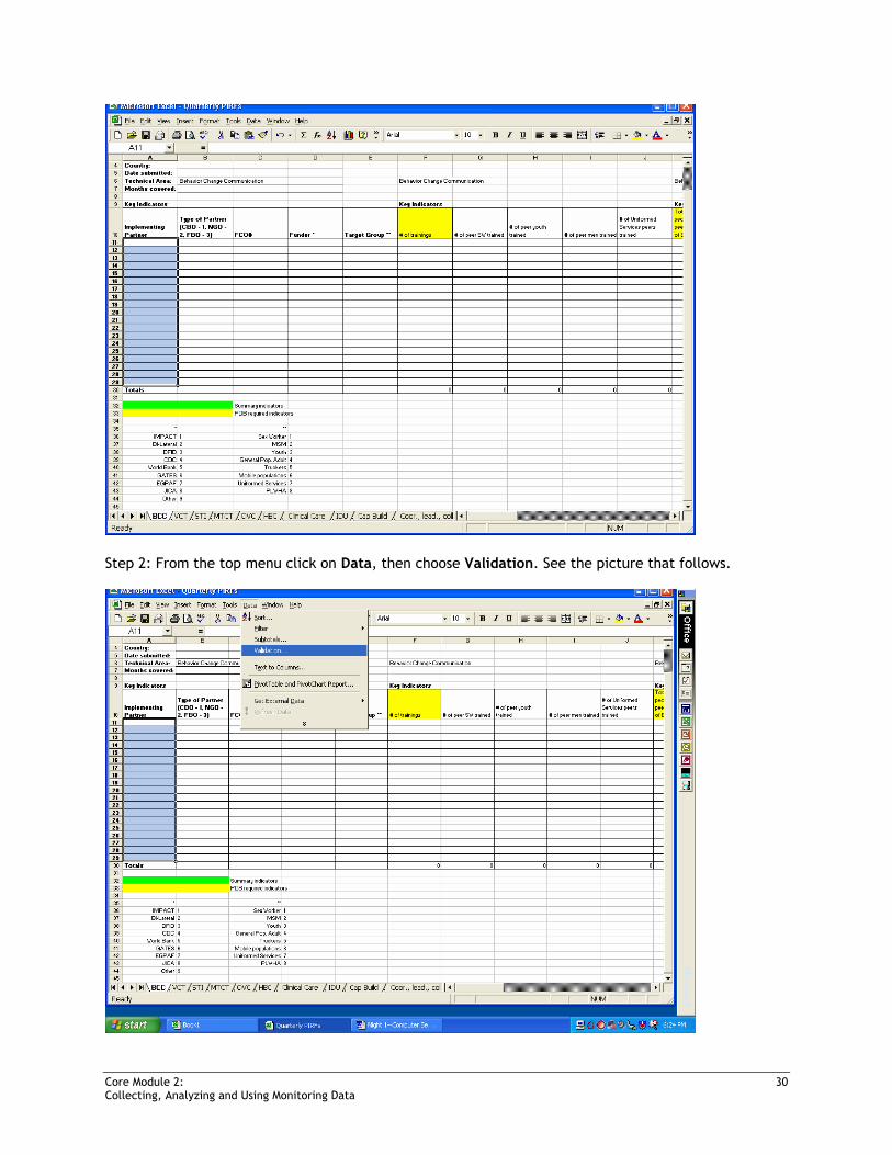
Step 3: After you click on Validation in Step 2, the following “Data Validation” dialog box should appear. In the “Allow:” box, select “Custom,” and the “Formula:” box should appear. See picture below.
Step 4: In the “Formula” box, type the following formula: =COUNTIF($A$11:$A$29,A11)=1 Step 5: Click the “Input Message” tab and type in a message, which the data entry person will see when the cursor is in any of the cells within the range being protected from duplicate entries. You can type in a message such as “Avoid duplicating entries” or some other suitable message in the “Input Message” box. Step 6: Click the “Error Alert” tab and type a message in the “Error message” box, which will appear and alert the data entry person if he/she types in a duplicate entry. Now set the error level to STOP, INFORMATION, or WARNING in the “Style” box to the left. (STOP: if you type a value that already exists in the cell range A11:A29, this forces you to enter another value in the field. INFORMATION or WARNING: if you type a value that already exists in the cell range A11:A29, this informs you that your entry is a duplicate and gives you a choice to accept or change the duplicate entry). When satisfied with all the settings, click “OK” to return to the spreadsheet.

Core Module 2: 32 Collecting, Analyzing and Using Monitoring Data
Step 7: Try and type the same word or number in any two cells within the range A11:A29.
Basic Excel Activities 2: Preventing Accidental Overtyping in Cells or Ranges
We know that certain cells, columns, rows, or ranges of cells contain important data, such as FCO numbers or formulas for computing totals or other values. To ensure data entry people do not accidentally overtype the data in these cells, columns, rows, or ranges of cells (e.g., Column C, which contains the FCO numbers (i.e., cells C11 to C29 in this example), follow the steps below. Step 1: Note that column C contains the FCO numbers and that you want to protect this column from accidental overtyping. Select the cell range C11:C29, and then repeat steps 1 to 3 under Preventing Duplicates above, until you reach the “Data Validation” dialog box. (Note: If any of the selected cell contain previous validation instructions, a message will appear asking you to extend/cancel the previous validation because you are not allowed to have two validation instructions active at the same time within the same range.) Step 2: In the “Formula” box type the following formula: =”” (Please use 2 double quotes, not 4 single quotes. Remember, do not put spaces between the quotes.) Step 3: Click the “Input Message” tab and type in a message that the data entry person will see if they happen to select the cell (e.g., “Are you sure you want to type in this column?” or “Do you really want to type inside this cell?”) Step 4: Click the “Error Alert” tab and type a message the data entry person will see if he/she tries to type in the cell. Step 5: Set the error level from the “Style” box to the left. When satisfied with all of your settings, click “OK.”
Core Module 2: 33 Collecting, Analyzing and Using Monitoring Data
Step 6: Try and type in any cell within the range C11:C29 and you will receive the error message you set.
Basic Excel Activities 3: Creating a List of Allowed Entries
When we want to restrict entries to specific values for particular cells, columns, rows, or ranges, then we need to create a list of the allowed entries from which the data entry person can choose. This may be necessary for Type of Partner, Funder, Target Group, and so on. The three variables below (Column B, Type of Partner; Column D, Funder; and Column E, Target Group) are already pre-coded, so they can take only the following numbers (i.e., only the numbers indicated can be typed into the cells):
Column B: Type of Partner
Column D: Funder
Column E: Target Group
1=CBO 1=IMPACT 1=Sex Worker
2=NGO 2=Bi-Lateral 2=MSM
3=FBO 3=DFID 3=Youth
4=CDC 4=General Pop. Adult
5=World Bank 5=Truckers
6=GATES 6=Mobile Populations
7=EGPAF 7=Uniformed Services
8=JICA 8=PLWHA
9=Other
To restrict entries into Column D (Funder), follow these steps:
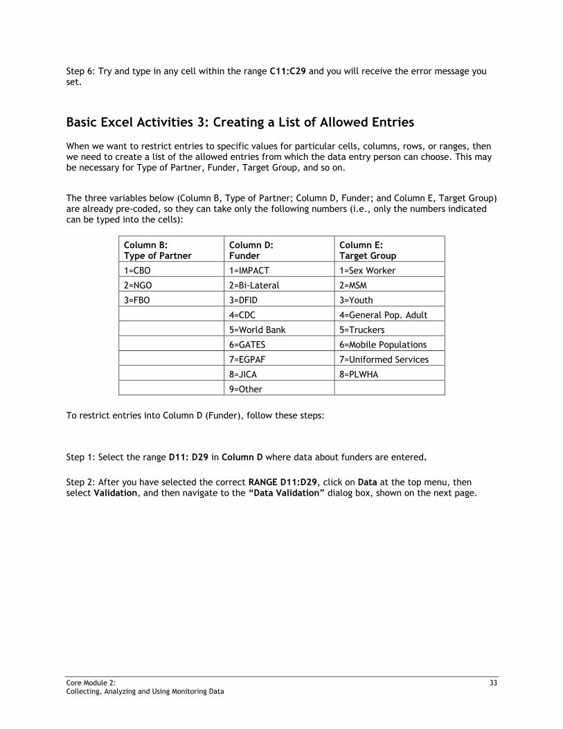
Step 1: Select the range D11: D29 in Column D where data about funders are entered. Step 2: After you have selected the correct RANGE D11:D29, click on Data at the top menu, then select Validation, and then navigate to the “Data Validation” dialog box, shown on the next page.
Core Module 2: 34 Collecting, Analyzing and Using Monitoring Data
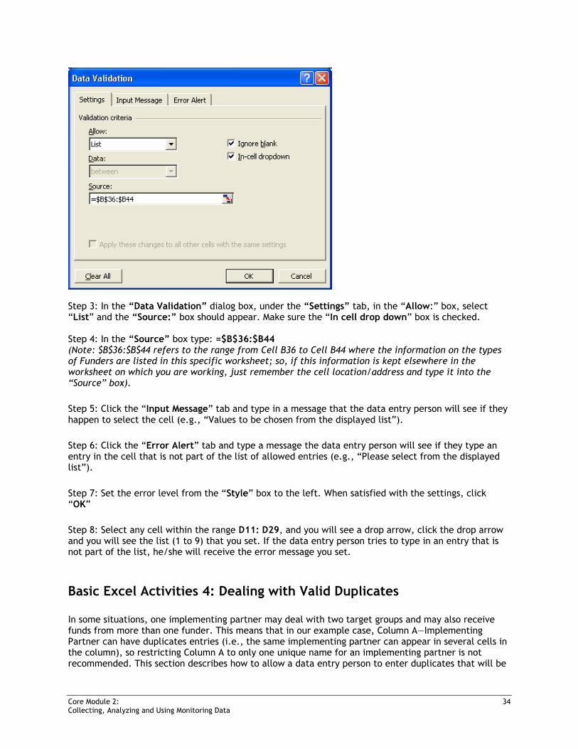
Step 3: In the “Data Validation” dialog box, under the “Settings” tab, in the “Allow:” box, select “List” and the “Source:” box should appear. Make sure the “In cell drop down” box is checked. Step 4: In the “Source” box type: =$B$36:$B44 (Note: $B$36:$B$44 refers to the range from Cell B36 to Cell B44 where the information on the types of Funders are listed in this specific worksheet; so, if this information is kept elsewhere in the worksheet on which you are working, just remember the cell location/address and type it into the “Source” box). Step 5: Click the “Input Message” tab and type in a message that the data entry person will see if they happen to select the cell (e.g., “Values to be chosen from the displayed list”). Step 6: Click the “Error Alert” tab and type a message the data entry person will see if they type an entry in the cell that is not part of the list of allowed entries (e.g., “Please select from the displayed list”). Step 7: Set the error level from the “Style” box to the left. When satisfied with the settings, click “OK” Step 8: Select any cell within the range D11: D29, and you will see a drop arrow, click the drop arrow and you will see the list (1 to 9) that you set. If the data entry person tries to type in an entry that is not part of the list, he/she will receive the error message you set.
Basic Excel Activities 4: Dealing with Valid Duplicates
In some situations, one implementing partner may deal with two target groups and may also receive funds from more than one funder. This means that in our example case, Column A—Implementing Partner can have duplicates entries (i.e., the same implementing partner can appear in several cells in the column), so restricting Column A to only one unique name for an implementing partner is not recommended. This section describes how to allow a data entry person to enter duplicates that will be
Core Module 2: 35 Collecting, Analyzing and Using Monitoring Data
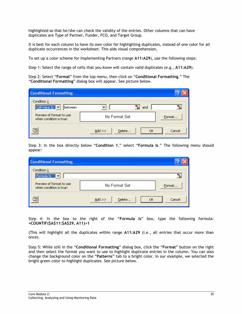
highlighted so that he/she can check the validity of the entries. Other columns that can have duplicates are Type of Partner, Funder, FCO, and Target Group. It is best for each column to have its own color for highlighting duplicates, instead of one color for all duplicate occurrences in the worksheet. This aids visual comprehension, To set up a color scheme for Implementing Partners (range A11:A29), use the following steps: Step 1: Select the range of cells that you know will contain valid duplicates (e.g., A11:A29). Step 2: Select “Format” from the top menu, then click on “Conditional Formatting.” The “Conditional Formatting” dialog box will appear. See picture below.
Step 3: In the box directly below “Condition 1,” select “Formula Is.” The following menu should appear:
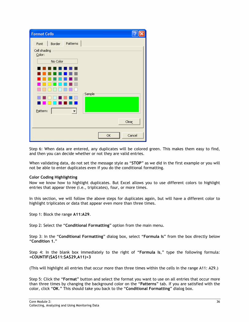
Step 4: In the box to the right of the “Formula Is” box, type the following formula: =COUNTIF($A$11:$A$29, A11)>1 (This will highlight all the duplicates within range A11:A29 (i.e., all entries that occur more than once). Step 5: While still in the “Conditional Formatting” dialog box, click the “Format” button on the right and then select the format you want to use to highlight duplicate entries in the column. You can also change the background color on the “Patterns” tab to a bright color. In our example, we selected the bright green color to highlight duplicates. See picture below.
Core Module 2: 36 Collecting, Analyzing and Using Monitoring Data
Step 6: When data are entered, any duplicates will be colored green. This makes them easy to find, and then you can decide whether or not they are valid entries. When validating data, do not set the message style as “STOP” as we did in the first example or you will not be able to enter duplicates even if you do the conditional formatting. Color Coding Highlighting Now we know how to highlight duplicates. But Excel allows you to use different colors to highlight entries that appear three (i.e., triplicates), four, or more times. In this section, we will follow the above steps for duplicates again, but will have a different color to highlight triplicates or data that appear even more than three times. Step 1: Block the range A11:A29. Step 2: Select the “Conditional Formatting” option from the main menu. Step 3: In the “Conditional Formatting” dialog box, select “Formula Is” from the box directly below “Condition 1.” Step 4: In the blank box immediately to the right of “Formula Is,” type the following formula: =COUNTIF($A$11:$A$29,A11)>3 (This will highlight all entries that occur more than three times within the cells in the range A11: A29.) Step 5: Click the “Format” button and select the format you want to use on all entries that occur more than three times by changing the background color on the “Patterns” tab. If you are satisfied with the color, click “OK.” This should take you back to the “Conditional Formatting” dialog box.

Core Module 2: 37 Collecting, Analyzing and Using Monitoring Data
Step 6: Do not click the “OK” button in the “Conditional Formatting” dialog box yet. Click the “Add>>” button. Repeat steps 3, 4, and 5 above to set the format for triplicates. The formula for triplicates is: =COUNTIF($A$11:$A$29,A11)=3 Step 7: Do not click the “OK” button in the “Conditional Formatting” dialog box yet. Click the “Add>>” button. Repeat steps 3, 4, and 5 above to set a format for duplicates. The formula for duplicates is: =COUNTIF($A$11:$A$29,A11)=2 Step 8: You should end up with the following picture. Now you click the “OK” button in the “Conditional Formatting” dialog box.
All entries that occur twice will appear in one color, all entries that occur three times will appear in another color, and all entries that occur more than three times will appear in yet another color.
Core Module 2: 38 Collecting, Analyzing and Using Monitoring Data
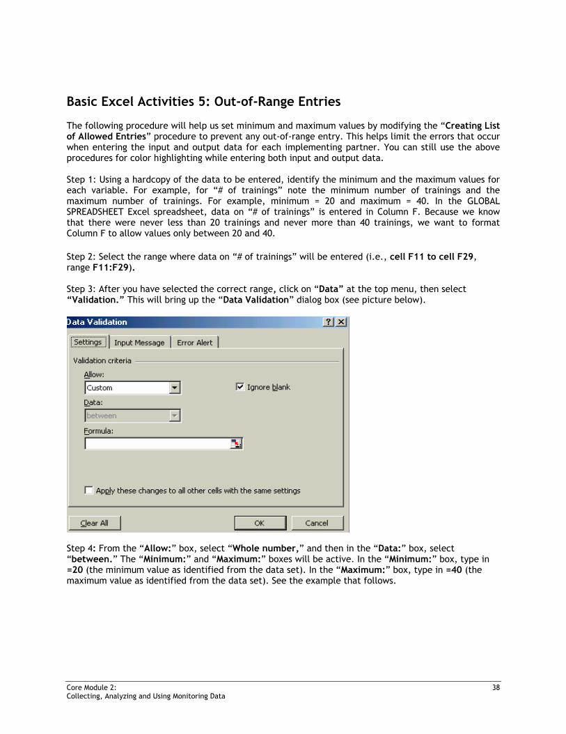
Basic Excel Activities 5: Out-of-Range Entries
The following procedure will help us set minimum and maximum values by modifying the “Creating List of Allowed Entries” procedure to prevent any out-of-range entry. This helps limit the errors that occur when entering the input and output data for each implementing partner. You can still use the above procedures for color highlighting while entering both input and output data. Step 1: Using a hardcopy of the data to be entered, identify the minimum and the maximum values for each variable. For example, for “# of trainings” note the minimum number of trainings and the maximum number of trainings. For example, minimum = 20 and maximum = 40. In the GLOBAL SPREADSHEET Excel spreadsheet, data on “# of trainings” is entered in Column F. Because we know that there were never less than 20 trainings and never more than 40 trainings, we want to format Column F to allow values only between 20 and 40. Step 2: Select the range where data on “# of trainings” will be entered (i.e., cell F11 to cell F29, range F11:F29). Step 3: After you have selected the correct range, click on “Data” at the top menu, then select “Validation.” This will bring up the “Data Validation” dialog box (see picture below).
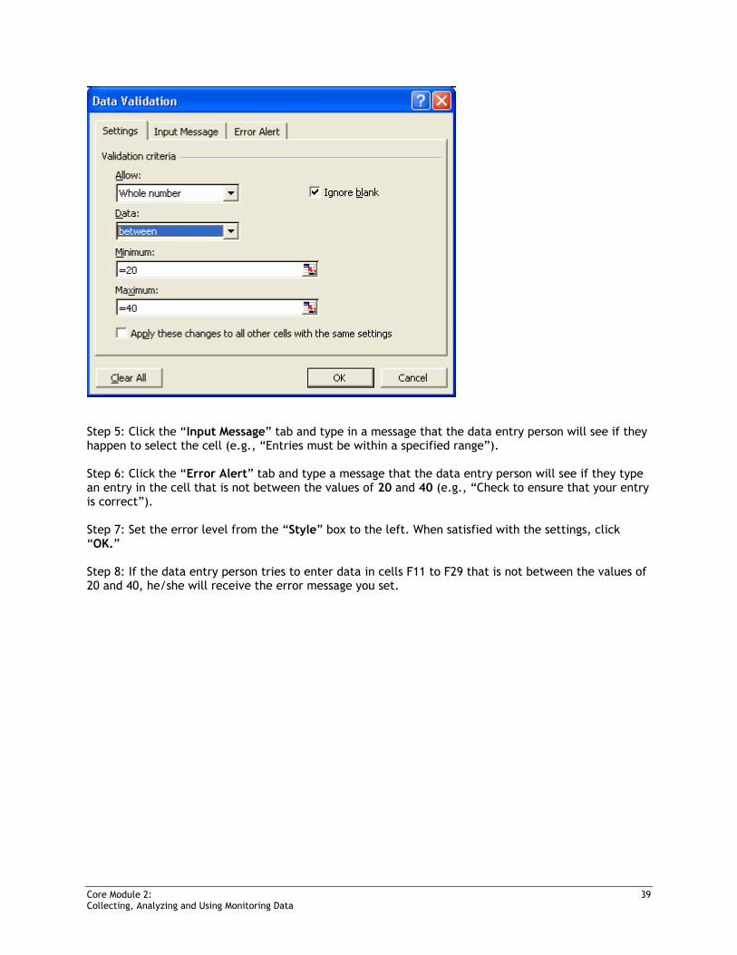
Step 4: From the “Allow:” box, select “Whole number,” and then in the “Data:” box, select “between.” The “Minimum:” and “Maximum:” boxes will be active. In the “Minimum:” box, type in =20 (the minimum value as identified from the data set). In the “Maximum:” box, type in =40 (the maximum value as identified from the data set). See the example that follows.
Core Module 2: 39 Collecting, Analyzing and Using Monitoring Data
Step 5: Click the “Input Message” tab and type in a message that the data entry person will see if they happen to select the cell (e.g., “Entries must be within a specified range”). Step 6: Click the “Error Alert” tab and type a message that the data entry person will see if they type an entry in the cell that is not between the values of 20 and 40 (e.g., “Check to ensure that your entry is correct”). Step 7: Set the error level from the “Style” box to the left. When satisfied with the settings, click “OK.” Step 8: If the data entry person tries to enter data in cells F11 to F29 that is not between the values of 20 and 40, he/she will receive the error message you set.
Core Module 2: 40 Collecting, Analyzing and Using Monitoring Data
CORE MODULE 2:
Night 2: Descriptive Statistics and Charts
Learning Objectives At the end of this session, participants will be able to:
• Create simple charts from the GLOBAL SPREADSHEET file • Calculate the mean for some indicators from the GLOBAL SPREADSHEET file
Core Module 2: 41 Collecting, Analyzing and Using Monitoring Data
Creating Pivot Tables
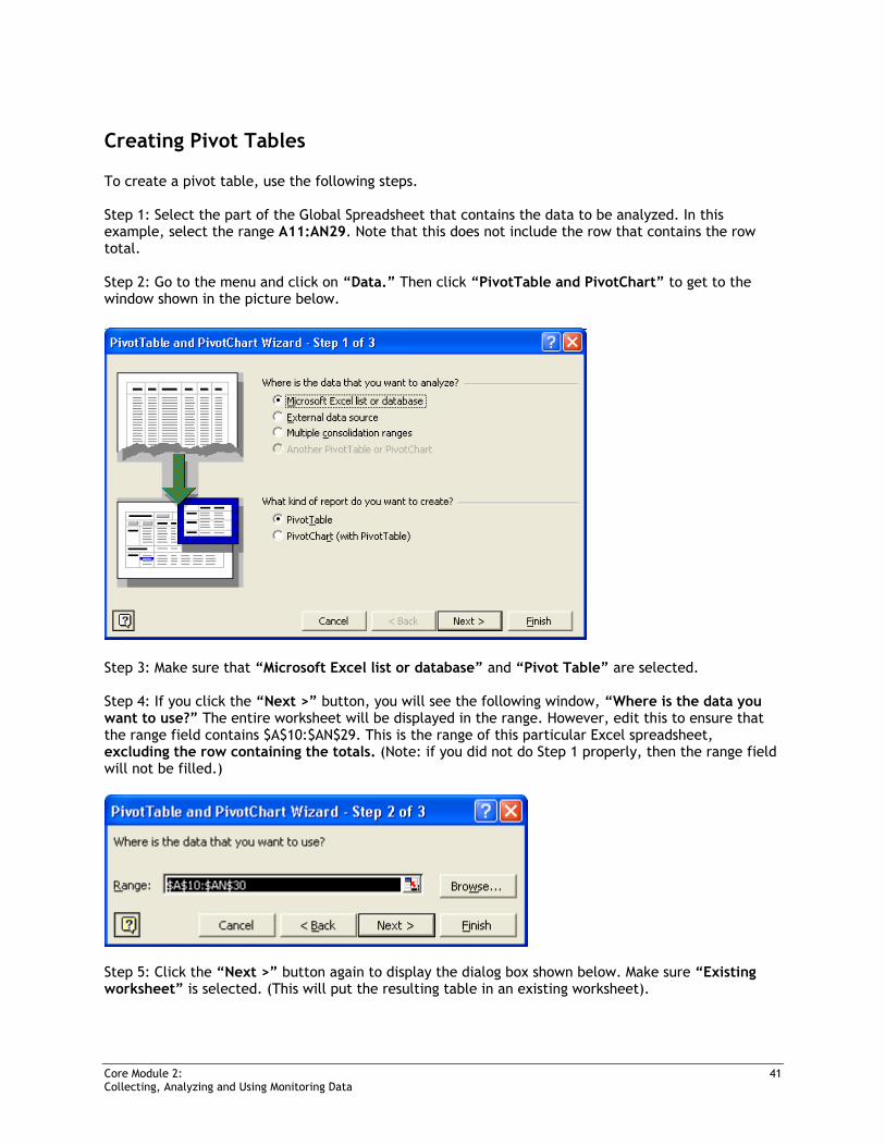
To create a pivot table, use the following steps. Step 1: Select the part of the Global Spreadsheet that contains the data to be analyzed. In this example, select the range A11:AN29. Note that this does not include the row that contains the row total. Step 2: Go to the menu and click on “Data.” Then click “PivotTable and PivotChart” to get to the window shown in the picture below.
Step 3: Make sure that “Microsoft Excel list or database” and “Pivot Table” are selected. Step 4: If you click the “Next >” button, you will see the following window, “Where is the data you want to use?” The entire worksheet will be displayed in the range. However, edit this to ensure that the range field contains $A$10:$AN$29. This is the range of this particular Excel spreadsheet, excluding the row containing the totals. (Note: if you did not do Step 1 properly, then the range field will not be filled.)
Step 5: Click the “Next >” button again to display the dialog box shown below. Make sure “Existing worksheet” is selected. (This will put the resulting table in an existing worksheet).
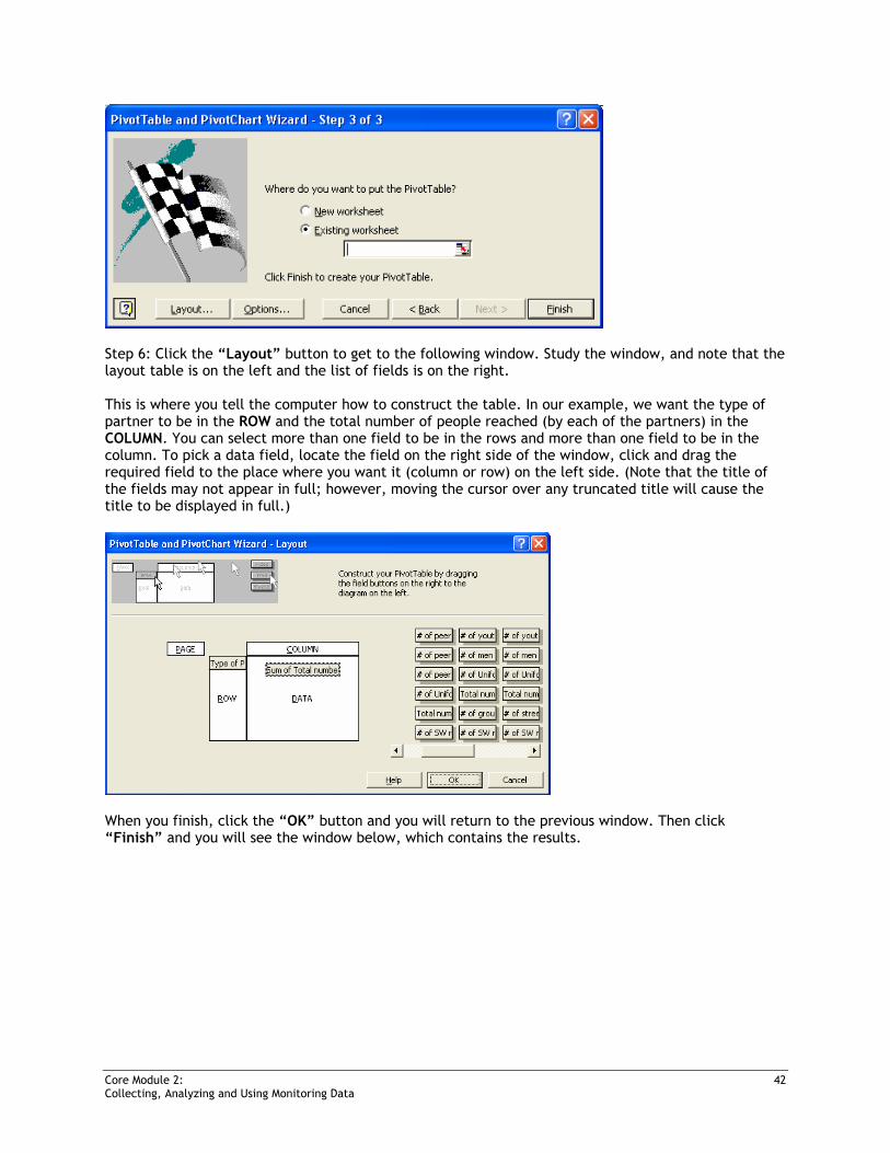
Core Module 2: 42 Collecting, Analyzing and Using Monitoring Data
Step 6: Click the “Layout” button to get to the following window. Study the window, and note that the layout table is on the left and the list of fields is on the right. This is where you tell the computer how to construct the table. In our example, we want the type of partner to be in the ROW and the total number of people reached (by each of the partners) in the COLUMN. You can select more than one field to be in the rows and more than one field to be in the column. To pick a data field, locate the field on the right side of the window, click and drag the required field to the place where you want it (column or row) on the left side. (Note that the title of the fields may not appear in full; however, moving the cursor over any truncated title will cause the title to be displayed in full.)
When you finish, click the “OK” button and you will return to the previous window. Then click “Finish” and you will see the window below, which contains the results.
Core Module 2: 43 Collecting, Analyzing and Using Monitoring Data
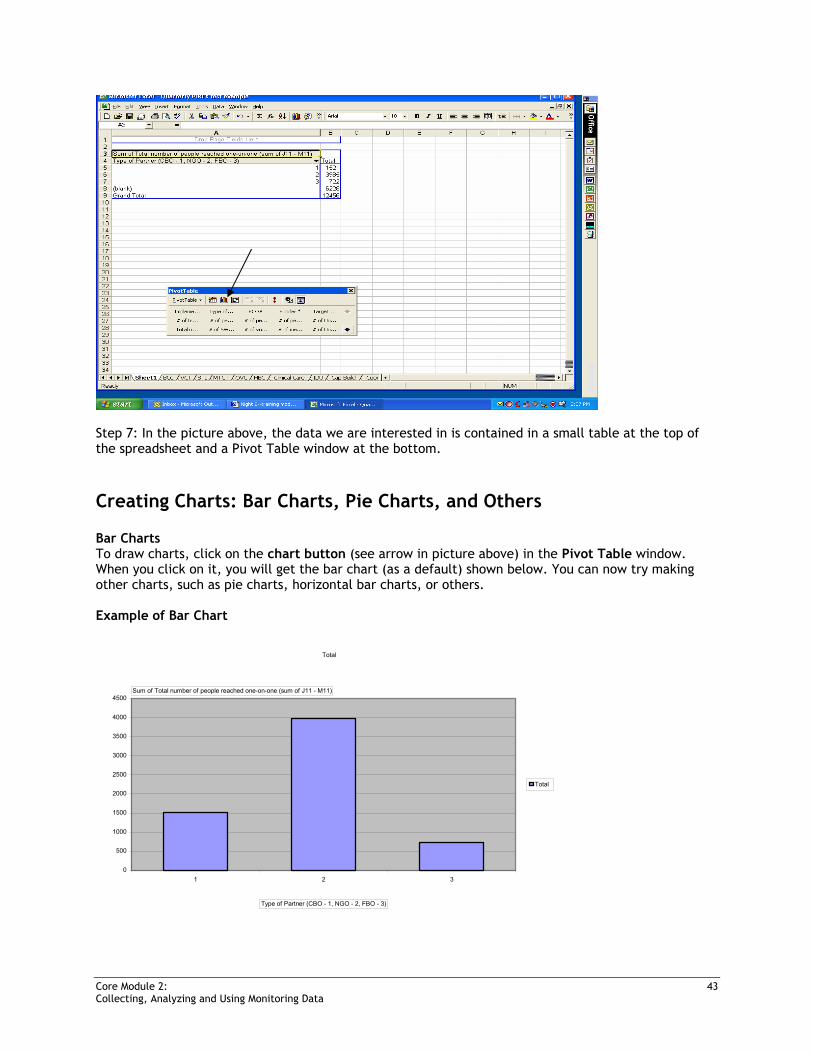
Step 7: In the picture above, the data we are interested in is contained in a small table at the top of the spreadsheet and a Pivot Table window at the bottom.
Creating Charts: Bar Charts, Pie Charts, and Others
Bar Charts To draw charts, click on the chart button (see arrow in picture above) in the Pivot Table window. When you click on it, you will get the bar chart (as a default) shown below. You can now try making other charts, such as pie charts, horizontal bar charts, or others. Example of Bar Chart
Total
0
500
1000
1500
2000
2500
3000
3500
4000
4500
1 2 3
Total
Sum of Total number of people reached one-on-one (sum of J11 - M11)
Type of Partner (CBO - 1, NGO - 2, FBO - 3)
Core Module 2: 44 Collecting, Analyzing and Using Monitoring Data
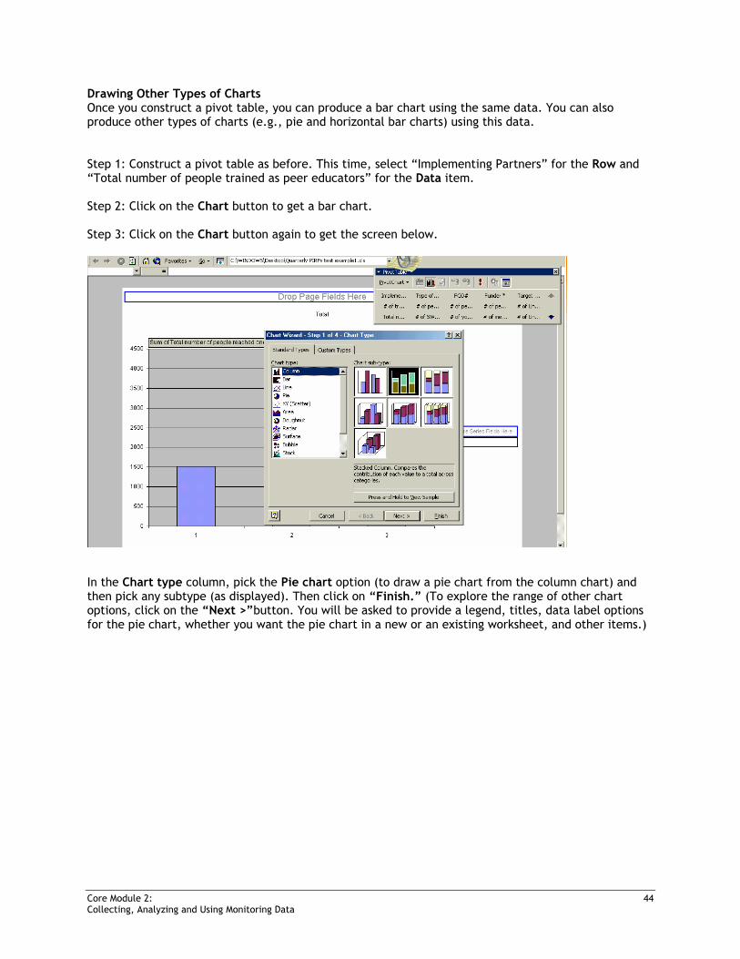
Drawing Other Types of Charts Once you construct a pivot table, you can produce a bar chart using the same data. You can also produce other types of charts (e.g., pie and horizontal bar charts) using this data. Step 1: Construct a pivot table as before. This time, select “Implementing Partners” for the Row and “Total number of people trained as peer educators” for the Data item. Step 2: Click on the Chart button to get a bar chart. Step 3: Click on the Chart button again to get the screen below.
In the Chart type column, pick the Pie chart option (to draw a pie chart from the column chart) and then pick any subtype (as displayed). Then click on “Finish.” (To explore the range of other chart options, click on the “Next >”button. You will be asked to provide a legend, titles, data label options for the pie chart, whether you want the pie chart in a new or an existing worksheet, and other items.)
Core Module 2: 45 Collecting, Analyzing and Using Monitoring Data
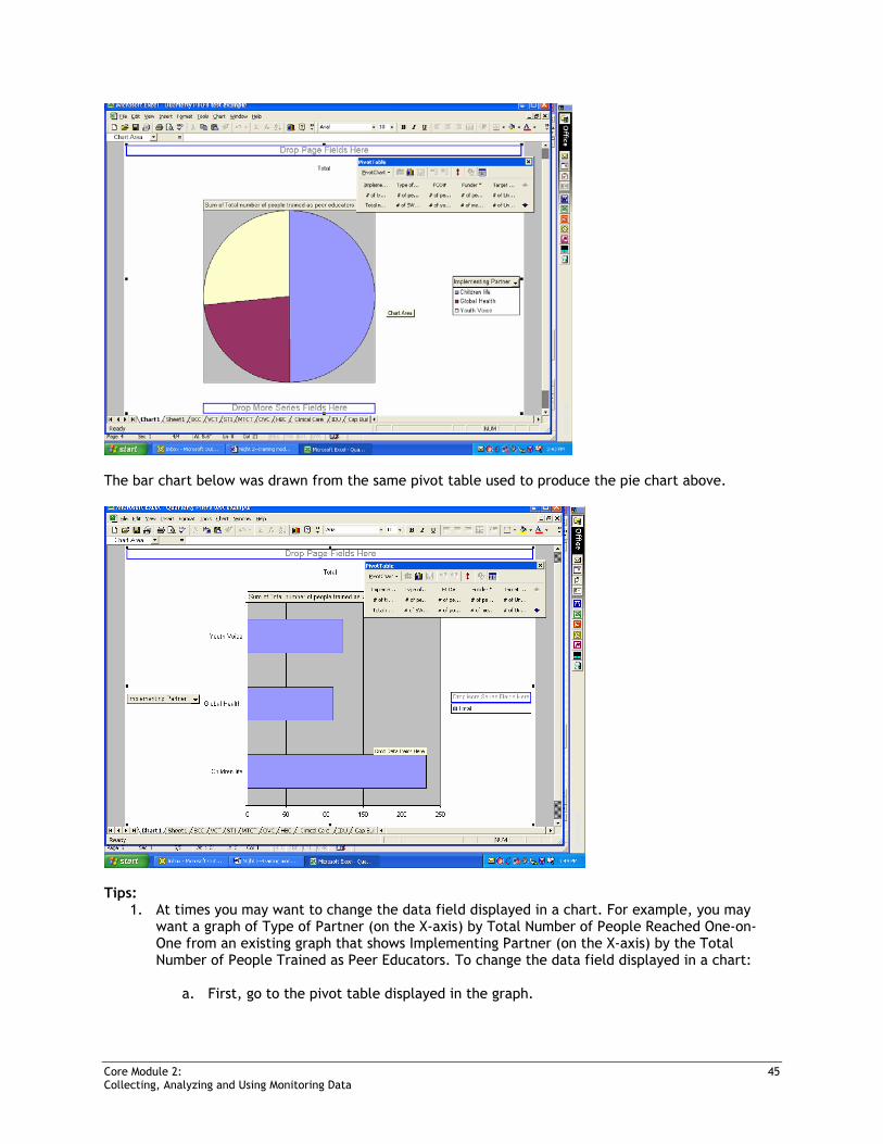
The bar chart below was drawn from the same pivot table used to produce the pie chart above.
Tips:
1. At times you may want to change the data field displayed in a chart. For example, you may want a graph of Type of Partner (on the X-axis) by Total Number of People Reached One-on-One from an existing graph that shows Implementing Partner (on the X-axis) by the Total Number of People Trained as Peer Educators. To change the data field displayed in a chart:
a. First, go to the pivot table displayed in the graph.
Core Module 2: 46 Collecting, Analyzing and Using Monitoring Data
b. Select and drag your choice for the X axis from the fields displayed in the pivot table (i.e., type of partner) to the X-axis where the implementing partner is written on the graph. The computer will ask if you want to replace the contents of the destination cells. Answer “Yes.” The two field names will be displayed side by side.
c. Right click the mouse on the field name that you want to change. You will be given some options; select the “remove field” option. This will remove the field that you want to replace.
d. To change the other variable, return to the pivot table, select the new field, drag it beside the field you want it to replace, and the new field will again appear beside the field on the X-axis. Right click one new field beside the X-axis field; this will give you the name of the fields that you want to replace and the one you just brought from the pivot table. Deselect the one that you do not want anymore.
2. To get rid of variables in any field, click on the arrow next to the field and deselect the
unwanted variable. Click “OK”. 3. Click different buttons and see what you can do.
4. You can also double-click on the bar to change the color. 5. If you lose your pivot table, go to the menu bar, click on “View,” then on “Toolbars,” and
select “Pivot Table.” The pivot table should pop up.
6. If you have a major problem, just restart the process from the beginning.
Basic Analysis: Frequencies, Means, and Other Tips
Mean—The mean is an index of central tendency that statisticians use to indicate the point on a scale of measure where the population is centered. The mean is the average of the scores in the population. Numerically, it equals the sum of the scores divided by the number of scores. The mean is the one value that, if substituted for every score in a population, would yield the same sum as the original scores, and hence it would yield the same mean. Median—The median is an index of central tendency that statisticians use to indicate the point on a scale of measure where the population is centered. The median of a population is the point that divides the distribution of scores in half. Numerically, half of the scores in a population will have values that are equal to or larger than the median and half will have values that are equal to or smaller than the median. Mode—The mode is a measure of central tendency that statisticians use to indicate the point (or points) on a scale of measure where the population is centered. It is the score in the population that occurs most frequently. Please note that the mode is not the frequency of the most numerous score. It is the value of that score itself. Minimum—Lowest value/number Maximum—Highest value/number
Core Module 2: 47 Collecting, Analyzing and Using Monitoring Data
Exercises
Graphing the Mean Exercise 1:
Question 1: Using pivot tables, calculate the mean number of people reached per peer educator trained (assuming that all of those trained as peer educators were active) by each implementing partner.
Question 2: Draw a bar chart showing the mean number of people reached per peer educator by type of implementing partner.
Answer for Question 1: This is given by the total number of people reached by each implementing partner divided by the total number of peer educators trained by each Implementing partner. Tips: Step 1: Set up a pivot table to show the total number of people reached one-on-one by each implementing partner.
Sum of total number of people reached one-on-one (sum of J11 - M11) Implementing Partner Total Children Life 3194 Global Health 1671 Youth Voice 1363 Grand Total 6228
Step 2: Set up another pivot table* (see below) on the same worksheet to show the total number of people trained as peer educators by each implementing partner.
Sum of total number of people trained as peer educators (sum of E11 - H11) Implementing Partner Total Children Life 232 Global Health 111 Youth Voice 124 Grand Total 467
*Set up another pivot table on the same sheet containing a previous pivot table.
1. Note the name of the sheet where the previous pivot table was displayed (Sheet4, Sheet3, and so on).
2. Set up the pivot table as before. (Note: The range should contain the worksheet that
contains the data to be analyzed. Remember to adjust the range to exclude the row that contains the total, as before.) However, after the screen below is displayed, you will be asked if you want your new report to be based on the same data as your existing report. Answer “No.”
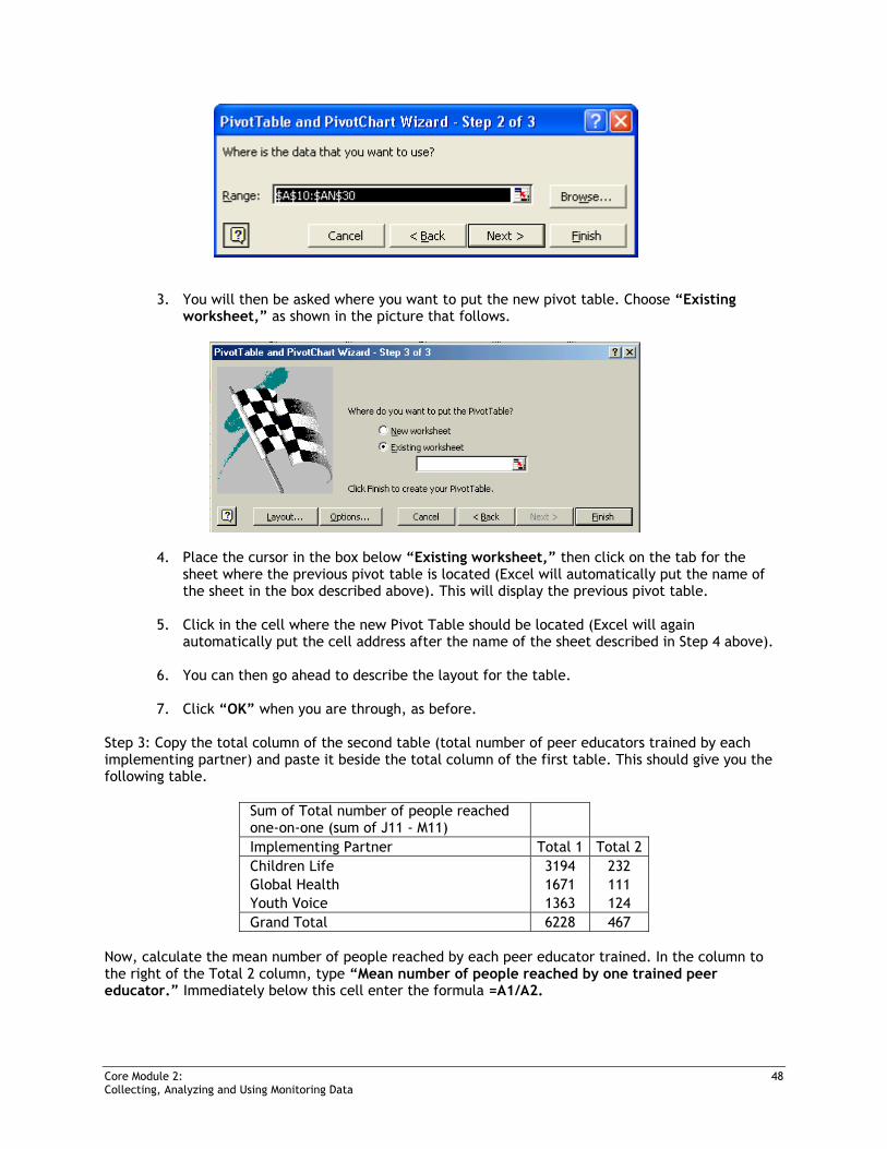
Core Module 2: 48 Collecting, Analyzing and Using Monitoring Data
3. You will then be asked where you want to put the new pivot table. Choose “Existing worksheet,” as shown in the picture that follows.
4. Place the cursor in the box below “Existing worksheet,” then click on the tab for the sheet where the previous pivot table is located (Excel will automatically put the name of the sheet in the box described above). This will display the previous pivot table.
5. Click in the cell where the new Pivot Table should be located (Excel will again
automatically put the cell address after the name of the sheet described in Step 4 above).
6. You can then go ahead to describe the layout for the table.
7. Click “OK” when you are through, as before.
Step 3: Copy the total column of the second table (total number of peer educators trained by each implementing partner) and paste it beside the total column of the first table. This should give you the following table.
Sum of Total number of people reached one-on-one (sum of J11 - M11) Implementing Partner Total 1 Total 2 Children Life 3194 232 Global Health 1671 111 Youth Voice 1363 124 Grand Total 6228 467
Now, calculate the mean number of people reached by each peer educator trained. In the column to the right of the Total 2 column, type “Mean number of people reached by one trained peer educator.” Immediately below this cell enter the formula =A1/A2.
Core Module 2: 49 Collecting, Analyzing and Using Monitoring Data
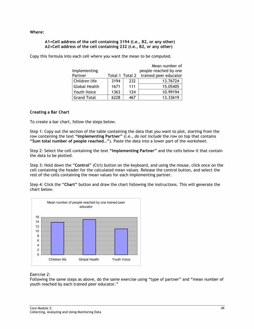
Where: A1=Cell address of the cell containing 3194 (i.e., B2, or any other) A2=Cell address of the cell containing 232 (i.e., B2, or any other) Copy this formula into each cell where you want the mean to be computed.
Implementing Partner Total 1 Total 2
Mean number ofpeople reached by onetrained peer educator
Children life 3194 232 13.76724 Global Health 1671 111 15.05405 Youth Voice 1363 124 10.99194 Grand Total 6228 467 13.33619
Creating a Bar Chart To create a bar chart, follow the steps below. Step 1: Copy out the section of the table containing the data that you want to plot, starting from the row containing the text “Implementing Partner” (i.e., do not include the row on top that contains “Sum total number of people reached…”). Paste the data into a lower part of the worksheet. Step 2: Select the cell containing the text “Implementing Partner” and the cells below it that contain the data to be plotted. Step 3: Hold down the “Control” (Ctrl) button on the keyboard, and using the mouse, click once on the cell containing the header for the calculated mean values. Release the control button, and select the rest of the cells containing the mean values for each implementing partner. Step 4: Click the “Chart” button and draw the chart following the instructions. This will generate the chart below.
Mean number of people reached by one trained peer educator
02468
10121416
Children life Global Health Youth Voice
Exercise 2: Following the same steps as above, do the same exercise using “type of partner” and “mean number of youth reached by each trained peer educator.”