MONICA Graphics - WHO...MONICA Data Centre (MDC), #12 Quality Assurance, MONICA Manual Part I,...
41
MONICA Graphics Prepared by Hanna Tolonen (Helsinki) and Hugh Tunstall-Pedoe (Dundee) Commentary and notes by Hugh Tunstall-Pedoe The following graphics are therefore a key product of the MONICA collaboration, and one of the reasons for producing this Monograph. No other study has produced standardized data of such range and value. The graphics should encourage those looking at them in this book to go on to do some or all of a number of things: explore the MONICA Publications (2) study the MONICA Quality assessment reports (1), look at the MONICA Data Books; check the MONICA Website (1), and even analyse the sample Data Base on the CD-ROM. Developed originally for transient presentation, the slides have been reviewed and revised meticulously before appearing here in print. In addition, a number of the graphics that follow have been prepared specifically for this Monograph. Three slide formats are of particular interest in the history of presenting MONICA collaborative results. One is the presentation of trends, exemplified for example by G15 or by G38, a MONICA standard. The second is their simplified rendering into ‘traffic-light’ symbols in the spot- maps such as G24, G25 and G39—too simple for publica- tion in scientific journals, but of great educational value. The third illustrates how results of major publications can be simplified into single images such as G23 and G31. These are examples of the formidable challenge of making research results understandable to a wide readership. They illustrate how complex epidemiological findings can be summarized simply through an understanding of mathe- matical relationships, even though this final format was achieved only after considerable labour and numerous false starts. 1. See Monograph CD-ROM or MONICA Website http://www.ktl.fi/monica/. 2. Full references and summaries of MONICA Publications appear in #85/86. 157 #89 MONICA Graphics Introduction T he analysis of the final results of the WHO MONICA Project involved the creation of large numbers of complex tables. These were eventually reduced to six or so for each of the MONICA Publications. Each table needed to encompass between 15 and 38 populations, to show the results for men and women, and to include different factors and end-points. Their preparation involved a for- midable amount of work. This was matched by the chal- lenge, first to the editorial staff of the journals and the reviewers, and then to the readers of the papers when they eventually appeared. Understanding a two-by-two table is a problem for many readers. MONICA tables commonly had 20 or more columns and 40 rows. While the manuscripts were being prepared for publi- cation, preliminary results were being communicated to cardiology, stroke, epidemiology, and public health con- ferences. Complex tables cannot be projected onto a screen. MONICA needed to summarize its findings graph- ically, in a way that made sense within a few seconds to a professional audience. By trial and error we developed a MONICA style. Over a number of years a portfolio of slides was created, shown at international meetings, and distributed to MONICA investigators for local use. Publication of MONICA results in scientific journals might be thought to have made these slide images redundant. Readers of scientific papers tend to be more interested in the conclusions than in the data. But the WHO MONICA Project has an incomparable collection of data, of interest to many investigators beyond those concerned with the testing of the MONICA hypotheses. There was a danger that MONICA graphics summarizing the data would be lost to the wider audience in cardiovascular disease and public health. Even this pro- fessional audience preferred graphics to tables, wanted to see them, and to be able to study them in their own time.
Transcript of MONICA Graphics - WHO...MONICA Data Centre (MDC), #12 Quality Assurance, MONICA Manual Part I,...
MONICA GraphicsPrepared by Hanna Tolonen (Helsinki) and Hugh Tunstall-Pedoe (Dundee) Commentary and notes by Hugh Tunstall-Pedoe
The following graphics are therefore a key product of
the MONICA collaboration, and one of the reasons for
producing this Monograph. No other study has produced
standardized data of such range and value. The graphics
should encourage those looking at them in this book to
go on to do some or all of a number of things: explore
the MONICA Publications (2) study the MONICA Quality
assessment reports (1), look at the MONICA Data Books;
check the MONICA Website (1), and even analyse the
sample Data Base on the CD-ROM.
Developed originally for transient presentation, the
slides have been reviewed and revised meticulously before
appearing here in print. In addition, a number of the
graphics that follow have been prepared specifically for
this Monograph.
Three slide formats are of particular interest in the
history of presenting MONICA collaborative results. One
is the presentation of trends, exemplified for example by
G15 or by G38, a MONICA standard. The second is their
simplified rendering into ‘traffic-light’ symbols in the spot-
maps such as G24, G25 and G39—too simple for publica-
tion in scientific journals, but of great educational value.
The third illustrates how results of major publications can
be simplified into single images such as G23 and G31.
These are examples of the formidable challenge of making
research results understandable to a wide readership. They
illustrate how complex epidemiological findings can be
summarized simply through an understanding of mathe-
matical relationships, even though this final format was
achieved only after considerable labour and numerous
false starts.
1. See Monograph CD-ROM or MONICA Websitehttp://www.ktl.fi/monica/.
2. Full references and summaries of MONICA Publicationsappear in #85/86.
157
#89 MONICA GraphicsIntroduction
The analysis of the final results of the WHO MONICA
Project involved the creation of large numbers of
complex tables. These were eventually reduced to six or so
for each of the MONICA Publications. Each table needed
to encompass between 15 and 38 populations, to show the
results for men and women, and to include different
factors and end-points. Their preparation involved a for-
midable amount of work. This was matched by the chal-
lenge, first to the editorial staff of the journals and the
reviewers, and then to the readers of the papers when they
eventually appeared. Understanding a two-by-two table is
a problem for many readers. MONICA tables commonly
had 20 or more columns and 40 rows.
While the manuscripts were being prepared for publi-
cation, preliminary results were being communicated to
cardiology, stroke, epidemiology, and public health con-
ferences. Complex tables cannot be projected onto a
screen. MONICA needed to summarize its findings graph-
ically, in a way that made sense within a few seconds to a
professional audience.
By trial and error we developed a MONICA style. Over
a number of years a portfolio of slides was created, shown
at international meetings, and distributed to MONICA
investigators for local use. Publication of MONICA results
in scientific journals might be thought to have made these
slide images redundant. Readers of scientific papers tend
to be more interested in the conclusions than in the data.
But the WHO MONICA Project has an incomparable
collection of data, of interest to many investigators
beyond those concerned with the testing of the MONICA
hypotheses. There was a danger that MONICA graphics
summarizing the data would be lost to the wider audience
in cardiovascular disease and public health. Even this pro-
fessional audience preferred graphics to tables, wanted to
see them, and to be able to study them in their own time.

1. To qualify for the final testing of the MONICA
hypotheses populations needed to provide approxi-
mately ten years of ‘core data’, that is data on trends
in coronary-event rates, trends in cardiovascular risk
factors and trends in coronary care. For testing the
stroke hypotheses, data on trends in stroke rates were
needed. These data were sent to the MONICA Data
Centre in Helsinki, where they underwent formal
quality assessment before they were used. See #7
MONICA Data Centre (MDC), #12 Quality Assurance,
MONICA Manual Part I, Section 1 (1).
2. Populations are known in the WHO MONICA Project
as Reporting Unit Aggregates, abbreviated to RUAs.
Each is identified in this Monograph and in the later
MONICA Publications (2) by a seven-character code.
The first three characters are the national country code,
followed by a hyphen, and then the three-character
population code. Characteristics of each population are
described in #51–#83. See MONICA Manual Part I,
Appendix 2 (1), also Appendix.
3. Populations from former MONICA Collaborating
Centres (see Glossary), provided material for the early
parts of the study, but are not shown in maps G1 and
G2. Either the quantity or the quality of their data were
inadequate to contribute to the analysis of 10-year
trends, and therefore to hypothesis testing. These
populations are listed in #84. Some of their data were
processed in the MONICA Data Centre and appear in
MONICA Quality assessment reports (1), MONICA
Data Books (1), and in early MONICA Publications of
cross-sectional data, or of five-year trends, such as 1, 2,
3, 10, 15 (2).
4. There were changes over time in the number of coun-
tries involved in the WHO MONICA Project. Some
withdrew, some joined together (two Germanies), and
some separated (republics of the former Soviet Union).
The final total was 21.
5. There are 35 MONICA population RUAs shown in
maps G1 and G2, seven outside Europe and 28 within.
The number of RUAs used varied between analyses,
some using more than 35 and some fewer:
a. The first major analysis on 10-year trends in
coronary-event rates, case fatality and mortality
rates, for MONICA Publication 36 (2), used 37 RUAs.
The two Russian cities shown here, Russia-Moscow,
RUS-MOS, see #74, and Russia-Novosibirsk, RUS-
NOV, see #75, were each split into ‘intervention’ and
‘control’ population RUAs.
b. The largest number of RUAs was used in testing the
First MONICA Hypothesis, also known as the risk-
factor hypothesis, see #2 MONICA Hypotheses and
Study Design for MONICA Publication 38 (2). In
addition to the 37 RUAs used in the coronary-event
paper, Germany-Augsburg, GER-AUG, see #63, was
split into ‘urban’ and ‘rural’ RUAs, making 38.
c. In testing the Second MONICA Hypothesis on
coronary care, see #2, for MONICA Publication 39
(2), the 35 population RUAs shown in G1 and G2
were all used, but only after amalgamating the two
from Belgium into one, the two from Switzerland
into one, and three from Finland into one, leaving
31 separate RUAs.
d. The two Swiss populations provided information
on core data items in men, but only on risk factors
in women. Therefore there are fewer population
RUAs for women, compared with men, in many
of the following graphics. Exceptions are risk-
factor graphics G36–G56 (Swiss men and women
both represented) and stroke graphics G26–G35
(neither).
e. Fifteen RUAs from ten countries provided data for
testing the stroke hypotheses. They are identified
in #26 Registration of Stroke Events, and G9. In
addition GER-EGE, see # 65, provided data over six
years.
6. The MONICA Protocol specified that all data compo-
nents should be measured in the same defined popu-
lations. See MONICA Manual Part I, Section 1 (1).
For local technical reasons, described in the relevant
MONICA Quality assessment reports, this did not
always happen. Variants of the same population, where
the RUAs may overlap, are shown in Data Books by suf-
fixes a, b, c, for example AUS-PERa, AUS-PERb. Over-
lapping but different RUAs explain why the graphics
occasionally differ from MONICA Publications for a
particular RUA. See Appendix where the RUAs used in
each graphic are defined in terms of their constituent
MONICA reporting units. (Other discrepancies from
the early MONICA Publications result from different
age standardization. See #39 Age Standardization.)
1. See Monograph CD-ROM or MONICA Websitehttp://www.ktl.fi/monica/.
2. Full references and summaries of MONICA Publicationsappear in #85/86.
158 MONICA MONOGRAPH AND MULTIMEDIA SOURCEBOOK
Populations, data collection and official mortality
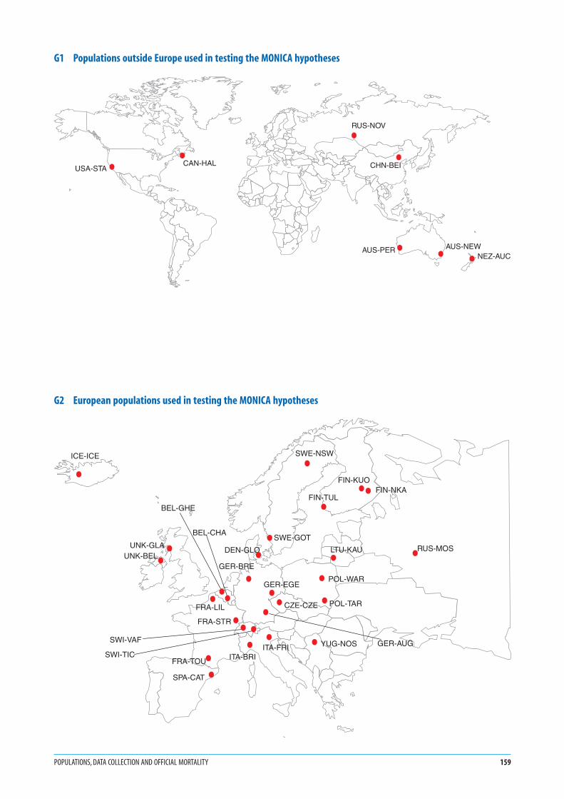
G1 Populations outside Europe used in testing the MONICA hypotheses
G2 European populations used in testing the MONICA hypotheses
POPULATIONS, DATA COLLECTION AND OFFICIAL MORTALITY 159
CHN-BEI
NEZ-AUCAUS-NEW
RUS-NOV
USA-STACAN-HAL
AUS-PER
ITA-FRI
FIN-TUL
SWE-GOT
DEN-GLO
ICE-ICE
UNK-GLA
BEL-CHA
FRA-STR
SWI-VAF
FRA-TOU
SPA-CAT
ITA-BRI
LTU-KAU
POL-TARCZE-CZE
FIN-NKA
YUG-NOS
GER-EGE
SWE-NSW
FRA-LIL
BEL-GHE
SWI-TICGER-AUG
RUS-MOS
GER-BREUNK-BEL
POL-WAR
FIN-KUO

1. These charts incorporate the official, routine, death
certificate data, obtained directly from local or national
statistical sources. MONICA registration procedures
for validation and diagnostic classification of coronary
and stroke events have not been applied. Population
denominators are the same as those used in calculating
MONICA event rates, as are the methods of age stan-
dardization. Discrepancies between these results and
those for coronary and stroke mortality after MONICA
validation therefore result from different numerators,
not differences in denominators or in age standardiza-
tion. See #16 Routine Mortality Data, #37 Event Rates,
Case Fatality and Trends, #39 Age Standardization,
MONICA Quality assessment of demographic data (1).
2. According to basic international coding rules, even if
there are several causes, or a sequence of causes of death
written on a death certificate, each death is assigned a
single ‘underlying’ cause. Deaths or death rates from
single causes can be added up therefore to give the total
number of deaths or death rates from all causes (that
is, from any cause).
3. CHD is coronary heart disease, also known as IHD, or
ischaemic heart disease. See Glossary.
4. Stroke is also known as cerebrovascular disease. See
Glossary.
5. Other CVD are cardiovascular diseases (that is diseases
of the heart and circulatory system—arteries, veins and
lymphatics) other than coronary heart disease and
cerebrovascular disease.
6. Non-CVD are all other causes of death, such as infec-
tions, cancer, respiratory disease, injury and poisoning,
to name a few.
7. The three years specified for each graph varied by
population. They are the starting and stopping years
for coronary-event registration in the population con-
cerned, shown graphically in G8.
8. Results, as in many of the following graphs, are age-
standardized for the 35–64 age group, using the world
standard population. See #39 Age Standardization.
9. Note that the scale maximum for women on the x-axis
is only half of that for men.
10. The bar charts allow comparison of mortality rates
between populations and between the sexes. Compar-
ison of G4 with G3 shows changes in mortality rates
and in consequent population ranking over time.
11. Some of these mortality data were used in the early
MONICA Publications 1, 6, 10, 16 (2).
1. See Monograph CD-ROM or MONICA Websitehttp://www.ktl.fi/monica/.
2. Full references and summaries of MONICA Publicationsappear in #85/86.
160 MONICA MONOGRAPH AND MULTIMEDIA SOURCEBOOK
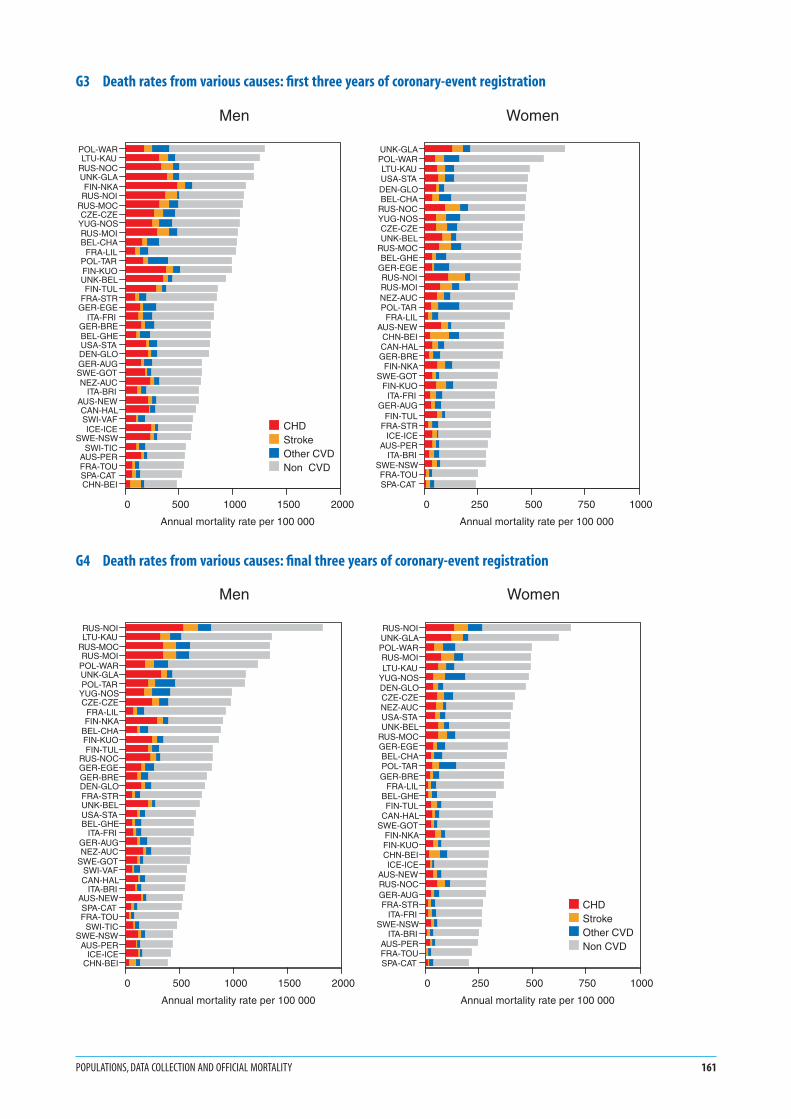
G3 Death rates from various causes: first three years of coronary-event registration
G4 Death rates from various causes: final three years of coronary-event registration
POPULATIONS, DATA COLLECTION AND OFFICIAL MORTALITY 161
POL-WARLTU-KAU
RUS-NOCUNK-GLAFIN-NKA
RUS-NOIRUS-MOCCZE-CZE
YUG-NOSRUS-MOIBEL-CHA
FRA-LILPOL-TARFIN-KUOUNK-BELFIN-TUL
FRA-STRGER-EGE
ITA-FRIGER-BREBEL-GHEUSA-STADEN-GLOGER-AUGSWE-GOTNEZ-AUC
ITA-BRIAUS-NEWCAN-HALSWI-VAFICE-ICE
SWE-NSWSWI-TIC
AUS-PERFRA-TOUSPA-CATCHN-BEI
0 500 1000 1500 2000
Annual mortality rate per 100 000
CHDStrokeOther CVDNon CVD
Men
UNK-GLAPOL-WARLTU-KAUUSA-STADEN-GLOBEL-CHA
RUS-NOCYUG-NOSCZE-CZEUNK-BEL
RUS-MOCBEL-GHE
GER-EGERUS-NOIRUS-MOINEZ-AUCPOL-TAR
FRA-LILAUS-NEW
CHN-BEICAN-HALGER-BRE
FIN-NKASWE-GOT
FIN-KUOITA-FRI
GER-AUGFIN-TUL
FRA-STRICE-ICE
AUS-PERITA-BRI
SWE-NSWFRA-TOUSPA-CAT
0 250 500 750 1000
Annual mortality rate per 100 000
Women
RUS-NOILTU-KAU
RUS-MOCRUS-MOI
POL-WARUNK-GLAPOL-TAR
YUG-NOSCZE-CZE
FRA-LILFIN-NKA
BEL-CHAFIN-KUOFIN-TUL
RUS-NOCGER-EGEGER-BREDEN-GLOFRA-STRUNK-BELUSA-STABEL-GHE
ITA-FRIGER-AUGNEZ-AUC
SWE-GOTSWI-VAFCAN-HAL
ITA-BRIAUS-NEWSPA-CATFRA-TOU
SWI-TICSWE-NSW
AUS-PERICE-ICE
CHN-BEI
0 500 1000 1500 2000
Annual mortality rate per 100 000
Men
RUS-NOIUNK-GLAPOL-WARRUS-MOILTU-KAU
YUG-NOSDEN-GLOCZE-CZENEZ-AUCUSA-STAUNK-BEL
RUS-MOCGER-EGEBEL-CHAPOL-TARGER-BRE
FRA-LILBEL-GHEFIN-TUL
CAN-HALSWE-GOT
FIN-NKAFIN-KUOCHN-BEIICE-ICE
AUS-NEWRUS-NOCGER-AUGFRA-STR
ITA-FRISWE-NSW
ITA-BRIAUS-PERFRA-TOUSPA-CAT
0 250 500 750 1000
Annual mortality rate per 100 000
CHDStrokeOther CVDNon CVD
Women

1. As in graphs G3 and G4 the official, unvalidated cause
of death is used. Here the denominator is all the deaths
in that sex. Demographic data on population numbers
are not essential for the calculation of what is called
proportional mortality. However in this case the calcu-
lation was made using mortality rates.
2. The disease groups are described for G3 and G4 (pre-
vious page), as is age standardization.
3. There is more than two-to-one variation in the pro-
portion of all deaths attributable to cardiovascular
disease in different populations. The proportion is gen-
erally higher in men than women. The sex difference is
smaller than the difference within one sex between dif-
ferent populations.
4. There is variation also in the proportion of all cardio-
vascular deaths attributable to coronary heart disease,
stroke and other cardiovascular diseases. A geographi-
cal pattern is apparent.
5. The distribution of proportions of deaths from differ-
ent causes is not changing greatly over time.
6. Proportional mortality analyses such as these have not
featured in MONICA Publications.
162 MONICA MONOGRAPH AND MULTIMEDIA SOURCEBOOK
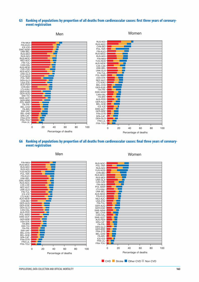
G5 Ranking of populations by proportion of all deaths from cardiovascular causes: first three years of coronary-event registration
G6 Ranking of populations by proportion of all deaths from cardiovascular causes: final three years of coronary-event registration
POPULATIONS, DATA COLLECTION AND OFFICIAL MORTALITY 163
FIN-NKAFIN-KUOICE-ICE
SWE-NSWUNK-BELRUS-MOIRUS-NOI
RUS-MOCNEZ-AUC
FIN-TULCAN-HAL
AUS-NEWCZE-CZE
RUS-NOCUNK-GLAYUG-NOSPOL-TARDEN-GLOUSA-STAAUS-PERCHN-BEILTU-KAU
GER-EGEGER-AUG
SWI-TICSWE-GOTGER-BREPOL-WAR
ITA-FRIBEL-CHA
ITA-BRISWI-VAFBEL-GHESPA-CATFRA-STRFRA-TOU
FRA-LIL
0 20 40 60 80 100
Percentage of deaths
Men
RUS-NOIRUS-NOCCHN-BEIPOL-TARFIN-KUO
RUS-MOCRUS-MOIFIN-NKA
YUG-NOSAUS-NEWCZE-CZEUNK-BELUNK-GLA
FIN-TULPOL-WARUSA-STANEZ-AUCLTU-KAUBEL-CHA
GER-EGEITA-FRI
SWE-NSWCAN-HAL
ITA-BRIAUS-PERGER-AUGBEL-GHE
ICE-ICESWE-GOTGER-BREFRA-STRSPA-CATDEN-GLO
FRA-LILFRA-TOU
0 20 40 60 80 100
Percentage of deaths
Women
FIN-NKARUS-MOCRUS-MOIRUS-NOI
YUG-NOSPOL-TARFIN-KUOUNK-BEL
SWE-NSWRUS-NOCCZE-CZENEZ-AUCUNK-GLA
FIN-TULICE-ICE
LTU-KAUAUS-NEWCHN-BEI
GER-AUGGER-EGEDEN-GLOCAN-HALAUS-PERPOL-WARSWE-GOTGER-BREUSA-STA
ITA-BRISWI-TICITA-FRI
SWI-VAFBEL-CHABEL-GHESPA-CATFRA-STR
FRA-LILFRA-TOU
0 20 40 60 80 100
Percentage of deaths
Men
RUS-NOCPOL-TARRUS-NOI
YUG-NOSCHN-BEI
RUS-MOCRUS-MOIUNK-GLACZE-CZEFIN-NKA
POL-WARLTU-KAUUNK-BEL
AUS-NEWFIN-KUO
NEZ-AUCUSA-STAFIN-TUL
GER-AUGGER-EGE
SWE-NSWBEL-CHACAN-HAL
SWE-GOTAUS-PERSPA-CAT
ITA-FRIDEN-GLOGER-BREFRA-STRBEL-GHE
ITA-BRIICE-ICEFRA-LIL
FRA-TOU
0 20 40 60 80 100
Percentage of deaths
CHD Stroke Other CVD Non CVD
Women

G71. ‘Hot pursuit’ (red dots in G7) is the identification of
potential cases of non-fatal myocardial infarction from
their admission to hospital. ‘Cold pursuit’ (blue dots
in G7) is identification from documents, particularly
paper or computer listings produced on discharge from
hospital. See #20 Registration of Coronary Events,
Hot and Cold Pursuit, and MONICA Manual Part IV,
Section 1 (1), MONICA Publications 4, 10, 16 (2).
Despite concern about comparability at the time, the
method of identifying cases for registration did not
appear to show any systematic geographical pattern, or
to have a systematic effect on results. G7 shows that dif-
ferent MONICA Collaborating Centres (MCCs) within
one country, responsible for neighbouring RUAs, often
employed different methods for identifying cases. In
some population RUAs a combination or intermediate
methods were used—sometimes these changed over
time.
G82. Years chosen for coronary-event registration were
those in which data were available and passed the
quality assessments of the MONICA Data Centre. See
MONICA Quality assessment of coronary event regis-
tration data (1). The years shown in G8 define the
initial and final years used for graphs G3–G6, and for
many later graphs. All 38 of the population RUAs from
MONICA Publication 38 (2) are included.
3. Starting and stopping dates varied between popu-
lations. Twenty-two of the 38 main MONICA
hypothesis-testing population RUAs began by 1 January
1984; all 38 monitored coronary events together for the
seven years 1 January 1985–31 December 1991; all but
two, Denmark-Glostrup, DEN-GLO, see #57, and New
Zealand-Auckland, NEZ-AUC, see #71, continued past
the end of 1992, and just nine more stopped at the end
of 1993. Twenty-seven of the 38 therefore registered
coronary events for the same nine years, 1985–1993
inclusive.
4. The ‘lagged’ registration period, shown in red in G8,
was used when testing the First MONICA Hypothesis
on coronary risk factors, see #2 MONICA Hypotheses
and Study Design. Trends in coronary-event rates were
calculated twice: firstly over the full period (blue plus
red bars) without any time difference from the meas-
urement of trends in risk factors, and secondly after a
delayed onset of several years. See G70, G72 and
MONICA Publication 38 (2).
1. See Monograph CD-ROM or MONICA Websitehttp://www.ktl.fi/monica/.
2. Full references and summaries of MONICA Publicationsappear in #85/86.
164 MONICA MONOGRAPH AND MULTIMEDIA SOURCEBOOK

G7 Populations using different methods of identifying non-fatal cases for coronary-event registration
G8 Years of coronary-event registration in different populations
POPULATIONS, DATA COLLECTION AND OFFICIAL MORTALITY 165
Hot pursuitMixed pursuitCold pursuit
AUS-NEWAUS-PERBEL-CHABEL-GHECAN-HALCHN-BEICZE-CZEDEN-GLOFIN-KUOFIN-NKAFIN-TULFRA-LIL
FRA-STRFRA-TOUGER-AURGER-AUUGER-BREGER-EGE
ICE-ICEITA-BRIITA-FRI
LTU-KAUNEZ-AUCPOL-TAR
POL-WARRUS-MOCRUS-MOI
RUS-NOCRUS-NOISPA-CAT
SWE-GOTSWE-NSW
SWI-TICSWI-VAFUNK-BELUNK-GLAUSA-STA
YUG-NOS
1980 1985 1990 1995Early registration period Lagged registration period
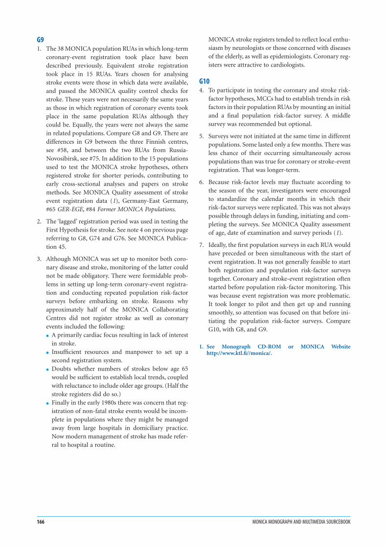
G91. The 38 MONICA population RUAs in which long-term
coronary-event registration took place have been
described previously. Equivalent stroke registration
took place in 15 RUAs. Years chosen for analysing
stroke events were those in which data were available,
and passed the MONICA quality control checks for
stroke. These years were not necessarily the same years
as those in which registration of coronary events took
place in the same population RUAs although they
could be. Equally, the years were not always the same
in related populations. Compare G8 and G9. There are
differences in G9 between the three Finnish centres,
see #58, and between the two RUAs from Russia-
Novosibirsk, see #75. In addition to the 15 populations
used to test the MONICA stroke hypotheses, others
registered stroke for shorter periods, contributing to
early cross-sectional analyses and papers on stroke
methods. See MONICA Quality assessment of stroke
event registration data (1), Germany-East Germany,
#65 GER-EGE, #84 Former MONICA Populations.
2. The ‘lagged’ registration period was used in testing the
First Hypothesis for stroke. See note 4 on previous page
referring to G8, G74 and G76. See MONICA Publica-
tion 45.
3. Although MONICA was set up to monitor both coro-
nary disease and stroke, monitoring of the latter could
not be made obligatory. There were formidable prob-
lems in setting up long-term coronary-event registra-
tion and conducting repeated population risk-factor
surveys before embarking on stroke. Reasons why
approximately half of the MONICA Collaborating
Centres did not register stroke as well as coronary
events included the following:
● A primarily cardiac focus resulting in lack of interest
in stroke.
● Insufficient resources and manpower to set up a
second registration system.
● Doubts whether numbers of strokes below age 65
would be sufficient to establish local trends, coupled
with reluctance to include older age groups. (Half the
stroke registers did do so.)
● Finally in the early 1980s there was concern that reg-
istration of non-fatal stroke events would be incom-
plete in populations where they might be managed
away from large hospitals in domiciliary practice.
Now modern management of stroke has made refer-
ral to hospital a routine.
MONICA stroke registers tended to reflect local enthu-
siasm by neurologists or those concerned with diseases
of the elderly, as well as epidemiologists. Coronary reg-
isters were attractive to cardiologists.
G104. To participate in testing the coronary and stroke risk-
factor hypotheses, MCCs had to establish trends in risk
factors in their population RUAs by mounting an initial
and a final population risk-factor survey. A middle
survey was recommended but optional.
5. Surveys were not initiated at the same time in different
populations. Some lasted only a few months. There was
less chance of their occurring simultaneously across
populations than was true for coronary or stroke-event
registration. That was longer-term.
6. Because risk-factor levels may fluctuate according to
the season of the year, investigators were encouraged
to standardize the calendar months in which their
risk-factor surveys were replicated. This was not always
possible through delays in funding, initiating and com-
pleting the surveys. See MONICA Quality assessment
of age, date of examination and survey periods (1).
7. Ideally, the first population surveys in each RUA would
have preceded or been simultaneous with the start of
event registration. It was not generally feasible to start
both registration and population risk-factor surveys
together. Coronary and stroke-event registration often
started before population risk-factor monitoring. This
was because event registration was more problematic.
It took longer to pilot and then get up and running
smoothly, so attention was focused on that before ini-
tiating the population risk-factor surveys. Compare
G10, with G8, and G9.
1. See Monograph CD-ROM or MONICA Websitehttp://www.ktl.fi//monica/.
166 MONICA MONOGRAPH AND MULTIMEDIA SOURCEBOOK

G9 Years of stroke registration in different populations
G10 Timing of risk-factor surveys in different populations
POPULATIONS, DATA COLLECTION AND OFFICIAL MORTALITY 167
CHN-BEI
DEN-GLO
FIN-KUO
FIN-NKA
FIN-TUL
ITA-FRI
LTU-KAU
POL-WAR
RUS-MOC
RUS-MOI
RUS-NOC
RUS-NOI
SWE-GOT
SWE-NSW
YUG-NOS
1980 1985 1990 1995
Early registration period Lagged registration period
AUS-NEWAUS-PERBEL-CHABEL-GHECAN-HALCHN-BEICZE-CZEDEN-GLOFIN-KUOFIN-NKAFIN-TULFRA-LIL
FRA-STRFRA-TOUGER-AURGER-AUUGER-BREGER-EGE
ICE-ICEITA-BRIITA-FRI
LTU-KAUNEZ-AUCPOL-TAR
POL-WARRUS-MOCRUS-MOI
RUS-NOCRUS-NOISPA-CAT
SWE-GOTSWE-NSW
SWI-TICSWI-VAFUNK-BELUNK-GLAUSA-STA
YUG-NOS
1980 1985 1990 1995Initial survey Middle survey Final survey

1. Coronary-care recording was more limited in duration
in most population RUAs than coronary-event regis-
tration, particularly in the early years of the MONICA
Project. However, some MCCs monitored both data
components in their RUAs from start to finish. See #24
Acute Coronary Care, MONICA Quality assessment of
acute coronary care data (1), MONICA Data Book of
coronary care (1).
2. To test the coronary-care hypothesis, differences in
coronary care and rates of coronary end-points were
measured across two separate time periods. See
G57–G68 and G77, MONICA Publication 39 (2).
3. This graph therefore depicts only the defined time
periods used in testing that hypothesis, and not the
total amount of coronary-care data available. For the
same reason G11 shows only part of the coronary-
event period of registration.
4. The MONICA collaboration did not require simulta-
neous recording of coronary care across the MONICA
populations. However, comparison of G11 with G10
shows greater uniformity in timing across populations
for coronary care than there was for the population
risk-factor surveys.
5. The lapse of time between the first and second period
differed in different populations. The improvements in
treatment between the two periods in different popu-
lations (See G57–G68) are specific to those periods and
the variable distance between them, as are the associ-
ated changes in coronary-event rates. Differences in
treatment and in event rates in the same population
RUA can be considered together because they are
matched for time difference. If either the changes in
treatments or the changes in end-point rates are com-
pared across population RUAs, the lack of standardiza-
tion of the time differences might lead to wrong
conclusions.
1. See Monograph CD-ROM or MONICA Websitehttp://www.ktl.fi/monica/.
2. Full references and summaries of MONICA Publicationsappear in #85/86.
168 MONICA MONOGRAPH AND MULTIMEDIA SOURCEBOOK
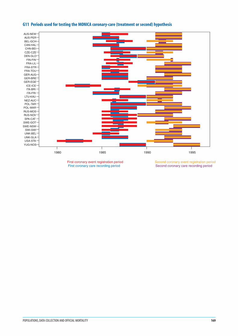
G11 Periods used for testing the MONICA coronary-care (treatment or second) hypothesis
POPULATIONS, DATA COLLECTION AND OFFICIAL MORTALITY 169
AUS-NEWAUS-PERBEL-GCHCAN-HALCHN-BEICZE-CZEDEN-GLO
FIN-FINFRA-LIL
FRA-STRFRA-TOUGER-AUGGER-BREGER-EGE
ICE-ICEITA-BRIITA-FRI
LTU-KAUNEZ-AUCPOL-TAR
POL-WARRUS-MOSRUS-NOVSPA-CAT
SWE-GOTSWE-NSW
SWI-SWIUNK-BELUNK-GLAUSA-STA
YUG-NOS
1980 1985 1990 1995
AUS-NEWAUS-PERBEL-GCHCAN-HALCHN-BEICZE-CZEDEN-GLO
FIN-FINFRA-LIL
FRA-STRFRA-TOUGER-AUGGER-BREGER-EGE
ICE-ICEITA-BRIITA-FRI
LTU-KAUNEZ-AUCPOL-TAR
POL-WARRUS-MOSRUS-NOVSPA-CAT
SWE-GOTSWE-NSW
SWI-SWIUNK-BELUNK-GLAUSA-STA
YUG-NOS
1980 1985 1990 1995
First coronary event registration period Second coronary event registration period First coronary care recording period Second coronary care recording period
1. The specific calendar years included in the two three-
year periods differed by population. They were identi-
fied previously in G8.
2. Event rates are calculated using registration data for
events, and demographic data for population denomi-
nators. See #17 Demographic Data, #37 Event Rates,
Case Fatality, and Trends, MONICA Quality assessment
of demographic data (1), MONICA Quality assessment
of coronary-event registration data (1), MONICA Data
Book of coronary events (1).
3. Results are age-standardized for the 35–64 age group,
using the world standard population. See #39 Age
Standardization.
4. Coronary events are defined using MONICA diagnos-
tic criteria. In this case definition 1 is used, incorpo-
rating definite non-fatal myocardial infarction and
definite, possible and unclassifiable (previously called
‘insufficient data’) coronary deaths. Non-fatal possible
myocardial infarction is excluded from this definition.
See #23 Diagnosing Myocardial Infarction and Coronary
Death, MONICA Manual Part IV, Section 1 (1), and
MONICA Publication 16 (2).
5. Note that the scale maximum for women on the x-axis
is half of that for men.
6. Confidence intervals, an indicator of precision, are not
shown. Rates are averaged over three years, involving
large numbers of events in most populations. Estimates
of rates should therefore be reasonably precise. See
the MONICA Data Book of coronary events, table 6
(1), for numbers.
7. These figures illustrate the five-to-one and ten-to-one
variation in event rates between populations of the
same sex, and the four to one ratio between coronary-
event rates in men and women. Comparison of G13
with G12 shows the changes of coronary-event rates
over time and resulting change in population RUA
rankings.
1. See Monograph CD-ROM or MONICA Websitehttp://www.ktl.fi/monica/.
2. Full references and summaries of MONICA Publicationsappear in #85/86.
170 MONICA MONOGRAPH AND MULTIMEDIA SOURCEBOOK
Coronary events: incidence, case fatality and mortality rates

G12 Coronary-event rates: first three years of registration
G13 Coronary-event rates: final three years of registration
CORONARY EVENTS: INCIDENCE, CASE FATALITY AND MORTALITY RATES 171
FIN-NKAFIN-KUO
UNK-GLAUNK-BEL
FIN-TULCAN-HAL
SWE-NSWICE-ICE
DEN-GLOAUS-NEWPOL-WARCZE-CZEUSA-STA
RUS-MOCNEZ-AUCLTU-KAURUS-MOIBEL-CHARUS-NOCAUS-PERPOL-TARYUG-NOSSWE-GOTRUS-NOI
GER-BREBEL-GHEGER-EGEFRA-STR
SWI-TICGER-AUG
FRA-LILITA-BRIITA-FRI
SWI-VAFFRA-TOUSPA-CATCHN-BEI
0 200 400 600 800 10000
Average annual event rate per 100 000
Men
UNK-GLAUNK-BELAUS-NEW
FIN-NKAUSA-STA
DEN-GLOPOL-WARFIN-KUO
CAN-HALSWE-NSWNEZ-AUCRUS-NOI
ICE-ICEPOL-TAR
FIN-TULRUS-NOCRUS-MOCBEL-CHARUS-MOI
YUG-NOSAUS-PERSWE-GOTCZE-CZEBEL-GHEGER-BREFRA-STR
GER-EGELTU-KAU
FRA-LILGER-AUG
ITA-FRIITA-BRI
FRA-TOUCHN-BEISPA-CAT
0 100 200 300 400 5000
Average annual event rate per 100 000
Women
UNK-GLAFIN-NKA
POL-WARFIN-KUO
UNK-BELRUS-NOILTU-KAUCZE-CZEBEL-CHARUS-NOC
FIN-TULPOL-TAR
RUS-MOCCAN-HALRUS-MOI
DEN-GLOYUG-NOSAUS-NEWSWE-NSW
ICE-ICEGER-EGENEZ-AUCAUS-PERUSA-STAGER-BRESWE-GOTBEL-GHE
FRA-LILSWI-TIC
FRA-STRITA-BRIITA-FRI
GER-AUGFRA-TOUSPA-CATSWI-VAFCHN-BEI
0 200 400 600 800 10000
Average annual event rate per 100 000
Men
UNK-GLAUNK-BELPOL-WARRUS-NOI
CAN-HALDEN-GLORUS-NOCUSA-STA
AUS-NEWBEL-CHAYUG-NOS
FIN-NKACZE-CZEFIN-KUO
POL-TARSWE-NSWNEZ-AUCGER-EGELTU-KAUGER-BRERUS-MOIFIN-TUL
AUS-PERICE-ICE
SWE-GOTRUS-MOCBEL-GHEGER-AUG
FRA-LILFRA-STR
ITA-FRISPA-CAT
ITA-BRICHN-BEI
FRA-TOU
0 100 200 300 400 5000
Average annual event rate per 100 000
Women

G141. For calculating the trends in population coronary-
event rates in MONICA we use a statistical model that
assumes that each trend is log-linear in pattern, and
that expresses the result as annual percentage change.
See #37 Event Rates, Case Fatality, and Trends. Graph
G14 shows annual event rates before any statistical
modelling has been done. Although largely unreadable
it is there because it illustrates the problems in the raw
data before the statistical model is used. There are large
year-on-year fluctuations. Trends in event rates in spe-
cific populations may not appear linear, but J-, or U-
shaped. A large absolute difference where rates are high
will be equivalent, in percentage terms, to a smaller one
in different population RUAs where the underlying rate
is low.
2. G14 does show a general pattern of decline, but also
what is happening at the extremes. Results for Finland-
North Karelia, FIN-NKA, see #58, in men and United
Kingdom-Glasgow, UNK-GLA, see #81, in women are
notable at the top end of the distribution. China-
Beijing, CHN-BEI, see #55, in men and Spain-
Catalonia, SPA-CAT, see #76, in women have the lowest
rates. Yearly numbers of coronary events, and coro-
nary-event rates are published in the MONICA Data
Book of coronary events, table 6 (1) from which this
graph is derived.
3. Note in G14 the difference in scale maximum on the y-
axis between men and women. It is almost four-to-one.
G154. G15 is derived from the same set of data as G14, but
after calculation of trends. See #37 Event Rates, Case
Fatality and Trends. It is partly coincidental and not
inevitable that the extreme values are held by almost
the same population RUAs in men in G14 and G15
(Finland-North Karelia, FIN-NKA and China Beijing,
CHN-BEI). G14 is plotted for rates, low to high, and
G15 for trends in rates, decreasing to increasing. The
same pattern is not seen in women, where there is no
association between extremes in rates and extremes in
trends.
5. Horizontal bars in G15 show the 95% confidence inter-
vals around the estimated annual trend. The smaller
the length of the bars the more precise the estimated
trend. If the bars fail to cross the zero line the estimated
trend is considered to deviate significantly from zero.
This graph follows a standard model used for present-
ing estimated trends in the MONICA results. Declin-
ing trends are shown to the left of the zero line, and
increasing trends to the right.
6. Confidence intervals are wider for women than for
men because there were fewer events. Greater relative
year-on-year fluctuations, through the random varia-
tion resulting from smaller numbers, are seen well in
G14 when the two sexes are compared. This resulted in
less precise estimates of trends in women in G15 than
in men. Wide confidence intervals are also found where
the trend appears to deviate from log-linear.
7. Both G14 and G15 show that the tendency in the
majority of MONICA population RUAs is towards a
decline in coronary-event rates. In this majority in G15
the estimated annual trend is to the left of the zero line.
In men the ratio is four-fifths declining versus one-fifth
increasing. In women it is nearer to two-thirds declin-
ing to one-third increasing. See the same data pre-
sented also in G23, G24 and G25.
8. G15 was previously published in MONICA Publication
36 (2). It was important in establishing that there were
differing trends in coronary-event rates (rates when
non-fatal and fatal coronary events were combined), in
the different MONICA population RUAs around the
world. The data previously available for multinational
comparisons were from routine death certification.
1. See Monograph CD-ROM or MONICA Websitehttp://www.ktl.fi/monica/.
2. Full references and summaries of MONICA Publicationsappear in #85/86.
172 MONICA MONOGRAPH AND MULTIMEDIA SOURCEBOOK

G14 Coronary-event rates by calendar year of registration
G15 Average annual change in coronary-event rates
CORONARY EVENTS: INCIDENCE, CASE FATALITY AND MORTALITY RATES 173
80 82 84 86 88 90 92 94 96
Calender years 19--
0
200
400
600
800
1000
1200
Ave
rag
e an
nu
al e
ven
t ra
te p
er 1
00 0
00
Men
80 82 84 86 88 90 92 94 96
Calendar years 19--
0
200
400
600
800
1000
1200
Ave
rage
ann
ual e
vent
rat
e pe
r 10
0 00
0
Men
FIN-NKA
AUS-NEW
AUS-PERBEL-CHA
BEL-GHE
CAN-HAL
CHN-BEI
DEN-GLO
FIN-KUO
FIN-TUL
FRA-LILFRA-STR
FRA-TOU
GER-AUGGER-BREGER-EGE
ICE-ICE
ITA-BRI
ITA-FRI
LTU-KAUNEZ-AUC
POL-TAR
POL-WAR
RUS-MOCRUS-MOI
RUS-NOC
RUS-NOI
SPA-CAT
SWE-GOT
SWE-NSW
SWI-TIC
SWI-VAF
UNK-BELUNK-GLA
USA-STAYUG-NOS
80 82 84 86 88 90 92 94 96
Calender years 19--
0
50
100
150
200
250
300
350
Ave
rag
e an
nu
al e
ven
t ra
te p
er 1
00 0
00
Women
80 82 84 86 88 90 92 94 96
Calendar years 19--
0
50
100
150
200
250
300
350
Ave
rage
ann
ual e
vent
rat
e pe
r 10
0 00
0
Women
AUS-NEW
AUS-PERBEL-CHA
BEL-GHE
CAN-HAL
CHN-BEI
CZE-CZE
DEN-GLOFIN-KUO
FIN-NKA
FIN-TUL
FRA-LILFRA-STR
FRA-TOU
GER-AUG
GER-BRE
GER-EGE
ICE-ICE
ITA-BRI
ITA-FRILTU-KAU
NEZ-AUCPOL-TAR
POL-WAR
RUS-MOC
RUS-MOI
RUS-NOCRUS-NOI
SPA-CAT
SWE-GOT
SWE-NSW
UNK-BEL
UNK-GLA
USA-STA
YUG-NOS
FIN-NKAFIN-KUOICE-ICE
SWE-NSWAUS-NEWNEZ-AUCCAN-HALUNK-BELGER-AURUSA-STAFIN-TUL
DEN-GLOSWE-GOTFRA-STRSWI-VAFBEL-GHEAUS-PERRUS-MOIGER-BRE
SWI-TICITA-BRI
FRA-TOUGER-AUUUNK-GLA
FRA-LILRUS-MOC
ITA-FRIRUS-NOCGER-EGECZE-CZEBEL-CHA
YUG-NOSPOL-WARPOL-TARLTU-KAUSPA-CATCHN-BEIRUS-NOI
-15 -10 -5 0 5 100
Annual trend per cent
Men
RUS-MOCFRA-STR
AUS-NEWFIN-NKAFIN-TUL
FIN-KUOICE-ICE
SWE-GOTITA-BRI
NEZ-AUCBEL-GHEDEN-GLOUSA-STAUNK-BEL
SWE-NSWAUS-PERFRA-TOURUS-MOI
FRA-LILITA-FRI
CHN-BEIGER-AUUGER-BREPOL-TARUNK-GLACAN-HAL
POL-WARBEL-CHA
RUS-NOCRUS-NOI
GER-EGESPA-CATCZE-CZELTU-KAU
YUG-NOSGER-AUR
-15 -10 -5 0 5 100
Annual trend per cent
Women

Notes in italics are repeated to help random browsers—
systematic readers should ignore them
1. The specific calendar years included in the two three-year
periods differed by population. They were identified in
G8.
2. Case fatality is the proportion of events ending fatally
within 28 days from the onset of the attack. See #37
Event Rates, Case Fatality, and Trends.
3. The denominator is all events so the scale is the same
for men and women. Case fatality does not involve
population demographic data.
4. Results are age-standardized for the 35–64 age group,
using the MONICA weightings for case fatality. See #39
Age Standardization.
5. The case fatality here is for coronary events defined using
MONICA diagnostic criteria, definition 1. Definition 1
incorporates definite non-fatal myocardial infarction and
definite, possible and unclassifiable (previously called
‘insufficient data’) coronary deaths. Non-fatal possible
myocardial infarction is excluded from this definition. See
#23 Diagnosing Myocardial Infarction and Coronary
Death, MONICA Manual Part IV, Section 1 (1), and
MONICA Publication 16 (2).
6. Case fatality here is higher than that in published clin-
ical case series of myocardial infarction. Results include
all coronary deaths, two-thirds or more of which occur
before admission to hospital. Clinical case series
usually start with diagnosed patients’ admission to hos-
pital and exclude coronary deaths in patients admitted
for other conditions. That is why the case fatality is
much lower. Follow-up may cease at hospital discharge
or at three weeks rather than the 28 days in MONICA,
but that has a smaller impact on case fatality than that
from exclusion of pre-hospital sudden deaths. See
MONICA Publications 16, 29 (2).
7. The complement of case fatality, survival, should relate
to treatment. Fatality and survival also reflect the rela-
tive success of the MONICA registers in finding and
confirming putative fatal and non-fatal coronary cases.
This problem is discussed in MONICA Publications 16,
29, 36 (2).
8. High case fatality, as in Poland-Tarnobrzeg Voivodship,
POL-TAR, see #72, reflects delays and difficulties in
obtaining diagnostic confirmation of non-fatal events,
to make them definite myocardial infarction. Without
early electrocardiographic or serological confirma-
tion, all potential definite non-fatal cases are classified
as possibles, and excluded from the case mix for
MONICA definition 1. See #23 Diagnosing Myocardial
Infarction and Coronary Death, MONICA Manual Part
IV, Section 1 (1), and MONICA Publication 16 (2).
9. Confidence intervals, an indicator of precision, are not
shown. Rates are averaged over three years, involving
large numbers of events in most population. Estimates of
case fatality should therefore be reasonably precise. See
MONICA Data Book of coronary events, table 6 (1) for
the numbers.
10. These figures illustrate the variation between popu-
lations, and between the two sexes, and changes in
ranking over time. On average, case fatality was slightly
higher in women than in men. Differences were usually
small, and were absent in some populations with high
coronary-event rates in both sexes. This question is
examined in MONICA Publications 16, 29, 36 (2).
MONICA Publication 16 showed that high case fatal-
ity in women, but not in men, correlated with low
population event rates. The authors suggested that this
might result from a lower level of suspicion, recogni-
tion and ascertainment of myocardial infarction in
women patients with non-fatal infarction compared to
that in men. MONICA Publication 39 (2) discussed
trends in case fatality in relation to changes in treat-
ment, examining the Second MONICA Hypothesis.
Graphs G16 and G17 show some suggestive geograph-
ical polarization between populations with low and
high case fatality.
1. See Monograph CD-ROM or MONICA Websitehttp://www.ktl.fi/monica/.
2. Full references and summaries of MONICA Publicationsappear in #85/86.
174 MONICA MONOGRAPH AND MULTIMEDIA SOURCEBOOK

G16 Case fatality for coronary events: first three years of registration
G17 Case fatality for coronary events: final three years of registration
CORONARY EVENTS: INCIDENCE, CASE FATALITY AND MORTALITY RATES 175
POL-TARPOL-WAR
FRA-LILRUS-NOCCHN-BEIRUS-MOI
YUG-NOSRUS-MOCRUS-NOILTU-KAU
GER-AUGFRA-STRNEZ-AUCUSA-STACZE-CZEBEL-GHEDEN-GLOBEL-CHA
ITA-FRIGER-BRE
FIN-NKAUNK-GLA
FIN-TULGER-EGEFIN-KUOUNK-BELFRA-TOU
SWE-GOTAUS-NEWSWI-VAF
ICE-ICEITA-BRI
SPA-CATCAN-HAL
SWE-NSWAUS-PER
SWI-TIC
0 20 40 60 80 1000
Average case fatality per cent
Men
POL-TARCHN-BEIFRA-LIL
GER-EGEGER-AUGPOL-WARBEL-GHEFRA-TOURUS-NOCRUS-MOIFRA-STRRUS-NOI
ITA-BRIBEL-CHACZE-CZELTU-KAUUSA-STA
RUS-MOCITA-FRI
GER-BREFIN-TUL
DEN-GLOYUG-NOSNEZ-AUCUNK-GLAAUS-NEWSPA-CATAUS-PERUNK-BEL
SWE-GOTFIN-KUOICE-ICE
FIN-NKACAN-HAL
SWE-NSW
0 20 40 60 80 1000
Average case fatality per cent
Women
POL-TARRUS-MOI
RUS-MOCRUS-NOICHN-BEI
POL-WARRUS-NOCGER-AUGLTU-KAUFRA-LIL
DEN-GLOYUG-NOSCZE-CZE
GER-EGEGER-BREFIN-KUO
NEZ-AUCFIN-TUL
FIN-NKAFRA-STRBEL-CHABEL-GHE
ITA-FRIUNK-GLA
SWE-GOTUSA-STA
ITA-BRIUNK-BEL
AUS-NEWSWI-VAF
FRA-TOUSPA-CAT
ICE-ICEAUS-PERCAN-HAL
SWE-NSWSWI-TIC
0 20 40 60 80 1000
Average case fatality per cent
Men
POL-TARCHN-BEIRUS-NOIFRA-LIL
RUS-MOIRUS-MOCGER-AUGRUS-NOCDEN-GLOGER-EGEYUG-NOSFRA-STRUSA-STAFRA-TOULTU-KAUBEL-GHEPOL-WARNEZ-AUCCZE-CZEBEL-CHAGER-BRESPA-CAT
SWE-GOTITA-FRIITA-BRI
UNK-GLAFIN-NKA
AUS-NEWAUS-PERUNK-BELFIN-TUL
FIN-KUOICE-ICE
SWE-NSWCAN-HAL
0 20 40 60 80 1000
Average case fatality per cent
Women

Notes in italics are repeated to help random browsers—
systematic readers should ignore them
G181. Calculation of trends is explained in #37 Event Rates,
Case Fatality and Trends. The units of change in case
fatality are potentially confusing because its basic unit
is per cent, so that a percentage decline can be inter-
preted as absolute or relative. (Similarly potential con-
fusion arises later for changes in cigarette smokers (see
G37).) Because of an important mathematical rela-
tionship (see later, G23) the trend shown here is the rel-
ative trend. Case fatality averages about 50% overall. If
it declined from 50% to 49% the relative decline would
be about 2%, as shown in G18, but the absolute change
would be 1%.
2. Horizontal bars in G18 show the 95% confidence inter-
vals around the estimated annual trend. The smaller the
length of the bars the more precise the estimated trend. If
the bars fail to cross the zero line the estimated trend is
considered to deviate significantly from zero. Declining
trends are shown to the left of the zero line, and increas-
ing trends to the right.
3. Confidence intervals are wider for women than for men
because there were fewer events. Greater year-on-year
fluctuations through the random variation resulting from
smaller numbers resulted in less precise estimates of
trends. Wide confidence intervals are also found where
the trend appears to deviate from log-linear.
4. G18 shows that case fatality is tending downwards in
most populations in MONICA, although the estimated
trend in many individual results fails to differ signifi-
cantly from zero. The crossover point in the graph for
men is slightly lower down than that in the graph
for women, but in both there is close to two-thirds of
populations with an estimated decline and one-third
with an increase. This graph has been published pre-
viously in MONICA Publication 36 (2).
G195. G19 contrasts the results of comparing mortality rates,
calculated from two sources: firstly from numbers
of MONICA coronary heart disease (CHD) deaths
validated through registration, and secondly from
numbers of coronary deaths reported by routine offi-
cial sources. See #16 Routine Mortality Data. The same
population denominators were used to calculate both
event rates. There are substantial discrepancies in some
populations but not all, suggesting both potential
under-reporting and over-reporting of coronary
deaths. A dilemma posed by the discrepancy is whether
to include as coronary deaths those that MONICA
found unclassifiable—deaths with no available diag-
nostic information (originally labelled ‘insufficient
data’). These accounted for 22% of potential coronary
deaths overall, and over 40% in some populations. This
graph uses MONICA case definition 1, including
unclassifiable deaths. MONICA definition 2, which
excludes them, gives a different result. The answer may
be somewhere between. See #23 Diagnosing Myocardial
Infarction and Coronary Death, MONICA Manual Part
IV, Section 1 (1), MONICA Publications 16 (2) (which
examines this issue in detail) and 36 (2).
6. In G19 the scale maximum for men and women is dif-
ferent on the x-axis, that for men being three-and-a-
half times greater than for women. Discrepancies
between MONICA and official CHD mortality rates in
women are proportionately greater than those in men.
7. G19 gives an impression of what is happening across
populations, but is less easy to read for single popula-
tions. The grey line joining the red and blue marks
indicates the extent of the discrepancy. Basic informa-
tion on which G19 is based is found in the MONICA
Data Book of coronary events, table 11 (1). Five year
cross-sectional data were published in MONICA
Publication 16 (2).
1. See Monograph CD-ROM or MONICA Websitehttp://www.ktl.fi/monica/.
2. Full references and summaries of MONICA Publicationsappear in #85/86.
176 MONICA MONOGRAPH AND MULTIMEDIA SOURCEBOOK
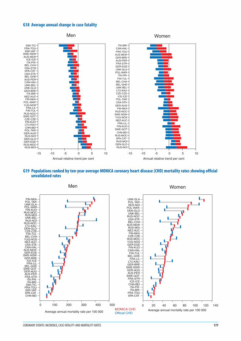
G18 Average annual change in case fatality
G19 Populations ranked by ten-year average MONICA coronary heart disease (CHD) mortality rates showing officialunvalidated rates
CORONARY EVENTS: INCIDENCE, CASE FATALITY AND MORTALITY RATES 177
SWI-TICFRA-TOUSWI-VAF
SWE-NSWAUS-NEW
ICE-ICEITA-FRI
BEL-CHAFRA-STRSPA-CATUSA-STABEL-GHEAUS-PERCAN-HALUNK-BELUNK-GLAGER-BRE
ITA-BRINEZ-AUCFIN-NKA
POL-WARYUG-NOS
FRA-LILFIN-TUL
RUS-NOCSWE-GOTCZE-CZEFIN-KUOLTU-KAUCHN-BEIPOL-TAR
GER-AUGRUS-NOI
DEN-GLOGER-EGERUS-MOCRUS-MOI
-15 -10 -5 0 5 10
Annual relative trend per cent
Men
ITA-BRICAN-HALFRA-TOU
AUS-NEWGER-BREAUS-PERFRA-STRGER-EGEUNK-GLAPOL-WAR
ITA-FRIFIN-TUL
BEL-CHABEL-GHEUNK-BELLTU-KAUCZE-CZE
ICE-ICEPOL-TARUSA-STA
GER-AUGFIN-NKA
RUS-NOCSWE-NSWYUG-NOSNEZ-AUC
FRA-LILFIN-KUO
SWE-GOTCHN-BEI
RUS-MOCSPA-CATRUS-MOI
DEN-GLORUS-NOI
-15 -10 -5 0 5 10
Annual relative trend per cent
Women
MONICA CHDOfficial CHD
Women
Average annual mortality rate per 100 000
UNK-GLAPOL-TARRUS-NOI
POL-WARDEN-GLOUNK-BEL
RUS-NOCUSA-STABEL-CHA
AUS-NEWRUS-MOINEZ-AUCFIN-NKACZE-CZE
RUS-MOCYUG-NOSGER-EGEFIN-KUOCAN-HALFIN-TUL
BEL-GHEFRA-LIL
LTU-KAUGER-BRE
SWE-NSWGER-AUGAUS-PER
SWE-GOTFRA-STR
ICE-ICECHN-BEIITA-FRIITA-BRI
FRA-TOUSPA-CAT
0 20 40 60 80 100 120 140
Men
Average annual mortality rate per 100 000
FIN-NKAPOL-TARUNK-GLAPOL-WARFIN-KUO
RUS-MOCRUS-MOIUNK-BELRUS-NOI
RUS-NOCLTU-KAU
DEN-GLOCZE-CZEFIN-TUL
BEL-CHAYUG-NOSNEZ-AUCUSA-STACAN-HAL
AUS-NEWGER-EGE
SWE-NSWGER-BRE
ICE-ICEFRA-LIL
BEL-GHESWE-GOTGER-AUGAUS-PERFRA-STR
ITA-FRIITA-BRI
SWI-TICFRA-TOUSWI-VAFSPA-CATCHN-BEI
0 100 200 300 400 500
Notes in italics are repeated to help random browsers—
systematic readers should ignore them
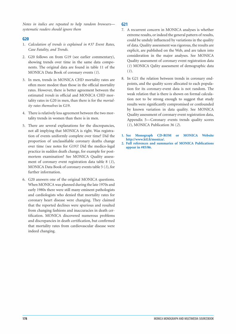
G201. Calculation of trends is explained in #37 Event Rates,
Case Fatality, and Trends.
2. G20 follows on from G19 (see earlier commentary),
showing trends over time in the same data compo-
nents. The original data are found in table 11 of the
MONICA Data Book of coronary events (1).
3. In men, trends in MONICA CHD mortality rates are
often more modest than those in the official mortality
rates. However, there is better agreement between the
estimated trends in official and MONICA CHD mor-
tality rates in G20 in men, than there is for the mortal-
ity rates themselves in G19.
4. There is relatively less agreement between the two mor-
tality trends in women than there is in men.
5. There are several explanations for the discrepancies,
not all implying that MONICA is right. Was registra-
tion of events uniformly complete over time? Did the
proportion of unclassifiable coronary deaths change
over time (see notes for G19)? Did the medico-legal
practice in sudden death change, for example for post-
mortem examination? See MONICA Quality assess-
ment of coronary event registration data table 8 (1),
MONICA Data Book of coronary events table 5 (1), for
further information.
6. G20 answers one of the original MONICA questions.
When MONICA was planned during the late 1970s and
early 1980s there were still many eminent pathologists
and cardiologists who denied that mortality rates for
coronary heart disease were changing. They claimed
that the reported declines were spurious and resulted
from changing fashions and inaccuracies in death cer-
tification. MONICA discovered numerous problems
and discrepancies in death certification, but confirmed
that mortality rates from cardiovascular disease were
indeed changing.
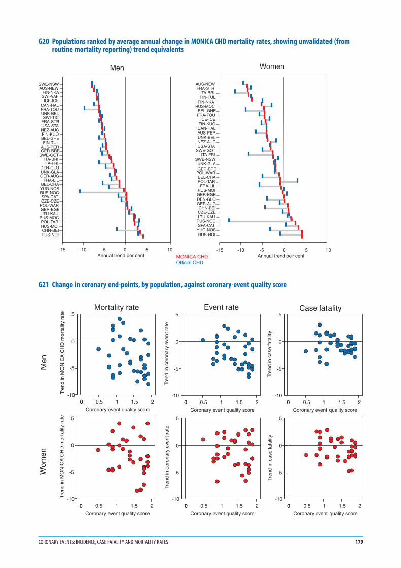
G217. A recurrent concern in MONICA analyses is whether
extreme results, or indeed the general pattern of results,
could be unduly influenced by variations in the quality
of data. Quality assessment was rigorous, the results are
explicit, are published on the Web, and are taken into
consideration in the major analyses. See MONICA
Quality assessment of coronary event registration data
(1) MONICA Qality assessment of demographic data
(1).
8. In G21 the relation between trends in coronary end-
points, and the quality score allocated to each popula-
tion for its coronary-event data is not random. The
weak relation that is there is shown on formal calcula-
tion not to be strong enough to suggest that study
results were significantly compromised or confounded
by known variation in data quality. See MONICA
Quality assessment of coronary event registration data,
Appendix 5—Coronary events trends quality scores
(1), MONICA Publication 36 (2).
1. See Monograph CD-ROM or MONICA Websitehttp://www.ktl.fi/monica/.
2. Full references and summaries of MONICA Publicationsappear in #85/86.
178 MONICA MONOGRAPH AND MULTIMEDIA SOURCEBOOK
G20 Populations ranked by average annual change in MONICA CHD mortality rates, showing unvalidated (fromroutine mortality reporting) trend equivalents
G21 Change in coronary end-points, by population, against coronary-event quality score
CORONARY EVENTS: INCIDENCE, CASE FATALITY AND MORTALITY RATES 179
MONICA CHDOfficial CHD
Men
SWE-NSWAUS-NEW
FIN-NKASWI-VAFICE-ICE
CAN-HALFRA-TOUUNK-BELSWI-TIC
FRA-STRUSA-STANEZ-AUCFIN-KUOBEL-GHEFIN-TUL
AUS-PERGER-BRE
SWE-GOTITA-BRIITA-FRI
DEN-GLOUNK-GLAGER-AUG
FRA-LILBEL-CHAYUG-NOSRUS-NOCSPA-CATCZE-CZE
POL-WARGER-EGELTU-KAU
RUS-MOCPOL-TARRUS-MOICHN-BEIRUS-NOI
-15 -10 -5 0 5 10 Annual trend per cent
Women
ITA-BRI
AUS-NEWFRA-STR
FIN-TULFIN-NKA
RUS-MOCBEL-GHEFRA-TOU
ICE-ICEFIN-KUOCAN-HALAUS-PERUNK-BELNEZ-AUCUSA-STA
SWE-GOTITA-FRI
SWE-NSWUNK-GLAGER-BRE
POL-WARBEL-CHAPOL-TAR
FRA-LILRUS-MOIGER-EGEDEN-GLOGER-AUGCHN-BEICZE-CZELTU-KAU
RUS-NOCSPA-CAT
YUG-NOSRUS-NOI
-15 -10 -5 0 5 10 Annual trend per cent
0 0.5 1 1.5 20
Coronary event quality score
-10
-5
0
5
Tren
d in
MO
NIC
A C
HD
mor
talit
y ra
te
0 0.5 1 1.5 20
Coronary event quality score
-10
-5
0
5
Tren
d in
cor
onar
y ev
ent r
ate
0 0.5 1 1.5 20
Coronary event quality score
-10
-5
0
5
Tren
d in
cas
e fa
talit
y
0 0.5 1 1.5 20
Coronary event quality score
-10
-5
0
5
Tren
d in
MO
NIC
A C
HD
mor
talit
y ra
te
0 0.5 1 1.5 20
Coronary event quality score
-10
-5
0
5
Tren
d in
cor
onar
y ev
ent r
ate
0 0.5 1 1.5 20
Coronary event quality score
-10
-5
0
5
Tren
d in
cas
e fa
talit
y
Men
Wom
en
Mortality rate Event rate Case fatality
Notes in italics are repeated to help random browsers—
systematic readers should ignore them
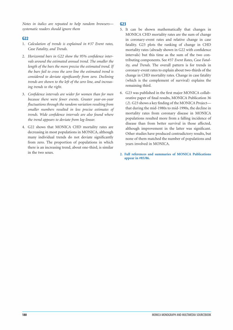
G221. Calculation of trends is explained in #37 Event rates,
Case Fatality, and Trends.
2. Horizontal bars in G22 show the 95% confidence inter-
vals around the estimated annual trend. The smaller the
length of the bars the more precise the estimated trend. If
the bars fail to cross the zero line the estimated trend is
considered to deviate significantly from zero. Declining
trends are shown to the left of the zero line, and increas-
ing trends to the right.
3. Confidence intervals are wider for women than for men
because there were fewer events. Greater year-on-year
fluctuations through the random variation resulting from
smaller numbers resulted in less precise estimates of
trends. Wide confidence intervals are also found where
the trend appears to deviate from log-linear.
4. G22 shows that MONICA CHD mortality rates are
decreasing in most populations in MONICA, although
many individual trends do not deviate significantly
from zero. The proportion of populations in which
there is an increasing trend, about one-third, is similar
in the two sexes.
G235. It can be shown mathematically that changes in
MONICA CHD mortality rates are the sum of change
in coronary-event rates and relative change in case
fatality. G23 plots the ranking of change in CHD
mortality rates (already shown in G22 with confidence
intervals) but this time as the sum of the two con-
tributing components. See #37 Event Rates, Case Fatal-
ity, and Trends. The overall pattern is for trends in
coronary-event rates to explain about two-thirds of the
change in CHD mortality rates. Change in case fatality
(which is the complement of survival) explains the
remaining third.
6. G23 was published in the first major MONICA collab-
orative paper of final results, MONICA Publication 36
(2). G23 shows a key finding of the MONICA Project—
that during the mid-1980s to mid-1990s, the decline in
mortality rates from coronary disease in MONICA
populations resulted more from a falling incidence of
disease than from better survival in those affected,
although improvement in the latter was significant.
Other studies have produced contradictory results, but
none of them matched the number of populations and
years involved in MONICA.
2. Full references and summaries of MONICA Publicationsappear in #85/86.
180 MONICA MONOGRAPH AND MULTIMEDIA SOURCEBOOK

G22 Average annual change in MONICA coronary heart disease (CHD) mortality rates
G23 Changes in MONICA coronary heart disease (CHD) mortality rates divided between changes in coronary-eventrates and changes in case fatality
CORONARY EVENTS: INCIDENCE, CASE FATALITY AND MORTALITY RATES 181
SWE-NSWAUS-NEW
FIN-NKASWI-VAFICE-ICE
CAN-HALFRA-TOUUNK-BELSWI-TIC
FRA-STRUSA-STANEZ-AUCFIN-KUOBEL-GHEFIN-TUL
AUS-PERGER-BRE
SWE-GOTITA-BRIITA-FRI
DEN-GLOUNK-GLAGER-AUG
FRA-LILBEL-CHA
YUG-NOSRUS-NOCSPA-CATCZE-CZE
POL-WARGER-EGELTU-KAU
RUS-MOCPOL-TARRUS-MOICHN-BEIRUS-NOI
-15 -10 -5 0 5 10
Annual trend per cent
Men
AUS-NEWFRA-STR
ITA-BRIFIN-TULFIN-NKA
RUS-MOCBEL-GHEFRA-TOU
ICE-ICEFIN-KUOCAN-HALAUS-PERUNK-BELNEZ-AUCUSA-STA
SWE-GOTITA-FRI
SWE-NSWUNK-GLAGER-BREPOL-WARBEL-CHAPOL-TARFRA-LIL
RUS-MOIGER-EGEDEN-GLOGER-AUGCHN-BEICZE-CZELTU-KAU
RUS-NOCSPA-CAT
YUG-NOSRUS-NOI
-15 -10 -5 0 5 10
Annual trend per cent
Women
SWE-NSWAUS-NEW
FIN-NKASWI-VAFICE-ICE
CAN-HALFRA-TOUUNK-BELSWI-TIC
FRA-STRUSA-STANEZ-AUCFIN-KUO
BEL-GHEFIN-TUL
AUS-PERGER-BRE
SWE-GOTITA-BRIITA-FRI
DEN-GLOUNK-GLAGER-AUG
FRA-LILBEL-CHAYUG-NOSRUS-NOCSPA-CATCZE-CZE
POL-WARGER-EGELTU-KAU
RUS-MOCPOL-TARRUS-MOICHN-BEIRUS-NOI
-15 -10 -5 0 5 10
Annual trend per cent
Event rateCase fatality
Men
AUS-NEWFRA-STR
ITA-BRIFIN-TULFIN-NKA
RUS-MOCBEL-GHEFRA-TOU
ICE-ICEFIN-KUO
CAN-HALAUS-PERUNK-BELNEZ-AUCUSA-STA
SWE-GOTITA-FRI
SWE-NSWUNK-GLAGER-BREPOL-WARBEL-CHAPOL-TAR
FRA-LILRUS-MOI
GER-EGEDEN-GLOGER-AUGCHN-BEICZE-CZELTU-KAU
RUS-NOCSPA-CATYUG-NOSRUS-NOI
-15 -10 -5 0 5 100
Annual trend per cent
Event rateCase fatality
Women

1. G24 and G25 summarize the results shown for trends
in mortality in G22, for trends in coronary-event
rates in G15, and for trends in case fatality in G18.
The Russia-Moscow (RUS-MOS, MOC/MOI, #74) and
Russia-Novosibirsk (RUS-NOV, NOC/NOI, #75) pop-
ulations were split in the previous graphs, but here they
feature as single RUAs, with single spots.
2. A blue spot indicates a population RUA whose esti-
mated trend and confidence intervals for that end-
point are to the left of the zero line in the relevant graph
indicating a significant decline.
3. Red spots indicate population RUAs whose estimated
trends and confidence intervals are to the right of the
zero line, showing significant increases.
4. Black spots indicate populations where confidence
intervals straddle the zero line, so that trends are not
significantly different from zero, even though the trend
estimate itself may be to one side of it, as is usually the
case.
5. There are more black spots in women, G25, than in
men, G24, because estimated trends are less precise,
with greater confidence intervals, even though the esti-
mated trends themselves are often as large as those in
men.
6. The European and world maps suggest clustering of
populations with similar trends in coronary end-
points, shown by the distribution of spots of the same
colour.
182 MONICA MONOGRAPH AND MULTIMEDIA SOURCEBOOK
G24 Spot maps of changes in coronary end-points in men
G25 Spot maps of changes in coronary end-points in women
CORONARY EVENTS: INCIDENCE, CASE FATALITY AND MORTALITY RATES 183
Change in coronary event rate
Change in MONICA CHD mortality
Change in case fatality
Significant increaseInsignificant changeSignificant decrease
Men
Change in coronary event rate
Change in MONICA CHD mortality
Change in case fatality
WomenSignificant increaseInsignificant changeSignificant decrease

1. The specific calendar years included in the two three-
year periods differed by population. They were identi-
fied in G9, and were not necessarily the same as those
used for coronary-event registration.
2. Event rates are calculated using registration data for
events, and demographic data for population denomi-
nators. See #17 Demographic Data, #37 Event Rates,
Case Fatality, and Trends, MONICA Quality assessment
of demographic data (1), MONICA Quality assessment
of stroke registration data (1), MONICA Data Book of
stroke events (1).
3. Results are age-standardized for the 35–64 age group,
using the world standard population. See #39 Age
Standardization.
4. Strokes are defined using MONICA diagnostic criteria.
The criterion for stroke itself is the clinical presenta-
tion: symptoms, signs and clinical examination. Stroke
does not have simple confirmatory tests equivalent to
the electrocardiogram and cardiac enzyme tests used to
define definite myocardial infarction, but there was
increasing use of imaging techniques over the registra-
tion period, which were used to identify what sort of
stroke had occurred. The cerebrovascular disease in
stroke can be haemorrhage from an artery (subarach-
noid haemorrhage, or intracerebal haemorrhage) or
ischaemia from atheromatous arterial thrombosis
leading to infarction or death of part of the brain
(atherothrombotic cerebral infarction). See #26 and
#27 Registration of Stroke Events, Diagnosis of Stroke,
MONICA Manual Part IV, Section 2 (1), MONICA
Publications 5, 18, 19, 21. (2).
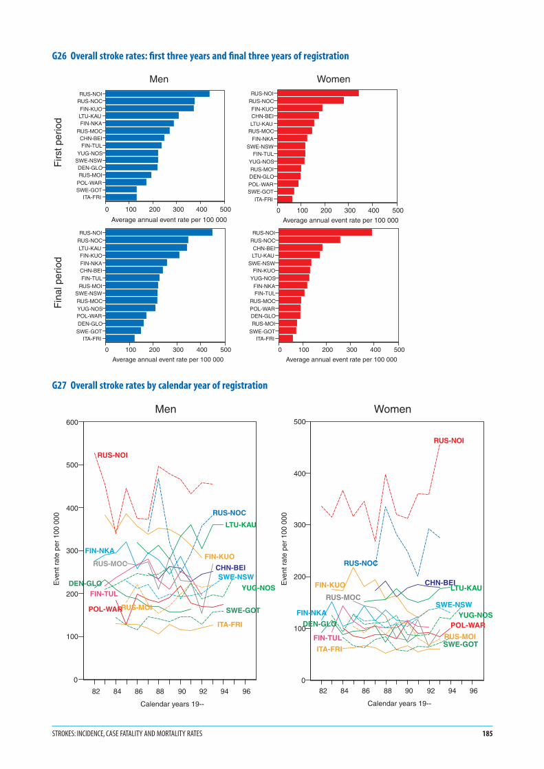
G265. The x-axes of the graphs for stroke-event rates in G26
show the same maximum readings for men and women
as their rates are not as different as those previously
described for coronary-event rates. Comparison with
the values in G12 and G13 shows that these stroke rates
are intermediate between the coronary-event rates in
men and women.
6. Confidence intervals, an index of precision, are not
shown. Rates are averaged over three years. They are
less precise than those for coronary events in men and
more similar to those in women. See MONICA Data
Book of stroke events, table 5.1 (1) for numbers of
events from which these rates are derived.
7. These figures show: a four-fold variation in rates across
populations in men and six-fold variation in women;
on average higher event rates in men than women
within populations; the changes in population event
rates over time; and the effects of these changes on the
population rankings.
G278. The lower graph, G27 is unreadable for some popula-
tions but deliberately inserted to show what the annual
trend data look like before summarizing them statisti-
cally in terms of log-linear trends, shown in G29. (See
the discussion for G14.) G27 gives an overall picture of
the trends over time. Among the year-on-year fluctua-
tions some populations seem to show a decline in rates
but others little change. Yearly numbers and rates are
available in the MONICA Data Book of stroke events,
table 5.1 (1), from which this graph is derived.
1. See Monograph CD-ROM or MONICA Websitehttp://www.ktl.fi/monica/.
2. Full references and summaries of MONICA Publicationsappear in #85/86.
184 MONICA MONOGRAPH AND MULTIMEDIA SOURCEBOOK
Strokes: incidence, case fatality and mortality rates
G26 Overall stroke rates: first three years and final three years of registration
G27 Overall stroke rates by calendar year of registration
STROKES: INCIDENCE, CASE FATALITY AND MORTALITY RATES 185
RUS-NOIRUS-NOC
FIN-KUOLTU-KAUFIN-NKA
RUS-MOCCHN-BEIFIN-TUL
YUG-NOSSWE-NSWDEN-GLORUS-MOI
POL-WARSWE-GOT
ITA-FRI
0 100 200 300 400 500
Average annual event rate per 100 000
RUS-NOIRUS-NOC
FIN-KUOCHN-BEILTU-KAU
RUS-MOCFIN-NKA
SWE-NSWFIN-TUL
YUG-NOSRUS-MOIDEN-GLOPOL-WARSWE-GOT
ITA-FRI
0 100 200 300 400 500
Average annual event rate per 100 000
RUS-NOIRUS-NOCLTU-KAUFIN-KUOFIN-NKACHN-BEIFIN-TUL
RUS-MOISWE-NSWRUS-MOCYUG-NOSPOL-WARDEN-GLO
SWE-GOTITA-FRI
0 100 200 300 400 500
Average annual event rate per 100 000
RUS-NOIRUS-NOCCHN-BEILTU-KAU
SWE-NSWFIN-KUO
YUG-NOSFIN-NKAFIN-TUL
RUS-MOCPOL-WARDEN-GLORUS-MOI
SWE-GOTITA-FRI
0 100 200 300 400 500
Average annual event rate per 100 000
Men Women
Firs
t per
iod
Fin
al p
erio
d
82 84 86 88 90 92 94 96
Calendar years 19--
0
100
200
300
400
500
600
Eve
nt r
ate
per
100
000
CHN-BEI
DEN-GLO
FIN-KUOFIN-NKA
FIN-TUL
ITA-FRI
LTU-KAU
POL-WAR
RUS-MOC
RUS-MOI
RUS-NOC
RUS-NOI
SWE-GOT
SWE-NSW
YUG-NOS
Men
82 84 86 88 90 92 94 96
Calendar years 19--
0
100
200
300
400
500
Eve
nt r
ate
per
100
000
CHN-BEI
DEN-GLO
FIN-KUO
FIN-NKA
FIN-TUL
ITA-FRI
LTU-KAU
POL-WAR
RUS-MOC
RUS-MOI
RUS-NOC
RUS-NOI
SWE-GOT
SWE-NSWYUG-NOS
Women
G281. The calendar years involved in each three-year period
differed by population, and are identified in G9. They are
not necessarily the same as those used in registration of
coronary events.
2. Case fatality is the proportion of events ending fatally
within 28 days from onset. See #37 Event Rates, Case
Fatality and Trends, MONICA Manual Part IV, Section
2 (1), MONICA Data Book of stroke events, table 8.1
(1), MONICA Publication 19 (2).
3. The denominator is all events and the scale is therefore
the same for men and women. Case fatality does not
involve population demographic data.
4. Results are age-standardized for the 34–64 age group,
using the weightings for case fatality in MONICA. See
#39 Age Standardization.
5. The case fatality shown is for strokes defined using
MONICA diagnostic criteria. See #26 and #27 Registra-
tion of Stroke Events, Diagnosis of Stroke, MONICA
Publication 5 (2).
6. Case fatality shown here may be higher than that
derived from hospitalized stroke cases. Results include
all stroke deaths. Some of these (particularly cerebral
haemorrhage) may occur rapidly before admission to
hospital, although this is less common than it is for
coronary deaths. Clinical case series may start with
admission to hospital, and follow-up may cease at hos-
pital discharge, rather than the 28 days used here.
7. The complement of case fatality, survival, should relate
to acute management of stroke. Differences in case
fatality probably also reflect variations between popu-
lations in the distribution of stroke subtypes (haemor-
rhagic versus ischaemic strokes) and variations in
stroke severity at onset. Case-mix also reflects the rel-
ative success of the MONICA registers in finding both
fatal strokes and non-fatal stroke cases of all degrees of
severity. This problem of case ascertainment of fatal
versus non-fatal cases is probably greater in the delin-
eation of specific stroke subtypes. (See G35, subarach-
noid haemorrhage.)
8. Confidence intervals, an index of precision, are not
given. Rates are averaged over three years. See
MONICA Data Book of stroke events tables 5.1, 8.1 (1)
for numbers. As in coronary events, the case fatality
appears higher in women than in men. Within each sex
there is a nearly four-fold variation across population
RUAs in case fatality without any apparent modal
values. (Compare with G16 and G17.) G28 illustrates
the variation between populations, and between the
two sexes, changes in case fatality over time and the
resulting change in population rankings. There is some
apparent geographical clustering of results.
G299. Horizontal bars in G29 show the 95% confidence inter-
vals around estimated annual trends. The smaller the
length of the bars, the more precise the estimated trend.
If the bars fail to cross the zero line, the estimated
trends are considered to deviate significantly from zero.
Declining trends are shown to the left of the zero line,
and increasing trends to the right.
10. Confidence intervals are similar for men and women
because the number of events is similar. Examination
of the year-on-year trend for Russia-Novosibirsk
Control, RUS-NOC, see #75, in G27 helps to explain
lack of precision in the estimated trend in G29.
11. G29 shows that incidence rates of stroke events are
tending to decrease in around half the populations but
some of the remainder show an increasing trend. The
trends in case fatality show a fairly similar pattern. With
a few exceptions estimated trends in individual popu-
lations are not large enough to be statistically signifi-
cant, as they are small in relation to the width of the
confidence interval. See MONICA Publications 19, 25,
45 (2), MONICA Data Book of stroke events table 5.1
(1). MONICA Publications on stroke, incorporating
these results, were in preparation at the same time as
this Monograph. (Note that some of the RUAs used in
these differ slightly from those in this Monograph, so
the results may disagree on particular populations—
see note 6 on G1, G2.)
1. See Monograph CD-ROM or MONICA Websitehttp://www.ktl.fi/monica/.
2. Full references and summaries of MONICA Publicationsappear in #85/86.
186 MONICA MONOGRAPH AND MULTIMEDIA SOURCEBOOK
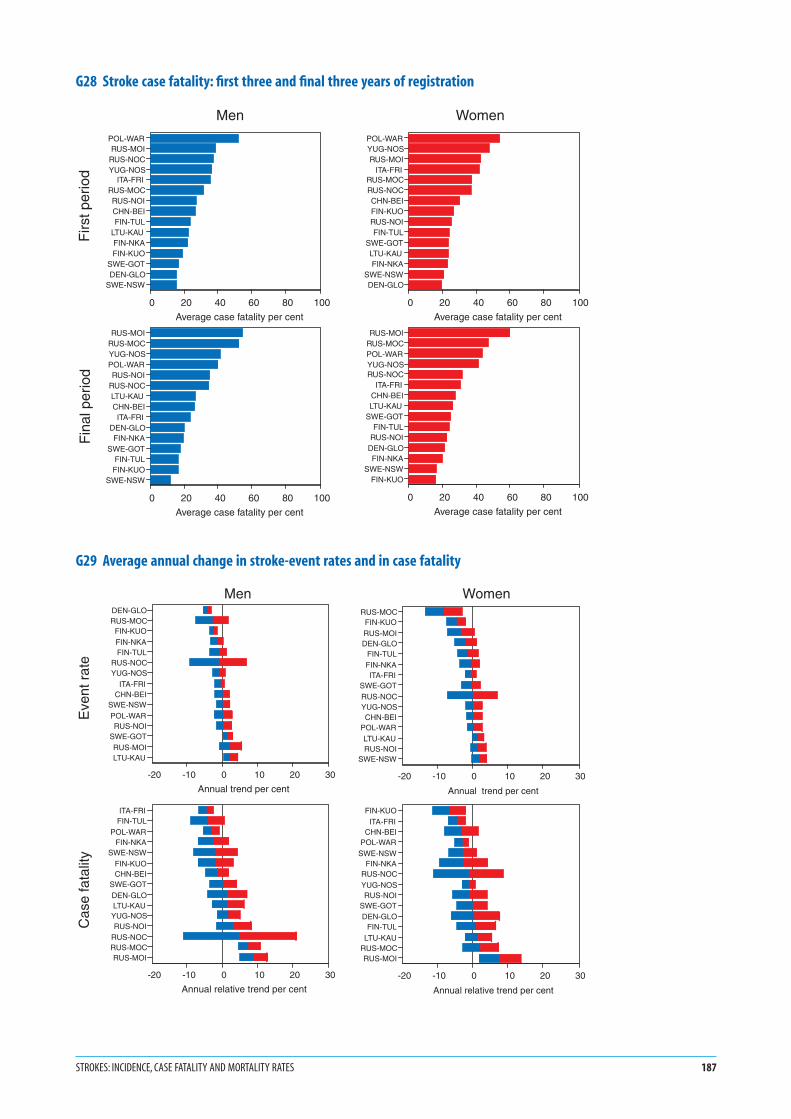
G28 Stroke case fatality: first three and final three years of registration
G29 Average annual change in stroke-event rates and in case fatality
STROKES: INCIDENCE, CASE FATALITY AND MORTALITY RATES 187
POL-WARRUS-MOI
RUS-NOCYUG-NOS
ITA-FRIRUS-MOCRUS-NOICHN-BEIFIN-TUL
LTU-KAUFIN-NKAFIN-KUO
SWE-GOTDEN-GLO
SWE-NSW
0 20 40 60 80 100
Average case fatality per cent
POL-WARYUG-NOSRUS-MOI
ITA-FRIRUS-MOCRUS-NOCCHN-BEIFIN-KUORUS-NOIFIN-TUL
SWE-GOTLTU-KAUFIN-NKA
SWE-NSWDEN-GLO
0 20 40 60 80 100
Average case fatality per cent
RUS-MOIRUS-MOCYUG-NOSPOL-WARRUS-NOI
RUS-NOCLTU-KAUCHN-BEIITA-FRI
DEN-GLOFIN-NKA
SWE-GOTFIN-TULFIN-KUO
SWE-NSW
0 20 40 60 80 100
Average case fatality per cent
RUS-MOIRUS-MOCPOL-WARYUG-NOSRUS-NOC
ITA-FRICHN-BEILTU-KAU
SWE-GOTFIN-TUL
RUS-NOIDEN-GLOFIN-NKA
SWE-NSWFIN-KUO
0 20 40 60 80 100
Average case fatality per cent
Firs
t per
iod
Fin
al p
erio
d
Men Women
DEN-GLORUS-MOC
FIN-KUOFIN-NKAFIN-TUL
RUS-NOCYUG-NOS
ITA-FRICHN-BEI
SWE-NSWPOL-WARRUS-NOI
SWE-GOTRUS-MOILTU-KAU
-20 -10 0 10 20 30
Annual trend per cent
RUS-MOCFIN-KUORUS-MOIDEN-GLO
FIN-TULFIN-NKAITA-FRI
SWE-GOTRUS-NOCYUG-NOSCHN-BEI
POL-WARLTU-KAURUS-NOI
SWE-NSW
-20 -10 0 10 20 30
Annual trend per cent
ITA-FRIFIN-TUL
POL-WARFIN-NKA
SWE-NSWFIN-KUOCHN-BEI
SWE-GOTDEN-GLOLTU-KAUYUG-NOSRUS-NOI
RUS-NOCRUS-MOCRUS-MOI
-20 -10 0 10 20 30
Annual relative trend per cent
FIN-KUOITA-FRI
CHN-BEIPOL-WAR
SWE-NSWFIN-NKA
RUS-NOCYUG-NOSRUS-NOI
SWE-GOTDEN-GLO
FIN-TULLTU-KAU
RUS-MOCRUS-MOI
-20 -10 0 10 20 30
Annual relative trend per cent
Men Women
Eve
nt r
ate
Cas
e fa
talit
y
Notes in italics are repeated to help random browsers—
systematic readers should ignore them
G301. The calendar years involved in each three-year period dif-
fered by population, and are identified in G9. Mortality
rates are those for definite and unclassifiable strokes,
excluding cases classified as not stroke. See #26 and #27
Registration of Stroke Events, Diagnosis of Stroke, #37
Event Rates, Case Fatality and Trends, MONICA
Manual Part IV, Section 2 (1), MONICA Quality assess-
ment of stroke registration data (1), MONICA Data
Book of stroke events, table 7.1 (1).
2. Results are age-standardized for the 35–64 age group,
using the world standard population. See #39 Age
Standardization.
3. Mortality rates in G30 show a four-to-one variation in
both men and women, and higher mortality rates in
men within each population RUA. There is a geo-
graphical gradient in stroke mortality from western
and northern Europe towards the east.
4. MONICA stroke data involve fewer RUAs and fewer
events, taking both sexes together, than do coronary
events, along with different diagnostic and case-finding
challenges. In contrast with the findings for coronary
events discrepancies between the official and
MONICA-validated stroke mortality rates occurred in
only a small number of RUAs so we have not included
stroke graphs equivalent to G19 and G20. The material
for constructing such graphs is found in MONICA
Quality assessment of stroke registration data, tables 7
and 8 (1).
G315. Calculation of trends is explained in #37 Event Rates,
Case Fatality and Trends. Horizontal bars in the mortal-
ity rate plots of G31 show the 95% confidence intervals
around the estimated annual trend. The smaller the
length of the bars, the more precise the estimated trend.
If the bars fail to cross the zero line, the estimated trend
is considered to deviate significantly from zero. Declining
trends are shown to the left of the zero line and increas-
ing trends to the right.
6. The upper graph in G31 shows the change in stroke
mortality rates. The tendency is towards a decline in the
majority of populations in both sexes, but there is a
cluster of populations in eastern Europe with increas-
ing mortality.
7. It can be shown mathematically that changes in stroke
mortality rates are the sum of changes in stroke-event
rates and relative changes in case fatality. The lower
graphs in G31 plot the ranking of change in stroke
mortality (already shown in G31 with confidence inter-
vals), but this time as the sum of the two contributing
components. G31 suggests that change in case fatality
is the major contributor to changing mortality rates
from stroke, particularly when they are increasing, with
a lesser contribution from decline in stroke-event rates.
8. These results contrast with those for coronary events
(G22 and G23), which originated with the analyses for
MONICA Publication 36 (2). Equivalent MONICA
Publications for stroke were in preparation at the same
time as this Monograph (1). (Note that some of the
RUAs used in these differ slightly from those in this
Monograph, so the results may disagree on particular
populations. See note 6 on G1, G2.) It was the decline
in event rates that accounted for two-thirds of the
decline in mortality from coronary heart disease. See
G23. The confidence intervals in G29 and G31 are wide
in relation to the estimated trends, particularly those
for case fatality. Calculation of the relative contribution
of trends in event rates, and in case fatality, to declin-
ing stroke mortality rates may be more subject to
random error or ‘noise’ than is the case for coronary
events.
1. See Monograph CD-ROM or MONICA Websitehttp://www.ktl.fi/monica/.
2. Full references and summaries of MONICA Publicationsappear in #85/86.
188 MONICA MONOGRAPH AND MULTIMEDIA SOURCEBOOK

G30 Stroke mortality rates: first three years and final three years of registration
G31 Changes in stroke mortality rates divided between changes in stroke-event rates and changes in case fatality
STROKES: INCIDENCE, CASE FATALITY AND MORTALITY RATES 189
RUS-NOCRUS-NOI
POL-WARRUS-MOCYUG-NOSRUS-MOIFIN-KUOLTU-KAUFIN-NKACHN-BEIFIN-TULITA-FRI
SWE-NSWDEN-GLO
SWE-GOT
0 40 80 120 160
Average annual mortality rate per 100 000
RUS-NOCRUS-NOI
YUG-NOSCHN-BEI
RUS-MOCFIN-KUO
POL-WARRUS-MOILTU-KAUFIN-NKAFIN-TULITA-FRI
SWE-NSWDEN-GLO
SWE-GOT
0 40 80 120 160
Average annual mortality rate per 100 000
RUS-NOIRUS-MOI
RUS-NOCRUS-MOCLTU-KAU
YUG-NOSPOL-WAR
CHN-BEIFIN-NKAFIN-KUOFIN-TUL
DEN-GLOITA-FRI
SWE-GOTSWE-NSW
0 40 80 120 160
Average annual mortality rate per 100 000
RUS-NOIRUS-NOCYUG-NOSCHN-BEIRUS-MOI
RUS-MOCLTU-KAU
POL-WARFIN-TULFIN-NKA
SWE-NSWFIN-KUO
DEN-GLOITA-FRI
SWE-GOT
0 40 80 120 160
Average annual mortality rate per 100 000
Men Women
Firs
t per
iod
Fin
al p
erio
d
ITA-FRIFIN-TUL
FIN-KUOFIN-NKA
DEN-GLOPOL-WAR
SWE-NSWCHN-BEI
YUG-NOSSWE-GOT
RUS-NOILTU-KAU
RUS-NOCRUS-MOCRUS-MOI
-20 -10 0 10 20 30
Annual trend per cent
FIN-KUOITA-FRI
RUS-MOCCHN-BEI
DEN-GLOPOL-WAR
FIN-NKARUS-NOC
SWE-NSWYUG-NOSSWE-GOT
RUS-NOIFIN-TUL
RUS-MOILTU-KAU
-20 -10 0 10 20 30
Annual trend per cent
ITA-FRIFIN-TUL
FIN-KUOFIN-NKA
DEN-GLOPOL-WAR
SWE-NSWCHN-BEI
YUG-NOSSWE-GOT
RUS-NOILTU-KAU
RUS-NOCRUS-MOCRUS-MOI
-20 -10 0 10 20 30
Annual trend per cent
Event rateCase fatality
FIN-KUOITA-FRI
RUS-MOCCHN-BEI
DEN-GLOPOL-WAR
FIN-NKARUS-NOC
SWE-NSWYUG-NOSSWE-GOT
RUS-NOIFIN-TUL
RUS-MOILTU-KAU
-20 -10 0 10 20 30
Annual trend per cent
Event rateCase fatality
Men Women
Mor
talit
y ra
teE
vent
rat
e an
d
case
fata
lity
1. The six spot maps, in G32 and G33 are derived directly
from the data already shown on trends in stroke-event
rates and on trends in case fatality in G29, and on
trends in mortality rates in G31. However, the two
Moscow population RUAs, and two Novosibirsk RUAs,
are combined to produce one RUA for each city in these
maps.
2. Blue spots indicate populations whose estimated trend
for that end-point and its confidence intervals are to
the left of the zero line in G29 or G31 indicating a sig-
nificant decline.
3. Red spots indicate populations whose estimated trend
for that end-point and its confidence intervals are to
the right of the zero line in G29 or G31 indicating a
significant increase.
4. Black spots indicate populations where confidence
intervals straddle the zero line, so the estimated trend
does not deviate significantly from zero, even though
the trend estimate may be to one side of it, as is usually
the case.
5. Fifty-six of the seventy-eight spots in G32 and G33 are
black, so most individual estimates of trends failed to
deviate significantly from zero. In most populations the
number of stroke events being recorded each year in
the below 65-year age group was modest in relation to
the trends that were being investigated. Stroke numbers
were smaller than those for coronary events in men, for
which the original MONICA power calculations had
been done. Some MONICA centres extended their age-
range for stroke to 74, instead of 64, increasing the
number of registrations and making analysis of trends
more precise. This happened in 8 of the 15 RUAs.
Results are not shown here. See MONICA Quality
assessment for stroke event registration data (1) and
MONICA Data Book of stroke events (1).
6. Perhaps because there were fewer stroke populations
than there were for coronary events and less precision
in estimating trends, geographical clustering of the
coloured spots seems less obvious. Contrast G32, G33
with G24, G25. There is more of a geographical pattern
to be seen in G29 and G31 if tendencies to increasing
and decreasing trends are considered. For consistency
with other spot maps in this Monograph, G32 and G33
feature only results that reach statistical significance.
1. See Monograph CD-ROM or MONICA Websitehttp://www.ktl.fi/monica/.
2. Full references and summaries of MONICA Publicationsappear in #85/86.
190 MONICA MONOGRAPH AND MULTIMEDIA SOURCEBOOK

G32 Spot maps of changes in stroke end-points in men
G33 Spot maps of changes in stroke end-points in women
STROKES: INCIDENCE, CASE FATALITY AND MORTALITY RATES 191
Change in stroke event rate
Change in MONICA stroke mortality rate
Change in stroke case fatality
Men
Significant increaseInsignificant changeSignificant decrease
Change in MONICA stroke mortality rate Change in stroke event rate Change in stroke case fatality
WomenSignificant increaseInsignificant changeSignificant decrease

G341. A recurrent concern in MONICA analyses is whether
extreme results, or indeed the general pattern of results,
could be influenced by variations in the quality of
data. Quality assessment was rigorous. The results are
explicit, are published, and are taken into consideration
in the major analyses. See MONICA Quality assess-
ment of stroke event registration data (1), MONICA
Quality assessment of demographic data (1).
2. In G34 the relation between the stroke end-points, and
the quality score allocated to each population for its
stroke data, may not be random. Patterns are not con-
sistent across the sexes. Any weak relation that there is
can be shown in formal calculations not to be strong
enough to suggest that study results are being seriously
compromised or confounded by the quality of items
that have been measured.
3. The document explaining the derivation of the stroke-
event quality score is published on the MONICA
Website as Stroke Event Trend Quality Score for the
WHO MONICA Project (1).
G354. Subarachnoid haemorrhage is a specific variety of
stroke in which there is bleeding into the cerebro-spinal
fluid from a congenital weakness in a middle-sized
artery at the base of the brain. Confirmation depends
upon specific diagnostic tests. Subarachnoid haemor-
rhage has a younger age-distribution than other sub-
types of stroke. It is very commonly considered for
neurosurgical treatment to prevent recurrence. See
#26 and #27 Registration of Stroke Events, Diagnosis
of Stroke, MONICA Manual Part IV, Section 2 (1),
MONICA Data Book of stroke events tables 4.3, 4.4 (1),
MONICA Publication 40 (2).
5. Numbers of cases are small compared with stroke
overall. Unlike other graphs in this Monograph, results
in G35 are averaged over the whole registration period
for the population concerned. Despite this, the esti-
mated rates are small (approximately 10% of overall
stroke rates) and cannot be very precise.
6. With the need for greater investigational and diagnos-
tic involvement, some stroke registers had greater prob-
lems than others in satisfying MONICA criteria for
reliably identifying fatal and non-fatal stroke subtypes
such as subarachnoid haemorrhage. Problems of data
quality have led to results from fewer population RUAs
featuring in G35 than for the other overall stroke
results.
7. Since autopsy is not performed in China, the low case
fatality there may be from failure to identify all fatal
cases of subarachnoid haemorrhage. Through rela-
tively small numbers, some of the other results will
have limited precision. Despite these limitations, this is
a unique set of data on international variation in fre-
quency and outcome of subarachnoid haemorrhage.
See MONICA Publication 40 (2) whose subject is sub-
arachnoid haemorrhage in MONICA. In that paper the
choice of population RUAs is slightly different from
that in G35. Some RUAs shown in the latter have been
amalgamated but the paper included data from the
limited period of stroke registration in Germany-East
Germany, GER-EGE, see #65.
1. See Monograph CD-ROM or MONICA Websitehttp://www.ktl.fi/monica/.
2. Full references and summaries of MONICA Publicationsappear in #85/86.
192 MONICA MONOGRAPH AND MULTIMEDIA SOURCEBOOK
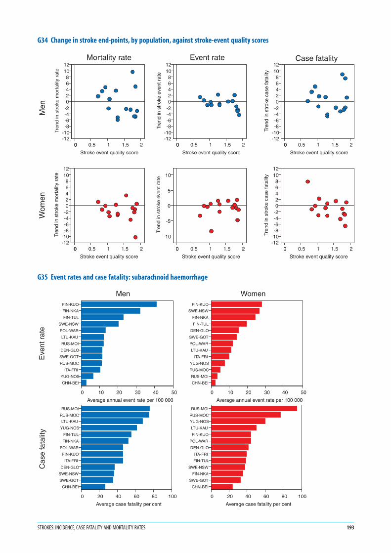
G34 Change in stroke end-points, by population, against stroke-event quality scores
G35 Event rates and case fatality: subarachnoid haemorrhage
STROKES: INCIDENCE, CASE FATALITY AND MORTALITY RATES 193
0 0.5 1 1.5 20
Stroke event quality score
-12-10-8-6-4-202468
1012
Tren
d in
str
oke
mor
talit
y ra
te
0 0.5 1 1.5 20
Stroke event quality score
-12-10-8-6-4-202468
1012
Tren
d in
str
oke
mor
talit
y ra
te
0 0.5 1 1.5 20
Stroke event quality score
-12-10-8-6-4-202468
1012
Tren
d in
str
oke
even
t rat
e
0 0.5 1 1.5 20
Stroke event quality score
-10
-5
0
5
10
Tren
d in
str
oke
even
t rat
e
0 0.5 1 1.5 20
Stroke event quality score
-12-10-8-6-4-202468
1012
Tren
d in
str
oke
case
fata
lity
0 0.5 1 1.5 20
Stroke event quality score
-12-10-8-6-4-202468
1012
Tren
d in
str
oke
case
fata
lity
Men
Wom
en
Mortality rate Event rate Case fatality
FIN-KUO
FIN-NKA
FIN-TUL
SWE-NSW
POL-WAR
LTU-KAU
RUS-MOI
DEN-GLO
SWE-GOT
RUS-MOC
ITA-FRI
YUG-NOS
CHN-BEI
0 10 20 30 40 50
Average annual event rate per 100 000
FIN-KUO
SWE-NSW
FIN-NKA
FIN-TUL
DEN-GLO
SWE-GOT
POL-WAR
LTU-KAU
ITA-FRI
YUG-NOS
RUS-MOC
RUS-MOI
CHN-BEI
0 10 20 30 40 50
Average annual event rate per 100 000
RUS-MOI
RUS-MOC
LTU-KAU
YUG-NOS
FIN-TUL
FIN-NKA
POL-WAR
FIN-KUO
ITA-FRI
DEN-GLO
SWE-NSW
SWE-GOT
CHN-BEI
0 20 40 60 80 100
Average case fatality per cent
RUS-MOI
RUS-MOC
YUG-NOS
LTU-KAU
FIN-KUO
POL-WAR
DEN-GLO
ITA-FRI
FIN-TUL
SWE-NSW
FIN-NKA
SWE-GOT
CHN-BEI
0 20 40 60 80 100
Average case fatality per cent
Men Women
Eve
nt r
ate
Cas
e fa
talit
y
1. The timing of the initial and final surveys differed by
population. These surveys were usually eight to ten
years apart but the interval could be as little as six years.
The calendar years and months varied. See G10 and
MONICA Quality assessment of age, date of examina-
tion and survey periods (1).
2. Results are shown as the estimated prevalence, or per-
centage, of daily cigarette smokers in the 34–65 age
group. The results are age-standardized to minimize
any effect of differing age structures on the apparent
findings. See #38 Population Prevalence and Trends, #39
Age Standardization, #31 Smoking.
3. The graphs characterize men and women over a thirty-
year age band in each survey for each population with
a single value, but levels and trends vary with age. Age-
specific data are available in the MONICA Data Book
of population surveys, table 6.4.3 (1), and early results
in MONICA Publication 11 (2).
4. Survey results could be influenced by failure to partic-
ipate by some of those selected for the survey. The issue
is complex, as different methods of recruitment and
sampling were used in different populations. There
is more than one definition of response rates. See
#28 Sampling, #29 Recruitment and Response Rates,
MONICA Quality assessment of participation rates,
sampling frames and fractions (1).
5. A daily cigarette smoker was someone who usually
smoked at least one cigarette a day. Comparisons of
smoking prevalence between populations are not as
simple as they may appear. In addition to the hard core
of daily cigarette smokers, easy to categorize, there are
variable numbers of additional smokers who are less
easy to classify, such as weekend or social smokers, pipe
and cigar smokers. These groups create problems in
standardizing the assessment of the prevalence of
smoking. See #31 Smoking, MONICA Quality assess-
ment of data on smoking (1), MONICA Manual Part
III, Section 1 (1).
6. Smoking is the only classical risk factor ascertained by
questionnaire. Because of the potential for conceal-
ment of smoking by ‘deceivers’ biochemical validation
was attempted in MONICA using serum thiocyanate.
See MONICA Manual Part III, Section 3 (1). This
was found to be neither sensitive nor specific, and it
was abandoned. Some centres measured expired-air-
carbon-monoxide and/or serum cotinine on all or
some of their participants. However it is questionnaire
results that are used in these analyses. See MONICA
Quality assessment of data on smoking (1).
7. The scales for men and women are the same. Smoking
prevalence was generally higher in men than in women
in the same population, with a few exceptions such as
United Kingdom-Glasgow, UNK-GLA, see #81, where
findings in the two sexes were similar. Some popula-
tions showed a large disparity in their ranking for men
and women. This is true of the two Russia-Novosibirsk
populations in the initial survey, RUS-NOC, RUS-NOI,
see #75, and China-Beijing, CHN-BEI, see #55, in the
final survey.
8. Data for these graphs are found in the MONICA Data
Book of population surveys, table 6.4.3 (1). The Data
book and the MONICA Quality assessment of data
on smoking (1) contain tables describing items of
smoking behaviour not shown here, such as the preva-
lence of never smokers and former or ex-smokers,
numbers of cigarettes smoked, and frequency of other
varieties of tobacco smoking. See the MONICA Data
Book of population surveys, tables 6.4.2–6.4.6 (1).
1. See Monograph CD-ROM or MONICA Websitehttp://www.ktl.fi/monica/.
2. Full references and summaries of MONICA Publicationsappear in #85/86.
194 MONICA MONOGRAPH AND MULTIMEDIA SOURCEBOOK
Risk factors: daily cigarette smoking

G36 Prevalence of daily cigarette smokers in the initial risk-factor survey
G37 Prevalence of daily cigarette smokers in the final risk-factor survey
RISK FACTORS: DAILY CIGARETTE SMOKING 195
RUS-NOCPOL-WARPOL-TARRUS-NOIUNK-GLABEL-CHACHN-BEI
YUG-NOSRUS-MOCSPA-CATDEN-GLOGER-BRECZE-CZE
ITA-BRIBEL-GHERUS-MOIFRA-LILSWI-TIC
LTU-KAUGER-EGEFRA-TOUUSA-STAGER-AUU
ITA-FRIFIN-KUO
FRA-STRAUS-NEWUNK-BELAUS-PERSWI-VAF
SWE-GOTFIN-TUL
GER-AURFIN-NKA
NEZ-AUCCAN-HAL
ICE-ICESWE-NSW
0 20 40 60 80 100
Percentage of daily cigarette smokers
Men
UNK-GLADEN-GLO
ICE-ICESWE-GOTUSA-STA
POL-WARUNK-BELGER-BRECAN-HAL
SWE-NSWYUG-NOS
ITA-FRIBEL-GHENEZ-AUCSWI-TIC
BEL-CHAAUS-NEWAUS-PERCZE-CZESWI-VAF
ITA-BRIGER-AUUFRA-TOUFIN-TUL
CHN-BEIGER-EGEFRA-STRFRA-LIL
RUS-MOIRUS-MOCGER-AURPOL-TARFIN-KUOFIN-NKASPA-CATLTU-KAU
RUS-NOCRUS-NOI
0 20 40 60 80 100
Percentage of daily cigarette smokers
Women
CHN-BEIRUS-NOCRUS-NOIPOL-TAR
POL-WARYUG-NOSBEL-CHA
RUS-MOCGER-BREDEN-GLOBEL-GHERUS-MOISPA-CATUNK-GLACZE-CZESWI-TIC
GER-AUULTU-KAU
ITA-BRIFRA-LIL
CAN-HALFIN-KUOFIN-TULITA-FRI
UNK-BELFIN-NKASWI-VAF
GER-EGESWE-GOTGER-AURFRA-TOUAUS-PERFRA-STR
ICE-ICEUSA-STA
AUS-NEWSWE-NSWNEZ-AUC
0 20 40 60 80 100
Percentage of daily cigarette smokers
Men
DEN-GLOUNK-GLAPOL-WAR
ICE-ICEGER-BREYUG-NOSBEL-CHA
SWE-GOTSWE-NSW
BEL-GHESWI-TIC
GER-AUUCAN-HALSWI-VAFUNK-BELCZE-CZE
ITA-BRIITA-FRI
FRA-TOUPOL-TARUSA-STAFIN-TULFRA-LIL
AUS-NEWGER-AURSPA-CATFRA-STRNEZ-AUCRUS-MOI
RUS-MOCFIN-KUO
AUS-PERFIN-NKA
GER-EGECHN-BEIRUS-NOI
RUS-NOCLTU-KAU
0 20 40 60 80 100
Percentage of daily cigarette smokers
Women

G381. Calculation of trends is explained in #38 Population
Prevalence and Trends.
2. The initial and final surveys did not take place exactly
ten years apart. G38 incorporates corrections to stan-
dardize the differences, as if they were being measured
across ten years.
3. Horizontal bars in G38 show the 95% confidence inter-
vals around the estimated 10-year trend. The smaller
the length of the bars the more precise the estimated
trend. If the bars fail to cross the zero line the estimated
trend is considered to deviate significantly from zero.
Declining trends are shown to the left of the zero line,
and increasing trends to the right.
4. Confidence intervals are similar for men and women;
the population surveys sampled them in similar
numbers.
5. G38 shows different trends in smoking between men
and women in the different populations. The majority
of male populations show a decrease in smoking, so
that the tendency is to the left of zero in 32 populations
and towards an increase, right of the zero line in five.
In women, it is a minority of populations that show a
decrease in smoking. Twelve are to the left of zero and
25 are to the right. Results varied in different age
groups. What is shown here is an age-standardized
summary statistic. Age-specific data are available in
the MONICA Data Book of population surveys,
table 6.4.4 (1).
G396. G39 is a spot map showing the geographical distribu-
tion of the results shown in G38. Half or more of the
confidence intervals in G38 include zero. The popula-
tions concerned are marked by black spots. Those with
a significant decrease in smoking levels are shown with
blue spots, while a significant increase is shown with a
red spot.
7. G39 shows little difference between the sexes outside
Europe. Within Europe however, there are no male
populations showing a significant increase in smoking
and many show a significant decrease. In women
increases and decreases are almost evenly balanced.
8. It is unlikely that smoking data of poor quality had a
significant effect on overall MONICA results. G56 (see
later) shows acceptable quality scores for most popula-
tions and little correlation in the scatter plot between
quality scores of the smoking data and the apparent
trends in smoking. See MONICA Quality assessment
of data on smoking (1).
9. Trends in cigarette smoking in the MONICA popula-
tions are the subject of MONICA Publications 34
and 42 (2); early cross-sectional data are found in
MONICA Publication 11 (2).
1. See Monograph CD-ROM or MONICA Websitehttp://www.ktl.fi/monica/.
2. Full references and summaries of MONICA Publicationsappear in #85/86.
196 MONICA MONOGRAPH AND MULTIMEDIA SOURCEBOOK
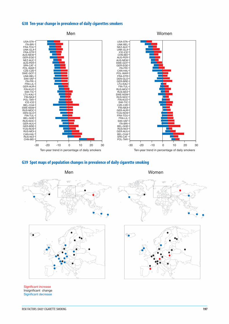
G38 Ten-year change in prevalence of daily cigarettes smokers
G39 Spot maps of population changes in prevalence of daily cigarette smoking
RISK FACTORS: DAILY CIGARETTE SMOKING 197
USA-STAITA-BRI
FRA-TOUUNK-GLAFRA-STR
AUS-NEWGER-EGENEZ-AUCAUS-PERSPA-CAT
POL-WARCZE-CZE
SWE-GOTUNK-BELSWI-VAF
ITA-FRIFRA-LIL
GER-AURFIN-KUOSWI-TIC
LTU-KAUFIN-NKA
POL-TARICE-ICE
BEL-CHASWE-NSWRUS-MOCDEN-GLO
FIN-TULBEL-GHE
RUS-NOCGER-AUUGER-BREYUG-NOSRUS-MOICAN-HALRUS-NOICHN-BEI
-30 -20 -10 0 10 20 30
Ten-year trend in percentage of daily smokers
Men
USA-STAUNK-BELNEZ-AUCUNK-GLA
ICE-ICECHN-BEI
AUS-PERAUS-NEWSWE-GOTGER-EGE
ITA-FRICAN-HAL
POL-WARFRA-STRDEN-GLOGER-BRELTU-KAUFIN-TUL
RUS-MOCRUS-MOI
SWE-NSWRUS-NOCFIN-KUOSWI-TIC
CZE-CZEFIN-NKA
GER-AURYUG-NOSFRA-TOU
FRA-LILSWI-VAF
ITA-BRIBEL-GHERUS-NOI
GER-AUUBEL-CHASPA-CATPOL-TAR
-30 -20 -10 0 10 20 30
Ten-year trend in percentage of daily smokers
Women
Men Women
Significant increaseInsignificant change Significant decrease


![Compact and Discreet - yaesu.ru · Battery Life [5-5-90 duty with battery saver]MDC-1200® Features: - MDC-1200® ANI - MDC-1200® Call Alert - MDC-1200® Sel Call - MDC-1200® Radio](https://static.fdocuments.net/doc/165x107/5e80d3de6005c20fb639820d/compact-and-discreet-yaesuru-battery-life-5-5-90-duty-with-battery-savermdc-1200.jpg)