
Mobile Email Templates: It’s time to go responsive!
22
913.888.0772 | imodules.com 913.888.0772 | imodules.com Mobile Email Templates: It’s time to go responsive! Presented by Chris Smith, Design Services Team Lead
-
Upload
derek-finch -
Category
Documents
-
view
46 -
download
0
description
Mobile Email Templates: It’s time to go responsive!. Presented by Chris Smith, Design Services Team Lead. Why bother with mobile?. Methods for our mobile madness. Mobile Friendly (Aware) Narrow Template Fluid Layout Responsive or Adaptive. Responsive techniques. Table alignment - PowerPoint PPT Presentation
Transcript of Mobile Email Templates: It’s time to go responsive!

913.888.0772 | imodules.com913.888.0772 | imodules.com
Mobile Email Templates: It’s time to go responsive!Presented by Chris Smith, Design Services Team Lead
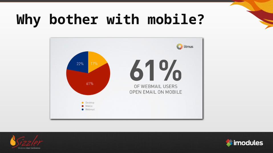
Why bother with mobile?
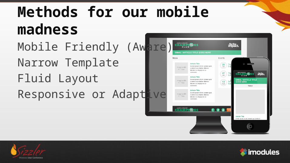
Methods for our mobile madness
Mobile Friendly (Aware)Narrow TemplateFluid LayoutResponsive or Adaptive
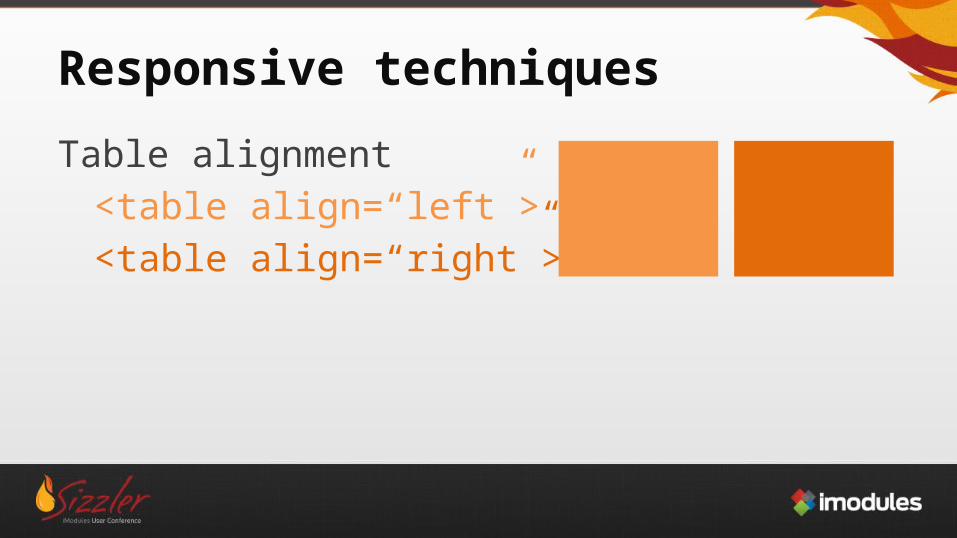
Responsive techniques
Table alignment<table align=“left”><table align=“right”>
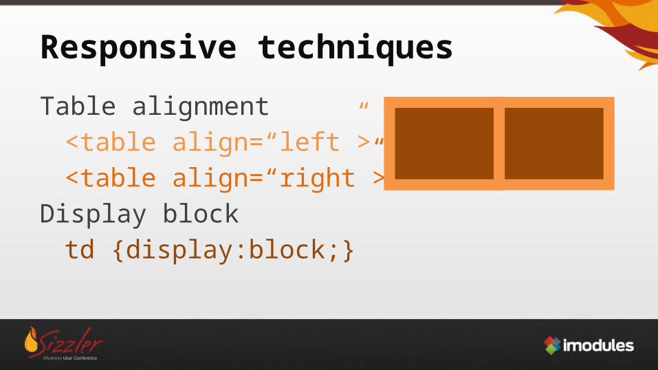
Responsive techniques
Table alignment<table align=“left”><table align=“right”>
Display blocktd {display:block;}
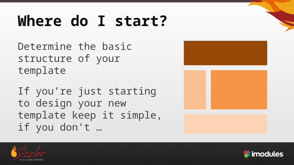
Where do I start?
Determine the basic structure of your template
If you’re just starting to design your new template keep it simple, if you don’t …
You’re going to feel like this
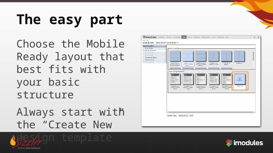
The easy part
Choose the Mobile Ready layout that best fits with your basic structure
Always start with the “Create New” design template
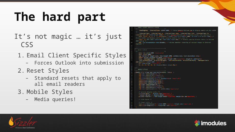
The hard part
It’s not magic … it’s just CSS1. Email Client Specific Styles
– Forces Outlook into submission
2. Reset Styles– Standard resets that apply to all
email readers
3. Mobile Styles– Media queries!
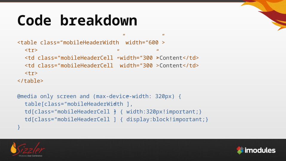
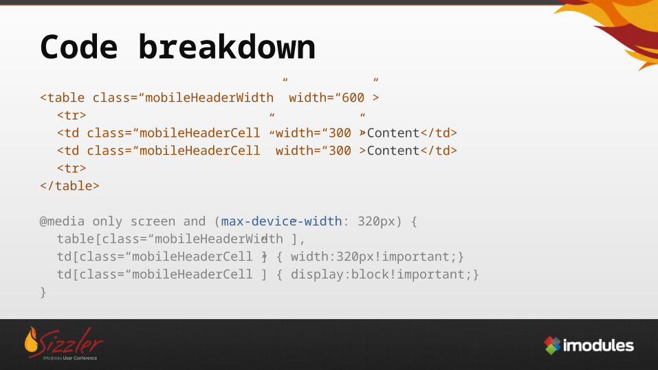
Code breakdown<table class=“mobileHeaderWidth” width=“600”>
<tr><td class=“mobileHeaderCell” width=“300”>Content</td><td class=“mobileHeaderCell” width=“300”>Content</td>
<tr></table>
@media only screen and (max-device-width: 320px) {table[class=“mobileHeaderWidth”],td[class=“mobileHeaderCell”] { width:320px!important;}td[class=“mobileHeaderCell”] { display:block!important;}
}
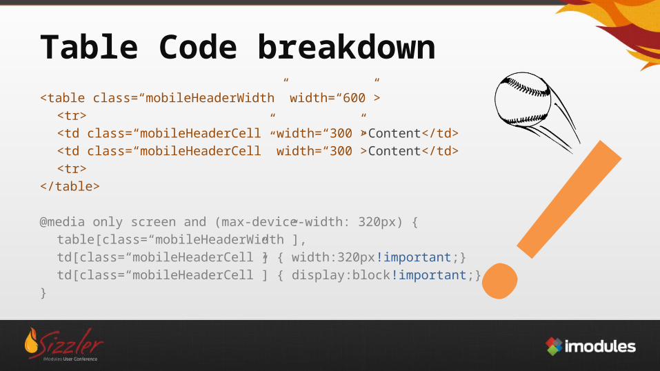
Table Code breakdown<table class=“mobileHeaderWidth” width=“600”>
<tr><td class=“mobileHeaderCell” width=“300”>Content</td><td class=“mobileHeaderCell” width=“300”>Content</td>
<tr></table>
@media only screen and (max-device-width: 320px) {table[class=“mobileHeaderWidth”],td[class=“mobileHeaderCell”] { width:320px!important;}td[class=“mobileHeaderCell”] { display:block!important;}
}
!
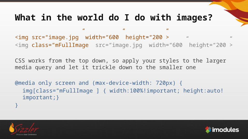
What in the world do I do with images?
<img src=“image.jpg” width=“600” height=“200”><img class=“mFullImage” src=“image.jpg” width=“600” height=“200”>
CSS works from the top down, so apply your styles to the larger media query and let it trickle down to the smaller one
@media only screen and (max-device-width: 720px) {img[class=“mFullImage”] { width:100%!important; height:auto!important;}
}
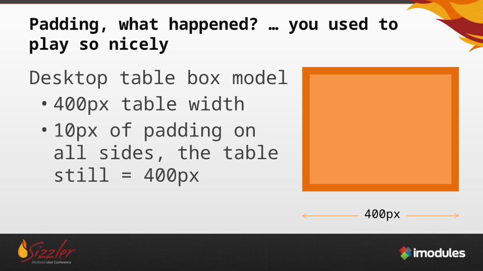
Padding, what happened? … you used to play so nicely
Desktop table box model• 400px table width• 10px of padding on all sides,
the table still = 400px
400px
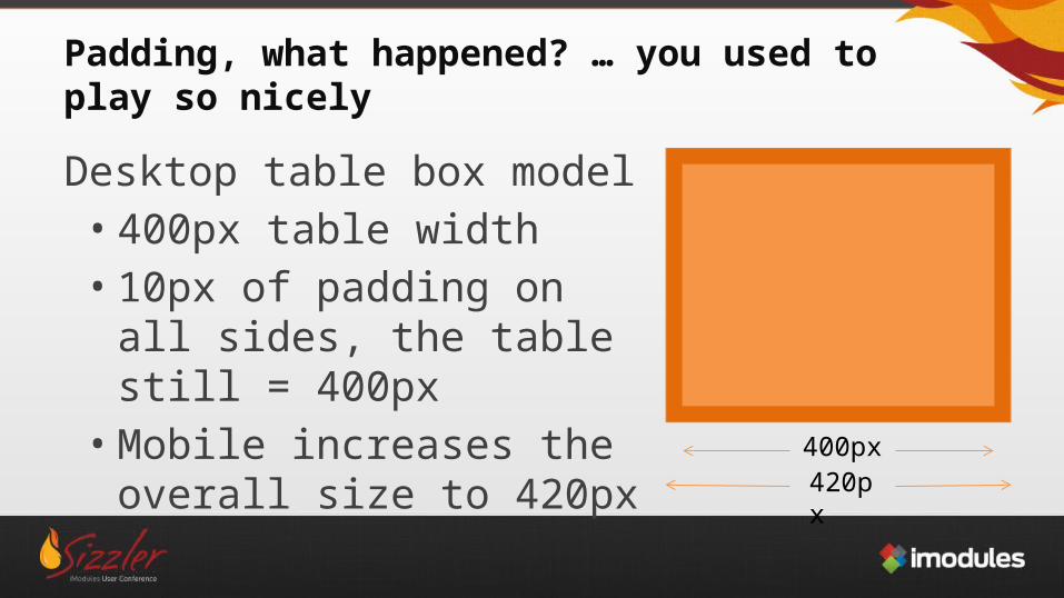
Padding, what happened? … you used to play so nicely
Desktop table box model• 400px table width• 10px of padding on all sides,
the table still = 400px• Mobile increases the overall
size to 420px 400px420px
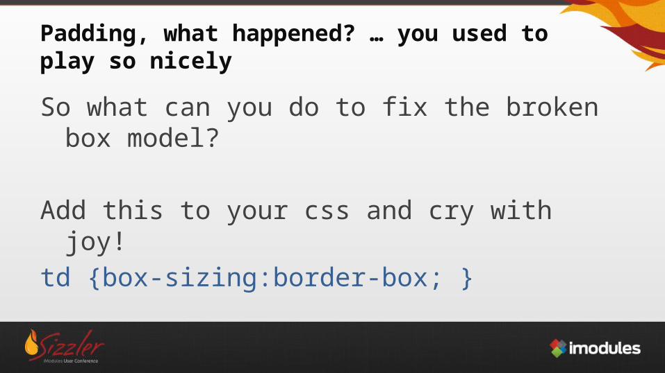
Padding, what happened? … you used to play so nicely
So what can you do to fix the broken box model?
Add this to your css and cry with joy!td {box-sizing:border-box; }
Working with Attribute SelectorsWhat to do when your classes are applied to various elements?<span class=“mHide”>Hide on mobile</span><table class=“mHide”>the rest of the table</table>
Instead of doing:@media only screen and (max-device-width: 720px) {
span[class=“mHide”],table[class=“mHide”] { display:none!important; }
}
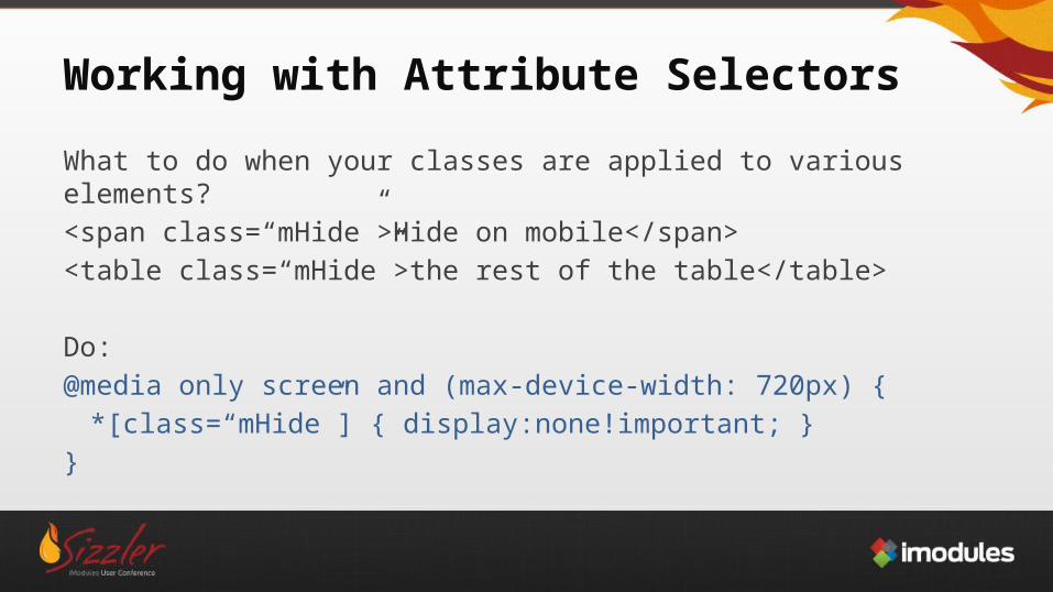
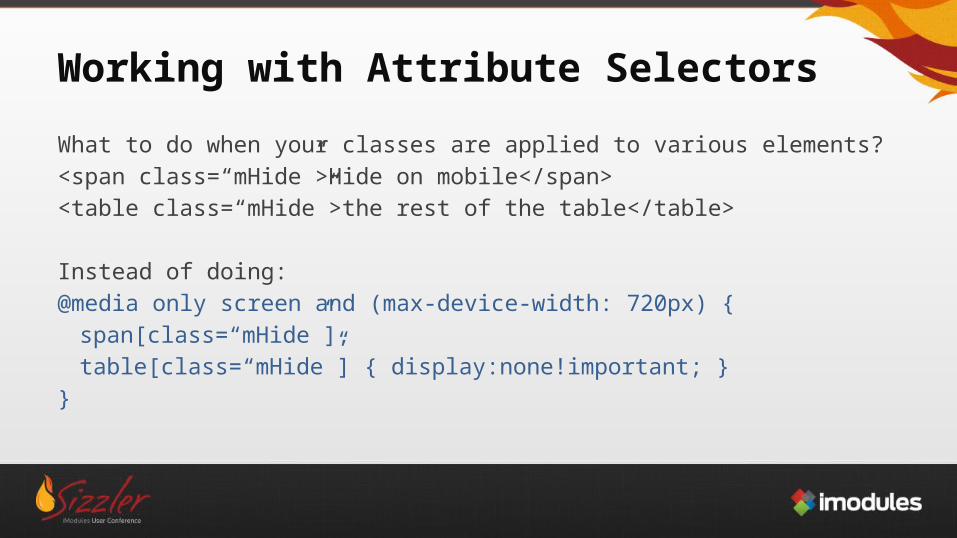
Working with Attribute Selectors
What to do when your classes are applied to various elements?<span class=“mHide”>Hide on mobile</span><table class=“mHide”>the rest of the table</table>
Do:@media only screen and (max-device-width: 720px) {
*[class=“mHide”] { display:none!important; }}
Some final tips
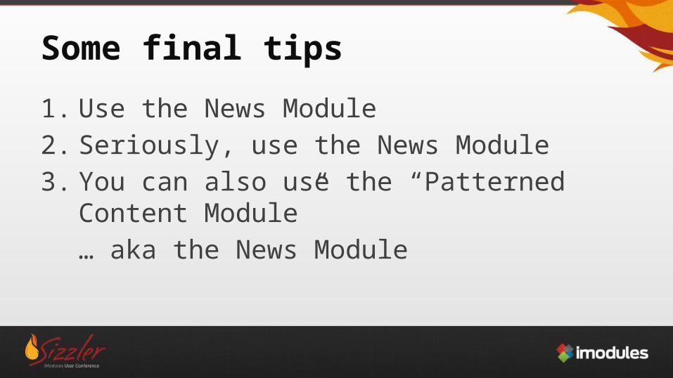
1. Use the News Module2. Seriously, use the News Module3. You can also use the “Patterned Content Module”
… aka the News Module
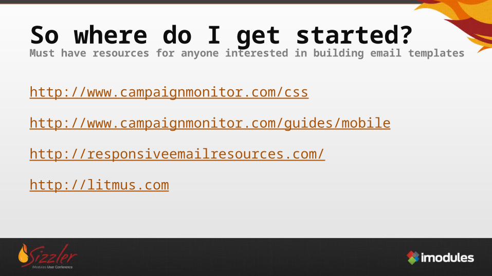
So where do I get started?Must have resources for anyone interested in building email templates
http://www.campaignmonitor.com/css
http://www.campaignmonitor.com/guides/mobile
http://responsiveemailresources.com/
http://litmus.com
913.888.0772 | imodules.com913.888.0772 | imodules.com
Questions?