Miranda Duncan Portfolio
14
MIRANDA DUNCAN PORTFOLIO
-
Upload
miry-duncan -
Category
Design
-
view
253 -
download
0
Transcript of Miranda Duncan Portfolio

MIRANDA DUNCAN
PORTFOLIO

720.879.7663 mirandaduncandesign
@gmail.com
38 Skyline Drive Wheat Ridge, Colorado 80215
CONTENTSCONTACT1 Photo Montage
2 Logo Design
3 Brochure
4 Photo Design
5 Infographic
6 Web Page Mockup
7 Prezi Presentation
8 Magazine Cover
9 Coding
10 Booklet
11 Poster Typography
12 Stationary Mockup

1
DESCRIPTION
PROGRAMS OBJECTIVE
PROCESS
COURSE
INSTRUCTOR DATE
Photoshop, Illustrator Use Photoshop to blend images, utilizing layers, blend modes, and opacity, illustrating gestalt with the overall theme.
COMM 130
Jason Stucki October 2016
Design a spiritual poster montage using a blend of images and type.
PHOTOMONTAGE
The quote alludes to changing something that is broken, so I searched for crumbling or broken brick walls. I found an angled photo of a brick wall which matched perfectly with the angle of the subject’s head. I had previously found a photo of a man laying brick and wanted utilized it as well.
I knew I wanted to make it look like the subject’s head was the surface of the brick, so I worked with several sizes and opacities of brushes in the layer mask. I used the sharpening tool on the subject’s eyes, mouth, and hair. I used a duplicate layer of brick set to overlay to make it more an earthy red than the pale, cold red it was originally. I intensified the color of the worker so the highlights weren’t as stark (he’s inside a head, after all). Lastly, I worked to create an overlapping effect of the subject’s hair coming over the brick layer.
For the typography, I initially had more of this quote on the page. I cut out a long sentence in the middle to make it more readable and interesting. I also really had to work with the kerning, eventually trying out different fonts so the lines weren’t so jagged. I settled on a much thicker font, which I think complements the script font better anyway.

BUSINESSIDENTITY
DESCRIPTION
PROGRAMS OBJECTIVE
PROCESS
COURSE
INSTRUCTOR DATE
Create a logo for a company and establish a visual identity across documents.
COMM 130
Jason Stucki
Years ago, I enjoyed making barbecue sauces with fruit (like a jam-b-q), and named it “Nan’s Wild Fruit BBQ.” This fictional company is a take on that idea.
I used Illustrator to create a rough draft of various logo sketches, and I felt that this one had the most potential. I extensively processed a photo of a butter knife in Photoshop, reducing it to a solid color, to give the letterhead and business card something other than just the Illustrator-created design.
With the letterhead, I focused on good visual flow and readability. I then set out to design the business card. I researched quite a few business card design ideas, and I think I came up with some interesting compositions. The one I chose really showcases the unique logo – thus strengthening brand recognition – and left the back not as bare as plain white.
After everything was finished, I found some mockups to really put the designs on display.
2October 2016
Illustrator, Photoshop Use Illustrator to organize and align text and images with appropriate transparencies.

DESCRIPTION
PROGRAMS OBJECTIVE
PROCESS
COURSE
INSTRUCTOR DATE
COMM 130
Jason Stucki
This brochure is for an actual business: my husband’s DJ business. He’s looking to expand his wedding reception demographic, so he wanted something elegant, something “black tie” fancy.
We sketched out several ideas together. I designed his logo in Illustrator, then went through several concepts of brochure styles. It was painstaking to watch my ideas go by the wayside, but the elegance he was looking for kept eluding me. I settled on a gate fold brochure with cutouts to make his signature white bow tie stand out. However, I was also stumped when it came to the layout of the inside. I had several restrictions because of the bow tie cutouts and the curtain cutout.
I decided to take a risk and place a block of text over a fold. I thought this out over many days, but my reasons for giving it the nod included the layout constraints previously mentioned, the fact that it would be printed on a relatively thin piece of glossy brochure paper, and how my font size is large enough that individual letters wouldn’t get lost in the crease. I placed the pictures in a way to help visual flow, and I creatively contoured the social media information to fit in the cut-out curve.
December 2016
InDesign, Photoshop, Illustrator Use InDesign in conjunction with other programs to create a brochure with cut out sections, contact information, a logo, and several photos.
Design a brochure for a company.
BROCHURE
3

DESCRIPTION
PROGRAMS OBJECTIVE
PROCESS
COURSE
INSTRUCTOR DATE
COMM 130
Jason Stucki
I began with the quote. I knew I wanted something you wouldn’t see on an inspirational poster. I found a quote attributed to Chuck Norris, and I loved it for its strong relationship to something tangible: steel.
I drove to downtown Denver to take pictures of the old steel railroad bridges spanning Cherry Creek. I found an angle which highlighted the vanishing point effect of the angled girders above. While incorporating various design elements, I discovered that I didn’t want anything curved, because that seemed to take away from the solid effect I was after. I explored straight line and found that continuing the angles of the girders with design elements created a 3-D effect as well as additional depth when “shaded” with darker colors within the color scheme.
Then I added the text. I wanted something strong and in caps for “Steel.” I figured I could go with a decorative font since it was a single word, and I added some subtle elements to make it stand out. After playing with the alignment and contrast of the text color, as well as changing the fonts a few dozen times, I finished by placing the name of the color scheme and the swatches in concert with the angles and the rivets in the steel.
Use a well-composed photograph I had taken to create a design within Photoshop using tasteful typography and a harmonizing color scheme.
October 2016
Photoshop
By using photography and design skills, create a project that encompasses a consistent color scheme from the image.
PHOTODESIGN
4

DESCRIPTION
PROGRAMS OBJECTIVE
PROCESS
COURSE
INSTRUCTOR DATE
Use Photoshop to blend images, utilizing layers, blend modes, and opacity, illustrating gestalt with the overall theme.
COMM 130
Jason Stucki November 2016
Illustrator
I remembered reading a great article on how to make better pizza at home. It talked about the main differences between pizzerias and home kitchens, but it pointed out how a few small adjustments can make a major difference in the taste of homemade pie.
I narrowed down the steps to six: toppings, cheese, sauce, dough, pan, and heat. These were the essentials. I listed a few thoughts on each category and began to brainstorm-sketch. I thought about do’s and don’ts, examples, best practices, etc. Once I sketched a page of thoughts and icons, I began to sketch some layout designs.
I wanted to avoid the red-green pizza colors, so I used something more striking and vibrant. I completely re-did the layout about halfway through, struggling every step to simplify things. The end result has a cartoony, accessible feel to it, which is the whole point: you can make great pizza in your own kitchen.
Create an infographic that organizes data in a visually pleasing way.
INFOGRAPHIC
5

DESCRIPTION
PROGRAMS OBJECTIVE
PROCESS
COURSE
DATE
COMM 130
InDesign, Photoshop, Illustrator
INSTRUCTORJason Stucki November 2016
Use InDesign to organize front-end data, creating an engaging homepage with several photos and other elements.
This project was unique. I learned the most during this creation process because I had several iterations and many learning curves. I learned to do more research in the beginning. I searched for other jams’ websites to see what worked and what ratio of text to images I should be using. What did their headers look like? Did they use columns? How many? How did they incorporate their color scheme?
I researched Smuckers, E.D.Smith, and Bonnie’s Jams, and I found many similarities between the first two; namely, a solid and small header bar, a smaller-than-I-thought logo, pictures as integral, full-width elements, and equal amounts of real estate given to pictures and text.
I chose to utilize the original color scheme for main elements, but I used a complementary color for the background. I also customized social media icons for this site and changed the specific fonts. I added a burlap texture to the background, which goes nicely with the main picture. I edited the photos in Photoshop so they had similar contrast and vibrance. The bold action buttons - “Buy Now” and social media icons - keep sales and marketing in mind.
Design a website homepage using a grid.
WEB PAGEMOCKUP
6

DESCRIPTION
PROGRAMS OBJECTIVE
PROCESS
COURSE
INSTRUCTOR DATE
COMM 130
Jason Stucki October 2016
Use Prezi to illustrate a concept, bringing in images both created by me and stock images.
Prezi, Photoshop, Illustrator
I initially began by thinking of the background as something I could anchor my frames with, but I quickly learned this is not the case. I was frustrated at first that I had to use both Illustrator and Photoshop in addition to Prezi; however, I found this gives more freedom and ability to customize than Prezi alone.
I chose another of my sketched layouts – the very simplistic numeral design. I chose a neutral-color background, and I liked the short field of view serving as a nice variation to the otherwise ho-hum pattern. I then used Illustrator to create templates for my numbers and titles. I used a sans serif font for the central “4”, extending anchor points on the stem at the bottom to accommodate for more lines of adjacent text. A serif font (Bodoni) was used for the other numbers. All numbers were a dark purple color.
I used various license-free pictures from the internet, as well as a YouTube clip to add variety. The subtitles were lime green and an in-program typeface called Fira Sans. I utilized Prezi’s fade-in effect to better display the elements on each frame (other effects come with paid memberships).
Create an instructional presentation using the Prezi software to demonstrate its features and capabilities
7
PREZIPRESENTATION

DESCRIPTION
PROGRAMS OBJECTIVE
PROCESS
COURSE
INSTRUCTOR DATE
COMM 130
Jason Stucki September 2016
InDesign, Photoshop Use InDesign to compose a magazine cover which demonstrates conceptual typography.
I began by looking at TIME, Discover, and Taste of Home for cover ideas, and I liked the casual feel of Taste of Home best. I switched to my own idea for a magazine title because the Taste of Home masthead just wasn’t working with the background photo I had. I initially went with a serif font for the main title, but I changed to sans serif because it was looking too formal. Plus, I love the compact curves and perfect circles with the font I chose, because it seemed to reflect cooking hardware (pans, etc.). “Cookworks” describes what makes a cook tick, so not just life in the kitchen but the overall life of a cook.
I took several photos in full sun of myself and a frying pan. Moving to Photoshop, I finessed the photos to compose the cover. I took out stray hairs, touched up some areas on my face, and muted the reflection on my glasses. I also gave my lips a deep pink hue found in my sunglasses frame.
I set up the wireframe with InDesign, placed the photo, and began to work with the title first, the articles next, and the barcode last. I then added the solid color bars on the top and bottom of the page and put additional story titles within.
Design a magazine cover that showcases a self-portrait as well as articles about yourself.
8
MAGAZINECOVER
DESCRIPTION
PROGRAMS OBJECTIVE
PROCESS
COURSE
INSTRUCTOR DATE
COMM 130
Jason Stucki November 2016
Use HTML and CSS to showcase a logo, demonstrating a color scheme and positional coding.
Notepad++, Mozilla Firefox
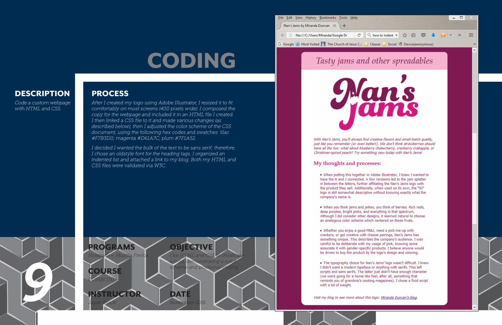
After I created my logo using Adobe Illustrator, I resized it to fit comfortably on most screens (400 pixels wide). I composed the copy for the webpage and included it in an HTML file I created. I then linked a CSS file to it and made various changes (as described below), then I adjusted the color scheme of the CSS document, using the following hex codes and swatches: lilac #F7B3D0; magenta #D61A7C; plum #7F1A52.
I decided I wanted the bulk of the text to be sans serif; therefore, I chose an oldstyle font for the heading tags. I organized an indented list and attached a link to my blog. Both my HTML and CSS files were validated via W3C.
Code a custom webpage with HTML and CSS.
9
CODING

DESCRIPTION
PROGRAMS OBJECTIVE
PROCESS
COURSE
INSTRUCTOR DATE
The research and design of this booklet began with finding a talk that I could extrapolate my elements from. “Is It Still Wonderful to You?” is the name of the talk I chose, and I envisioned “upward” elements. I chose a simple right triangle as my main element and began brainstorming how to incorporate this shape in other ways, such as my text blocks.
Using complementary fonts and contrasting sizes, I separated different ideas into easily scan-able sections and used colored side bars to maintain consistency. I also utilized the center spread by adding a photo of the talk’s author - again, in a triangle shape. This booklet prints beautifully and is intended to be a gift.
Debbie Funk
Use InDesign to create several pages, elements, and text boxes in various shapes, utilizing the center spread.
July 2015
ART 230
InDesign
Create a booklet to showcase a thematic discourse.
10
BOOKLET

DESCRIPTION
PROGRAMS OBJECTIVE
PROCESS
COURSE
INSTRUCTOR DATEJune 2015Debbie Funk
ART 230
Illustrator Use Illustrator to compose a visual representation of mass quantities of facts and text.
Create a large poster to display large amounts of information.
I researched railroads generally, looking for a theme to use in my poster. I decided to design a map of the United States and include railroads from each state.
I loosely traced over a map using Illustrator, then doubled the lines and created ties to bring in the concept of railways. The data is organized alphabetically by state, so the viewer could see tourist railway destinations by areas represented on the map. I made the illustration’s lines and font relatively very thick to balance the text-heavy bottom half.
Since there was copious amounts of information, I wanted to keep the design simple so it wasn’t overwhelming. I chose black and white as the color scheme due to this thought process as well. The mockup shows the well-balanced real estate between white space, illustration, and text.
11
POSTERTYPOGRAPHY

DESCRIPTION
PROGRAMS OBJECTIVE
PROCESS
COURSE
INSTRUCTOR DATE
After several sketches and many iterations within Illustrator, I began focusing on the lower-case version of my initials. I attempted to weave the “m” into the “d” to give an interlocked effect, but the thickness of each letter’s elements took a lot of thought and effort. The weave didn’t come out as obvious as I was hoping for, but I realized that what I had created was still as interlocked as I had envisioned in the beginning.
The stark contrast between the peach-pink and solid black made the business card a straightforward design, bringing block elements in to center the logo. This pattern of centering the logo is echoed in the letterhead and envelope, with all elements shifted to a left-aligned side bar.
I created a pattern out of the logo for the back of the business card to keep it from getting lost in a wallet, and added this pattern to the inside of the envelope.
Illustrator
Create a personal logo and business identity.
Use Illustrator to decompose letters and combine with other letters to form a personal logo; apply this logo in various forms to create personal stationary.ART 230
May 2015Debbie Funk12
PERSONALLOGO