MicroStrategy Academic Program - Virginia · PDF filemicrostrategy.com 1 DATA OVERY...
34
ENTERPRISE-READY DATA DISCOVERY APPROXIMATE TIME NEEDED: 1 HOUR MicroStrategy Academic Program Creating a center of excellence for enterprise analytics and mobility.
-
Upload
trinhquynh -
Category
Documents
-
view
213 -
download
0
Transcript of MicroStrategy Academic Program - Virginia · PDF filemicrostrategy.com 1 DATA OVERY...

microstrategy.com 1
| ENTERPRISE-READY DATA DISCOVERY
ENTERPRISE-READY DATA DISCOVERYAPPROXIMATE TIME NEEDED: 1 HOUR
MicroStrategy Academic Program
Creating a center of excellence for enterprise analytics and mobility.
microstrategy.com 2
| ENTERPRISE-READY DATA DISCOVERY
INTRODUCTION
BikePort, a national bicycle distribution company,
is preparing for their Annual Cycling Convention
where they present new products and features to
prospects and customers. Prior to the convention,
the Vice President of Operations wants to
understand the largest clients of BikePort to
arrange meetings with individuals to thank them
for their support. He asks you to help identify the
top clients.
The VP would also like to gain insight on the
lagging accounts so he can redeploy his sales
representatives to better serve those accounts.
You will create a presentation-ready dashboard
using MicroStrategy Desktop, which you will
present to the VP.
microstrategy.com 3
| ENTERPRISE-READY DATA DISCOVERY
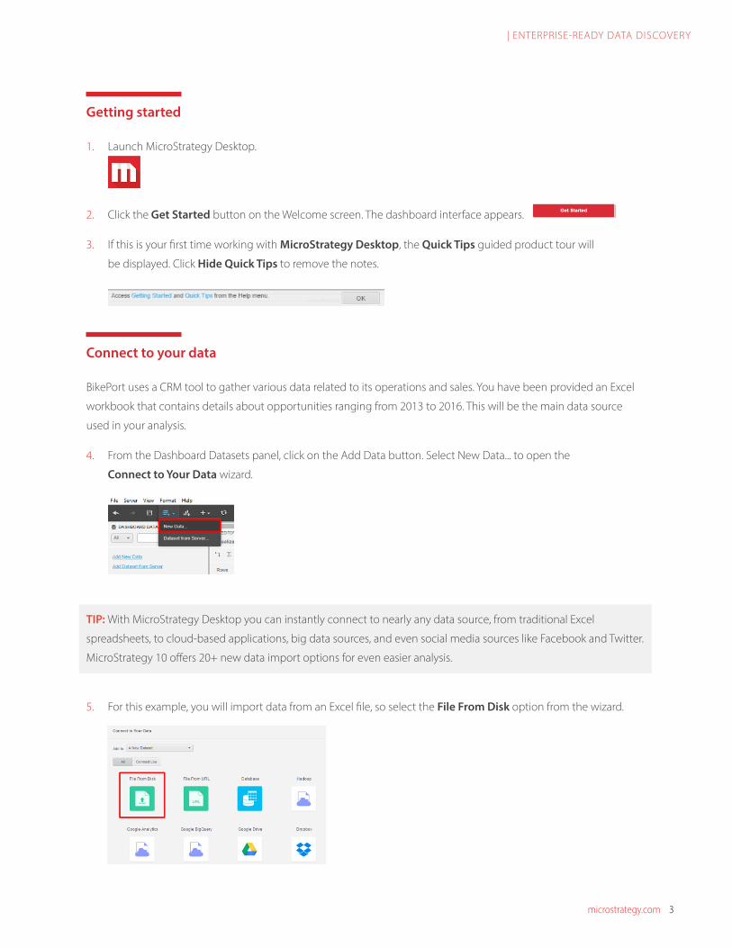
Getting started
1. Launch MicroStrategy Desktop.
2. Click the Get Started button on the Welcome screen. The dashboard interface appears.
3. If this is your first time working with MicroStrategy Desktop, the Quick Tips guided product tour will
be displayed. Click Hide Quick Tips to remove the notes.
Connect to your data
BikePort uses a CRM tool to gather various data related to its operations and sales. You have been provided an Excel
workbook that contains details about opportunities ranging from 2013 to 2016. This will be the main data source
used in your analysis.
4. From the Dashboard Datasets panel, click on the Add Data button. Select New Data... to open the
Connect to Your Data wizard.
TIP: With MicroStrategy Desktop you can instantly connect to nearly any data source, from traditional Excel
spreadsheets, to cloud-based applications, big data sources, and even social media sources like Facebook and Twitter.
MicroStrategy 10 offers 20+ new data import options for even easier analysis.
5. For this example, you will import data from an Excel file, so select the File From Disk option from the wizard.

microstrategy.com 4
| ENTERPRISE-READY DATA DISCOVERY
6. After selecting your data source, click Choose Files to browse your local machine.
7. Browse to the SalesOpps.xlsx file, select it, and click Open. The file should be located
in the workshop materials folder provided to you preceding this lesson.
8. Select the Prepare Data button in the dialog box to enhance the data you are importing.
TIP: If an Excel file has several different sheets, you can check multiple sheets via the Select Worksheets window to import
them. Each sheet will be treated as a different table within the dataset, allowing you to create joins between tables.
After the data source loads, you will be taken to the Preview window, which contains information about the attributes
and metrics included in your dataset(s). Note that each attribute and metric is clearly denoted. Attributes are
represented by a green icon, while icons are represented by an orange icon. The provided dataset contains various
location data related to opportunities as well as metrics related to each opportunity.
TIP: MicroStrategy automatically maps the columns as attributes and metrics. Attributes provide a business model with
context to report on. Metrics represent business measures and key performance indicators (KPIs). If changes to any
content or data types of the attributes or metrics are needed, they can be performed manually in the Preview window.

microstrategy.com 5
| ENTERPRISE-READY DATA DISCOVERY
9. In order to display the actual columns in the dataset, click on the Expand Preview arrow adjacent to
“SalesOpps.xlsx” to expand the Preview window.
Now you can see the full attribute and metric columns. Note that the Preview window shows data for the first 50
rows in the dataset. This gives you a general idea of the data you’re working with.
Prepare your data
The data you’re trying to input needs to be cleaned up with correct formatting before you can start analyzing the
data. The new Data Wrangling tool enables you to quickly sanitize the data without ever leaving the MicroStrategy
Desktop environment.
10. On the Preview screen, select the blue Wrangle link to refine your data.
microstrategy.com 6
| ENTERPRISE-READY DATA DISCOVERY
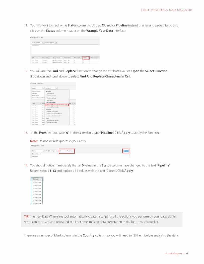
11. You first want to modify the Status column to display Closed or Pipeline instead of ones and zeroes. To do this,
click on the Status column header on the Wrangle Your Data interface.
12. You will use the Find and Replace function to change the attribute’s values. Open the Select Function
drop down and scroll down to select Find And Replace Characters In Cell.
13. In the From textbox, type “0”. In the to textbox, type “Pipeline”. Click Apply to apply the function.
Note: Do not include quotes in your entry.
14. You should notice immediately that all 0 values in the Status column have changed to the text “Pipeline”.
Repeat steps 11-13 and replace all 1 values with the text “Closed”. Click Apply.
TIP: The new Data Wrangling tool automatically creates a script for all the actions you perform on your dataset. This
script can be saved and uploaded at a later time, making data preparation in the future much quicker.
There are a number of blank columns in the Country column, so you will need to fill them before analyzing the data.

microstrategy.com 7
| ENTERPRISE-READY DATA DISCOVERY
15. Using the scroll bar at the bottom of the table, scroll to the right until you see the Country column. Select the
Country column by clicking on it, then click on the Fill Down option in the Suggested Operations window to
fill the rest of the columns with “USA”. Since we know this data is related to only the United States region, we can
infer any rows missing “USA” were recorded incorrectly.
Next, you will replace a Stage Name number with a proper stage name.
16. Select the downward facing arrow to the right of Stage Name in the column and click on the Text Selector
option in the dropdown menu.
17. The Text Facet window will appear below the table Using this window, you can change a batch of row data all
at once. Select 5 from the window and then click on Edit.
18. After selecting Edit, change the text from 5 to Negotiation. Select Apply To All or press Enter on your keyboard.
microstrategy.com 8
| ENTERPRISE-READY DATA DISCOVERY
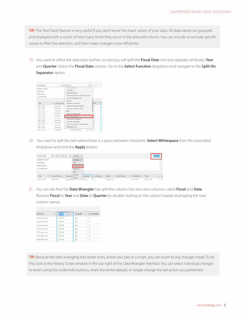
TIP: The Text Facet feature is very useful if you don’t know the exact values of your data. All data values are grouped
and displayed with a count of how many times they occur in the selected column. You can include or exclude specific
values to filter the selection, and then make changes more efficiently.
19. You want to refine the data even further, so next you will split the Fiscal Date into two separate attributes, Year
and Quarter. Select the Fiscal Date column. Go to the Select Function dropdown and navigate to the Split On
Separator option.
20. You want to split the text where there is a space between characters. Select Whitespace from the associated
dropdown and click the Apply button.
21. You can see that the Data Wrangler has split the column into two new columns, called Fiscal and Date.
Rename Fiscal to Year and Date to Quarter by double clicking on the column header and typing the new
column names.
TIP: Because the data wrangling tool stores every action you take in a script, you can revert to any changes made. To do
this, look at the History Script window in the top right of the Data Wrangler interface. You can select individual changes
to revert using the undo/redo buttons, revert the entire dataset, or simply change the last action you performed.
microstrategy.com 9
| ENTERPRISE-READY DATA DISCOVERY
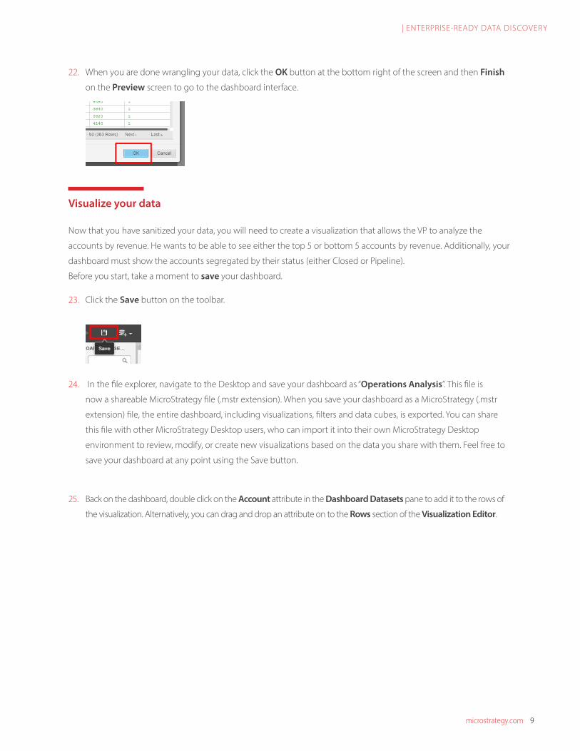
22. When you are done wrangling your data, click the OK button at the bottom right of the screen and then Finish
on the Preview screen to go to the dashboard interface.
Visualize your data
Now that you have sanitized your data, you will need to create a visualization that allows the VP to analyze the
accounts by revenue. He wants to be able to see either the top 5 or bottom 5 accounts by revenue. Additionally, your
dashboard must show the accounts segregated by their status (either Closed or Pipeline).
Before you start, take a moment to save your dashboard.
23. Click the Save button on the toolbar.
24. In the file explorer, navigate to the Desktop and save your dashboard as “Operations Analysis”. This file is
now a shareable MicroStrategy file (.mstr extension). When you save your dashboard as a MicroStrategy (.mstr
extension) file, the entire dashboard, including visualizations, filters and data cubes, is exported. You can share
this file with other MicroStrategy Desktop users, who can import it into their own MicroStrategy Desktop
environment to review, modify, or create new visualizations based on the data you share with them. Feel free to
save your dashboard at any point using the Save button.
25. Back on the dashboard, double click on the Account attribute in the Dashboard Datasets pane to add it to the rows of
the visualization. Alternatively, you can drag and drop an attribute on to the Rows section of the Visualization Editor.
microstrategy.com 10
| ENTERPRISE-READY DATA DISCOVERY
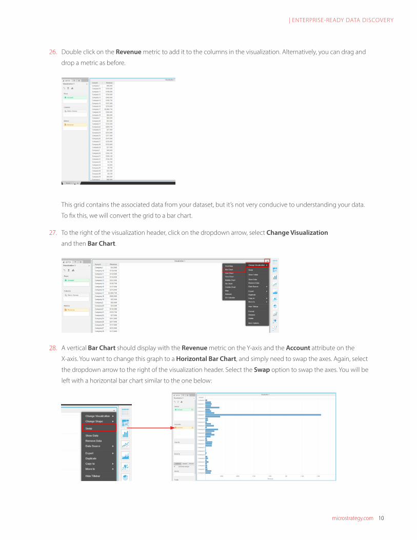
26. Double click on the Revenue metric to add it to the columns in the visualization. Alternatively, you can drag and
drop a metric as before.
This grid contains the associated data from your dataset, but it’s not very conducive to understanding your data.
To fix this, we will convert the grid to a bar chart.
27. To the right of the visualization header, click on the dropdown arrow, select Change Visualization
and then Bar Chart.
28. A vertical Bar Chart should display with the Revenue metric on the Y-axis and the Account attribute on the
X-axis. You want to change this graph to a Horizontal Bar Chart, and simply need to swap the axes. Again, select
the dropdown arrow to the right of the visualization header. Select the Swap option to swap the axes. You will be
left with a horizontal bar chart similar to the one below:

microstrategy.com 11
| ENTERPRISE-READY DATA DISCOVERY
29. You now want to create a derived metric called Profit. Right click on the COGS metric in the Dashboard
Dataset pane and select Create Metric…
30. The Metric Editor will open. Rename the new metric to Profit in the Metric Name textbox. Double click the
Revenue metric to add it to the formula window.
31. Select the Subtraction (-) icon and then double click the COGS metric. Your formula should read: Revenue –
COGS. Select the Save button to save the Profit metric.
32. You want to create another derived metric that incorporates the Profit derived metric you just
created. Right click on a metric and select Create Metric… just as in the previous steps.

microstrategy.com 12
| ENTERPRISE-READY DATA DISCOVERY
Name the metric Margin % and select the metric Profit, then the Division icon ( ) followed by the Revenue
metric to build the formula: Profit / Revenue. Click Save to return back to the dashboard.
33. You need to change the Number Format of both the Profit metric and the Margin % metric in order to display
the data correctly. In the Dashboard Datasets sidebar on the left of the screen, right click the Profit metric and
select Number Format.
34. In the Number Format pop-out, select Currency from the top dropdown box, and then click OK.

microstrategy.com 13
| ENTERPRISE-READY DATA DISCOVERY
Note: Ensure that the Preview number doesn’t show any decimals ($1,234 is correct). If decimals are present,
use the Decrease Decimal button to reduce the number of decimals.
35. Following steps 33 through 34 from above, change the Number Format of the Margin % metric to a
Percentage with no decimal places.
Note: Both the Margin % and Profit metrics will be used later in the dashboard.
36. Rename your visualization to Accounts by Revenue by double clicking on the visualization header
(currently displayed as Visualization 1) and replacing the text. Press Enter to apply the change.
Your visualization should look similar to the one below:
The first visualization contains generic company names with their company revenue, in order for the VP to
recognize the real customer names we have to add an additional dataset to that visualization.
Now is a good time to Save your progress.

microstrategy.com 14
| ENTERPRISE-READY DATA DISCOVERY
Connect to your data, part II
You know that BikePort is using a CRM tool to gather sales data; however, you have just learned that the related
account data is stored within a separate file in a Dropbox account. You have been given the necessary credentials to
retrieve this data.
37. Add a new dataset to your dashboard by selecting New Data… via the Add Data icon on the toolbar.
38. From the available options, choose Dropbox to import data from a Dropbox account.
Note: If internet connectivity is unavailable please use the Import File From Disk option rather than Dropbox.
The AcctNames.xlsx file is located in the previously distributed Supporting Files folder.
39. Using the 3rd Party Data Source Authentication wizard, sign in to Dropbox with the following credentials and
then select Sign in.
Log in with the following credentials: Username: [email protected] Password: mstrWorkshop16
40. Click Allow for the API Request Authentication to access the files in the Dropbox account.

microstrategy.com 15
| ENTERPRISE-READY DATA DISCOVERY
41. Drag and drop the AcctNames.xlsx file into the selection window, and then click Finish to import this second dataset.
Prepare your data, part II
Even though the second dataset you imported is related to the opportunity data, it is not directly linked. You must
first create a linkage between both datasets using a common data element.
42. Right click on the Account attribute in the AcctNames.xlsx dataset and select Link to Other Dataset…
43. In the Link Attributes wizard, select the Account attribute from the SalesOpps dataset, and then click OK. This
will link the Account attributes between the two different datasets.
TIP: This linking process is important because it enables the data to interact seamlessly across different datasets. If
you were to skip this step, the relationship between the two Account attributes wouldn’t exist, making it difficult to
blend the data for analysis.

microstrategy.com 16
| ENTERPRISE-READY DATA DISCOVERY
44. You want to replace the Account column on the grid with the Account Name attribute from the newly linked
dataset. Drag and drop Account Name directly onto the green Account attribute box in the Editor tab to
replace the attribute. Without replacing the Account with Account Name, you would be left with a number of
non-descriptive accounts (ex: Company12, Company13, etc.), making your visualization harder to decipher.
You should be left with a visualization similar to the one below:
45. You only want to see data for the year 2015. You can accomplish by using a dashboard- wide filter. Select the
Filter tab and then drag the Year attribute into the Filter window.
microstrategy.com 17
| ENTERPRISE-READY DATA DISCOVERY
TIP: The filter panel affects all visualizations in the currently selected sheet. You can add multiple attribute or metric
filters to this panel, and each will impact the results on all visualizations.
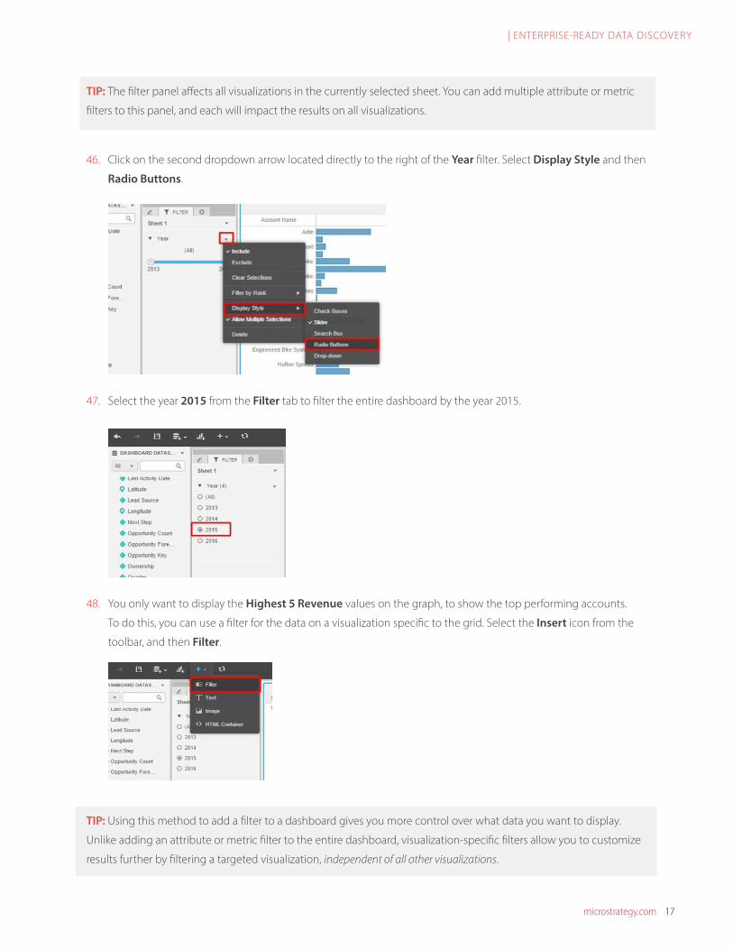
46. Click on the second dropdown arrow located directly to the right of the Year filter. Select Display Style and then
Radio Buttons.
47. Select the year 2015 from the Filter tab to filter the entire dashboard by the year 2015.
48. You only want to display the Highest 5 Revenue values on the graph, to show the top performing accounts.
To do this, you can use a filter for the data on a visualization specific to the grid. Select the Insert icon from the
toolbar, and then Filter.
TIP: Using this method to add a filter to a dashboard gives you more control over what data you want to display.
Unlike adding an attribute or metric filter to the entire dashboard, visualization-specific filters allow you to customize
results further by filtering a targeted visualization, independent of all other visualizations.
microstrategy.com 18
| ENTERPRISE-READY DATA DISCOVERY
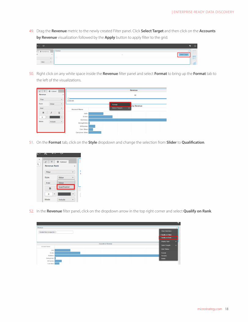
49. Drag the Revenue metric to the newly created Filter panel. Click Select Target and then click on the Accounts
by Revenue visualization followed by the Apply button to apply filter to the grid.
50. Right click on any white space inside the Revenue filter panel and select Format to bring up the Format tab to
the left of the visualizations.
51. On the Format tab, click on the Style dropdown and change the selection from Slider to Qualification.
52. In the Revenue filter panel, click on the dropdown arrow in the top right corner and select Qualify on Rank.

microstrategy.com 19
| ENTERPRISE-READY DATA DISCOVERY
53. Ensure the Highest option from the dropdown menu is selected, and then type in the number “5”, followed by
Enter. This selector has the flexibility to select the worst performing accounts as well.
54. Change the name of the Revenue filter to Revenue Rank by double clicking on the current header.
55. Right-click on the Revenue metric on the x-axis of the bar chart and select Sort Descending. This will sort the
bar chart starting with the highest revenue first.
56. Create another filter for the visualization using the process described in step 48. This visualization will filter
the Accounts by Revenue chart based on the account status (either Closed or Pipeline). Drag the attribute
Status onto the filter panel. Click Select Target, and point to the Accounts by Revenue chart. Click Apply.
57. With the Status Filter selected, click the Style dropdown under the Format tab. Select Button Bar to change
the style of the filter.
microstrategy.com 20
| ENTERPRISE-READY DATA DISCOVERY
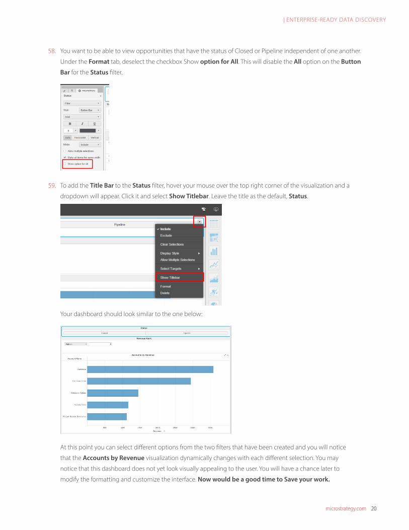
58. You want to be able to view opportunities that have the status of Closed or Pipeline independent of one another.
Under the Format tab, deselect the checkbox Show option for All. This will disable the All option on the Button
Bar for the Status filter.
59. To add the Title Bar to the Status filter, hover your mouse over the top right corner of the visualization and a
dropdown will appear. Click it and select Show Titlebar. Leave the title as the default, Status.
Your dashboard should look similar to the one below:
At this point you can select different options from the two filters that have been created and you will notice
that the Accounts by Revenue visualization dynamically changes with each different selection. You may
notice that this dashboard does not yet look visually appealing to the user. You will have a chance later to
modify the formatting and customize the interface. Now would be a good time to Save your work.
microstrategy.com 21
| ENTERPRISE-READY DATA DISCOVERY
Visualize your data, part II
BikePort is a national company that has accounts in a number of different states. Your VP is also planning to meet
with the sales team during the conference to reward the most successful regional sales teams. In order to determine
the top performing region, you must discover which regions in the US have had the most sales during the past year.
Although revenue is a key driver for the organization the VP is also interested in understanding the operating margin
associated with each region. You have decided that a regional map would be the best visualization to highlight the
results. MicroStrategy Desktop enables the use of ESRI Maps, which are very effective visualizations when working
with location-specific data.
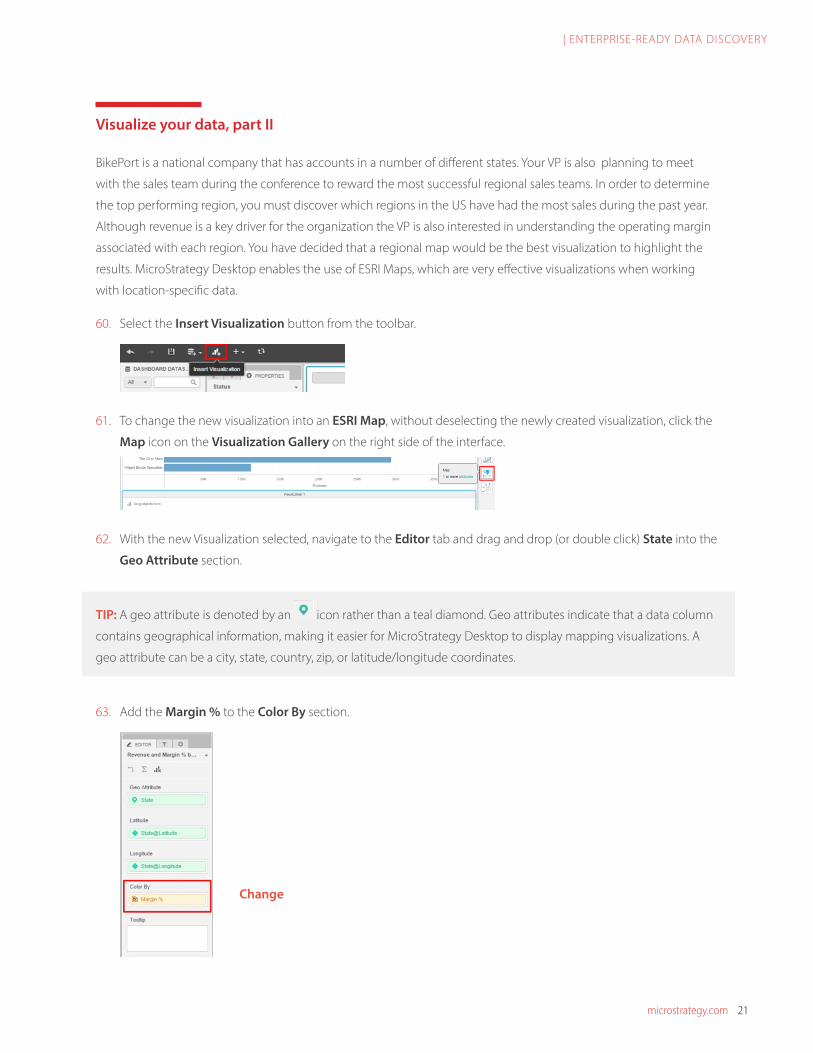
60. Select the Insert Visualization button from the toolbar.
61. To change the new visualization into an ESRI Map, without deselecting the newly created visualization, click the
Map icon on the Visualization Gallery on the right side of the interface.
62. With the new Visualization selected, navigate to the Editor tab and drag and drop (or double click) State into the
Geo Attribute section.
TIP: A geo attribute is denoted by an icon rather than a teal diamond. Geo attributes indicate that a data column
contains geographical information, making it easier for MicroStrategy Desktop to display mapping visualizations. A
geo attribute can be a city, state, country, zip, or latitude/longitude coordinates.
63. Add the Margin % to the Color By section.
Change

microstrategy.com 22
| ENTERPRISE-READY DATA DISCOVERY
64. In the Format tab for the ESRI Map visualization, select the top-most dropdown and ensure you have Map
Options choice selected.
65. Select the Graphic type dropdown and then the Bubbles option.
Note: The Bubbles option is useful for displaying two metrics at once in a single map. One metric can impact the
size of each bubble and the other metric can change the color of each bubble.
66. Add the Revenue metric to the Size By section of the Editor panel. Your Editor panel should look similar to the
one below:

microstrategy.com 23
| ENTERPRISE-READY DATA DISCOVERY
67. Rename the visualization to Revenue and Margin % by State by double clicking on the Visualization 1 header.
68. Change the visualization Style from the default Light Gray to the Street style. This style provides a more
detailed map view, down to the street level. Select the Styles dropdown menu from inside the map visualization,
and then select the top-left choice, called Street.
69. Now is a good time to clean up the placement of each visualization. MicroStrategy Desktop lets you
dynamically move and resize each visualization to make your dashboard more visually appealing.
To move a visualization, click and hold on the individual visualization header name and release your mouse
when you have selected a valid position. Blue lines will appear when you hover over a valid movement position.
Try to get your dashboard to look like the one below:
Now would be a good time to save your work.

microstrategy.com 24
| ENTERPRISE-READY DATA DISCOVERY
Visualize your data, part III
Next, you will create a grid that contains key metrics broken down by state. This grid will be filtered directly by the
map you just created, in order to create a “drill-down” effect on the data.
70. Insert a new Visualization and add State and Account Name to the rows. Then, add the metrics Revenue,
COGS, Profit, and Margin % to the columns. Your new visualization should look similar to the one below:
71. Rename this visualization Accounts by State.
72. You want to use the ESRI map visualization you created to filter the Accounts by State visualization depending
on the state bubble selected. This allows you to have interactive control directly on the map visualization for
quick and easy data filtering. Click on the upper right drop-down arrow on the Revenue and Margin % by State
map and select Use as Filter…
73. In the Filtering options window, select the Accounts by State checkbox and ensure that Filter is selected on
the drop-down menu.

microstrategy.com 25
| ENTERPRISE-READY DATA DISCOVERY
74. Move the Accounts by State grid to the right of the ESRI Map. When you select the California (CA) bubble on
the ESRI Map, your dashboard should resemble the one below:
Note: Notice how your selection of each individual bubble impacts the grid to the right. You can select multiple
bubbles at one time by holding down the CTRL key and clicking each bubble. Additionally, you can use the
built-in tools on the ESRI Map to select a certain area or radius from a specific point. This allows for vast flexibility
in the data you wish to view.
Your dashboard currently shows an ESRI Map that plots bubbles representing different States that are sized
and colored based on Revenue and Margin %, respectively. Selecting a bubble on this map impacts the grid to
the right, which shows different accounts by State, based on the state selected. The Revenue Rank and Status
filters only impact the Accounts by Revenue bar chart at the top of the dashboard.
75. To make your insights stand out to users, you want to establish a threshold for the Margin % metric. On the
Accounts by State grid, right click the Margin % header and select Thresholds…
microstrategy.com 26
| ENTERPRISE-READY DATA DISCOVERY
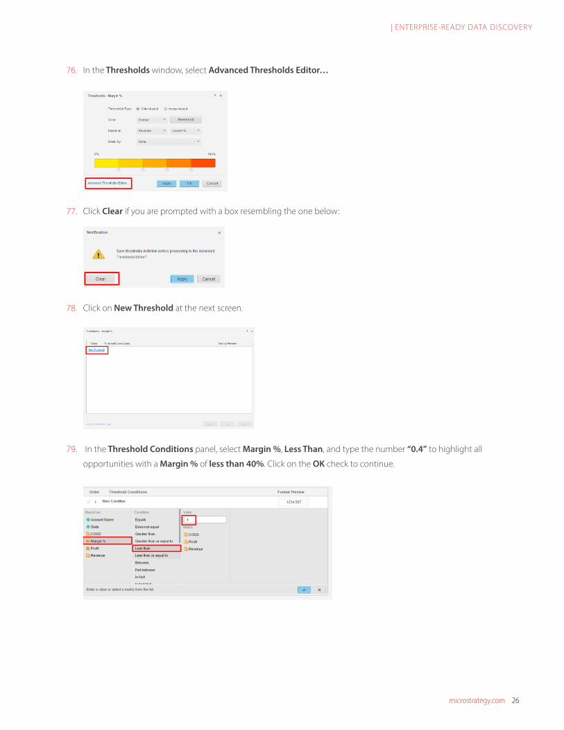
76. In the Thresholds window, select Advanced Thresholds Editor…
77. Click Clear if you are prompted with a box resembling the one below:
78. Click on New Threshold at the next screen.
79. In the Threshold Conditions panel, select Margin %, Less Than, and type the number “0.4” to highlight all
opportunities with a Margin % of less than 40%. Click on the OK check to continue.

microstrategy.com 27
| ENTERPRISE-READY DATA DISCOVERY
80. To make the threshold stand out to users, select the Text Format area and make the font BOLD and the font
color Orange. Select the OK check to continue and then the OK button to apply and close the
Threshold window.
TIP: Thresholds are an easy way to highlight specific information that you want the users to see. You can use different
colors and fonts to help certain metrics “pop,” or you can replace entire text fields with an image of your choice.
Refine your dashboard
To make your dashboard more aesthetically pleasing, you will add and resize an image of BikePort’s logo, and change
the color palette on a visualization. MicroStrategy 10 offers a wide variety of customization options that let users
easily change the appearance of their dashboards.
81. On the toolbar, click Insert and then Image.
82. In the Image URL textbox, enter the URL: http://tinyurl.com/bikeport16 and select OK.
83. Position the image to the right of the Accounts by Revenue bar chart. Drag the left edge of the image to
increase the width. As you can see, the image needs to be resized to properly display.

microstrategy.com 28
| ENTERPRISE-READY DATA DISCOVERY
84. Right click on the image and click Format. In the Format Panel that displays select the Size drop-down and
then click on Fit to container. This will resize the image to fit in the visualization pane.
85. To make the Accounts by State grid stand out more to the user, you can enable Banding which alternates
the shading of each column. Click on the Accounts by State grid and then under the Properties Panel, select
General Settings.
86. Under General Settings, click the Show banding checkbox.

microstrategy.com 29
| ENTERPRISE-READY DATA DISCOVERY
87. To change the color scheme of the Map bubbles denoting relative state Revenue, you can incorporate
Thresholds. Select the Revenue and Margin % by State map, and navigate to the Editor tab. Right click on the
Margin % metric in the Color By section and select Thresholds…
88. Select Red-Green from the Color drop-down.
89. You want to create a custom threshold that bases the color off of the Margin % threshold of 40% from the
Accounts by State grid. Each arrow represents a percentage range, which you can slide around freely to attain
your desired colors. Right click on the second to last arrow on the right, and select Delete.

microstrategy.com 30
| ENTERPRISE-READY DATA DISCOVERY
90. Click on the slider arrow where the red and green bars intersect and type in “40” in the text box that appears
above. Do this to the slider arrow that intersects the two shaded green bars as well, but type in “70”. Click OK to
exit the Thresholds wizard.
91. Don’t forget to Save your dashboard before moving forward.
In MicroStrategy Desktop, users can freely move the dashboard objects around and dynamically change their size.
The key to a visually appealing, effective dashboard is making the data “digestible” for each individual user.
Your final dashboard should look similar to the following:

microstrategy.com 31
| ENTERPRISE-READY DATA DISCOVERY
Share your dashboard
Now that you have created a dashboard and analyzed the data, it can be shared by an unlimited number of
individuals, using a number of different formats.
92. To share your dashboard, you can export the dashboard image or PDF. Click on File, Export, Image. You can
select the file path and name the file to your choosing. The saved image or PDF can be now shared via e-mail.
93. Your dashboard file can also be accessed from the file location where you saved it earlier. You can now share this
with other MicroStrategy Desktop 10 users.
TIP: You may export your dashboards in either PDF or Image file formats. Both formats can be shared via e-mail, but
the choice is completely up to the user. After exporting to an Image or PDF, you may also print the dashboard to have
physical copies of it.
94. A brand new feature in MicroStrategy 10, Annotation Mode, allows the user to overlay comments on the
dashboard to help external users better understand the information being displayed. Looking at the ESRI map,
it appears that the state of Oregon has mixed performance results. Hovering over the associated bubble, you can
see that the Revenue is very low, but the state has a very high Margin %. To show this, you can annotate
the dashboard.
95. Click on the green bubble for the state of Oregon, and then select the Annotate Mode icon from the toolbar at
the top right of the screen.

microstrategy.com 32
| ENTERPRISE-READY DATA DISCOVERY
96. The Rectangle Tool is useful for highlighting certain areas (in this case the state of Oregon). Click on the
Comment Tool (indicated by a large T) to write a quick note, and the Arrow Tool to point to different items. An
example is shown below:
97. You can now export your annotation as a .png file and send it to other users, or you can print the annotated
dashboard from inside the MicroStrategy Desktop environment to have a physical copy to distribute.

microstrategy.com 33
| ENTERPRISE-READY DATA DISCOVERY
Congratulations! You have completed the
Enterprise-Ready Data Discovery workshop!
For further MicroStrategy Desktop 10
information, including resources and
certifications within the MicroStrategy
Community, please visit:
https://www.microstrategy.com/us/learn/
education/programs
Visit us at http://www.southportsg.com to
learn more about how Southport can help you
enable Business Intelligence.

microstrategy.com 341850 Towers Crescent Plaza | Tysons Corner, VA 22182 | Copyright ©2017. All Rights Reserved. microstrategy.comCOLL-1664Data Discovery