Methods of Exploratory Data Analysis GG 313 Fall 2003 8/25/05.
20
Methods of Exploratory Data Analysis GG 313 Fall 2003 8/25/05
-
date post
20-Dec-2015 -
Category
Documents
-
view
215 -
download
1
Transcript of Methods of Exploratory Data Analysis GG 313 Fall 2003 8/25/05.

Methods ofExploratory Data Analysis
GG 313 Fall 2003 8/25/05

CRUISESave October 24-27 (Monday-Thurs)
For a STUDENT CRUISE on the
R/V Kilo Moana

Scatter Plots
• We did an example Tuesday with the tide data - let’s look at another:
These data taken at Scripps Pier (LaJolla, Ca) on Dec. 26 2004. The data are taken every second and the units are cm.

We’ll do a very simple MatLab plot. There are too many data points for Excel to handle. The data are in my computer in file df07301.txt in a single column of numbers.
The Matlab commands are:
load 'df07301.txt’plot (df07301)

These data show the tidal components as the long-period oscillation, the normal ocean waves as the thickening of the blue line, and the signal from the Sumatra earthquake tsunami as the larger thickening.
What does this plot tell us about our data?
It’s clean - no wild pointsIf we’re after the tsunami signal, we’ve got itIf we want to see it better, we need to do some
analysis
There are 86400 sec in a day, so this plot is 500000/86400=5.78 days long.

Just for fun, let’s try one more technique before we leave this data set.
The tidal signal is noise for us, so let’s subtract it from the data. To do this we first apply a FILTER to the data to isolate the tidal signal:
windowsize=3600 ; % that’s 1 hourlpout=filter(ones(1,windowsize)/windowsize,1,df07301);
This does a pretty good job of SMOOTHING the data, isolating the tidal signal from the waves - both tsunami and wind waves.
Now we subtract the filtered data from the original data:
Hipass=df07301-lpout;

What does BAD data look like?
Be extremely careful before discounting the validity of data. Some of the most important theories have come from data that looked wrong.
Early El-Nino data were rejected by a computer program because they were so far from normal!
Recognition of bad data takes experience. Determination of the origin of these data is particularly important to be sure that rejection is justified.
Here are some examples:

Expected deepest depth Anomalously deep data
0
1500
3000
The anomalous data don’t look bad, but they are too deep by 750 m. This is a key number in that sound travels at 1500 m/s in water, and sound from a ship is observed reflecting off the ocean floor at 750 m depth for each second. That is, sound returning to the ship one second after it was generated implies a water depth of 750m. We often generate sound pulses once per second, so it’s easy to make a 750 m mistake.

A good example of how anomalous data can lead to discovery was presented by Lord Rayleigh in 1894. In an investigation of the density of nitrogen, he collected the data shown below:
These data don’t look much different from each other, but take a closer look:

The scatter in these data certainly do not look like what would be expected from sampling of a single population - and the distribution of the data do not look like they could be caused by measurement error. In fact, the higher weight data come from air, and the lower weights come from nitrogen in chemicals. Rayleigh used these data to prove that another element was present in air -argon.

Box and whisker plot
Another important plot for preliminary analysis is the box and whisker plot. At least five statistical values are plotted to get a quick look at some basic statistics of data samples.
minimumvalue
maximumvaluemedian25% 75%
The box shows the region containing the middle half of the data, and the vertical line shows the middle, or median, value.

Box and whisker plots are most informative to compare different samples:
0
The plots above show what might be expected from samples of an experiments with a Poisson distribution.

The box and whisker plot for Lord Rayleigh’s data looks like this:
This plot tells us that the distribution of these data is weird, and we should look closely at it to see what’s going on.

Histograms
Histograms are used to plot the frequency of occurrence of particular events. For example, the time between large earthquakes in the Aleutian subduction zone:
0 5 10 2015
Years
(these are not real data)
We will see more of these plots as we study the basics of statistics and probability.

Smoothing
As we saw earlier, filtering, which we will discuss in detail later, can go a long way to separate signals from noise. Different filters have different functions and characteristics.
Functions in exploratory analysis include removal of occasional bad data points, removal of high frequency noise, and removal of trends.
Removal of occasional bad points is best done by a median filter. This filter compares three consecutive points, replacing the middle point by the median point of the three. This is a very effective filter for removing noise spikes in data-as long as the spikes are separated by more than 1 point.

In the Scripps Pier data, I’ve replaced occasional data points by zeroes. This is a common problem in real data. Application of the median filter adds a small amount of noise while removing the spikes.

After applying the median filter, the data are (nearly) back to normal:
The Matlab function for this operation is medfilt1(x,3)Where x is the data and 3 is the number of points in the window.

Smoothing can also involve the removal of high frequency noise, like we did to isolate the tidal signal in the Scripps pier data. A Hanning filter can do this by marching through the data 3 points at a time, weighting the middle point higher than the ones on each side:
€
filtered _ data(i) =y(i −1) + 2y(i) + y(i +1)
4
Note: Wessel’s notes are not quite correct for this equation.
This filter works poorly for spikes in the data - spreading the spikes out, rather than removing them.
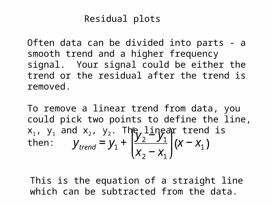
Residual plots
Often data can be divided into parts - a smooth trend and a higher frequency signal. Your signal could be either the trend or the residual after the trend is removed.
To remove a linear trend from data, you could pick two points to define the line, x1, y1 and x2, y2. The linear trend is then:
€
y trend = y1 +y2 − y1
x2 − x1
⎛
⎝ ⎜
⎞
⎠ ⎟ x − x1( )
This is the equation of a straight line which can be subtracted from the data.

The trend need not be linear, and other functions can be tried to remove a trend, such as √y, log(y), y2, etc. -whatever fits. Often, a good understanding of why the trend is there can aid in its removal.
Let’s run a MatLab program Dr. Wessel wrote to display some of the topics we’ve been discussing.
gg313_EDA.m


![· 2020-04-15 · ˚ ˘ [f /] -˚2 5j- 48k 5; ˝˚ p ˝k ,. ˘ gg jp ˆ ˜˝ gg / gg 4˘ ggj 5gg6 5gg ,gg 2 3 / ˆ7 gg 5gg6 ˝ gg˚ q gg :˝ ˜ ˘ ˝ w l; 6 p„ t 6 .˝- ˘ ˘ -](https://static.fdocuments.net/doc/165x107/5ea9c71468ab2b044305bbac/2020-04-15-f-2-5j-48k-5-p-k-gg-jp-oe-gg-gg.jpg)