Media Evaluation.
9
Media Evaluation.
-
Upload
kimberley-carroll -
Category
Documents
-
view
91 -
download
0
Transcript of Media Evaluation.

Media Evaluation.

In what ways does your media product use, develop or challenge forms and conventions of real media
products?
• When deciding how I wanted my music magazine to look, I looked at existing
music magazines planned, and came to the conclusion that I wanted my
music magazine to have a conventional magazine look to fit in with my
chosen genre of Rock music as something that does not look like a normal
music magazine may put readers off from buying it. The magazines I have
based my music magazines on are Kerrang and NME, I chose these two
magazines because I liked the how each were laid out as they are very
different looking however still look quite convention at a magazine. However
when creating my magazine I took the most inspiration from Kerrang
magazine. I did this because Kerrang! is aimed at a similar audience to my
magazine (Unplugged) rather than NME which appeals to the older
generation of music fans.

I have kept the style of the front cover of my magazine quite conventional for a rock music magazine. I included key details such as a masthead at the top of the page however I did not cover it with my models. I have done This because i wanted the main masthead to stand out. I have also included a barcode with a price in the top right hand corner and main cover story which attracts the reader to glancing at the magazine. I also included smaller details within such as a Web address on the Front Cover. This shows my readers are able to gain access to similar news featured within my magazine however online. However my front cover does differ from normal magazines as it does not feature smaller cover
Stories showing readers what is inside apart from the cover story in the bottom right hand corner that uses an image. Instead I have listed names of bands and artists that are within thisIssue if Unplugged.
When creating my front cover I took inspiration from this issue of Kerrang! There are a few similarities between the two. The first being I have placed my masthead in relatively the same position and have used a similar broken/ grazed look for my masthead as Kerrang does.
The second, is the free cd give away, I did this because I thought It would look interesting and would also make the reader more likely to purchase this issue. The third, is the offer of free posters which again I decided to use as it adds a nice complete look to the bottom of the page and avoids it from looking boring but also, it will appeal to the reader.

For my contents page I have made it the most convention looking. I have layout on my contents page in this way for two reasons. The first, it looks very profession as if it would be featured in a existing magazine, and the second It is organized an easy to follow and read, which allows theReader to find exactly what they are looking for.I have included details such as issue
information at the top of the page that includes such details as the issue number of the magazine, The date of the issue and the web address which is also used on the front to remind readers of the website. Subscription box to give readers information on how to get a continuous supply of Unplugged Magazine and Headers above each page number and a brief description of what those stories include to interest the reader.
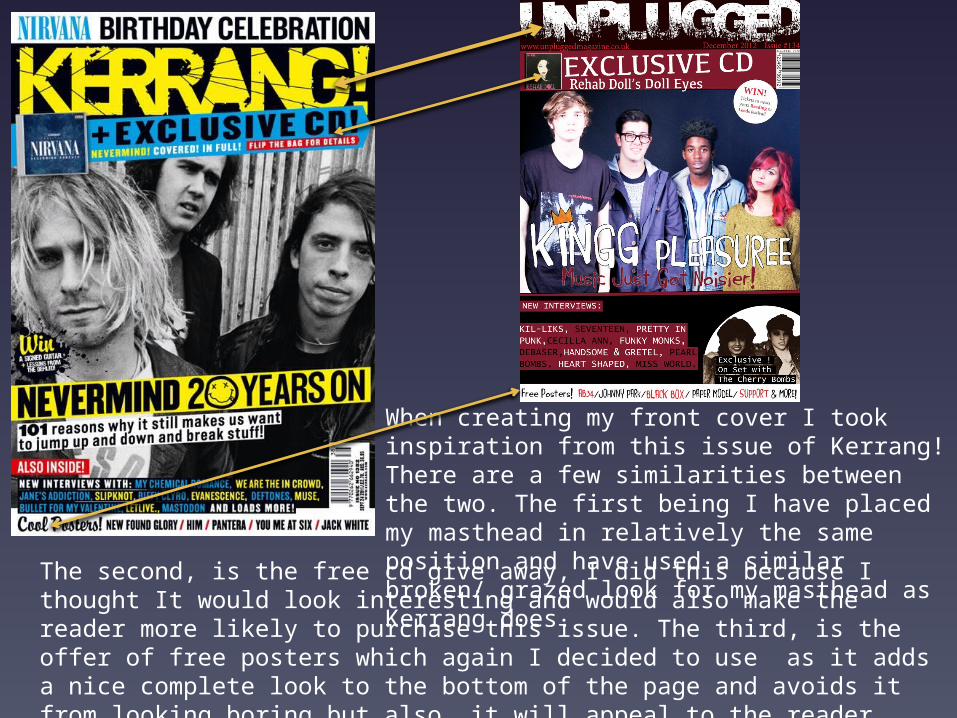
When creating my contents page I based it heavily onThe contents page layout used in Kerrang! magazine
I have taken inspiration from a many details of Kerrang magazines contest page such as the layout. I used a similar layout because I liked the way it was laid out. I place an image of the band on the top of the page as it shows the importance of the band due to the size of the image. I have also decided to use smaller details used my Kerrang! Such as the small icon next to each story with shows the reader the stories advertised on the front cover, And a credit to the photographer, I added this as it is a nice touch to the page and added a finished look.

I did not base my dps on any existing magazine, I created the layout myself, I decided to make my double page spread convention in the sense it does include an interview and images of the band however I decided to add a few more details on to the page.
Details such as a QR code.I decided to include this asMany people now own
smartphones such as Blackberry’s and IPhones, therefore I added this in to be scanned by the app so the reader can listen to the album instead of wasting time listening online. I have also used individual images of the band members with their name and position in the band as anIntroduction to each member. And finally I have added the masthead of the magazine at the Bottom of the pages by the page numbers as this is used in existing music magazines.

How does your media product represent particular social groups?

From the feedback I have received shows that my music magazine represents particular social groups such as class, ethnicity and gender positively this was my main intention. Ethnicity: My music magazine does not follow the stereotype that all fans of rock music are predominantly white this because of my choice of models are very mixed and are all from different ethnic backgrounds. This is positive at it shown other fans of rock music that it is not just for one group of people.Gender: My music magazine shows gender positively as it includes both genders which goes against the stereotype that rock music is not just for a male audience but a female audience too and also shows that female musicians are also respected just as male musicians.
Class: My music magazine is aimed at the working class, and it shows this class positively as the musicians I have photographer are from the same class and are educated. We can see this from the article, the responses to the questions are not difficultly worded however are not basic. The band also show a positive message for the working class as we can see in the article they are motivated an focused on a goal.