MATHEMATICAL FUNCTIONS AND GRAPHS functions and graphs.pdf · Mathematical Functions and Graphs NRM...
19
Mathematical Functions and Graphs NRM 4793, Fall 2015 Lab Exercise #1 Learning Objectives: • Learn how to enter formulae and create and edit graphs in Excel 2013. • Familiarize yourself with 3 classes of mathematical functions: linear, exponential, and power. • Explore effects of logarithmic plots on graphs of each kind of function. Introduction Wildlife population ecology, like all the sciences, uses mathematical relationships to describe natural phenomena. In many cases, the mathematics is only implied, as in a graph of 1 variable plotted against another (Figure 1). In other cases, the relationship(s) is (are) made explicit in the form of an equation. Such relationships take a variety of forms, but you will encounter 3 classes of relationships with some regularity in textbooks and wildlife journal articles: linear functions, exponential functions, and power functions. For example, the gross energy content of army cutworm moths (an important summer grizzly bear food in the northern Rocky Mountains) increases linearly throughout the summer months; a bacterial population introduced into an empty vial of nutrient broth will grow exponentially (at least for a time); and the number of species on an island is a power function of the island’s area (the larger the island, the larger the number of species). A mathematical function relates 1 variable to another. For example, we may say that the survival rate of elk calves in an elk population is a function of population density, meaning that survival rate and population density are related in some way. By writing an equation, we can specify precisely how these variables relate to one another. For convenience, we usually refer to 1 variable as the independent variable and the other as the dependent variable, and we speak of the dependent variable as “depending on” the independent variable. For example, in wildlife population ecology we expect a population’s birth rate � = � to “depend”
Transcript of MATHEMATICAL FUNCTIONS AND GRAPHS functions and graphs.pdf · Mathematical Functions and Graphs NRM...

Mathematical Functions and Graphs NRM 4793, Fall 2015 Lab Exercise #1
Learning Objectives: • Learn how to enter formulae and create and edit graphs in Excel 2013. • Familiarize yourself with 3 classes of mathematical functions: linear,
exponential, and power. • Explore effects of logarithmic plots on graphs of each kind of function.
Introduction Wildlife population ecology, like all the sciences, uses mathematical relationships to describe natural phenomena. In many cases, the mathematics is only implied, as in a graph of 1 variable plotted against another (Figure 1). In other cases, the relationship(s) is (are) made explicit in the form of an equation. Such relationships take a variety of forms, but you will encounter 3 classes of relationships with some regularity in textbooks and wildlife journal articles: linear functions, exponential functions, and power functions. For example, the gross energy content of army cutworm moths (an important summer grizzly bear food in the northern Rocky Mountains) increases linearly throughout the summer months; a bacterial population introduced into an empty vial of nutrient broth will grow exponentially (at least for a time); and the number of species on an island is a power function of the island’s area (the larger the island, the larger the number of species). A mathematical function relates 1 variable to another. For example, we may say that the survival rate of elk calves in an elk population is a function of population density, meaning that survival rate and population density are related in some way. By writing an equation, we can specify precisely how these variables relate to one another. For convenience, we usually refer to 1 variable as the independent variable and the other as the dependent variable, and we speak of the dependent variable as “depending on” the independent variable. For example, in wildlife population ecology we expect a population’s birth rate �𝑏𝑏 = 𝐵𝐵𝑡𝑡
𝑁𝑁𝑡𝑡� to “depend”
2
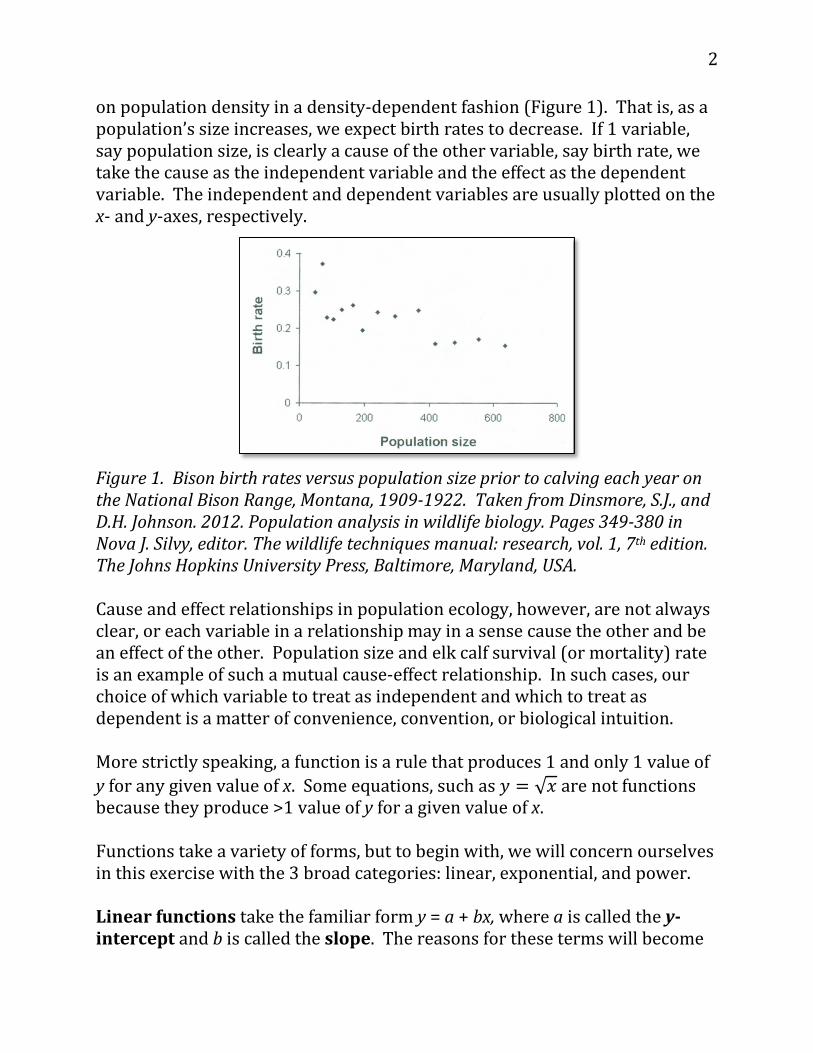
on population density in a density-dependent fashion (Figure 1). That is, as a population’s size increases, we expect birth rates to decrease. If 1 variable, say population size, is clearly a cause of the other variable, say birth rate, we take the cause as the independent variable and the effect as the dependent variable. The independent and dependent variables are usually plotted on the x- and y-axes, respectively.
Figure 1. Bison birth rates versus population size prior to calving each year on the National Bison Range, Montana, 1909-1922. Taken from Dinsmore, S.J., and D.H. Johnson. 2012. Population analysis in wildlife biology. Pages 349-380 in Nova J. Silvy, editor. The wildlife techniques manual: research, vol. 1, 7th edition. The Johns Hopkins University Press, Baltimore, Maryland, USA. Cause and effect relationships in population ecology, however, are not always clear, or each variable in a relationship may in a sense cause the other and be an effect of the other. Population size and elk calf survival (or mortality) rate is an example of such a mutual cause-effect relationship. In such cases, our choice of which variable to treat as independent and which to treat as dependent is a matter of convenience, convention, or biological intuition. More strictly speaking, a function is a rule that produces 1 and only 1 value of y for any given value of x. Some equations, such as 𝑦𝑦 = √𝑥𝑥 are not functions because they produce >1 value of y for a given value of x. Functions take a variety of forms, but to begin with, we will concern ourselves in this exercise with the 3 broad categories: linear, exponential, and power. Linear functions take the familiar form y = a + bx, where a is called the y-intercept and b is called the slope. The reasons for these terms will become

3
clear later. Figure 2 contains 2 real-world examples. Note that a linear function can be positive or negative.
Figure 2. Gross energy (left panel) and crude protein (right panel) content of army cutworm moths captured at a light trap (elevation 2150 m) located adjacent to an alpine moth aggregation site in Glacier National Park, Montana, 1994 and 1995. The curved lines denote the 95% CI of the regression line. Taken from White, D., Jr., K.C. Kendall, and H.D. Picton. 1998. Seasonal occurrence, body composition, and migration potential of army cutworm moths in northwest Montana. Canadian Journal of Zoology 76:835-842. Exponential functions take the form y = a + qx. In wildlife population ecology, the population growth rate measures the change in the number of individuals in a population over a specified length of time. Patterns of population growth can be shaped by a variety of factors, and so wildlife population biologists have developed different mathematical expressions, or models, to describe population growth rate. One of the most basic expressions of population growth rate is the exponential model 𝑑𝑑𝑁𝑁
𝑑𝑑𝑑𝑑= 𝑟𝑟𝑟𝑟. Although this
function is not in the form y = a + qx, it is still an exponential function. Change in population size (dN) over a specified, and usually short, interval of time (dt), is proportional to the product of the per capita growth rate r and population size. Exponential growth is best visualized in a graph that plots how the population size changes over time (Figure 3). Note that in the
Y = 5.19 + 0.45x r2 = 0.96, P = 0.05
Y = 49.77 + -5.98x r2 = 0.94, P = 0.05
Y = 5.61 + 0.31x r2 = 0.96, P = 0.05
Y = 44.51 + -2.61x r2 = 0.87, P = 0.05

4
equation, r, the per capita growth rate, is constant and the population size changes over time. The constancy of r is what produces exponential growth.
Figure 3. An example of an exponential function. Taken from Ricklefs, R.E. 2008. The economy of nature, 6th edition. W.H. Freeman and Company, New York, New York, USA. Power functions take the form y = a + kxp. In ecology, a species-area curve is a relationship between the area of a habitat, or part of a habitat, and the number of species found within that area (Figure 4). Larger areas tend to contain larger numbers of species. Species-area relationships are often fit with a simple power function. If S is the number of species, A is the habitat area, and z is the slope of the species area relationship in log-log space, then the power function species-area relationship is S = cAz. In this equation, c is a constant that depends on the unit used for area measurement, and equals the number of species that would exist if the habitat area was confined to 12 unit.

5
Figure 4. Number of species on islands of differing sizes in the Caribbean Sea. Note the logarithmic (log) axes on the graph.
Did you notice the difference between exponential functions (y = a + qx) and power functions (y = a + kxp)? Exponential functions have a constant base (q) raised to a variable power (x); power functions have a variable base (x) raised to a constant power (p). The goals of this exercise are to learn how to use Excel 2013 to calculate and graph linear, exponential, and power functions and to see how these graphs look with linear and logarithmic axes. In this course, we will be examining and plotting a lot of data. It is important that you get proficient in constructing graphs using Excel 2013. In achieving these goals, you will learn about the behavior of the 3 classes of functions, how to use formulae, how to make graphs, and the utility of logarithmic plots. Instructions A. Set up the spreadsheet
1. Enter titles and headings through Row 9, as shown in Figure 5. You don’t have to enter the text shown in Rows 2 through 6. If you choose not to, leave these rows blank so that the cell addresses in your formulae will match the ones given in these instructions.
These are all literals, so select each cell by clicking in it with the mouse, then type in each title or heading.
Figure 5

6
Linear Functions
2. Set up a linear series of numbers from 0 to 9 in cells A10–A19 (Figure 6). Enter the value 0 as a literal in cell A10. In cell A11, enter the formula =A10+1. Copy the formula in cell A11. Select cells A12–A19. Paste. This will provide values for the independent variable x.
Figure 6
3. In cell B10, enter a spreadsheet formula that expresses the equation shown in cell B9. In cell B10, type the formula =5+1*A10. We could omit the 1 in the equation and in the formula, but we keep it for consistency with the others.
4. Copy the formula in cell B10 down the column through cell B19 (Figure 6). Copy the contents of cell B10. Select cells B11–B19. Paste.

7
5. Enter formulae for the equations shown in cells C10, D10, and E10 into
cells C11, D11, and E11, respectively. These should be: Cell C10: =0+5*A10 Cell D10: =10+5*A10 Cell E10: = 60-5*A10
6. Copy these formulae down their respective columns. Select cells C10–
E10. Copy. Select cells C11–E19. Paste. At this point, your spreadsheet should contain the values shown in Figure 6.
7. Adjust the widths of columns to accommodate text and numbers. Click and drag column boundaries at the top of the page to achieve the desired widths.
Exponential Functions
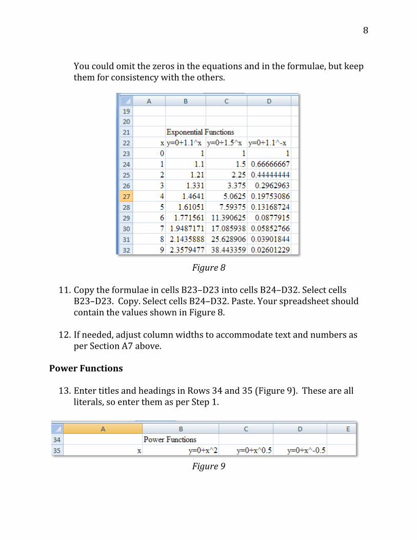
8. Enter titles and headings in Rows 21 and 22 (Figure 7). These are all literals, so enter them as per Step 1.
Figure 7
9. Set up a linear series of numbers from 0 to 9 in cells A23–A32 (Figure
8). This will provide values for the independent variable x. Enter the number 0 as a literal in cell A23. In cell A24, enter the formula =A23+1. Copy the formula in cell A24. Select cells A25–A32. Paste.
10. In cells B23–D23, enter spreadsheet formulae that express the equations shown in cells B22–D22 (Figure 8). These should be: Cell B23: =0+1.1^A23 Cell C23: =0+1.5^A23 Cell D23: =0+1.5^-A23
8
You could omit the zeros in the equations and in the formulae, but keep them for consistency with the others.
Figure 8
11. Copy the formulae in cells B23–D23 into cells B24–D32. Select cells B23–D23. Copy. Select cells B24–D32. Paste. Your spreadsheet should contain the values shown in Figure 8.
12. If needed, adjust column widths to accommodate text and numbers as per Section A7 above.
Power Functions
13. Enter titles and headings in Rows 34 and 35 (Figure 9). These are all literals, so enter them as per Step 1.
Figure 9

9
14. Set up a linear series of numbers from 1 to 10 in cells A36–A45 (Figure 10). This will provide values for the independent variable x. Enter the number 1 as a literal in cell A36. In cell A37, enter the formula =A36+1. Copy the formula in cell A37. Select cells A38–A45. Paste. Note that this differs from previous examples by starting at 1 rather than 0. I will explain why later.
Figure 10
15. In cells B36–D36, enter spreadsheet formulae that express the
equations shown in cells B35–D35 (Figure 10). These should be:
Cell B36: =0+A36^2 Cell C36: =0+A36^0.5 Cell D36: =0+A36^-0.5 Again, we could omit the zeros in the equations and in the formulae, but we keep them for consistency with the others.
16. Copy the formulae in cells B36–D36 into cells B37–D45. Select cells
B36–D36. Copy. Select cells B37–D45. Paste. At this point, your spreadsheet should contain the values shown in Figure 10.
Comparing Functions
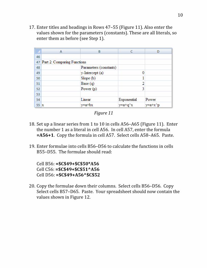
10
17. Enter titles and headings in Rows 47–55 (Figure 11). Also enter the values shown for the parameters (constants). These are all literals, so enter them as before (see Step 1).
Figure 11
18. Set up a linear series from 1 to 10 in cells A56–A65 (Figure 11). Enter
the number 1 as a literal in cell A56. In cell A57, enter the formula =A56+1. Copy the formula in cell A57. Select cells A58–A65. Paste.
19. Enter formulae into cells B56–D56 to calculate the functions in cells
B55–D55. The formulae should read: Cell B56: =$C$49+$C$50*A56 Cell C56: =$C$49+$C$51^A56 Cell D56: =$C$49+A56^$C$52
20. Copy the formulae down their columns. Select cells B56–D56. Copy
Select cells B57–D65. Paste. Your spreadsheet should now contain the values shown in Figure 12.

11
Figure 12
Your spreadsheet is now complete! B. Create graphs Linear Functions
1. Graph all 4 linear functions on the same graph. Select the contiguous block of cells from cell A9 through cell E19. Note that you should select the column headings as well as the data to be graphed. This lets the program label the graph legend correctly. Click Insert|Charts|All Charts|XY (Scatter). Then, from the chart subtypes shown, choose the graph type which has straight lines and markers as shown in Figure 13.

12
Figure 13
You should now have a graph like the one (Figure 14).
Figure 14
Create a graph title. Click in the Chart Title box that appears at the top of the graph and type “Linear Functions.”

13
Label the axes. Click in the x-axis Axis Title box that appears on the graph and type “Independent Variable (x)” as a title. Do the same for the y axis, except type “Dependent Variable (y)” as a title. Your graph and axes titles should look like those in Figure 15.
Figure 15
2. Edit your graph to improve readability. Remove the horizontal gridlines
that appear by default. Click on a grid line. This will select all the grid lines on the graph. Hit Delete on your keyboard. Your graph should look like Figure 16. Note. Deleting the gridlines may also delete your tick marks. If so, put them back in.
Figure 16
14
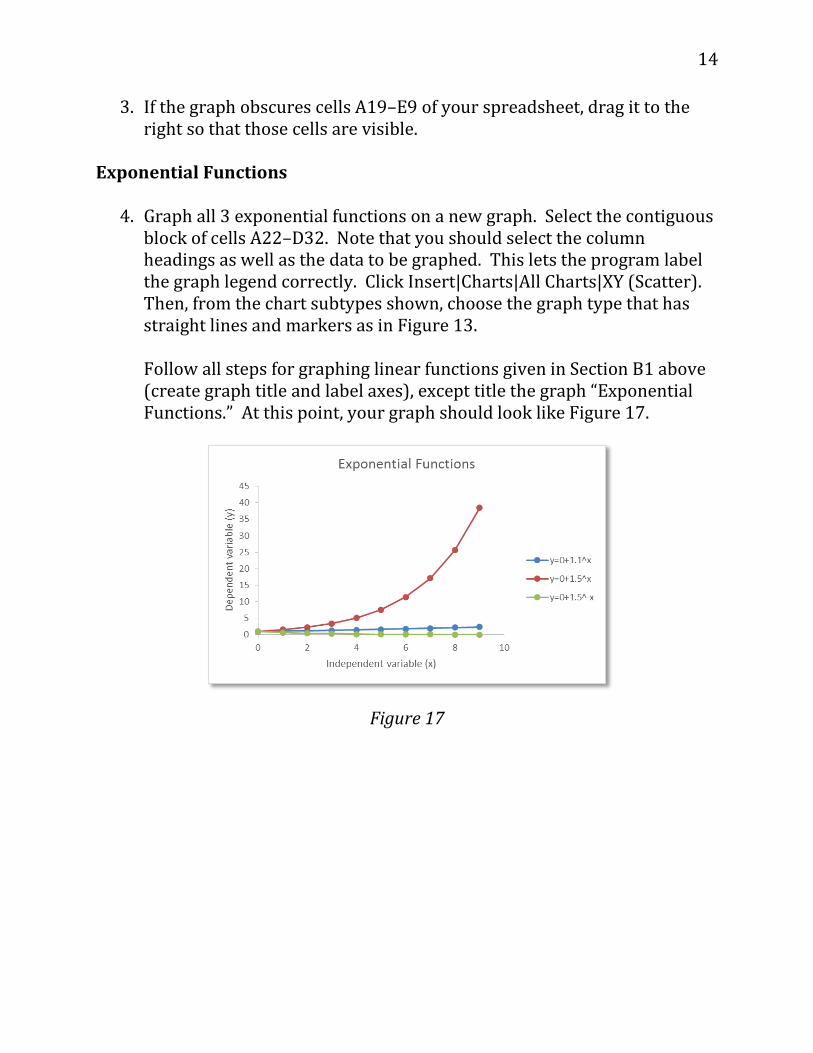
3. If the graph obscures cells A19–E9 of your spreadsheet, drag it to the right so that those cells are visible.
Exponential Functions
4. Graph all 3 exponential functions on a new graph. Select the contiguous block of cells A22–D32. Note that you should select the column headings as well as the data to be graphed. This lets the program label the graph legend correctly. Click Insert|Charts|All Charts|XY (Scatter). Then, from the chart subtypes shown, choose the graph type that has straight lines and markers as in Figure 13.
Follow all steps for graphing linear functions given in Section B1 above (create graph title and label axes), except title the graph “Exponential Functions.” At this point, your graph should look like Figure 17.
Figure 17

15
5. Change the vertical axis to a logarithmic scale. Click on the vertical axis. At right a Format Axis dialog box appears (Figure 18). Under AXIS OPTIONS, click Logarithmic scale. Leave the base value at 10.
Figure 18
6. Change the numbers on the vertical axis to display 2 decimal places.
Click on the vertical axis as in Section B5 above. Again, a gray box appears around the axis indicating it is selected. The same dialog box shown in Figure 18 will appear. This time, select Number and then change the number of decimal places to 2. Your graph should now resemble Figure 19.
16
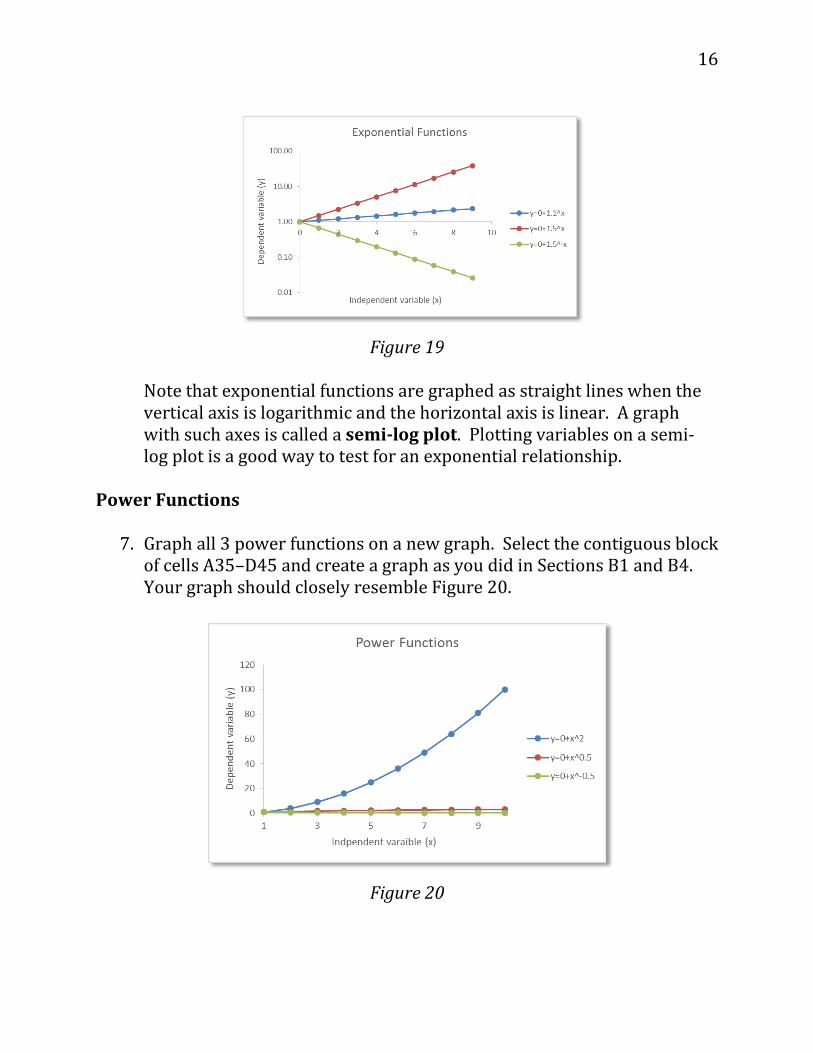
Figure 19
Note that exponential functions are graphed as straight lines when the vertical axis is logarithmic and the horizontal axis is linear. A graph with such axes is called a semi-log plot. Plotting variables on a semi-log plot is a good way to test for an exponential relationship.
Power Functions
7. Graph all 3 power functions on a new graph. Select the contiguous block of cells A35–D45 and create a graph as you did in Sections B1 and B4. Your graph should closely resemble Figure 20.
Figure 20

17
The graph of y = 0 + x2 resembles an exponential function. We will find out shortly, however, it is not. The other functions lie almost on top of the x-axis
8. Change the vertical axis to a logarithmic scale and change the numbers
on the vertical axis to display one decimal place. Note that none of the functions appears as a straight line; this tells you that they are not exponential functions (Figure 21).
Figure 21
9. Change the horizontal axis to a logarithmic scale. Your graph should now resemble Figure 22. Note that all these power functions are graphed as straight lines when both axes are logarithmic. A graph with such axes is called a log-log plot. Plotting variables on a log-log plot is a good way to test for a power relationship.

18
Figure 22
Now You Do It! On your own, complete the steps below as indicated. Your laboratory report should include the following: (1) a paragraph explaining the objectives of this exercise, and (2) your graphs and answers to the 7 discussion questions below. Email me ([email protected]) your spreadsheet model (but not your lab report). Turn in your lab report during lab next week. 1. Graph the 3 functions in cells A55–D65 in the spreadsheet.
2. Graph 2 different combinations of logarithmic and linear axes: 1)
logarithmic on the x-axis and linear on the y-axis (semi-log), and 2) both axes logarithmic (log-log).
3. Experiment with different values of y-intercept, slope, base, and power, and observe the effects on the graph. Simply enter new values in the cells labeled “Parameters” (constants)—cells C49 through C52 (Figure 11). You do not need to edit the formulae.
4. How does changing the value of the y-intercept (a) affect each of the kinds
of functions? Enter different values in cell C49 and observe the effects on your graph of 3 kinds of functions. The effects may be difficult to see at first because the spreadsheet automatically rescales the y-axis to accommodate values to be graphed. Be sure to note the values along the y-

19
axis in your comparisons. Also compare the 4 linear functions you graphed in step B1.
5. How does changing the value of the slope (b) in cell C50 affect the linear
function? Try values greater and <0. Also compare the 4 linear functions you graphed in step B1.
6. How does the exponential function look if you enter different values for the
base (q) in cell C51? Try values >1, =1, <1, and <0. You will have to reformat the axes of your graph to see some of these effects. Also compare the 3 exponential functions you graphed in step B4.
7. How does the power function look if you enter different values for the
power (p) in cell C52? Try values >1, =1, <1, and <0. You will have to reformat the axes of your graph to see some of these effects. Also compare the 3 power functions you graphed in step B7.
Acknowledgement This problem set was modified from Chapter 1: Mathematical functions and graphs, pages 19-31 in Donovan, T. M. and C. Welden. 2002. Spreadsheet exercises in ecology and evolution. Sinauer Associates, Inc. Sunderland, MA, USA. This publication is available free-of-charge at http://www.uvm.edu/rsenr/vtcfwru/spreadsheets/?Page=ecologyevolution/EE1.htm.


![References - link.springer.com3A978-1-4757-3559-8%2F1.pdfReferences [AS] Abramowitz, M. and l. Stegun, Handbook of Mathematical Functions with Formulas, Graphs, and Mathematical Tables,](https://static.fdocuments.net/doc/165x107/6034d122bad63725c735a484/references-link-3a978-1-4757-3559-82f1pdf-references-as-abramowitz-m-and.jpg)