
Material Design Keynote
71
Papercraft Material design + implementation Material Design for Developers
-
Upload
abdellah-selassi -
Category
Mobile
-
view
1.773 -
download
0
Transcript of Material Design Keynote

PapercraftMaterial design + implementationMaterial Desig
n for Developers

A long time ago…

majorgeeks.com zdnet.comcomputer.howstuffworks.com
Gmail.com Android Mobile Web

2011

theverge.com

loliboat.wordpress.com
Holo

smartphoneblogging.com
Gmail for Android (Holo)
Gmail.com (Kennedy)

smartphoneblogging.com
Gmail for Android (Holo)
Gmail.com (Kennedy)

This was an industry-wide problem.

2012

M A T E R I A L D E S I G N

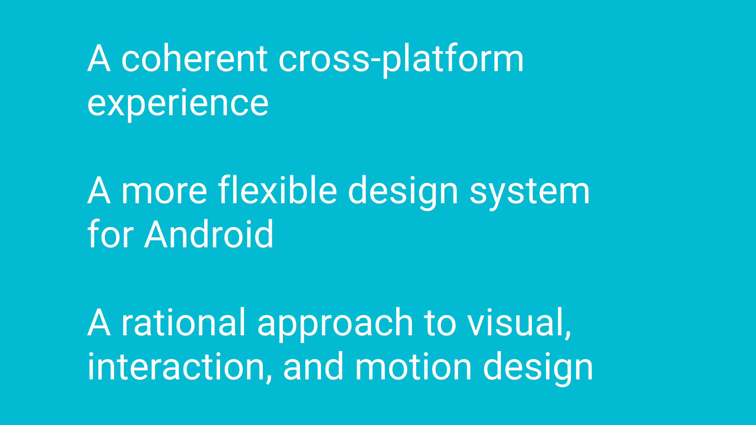
A coherent cross-platform experience

A coherent cross-platform experience
A more flexible design system for Android
A coherent cross-platform experience
A more flexible design system for Android
A rational approach to visual, interaction, and motion design

Applied Material


Tangible surfaces
Print-like design
Meaningful motion
Adaptive design

Tangible surfaces
Print-like design
Meaningful motion
Adaptive design

Tangible surfaces
Print-like design
Meaningful motion
Adaptive design

Tangible surfaces
Print-like design
Meaningful motion
Adaptive design

Tangible surfaces
Print-like design
Meaningful motion
Adaptive design

Tangible surfaces1


Interaction cues (scrolling and pinning)

Surface reaction

<div id="myCard" class="card"></div> <paper-shadow id="myShadow" z="1"></div> // Assign a target explicitlymyShadow.target = document.getElementById('myCard');// Auto-assign the target.<div class="card"> <paper-shadow z="1"></paper-shadow> </div>

paper-focusable
paper-button-base
paper-button
activefocusedpresseddisabledisToggle
raisedrecenteringTouchfill
<paper-button>flat button</paper-button> <paper-button raised>raised button</paper-button>

paper-focusable
paper-button-base
paper-fabiconsrcmini
<paper-fab icon="add"></paper-fab> <paper-fab mini icon="favorite"></paper-fab> <paper-fab src="star.png"></paper-fab>

View elevation
View plane
Permanent z-depth of view elevation
Transient z delta translationZ
Z = elevation + translationZ

<ImageView ... android:elevation="8dp" />
view.animate().translationZ(…).start();
View elevation

<ImageView android:layout_width=“wrap_content” android:layout_height=“wrap_content” android:elevation="8dp" android:stateListAnimator=“@anim/my_state_list_animator” ... />
StateListAnimator
Note: the Button provides this automatically

OutlineA view’s outline defines the shadow it castsBy default, the outline is derived from the view’s background
<shape android:shape="oval"> <solid android:color=“@color/blue“ /> </shape>
Custom outline: see OutlineProvider

A card is a piece of paper that contains a unique data set of related, heterogeneous information.
Cards

A card is a piece of paper that contains a unique data set of related, heterogeneous information.
Cards
outlineelevation

Cards
<android.support.v7.widget.CardView android:layout_width="match_parent" android:layout_height="wrap_content"> !
<!-- Your card content --> !
</android.support.v7.widget.CardView>

Don’t over cardify! x

Print-like design2

Refined typography

Refined typography

Typographic scale
Display 4 !
Display 3 !
Display 2 !
Display 1 !Headline !Title !Subhead !Body 2 !Body 1 !Caption !Menu !Button
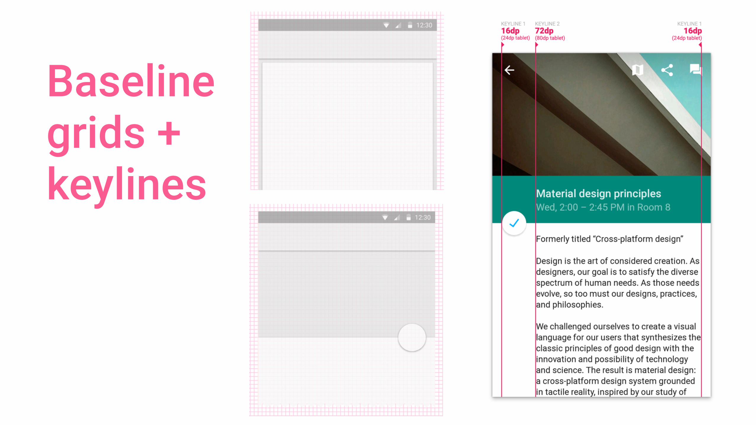
Baseline grids + keylines

NOTHIN
G
TO SEE
HERE
Baseline grids + keylines

Bold color

Primary + Accent

<style name=“MyTheme” parent=“android:Theme.Material.Light.DarkActionBar”> <item name=“android:colorPrimary">@color/indigo_500</item> <item name=“android:colorPrimaryDark">@color/indigo_700</item> <item name=“android:colorAccent”>@color/teal_a200</item> </style>

colorPrimary
<style name=“MyTheme” parent=“android:Theme.Material.Light.DarkActionBar”> <item name=“android:colorPrimary">@color/indigo_500</item> <item name=“android:colorPrimaryDark">@color/indigo_700</item> <item name=“android:colorAccent”>@color/teal_a200</item> </style>

colorPrimaryDark
colorPrimary
<style name=“MyTheme” parent=“android:Theme.Material.Light.DarkActionBar”> <item name=“android:colorPrimary">@color/indigo_500</item> <item name=“android:colorPrimaryDark">@color/indigo_700</item> <item name=“android:colorAccent”>@color/teal_a200</item> </style>

colorPrimaryDark
colorPrimary colorAccent
<style name=“MyTheme” parent=“android:Theme.Material.Light.DarkActionBar”> <item name=“android:colorPrimary">@color/indigo_500</item> <item name=“android:colorPrimaryDark">@color/indigo_700</item> <item name=“android:colorAccent”>@color/teal_a200</item> </style>

Content can provide color
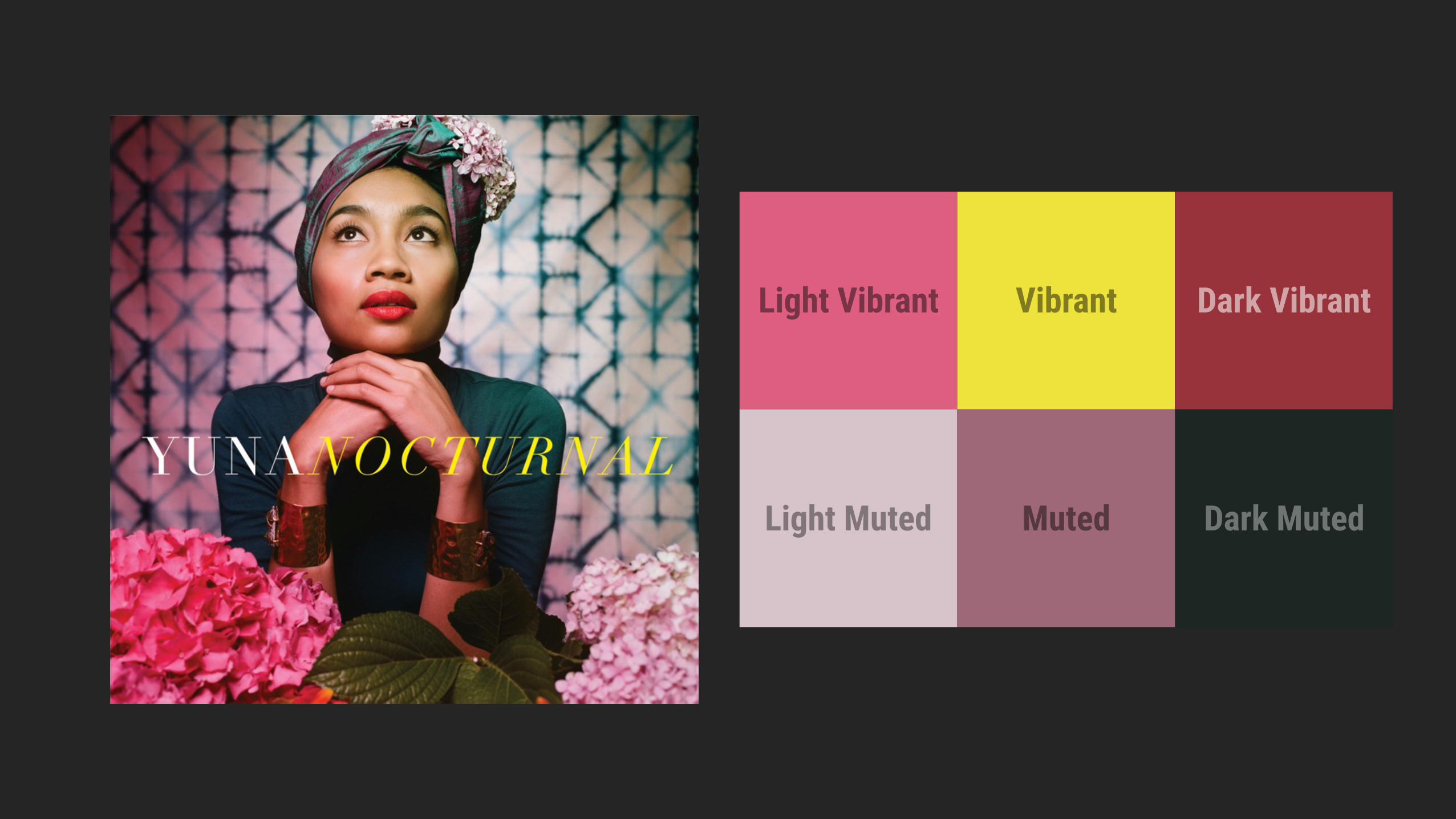
Light Vibrant Vibrant Dark Vibrant
Light Muted Muted Dark Muted

Palette p = Palette.generate(bitmap);
Palette
Swatch vibrant = p.getVibrantSwatch(); int vibrantColor = vibrant.getRgb(); int titleColor = vibrant.getTitleTextColor();

Meaningful motion3

<core-animated-pages transitions="hero-transition cross-fade"> <section id="page1"> <div id="hero1" hero-id="hero" hero></div> <div id="bottom1" cross-fade></div> </section> <section id="page2"> <div id="hero2" hero-id="hero" hero></div> <div id="bottom2" cross-fade></div> </section> </core-animated-pages>
core-selector
core-animated-pagestransitionslastSelected


Activity Transitions1. Specify any
<ImageView ... android:transitionName="@string/transition_album_cover" />
layout/album_details.xml

Activity Transitions2
Intent intent = ... // setup Intent as usual !
ActivityOptionsCompat opts = ActivityOptionsCompat .makeSceneTransitionAnimation(. . .); !
// Now start the Activity, using our options bundle ActivityCompat.startActivity(activity, intent, opts.toBundle());

Users initiate change
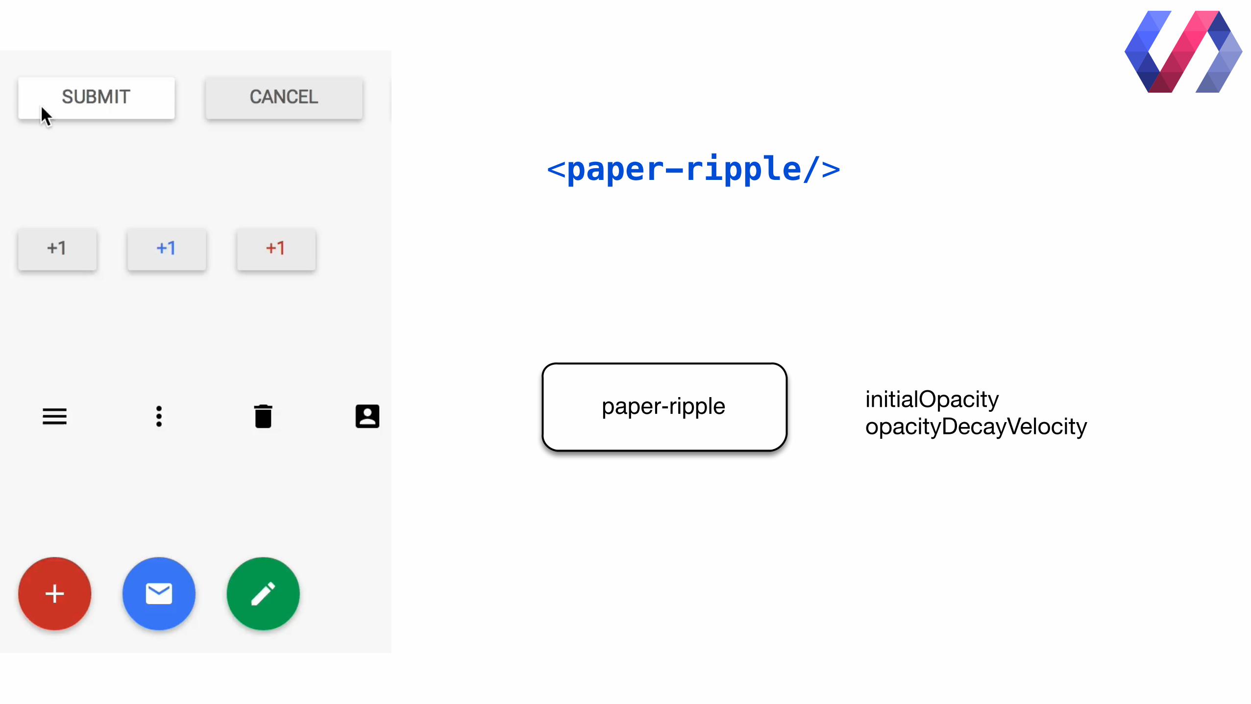
<paper-ripple/>
paper-ripple initialOpacityopacityDecayVelocity

RippleDrawable
<ripple android:color=“?android:colorControlHighlight”> <item> <shape android:shape="rectangle"> <solid android:color=“@color/grey“ /> </shape> </item> </ripple>
Bound to another Drawable
New (v21+)
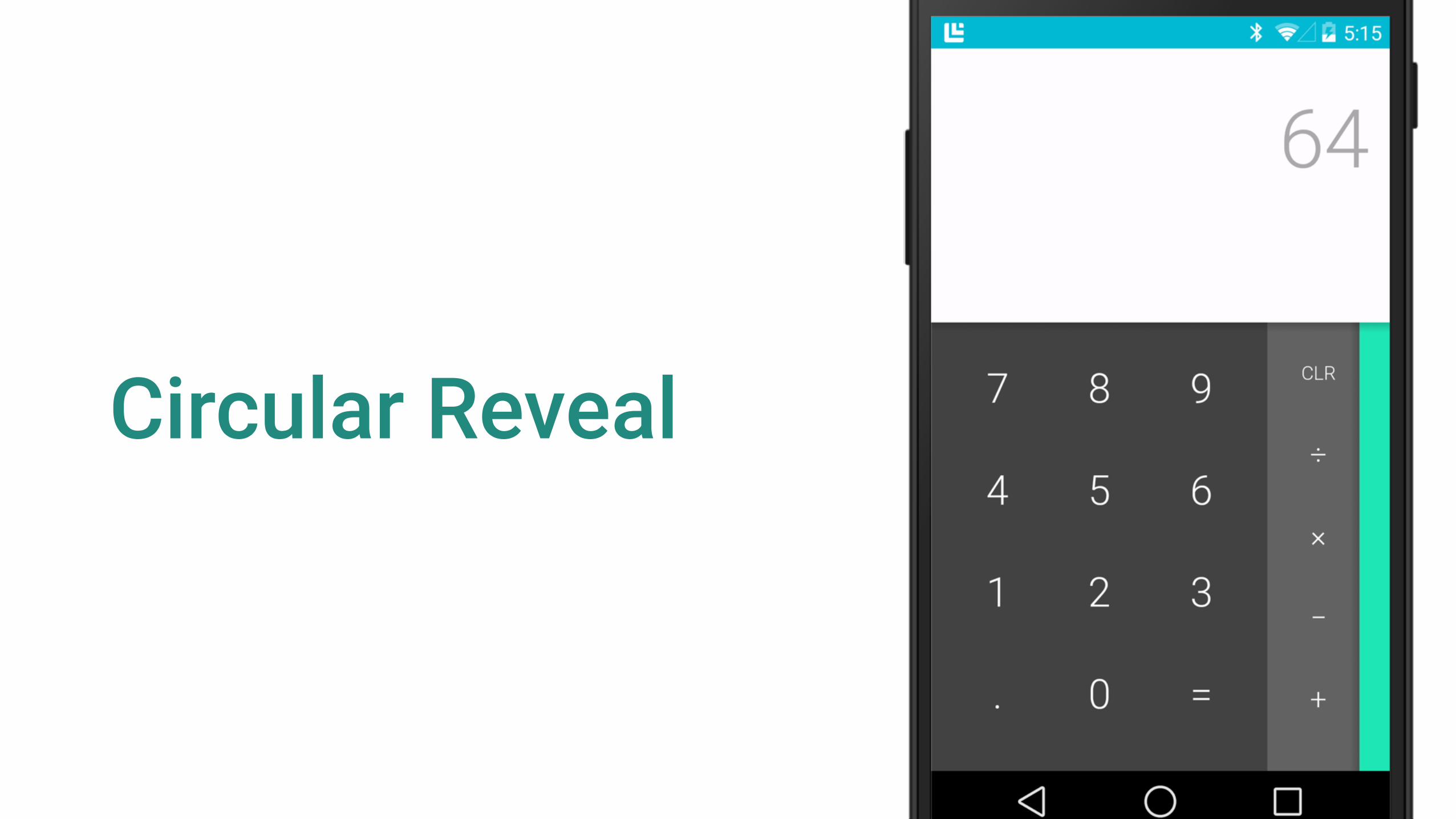
Circular Reveal

Circular Reveal
Animator reveal = ViewAnimationUtils.createCircularReveal( viewToReveal, // View to reveal centerX, // mask centre x centerY, // mask centre y startRadius, // mask start radius endRadius); // mask end radius reveal.start();

Fast, precise motion
@interpolator/ fast_out_slow_in

Fast, precise motion
@interpolator/ linear_out_slow_in
@interpolator/ fast_out_linear_in

Asymmetric motion

Adaptive design4


Toolbar
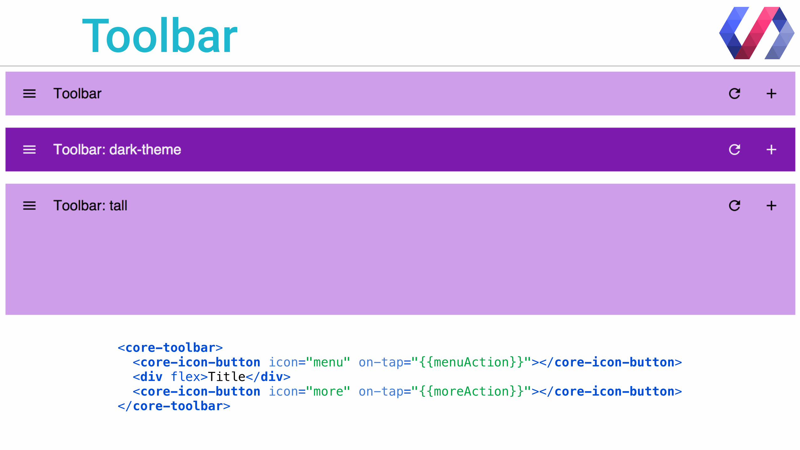
Toolbar
<core-toolbar> <core-icon-button icon="menu" on-tap="{{menuAction}}"></core-icon-button> <div flex>Title</div> <core-icon-button icon="more" on-tap="{{moreAction}}"></core-icon-button> </core-toolbar>

Toolbar
<Toolbar android:id=”@+id/my_toolbar” android:layout_height=”?android:actionBarSize” android:layout_width=”match_parent” android:background=”?android:colorPrimary” />
Place it within your layouts
Toolbar toolbar = findViewById(R.id.my_toolbar); setActionBar(toolbar);
Then in your Activity/Fragment
New (v21+)

M A T E R I A L D E S I G N

Q? +Nick Butcher @crafty
+Chet Haase @chethaase
google.com/design/spec


![Keynote design & animation seminar [at] uns](https://static.fdocuments.net/doc/165x107/557961ebd8b42ab6648b5358/keynote-design-animation-seminar-at-uns.jpg)