MAT 1000 Mathematics in Today's World. Last Time 1.Collecting data requires making measurements....
35
MAT 1000 Mathematics in Today's World
-
Upload
flora-small -
Category
Documents
-
view
213 -
download
0
Transcript of MAT 1000 Mathematics in Today's World. Last Time 1.Collecting data requires making measurements....

MAT 1000
Mathematics in Today's World

Last Time
1. Collecting data requires making
measurements.
2. Measurements should be valid.
3. We want to minimize bias and
variability, as much as possible.

Today
1. Three keys for summarizing a collection of data
2. The distribution of a data set
3. Two ways to visualize a distribution

Summarizing data
The best summary of a large collection of data tells us about three things• Shape • Center• Spread
Today we focus on the “shape” of a collection of data
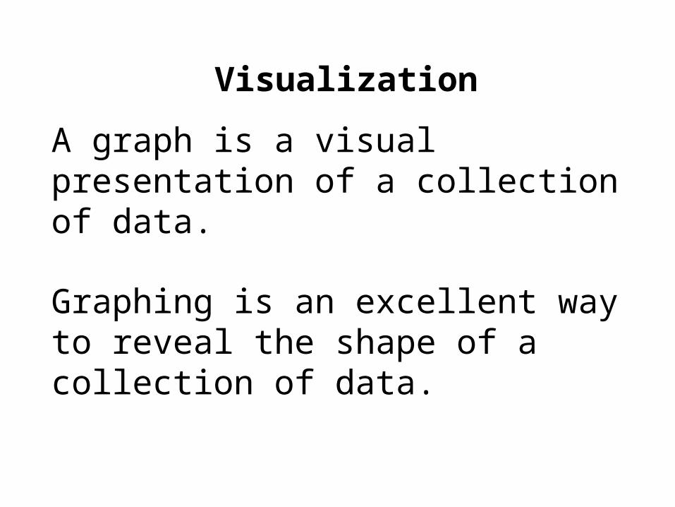
Visualization
A graph is a visual presentation of a collection of data.
Graphing is an excellent way to reveal the shape of a collection of data.

Visualization
There are many different types of graph, each with advantages and disadvantages.
We will look at two types of graph• Histograms• Stemplots

Organizing data
Before we can visualize the data, it may be necessary to organize it.
One way is to count how often particular values occur in our data set.
For example: how many students in this class are psychology majors?

Organizing data
The number of times a value occurs is called the value’s frequency.
Number of psychology majors = frequency of psychology majors.
The proportion of times a value occurs is called the relative frequency of that value.
Percent of psychology majors = relative frequency of psychology majors.

Organizing data
The variable “a student’s major” is not numeric.
For non-numeric variables we can always find frequencies or relative frequencies.
What about numeric variables?

Organizing data
We can find the frequency or relative frequency for numeric variables, but often there’s a better option:
Organize by grouped frequencies.
This means we put the data into classes, lumping together numbers which are close.

Organizing data
However we choose to organize the data—by count, proportion, or in classes—we produce a list of different values and how often they occur.
Distribution: a list of different data values and how often each value occurs.
A distribution shows the “shape” of the data.
This shape is best presented visually.

Example
Consider the set:
3, 11, 12, 19, 22, 23, 24, 25, 27, 29, 35, 36, 37, 38, 45, 49
(the ages of a population consisting of 16 people)

Example (continued)
Knowing the frequency (how many 1s, how many 2s, how many 3s, etc.) would be useless—no number occurs more than once.
Instead, let’s look at grouped frequencies.Data Range Frequency
0-9 1
10-19 3
20-29 6
30-39 4
40-49 2

Example (continued)
3, 11, 12, 19, 22, 23, 24, 25, 27, 29, 35, 36, 37, 38, 45, 49

Example (continued)
Now we can make a chart of the frequency distribution of the data
The following is called a frequency histogram:

Histograms
Bars for each class.
Height of the bar is the number of data in the class.
Note that the bars touch each other.
Only leave a blank space for empty classes.

The shape of a distribution
Important features to identify:
• Number of peaks
• Symmetric or asymmetric
• Asymmetric: skewed to the left, the right, or neither
• Outliers: values that stand out from the overall shape.
• Clusters

Symmetric DistributionsBell-Shaped
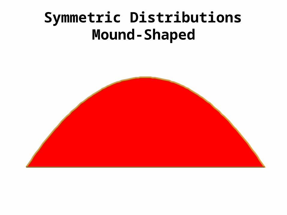
Symmetric Distributions Mound-Shaped

Symmetric Distributions Uniform

Asymmetric Distributions Skewed to the Left

Asymmetric Distributions Skewed to the Right
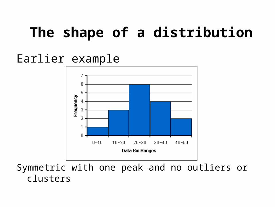
The shape of a distribution
Earlier example
Symmetric with one peak and no outliers or clusters

The shape of a distribution
Asymmetric with one peak, skewed to the left, no clusters, one outlier in the 70-79 class.
0-9 10-19 20-29 30-39 40-49 50-59 60-69 70-790
1
2
3
4
5
6
7
8
Home Runs
Fre
qu
ency

The shape of a distribution
Asymmetric with one peak, skewed to the right, and no outliers or clusters
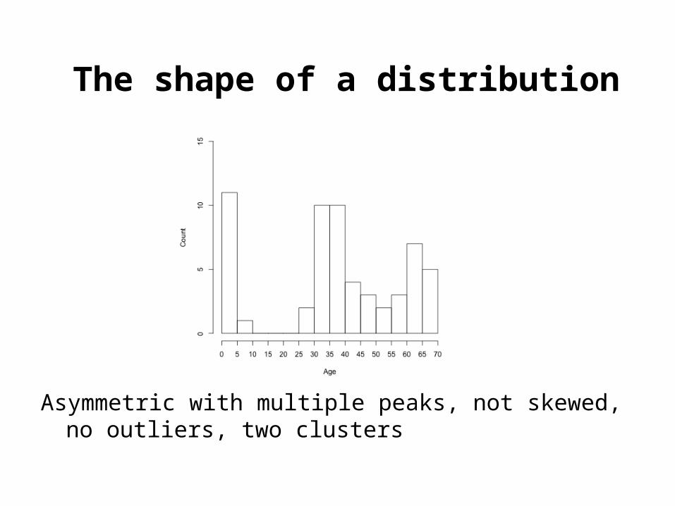
The shape of a distribution
Asymmetric with multiple peaks, not skewed, no outliers, two clusters

The disadvantage of histograms
In a histogram the original data points are lost.
We can see that there is one data value in the 70-79 range, but there is no way to determine the value.
0-9 10-19 20-29 30-39 40-49 50-59 60-69 70-790
1
2
3
4
5
6
7
8
Home Runs
Fre
qu
ency

Stemplots
Here is a sample of a stemplot
The numbers on the left are the “stems.” The other numbers are the “leaves.”

StemplotsThe leaf is the rightmost digit of the data value.
The stem is the rest of the data value.
For example, the 0 in the last row means that the number 60 is in this data set.
Notice there are no leaves on the 1 stem, but we still include it in the stemplot.

How to make a stemplot
1. Each observation gets separated into a stem (all but the rightmost digit) and a leaf (the final digit).
2. The stems get put in a vertical column with the smallest at the top. A vertical line is then drawn.
3. Each leaf is then written in the row to the right of its stem, in increasing order out of the stem.
4. Make sure to line up the leaves in columns.

ExampleThe following data is a list of the annual home run totals of
the baseball player Barry Bonds over his entire 22 year career, sorted from smallest to largest.
5 16 19 24 25 25 26 28 33 33 34 34 37 37 40 42 45 45 46 46 49 73
0
1
2
3
4
5
6
7
5
6 9
4 5 5 6 8
3 3 4 4 7 7
0 2 5 5 6 6 9
3

ExampleThe following data is a list of the annual home run totals of
the baseball player Barry Bonds over his entire 22 year career, sorted from smallest to largest.
5 16 19 24 25 25 26 28 33 33 34 34 37 37 40 42 45 45 46 46 49 73
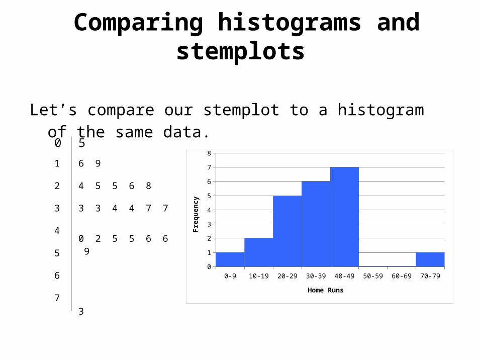
Comparing histograms and stemplots
Let’s compare our stemplot to a histogram of the same data.
0
1
2
3
4
5
6
7
5
6 9
4 5 5 6 8
3 3 4 4 7 7
0 2 5 5 6 6 9
3
0-9 10-19 20-29 30-39 40-49 50-59 60-69 70-790
1
2
3
4
5
6
7
8
Home Runs
Fre
qu
ency

Comparing histograms and stemplots
Stemplots are like histograms that are “tipped over.”
Stemplots gives all of the same information about the shape of the distribution.
In addition, stemplots show all of the data values, which histograms do not.
But, we can’t use stemplots for large data sets.
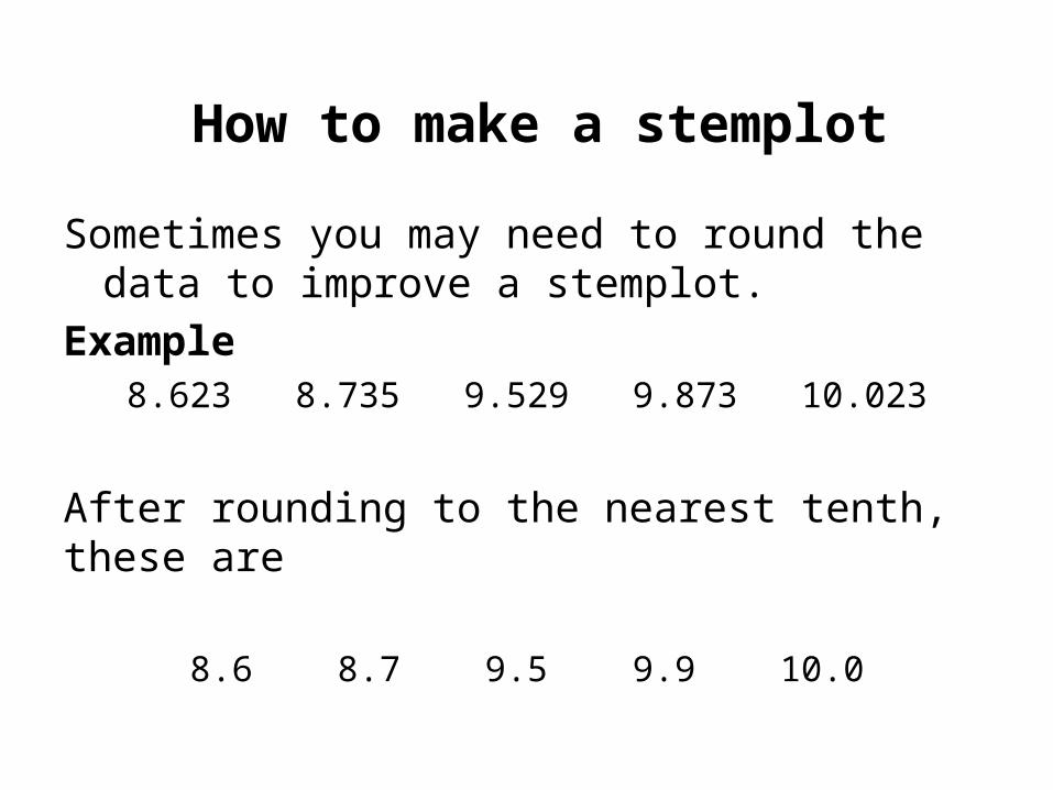
How to make a stemplot
Sometimes you may need to round the data to improve a stemplot.
Example8.623 8.735 9.529 9.873 10.023
After rounding to the nearest tenth, these are
8.6 8.7 9.5 9.9 10.0