Mastering Python for Data Science - Sample Chapter
24
Community Experience Distilled Explore the world of data science through Python and learn how to make sense of data Mastering Python for Data Science Samir Madhavan Free Sample
-
Upload
packt-publishing -
Category
Technology
-
view
325 -
download
3
Transcript of Mastering Python for Data Science - Sample Chapter
C o m m u n i t y E x p e r i e n c e D i s t i l l e d
Explore the world of data science through Python and learn how to make sense of data
Mastering Python for Data Science
Sam
ir Madhavan
Mastering Python for Data Science
Data science is a relatively new knowledge domain which is used by various organizations to make data-driven decisions. The Python programming language, beyond having conquered the scientifi c community in the last decade, is now an indispensable tool for the data science practitioner and a must-know tool for every aspiring data scientist.
This comprehensive guide helps you move beyond the hype and transcend the theory by providing you with a hands-on, advanced study of data science. Beginning with the essentials of Python in data science, you will learn to manage data and perform linear algebra in Python. You will move on to deriving inferences from the analysis by performing inferential statistics and mining data to reveal hidden patterns and trends.
You will then use the matplotlib library to create high-end visualizations in Python and uncover the fundamentals of machine learning. Next, you will apply the linear regression technique and also learn to apply the logistic regression technique to your applications, before fi nally performing k-means clustering, along with an analysis of unstructured data with different text mining techniques and leveraging the power of Python in big data analytics.
Who this book is written forIf you are a Python developer who wants to master the world of data science, then this book is for you. Some knowledge of data science is assumed.
$ 54.99 US£ 34.99 UK
Prices do not include local sales tax or VAT where applicable
Samir Madhavan
What you will learn from this book
Manage data and perform linear algebra in Python
Derive inferences from the analysis by performing inferential statistics
Solve data science problems in Python
Create high-end visualizations using Python
Evaluate and apply the linear regression technique to estimate the relationships among variables
Build recommendation engines with the various collaborative fi ltering algorithms
Apply the ensemble methods to improve your predictions
Work with big data technologies to handle data at scale
Mastering Python for D
ata ScienceP U B L I S H I N GP U B L I S H I N G
community experience dist i l led
Visit www.PacktPub.com for books, eBooks, code, downloads, and PacktLib.
Free Sample

In this package, you will find: The author biography
A preview chapter from the book, Chapter 10 'Applying Segmentation with
k-means Clustering'
A synopsis of the book’s content
More information on Mastering Python for Data Science
About the Author
Samir Madhavan has been working in the fi eld of data science since 2010. He is an industry expert on machine learning and big data. He has also reviewed R Machine Learning Essentials by Packt Publishing. He was part of the ubiquitous Aadhar project of the Unique Identifi cation Authority of India, which is in the process of helping every Indian get a unique number that is similar to a social security number in the United States. He was also the fi rst employee of Flutura Decision Sciences and Analytics and is a part of the core team that has helped scale the number of employees in the company to 50. His company is now recognized as one of the most promising Internet of Things—Decision Sciences companies in the world.

PrefaceData science is an exciting new fi eld that is used by various organizations to perform data-driven decisions. It is a combination of technical knowledge, mathematics, and business. Data scientists have to wear various hats to work with data and derive some value out of it. Python is one of the most popular languages among all the languages used by data scientists. It is a simple language to learn and is used for purposes, such as web development, scripting, and application development to name a few.
The ability to perform data science using Python is very powerful as it helps clean data at a raw level to create advanced machine learning algorithms that predict customer churns for a retail company. This book explains various concepts of data science in a structured manner with the application of these concepts on data to see how to interpret results. The book provides a good base for understanding the advanced topics of data science and how to apply them in a real-world scenario.
What this book coversChapter 1, Getting Started with Raw Data, teaches you the techniques of handling unorganized data. You'll also learn how to extract data from different sources, as well as how to clean and manipulate it.
Chapter 2, Inferential Statistics, goes beyond descriptive statistics, where you'll learn about inferential statistics concepts, such as distributions, different statistical tests, the errors in statistical tests, and confi dence intervals.
Chapter 3, Finding a Needle in a Haystack, explains what data mining is and how it can be utilized. There is a lot of information in data but fi nding meaningful information is an art.

Preface
Chapter 4, Making Sense of Data through Advanced Visualization, teaches you how to create different visualizations of data. Visualization is an integral part of data science; it helps communicate a pattern or relationship that cannot be seen by looking at raw data.
Chapter 5, Uncovering Machine Learning, introduces you to the different techniques of machine learning and how to apply them. Machine learning is the new buzzword in the industry. It's used in activities, such as Google's driverless cars and predicting the effectiveness of marketing campaigns.
Chapter 6, Performing Predictions with a Linear Regression, helps you build a simple regression model followed by multiple regression models along with methods to test the effectiveness of the models. Linear regression is one of the most popular techniques used in model building in the industry today.
Chapter 7, Estimating the Likelihood of Events, teaches you how to build a logistic regression model and the different techniques of evaluating it. With logistic regression, you'll be able learn how to estimate the likelihood of an event taking place.
Chapter 8, Generating Recommendations with Collaborative Filtering, teaches you to create a recommendation model and apply it. It is similar to websites, such as Amazon, which are able to suggest items that you would probably buy on their page.
Chapter 9, Pushing Boundaries with Ensemble Models, familiarizes you with ensemble techniques, which are used to combine the power of multiple models to enhance the accuracy of predictions. This is done because sometimes a single model is not enough to estimate the outcome.
Chapter 10, Applying Segmentation with k-means Clustering, teaches you about k-means clustering and how to use it. Segmentation is widely used in the industry to group similar customers together.
Chapter 11, Analyzing Unstructured Data with Text Mining, teaches you to process unstructured data and make sense of it. There is more unstructured data in the world than structured data.
Chapter 12, Leveraging Python in the World of Big Data, teaches you to use Hadoop and Spark with Python to handle data in this chapter. With the ever increasing size of data, big data technologies have been brought into existence to handle such data.

[ 193 ]
Applying Segmentation with k-means Clustering
Clustering comes under unsupervised learning and helps in segmenting an instance into groups in such a way that instances in the group have similar characteristics. Amazon might want to understand who their high-value, medium-value and low-value users are. In the simplest form, we can determine this by bucketing the total transaction amount of each user into three buckets. The high value customers will come under the top 20 percentile bucket, the medium value will come under the 20th to 80th percentile bucket, and the bottom 20 percentile will contain the low-value customers. Amazon will know who their high value customers are through this and ensure that they are taken care of in case of scenarios, such as payment failures for transactions. Here, we've used a single variable, such as the transaction amount, and we've manually bucketed the data.
We require an algorithm that can take multiple variables and helps us in bucketing instances. The k-means is one of the most popular algorithms to perform clustering as it is the easiest machine learning algorithm to understand under clustering. Also, segmentation is the process of dividing customers into groups, and clustering is the technique that helps in fi nding the similarities in a group and help assign customers to a particular group.
In this chapter, you'll learn the following topics:
• Determining the ideal number of clusters through the k-means technique• Clustering with the k-means algorithm

Applying Segmentation with k-means Clustering
[ 194 ]
The k-means algorithm and its workingThe k-means clustering algorithm operates by computing the average of features, such as the variables that we use for clustering. For example, segmenting customers based on the average transaction amount and the average number of products purchased in a quarter of a year. This mean then becomes the center of a cluster. The K number is the number of clusters, that is, the technique consists of computing a K number of means that lead to the clustering of data around these k-means.
How do we choose this K? If we have some idea of what we are looking for or how many clusters we expect or want, then we can set K to be this number before we start the engines and let the algorithm compute along.
If we don't know how many clusters there are, then our exploration will take a little longer and involve some trial and error, say, as we try K=3,4, and 5.
The k-means algorithm is iterative. It starts by choosing K points at random from the data and uses these as cluster centers just to get started. Then, at each iterative step, this algorithm decides which row values are closest to the cluster center and assigns K points to them.
Once this is done, we have a new arrangement of points. Thus, the center or mean of the clusters is computed again as it may have changed. When does it not shift? When we have stable clusters, and we have iterated till we get no benefi t from iterating further, then this is our result.
There are conditions under which k-means do not converge, that is, there are no stable clusters, but we won't get into that here. You can read further about the convergence of k-means at http://webdocs.cs.ualberta.ca/~nray1/CMPUT466_551/kmeans_convergence.pdf.
A simple exampleLet's look at a simple example before getting into k-means clustering. We'll use a dataset of t-shirt sizes with the following columns:
• Size: This refers to the size of a t-shirt• Height: This refers to the height of a person• Weight: This refers to the weight of a person
Chapter 10
[ 195 ]
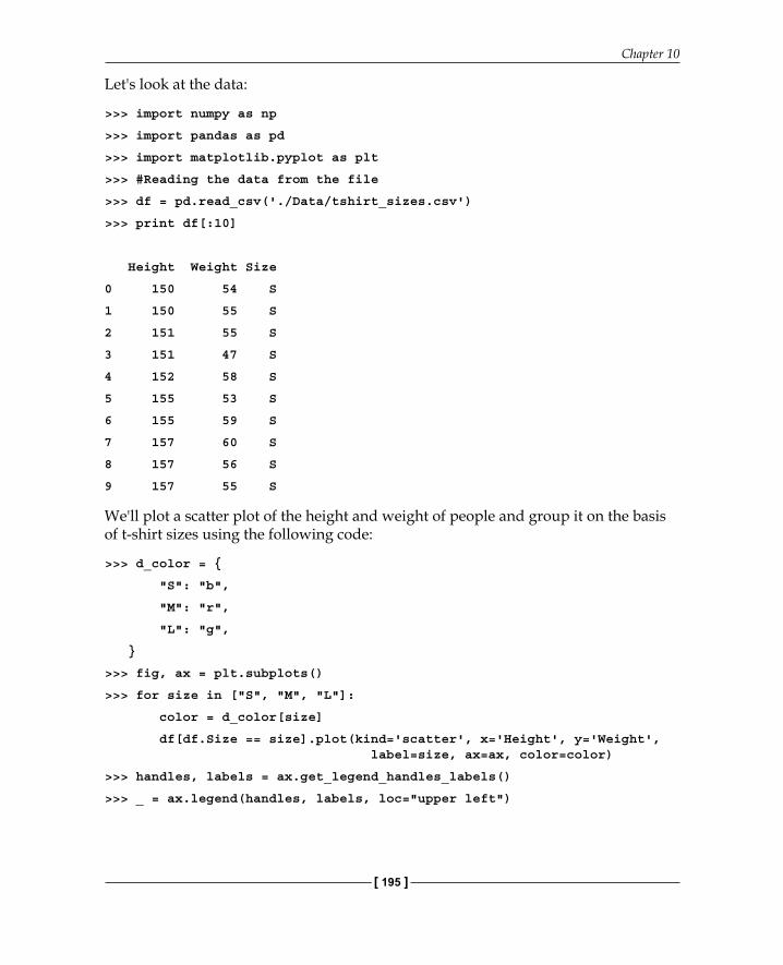
Let's look at the data:
>>> import numpy as np
>>> import pandas as pd
>>> import matplotlib.pyplot as plt
>>> #Reading the data from the file
>>> df = pd.read_csv('./Data/tshirt_sizes.csv')
>>> print df[:10]
Height Weight Size
0 150 54 S
1 150 55 S
2 151 55 S
3 151 47 S
4 152 58 S
5 155 53 S
6 155 59 S
7 157 60 S
8 157 56 S
9 157 55 S
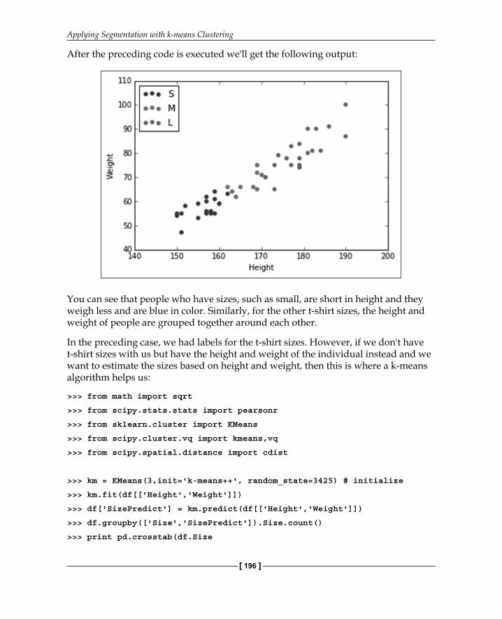
We'll plot a scatter plot of the height and weight of people and group it on the basis of t-shirt sizes using the following code:
>>> d_color = {
"S": "b",
"M": "r",
"L": "g",
}
>>> fig, ax = plt.subplots()
>>> for size in ["S", "M", "L"]:
color = d_color[size]
df[df.Size == size].plot(kind='scatter', x='Height', y='Weight', label=size, ax=ax, color=color)
>>> handles, labels = ax.get_legend_handles_labels()
>>> _ = ax.legend(handles, labels, loc="upper left")
Applying Segmentation with k-means Clustering
[ 196 ]
After the preceding code is executed we'll get the following output:
You can see that people who have sizes, such as small, are short in height and they weigh less and are blue in color. Similarly, for the other t-shirt sizes, the height and weight of people are grouped together around each other.
In the preceding case, we had labels for the t-shirt sizes. However, if we don't have t-shirt sizes with us but have the height and weight of the individual instead and we want to estimate the sizes based on height and weight, then this is where a k-means algorithm helps us:
>>> from math import sqrt
>>> from scipy.stats.stats import pearsonr
>>> from sklearn.cluster import KMeans
>>> from scipy.cluster.vq import kmeans,vq
>>> from scipy.spatial.distance import cdist
>>> km = KMeans(3,init='k-means++', random_state=3425) # initialize
>>> km.fit(df[['Height','Weight']])
>>> df['SizePredict'] = km.predict(df[['Height','Weight']])
>>> df.groupby(['Size','SizePredict']).Size.count()
>>> print pd.crosstab(df.Size
Chapter 10
[ 197 ]
,df.SizePredict
,rownames = ['Size']
,colnames = ['SizePredict'])
SizePredict 0 1 2
Size
L 13 0 1
M 0 6 14
S 0 15 0
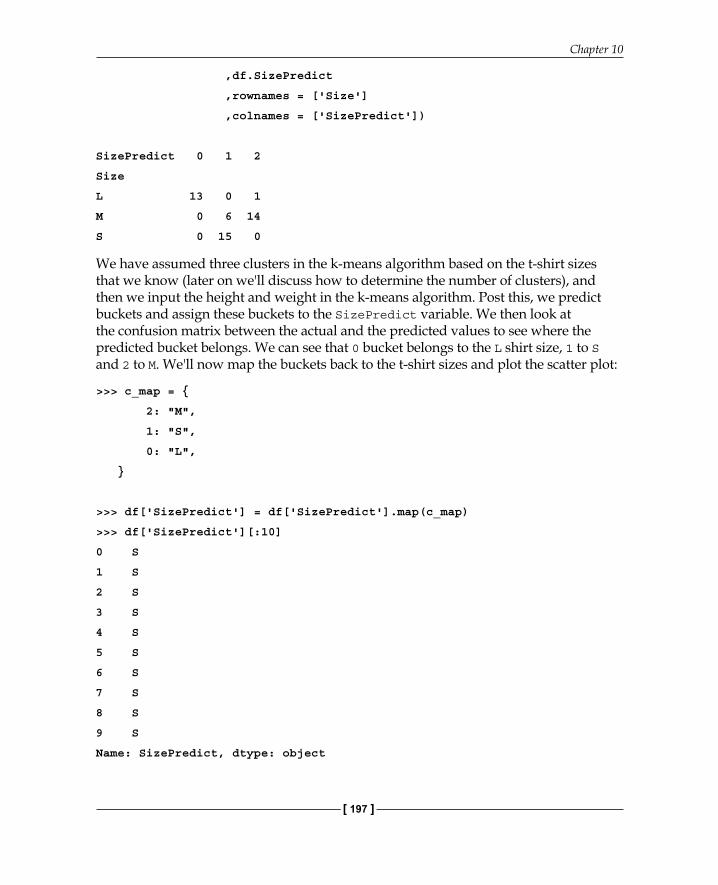
We have assumed three clusters in the k-means algorithm based on the t-shirt sizes that we know (later on we'll discuss how to determine the number of clusters), and then we input the height and weight in the k-means algorithm. Post this, we predict buckets and assign these buckets to the SizePredict variable. We then look at the confusion matrix between the actual and the predicted values to see where the predicted bucket belongs. We can see that 0 bucket belongs to the L shirt size, 1 to S and 2 to M. We'll now map the buckets back to the t-shirt sizes and plot the scatter plot:
>>> c_map = {
2: "M",
1: "S",
0: "L",
}
>>> df['SizePredict'] = df['SizePredict'].map(c_map)
>>> df['SizePredict'][:10]
0 S
1 S
2 S
3 S
4 S
5 S
6 S
7 S
8 S
9 S
Name: SizePredict, dtype: object
Applying Segmentation with k-means Clustering
[ 198 ]
We'll now plot the scatter plot:
>>> fig, ax = plt.subplots()
>>> for size in ["S", "M", "L"]:
color = d_color[size]
df[df.SizePredict == size].plot(kind='scatter', x='Height', y='Weight', label=size, ax=ax, color=color)
>>> handles, labels = ax.get_legend_handles_labels()
>>> _ = ax.legend(handles, labels, loc="upper left")
After the preceding code is executed we'll get the following output:
We can see from the plot that the k-means algorithm was able to bucket people into appropriate buckets where the shirt sizes can be used to identify a bucket as unique.

Chapter 10
[ 199 ]
The k-means clustering with countriesWe have UN data on different countries of the world with regard to education of people to Gross Domestic Product. We'll use this data to bucket the countries based on their development. Here are the descriptions of the columns:
Here is a screenshot of the data:

Applying Segmentation with k-means Clustering
[ 200 ]
Lets see the data type of each column:
>>> df = pd.read_csv('./Data/UN.csv')
>>> # print the raw column information plus summary header
>>> print('----')
>>> # look at the types of each column explicitly
>>> [(col, type(df[col][0])) for col in df.columns] [(x, type(df[x][0])) for x in df.columns]
[('country', str),
('region', str),
('tfr', numpy.float64),
('contraception', numpy.float64),
('educationMale', numpy.float64),
('educationFemale', numpy.float64),
('lifeMale', numpy.float64),
('lifeFemale', numpy.float64),
('infantMortality', numpy.float64),
('GDPperCapita', numpy.float64),
('economicActivityMale', numpy.float64),
('economicActivityFemale', numpy.float64),
('illiteracyMale', numpy.float64),
('illiteracyFemale', numpy.float64)]
Let's check the fi ll rate of the columns, which is basically the percentage of rows and columns that have values:
>>> print('Percentage of the values complete in the columns')
>>> s_col_fill = df.count(0)/df.shape[0] * 100
>>> s_col_fill
country 100.000000
region 100.000000
tfr 95.169082
contraception 69.565217
educationMale 36.714976
educationFemale 36.714976
lifeMale 94.685990
lifeFemale 94.685990
infantMortality 97.101449

Chapter 10
[ 201 ]
GDPperCapita 95.169082
economicActivityMale 79.710145
economicActivityFemale 79.710145
illiteracyMale 77.294686
illiteracyFemale 77.294686
dtype: float64
We can see that the education column does not have a good fi ll rate followed by the contraception column.
The columns with a good fi ll rate are life expectancy of lifeMale and lifeFemale, infantMortality and GDPperCapita. With these columns, we'll remove only a few countries, whereas if we include other columns, we'll remove a lot of countries.
There should be a clustering infl uence based on the life expectancy of males and females and the infant mortality rate based on the GDP of a country. This is because a higher GDP is better for the economy of the country, and a country with a good economy is presumed to have a good life expectancy and low infant mortality rate:
>>> df = df[['lifeMale', 'lifeFemale', 'infantMortality', 'GDPperCapita']]
>>> df = df.dropna(how ='any')
Determining the number of clustersBefore applying the k-means algorithm, we would like to estimate the ideal number of clusters to the group called countries:
>>> K = range(1,10)
>>> # scipy.cluster.vq.kmeans
>>> KM = [kmeans(df.values,k) for k in K] # apply kmeans 1 to 10
>>> KM[:3]
[(array([[ 63.52606383, 68.30904255, 44.30851064, 5890.59574468]]), 6534.9809626620172), (array([[ 6.12227273e+01, 6.57779221e+01, 5.23831169e+01, 2.19273377e+03], [ 7.39588235e+01, 7.97735294e+01, 7.73529412e+00, 2.26397353e+04]]), 2707.2294867471232), (array([[ 7.43050000e+01, 8.02350000e+01, 6.60000000e+00, 2.76644500e+04], [ 6.02309353e+01, 6.46640288e+01, 5.61007194e+01, 1.47384173e+03], [ 7.18862069e+01, 7.75551724e+01, 1.37931034e+01, 1.20441034e+04]]), 1874.0284870915732)]
Applying Segmentation with k-means Clustering
[ 202 ]
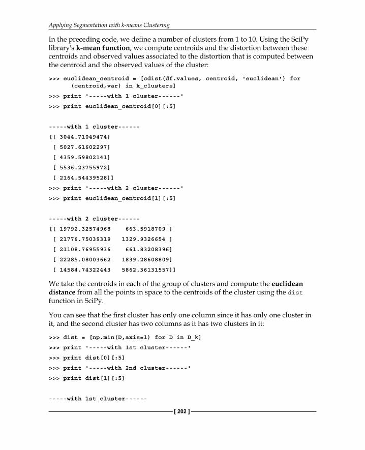
In the preceding code, we defi ne a number of clusters from 1 to 10. Using the SciPy library's k-mean function, we compute centroids and the distortion between these centroids and observed values associated to the distortion that is computed between the centroid and the observed values of the cluster:
>>> euclidean_centroid = [cdist(df.values, centroid, 'euclidean') for (centroid,var) in k_clusters]
>>> print '-----with 1 cluster------'
>>> print euclidean_centroid[0][:5]
-----with 1 cluster------
[[ 3044.71049474]
[ 5027.61602297]
[ 4359.59802141]
[ 5536.23755972]
[ 2164.54439528]]
>>> print '-----with 2 cluster------'
>>> print euclidean_centroid[1][:5]
-----with 2 cluster------
[[ 19792.32574968 663.5918709 ]
[ 21776.75039319 1329.9326654 ]
[ 21108.76955936 661.83208396]
[ 22285.08003662 1839.28608809]
[ 14584.74322443 5862.36131557]]
We take the centroids in each of the group of clusters and compute the euclidean distance from all the points in space to the centroids of the cluster using the dist function in SciPy.
You can see that the fi rst cluster has only one column since it has only one cluster in it, and the second cluster has two columns as it has two clusters in it:
>>> dist = [np.min(D,axis=1) for D in D_k]
>>> print '-----with 1st cluster------'
>>> print dist[0][:5]
>>> print '-----with 2nd cluster------'
>>> print dist[1][:5]
-----with 1st cluster------
Chapter 10
[ 203 ]
[ 3044.71049474
5027.61602297
4359.59802141
5536.23755972
2164.54439528]
-----with 2nd cluster------
[ 663.5918709
1329.9326654
661.83208396
1839.28608809
5862.36131557]
As we have the distance of each of the observed points from the different centroids, we can fi nd the minimum distance of each observed point from the closest centroid.
You can see in the preceding code that the fi rst and second clusters contain a single value, which is the distance from the centroid.
We'll now compute the average of the sum of the square of the distance:
>>> avgWithinSS = [sum(d)/df.values.shape[0] for d in dist]
>>> avgWithinSS
[6534.9809626620136,
2790.2101193300132,
1890.9166153060164,
1438.7793254224125,
1120.3902815703975,
903.15438285732,
740.45942949866003,
645.91915410445336,
604.37878538964185]
Each of the values in the array is the average sum of the square that has one cluster to a group of ten clusters.

Applying Segmentation with k-means Clustering
[ 204 ]
We'll now plot the elbow curve (this is the point at which a curve starts fl attening out) for the k-means clustering using this data:
>>> #Choosing the cluster number
>>> kIdx = 2
>>> # plot elbow curve
>>> fig = plt.figure()
>>> ax = fig.add_subplot(111)
>>> ax.plot(K, avgWithinSS, 'b*-')
>>> ax.plot(K[kIdx], avgWithinSS[kIdx], marker='o', markersize=12,
markeredgewidth=2, markeredgecolor='r', markerfacecolor='None')
>>> plt.grid(True)
>>> plt.xlabel('Number of clusters')
>>> plt.ylabel('Average within-cluster sum of squares')
>>> tt = plt.title('Elbow for K-Means clustering')

Chapter 10
[ 205 ]
After the preceding code is executed we'll get the following output:
By looking at the curve, we can see that there is big jump from one cluster to the other, and then a signifi cant jump from cluster 2 to cluster 3. There is a slight jump from cluster 3 to cluster 4, and then the jump to the subsequent number of clusters is very small. Let's fi x the elbow point at cluster 3 and create three clusters to segment t he countries.
Clustering the countriesWe'll now apply the k-means algorithm to cluster the countries together:
>>> km = KMeans(3, init='k-means++', random_state = 3425) # initialize
>>> km.fit(df.values)
>>> df['countrySegment'] = km.predict(df.values)
>>> df[:5]

Applying Segmentation with k-means Clustering
[ 206 ]
After the preceding code is executed we'll get the following output:
Let's fi nd the average GDP per capita for each country segment:
>>> df.groupby('countrySegment').GDPperCapita.mean()
>>> countrySegment
0 13800.586207
1 1624.538462
2 29681.625000
Name: GDPperCapita, dtype: float64
We can see that cluster 2 has the highest average GDP per capita and we can assume that this includes developed countries. Cluster 0 has the second highest GDP, we can assume this includes developing countries, and fi nally, cluster 1 has a very low average GDP per capita. We can assume this includes developed nations:
>>> clust_map = {
0:'Developing',
1:'Under Developed',
2:'Developed'
}
>>> df.countrySegment = df.countrySegment.map(clust_map)
>>> df[:10]

Chapter 10
[ 207 ]
After the preceding code is executed we'll get the following output:
Let's see the GDP versus infant mortality rate of the countries for each of the clusters:
>>> d_color = {
'Developing':'y',
'Under Developed':'r',
'Developed':'g'
}
>>> fig, ax = plt.subplots()
>>> for clust in clust_map.values():
color = d_color[clust]
df[df.countrySegment == clust].plot(kind='scatter', x='GDPperCapita', y='infantMortality', label=clust, ax=ax, color=color)
>>> handles, labels = ax.get_legend_handles_labels()
>>> _ = ax.legend(handles, labels, loc="upper right")

Applying Segmentation with k-means Clustering
[ 208 ]
After the preceding code is executed we'll get the following output:
We can see from the preceding graph that when the GDP is low, the infantMortality rate is really high, and as the GDP increases, the InfantMortality rate decreases.
We can also clearly see that the countries in green are the underdeveloped nations, the one in dark blue are the developing nations, and the ones in red are the developed nations.
Let's see the life expectancy of males with respect to the GDP:
>>> fig, ax = plt.subplots()
>>> for clust in clust_map.values():
color = d_color[clust]
df[df.countrySegment == clust].plot(kind='scatter', x='GDPperCapita', y='lifeMale', label=clust, ax=ax, color=color)
>>> handles, labels = ax.get_legend_handles_labels()
>>> _ = ax.legend(handles, labels, loc="lower right")
Chapter 10
[ 209 ]
After the preceding code is executed we'll get the following output:
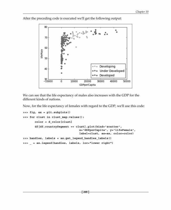
We can see that the life expectancy of males also increases with the GDP for the different kinds of nations.
Now, for the life expectancy of females with regard to the GDP, we'll use this code:
>>> fig, ax = plt.subplots()
>>> for clust in clust_map.values():
color = d_color[clust]
df[df.countrySegment == clust].plot(kind='scatter', x='GDPperCapita', y='lifeFemale', label=clust, ax=ax, color=color)
>>> handles, labels = ax.get_legend_handles_labels()
>>> _ = ax.legend(handles, labels, loc="lower right")

Applying Segmentation with k-means Clustering
[ 210 ]
After the preceding code is executed we'll get the following output:
There is a similar trend for females too.
SummaryIn this chapter, you were made to understand the concept of clustering and learned an unsupervised learning technique called the k-means technique. You also learned how to determine the number of clusters before segmenting data using k-means, and fi nally, you saw the results of this using the k-means clustering.
In the next chapter, you'll learn how to explore unstructured data and use text mining techniques on unstructured data.

Where to buy this book You can buy Mastering Python for Data Science from the Packt Publishing website.
Alternatively, you can buy the book from Amazon, BN.com, Computer Manuals and most internet
book retailers.
Click here for ordering and shipping details.
www.PacktPub.com
Stay Connected:
Get more information Mastering Python for Data Science