Martha Hagan Newsstand Visit
32
Martha Hagan Food Genre Clean Eating Magazine
Transcript of Martha Hagan Newsstand Visit
Martha HaganFood Genre
Clean Eating Magazine

My Visit to the Newsstand

Caught my Eye
The Buddhist Review Tricycle Winter 2014 caught my eye the most out of all of
the magazines in the newsstand. I really like all of the colors and the interesting
way it is designed. It is an image that I could keep
looking at and find more appealing parts.

Caught my Eye (My Genre)
Intermezzo’s Volume 11 Edition 32 caught my eye the most within genre. It purely was my favorite because of the delicious
looking desserts. The magazine’s central image is really appealing which is why it caught my eye

Best Photography
To me, this magazine had the best design. I like how the cover lines,
masthead, puff, and pug go right around the
central image. The way the photographer capture the caramel dripping off
the cake is perfect.

Best Design
I absolutely love the photography of this
magazine. I really like how the elements of art were
used and the circular photography and design of
the Apple Tart.

Grabbed my Attention
These cover lines and articles grabbed my attention the most out of all of the food
genre magazines in the newsstand. Everyone loves comfort food and the way the macaroni and cheese is displayed really makes the viewer jealous. All of the
articles here look appealing to every body.

Best Table of Contents
This Table of Contents is from the Food Network Magazine in the
January/February Edition of 2015. This had the best because every single article looked appealing.
The image on this page also made it my favorite. The hamburger looks delicious and it gives the
page number to find it. I also like how the magazine pointed out the page numbers of the magazine’s cover lines. Many magazines did
not do this.

Best Articles
After reading several articles from food
magazines, I determined that Skinny Slow
Cooker’s articles were the most informative and interesting. They share yummy ways to eat as
few calories as possible which is relatable for
everyone.

Newsstand Reflection
After going to the newsstand, I learned exactly how I want to create my magazine. Overall, the magazines that
mostly caught my attention were those with interesting and detail oriented central images. So, my central must be interesting to gain attention. I realized after leaving that the magazines I picked up were because of the central image. I did not even look at the cover lines unless the
central image appealed to me.

Most Inspirational Magazine
I chose Clean Eating as my inspirational
magazine. This type of magazine is exactly what I’m striving to achieve. I want to focus on healthy eating while making it
interesting.

Magazine 1
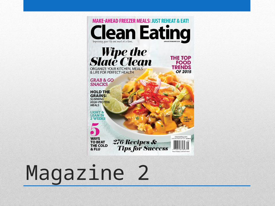
Magazine 2

Magazine 3

Magazine 4

Magazine 5

Magazine 6

Magazine 7

Magazine 8

Magazine 9

Magazine 10

Magazine 11

Magazine 12

Clean Eating
• This magazine is mainly about healthy eating. It includes recipes and ways to cut down on unhealthy recipes. Clean Eating informs on kitchen materials. It also focuses on having a strong lifestyle with exercise and more sleep.
• The target audience for this magazine is for chefs and cooks. It is probably for the middle aged and anyone interested in a healthy lifestyle, mostly women.
• The types of articles inside the magazine include interviews with chefs, recipes, tips from experts, “how tos”, success stories, and reviews.

Clean Eating Magazine
• The central image on every Clean Eating Magazine is of food. All the food is fresh. They are close-up pictures and include sharp enough details to see the seasonings on the food.
• The photos are used taken on a plate with a different colored background or a table cloth.
• Yes, the masthead is always the same font; but, different colors. The layout is also always the same: with a picture of food on the right side with the cover lines on the left side. Usually, Clean Eating has a skyline.

Table of Contents 1

Table of Contents 2

Table of Contents 3

Table of Contents Layout
Yes, all of the Table of Contents layouts include pictures of food with descriptions and cover lines on the side. All use white space and have similar, bright, fun colors. All of the
food looks good and the layout is overall, very similar.

Two Page Spread 1

Two Page Spread 2

Two Page Spreads
Each of the magazine two spreads are very alike. They include pictures of food and are in columns. One column is aligned to the right while the other is justified. There are a lot of graphics on the first one but just one main graphic on
the other.