SPIE Accessibility Conformance Report Revised Section 508 ...
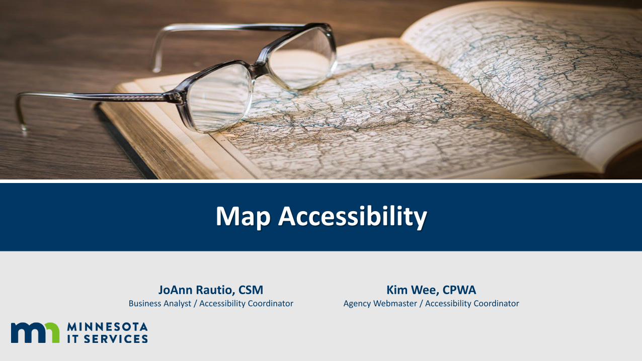
Map Accessibility
JoAnn Rautio, CSMBusiness Analyst / Accessibility Coordinator
Kim Wee, CPWAAgency Webmaster / Accessibility Coordinator

I. Digital Accessibility 101II. Cartographic Best PracticesIII. Static Map AccessibilityIV. Interactive Map AccessibilityV. Resources
Map Accessibility Agenda

Digital Accessibility 101
• Accessible design is a design process that considers the needs of people with disabilities.
• Think about accessibility from the start in the design phase. Avoids rework (saving time and $$$).
• Creating accessible information shouldn’t be an exception to the rule, it should be there when people need it and not by request.

Minnesota Standards and Expectations
• Section 508 of the U.S. Rehabilitation Act
• Web Content Accessibility Guidelines (WCAG) 2.0, level A and AA
• Supplementing the standard are statutes on public records (363A.42) and continuing education (363A.43)

Cartographic Best Practices

Low Vision and Color Vision Deficiency
• Beyond cartographic design standards, we also include design that assists those with Low Vision and/or Color Vision Deficiency.

Color is tricky!
Ask yourself some questions before you start:• Choose colors based on information hierarchy.
• Basemap information should be muted back by use of transparency or muted colors. Contrast is important!
• Is the map being printed? CMYK (ink) vs. RGB (onscreen)

Accessible Color Schemes
The MN Map Design Guide has color scheme resources to help

Tell a Story
A map should tell a story.
3/4/2019 9

Map Considerations
Map source: www.sutori.com
• What is the purpose of the map?
• Is a map really needed?
• Can the information be portrayed with a tableand/or graph?

Too Much Information
• Don’t get lost in the weeds.
• Too much information can confuse your reader.
Map source: Map of London roads, A to Z Maps

Map Size and Scale
Wild River State Park 11 x 17 map example:
• Large park area (scale 1:74,500)
• Seasonal activities (summer trails/winter trails) almost same physical size as full park overview (scale 1:29,550)

Font Recommendations
Some considerations for good design and accessibility that can make your map easier to read:
• In print ideal size is 8-10 point.
• Do not use underlined text.
• Do not overlap labels.
• Do not place labels upside down.
• Do not use shadow text.

Map Symbols with Labels
If the symbol doesn’t intuitively represent the feature then we can add text, or a map label to the object to provide context.

Patterns
• Limit use of patterns to 1 to 2 non-hierarchal pieces. Patterns are very distracting and difficult to distinguish with elements on top of them.
• Ensure the pattern is placed below the primary map information in the order list.
• Try adding a transparency to the pattern to avoid overwhelming the viewer.
• Never put dashed/dotted lines on top of opaque patterns!

Patterns (Continued)
Subtle, or transparent patterns are effective in designating a large area, while still providing enough contrast to separate from other features.

Line Styles
• Be creative! Lines styles should be distinguishable.
• Aim for no more than 6-7 style types for hierarchal information lines.
• This map pushes the boundaries!

Colored Line Styles
• If you can produce a map in color, your options open greatly. Focus on high contrast colors.
• This map features a mixture of color and line patterns, allowing for higher map readability.

Map Legend
• All symbols should be represented in the legend.
• Legend symbols should be the same size as the map symbol.
• Larger legends can group items by category and symbol type.

Parting Cartographic Thoughts
• Balance map items on the page. • White space is okay! Less clutter is an easier to read map.• Important Accessibility Information
Web PDF Word or print via InDesign
Static Map Accessibility

Static Map Examples
Four Examples:
1. Map with description & data
2. Map with description
3. Map with links
4. Map linking to website (with additional description)
6th C BC map of the world Source: https://commons.wikimedia.org/wiki/File:Baylonianmaps.JPG

1. Map with description & data

2. Map with description

3. Map with links

4. Map linking to website

Interactive Map Accessibility

Interactive Map Accessibility Solutions
Top Five1.Focus on the map’s intent/purpose2.Don’t rely on color alone3.Consider the reading order4.Consider text layout5.Recognize technological
constraints

1. Focus on the map’s intent/purpose
• Focus on the map’s purpose.• Start with the foundational
cartographic principles. • Provide controls where possible
that don’t rely on map interaction.

Map Intent/Purpose Example
• Present the data. Most maps have an accompany set of tabular data. It can be helpful to present that data as an alternative to viewing the map.
3/4/2019 30

2. Don’t rely on color alone
• Provide good color contrast. • Color cannot be the only way
information is conveyed.• Underline links. • Use shapes and/or texture.

Color + Texture Example
3/4/2019 32

Color + Texture Example, continued

3. Consider the reading order
• The visual hierarchy should match the keyboard order.
• Ensure elements can be accessed via the keyboard.
• Use Focus Indicators (CSS) to highlight keyboard focus.

4. Consider text and layout
• Keep simplicity in mind.• Use clear semantics and remember
line length.• Use a minimum of 12-pt font • Use true text (HTML text) • Refrain from using ALL CAPS.

Text Layout Example, continued
Zoom: 175%

5. Recognize technological constraints
• Research assistive technologies.• Research mapping libraries.• Use accessibility tools.• Use people and conduct a usability
study.

ARIA
ARIA – Accessible Rich Internet Applications
• ARIA is a set of attributes to help enhance the semantics of a web site or web application to help screen readers make sense of certain things that are not native to HTML.
First Rule of ARIA: Don’t use ARIA
• Use Semantic HTML elements in place of an ARIA attribute wherever possible.
• Should be used only to fill in gaps for screen reader users.

aria-live Example

Resources
Color• WebAIM Color Contrast Checker (website)
• Colour Contrast Analyser (software)
Google Chrome extensions• aXe (also Firefox)
• WAVE
• Colorblinding

Questions?PresentersKim Wee, CPWA [email protected] Rautio, CSM [email protected]