Chaitanya Baliga, Ph.D., ASQ-CQA/CMQOE/CSSGB Chaitanya Baliga - ASQ Meeting111 March 2015.
date post
21-Dec-2015Category
view
214download
0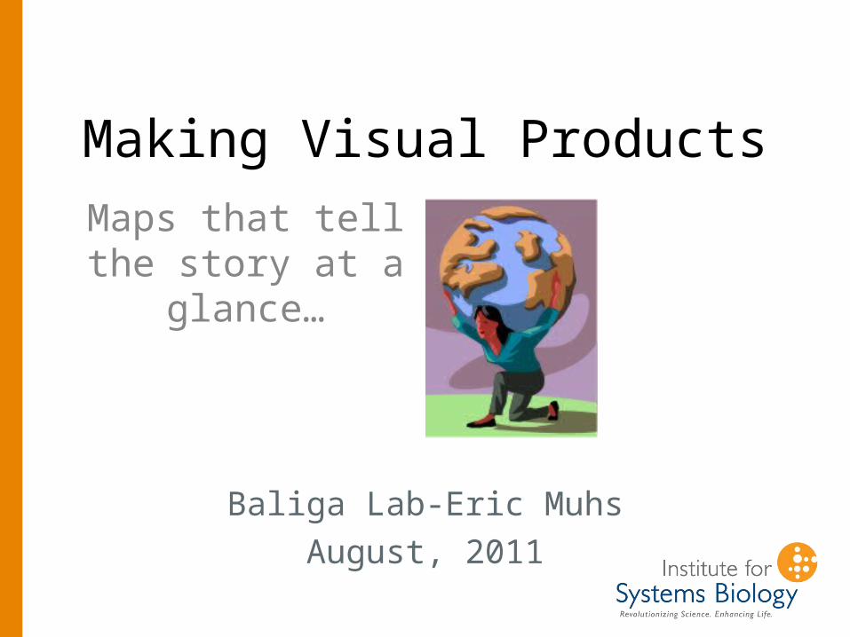
Making Visual Products
Baliga Lab-Eric Muhs
August, 2011
Maps that tell the story at a
glance…

The color density indicates the microorganism population found at each location on the map.
At a glance, you can spot where the microorganisms are most abundant.
In this case, the presence of extremophile microorganisms points to the presence of Arsenic, a mine tailing pollutant.
The Map tells the story at a glance.

This kind of work is very common for studying and planning land use around the world.
This image from The Sanborn Map Company, Inc., shows a geoprocessed sample explosion radius around an area in California.
GIS.com

We’ve supplied a template made in Paint.net software (PC,
free)
The template is the file Death Valley Template.pdn

Paint.net is a free version of Adobe Photoshop, and works
very much the same. Let’s look at LAYERS…
Don’t see the layers window? Look under the “Window” menu.

There’s a layer for each map (zoomed out & close up), and a layer to show either the map
or the satellite photo version. By checking the layers, you can turn them on or off.
You can also drag the layers to change the order of the stack, which will also affect what you see.

For the coloring of the squares, we use the grid layer.
Click on it to make it active.You select the layer you want to work on. The layer turns blue when active.

Under the grid, also turn on the map layer (or satellite layer) you want for your finished product.
But it’s the GRID layer you want to put color in, not the map layer.
Same template file, but with the green map layer turned OFF, and the satellite photo of the
same area turned on.The grid layer is still sitting on top of the stuff underneath.

Then, use the paint bucket to add color to squares. The paint
bucket will fill an area until it reaches an edge (the grid)
In general, the more intense the color, the higher the measurement.

Use the color window to select the color and the transparency you want to use for
a particular measurement.
Don’t see the color window? Look under the “Window” menu.

Click in the color wheel to select a color for your product. Select a color that will contrast well with
the green of the map ( or the dark colors of the satellite photo)
Hit the “More>>” button to select transparency values.
Adjust this slider for the amount of transparency you want for a
particular measurement.
Transparency values run between 0 and 255.

So, as you make your map product…
• It might be quickest to color all the squares with the same values all at once, rather than continually readjusting the transparency slider.
• Save your map(s) as jpg files, so you can drop them into a word doc.
• Remember, your finished map products should tell the story AT A GLANCE.

Choosing the transparency value• You have to associate data with map color.
In other words, an optical density number has to end up with a transparency number.
• Suggestion: group all of your data into 10
evenly spaced groups. Let’s say your highest reading was 45 units, and your lowest was 21units. That’s a total range of 24 units. So, make 10 groups, each 2.4 units apart.
• Any readings between 21 and 23.4 would go into Group 1. Any readings between 23.4 and 25.8 would go into Group 2, and so on.

Choosing the transparency value, continued
• Transparency values go between 0 and 255.
• Break that into 10 steps = 25• So any squares whose data put them
into Group 1 would get colored with a transparency of 25
• Group 2 squares would get colored with a transparency of 50
• And so on. Of course, adjust your coloring scheme if you’re not satisfied….