Magazine cd adverts
3
The album cover and name is placed typically at the top of the page – this is conventional for an indie-pop genre. Band picture is in the middle of the page (conventional) – however, the band picture is drawn – this is more unconventional. Website at the bottom of the page (small List of songs featured as well as the original album cover. Colour theme is mainly black and white. However; there is colour in the actual image. Includes a bonus track, a live performance and behind the scenes footage. Typical oasis logo – identifies to the audience who the band is straight away. Font is continuous – easier for the audience to understand the cover and it is conventional. Layout follows a convention – important information at the top, image in the middle and less important information lower down.
-
Upload
shiplake-college -
Category
Documents
-
view
103 -
download
0
Transcript of Magazine cd adverts
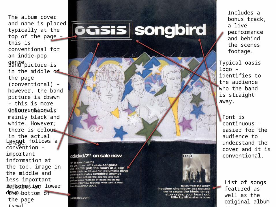
The album cover and name is placed typically at the top of the page – this is conventional for an indie-pop genre.
Band picture is in the middle of the page (conventional) – however, the band picture is drawn – this is more unconventional.
Website at the bottom of the page (small writing)
List of songs featured as well as the original album cover.
Colour theme is mainly black and white. However; there is colour in the actual image.
Includes a bonus track, a live performance and behind the scenes footage.
Typical oasis logo – identifies to the audience who the band is straight away.
Font is continuous – easier for the audience to understand the cover and it is conventional.Layout follows a
convention – important information at the top, image in the middle and less important information lower down.

Artist name at the top of the page – conventional. So that everyone knows who the artist is straightaway.
Image in the centre of the page (conventional) has the band in it.
Information overload with the image (food, candles, lights, messy room, etc).
The setting is quite dark – this could mirror the theme of the album and the songs.
Conventional – date of the new album being released.
The album name and artist is included in the picture – this is more unconventional.
Conventional having the website name at the bottom of the magazine advert.
Advert includes a single – “For What It’s Worth”.
Can tell that the genre nay be quite rock/country but it is not as clear as it could be.
Conventional – important information at top, image in middle and less important information lower down.

Slightly more unconventional album cover. Artist is not included in the picture.
Cannot tell what the genre is immediately – would have to either know the artist and her songs or research into it.
Image is split up into two. Firstly of a couple kissing and secondly of children playing. But they have one thing in common – they are both holding a sign saying ‘blessed’
All the information is included in the middle (artist name, album name and album release date).
Conventional that the website name is included at the bottom of the page.
The way the images looks – it looks as if both people in the images are homeless – yet they have each other – so they are ‘blessed’.
The images are separated by a piece of old paper with all of the information on it.
The album name could suggest that the songs may be deeper than they first appear.